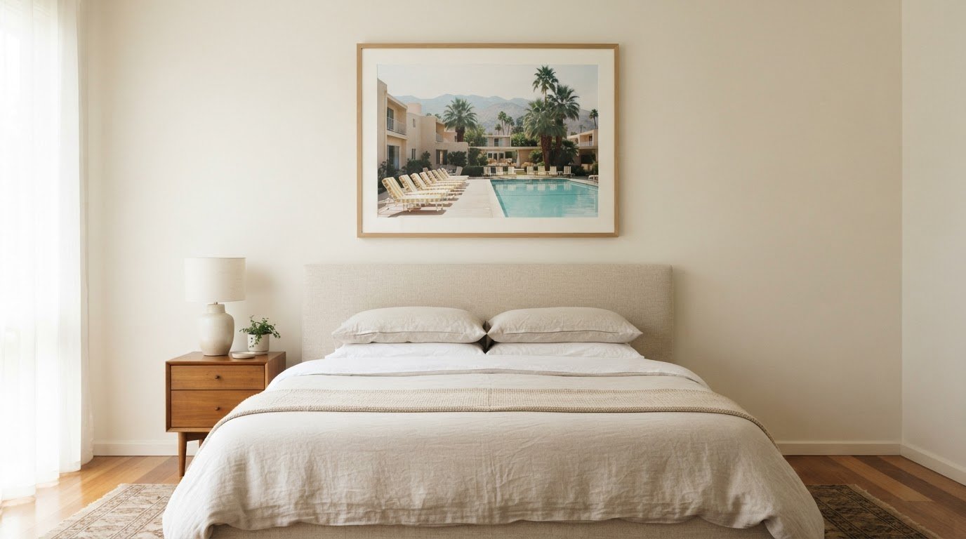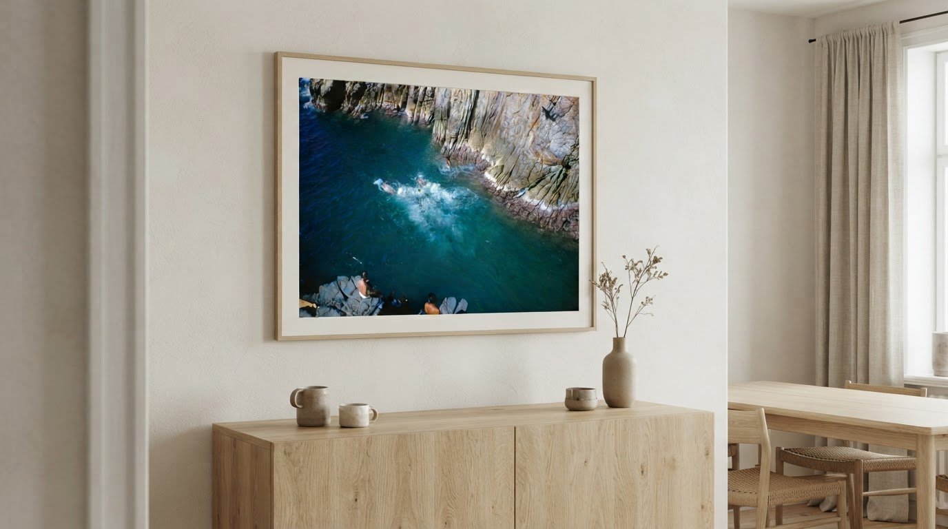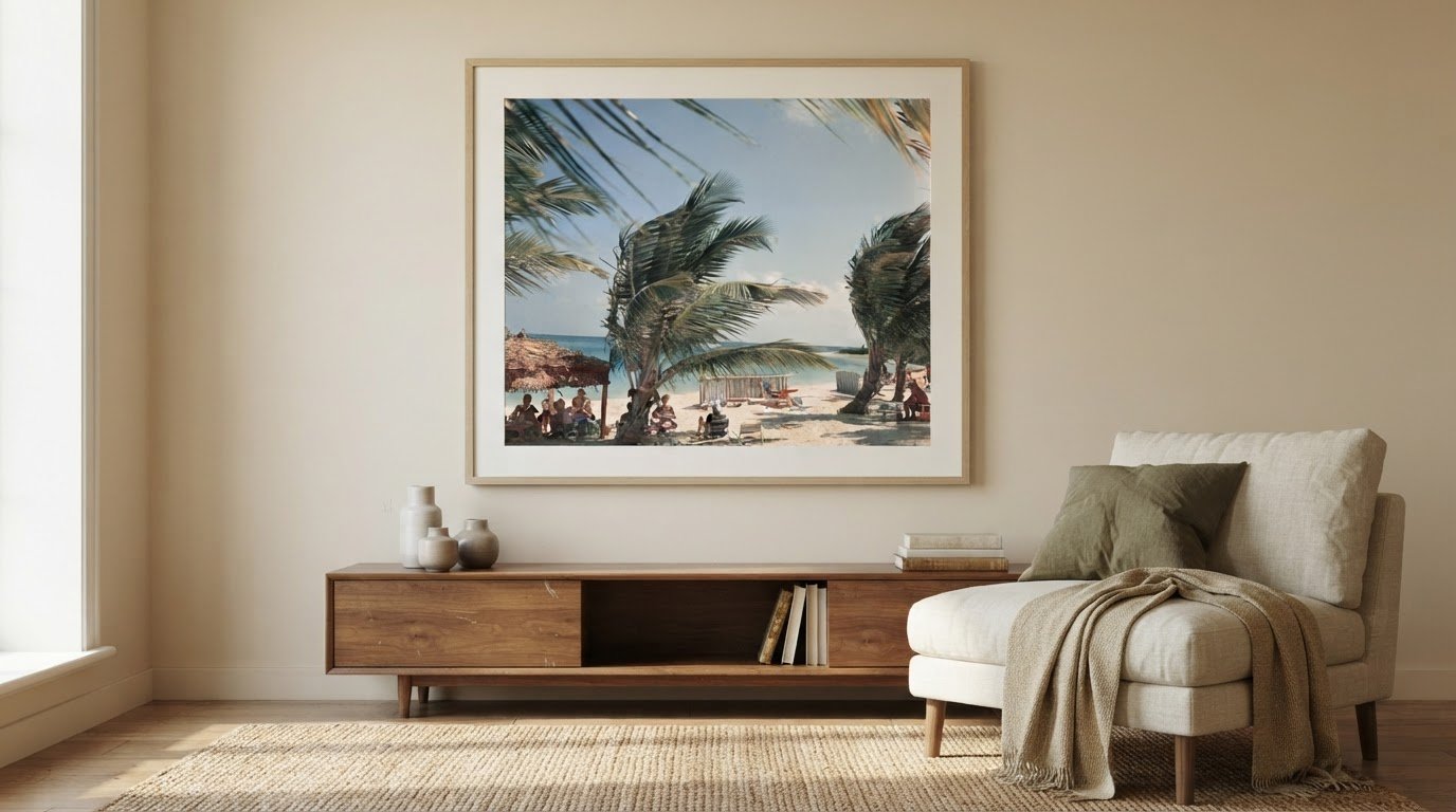
What if the most calming print isn’t the one with the softest colors, but the one that brings a room into balance? Choosing calming photography prints for the home starts with considering how a photograph’s palette, scale, and subject will sit alongside the furnishings already there. This gives you a practical way to picture the print in your space before deciding where it belongs.
It’s natural to want artwork that feels peaceful without making a room feel impersonal. This guide explores how color, décor, and landscape imagery can help you find that balance, from the quiet simplicity of water to the sheltering quality of a misty scene. You’ll learn what to consider when imagining a print in your space, how to coordinate it with textiles and furnishings, and how a larger photograph can create a focal point that draws the eye gently into the landscape.
Key Takeaways
- Choose color or black-and-white photography according to the atmosphere and visual balance you want in the room.
- Use colors in your textiles and furnishings to create a considered connection with the artwork.
- Explore how water, trees, mist, and waterfalls each bring a distinct quality to a landscape photograph.
- Consider the print’s scale and placement to shape a focal point that feels at ease within your décor.
Color and black-and-white photo art
Begin with the room’s existing palette, then decide whether the photograph should echo or soften it. Green and blue are often chosen for their calming associations, making a forest scene or quiet seascape a considered choice for a restful space. Muted green foliage can sit comfortably beside natural wood, while blue water may complement pale, cool-toned walls. Look at the photograph’s dominant colors, not just its overall impression. A small area of vivid color can draw more attention than a broad field of gentle tones.
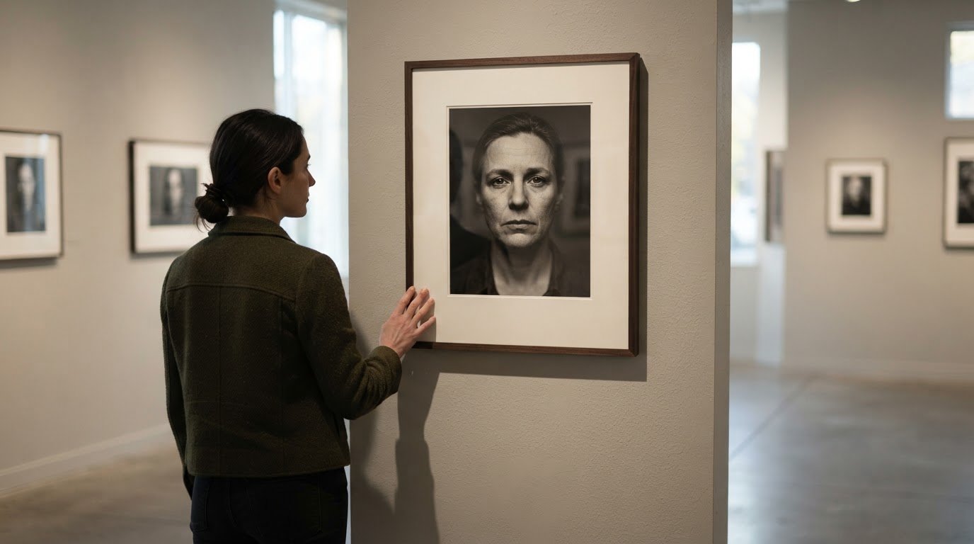
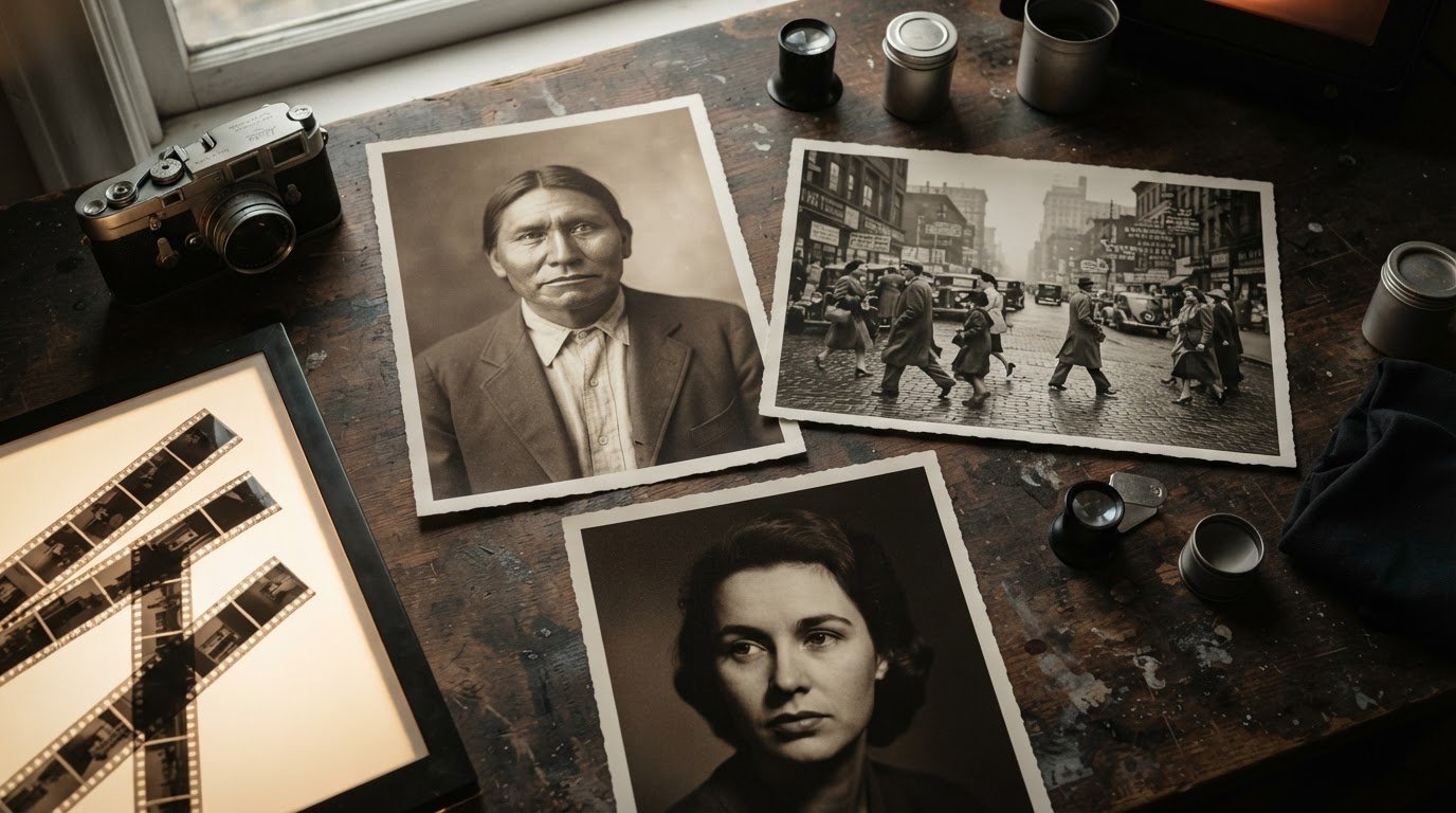
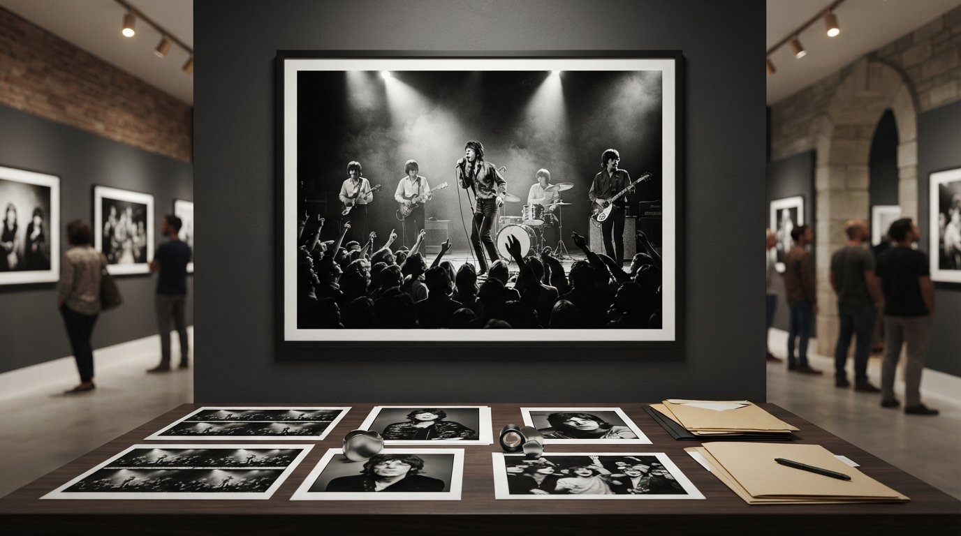
Black-and-white photography offers a different kind of visual calm. Without color, the eye follows tonal contrast, texture, and composition. A misty landscape in gray may feel quieter than a high-contrast image with deep blacks and bright whites. In a room with patterned upholstery or colorful objects, monochrome photography can create a visual pause. In a restrained interior, a strongly contrasted image can instead become the room’s most commanding detail. Consider how the print’s darkest and lightest areas relate to nearby furnishings.
Compare the artwork with the colors already in the room. Picture its palette beside a blue cushion, a green throw, or a cream wall. Similar hues can create continuity; a restrained contrast can give the image definition without overwhelming the setting. A soft blue landscape, for example, may connect with a blue textile, while a black-and-white print can balance a room with several competing colors. Aim for one clear relationship between the photograph and its surroundings.
To narrow your choice, identify the room’s strongest color, such as sage upholstery or a charcoal sofa. Decide whether you want the print to repeat that color, introduce a related tone, or offer monochrome contrast. Then consider the image’s tonal range. A pale photograph may blend into a light wall, while darker details can give it presence. Finally, view the choice alongside the room’s textiles and furnishings. This sequence helps you select photographic art that feels composed rather than disconnected.
Matching artwork with décor
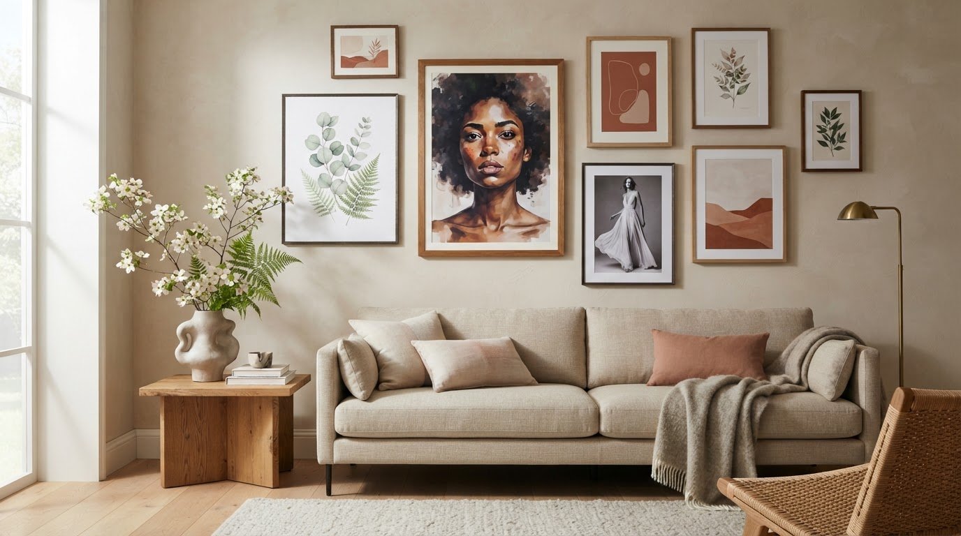
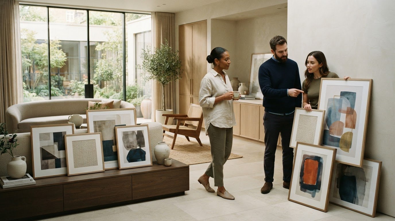
Start with the room’s materials, then consider how a photograph might relate to them. Nature imagery can feel more cohesive when nearby textiles echo its colors. A landscape with mossy greens, for example, may connect with a muted cushion or woven throw. The aim isn’t to match every shade exactly. A shared color note can link artwork and furnishings while allowing each to retain its character.
Look beyond color to the textures shaping the room. A photograph of smooth water may complement linen, glass, or polished wood, while a rugged mountain scene can sit naturally among woven fabrics and tactile ceramics. These pairings create visual relationships between image and setting. If the room already has strong patterns, choose a photograph with a simpler composition. In a quieter interior, a richly layered landscape can introduce detail without requiring more decorative objects.
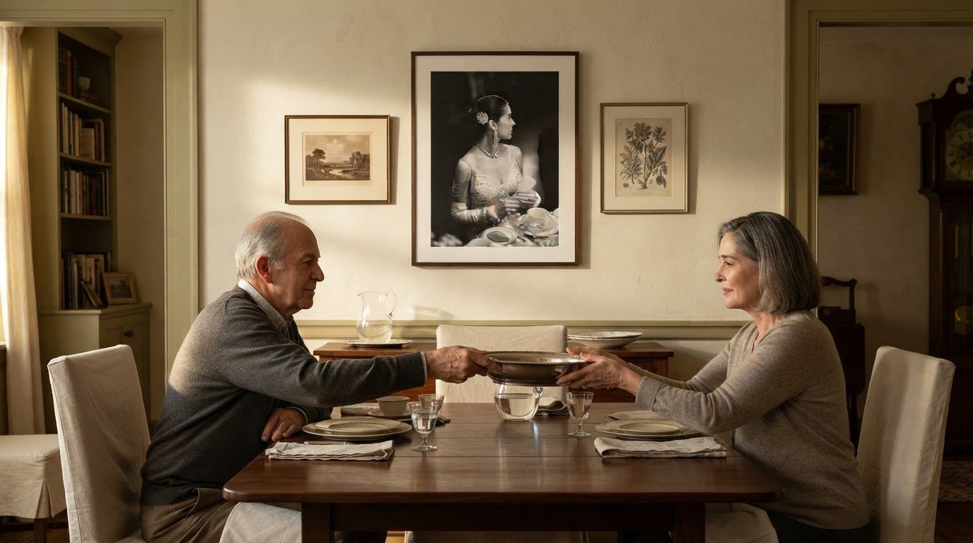
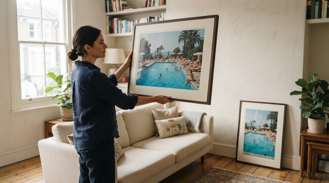
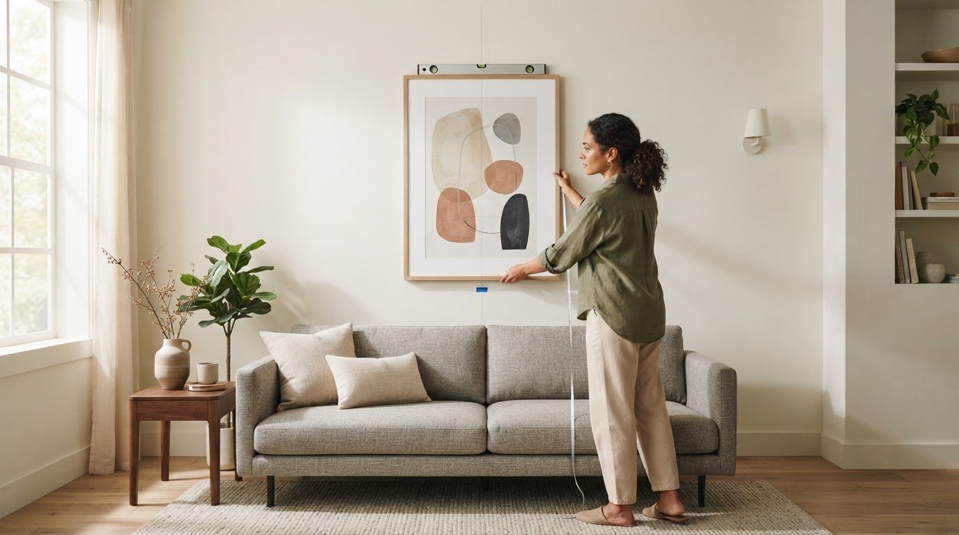
Placement also affects how artwork relates to furniture. Above a sofa, a horizontal photograph can echo the furniture’s long line; beside a reading chair, a vertical composition may follow the shape of a bookcase or window. Keep the arrangement deliberate. A crowded cluster of objects can compete with a peaceful image, while clear space lets its subject remain legible. In a small room, consider nearby shelves, lamps, and doorways before settling on a position.
To choose calming photography prints for home décor, identify a textile or finish the artwork can relate to, then look for a landscape with a compatible hue or texture. Consider the image’s orientation and nearby furniture. The best calming photography prints for home interiors support the room’s atmosphere without competing with its furnishings. Notice whether surrounding objects frame the photograph or distract from it. A nature image with soft greens, for instance, may feel at home beside woven upholstery and pale wood. Explore photographic prints for considered interiors as you refine the relationship between image, room, and furnishings.
Peaceful landscape imagery and emotional connection
Water offers a particularly quiet subject for photographic art. Wallace J. Nichols, PhD, notes that water simplifies the visual landscape, giving the eye fewer competing details to process. A broad lake, still shoreline, or gently receding tide can create that sense of visual spaciousness. Waves add movement, while their repeated forms can make a seascape feel measured rather than busy. Choose a photograph where the water’s pattern and surrounding detail suit the room’s intended mood.
Trees can suggest shelter, depth, and a connection to the natural world. Viewing tree photographs may reduce stress and support focus for people without easy access to forests. A close study of trunks and leaves offers intricate detail, while a woodland path gives the gaze a clear route through the composition. For a reading corner, consider which image would hold your attention without demanding it. Nature imagery can decrease stress and increase positivity, making the photograph’s particular subject worth considering—much like how creative studios such as Art Therapy explore how artistic engagement contributes to relaxation and everyday well-being.
Mist changes the emotional character of a landscape. Fog can make a scene feel intimate and protected, qualities that may evoke security and peace. A distant hill softened by mist often has less visual urgency than a sharply defined skyline. Waterfalls offer another kind of calm: their sights and sounds are soothing, and their motion is perceived by the brain as non-threatening. In a still photograph, flowing water preserves the impression of movement through cascading lines and pale highlights.
Use the image’s visual rhythm to guide your choice. For a quieter effect, look for a level horizon, gentle tonal shifts, or open space around the main subject. A close crop of rushing water creates more energy than a wide view of a calm bay. Waves produce negative ions that can improve mood, increase alertness, and boost mental energy. Consider whether that livelier association suits the room. Compare the emotional character of trees, fog, and water, then choose the landscape you’d most like to return to.
Photographic prints for home decor
Paper and finish affect how a print looks in a room. Matte surfaces reduce reflections, while glossy ones emphasize contrast and sheen. Fine-art prints can draw attention to tonal detail and the character of the paper. Consider the room’s lighting: a glossy surface near a bright window may catch reflections, while matte artwork can appear more subdued.
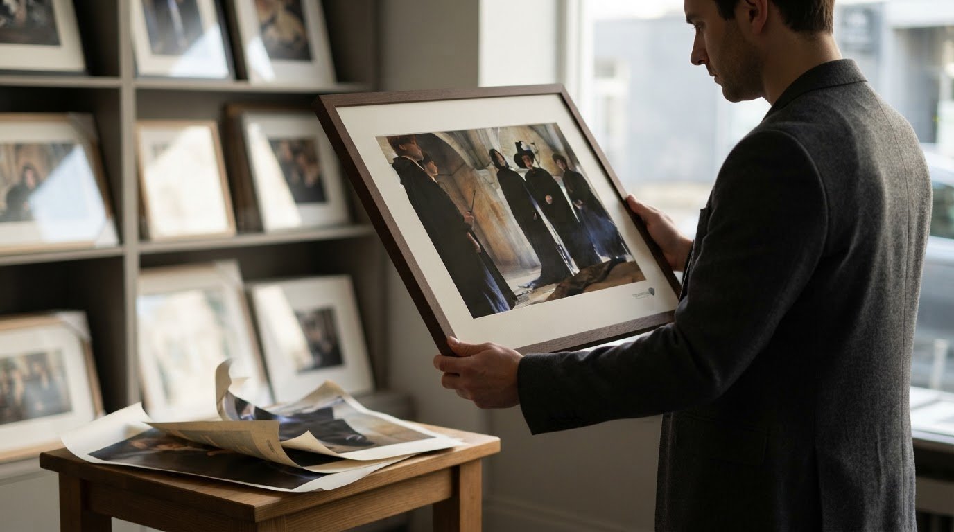
A print’s price depends on its dimensions, material, and presentation, including framing. Larger prints use more material, while framing affects the overall purchase. Compare the finished piece rather than size alone, since the frame and print surface influence its presence. Decide what matters most: scale, finish, or frame.
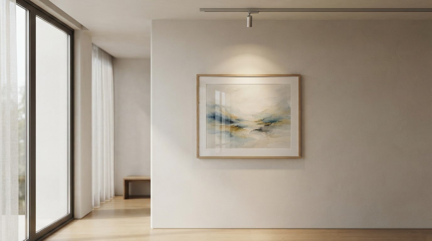
For bedrooms, still water, fog, or a softly lit woodland can suit a restful mood. In living rooms, a broad landscape may establish a focal point, while a close view of leaves can bring nature into a smaller arrangement. The best calming photography prints for home décor suit the room’s scale, light, and intended mood.
In the United States, explore photographic prints through an art gallery’s collection, where image and presentation can be considered together. To choose calming photography prints for home, compare the available artwork with the room’s purpose and the effect you want it to create. A clear visual intention can help narrow the selection.
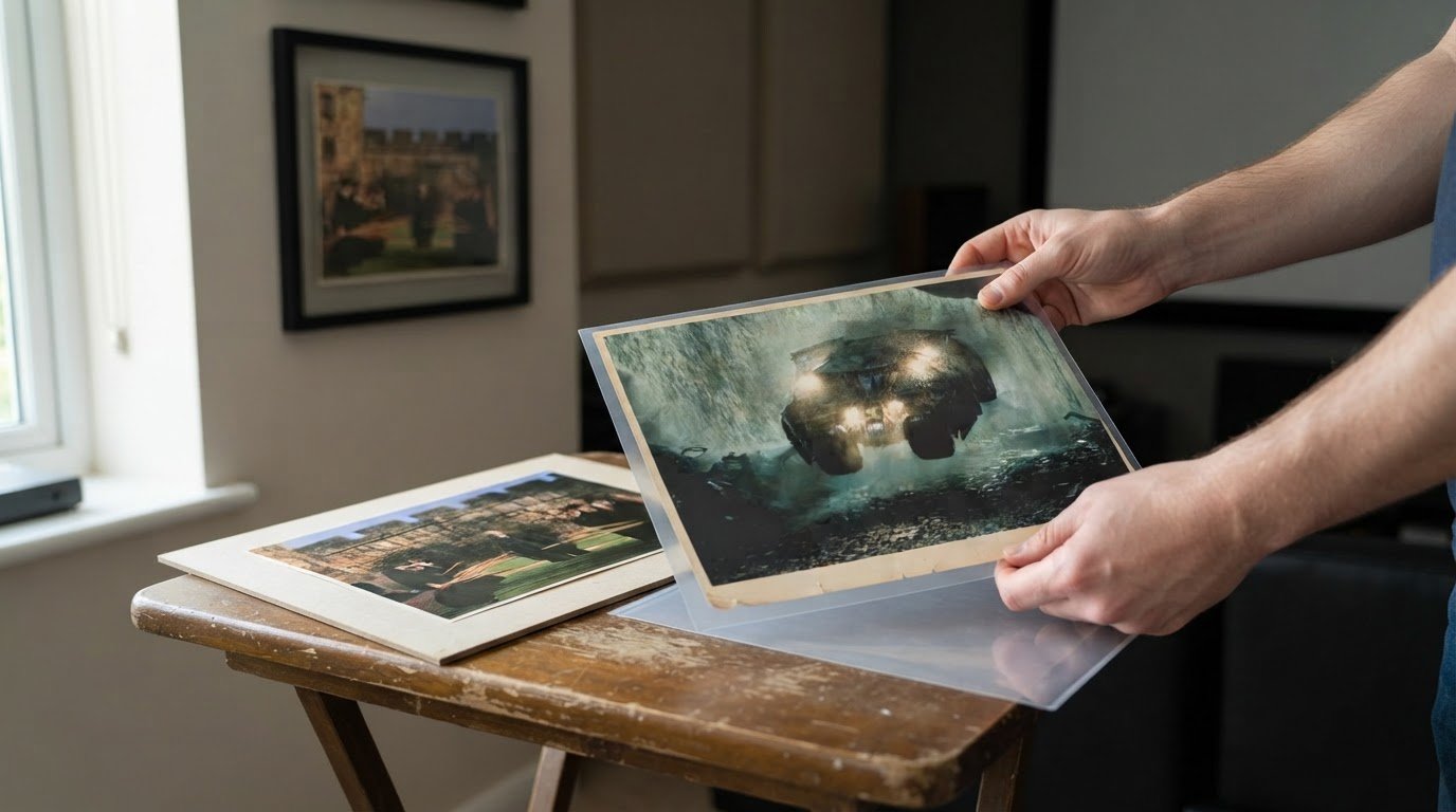
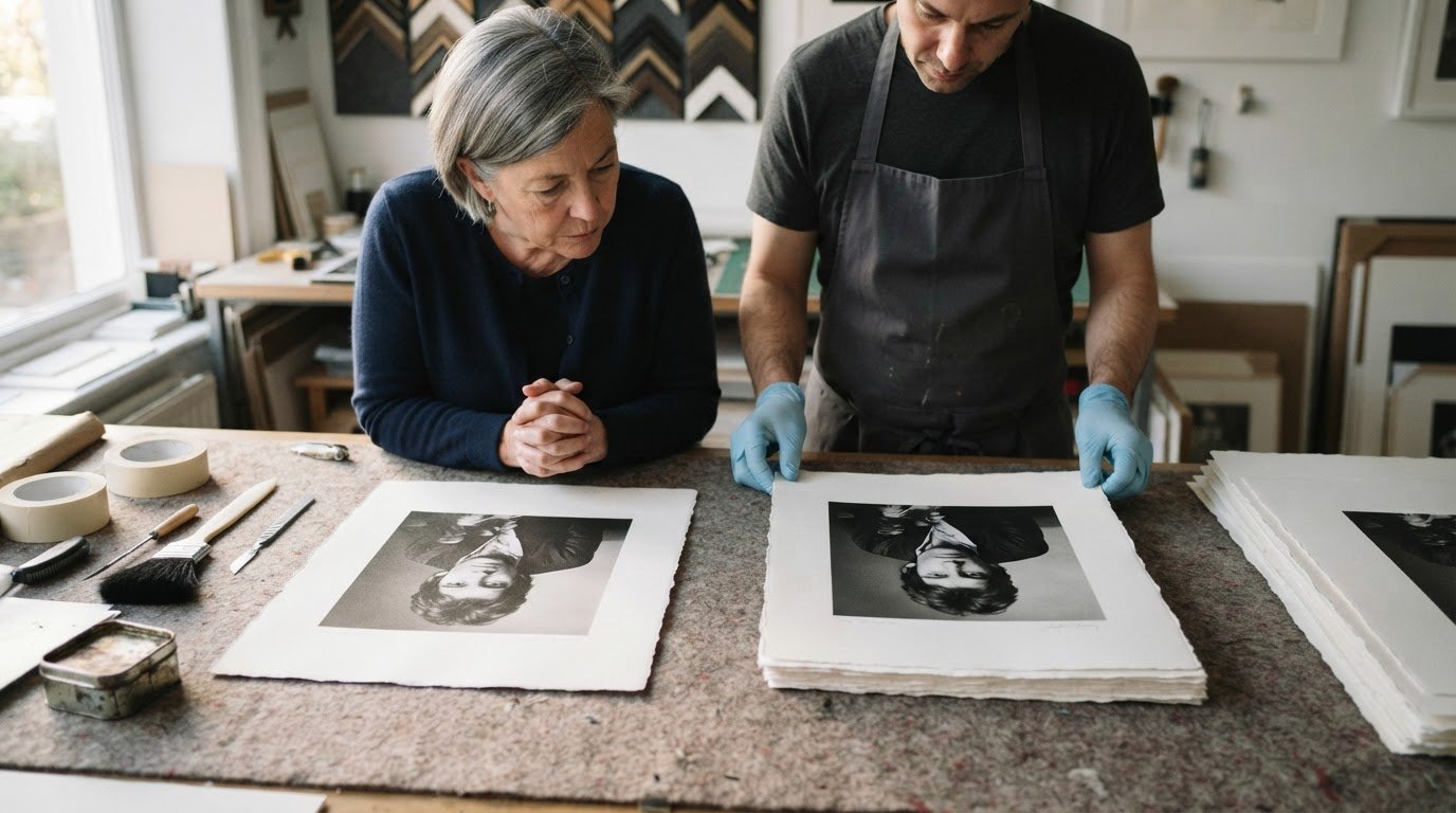
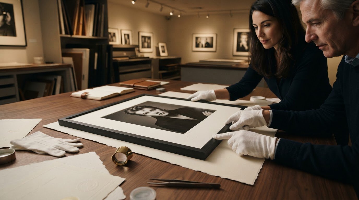
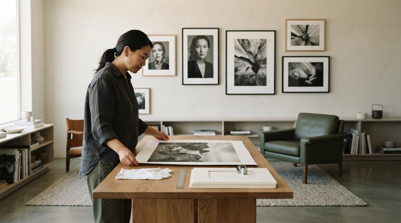
Preserve a print by keeping it away from direct sunlight, moisture, and abrupt environmental changes. Handle it by the edges with clean, dry hands, and avoid touching the image area. Dust a frame gently with a soft cloth rather than applying cleaner to the print. For example, position a framed landscape away from a sunny window and a damp bathroom wall.
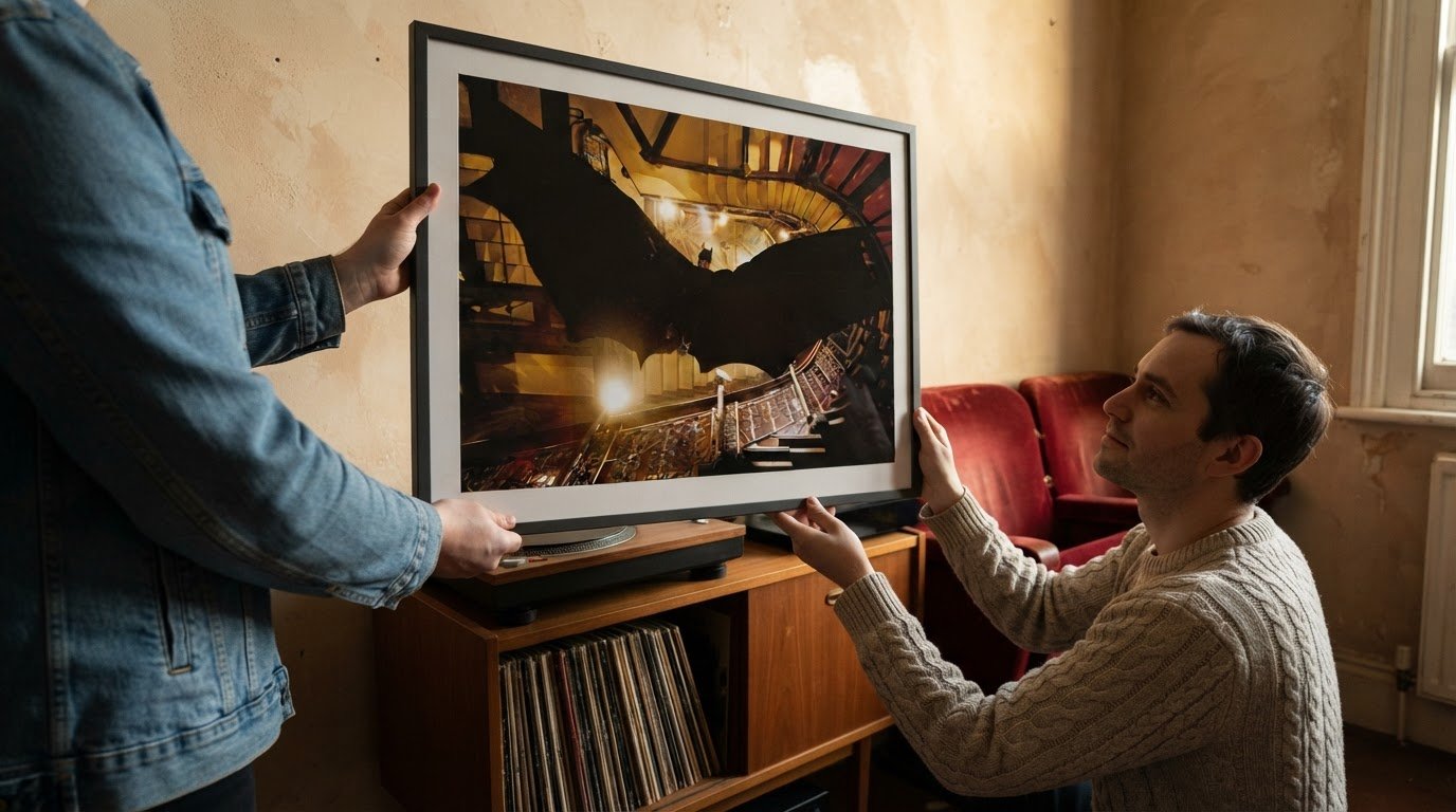
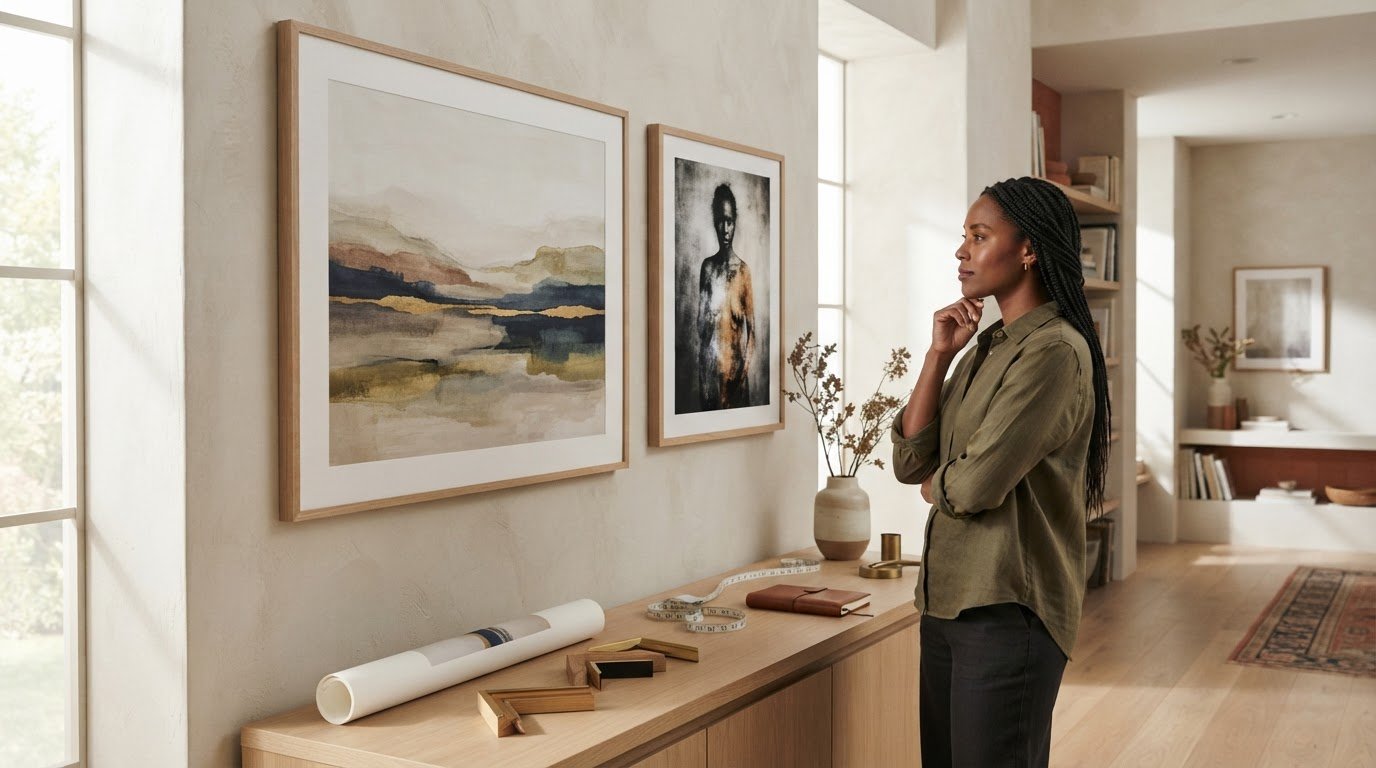
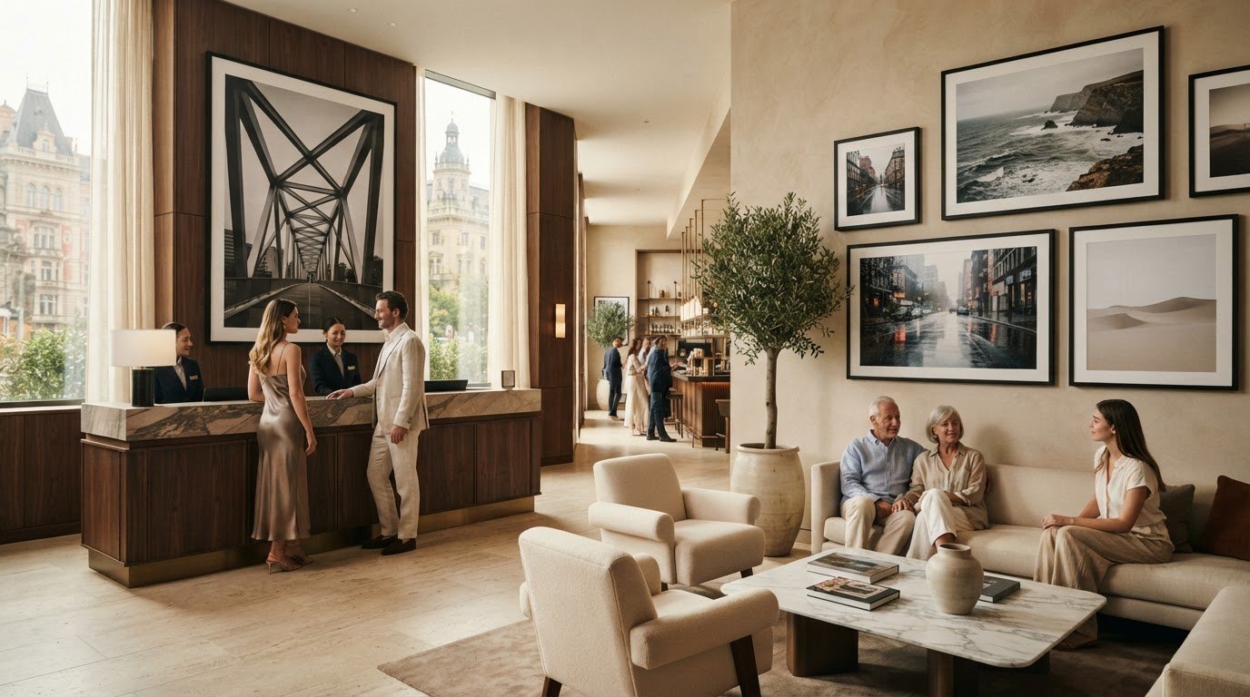
Before choosing, picture the finished work in its intended position. A large, immersive nature print can create a focal point and suggest a view into the landscape. Consider the wall’s available space, nearby furniture, and image orientation together. Browse photographic prints for your home to explore images that could bring this visual balance into your rooms.
Galerie Prints: Terry O’Neill Photography
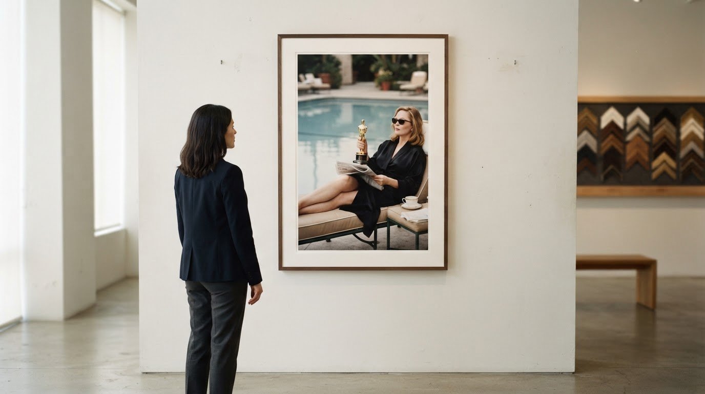
Galerie Prints offers Terry O’Neill Photography for readers drawn to photographic art with a distinctive cultural presence. Once you’ve considered color, subject, and placement, exploring a photographer’s work can help you find images that suit your room and personal taste. The Slim Aarons Collection, Cinema Lobby Cards, and Star Wars Limited Edition Prints offer other directions, from photographic collections to cinema imagery.
Choose according to the atmosphere you want the artwork to contribute. A print can complement a considered interior or provide a point of contrast within it. Galerie Prints also offers a Bespoke Framing Service, a useful consideration when you want the finished presentation to relate thoughtfully to your décor. For a closer look at the photographic choices, contact Galerie Prints.
Choose a Print That Feels at Home
Let your final choice reflect more than the room’s palette. The photograph you live with can carry a personal association, a remembered place, or a sense of escape that makes the space feel distinctly yours. Before deciding, picture the artwork in its intended setting and consider whether you’ll enjoy seeing it every day. That personal connection can turn a considered piece into part of your home’s story.
For a next step, explore the distinct photographic perspectives in Terry O’Neill Photography and The Slim Aarons Collection, alongside the cinematic character of Cinema Lobby Cards. Each offers a different visual mood to consider as you refine your selection. Galerie Prints brings these collections together to help you explore the atmosphere you want to create.
Contact Galerie Prints for help choosing, and take the next step toward finding a photograph that feels personal to your home.
Frequently Asked Questions
Can I See How a Print Will Look in My Room?
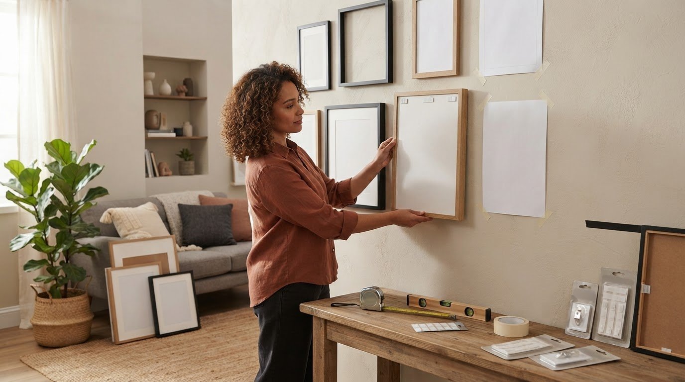
Yes, make a simple paper template to preview the print’s scale and placement. Cut kraft paper to match the intended dimensions, then tape it where you plan to hang the artwork. This helps you judge its relationship to a sofa, doorway, or nearby shelf before choosing. Include the frame’s outer dimensions too, so your preview reflects the finished piece.
How Should I Display The Print?
Place the print where its composition can be appreciated without competing with nearby objects. Above a console, align the artwork with the furniture’s center; in a gallery arrangement, keep spacing visually consistent. Consider the room’s sightlines from the main entrance and seating area. A photograph opposite a favorite chair, for instance, can become a quiet point of focus.
What Photography Print Subjects and Styles Create a Calming Atmosphere at Home?
Choose a subject whose mood suits the room’s purpose. An open shoreline can feel spacious, while a close botanical study offers a more intimate view of nature. In a bedroom, a restrained composition may feel restful; in a living room, a wider scene can invite longer attention. Personal meaning matters too: a landscape reminiscent of a cherished place can make the artwork especially resonant.
Which Colors in Wall Art Are Most Calming for Living Spaces?
Green and blue are often chosen for their calming associations, but the specific shade and balance matter. Muted blue can feel quieter than a highly saturated shade, while soft green may blend gently with natural materials. Consider the wall color and furnishings as well. A small accent of a stronger hue can add definition without making the entire artwork feel visually intense.
What Print Sizes Work Best for Different Rooms and Wall Dimensions?
The right size depends on the available wall area, nearby furniture, and the visual role you want the print to play. Measure the intended space, including room for the frame, then compare that footprint with the furniture below. A narrow wall may suit a vertical composition, while a broad sofa wall can accommodate a wider work. A paper template makes these proportions easier to judge.
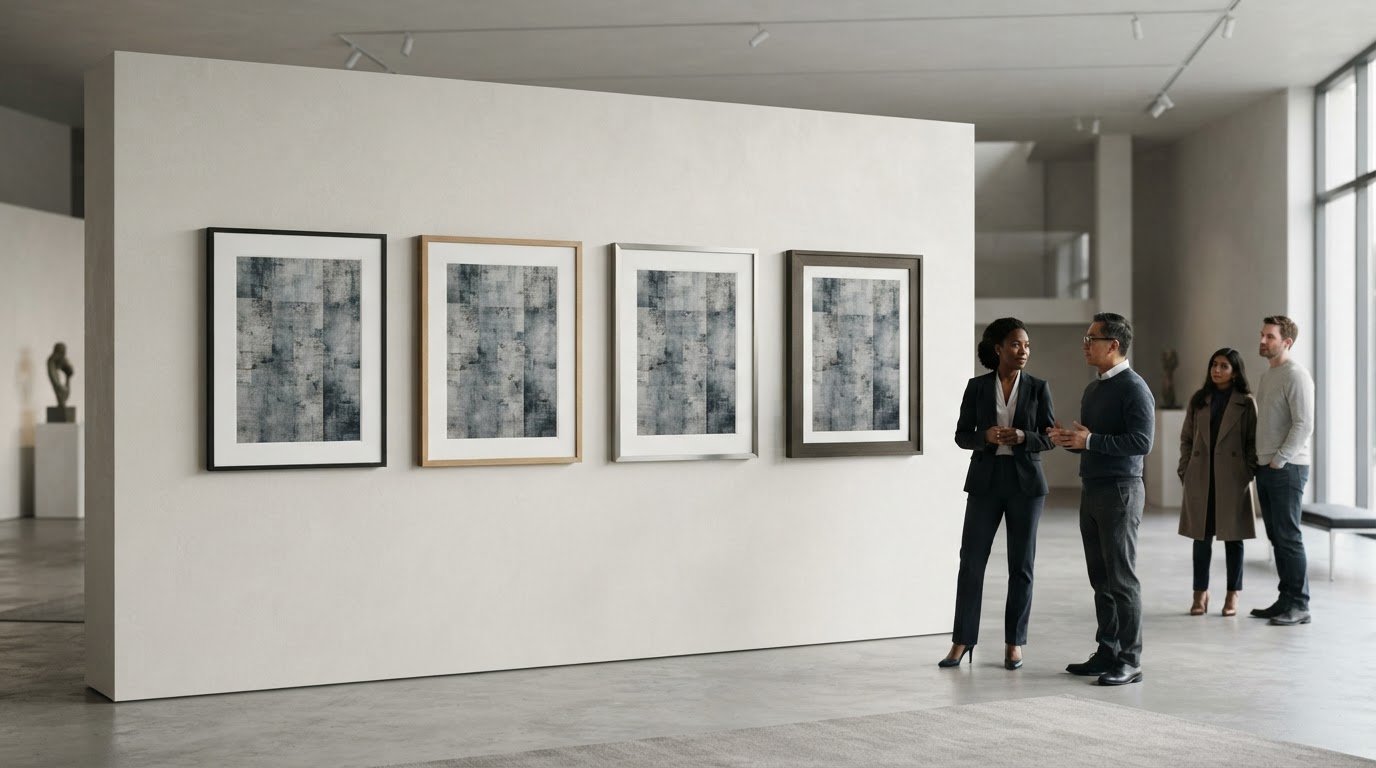
How Do I Choose a Frame and Mat for Photography Prints?
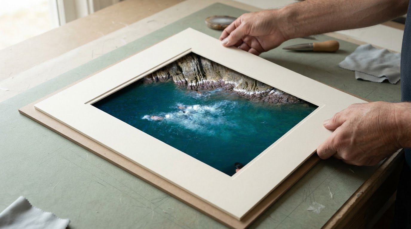
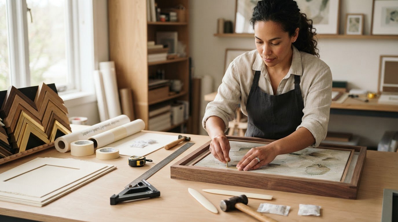
Choose a frame that relates to the room’s finishes, such as pale wood near light timber furniture or a dark frame against deeper accents. A mat can create separation between the photograph and frame, especially when the image has delicate details. Keep the overall presentation in proportion to the print and wall. Galerie Prints offers bespoke framing for its prints.