Tag: gallery walls

How to Choose Frames That Suit Your Interior Style

The frame should never outshine the image it holds. Matching a frame to interior decor starts with the artwork’s dominant tones, then considers the room’s palette, materials, and character. When two options feel equally convincing, the simpler frame often lets the image breathe.

It’s natural to want a frame that feels at home with your furniture and walls, but an exact match isn’t essential. The most harmonious choice connects the artwork to its surroundings without competing with either, through a shared colour, a complementary material, or a considered contrast.

This guide explores how frame profiles, colours, and materials can complement different interior styles, from pared-back Scandinavian rooms to richly layered spaces. You’ll also find practical ways to create cohesion across gallery walls and open-plan interiors, while keeping each photograph or print at the centre of attention.

Key Takeaways

  • For rustic and farmhouse rooms, consider oak, walnut, or weathered white wood, and vary frame sizes or wood tones for a collected feel.
  • Choose a frame colour that connects with the artwork or echoes a room detail, while keeping the image as the focal point.
  • Create gallery-wall cohesion through a repeated element such as spacing, colour tone, or subject matter, even when the frames differ.
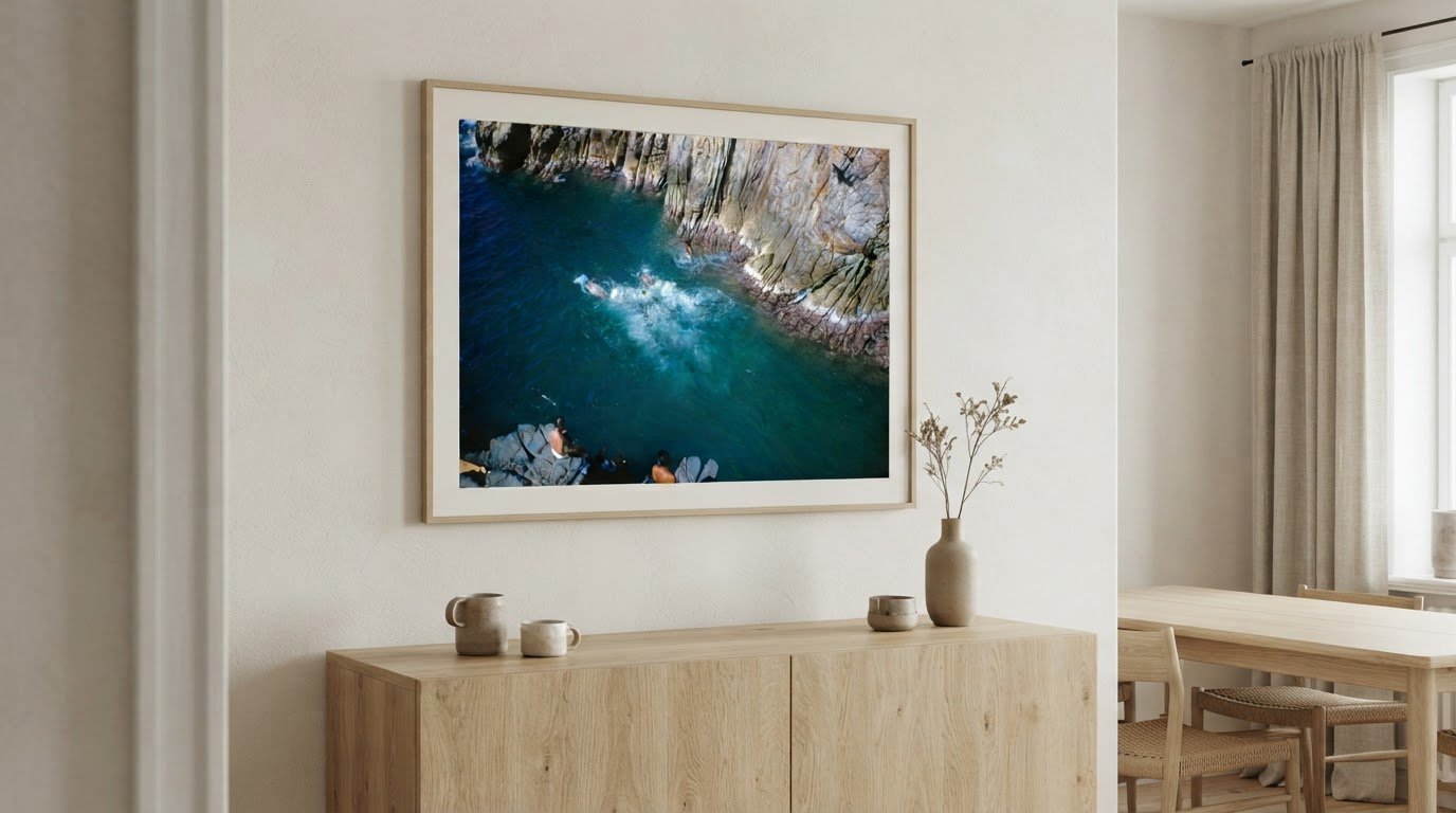
  • In Scandinavian interiors, simple white, light oak, or matte black frames and generous negative space can preserve a calm, uncluttered look.

1. How to choose frames for your interior style

Start with the room’s character, then choose a profile to suit it. Modern interiors often work well with slim metal or natural wood frames; traditional rooms can take carved profiles and gold finishes. Farmhouse spaces feel at ease with oak, walnut, or distressed white wood. Minimalist rooms benefit from unornamented frames that preserve visual calm.

In rustic and farmhouse interiors, connect the frame to the furniture rather than matching every finish exactly. An oak frame can echo an oak dining table, while walnut adds warmth beside darker furnishings. Weathered white wood complements painted furniture and cottage details. Mixing wood tones and frame sizes can create a collected feel, especially around botanical prints or pastoral artwork.

Let the artwork’s palette guide your choice. A frame that picks up a dominant tone can link the image to the room; soft white, off-black, natural oak, and ash offer quieter surroundings for detailed compositions. Match the frame’s width to the artwork’s visual weight: substantial moulding can support oversized work, while a thick profile may overwhelm a small, delicate photograph. Sleek profiles suit architectural photography; ornate frames can give portraits or landscapes a traditional presence.

A frame’s appearance and fit matter more than a precise match with the room. Compare profiles and finishes beside the artwork and nearby furnishings, considering how the finished piece will sit on the wall. Choose a frame that supports the image’s scale and character, rather than judging by width alone.

Wood and metal describe a frame’s structure, but neither alone protects artwork from sunlight, moisture, or fading. For photographs and prints, protection also depends on glazing and backing, as well as where the piece hangs. Limit direct sunlight and avoid damp locations; consider protective glazing designed to reduce UV exposure. This can help preserve colour, but framing choices should suit the specific artwork and room conditions.

2. Coordinating frame colors with artwork and room décor

A picture frame can connect an image to a room without matching every wall or furnishing. Pick a colour or finish from the surroundings, then decide whether the frame should echo it or create contrast. With a grey sofa, for example, a grey frame can make a quiet connection; black against pale walls gives the artwork a more defined edge. The aim is a considered relationship, not a staged set.

In coastal spaces, whitewashed wood, pale driftwood, soft grey, and muted blue frames reflect the room’s light character. A gold filigree finish can work, too, alongside nautical or beach-themed artwork. For warm pink or red walls, a traditional frame can complement the richer palette. Ornate gold adds formality, while a restrained neutral finish keeps the picture’s colours prominent.

Let the image guide your choice. A neutral frame can settle a detailed photograph, while a contrasting colour can sharpen graphic or strongly colour-blocked artwork. Clean lines and subtle finishes suit contemporary spaces; carved details lend traditional styles a sense of elegance. Furniture offers another cue: repeat a material or tone from a side table, cabinet, or sofa without requiring an exact match.

A mat changes the relationship between picture and frame by adding a border of negative space. A light mat can separate dark artwork from a dark frame, while a wider mat gives a small image more visual presence. A narrow mat keeps attention closer to the image. Choose its tone from a subtle colour within the artwork, then consider how the border sits against nearby wall colours.

For a room shaped by pale tones and relaxed leisure, The Slim Aarons Collection offers photographic images to consider alongside coastal colors and finishes. Let the picture’s own palette lead, then use the frame and mat to give it a distinct place in the room.

A gallery wall feels composed when its frames share a visual thread, even if their profiles differ. Repeat one element, such as a finish, mat tone, subject, or spacing, then vary the other details. For example, portrait and landscape photographs can feel unified through consistent gaps and a recurring frame finish. This gives an eclectic collection room for personality without making every piece identical.

Frames don’t need to match exactly; coordinate them through one or two repeated details. A rustic wood frame can sit beside a slim contemporary profile if the artwork, spacing, or shared tone connects them. Consistent framing creates a quieter gallery, while contrasting finishes and widths add drama. In a neutral room, a vivid frame or a single richly coloured print can become a deliberate focal point.

In open-plan rooms, artwork should relate across distinct areas, such as a dining space and a living room. Carry one visual element between them, perhaps a repeated subject or similar frame finish, while adapting each grouping to its setting. A compact arrangement near a reading chair can feel intimate; a broader gallery above a sofa can anchor the larger zone. Keep the overall palette connected rather than repeating every frame.

Before hanging, arrange the gallery on the floor and consider its outline against the furniture below. A symmetrical grid suits a formal room, while an asymmetrical grouping brings movement to a casual, creative space. Keep the gaps consistent so varied pieces feel intentional. Aligning the group’s outer edges can also create a clear shape, even when individual frames differ.

In minimalist interiors, one large framed work can preserve openness and focus. A grid offers more structure; an irregular gallery adds character. Choose an arrangement that suits the room’s proportions and the way people move through it, then hang the work where it can be viewed comfortably from the main seating area.

4. Frame materials, colours, and designs for Scandinavian interiors

Scandinavian interior design favours clarity, natural materials, and restrained contrast. Choose simple picture frames in white, light oak, or matte black to support that quiet visual language. A solid wood frame can add warmth beside pale walls and linen upholstery, while a black profile gives a monochrome photograph a crisp outline. A mat creates negative space around the image, preserving an uncluttered atmosphere.

Industrial interiors call for a balance of texture and structure. Simple black, metal, or brushed-silver frames echo steel fixtures, exposed brick, and concrete without adding ornament. A grid can bring order to a wall of prints, while one large framed work creates a clear focal point. Repeat a finish around the room, such as black metal on frames and lighting, to make the pairing feel intentional.

Farmhouse and cottage rooms can take their cues from natural wood and weathered surfaces. Oak, walnut, or distressed white frames sit comfortably beside a timber table, painted cabinet, or reclaimed shelf. Simple profiles keep the display relaxed; varied sizes and wood tones add a collected feel. Botanical prints and pastoral scenes suit these textures, especially when their colours echo nearby fabrics or foliage.

To connect frames with furniture, repeat one material or tone rather than copying every finish. A light-oak frame can relate to a pale wood floor, while a darker walnut profile can anchor a room with deep timber furniture. In an eclectic space, add a contrasting frame colour or carved detail, then repeat another element, such as a shared mat tone. This keeps the contrast from feeling accidental.

Choose a well-made solid wood frame in a tone that belongs with the room, then consider how its profile supports the artwork. For a calm Scandinavian scheme, keep the moulding simple and let the image provide character. To find a photographic focal point for a considered interior, explore photographic prints that suit your chosen palette and framing approach.

Galerie Prints

Galerie Prints can help you bring a considered artwork and framing choice together when a room needs a distinctive focal point. Its collections include The Slim Aarons Collection, Terry O’Neill Photography, Cinema Lobby Cards, and Star Wars Limited Edition Prints, offering varied imagery to suit different palettes and interior styles.

Once you’ve chosen a piece, Galerie Prints’ Bespoke Framing Service is a natural next step for shaping its presentation around your space. Consider the room’s materials, the artwork’s tones, and whether a simple profile or a more pronounced frame will create the right effect. The aim is a thoughtful relationship between image, frame, and interior, with the artwork remaining central.

Explore artwork and bespoke framing at Galerie Prints to find a considered fit for your interior.

Let the artwork shape what comes next

A framed image can become part of a room’s story, not merely a finishing touch. Before choosing your next piece, consider what you want the space to express: quiet reflection, a sense of travel, or the glamour of another era. That intention can guide your search and make matching a frame to your interior decor feel more personal than following a fixed style rule.

Think of the wall as an evolving setting. A single photograph might establish its mood today, while future additions deepen its character over time. Choose work that holds your attention, then present it in a way that feels considered in your home. The right pairing can make an everyday room feel unmistakably yours.

If you’d like guidance on a framing choice for your space, contact Galerie Prints for framing advice. Take the next step with confidence, and let the image you love find its place.

Frequently Asked Questions

How do you choose frames to match the style of your interior?

Start by deciding whether the artwork or the room should make the stronger statement. In a quiet room, a distinctive frame can introduce character; in a richly decorated space, a restrained profile helps avoid visual competition. Consider the room’s overall mood, then assess the frame beside the artwork and nearby furnishings. Matching a frame to interior decor works best when the choice feels deliberate, not exact.

Why are frames important in interior design?

Frames give artwork a boundary, helping it read clearly against a wall and establish its visual presence. They also introduce another material and finish into the room, linking a photograph to nearby objects or making it a focal point. For example, a framed image above a console can anchor that area visually, while a collection of smaller works can give a bare hallway a sense of purpose.

How do I choose a picture frame that matches my interior decor style?

Use one detail from the artwork or room as your starting point, then choose a frame that supports it. For example, a black-and-white architectural photograph can take a crisp dark frame in a pale room, while a warm-toned image may sit naturally in a wood finish. Step back and consider the whole composition, including the wall and furnishings, rather than judging the frame alone.

What are the best frame choices for small rooms, large walls, and gallery walls?

In a small room, choose a frame that gives a cherished image presence without crowding nearby objects. A spacious wall can support one substantial work or a carefully composed grouping. For a gallery wall, plan the arrangement around its overall outline, such as a balanced grid above a console or a relaxed grouping in a hallway. Keep the display’s scale suited to the furniture beneath it.
How to Choose an Art Print Size for Your Wall and Artwork

Knowing how to choose art print size begins with the image’s proportions, the available wall space, and its pixel dimensions. Common options include 5 × 7, 8 × 10, 11 × 14, 16 × 20, 18 × 24, and 24 × 36 inches, from intimate accents to room-defining statements. For a digital image, divide each pixel dimension by 300 to estimate the maximum print dimension in inches.

It’s easy to focus on the wall and overlook the image itself. A print may suit the room beautifully, yet lose detail if enlarged beyond the resolution the image can support. Knowing how to choose art print size means balancing the setting with the clarity and character that drew you to the artwork.

This guide explains how to choose art print size by comparing familiar dimensions, matching them to the artwork and display space, and considering image resolution. You’ll have a clearer way to compare options and choose a print that feels considered, not merely large enough to fill a wall.

Key Takeaways

  • Compare familiar print dimensions, from compact 5 × 7-inch pieces to dramatic 24 × 36-inch displays, to find a scale that suits your space.
  • Match the artwork’s proportions to a compatible print format so its composition remains balanced, whether framed, on canvas, or presented on acrylic.
  • Use the wall and nearby furniture as a guide: artwork often feels balanced when it spans about two-thirds to three-quarters of the available width.
  • Estimate a digital image’s suitable print dimensions by dividing its pixel measurements by 300, then consider whether its aspect ratio fits your chosen size.

What Are the Common Print Sizes for Art?

Common art print sizes range from 5 × 7 inches to 24 × 36 inches. Knowing how to choose art print size means weighing the image’s proportions against the wall and display setting.

Print formats and size comparisons

Print dimensions describe the artwork’s surface, while frames add to its overall footprint. This distinction matters when measuring a wall or selecting a frame. A frame can add 1-3 inches to the artwork’s overall size, so include its outer edges in your measurements. Canvas and acrylic prints also have stated dimensions, but their presentation differs from framed prints.

Print, mat and frame costs depend on the size and materials you choose. Compare the complete presentation: the mat and frame affect the finished artwork’s overall dimensions.

Matching print sizes to display settings

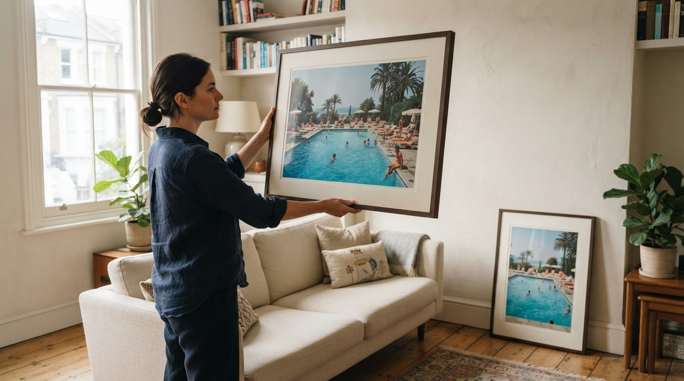
Display setting means the wall, furniture, and surrounding space where the artwork will hang. Matching the scale to that setting helps a piece feel intentional. For a small nook or gallery wall, 8 × 10-inch or 11 × 14-inch prints suit compact arrangements. Above a sofa, a 24 × 36-inch print can anchor a living room, while a larger wall can accommodate more expansive pieces.

Choose one large print when you want a singular focal point and an uninterrupted composition. Choose a gallery wall when several pieces can create a balanced visual arrangement.

Size visualization and popular uses

Size visualization means comparing a print’s dimensions with familiar objects or a measured wall outline. It helps you judge scale before choosing a format. A 16 × 20-inch print has roughly the area of two standard sheets of paper side by side; an 18 × 24-inch print resembles four sheets arranged in a grid.

Popular fine art sizes include 8 × 10 inches for small spaces, 11 × 14 inches for standalone display or collections, and 16 × 20 inches for greater presence. An 18 × 24-inch print suits a larger wall, while 24 × 36 inches creates a dramatic focal point. For how to choose art print size, keep the artwork’s composition intact when selecting a square or rectangular format.

Small, medium, large, and oversized print dimensions

Size labels indicate scale, but the wall and placement determine how the artwork reads. Measure the available space first to narrow down dimensions without letting a frame or nearby pieces crowd the composition.

Measure the wall’s width and height, then allow at least 2-3 inches of breathing room around the print. For a wall above furniture, compare the artwork’s width with the furniture beneath it; a piece spanning about two-thirds to three-quarters of the available width often feels balanced. Include the frame in your measurement.

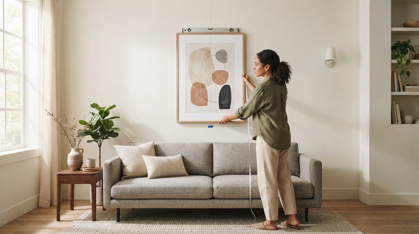
Preview the dimensions by marking the proposed outline with painter’s tape. Leave it in place for a day, then view the shape from the room’s usual entrance and seating area. This helps you judge how the print will relate to furniture and nearby wall space before choosing a format.

Size categories offer a useful starting point:

  • Small: 5 × 7, 6 × 8, and 8 × 10 inches suit shelves, compact walls, and a collection of smaller prints.
  • Medium: 10 × 10 and 16 × 24 inches give artwork more presence without requiring an expansive wall.
  • Large: 18 × 24 and 20 × 20 inches can hold attention above smaller furniture or on a broad wall.
  • Oversized: 30 × 40 and 36 × 48 inches suit spacious rooms and open wall space.

Common frame dimensions can influence the choice. For instance, 11 × 14 inches is a familiar frame size, but it doesn’t exactly match a 4:5 image ratio, so fitting the artwork may require adjusting its crop or presentation. Hang framed art with its centre approximately 57-60 inches from the floor. Above furniture, keep the lower edge 6-10 inches above the top edge.

Choosing print size for the artwork and display space

Consider the artwork’s proportions, the wall’s dimensions and the nearby furniture. A useful starting point is to let wall art occupy about two-thirds to three-quarters of the available width, then adjust for the image format and room.

Artwork proportions around furniture

Artwork proportion describes the print’s width in relation to the furniture beneath it. This relationship matters because a piece that’s too narrow can feel detached, while an overly wide one can overwhelm the arrangement. Above a 72-inch sofa, a print spanning 48-54 inches provides a practical reference. For a pair or a gallery wall, consider the combined width of all pieces, including the gaps between them.

In a bedroom, compare the print with the bed’s width and the open wall area above it. A broad wall can support a larger format, while a smaller wall beside a doorway may suit a narrower piece. Measure the full display area before choosing a custom crop or frame.

Viewing distance and print size

Viewing distance is how far away someone typically stands or sits from the artwork. It matters because a print seen across a living room needs a clear, readable composition, while details in a smaller work may reward closer viewing. Consider the main viewpoint, such as a sofa or dining chair, when choosing dimensions.

For a gallery wall, assess each image both up close and from across the room. Smaller pieces can reward close viewing, while a larger central print gives the arrangement a visual anchor from farther away. Keep the format in proportion to the room’s sightlines.

The room’s use also shapes your choice. In a living room, a prominent landscape or portrait can anchor the main seating area; in a narrow hallway, a smaller vertical format may suit the available wall. Choose a print whose subject and composition feel at home in the setting, rather than enlarging every image to fill the space.

For your final decision, measure the furniture and display area, then compare them with the print’s full dimensions, including the frame. Leave breathing room around the piece and check that the artwork’s original proportions remain intact. A format that balances the image, furniture and viewing position will feel considered in the room.

Estimating print size from image resolution

Image resolution helps estimate how large a digital file can print while retaining detail. Divide each pixel dimension by 300 to estimate its maximum print dimension in inches. For example, a 6000 × 4000-pixel image suits a print around 20 × 13 inches or smaller at that resolution.

Calculate width and height separately while preserving the image’s aspect ratio. If a common print format has different proportions, cropping may remove part of the composition. A square crop, for instance, cannot show the full width of a rectangular image without changing its framing.

These examples show the pixel dimensions associated with several print formats at 300 DPI:

  • 8 × 10 inches: 2400 × 3000 pixels.
  • 11 × 14 inches: 3300 × 4200 pixels.
  • 16 × 20 inches: 4800 × 6000 pixels.
  • 18 × 24 inches: 5400 × 7200 pixels.
  • 24 × 36 inches: 7200 × 10800 pixels.
  • 30 × 40 inches: 9000 × 12000 pixels.

Compare your file with the intended dimensions before choosing a statement print, canvas, or smaller gallery wall piece. A pixel count below the example for your chosen format means the image will print at fewer than 300 pixels per inch. Enlarging it can soften fine details, especially in intricate artwork or photographs by artists where texture and clarity shape the visual impact.

Resolution is one part of the decision, not the whole composition. A versatile image can suit several formats if its proportions and important details remain intact. For a gallery wall, consider whether the image will read clearly at the planned size; avoid making a small file overwhelming through excessive enlargement.

Explore Star Wars Limited Edition Prints and consider how each composition might read at your intended scale.

Galerie Prints: The Slim Aarons Collection

Galerie Prints brings together photographic art for those choosing a print to suit a particular wall and interior. Explore the Slim Aarons Collection and consider how its compositions could work as a focal point or within a wider display. Terry O’Neill Photography, Cinema Lobby Cards and Star Wars Limited Edition Prints offer other distinct subjects to consider for your room.

Once you’ve settled on an image and display scale, Galerie Prints’ Bespoke Framing Service can complete the presentation. Framing affects the artwork’s overall footprint, so include the finished dimensions in your wall plan. Explore the collection that suits your space and contact Galerie Prints to discuss your print and framing needs.

Make the Wall Feel Like Yours

The right artwork should feel at home in the room while holding your attention over time. As you decide how to choose an art print size, consider not only what fills the wall today, but also how the image’s mood and composition will sit alongside the furnishings and objects you already value.

Take a moment to picture the finished setting. A print can become a quiet accent or the defining presence in a room; its role depends on the artwork, its placement and the atmosphere you want to create. The final choice is personal, and a thoughtful selection can make the space feel distinctly your own.

If you’re ready to find a photograph or print for your home, explore Galerie Prints. Let the image that stays with you guide the next step, and enjoy shaping a display that feels considered and enduring.

Frequently Asked Questions

What is the most popular art print size?

8 × 10 inches is a popular, versatile art print size, though the best choice depends on the image and display. It suits a modest standalone piece or a place in a gallery wall. Other widely used options include 11 × 14 and 16 × 20 inches, which offer different visual scales. Compare the image’s proportions with the space before settling on a format.

Why Does Wall Art Size Matter?

Wall art size shapes the room’s visual balance and how you experience the artwork’s details. A small piece can feel intimate and invite a closer look, while a larger one can give a room a focal point. Scale also affects how art relates to nearby objects. Consider the room’s sightlines and the image’s composition so neither feels visually lost or overpowering.

What size art print should go above a sofa, bed, or console table?

Above a sofa or console table, a 24 × 36-inch print is one suggested large-format choice. Above a queen bed, options include 16 × 20, 24 × 36, or 24 × 48 inches. Treat these as starting points, not fixed rules: compare the print’s orientation with the furniture and the wall’s shape. A wide piece may suit a long sofa better than a tall image.

How wide should wall art be compared with the furniture below it?

For art above a sofa, a useful guide is a width around 60-75% of the sofa’s width. For example, above a 72-inch-wide sofa, artwork spanning 48-54 inches is suggested. Measure the complete arrangement if displaying several pieces, counting the spaces between them. This helps the group read as one visual feature rather than separate images floating above the furniture.

What are standard art print and frame sizes in the US?

Common US print dimensions include 5 × 7, 8 × 10, 11 × 14, 16 × 20, 18 × 24, and 24 × 36 inches. The 11 × 14-inch size is also a familiar frame option, although it doesn’t exactly match a 4:5 image ratio. Check whether the frame’s opening fits the image or requires a mat before choosing the finished presentation.

How do aspect ratio and cropping affect art print size?

Aspect ratio is the relationship between an image’s width and height; cropping trims part of the image to fit another shape. For example, 2:3 proportions suit formats such as 12 × 18 inches, while 4:5 suits 8 × 10 inches. If the ratios differ, fitting the image may cut off visual details. Preview the crop to ensure the subject and composition remain intact.

How to Set the Right Center Line for Art Placement and Height

The artwork’s center, not its top edge, is the right place to begin. On an open wall, position the center 57 to 58 inches above the floor, using 57 inches as the familiar baseline. This art placement and height guide shows how to adapt that starting point to furniture, a gallery wall, and the way a room is used.

It’s easy to focus on the frame’s upper edge or the height of the ceiling, yet a considered placement begins with the visual center of the work. Learn how to apply the 57-inch rule, align several pieces with balanced spacing, and calculate the precise hanger position from the artwork’s dimensions and wire. The result is a wall that feels composed rather than guessed at, allowing each photograph or print to settle naturally into the room.

Key Takeaways

  • Above furniture, balance the artwork’s scale with the piece below and leave a considered gap beneath the frame.
  • Plan a gallery wall as a unified composition, using consistent spacing and a clear alignment or anchor point.
  • Find the hanger position by measuring from the frame’s top to its wire or hanging point, then adding that distance to the intended center mark.
  • For rooms where people mainly view art while seated, adjust the placement to suit the room’s everyday perspective.

What is the 57 rule for hanging art?

The 57-inch rule is a starting point for placing art, not a fixed height for every wall. Above furniture, the furniture’s top edge and the artwork’s scale help determine the final position.

  1. Assess placement above furniture

    Measure from the top of the sofa, console, or mantle, then place the artwork’s bottom edge about 6 to 8 inches above it. This gap keeps the frame visually connected to the furniture without crowding the surface. Before hanging art, mark the proposed position and assess it from across the room. For safer placement, keep frames securely mounted and clear of areas where people might bump them.

  2. Set height above sofas, beds, and consoles

    Position art above a sofa, bed, or console with its bottom edge about 6 to 12 inches above the furniture. Choose a width that gives the arrangement presence: artwork above furniture should fill about one-half to two-thirds of the furniture’s width. For a single large piece, compare its frame with the furniture’s full span. Heavy artwork needs a secure hanging method suited to its weight and wall.

  3. Adapt placement to ceilings and staircases

    Keep the artwork’s centre near the usual viewing height, even in a room with a high ceiling; the ceiling height alone is no reason to raise the frame. Above a staircase, arrange a sequence to follow the wall’s rising line, then view it from the steps and landing. Check that the frames align with the stair angle and don’t intrude on the walking path.

  4. Position art in hallways and entryways

    Center a piece on the available wall space in a hallway or entryway, using the 57-inch center-height rule as a starting point. In a narrow passage, consider the sightline from the entrance and from the route through the hall. Keep artwork clear of doors and busy corners, and choose a scale that suits the wall rather than overwhelming the walkway.

Spacing and aligning multiple artworks

For a gallery wall, plan the full arrangement before marking individual hanger points. Framing and matting change each piece’s outer dimensions, so measure spacing and alignment from the finished frame edges.

  1. Align framed artwork

    Lay the framed pieces out on the floor, then choose a shared alignment: top edges, centre lines, or a clean grid. For a grid, keep frame edges straight and repeat the same gap across each row and column. Check the outer frame dimensions, not just the visible image, so different mats or mouldings don’t make aligned artwork look uneven.

  2. Space pieces in a grouping

    Set frames about 2-3 inches apart for a close, cohesive gallery wall. If the works need more visual breathing room, use gaps of 3-6 inches, keeping the spacing consistent across the grouping. Place the pieces on the floor first, then adjust the arrangement until it reads as one composition rather than separate works scattered across the wall.

  3. Account for framing and matting

    Measure each finished frame, including its mat, before deciding where its centre or edge should sit. A wider mat increases the overall dimensions and can change a piece’s visual weight, even though the image itself stays the same. Use the outside dimensions to set the spacing, then assess how the visible artwork sits within each frame.

For a mixed collection, choose one anchor piece and arrange the remaining frames around it. Keep their gaps deliberate, and compare the outer edges from a few steps back; a small shift can make a grouping feel unbalanced. If framing decisions affect your layout, Galerie Prints’ Bespoke Framing Service offers a considered next step for bringing the pieces into a coherent arrangement.

Calculating hanger placement from the artwork’s center

Mark the artwork’s centre height first, then calculate the hook position from the frame’s hanging hardware. This keeps the centre line accurate, even when the wire sits well below the top of the frame.

  1. Find the recommended artwork center height

    Mark the wall at 57 to 58 inches from the floor for the center of artwork on an open wall. This measurement refers to the artwork’s midpoint, not the nail or hook. If people regularly view the piece while seated, lower the center until it feels comfortable from the main seat, rather than relying on a standing sightline.

  2. Avoid hanging artwork too high

    Measure the frame before placing a hanger, and don’t use its top edge as the height reference. A frame can look too high when its centre sits well above the intended viewing line, even if its top edge seems aligned with nearby decor. In a room with high ceilings, keep the same centre-height baseline rather than raising the artwork to fill the wall.

  3. Position vertical artwork

    Measure the full height of a vertical frame, then divide that measurement in half to find its center. For a 34-inch-tall framed work, the center is 17 inches from either edge. Align that midpoint with the chosen wall mark; the artwork’s portrait orientation doesn’t change how its center is calculated. Check the sightline from the room’s main viewing position.

  4. Measure from the frame’s top to its wire’s highest hanging point while the wire is gently pulled taut. For the 34-inch example, a wire 10 inches below the top places the hook 7 inches above the 57-inch center mark, at 64 inches from the floor. Mark that hook point, then assess lighting from the intended viewing position; shift the artwork slightly if a light source creates distracting glare.

The 57- to 58-inch center-height baseline

Use the artwork’s centre as the reference point on an open wall, rather than measuring to its top edge. This baseline creates a consistent visual line for positioning a single piece or planning a gallery arrangement.

  1. Measure 57 to 58 inches up from the floor and mark the wall. That mark represents the center of the artwork, not its hanger. The 57-inch point is a useful starting baseline; the 57- to 58-inch range gives a little room to judge how the piece sits in its particular setting.
  2. Centre one artwork on the mark by measuring its full framed height and finding the midpoint. A tall, narrow piece still uses its vertical centre, while a wide piece uses its horizontal midpoint. Base the measurement on the framed work’s outer dimensions so the visible composition sits where you intend.
  3. For a gallery wall, treat the arrangement as one large artwork. Find the overall grouping’s top and bottom edges, then mark its midpoint at about 57 inches above the floor. This keeps the collection aligned as a whole, even when individual frames differ in shape or size.
  4. Keep the baseline even in rooms with high ceilings; don’t raise a piece simply to fill more wall space. If the room is mainly used while seated, adjust the artwork lower until it feels comfortable from the primary seat. A modest shift of 2 to 3 inches can suit the room’s daily use while preserving the composition.
  5. Before making a hole, mark the centerline and step back to view the work from the room’s main approach. If you’re planning a wall around Star Wars Limited Edition Prints, use the same center-height principle to give the chosen print a considered place within the room.

Galerie Prints: The Slim Aarons Collection

Galerie Prints brings photographic heritage into the home through The Slim Aarons Collection, a considered starting point for choosing work that suits your room and its intended placement. Once you’ve measured the wall and established its centre line, explore imagery that could become the focus of a living space, hallway, or carefully arranged gallery wall.

For a different visual character, browse Terry O’Neill Photography, Cinema Lobby Cards, or Star Wars Limited Edition Prints. Compare each work’s proportions with the available wall space and nearby furniture, then use the placement principles above to plan where it will hang. This lets you consider the image and its setting together, from the initial choice through to the final alignment.

Contact Galerie Prints to explore its collections.

Let the Artwork Shape What Comes Next

A carefully placed image can do more than complete a room. It can establish a mood, draw the eye to a considered detail, and offer a fresh perspective each time you pass. Use this art placement and height guide as a starting point, then let the character of your chosen work shape the space around it.

Galerie Prints offers The Slim Aarons Collection, Terry O’Neill Photography, and Cinema Lobby Cards, each bringing its own visual history and atmosphere to a room. Explore the imagery that feels right for your setting, and consider how its presence might shape the room’s character over time.

Contact Galerie Prints for art advice as you consider the next piece for your walls. A thoughtful choice can make the room feel distinctly your own.

Frequently Asked Questions

How high should art be hung?

On an open wall, start with the artwork’s center about 57 to 58 inches above the floor. Then judge the placement from the room’s usual viewing position, rather than relying only on a measurement. If the piece sits above furniture, the relationship between its lower edge and the furniture may guide the final position more than the open-wall baseline.

What is the standard height to hang art on a wall?

A common standard places the artwork’s center 57 inches above the floor. Measure to the center of the complete framed piece, not its upper edge or hanging hardware. In a gallery arrangement, use the center of the whole grouping as the reference. That keeps the composition coherent even if individual frames have different proportions.

How do you choose the right art size for a wall or furniture?

Above furniture, choose artwork or a grouping that spans roughly one-half to two-thirds of the furniture’s width. On an open wall, consider the surrounding space and the visual weight of nearby furnishings. For example, a narrow vertical frame may suit a slim console, while a wider arrangement can balance a longer sofa.

How much space should be between multiple pieces in a gallery wall?

For a close, unified gallery wall, leave about 2 to 3 inches between frames. A wider gap of 3 to 6 inches can give a grouping more visual separation. Choose one spacing and repeat it throughout the arrangement. Before hanging, check the gaps at frame corners and along rows, where small inconsistencies are easiest to notice.

How do you measure and mark art placement before hanging?

First, measure the framed artwork and mark its intended centre on the wall. Then measure from the top of the frame to the taut hanging wire or fitting to find the hanger position relative to that centre. For a group, lay out the pieces on the floor or use paper templates, and mark each hanger only once the full arrangement looks balanced.