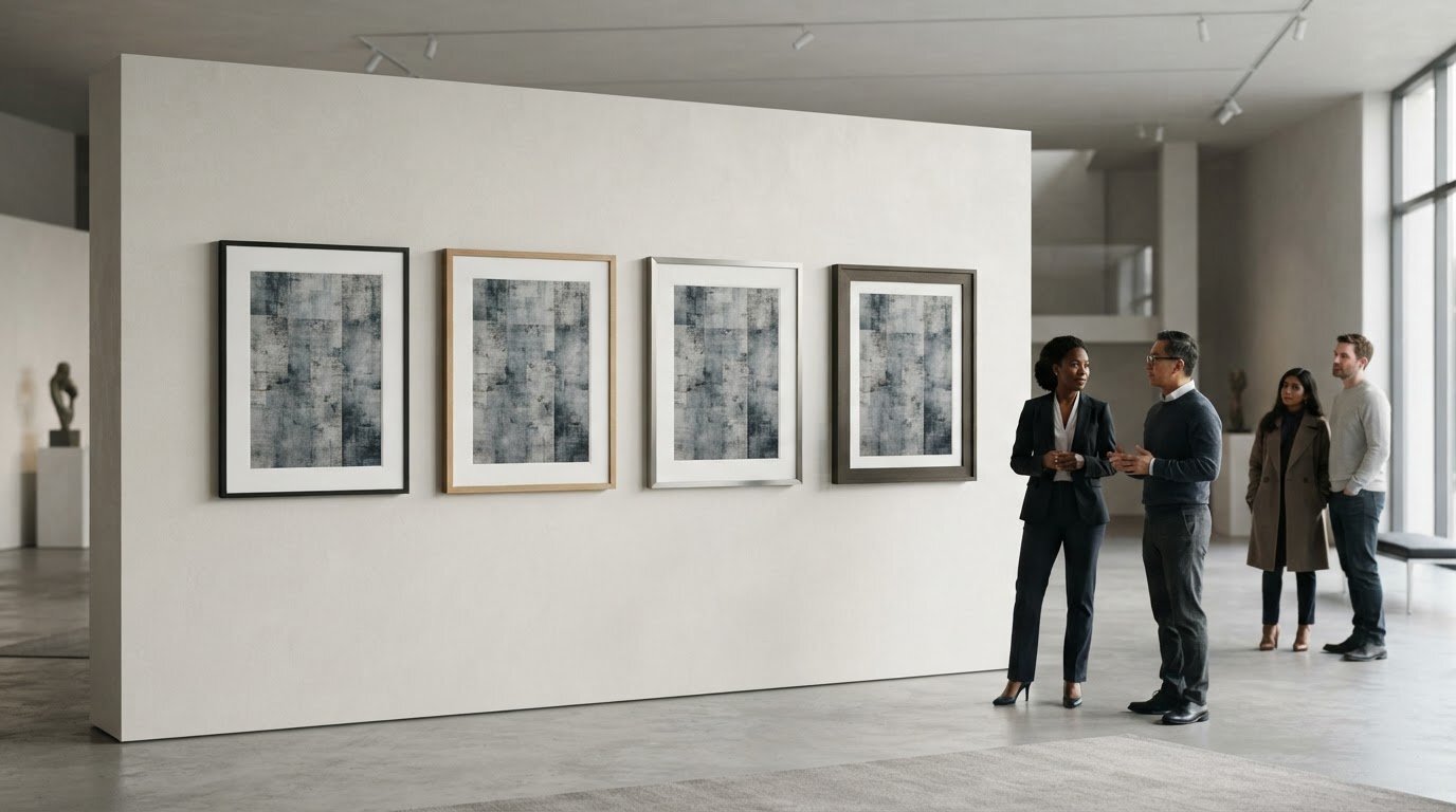
Tag: Wall Decor

Best Frame Style for Modern Art: A Curated Guide

The best frame style for modern art may be the one you barely notice, or the one that creates a deliberate contrast. The right choice depends on the artwork and how you want it to read in the room. A frame that feels too dominant can interrupt a composition, while one that’s too restrained may leave a bold work feeling unfinished. Profile, finish, and the space around the image all affect the balance.

If you’re weighing a clean, minimal profile against a more expressive presentation, start with the artwork, then consider where it will hang. Look at the image’s colours, lines, and visual density, and compare how different frame widths and finishes change its presence. This guide explains how to make those comparisons, when contrast can feel intentional, and how custom sizing and cropping can help a photographic print suit its setting. The aim is a presentation in which the artwork and its surroundings feel considered together.

Key Takeaways

  • The best frame style for modern art depends on the work’s visual intent, not a single rule about contemporary art.
  • Compare profile, finish, and spacing to see how each choice changes the artwork’s presence.
  • Use the artwork’s character and the room to decide whether minimalist framing or a more traditional presentation feels right.
  • Assess the piece at its intended display distance and against the wall where it will hang.
  • Galerie Prints offers professional framing as an add-on for purchased exhibition-quality photographic prints.

What Makes a Frame Work with Modern Art?

A frame works when it helps the artwork’s visual intent come into focus. A quiet edge can give a composition room to breathe; a more pronounced border can create a deliberate counterpoint. The best frame style for modern art isn’t defined by one profile or finish. It’s the choice that feels in dialogue with the work rather than competing for attention.

Modern art encompasses many visual languages and approaches. A brief overview of Modern art offers context, but the individual piece should guide your framing decision. Consider its colour, line, texture, and visual density. Then look at how the frame and surrounding space change the image’s presence. A frame can give the artwork definition, connect it to the room, or make the overall presentation feel crowded.

Why modern art does not have one universal frame

A minimal composition with open space and fine lines may benefit from a restrained edge that preserves its calm. A geometric work with crisp shapes may suit a frame that echoes its order or gives it a clean boundary. An expressive piece with layered texture and energetic marks has a different character: a substantial profile might lend it visual weight, while a simpler one can keep attention on the surface.

Photographic works bring their own considerations, including tonal range, fine detail, and atmosphere. A dark frame may reinforce contrast, while a lighter one can keep the presentation open. Treat these as options, not rules for a medium or movement. Judge the specific artwork rather than assuming that every abstract, geometric, or photographic piece calls for the same treatment.

The frame’s relationship to the artwork and room

Begin with the artwork, then consider the room. Look at the palette and architecture around it, as well as the display context. A single piece above a console makes a different impression from one shown among other works. The frame can separate the image from a busy wall, pick up a tone or material already in the room, or create a deliberate contrast that makes the relationship between artwork and interior more dynamic.

The test is not whether the frame matches the room perfectly, but whether the full presentation feels resolved. Step back and notice what catches your eye first. If the frame’s colour, width, or ornament draws attention away from the artwork’s defining feature, it may be too dominant. If it helps the image read clearly and sit comfortably in its setting, it’s doing useful work.

A frame clarifies modern art when it gives the work a considered boundary without becoming the reason you look. That leaves room for both restraint and contrast: the right choice depends on what best serves the particular piece.

How Frame Profile, Finish, and Spacing Change the Artwork

Profile, finish, and spacing work together to shape the boundary around an artwork. A narrow edge can feel discreet; a broad one adds visual weight. A flat profile keeps the outline crisp, while a dimensional profile introduces shadow and depth. The question is how each choice changes the balance between the image, its frame, and the space around it.

Frame proportion influences visual balance: the more presence the frame has, the more carefully it must relate to the artwork’s scale and visual weight.

Choosing a profile that matches the work’s visual weight

A work with strong graphic impact, crisp lines, or a compact composition may already have plenty of visual definition. A restrained profile can give it a clear edge without adding another competing shape. For example, a broad border around a small geometric composition can become a major part of its presence, while a narrow one can preserve the image’s precision.

A more substantial profile can be effective when the artwork feels expansive, richly layered, or visually dense. It may ground a large composition or create intentional contrast with a delicate image. Assess the frame’s width in relation to the artwork, not in isolation. A profile that seems modest up close can look quite different from across the room.

Using colour, finish, and negative space thoughtfully

Choose a finish in conversation with the artwork’s palette. A frame that echoes a quiet colour within the image can make the presentation feel composed. Contrast is more assertive: a dark edge beside a pale image, for instance, can sharpen its boundary. Instead of choosing a finish just because it is popular in interiors, compare how it affects the image’s tones and focal points.

Spacing matters, too. For a work on paper, a mat can set the image apart from the frame and offer visual breathing room. A generous border may give a small image greater presence, while a closer margin can keep a compact composition feeling contained. Consider the wall as part of the overall spacing: a frame that stands out against one wall may blend into another. View the complete arrangement from the distance at which it will usually be seen.

To compare options, look for changes in visual hierarchy. Does your eye go first to the artwork or to the frame’s colour and width? Does the space around the image make details easier to read, or leave the work feeling detached? These questions help identify the best frame style for modern art without reducing the decision to a fixed rule.

For an exhibition-quality photographic print, professional framing for purchased prints can complete the presentation as a considered whole.

Minimalist or Traditional Frame: Which Suits Your Modern Artwork?

A clean-lined frame and an ornate one make different impressions. The first can recede, keeping attention on the image; the second brings its own visual history and creates a purposeful conversation with the work. Neither is automatically more suitable for contemporary art. Consider the artwork’s visual language, the frame’s presence, and the room together.

Bauhaus, Pop Art, and Minimalism offer distinct starting points, not framing instructions. Bauhaus design often foregrounds structure and function, Pop Art may work with vivid imagery and deliberate visual impact, while Minimalism gives close attention to reduction and space. Each individual work still has its own scale, palette, and composition. The best frame style for modern art responds to those qualities rather than relying on a movement label.

Approach Visual effect Artwork and room context Trade-off to consider
Minimalist Creates a quiet, defined edge and keeps visual emphasis on the image. Can suit a work with strong colour, graphic lines, or an uncluttered composition, especially in a contemporary interior. May feel too discreet if the piece needs greater visual grounding or a more expressive relationship with the room.
Traditional Adds detail and a sense of visual richness, introducing contrast with a contemporary image. Can bring an unexpected note to a modern work, particularly where the room already includes traditional architectural details or furnishings. May compete with a dense or highly detailed composition if the frame’s ornament becomes the first thing noticed.

When a minimalist frame may be the stronger choice

Consider a restrained frame when the artwork already carries strong visual energy: a vivid field of colour, tightly controlled geometry, or a photograph with a clear focal point. A simple profile can keep the presentation composed and contemporary. Then assess it in the room. A minimal edge may suit a calm interior, while a more layered space might call for a frame with greater presence.

When a traditional frame can create purposeful contrast

A traditional-looking frame can make a modern work feel deliberately unexpected, setting contemporary imagery against a more classical visual language. The contrast works best when both elements remain legible: the frame contributes character, but the artwork retains its visual authority. Consider the scale and detail of each, then assess how their combined presence relates to the room.

Before choosing, compare the options from the artwork’s intended display distance. Notice whether the frame extends the work’s mood, gives it a counterpoint, or distracts from its defining qualities. This is a question of balance, not a contest between old and new. A thoughtfully chosen traditional frame can feel as considered as a minimalist one when it supports the overall presentation.

A Practical Checklist for Choosing a Modern Art Frame

A little preparation makes the decision clearer. Before browsing frame styles, study the artwork, the wall where it will hang, and the space it will occupy. This helps you move from visual impression to practical dimensions without letting room trends dictate the result.

  1. Observe the work. Note its dominant colours, strongest lines, texture, visual density, and overall mood. Decide whether the frame should blend into the composition or create deliberate contrast. Identify the details that matter most, such as a quiet margin around the image or a bold central form.
  2. Assess scale. Measure the artwork, then consider the full presentation, including any mat or surrounding border. Compare those proportions with the available wall space and nearby furnishings. A piece that looks substantial on its own may feel small above a long console, while a large work can dominate a narrow wall.
  3. Consider the room. Look at the wall colour, architectural details, furniture, and other art nearby. The frame needn’t match them exactly, but it should help the artwork feel at home. If possible, view the piece against the actual wall and step back to the distance from which it will usually be seen.
  4. Compare presentations. Settle on two or three distinct directions rather than considering every possible frame. Compare how each changes the image’s emphasis, separation from the wall, and overall visual weight. Ask someone else to view the options from the intended display distance. A choice that feels subtle up close may read quite differently across a room.
  5. Finalise the dimensions. Write down the desired finished size and, for a photographic print, any crop you’re considering before exploring bespoke options. This gives you a clear reference for the balance between image, border, and wall.

Assess the artwork before browsing frame styles

Keep your first observations focused on the artwork rather than a particular frame. A high-contrast image with assertive lines may call for a different balance from a soft, spacious composition. Then consider the work’s proportions alongside the wall and furnishings. This sequence helps you judge whether the frame should quietly contain the image or contribute a more noticeable counterpoint.

Plan the finished presentation and dimensions

Custom sizing and cropping can help shape a print for its intended setting, while the substrate also contributes to the presentation. Galerie Prints’ bespoke printing can be made on any substrate, including aluminium, wood, and glass. For further context on displaying photographic work, explore this fine art photography collecting and decorating guide.

Once you’ve noted the artwork’s character, desired dimensions, and room context, consider Galerie Prints’ bespoke framing service to complete a chosen print with a considered presentation.

Complete Your Modern Art Presentation with Galerie Prints

At Galerie Prints, a passion for art informs a collection of exhibition-quality photographic prints, selected for the character and stories held within each image. A considered frame is part of how a print meets its surroundings: it can establish a boundary, add visual presence, or let the image remain the focus. The best frame style for modern art is ultimately a personal decision shaped by the artwork, its intended setting, and the impression you want the finished presentation to make.

Thinking about these elements together makes the next steps more intentional. First, settle on the image and the space where it will live. Then consider its proportions, the surrounding wall, and whether the print’s crop and scale support the composition. With those choices in view, framing becomes part of a unified presentation rather than a separate decision made at the end.

Bring print, scale, and presentation together

Galerie Prints’ Bespoke Services include custom sizing and cropping, options that can help shape a print for its intended display. Custom sizing can help align the artwork with the available wall space; thoughtful cropping can adjust the image’s framing while keeping its visual character in mind. Note the desired finished dimensions and consider how much of the image should remain visible within the overall presentation.

The substrate is another part of the print’s visual expression. Bespoke printing can be made on any substrate, including aluminium, wood, and glass. Each can bring a different material quality to the presentation, so consider how the surface relates to the image and the room. These choices work alongside the frame: the print, its scale, and its material all contribute to how the artwork is experienced.

Photographic art also carries its own language of tone, detail, and atmosphere. Galerie Prints’ black and white photography collector’s guide explores one enduring example, where subtle gradations and contrast are central to the image’s presence. Reflecting on the qualities that draw you to a particular print can help you decide how its crop, scale, and surrounding presentation might best support it.

Explore bespoke framing and photographic art

For a purchased print, Galerie Prints offers professional framing as an add-on. This brings the framing decision into the same process as choosing the photographic work, allowing you to consider the finished presentation as a whole. Keep your notes on dimensions, crop, room context, and the artwork’s visual character close at hand. They can help you approach the options clearly while leaving room for the image itself to guide the final choice.

If you’re ready to explore photographic art and framing options, take a considered look through Explore Galerie Prints.

Let the Artwork Lead the Final Choice

The frame is not simply a finishing touch; it shapes how an artwork enters a room and how its details are encountered over time. As you make your choice, return to the feeling you want the piece to create. The best frame style for modern art is the one that supports that intention and feels at home in its setting, whether it recedes quietly or brings considered contrast.

Let that decision guide the next step: selecting a photographic print and shaping its presentation around the space you have in mind. Galerie Prints offers exhibition-quality prints, professional framing as an add-on for purchased prints, and bespoke options including sizing, cropping, and printing on any substrate. Together, these choices let you consider the image and its presentation as a whole.

Explore exhibition-quality prints and bespoke options, and find a work that feels distinctly at home in your space.

Frequently Asked Questions

Can I customise the size and crop of a Galerie Prints artwork?

Yes. Galerie Prints’ Bespoke Services include custom sizing and cropping, so you can consider a print’s proportions and image boundaries in relation to the space you have in mind. A crop may help direct attention within the composition, while a size adjustment can suit a particular wall. Consider these options as part of the presentation you’re planning.

Does Galerie Prints offer professional framing for purchased prints?

Yes. Professional framing is available as an add-on for prints purchased from Galerie Prints, with ready-to-hang delivery. If you’re considering the best frame style for modern art, framing can be part of your plan for presenting the chosen print rather than a separate decision made in isolation. Galerie Prints offers professional framing as an add-on for purchased prints.

Can Galerie Prints print artwork on different substrates?

Yes. Galerie Prints’ Bespoke Services include printing on any substrate. Aluminium, wood, and glass are examples, not a complete list. Consider the surface as part of the artwork’s final character: the image and its material together influence how the print feels in a room. Substrate selection is separate from choosing a frame, so consider both elements when planning the presentation.

Are Galerie Prints’ photographic prints exhibition quality?

Yes. Galerie Prints describes its photographic prints as exhibition quality and states that its printing and framing process is second to none. As you browse, consider the subject, mood, and scale that suit your collection, then reflect on how you’d like the finished work to live in your space.

Does Galerie Prints offer signed and limited-edition photography?

Yes. Galerie Prints offers signed and limited editions featuring photography from a wide variety of movements and periods. This selection gives collectors an opportunity to explore photographic art across distinct histories and sensibilities. As you browse, consider which period or visual language resonates with your collection and the space you’re furnishing. The offering encompasses varied photography rather than one single aesthetic or era.

What can bespoke framing and printing help me customise?

Galerie Prints’ Bespoke Services include custom sizing and cropping, as well as printing on any substrate, including aluminium, wood, and glass. Professional framing is a separate add-on for purchased prints. Consider image dimensions, crop, material, and framing as separate parts of the presentation you have in mind.
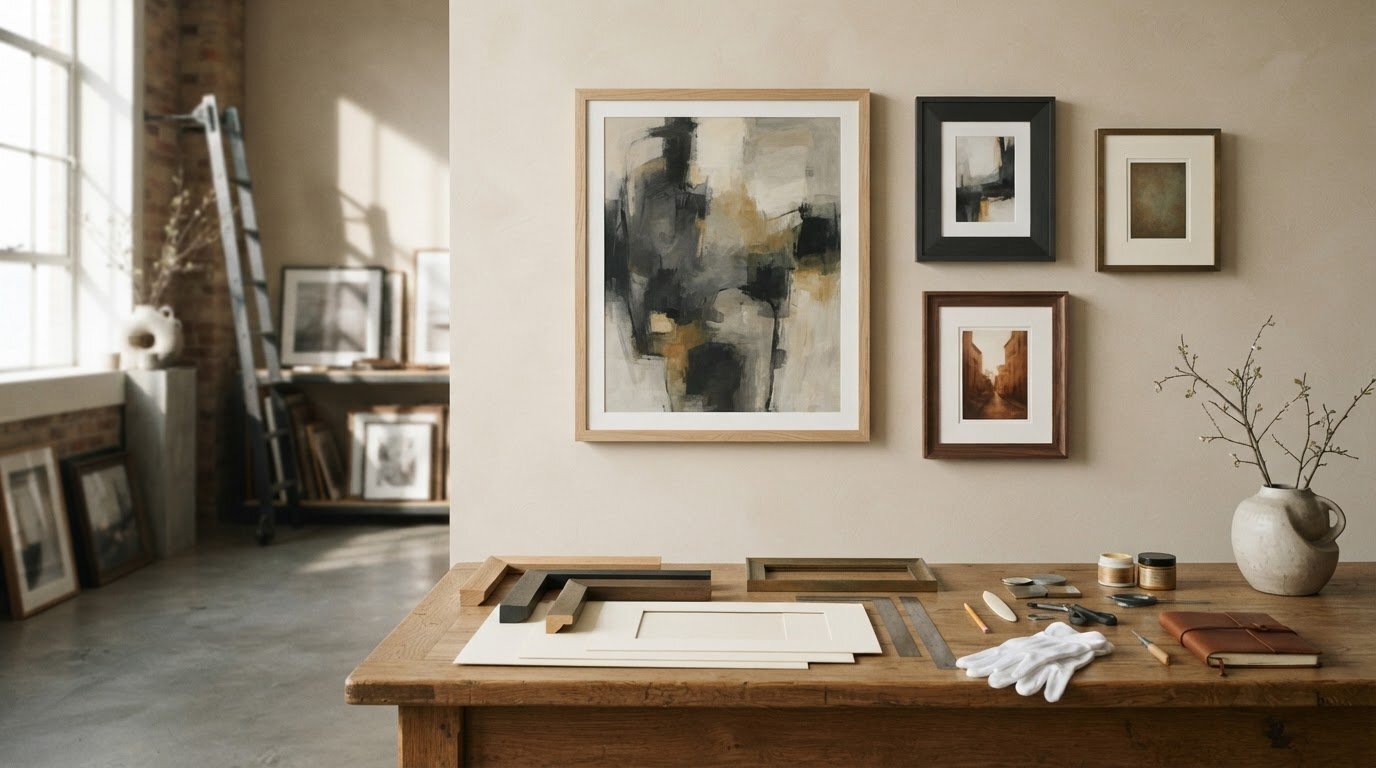
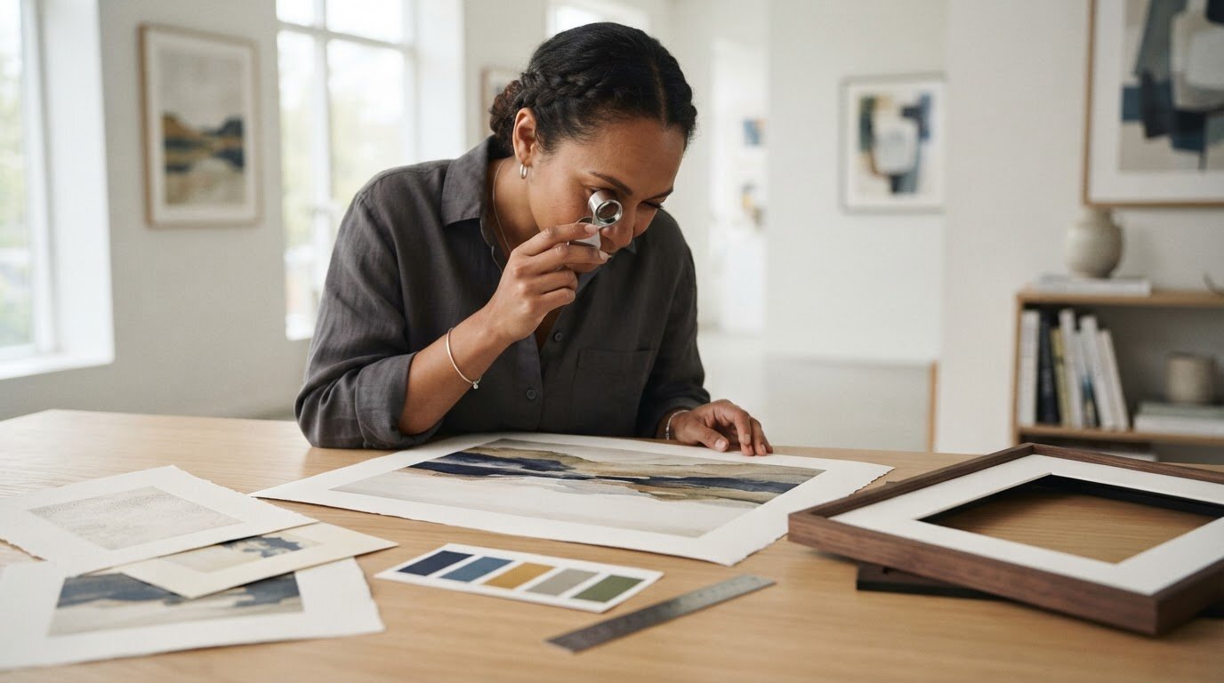
Hand Finished Picture Frames: A Collector’s Buying Guide

What if the best frame is the one you notice only after the artwork has drawn you in? Hand finished picture frames can bring depth, texture and character to a print, but the finish should support the image rather than compete with it. Choosing well involves more than matching colours: the frame’s scale, the space around the image and the room where it will hang all shape the result.

This guide explains what a hand-finished surface can contribute and how to compare frame proportions, materials and mounting choices. Use the practical checks to assess a frame in relation to the artwork and its setting, then make a choice that feels considered rather than based on a finish label alone.

Keep one principle in view: the frame serves the artwork first, then helps bring its materials and surroundings into harmony. Galerie Prints brings print selection and bespoke professional framing together. You can choose print dimensions, premium paper types and framing options, with framed prints delivered ready to hang.

Key Takeaways

  • Understand what hand finished picture frames means, and why the phrase describes the finish rather than every stage of making a frame.
  • Compare restrained and expressive finishes by considering the artwork’s character and the room where it will hang.
  • See how the frame, mount, glazing and artwork support each play distinct roles in the final presentation.
  • Use a practical checklist to move from identifying your artwork and measuring it to considering viewing distance, wall space and décor.
  • Discover how Galerie Prints’ bespoke framing brings print dimensions, premium paper and framing choices together in a finished print ready to hang.

What Does Hand Finished Picture Frames Mean for Your Artwork?

A hand-finished frame has finishing work applied or refined by hand. The phrase describes the frame’s surface treatment, not necessarily every stage of its design or construction. The surface might show subtle texture, gentle variation in tone or carefully worked decorative details. Since the term can describe different treatments, assess the frame’s actual appearance rather than relying on the label alone.

Hand-finished framing describes a frame whose visible finish has been applied or refined by hand; it doesn’t, by itself, tell you how every part was made. Nor does the label mean every frame is entirely handmade or one of a kind. Look at the surface, noting its sheen, colour and level of detail, then consider how those features will read beside the artwork. For broader context on frame forms and decorative elements, see Picture Frame Wikipedia.

How a hand-finished frame differs from a standard finish

A standard finish may look more even and consistent, while hand-applied or refined finishing can sometimes introduce delicate tonal variation or a more tactile surface. Neither is automatically superior. A softly varied surface may lend a crafted quality; a uniform finish can create a quieter outline. Compare the frame itself with the artwork, and don’t assume that “hand-finished” means the entire frame was made by hand.

Why finish matters for photographs and fine-art prints

A frame’s surface helps set the image’s visual register. A restrained finish can let a photograph’s composition, tonal range or subject hold attention. A more decorative finish may add presence and suit an image with a strong sense of period or drama, provided it doesn’t overwhelm the picture. Choose according to the artwork, the intended display and the atmosphere you want to create, rather than following a universal rule about which finish is best.

Keep the frame’s decorative role distinct from the functions of mounting and glazing. A mount sits between the image and frame, creating visual breathing room and changing the artwork’s proportions within the overall presentation. Glazing covers the image. These choices affect the finished display, but they aren’t the frame finish itself.

Choosing a frame is part of deciding how an image will live in a room. For a wider perspective on selecting and displaying photographic work, explore fine art photography collecting and decorating.

How Frame Finish, Colour and Proportion Shape the Final Look

A frame changes how an image meets the wall. Its colour can echo a tone in the photograph, its finish can introduce contrast, and its width can give the image more or less visual presence. Rather than seeking an exact match, consider how the artwork, frame and room relate as a whole. The comparison below offers starting points, not rules about which choice is best.

Approach Visual effect Artwork character Room context
Restrained finish Creates a quieter outline, keeping attention close to the image. Can suit photographs with delicate tonal shifts or a calm composition. May feel harmonious in a pared-back setting or among other framed works.
Expressive finish Adds visual emphasis and gives the frame a stronger presence. Can complement images with bold contrast, period character or dramatic subject matter. May provide a deliberate focal point in a room with more decorative elements.

Colour relationships needn’t be literal. A frame might pick up a subtle tone in the image, contrast with its darkest areas or connect with colours already present in the room. Consider the wall and nearby furnishings too, but don’t feel obliged to match them exactly. Whether arranging a print above refined furniture from Benjamin & Maxwell or on a minimalist feature wall, a little contrast can help the artwork stand apart, while a closer tonal relationship makes the overall display feel more composed.

Which frame finish suits a photographic print?

Let the photograph’s mood and tonal range guide your first thoughts. For black-and-white work, a restrained treatment may preserve a quiet, reflective quality, while a more expressive choice can heighten a dramatic or archival feel. Either approach can also work with colour images. Explore the enduring appeal of black and white pictures for more on the varied character of these prints.

How to judge frame width and visual balance

Width affects how much visual weight the frame carries around the image. A narrow profile can keep the boundary discreet; a broader one can make the finished piece feel more substantial on a large wall. Fine surface details may be visible up close but disappear when viewed across a room, so think about the distance from which the print will usually be seen. Step back and ask whether the frame gives the artwork presence without pulling attention away from it.

The frame should support, rather than distract from, the image. If you’re choosing a photograph for a particular space, browse the fine-art photography prints at Galerie Prints with the wall, viewing distance and desired atmosphere in mind.

Hand Finished Frames Compared: Finish, Mounting and Glazing

A framed print brings together several separate elements. The frame finish is the visible treatment of the frame itself; the mount, glazing and artwork support each have a different role. Keeping these choices distinct makes it easier to judge the complete presentation, rather than expecting one component to do everything.

When choosing hand finished picture frames, start by assessing the frame’s surface in relation to the image. Then consider how a mount might shape the space around it, how glazing will look in the intended setting, and how the print is held within the frame. No single combination suits every artwork or display environment.

What a mount adds to a framed picture

A mount creates a visible border between the image and frame, giving the photograph room to breathe and helping define its place within the overall composition. Its width changes the balance: a generous border can make the image feel more contemplative, while a narrower one keeps the presentation visually close to the picture. Colour matters too. A quiet tone may preserve a subtle mood; a contrasting one can make the image feel more distinct. A mount is a separate design choice, not part of the frame’s finish.

Distinguish the mount from the artwork support, which sits behind or holds the print within the framing. These components contribute to the construction of the finished piece, while the mount is visible around the image. Considering each separately helps you make more deliberate choices about appearance and presentation.

What glazing contributes to the finished presentation

Glazing is the transparent layer over the image. Its purpose and appearance are separate from the frame’s decorative finish, even though the two are seen together. Glazing choices can affect how the image is viewed, so consider reflections and the light in the room. A print displayed opposite a window, for example, may be seen under different conditions from one on a wall with less direct light.

Think about the usual viewing position, the room’s lighting and how clearly you want the image to read from different angles. Glazing options vary, so choose in relation to the print and its setting rather than assuming one type is right for every display. The artwork, its surroundings and the look you want all matter.

Finally, consider the frame, mount, glazing and support as a coordinated whole without confusing their functions. The mount can create breathing room; glazing places a transparent layer over the image; support holds the artwork within the frame. Together, these decisions complete the presentation, while the finish remains the frame’s own visible surface.

How to Choose Hand Finished Picture Frames: A Practical Checklist

A considered frame choice begins with the print, not a finish sample. Work through the decisions in sequence: identify what the artwork needs, record its dimensions, decide how you want it to feel on the wall, then review the complete framing choices in the room where it will hang. This keeps the frame in service of the image, even when you’re drawn to a distinctive finish.

  • Identify the artwork. Notice its subject, palette, contrast and mood. Decide whether your priority is an understated presentation, a stronger decorative accent or giving image preservation careful consideration.
  • Note the print’s dimensions. Start with the actual image size, then consider how the frame and any mount will shape the finished piece.
  • Set the visual direction. Choose whether the frame should recede, echo a tone in the image or add a deliberate point of contrast.
  • Review the display setting. Take account of viewing distance, available wall space, room light and surrounding décor.
  • Assess the whole presentation. Consider the finish, frame width, mount and glazing together before settling on the framing arrangement.

Checklist summary: Identify the print, measure it, choose the intended visual mood, consider the room, then review the complete framed composition.

Start with the print, its dimensions and its intended setting

Use the print’s dimensions as your starting point, rather than estimating from the wall or choosing a frame in isolation. Then picture its intended setting: will it have space to stand alone, or will it join a larger arrangement? A print displayed among other works may need to feel cohesive with its neighbours, while a single piece can take a more individual direction. For an example of a distinctive photographic sensibility, explore Slim Aarons’ photographic world.

Review the complete framed result before deciding

Imagine the frame, mount and glazing around the image as one composition, then consider how that arrangement will read from the usual viewing distance. A detail that feels subtle up close may become less apparent across the room; strong contrast may have greater presence on a quiet wall. Room light can also affect the viewing experience, so factor in where the piece will hang. The strongest choice is the one that feels coherent with both the artwork and its setting.

Galerie Prints brings print selection and bespoke professional framing together, with framed prints delivered ready to hang. Explore bespoke framing at Galerie Prints as you consider the finished presentation for your print.

Bespoke Framing at Galerie Prints: Complete Your Fine-Art Print

A photograph’s presentation begins with the image, then takes shape through the choices made around it. Galerie Prints offers bespoke professional framing as an add-on for purchased prints. Choose print dimensions, premium paper types and framing options to create a considered presentation around the photograph you’ve selected.

A considered frame for a curated photographic print

Galerie Prints’ collection brings together photography from established archives and photographers. Whether you’re drawn to an evocative portrait, a cinematic scene or a photograph that recalls a particular era, framing can help complete how that image lives in your space. Consider the artwork’s mood and visual character first, then decide whether you want a quietly complementary presentation or a more pronounced one.

As this guide has explored, hand finished picture frames describes a type of surface treatment, not a complete framing specification. When choosing framing for a print, focus on the visible finish and how it relates to the image, alongside the other available framing choices. The frame should contribute to the presentation without eclipsing the photograph.

From print selection to ready-to-hang artwork

Choosing a print and its framing options within one purchase journey brings the artwork and its presentation together. Professional framing and mounting options are available for purchased prints, so you can consider these elements alongside your chosen dimensions and paper type rather than treating framing as an entirely separate decision. The framed print is delivered ready to hang.

This gives your choices a clear order: begin with the photograph that speaks to you, select its dimensions and paper, then complete its presentation with framing. It keeps the artwork at the centre while making it easier to picture the finished piece in your home. When styling walls alongside modern interior accents, exploring curated home accessories at Artistry Deco Shop can help balance your artwork with the wider room. The aim isn’t to follow a formula, but to choose a presentation that feels coherent with both the image and its intended setting.

For a curated photographic print with framing considered as part of its presentation, explore fine-art prints and bespoke framing.

Choose a Frame That Lets the Artwork Belong

Considered framing begins with the artwork: its dimensions, character and intended place on the wall. A finish can add texture or emphasis, while frame width and colour shape the image’s presence. Mounting and glazing each contribute in a different way, so assess the complete presentation rather than treating “hand finished” as a guarantee of a particular technique or result.

Let the photograph lead, then weigh your priorities: a quieter presentation, a stronger decorative accent or thoughtful attention to how the print is displayed. Galerie Prints offers bespoke professional framing for purchased prints. Select print dimensions, premium paper types and framing options, then receive your framed print ready to hang.

Give a photograph a presentation that feels at home in your space. Explore fine-art prints and bespoke framing, and choose the image that speaks to you with greater confidence.

Frequently Asked Questions

What does hand finished mean on a picture frame?

On a picture frame, “hand finished” means finishing work has been applied or refined by hand. The phrase describes the surface treatment, not necessarily every stage of making the frame. Techniques and visible results can vary, so treat the description as a starting point rather than proof that the whole frame is handmade. Judge the finish itself, including its texture and sheen, and consider how it complements the artwork.

Are hand finished picture frames worth choosing?

Hand finished picture frames are worth considering if their appearance suits the artwork and the room. The label alone doesn’t determine value or quality. A carefully chosen finish can add character and give a print a considered presence, while a simpler frame may be preferable when you want the image to remain the focus. Compare the complete framed composition, including its proportions and any mount, rather than judging the frame surface in isolation.

How do I choose a frame finish for a photograph?

Start with the photograph’s palette, contrast and mood, then consider the room where it will hang and how prominently you want the frame to read. A restrained finish can keep attention on a subtle image; a more expressive one may add emphasis to a dramatic photograph. These are possible directions, not fixed rules. Assess the frame alongside any mount and glazing, since both influence the finished presentation.

Can I have a print framed when I buy it?

Yes. Galerie Prints offers bespoke professional framing as an add-on for purchased prints. You can select print dimensions, premium paper types and framing options as part of bringing the artwork and its presentation together. Framed prints are delivered ready to hang. This lets you consider the image, its scale and the overall framing choices within one purchase journey, without treating framing as a separate step after selecting your print.

What is the difference between a picture frame and a mount?

A picture frame is the outer structure around the artwork; a mount is a separate border between the image and the frame. A mount can create visual separation and change the proportions of the overall presentation, giving the image more space around it. The frame establishes the outer boundary, finish and presence. A mount is a design choice, not a requirement for every framed picture.

Does a hand finished picture frame protect a photograph?

Not necessarily. “Hand finished” describes finishing work or the frame’s appearance, not its protective qualities. A framed presentation can include several separate components, such as the frame, mount, glazing and artwork support, and protection depends on their specifications. Don’t assume a particular level of conservation, UV protection or archival performance from the finish label alone. Consider the components and their stated properties separately.

How do I choose the right frame size for my picture?

Start with the artwork’s actual dimensions, then decide whether a mount will form part of the composition. Consider the available wall space and how far away the print will usually be viewed. A broader frame can carry more visual weight, while a narrower one may feel quieter. Judge the finished proportions around the image as a whole, rather than relying on a universal sizing formula.

The Risk of Buying Cheap Art Prints: What to Check Before You Buy

The lowest-priced art print can become the costliest choice if a soft image, inaccurate colour or fragile paper leaves you disappointed. The risk of buying cheap art prints isn’t the price itself. It’s paying without enough information to judge what will arrive, how the image may age or whether it has been reproduced with appropriate rights. A low price can still represent good value when the details stand up to scrutiny.

It’s understandable to want an affordable way to bring a photograph or artwork into your home. Before deciding, look for clear information about image sharpness, colour, paper type and printing method, along with details about the image’s source and permitted use. This guide explains how to assess those details, what “archival” claims do and don’t tell you, and how display conditions and framing can affect a print over time. You’ll be better equipped to compare listings on their merits and choose a work that suits your space and expectations, rather than relying on price alone.

Key Takeaways

  • The risk of buying cheap art prints depends on what the listing leaves unclear, not simply on its low price.
  • Check image detail, exact dimensions, paper type, finish and production information before comparing prints.
  • Labels such as “archival” or “museum-quality” are more useful when supported by specific material details.
  • Verify the artist or source, image rights and seller contact information, and read carefully how the listing describes the print.
  • A specialist gallery may make artwork and format details easier to assess, but check the specifications and policies for the individual listing.

What is the real risk of buying cheap art prints?

The risk of buying cheap art prints lies in uncertainty, not in the price tag. A low price doesn’t prove that an image is poor, unlicensed or carelessly made. It does make the listing’s details especially important. Can you identify the image’s source, understand how it was reproduced and find clear seller information in case you have a question or problem?

It also helps to distinguish the format. A mass-produced poster is generally made for decorative display and distributed in quantity. An art reproduction is a copy of an existing artwork or photograph, made using a printing process. An editioned print may be numbered or limited, but the word “print” alone doesn’t establish that it was made using an artist’s original, hands-on process. For context on traditional printmaking techniques, including processes such as etching and lithography, check how the seller uses terms such as “edition” and “reproduction.”

The listing’s evidence matters more than the price alone. Clear information lets you judge what you’re buying, while a bargain without specifics leaves too much to guess.

When is a low-priced print a reasonable choice?

A budget print may suit a temporary display, a secondary room or a decorative purpose where collectability and long-term preservation aren’t priorities. The important distinction is between an affordable print described plainly and a listing that leaves essential facts unanswered. A seller who states the format, dimensions and materials gives you a basis for deciding whether it meets your needs. A higher price, by itself, proves neither superior materials nor stronger provenance.

What risks should buyers actually look for?

Look beyond the thumbnail. A soft or pixelated image may be more noticeable at the size you plan to display, and unclear dimensions can lead to an unexpected fit. Vague material descriptions make it difficult to anticipate the print’s feel or care needs. Missing seller contact information can also leave you unsure where to turn with a question or problem.

Colour on screen is only a preview. Your device’s display settings and viewing conditions can make hues look different from those on the physical print, so treat product images as references rather than exact colour proofs. Longevity depends on more than price: paper and inks, exposure to light, handling and display conditions can all affect fading or damage. If the listing claims fade resistance or archival quality, look for product-specific details before relying on those claims.

How can you assess an art print’s image, paper, and production?

A useful listing gives you more than an attractive preview. Check the image, the physical print you’ll receive and the process used to make it. If a key detail is missing, ask the seller before ordering rather than relying on a broad quality label.

  • Image clarity: Look for enlarged product views that show fine detail. A small thumbnail can conceal softness or pixelation.
  • Crop and dimensions: Check whether the composition is cropped and confirm the finished print’s width and height, not just the image file or frame size.
  • Paper and finish: Look for a named paper type and a description of its surface, such as matte or glossy. Don’t assume a finish or substrate that isn’t stated.
  • Production: See whether the listing identifies the printing process and explains what is being reproduced.

Close-up photographs can help you inspect detail and surface, though they can’t fully convey how a print feels in person. For an introduction to how to analyze art, PBS describes techniques for examining physical works. Apply the same attentive eye online, while remembering that a listing image isn’t a substitute for inspecting the print itself.

How can you judge image resolution and colour online?

Enlarged views should remain reasonably clear rather than breaking into visible blocks or blur. Compare the preview with the stated finished dimensions, and check whether the image is shown edge to edge or with a border. Screen settings affect appearance, so an online image can’t promise an exact colour match. If faithful tonal rendering matters to you, ask the seller how colour variation is handled.

What should a paper or printing description tell you?

Compare paper type, surface finish and print process where the listing provides those details. “Inkjet” describes a method of printing, not a complete guarantee of image quality or longevity. Those depend on the specific materials and production information. Likewise, “archival” and “museum-quality” need substance behind them.

If a listing calls a print archival, check the specific paper, ink or other materials, and look for evidence supporting the claim for that particular print. The word alone doesn’t tell you how the work was made or how it may perform over time. For broader context on choosing and displaying photographic work, consult Fine Art Photography: A Curator’s Guide to Collecting and Decorating.

Print size and paper choices can shape both the presentation and the finished work. Galerie Prints offers options across its photographic prints, but check each listing for its own specifications. Explore photographic prints to compare formats before you decide.

How do cheap posters, art reproductions, and collectable prints differ?

These labels describe different things, but sellers don’t always use them consistently. A poster is usually a format intended for display; an art reproduction describes an image copied from an existing work; and a collectable print may carry additional significance because of its subject, history or documented edition. None of these labels alone tells you the print’s quality or value. Read the listing for specifics.

Format Typical purpose Information to verify Questions to ask
Poster Decorative display or promotion Dimensions, paper, finish, image source Is this a reproduction, promotional item or another format?
Art reproduction Display of an existing artwork or photograph Creator, image attribution, reproduction method, materials What original image is reproduced, and who authorized it?
Collectable or editioned print Display and, in some cases, collecting Edition size, number, signature status, issuer and provenance What supports the edition or collectable claim?

For historic printed objects such as cinema lobby cards, the format itself can carry cultural and visual interest beyond its decorative use. Galerie Prints offers cinema memorabilia, including Cinema Lobby Cards. Its guide, Cinema Lobby Cards: A Collector’s Guide to Hollywood’s Photographic Heritage, explores this category of collectable object. As with any listing, check what is being sold and how its history or edition status is described.

What is the difference between a poster and an art reproduction?

A poster is best understood as a display format, not automatically as a low-grade product. Paper, printing and image quality can vary. A reproduction, by contrast, tells you that an existing image has been copied, but the term doesn’t specify how well or on what materials. For either format, confirm the creator or image attribution, exact dimensions, paper and finish. If the listing doesn’t name the source, ask.

What does limited edition mean on a print listing?

Scarcity language needs evidence. Look for the edition size, whether the print is numbered or signed, and who issued the edition. Ask whether the stated edition refers to this format or to all reproductions of the image. A claim of rarity is not the same as documented edition information, and neither collectability nor future resale value should be assumed without evidence specific to the work.

Clear distinctions matter: the risk of buying cheap art prints rises when a category label stands in for facts about the object. Compare the description with the actual format and ask for clarification if the wording is ambiguous.

What should you check before ordering an inexpensive art print?

A quick review before checkout can reveal whether a listing gives you enough information to make a considered choice. The risk of buying cheap art prints often comes down to details that are easy to overlook when a compelling image and low price take centre stage. Use this checklist:

  1. Confirm the artwork attribution. Is the artist, photographer or other creator named clearly?
  2. Check the image source and rights information. Does the seller explain where the image comes from and how it is authorized for reproduction?
  3. Verify the finished dimensions. Compare the print size with your intended wall space and frame, and check whether the dimensions include a border.
  4. Read the material and production details. Look for the stated paper, finish and printing process. If the listing makes claims about longevity, look for product-specific information to support them.
  5. Find the seller’s contact details. Make sure you know how to ask questions or report a problem after ordering.
  6. Review delivery and display terms. Check how the print is protected in transit, what to do if it arrives damaged, the current return policy and whether made-to-order conditions apply.
  7. Clarify framing. Confirm whether a frame is included, optional or unavailable for the chosen format, and review any framing terms before purchase.

A specialist gallery may present artwork, archive and format information together, but details can differ from one listing to another. Galerie Prints offers choices in print size, paper type and bespoke framing. Review the specific artwork listing rather than assuming every option applies to every print. Explore photographic prints and framing options as you compare what each purchase includes.

Which questions should you ask the seller?

If anything important is unclear, ask directly: who created or licensed the image, and how is this print described? Request the exact paper type, print process and finished size if they aren’t stated. Before choosing a frame, ask whether it’s included or optional for that format. Clear answers help you compare the product with your expectations before placing an order.

How do shipping, returns, and display affect the decision?

Packaging matters. Find out how the print is protected and what steps to take if it arrives bent, marked or otherwise damaged. Read the seller’s current return policy before checkout, paying attention to any conditions for made-to-order items. Once displayed, the surroundings matter too. Consider direct light, humidity and handling, and choose framing with the room and your care expectations in mind.

A specialist gallery can provide useful context for a purchase: who made the image, where it comes from, and which formats or framing choices are available. That context helps you assess a print as more than a pleasing image on a screen. It may also be easier to compare options when listings explain their specifications and the seller makes its policies accessible.

Curation is a starting point, not a substitute for checking the individual work. Image rights, edition status, paper, production method and framing details can vary between listings, even within the same gallery. If a point matters to your decision and isn’t clear, ask the seller or look for item-specific information before ordering.

What can a curated gallery offer beyond the image?

Collection and photographer context can make a work more meaningful by helping you understand its place within a broader archive or body of photography. Galerie Prints presents selections that include the Slim Aarons Collection and Terry O’Neill Photography, alongside posters and collectable cinema memorabilia. For readers interested in the background to Aarons’ work, Slim Aarons: The Definitive Guide to the Master of Aspirational Photography offers additional archive context. Use that history to learn about the image, while checking the specifications of the particular print you’re considering.

Format choices matter, too. Galerie Prints offers print sizes, paper types and a bespoke framing service. These options can help you plan the presentation, but don’t assume every format or framing choice applies to every listing. Confirm what’s available for the specific work and review the relevant terms.

How should you make the final decision?

Compare like with like: the same finished dimensions, stated paper details, framing status and level of seller information. Then weigh those facts against your budget, where the print will hang and how long you expect to display it. If collectability matters, look for evidence such as clear edition details rather than relying on claims of rarity alone.

The risk of buying cheap art prints is easier to judge when you compare a listing’s claims with your own expectations. A specialist gallery can make that evaluation more informed, but your decision should rest on details you can verify for the specific piece. Take a considered look through curated photography prints and framing options, and assess each listing on its own specifications.

Choose a print with confidence and care

The risk of buying cheap art prints isn’t defined by price alone. It comes from unclear information about the image, materials, edition or seller. Before you decide, look for specific listing details, compare like with like, and consider how the print’s dimensions and materials suit your space and expectations. A poster, reproduction and collectable print aren’t interchangeable terms, so check what the seller means for the particular work.

A well-chosen print can bring character and history into a room, whether you’re drawn to a striking photograph or a piece of cinema heritage. Galerie Prints presents curated selections including the Slim Aarons Collection and Terry O’Neill Photography, with choices of print sizes, paper types and bespoke framing. Specifications and options can vary by listing, so review the details for the artwork that catches your eye.

Let the image inspire you, then let clear information guide your decision. Explore curated photography prints and bespoke framing to find a work that suits your home and expectations.

Frequently Asked Questions

Is it always risky to buy cheap art prints?

No. A low price alone doesn’t show that a print is poorly made or that its image rights are questionable. The risk of buying cheap art prints comes from uncertainty: missing information about the image, materials, dimensions or seller can make it hard to know what you’ll receive. A clearly described print may suit a decorative purpose or shorter display period. Compare its stated qualities with your expectations, rather than assuming price determines quality.

Can cheap art prints fade quickly?

They can fade, but price alone doesn’t predict how quickly. Fading depends on the print’s materials and production as well as its display conditions, including exposure to light. Handling and framing can also affect its condition. Look for specific information about the paper and inks, and treat claims such as “fade-resistant” or “archival” as claims to verify against the particular print. For longer display, consider reducing direct light exposure.

How can you tell whether an art print is good quality online?

Look for enlarged product views that remain clear, then check the stated finished dimensions, crop, paper type, surface finish and printing process. The listing should identify the artist or image source and give enough detail to understand what’s being sold. Screen images can’t guarantee an exact colour match, so ask about colour variation if accurate tones matter. Clear seller contact information and straightforward product descriptions add useful reassurance.

What happens if an art print listing does not name the paper?

An unnamed paper doesn’t automatically mean the print is poor, but it leaves you without an important point of comparison. Ask the seller for the paper type and surface finish, and whether the listing provides information about the production process. If you can’t get details that matter to your decision, consider whether the uncertainty fits your budget and intended use. Check the return policy before ordering, too.

Are limited-edition prints worth more than open-edition prints?

Not necessarily. “Limited edition” describes a claimed restriction on the number of prints, but it doesn’t by itself establish desirability or future resale value. Check the edition size, numbering, signature status, who issued the edition, and whether those details apply to the specific format. Compare the documentation with the seller’s description. An open-edition print may still be the right choice if you value the image for display rather than collectability.

Should I buy an art print framed or unframed?

Choose based on your space, presentation preferences and plans for display. An unframed print gives you flexibility to select a frame later, while a framed option may offer a more finished presentation. Before ordering, confirm whether framing is included or optional for that particular print, and check the dimensions and framing terms. Galerie Prints offers a bespoke framing service, but available choices should be confirmed for the individual listing.

What should I check before buying a photographic art print?

Confirm the photographer or image attribution and look for information about the image’s source and reproduction rights. Check the finished dimensions, crop, paper, finish and printing process, then review the seller’s contact details, delivery protection and return policy. The risk of buying cheap art prints is easier to judge when those facts are clear. Finally, consider where the photograph will hang and how light, handling and framing may affect its condition over time.

Frame Colour Guide for Black and White Photos

A frame is never just a border; it’s the final, silent dialogue between a monochrome masterpiece and the space it inhabits. Whether you’re curating a private collection or styling a single statement piece, choosing a frame color for black and white photos is the critical step that either liberates the image or anchors it in mediocrity. Many collectors worry that a heavy wood grain might overwhelm delicate greyscale tones or that a stark white finish could “choke” the life out of a classic cinematic scene.

We recognize the importance of achieving a gallery-standard display that honors the technical excellence of your prints. This guide will provide you with the confidence to select a frame that enhances tonal depth and historical resonance while harmonizing with your room’s aesthetic. We’ll explore how specific finishes, from deep charcoals to artisanal wood grains, interact with light and shadow to transform a photographic print into a definitive piece of heritage.

Key Takeaways

  • Learn to identify whether your monochrome print possesses warm or cool undertones to ensure your frame enhances rather than clashes with the photograph’s tonal depth.
  • Master the art of choosing a frame color for black and white photos by understanding how classic black provides a definitive visual stop while gallery white offers essential breathing room.
  • Discover how to pair metallic accents like pewter or brass with specific photographic archives to echo the era’s historical resonance and prestige.
  • Understand why artisanal, museum-quality materials are essential for preserving the integrity of world-renowned collections like Slim Aarons and Terry O’Neill.
  • Gain the confidence to select a bespoke frame profile that serves as a bridge between your photograph’s narrative and your modern interior decor.

The Curatorial Philosophy of Framing Black and White Photography

In the quiet halls of a premier gallery, a frame is never a secondary thought. It serves as a curated threshold, a deliberate window that invites the viewer into the photograph’s unique narrative. While color photography often allows for a playful dialogue with interior accents, black and white imagery demands a more disciplined palette. Every choice must serve the image’s soul, ensuring the frame doesn’t compete with the artist’s intended contrast. The process of choosing a frame color for black and white photos is less about matching your furniture and more about respecting the provenance of the work.

A gallery-standard display relies on the concept of ‘visual weight.’ This psychological effect dictates how the viewer’s eye moves across the composition. A dense, charcoal frame can ground a high-key image, providing a definitive anchor for the eye. Conversely, a lighter profile allows the photograph to expand, creating a sense of infinite space. Unlike domestic decorative styles that prioritize wall color, a curatorial approach focuses on the photograph’s intrinsic needs:

  • Tonal Extension: The frame should feel like a natural continuation of the print’s darkest or lightest values.
  • Architectural Presence: The frame provides the structural integrity necessary to transform a paper print into a sculptural object.
  • Historical Context: The finish should echo the era of the photograph, whether it’s a mid-century Terry O’Neill or a contemporary architectural study.

Defining the Visual Narrative of Your Print

The color of your frame dictates which elements of the image the viewer notices first. A matte black frame often emphasizes the deep shadows and rich blacks of a noir-style portrait, drawing the eye toward the drama of the darks. If you prefer to highlight the delicate textures in the highlights, a soft white or light timber frame can lift those brighter tones, making the entire piece feel more luminous. Monochrome balance is the harmony between frame depth and print contrast.

Bespoke vs. Ready-Made: Why Quality Dictates Colour Perception

The perceived color of a frame changes based on the quality of its materials. A hand-stained timber frame possesses a tactile soul and a depth of hue that mass-produced plastic alternatives simply cannot replicate. In high-end curation, material authenticity is paramount. Using professional archival processing ensures that the tonal subtleties of a silver gelatin print remain vibrant for generations. When you invest in fine art photography, the framing must meet the same museum-quality standards. Choosing a frame color for black and white photos becomes a matter of selecting a finish that matures with the art, rather than a cheap veneer that distracts from the print’s technical excellence.

The Essential Palette: Black, White, and Natural Timber

Selecting the right boundary for a monochrome image is an exercise in sophisticated restraint. The essential palette of black, white, and natural timber remains the gold standard for a reason. While many retailers suggest that black frames work for every scenario, a seasoned curator knows that choosing a frame color for black and white photos requires a more nuanced touch. The goal is to create a visual dialogue that respects the print’s tonal range without overwhelming its subtle greys. For those seeking a broader overview of the technical considerations involved, this Guide to Framing Black and White Photography offers excellent foundational advice on the impact of different finishes.

The Sophistication of the Classic Black Frame

A black frame acts as a definitive ‘stop’ for the eye, containing the energy of the photograph within a crisp, architectural boundary. This choice is particularly effective for the high-contrast, iconic work found in the Terry O’Neill archive. When the frame matches the ‘black point’, which is the deepest, darkest area of the photographic paper, the image gains an immediate sense of depth and authority. Thin black profiles offer a modern, minimalist edge, while thicker, more substantial frames add a sense of historical weight and prestige to the display.

Gallery white frames, by contrast, encourage a ‘breathing room’ effect. This approach allows the photograph to float effortlessly on the wall, making it the preferred choice for contemporary, high-key interiors where the focus is on light and air. It’s an ideal strategy for minimalist compositions that rely on negative space to tell their story.

Natural Woods: Bringing Warmth to Silver Gelatin Tones

While monochrome can sometimes feel clinical, natural timber introduces an organic warmth that softens the display. Woods like oak, walnut, and ash are exceptional companions for black and white pictures that feature natural textures, such as architectural stone or botanical details. The key is to avoid grains that are too aggressive, as they can clash with the fine grain of the photographic film. A hand-stained walnut frame provides a rich, dark brown that complements the warmer, subtle undertones often found in vintage silver gelatin prints.

Beyond the hue, the finish of the wood or paint is vital. A matte finish absorbs light, keeping the focus entirely on the print’s details, whereas a satin finish adds a subtle, prestigious sheen that catches the light without distracting. Gloss finishes should be used sparingly, typically reserved for very modern, high-contrast works that require a bold, reflective statement. Our bespoke framing service ensures that every element, from the wood species to the final finish, is meticulously selected to honor the photographic heritage of your piece.

Metallics and Tonal Accents: Elevating Archival Prints

When choosing a frame color for black and white photos, collectors often overlook the transformative power of metallics. These finishes shouldn’t be dismissed as merely “vintage” or “traditional” accents. Instead, think of silver and pewter as a tonal extension of the silver gelatin process itself. These cool-toned metals harmonize with the metallic sheen inherent in archival prints, creating a seamless visual bridge between the artwork and its boundary. In a gallery setting, metallic frames catch ambient light with a subtle glow, adding a layer of luminosity that can breathe life into a low-contrast, grey-heavy image.

The interaction between metal and monochrome is deeply rooted in the history of the medium. While a black frame provides a definitive border, a metallic profile reflects the environment, making the piece feel more integrated into the room’s atmosphere. This choice is particularly effective for prints that possess a wide range of mid-tone greys, as the metallic luster echoes the delicate highlights found within the grain of the paper.

The Mid-Century Modern Appeal of Metallic Frames

For the aspirational lifestyle captures within the Slim Aarons collection, a slim gold or brass frame adds a touch of Hollywood Regency glamour. This choice isn’t just about decoration; it’s about reinforcing the narrative of high-society elegance. A gold profile provides a warm contrast to monochrome tones, particularly when balanced with the hardware or accents in a modern room. It transforms a simple photograph into a prestigious object of art that feels both historical and contemporary.

Dark Grey and Charcoal: The Understated Sophisticate

While black remains the classic choice, gunmetal and charcoal offer a modern, more versatile alternative. True black can occasionally feel too harsh against soft-focus art or prints with delicate tonal transitions. Charcoal, however, provides a softer “visual stop” that feels more integrated into the composition. This palette is particularly effective in industrial-style interiors where raw materials and muted tones dominate. It offers the authority of a dark frame without the clinical coldness of a pitch-black border.

Using a matte charcoal frame allows for a seamless transition when paired with dark mount boards, creating a sophisticated “box” effect that draws the viewer’s eye deep into the photograph’s center. This approach reinforces our curatorial philosophy: the frame should never compete with the image. By choosing a frame color for black and white photos that leans into these nuanced tonal accents, you ensure your display feels like a bespoke investment rather than an off-the-shelf afterthought. Our London-based production team specializes in these subtle finishes, ensuring every archival print is matched with a profile that respects its unique tonal chemistry.

Matching Frame Colour to Your Print’s Tonal Range

Black and white photography is rarely a simple matter of grey. Every print possesses a ‘tonal temperature’ that dictates its emotional resonance and its relationship with the surrounding decor. Warm monochrome prints, often seen in vintage silver gelatin works, lean toward subtle sepia or cream undertones. Cool prints, common in modern digital archival processes, exhibit a steely, almost bluish crispness. When choosing a frame color for black and white photos, identifying this temperature is the first step toward a harmonious gallery display.

The ‘Rule of Contrast’ serves as your curatorial compass. You must decide whether to match the frame to the print’s dominant tone for a seamless look or oppose it to create a dramatic boundary. If your photograph features a heavy concentration of mid-tone greys, a frame that matches that specific grey can make the artwork feel more expansive. However, a contrasting frame provides the necessary tension to make a minimalist piece stand out. Identifying the dominant grey in your image allows you to select a profile that either recedes into the background or anchors the composition with authority.

High-Contrast Prints vs. Soft Tonal Gradations

Dramatic ‘Noir’ style photography, characterized by deep shadows and piercing highlights, often demands the authority of a high-gloss black profile. This finish echoes the intensity of the blacks within the image, reinforcing the artist’s use of shadow. Conversely, high-key photography with its airy, ethereal quality is best preserved with a gallery white frame that doesn’t ‘choke’ the light. To achieve a classic, professional aesthetic, employ the ‘sandwich technique’ by utilizing a crisp white archival mount board placed between the photograph and a slim black frame. This creates a layered, sophisticated transition that guides the eye inward toward the narrative of the print.

The Interplay of Archival Mount Boards and Frame Colour

The mount board acts as the essential buffer between the art and its casing. It’s important to consider how the white-point of your archival photo paper interacts with the surrounding mat. A brilliant white paper paired with an off-white mount can make the mat appear aged or ‘yellowed’ incorrectly. In these instances, choosing a natural wood frame like ash or light oak can bridge the gap, providing a warm, organic transition that feels intentional rather than accidental.

For a more complex display, a ‘double-mount’ effect using contrasting colours can add a sense of three-dimensional depth and prestige. This technique is particularly effective for small, precious prints that require additional visual weight to command a wall. Our bespoke framing service offers expert consultation to ensure your mount and frame work in perfect unison with your print’s unique tonal chemistry, preserving your investment for decades to come.

The Galerie Prints Bespoke Approach: A Legacy of Quality

At our London studio, framing is regarded as a final, vital act of creation. We don’t view the casing as a mere boundary; it’s a structural testament to the photograph’s provenance. For the serious collector, choosing a frame color for black and white photos is an exercise in heritage preservation. Our artisanal approach ensures that every piece leaves our gallery ready to hang, possessing a professional finish that mirrors the technical brilliance of the world-renowned archives we represent. This level of craftsmanship provides a bridge between the historical significance of the image and the modern elegance of your home.

Our curators possess a deep understanding of the specific requirements of legendary collections. When honoring the Slim Aarons archive, for instance, we select profiles that echo the mid-century glamour and aspirational lifestyle captured in his work. We consider the narrative era of the photograph, ensuring the frame color and texture act as a sympathetic extension of the scene. This curatorial expertise is what separates a gallery-standard display from standard e-commerce offerings.

Museum-Quality Materials for Timeless Preservation

The longevity of your investment depends entirely on the materials that remain invisible to the eye. We utilize acid-free mounts and pH-neutral backing boards to prevent the chemical degradation that often plagues lesser framing options. This commitment to archival standards is a fundamental part of fine art photography ownership. A hand-finished gallery frame offers a tactile soul and a depth of color that mass-produced alternatives cannot replicate. When you run your hand along the grain of our hand-stained timbers, you feel the weight of artisanal tradition.

Professional Guidance for Your Collection

Whether you are acquiring rare lobby cards or commanding large-scale prints, our team provides the expert guidance necessary to navigate the nuances of display. We understand that choosing a frame color for black and white photos can be a daunting investment; therefore, we act as your trusted guide through every tonal decision. Every acquisition is handled with meticulous care, from the initial selection to the final, secure crating for worldwide shipping.

We invite you to explore our bespoke framing service to complete your acquisition with the prestige it deserves. By choosing a professional, London-based production, you aren’t just decorating a wall. You are securing a piece of photographic history for generations to come, ensuring your collection remains as vibrant and evocative as the day it was first captured.

Elevating Your Monochrome Masterpiece

Framing isn’t just a border; it’s the final layer of the artistic process. By analyzing the tonal temperature of your print and selecting a palette that respects its historical provenance, you transform a simple image into a lasting piece of heritage. Whether you opt for the definitive authority of a matte black profile or the organic warmth of hand-stained timber, the process of choosing a frame color for black and white photos should always prioritize the photograph’s intrinsic needs over fleeting interior trends.

Our London-based studio specializes in this delicate balance. We utilize museum-quality archival materials trusted by world-renowned archives to ensure your collection remains pristine for generations. Every frame is hand-crafted with the same artisanal precision found in the original works themselves, providing a bridge to a bygone era of elegance. This commitment to quality ensures your investment is both protected and perfectly presented within your home.

Discover the perfect frame for your collection with our bespoke framing service and ensure your acquisition is presented with the prestige it deserves. Let your walls reflect a shared reverence for beauty, history, and technical excellence.

Frequently Asked Questions

Is a black frame always the best choice for black and white photos?

A black frame is a definitive classic, but it isn’t the universal solution for every monochrome print. For high-key photography where light and airy tones dominate, a stark black border can feel restrictive or “choke” the composition. In these instances, a gallery white frame or a light ash timber provides the necessary breathing room. The choice depends entirely on the photograph’s tonal balance and the emotional atmosphere you wish to evoke.

Should my frame colour match the darkest part of the photo?

Matching the frame to the deepest “black point” of the photographic paper is an excellent way to ground a high-contrast image. This technique creates a definitive visual anchor that draws the viewer’s eye inward. However, for images with a softer tonal range or dominant mid-tone greys, a charcoal or gunmetal finish may be more sophisticated. Choosing a frame color for black and white photos often involves finding a tonal extension rather than a literal match.

Can I use a coloured frame (like blue or red) for monochrome art?

Coloured frames are technically possible but often distract from the intrinsic narrative of a monochrome print. A bold red or blue border risks overwhelming the delicate greyscale transitions that define fine art photography. If you desire a contemporary statement, consider a muted metallic or a deep, hand-stained wood. These options provide a subtle hint of colour while maintaining the curatorial integrity and prestige of the artwork itself.

What is the best frame colour for a vintage silver gelatin print?

Vintage silver gelatin prints often possess a warm, subtle sepia undertone that responds beautifully to natural materials. A hand-stained walnut frame or a muted pewter finish harmonizes with the chemical heritage of the silver gelatin process. These choices avoid the clinical coldness of modern black finishes, instead leaning into the historical resonance of the piece. Our bespoke framing service specializes in selecting profiles that honour the specific archives of legendary photographers.

How do I choose between a matte or glossy frame finish for B&W art?

Matte finishes are generally preferred for archival prints because they absorb light and keep the focus entirely on the photograph’s details. A matte charcoal or black profile provides a sophisticated, understated elegance that suits most gallery-standard displays. Glossy finishes are better reserved for high-contrast, modern works where a bold, reflective statement is required. The finish should always complement the texture of the photographic paper without creating distracting glare.

Does the mount colour need to match the frame colour?

The mount and frame should work in unison, but they rarely need to match in colour. Using a crisp white archival mount board with a slim black frame creates a classic “sandwich” effect that provides essential breathing room for the print. This layered approach adds three-dimensional depth and a sense of prestige to the display. The mount acts as a neutral buffer, ensuring the frame doesn’t compete directly with the artwork’s tonal range.

What frame colour makes a small black and white photo look larger?

A gallery white frame paired with an oversized mount is the most effective way to make a small photograph command a larger space. This technique utilizes negative space to expand the visual footprint of the artwork, giving it the prestige of a much larger piece. Choosing a frame color for black and white photos that matches the wall colour can also create a seamless, expansive effect that allows the image to float effortlessly.

Should I match my frame colour to my room’s furniture or the art?

You should always prioritize the needs of the artwork over the room’s furniture. A frame is a curated window into the photograph’s narrative, and its primary role is to enhance the print’s tonal depth. While a walnut frame might happen to match your desk, its first duty is to harmonize with the warm tones of the photograph. A well-framed piece of art possesses a permanence that outlasts changing interior trends and furniture arrangements.