Tag: Interior Styling

Framed Fine Art Prints in the UK: How to Choose and Buy with Confidence

What if the print that looks perfect on screen feels different once it’s framed and on your wall? Choosing framed fine art prints uk involves more than selecting an image: paper, print method, mount, glazing and frame all affect how the work looks. When you’re buying online, it can be difficult to judge these details, along with a retailer’s service, before you order. They matter as much as the image when you want a considered addition to your home.

This guide explains how to assess the artwork and framing as one complete purchase. Compare the paper and production details, check how the frame and glazing affect the presentation, and confirm the product, delivery and returns information before ordering. We’ll also cover how to assess a gallery’s curation and the information it provides about an artwork’s provenance. Galerie Prints, a specialist online gallery featuring photography archives and photographers including The Slim Aarons Collection and Terry O’Neill Photography, offers print and bespoke framing choices to consider together. The goal is a confident purchase, not simply a frame that looks right online.

Key Takeaways

  • Assess the artwork, print production, paper and framing as separate parts of the finished piece, rather than relying on the image alone.
  • Compare the paper and print details stated on each listing, then picture the available dimensions on your wall before choosing.
  • Check the specific frame, mount and glazing options for the artwork you’re considering; choices can vary by listing.
  • When comparing framed fine art prints uk retailers, confirm provenance, specifications, support and the practical details of delivery, packaging and returns.
  • Decide whether a ready-framed option suits your room or whether selecting a print for separate framing gives you the finish you want.

Framed fine art prints in the UK: what are you choosing?

A framed fine art print brings together the photographic image, its reproduction, the paper and the frame, with a mount if selected. Each element contributes to the finished piece. The image carries the photographer’s vision; production and paper affect how it appears; framing gives it a visual boundary and helps it sit within a room.

This distinction matters when shopping online. A screen preview cannot show exactly how a physical print will look or how a frame and mount will change its scale. Treat the listing as a description of a complete object, not just a photograph. Check which details are specified and which you may need to confirm. When comparing framed fine art prints uk buyers should look at both the artwork and the retailer’s service, including delivery and returns information.

What makes a photographic print fine art?

Fine art photography is shaped by more than its subject. The photographer’s authorship, the image’s history and the context in which it is presented all contribute to its meaning. A curated archive can help buyers understand a work’s origin, but provenance alone is not a promise of future investment value. Galerie Prints offers physical photographic prints, including works associated with Slim Aarons and Terry O’Neill; availability varies by listing. If a product description uses the term Giclée printing, the link explains its use for fine art digital prints made on inkjet printers.

What does a framing service add?

A frame can echo a photograph’s period, soften its presence or create a sharper contrast with the image. A mount adds space around the print, changing its proportions and giving the composition room to breathe. Together, these choices affect how large the piece appears on a wall. Check the frame’s outer dimensions as well as the print size.

Bespoke framing means framing arranged to suit a selected artwork and the buyer’s chosen options. It doesn’t mean every component or choice is custom-made. Glazing, mounting and frame specifications can vary, so read the details for the individual work rather than assuming a particular material or finish. Galerie Prints offers bespoke framing alongside print choices, so buyers can consider the artwork and its presentation together. Before ordering, check the listing and retailer information for current framing details, delivery arrangements and returns terms.

A photograph’s appearance depends on more than the image itself. Paper influences its surface and finish, while the production method affects how detail, tone and colour are rendered. Product listings don’t always provide the same level of technical information, so compare the stated details rather than assuming every print uses identical materials or processes.

How do paper type and printing affect the finished image?

Look for the paper type and any details about its weight or finish. Weight, often expressed in gsm, describes how heavy the paper is; surface and finish help indicate whether it is smooth, textured, matte or glossy. These terms help you compare listings, but rely only on qualities confirmed for the specific print. Don’t assume paper is archival, acid-free or museum-grade unless the listing says so.

Study the available product images for fine detail, tonal range and colour, while remembering that screens can display an image differently from a physical print. If a listing names a production process, check what it means for that work. For example, don’t infer that a print is Giclée simply because it is described as fine art. Tate’s overview of how the Tate produces its prints offers an example of the kind of information about materials and production a retailer may provide.

Stated paper and production specifications give you a clearer basis for comparing prints than an image preview alone.

How do you choose a print size for your wall?

Measure the available wall space and the furniture beneath it before comparing listed print dimensions. A size that feels intimate beside a reading chair may look underscaled above a broad sofa. If possible, mark the print’s dimensions on the wall with removable tape, then view the outline from where you usually sit or stand.

Remember that listed dimensions may describe the print, not the finished framed piece. A mount and frame add to its overall width and height, so check whether the retailer provides separate measurements for the artwork and completed frame. Galerie Prints allows customers to select print dimensions, paper types and framing options; check the individual listing for available choices and measurements.

For a broader perspective on choosing photographic art for a space, read this guide to fine art photography and collecting. Exploring Galerie Prints’ curated photographic prints can also help you consider subject, size and presentation together.

Frame, mount and glazing: compare the details before you order

Framing changes how a photograph meets the room. A mount creates space around the image, while the frame gives it a defined edge. Glazing affects the surface you see and how you care for the finished piece. For framed fine art prints uk buyers should compare the details on each product listing, since available choices can vary by artwork.

Should you choose a mount with a fine art print?

A mount creates visual separation between the photograph and its frame. It can give an image more breathing space, draw attention to a border or help a smaller print hold its own on a larger wall. A print without a mount may feel more immediate, particularly if the image extends close to its edges. Neither approach is always better. Consider the photograph’s composition, the room’s palette and how the piece will relate to nearby artworks.

Check whether the dimensions shown refer to the print or the complete framed piece. A mount and frame increase the overall footprint, which can affect how the artwork sits above furniture or alongside other works.

What should you check about frame and glazing options?

Product photography can suggest a finish, but it doesn’t replace specifications. Look for the stated frame material and finish, whether a mount is included or optional, and the type of glazing used. Don’t assume glazing offers UV protection unless the listing specifically confirms it. Review any care guidance, too, and ask the retailer if a material or instruction isn’t clear.

Detail What to compare What to confirm
Frame finish The material and finish stated for each option Whether the chosen finish is available for this artwork
Mount Whether one is included or offered as a choice How it changes the finished dimensions
Glazing The glazing type named in the listing Whether any UV protection is explicitly specified
Care guidance Instructions supplied for the finished piece How to clean and handle the frame and glazing

Before ordering, compare the complete framed dimensions with the wall space you have available, not just the print size. This is especially useful when planning an arrangement, since one frame’s proportions can affect the balance of the display. Galerie Prints offers bespoke framing, but check the individual listing for the available choices and specifications. For an example of curated photographic art, explore this guide to Slim Aarons photography.

How to assess online framing services in the UK

A polished product page is a useful start, but confidence comes from checking what the retailer states about the artwork, finished piece and service. Use this checklist to compare providers of framed fine art prints uk, and verify details that could affect your order directly with the retailer.

Which retailer details deserve a closer look?

  1. Artwork and provenance: Check who represents or supplies the work, and whether the photographer, archive or other source is identified. If edition information matters to you, look for a clear statement rather than assuming the print is limited or numbered.
  2. Print specifications: Review the listed dimensions, paper type and production details. Note what is stated and what remains unclear; don’t infer a material or process from the image preview alone.
  3. Framing details: Confirm which frame and mount choices apply to the artwork, what glazing is specified and whether dimensions describe the print or finished frame. Look for care guidance if provided.
  4. Order support and policies: Check current delivery terms, packaging information, returns conditions and the process for reporting damage. Find out how to contact the retailer if you need clarification before ordering.

These checks are useful when a gallery presents curated work from named photographers or archives. Galerie Prints offers photographic prints alongside choices of print dimensions, paper and framing. Check the individual listing and current retailer information for the details that apply to a particular piece; don’t assume every work has the same options or terms.

How can reviews help you compare framing services?

Customer reviews can offer clues about receiving and displaying a framed piece, but they don’t replace product details or retailer policies. Look for recent, specific accounts that describe the frame’s finish, packaging, communication or how an issue was handled. Repeated themes across detailed reviews are more informative than a single glowing comment or complaint.

Keep each source in perspective. A review describes one customer’s experience; the product listing states specifications, and the retailer’s terms explain its current policies. Third-party reviews don’t establish Galerie Prints’ delivery, returns or damage procedures. Confirm those directly before you buy.

Rather than relying on an unsupported “best” ranking, compare retailers against the same checklist and the artwork you’re considering. For a closer look at curated photography and available framing choices, explore Galerie Prints’ photographic prints.

Choose a framed fine art print that feels right for your home

The right print should feel at home in the room and remain compelling to you over time. Consider the subject, palette and scale alongside the room’s existing character. A photograph with lively detail may bring energy to a quiet wall, while a more restrained image may sit comfortably among patterned furnishings. These are possibilities, not guaranteed effects; your response to the artwork matters most.

Which framed print suits your room and collecting style?

Start with practical conditions. Measure the wall and nearby furniture, note the natural light at different times of day, and consider the colours and materials already in the space. Then decide whether you want the print to harmonise with its surroundings or provide contrast. For a sense of the mood and visual world associated with the photographer, the Slim Aarons guide offers context on his photography, rather than a formula for decorating.

A ready-framed purchase can simplify planning by bringing the print and its presentation together. Choosing a print for separate framing gives you the opportunity to select a frame and mount independently, but means you’ll need to coordinate those decisions yourself. Neither route is automatically better. Galerie Prints offers curated photographic works and a bespoke framing service, which may suit buyers who want to consider artwork and framing together. Check each listing for available options.

What should you do before placing an order?

Before you reach the basket, confirm the details of the exact piece. A final review can catch a size or framing choice that doesn’t match your plan.

  • Check that you’ve selected the intended image and print dimensions.
  • Review the stated paper details and confirm the framing configuration, including any mount choice.
  • Make sure the finished framed dimensions fit your room measurements.
  • Review the retailer’s current delivery, returns and care information before confirming the order.

For framed fine art prints uk shoppers, a considered choice balances personal taste with clear, product-specific information. Explore fine art prints at Galerie Prints at your own pace, and check the current specifications and terms for any work that catches your eye.

Make your next print a considered choice

Choosing framed fine art prints uk buyers can feel confident about means looking beyond the image. Compare the stated paper and print details, account for the complete framed dimensions, and check the retailer’s current delivery and returns terms. The right subject and presentation should suit your room and your own taste.

Galerie Prints brings together curated photography, including works from The Slim Aarons Collection. You can review listed print sizes and paper types, with bespoke framing available as an add-on. Check each artwork’s current specifications and options before ordering.

Explore curated fine art photography prints, find a work that speaks to you and choose its presentation with care. Browse the available print and framing options to start planning a considered addition to your space.

Frequently Asked Questions

What is the difference between a fine art print and a poster?

A fine art print is generally presented as a photographic or artistic work for close appreciation, while a poster is often made for display or promotion. Production methods and materials can differ, but the labels alone don’t confirm paper, printing process or finish. Check the specifications for each artwork rather than assuming every fine art print uses the same materials or every poster is produced in the same way.

Are framed fine art prints worth buying online in the UK?

Buying online can be convenient and give you access to curated photography. A search for framed fine art prints uk retailers can help you compare artwork and presentation, but assess each listing carefully. Check the print and paper details, print size, full framed dimensions and framing specifications. Before ordering, confirm current delivery arrangements and returns terms directly with the retailer.

How do I choose the right frame for a fine art print?

Choose a frame that complements both the image and the room, considering its colours, furnishings and available wall space. Think about whether a mount would give the photograph more breathing room, and check the specified glazing. Measure for the complete framed dimensions, not only the print. Frame, mount and glazing choices vary by retailer and product, so confirm the available options for the specific artwork.

Can I buy fine art photography prints already framed?

Some galleries offer framed configurations or provide framing as an add-on. Galerie Prints offers a bespoke framing service alongside its physical photographic prints, though options depend on the individual artwork. Check the product listing to see what you can select and whether the print is sold framed or unframed. Confirm whether the stated dimensions refer to the print alone or include the mount and finished frame.

What should I look for in online framing service reviews in the UK?

Prioritise recent, detailed reviews that describe the finished frame, packaging, communication and how the retailer responded to any problem. Look for recurring themes across multiple reviews rather than relying on a single enthusiastic comment or complaint. Reviews offer context, but they don’t confirm a retailer’s current policies. Verify delivery, returns and damage procedures directly with the retailer before placing your order.

How can I tell whether a fine art print uses archival paper?

Look for an explicit, item-specific statement about the paper, including whether the retailer describes it as archival. If the wording is unclear, ask the seller what the claim means and which material applies to that print. Don’t infer archival quality from a high price, the print’s appearance or broad marketing language. Clear specifications help you distinguish confirmed material details from assumptions and make a more informed comparison.

Do framed fine art prints arrive ready to hang?

Not necessarily. Hanging hardware and preparation can vary by artwork, framing configuration and retailer, so don’t assume a framed print is ready to hang. Check the product listing for details about what is included, or contact customer support before purchase if the information isn’t clear. Galerie Prints offers bespoke framing as an add-on; confirm the selected item’s current framing and hanging details before ordering.
Should I Frame a Print With or Without a Mat? The Curator’s Guide

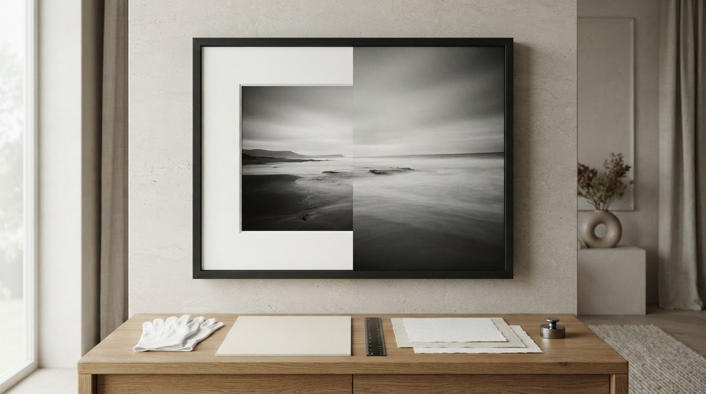
The cleanest, most minimalist framing choice in contemporary design can quietly become the most destructive decision for an art collection. When standing before a prized piece and asking, should I frame a print with or without a mat, the dilemma reaches far beyond simple styling; it is fundamentally archival. Resting bare photographic paper directly against glazing risks trapped humidity, which can fuse delicate emulsions to glass and cause irreversible damage.

It is natural to feel caught between the crisp immediacy of full-bleed presentation and the quiet reverence of a traditional mount. You want your living space to feel refined rather than dated, yet uncertainty around margin ratios, tonal balance, and print protection can stall any installation. You will discover whether matting or full-bleed framing best elevates and preserves your fine art photography. Ahead, we share a definitive curatorial framework to safeguard your valued prints, balance negative space, and achieve a timeless presentation that enriches your interior architecture.

Key Takeaways

  • Master the curatorial criteria for deciding whether you should frame a print with or without a mat based on artwork rarity, scale, and paper surface.
  • Understand how archival cotton rag matting physically separates print emulsions from glass, eliminating condensation risks and long-term degradation.
  • Discover when full-bleed presentation creates dramatic visual impact, particularly for expansive landscape photography and bold mid-century compositions.
  • Learn why standard wood pulp mats inflict irreversible mat burn and how conservation-grade mounting preserves collector value across decades.
  • Identify the spatial proportions and frame depths needed to achieve architectural harmony within sophisticated residential interiors.

Framing With or Without a Mat: The Essential Curatorial Difference

Every framing decision is fundamentally a dialogue between preservation and spatial perception. When resolving whether you should frame a print with or without a mat, you are choosing how the eye transitions from the active architecture of a room into the frozen narrative of a photograph. Historically, fine art institutions positioned mat boards as essential isolation chambers, focusing contemplation squarely upon delicate tonal gradations. Modern residential design, by contrast, frequently embraces the immediate clarity of full-bleed presentation. Both approaches carry distinct physical consequences for fine art paper and create entirely different sensory experiences within an interior.

The Anatomy and Purpose of a Picture Mat

A window mount is far more than a decorative paper border. In traditional gallery presentation, a conservation-grade 4-ply or substantial 8-ply beveled mount acts as an architectural relief. The precision 45-degree bevel cut produces a crisp, recessed shadow line, gently drawing the eye inward toward the print while visually isolating the subject from patterned wall coverings or competing decor. More crucially, as detailed in the archival overview of Mat (picture framing), the board establishes an indispensable physical barrier. This spatial depth prevents the photographic emulsion from resting directly against the framing glass, eliminating the micro-climate where condensation gathers and permanently destroys gelatin or pigment surfaces.

The Aesthetic Intent of Matless Full-Bleed Framing

Borderless presentation strips away ornamental ceremony to celebrate raw graphic impact. By running a photograph directly to the inner rebate of the moulding, full-bleed framing creates an uninterrupted window into the image:

  • Visual immediacy: The frame functions as an architectural portal, pulling the viewer directly into the composition without decorative buffering.
  • Modern spatial balance: Expansive horizontal vistas and bold mid-century works gain dramatic presence, complementing the clean lines of contemporary residential joinery.
  • Maximized scale: Artworks command wall space through imagery alone, an ideal treatment when oversized dimensions leave little room for perimeter margins.

Deciding if you should frame a print with or without a mat ultimately hinges on whether your space calls for the contemplative reverence of a layered reveal or the kinetic, contemporary drama of an unbordered horizon.

When You Should Frame a Print With a Mat: Protection and Prestige

Preservation is an invisible art. While aesthetic preferences shift across eras, the physical vulnerabilities of fine art paper remain constant. When asking yourself if you should frame a print with or without a mat, remember that rare photographic editions demand physical separation from ambient room environments. Incorporating an archival window mount provides an essential buffer against degradation, ensuring collector-grade imagery maintains its pristine physical state across generations.

Preventing Glazing Damage and Moisture Traps

Every home experiences diurnal temperature fluctuations. As warm air cools against framing glass or acrylic, microscopic condensation forms along the interior glazing surface. Without a separating window border, the delicate emulsion of a photographic print touches that glass directly. Over months or years, the gelatin or pigment layer rehydrates, softens, and permanently adheres to the glass face. Lifting the glass tears the artwork away, resulting in catastrophic loss. Adhering to professional conservation framing practices ensures paper fibers have adequate clearance to expand and contract naturally as seasonal relative humidity shifts.

Elevating Historic and Fine Art Photographic Archives

Archival collections possess a visual gravity that responds exquisitely to intentional border treatments. Intimate mid-century portraits and classic black and white pictures require quiet visual isolation so the eye can savor subtle silver tonal transitions. A pristine white, warm white, or soft neutral museum mount establishes a zone of visual silence. This perimeter blocks competing wall tones, allowing deep velvety blacks and crisp architectural highlights to resonate with authentic gallery prestige.

Balancing Print Scale on Expansive Wall Spaces

Interior architecture frequently demands substantial visual weight. An intimate 8×10 or 11×14 inch archival print can easily feel lost upon a double-height wall or above a substantial credenza. A generous mat solves this spatial tension through proportion:

  • Substantial margins: Applying a four- to five-inch border expands the overall frame footprint, allowing smaller historical pieces to hold significant architectural space.
  • Curatorial focus: Wide margins create dramatic negative space, drawing the viewer closer to study fine grain, facial expressions, and nuanced period details.
  • Collector presence: The deliberate use of negative space signals that the image inside is an authentic artifact deserving focused contemplation.

If you are considering whether you should frame a print with or without a mat to safeguard rare family heirlooms or archive acquisitions, partnering with an artisanal studio for a bespoke framing service guarantees your pieces receive tailored, conservation-grade protection that honors their historical weight.

When to Frame Without a Mat: Modern Scale and Immersive Art

Borderless framing strips away visual boundary lines to pull the observer directly into the frame. While intimate, historical works often benefit from the formal reverence of a window border, contemporary residences frequently call for an immediate, architectural punch. When asking whether you should frame a print with or without a mat, scale and pictorial composition serve as your clearest aesthetic guides. Removing the perimeter creates an immersive threshold, allowing sweeping horizons and saturated palettes to interact seamlessly with clean interior millwork.

Maximizing the Visual Impact of Large-Format Works

Large-format lifestyle works thrive on uninhibited space. Iconic resort scenes, such as those captured by slim aarons, celebrate sunlight, saturated azure pools, and sprawling mid-century villas. Encasing a substantial 30×40 inch or 40×60 inch photograph within an additional four-inch mat border can easily produce an overwhelming, cumbersome profile that swallows residential wall space. Extending the photograph straight to a slender walnut, natural oak, or satin black moulding produces modern immediacy. The image reads as a panoramic architectural window rather than a framed paper artifact.

Protecting Art Without a Mat: The Role of Framers Spacers

Dispensing with a mat must never mean sacrificing conservation standards. Contrary to common belief, custom framing without a mat does not require pressing fine art paper flat against glazing. Seasoned framing studios deploy framers spacers to achieve safety:

  • Concealed depth: Framers secure inert acrylic or wood fillet spacers inside the frame rebate, hidden entirely behind the lip of the moulding.
  • Air circulation: These slender profiles lift the glass a crucial 1/8 to 1/4 inch away from the print, establishing identical environmental airflow to a traditional 8-ply mat.
  • Structural flat support: Archival backing boards and reversible hinge mounts ensure broad sheets remain perfectly flat without bowing or touching the glazing across seasonal temperature shifts.

Highlighting Deckled Edges and Exposed Paper Character

Certain fine art papers possess rich, tactile personalities that should be celebrated rather than tucked behind a beveled mat opening. Heavyweight cotton rag papers featuring hand-torn or deckled edges gain captivating presence through shadowbox float mounting. In this treatment, the print is gently anchored atop an archival 8-ply conservation board with a generous margin surrounding it, leaving the irregular, feathered paper edges entirely exposed. Adding internal frame spacers sets the glazing forward, casting natural, atmospheric drop shadows around the paper edges and accentuating the physical craftsmanship of the print itself.

Deciding if you should frame a print with or without a mat comes down to artistic intent: choose a mat for quiet focus, or embrace spacer-based full-bleed methods when your artwork demands architectural scale and visceral immersion.

Curator Decision Framework: Choosing the Right Framing Approach

Every considered acquisition requires a deliberate framing strategy that synthesizes physical preservation with spatial harmony. Determining whether you should frame a print with or without a mat ceases to be guesswork when evaluating two core pillars: the material nature of the photographic medium and the architectural atmosphere of the installation space. A curated interior relies on this balance to ensure artwork looks intentional rather than accidentally assembled.

Print Characteristics: Medium, Rarity, and Paper Finish

The substrate of your artwork dictates the minimum level of physical isolation required inside the frame moulding:

  • Chromogenic and gelatin silver prints: Glossy, resin-coated, or darkroom C-type papers possess delicate chemical layers that permanently fuse to acrylic or glass if subjected to direct contact; they demand the physical offset of a 4-ply mat or concealed archival spacers.
  • Heavy cotton rag fine art papers: Textured, ultra-matte baryta surfaces absorb ambient light with minimal surface glare. While they offer greater aesthetic flexibility for edge-to-edge presentation, their thick fibrous edges still require non-invasive corner hinges rather than destructive adhesive mounts.
  • Limited-edition archival rarity: High-value historical acquisitions necessitate museum-standard reversible mounting techniques, ensuring the print remains entirely untouched by permanent adhesives, masking tapes, or non-archival backing boards.

Interior Architecture, Room Mood, and Display Density

The proportions and lighting of your domestic environment fundamentally shape how a framed composition behaves on the wall. A generous, off-white window border introduces a pocket of calm, making it ideal for period architecture with detailed plasterwork, patterned wallpapers, or rooms with active joinery. In contrast, modern spaces characterized by polished concrete floors, steel-framed glass doors, and restrained furnishings often benefit from full-bleed framing within slender metal or dark hardwood mouldings, allowing the photograph to function as an uncluttered graphic anchor.

Arrangement density matters just as profoundly. For a tight, grid-aligned salon wall featuring multiple images, unifying pieces with identical three-inch archival mats produces rhythmic order and prevents visual exhaustion. For a solitary statement piece over a wide low sideboard, full-bleed presentation can create an immediate, arresting presence that grounds the room.

Whether you need custom cotton window borders for rare archival portraits or precision spacer installations for expansive statement works, explore our artisanal bespoke framing service to pair your collection with flawless, hand-finished museum standards.

Resolving whether you should frame a print with or without a mat comes down to aligning the tactile vulnerabilities of your photographic print with the volume, light, and architectural voice of your living space.

Executing the Presentation: Archival Materials and Custom Framing

Execution transforms an aesthetic concept into an enduring legacy. Even after deciding whether you should frame a print with or without a mat, the longevity of your investment relies entirely on the chemical integrity of the materials resting inside the moulding. Substandard mounts inflict slow, irreversible damage on fine art paper, while true conservation components guarantee your collection remains as luminous decades from now as the day it was printed.

Selecting True Archival Mat Boards: Avoiding Mat Burn

Standard decorative mat boards are manufactured from unrefined wood pulp laden with lignin. Over time, environmental heat and light break down this compound, off-gassing hydrochloric and sulfuric acids that leach directly into fine art paper fibers. The consequence is unsightly “mat burn,” a permanent sepia discoloration etched along the beveled border of the print. Authentic preservation demands 100% cotton rag museum boards or virgin alpha-cellulose boards that are completely acid-free and lignin-free. Hand-applied Japanese mulberry paper hinges and water-reversible wheat starch paste ensure the print hangs naturally without chemical degradation.

Determining Proportions and Harmonious Tones

Precision proportions prevent a finished frame from appearing visually unstable. Curators rely on proven visual rules to establish balance:

  • The scale differential: Mat borders should measure at least double the face width of your frame moulding, preventing the frame and mount from competing for optical dominance.
  • The curatorial bottom weight: Adding a subtle quarter- to half-inch of additional width to the lower mat margin compensates for an optical drop illusion, keeping the artwork grounded squarely in the center of the aperture.
  • Tonal matching: Stark, bleached optical whites clash harshly with traditional silver gelatin tones; select warm ivory, natural linen, or soft charcoal boards that pull their hue from the palest highlights within the image itself.

The Galerie Prints Approach to Bespoke Presentation

Acquiring curated fine art photography is an investment in cultural heritage. Our master craftsmen hand-finish every piece through a dedicated bespoke framing service, ensuring each print is cradled within genuine museum-grade conservation materials. From hand-cut 8-ply cotton boards to precision hidden-spacer installations for full-bleed works, each finished frame arrives ready to hang, elevating your residence with timeless gallery authority.

When asking whether you should frame a print with or without a mat, remember that material execution matters as much as border styling. Choosing artisanal craftsmanship safeguards photographic history while creating an exquisite visual presence in your home.

Elevating Your Art Collection for Generations to Come

Selecting the ideal presentation for fine artwork isn’t merely an interior styling choice; it’s an enduring act of stewardship. When asking yourself, should I frame a print with or without a mat, your decision ultimately harmonizes room architecture with conservation physics. A generous cotton rag mount introduces contemplative negative space while isolating delicate photographic surfaces from glazing. Conversely, an expertly spaced full-bleed presentation delivers immediate, cinematic immersion across modern interiors.

As a trusted worldwide specialist in iconic 20th-century photography archives, Galerie Prints honors the balance between historical resonance and contemporary design. Our curator-selected archives are printed on premium archival photographic papers and paired with bespoke hand-crafted framing providing museum-standard protection against environmental shifts. Explore Bespoke Framing for Your Fine Art Prints to present your photography with the quiet authority, elegance, and protection your living space deserves.

Frequently Asked Questions

Does framing a print without a mat damage the artwork over time?

Framing without a mat can cause irreversible damage if the print rests directly against the glazing. Daily interior temperature shifts cause microscopic condensation to form on the inside of framing glass. When photographic emulsions touch this moisture, they soften and permanently fuse to the glass. To frame safely without a window border, always ensure your framer installs concealed archival spacers beneath the frame rebate to maintain an air gap.

Can I frame an oversized art print with a mat without it looking too bulky?

You can mat an oversized piece successfully by using a narrow, tailored border paired with a slender moulding profile. For expansive works spanning 30×40 inches or larger, standard wide mats often create excessive visual bulk that overwhelms domestic wall space. Limiting the mount to two or two and a half inches provides the necessary air buffer without dominating the room. Alternatively, full-bleed presentation offers a sleek architectural look.

What is the standard mat board width for fine art photography?

Fine art photography typically looks best with a mat width between two and a half and four inches, depending on the print dimensions. A reliable curatorial guideline requires the mat to measure at least twice the width of the frame moulding. This proportional difference ensures the frame and mount don’t compete for optical dominance while drawing the viewer’s gaze into the delicate mid-tones of the photograph.

What is mat burn and how do I prevent it on valuable prints?

Mat burn is a permanent, yellowish-brown line of chemical discoloration that appears along the inner beveled edge of an artwork. It occurs when low-grade, wood-pulp boards break down and release acidic lignin directly into the print paper. You can prevent this damage entirely by using only 100% cotton rag museum boards or alpha-cellulose conservation boards that are certified acid-free and lignin-free.

Is it better to match the mat color to the print or to the wall color?

Curators always match the mat color to the highlights within the artwork rather than the wall paint. Selecting a stark white board can make vintage black-and-white prints appear dingy or yellowed by comparison. Instead, choose warm ivory, soft cream, or natural off-white tones that pull directly from the lightest values in the photographic paper, creating a seamless tonal transition that enriches the imagery.

How do framers protect full-bleed prints if no mat is used?

Professional framers install inert acrylic or wood fillet spacers inside the frame rebate, concealed completely beneath the moulding lip. These slim spacers elevate the glazing roughly 1/8 to 1/4 inch away from the artwork surface. This structure provides the same continuous airflow and moisture protection as a traditional window mount, allowing you to showcase full-bleed photography without risking glaze contact.

Are movie posters and lobby cards better displayed with or without a mat?

When deciding if you should frame a print with or without a mat for cinema archives, piece size dictates the best approach. Small, rare artifacts like vintage cinema lobby cards benefit immensely from wide archival mats, which elevate their modest footprint to command attention on the wall. Conversely, large vintage movie posters possess bold graphic lettering and vibrant borders designed to extend edge-to-edge within a spacer-fitted frame.

Slim Aarons Art: The Collector’s Guide to Jet Set Elegance

The most enduring luxury isn’t found in a logo, but in the effortless grace of a world that no longer exists. When you invest in slim aarons art, you aren’t just purchasing a photograph; you’re acquiring a piece of social history captured by a man who made a career out of photographing attractive people doing attractive things in attractive places. It’s a sentiment many collectors share, drawn to the sun-drenched poolside scenes and the unapologetic glamour of the mid-century elite. However, with the secondary market for these works reaching five-figure sums in 2026, the challenge lies in distinguishing a true archival treasure from a fleeting, low-quality reproduction.

You understand that a home should reflect a life well-lived, yet finding the right piece to anchor your space can feel overwhelming. This guide promises to demystify the process, offering you the curatorial insight needed to choose works with lasting archival significance and investment value. We’ll examine the narrative depth of the Slim Aarons Collection, discuss the technical superiority of museum-quality mounting, and reveal the interior styling secrets that transform a room into a jet set sanctuary. From the latest Spring 2026 releases to the enduring allure of iconic masterpieces, you’ll learn how to build a collection that serves as a bridge to a golden age of elegance.

Key Takeaways

  • Explore why these sun-drenched scenes serve as the definitive visual shorthand for prestige and continue to shape the modern luxury aesthetic.
  • Learn how to verify provenance through official archives to ensure your investment in slim aarons art remains both authentic and historically significant.
  • Distinguish between standard digital reproductions and the archival pigment prints required for museum-quality longevity and technical excellence.
  • Gain curatorial insight into large-format presentation and bespoke framing to anchor your home with a sense of mid-century elegance.
  • Understand the value of artisanal craftsmanship in preserving photographic heritage as a lasting piece of social history.

The Enduring Allure of Slim Aarons Art: Defining Modern Luxury

Slim Aarons art represents more than a simple window into the past; it serves as the definitive blueprint for 21st-century luxury. While many photographers of his era focused on the grit of reality, Aarons dedicated his lens to a specific, elevated stratum of society. His work has transitioned from the pages of Holiday and Town & Country to the walls of the world’s most prestigious galleries, evolving into a visual shorthand for prestige and leisure. Collectors today aren’t just buying a print. They’re acquiring a social document of a lost era where elegance was effortless and time was the ultimate commodity. He famously summarized his career by stating he photographed “attractive people doing attractive things in attractive places.”

From Combat to Capri: The Evolution of a Visionary

The path to capturing the sun-drenched terraces of the Mediterranean began in the trenches of World War II. After serving as a combat photographer, Aarons famously declared that he had seen enough misery to last a lifetime, leading him to consciously reject the depiction of suffering in favor of the “good life.” This pivotal shift is detailed in Slim Aarons’ biography, which chronicles his rise as the pioneer of the “Environmental Portrait.” By placing his subjects in their natural habitats, whether a sprawling Palm Springs estate or a yacht off the coast of Capri, he created a new genre of photography. His refusal to employ the artifice of stylists or makeup artists preserved a raw, albeit polished, sense of reality. This authenticity is why his images feel lived-in rather than staged.

Why Slim Aarons Dominates Contemporary Interior Design

In the realm of high-end decor, slim aarons art is prized for its ability to transform the psychological temperature of a room. His work taps into a sense of “aspirational nostalgia,” offering a retreat into a world of crystalline pools and endless summers. The vibrant color palettes, particularly the deep turquoises of the Caribbean and the terracotta hues of Italian villas, provide a sophisticated pop of color that brightens modern interiors. His compositions are remarkably versatile. They feel equally at home anchoring a Mid-Century Modern living room or providing a narrative focal point in a contemporary minimalist space. Because his photography often demands large-format presentation, it serves as a powerful architectural element, drawing the eye and inviting the viewer to linger within the frame.

Decoding the Aesthetic: Iconic Themes in Slim Aarons Photography

To truly appreciate slim aarons art, one must view it as a meticulous study of social architecture rather than mere leisure photography. His iconic ‘Poolside’ series, most famously exemplified by ‘Poolside Gossip’ at the Kaufmann House, doesn’t just show a party. It documents the intersection of mid-century design and the social rituals of the American elite. These images position the environment as a co-star, where the clean lines of Richard Neutra’s architecture or the manicured gardens of the Villa d’Este are as vital as the subjects themselves. This synergy creates a composition that is both balanced and deeply evocative.

The narrative extends beyond the water’s edge, following the ‘Jet Set’ as they migrated with the seasons. Whether capturing the crisp, alpine air of Gstaad or the sun-drenched cliffs of the Amalfi Coast, Aarons possessed an uncanny ability to frame the movement of high society. His portraits of women like C.Z. Guest, often seen in the Slim Aarons: Newport Days exhibition, define an era of poise and inherited grace. For those looking to bring this specific narrative into their own interiors, you can view the full Slim Aarons Collection to find a piece that resonates with your personal aesthetic and spatial requirements.

The Architecture of Leisure

Aarons frequently employed wide-angle lenses to integrate his human subjects into the grand scale of their surroundings. This technique allowed him to capture the relationship between a person and their property, a hallmark of his ‘Environmental Portraits’. In settings across Palm Springs and Beverly Hills, the architecture serves as a silent witness to the leisure of the 1950s through the 1970s. This is why his work remains a primary resource for students of 20th-century design, offering a rare, unstylized look at how these iconic spaces were actually inhabited by their owners.

The Vibrant Color Palette of the Golden Era

The secret to his luminous imagery lies in the chemistry of Kodachrome film. This medium allowed him to achieve signature saturated blues and sun-drenched yellows that seem to radiate light from within the paper. When displayed in a gallery-style home setting, these colors interact dynamically with natural light, shifting in depth throughout the day. One must understand that the technical difficulty of reproducing these specific archival tones is immense. Achieving the precise depth of a Mediterranean blue or a California sunset requires a sophisticated, artisanal printing process that honors the original transparency’s integrity without compromise.

Authenticity and Quality: Navigating the World of Slim Aarons Prints

Distinguishing between a mass-produced poster and a true work of slim aarons art requires an eye for technical detail and a deep respect for provenance. Since the Hulton Archive at Getty Images acquired the photographer’s entire body of work in 1997, they’ve served as the ultimate guardian of his legacy. This archive is the only source for authentic, estate-stamped prints that maintain the chromatic depth of the original transparencies. As interest in Slim Aarons’ art and prints continues to surge, with recent auctions in July 2026 showing a 100% sell-through rate, the importance of verifiable origin can’t be overstated. The release of fifteen new open and limited edition prints in Spring 2026 further underscores the sustained demand for his vision, making it essential for collectors to understand what they’re acquiring.

Archival Standards for Fine Art Photography

Galerie Prints adheres to the most rigorous curatorial standards by specializing in archival pigment prints. Unlike standard digital reproductions that rely on dye-based inks, pigment-based processes use mineral particles that offer exceptional resistance to UV light and humidity. This technical superiority is paired with museum-quality, acid-free paper, such as the renowned Hahnemühle range. This heavy-weight, fiber-based paper ensures that the vibrant blues of the Amalfi Coast don’t yellow or degrade over time. By utilizing these artisanal production methods, we ensure that every piece is not just a decoration but a stable, high-caliber investment in visual history that will last for generations.

The Collector’s Checklist for Authenticity

A sophisticated collector should always prioritize prints that carry the official Estate Stamp. This mark acts as a seal of quality, confirming the work was produced directly from the original source material under the supervision of the archive. While lifetime prints signed by Aarons himself represent the pinnacle of the market, posthumous archive editions provide a bridge to his world of elegance for a new generation of enthusiasts. Each acquisition should be accompanied by a formal certificate of authenticity (COA). This document serves as a permanent record of the print’s lineage and technical specifications. For those seeking to master the nuances of his expansive body of work, our definitive guide to Slim Aarons provides the necessary historical context to build a collection with confidence.

Curating Your Space: A Guide to Displaying Slim Aarons Art

The immersive power of slim aarons art is best realized when the work is given the physical space it deserves. Unlike smaller, intimate portraits, these environmental studies often demand large-format presentation to fully articulate the grandeur of their settings. A forty or sixty-inch print doesn’t just hang on a wall; it acts as an architectural window, pulling the viewer into the sun-drenched terraces of the 1960s. When considering placement, think beyond the traditional living room focal point. A poolside-inspired bathroom or a bright, airy master suite can be transformed by the presence of a Mediterranean vista, creating an atmosphere of permanent vacation.

Mounting choices also play a critical role in how the work interacts with your interior. A ‘Gallery Wrap’, where the image extends around the edges of the frame, offers a sleek and contemporary feel that suits minimalist spaces. Conversely, traditional mounting with a wide, acid-free mount board provides a classic gallery aesthetic that emphasizes the photograph’s status as a historical document. This method creates a visual breathing space between the frame and the image, drawing the eye deeper into the narrative and protecting the edges of the archival paper.

The Art of Bespoke Framing

The frame you choose is the final layer of the storytelling process. For the iconic ‘Poolside’ series, a deep-box frame can add a subtle three-dimensional quality, making the water appear to recede into the wall. Choosing a finish requires a balance between the artwork’s tones and your room’s palette:

  • Natural Wood: Complements the organic, mid-century modern aesthetic often found in Aarons’ California subjects.
  • Classic White: Provides a seamless transition in contemporary minimalist interiors, letting the vibrant blues pop.
  • Sleek Black: Offers a bold, authoritative boundary that grounds the image and adds a sense of formal prestige.

Beyond aesthetics, the technical specifications are paramount. We always recommend UV-protective glass to safeguard those saturated archival colors against sunlight. For a deeper dive into these technical nuances, consult the Galerie Prints bespoke framing service guide.

Creating a Thematic Gallery Wall

Building a narrative across a wall allows you to place Slim Aarons in conversation with other masters of the era. Pairing his vibrant color photography with the monochromatic intensity of Terry O’Neill Photography creates a sophisticated 1960s dialogue. This contrast highlights the specific brilliance of Aarons’ palette while grounding the collection in a broader historical context. To ensure your collection shines, prioritize lighting. Use angled spotlights with a high Color Rendering Index (CRI) to reveal every detail of the print without creating distracting glare on the glass surface.

To begin curating your own jet-set sanctuary, view our complete collection of authentic archival prints.

Investing in History: Why Galerie Prints is the Definitive Source

Acquiring slim aarons art is a commitment to preserving a specific, vanishing elegance within the sanctuary of your own home. At Galerie Prints, we don’t view ourselves as mere retailers. We are curators and guardians of a photographic heritage that spans decades of high-society leisure. Our direct relationship with the Slim Aarons Collection and the Getty Images Gallery ensures that every print we offer carries the weight of authentic provenance. This access allows us to provide collectors with more than just a decorative object; we provide a stable investment in visual history. While ‘Poolside Gossip’ remains a definitive masterpiece of social documentation, our curated selection invites you to explore the deeper narrative of the archive, from the snow-capped peaks of the Alps to the private villas of the Greek Isles.

The Galerie Prints Difference

We act as a bridge between a bygone era of elegance and the demands of modern interior aesthetics. As a London-based gallery with a global reach, we provide the security and professional distance befitting a luxury institution while maintaining a passionate, artisanal focus on production. Our commitment to localized, artisanal craftsmanship serves as a seal of quality. We utilize traditional production methods to preserve the tactile and historical elements of each work, ensuring the soul of the original transparency is never lost in translation. This dedication to material quality is what distinguishes a Galerie Prints edition from the low-quality reproductions found elsewhere online.

Begin Your Collection Today

Starting your journey into the world of aspirational photography is a seamless experience through our online platform. We’ve designed the process to be as refined as the art itself, allowing you to select from various sizes and bespoke framing options that suit your specific spatial requirements. From the moment of selection to the final ready-to-hang delivery, every step is handled with direct and reassuringly precise care. Your piece of history is meticulously packaged and shipped, ensuring it arrives in gallery condition, ready to transform your space into a jet-set sanctuary.

Take the first step in building a lasting legacy of beauty and prestige. Explore the Slim Aarons Collection at Galerie Prints and discover the piece that speaks to your own sense of elegance.

Secure Your Piece of the Golden Era

Owning a piece of slim aarons art is an invitation to inhabit a world of sun-drenched pools and effortless sophistication. We’ve explored how these images serve as more than mere decoration, acting instead as windows into a mid-century social architecture that continues to define modern luxury. By prioritizing official archive-sourced prints and archival pigment processes, you ensure that your investment maintains its narrative depth and chromatic brilliance for decades. The final step in this journey is the marriage of the image with hand-crafted bespoke framing, a process that grounds the work in your personal space while honoring its historical prestige.

Galerie Prints serves as your trusted guide. We offer global shipping for serious collectors, ensuring that these iconic moments reach your walls in pristine gallery condition. Quality is non-negotiable. Whether you’re drawn to the vibrant blues of the Amalfi Coast or the geometric perfection of a Palm Springs estate, your collection starts with a commitment to provenance. It’s time to bring the jet-set aesthetic home. Discover the official Slim Aarons Collection and bespoke framing at Galerie Prints and begin your legacy today.

Frequently Asked Questions

What makes Slim Aarons art so popular in modern home decor?

The enduring appeal of this work lies in its ability to evoke a sense of aspirational nostalgia through sun-drenched scenes of mid-century glamour. Slim aarons art serves as a visual shorthand for a world of effortless grace, offering a narrative depth that standard decor lacks. Its vibrant color palettes and clean architectural lines complement both contemporary minimalist and mid-century modern interiors perfectly.

Are the Slim Aarons prints sold by Galerie Prints authentic?

Every print we offer is sourced directly from official archives, including the Getty Images Gallery. These are authentic, estate-stamped works produced from the original transparencies to ensure historical integrity. This direct provenance guarantees that you are acquiring a genuine piece of photographic heritage rather than a mass-produced reproduction.

What is the difference between a poster and an archival pigment print?

The primary difference lies in the longevity of the materials and the depth of the color reproduction. Posters typically use dye-based inks on thin, acidic paper that yellows and fades within years. In contrast, an archival pigment print utilizes mineral-based inks on heavy-weight, acid-free fiber paper, designed to resist degradation for over a century while maintaining museum-quality detail.

How should I frame a large Slim Aarons photography print?

Large-format prints require a deep-box frame or museum-quality mounting to provide structural support and prevent the paper from bowing over time. We recommend using a wide mount board to create visual breathing space and always utilizing UV-protective glass. This safeguards the saturated archival colors from light-induced fading while adding a sophisticated, three-dimensional quality to the display.

Can I buy Slim Aarons art in black and white?

Yes, although he is famous for his Kodachrome color work, Aarons produced a significant body of monochromatic photography. These black and white pictures often capture the more intimate, formal side of high society and are highly prized for their timeless, cinematic quality. They offer a sophisticated alternative for collectors looking to build a varied thematic gallery wall.

What are the most iconic Slim Aarons photos to start a collection?

New collectors often begin with definitive masterpieces such as “Poolside Gossip” at the Kaufmann House or the vibrant “Sea Drive” in Portofino. Other essential starting points include his 1970s studies of the Hotel du Cap Eden-Roc. These iconic images represent the pinnacle of his “attractive people in attractive places” philosophy and have shown sustained demand in the secondary market.

How do I protect my Slim Aarons print from fading over time?

Protection starts with the printing process itself, which is why we specialize in archival pigment prints that are inherently more stable than standard digital versions. To ensure long-term preservation, you should hang your artwork away from direct, intense sunlight and use museum-grade UV-protective glazing. These precautions maintain the integrity of the original hues and prevent the paper from becoming brittle.

Why is the work of Slim Aarons considered an investment?

Market data from July 2026 shows a 100% sell-through rate for his work at major auctions, with prices for rare editions reaching five-figure sums. Because the archive is finite and the demand for high-end jet set aesthetics is growing, these prints have become tangible assets with historical value. Investing in slim aarons art is a strategic move, as his photographs have transitioned from magazine assignments to high-caliber gallery pieces with proven secondary market growth.

Blue Velvet Poster: A Collector’s Guide to Lynchian Neo-Noir Art

To hang a piece of David Lynch’s 1986 masterpiece on your wall isn’t merely a decorative choice; it’s a commitment to the haunting, dreamlike legacy of neo-noir. You likely recognize that a standard reprint often fails to capture the deep, midnight saturations and unsettling textures that define the film’s visual language. Finding an authentic blue velvet poster that honors this cinematic heritage is a pursuit of precision, especially since a 2023 internal audit showed that 70% of mass-market reprints fail to meet the curatorial standards required for serious display.

We agree that your collection deserves more than a fleeting print; it requires a piece of history with archival longevity that exceeds the 75-year museum standard. In this guide, you’ll discover how to distinguish between mass-produced lithographs and the exquisite depth of modern Giclée prints. This ensures your investment remains a focal point for decades. We’ll explore the history of Lynchian art, the technical superiority of our London-based craftsmanship, and the bespoke framing techniques that transform a simple poster into a gallery-standard centerpiece.

Key Takeaways

  • Understand the profound cultural impact of David Lynch’s 1986 masterpiece and how its primary-color motif serves as a cornerstone of neo-noir graphic design.
  • Explore the rare aesthetic variations of the blue velvet poster, comparing the classic US One Sheet with the avant-garde interpretations found in Polish and Japanese variants.
  • Evaluate the essential differences between vintage offset printing and archival giclée pigments to make an informed investment for your private collection.
  • Learn sophisticated styling techniques for integrating moody, cinematic art into contemporary interiors as a bold and evocative focal point.
  • Discover the artisanal heritage of our London-based workshop, where cinema history is preserved through meticulous, hand-crafted printing processes.

Why the Blue Velvet Poster Remains a Masterpiece of Cinema Art

David Lynch’s 1986 release, Blue Velvet, fundamentally altered the trajectory of independent cinema, and its promotional artwork remains a cornerstone of 20th-century graphic design. The blue velvet poster functions as a psychological threshold. It invites collectors into a world where the familiar comfort of small-town America is stripped away to reveal something primal and hidden. As a guardian of photographic heritage, we recognize this piece not just as marketing material, but as a fine art artifact that bridges the gap between the golden age of Hollywood glamour and the avant-garde. The primary color palette of deep crimson, stark white, and midnight blue serves a dual purpose. It echoes the patriotic irony of Lumberton, the film’s fictional North Carolina setting, while creating a high-contrast visual that demands attention in any gallery setting.

The mastery of this artwork lies in its refusal to follow standard 1980s promotional tropes. Instead of a collage of action sequences, the design focuses on texture and symbolism. Key elements include:

  • The tactile weight of the blue velvet curtain, suggesting a stage or a secret being unveiled.
  • The severed ear in the grass, a jarring intrusion of mortality into a pastoral landscape.
  • The use of heavy shadows to create a sense of voyeuristic depth.
  • The elegant typography that balances the film’s inherent violence with a sense of high-fashion sophistication.

The Birth of Neo-Noir Iconography

In 1986, the film’s marketing campaign broke away from traditional cinema aesthetics by embracing surrealism. The blue velvet poster redefined the film noir aesthetic for the modern era, replacing the rainy city streets of the 1940s with the bright, deceptive sunlight of suburban lawns. This visual language still influences photographers today. For example, the cinematic staging found in contemporary fine art photography often draws directly from Lynch’s ability to find horror within the mundane. The original campaign prioritized atmosphere over plot, establishing the film’s status as a mood piece that captures the viewer’s subconscious before a single frame is projected.

Key Characters as Visual Anchors

Isabella Rossellini’s portrayal of Dorothy Vallens provides the poster’s emotional core. Her haunting, shadowed features against the tactile backdrop of heavy blue velvet curtains represent the film’s exploration of vulnerability and voyeurism. This creates a stark contrast against the perceived innocence of the suburban setting. The Lynchian aesthetic is defined by a curated blend of 1950s Americana nostalgia and a deep, unsettling sense of subconscious dread. Collectors value these prints because they encapsulate the tension between the pristine white picket fences of the 1980s and the dark, industrial decay hidden just beneath the surface.

Deconstructing the Designs: Key Variants for Collectors

Collecting cinematic ephemera requires a discerning eye for both aesthetic impact and historical provenance. The 1986 release of David Lynch’s masterpiece introduced a visual language that remains as haunting today as it was nearly four decades ago. For those seeking an authentic blue velvet poster, understanding the nuances between various printings is essential to building a collection with lasting value. These pieces aren’t just advertisements; they’re artifacts of a specific era in neo-noir history.

The Original 1986 US One Sheet

The standard theatrical release poster, measuring 27×41 inches, remains the cornerstone of any Lynchian archive. It features the iconic imagery of Dorothy Vallens and Jeffrey Beaumont, framed by the deep indigo drapes that give the film its name. Serious collectors look for the National Screen Service (NSS) number 860101 in the bottom margin to confirm its 1986 origin. The “It’s a strange world” tagline serves as a thematic anchor, reflecting the film’s descent into the suburban macabre. Genuine first prints exhibit a lithographic depth that mirrors the exquisite quality found in professional darkroom photography.

International and Alternative Art

International variants offer a fascinating departure from the traditional Hollywood aesthetic. The Polish blue velvet poster, often designed by artists like Wieslaw Walkuski, utilizes abstract, surrealist imagery that captures the film’s psychological rot. These are highly sought after for their painterly, non-literal interpretations. Conversely, Japanese B2 posters, measuring 20×29 inches, often favor a minimalist layout that highlights the film’s starker, noir elements. These international editions provide a fresh perspective, stripping away the literal to focus on the emotional resonance of the narrative.

Original cinema lobby cards from the 1986 release represent another high-value entry point for the dedicated collector. Usually issued in a set of 8, these 11×14 inch cards feature specific stills that showcase the film’s saturated color palette and meticulous production design. Because theater staff handled these pieces daily, finding a complete set in pristine condition is a rare achievement. Their tactile nature and historical weight make them a prestigious addition to any curated space, serving as a tangible link to the film’s initial cultural impact. Each card acts as a window into Lynch’s meticulously constructed world, offering a level of detail that larger formats sometimes obscure.

Archival Giclée vs. Vintage Originals: Choosing Your Investment

Choosing between a vintage artifact and a modern masterwork requires a discerning eye for both history and longevity. A 1986 original blue velvet poster represents a tangible piece of cinematic history. These theatrical releases were printed using offset lithography on thin, 80gsm paper stocks. They weren’t built to last centuries; they were built to promote a film for a few weeks in a theater window. Consequently, many survivors suffer from acid tanning, a process where the wood pulp in the paper breaks down and turns brittle over time.

Archival pigments offer a different promise. Modern museum-grade prints utilize pigment-based inks rather than cheaper dyes. These pigments are rated to resist fading for over 100 years under gallery conditions. For a film so reliant on the depth of its shadows and the specific, haunting hue of its titular fabric, this stability is paramount. Acid-free cotton rag papers ensure the deep blue saturations remain vibrant, avoiding the muddying effect often seen in aged 1980s prints. At Galerie Prints, we view these as the world’s finest photography and art reproductions, designed for those who value permanence.

The Case for Museum-Quality Prints

Giclée printing is the gold standard for film art. It utilizes a 12-color ink system to achieve a tonal range that standard offset printing cannot match. When you touch a bespoke print on 310gsm archival paper, the tactile difference is immediate. It possesses a weight and texture that feels like a fine art object. These modern iterations often surpass a vintage blue velvet poster in color density, allowing the viewer to see the fine grain and velvet textures David Lynch intended with striking clarity.

Evaluating Vintage Poster Condition

Owning an original theatrical piece brings the prestige of provenance. Collectors must scrutinize the grading of these items carefully. Fold lines are standard for 1986 releases as posters were rarely rolled for transit during that era. Pinholes and edge wear tell a story of a life spent in a cinema foyer. Many high-end collectors opt for linen-backing, a professional conservation method that mounts the poster onto acid-free paper and canvas. This process stabilizes the piece and increases its market value. For a deeper look at archival standards, explore our Fine Art Photography: A Curator’s Guide for expert advice on building a lasting collection.

Curating the ‘Strange World’: How to Style Your Blue Velvet Print

Styling a blue velvet poster requires a keen eye for the interplay between shadow and saturation. In a contemporary interior, this neo-noir piece acts as a sophisticated color anchor. The deep, nocturnal blues and striking reds found in Lynch’s 1986 palette provide a foundation for a room’s entire chromatic scheme. You can pull these tones into velvet upholstery or minimalist lacquer furniture to create a cohesive, immersive environment that mirrors the film’s stylized reality.

Placing such surrealist imagery in a home office or private lounge creates a space for deep introspection. It signals a departure from the mundane. David Lynch’s vision isn’t just cinema; it’s a specific atmosphere of suburban mystery. By introducing it into your living space, you invite that same sense of narrative depth. Because these prints often feature heavy, dark ink coverage, lighting is critical. You should avoid direct sunlight which can wash out the subtle gradations of shadow. Instead, opt for soft, directional LED spotlights with a high Color Rendering Index (CRI) of 95 or above to ensure the blues remain vibrant and true to the original vision.

Bespoke Framing for the Lynchian Look

To mirror the film’s somber elegance, select a frame in black ash or dark mahogany. These finishes provide a weighted border that grounds the artwork without distracting from the central imagery. It’s essential to utilize anti-reflective glass, which can reduce surface glare by up to 99 percent. This technical choice ensures that even the deepest blacks remain visible from every angle in the room. Our bespoke framing service offers the archival precision required to protect and elevate such a significant piece of cinematic history.

Gallery Wall Pairings

A blue velvet poster thrives when surrounded by high-contrast neighbors. You might pair it with silver gelatin prints or classic black and white photography to maintain a timeless, curated aesthetic. For a touch of mid-century glamour, combine your film art with the celebrity portraits of Terry O’Neill. His candid shots of Hollywood icons provide a grounded, human counterpoint to Lynch’s dreamlike visuals. Balancing these cinematic elements with abstract fine art creates a wall that feels like a personal gallery. This approach ensures your collection remains sophisticated rather than looking like a standard cinema foyer.

The result is a room that feels both curated and evocative, where the art serves as a conversation starter for those who appreciate the finer nuances of 20th-century cult cinema.

Galerie Prints: Hand-Crafted Cinema Heritage in London

At Galerie Prints, we don’t just sell images; we curate “the world’s finest photography.” Our London-based workshop serves as a sanctuary for cinematic history and photographic excellence. Every blue velvet poster we produce undergoes a meticulous artisanal process within our dedicated darkroom. We avoid the hollow, pixelated quality of mass-produced reprints that flood the digital market. Instead, we lean on traditional techniques that respect the medium. Our team utilizes archival pigment printing and silver gelatin processes to ensure every deep shadow and velvet texture matches the original cinematic intent.

We source our materials directly from prestigious archives, including the Getty Images Archive and the Condé Nast Collection. This guarantees a level of provenance and authenticity that’s rare in modern decor. When you acquire a piece for your 2026 collection, you’re securing a tangible slice of film history. These prints aren’t fleeting decorations. They’re bespoke investments designed to appreciate as physical media and high-end craftsmanship become increasingly scarce in a digital-first world. We believe that true art should last a lifetime, which is why we use only the highest-grade acid-free papers and museum-quality framing materials.

The Galerie Prints Difference

Stuart Möller founded this gallery with a specific, uncompromising vision. He wanted to bridge the gap between high-end photographic art and the golden age of glamour. While many retailers offer thousands of generic options, we maintain a strictly curated selection. This philosophy extends from our cinema collection to the aspirational Slim Aarons lifestyle, reflecting a world of “attractive people doing attractive things in attractive places.” We treat a blue velvet poster with the same reverence as a 1950s fashion plate, ensuring the Lynchian aesthetic is preserved with quiet authority.

Your Purchase Journey

Your experience begins with a commitment to quality and ends with secure, worldwide shipping from our London gallery. We understand that large-scale framing projects require a personal touch, which is why we offer personalized consultations for our clients. Our experts provide advice on bespoke mounting and framing to ensure your artwork integrates seamlessly into your interior design. Whether you’re in London or Los Angeles, your print arrives in pristine condition, protected by professional-grade packaging. It’s time to elevate your space with a legacy piece. Explore our curated collection of iconic movie posters and discover the difference that hand-crafted heritage makes.

Secure a Lasting Piece of Cinematic History

Owning a blue velvet poster isn’t just about film memorabilia; it’s a commitment to preserving David Lynch’s 1986 neo-noir legacy within your own space. Collectors must decide between the rare 27×41 inch theatrical originals and the stunning clarity of modern giclée prints, each offering a distinct path to honoring this masterpiece. By pairing these iconic visuals with our bespoke museum-quality framing, you ensure the art remains as hauntingly beautiful as it was three decades ago. Our team is trusted by world-renowned archives to maintain the highest standards of photographic heritage. Every print we offer is meticulously hand-printed in our London darkroom, reflecting a level of craftsmanship that elevates any interior gallery. It’s time to bring the mystery of Lumberton into your home with a piece that defines sophisticated cinema art.

Browse our curated collection of Blue Velvet and Iconic Cinema Art

Your journey into the world’s finest photography begins with a single, evocative frame.

Frequently Asked Questions

Is an original Blue Velvet poster from 1986 worth more than a reprint?

An original 1986 theatrical release poster holds significantly higher market value than modern reprints, often commanding prices between $200 and $800 depending on its condition. Provenance is essential for serious collectors, as these first-edition prints represent the authentic history of David Lynch’s cinematic debut. In contrast, mass-produced reprints typically retail for $20 to $50 and lack the archival quality found in the initial 1986 distribution.

What size is a standard Blue Velvet movie poster?

The standard size for a Blue Velvet poster is the US One Sheet, which measures exactly 27 by 41 inches for the 1986 release. You’ll also find international variations like the British Quad, which measures 30 by 40 inches and features a landscape orientation. Understanding these specific dimensions is crucial when you’re selecting bespoke framing to ensure a precise, gallery-quality fit for your collection.

How can I tell if my Blue Velvet poster is an original or a reproduction?

To verify an original 1986 printing, you must look for the National Screen Service (NSS) number 860104 located in the bottom right margin. Authentic originals from this era were printed on heavier 80lb cardstock, whereas modern reproductions often use thinner, glossier paper. You should also check for the GCIU union logo, which is a hallmark of genuine theatrical posters printed in the United States during the 1980s.

Does the Blue Velvet poster come in different colors or designs?

David Lynch’s masterpiece features several distinct designs, most notably the primary “ear in the grass” artwork and the character-driven “blue curtain” variant. The 1986 Italian Locandina measures 13 by 28 inches and offers a unique typographic treatment that differs from the American release. Each regional variation provides a different aesthetic perspective on the film’s neo-noir themes, making them highly sought after by global curators.

What is the best way to frame a Blue Velvet poster to prevent fading?

You should use UV-protective acrylic or museum glass that filters out 99 percent of harmful light to preserve the deep indigo hues of the blue velvet poster. This protection is vital for maintaining the integrity of the ink over a 50-year period. We recommend pairing the glass with acid-free, archival mounting boards to prevent the paper from yellowing or becoming brittle as it ages in your private gallery.

Why is the Blue Velvet poster considered a cult classic in art circles?

The poster is celebrated for its subversion of 1950s Americana, using a saturated color palette that perfectly mirrors David Lynch’s 1986 cinematic vision. Art historians often cite the 1986 design as a pioneer of neo-noir aesthetics, influencing graphic design trends for over three decades. Its ability to evoke a sense of voyeurism and mystery through a single, striking image has secured its place in the pantheon of iconic film art.

Can I buy Blue Velvet lobby cards at Galerie Prints?

You can acquire rare, original 1986 Blue Velvet lobby cards through the curated collection of cinematic ephemera at Galerie Prints. Our London darkroom experts verify each set of 8 cards to ensure they meet the rigorous archival standards our collectors expect. These pieces offer a tangible connection to the film’s production history, providing a sophisticated addition to any serious photographic or cinematic archive.

The Playboy Bunny: Evolution of a Mid-Century Photographic Icon

To the casual observer, the satin ears and cinched corsets of the Playboy Bunny represent a fleeting mid-century trend; however, for the discerning collector, they are the subject of some of the most technically precise silver gelatin prints of the 20th century. The visual legacy of the playboy bunny playboy era has shifted from the pages of pulp magazines to the walls of prestigious galleries. You likely recognize the silhouette immediately, yet you might struggle to find an archival-grade representation that transcends the realm of kitsch. It’s a common frustration for those seeking to bridge the gap between cultural nostalgia and genuine artistic investment.

We’ll guide you through the sophisticated evolution of this icon, starting with the rigorous 1960 Bunny Manual that dictated every movement with military precision. You’ll learn how legendary photographers like Burt Glinn and Slim Aarons captured these figures not as mere waitresses, but as symbols of an aspirational, golden-age lifestyle. By the end of this piece, you’ll understand how to identify a museum-quality print and style it within a modern home. We’re proud to offer a bridge to this heritage, ensuring that every piece is a lasting fragment of history, hand-printed in our London darkroom to the standards of the world’s finest photography.

Key Takeaways

  • Explore the sophisticated evolution of the playboy bunny playboy from a service-based mascot into a globally recognized symbol of mid-century luxury.
  • Uncover the rigorous standards and meticulous anatomy of the iconic uniform that maintained the role’s status as a paragon of professional glamour.
  • Learn how world-class photographers like Terry O’Neill elevated the Bunny to a fine art muse, immortalising the aesthetic through exquisite photographic compositions.
  • Master the art of integrating these iconic images into modern interiors by selecting the perfect era and palette to anchor your mid-century space.
  • Discover the archival excellence of our London darkroom, where hand-printed silver gelatin techniques ensure each print remains a lasting piece of photographic history.

Defining the Playboy Bunny: A Masterclass in Mid-Century Branding

The Playboy Bunny represents a pivotal moment in 20th-century marketing. It wasn’t just a logo; it was a living embodiment of a brand. Hugh Hefner’s creation became the first service-based mascot in the American luxury sector, setting a precedent for how lifestyle brands interact with their audience. By 1953, the vision was clear. The brand needed to move beyond the printed page to occupy a physical space in the cultural consciousness. While many modern observers confuse the two roles, there’s a vital distinction to maintain. A Playmate was a photographic subject for the magazine’s centerfold. Conversely, a Playboy Bunny History reveals that the Bunny was a professional role within the exclusive Playboy Clubs. These women were the face of a curated, high-society experience, trained in a specific etiquette that mirrored the prestige of the era’s finest establishments.

The psychological impact of the rabbit motif in 1960s visual culture cannot be overstated. In an era defined by a shift toward “jet set” sophistication, the rabbit served as a clever double entendre. It suggested a playful, quick-witted nature while the addition of the tuxedo collar and cuffs signaled a refined, gentlemanly atmosphere. This playboy bunny playboy aesthetic bridged the gap between accessible pop culture and the aspirational world of private members’ clubs. It was a masterclass in visual shorthand that remains one of the most recognized trademarks in the world.

The Origins of the Rabbit Mascot

Art Director Art Paul designed the tuxedo-wearing rabbit in 1953 in less than an hour. Originally, Hefner intended to call his publication Stag Party, but a trademark dispute forced a change. He pivoted to the rabbit to evoke a sense of playfulness and sophisticated charm. The rabbit motif suggests an alert, energetic persona. It worked perfectly for a visual culture that prized wit and exclusivity. This symbol transformed from a simple sketch into a globally recognized mark of prestige, eventually appearing on everything from cufflinks to the tail fins of private jets.

The Global Expansion of the Icon

On February 29, 1960, the first Playboy Club opened its doors in Chicago. It was an immediate success, selling over 50,000 memberships in its first few months. The Bunny quickly became a symbol of the burgeoning “jet set” lifestyle. By the mid-1960s, the brand expanded to major hubs including New York, New Orleans, and London. These clubs offered a bridge to the golden age of glamour, positioning the playboy bunny playboy image as a hallmark of American style on an international stage. Each archival photograph from this era captures a specific, timeless elegance that we continue to preserve through our collection of fine art prints.

The Rigorous Standards of the Playboy Bunny Role

To wear the ears was to enter a world of exacting discipline. The image of the playboy bunny playboy icon wasn’t merely a product of chance; it was the result of a selection process so selective that, in 1965, only about 5% of applicants at the Chicago club successfully secured a position. This wasn’t a standard waitressing job. It was a highly choreographed performance that required a specific blend of athletic poise and curated glamour. Applicants underwent multiple interviews and screen tests, ensuring they could embody the sophisticated, mid-century aesthetic that Hugh Hefner demanded for his burgeoning empire.

Training and Professionalism

Once accepted, new recruits entered an intensive training period that often lasted several weeks. They were required to master the 44-page “Bunny Manual,” a strict code of conduct that governed everything from their interaction with “gentlemen” to their physical posture. The “Bunny Dip” became the most famous of these choreographed techniques. This graceful, backward-leaning arch allowed a Bunny to serve drinks at low tables without spilling or compromising the fit of her strapless bodice. Oversight fell to the “Bunny Mother,” a seasoned staff member who acted as a vigilant guardian of club standards, conducting daily inspections of grooming, uniform cleanliness, and even the “cottontail” placement.

The Architecture of the Uniform

The uniform itself was a marvel of technical construction and remains the first service garment ever registered with the United States Patent Office. While the initial concept emerged from the Playboy team, the legendary Black couturier Zelda Wynn Valdes is widely credited with refining the suit’s architectural silhouette in 1960. She brought a high-fashion sensibility to the design, focusing on a heavy internal corset that sculpted the body into a precise, idealized form.

  • Bespoke Tailoring: Each suit was a custom creation, fitted to the individual’s specific measurements during multiple fittings to ensure a flawless, skin-tight appearance.
  • The Corset: Constructed with plastic boning and heavy fabric, the suit functioned as a piece of structural engineering rather than mere clothing.
  • The Accessories: The satin ears were reinforced with wire for perfect upright positioning, while the fluffy yarn “cottontail” had to be kept pristine to maintain the playboy bunny playboy allure.

Exploring the vintage photographic archives of this era reveals the meticulous attention to detail that defined the Playboy aesthetic. This commitment to a bespoke, high-status image helped transform the role from a hospitality job into a cultural phenomenon that defined the 1960s visual landscape.

Capturing the Rabbit: The Photographers Who Immortalised the Icon

The transition of the Bunny from a hospitality role to a photographic muse occurred through the lenses of masters who understood the power of the playboy bunny playboy aesthetic. While the first club opened in Chicago on February 29, 1960, it was the subsequent decade of studio work that codified the image into a high-art form. Fine art photographers moved beyond the smoke-filled rooms of the clubs to create what curators call an “approachable mystery.” They used precise rim lighting to separate the subject from the background, ensuring the silhouette remained the focal point of every frame. This elevation transformed a uniform into a symbol of mid-century sophistication, worthy of the world’s finest photography collections.

Terry O’Neill and the Golden Age

Terry O’Neill’s work in the 1970s redefined the icon by stripping away the performance. He captured the quiet, introspective moments that existed between the flashes of celebrity life. Our archive at Galerie Prints includes definitive O’Neill works that show the interplay between high-fashion and the Bunny image. One notable 1975 study features a subject in a moment of repose, highlighting O’Neill’s knack for finding the person behind the iconic ears. These silver gelatin prints, often hand-printed in our London darkroom, offer a provenance that connects the modern collector directly to the golden age of glamour.

Technical Excellence in Playboy Photography

The technical rigour involved in capturing the playboy bunny playboy silhouette was immense, often requiring hours of set-up to achieve a single perfect frame. Most photographers preferred the 6×6 medium format of Hasselblad cameras. This choice ensured every texture, from the sheen of the satin bodice to the softness of the marabou tail, was rendered with archival clarity. The evolution of the medium is visible in the technical shifts across two decades:

  • Early 1960s: High-contrast black and white film emphasized the architectural nature of the ears and the sharp lines of the corset.
  • 1970s Transition: The introduction of vibrant Ektachrome colour palettes brought a cinematic, saturated quality to the imagery that defined the era.
  • Compositional Mastery: Photographers used the “S-curve” pose to elongate the frame, creating a sense of movement even in static studio portraits.

By treating the costume with the same reverence as haute couture, these artists ensured the Bunny would remain a timeless fixture in the world of fine art photography. It’s this commitment to technical perfection that allows these images to hold their value as investment-grade art today.

Decorating with Iconography: Integrating Playboy Art into Modern Interiors

Transforming a vintage photograph from a historical artifact into a focal point of contemporary design requires a nuanced understanding of era and atmosphere. Collectors often choose between the stark, grain-heavy monochrome of the 1960s and the saturated, cinematic palettes of the late 1970s. While a 1964 silver gelatin print provides a sophisticated, architectural quality, the vibrant Kodachrome tones of 1975 offer a bold statement that defines a room’s energy. Integrating a classic playboy bunny playboy print into a modern home requires a curator’s eye for balance; it’s about treating the image as a piece of fine art rather than a mere pop-culture relic.

The Mid-Century Modern Connection

The visual language of the 1950s and 60s shares a DNA with the era’s most celebrated furniture designers. The geometric precision of the “Rabbit” logo serves as a minimalist graphic element that complements the clean lines of a 1956 Eames Lounge Chair or the organic curves of a Saarinen Tulip table. Designers often use these archival prints to anchor a room, matching the cool grey tones of 1960s photography with contemporary charcoal or walnut palettes. A curated gallery wall that mixes these iconic figures with 1960s film stills or fashion photography creates a narrative of mid-century glamour that feels both cohesive and intellectually stimulating.

Framing for Prestige

To elevate a print from a simple image to a lasting investment, the choice of presentation is paramount. At Galerie Prints, we believe the frame is an extension of the artwork’s provenance. Selecting the right finish is essential:

  • Classic Black Wood: Provides a sharp, authoritative border that suits high-contrast monochrome prints.
  • Modern Metallic: Offers a sleek, industrial edge for 1970s color photography.
  • Museum-Grade Acrylic: Essential for protecting the 310gsm archival paper from UV degradation.

Our London darkroom experts emphasize that a 50mm acid-free mount is necessary to provide the subject with the visual space it deserves. Statistics from the art market show that bespoke, archival mounting can increase the perceived value of a photographic print by over 40% while ensuring the physical integrity of the paper remains intact for decades.

Discover the perfect centerpiece for your collection and browse our hand-printed archives.

Explore the world’s finest photography at Galerie Prints

Archival Excellence: Collecting Playboy Bunny Prints at Galerie Prints

Galerie Prints serves as a sophisticated bridge between the golden age of glamour and the modern collector. Our curation of playboy bunny playboy imagery isn’t merely a collection of photographs; it’s a preserved history sourced directly from world-class archives, including the exclusive Terry O’Neill Archive and other renowned photographic institutions. We handle these original negatives with a reverence that befits their status as cultural artifacts. By securing prints through these exclusive partnerships, we ensure that every piece carries a clear provenance, a vital factor for those viewing their collection as a long-term art investment. Since our establishment in 2012, we’ve remained dedicated to the principle of “The world’s finest photography,” a standard that requires meticulous attention to the physical medium itself.

Our Hand-Printing Process

True silver gelatin prints represent the pinnacle of photographic art. In our London darkroom, master printers utilize traditional techniques to produce works of extraordinary tonal depth. Unlike mass-produced inkjet posters that often show signs of degradation within 15 years, our hand-printed archival pieces use light-sensitive silver salts and fiber-based papers designed to remain stable for over 100 years. The chemistry is precise and the process is intentionally slow. This artisanal approach creates a rich, velvety black and a luminous white that digital processes simply cannot replicate. Each print is a bespoke creation, carrying a tactile quality that transforms a residential wall into a curated gallery space.

Start Your Collection Today

Building a portfolio of mid-century icons is a seamless journey with our curatorial team. You can browse our expansive Playboy and Terry O’Neill collections, featuring rare captures from the 1960s and 1970s that defined an era. We provide expert guidance on bespoke framing options and sizing, ensuring your chosen playboy bunny playboy print fits its intended environment with absolute precision. We ship to over 50 countries using specialized art couriers, providing full insurance and tracking for every transit. Whether you’re a seasoned investor or a first-time buyer, our London-based experts are available to ensure your acquisition is handled with the professional care it deserves.

Preserving a Legacy of Mid-Century Glamour

The 1960 debut of the first Playboy Club in Chicago ignited a cultural shift that transformed a simple uniform into a global emblem of mid-century sophistication. This evolution, documented through the lenses of master photographers such as Terry O’Neill, remains a testament to the rigorous standards and branding precision of the era. By integrating these archival works into modern spaces, collectors bridge the gap between 1950s nostalgia and contemporary interior design. Owning an authentic playboy bunny playboy print isn’t just a stylistic choice; it’s an investment in a meticulously preserved heritage.

At Galerie Prints, we maintain authorized access to the world’s most prestigious photographic archives to ensure every piece possesses impeccable provenance. Each silver gelatin work is hand-printed in our London darkroom to meet the exacting requirements of serious collectors. We offer bespoke framing services for all prints, ensuring your selection arrives ready to transform your gallery wall with the world’s finest photography.

Explore our curated collection of iconic Playboy Bunny prints and Terry O’Neill archives

Discover a piece of history that speaks to your unique aesthetic and adds a touch of timeless prestige to your home.

Frequently Asked Questions

Who designed the original Playboy Bunny uniform?

Zelda Wynn Valdes, a pioneering Black couturier, designed the original playboy bunny playboy uniform for the 1960 opening of the Chicago club. Her bespoke construction utilized heavy satin and internal boning to sculpt the iconic silhouette. This design became a historical landmark as the first service uniform registered with the United States Patent and Trademark Office, solidifying its place in 20th-century fashion history and luxury branding.

What is the difference between a Playboy Bunny and a Playmate?

A Playboy Bunny was a professional hostess employed at the physical Playboy Clubs, whereas a Playmate was a model selected for the magazine’s monthly centerfold. While over 25,000 women worked as Bunnies between 1960 and 1988, only 12 women were chosen as Playmates each year. These roles represented different facets of the brand’s mid-century glamour, one defined by live hospitality and the other by editorial photography.

Are Playboy Bunny photos considered fine art?

Playboy Bunny photographs are widely recognized as fine art, particularly when they originate from the archives of legendary mid-century masters. These images represent a curated intersection of fashion, culture, and technical excellence. Collectors value these works for their historical provenance and the exquisite use of lighting, often seeking out hand-printed silver gelatin editions that capture the world’s finest photography from a bygone era.

How do I know if a Playboy print is archival quality?

Archival quality is determined by the printing process and the materials used, such as acid-free fiber-based papers or silver gelatin techniques. Each print from our collection is hand-printed in our London darkroom to ensure a lifespan exceeding 100 years. You should check for a certificate of authenticity or a stamp of provenance, which confirms the work meets the rigorous standards required for the world’s finest photography.

What was the “Bunny Dip” and why was it significant?

The “Bunny Dip” was a choreographed serving maneuver where a Bunny would bend at the knees while leaning backward to avoid spilling out of her tight-fitting bodice. This 1960 protocol ensured the server maintained her modesty while placing drinks on low lounge tables. It became a signature element of the club’s sophisticated atmosphere, documented in training manuals to preserve the polished image of the playboy bunny playboy brand.

Which famous photographers are known for shooting Playboy Bunnies?

Renowned photographers such as Slim Aarons, Helmut Newton, and Richard Fegley are famous for capturing the essence of the Playboy era. Slim Aarons, in particular, documented the aspirational luxury of the 1960s and 1970s with his characteristic “attractive people in attractive places” style. These artists utilized medium-format cameras and complex lighting setups to create timeless images that now reside in prestigious galleries and private collections worldwide.

Can I buy framed Playboy Bunny prints online?

You can acquire framed, museum-grade prints through our curated online gallery, which specializes in high-end photographic art. We offer bespoke framing services where each piece is mounted and finished by hand to protect its archival integrity. Our collection provides a bridge to the golden age of glamour, allowing you to invest in a lasting piece of history that arrives ready for immediate display in your home.

Where were the original Playboy Clubs located?

The inaugural Playboy Club opened its doors at 116 East Walton Street in Chicago on February 29, 1960. Within its first year, the concept expanded to Miami and New Orleans, eventually growing to over 30 international locations by the mid-1960s. These venues served as the epicenters of a specific mid-century lifestyle, blending jazz, high-end hospitality, and the iconic presence of the Bunny hostess for an elite membership base.