Tag: art placement

Art to Make a Small Room Feel Bigger With Scale and Height

A small room can feel more expansive when art draws the eye beyond its walls. The most effective art to make a small room feel bigger isn’t necessarily a collection of tiny frames: one confident statement piece, chosen for the wall and furniture around it, can create a clear focal point. Landscape imagery adds a sense of depth, while a thoughtfully arranged gallery wall brings character without visual clutter.

It’s natural to assume a small room needs small art, but scale and placement often matter more than reducing the size of every piece. This guide explains how to choose a statement work, use vertical space, arrange a gallery wall with breathing room, and select landscape art that suggests distance. With a considered approach, your walls can help the room feel more open and distinctly your own.

Key Takeaways

  • Choose a statement piece that gives the room a clear focal point instead of filling every wall with small works.
  • Use vertical space thoughtfully: raising artwork can draw the eye upward and emphasize a room’s height.
  • Keep a gallery wall visually cohesive, with considered spacing so the arrangement feels intentional rather than crowded.
  • Look for landscape imagery with depth and a strong sense of distance to create a feeling of openness.

1. Using one large-scale statement piece in a small room

A single substantial artwork gives the eye a clear destination, while scattered small pieces can make a wall feel busy. In Kathryn and Perry’s dining nook, a framed canvas is 50 inches wide, showing how one generous work can hold attention without a cluster of frames. Choose an image that suits the room’s mood, then let it carry the wall.

Does one large artwork work better than a gallery wall in a small room? It can, particularly when furniture and belongings already make the space visually busy. Choose a piece in proportion to the wall and furniture beneath it, then place it where it reads as a single focal point. A gallery wall can work just as well when the arrangement feels deliberate.

For a budget-conscious approach, start with a print you already own or frame a meaningful image instead of buying several new pieces. A larger print can still feel restrained when its subject and palette suit the room. Keep the composition simple, and let the image create scale rather than adding more objects around it.

Mirrors and reflective artwork can make a room feel more open by redirecting light. Position a mirror to reflect a window, an accent wall, or a striking artwork. Frame color also affects the impression: a frame close to the wall color recedes, while a contrasting frame gives the image a stronger outline.

Furniture can reinforce the same sense of order. A large armoire combines storage and style, concealing loose belongings while giving the room a defined anchor. A large rug can unify a living room’s seating area, with its edges clarifying where that zone begins and ends.

Large-scale art or a mural can draw the eye across a wall, while a floor-to-ceiling mural can emphasize its height. Avoid crowding that wall with numerous small frames, competing patterns, and oversized furniture. One clear focal point, such as an expansive landscape print, gives the eye room to rest.

2. Hanging art higher to create a sense of height

In a room with a low ceiling, hanging art slightly above the usual 145 cm centre-height guideline can draw the eye upward. The aim isn’t to place every frame near the ceiling. Instead, raise a piece enough to create a vertical line of sight, while keeping it visually connected to nearby furniture. In a living room, for example, position a portrait above a sofa so the space between its frame and the ceiling feels intentional, not stranded.

Use the 145 cm guideline as a starting point, then consider the room’s proportions and viewing position. A work hung above a low console can sit higher than one placed over a deep sofa, where people often view it while seated. Step back from the wall after positioning the frame; if the art feels detached from the furniture, lower it slightly. This small adjustment creates a more coherent relationship between the artwork, wall, and room height.

Curtains can reinforce an upward line. Hang the rod closer to the ceiling than the window frame, then let the panels fall to the floor. This continuous vertical line makes the wall appear taller and keeps the window from seeming compressed. For rod placement, the recommendation is two-thirds of the distance from the top of the window. The approach also leaves more wall visible above the glass, extending the room’s visual height.

Before drilling, mark the proposed art and rod positions with removable tape. Compare the frame’s top edge with the ceiling line, and check that curtains won’t obscure nearby artwork when open. A narrow wall beside a window can suit a vertically oriented piece, while a broad wall benefits from art placed to guide the gaze upward. These adjustments use existing wall height, creating a more open impression without occupying floor space.

A gallery wall can give a small room personality, but it needs a clear boundary. Keep the display to one wall rather than carrying frames around corners or into adjoining spaces. This gives the eye a single composition to read. In a compact living room, the wall above a sofa or console often makes a natural centre for the display without taking up floor space.

Begin with a palette that connects the images, frames, or both. For example, black-and-white photographs in simple dark frames feel more unified than pieces with unrelated colours and finishes. The artwork doesn’t have to match: portraits, landscapes, and abstract images can sit together when a shared tone or subject links them. Leave generous white space between pieces so each image remains distinct.

For a gallery above furniture, keep a 10-15 cm gap between the furniture’s top and the lowest frame. That margin connects the display to the furnishing without making the wall feel crowded. Over a narrow console, arrange the frames within the console’s width; above a wider sofa, let the grouping follow its broader outline. These relationships make the composition feel considered in spaces with limited wall area.

Before hanging, lay the pieces on the floor and adjust their positions until the overall shape feels balanced. A larger frame in the centre can anchor smaller works, while a more even arrangement suits frames of similar size. Transfer the layout to the wall with paper templates, then check the spacing and outer edges from the room’s entrance. Don’t fill every patch of wall: a defined gallery with breathing room looks more composed than a dense spread of unrelated pieces.

4. Landscape art and visual depth

A landscape can suggest a view beyond the room, giving the eye somewhere to travel. Choose an image with a distinct foreground, middle distance, and horizon, such as a coastal scene with a nearby shoreline and a distant headland. These layers create visual depth within a single frame without adding objects to the room. A broad horizon can also bring a sense of openness above a low sofa or console.

What colors and subjects work best for art in a small room? Look for subjects with visible distance, such as an open coastline, a mountain pass, or a long avenue. Soft blues, greens, and pale neutrals can make an image feel airy, while a few darker details provide definition. Relate those tones to the room’s existing palette so the artwork feels connected rather than visually separate.

Composition matters as much as subject. A landscape with a clear path, river, or receding row of trees guides the gaze inward and creates an impression of distance. Place the work where its central view remains visible from the room’s main seat. If a bookcase or lamp blocks the horizon, move the artwork to a clearer wall or adjust the surrounding arrangement.

For a more expansive effect, choose an image whose perspective complements the room’s shape. A panoramic view can emphasize width on a narrow wall, while a winding trail can draw attention through a compact space. Keep nearby decor restrained, so the scene’s horizon and layers remain legible. Explore landscape photography prints to find imagery that brings a sense of distance to your walls.

An accent wall can add visual interest to a small room and give the eye a focal point. With landscape art, the wall can help the scene stand out while keeping attention on its horizon and sense of distance. Treat the wall as a backdrop, and keep the surrounding arrangement quiet enough for the artwork to remain easy to notice. This can support the room’s visual depth without adding more objects.

Galerie Prints

Galerie Prints offers photographic art and prints that can create a considered focal point in a compact room. Once you’ve decided whether the wall calls for a striking statement or a quieter image with depth, explore collections such as The Slim Aarons Collection, Terry O’Neill Photography, Cinema Lobby Cards, and Star Wars Limited Edition Prints. Their varied imagery offers different subjects and moods to consider alongside your room’s palette and proportions.

For a more finished presentation, Galerie Prints also offers a Bespoke Framing Service. A frame can bring a selected piece together with the wall and surrounding furnishings. To discuss artwork or framing for your space, contact Galerie Prints.

Choose a piece that gives the room a new perspective

The most successful art to make a small room feel bigger also gives it a point of view. Before choosing a print, consider the feeling you want to create: a serene retreat, a lively gathering place, or a room with a touch of cinematic drama. That intention can guide your choice of subject, tone, and scale, helping the artwork feel personal as well as visually at home.

Galerie Prints brings together photographic and archival imagery, including The Slim Aarons Collection, Terry O’Neill Photography, and Cinema Lobby Cards. Each offers a distinct visual language to consider as you shape your space. Let the image speak to you first, then picture how it will sit with the room’s furnishings and light.

For advice as you make your selection, contact Galerie Prints about art for your space. A thoughtful choice can turn a modest room into a place that feels unmistakably yours.

Frequently Asked Questions

What types of art make a small room feel bigger?

Art to make a small room feel bigger often has an open composition, visible depth, or generous negative space. An architectural photograph featuring a doorway or a glimpse into another room can suggest continuity beyond the wall. Consider how the image reads from the doorway and the room’s main seat; a clear focal detail should be easy to take in from both viewpoints.

How does oversized art affect the look of a small room?

A carefully chosen large work can be art to make a small room feel bigger when its subject gives the eye room to travel. A bold image can also establish the room’s character, making limited space feel considered rather than incidental. View it from the entrance before deciding where to hang it, and check that its strongest details remain clear from that distance.

Do landscape or perspective artworks make a room appear larger?

Yes. Landscape and perspective artworks can imply space beyond the wall, especially when they use a clear vanishing point or atmospheric perspective, where distant forms appear softer than nearer ones. A photograph of a long interior passage, for example, can extend the viewer’s gaze. Choose a scene whose visual direction complements the room rather than pointing towards a crowded corner.
How to Set the Right Center Line for Art Placement and Height

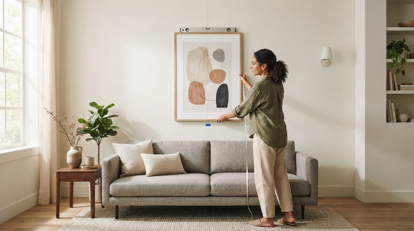
The artwork’s center, not its top edge, is the right place to begin. On an open wall, position the center 57 to 58 inches above the floor, using 57 inches as the familiar baseline. This art placement and height guide shows how to adapt that starting point to furniture, a gallery wall, and the way a room is used.

It’s easy to focus on the frame’s upper edge or the height of the ceiling, yet a considered placement begins with the visual center of the work. Learn how to apply the 57-inch rule, align several pieces with balanced spacing, and calculate the precise hanger position from the artwork’s dimensions and wire. The result is a wall that feels composed rather than guessed at, allowing each photograph or print to settle naturally into the room.

Key Takeaways

  • Above furniture, balance the artwork’s scale with the piece below and leave a considered gap beneath the frame.
  • Plan a gallery wall as a unified composition, using consistent spacing and a clear alignment or anchor point.
  • Find the hanger position by measuring from the frame’s top to its wire or hanging point, then adding that distance to the intended center mark.
  • For rooms where people mainly view art while seated, adjust the placement to suit the room’s everyday perspective.

What is the 57 rule for hanging art?

The 57-inch rule is a starting point for placing art, not a fixed height for every wall. Above furniture, the furniture’s top edge and the artwork’s scale help determine the final position.

  1. Assess placement above furniture

    Measure from the top of the sofa, console, or mantle, then place the artwork’s bottom edge about 6 to 8 inches above it. This gap keeps the frame visually connected to the furniture without crowding the surface. Before hanging art, mark the proposed position and assess it from across the room. For safer placement, keep frames securely mounted and clear of areas where people might bump them.

  2. Set height above sofas, beds, and consoles

    Position art above a sofa, bed, or console with its bottom edge about 6 to 12 inches above the furniture. Choose a width that gives the arrangement presence: artwork above furniture should fill about one-half to two-thirds of the furniture’s width. For a single large piece, compare its frame with the furniture’s full span. Heavy artwork needs a secure hanging method suited to its weight and wall.

  3. Adapt placement to ceilings and staircases

    Keep the artwork’s centre near the usual viewing height, even in a room with a high ceiling; the ceiling height alone is no reason to raise the frame. Above a staircase, arrange a sequence to follow the wall’s rising line, then view it from the steps and landing. Check that the frames align with the stair angle and don’t intrude on the walking path.

  4. Position art in hallways and entryways

    Center a piece on the available wall space in a hallway or entryway, using the 57-inch center-height rule as a starting point. In a narrow passage, consider the sightline from the entrance and from the route through the hall. Keep artwork clear of doors and busy corners, and choose a scale that suits the wall rather than overwhelming the walkway.

Spacing and aligning multiple artworks

For a gallery wall, plan the full arrangement before marking individual hanger points. Framing and matting change each piece’s outer dimensions, so measure spacing and alignment from the finished frame edges.

  1. Align framed artwork

    Lay the framed pieces out on the floor, then choose a shared alignment: top edges, centre lines, or a clean grid. For a grid, keep frame edges straight and repeat the same gap across each row and column. Check the outer frame dimensions, not just the visible image, so different mats or mouldings don’t make aligned artwork look uneven.

  2. Space pieces in a grouping

    Set frames about 2-3 inches apart for a close, cohesive gallery wall. If the works need more visual breathing room, use gaps of 3-6 inches, keeping the spacing consistent across the grouping. Place the pieces on the floor first, then adjust the arrangement until it reads as one composition rather than separate works scattered across the wall.

  3. Account for framing and matting

    Measure each finished frame, including its mat, before deciding where its centre or edge should sit. A wider mat increases the overall dimensions and can change a piece’s visual weight, even though the image itself stays the same. Use the outside dimensions to set the spacing, then assess how the visible artwork sits within each frame.

For a mixed collection, choose one anchor piece and arrange the remaining frames around it. Keep their gaps deliberate, and compare the outer edges from a few steps back; a small shift can make a grouping feel unbalanced. If framing decisions affect your layout, Galerie Prints’ Bespoke Framing Service offers a considered next step for bringing the pieces into a coherent arrangement.

Calculating hanger placement from the artwork’s center

Mark the artwork’s centre height first, then calculate the hook position from the frame’s hanging hardware. This keeps the centre line accurate, even when the wire sits well below the top of the frame.

  1. Find the recommended artwork center height

    Mark the wall at 57 to 58 inches from the floor for the center of artwork on an open wall. This measurement refers to the artwork’s midpoint, not the nail or hook. If people regularly view the piece while seated, lower the center until it feels comfortable from the main seat, rather than relying on a standing sightline.

  2. Avoid hanging artwork too high

    Measure the frame before placing a hanger, and don’t use its top edge as the height reference. A frame can look too high when its centre sits well above the intended viewing line, even if its top edge seems aligned with nearby decor. In a room with high ceilings, keep the same centre-height baseline rather than raising the artwork to fill the wall.

  3. Position vertical artwork

    Measure the full height of a vertical frame, then divide that measurement in half to find its center. For a 34-inch-tall framed work, the center is 17 inches from either edge. Align that midpoint with the chosen wall mark; the artwork’s portrait orientation doesn’t change how its center is calculated. Check the sightline from the room’s main viewing position.

  4. Measure from the frame’s top to its wire’s highest hanging point while the wire is gently pulled taut. For the 34-inch example, a wire 10 inches below the top places the hook 7 inches above the 57-inch center mark, at 64 inches from the floor. Mark that hook point, then assess lighting from the intended viewing position; shift the artwork slightly if a light source creates distracting glare.

The 57- to 58-inch center-height baseline

Use the artwork’s centre as the reference point on an open wall, rather than measuring to its top edge. This baseline creates a consistent visual line for positioning a single piece or planning a gallery arrangement.

  1. Measure 57 to 58 inches up from the floor and mark the wall. That mark represents the center of the artwork, not its hanger. The 57-inch point is a useful starting baseline; the 57- to 58-inch range gives a little room to judge how the piece sits in its particular setting.
  2. Centre one artwork on the mark by measuring its full framed height and finding the midpoint. A tall, narrow piece still uses its vertical centre, while a wide piece uses its horizontal midpoint. Base the measurement on the framed work’s outer dimensions so the visible composition sits where you intend.
  3. For a gallery wall, treat the arrangement as one large artwork. Find the overall grouping’s top and bottom edges, then mark its midpoint at about 57 inches above the floor. This keeps the collection aligned as a whole, even when individual frames differ in shape or size.
  4. Keep the baseline even in rooms with high ceilings; don’t raise a piece simply to fill more wall space. If the room is mainly used while seated, adjust the artwork lower until it feels comfortable from the primary seat. A modest shift of 2 to 3 inches can suit the room’s daily use while preserving the composition.
  5. Before making a hole, mark the centerline and step back to view the work from the room’s main approach. If you’re planning a wall around Star Wars Limited Edition Prints, use the same center-height principle to give the chosen print a considered place within the room.

Galerie Prints: The Slim Aarons Collection

Galerie Prints brings photographic heritage into the home through The Slim Aarons Collection, a considered starting point for choosing work that suits your room and its intended placement. Once you’ve measured the wall and established its centre line, explore imagery that could become the focus of a living space, hallway, or carefully arranged gallery wall.

For a different visual character, browse Terry O’Neill Photography, Cinema Lobby Cards, or Star Wars Limited Edition Prints. Compare each work’s proportions with the available wall space and nearby furniture, then use the placement principles above to plan where it will hang. This lets you consider the image and its setting together, from the initial choice through to the final alignment.

Contact Galerie Prints to explore its collections.

Let the Artwork Shape What Comes Next

A carefully placed image can do more than complete a room. It can establish a mood, draw the eye to a considered detail, and offer a fresh perspective each time you pass. Use this art placement and height guide as a starting point, then let the character of your chosen work shape the space around it.

Galerie Prints offers The Slim Aarons Collection, Terry O’Neill Photography, and Cinema Lobby Cards, each bringing its own visual history and atmosphere to a room. Explore the imagery that feels right for your setting, and consider how its presence might shape the room’s character over time.

Contact Galerie Prints for art advice as you consider the next piece for your walls. A thoughtful choice can make the room feel distinctly your own.

Frequently Asked Questions

How high should art be hung?

On an open wall, start with the artwork’s center about 57 to 58 inches above the floor. Then judge the placement from the room’s usual viewing position, rather than relying only on a measurement. If the piece sits above furniture, the relationship between its lower edge and the furniture may guide the final position more than the open-wall baseline.

What is the standard height to hang art on a wall?

A common standard places the artwork’s center 57 inches above the floor. Measure to the center of the complete framed piece, not its upper edge or hanging hardware. In a gallery arrangement, use the center of the whole grouping as the reference. That keeps the composition coherent even if individual frames have different proportions.

How do you choose the right art size for a wall or furniture?

Above furniture, choose artwork or a grouping that spans roughly one-half to two-thirds of the furniture’s width. On an open wall, consider the surrounding space and the visual weight of nearby furnishings. For example, a narrow vertical frame may suit a slim console, while a wider arrangement can balance a longer sofa.

How much space should be between multiple pieces in a gallery wall?

For a close, unified gallery wall, leave about 2 to 3 inches between frames. A wider gap of 3 to 6 inches can give a grouping more visual separation. Choose one spacing and repeat it throughout the arrangement. Before hanging, check the gaps at frame corners and along rows, where small inconsistencies are easiest to notice.

How do you measure and mark art placement before hanging?

First, measure the framed artwork and mark its intended centre on the wall. Then measure from the top of the frame to the taut hanging wire or fitting to find the hanger position relative to that centre. For a group, lay out the pieces on the floor or use paper templates, and mark each hanger only once the full arrangement looks balanced.

Decorating a Hallway with Art: A Practical Guide to a More Considered Space

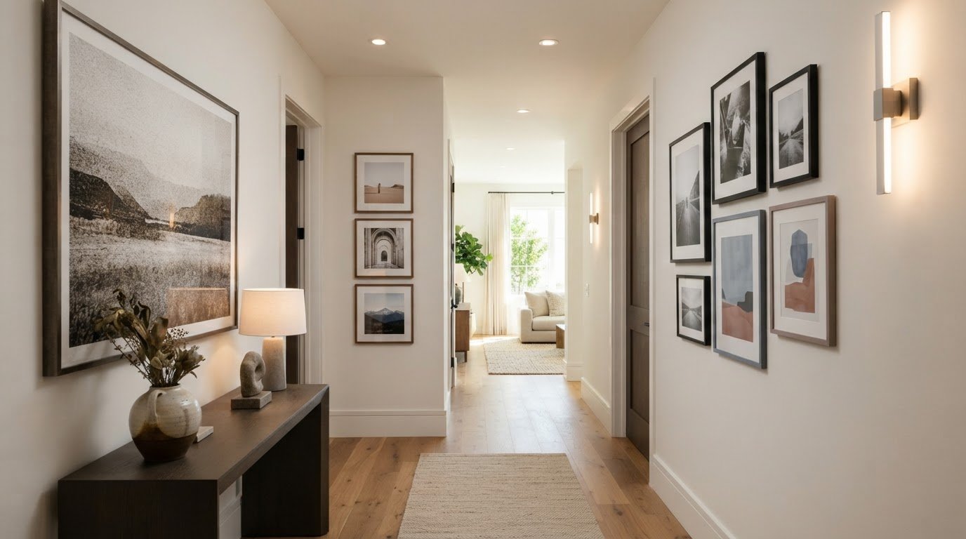
What if the hallway were more than a passage between rooms, and became the first glimpse of your home’s character? Decorating a hallway with art can give even a narrow or overlooked space a sense of purpose. But filling every bare patch of wall may leave it feeling cluttered rather than considered. Plan around the route through the space, so each work can be seen in relation to the next and to the rooms beyond.

It’s easy to misjudge scale or hanging height in a corridor, where viewing angles and proportions differ from those in a living room. A thoughtful arrangement can balance the walls, while carefully chosen imagery and framing connect the hallway to your home’s wider palette and mood.

This guide will help you assess your hallway, choose artwork suited to its proportions and arrange it with confidence. We’ll cover hanging height, spacing, gallery-wall layouts and framing, including how exhibition-quality photographic prints and bespoke sizing can help a work feel at home. The result is a more welcoming transition, with a visual rhythm that rewards both a passing glance and a pause.

Key Takeaways

  • Start decorating a hallway with art by considering the route through the space, its proportions and how it connects to adjoining rooms.
  • Measure the usable wall area, noting how doors, switches, mirrors and furniture shape your options.
  • Choose a single statement piece, a linear sequence or a compact cluster to suit your hallway’s shape and viewing distance.
  • Use image subject, colour and contrast to complement nearby rooms and respond thoughtfully to the hallway’s lighting.
  • Refine the final look with suitable framing and sizing, then explore exhibition-quality photographic prints for a considered finish.

Why Decorating a Hallway with Art Changes the Feel of Your Home

A hallway is a space for movement, not usually a room where people linger. Yet it shapes the experience of arriving home and offers an early impression of the rooms beyond. Decorating a hallway with art gives this passage its own visual identity, making the walls part of the home’s story rather than an afterthought.

A successful display is more than a collection of frames filling available space. It respects the hallway’s proportions and the way people move through it. A work positioned where the route opens up can invite a pause; a sequence along a longer wall can create a gentle rhythm. Either approach makes the journey feel deliberate.

What role should artwork play in a hallway?

Think of the hall as both a passageway and a personal introduction. Decide what you want it to express: quiet continuity, a sense of discovery or a confident focal point. A restrained arrangement might use a shared colour palette or subject to create cohesion. One striking image, by contrast, can give a simple corridor a distinct centre of attention.

These approaches can work together. A prominent piece can sit among smaller works, or a sequence of images can feel calm through considered spacing and a common thread. Cohesion doesn’t require identical subjects, frame finishes or dimensions. Variety can feel collected and personal when each piece has room to be seen and the arrangement suits the wall.

How can art help a hallway feel more welcoming?

Repeated visual cues can give a long route a sense of intention. A recurring tone, subject or frame detail may guide the eye from the entrance towards the rooms beyond, creating small visual pauses as you pass. The effect comes not from matching every object, but from establishing a subtle conversation between works—a principle also central to supportive living spaces, where specialists like Find Memory Care use visual markers and art to create intuitive, reassuring environments.

Let adjoining rooms inform your choices without making the hallway a copy of either one. A colour from a nearby room might reappear in a photograph, while a contrasting subject can create a fresh moment between familiar spaces. If you’re exploring how different visual traditions might shape the mood, The History of Art offers a broad introduction to styles and periods.

Fine art photography can bring a personal point of view to this transition, from evocative interiors and landscapes to portraits that suggest another era. Consider how each image reads both in passing and at close range. A thoughtful display welcomes visitors, connects the character of adjoining rooms and rewards a second look without interrupting the natural flow of the home.

Measure Your Hallway Before Choosing Art

Before choosing a work, look at the hallway as a series of viewing opportunities rather than one long wall. Note its length, the width of each usable section, ceiling height and the distance from which someone will first see the art. A piece viewed from the far end may need a different presence from one encountered at close range beside a doorway.

Measure the clear wall area, not just the full stretch from corner to corner. Doorways, light switches, mirrors, radiators and console tables interrupt the visual field or limit where a frame can sit. For hallways featuring period furnishings, design insights from Nwtiques can help you balance scale and historic character alongside your wall decor. Mark their positions, including how doors open and where people naturally pass. This helps you avoid placing a work where it feels squeezed, obstructs everyday use or competes with another feature.

How do you choose artwork scale for a narrow hallway?

Choose a scale that suits the wall area the artwork will actually occupy. On a long, uninterrupted wall, one larger focal piece can create a clear point of attention. A sequence of smaller works may suit a corridor broken up by doors or changes in wall space, giving the eye a measured progression. Neither approach has a fixed size requirement; the test is whether the art feels balanced against its immediate setting.

Where should hallway art sit on the wall?

A useful starting point is to place the centre of the artwork at a natural standing viewing height. Galleries commonly use a centre point around 57 to 60 inches from the floor, but treat this as a guide, not a rule. Ceiling height, nearby furniture and the corridor’s sightlines may call for an adjustment. Check the proposed position from both ends and while walking past, since the artwork will be seen from changing angles.

Test the layout before committing. Cut paper templates to match the outer dimensions of the framed pieces, then tape them to the wall. Step back, approach from each direction and check that the arrangement clears switches, mirrors and door swings. If a template feels too large in the actual corridor, revise the plan before choosing the artwork.

  1. Measure the hallway, wall sections, ceiling height and viewing distance.
  2. Mark obstacles such as doors, switches, mirrors and furniture.
  3. Mock up the proposed artwork positions with paper templates.
  4. Review the arrangement from both ends and along the route.

Once the layout feels right, accurate measurements can guide choices such as custom sizing and framing. Explore exhibition-quality photographic prints suited to your hallway’s proportions.

Choose a Hallway Art Layout That Suits the Space

The best layout follows the architecture rather than forcing a preferred style onto it. A short hall with one uninterrupted wall may suit a single image, while a longer corridor can support a sequence that carries the eye along its length. Where doorways divide the wall into smaller sections, a compact cluster can bring those areas together. Each arrangement feels composed when it leaves the route clear and gives the artwork room to register.

Use this comparison to find a starting point, then adjust it to the available wall space and the way the hall is experienced.

Layout Suitable space Visual effect Planning consideration
Single statement piece A short hall or a clear, uninterrupted wall section Creates a distinct focal point Allow enough surrounding space for the work to stand on its own
Linear sequence A long, relatively continuous corridor wall Establishes a steady visual rhythm along the route Keep spacing and alignment considered as the wall changes
Compact cluster A wider landing or a contained wall area between openings Forms a concentrated, layered composition Plan the group as one overall shape, not isolated frames

When does a single statement piece work best?

One focal image often suits a short hallway, where a sequence could feel compressed or a cluster might compete with nearby doors. Its impact depends on proportion and negative space. A work that nearly fills the available wall can feel imposing, while generous space around it gives the composition a quieter presence. Choose an image that feels at home with the wider interior, so the hallway makes a clear impression without seeming detached from the rooms beyond.

How can a sequence or gallery wall feel balanced?

For a sequence, repeat the spacing or alignment to give the eye a reliable rhythm, even if the photographs, frame finishes or formats vary. In a cluster, treat the outside edges as one larger shape and balance the visual weight across the group. Lay out the proposed arrangement on the floor before hanging it, preserving the relative gaps as you test alternate positions. Account for door openings and changing sightlines so no piece feels stranded or crowded as someone walks past.

Gallery walls benefit from planning before a single hook goes in. Sketch the wall and mark its boundaries, then arrange paper outlines or the framed works on the floor to see how the composition reads as a whole. A step-by-step gallery-wall guide can help with the broader process; the hallway-specific test is whether the arrangement remains clear from the approach as well as at close range. Consistent spacing adds structure, not uniformity, so a personal mix of images can still feel deliberate.

Select Art, Colour and Framing for Hallway Conditions

With the layout established, consider how each image relates to the hallway’s colours and light. Artwork doesn’t need to repeat the wall colour to belong there. It might echo a tone from an adjoining room, offer measured contrast against a pale wall or introduce a quieter note among richer colours. Subject matters too: a portrait, landscape or cinematic photograph sets a different mood as someone moves through the space.

Look at the image and its setting together. A photograph with strong tonal contrast can remain legible against a busy wall or in a dim passage; softer gradations may feel more integrated where the surroundings are calm. Neither is universally right. Choose a palette and subject that feel intentional beside the wall finish and the rooms around it.

What artwork works in a dark or windowless hallway?

Observe the hallway’s lighting at different times, including the effect of any ceiling or wall lights. In a dim corridor, compare subtle imagery with stronger contrast, and consider whether details remain easy to discern from the usual viewing distance. A restrained palette can sit harmoniously with the interior, while brighter tones may introduce another note. Neither guarantees that the space will appear lighter.

If possible, review a print in the hallway’s own lighting before settling on its position. Light can change how colours and tonal differences read, so an image that feels balanced elsewhere may have a different presence in the corridor.

How should frames complement hallway artwork?

A consistent frame treatment can lend a sequence or cluster visual unity, while deliberate variation can give a collected arrangement more character. In either case, consider how the frame’s visual weight relates to the image and the available wall space. The frame should support the artwork, not make a narrow passage feel busier. A dedicated guide to bespoke framing can offer further help with this choice.

Artwork and framing solve different parts of the design. First decide how the image’s subject, contrast and palette work in the hallway, then choose a frame that suits both the print and its surroundings. If a standard proportion doesn’t sit comfortably within the planned composition, custom sizing and cropping can help adapt the image to the space. Galerie Prints also offers bespoke framing for a tailored finish.

When decorating a hallway with art, assess each work in context rather than choosing by colour or subject alone. Consider how the print reads against the wall, under the available light and beside its frame. Explore Galerie Prints’ exhibition-quality photographic prints and bespoke framing as you refine a display for your hallway.

Bring Your Hallway Art Plan to Life with Galerie Prints

A considered hallway display comes together in stages: assess the available wall space, choose a layout that suits the route, then refine the image and its framing. With those decisions in place, you can select a print for a defined purpose rather than choosing an image first and trying to make it fit afterwards. The result can connect more closely to the character and proportions of your home.

Fine art photography offers a wide range of visual moods, from quietly atmospheric imagery to portraits and scenes with a more pronounced presence. Galerie Prints offers exhibition-quality photographic prints, alongside bespoke options to adapt a chosen work to a particular wall and composition.

How can a print be tailored to a hallway?

Custom sizing can help a print sit comfortably within the planned arrangement, whether it will serve as a focal point or form part of a group. Cropping offers another way to shape the composition, bringing attention to details that work well at the viewing distance and proportions of the hallway. These options are useful when a wall’s usable area has a distinctive shape or when a chosen image needs to relate carefully to nearby frames.

Galerie Prints’ bespoke services include printing on any substrate. Aluminium, wood and glass are examples, not an exhaustive list. Consider the substrate alongside the image, the interior and the display’s intended character, so the finished work feels deliberate within the space.

What should you settle before choosing a print?

Before making a final selection, note the exact wall or wall section the artwork will occupy, the layout you’ve chosen and the mood you want the hallway to convey. Decide whether the image should provide a quiet pause, introduce a distinctive subject or create continuity with an adjoining room. Then consider the frame alongside the image: its visual weight and character will affect how the finished piece relates to the wall and neighbouring works.

Keep your measurements and paper mock-up nearby as you browse. They provide a practical reference for comparing image proportions with the space and judging whether a single print or a group will feel balanced. If a composition needs adjustment, custom sizing and cropping can help shape the artwork to the plan, rather than forcing the plan around an unsuitable format.

With the wall, layout and visual mood in mind, explore Galerie Prints’ exhibition-quality photographic prints and consider bespoke sizing, cropping and framing for a display that feels at home in your hallway.

Let Your Hallway Tell a Story Over Time

A hallway display doesn’t have to feel complete in a single afternoon. It can grow as you discover photographs that speak to you, or change as the rooms around it evolve. Leave space for a future addition, or let one carefully chosen image remain the quiet centre of the composition. The most enduring displays feel personal, with each work earning its place rather than filling a wall for its own sake.

That’s the pleasure of decorating a hallway with art: a familiar route can offer a new detail to notice each time you pass, while still feeling connected to the wider home. Choose a subject you’ll enjoy seeing in the everyday rhythm of arriving, leaving and moving between rooms. When you’re ready to find the image that gives the space its own character, explore exhibition-quality photographic prints at Galerie Prints. A thoughtful choice can make the hallway feel unmistakably yours.

Frequently Asked Questions

How high should you hang art in a hallway?

A useful starting point is to place the centre of a single artwork about 57 to 60 inches (145 to 152 cm) from the floor. For a group, treat the whole arrangement as one piece and find its visual centre, rather than centring each frame separately. Stand back and check the result from the hallway entrance and while walking past. The position should feel comfortable to view without drawing attention to the ceiling or floor.

What size art is best for a narrow hallway?

Choose artwork in proportion to the clear wall area and the distance from which it will be viewed. A tall, narrow piece may suit a slim wall section, while a small work can feel lost on a broad expanse unless it’s part of a considered grouping. Before choosing, outline the frame dimensions on paper and check whether the piece leaves the passage feeling open. Let the usable wall, not the hallway’s full length, guide the scale.

How do you arrange pictures along a long hallway?

For a long corridor, arrange pictures in a steady line or sequence that responds to doorways and changes in the wall. Keep the spacing consistent; around 2 to 3 inches between frames is a common gallery-wall guideline. Before hanging, check that the first and last works don’t feel stranded at the ends and that the sequence reads clearly from both directions. Leave gaps where the wall is crowded by switches, mirrors or openings.

Can you mix different frame styles in a hallway?

Yes, different frame styles can work together if the overall arrangement has a unifying detail. Vary frame profiles while keeping a related tone, or mix finishes and let a shared subject or palette tie the images together. In a narrow corridor, use variation with intention: a cluster can feel more eclectic, while a long sequence may benefit from a repeating feature that guides the eye along the wall.

How do you decorate a dark hallway with art?

Choose imagery after observing the hallway under its usual lighting, since subtle details and colours can read differently in a dim space. Stronger tonal contrast may help an image remain distinct, while a restrained palette can sit quietly with the walls. LED lighting is often recommended for home artwork because it emits no damaging UV rays or significant heat. Assess the print where it will hang, and don’t rely on art alone to brighten the corridor.

Should hallway art match the artwork in adjoining rooms?

No, hallway art doesn’t need to match adjoining rooms or repeat their subjects. A more considered connection can come from echoing a colour, mood or period while choosing different imagery for the passage. For example, a contemporary portrait might sit between rooms with landscape art if its tones relate to the surrounding palette. This lets the hallway feel part of the home without making each space look identical.