
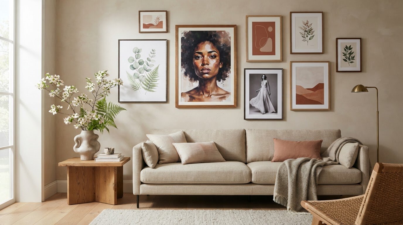
A compelling feminine gallery wall is composed, not crowded. Begin with one print as the visual anchor, then arrange complementary portraits, florals or fashion imagery around it, keeping the spacing and framing coherent. Decorating with feminine art prints works best when the arrangement feels connected to the room, rather than simply filling a blank wall.
A single beautiful print has obvious appeal, but a thoughtful grouping can bring more depth, character and a sense of personal history to an interior. The key is to balance the artwork’s mood and scale with the space it will inhabit.
Learn how to plan a gallery wall, choose print styles and formats, and place art in rooms from the living area to the bedroom. This guide also explores how changing the subject, palette or composition can help feminine art feel at home throughout the house, creating a considered visual rhythm without making every room look alike.
Key Takeaways
- Build a cohesive gallery wall by balancing portraits, florals, and fashion imagery, then use a consistent visual element to tie the selection together.
- Choose framed, unframed, or canvas presentation based on the artwork’s character and the finish you want in the room.
- Match each print’s scale and mood to its setting, so bedroom, living room, and other spaces feel connected without looking identical.
- Use color, contrast, and existing decor as your guide when selecting artwork, and explore photographic collections for a distinctive focal point.
Female art print styles and designs
Feminine art spans portraiture, botanical studies, fashion photography and still life. For a graceful gallery wall, pair a close-up portrait with a flower study and a fashion image. Vary the subjects while repeating a colour or visual detail. Motifs such as roses, fruit, flowing fabric and sculptural hats can suggest softness without limiting the wall to pastel tones.
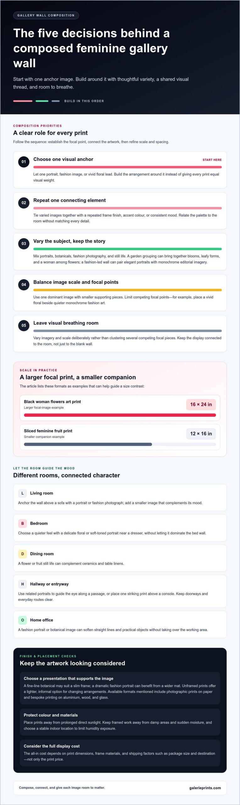
Choose a theme to give the selection a point of view. A garden-inspired group might combine blooms, leafy forms, and a woman among flowers, while a fashion-led arrangement could bring together elegant portraits and black-and-white editorial imagery. A Black woman flowers art print is listed in a 16×24-inch size, while a sliced feminine fruit print is listed as 12×16 inches. Those formats can help guide a contrast between a larger focal image and a smaller companion.
For a varied gallery, mix one dominant portrait with supporting botanicals or still lifes, then repeat a frame finish or accent colour. Preserve visual breathing room by limiting competing focal points. For example, place a single vivid floral beside quieter monochrome fashion art. A Star Wars Limited Edition Print can add a contrasting subject to a mixed display, with a shared frame tone or colour linking it to feminine imagery.
The all-in cost depends on the print’s dimensions, the frame materials, and shipping factors such as package size and destination. Compare those elements together rather than treating the print price as the complete display cost.
To protect colour, place prints away from prolonged direct sunlight, as Olive et Oriel recommends. Keep framed work away from damp areas and sudden moisture, and choose a stable indoor location to limit exposure to humidity.
To mix feminine prints with other artwork without creating visual clutter, establish one common element, such as a repeated frame finish, a shared accent colour or a consistent mood. Then vary the imagery and scale deliberately, pairing a floral portrait with restrained abstract or monochrome work instead of grouping several competing focal pieces.
Choosing framed, unframed, or canvas prints
Start with the artwork’s character and the room’s existing finishes. A fine-line botanical illustration may suit a slim frame, while a dramatic fashion portrait can benefit from a wider mat that gives the image visual space. Framing creates a boundary between the print and surrounding decor, helping a gallery wall feel composed. Consider the frame colour alongside nearby furniture, hardware and other artwork, rather than choosing it in isolation.
An unframed print offers a lighter, more informal presentation. It can work well in a changing arrangement, where you may want to rotate images or try different groupings before settling on a display. Plan how to mount it and keep its edges aligned with neighbouring pieces. For example, a row of unframed fashion studies can feel intentional when their edges form a clear line.
Choose a print format that suits the artwork and the room. Galerie Prints offers fine art photographic prints on paper, as well as bespoke printing on aluminium, wood and glass. Before deciding, consider how the chosen surface will sit alongside the room’s other materials. A delicate drawing may call for a smooth, defined presentation, while a bold image can make a stronger focal point.
Use this practical sequence: choose the image, decide whether it needs a visual border, then compare the format with the wall and surrounding objects. A graphic, cinematic image, for example, can hold its own in a simple presentation; explore Star Wars Limited Edition Prints as one example of artwork with a strong visual identity. Avoid selecting a frame or surface solely because it matches another room. The best choice supports the image and feels considered in its intended setting.
Using feminine prints in different rooms
Give each room its own visual character instead of repeating one arrangement throughout the home. In a living room, let a portrait or fashion photograph anchor the wall above a sofa, then introduce a smaller image that complements its mood. A room-by-room approach to decorating with feminine art prints helps each space feel personal while maintaining a thoughtful visual connection across the home.
A bedroom calls for a quieter atmosphere. Place a delicate floral or soft-toned portrait near a dresser, where it can add interest without dominating the bed wall. In a dining room, a still life of flowers or fruit can complement ceramics and table linens. Choose imagery that relates to the room’s use rather than repeating the same subject everywhere.
Hallways and entryways are natural settings for a sequence of related images. Portraits can guide the eye along a passage, while a single striking print above a console creates a focal point. Keep doorways and everyday routes clear, and consider how the display looks from the entrance.
In a home office, decorating with feminine art prints can soften a workspace filled with straight lines and practical objects. A fashion portrait or botanical image adds character near the desk without taking over the working area. Start by identifying the room’s focal point, then choose artwork that suits its purpose, furnishings and atmosphere.
How do you choose feminine art prints that match a room’s color palette and decor style?
Begin with the room’s existing colours, then identify one shade the artwork can echo. In a sage-green room, a botanical print with muted leaves can reinforce the palette without matching every detail. In blush or cream interiors, a portrait with warm undertones can create a similarly gentle connection. Let the print relate to the room, not duplicate it.
Next, consider contrast. A pale image may disappear against a light wall, while a dark portrait can give a soft palette definition. A black-and-white feminine fashion print, listed in a 16×12-inch format, can introduce graphic contrast without adding another color. In a richly colored room, choose artwork with quieter tones to keep the overall effect balanced.
Your decor style offers another guide. For a traditional interior, look for graceful portraiture, floral motifs and frames that complement existing wood finishes. A contemporary room can pair clean-lined furniture with fashion photography or simplified botanical forms. Eclectic spaces allow more variation, but repeating one element, such as a frame finish or accent colour, helps connect different subjects.
Before choosing, compare the print with the wall colour, textiles and nearby objects in the same light. A pastel botanical print can appear more subdued beside cream upholstery than against a crisp white wall. Use a small colour echo, such as a flower tone repeated in a cushion, rather than insisting that every artwork share the full palette.
For a considered contrast with floral and portrait imagery, explore Star Wars Limited Edition Prints as a distinct visual direction. Their cinematic subject matter can bring a different mood to an eclectic room. Choose contrast deliberately, then repeat a color, finish, or framing detail elsewhere to keep the display cohesive.
Galerie Prints: The Slim Aarons Collection
Galerie Prints offers The Slim Aarons Collection as a considered next step for readers seeking photographic art with a distinctive presence. If your gallery wall needs a visual counterpoint to floral motifs or portraits, explore how photographic imagery can introduce a different mood while still complementing your room’s palette and framing choices.
Terry O’Neill Photography, Cinema Lobby Cards and Star Wars Limited Edition Prints offer further possibilities for shaping a personal display. Compare each subject with the room’s existing colours, furnishings and atmosphere, then choose work that supports your intended composition rather than competing with it.
For a closer look at photographic art for your space, contact Galerie Prints.
Let your collection evolve with the room
A gallery wall can evolve beyond its first arrangement. As a room changes, let one image become the new focal point, or introduce a contrasting subject that reflects a shift in atmosphere. Decorating with feminine art prints is an opportunity to shape a personal visual language that feels graceful, expressive or quietly unexpected.
Galerie Prints brings together The Slim Aarons Collection and Terry O’Neill Photography, alongside Cinema Lobby Cards. Each has a distinct visual character to consider as you refine a display, whether you’re seeking an elegant portrait, a cinematic note or a more nostalgic mood.
When you’re ready to explore artwork for your space, contact Galerie Prints for print advice. Let your next choice begin with the image that feels most at home in your room.
Frequently Asked Questions
How do I create a gallery wall with feminine art?
Use paper templates to test your arrangement before making holes. Cut shapes to match each frame, then tape them to the wall and view them from the room’s entrance. This reveals awkward gaps or an imbalanced outline early. Try a loose salon-style cluster for a collected feel, or align the top edges for a more tailored display. Photograph both layouts and compare them beside the room’s furniture.
What rooms suit feminine wall art?
Feminine wall art suits any room where its imagery complements the space’s purpose and atmosphere. A dressing area can welcome fashion portraits, while a reading nook might feel more personal with a botanical illustration near the chair. On a staircase, a sequence of related images can guide the eye between floors. Choose a location where the work remains visible and does not obstruct doors, shelves or everyday use.
What styles of feminine art prints are popular for home decor?
Popular choices include fashion photography, botanical illustrations, expressive portraits and abstract pieces with graceful lines. The right style depends on the mood you want: a vintage editorial image can lend a room a nostalgic note, while a simplified floral drawing feels more contemporary. Look beyond subject matter, too. Brushwork, photographic grain and line quality can connect artworks even when their colours differ.
What are the best sizes and layouts for feminine art prints on a gallery wall?
Choose sizes that suit the wall’s proportions and the furniture below it. A broad wall can accommodate a wider arrangement, while a narrow passage often benefits from a vertical sequence. For a more collected look, mix portrait and landscape formats, then arrange them around the group’s overall silhouette. Lay the pieces on the floor first, keeping the outer edges visually balanced.
How high should art prints be hung, and how much space should be left between frames?
Hang prints at a height that lets viewers appreciate them naturally while standing or seated nearby. Above a sofa, relate the artwork to the backrest rather than treating it as an isolated wall object. Keep gaps between frames consistent, then step back from the doorway to assess the whole display. Paper templates help you adjust the placement before hanging.
What frame colors and materials work best with feminine art prints?
Choose frame colours and materials that work with both the artwork and the room’s finishes. A light wood frame can suit delicate botanical imagery and pale interiors, while a dark finish gives a portrait more definition. Black offers a crisp outline; warm metallic tones add an ornamental touch. Galerie Prints offers framing in black, white and brown, as well as unframed prints. For mixed frames, repeat one finish elsewhere in the room to make the variation feel deliberate.