
Gered Mankowitz didn’t just document the 1960s; he curated the very myth of the rock star through intimate, architectural portraiture. You likely recognize the brooding intensity of a young Keith Richards or the ethereal haze surrounding Jimi Hendrix, images that have become the visual shorthand for rock’s golden age. It’s natural to feel a deep reverence for gered mankowitz photography, yet finding authentic, high-quality prints from original archives often feels like a daunting pursuit for the discerning collector.
This guide invites you to delve into the storied career of Mankowitz, offering a bridge to a bygone era of elegance and raw talent. You’ll gain the knowledge needed to distinguish between print types and understand the artisanal craftsmanship that justifies a permanent place in a luxury home. We’ll trace his journey from a fifteen-year-old apprentice to a guardian of photographic heritage, while providing practical advice on selecting and framing these iconic works to create an evocative gallery wall with lasting presence. By understanding the technical soul of his archives, you can transform your living space into a sophisticated sanctuary of music history.
Key Takeaways
- Understand how Mankowitz shaped the visual identity of the 1960s, transitioning from a teenage apprentice to the definitive chronicler of the British Invasion.
- Explore the intimate sessions with The Rolling Stones and Jimi Hendrix that transformed raw musicianship into enduring cultural iconography.
- Learn to identify the architectural depth and studio mastery that defines gered mankowitz photography as a cornerstone for any serious fine art collection.
- Navigate the acquisition of physical prints as an appreciating asset class, focusing on the distinction between iconic hits and rare archival shots.
- Discover how bespoke framing and archival preservation techniques ensure your photographic investment remains a lasting piece of history for the modern home.
The Evolution of Rock Imagery: The Mankowitz Legacy
Gered Mankowitz stands as the definitive visual chronicler of the British Invasion, a period where the sonic landscape of London was shifting as rapidly as its social fabric. His career began with a precocious apprenticeship, leaving school at just fifteen to immerse himself in the technical rigours of the medium. By the time he established his own studio in Mason’s Yard, he was perfectly positioned to capture the burgeoning energy of a generation. His work represents more than just a series of portraits; it’s the cornerstone of our Music Archives, serving as a meticulous preservation of the cultural soul that defined an era.
Before the rise of gered mankowitz photography, images of musicians were often relegated to the status of tabloid fodder, captured in fleeting, low-quality snapshots for daily newspapers. Mankowitz elevated the medium. He treated his subjects with the gravity of classical portraiture, utilizing studio lighting and deliberate composition to move rock imagery into the territory of fine art. This transition was essential in establishing the rock star as a modern icon, a figure of depth rather than a mere celebrity. As noted in the Gered Mankowitz Wikipedia biography, his early professional journey was shaped by a profound connection to the London art scene, which allowed him to bridge the gap between traditional photography and the raw vitality of rock and roll.
Beyond the Lens: A Bridge to a Bygone Era
The social climate of 1960s London provided a vibrant, chaotic canvas for Mankowitz. He didn’t just photograph the scene; he helped invent the “cool” aesthetic that still resonates in contemporary fashion and art. His lens captured the quiet arrogance and effortless style of artists who were reinventing the world. To understand how these moments fit into the wider tapestry of the medium, one can explore our broader Music Photography collection. This curated selection highlights the art of capturing sound and soul through a visual medium, where the photographer acts as a silent witness to the birth of legends.
The Curatorial Authority of Galerie Prints
Stuart Möller founded Galerie Prints with a vision to act as a guardian for these historical treasures. We don’t merely sell prints; we curate archives that represent the pinnacle of photographic heritage. Our commitment to artisanal quality ensures that every piece of gered mankowitz photography is produced using professional gallery-grade archival paper and traditional production methods. This focus on material excellence means that acquiring a Mankowitz print isn’t a temporary purchase. It’s an investment in a lasting piece of history, intended to be passed down through generations. By focusing on the tactile and historical elements of the work, we ensure that the prestige of the artist is matched by the technical superiority of the final print.
Defining the 1960s: The Rolling Stones and Jimi Hendrix Sessions
The period between 1965 and 1967 represents a seismic shift in the visual language of music, a time when gered mankowitz photography became the primary lens through which the world viewed the outlaws of rock. As the official photographer for The Rolling Stones, Mankowitz didn’t just document their rise; he shaped their public identity as dangerous, unpolished, and undeniably cool. His work from this era, extensively detailed in the monograph Gered Mankowitz: Photographs, captures a raw intimacy that was previously unseen in the industry. Beyond the Stones, his portfolio expanded to include the fragile elegance of Marianne Faithfull and the blues-rock intensity of the Yardbirds, solidifying his status as the era’s premier image-maker.
The Rolling Stones: Capturing the Outlaws of Rock
During his tenure with the band, Mankowitz moved beyond the standard promotional shot to capture moments of quiet notoriety. He toured with them during their 1965 American tour, gaining a level of access that allowed for unforced, candid portraits of a group increasingly at odds with the establishment. The “Between the Buttons” cover shoot at Primrose Hill remains a definitive moment in his career. To achieve the iconic, ethereal look of the album, he applied Vaseline to the lens and used a homemade filter to create a sense of drug-induced fatigue. The “Between the Buttons” shoot stands as a masterpiece of atmospheric distortion.
Jimi Hendrix at Mason’s Yard: The Definitive Portrait
In 1967, at his Mason’s Yard studio, Mankowitz produced what are arguably the most famous portraits of Jimi Hendrix. These sessions were characterized by a stark, controlled technical setup that allowed Hendrix’s natural charisma to command the frame. By stripping away color, Mankowitz emphasized the textures of the musician’s military jacket and the intensity of his gaze. For collectors, these images exemplify the timeless allure of black and white pictures, where the absence of hue invites a deeper focus on the subject’s soul. If you’re looking to anchor a room with a piece of true rock history, you might consider how a large-format Hendrix print serves as a powerful focal point.
While his 60s work is legendary, Mankowitz’s influence didn’t stop with the summer of love. He successfully bridged the gap into the 1980s, documenting the synth-pop elegance of the Eurythmics and the vibrant energy of Kate Bush. This versatility ensured that his archive remained a comprehensive map of musical evolution, moving from the gritty streets of London to the polished aesthetics of the MTV era. You’ll find that his discerning eye remained constant, whether he was photographing the raw rebellion of Mick Jagger or the avant-garde grace of Annie Lennox.
The Mankowitz Aesthetic: Intimacy vs. Iconography
The architecture of the human face serves as the primary subject in the work of Gered Mankowitz. While many of his contemporaries focused on the chaotic energy of the stage, Mankowitz preferred the controlled environment of the studio, where he could manipulate shadow to create a sense of “architectural” depth. He builds with light. This meticulous approach didn’t just illuminate his subjects; it sculpted them, adding a layer of permanence to figures who were often perceived as fleeting pop stars. This balance between the raw vulnerability of the individual and the polished iconography of their public persona is what defines gered mankowitz photography as a high-art form.
His lens acted as a bridge between two worlds. He possessed a rare ability to capture the quiet, contemplative moments of artists who were otherwise surrounded by noise. As noted in this Gered Mankowitz Biography, his work is characterized by a signature “hand” that remains visible even as his subjects and styles changed. This consistency is particularly evident in the tactile quality of his silver gelatin prints, which possess a richness and tonal range that digital formats struggle to replicate. These physical objects carry the weight of history, offering a sensory connection to the moment of capture that transcends the digital image.
Studio Mastery and Environmental Portraits
The Mason’s Yard studio functioned as a creative sanctuary during the height of the London music scene. Mankowitz often utilized remarkably simple backdrops, stripping away distractions to ensure the viewer’s gaze remained fixed on the subject’s essence. This minimalism allowed the artist’s personality to fill the void. While his original work was captured on film, the transition to modern archival pigment prints has allowed for a level of preservation and clarity that meets the highest gallery standards. It’s this fusion of traditional vision and modern production that ensures the longevity of his archive, making each piece a durable fragment of cultural heritage.
The 1980s Transition: Annie Lennox and the Eurythmics
The 1980s marked a significant stylistic departure for Mankowitz, moving from the gritty, atmospheric 60s into the high-gloss pop aesthetic of the MTV generation. His collaboration with the Eurythmics, particularly during the “Sweet Dreams” era, showcased his ability to reinvent himself alongside his subjects. He helped craft the androgynous, avant-garde image of Annie Lennox, using sharp lines and bold contrasts that reflected the synth-pop sound of the time. This era proved that gered mankowitz photography wasn’t a static relic of the past but a living, evolving narrative of musical identity. Whether working with the jagged edges of rock or the smooth surfaces of pop, his commitment to the structural soul of the portrait remained unwavering.
Investing in Music History: A Collector’s Guide
Fine art music photography has transcended its origins as promotional material to become a legitimate, appreciating asset class for the modern investor. For the discerning collector, acquiring gered mankowitz photography is not merely an act of decoration; it’s a strategic investment in a cultural legacy that continues to gain prestige in the global art market. When building a private gallery, you must decide between the iconic “hits”—such as the legendary Hendrix sessions—and the rarer, candid shots that offer a glimpse into the unscripted lives of rock royalty. While the former provides an immediate, recognizable focal point, the latter often adds a layer of exclusivity and narrative depth that seasoned collectors prize.
Scale plays a vital role in how these images transform a space. A large-format portrait commands a room with quiet authority, emphasizing the grain and texture of the original film, while smaller, intimate prints invite a closer, more personal inspection. This versatility allows music photography to fit into even the most sophisticated home environments, bridging the gap between historical significance and contemporary interior aesthetics.
Archival Standards: Protecting Your Investment
Longevity is the cornerstone of any serious art acquisition, particularly when dealing with the delicate chemistry of photographic prints. At Galerie Prints, we utilize professional gallery-grade archival paper, which is specifically engineered to resist the fading and chemical deterioration that plagues standard commercial prints. Unlike mass-produced posters, these fine art prints are created using traditional production methods that ensure the structural integrity of the image remains pristine for decades. Collectors should always verify the provenance of their photographic prints to ensure authenticity and long-term value. This commitment to artisanal craftsmanship ensures that your purchase is not a temporary fixture but a permanent piece of history.
Building a Cohesive Gallery Wall
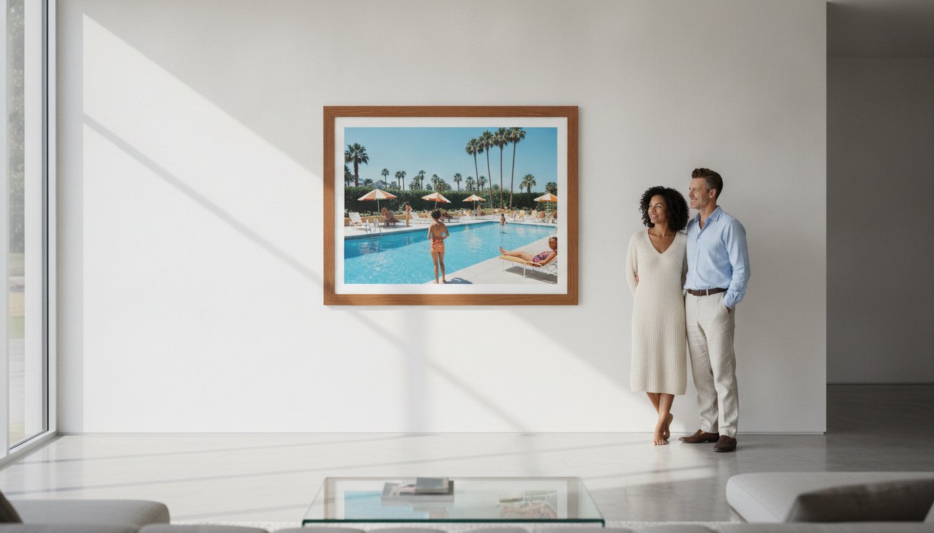
Creating an evocative gallery wall requires a balance of visual weight and narrative flow. You might consider mixing the gritty, monochromatic intensity of gered mankowitz photography with the vibrant, sun-drenched lifestyle imagery found in the Slim Aarons collection. This juxtaposition creates a sophisticated dialogue between the rebellious energy of the 60s London scene and the aspirational elegance of mid-century high society. Themes like “The Evolution of the Frontman” or “The Architecture of Cool” allow for a curated journey through time. To begin your journey into the world of elite music photography, explore our curated Music Archives and discover the perfect cornerstone for your private gallery.
Bespoke Presentation: Framing Mankowitz for the Modern Home
To own a piece of gered mankowitz photography is to hold a fragment of rock history; however, the transition from an archival print to a centerpiece of interior design requires a curatorial eye. At Galerie Prints, we believe the frame is not merely a border but an extension of the artwork’s soul. Our Bespoke Framing Service is designed to elevate these iconic images, ensuring they harmonize with the sophisticated aesthetics of a modern home while preserving the raw energy of the 1960s.
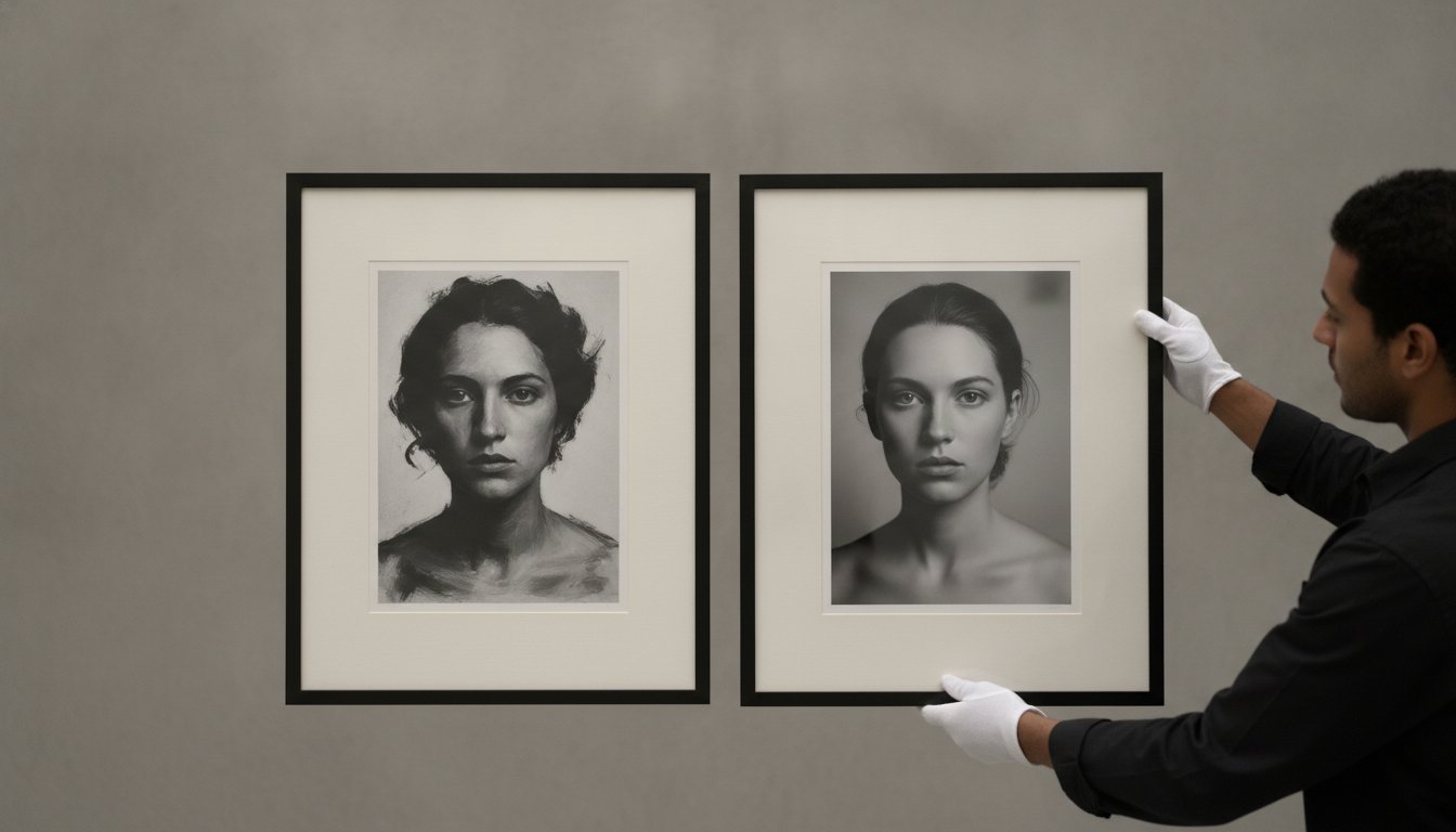
Frame styles play a critical role in how a photograph interacts with its environment. For the brooding, monochromatic intensity of the Stones or the vibrant textures of Hendrix, we often recommend sleek black wood frames. This choice provides a sharp, gallery-standard contrast that anchors the image, allowing the architectural depth Mankowitz is known for to command the room. It transforms a simple photograph into a window to a bygone era of elegance and rebellion, bridging the gap between historical heritage and contemporary luxury.
The Galerie Prints Artisanal Seal
Craftsmanship is our cornerstone. Every frame we produce is a result of localized, artisanal craftsmanship, reflecting our status as guardians of photographic heritage. We utilize high-quality mounting materials specifically selected to prevent warping over time, a common issue with inferior commercial products. This technical precision ensures your investment remains as stable and evocative as the day it was captured. For those seeking further advice on curating their space with gered mankowitz photography, our Fine Art Photography guide offers professional insights into displaying and decorating with high-caliber prints.
Transforming Your Interior with Iconic Imagery
The emotional impact of a large-scale Hendrix or Stones print in a living space is profound. These images act as conversational anchors, inviting guests into a world of artistic excellence and historical significance. We provide ready-to-hang convenience for our international collectors, ensuring that the journey from our gallery to your wall is handled with the same precision as the printing process itself. This seamless service allows you to focus on the aesthetic joy of your collection rather than the logistics of installation. A purchase from our archive is more than a decoration; it’s a lasting piece of history that gains character as it ages within your home.
We invite you to browse the full archive and discover how these historical treasures can redefine your interior. Explore the Gered Mankowitz Collection and Bespoke Framing Options to begin your journey as a collector of rock and roll’s visual soul.
Preserving the Visual Soul of Music History
Acquiring a piece of gered mankowitz photography is more than a simple aesthetic choice; it’s an intentional act of cultural preservation. By bridging the raw rebellion of 1960s London with the architectural precision of high-end portraiture, Mankowitz provided the definitive visual map for rock’s golden age. These images represent a stable and appreciating asset class, offering a permanent connection to the moments that defined a generation. Whether you’re drawn to the atmospheric distortion of the Stones or the stark charisma of Hendrix, these works carry a prestige that transcends mere decoration.
The transition from a historical archive to a sophisticated modern interior requires the artisanal touch of bespoke museum-quality framing. Curated by our gallery director, Stuart Möller, our collection offers exclusive access to iconic music archives that are as technically superior as they are emotionally resonant. Each print serves as a bridge to a bygone era of elegance, meticulously produced to ensure it remains a lasting piece of history for your private gallery. We invite you to discover the evocative power of these legendary sessions and find the perfect cornerstone for your collection.
Browse the Gered Mankowitz Archive at Galerie Prints
Frequently Asked Questions
Who is Gered Mankowitz and why is he famous?
Gered Mankowitz is a legendary British photographer renowned for shaping the visual identity of the 1960s rock scene. He gained international fame as the official photographer for The Rolling Stones between 1965 and 1967, capturing the band’s rise to notoriety. His work is celebrated for its intimate, off-guard approach, moving music photography from promotional snapshots to fine art. Today, his pieces are held in prestigious permanent collections like the National Portrait Gallery.
Which famous bands did Gered Mankowitz photograph?
Mankowitz’s portfolio reads like a history of modern music, beginning with his era-defining work with The Rolling Stones and Jimi Hendrix. He also captured iconic portraits of Marianne Faithfull, The Yardbirds, and Small Faces during the British Invasion. As the decades progressed, he successfully transitioned his style to document 1980s legends such as the Eurythmics, Kate Bush, Elton John, and Duran Duran, demonstrating a rare versatility across various musical genres.
Are Gered Mankowitz prints a good investment for art collectors?
Yes, gered mankowitz photography is considered a legitimate and appreciating asset class within the fine art market. As physical prints from original archives become rarer, their value often increases, particularly for limited edition or signed pieces. These works represent a permanent piece of cultural heritage. Investing in high-quality physical prints ensures you own a tangible fragment of music history that maintains its prestige and historical significance over time.
What is the difference between an archival pigment print and a silver gelatin print?
A silver gelatin print is a traditional black and white process using light-sensitive silver salts, prized for its rich tonal range and tactile quality. In contrast, an archival pigment print uses advanced inkjet technology with mineral-based pigments on gallery-grade paper. Both methods meet high museum standards for longevity. At Galerie Prints, we prioritize these archival standards to prevent fading, ensuring your photographic investment remains pristine and vibrant for future generations.
How do I choose the right frame for a Gered Mankowitz music print?
Choosing a frame should enhance the photograph’s architectural depth without distracting from the subject. For the raw, monochromatic intensity of 1960s rock portraits, a sleek black wood frame is often the most sophisticated choice. This style provides a gallery-standard finish that complements the “cool” aesthetic of the era. Our bespoke framing service uses high-quality mounting materials to prevent warping, ensuring the final presentation matches the prestige of the artist.
Does Galerie Prints ship Gered Mankowitz photography internationally?
Galerie Prints provides worldwide shipping, ensuring that collectors across the globe can access our curated Music Archives. We handle every order with professional care, utilizing secure packaging designed to protect the integrity of the archival paper and frame. Whether you’re in London or New York, your chosen piece will arrive safely. Our global coverage reflects our commitment to acting as a bridge between historical photographic heritage and international art enthusiasts.
Can I buy a Gered Mankowitz print already framed?
Yes, we offer a professional bespoke framing service that allows you to receive your print in a ready-to-hang condition. You can select from various premium frame styles and mounting options directly through our online platform. This service is handled with localized, artisanal craftsmanship, ensuring that the final product meets the high-end requirements of a luxury gallery. It’s a convenient and secure way to ensure your new artwork is perfectly presented upon arrival.
What is the story behind the Rolling Stones “Between the Buttons” cover?
The “Between the Buttons” cover was shot by Mankowitz at Primrose Hill during a cold morning in 1966. To capture the band’s weary, drug-influenced energy, Mankowitz utilized a homemade filter and smeared Vaseline on the lens. This technique created the famous out-of-focus, atmospheric distortion that defined the album’s aesthetic. It remains one of the most celebrated examples of gered mankowitz photography, perfectly capturing the Stones as the unpolished and defiant outlaws of rock.