Tag: wall art

How to Hang Large Framed Prints at the Right Height

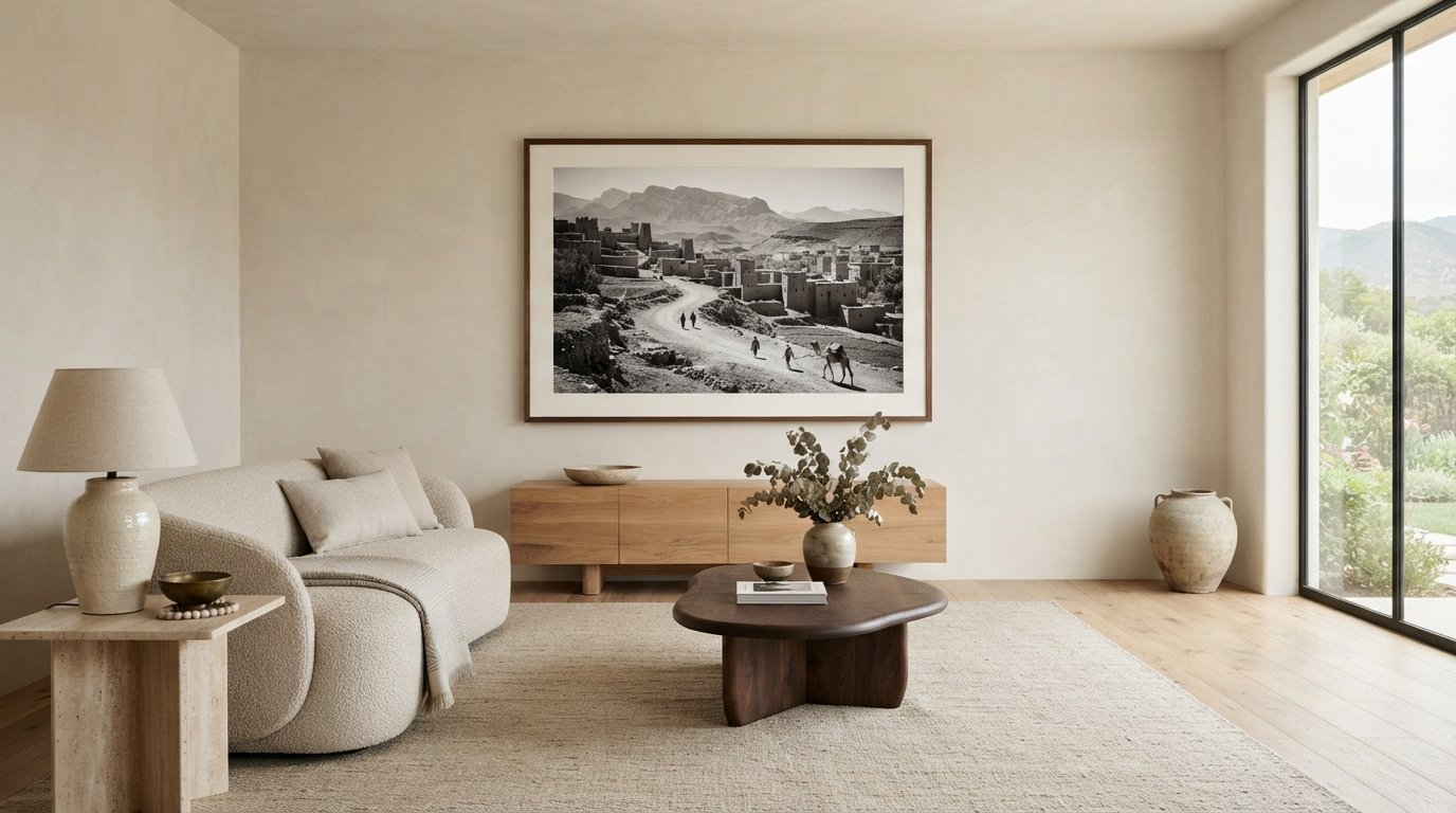
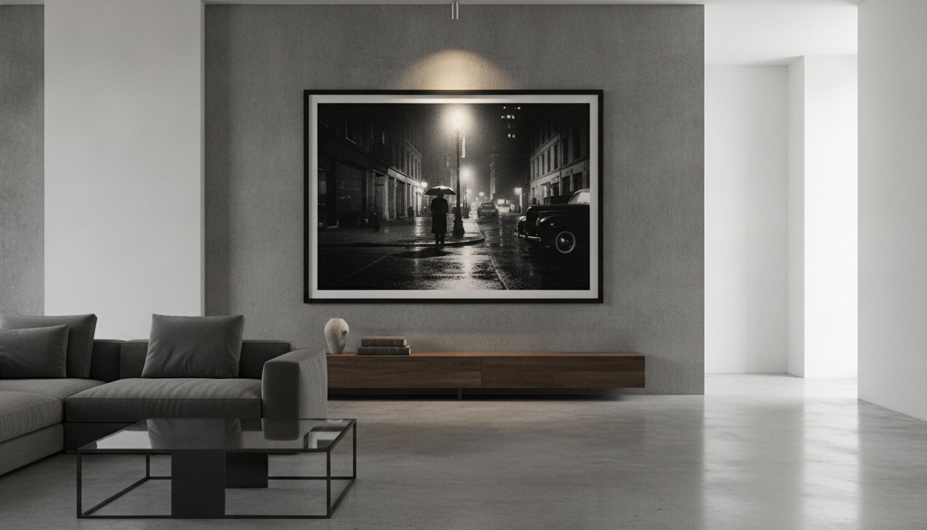
A large print should be centered over the furniture beneath it, rather than automatically centered on the wall. For a starting height, place the center of the artwork 48-56 inches above the floor; knowing how to hang large framed prints also means setting the frame level and choosing support suited to its weight. Above a bed or mantel, a generously scaled piece can anchor the room without feeling disconnected from the furnishings.

Getting the height right is only part of the job. A slight tilt or unsuitable hanging method can distract from the image and its frame. This guide explains how to position a large print, measure and check its level, and choose alternatives to picture wire, such as direct screw mounting or a French cleat. It also covers centering artwork over furniture, locating wall studs, and selecting a suitable hanging method for your room.

Key Takeaways

  • Center a large print over the furniture beneath it to create a considered focal point, and use a wall stud for a more secure installation.
  • Set the artwork’s center 48-56 inches above the floor as a starting point, then adjust the placement to suit the room and viewing position.
  • Check for a level hang by comparing the frame’s lower corners with the floor or using a small round object on its top edge.
  • Explore alternatives to picture wire, such as mounting the frame on two screws or using a French cleat.

Common Question: Should Large Wall Art Be Centered on a Wall or Centered Over Furniture?

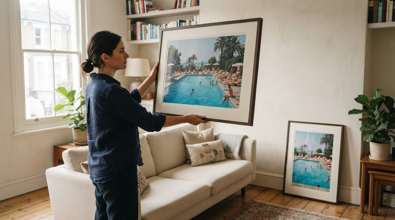
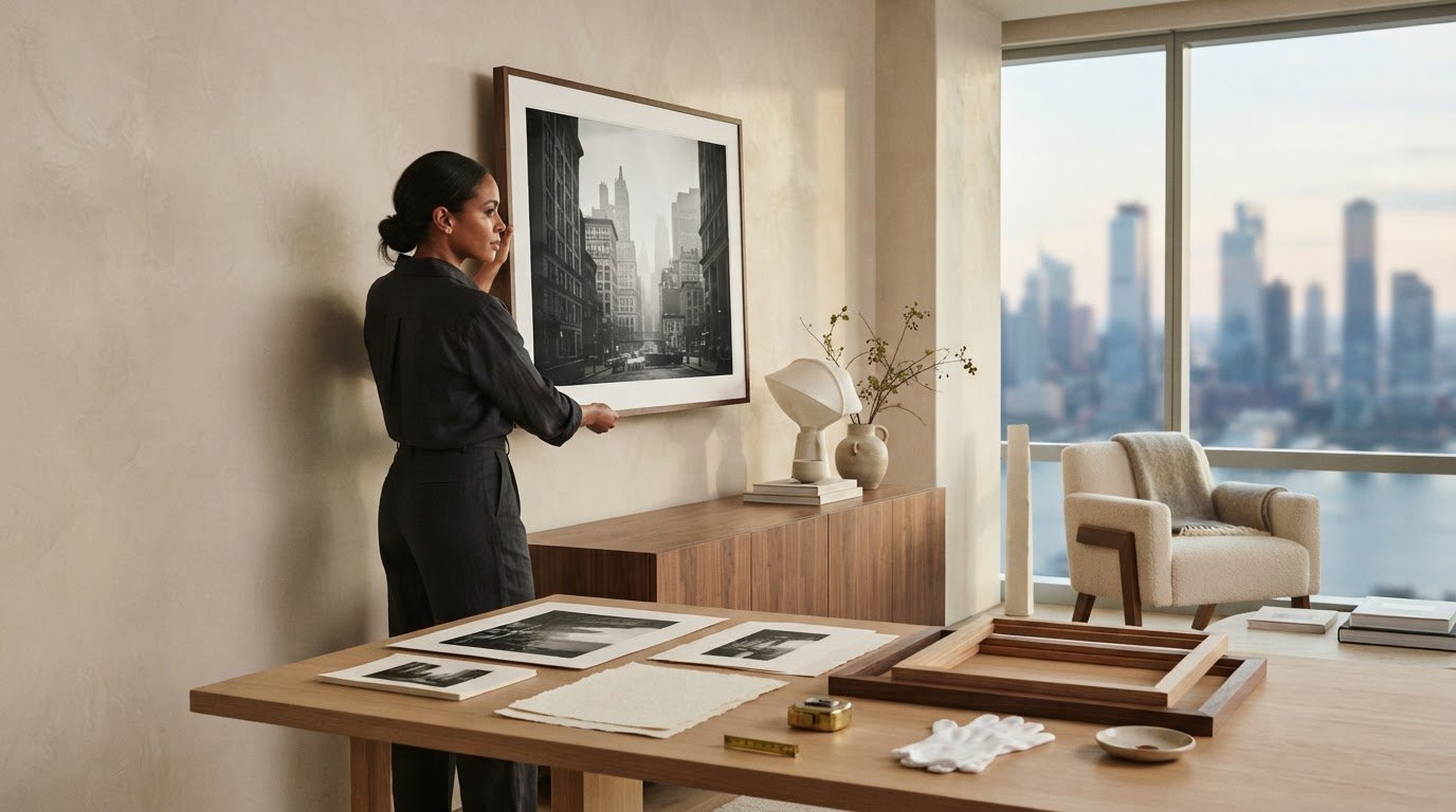
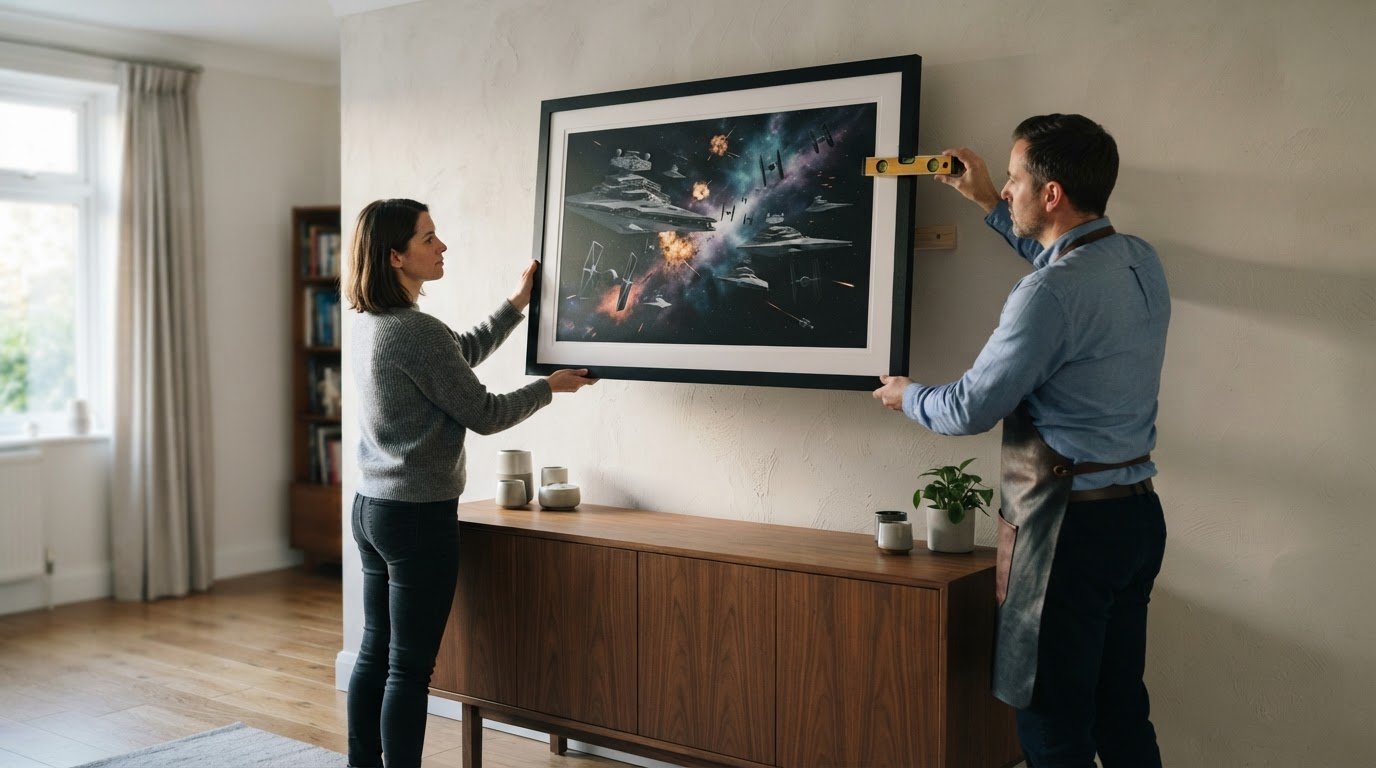
Center a large print over the furniture beneath it when the artwork is intended to anchor the arrangement. Above a sofa, bed, or mantel, align it with the furniture’s center rather than the full wall. For a heavy framed picture, ask someone to help: one person can support the frame while the other marks and secures the hanging points.

  1. Mark the furniture’s center. Measure the width of the sofa, bed, or mantel, then mark its midpoint on the wall. Align the print’s center with that mark. If there’s no furniture below, use the wall’s center as your visual guide.
  2. Find a stud before positioning the bracket. Use a stud finder to locate the wooden framing behind drywall, then mark its center. Studs are typically spaced 16 inches from center to center, with about 14.5 inches of open space between them. For artwork weighing more than 20 pounds, art consultant Faye Urlacher recommends anchoring it into a stud. Attaching the bracket to a stud is the most secure approach.
  3. Choose suitable support for drywall. If the bracket cannot meet a stud, use a wall anchor suited to the frame and its weight. Wall anchors typically support smaller sizes of wall art, even when the bracket misses a stud. Drive screws into the anchor or stud, keeping the bracket straight and firmly seated against the wall.
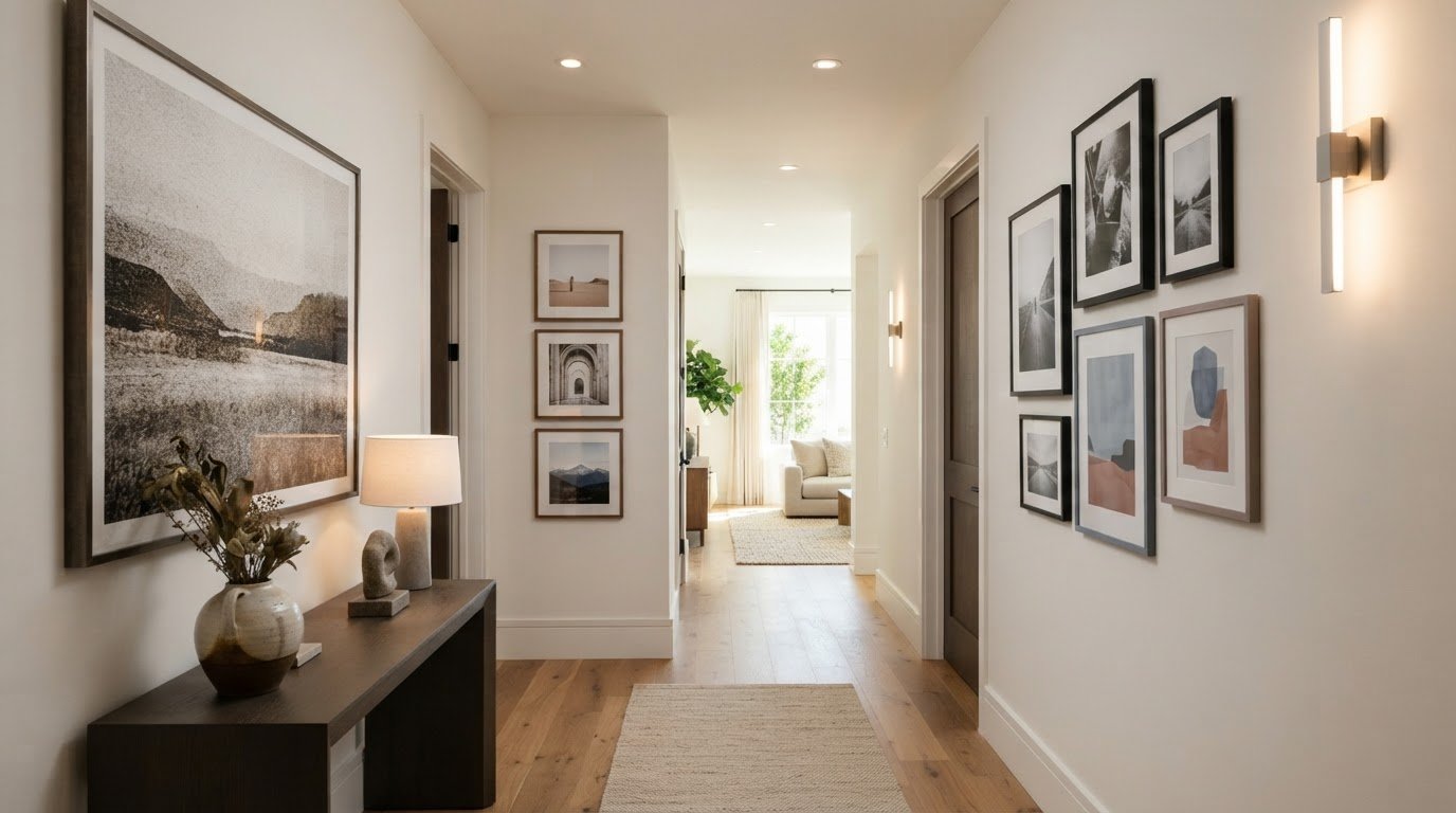
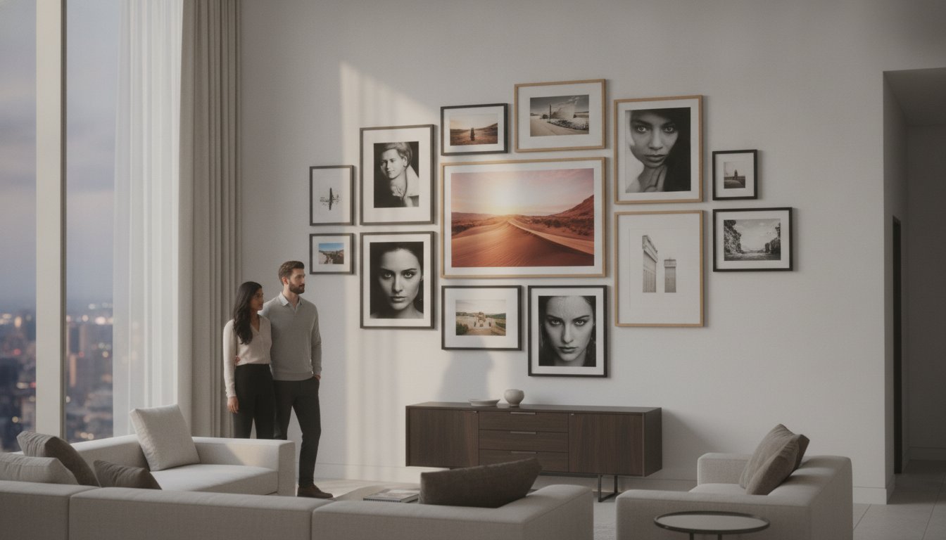
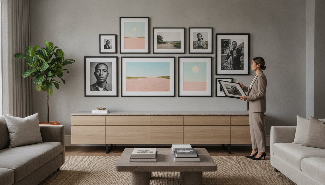
  4. Plan a gallery wall as one composition. Arrange mixed print sizes and objects, such as fiber art or a small shelf, around a shared visual center. Lay out the arrangement before marking the wall, then keep the group aligned over the sofa or bed. This lets each piece contribute texture without competing with the larger frame.

Adjusting and checking artwork level

  1. Set the frame on its hanging points. Once the frame is supported, step back and assess its top edge against nearby architectural lines, such as a mantel or doorframe. These lines help reveal a tilt that may be difficult to notice while standing close. Keep one hand on the frame as you make small adjustments.
  2. Compare both lower corners with the floor. Measure the distance from each bottom corner to the floor, then compare the two measurements. If one corner sits lower, the frame is not level. Shift the frame gently on its hanging hardware, then measure both corners again. Repeat until their distances match.
  3. Use a small round object as a visual check. Place a marble or another small round object on the frame’s top lip. Watch whether it stays in place or rolls toward one side. If it moves, adjust the frame and test again. This simple check complements the corner measurements, especially when the frame’s edge is hard to judge by eye.
  4. Correct movement at the hanging hardware. A frame suspended from picture wire can tilt or shift as it settles. Lift it carefully, reposition the wire on its hook, and lower it back into place. For a frame that leans forward, stick-on felt pads placed a few inches in from the lower corners can help counteract the lean and keep the presentation more composed.
  5. Recheck after the final adjustment. Repeat the floor-distance comparison and the marble test after repositioning the frame. Then view the artwork from the main doorway and from the seating area; a print above a sofa, for example, should appear level from the room’s usual viewpoint. If either test shows a tilt, make another small adjustment rather than forcing one corner.

Finding the right hanging height

Use the artwork’s center as your height reference: place it 48-56 inches above the floor, or start with its middle at standing eye level for a focal piece. To mark the placement, measure from the floor to your chosen center point, then calculate where the frame’s top and hanging hardware will sit. This measured approach makes how to hang large framed prints at the right height more precise.

  1. Choose the viewing position. Stand where the print will usually be seen, such as the main seating area or room entrance. For a single focal artwork, use standing eye level as your starting point. If the print belongs above furniture, consider the composition from the seated position too, rather than judging its height from across the room alone.
  2. Measure the framed print. Record its full height, including the frame, then divide that measurement in half to find the center. For example, if the frame is 30 inches tall, its center is 15 inches below the top edge. Use the outer frame dimensions, not just the image opening.
  3. Mark the center height on the wall. Measure upward from the floor to your chosen center point within the 48-56-inch range. Make a small pencil mark. This mark represents the artwork’s center, not its top edge or the screw position.
  4. Calculate the frame’s top edge. Add half the framed height to the center mark’s height. For a 30-inch frame centered at 52 inches, the top edge will sit at 67 inches above the floor. This gives you a clear reference for checking the planned placement.
  5. Translate the frame position to its hardware. Measure the distance from the frame’s top edge to its hanging point, then mark that distance down from the calculated top-edge position. If the print uses two hanging points, measure each one separately and transfer both positions. Hold the frame against the wall before drilling, then check that its center aligns with your original mark. These measurements help make how to hang large framed prints easier to plan accurately.

Alternatives to picture wire

  1. Hang the frame directly on two screws. This avoids relying on a wire that can shift along its hook. Measure the spacing between the frame’s two hanging points, then transfer that distance to the wall. Set the screws level and align each point with its corresponding screw. Lower the frame onto both supports, keeping one hand on its edge until it sits securely.
  2. Fit two hooks or D-rings for a balanced hang. Attach D-rings a few inches in from the frame’s outer edges, at matching heights. Use their positions to mark two wall hooks, then align the marks before installing the hardware. With a helper supporting the frame, lower each D-ring onto its hook. Two contact points help keep the frame from pivoting around one central hanger.
  3. Use a French cleat for a broad, stable connection. Fix one part of the cleat to the frame and its matching part to the wall, following the hardware’s orientation. Align the wall section before fastening it, then lift the frame and lower the paired sections together. A French cleat may require as few as two drill holes or as many as six, depending on its design.
  4. Choose a no-nail display for a lighter print. Washi tape can hold prints without nails, while a floating shelf lets you lean a framed print against the wall. Set a leaning frame fully on the shelf, rather than balancing it partly over the edge. These approaches suit display preferences that avoid drilled hardware, but they aren’t substitutes for secure support on a heavy frame.
  5. Skip adhesive strips for large framed art. Command Strips aren’t recommended for hanging this wall art. Instead, select a mechanical support that suits the frame and wall, then follow the hardware’s installation directions. After hanging, check that both supports engage and the frame stays in place when lightly touched.

Galerie Prints

Galerie Prints offers a Bespoke Framing Service for customers choosing artwork and considering how its frame will sit in a room. Framing is part of the finished presentation, alongside the image, wall placement, and hanging method. Consider these elements together before installation.

The collections include The Slim Aarons Collection, Terry O’Neill Photography, Cinema Lobby Cards, and Star Wars Limited Edition Prints. Whether you choose a photographic image or a cinematic work, the hanging principles in this guide can help you plan a balanced display and choose suitable support for the framed piece.

For guidance on framing artwork for your space, contact Galerie Prints.

Make the Artwork Part of the Room

The right print does more than fill a wall; it gives a room a visual point of view. When deciding how to hang large framed prints, consider how the image relates to the room’s light, furnishings, and atmosphere. A photograph from The Slim Aarons Collection, Terry O’Neill Photography, or a Cinema Lobby Card can each give a space a distinct character.

Once you’ve chosen an image, plan its placement and framing as parts of the same composition. A considered frame can help the artwork sit naturally among the room’s materials and forms, while a well-planned position gives the image space to draw attention without overwhelming its surroundings.

For guidance as you consider a piece and its presentation, Ask Galerie Prints for hanging advice. Let your next artwork bring a distinctive note of history and character to the room.

Frequently Asked Questions

How high should a large framed print hang above the floor or furniture?

Place the artwork’s center 48-56 inches above the floor as a starting point, or begin with its middle at standing eye level for a focal piece. Above a sofa, bed, or mantel, align the print with the furniture’s center. Consider the room’s usual viewing position, since a piece viewed mainly from a seated area may need a different visual balance.

How do I find wall studs before hanging a large framed picture?

Use a stud finder to locate the stud, then mark its center where the bracket will sit. You can scan nearby areas to identify the stud’s edges and position the mark between them. Studs are typically spaced 16 inches from center to center, but treat that spacing as a guide, not a substitute for locating the stud itself.

What picture-hanging hardware is best for a heavy framed print?

For a heavy frame, attach the hanging bracket to a wall stud when possible. If the frame is designed for two hanging points, mounting it directly on two wall screws can be a more secure alternative to picture wire. A French cleat is another option: its interlocking sections are fixed to the frame and wall. Choose a method suited to the frame’s construction.

How much weight can picture hooks, nails, and drywall anchors support?

There isn’t one safe weight limit for every hook, nail, or drywall anchor. Capacity depends on the specific hardware, the wall material, and correct installation. Read the hardware’s stated rating and compare it with the complete framed artwork’s weight. For artwork weighing more than 20 pounds, art consultant Faye Urlacher recommends anchoring it into a wall stud.

How do I hang a large framed print securely on drywall, plaster, brick, or concrete?

Choose fasteners suited to the wall material rather than treating every surface like drywall. On standard drywall, secure the bracket to a stud or use an appropriate wall anchor if it cannot reach one. Plaster, brick, and concrete require compatible fixings. Before hanging the frame, check that each fastener is firmly in place.

How can I prevent a large framed print from tilting or damaging the wall?

Use two well-aligned hanging points to reduce the frame’s tendency to pivot, then check that it sits evenly after installation. If picture wire makes the frame lean forward, stick-on felt pads placed a few inches in from the lower corners can help counter the angle. Lift the frame to adjust its position instead of dragging its edges across the wall.
How to Display Fine Art Prints at Home on Any Wall

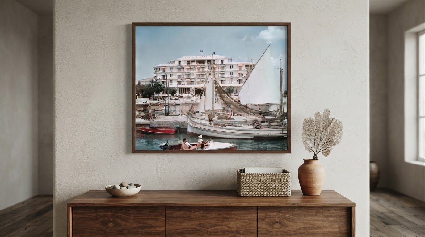
A beautiful print deserves a considered place on the wall. To understand how to display fine art prints at home, begin with scale: position the centre of the artwork about 57 inches above the floor, or hang it 6 to 10 inches above a sofa or console. Above furniture, aim for a print around 60–75% of its width, so the arrangement feels balanced rather than adrift.

It’s easy to focus on the image and overlook how spacing, framing and light shape its presence in a room. A few thoughtful choices can help a print sit naturally with your furniture while preserving the detail and character that drew you to it.

This guide explains how to choose a suitable size, arrange a single work or gallery wall, select hanging hardware for different walls, and limit exposure to direct sunlight. It also explores where prints can make an impression beyond the living room, from stairwells to quieter corners, so your collection feels considered throughout your home.

Key Takeaways

  • Choose artwork that feels proportionate to the wall and nearby furniture, then use its placement to give the room a clear visual anchor.
  • Match hanging hardware to the framed print’s weight and the wall’s support, with stronger support for heavier pieces.
  • Build a floating-frame collage by varying the arrangement thoughtfully and keeping the composition visually balanced.
  • Limit prolonged direct sunlight and consider glazing choices to help protect prints from fading over time.

1. Artwork scale relative to walls and furniture

Begin by measuring the wall and nearby furniture before choosing a print. A common hanging practice places the artwork’s centre about 57 inches above the floor. Above a sofa or console, leave 6 to 10 inches between the furniture and frame. This clearance connects the composition to the room without crowding the furniture. For example, centre a landscape over the sofa, rather than aligning it with one end.

Use furniture width to judge the print’s scale. Artwork above a sofa or console should measure about 60–75% of the furniture’s width. A print that’s much narrower can appear lost, while an oversized piece may overwhelm the arrangement. For a gallery wall, consider the full arrangement as one shape: keep its outer edges at least 6 to 8 inches from wall corners and furniture below. A single large artwork can also anchor a room when the wall needs a clear focal point.

Choose a frame that supports the image’s character and the room’s style. Ornate frames can complement classical or vintage art, echoing the work’s period. Sleek, minimalist frames offer a quieter edge for modern compositions. Before hanging, compare the frame’s visual weight with the artwork: a delicate image may benefit from a restrained border, while a richly detailed piece can hold a more decorative frame.

Light and regular care matter as much as placement. Direct sunlight can fade artwork, so avoid walls that receive prolonged direct sun. Natural light can bring colour to life, but moving a print away from a bright window limits exposure. Rotate unframed prints every few months to reduce the time each one spends in the light. During each rotation, check frames and backings for wear, then rearrange the display to see familiar pieces in a fresh context.

2. Choosing hanging hardware for different wall types

Start with the framed artwork’s weight and the wall’s construction. On drywall, artwork weighing under about 5 pounds can usually hang from one rated adhesive strip or a single anchored hook. For frames weighing 5 to 20 pounds, use two fasteners into studs or two toggle bolts. For pieces over 20 pounds, use two fasteners into studs or a French cleat. These weight ranges help narrow the hardware choice; the wall’s ability to support each fastener matters too.

Locate wall studs before installing heavier hardware. Fastening into studs gives the screws solid support, while toggle bolts provide an option when the placement falls between studs. A French cleat distributes the artwork’s weight across the cleat’s length, helping support a larger frame. Mount its wall-side cleat into studs when possible, and use a level at least 24 inches long to keep the installation straight.

Plan a gallery wall as one composition before hanging individual pieces. For a tight grid, leave 2 to 3 inches between frames; for a looser salon-style arrangement, use 3 to 4 inches. Keep spacing consistent to create visual balance, even when frame sizes differ. The 70/30 guideline suggests artwork occupies about 30 percent of the wall, leaving about 70 percent open. That breathing space helps a collection feel deliberate rather than crowded.

For a lighter, changeable display, prop framed artwork on a stable shelf or against a wall instead of fixing every piece in place. Overlapping frames can create depth, but keep their bases steady and avoid placing them where they could be knocked. Wall Buddies mounting systems are another option; match the specific system’s stated weight capacity to the framed piece and follow its installation instructions. Whether you choose a cleat, anchor or Wall Buddies system, let the artwork’s weight and the wall’s support guide your decision.

3. How Do You Display Fine Art Prints at Home?

A propped floating-frame collage gives framed prints a layered, informal presence without fixing every piece to the wall. Arrange frames on a deep shelf or mantel, then overlap their edges slightly to create depth. Keep the artwork stable, with larger frames behind smaller ones. A relaxed arrangement can leave 4–6 inches between frames, while varied heights make the composition feel collected rather than rigid.

For one print, choose a standalone frame that complements its subject and the room. A restrained profile can let a vivid image command attention, while an ornate frame can enrich classical or vintage artwork. Museum glass allows less than 1% light reflection, helping preserve a clear view when reflections distract from the image. Experiment with the light’s angle, too, so glazing doesn’t mirror a window or lamp.

Framed prints offer a finished presentation and a protective barrier, while frameless prints feel lighter and reveal their edges. To mat and mount a paper print safely, use an acid-free mat and reversible mounting methods, keeping adhesive away from the artwork. The mat creates a visual border and separates the print from the glazing. Avoid pressing the image against glass, which can make later removal difficult.

A sturdy music stand can display a framed print as a temporary focal point in a reading corner or studio. Set the frame securely on its ledge and place the stand where it won’t obstruct movement. For a more permanent display, a wall-mounted frame gives the artwork a defined place. Choose the format according to the room’s function and how often you want to change the arrangement.

Professional framing for fine art prints in the United States has no single set cost. The total depends on the print’s dimensions, frame materials, glazing and mounting requirements, so these choices shape the estimate.

4. Protecting art from direct sunlight and UV rays

Protect prints by avoiding prolonged direct sunlight and keeping them away from moisture, heat, and abrupt temperature changes. Store and display artwork in a stable room between 65 and 75 degrees, away from ventilation drafts. If a home may reach 90 degrees while its occupants are away, consider central air to help manage the indoor temperature.

Glazing can reduce ultraviolet exposure, but protection varies by material. Plexiglass protects artwork from about 60% of UV rays, while museum glass blocks 99% of damaging UV rays. Regular and non-glare glass provide between zero and half protection against UV rays. For a print near a bright window, choose glazing for its protective properties, then position the frame to limit direct sun.

Framing also affects how a print is protected. A well-fitted frame with a backing helps enclose the work, while a mat separates the print from the glazing. Keep paper prints away from kitchens, bathrooms and other areas where moisture could reach the artwork. Avoid hanging valuable art directly above a fireplace, where smoke and heat can cause damage.

Before settling on a statement piece, observe how sunlight moves across the wall during the day. A spot that seems shaded in the morning may receive direct sun later. Move the artwork or use curtains to limit exposure rather than relying on glazing alone. Wall-mounted picture lights or adjustable track lighting can highlight a print in the evening without placing it in the path of a sunny window.

Include care in your display routine: inspect the frame and backing as you rotate prints, and look for signs of moisture or heat exposure. A print near an air vent may face repeated drafts, so choose a more stable wall. These small placement decisions help protect the image while keeping its colours and details central to the room.

Galerie Prints

Galerie Prints brings together photographic and visual works to help you find a piece suited to your home’s scale, mood and existing display. The collection includes The Slim Aarons Collection, Terry O’Neill Photography, Cinema Lobby Cards and Star Wars Limited Edition Prints, each with a distinct visual character to consider when planning a wall or room focal point.

If you’ve chosen a print but want a finished presentation, Galerie Prints also offers a Bespoke Framing Service. It’s a natural next step when framing needs to complement both the artwork and its intended setting. Consider the wall, available light, and surrounding furniture as you decide how the piece should appear. For help exploring fine art prints and framing options, contact Galerie Prints.

Let Your Collection Evolve With Your Home

A considered display can grow alongside the rooms and memories that give a home its character. Rather than treating every wall as a finished arrangement, leave space for a future discovery, a meaningful image or a change in how you use a room. That openness lets your collection feel personal over time, not simply assembled for one moment.

Understanding how to display fine art prints at home is ultimately about making choices that feel true to your space and to you. Notice which images hold your attention, then imagine how their mood might shape a room’s atmosphere. A print can introduce a new visual note or deepen a story already present in your surroundings—and for those inspired to capture and frame their own original work, learning camera techniques through courses like Pictorial can help turn personal vision into wall-worthy prints.

When you’re ready to find a work that feels at home in your space, contact Galerie Prints for help. Let the next piece begin a display that reflects your eye and continues to unfold with time.

Frequently Asked Questions

How Do You Display Fine Art Prints at Home?

Start with the room’s purpose, then choose a print and display style to suit it. A quiet reading nook might suit one intimate framed image, while a hallway can accommodate a sequence of related works. Group pieces by subject, colour palette or personal significance to give the arrangement a coherent point of view. Before hanging, consider how people move through the room and see the artwork.

How do you choose the right wall and placement for fine art prints at home?

Choose a wall where the image can be viewed comfortably and won’t compete with doors, shelves or busy patterns. A stairwell can suit a vertical sequence, while a dining area can give a single image prominence. Avoid spots exposed to direct sunlight, moisture or heat, including walls beside bright windows and above fireplaces. Check how daylight changes across the wall before settling on a position.

What is the ideal height and spacing for hanging art prints?

A familiar starting point is to place the centre of a print about 57 inches above the floor. For a work above a sofa or console, leave 6 to 10 inches above the furniture. In a gallery arrangement, assess the combined group as one composition, then keep its margins visually consistent. Measure from the artwork’s outer frame, not just the paper, so the finished placement matches your plan.

How do you choose frame styles and colors for fine art prints?

Let the image guide your frame choice, then consider the room’s materials and palette. A restrained frame can keep attention on a photograph with strong colours, while an ornate profile may suit a classical subject. Compare a frame sample beside the print and nearby furniture in daylight and evening light. This helps you see whether its tone supports the image or competes with it.

What glazing is best for framing fine art prints: glass or acrylic?

Choose glazing according to the print’s placement and the kind of protection you need. Museum glass blocks 99% of damaging UV rays and reflects less than 1% of light. Plexiglass protects against about 60% of UV rays. Regular and non-glare glass provide between zero and half protection against UV rays. Glazing reduces some exposure, but placement away from prolonged direct sun remains important.

How do you hang framed art prints securely on different wall types?

Match the fastener to both the frame’s weight and the wall. On drywall, one rated adhesive strip or anchored hook is usually enough for artwork under about 5 pounds. Frames weighing 5 to 20 pounds call for two fasteners into studs or two toggle bolts. For heavier pieces, use two fasteners into studs or a French cleat, which spreads weight along its length.

Dining Room Art Styles and Layouts for a Cohesive Look

The most cohesive dining-room art doesn’t need to come as a matching set. Choose pieces that echo the room’s palette or mood, then consider their scale and placement in relation to the table, sideboard, and available wall space. When deciding what art to put in a dining room, consider photography, paintings, vintage prints, or a thoughtful mix of mediums.

It’s easy to focus on the image alone, but framing, proportion, and arrangement also shape how a room feels. A single striking work can lend a dining area quiet presence, while a considered grouping can bring personality and history to a larger wall.

This guide explores styles for modern, traditional, eclectic, and rustic interiors, along with practical ways to choose artwork and arrange it with confidence. You’ll also find ideas for balancing color and subject, choosing a suitable scale, and creating a display that feels connected to the room rather than simply added to it.

Key Takeaways

  • Choose artwork that echoes your dining room’s palette, mood, and style, from pared-back modern spaces to layered eclectic interiors.
  • Consider how a piece’s medium, subject, and frame contribute to the room’s overall character.
  • Plan a gallery wall or grid around the wall’s shape and the furniture below it, using a paper layout to refine the arrangement before hanging.
  • Explore photographic art, cinema imagery, and limited edition prints when you want a display with a distinctive sense of history and personality.

1. Dining room wall art styles and paintings

Choose dining room wall art that connects with the room’s colors, furnishings, and atmosphere. Muted paintings can soften saturated walls, while vintage fruit and vegetable prints bring playful character to a breakfast nook. Botanical imagery, including a succulent wall or wreath, can fill a broad, open surface. A hanging succulent adds living color to a small dining room or ledge. For a custom-feeling display, repeat a color or subject across several works without matching every frame.

Above a dining table, choose artwork proportionate to both the table and the wall, rather than overwhelming the setting. For a buffet or console, let the artwork span about two-thirds to three-quarters of the furniture’s width. To plan a gallery wall, cut paper templates to match each frame, tape them to the wall, then adjust the arrangement before hanging. This reveals gaps and uneven spacing without putting extra holes in the wall.

Seasonal-color art can stay in place beyond one holiday, while holiday-themed pieces help set a festive scene for family dinners and parties. For a flexible update, use a wall-mounted vase and change its flowers with the season. Vintage-inspired prints also pair naturally with related images for a collected, coordinated effect.

Adjustable lighting lets you shift attention and mood as the dining room changes from daytime meals to evening gatherings. Position art to receive natural light without direct sun, which can fade it; UV-resistant glass can help protect works exposed to sunlight. Keep pieces away from high-humidity areas and potential food splashes. Dust framed photographs and prints with a microfiber cloth, and clean glass without spraying cleaner directly onto it.

To decorate on a budget, begin with one focal print, use existing frames, or build a display gradually. Choose inviting themes such as botanicals, vintage produce, or warm seasonal colors, then repeat a hue already present in the room.

2. Art styles for modern, traditional, eclectic, and rustic rooms

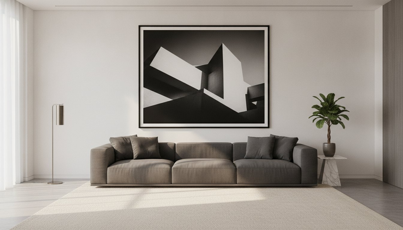
In a modern dining room, choose pieces with clear shapes, restrained palettes, or graphic compositions. A monochrome architectural photograph can complement streamlined furniture without competing with its silhouette. Abstract art also suits contemporary spaces, especially when a color echoes a chair, pendant, or table setting. Let clean lines guide the frame choice, keeping attention on the image. For this style, choosing what art to put in a dining room often comes down to visual clarity.

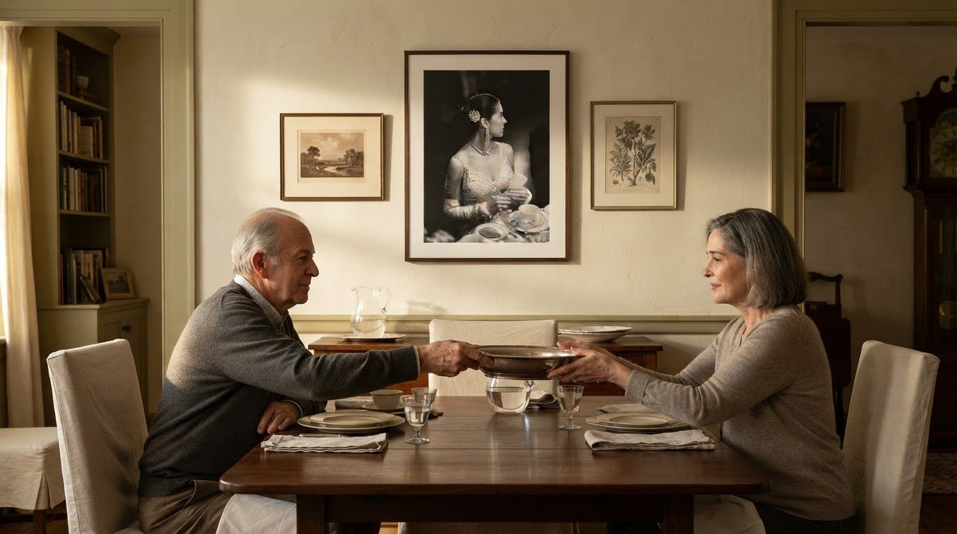
Traditional rooms welcome subjects with a sense of history, including still lifes, portraits, and classic landscapes. A formal dining table and carved chairs can support richly toned imagery, while an ornate frame reinforces the room’s established character. For a lighter interpretation, pair traditional subject matter with a quieter frame. The result feels considered, not like a display assembled from unrelated period references.

An eclectic dining room can bring contrasting eras together, provided the display has a visual thread. Combine a contemporary abstract with a vintage portrait, then connect them through repeated colors or similar frame finishes. Alternatively, let the frames vary while keeping the artwork within one subject family. This gives dining room wall art personality without making every piece compete for attention.

Rustic interiors pair naturally with landscapes, botanical studies, and imagery recalling mountain or country life. For example, vintage skis or snowshoes can hang above a buffet alongside a vintage ski-lodge print. Wood furniture and textured finishes give these pieces a fitting setting. Keep the arrangement deliberate, so the objects feel curated rather than gathered at random.

Begin by identifying the room’s strongest feature, such as a modern light fixture or farmhouse table. Then decide what art to put in a dining room by choosing work that complements that feature or introduces a deliberate contrast. A pale landscape can soften dark timber; a bold graphic print can sharpen a rustic interior. Repeat one visual detail, such as a color, subject, or frame finish, to give the selection cohesion.

3. Art mediums and cohesive room design

The medium changes how artwork relates to dining furniture, lighting, and nearby materials. Photography offers crisp detail, from a quiet landscape to a lively street scene. A print on paper can feel refined and graphic, especially with a generous border. Canvas brings a softer surface presence, while a framed photograph can introduce sharper edges beside rounded chairs. Choose a medium for its visual character, not simply because it matches another piece.

Build cohesion through deliberate contrasts. Pair a richly textured wall with a smooth photographic print, or place a detailed image near simple, sculptural tableware. If the room already includes glass, polished metal, and glossy finishes, matte artwork can temper their brightness. In a timber dining room, a dark frame can echo the table, while a pale mount creates separation around the image.

Consider how each work’s frame, mount, and finish contribute to the whole. A narrow black frame can connect photographs with different subjects; a natural wood frame can relate a botanical print to a timber sideboard. For a more collected display, vary frame profiles but repeat one finish. This small choice helps distinct pieces feel intentional without making them identical.

Think about the view from the table as well as the room’s entrance. A large photographic image can anchor the main wall, while smaller works on an adjacent surface carry its colors or subject into the wider space. A sculptural object on a console, such as a botanical piece from Taraxacum Orbis – Dandelion Sphere, can add depth beside two-dimensional art, provided it doesn’t crowd the display. Keep the arrangement visually balanced with the furniture and table settings.

To elevate the room, select one work as the focal point, then let secondary pieces support it through tone, subject, or framing. A serene coastal photograph might sit comfortably beside a simple ceramic vessel and linen tablecloth. By contrast, a vivid print can supply the room’s strongest accent, with quieter surrounding materials giving it space to command attention.

A grid gives dining room photos a measured, architectural presence. Choose frames with matching proportions, then align their edges into orderly rows and columns. This structure suits a modern interior, where repeated lines can echo cabinet fronts or a rectangular dining table. Keep the images related through a shared subject, tonal range, or frame finish. For example, black-and-white travel photographs create a unified display without repeating the same scene.

Gallery walls allow more variety. Begin with one larger image as an anchor, then arrange smaller pieces around it. A landscape photograph might sit beside a portrait and a graphic print, with a recurring color tying them together. Balance the composition around its visual center, rather than letting every frame pull to one side. This looser arrangement can bring character to a traditional or eclectic dining room.

Match the layout to the wall and the furniture beneath it. A wide wall above a sideboard can accommodate a horizontal arrangement; a narrow wall between doorways may suit a vertical grouping. Keep the display’s outer shape deliberate, even when frame sizes differ. Consistent spacing helps a varied collection feel composed. Leave enough breathing room around a standout image, so nearby photos enhance rather than diminish its presence.

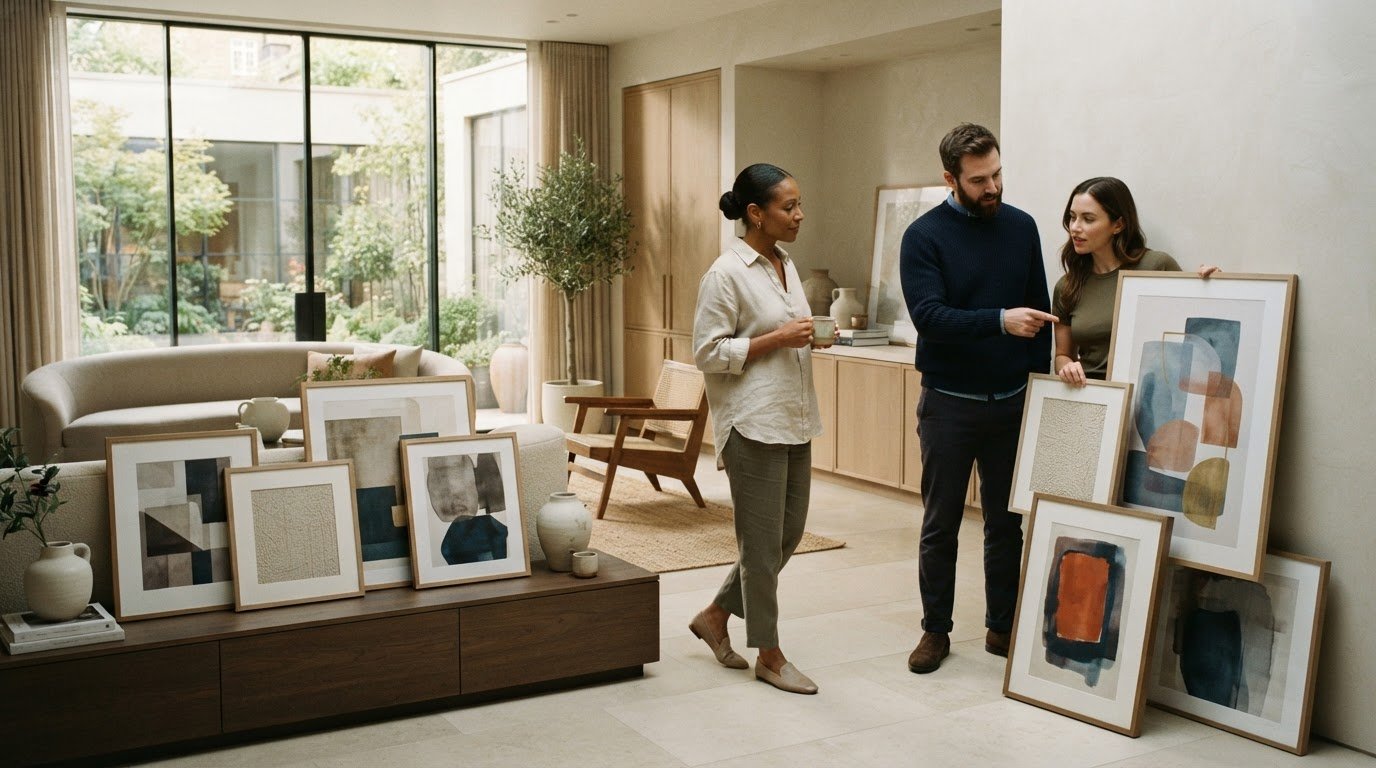
Before hanging, arrange the frames on the floor and view them from the dining table and room entrance. Adjust the order until the colors and subjects move naturally across the composition. A grid depends on precise alignment, while an eclectic gallery wall benefits from a clear visual anchor. If you’re selecting a focal image for your arrangement, explore photographic prints for inspiration.

Galerie Prints

Galerie Prints offers photographic art and prints for readers shaping a dining-room display with character. Its selection includes The Slim Aarons Collection, Terry O’Neill Photography, Cinema Lobby Cards, and Star Wars Limited Edition Prints, offering distinct subjects and visual moods to consider alongside your room’s palette and furnishings. Choose a work that complements the atmosphere you want, whether that means a nostalgic image, a cinematic reference, or a vivid focal point. The Bespoke Framing Service can help complete the presentation when framing is part of your plan. If you’re narrowing down artwork for your dining room, contact Galerie Prints to discuss your choices.

Choose a Piece That Feels Like Yours

Before making a final choice, consider the atmosphere you want guests to carry with them after a meal. A dining room can feel contemplative, lively, nostalgic, or quietly refined, and artwork can help establish that character. Choosing what art to put in a dining room becomes more personal when you think beyond coordination and ask which image you’ll enjoy seeing on ordinary evenings as well as during special gatherings.

Picture the work from the seat where you spend the most time. Notice whether its subject holds your attention, whether its mood suits shared meals, and whether it feels connected to the home around it. The right choice needn’t follow a single decorating formula. It should give the room a point of view and make the space feel distinctly yours.

For thoughtful guidance as you consider your next piece, contact Galerie Prints for art advice. Let your dining room become a setting for art that continues to reward your attention.

Frequently Asked Questions

What types of art work best in a dining room?

Photography, paintings, and prints can all suit a dining room when their subject and visual intensity fit the setting. Consider how the image feels during a meal: a serene landscape creates a quieter mood, while a lively portrait or cinematic image adds energy. For a polished, personal touch, choose artwork with a subject that reflects your interests or gives guests an inviting point of conversation.

How do I choose dining room art to match my decor and color scheme?

Start with a color already present in a lasting room feature, such as upholstery, a rug, or cabinetry. Choose artwork that repeats that tone, or use a complementary color for a more pronounced contrast. For example, a print with a warm accent can connect to wood furniture without matching it exactly. Consider the colors in daylight and evening lighting before settling on your selection.

How high should art be hung in a dining room?

Hang art where it feels comfortable to view from the dining chairs, rather than positioning it solely for someone standing nearby. Sit at the table and assess the image’s center against your natural line of sight. If the piece sits above a sideboard, consider the furniture and the space between its surface and the frame. This helps the artwork feel connected to the dining area.

Should dining room art be one large piece or a gallery wall?

Choose one large piece when you want a clear focal point and the wall can give it visual space. A gallery wall works well when you want to bring several subjects or memories together. Consider the room’s existing visual activity: patterned wallpaper or decorative furniture may pair more easily with one restrained image, while simpler surroundings can accommodate a more varied display.

What materials and finishes are best for dining room artwork?

Choose a finish that suits the artwork and the room’s surfaces. A framed print can give a crisp, defined presentation, while canvas offers a less reflective appearance. Glass, metal, and wood frames each create a different relationship with nearby furniture and lighting. In a busy dining area, a frame can also separate the artwork from casual contact, while a simple finish keeps attention on the image.

How to Choose Art for Above the Bed and Get the Height Right

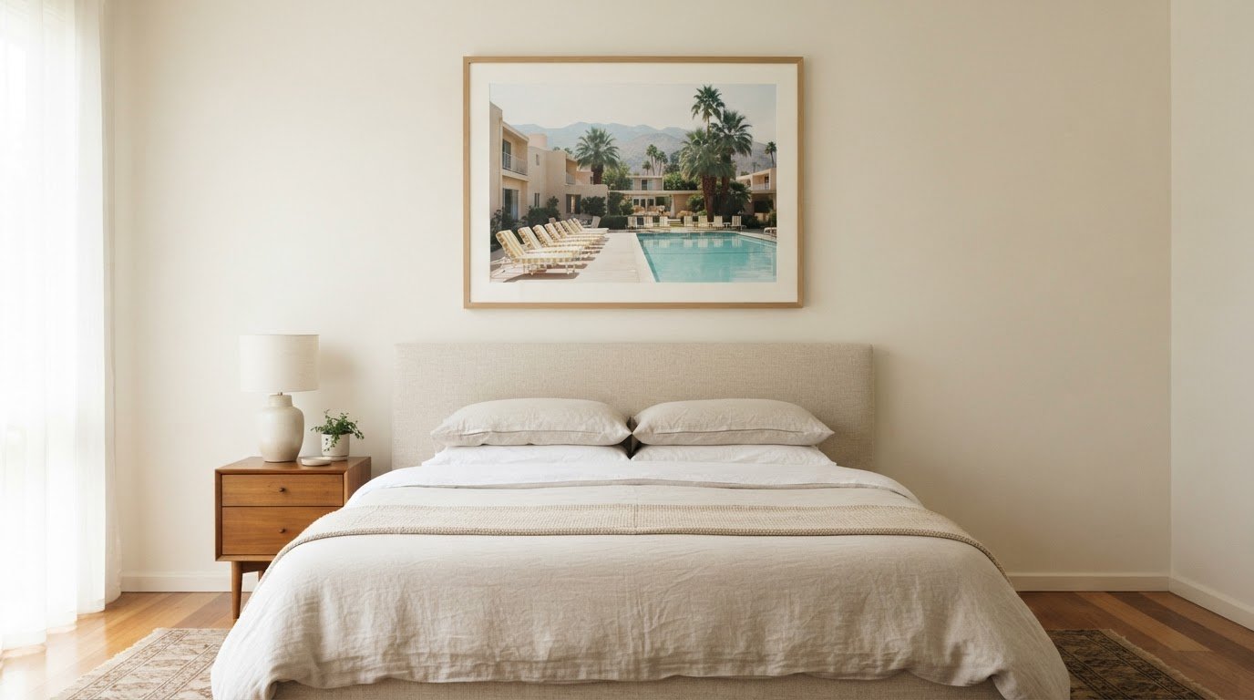
A restful arrangement begins with proportion, not a dramatic image. To learn how to choose art for above the bed, start with a piece about two-thirds to three-quarters of the bed’s width, then hang its bottom edge 6–8 inches above the headboard. These simple measurements create a considered connection between the artwork and the bed without letting either overwhelm the room.

The image matters as much as its scale. A bedroom is a place to unwind, so artwork with a quieter mood, harmonious colours and gentle visual movement may feel more at home than a composition that demands constant attention. The right choice can bring character and history to the room while preserving its calm.

This guide explains how to balance artwork with your bed and headboard, adapt its size and hanging height to the ceiling, and choose imagery that supports a restful atmosphere. You’ll also find practical guidance on single pieces and multi-work arrangements, so the wall above the bed feels composed rather than crowded.

Key Takeaways

  • Let the headboard’s height and shape guide how closely the artwork sits above it.
  • Use the bed, windows and surrounding colours to help the artwork feel composed within the room.
  • Choose imagery with a calm visual character to give the bedroom a more restful atmosphere.
  • Decide whether a single image or a considered grouping best suits the wall and the story you want it to tell.

1. Adjusting artwork to ceiling height and headboard style

Begin with the bed’s width, then consider the headboard and ceiling. Artwork often looks balanced at about two-thirds to three-quarters of the bed’s width. For a 60-inch queen bed, a piece measuring 40–50 inches wide offers a useful reference. A 76-inch king bed generally suits artwork 50–60 inches wide, while a 54-inch full bed suits 36–45 inches.

Headboard proportions refine that choice: artwork can span 50–75% of its width. A 60-inch headboard, for example, pairs with art 30–45 inches wide. Avoid a piece that disappears against a broad headboard or dominates a narrow one. In a bedroom with standard 8-foot ceilings, artwork 20–30 inches tall usually fits comfortably, leaving breathing room above the bed.

Set the bottom edge about 6–12 inches above the headboard with a standard 8-foot ceiling. A tall or upholstered headboard—such as the styles available from Sheepbridge Sofas & Beds—can feel better with a closer 4–6-inch gap. With a low-profile or absent headboard, artwork may hang up to 30 cm above it. Keep the composition visually connected to the bed rather than drifting toward the ceiling.

One large piece creates a calm focal point; a gallery wall adds rhythm and can accommodate several images. Above a king bed, try two 24-inch pieces or three 16-inch pieces. A queen bed can suit two 20-inch pieces or a diptych. Keep the arrangement visually unified and within the bed’s overall width.

In a small bedroom, light-coloured artwork can make the wall feel more open, especially when its palette echoes the bedding. Choose a subject and style that suit the room: serene landscapes complement a quiet, traditional scheme, while graphic imagery can sharpen a modern interior. Photographic art has a different character from a painter’s brushwork, so let the room’s existing textures guide your selection.

There’s no single typical cost for art above a bed; the artist, format, dimensions and framing all affect the price. Use appropriate hanging hardware for the artwork’s weight, and choose hardware designed for heavier pieces, such as mirrors, when extra support is needed.

2. How high should wall art hang above the bed?

Hang framed art with its bottom edge about 6–8 inches above the headboard. That gap keeps the work visually connected to the bed without crowding the headboard. In a bedroom with a wide headboard, center the artwork over the bed, not automatically across the entire wall.

Read the room’s layout before settling on placement. If the bed sits between two windows, center a single work or triptych in that space. Its top edge doesn’t need to align with the window frames. In a room with two beds, place one work above each bed or center a single composition over a shared table.

A calming scheme comes from thoughtful editing, not matching every detail. Choose one or two colours already present in the bedding, curtains or rug, then let the artwork add a measured accent. A pale landscape, for example, can complement neutral linen, while a dark image can make a deliberate statement against a light wall. Keep bedside décor simple so the art remains the focal point.

Frames shape the artwork’s presence. A slim frame can suit a smaller bedroom, where a heavy border might feel imposing; a substantial frame can echo substantial furniture. Match the frame’s finish to an existing detail, such as a bedside table or lamp, rather than repeating every finish in the room. For a gallery wall, consistent framing helps unify the pieces.

Alternatives to framed art include a textile wall hanging or decorative wall panel. Choose a calm surface and restrained colours, then position it above the bed as the room’s central artwork.

Let personal style set the mood: a quiet composition can support a restful bedroom, while a vivid image brings more personality. The choice needn’t be literal; select a meaningful subject that suits the room’s palette. Before hanging it, step back from the bed and check that the artwork feels balanced with the headboard and surrounding walls.

3. Hanging height above headboards and pillows

Without a headboard, use the pillows as your reference point. Arrange them as you normally would, then measure from their upper edge to the artwork’s bottom edge. An 8–10-inch gap gives the composition breathing room while keeping it visually connected to the bed. This makes pillow placement part of the hanging decision, not an afterthought.

If your bed has a headboard, treat its top edge as the artwork’s visual anchor. The frame should feel connected to the headboard rather than floating midway up the wall. Compare the gap with the spacing around nearby furniture, such as bedside tables and lamps. If everything is too tightly clustered, the whole bed wall can feel compressed, even when each object suits the room.

Check the position from the places where you’ll actually see the work. Stand at the bedroom entrance, then sit on the bed and look toward the wall. An abstract composition may read clearly across the room but feel too dominant from the pillows. Adjust its placement until the artwork complements the bed from both viewpoints.

Before hanging, mark the proposed frame outline with removable paper. This lets you assess its position above the bed in relation to the headboard, pillows and surrounding furniture before making holes. For a multi-piece arrangement, mark every outline and preserve consistent spacing between pieces. A balanced overall shape matters more than aligning each frame individually with the bed’s centre.

Consider the wall’s vertical proportions, too. On a low-ceilinged wall, artwork placed too close to the ceiling can feel crowded; on a tall wall, a small piece may look adrift. Use the bed and headboard as the composition’s centre of gravity, then judge whether the artwork has enough space above and around it. The final hanging height should feel intentional from the doorway and restful from the bed.

4. Choosing restful imagery and textures

A restful image gives the eye somewhere gentle to settle. Consider a quiet coastline, soft botanical forms or a still life in muted colours. These subjects create visual interest without sharp contrast or dramatic movement that could overwhelm a sleeping space. When deciding how to choose art for above the bed, consider whether its mood feels composed from the pillows, not only from the doorway.

Texture influences a room’s atmosphere as strongly as subject matter. A photograph with fine tonal gradations feels different beside crisp cotton than a heavily textured canvas beside woven bedding. Let one surface lead: pair a richly detailed image with simpler linens, or let a restrained image complement tactile cushions and a wool throw. Exploring collections from Campbell Contemporary, which pairs original art with bespoke interior accessories, can help coordinate tactile finishes across the entire room. This balance keeps the wall from competing with the bed.

For a cohesive selection, notice the colours already present in the room. A muted green in the artwork can echo a plant or bedcover; warm ochre can connect with wood furniture. Choose a dominant tone and one supporting accent rather than repeating every colour in the palette. The result feels intentional without making the bedroom look staged.

Feng shui interpretations vary, so treat them as a personal design lens rather than a fixed formula. Choose imagery that suggests the feeling you want in the room, such as peaceful water or a balanced landscape, and avoid scenes that feel tense or unsettling to you. A symmetrical composition can also give the bed wall a sense of visual order.

Think about placement as part of the image’s effect. A busy composition can feel intense directly above the pillows, while a quieter scene may create a softer focal point. Before hanging the work, view it in daylight and lamplight; changing light can alter its colour and contrast. If the image still commands attention after the room lights dim, consider gentler imagery or simpler surroundings.

The question of how to choose art for above the bed becomes easier when you judge subject, palette and surface together. Let the final choice express your taste while preserving the bedroom’s calm. Explore photographic artwork for a restful bedroom to consider images with distinctive atmosphere and character.

Galerie Prints

Galerie Prints brings together photographic and cultural imagery for anyone seeking a distinctive focal point above the bed. Explore The Slim Aarons Collection, Terry O’Neill Photography, Cinema Lobby Cards and Star Wars Limited Edition Prints to find a subject whose mood and visual character suit your bedroom. Galerie Prints also offers a Bespoke Framing Service, helping you create a considered presentation for your artwork and interior.

Once you’ve settled on scale and placement, explore Galerie Prints’ collections for a work that adds personality without disturbing the room’s calm. To discuss artwork for above your bed, contact Galerie Prints.

Let the final choice feel like yours

Art above the bed deserves a place that feels considered, not simply filled. Let the image’s atmosphere become part of the room’s quiet rhythm, bringing a personal association that still feels restorative at the close of the day.

As you live with your selection, notice how it meets changing light, familiar objects and the room’s evolving character. A piece can hold meaning without becoming the loudest presence; that balance is what makes it feel truly at home.

Ultimately, how to choose art for above the bed comes down to creating a relationship between the image, the interior and the feeling you want to return to. Trust the subject that continues to resonate rather than chasing a passing fashion.

Galerie Prints offers a thoughtful point of departure for finding artwork with lasting character. When you’re ready to consider what belongs in your bedroom, contact Galerie Prints for art advice.

Frequently Asked Questions

How high should wall art hang above the bed?

With a headboard, place the artwork’s bottom edge about 6–8 inches above its top. That measurement leaves a visible gap while keeping the work connected to the bed. If the headboard is tall or upholstered, a narrower 4–6-inch gap may suit the proportions better. For a bed without a headboard, measure from the pillows instead and leave about 8–10 inches.

How do you choose the right art for above the bed?

Choose artwork that suits the room’s mood, available wall space and existing colours. A quiet landscape, for example, can complement neutral bedding, while a vivid photograph can provide a deliberate focal point in a restrained room. Consider how the image feels from the bed, not just how it looks from the doorway. Choose a subject you’ll enjoy seeing as the room’s atmosphere changes through the day.

What Size Wall Art Works Best?

Artwork around two-thirds to three-quarters of the bed’s width is a useful starting point. The right height depends on the open wall above the headboard and the ceiling, so consider the whole composition rather than width alone. A wide, low-format image, for instance, can suit a broad bed, while a taller piece may work better where the wall has more vertical space.

How wide should art above a bed be compared with the headboard?

Aim for artwork spanning about 50–75% of the headboard’s width. For a 60-inch-wide queen headboard, that corresponds to artwork around 30–45 inches wide. Measure the headboard itself, especially if it extends beyond the mattress, then centre the artwork over the bed. This keeps the piece proportionate without making the headboard appear visually narrow or crowded.

How high should artwork hang above a bed?

For a bed without a headboard, position the bottom edge of the artwork about 8–10 inches above the pillows. Arrange the pillows as they’re usually used before measuring, since stacked or decorative pillows change the visible gap. If the bed has a headboard, use its top edge as the reference instead. In either case, view the placement from the bed before final hanging.

What size art works above a king, queen, or full bed?

For a king bed, consider artwork 50–60 inches wide; for a queen, 40–50 inches; and for a full bed, 36–45 inches. These ranges provide a starting point, not a fixed prescription. If choosing several works, judge their combined width, including the gaps between frames. A balanced grouping should read as one arrangement above the bed, rather than scattered pieces.

How to Choose an Art Print Size for Your Wall and Artwork

Knowing how to choose art print size begins with the image’s proportions, the available wall space, and its pixel dimensions. Common options include 5 × 7, 8 × 10, 11 × 14, 16 × 20, 18 × 24, and 24 × 36 inches, from intimate accents to room-defining statements. For a digital image, divide each pixel dimension by 300 to estimate the maximum print dimension in inches.

It’s easy to focus on the wall and overlook the image itself. A print may suit the room beautifully, yet lose detail if enlarged beyond the resolution the image can support. Knowing how to choose art print size means balancing the setting with the clarity and character that drew you to the artwork.

This guide explains how to choose art print size by comparing familiar dimensions, matching them to the artwork and display space, and considering image resolution. You’ll have a clearer way to compare options and choose a print that feels considered, not merely large enough to fill a wall.

Key Takeaways

  • Compare familiar print dimensions, from compact 5 × 7-inch pieces to dramatic 24 × 36-inch displays, to find a scale that suits your space.
  • Match the artwork’s proportions to a compatible print format so its composition remains balanced, whether framed, on canvas, or presented on acrylic.
  • Use the wall and nearby furniture as a guide: artwork often feels balanced when it spans about two-thirds to three-quarters of the available width.
  • Estimate a digital image’s suitable print dimensions by dividing its pixel measurements by 300, then consider whether its aspect ratio fits your chosen size.

What Are the Common Print Sizes for Art?

Common art print sizes range from 5 × 7 inches to 24 × 36 inches. Knowing how to choose art print size means weighing the image’s proportions against the wall and display setting.

Print formats and size comparisons

Print dimensions describe the artwork’s surface, while frames add to its overall footprint. This distinction matters when measuring a wall or selecting a frame. A frame can add 1-3 inches to the artwork’s overall size, so include its outer edges in your measurements. Canvas and acrylic prints also have stated dimensions, but their presentation differs from framed prints.

Matching print sizes to display settings

Display setting means the wall, furniture, and surrounding space where the artwork will hang. Matching the scale to that setting helps a piece feel intentional. For a small nook or gallery wall, 8 × 10-inch or 11 × 14-inch prints suit compact arrangements. Above a sofa, a 24 × 36-inch print can anchor a living room, while a larger wall can accommodate more expansive pieces.

Choose one large print when you want a singular focal point and an uninterrupted composition. Choose a gallery wall when several smaller pieces—from fine photographs to framed printable art from Fun With Crayons—can work together to create a balanced visual arrangement.

Size visualization and popular uses

Size visualization means comparing a print’s dimensions with familiar objects or a measured wall outline. It helps you judge scale before choosing a format. A 16 × 20-inch print has roughly the area of two standard sheets of paper side by side; an 18 × 24-inch print resembles four sheets arranged in a grid.

Popular fine art sizes include 8 × 10 inches for small spaces, 11 × 14 inches for standalone display or collections, and 16 × 20 inches for greater presence. An 18 × 24-inch print suits a larger wall, while 24 × 36 inches creates a dramatic focal point. For how to choose art print size, keep the artwork’s composition intact when selecting a square or rectangular format.

Small, medium, large, and oversized print dimensions

Size labels indicate scale, but the wall and placement determine how the artwork reads. Measure the available space first to narrow down dimensions without letting a frame or nearby pieces crowd the composition.

Measure the wall’s width and height, then allow at least 2-3 inches of breathing room around the print. For a wall above furniture, compare the artwork’s width with the furniture beneath it; a piece spanning about two-thirds to three-quarters of the available width often feels balanced. Include the frame in your measurement.

Preview the dimensions by marking the proposed outline with painter’s tape. Leave it in place for a day, then view the shape from the room’s usual entrance and seating area. This helps you judge how the print will relate to furniture and nearby wall space before choosing a format.

Size categories offer a useful starting point:

  • Small: 5 × 7, 6 × 8, and 8 × 10 inches suit shelves, compact walls, and a collection of smaller prints.
  • Medium: 10 × 10 and 16 × 24 inches give artwork more presence without requiring an expansive wall.
  • Large: 18 × 24 and 20 × 20 inches can hold attention above smaller furniture or on a broad wall.
  • Oversized: 30 × 40 and 36 × 48 inches suit spacious rooms and open wall space.

Common frame dimensions can influence the choice. For instance, 11 × 14 inches is a familiar frame size, but it doesn’t exactly match a 4:5 image ratio, so fitting the artwork may require adjusting its crop or presentation. Hang framed art with its centre approximately 57-60 inches from the floor. Above furniture, keep the lower edge 6-10 inches above the top edge.

Choosing print size for the artwork and display space

Consider the artwork’s proportions, the wall’s dimensions and the nearby furniture. A useful starting point is to let wall art occupy about two-thirds to three-quarters of the available width, then adjust for the image format and room.

Artwork proportions around furniture

Artwork proportion describes the print’s width in relation to the furniture beneath it. This relationship matters because a piece that’s too narrow can feel detached, while an overly wide one can overwhelm the arrangement. Above a 72-inch sofa, a print spanning 48-54 inches provides a practical reference. For a pair or a gallery wall, consider the combined width of all pieces, including the gaps between them.

In a bedroom, compare the print with the bed’s width and the open wall area above it. A broad wall can support a larger format, while a smaller wall beside a doorway may suit a narrower piece. Measure the full display area before choosing a custom crop or frame.

Viewing distance and print size

Viewing distance is how far away someone typically stands or sits from the artwork. It matters because a print seen across a living room needs a clear, readable composition, while details in a smaller work may reward closer viewing. Consider the main viewpoint, such as a sofa or dining chair, when choosing dimensions.

For a gallery wall, assess each image both up close and from across the room. Smaller pieces can reward close viewing, while a larger central print gives the arrangement a visual anchor from farther away. Keep the format in proportion to the room’s sightlines.

The room’s use also shapes your choice. In a living room, a prominent landscape or portrait can anchor the main seating area; in a narrow hallway, a smaller vertical format may suit the available wall. Whether curating contemporary visual artwork from studios like Mark Finzel Art and Design or displaying classic prints, choose a piece whose subject and composition feel at home in the setting, rather than enlarging every image to fill the space.

For your final decision, measure the furniture and display area, then compare them with the print’s full dimensions, including the frame. Leave breathing room around the piece and check that the artwork’s original proportions remain intact. A format that balances the image, furniture and viewing position will feel considered in the room.

Estimating print size from image resolution

Image resolution helps estimate how large a digital file can print while retaining detail. Divide each pixel dimension by 300 to estimate its maximum print dimension in inches. For example, a 6000 × 4000-pixel image suits a print around 20 × 13 inches or smaller at that resolution.

Calculate width and height separately while preserving the image’s aspect ratio. If a common print format has different proportions, cropping may remove part of the composition. A square crop, for instance, cannot show the full width of a rectangular image without changing its framing.

These examples show the pixel dimensions associated with several print formats at 300 DPI:

  • 8 × 10 inches: 2400 × 3000 pixels.
  • 11 × 14 inches: 3300 × 4200 pixels.
  • 16 × 20 inches: 4800 × 6000 pixels.
  • 18 × 24 inches: 5400 × 7200 pixels.
  • 24 × 36 inches: 7200 × 10800 pixels.
  • 30 × 40 inches: 9000 × 12000 pixels.

Compare your file with the intended dimensions before choosing a statement print, canvas, or smaller gallery wall piece. A pixel count below the example for your chosen format means the image will print at fewer than 300 pixels per inch. Enlarging it can soften fine details, especially in intricate artwork or photographs by artists where texture and clarity shape the visual impact.

Resolution is one part of the decision, not the whole composition. A versatile image can suit several formats if its proportions and important details remain intact. For a gallery wall, consider whether the image will read clearly at the planned size; avoid making a small file overwhelming through excessive enlargement.

Explore Star Wars Limited Edition Prints and consider how each composition might read at your intended scale.

Galerie Prints: The Slim Aarons Collection

Galerie Prints brings together photographic art for those choosing a print to suit a particular wall and interior. Explore the Slim Aarons Collection and consider how its compositions could work as a focal point or within a wider display. Terry O’Neill Photography, Cinema Lobby Cards and Star Wars Limited Edition Prints offer other distinct subjects to consider for your room.

Once you’ve settled on an image and display scale, Galerie Prints’ Bespoke Framing Service can complete the presentation. Framing affects the artwork’s overall footprint, so include the finished dimensions in your wall plan. Explore the collection that suits your space and contact Galerie Prints to discuss your print and framing needs.

Make the Wall Feel Like Yours

The right artwork should feel at home in the room while holding your attention over time. As you decide how to choose an art print size, consider not only what fills the wall today, but also how the image’s mood and composition will sit alongside the furnishings and objects you already value.

Take a moment to picture the finished setting. A print can become a quiet accent or the defining presence in a room; its role depends on the artwork, its placement and the atmosphere you want to create. The final choice is personal, and a thoughtful selection can make the space feel distinctly your own.

If you’re ready to find a photograph or print for your home, explore Galerie Prints. Let the image that stays with you guide the next step, and enjoy shaping a display that feels considered and enduring.

Frequently Asked Questions

What is the most popular art print size?

8 × 10 inches is a popular, versatile art print size, though the best choice depends on the image and display. It suits a modest standalone piece or a place in a gallery wall. Other widely used options include 11 × 14 and 16 × 20 inches, which offer different visual scales. Compare the image’s proportions with the space before settling on a format.

Why Does Wall Art Size Matter?

Wall art size shapes the room’s visual balance and how you experience the artwork’s details. A small piece can feel intimate and invite a closer look, while a larger one can give a room a focal point. Scale also affects how art relates to nearby objects. Consider the room’s sightlines and the image’s composition so neither feels visually lost or overpowering.

What size art print should go above a sofa, bed, or console table?

Above a sofa or console table, a 24 × 36-inch print is one suggested large-format choice. Above a queen bed, options include 16 × 20, 24 × 36, or 24 × 48 inches. Treat these as starting points, not fixed rules: compare the print’s orientation with the furniture and the wall’s shape. A wide piece may suit a long sofa better than a tall image.

How wide should wall art be compared with the furniture below it?

For art above a sofa, a useful guide is a width around 60-75% of the sofa’s width. For example, above a 72-inch-wide sofa, artwork spanning 48-54 inches is suggested. Measure the complete arrangement if displaying several pieces, counting the spaces between them. This helps the group read as one visual feature rather than separate images floating above the furniture.

What are standard art print and frame sizes in the US?

Common US print dimensions include 5 × 7, 8 × 10, 11 × 14, 16 × 20, 18 × 24, and 24 × 36 inches. The 11 × 14-inch size is also a familiar frame option, although it doesn’t exactly match a 4:5 image ratio. Check whether the frame’s opening fits the image or requires a mat before choosing the finished presentation.

How do aspect ratio and cropping affect art print size?

Aspect ratio is the relationship between an image’s width and height; cropping trims part of the image to fit another shape. For example, 2:3 proportions suit formats such as 12 × 18 inches, while 4:5 suits 8 × 10 inches. If the ratios differ, fitting the image may cut off visual details. Preview the crop to ensure the subject and composition remain intact.

Feminine Art Prints for a Gallery Wall and Every Room

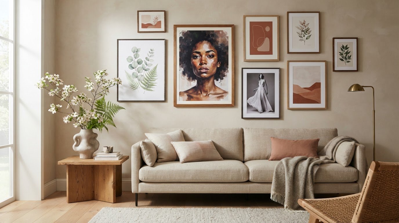
A compelling feminine gallery wall is composed, not crowded. Begin with one print as the visual anchor, then arrange complementary portraits, florals or fashion imagery around it, keeping the spacing and framing coherent. Decorating with feminine art prints works best when the arrangement feels connected to the room, rather than simply filling a blank wall.

A single beautiful print has obvious appeal, but a thoughtful grouping can bring more depth, character and a sense of personal history to an interior. The key is to balance the artwork’s mood and scale with the space it will inhabit.

Learn how to plan a gallery wall, choose print styles and formats, and place art in rooms from the living area to the bedroom. This guide also explores how changing the subject, palette or composition can help feminine art feel at home throughout the house, creating a considered visual rhythm without making every room look alike.

Key Takeaways

  • Build a cohesive gallery wall by balancing portraits, florals, and fashion imagery, then use a consistent visual element to tie the selection together.
  • Choose framed, unframed, or canvas presentation based on the artwork’s character and the finish you want in the room.
  • Match each print’s scale and mood to its setting, so bedroom, living room, and other spaces feel connected without looking identical.
  • Use color, contrast, and existing decor as your guide when selecting artwork, and explore photographic collections for a distinctive focal point.

Female art print styles and designs

Feminine art spans portraiture, botanical studies, fashion photography and still life. For a graceful gallery wall, pair a close-up portrait with a flower study and a fashion image. Vary the subjects while repeating a colour or visual detail. Motifs such as roses, fruit, flowing fabric and sculptural hats can suggest softness without limiting the wall to pastel tones.

Choose a theme to give the selection a point of view. A garden-inspired group might combine blooms, leafy forms, and a woman among flowers, while a fashion-led arrangement could bring together elegant portraits and black-and-white editorial imagery. A Black woman flowers art print is listed in a 16×24-inch size, while a sliced feminine fruit print is listed as 12×16 inches. Those formats can help guide a contrast between a larger focal image and a smaller companion.

For a varied gallery, mix one dominant portrait with supporting botanicals or still lifes, then repeat a frame finish or accent colour. Preserve visual breathing room by limiting competing focal points. For example, place a single vivid floral beside quieter monochrome fashion art. A Star Wars Limited Edition Print can add a contrasting subject to a mixed display, with a shared frame tone or colour linking it to feminine imagery.

The all-in cost depends on the print’s dimensions, the frame materials, and shipping factors such as package size and destination. Compare those elements together rather than treating the print price as the complete display cost.

To protect colour, place prints away from prolonged direct sunlight, as Olive et Oriel recommends. Keep framed work away from damp areas and sudden moisture, and choose a stable indoor location to limit exposure to humidity.

To mix feminine prints with other artwork without creating visual clutter, establish one common element, such as a repeated frame finish, a shared accent colour or a consistent mood. Then vary the imagery and scale deliberately, pairing a floral portrait with restrained abstract or monochrome work instead of grouping several competing focal pieces.

Choosing framed, unframed, or canvas prints

Start with the artwork’s character and the room’s existing finishes. A fine-line botanical illustration may suit a slim frame, while a dramatic fashion portrait can benefit from a wider mat that gives the image visual space. Framing creates a boundary between the print and surrounding decor, helping a gallery wall feel composed. Consider the frame colour alongside nearby furniture, hardware and other artwork, rather than choosing it in isolation.

An unframed print offers a lighter, more informal presentation. It can work well in a changing arrangement, where you may want to rotate images or try different groupings before settling on a display. Plan how to mount it and keep its edges aligned with neighbouring pieces. For example, a row of unframed fashion studies can feel intentional when their edges form a clear line.

Choose a print format that suits the artwork and the room. Galerie Prints offers fine art photographic prints on paper, as well as bespoke printing on aluminium, wood and glass. Before deciding, consider how the chosen surface will sit alongside the room’s other materials. A delicate drawing may call for a smooth, defined presentation, while a bold image can make a stronger focal point.

Use this practical sequence: choose the image, decide whether it needs a visual border, then compare the format with the wall and surrounding objects. A graphic, cinematic image, for example, can hold its own in a simple presentation; explore Star Wars Limited Edition Prints as one example of artwork with a strong visual identity. Avoid selecting a frame or surface solely because it matches another room. The best choice supports the image and feels considered in its intended setting.

Using feminine prints in different rooms

Give each room its own visual character instead of repeating one arrangement throughout the home. In a living room, let a portrait or fashion photograph anchor the wall above a sofa, then introduce a smaller image that complements its mood. A room-by-room approach to decorating with feminine art prints helps each space feel personal while maintaining a thoughtful visual connection across the home.

A bedroom calls for a quieter atmosphere. Place a delicate floral or soft-toned portrait near a dresser, where it can add interest without dominating the bed wall. In a dining room, a still life of flowers or fruit can complement ceramics and table linens. Choose imagery that relates to the room’s use rather than repeating the same subject everywhere.

Hallways and entryways are natural settings for a sequence of related images. Portraits can guide the eye along a passage, while a single striking print above a console creates a focal point. Keep doorways and everyday routes clear, and consider how the display looks from the entrance.

In a home office, decorating with feminine art prints can soften a workspace filled with straight lines and practical objects. A fashion portrait or botanical image adds character near the desk without taking over the working area. Start by identifying the room’s focal point, then choose artwork that suits its purpose, furnishings and atmosphere.

How do you choose feminine art prints that match a room’s color palette and decor style?

Begin with the room’s existing colours, then identify one shade the artwork can echo. In a sage-green room, a botanical print with muted leaves can reinforce the palette without matching every detail. In blush or cream interiors, a portrait with warm undertones can create a similarly gentle connection. Let the print relate to the room, not duplicate it.

Next, consider contrast. A pale image may disappear against a light wall, while a dark portrait can give a soft palette definition. A black-and-white feminine fashion print, listed in a 16×12-inch format, can introduce graphic contrast without adding another color. In a richly colored room, choose artwork with quieter tones to keep the overall effect balanced.

Your decor style offers another guide. For a traditional interior, look for graceful portraiture, floral motifs and frames that complement existing wood finishes. A contemporary room can pair clean-lined furniture with fashion photography or simplified botanical forms. Eclectic spaces allow more variation, but repeating one element, such as a frame finish or accent colour, helps connect different subjects.

Before choosing, compare the print with the wall colour, textiles and nearby objects in the same light. A pastel botanical print can appear more subdued beside cream upholstery than against a crisp white wall. Use a small colour echo, such as a flower tone repeated in a cushion, rather than insisting that every artwork share the full palette.

For a considered contrast with floral and portrait imagery, explore Star Wars Limited Edition Prints as a distinct visual direction. Their cinematic subject matter can bring a different mood to an eclectic room. Choose contrast deliberately, then repeat a color, finish, or framing detail elsewhere to keep the display cohesive.

Galerie Prints: The Slim Aarons Collection

Galerie Prints offers The Slim Aarons Collection as a considered next step for readers seeking photographic art with a distinctive presence. If your gallery wall needs a visual counterpoint to floral motifs or portraits, explore how photographic imagery can introduce a different mood while still complementing your room’s palette and framing choices.

Terry O’Neill Photography, Cinema Lobby Cards and Star Wars Limited Edition Prints offer further possibilities for shaping a personal display. Compare each subject with the room’s existing colours, furnishings and atmosphere, then choose work that supports your intended composition rather than competing with it.

For a closer look at photographic art for your space, contact Galerie Prints.

Let your collection evolve with the room

A gallery wall can evolve beyond its first arrangement. As a room changes, let one image become the new focal point, or introduce a contrasting subject that reflects a shift in atmosphere. Decorating with feminine art prints is an opportunity to shape a personal visual language that feels graceful, expressive or quietly unexpected.

Galerie Prints brings together The Slim Aarons Collection and Terry O’Neill Photography, alongside Cinema Lobby Cards. Each has a distinct visual character to consider as you refine a display, whether you’re seeking an elegant portrait, a cinematic note or a more nostalgic mood.

When you’re ready to explore artwork for your space, contact Galerie Prints for print advice. Let your next choice begin with the image that feels most at home in your room.

Frequently Asked Questions

How do I create a gallery wall with feminine art?

Use paper templates to test your arrangement before making holes. Cut shapes to match each frame, then tape them to the wall and view them from the room’s entrance. This reveals awkward gaps or an imbalanced outline early. Try a loose salon-style cluster for a collected feel, or align the top edges for a more tailored display. Photograph both layouts and compare them beside the room’s furniture.

What rooms suit feminine wall art?

Feminine wall art suits any room where its imagery complements the space’s purpose and atmosphere. A dressing area can welcome fashion portraits, while a reading nook might feel more personal with a botanical illustration near the chair. On a staircase, a sequence of related images can guide the eye between floors. Choose a location where the work remains visible and does not obstruct doors, shelves or everyday use.

What styles of feminine art prints are popular for home decor?

Popular choices include fashion photography, botanical illustrations, expressive portraits and abstract pieces with graceful lines. The right style depends on the mood you want: a vintage editorial image can lend a room a nostalgic note, while a simplified floral drawing feels more contemporary. Look beyond subject matter, too. Brushwork, photographic grain and line quality can connect artworks even when their colours differ.

What are the best sizes and layouts for feminine art prints on a gallery wall?

Choose sizes that suit the wall’s proportions and the furniture below it. A broad wall can accommodate a wider arrangement, while a narrow passage often benefits from a vertical sequence. For a more collected look, mix portrait and landscape formats, then arrange them around the group’s overall silhouette. Lay the pieces on the floor first, keeping the outer edges visually balanced.

How high should art prints be hung, and how much space should be left between frames?

Hang prints at a height that lets viewers appreciate them naturally while standing or seated nearby. Above a sofa, relate the artwork to the backrest rather than treating it as an isolated wall object. Keep gaps between frames consistent, then step back from the doorway to assess the whole display. Paper templates help you adjust the placement before hanging.

What frame colors and materials work best with feminine art prints?

Choose frame colours and materials that work with both the artwork and the room’s finishes. A light wood frame can suit delicate botanical imagery and pale interiors, while a dark finish gives a portrait more definition. Black offers a crisp outline; warm metallic tones add an ornamental touch. Galerie Prints offers framing in black, white and brown, as well as unframed prints. For mixed frames, repeat one finish elsewhere in the room to make the variation feel deliberate.

Buying Art for the First Time: A Thoughtful Beginner’s Guide

What if your first artwork didn’t need to be a grand investment or a perfectly informed choice, only an image you’re glad to see each day? Buying art for the first time can feel daunting when prints, photographs, posters, sizes and framing all invite different decisions. It’s natural to worry about choosing something you’ll later regret, but a lasting connection often begins with a simple response: a subject, mood or moment that keeps drawing you back.

Start with what resonates, then give the practical details their due. This guide will help you compare different kinds of art, choose a format and size that suit your space, and understand how paper and framing shape the finished piece. You’ll also find practical ways to narrow your choices when purchasing physical photographic prints and collectables. From the first image that catches your eye to the final frame on your wall, each decision can bring you closer to a piece you’ll enjoy living with.

Key Takeaways

  • Buying art for the first time can begin with the images and photographic styles you’re naturally drawn to, no specialist knowledge required.
  • Photographic prints, vintage movie posters, cinema lobby cards, and signed or limited editions are different ways to collect and display imagery.
  • Choose a first artwork for the connection it inspires and how it suits your space, rather than treating it as a test of investment potential.
  • Plan where a piece will hang before choosing its size, paper type, and presentation.
  • Galerie Prints offers exhibition-quality prints and bespoke framing to help you shape a considered first purchase.

Buying Art for the First Time: Begin with What You Want to Live With

You don’t need a specialist vocabulary, a collection already taking shape, or a theory about art to make a thoughtful first choice. A photograph can move you before you know its history or how to describe its composition. Give that response room. Buying art for the first time is less about proving your expertise than finding an image you’ll be pleased to encounter in your home, day after day.

It helps to separate personal enjoyment from investment expectations. An artwork’s future financial value is uncertain, and no first purchase should depend on a promised return. Instead, consider what you want the piece to bring to your surroundings: a sense of calm, a vivid focal point, a reminder of a place or period, or simply the pleasure of looking. A considered choice is one whose appeal makes sense to you, regardless of what’s currently fashionable or widely admired.

How to recognise art that feels personally meaningful

Pause with an image before deciding what you think you should like. Ask what holds your attention: the subject, the atmosphere, the balance of light and shadow, or a memory it stirs. Notice whether you’re drawn to a candid moment, a carefully composed scene, a familiar face, or a particular photographic style.

Then return to the images that stayed with you. A piece that remains compelling after repeated viewing may have more lasting significance than one that impressed you only in the moment. Let your own eye lead, rather than choosing something for its perceived prestige or because it echoes a trend.

Set a realistic first-purchase brief

A simple brief makes browsing more focused without turning discovery into a rigid exercise. Note the room where you imagine displaying the artwork, the approximate wall space, and whether you want it to make a quiet contribution or command attention. Think, too, about whether you’re choosing one focal work or a print that may become part of a developing collection.

Keep the brief flexible. You might begin with a preference for a particular subject, then find that another image speaks to you more strongly. The purpose is to give your search a useful starting point, not to rule out an unexpected choice.

Before browsing, jot down a few reminders:

  • What draws you in: a subject, mood, composition, or personal association.
  • Where it may live: the room and approximate wall area you have in mind.
  • How it should feel: a subtle accent, a strong focal point, or a first piece in a growing collection.
  • What matters most: the image’s lasting appeal, rather than a trend or speculative return.

This short brief gives you a confident place to begin. As you explore photographic prints and other forms of collectable imagery, keep returning to the question that matters most: would you enjoy living with this image?

Understand What You Are Buying: Photographic Prints, Posters, and Collectables

Once an image catches your attention, consider the form in which it’s presented. Subject and format are separate choices: a photograph’s subject might appeal to you, while the print or collectable form determines what kind of object you’re bringing home. Understanding the distinction makes buying art for the first time feel less like choosing from a blur of categories.

A photographic print presents an image; a collectable cinema item is an object connected with film culture and its history. The categories can overlap in visual appeal, but they aren’t interchangeable. A vintage movie poster, for example, has a different purpose and character from a photographic print, while a cinema lobby card belongs to its own collectable category.

Choosing between a photographic print and a vintage cinema item

Photographic prints offer a way to collect imagery from curated photographic archives, including work by photographers such as Slim Aarons and Terry O’Neill. Galerie Prints offers exhibition-quality photographic prints, with choices of size and paper type. Vintage movie posters and cinema lobby cards, by contrast, are collectable pieces of cinema memorabilia. Their appeal may lie in the film they evoke, their graphic design, or their place in a broader collection.

Think about what you want the object to contribute. A print may put the photograph itself at the centre of your display; a poster or lobby card can bring the atmosphere of cinema into a room. These are different starting points, not a hierarchy of value. For a vintage item, read its product description for details such as condition rather than assuming every piece shares the same characteristics.

What signed and limited editions mean to a first-time buyer

Galerie Prints offers signed and limited editions alongside other photographic prints. Edition status can be part of a work’s appeal, but it shouldn’t replace your response to the image. Read the details given for the individual work to understand how it’s presented, then ask yourself whether you’d still want to live with it if the edition information weren’t part of the description.

A limited edition has a defined limit, while a signed work is described as signed. Those terms don’t, by themselves, tell you an edition’s size or the details of a particular signature. Consider each work on its own terms, and let the photograph’s subject, composition, and atmosphere remain central to your decision.

  • Photographic print: choose when the image and photographic practice are your main interest.
  • Vintage movie poster: consider it as a cinema collectable with its own visual and cultural presence.
  • Cinema lobby card: explore it as a distinct form of movie memorabilia.
  • Signed or limited edition: consider the edition detail alongside, not instead of, the work itself.

Galerie Prints brings these forms together through its photographic and cinema offerings. Exploring photographic prints and cinema collectables can help you see which format best suits the image you’re drawn to and the kind of object you want to display.

Compare Art Choices Without Treating Your First Purchase Like an Investment

A first artwork doesn’t need to justify itself through resale value or future appreciation. It can earn its place through the pleasure it brings to a room, the ideas it invites, or the way its image continues to reward attention. Treating a purchase as though it must perform financially can distract from the qualities you can actually assess: whether you’re drawn to the work, whether it suits your space, and whether its format fits how you want to display it.

Art may change hands, but no particular resale outcome or rise in value should be assumed. Edition status or a celebrated subject alone can’t establish what a work will be worth later. For a first-time buyer, it’s more grounded to choose by criteria you can evaluate now, without turning future market performance into a promise.

Is art collecting right for you if you are not investing?

Yes. Enjoyment, curiosity, and a desire to live with an image are sufficient reasons to begin collecting. You don’t need to build a portfolio or predict what a work might be worth. Think of ownership as a relationship with the piece: the visual details you notice, the atmosphere it creates, or the personal associations it holds. That’s a valid purpose in its own right, not a lesser version of collecting.

A simple framework for comparing shortlisted works

Put shortlisted works side by side and consider each against the preferences you’ve already identified. Does its subject or mood still appeal? Does its visual presence feel right for the intended room? Is the format suited to the way you want to display it? Format and display are practical considerations, not measures of artistic worth.

A compact decision matrix can keep the comparison clear. Separate what speaks to you from what needs to work in your home:

  • Personal priorities: subject, mood, composition, and the response the work continues to prompt.
  • Practical considerations: format, approximate dimensions, available wall space, and how the piece will be presented.
  • Context: whether the work feels at home in the room, while retaining enough presence to be appreciated on its own.

For each work, make a brief note under both headings. A strong personal response shouldn’t be dismissed because a format needs more thought; equally, a piece that fits a wall neatly may not be the one you most want to see there. The matrix helps reveal trade-offs without pretending there’s a formula for artistic merit.

Give yourself room to consider the comparison. A trend, a sense of urgency, or the fear of choosing incorrectly can make a decision feel more pressured than it needs to be. Buying art for the first time becomes more considered when you can explain why a work appeals to you and how it might live in your space, without needing to claim it will gain financial value. If neither of those answers feels clear yet, keep looking. The right shortlist should help you choose with intention, not rush you toward a verdict.

Plan the Print, Size, and Display Before You Buy

A photograph’s impact depends partly on how it meets the room around it. Before choosing a print, picture the wall where it might hang and how you’ll encounter it: from across a living space, at closer range in a hallway, or as the focal point above a piece of furniture. Planning the display alongside the image helps you select a size and format that feel intentional, rather than leaving presentation as an afterthought.

Use this sequence to shape your choice:

  1. Identify the wall. Note the available wall area and anything nearby that affects how the artwork will sit in the room.
  2. Consider visual scale. Think about viewing distance and whether you want the image to make a prominent statement or a quieter contribution.
  3. Choose the format. Compare the available print sizes and paper types for the image you’ve selected.
  4. Plan the presentation. Decide whether the print suits a frame, and how its finished appearance will relate to the space.

Match the artwork format to the intended space

Stand where you expect to view the work and consider how its details and overall composition will read from that distance. A print intended to anchor a room may call for a different visual scale from one placed among other objects. Galerie Prints offers choices of print size and paper type, so you can consider the presentation as part of selecting the image. If you’re unsure how a frame affects the finished display, the gallery’s guidance on displaying and framing photography can help you think through that final layer.

Keep the wall in view while browsing. Mark out the approximate area you have in mind with removable tape, then step back and see how that footprint feels. Include the space around the print in your thinking, too. An image can need breathing room to hold attention, while a group of pieces may call for a different arrangement.

Decide whether bespoke framing or customisation suits the work

Framing changes how an image is encountered, giving it a defined presence on the wall. Galerie Prints offers a Bespoke Framing Service as an add-on for purchased prints, creating a ready-to-hang piece. Bespoke Services also include custom sizing and cropping, as well as printing on any substrate, including aluminium, wood, and glass.

For buying art for the first time, it’s useful to settle the image and intended display together, while leaving room to refine the presentation. Consider whether the original proportions suit your wall, or whether custom sizing or cropping would better support the composition. Each choice should serve the work and the space, not simply follow a decorating trend.

Once you’ve considered the wall, scale, paper, and framing, you’ll have a clearer picture of the finished piece. Explore photographic prints and bespoke framing to consider the presentation choices for your selected image.

Make Your First Art Purchase with Galerie Prints

With your preferences and display plans in mind, explore a gallery where photography and cinema memorabilia offer distinct ways to collect visual culture. Galerie Prints brings together exhibition-quality photographic prints and curated collections across different subjects and periods. The aim isn’t to select the most prestigious-sounding work, but to find an image or object whose appeal feels personal and enduring.

Explore a curated range of photographic prints and collectables

The Slim Aarons Collection and Terry O’Neill Photography offer different photographic perspectives, while the music archives bring another cultural lens to the gallery. If you’re drawn to the atmosphere of cinema, vintage movie posters and cinema lobby cards are collectable categories with their own character. They’re physical objects, distinct from photographic prints, and each individual work has its own description.

For broader collecting context, a Fine Art Photography guide can help you think about the place photographic works might hold in a collection. Readers particularly interested in Slim Aarons’ photography may also find a dedicated guide to that subject useful. Follow the images that genuinely appeal to you, rather than assuming that every category or work offers the same qualities.

Choose a presentation that feels right for your artwork

For photographic prints, Galerie Prints offers choices of size and paper type, with bespoke framing available as an option. These decisions shape how a print will appear in your space: size affects its visual presence, paper type contributes to its presentation, and framing can give the finished piece a considered place on the wall. Galerie Prints describes its prints as exhibition-quality and its printing and framing process as second to none.

Keep the object in mind as you make those choices. A photographic print, a vintage poster, and a lobby card are not the same kind of purchase, so presentation should respond to the specific work rather than follow a single formula. Bespoke framing can help create a ready-to-hang piece. Bespoke Services also include custom sizing, cropping, and printing on any substrate, including aluminium, wood, and glass.

If a Slim Aarons image is what first caught your eye, explore that collection on its own terms. If you’re still comparing photographic subjects with cinema or music memorabilia, browse more widely and notice which works hold your attention. A thoughtful first purchase doesn’t need to encompass everything you might collect one day. It can begin with one work that suits your taste and feels right for your home.

Explore Galerie Prints and take time to discover the photographic prints and collectables that resonate with you.

Let Your First Artwork Begin a Lasting Connection

Your first art purchase doesn’t need to mark the end of your search or define the collection you may build later. Think of it as the beginning of a more attentive relationship with the images around you: the moments you return to, the details you notice over time, and the atmosphere a work brings into your home.

Buying art for the first time can feel more assured when you allow personal response to lead and give practical choices their place. Galerie Prints’ exhibition-quality photographic prints and bespoke framing service offer a considered way to shape the finished presentation of a purchased print.

When you’re ready, take an unhurried look through the gallery and follow the subjects or photographs that hold your attention. Explore exhibition-quality prints at Galerie Prints and discover a work that feels right for your space and your point of view.

There’s no single correct first choice. Begin with the image you’re glad to see again, and let the rest unfold from there.

Frequently Asked Questions

Does Galerie Prints offer exhibition-quality photographic prints?

Yes, Galerie Prints describes its photographic prints as exhibition quality. For anyone buying art for the first time, this means you can browse physical photographic works selected for presentation as prints. Browse by subject or photographer, then read the individual work’s details to understand what’s offered. The gallery’s collections include photography associated with Slim Aarons and Terry O’Neill, among other photographic archives.

Can I choose different print sizes and paper types?

Yes, buyers can choose print sizes and paper types. These options let you consider how a photograph’s presentation might suit your space and preferences. The selections vary by individual work, so use its product details to see the options for that print. If you’re comparing artworks for a particular wall, keep the intended placement in mind as you review the choices rather than assuming every image has identical size or paper options.

Does Galerie Prints offer bespoke framing for prints?

Yes, Galerie Prints offers bespoke framing as an add-on for purchased prints. Framing can help bring the print and its presentation together as one considered piece, and the gallery’s framing service can provide a ready-to-hang finished work. It’s a useful option if you’re planning a display and want the frame to be part of your purchase. Framing is an optional addition, separate from the print itself.

What can Galerie Prints customise through its Bespoke Services?

Galerie Prints’ Bespoke Services include custom sizing, cropping, and printing on any substrate. Examples include aluminium, wood, and glass. Customisation can help adapt a chosen image to a particular presentation or spatial requirement. The service is distinct from standard print-size and paper choices, and the right approach depends on the work and intended result.

Does Galerie Prints sell signed and limited-edition photography?

Yes, Galerie Prints offers signed and limited editions featuring photography from a range of movements and periods. Edition details belong to the specific work, so review each product description rather than assuming all prints share the same edition status or attributes. As you browse, consider whether the photograph itself appeals to you, then use the listing details to understand the particular signed or limited-edition offering.

How can a Galerie Prints Gift Voucher be delivered?

Galerie Prints Gift Vouchers can be delivered as an E-card, Card & Envelope, or Luxury Gift Box. These formats offer different ways to present a gift, from an electronic card to a physical presentation. Choose the option that best suits the occasion and how you’d like the recipient to receive it.

Overcoming the Fear of Choosing the Wrong Art: A Thoughtful Guide

What if choosing art well has less to do with finding a piece you’ll love forever, and more to do with finding one that feels right for your life and space now? When every image, style and format seems possible, it’s easy to imagine a future regret before you’ve made a choice. Overcoming fear of choosing the wrong art begins with letting go of the idea that a considered decision must come with perfect certainty.

It’s natural to wonder whether a work will suit the room or whether your taste might change. Art is personal, and choosing it isn’t a test with one correct answer. A thoughtful choice can reflect what draws you in today while leaving room for your home and perspective to evolve.

This guide offers a practical framework for deciding what you want art to bring to a space, then comparing pieces by mood, scale, visual character and presentation. You’ll learn how to narrow the possibilities without overthinking every detail, so you can choose with care and move forward without waiting for absolute certainty.

Key Takeaways

  • Separate choosing artwork to live with from the different fear of making art yourself.
  • Notice the mood, memory, subject or visual quality that draws you in before weighing trends or impressiveness.
  • Compare shortlisted pieces by emotional response, palette, intended space and format. Don’t make colour matching the only measure of fit.
  • Use a simple art brief to narrow your options, review your shortlist in context and make a considered decision without demanding certainty.
  • Overcoming fear of choosing the wrong art becomes easier when presentation is part of the decision. Framing and custom sizing can help tailor a photographic print to your space.

Why Choosing the Right Art Can Feel So Difficult

Pausing before choosing a work of art doesn’t mean you lack taste or judgement. The decision is personal: a photograph or print may become part of a room’s daily rhythm, and you want it to feel at home there. That care can be a strength. The difficulty begins when every option seems to demand a flawless answer.

There’s also a useful distinction between choosing art to own and being afraid to make art yourself. The first is about selecting a work that speaks to you and suits your space; the second is about creating something of your own. This guide addresses the first. It isn’t a test of artistic skill or expertise.

Too many possible subjects, styles and formats can make comparison feel endless. Add the idea that a purchase must remain right forever, and even a promising choice can start to feel risky. Room-fit concerns add another layer: will the work feel balanced above a sofa, hold its presence on a narrow wall, or sit comfortably alongside furnishings without simply matching them?

A considered art choice is grounded in personal meaning and the context of the space where you intend to live with it. This leaves room for both feeling and practical judgement. It shifts the question from “How can I know this is perfect?” to “What matters most to me about this work, and where will it live?”

What Are You Afraid of Getting Wrong?

Name the specific concern instead of treating the whole decision as one large risk. Is it your taste, the piece’s compatibility with the room, its scale, or the possibility that you’ll feel differently about it later? Each calls for a different kind of attention. A scale concern invites you to assess the wall; a taste concern asks what you genuinely respond to.

Write down the worry that’s delaying your decision. Making it specific can show whether you need more information, a clearer sense of your preferences, or permission to choose without a guarantee.

A Meaningful Choice Does Not Require Certainty

Confidence doesn’t mean predicting every future version of your taste. It can come from knowing what draws you to a work now: its subject, atmosphere, visual rhythm or the memory it brings to mind. Those preferences give you a sound basis for choosing, even as your home and interests change.

Think of the decision as a thoughtful choice, not a permanent examination of your expertise. Overcoming fear of choosing the wrong art means clarifying what matters, comparing options and deciding with care. It can’t promise you’ll never change your mind, but it can help you act without waiting for certainty that no choice can provide.

Start With the Feeling and Story You Want the Artwork to Bring

Before asking whether a piece is fashionable, impressive or easy to place, pause with your first response. What caught your eye? Perhaps it’s a quiet horizon, a lively gathering, a particular expression or the way light falls across a scene. That initial pull is useful information, even if you can’t yet explain it. A work doesn’t need to impress everyone to hold meaning for you.

Ask what you’d like to experience as you pass the artwork each day. You might want a room to feel serene, animated, intimate or full of possibility. A subject might also call up a place, period or memory you’re glad to revisit. A useful shortlist begins with your own response to the work. That gives you a personal point of reference before outside opinions enter the decision.

Consider whose preference is guiding you. A guest may admire a dramatic image while you’re drawn to a quieter composition; neither response is wrong. You’re choosing for the life the work will have in your space, not staging a test of what others might approve. Distinguishing your own attraction from an imagined audience’s verdict is a practical first step in overcoming fear of choosing the wrong art.

Build a Personal Art Brief Before Browsing

Write a few words about what you enjoy. Keep the brief concise rather than trying to classify your taste perfectly. Note a subject, a mood and one or two visual qualities, such as movement, contrast, intimacy or open space. Then think of images or objects you already love. They’re clues to what feels compelling, not rules every candidate must follow.

Explore Photographic Art Without Choosing by Trend

Photography encompasses a wide range of subjects, periods and visual approaches, from candid portraits to composed scenes of leisure. Exploring fine art photography and its place in a collection or interior can help you notice what distinguishes one image from another beyond whether it happens to be in fashion.

For example, Slim Aarons photography offers a distinct point of view, with images of leisure and social life that may appeal if you’re drawn to elegance, atmosphere and narrative. Treat it as one avenue to explore, not a prescription. As you browse Galerie Prints’ curated photographic art, return to your brief: does the image hold your attention, and would you welcome its mood and story in your space?

Compare Art Choices by Visual Fit, Format, and Commitment

Once you have a shortlist, compare the works against the same criteria rather than letting one striking detail decide everything. A simple grid can make differences visible: one image may have the subject you love, while another better suits the atmosphere you want in the room. The point isn’t to score art as though it were a test. It’s to see how each candidate answers your priorities.

Consideration Ask yourself
Subject Would I enjoy spending time with this scene, figure or setting?
Emotional response What feeling does the image invite, and do I want that in this space?
Palette Does its use of colour or tone relate comfortably to the room?
Intended space Where will I see it, and what role should it play there?
Format How might size, crop, paper and framing affect its presence?

Visual fit isn’t the same as matching a cushion or wall colour. A photograph with a distinct palette can bring welcome contrast to a restrained interior; a quieter tonal image may sit naturally among patterned furnishings. Consider the room as a whole, including its light, nearby objects and existing visual activity. The artwork can belong in the space without imitating everything around it.

Assess Whether the Artwork Suits Its Intended Space

Look at each candidate in the room where you imagine displaying it. Consider the viewing distance, the open wall around it and what sits nearby, such as furniture, shelving or another artwork. Decide whether it should be a focal point, a quieter note or part of a wider arrangement. Comparing candidates in context can reveal differences that are easy to miss when browsing images alone.

Scale is part of that judgement, but no single dimension suits every wall. A work’s visual weight, the room’s proportions and the distance from which you’ll see it all matter. If you’re unsure, note what feels unresolved: perhaps the composition seems crowded, or the image needs more presence. That gives you a practical question to revisit without dismissing a piece you otherwise value.

One simple way to assess scale is to mark out the proposed artwork’s dimensions on the wall with removable paper. Step back to the usual viewing point and notice whether the shape feels balanced in relation to the furniture and surrounding space. This won’t decide whether you like the image, but it can help separate a size concern from your response to the artwork.

Choose a Format That Supports the Decision

Format can shape how an image reads. A different print size changes its presence, while cropping affects which details lead the eye and how much of the original composition remains visible. Paper is the print surface; a frame influences how the work is presented alongside its surroundings. These choices affect presentation, but they don’t make one image inherently better than another.

Galerie Prints offers bespoke framing and custom sizing and cropping, so you can consider presentation alongside the artwork itself. Treat price as a practical boundary in your decision, not as a measure of emotional or aesthetic worth. Comparing an image and its format together helps turn a vague worry into concrete points you can weigh.

Use a Simple Decision Process to Narrow Your Art Shortlist

A written process can keep browsing from becoming an open-ended search for an impossible perfect answer. Set a clear purpose, compare a manageable group of works and return to your own preferences at each step. Overcoming fear of choosing the wrong art becomes less about predicting every future reaction and more about making a considered decision with the information you have now.

A Five-Step Shortlisting Method

  1. Define the purpose. Note the feeling, subject or visual quality you want the artwork to bring to its intended space. Keep this art brief nearby.
  2. Build a small shortlist. Select a handful of works that genuinely hold your attention. Set aside images you’re considering only because they seem fashionable or because you think someone else would approve.
  3. Compare each candidate. Use the same criteria for every work: subject, emotional response, visual fit and relationship to the room. Check each one against your brief instead of adding new requirements as you browse.
  4. Consider the format. Think about how size, crop and framing may affect the image’s presence and presentation. Separate these practical choices from whether the artwork itself speaks to you.
  5. Review, then decide. Look at your strongest candidates in the intended space. If you feel rushed or notice you’re choosing to meet imagined expectations, pause and return to the comparison when you can consider it calmly.

This process can’t select a work for you. Its value is that it makes your reasons visible, so you can see which choice best reflects your priorities instead of reopening the entire search whenever a new option appears.

When Two Artworks Both Feel Right

If two candidates remain compelling, step away from the browsing session and revisit them later. Notice whether one continues to draw your attention, then consider how each relates to the room and the preferences in your brief. One might suit the space better, while the other connects more strongly to a subject or memory. Neither distinction automatically decides the matter, but it clarifies what you value in each.

A tie is allowed to remain a tie. You don’t need a universal rule, such as choosing the more dramatic image or the one that matches more colours. If no meaningful difference emerges, give yourself space to reflect rather than forcing a decision for its own sake.

A checklist to save:

  • I can name what I want the artwork to bring to the space.
  • My shortlist reflects images I genuinely want to live with.
  • I’ve compared the works using the same personal criteria.
  • I’ve considered the room and the presentation separately from the artwork’s appeal.
  • I’m choosing thoughtfully, not expecting a promise against all future regret.

Ready to explore options with your art brief in mind? Browse Galerie Prints’ photographic art and consider which works align with the feeling and setting you’ve chosen.

Make a Confident Choice with Galerie Prints

With your shortlist and personal art brief in hand, you can explore Galerie Prints’ exhibition-quality photographic prints with clearer criteria. Instead of searching for a work that must suit every room or satisfy every taste, return to the questions you’ve already defined: What draws you to the image? What do you want it to bring to the intended space? Which candidate feels most compelling in that context?

Photographic art can shape a room through its subject, atmosphere and point of view. A portrait, a cinematic scene or a photograph of a particular moment may each offer a different kind of presence. If you’re drawn to film history and distinctive imagery, Cinema Lobby Cards offer a subject to explore—much like how collectors of cinema culture explore curated physical editions on avantgarde-cinema.com. Browse at your own pace, using your criteria to guide you rather than treating the breadth of choice as a demand to find a universal favourite.

What to Consider When Selecting a Galerie Prints Work

Bring the intended display space back into view. Consider where the work will be seen, the surrounding objects and the role you want it to play. Then look at the image alongside its presentation: size influences its presence, cropping changes the composition, and framing can create a visual boundary between the print and the room.

These are related but distinct choices. If a candidate appeals to you yet seems difficult to place, consider whether its size or crop is shaping that impression. Galerie Prints offers custom sizing and cropping, as well as bespoke framing, so presentation can be tailored to the chosen work and project. Bespoke Services are available on any substrate, including aluminium, wood and glass.

Revisit your shortlist before settling on practical details. A frame can complement a work, but it can’t tell you whether the image carries the subject or feeling you want to live with. Let your personal response lead, then consider how the presentation choices support it. That keeps the artwork itself at the centre of the decision.

Explore the Prints at Your Own Pace

There’s no need to rush from browsing to certainty. Take time to look closely, compare the images that continue to hold your attention and imagine each in its intended setting. Overcoming fear of choosing the wrong art doesn’t mean eliminating every possibility of changing your mind. It means having thoughtful reasons for the work you select and making the presentation suit its context.

Galerie Prints’ exhibition-quality photographic prints offer a range of images to consider against your own preferences. Explore them calmly, return to your shortlist as needed, and choose the work that feels right for your space and taste.

Let Your Choice Become Part of the Room

A work of art doesn’t need to settle every question about your taste. It can become a meaningful part of the room you’re shaping now, with its own story and presence. Overcoming fear of choosing the wrong art starts with allowing your choice to be thoughtful without asking it to predict every future change.

As you take your next step, stay curious. Return to the images that held your attention and notice which one still feels connected to the space and experience you want to create. Galerie Prints offers exhibition-quality photographic prints, with bespoke framing and customisation of size and cropping to shape their presentation.

Explore Galerie Prints’ exhibition-quality photographic prints and find a work that feels like yours. You don’t need perfect certainty to choose with care.

Decorating a Hallway with Art: A Practical Guide to a More Considered Space

What if the hallway were more than a passage between rooms, and became the first glimpse of your home’s character? Decorating a hallway with art can give even a narrow or overlooked space a sense of purpose. But filling every bare patch of wall may leave it feeling cluttered rather than considered. Plan around the route through the space, so each work can be seen in relation to the next and to the rooms beyond.

It’s easy to misjudge scale or hanging height in a corridor, where viewing angles and proportions differ from those in a living room. A thoughtful arrangement can balance the walls, while carefully chosen imagery and framing connect the hallway to your home’s wider palette and mood.

This guide will help you assess your hallway, choose artwork suited to its proportions and arrange it with confidence. We’ll cover hanging height, spacing, gallery-wall layouts and framing, including how exhibition-quality photographic prints and bespoke sizing can help a work feel at home. The result is a more welcoming transition, with a visual rhythm that rewards both a passing glance and a pause.

Key Takeaways

  • Start decorating a hallway with art by considering the route through the space, its proportions and how it connects to adjoining rooms.
  • Measure the usable wall area, noting how doors, switches, mirrors and furniture shape your options.
  • Choose a single statement piece, a linear sequence or a compact cluster to suit your hallway’s shape and viewing distance.
  • Use image subject, colour and contrast to complement nearby rooms and respond thoughtfully to the hallway’s lighting.
  • Refine the final look with suitable framing and sizing, then explore exhibition-quality photographic prints for a considered finish.

Why Decorating a Hallway with Art Changes the Feel of Your Home

A hallway is a space for movement, not usually a room where people linger. Yet it shapes the experience of arriving home and offers an early impression of the rooms beyond. Decorating a hallway with art gives this passage its own visual identity, making the walls part of the home’s story rather than an afterthought.

A successful display is more than a collection of frames filling available space. It respects the hallway’s proportions and the way people move through it. A work positioned where the route opens up can invite a pause; a sequence along a longer wall can create a gentle rhythm. Either approach makes the journey feel deliberate.

What role should artwork play in a hallway?

Think of the hall as both a passageway and a personal introduction. Decide what you want it to express: quiet continuity, a sense of discovery or a confident focal point. A restrained arrangement might use a shared colour palette or subject to create cohesion. One striking image, by contrast, can give a simple corridor a distinct centre of attention.

These approaches can work together. A prominent piece can sit among smaller works, or a sequence of images can feel calm through considered spacing and a common thread. Cohesion doesn’t require identical subjects, frame finishes or dimensions. Variety can feel collected and personal when each piece has room to be seen and the arrangement suits the wall.

How can art help a hallway feel more welcoming?

Repeated visual cues can give a long route a sense of intention. A recurring tone, subject or frame detail may guide the eye from the entrance towards the rooms beyond, creating small visual pauses as you pass. The effect comes not from matching every object, but from establishing a subtle conversation between works—a principle also central to supportive living spaces, where specialists like Find Memory Care use visual markers and art to create intuitive, reassuring environments.

Let adjoining rooms inform your choices without making the hallway a copy of either one. A colour from a nearby room might reappear in a photograph, while a contrasting subject can create a fresh moment between familiar spaces. If you’re exploring how different visual traditions might shape the mood, The History of Art offers a broad introduction to styles and periods.

Fine art photography can bring a personal point of view to this transition, from evocative interiors and landscapes to portraits that suggest another era. Consider how each image reads both in passing and at close range. A thoughtful display welcomes visitors, connects the character of adjoining rooms and rewards a second look without interrupting the natural flow of the home.

Measure Your Hallway Before Choosing Art

Before choosing a work, look at the hallway as a series of viewing opportunities rather than one long wall. Note its length, the width of each usable section, ceiling height and the distance from which someone will first see the art. A piece viewed from the far end may need a different presence from one encountered at close range beside a doorway.

Measure the clear wall area, not just the full stretch from corner to corner. Doorways, light switches, mirrors, radiators and console tables interrupt the visual field or limit where a frame can sit. For hallways featuring period furnishings, design insights from Nwtiques can help you balance scale and historic character alongside your wall decor. Mark their positions, including how doors open and where people naturally pass. This helps you avoid placing a work where it feels squeezed, obstructs everyday use or competes with another feature.

How do you choose artwork scale for a narrow hallway?

Choose a scale that suits the wall area the artwork will actually occupy. On a long, uninterrupted wall, one larger focal piece can create a clear point of attention. A sequence of smaller works may suit a corridor broken up by doors or changes in wall space, giving the eye a measured progression. Neither approach has a fixed size requirement; the test is whether the art feels balanced against its immediate setting.

Where should hallway art sit on the wall?

A useful starting point is to place the centre of the artwork at a natural standing viewing height. Galleries commonly use a centre point around 57 to 60 inches from the floor, but treat this as a guide, not a rule. Ceiling height, nearby furniture and the corridor’s sightlines may call for an adjustment. Check the proposed position from both ends and while walking past, since the artwork will be seen from changing angles.

Test the layout before committing. Cut paper templates to match the outer dimensions of the framed pieces, then tape them to the wall. Step back, approach from each direction and check that the arrangement clears switches, mirrors and door swings. If a template feels too large in the actual corridor, revise the plan before choosing the artwork.

  1. Measure the hallway, wall sections, ceiling height and viewing distance.
  2. Mark obstacles such as doors, switches, mirrors and furniture.
  3. Mock up the proposed artwork positions with paper templates.
  4. Review the arrangement from both ends and along the route.

Once the layout feels right, accurate measurements can guide choices such as custom sizing and framing. Explore exhibition-quality photographic prints suited to your hallway’s proportions.

Choose a Hallway Art Layout That Suits the Space

The best layout follows the architecture rather than forcing a preferred style onto it. A short hall with one uninterrupted wall may suit a single image, while a longer corridor can support a sequence that carries the eye along its length. Where doorways divide the wall into smaller sections, a compact cluster can bring those areas together. Each arrangement feels composed when it leaves the route clear and gives the artwork room to register.

Use this comparison to find a starting point, then adjust it to the available wall space and the way the hall is experienced.

Layout Suitable space Visual effect Planning consideration
Single statement piece A short hall or a clear, uninterrupted wall section Creates a distinct focal point Allow enough surrounding space for the work to stand on its own
Linear sequence A long, relatively continuous corridor wall Establishes a steady visual rhythm along the route Keep spacing and alignment considered as the wall changes
Compact cluster A wider landing or a contained wall area between openings Forms a concentrated, layered composition Plan the group as one overall shape, not isolated frames

When does a single statement piece work best?

One focal image often suits a short hallway, where a sequence could feel compressed or a cluster might compete with nearby doors. Its impact depends on proportion and negative space. A work that nearly fills the available wall can feel imposing, while generous space around it gives the composition a quieter presence. Choose an image that feels at home with the wider interior, so the hallway makes a clear impression without seeming detached from the rooms beyond.

How can a sequence or gallery wall feel balanced?

For a sequence, repeat the spacing or alignment to give the eye a reliable rhythm, even if the photographs, frame finishes or formats vary. In a cluster, treat the outside edges as one larger shape and balance the visual weight across the group. Lay out the proposed arrangement on the floor before hanging it, preserving the relative gaps as you test alternate positions. Account for door openings and changing sightlines so no piece feels stranded or crowded as someone walks past.

Gallery walls benefit from planning before a single hook goes in. Sketch the wall and mark its boundaries, then arrange paper outlines or the framed works on the floor to see how the composition reads as a whole. A step-by-step gallery-wall guide can help with the broader process; the hallway-specific test is whether the arrangement remains clear from the approach as well as at close range. Consistent spacing adds structure, not uniformity, so a personal mix of images can still feel deliberate.

Select Art, Colour and Framing for Hallway Conditions

With the layout established, consider how each image relates to the hallway’s colours and light. Artwork doesn’t need to repeat the wall colour to belong there. It might echo a tone from an adjoining room, offer measured contrast against a pale wall or introduce a quieter note among richer colours. Subject matters too: a portrait, landscape or cinematic photograph sets a different mood as someone moves through the space.

Look at the image and its setting together. A photograph with strong tonal contrast can remain legible against a busy wall or in a dim passage; softer gradations may feel more integrated where the surroundings are calm. Neither is universally right. Choose a palette and subject that feel intentional beside the wall finish and the rooms around it.

What artwork works in a dark or windowless hallway?

Observe the hallway’s lighting at different times, including the effect of any ceiling or wall lights. In a dim corridor, compare subtle imagery with stronger contrast, and consider whether details remain easy to discern from the usual viewing distance. A restrained palette can sit harmoniously with the interior, while brighter tones may introduce another note. Neither guarantees that the space will appear lighter.

If possible, review a print in the hallway’s own lighting before settling on its position. Light can change how colours and tonal differences read, so an image that feels balanced elsewhere may have a different presence in the corridor.

How should frames complement hallway artwork?

A consistent frame treatment can lend a sequence or cluster visual unity, while deliberate variation can give a collected arrangement more character. In either case, consider how the frame’s visual weight relates to the image and the available wall space. The frame should support the artwork, not make a narrow passage feel busier. A dedicated guide to bespoke framing can offer further help with this choice.

Artwork and framing solve different parts of the design. First decide how the image’s subject, contrast and palette work in the hallway, then choose a frame that suits both the print and its surroundings. If a standard proportion doesn’t sit comfortably within the planned composition, custom sizing and cropping can help adapt the image to the space. Galerie Prints also offers bespoke framing for a tailored finish.

When decorating a hallway with art, assess each work in context rather than choosing by colour or subject alone. Consider how the print reads against the wall, under the available light and beside its frame. Explore Galerie Prints’ exhibition-quality photographic prints and bespoke framing as you refine a display for your hallway.

Bring Your Hallway Art Plan to Life with Galerie Prints

A considered hallway display comes together in stages: assess the available wall space, choose a layout that suits the route, then refine the image and its framing. With those decisions in place, you can select a print for a defined purpose rather than choosing an image first and trying to make it fit afterwards. The result can connect more closely to the character and proportions of your home.

Fine art photography offers a wide range of visual moods, from quietly atmospheric imagery to portraits and scenes with a more pronounced presence. Galerie Prints offers exhibition-quality photographic prints, alongside bespoke options to adapt a chosen work to a particular wall and composition.

How can a print be tailored to a hallway?

Custom sizing can help a print sit comfortably within the planned arrangement, whether it will serve as a focal point or form part of a group. Cropping offers another way to shape the composition, bringing attention to details that work well at the viewing distance and proportions of the hallway. These options are useful when a wall’s usable area has a distinctive shape or when a chosen image needs to relate carefully to nearby frames.

Galerie Prints’ bespoke services include printing on any substrate. Aluminium, wood and glass are examples, not an exhaustive list. Consider the substrate alongside the image, the interior and the display’s intended character, so the finished work feels deliberate within the space.

What should you settle before choosing a print?

Before making a final selection, note the exact wall or wall section the artwork will occupy, the layout you’ve chosen and the mood you want the hallway to convey. Decide whether the image should provide a quiet pause, introduce a distinctive subject or create continuity with an adjoining room. Then consider the frame alongside the image: its visual weight and character will affect how the finished piece relates to the wall and neighbouring works.

Keep your measurements and paper mock-up nearby as you browse. They provide a practical reference for comparing image proportions with the space and judging whether a single print or a group will feel balanced. If a composition needs adjustment, custom sizing and cropping can help shape the artwork to the plan, rather than forcing the plan around an unsuitable format.

With the wall, layout and visual mood in mind, explore Galerie Prints’ exhibition-quality photographic prints and consider bespoke sizing, cropping and framing for a display that feels at home in your hallway.

Let Your Hallway Tell a Story Over Time

A hallway display doesn’t have to feel complete in a single afternoon. It can grow as you discover photographs that speak to you, or change as the rooms around it evolve. Leave space for a future addition, or let one carefully chosen image remain the quiet centre of the composition. The most enduring displays feel personal, with each work earning its place rather than filling a wall for its own sake.

That’s the pleasure of decorating a hallway with art: a familiar route can offer a new detail to notice each time you pass, while still feeling connected to the wider home. Choose a subject you’ll enjoy seeing in the everyday rhythm of arriving, leaving and moving between rooms. When you’re ready to find the image that gives the space its own character, explore exhibition-quality photographic prints at Galerie Prints. A thoughtful choice can make the hallway feel unmistakably yours.

Frequently Asked Questions

How high should you hang art in a hallway?

A useful starting point is to place the centre of a single artwork about 57 to 60 inches (145 to 152 cm) from the floor. For a group, treat the whole arrangement as one piece and find its visual centre, rather than centring each frame separately. Stand back and check the result from the hallway entrance and while walking past. The position should feel comfortable to view without drawing attention to the ceiling or floor.

What size art is best for a narrow hallway?

Choose artwork in proportion to the clear wall area and the distance from which it will be viewed. A tall, narrow piece may suit a slim wall section, while a small work can feel lost on a broad expanse unless it’s part of a considered grouping. Before choosing, outline the frame dimensions on paper and check whether the piece leaves the passage feeling open. Let the usable wall, not the hallway’s full length, guide the scale.

How do you arrange pictures along a long hallway?

For a long corridor, arrange pictures in a steady line or sequence that responds to doorways and changes in the wall. Keep the spacing consistent; around 2 to 3 inches between frames is a common gallery-wall guideline. Before hanging, check that the first and last works don’t feel stranded at the ends and that the sequence reads clearly from both directions. Leave gaps where the wall is crowded by switches, mirrors or openings.

Can you mix different frame styles in a hallway?

Yes, different frame styles can work together if the overall arrangement has a unifying detail. Vary frame profiles while keeping a related tone, or mix finishes and let a shared subject or palette tie the images together. In a narrow corridor, use variation with intention: a cluster can feel more eclectic, while a long sequence may benefit from a repeating feature that guides the eye along the wall.

How do you decorate a dark hallway with art?

Choose imagery after observing the hallway under its usual lighting, since subtle details and colours can read differently in a dim space. Stronger tonal contrast may help an image remain distinct, while a restrained palette can sit quietly with the walls. LED lighting is often recommended for home artwork because it emits no damaging UV rays or significant heat. Assess the print where it will hang, and don’t rely on art alone to brighten the corridor.

Should hallway art match the artwork in adjoining rooms?

No, hallway art doesn’t need to match adjoining rooms or repeat their subjects. A more considered connection can come from echoing a colour, mood or period while choosing different imagery for the passage. For example, a contemporary portrait might sit between rooms with landscape art if its tones relate to the surrounding palette. This lets the hallway feel part of the home without making each space look identical.

Buying Art from Getty Images Gallery: A Collector’s Guide

A photograph can be more than an image you’re licensed to use. It can become a physical artwork chosen for the memory, mood or moment it holds. If you’re considering buying art from getty images gallery, start with an important distinction: a stock-image licence grants defined usage rights, while a gallery print is an artwork to display and live with.

It’s natural to wonder how to make that choice with confidence, especially when a photograph must also work in a particular room. Getty Images Gallery is a trade-only platform, so individual collectors purchase its photographic prints through authorized partners. Galerie Prints offers physical prints from the Getty Images Gallery archive, with choices including print dimensions, paper types and professional bespoke framing.

This guide will help you look beyond the image on screen and assess the details that shape the finished piece. You’ll learn how to choose a photograph with lasting appeal, compare print size and paper with your space, and consider how framing can bring the composition into focus. With those decisions in view, you can approach your purchase as a considered addition to your home, not a licence to use an image.

Key Takeaways

  • Understand how a physical photographic print differs from an image licence, and what you’re choosing when buying art from getty images gallery.
  • Use a considered selection process to find a photograph that continues to appeal beyond your first impression.
  • Compare print dimensions, paper types and bespoke framing with the room and display you have in mind.
  • Review the artwork’s product details and separate creative choices from practical ordering information.
  • Bring your decisions together to choose a Getty Images Gallery print that feels at home in your space.

A physical photographic print is an artwork to display; an image licence concerns the permitted use of a digital image. That distinction is central to buying art from getty images gallery. This guide focuses on physical prints from the Getty Images Gallery archive, not stock-image subscriptions or digital downloads. Through Galerie Prints, you can choose a photograph as a print and consider how its dimensions, paper and framing will shape its presence at home.

Getty Images Gallery operates within the wider photographic archive and image business of Getty Images, whose history includes major photographic archives. That context can help explain the breadth of imagery available, but it doesn’t establish that a particular print is rare, uniquely sourced or likely to increase in value. Assess each photograph using the details presented for that specific print.

How a gallery print differs from a stock image licence

A licence concerns using an image in a particular way; a physical print is a tangible object selected for display. Ordering a print means choosing an artwork, not receiving a file to download or a subscription to a stock library. Getty Images Gallery is a trade-only platform, and individual collectors buy its prints through partner retailers and galleries. Galerie Prints offers physical prints from the archive, with product details to guide your selection. If you’re considering image use beyond displaying the artwork, don’t assume the print’s product information grants those permissions.

Why collectors are drawn to photographic archives

An archive can open a view into different people, places and periods, bringing together images that might otherwise be difficult to discover. A portrait could lend a room intimacy; a scene of a faraway city might evoke travel; a candid moment could add movement to a composed interior. The archive offers a starting point for discovery, while the individual photograph creates the personal connection.

Give that connection time. An image may catch your eye for its colour or subject, yet feel less compelling after the first glance. Look again at its composition, atmosphere and details. Then imagine it on the wall: does it invite you to pause, and does its story feel at home in the room? Let both the image’s character and the specific print information guide your choice. Next, compare the available formats and presentation choices with the space you have in mind.

A photograph may first catch your attention through its subject, but the right one earns a place in your home by continuing to hold it. As you consider buying art from getty images gallery, look beyond the immediate appeal. Notice how the image’s atmosphere, tonal range and composition might shape a room.

Photography can invite the same close attention as other art forms. Tate’s overview of fine art photography offers a perspective on the medium’s artistic possibilities. For a wider look at how photographs can inform a collection and an interior, explore Fine Art Photography: A Curator’s Guide to Collecting and Decorating.

A considered process for choosing

  • 1. Notice your first response. Ask what draws you in: a person, a place, a particular period, the light or the mood. A clear personal response is a stronger starting point than choosing only to match a current trend.
  • 2. Revisit your shortlist. Save several possibilities, then return to them later at a comfortable viewing scale. Look for images that still hold your attention after the first impression has passed.
  • 3. Consider the room and composition. Think about whether the photograph’s subject, orientation and visual weight suit the intended wall. A focused image can anchor a room; a more restrained composition may sit comfortably among other works.
  • 4. Review the product details. Once an image feels right, compare its listed print dimensions with the available wall area and surrounding furnishings.

Match subject, scale and setting

Imagine the photograph in its intended position, not just on a screen. A wide composition above a long sofa may echo the furniture’s horizontal line, while a portrait-oriented image can draw the eye upward on a narrower wall. These are starting points, not strict rules. Measure the wall area and account for nearby furniture before settling on a print dimension.

Colour and tonal range matter, too. A photograph with deep shadows may bring visual weight to a light interior, while softer tones can create a quieter transition among existing artwork and furnishings. Decide whether you want the image to become a focal point or contribute to a larger arrangement. The aim isn’t simply to coordinate, but to bring the photograph’s character into the room.

When your shortlist is ready, browse Getty Images Gallery prints and use each image’s product details to guide your next decision.

Once you’ve settled on a photograph, its format shapes how you’ll experience it. Galerie Prints offers choices of print dimensions, paper types and professional bespoke framing. Compare the options shown for the specific artwork rather than assuming every image has identical formats. The guide to collecting photographs from AIPAD offers a broader collecting perspective. For this decision, start with how each available choice will serve the image and the room.

Choice What to consider A practical way to decide
Print size Wall area, viewing distance, the image’s orientation and its visual weight. Measure the intended space and mark out candidate dimensions before ordering.
Paper The paper description and how its presentation complements the photograph’s tonal range and character. Compare the paper choices listed for that artwork, considering the image as well as the room.
Framing How a frame defines the print and relates to nearby furnishings and other works. Consider the complete framed piece in its planned position, not only the print by itself.

Choose a print size that suits the wall

Scale changes the way a photograph reads. A smaller print may invite closer viewing, while a larger one can command attention across a room. Viewing distance matters, too: consider whether the image will be seen up close in a hallway or from across a living space. Before buying art from getty images gallery, use a tape measure or removable paper to mark the dimensions on the wall. Check the selected artwork’s product details. Listed dimensions may refer to the paper, including a handling border, while the image area can vary to preserve the photograph’s proportions.

Consider paper and bespoke framing together

Paper is part of the print’s visual and tactile presentation, so read the specific product description rather than choosing based on a general assumption about paper types. Then consider framing alongside it. A frame can give the photograph a defined boundary and help it sit harmoniously with the room, whether it stands alone or joins a collection. Galerie Prints’ bespoke framing options let you plan the presentation as part of the artwork’s place in your home. For more guidance, read How to Choose the Perfect Frame for Your Art.

With the wall measured and the product details in view, compare the formats for your chosen photograph. Explore Getty Images Gallery prints to consider the available dimensions, paper choices and framing together.

A final review helps ensure the photograph you’ve chosen becomes the artwork you intended, in a format suited to its place in your home. When buying art from getty images gallery, separate two questions: does this image and print format feel right, and have you reviewed the practical order details? A physical print and permission to reproduce or otherwise use an image are distinct considerations. Read the product information for the artwork rather than assuming a print purchase covers other uses.

Artwork and format

  • Confirm the image. Check the product image and title against the photograph you shortlisted. Revisit it at a comfortable viewing size and look again at the details and composition that caught your attention.
  • Check the dimensions. Make sure the selected size is the one you intend to order. Compare the dimensions shown for that artwork with your measurements for the wall, and note whether they refer to the paper or image area.
  • Review the paper choice. Read the options presented for the item and consider which description best suits the image’s tonal character and the presentation you want.
  • Settle the framing decision. If you’re choosing professional bespoke framing, review the options shown for the print and picture the complete piece in its planned position. Consider the frame alongside nearby furniture and other artwork.
  • Read the displayed product information. Check the item-specific details before ordering, particularly those that shape your choice of print and presentation. Don’t assume information about one photograph applies to another.

Practical order and display

  • Review delivery details during checkout. Read the delivery and order information presented in the purchase journey, including details relevant to your destination and chosen format.
  • Plan where the finished work will go. Consider the wall, viewing distance and surrounding furnishings, then decide whether the photograph should stand alone or join an existing arrangement.

Keeping these checks distinct makes the decision clearer: first confirm the artwork and its format, then review the practical information for completing the order. For further inspiration on presenting a photograph in your home, explore The Art of Framing and Displaying Photography.

Ready to put your choices into practice? Browse physical Getty Images Gallery prints and review the details for the photograph you have in mind.

A photograph’s place in a home is shaped by more than the image alone. Its dimensions, paper and framing affect how it meets the wall, while light, surrounding colours and furniture influence how its tones and details are perceived. Picture the finished work in its intended setting before settling on a format.

Create a considered place for the photograph

Think about how the room is used and where attention naturally falls. A photograph hung above a sideboard may become a focal point, while one placed among other works can contribute to a layered arrangement. Allow enough visual space around a prominent print for its subject and composition to register. In a quieter corner, a smaller-scale piece may invite a closer look.

Light and colour can subtly alter the image’s presence. A photograph with strong contrast may stand out against a softly toned wall; a more muted image might sit gently alongside patterned furnishings or other art. There’s no single formula. Let the subject and scale guide the placement, and consider how the image reads at different times of day.

Turn a considered choice into a lasting artwork

The decision comes together through four connected choices: an image you feel drawn to, dimensions suited to its intended place, paper that complements its presentation, and framing that relates to the room. Galerie Prints offers physical photographic prints from its curated Getty Images Gallery offering, with print dimensions, paper types and professional bespoke framing to consider. Choosing framing lets you plan the finished presentation while leaving the pleasure of deciding where the piece belongs.

Buying art from getty images gallery is ultimately about choosing a photograph whose character continues to resonate, then giving it a setting where it can be appreciated. A personal connection to the image and a thoughtful visual fit are more dependable guides than assumptions about future value. Review the product details for your chosen print, and let the room inform its presentation.

Browse Getty Images Gallery prints at Galerie Prints to discover a photograph that speaks to you, then consider the available dimensions, paper and bespoke framing options as you imagine it in your home.

Choose a Photograph You’ll Be Glad to Live With

A thoughtful purchase begins with an image that continues to speak to you, then takes shape through choices that suit both the photograph and its place at home. The key steps in buying art from getty images gallery are to select a photograph for its lasting personal appeal, compare the dimensions and paper choices shown for that artwork, and consider how framing and placement will affect its presence.

Galerie Prints offers physical photographic prints from the Getty Images Gallery archive, with print dimensions, paper types and professional bespoke framing to help you plan the finished presentation. Reviewing the specific product details before ordering makes each choice clearer, from the proportions of the print to how it may sit within your room.

Explore the archive at your own pace and discover an image that feels right for your space. Explore Getty Images Gallery prints at Galerie Prints and consider the available print and framing choices. A photograph chosen with care can bring a memorable point of view into your home.

Frequently Asked Questions

Can I buy a physical print from Getty Images Gallery?

Yes, individual collectors can buy Getty Images Gallery photographs as physical prints through authorized partners, including Galerie Prints. Galerie Prints offers prints from the Getty Images Gallery archive, with choices of print dimensions, paper types and professional bespoke framing. Browse the specific artwork’s product details to see the format and presentation options for that image, then consider how the finished piece will suit your intended display.

Is buying art from Getty Images Gallery the same as licensing a Getty Images photo?

No. Buying art from Getty Images Gallery through a partner such as Galerie Prints means purchasing a physical photographic print to display. An image licence relates to permitted uses of an image, such as using it in a particular publication or project. These are separate considerations. Review the print’s product information for details about the artwork, and don’t assume a print purchase is a licence for other image uses.

How do I choose the right size for a Getty Images Gallery print?

Choose a size that suits both the photograph and the space where you plan to display it. Measure the available wall area, consider the viewing distance, and mark candidate dimensions on the wall with removable tape or paper. Then compare those measurements with the options shown for your chosen artwork. Check whether the listed dimensions refer to the paper, as the image area may differ to preserve the photograph’s proportions.

Can I have a Getty Images Gallery print framed?

Yes. Galerie Prints offers professional bespoke framing for its photographic prints, including prints from Getty Images Gallery. Framing can help define the image and bring it into visual conversation with the room. Review the framing choices presented for your selected artwork and think about the frame alongside the wall colour, nearby furnishings and other pieces on display. Consider the complete framed work when planning its dimensions and placement.

What should I check before buying a Getty Images Gallery print?

Check that the product image and title match the photograph you want, then review the selected print dimensions, paper choices and framing options. Compare the stated dimensions with your measurements and revisit the image at a comfortable viewing scale. Keep artwork decisions separate from practical ordering details: review the delivery and order information shown during checkout. A physical print is also distinct from a licence to use an image elsewhere.

Are Getty Images Gallery prints digital downloads?

No. A Getty Images Gallery print purchased through Galerie Prints is a physical photographic artwork, not a digital download. You can review the options for print dimensions, paper and professional bespoke framing presented for the selected image. If you’re seeking permission to use an image in a publication, campaign or other project, that’s different from purchasing a print for display, so don’t treat the two as interchangeable.

How can I make a photographic print work in my interior?

Start with the place you have in mind, then consider how the photograph’s subject, colours and composition will read against the room. Measure the wall and account for viewing distance, furniture and the print’s orientation. A striking image may benefit from clear space around it, while a quieter work can sit within a larger arrangement. Choose paper and framing with the image and its surroundings in mind, so the presentation feels considered.

Curating Art for a Minimalist Home: Intentional Walls

True minimalism is never achieved by leaving your walls entirely barren, as a sterile white expanse often reflects hesitation rather than quiet sophistication. When curating art for a minimalist home, the objective isn’t to fill negative space out of obligation; it’s to anchor an interior with a singular, evocative visual voice that honors the room’s architectural calm.

You’ve likely felt the delicate tension between protecting a serene sanctuary and dreading the soulless, impersonal nature of mass-produced wall art. Balancing a warm cultural narrative with crisp spatial discipline isn’t simple, particularly when an improper print proportion or chaotic arrangement risks cluttering the very peace you worked to design.

In this guide, you’ll discover how to select, scale, and frame archival photography to build striking, intentional minimalist interiors. We’ll explore exact architectural hanging ratios, the power of generous matting, and the bespoke framing standards needed to turn legendary photographic archives into lasting, heirloom anchors for your home.

Key Takeaways

  • Master the philosophy of visual restraint by treating negative space as an active architectural element rather than empty wall area.
  • Discover the definitive spatial proportions and golden ratio formulas that prevent undersized prints from cluttering clean interior lines.
  • Learn how curating art for a minimalist home relies on selecting singular, storied archives rather than impersonal, mass-market decor.
  • Explore how bespoke framing materials, from natural hardwood profiles to museum-grade glazing, bridge the artwork with your living environment.
  • Build an enduring, iterative art collection guided by authentic provenance and certified archival darkroom print quality.

The Philosophy of Minimalist Art: Choosing Impact Over Abundance

Minimalism is frequently misunderstood as an exercise in sheer erasure. In interior architecture, stripped-back rooms often fall into sterile emptiness when bare walls are treated as an aesthetic virtue rather than a missed opportunity. True intentionality operates on restraint, not deprivation. In the practice of curating art for a minimalist home, the objective isn’t to cover every surface, nor is it to leave walls hollow; it’s about choosing singular, narrative-rich works that command attention through quiet authority.

A solitary, museum-grade photographic print introduces emotional tranquility that scattered decor cannot replicate. By presenting an authentic narrative, whether captured in the sun-drenched leisure of Slim Aarons or the candid intimacy of legendary music archives, the wall transforms from an unoccupied barrier into an intentional architectural anchor.

Rethinking Negative Space on Modern Walls

Negative space isn’t blank void; it’s an active structural design element. Much like the pauses between musical notes, unadorned expanses of vertical plaster give an artwork room to breathe, elevating the piece from casual decoration to an intentional installation. In movements such as minimalist photography, sparse composition and expansive margins direct visual energy toward subtle variations in light and form.

To successfully integrate negative space into your environment, consider how surrounding physical elements interact:

  • Clear visual boundaries: Ensure at least two to three feet of uninterrupted wall surface surrounds the frame to prevent sightline friction.
  • Architectural alignment: Balance low-slung credenzas or linen sofas against open vertical planes to emphasize ceiling height.
  • Breathing room: Avoid competing sconces or adjacent shelving that dilute the impact of the primary print.

The Power of the Singular Focal Point

Eclectic gallery clusters often fracture a room’s composure. When you distribute attention across a dozen mismatched frames, visual clutter naturally follows. Curating art for a minimalist home requires replacing that chaotic visual noise with one decisive, large-format statement work that anchors the entire room’s layout.

A monumental, darkroom-grade print immediately establishes spatial hierarchy. Rather than allowing eyes to dart aimlessly across disparate frames, an oversized archival work pulls the gaze inward, setting the emotional temperature of the living space. By investing in museum-quality fine art photography, you introduce genuine cultural provenance and technical mastery, grounding modern architectural discipline with profound human history.

How to Select the Perfect Photographic Art for Minimalist Spaces

Minimalist interior design relies on raw, honest surfaces. Poured concrete, lime-washed plaster, honed limestone, and white oak create an architectural canvas that rejects decorative superficiality. When curating art for a minimalist home, the artwork shouldn’t sit as an alien layer atop these materials; it must harmonize with their inherent weight and grain. Medium-format and large-format photographic prints achieve this seamlessly because their physical medium possesses depth, texture, and technical provenance.

Silver halide prints on fiber-based archival paper respond dynamically to daylight, shifting their tonal presence as shadows cross the room. To ensure these tactile heirlooms endure, collectors adhere to strict preservation matting and framing standards, utilizing acid-free cotton rag boards that protect delicate emulsions while providing essential visual containment.

Tonal Restraint: The Case for Monochromatic Imagery

Monochrome imagery provides immediate architectural grounding. A deep black-and-white print establishes a strong graphic contrast against pale, neutral wall finishes, anchoring an open floor plan without introducing chromatic discord. The quiet depth found in historical black and white pictures, whether documenting brutalist facades or intimate portraits by masters like Terry O’Neill, brings human narrative into stark living spaces without competing against organic interior finishes.

Consider these key pairings when integrating black-and-white prints:

  • Charcoal and warm taupe: Softens the stark contrast against unsealed concrete and pale linen upholstery.
  • Deep pitch black: Aligns with blackened steel fixtures, minimal joinery, and architectural window mullions.
  • High-key silvers: Harmonizes with pale ash, light travertine, and brushed aluminum accents.

Aspirational Color: Curating Saturated Heritage Photography

Color in a minimalist residence must feel deliberate, never accidental. Instead of scattering decorative accents across cushions and accessories, introduce focused, saturated heritage works. The mid-century archives of Slim Aarons serve as an extraordinary tool for this approach. His depictions of poolside leisure and modernist architecture juxtapose azure waters and terracotta roofs directly against neutral interior textiles.

A single, expansive Aarons print breathes warm, golden-era vitality into disciplined rooms, delivering an effortless narrative bridge between modern restraint and storied European or desert modernism. To discover pieces that elevate your space through verifiable historical significance, explore the curated editions available at galerieprints.com.

Proportion, Scale, and Placement: The Architectural Formula

Minimalist architecture exposes spatial errors without mercy. While traditional interiors can disguise improper sizing amid layered furnishings, an uncluttered room highlights every proportional mismatch. An undersized frame adrift on a wide expanse of drywall doesn’t read as delicate; it appears hesitant, fracturing the room’s sightlines and generating visual clutter through awkward emptiness. Successful wall curation requires mathematical discipline to ensure the artwork functions as a natural structural extension of the space.

Mastering this balance is essential when curating art for a minimalist home. When an archival print commands the correct physical volume, the surrounding wall transitions from blank drywall into intentional, calming negative space.

Calculating the Two-Thirds Furniture Proportion Rule

Placing art above primary furniture anchors, such as low-profile credenzas, linen sofas, or platform headboards, requires strict adherence to spatial ratios. The total width of the framed artwork should span approximately 60% to 75% (roughly two-thirds to three-quarters) of the furniture piece beneath it. For an 84-inch sofa, the ideal frame width falls between 56 and 63 inches.

To preserve structural balance between the artwork and the furniture foundation, apply these clear guidelines:

  • The vertical gap: Hang the bottom edge of the frame 6 to 8 inches above the back of a sofa or the surface of a console to maintain a unified visual unit.
  • The Mantel clearance: Position the frame 4 to 8 inches above a fireplace mantel to prevent the art from floating away from the hearth.
  • Prevent visual tipping: Avoid frames narrower than 50% of the furniture width, which look stranded and disrupt horizontal balance.

Gallery Sightlines and Spatial Breathing Room

Residential art placement frequently suffers from being mounted too high. Gallery and museum standards dictate that the vertical center of an artwork should sit at eye level, precisely 57 to 60 inches from the finished floor. In rooms with standard eight-foot ceilings or seated gathering areas, 57 inches provides an intimate resting point. In hallways or open spaces featuring nine- to ten-foot ceilings, lifting the center line to 60 inches preserves vertical harmony.

When curating art for a minimalist home, calculate fastener placement using this museum formula: add half the total frame height to 57 inches, then subtract the distance from the top edge of the frame to the hanging hardware. This prevents measuring to the top rim and guarantees exact eye-level centering. Finally, preserve at least 12 to 18 inches of clearance between the outer frame and adjacent door casings, architectural corners, or light sconces, ensuring natural light washes across the glazing without visual interruption.

The Art of Bespoke Framing: Enhancing Without Overwhelming

A frame should never compete with the artwork it encloses, nor should it feel like an afterthought. In modern interiors, bespoke framing acts as a structural bridge, linking the artwork to the room’s materials, millwork, and light quality. When curating art for a minimalist home, the moulding profile, mat margin, and glazing specifications define the piece’s physical presence on the wall. Mass-market frames flex, cast distracting reflections, and rely on acidic backing boards that degrade paper over time. Artisanal framing, by contrast, transforms an archival print into an enduring architectural fixture.

Selecting Frame Profiles for Minimalist Architecture

Disciplined spaces demand restrained frame profiles that emphasize geometric precision. Deep-set box mouldings with ultra-narrow faces, measuring between one-quarter and one-half inch, create subtle shadow lines without cluttering clean wall planes.

  • Raw White Oak and Maple: Introduces organic grain and warmth, softening austere concrete, limestone, or Scandinavian palettes.
  • Satin Black and Powder-Coated Aluminium: Provides a razor-sharp graphic perimeter, perfect for delineating high-contrast black-and-white photography.
  • Deep-Set Spacers: Suspends the print away from the glazing, letting the paper’s natural texture and darkroom luster sit undisturbed.

Matting Margins and Glazing Precision

Matting establishes vital breathing room between the subject and its perimeter. Standard narrow mats often look cramped in minimalist rooms. Specifying generous mat borders, where the mat width is at least twice the moulding face (typically 3 to 4.5 inches of unblemished white space), amplifies negative space and intensifies visual focus. For full-bleed images, float mounting with internal spacers allows the entire physical sheet to sit celebrated as an authentic artifact.

Archival preservation is equally paramount. To safeguard rare photographic emulsions from irreversible light degradation, specify museum-grade glazing that blocks 99% of UV rays while suppressing surface reflection to under 1%. Combined with acid-free, 100% cotton rag mat boards that pass ISO 18916 Photographic Activity tests, your collection retains its darkroom clarity across generations. To ensure your artwork is tailored to your exact architectural dimensions, specify museum-grade finishes through the artisanal bespoke framing service at Galerie Prints.

Building a Cohesive Art Collection Over Time

Minimalist curation rejects the impulse to fill every room immediately. The most striking architectural homes embrace the slow art philosophy, where an intentional wall remains unadorned until an authentic, resonant work is acquired. When curating art for a minimalist home, acquiring pieces iteratively ensures your collection reflects genuine cultural stewardship rather than hasty interior decorating. A disciplined collection develops through patience, guided by a clear aesthetic thesis rather than fleeting design trends.

Developing a Personal Curatorial Narrative

A cohesive home doesn’t demand identical themes in every room. Instead, visual continuity emerges from subtle connective threads across adjacent living areas. You might link spaces through shared historical eras, photographic printing techniques, or disciplined tonal palettes. For instance, pairing high-contrast silver halide music archives in an entryway with dramatic Terry O’Neill portraits in a formal study establishes a sophisticated rhythm across rooms.

To build an enduring narrative across your interior, prioritize works with distinct historical authenticity:

  • Thematic resonance: Unify separate rooms through consistent subject matter, such as mid-century architecture, classic cinema, or candid performance imagery.
  • Documented provenance: Select prints sourced directly from authorized negative archives, accompanied by gallery certification.
  • Tonal continuity: Match black-and-white tonal depth across hallways to maintain unbroken sightlines between doorways.

Acquiring Masterworks for Your Home

Living with intention means allowing your collection to evolve without accumulating visual clutter. Rotating signature prints seasonally between rooms refreshes your living environment while honoring your home’s spatial restraint. A large-format Slim Aarons print that enlivens a bright summer living room can easily make way for a moody, contemplative darkroom study during winter months, altering the space’s energy without adding a single extra frame.

Mastering this approach is the cornerstone of curating art for a minimalist home. When every acquisition represents museum-grade darkroom craftsmanship and historic provenance, each piece commands permanent respect within your private sanctuary. To begin building an intentional collection of heirloom photography, explore ready-to-hang collections at Galerie Prints.

Transforming Minimalist Walls into Architectural Statements

Intentional interiors require a confident dialogue between architectural space and cultural narrative. When curating art for a minimalist home, true sophistication isn’t found in sterile emptiness or rushed decoration. It reveals itself when you honor negative space, observe precise spatial proportions, and anchor your environment with an authentic masterwork that speaks with quiet authority.

Selecting the right photographic print gives your walls permanent gravity. Whether you are drawn to the sun-soaked elegance of the Slim Aarons archive or dramatic monochrome portraiture from storied music archives, your private collection deserves museum-level preservation. Handcrafted bespoke framing, museum-grade glazing, and darkroom-grade silver halide papers ensure each ready-to-hang piece endures across generations without losing its visual luster.

Take your time building an intentional environment that allows your living space to breathe. Explore the curated archives at Galerie Prints to discover fine art photography that brings timeless elegance and cultural resonance to your home.

Frequently Asked Questions

Can you have vibrant, colorful art in a minimalist home?

Yes, vibrant artwork functions beautifully in minimalist spaces when it serves as the singular chromatic anchor. Rather than scattering competing accent colors across pillows and accessories, concentrate color within one commanding archival print. Works from the Slim Aarons Collection, with their vivid pool blues and sun-drenched architectural settings, inject warmth and narrative energy while preserving clean spatial serenity.

What size print should I choose for an expansive living room wall?

Choose a print that commands significant physical volume rather than defaulting to smaller, standard sizes. An ideal statement frame spans 60% to 75% of the width of adjacent furniture, such as a credenza or sofa. In large rooms without anchoring furniture, an oversized print measuring at least 40 by 60 inches preserves scale and prevents blank walls from feeling cavernous or abandoned.

Is black and white photography better suited for minimalism than color?

Monochrome photography isn’t inherently better, but it offers immediate architectural discipline. Black-and-white silver gelatin prints emphasize contrast, graphic structure, and texture without introducing chromatic tension. When curating art for a minimalist home, high-contrast monochrome portraits by photographers like Terry O’Neill provide dramatic human depth while seamlessly honoring neutral palettes of raw timber, stone, and plaster.

Should minimalist art always be framed with a wide white mat board?

Wide matting isn’t mandatory, but it significantly elevates focus and provides breathing room. A generous mat border, typically measuring three to four inches, creates intentional negative space within the frame itself. Alternatively, full-bleed float mounting inside a deep spacer box offers an equally refined look, letting the physical edges and natural paper texture of an archival print take center stage.

How do I choose art if my furniture features diverse natural materials?

Select art that complements the underlying tonal undertones and grain of your materials rather than trying to match them identically. If your interior combines travertine, blackened steel, and white oak, archival photography works exceptionally well because darkroom prints offer organic paper luster. A bespoke natural oak or slender black frame effortlessly ties these contrasting interior textures into a unified visual statement.

Can I curate a gallery wall while maintaining a minimalist aesthetic?

You can curate multi-print displays while preserving minimalism by replacing chaotic salon arrangements with strict geometric symmetry. Instead of varied frame profiles and eclectic layouts, choose a disciplined diptych or triptych of matching dimensions. Curating art for a minimalist home requires consistent spacing, identical bespoke mouldings, and a cohesive subject theme to maintain a calm architectural rhythm.

What makes archival fine art prints superior to standard poster prints?

Archival fine art prints are exposed onto darkroom-grade silver halide or cotton rag papers rather than mass-produced ink-jet paper. These museum-quality substrates resist yellowing and fading across decades, preserving deep tonal graduations and rich shadow details. When paired with conservation glazing and acid-free mounting, archival prints retain genuine physical value and historical authenticity that disposable commercial posters lack.

Buying Slim Aarons Prints: The Collector’s Guide to Aspirational Art

A Slim Aarons photograph is far more than a simple visual accent; it is a meticulously preserved portal into a vanished era of effortless glamour. You probably recognize the sun-drenched poolsides of Palm Springs or the crystalline horizons of the French Riviera, and you likely feel the pull of that specific, jet-set elegance. When you begin decorating with slim aarons prints, you aren’t just filling wall space. You are curating an atmosphere of mid-century sophistication that celebrates a life well-lived among beautiful people in beautiful places.

We understand that the journey to owning such a piece can feel clouded by uncertainty, especially when trying to distinguish between disposable posters and authentic, archival works. You want the assurance that your investment carries the weight of history and the technical excellence of a museum-grade production. This guide, brought to you by Galerie Prints, will illuminate the nuances of the Slim Aarons Collection, from understanding how to source authorized prints to selecting the perfect bespoke frame. You will discover how to navigate sizing, understand the value of C-type printing on archival paper, and ultimately secure a lasting piece of photographic heritage for your home.

Key Takeaways

  • Understand why the “attractive people in attractive places” philosophy remains the gold standard for aspirational luxury and historical significance in modern interiors.
  • Learn to distinguish between mass-market posters and authentic, gallery-grade C-type prints sourced directly from the original Getty Images Gallery negatives.
  • Master the art of decorating with slim aarons prints by selecting iconic themes and locations that harmonize with your home’s specific architectural mood.
  • Discover why bespoke framing is a non-negotiable final step for protecting the archival integrity and long-term value of your fine art investment.
  • Identify the hallmarks of a trusted curator to ensure your acquisition is a museum-quality piece of photographic history rather than a simple reproduction.

The Allure of Slim Aarons: Why These Prints Define Aspirational Luxury

Slim Aarons didn’t just take pictures; he captured a lifestyle that remains the pinnacle of mid-century elegance. His work defined a specific visual language: “attractive people in attractive places doing attractive things.” For those interested in decorating with slim aarons prints, this aesthetic offers more than just a splash of color. It provides a sense of arrival. Between the 1950s and the 1980s, Aarons functioned as the unofficial chronicler of the international jet-set, moving through elite social circles with a camera and a keen eye for composition.

His journey to the poolside was unlikely. As detailed in the biography of Slim Aarons, he began his career as a combat photographer during World War II. This proximity to the visceral reality of war fueled his later desire to capture only the beautiful. Over decades, his work transitioned from high-end photojournalism for magazines like Town & Country and Holiday into the category of high-art photography. Today, these images are prized as collectible assets that anchor luxury interiors with a sense of permanence and prestige.

The ‘Attractive People’ Philosophy

Aarons operated with a unique mantra that prioritized naturalism over artifice. He famously refused to use stylists, makeup artists, or artificial lighting. This commitment to “authentic luxury” meant that the elegance on display was genuine, not manufactured. In an age where lifestyle photography is often heavily staged and digitally altered, his prints offer a refreshing, tangible honesty. This authenticity is exactly what makes decorating with slim aarons prints so compelling for modern collectors; it brings a piece of unvarnished history into the home.

A Window to a Vanished World

The archive provides unprecedented access to a world that no longer exists in the same way. We see private villas in Tuscany, secluded yachts in the Mediterranean, and the storied lawns of Palm Beach. There is a profound nostalgia in these scenes, representing a “Golden Era” of travel and leisure. His ability to gain entry into these exclusive enclaves was a result of his charm and discretion, allowing him to document the private lives of the era’s most influential figures. For a deeper exploration of his life and legacy, you can read our comprehensive feature, Slim Aarons: The Definitive Guide to the Master of Aspirational Photography. His work remains the gold standard for mid-century modern design because it embodies the optimism and effortless style of the period.

Owning a piece of the Slim Aarons Collection is a commitment to preserving a specific moment in history. While many retailers offer digital reproductions, there is a vast difference between a mass-produced poster and a gallery-grade archival print. When you are decorating with slim aarons prints, the depth of color and the precision of the grain are what breathe life into your space. A standard poster often lacks the nuanced contrast and longevity required for luxury interiors. The visual impact of a museum-quality print is unmistakable, offering a tactile richness that commands attention in any room.

Understanding C-Type and Archival Printing

Professional collectors favor C-type (chromogenic) prints because they are produced using light-sensitive paper and a traditional chemical development process. This method allows the vibrant, saturated hues of Aarons’ poolside scenes to emerge with a depth that inkjet processes cannot replicate. We utilize premium materials like Fuji Crystal Archive paper to ensure every azure sky and turquoise pool remains vivid. This technical superiority is evident in the way the print interacts with light, revealing subtle details in the architecture and landscape. Archival quality in this context refers to a professional standard where the print is guaranteed to maintain its color-fastness and structural integrity for over 100 years under proper display conditions.

Provenance and the Getty Images Gallery

Authenticity begins with the source. Every print we offer is produced through our official partnership with the Getty Images Gallery in London, utilizing the original negatives and transparencies held in the Hulton Archive. This provenance is critical; it ensures that the artwork you hang in your home is a direct descendant of the artist’s own work. Sourcing from authorized archives protects the long-term value of your collection and guarantees that the technical specifications meet museum standards. You can identify an authentic piece by its specific archival markers and the clear, sharp resolution that only comes from original source material. This connection to the Getty archive serves as a bridge to the past, ensuring the heritage of the work is respected.

Artisanal craftsmanship is the final ingredient in our production process. Each print is handled with meticulous care by experts who understand the historical significance of the imagery. This measured approach ensures the final product reflects the technical superiority of a premier gallery destination. If you are ready to begin your journey as a collector, you can explore our curated selection of authorized Slim Aarons works to find a piece that resonates with your aesthetic. This ensures your purchase is not just a decoration but a lasting piece of history.

Selecting Your Slim Aarons Print: Iconic Locations and Themes

Selecting a piece from the Slim Aarons archive is a curatorial exercise that requires an understanding of how a specific image interacts with the architecture of your home. It isn’t merely about finding a beautiful picture; it’s about matching the intended mood of a room with the historical narrative of the work. Whether you are seeking a serene retreat for a master suite or a vibrant social centerpiece for a dining room, the location in the print dictates the energy of the space. Occasionally, new collectors search for Aaron Slims or Slim Aarons when beginning their journey. Clarifying this identity is the first step toward building a serious collection of high-end photography that carries genuine provenance.

The Poolside Collection: Palm Springs and Desert Modernism

‘Poolside Gossip’ remains the definitive piece for those decorating with slim aarons prints in contemporary homes. Captured at the Kaufmann Desert House in 1970, this image epitomizes the sleek lines and open spaces of Desert Modernism. The appeal of the Kaufmann House lies in its architectural purity, which complements mid-century furniture and minimalist decor. These poolside prints work exceptionally well in sun-drenched living areas, fostering a seamless indoor-outdoor feel. By placing a large-scale Palm Springs print in a room with ample natural light, you create a visual dialogue between the art and your own environment.

Coastal Elegance: The French Riviera and Amalfi Coast

For a Mediterranean-inspired aesthetic, the coastal collections offer a sense of nautical luxury that is difficult to replicate. Prints featuring the Hotel du Cap-Eden-Roc or the sun-bleached cliffs of the Amalfi Coast introduce a palette of deep blues, crisp whites, and vibrant teals. These colors are particularly effective in bedrooms and bathrooms, where they evoke a tranquil, summer-all-year atmosphere. These works celebrate the leisure of the European elite, providing a sophisticated backdrop for rooms that prioritize relaxation. They serve as a window to the turquoise waters of the Mediterranean, bringing a touch of the Riviera to your daily life.

Winter Glamour: Skiing in Gstaad and Aspen

While the summer scenes are iconic, the winter archives provide a refined alternative for more intimate interiors. The “Apres-Ski” aesthetic captures the social energy of Gstaad, Aspen, and Verbier, focusing on the high-society life found off the slopes. These prints often feature a grounded color palette of warm wood tones, vintage winter fashion, and crisp snow. They are perfectly suited for cozy spaces such as libraries, dens, or home offices. Decorating with slim aarons prints from the winter collection allows you to introduce a sense of sophisticated warmth and social history into the more private corners of your home.

Bespoke Framing: The Essential Final Touch for Fine Art

Decorating with slim aarons prints is a process that only truly concludes once the work is encased in a frame that honors its heritage. A standard, off-the-shelf frame is insufficient for a museum-quality C-type print. These mass-produced options often use acidic materials that can degrade the paper over time, stripping the artwork of its long-term value and aesthetic brilliance. By opting for a bespoke solution, you transform a beautiful photograph into a definitive art object, ready to serve as a centerpiece in a luxury interior. Professional framing isn’t merely an aesthetic choice; it’s a protective measure that ensures the archival integrity of your investment.

Our bespoke framing service is designed to bridge the gap between the archive and your home, ensuring every piece meets the rigorous standards of a professional gallery. This artisanal approach allows you to tailor the presentation to your specific interior architecture, creating a sense of permanence and stability that off-the-shelf solutions simply cannot provide.

Choosing the Right Frame Style

The choice of frame style dictates how the artwork interacts with your existing decor. Classic white or black frames are the hallmark of a minimalist, gallery-inspired look. They provide a neutral border that allows the saturated turquoises and vibrant pinks of the Slim Aarons Collection to resonate without distraction. For those seeking a warmer, more integrated feel, natural wood frames like oak or walnut are an excellent choice. These materials complement mid-century modern furniture and organic interior tones, grounding the photograph within the room’s design language. To further elevate the sophistication of your interior, you can learn more about Melody Carpet and how their luxury handmade rugs provide the perfect foundation for fine art photography. When decorating with slim aarons prints, you must also consider the mounting style. A “floating” mount, where the edges of the paper are visible, creates a contemporary, three-dimensional effect. Traditional matting, however, provides a classic sense of proportion and offers the image necessary breathing room.

Preserving the vivid colors of an archival print requires specific technical interventions. UV-protective glazing is a non-negotiable requirement for any serious collector, as modern luxury homes are often flooded with natural light that can cause significant fading over time. Without this shield, the delicate chemical balance of a C-type print is at risk. Furthermore, acid-free mounting materials are essential to prevent yellowing or chemical degradation of the paper. Professional mounting techniques are vital because they prevent “cockling,” the term for the unsightly warping or rippling that occurs when paper reacts to environmental changes. This meticulous attention to technical detail ensures that your piece of history remains as pristine as the day it was printed.

Galerie Prints: The Definitive Destination for Slim Aarons Collectors

Galerie Prints operates as more than a retailer; we are the guardians of a specific photographic legacy. Choosing the right gallery is as critical as choosing the right image, as the quality of the print and the integrity of the provenance define the long-term value of your acquisition. Our official partnership with the Getty Images Gallery ensures that every piece is produced from original negatives, adhering to the highest museum-quality standards. When you are decorating with slim aarons prints, you deserve the assurance that your artwork is a genuine C-type archival piece, handled with the artisanal care that such historical significance demands.

We invite you to explore The Slim Aarons Collection to discover the perfect window into this vanished world. Beyond Aarons, our archives include other masters of the lens, such as Terry O’Neill, allowing you to expand your collection into a broader narrative of 20th-century culture and celebrity. This curatorial breadth ensures that your home reflects a sophisticated appreciation for the history of photography.

A Curated Buying Experience

Our gallery experts provide a personalized service that goes beyond a simple transaction. We assist collectors in determining the ideal dimensions for their specific wall space, ensuring the scale of the print harmonizes with the room’s architecture. Understanding the narrative context of a photograph adds a layer of intellectual depth to your home, and we take pride in sharing the stories behind these iconic moments. To support our global community of collectors, we have developed rigorous secure packaging protocols and offer reliable global shipping. This ensures that even the most delicate, large-scale framed works arrive in pristine condition, ready to be displayed immediately upon arrival.

Building Your Photography Archive

For many, a Slim Aarons piece is the perfect gateway into the world of fine art photography. His work’s accessibility and undeniable beauty make it an ideal starting point for a growing archive. You might begin with a single, commanding statement piece or choose to build a narrative gallery wall using multiple smaller prints that tell a story of travel and leisure. Decorating with slim aarons prints allows you to create a thematic thread through your home, linking different spaces with a shared aesthetic of optimism and elegance. Ultimately, an investment in these prints is an investment in a lasting piece of history. It is a permanent tribute to a golden era, offering a daily reminder of the beauty that exists when the right people find themselves in the right places.

Elevate Your Interior with a Masterpiece of Leisure

A Slim Aarons print is more than a decorative choice; it’s an enduring investment in a specific era of elegance. By prioritizing archival C-type prints and understanding the importance of provenance through our official Getty Images Gallery partnership, you ensure your collection maintains its value and visual brilliance for generations. Decorating with slim aarons prints allows you to bridge the gap between historical significance and modern aesthetic, creating a home that feels both cultured and inviting. This journey into the jet-set world isn’t merely about nostalgia; it is about bringing a sense of permanent optimism into your daily environment.

The final, essential step in this curatorial process is the application of hand-finished bespoke framing. By utilizing museum-quality archival materials, our in-house experts protect the delicate chemistry of your print while transforming it into a definitive art object. We invite you to Explore The Complete Slim Aarons Collection at Galerie Prints and begin curating your own window into a world of timeless glamour. Your home is a reflection of your discernment, and there is no finer way to celebrate a life of beauty than with a meticulously preserved piece of photographic history.

Frequently Asked Questions

Are these prints official Slim Aarons editions?

Yes, every photograph in the Slim Aarons Collection is an official edition produced through our partnership with the Getty Images Gallery in London. These prints are created using the original negatives and transparencies held within the Hulton Archive. This ensures that each piece carries the necessary provenance and technical authenticity required by serious collectors. You are acquiring a museum-quality work that adheres to the strict standards established by the artist’s estate.

What is the difference between a C-type print and a Giclée print?

C-type prints are produced using a traditional chemical development process on light-sensitive paper, resulting in the rich, saturated colors characteristic of mid-century photography. In contrast, Giclée prints use an inkjet process with pigment-based inks. While Giclée is excellent for fine art, C-type remains the preferred medium for the Slim Aarons archive. This method provides superior depth and a specific tonal range that perfectly captures the sun-drenched atmosphere of his most iconic works.

Which Slim Aarons print is the most famous for a living room?

“Poolside Gossip” is arguably the most celebrated choice for living rooms, particularly those embracing a mid-century modern aesthetic. Captured at the Kaufmann House in Palm Springs, it serves as a definitive focal point that anchors a room with a sense of architectural prestige. When decorating with slim aarons prints, many collectors start with this iconic scene because it perfectly embodies the “attractive people in attractive places” philosophy that defined his legendary career.

Can I order a custom size for my Slim Aarons print?

We offer a curated selection of standard gallery dimensions designed to suit various architectural settings, ranging from intimate studies to grand living areas. While the archive dictates specific aspect ratios to maintain the artist’s original composition, our experts can advise on the best scale for your wall. Selecting the right size is a critical part of decorating with slim aarons prints, ensuring the artwork complements your interior proportions without overwhelming the space.

How should I clean and maintain my framed photography?

Maintenance should be handled with a gentle, minimalist approach to protect the archival integrity of the work. Use a clean, dry microfiber cloth to remove dust from the frame and glazing. Avoid using liquid cleaners or sprays directly on the glass, as moisture can seep into the mount. Because we utilize UV-protective glazing, your print is shielded from light damage, but we still recommend avoiding placement in direct, prolonged sunlight to ensure maximum longevity.

Do you ship Slim Aarons prints internationally?

Yes, we provide global shipping for our entire collection, ensuring that serious collectors worldwide can access these historical works. Every piece is encased in secure, professional packaging designed specifically for delicate framed photography. We manage the logistics with a focus on precision and safety, providing tracking and insurance for every journey. This ensures that your investment arrives in pristine condition, regardless of whether it is traveling across the country or across the globe.

Is the framing done in-house at Galerie Prints?

Every frame is hand-finished within our own studio by skilled artisans who specialize in conservation-grade presentation. Our bespoke framing service is an integral part of our commitment to quality, utilizing only acid-free materials and museum-standard glazing. By managing the process in-house, we maintain total control over the technical and aesthetic standards of the final piece. This ensures that your print is not just framed but truly preserved as a lasting piece of history.

Why are some Slim Aarons prints in black and white?

While Aarons is famous for his vibrant color work, his early career and certain high-society assignments were captured in black and white. These monochrome images offer a different kind of sophistication, highlighting the textures and compositions of the mid-century era without the distraction of color. They provide a timeless, classic appeal that works beautifully in more formal interiors. These prints represent a vital part of his legacy as a chronicler of the international elite.

Slim Aarons Art: The Ultimate Collector’s Guide to Aspirational Photography

A Slim Aarons photograph is much more than a piece of decor; it’s a structural element of interior design that anchors a room’s emotional temperature. You’ve likely felt the pull of his “attractive people in attractive places” philosophy, a vision that defined an era of post-war privilege and leisure. However, when you’re looking to bring slim aarons art into your own home, the sheer scale of the Getty Images archive can feel overwhelming. It’s natural to wonder how a 1960s poolside scene fits within a 2026 modern interior or how to ensure you’re investing in a print with true archival integrity rather than a fleeting reproduction.

Quality is paramount for any serious investment. We understand that a collector seeks a piece that serves as a profound conversation starter while maintaining the highest standards of the art world. This guide provides the expert clarity you need to curate your collection with confidence. We’ll demystify the difference between open edition and limited edition C-type prints, explore the necessity of bespoke framing, and share professional styling secrets for achieving a refined gallery look. By the end, you’ll know exactly how to select a work that offers both historical resonance and lasting beauty for your personal sanctuary.

Key Takeaways

  • Understand the “attractive people in attractive places” philosophy and how this unique aesthetic serves as a structural anchor for contemporary interior design.
  • Learn to identify authentic slim aarons art by recognizing authorized Getty Images Gallery certifications and the technical superiority of premium archival photo paper.
  • Discover a thematic framework for selecting imagery based on room function, from the vibrant energy of coastal poolside scenes to the quiet elegance of high-society portraits.
  • Master the professional techniques for scaling and styling your prints, including the strategic use of bespoke framing to create a sophisticated, ready-to-hang gallery look.
  • Gain the confidence to invest in photographic heritage by understanding the curatorial nuances that transform a simple photograph into a lasting piece of history.

The Allure of Slim Aarons Art: More Than Just a Moment

The enduring appeal of George “Slim” Aarons lies in his unwavering commitment to beauty. After serving as a combat photographer during World War II, a period documented in any comprehensive Slim Aarons biography, he chose to turn his lens away from the carnage of the front lines. He sought a different reality altogether. His mantra, “attractive people doing attractive things in attractive places,” became the cornerstone of a new photographic genre. This pivot wasn’t merely about escapism; it was a profound celebration of life, leisure, and the aesthetic possibilities of a world finally at peace.

For the modern collector, slim aarons art represents the gold standard of mid-century modern style. His images don’t just decorate a room; they define its emotional temperature. They act as a bridge to an era of effortless sophistication, where the architecture of a Richard Neutra house or the turquoise waters of the Hotel du Cap-Eden-Roc served as the stage for high society. In 2026, these works provide a necessary “visual escape” from the frantic pace of digital life, offering a sense of stability and historical weight to contemporary interiors.

The Philosophy of the Lens

Aarons pioneered a style known as environmental portraiture, where the subject is inseparable from their meticulously curated surroundings. He possessed a masterly command of natural light, using the harsh sun of Palm Springs or the soft glow of the Mediterranean to saturate his frames with vivid, unyielding color. Unlike contemporary fashion shoots, he famously refused to use stylists or makeup artists. This decision ensured that the glamour captured was authentic. The pearls were real, the tans were earned, and the elegance—often accompanied by a classic timepiece from a source like Luxury Time NYC—was innate rather than manufactured.

Why Slim Aarons Art is Trending in 2026

The current resurgence of “Old Money” and “Quiet Luxury” aesthetics has propelled slim aarons art back into the cultural vanguard. Collectors in 2026 are increasingly drawn to heritage and narrative over transient trends. While these images were once the exclusive domain of elite galleries, the meticulous preservation of digital archives has made these masterpieces accessible to a wider audience of discerning decorators. To understand the man behind the camera more deeply, you can explore the definitive guide to Slim Aarons for further biographical context. His work remains a structural pillar of interior design, bridging the gap between historical significance and modern passion for aesthetics.

Curating the Seasons: Choosing Your Slim Aarons Subject

Selecting a piece of slim aarons art is an exercise in atmospheric curation. The archive is broadly categorized into “seasons,” each dictating the mood of the room it inhabits. Whether you seek the sun-drenched hedonism of a California summer or the crisp, elite seclusion of an Alpine winter, understanding these thematic pillars helps you align the artwork with your home’s architectural spirit. These images aren’t just snapshots; they’re windows into a world of curated elegance that can transform the energy of a living space instantly.

Iconic Poolside Photography

“Poolside Gossip,” captured in 1970 at the Kaufmann House, remains the most coveted masterwork in the collection. It’s a masterclass in composition, featuring Nelda Linsk and Helen Dzo Dzo in a setting that epitomizes desert modernism. The vibrant turquoise of the water and the stark, clean lines of the architecture make it a perfect anchor for bright, airy living spaces. For collectors seeking a more niche European sensibility, “Hotel Il Pellicano” offers a sophisticated alternative. These coastal scenes utilize a palette of azure and citrus, injecting a sense of perpetual summer into neutral rooms.

Winter Glamour and the Alpine Archive

The “Skiing in Verbier” and “St. Moritz” collections offer a stark, elegant contrast to the poolside series. These works focus on the “Ski Set,” capturing the high-altitude social life of the 1960s and 70s. From a design perspective, these prints are exceptionally versatile for minimalist interiors. The monochromatic nature of the snow, punctuated by the bold primary colors of vintage ski gear, creates a crisp visual language. There is a fascinating tension in these images; the “cold” Alpine backdrop serves only to highlight the “warm” social intimacy of the subjects. They’re ideal for libraries, dens, or mountain retreats where a sense of cozy, intellectual prestige is desired.

Beyond the outdoor spectacles, Aarons’ intimate portraits of 20th-century icons in their homes provide a window into a vanished world. These interior shots are often more subdued, focusing on texture, art collections, and heritage. This continued relevance is evidenced by major cultural institutions Investing in History through dedicated exhibitions, ensuring these moments remain part of our shared artistic consciousness. When you’re ready to select a piece that resonates with your personal aesthetic, you can explore the curated works within The Slim Aarons Collection to find your perfect seasonal match.

Decorating with Slim Aarons: A Room-by-Room Style Guide

Integrating slim aarons art into a 2026 home requires a thoughtful approach to scale and spatial narrative. A common dilemma for collectors is choosing between a single “hero piece” or a curated cluster. A large-scale landscape, often spanning 40 to 60 inches, acts as a structural anchor for a room, drawing the eye and establishing a definitive mood. Conversely, a gallery wall allows for a more complex story, mixing various “seasons” of Aarons’ work to create a tapestry of 20th-century leisure. For those unsure of the layout, our guide on how to create a gallery wall offers professional inspiration for balancing these iconic frames.

Consider the sightlines of your home. Large-scale photographic prints demand space to breathe; they should be positioned where they can be appreciated from a distance, such as at the end of a long hallway or centered on a primary living room wall. These works are also exceptional tools for introducing a pop of color into a neutral palette. The turquoise waters and citrus hues typical of his Mediterranean scenes can pull together disparate design elements, providing a focal point that feels both vibrant and historically grounded. The cultural weight of these images is often highlighted in institutional settings, such as the Slim Aarons: Newport Days exhibition, which reminds us that these photographs are significant artifacts of social history.

The Living Room: Making a Statement

The living room is the social heart of the home, making it the ideal stage for Aarons’ most aspirational works. An oversized landscape print positioned above a sofa immediately sets a tone of sophisticated hospitality. These images pair instinctively with mid-century modern furniture, such as Eames lounge chairs or Knoll sofas, reinforcing a cohesive period aesthetic. By displaying slim aarons art in these communal spaces, you aren’t just decorating; you’re inviting guests into a conversation about heritage, travel, and the pursuit of the “good life.” For those looking to mirror this level of refinement in their entertaining, TSARINE Caviar adds an authentic touch of high-society luxury.

The Bedroom and Private Sanctuaries

In more intimate spaces, the goal shifts from social statement to personal escapism. For a bedroom or private study, consider softer compositions, such as serene garden scenes or the quiet elegance of a Roman balcony. Waking up to a sun-drenched view of the Amalfi Coast provides a daily sense of renewal. If a vibrant palette feels too energetic for a rest area, his black and white archives offer a more subdued, classic alternative. These monochromatic prints maintain the prestige of the subject matter while providing a timeless, calming influence on the room’s atmosphere.

The Collector’s Standard: Quality, Paper, and Framing

A common concern for new collectors is whether their chosen slim aarons art will possess the tactile weight of a gallery piece or the flimsy feel of a mass-produced poster. Authenticity is the dividing line. Authorized prints sourced directly from the Getty Images Gallery archives ensure that the work maintains its historical integrity and visual fidelity. By utilizing museum-grade archival photo paper, these prints offer superior UV resistance, preventing the vibrant Ektachrome colors from fading over decades.

Technical Excellence: C-Type vs. Giclée

Choosing the right printing process is essential for capturing the specific luminosity of Aarons’ work. Traditional Silver Halide prints remain the gold standard for photographic collectors, as they use a chemical process to develop the image within the paper itself rather than sitting on the surface. This method is particularly suited to the rich, high-contrast palettes of 1960s poolside scenes, providing a depth of color that inkjet methods struggle to replicate.

Feature C-Type (Chromogenic) Giclée (Inkjet)
Process Traditional chemical development High-precision pigment spraying
Finish High gloss or luster with rich depth Wide range of matte and textured options
Longevity Archival standard (70+ years) Museum standard (100+ years)

The Art of Bespoke Framing

A photograph of this caliber requires more than a standard off-the-shelf frame. A professional bespoke framing service is essential for both aesthetic elevation and long-term protection. The choice of frame should complement the room’s architecture; slim black gallery frames offer a modern, focused look, while natural wood can soften the atmosphere of a coastal scene. The mount, or matting, is equally critical. It provides the visual breathing room necessary to draw the eye into the center of the composition. For prints destined for sun-drenched rooms, we always advise the use of anti-reflective, UV-protective glass to ensure the image remains crisp and clear without the distraction of glare.

Investing in slim aarons art is an investment in a lasting piece of history. To ensure your collection is protected by the highest artisanal standards, explore our Bespoke Framing Service for a ready-to-hang finish that meets museum specifications.

Investing in History: Why Buy Slim Aarons from Galerie Prints?

Galerie Prints serves as a dedicated bridge between the vast historical archives of Getty Images and the discerning interiors of the modern home. We don’t merely facilitate a transaction; we act as guardians of a photographic heritage that demands a specific level of reverence. The selection of slim aarons art within our gallery is personally curated by Stuart Möller, whose expertise ensures that every piece isn’t just an iconic photograph but a decor-friendly masterpiece that enhances the architectural spirit of a room. This human touch distinguishes our collection from generic retailers, as we focus on images that offer the most profound narrative and aesthetic value for a collector.

Our commitment to the physical integrity of the work is absolute. In an age of transient digital media, we strictly provide only tangible, museum-quality art. We don’t offer digital downloads, as the true soul of an Aarons photograph is found in the interplay of archival paper, traditional chemical development, and artisanal framing. When you acquire a print through us, you’re investing in a lasting piece of history that will maintain its brilliance for generations. It is a permanent anchor for your home, not a temporary decoration.

The Galerie Prints Difference

Operating from our London-based studio, we combine localized, artisanal craftsmanship with the ability to ship our collections globally. Our “ready-to-hang” philosophy is designed to remove the friction often associated with high-end art acquisitions. By handling the bespoke framing in-house, we ensure that the technical superiority of the production matches the prestige of the artist. You can begin your exploration of these masterworks by visiting the Slim Aarons collection, where the story of aspirational photography continues to unfold.

Starting Your Collection

Building a personal gallery of slim aarons art should be a deliberate and rewarding process. We suggest a refined three-step approach to help you find the perfect anchor for your space:

  • Choose Your Mood: Determine whether the room requires the vibrant energy of a Mediterranean summer or the quiet, intellectual prestige of the Alpine archive.
  • Measure Your Space: Consider the sightlines of your room to decide between a commanding hero piece or a sophisticated gallery wall layout.
  • Select Your Frame: Work with our curators to choose a bespoke frame that complements both the photograph and your interior architecture.

Our team is always available to provide personalized advice on sizing, curation, and placement. We invite you to Explore the Full Slim Aarons Collection at Galerie Prints and discover a work that speaks to your own pursuit of beauty and elegance.

Transform Your Interior with a Legacy of Elegance

Bringing slim aarons art into your home is a transformative act that bridges the gap between mid-century glamour and modern interior design. Selecting the right subject matter involves more than a simple preference for poolside scenes. It requires a curatorial eye for the specific “season” and mood that best serves your room’s architecture. Whether you anchor a living space with a large-scale landscape or build a narrative through a sophisticated gallery wall, these images act as windows into an era of unparalleled leisure.

Authenticity is the foundation of any serious collection. As an authorized Getty Images Gallery partner, Galerie Prints provides access to the definitive archive using museum-quality archival materials. Our expert bespoke framing is included to ensure a ready-to-hang finish that meets the highest standards of the art world. By choosing a piece that resonates with your personal aesthetic, you’re securing a permanent piece of history. It’s an investment in beauty that will inspire wonder for decades.

Ready to find your perfect focal point? Curate your home with the Slim Aarons Collection and invite a timeless sense of beauty into your sanctuary.

Frequently Asked Questions

Is Slim Aarons art a good investment?

Authentic works by the photographer are widely regarded as sound investments for collectors of 20th-century photography. His images have achieved five-figure prices on the secondary market, reflecting a steady appreciation in value. As the official archive releases “new discoveries,” the cultural relevance of his aesthetic continues to grow. Investing in an authorized print ensures archival integrity, which is essential for maintaining the long-term value of your collection within the high-end art market.

What is the most famous Slim Aarons print?

“Poolside Gossip” remains the most famous and sought-after print in the entire archive. Captured in 1970 at the Kaufmann Desert House in Palm Springs, it perfectly encapsulates the “attractive people in attractive places” philosophy. While this piece is a cornerstone of mid-century design, other works like “Sea Drive” or his vibrant Mediterranean coastal scenes are also highly prized by serious collectors for their unique social narratives and historical significance.

Where are Slim Aarons prints sourced from?

Every authentic print is sourced directly from the Hulton Archive at Getty Images, which has owned the photographer’s entire body of work since 1997. Galerie Prints operates as an authorized Getty Images Gallery partner. This partnership ensures that each piece is produced from the original transparency or negative, maintaining the precise color and detail that defined the photographer’s legendary career and ensuring the highest standards of production.

How can I tell if a Slim Aarons print is authentic?

Authenticity is verified through official certification markers. Open edition prints from the archive feature a Getty Images Archive embossed stamp. Limited edition C-type prints are typically produced in numbered runs of 150 and include a signature stamp alongside a formal Certificate of Authenticity. Purchasing through an authorized partner is the only way to guarantee you aren’t acquiring a low-quality reproduction or a mass-produced poster that lacks archival integrity.

What is the best frame for a Slim Aarons poolside photo?

A slim black gallery frame is the professional standard for a slim aarons art poolside scene. This minimalist approach provides a crisp border that allows the vibrant turquoise water and desert architecture to take center stage. For a softer, more organic feel in coastal interiors, natural wood frames are an excellent alternative. We always recommend using anti-reflective, UV-protective glass to preserve the print’s vivid Ektachrome colors from light damage.

Can I buy Slim Aarons art in large or oversized formats?

Although he is celebrated for his mastery of color, a significant portion of his archive includes black and white photography. These monochromatic works often capture more intimate, candid moments or formal high-society portraits from his early career. They offer a timeless, subdued aesthetic that works beautifully in private sanctuaries like bedrooms or studies, providing a sophisticated alternative to his more famous sun-drenched, color-saturated poolside compositions.

How do I care for and clean my fine art photography print?

Proper care is essential for maintaining the museum quality of your slim aarons art. You should hang your print away from sources of intense heat or humidity and avoid direct, prolonged sunlight. To clean the frame or UV-protective glass, use a dry, lint-free microfiber cloth to gently remove dust. Never spray cleaning liquids directly onto the glass, and ensure that only a professional conservator ever handles the actual print surface.

French Riviera Photography: 2026 Collector’s Buying Guide

Can a single image truly capture the scent of salt air and the effortless glamour of a mid-century summer? You likely understand that your home should be a reflection of your finest experiences, yet finding authentic french riviera photography prints that transcend the cliché of generic stock imagery can feel like an impossible task. It is often frustrating to seek the soul of the Mediterranean only to be met with mass-produced works that lack archival integrity or the historical weight of a true masterpiece. You deserve a piece of photographic history that acts as a permanent window into a bygone era of elegance.

This collector’s guide will show you how to navigate the world of high-end photography to select and curate a collection that brings the timeless sophistication of the Côte d’Azur into your living space. We will explore the enduring legacy of the Slim Aarons Collection, the technical nuances of museum-grade archival materials, and the transformative power of a bespoke framing service. By the end, you’ll have the knowledge to transform your walls into a sophisticated gallery that preserves the prestige of the French Riviera for generations to come.

Key Takeaways

  • Learn why the Slim Aarons Collection and Terry O’Neill archives represent the pinnacle of Mediterranean visual heritage, offering a bridge to an era of unparalleled elegance.
  • Discover how to select french riviera photography prints that align with your interior aesthetic by distinguishing between the vibrant energy of St. Tropez and the secluded luxury of Cap d’Antibes.
  • Understand the technical necessity of museum-grade archival papers and bespoke framing to ensure your artwork maintains its color depth and structural integrity for decades.
  • Master the professional techniques for displaying your collection, whether you’re creating a curated gallery wall or positioning an oversized statement piece as a room’s focal point.

Defining the Allure of French Riviera Fine Art Photography

The French Riviera has long occupied a singular space in the global imagination, serving as the definitive cultural symbol of post-war glamour and leisurely sophistication. It’s a landscape where the azure waters of the Mediterranean meet a rugged coastline, providing a backdrop for a lifestyle that prioritizes beauty, art, and the pursuit of pleasure. Riviera Style is best defined as the seamless intersection of raw natural beauty and high-society elegance. This unique aesthetic has transformed the region from a simple coastline into a legendary stage where every afternoon feels like a scene from a classic film.

While digital snapshots offer a fleeting record of a moment, authentic french riviera photography prints capture the soul of the region through a deliberate, artistic lens. Fine art photography is not merely about documentation; it’s about the evocative power of composition and light. There is a profound distinction between a mass-produced commercial poster and a gallery-grade photographic print. The former is a decorative placeholder often lacking in tonal range, while the latter is a meticulously crafted artifact. Gallery-grade works are produced using archival processes that ensure depth, texture, and a sense of permanence that a standard print simply cannot replicate.

The “Golden Era” Aesthetic

Photography as a Window to Heritage

When you acquire a fine art print, you’re investing in a piece of history rather than a simple decorative object. Archival imagery plays a vital role in preserving the architectural and social heritage of France, documenting the legendary villas and social rituals that defined an epoch. These works serve as a tangible link to a storied past, capturing the evolution of style and the enduring spirit of the Mediterranean. For those looking to build a meaningful collection, exploring a broader fine art photography guide can provide deeper insights into how these historical pieces function within contemporary spaces.

Selecting the Master: Slim Aarons vs. Terry O’Neill and Iconic Archives

The prestige of a private collection often rests on the provenance of the eye behind the lens. While many photographers have attempted to capture the Côte d’Azur, only a few have successfully defined its visual language for future generations. Choosing between these masters requires a deep understanding of their distinct narratives and the specific moods they evoke. The Getty Images Gallery serves as a vital repository for these rare, editorial moments, offering access to archives that were once the exclusive domain of high-end publications. This curated approach ensures that each print carries the weight of genuine history. Even the provocative nature of Helmut Newton’s Riviera photography highlights how the region has long been a playground for the world’s most significant visual artists, each finding a different truth beneath the Mediterranean sun.

The Slim Aarons Signature

Slim Aarons remains the definitive chronicler of mid-century leisure. His philosophy was famously simple: he sought to photograph “attractive people doing attractive things in attractive places.” For the collector seeking the ultimate poolside or yachting aesthetic, his work is entirely unparalleled. He didn’t just document the elite; he elevated their environment into a high-art form that feels both aspirational and timeless. Key works often feature the sun-drenched terraces of the Hotel du Cap or the vibrant, uninhibited social gatherings of St. Tropez. These french riviera photography prints function as portals into an era where glamour was a full-time occupation and style was effortless. You can explore his full legacy in our Slim Aarons definitive guide to understand why his work remains a cornerstone of luxury decor.

Terry O’Neill and the Celebrity Lens

If Aarons captured the environment, Terry O’Neill captured the raw charisma of the icons within it. His work frequently utilizes the stark, timeless allure of black and white photography to create a sense of profound intimacy. O’Neill possessed a unique ability to blend into the background, catching candid moments that felt entirely unscripted despite the high-profile subjects. His portraits of Brigitte Bardot in St. Tropez are legendary, blending the “cool” of the 1960s with the sophisticated backdrop of the South of France. These prints add a narrative depth to a home, suggesting a story that exists beyond the frame. They represent a more personal side of the Riviera, defined by individual spirit and the quiet moments between the flashbulbs.

Evaluating the rarity and collectability of these archives is essential for anyone looking to invest in photographic heritage. The value of a print is anchored in its authenticity and the technical excellence of the production process. We invite you to browse our curated archives to find a piece that resonates with your personal sense of style and history.

Choosing Your Vista: From St. Tropez to Cap d’Antibes

The topography of leisure along the Côte d’Azur is remarkably diverse, with each coastal enclave offering a distinct visual narrative for your collection. Selecting the right french riviera photography prints involves more than just picking a beautiful view; it requires an appreciation of the specific energy each location radiates. St. Tropez remains the epicenter of sun-drenched hedonism, where the vibrant energy of iconic beach clubs and golden sands creates a sense of perpetual summer. In contrast, Cap d’Antibes represents the pinnacle of old-world luxury. Its secluded villas and the legendary Hotel du Cap-Eden-Roc provide a more reserved, aristocratic backdrop that speaks to a heritage of quiet prestige.

Further east, Monte Carlo offers a landscape of high-octane glamour defined by architectural opulence and the sleek lines of world-class yachts. It’s a vista of precision and wealth that contrasts sharply with the cinematic heart of the region: Cannes. For the film enthusiast, Cannes is unparalleled, capturing the intersection of Mediterranean beauty and the magnetic pull of the silver screen. Each of these locations serves a different purpose within a home, allowing a collector to curate an environment that reflects their personal connection to the Mediterranean lifestyle.

Matching Location to Interior Mood

The “Riviera Blue” spectrum is perhaps the most famous element of this aesthetic, using varying sea and sky tones to bring a sense of airy expanse into an interior. However, one shouldn’t overlook the warmth of terracotta and ochre found in village-scene photography, which can add a necessary earthy balance to a minimalist room. While color captures the heat of the sun, there are times when a more formal, classic look is required. In these instances, choosing black and white pictures allows the focus to shift entirely to composition, light, and the timeless silhouettes of the Mediterranean coast.

Technical Excellence: Archival Papers and Bespoke Framing

While photography captures the heat and light of the Mediterranean, you can further enrich your space by incorporating other original art forms. For those looking to complement their collection with contemporary pieces, Wine Art Gallery offers unique paintings and artist-designed decor that bring a modern, sophisticated touch to any room.

Serious collectors understand that the value of french riviera photography prints is as much in the physical artifact as it is in the captured imagery. It’s a commitment to preserving history. Investing in high-caliber art requires an uncompromising focus on technical excellence to ensure the work remains a legacy piece for generations. Museum-quality archival photo paper serves as the foundation for this longevity. These acid-free, cotton-rag materials, such as the industry-standard Hahnemühle Photo Rag, are designed to hold pigment for over a century without yellowing or degradation. This ensures that the crystalline clarity of the Mediterranean coast doesn’t fade with time.

The scale of the print also dictates its psychological impact within a space. Intimate desk pieces offer a personal, tactile connection to a specific moment, while oversized statement works can anchor an entire room’s design. Regardless of the dimensions, professional mounting is essential to prevent warping and “rippling” as environmental humidity shifts. Proper mounting provides a rigid, stable support that keeps the paper perfectly flat, preserving the intended perspective of the master photographer. This technical precision is what separates a true gallery acquisition from a temporary decoration.

The Anatomy of a Premium Print

Giclée printing utilizes sophisticated inkjet technology with pigment-based inks to achieve a depth of color and detail that far surpasses the capabilities of standard digital reproduction. The tactile quality of high-weight art paper, often exceeding 300gsm, adds a physical presence to the work that mass-produced alternatives simply lack. To protect these delicate surfaces, UV-protective glazing is a non-negotiable requirement for serious collectors. It filters out harmful light rays that would otherwise bleach the vibrant blues and golden ochres of the Riviera, keeping the image as vivid as the day it was first developed.

Choosing the Perfect Frame

A frame should act as a sophisticated bridge between the artwork and your interior architecture. For a contemporary, minimalist gallery feel, classic black or white frames with clean, sharp lines allow the focus to remain entirely on the composition. Conversely, natural wood frames often complement the “vintage” Slim Aarons aesthetic, echoing the warmth of mid-century Mediterranean villas. The role of the mount, or mat, is equally critical; it provides essential breathing room for the image and prevents the artwork from feeling crowded by its borders. You can explore our artisanal bespoke framing service to ensure your selection receives the professional finish it requires.

Curating Your Sanctuary: How to Order and Display Your Art

Displaying french riviera photography prints is an exercise in visual storytelling. A “Riviera Gallery Wall” is a sophisticated method for those who wish to evoke the multifaceted spirit of the Mediterranean within a single space. By mixing landscape orientations with portrait studies and blending the vibrant colors of the Slim Aarons Collection with the monochrome depth of Terry O’Neill, you’ve created a narrative of leisure and heritage. This approach allows smaller, intimate works to coexist with medium-format pieces, creating a rhythmic flow that draws the eye across the room. It’s a curated look that suggests a lifetime of discerning travel and artistic appreciation.

Conversely, the “Statement Piece” approach relies on the power of scale. Selecting a single, oversized print to anchor a room transforms the space into a dedicated sanctuary of style. An expansive view of the Hotel du Cap or a sun-drenched St. Tropez beach club becomes a permanent window, dictating the room’s atmosphere through its sheer presence. Galerie Prints provides a comprehensive bespoke service to facilitate this, offering expert curation advice to ensure your chosen vista aligns perfectly with your architectural environment. Our global logistics team ensures that your piece of the Mediterranean arrives safely, utilizing specialized packaging designed to protect high-caliber art during transit to any corner of the globe.

The Collector’s Journey at Galerie Prints

Your journey begins with an exploration of our meticulously organized archives. You can browse by specific collection, whether your interest lies in the golden age of Film, the raw energy of the Music Archives, or the definitive Slim Aarons archive. Once a piece is selected, you’ve the freedom to customize your print size and choose from museum-quality framing options directly online. There’s a profound reassurance in acquiring art from a physical London gallery with a worldwide reputation for excellence. This connection to a physical space ensures that every print is handled with the care and expertise that a digital-only retailer simply cannot provide.

Final Considerations for the Discerning Buyer

Before finalizing a purchase, the discerning collector must verify the provenance of the archive. Authenticity is the cornerstone of value. Iconic french riviera photography prints aren’t merely decorative; they’re investments in cultural history that often maintain their significance as the archives become more exclusive. By choosing works with a documented heritage, you ensure that your gallery remains a source of pride and a lasting piece of history. We invite you to explore our curated French Riviera collection at Galerie Prints and begin the process of transforming your home into a Mediterranean sanctuary.

Securing Your Piece of the Golden Era

Collecting fine art is a journey of preservation. You’ve discovered how the masters of the lens captured the soul of the Côte d’Azur, from the vibrant social energy of St. Tropez to the aristocratic stillness of Cap d’Antibes. By prioritizing museum-grade archival materials and artisanal mounting, you ensure that your investment remains a vibrant window into history. Authentic french riviera photography prints don’t just decorate a room; they anchor it in a legacy of timeless elegance and mid-century glamour.

As an official Slim Aarons and Getty Images partner, Galerie Prints is dedicated to maintaining the highest standards of photographic heritage. Every selection is accompanied by our hand-finished bespoke framing in London, ensuring your artwork is gallery-ready upon arrival. We provide worldwide white-glove shipping to ensure your acquisition reaches you in pristine condition, regardless of your location. We invite you to Browse the Iconic French Riviera Collection at Galerie Prints and begin building a collection that will inspire wonder for years to come.

Frequently Asked Questions

What makes Slim Aarons photography so popular for French Riviera prints?

Slim Aarons is celebrated for his ability to document the mid-century social elite with an unrivaled eye for composition and natural light. His work defines the aspirational lifestyle of the 1950s and 60s, transforming private poolside moments into enduring art. Collectors choose his french riviera photography prints because they serve as a definitive visual record of a golden age, blending architectural precision with the effortless glamour of the Mediterranean coast.

How do I know if a French Riviera print is an authentic archival piece?

Authenticity is verified through a combination of provenance and material quality. A true archival piece will be produced on museum-grade, acid-free paper, such as Hahnemühle Photo Rag, which is designed for a lifespan exceeding one hundred years. Serious collectors should look for official estate stamps or certification from recognized partners like the Getty Images Gallery. These markers ensure the work is a faithful reproduction from the original negative, preserving the artist’s intended tonality.

What is the best size for a photography print in a living room?

The ideal size depends on the architectural scale of your space, but a statement piece typically begins at twenty-four by thirty-six inches. Oversized works act as a focal point, creating a virtual window that expands the perceived boundaries of a room. For more intimate arrangements, a series of smaller prints can be curated into a gallery wall. It’s essential to consider the “breathing room” provided by the mount to ensure the image doesn’t feel crowded.

Do you offer international shipping for framed photography prints?

We provide comprehensive worldwide white-glove shipping for all our framed collections. Our logistics team utilizes specialized, reinforced packaging to protect the delicate glazing and bespoke frames during transit. Whether you are located in North America or Asia, your acquisition is handled with the same curatorial care it received in our London gallery. This ensures that your piece of Mediterranean history arrives in pristine, ready-to-hang condition, regardless of the distance it travels.

What is the difference between a C-type print and a Giclée print?

A C-type print is a traditional photographic process where light-sensitive paper is exposed to a negative and developed using chemicals. This method is prized for its continuous tone and depth. In contrast, a Giclée print utilizes high-resolution inkjet technology with pigment-based inks on archival rag paper. While both offer exceptional quality, Giclée is often preferred for french riviera photography prints due to its superior color gamut and the rich, matte texture of the art paper.

Can I choose a custom frame for my French Riviera photography?

Our bespoke framing service allows you to select from a range of museum-quality finishes tailored to your interior aesthetic. You can choose classic black or white frames for a contemporary look, or opt for natural wood to complement a vintage archive. Every frame is hand-finished in our London workshop using archival-grade materials. This personalized approach ensures that the framing doesn’t just protect the print but elevates it to a gallery-standard centerpiece for your home.

How should I clean and maintain my framed photography prints?

Maintaining your print requires a gentle approach to preserve the archival integrity of the materials. You should use a clean, dry microfiber cloth to remove dust from the glazing and frame. Avoid using liquid cleaners or household sprays, as moisture can seep behind the glass and damage the paper. It’s also vital to hang your artwork away from direct sunlight and high-humidity areas to prevent the colors from fading or the paper from warping over time.

Why is the Hotel du Cap-Eden-Roc so prominent in Riviera photography?

The Hotel du Cap-Eden-Roc has served as the unofficial headquarters for high society since the nineteenth century. Its secluded location on the tip of Cap d’Antibes provided the perfect, private stage for photographers like Slim Aarons to capture the elite at play. The hotel’s iconic diving boards and saltwater pool are symbols of a specific, old-world luxury. Its prominence in photography reflects its status as a cultural landmark that remains the beating heart of Riviera glamour.

Music Photography Prints: A Collector’s Guide to Iconic Soundscapes

A photograph is more than a captured moment; it is a resonant echo of a cultural revolution that still vibrates through our modern lives. You’ve likely felt that magnetic pull when viewing an image of a rock legend, yet the market is often saturated with thin, pixelated reprints that fail to honor the subject’s soul. It’s frustrating to seek a piece of history only to receive a low-quality digital copy that lacks the depth and texture of the original negative. Authentic music photography prints should feel like holding a piece of the stage, offering a tactile connection to the artists who defined generations.

We’ll show you how to source, collect, and display museum-quality works that transform your walls into a curated gallery of cultural heritage. You’ll learn to identify iconic archives, understand the significance of modern archival standards like ISO 18937-3:2026, and appreciate the artisanal framing that ensures your investment lasts for decades. From the legendary lens of Terry O’Neill to the curated selections of esteemed galleries, we’ll guide you through the process of acquiring a sophisticated, ready-to-hang masterpiece that brings the golden age of sound into your private collection.

Key Takeaways

  • Understand the transition of music photography from ephemeral press shots into a prestigious and collectable category of fine art.
  • Discover how to source authentic music photography prints from world-renowned archives to ensure your collection possesses genuine cultural and historical provenance.
  • Learn to select evocative imagery that balances your personal musical passions with the sophisticated aesthetic demands of your interior design.
  • Master the technical distinctions between mass-produced reprints and museum-standard works, prioritizing archival-grade materials and bespoke, artisanal framing.
  • Gain the confidence to build a curated home gallery that serves as a permanent, high-end tribute to the most iconic eras of sound.

The Evolution of Music Photography Prints as Fine Art

For decades, the images captured in the heat of a performance or the quiet of a dressing room were viewed as ephemeral. They were tools of the trade, destined for the coarse newsprint of music weeklies or the glossy but temporary life of a fan magazine. Today, that perspective has shifted entirely. We now recognize music photography prints as a sophisticated category of fine art, standing alongside classical portraiture and landscape photography in prestigious galleries. This evolution marks a transition from “disposable” press photography to “collectable” historical artifacts, where the value lies not just in the subject, but in the artistic eye that captured them.

The distinction between a mass-produced poster and a gallery-grade print is rooted in the concept of provenance. In the art world, provenance provides a documented history of an object’s origins, ensuring that a piece is a true reflection of the artist’s intent. When you acquire a print sourced from a definitive archive, you aren’t just buying an image; you’re securing a physical connection to the original negative and the era it represents. Unlike a digital file, which is infinitely replicable and lacks tactile depth, a physical print possesses a sense of permanence and weight. It is a tangible piece of cultural history that matures alongside your home.

From Backstage Pass to Gallery Wall

The photographers who defined the visual language of music were often silent witnesses to seismic cultural shifts. By cultivating deep intimacy with their subjects, they were able to capture moments that felt remarkably private despite the public stature of the artists involved. This proximity allowed them to move beyond the stage, documenting the vulnerability and quiet charisma of icons before they became legends. Music photography serves as the visual heartbeat of a generation, crystallizing the raw energy of sound into a permanent, silent narrative of human expression.

The Cultural Value of a Frozen Moment

As we trace the history of music photography, we see a transition from functional documentation to poetic expression. Collectors are increasingly turning to curated music archives to anchor their interior spaces, seeking the emotional resonance that only a high-definition, archival print can provide. There is a profound psychological impact in viewing an iconic performer in such detail that you can see the texture of their velvet jacket or the grit on a guitar string. This shift mirrors broader trends in fine art photography, where the focus has moved toward preservation and narrative depth. By choosing a museum-quality work, you ensure that the vibrancy of the “frozen moment” remains as vivid decades from now as it is today.

Sourcing fine art requires a discerning eye for provenance. To ensure that music photography prints retain their value and visual integrity, they must be sourced from reputable, world-renowned archives. These institutions act as the definitive guardians of photographic heritage. Unlike unauthorized reproductions, which often suffer from digital artifacts and poor tonal range, official prints are struck from original negatives or master digital files. This process preserves the artisanal quality of the grain and the specific lighting choices made by the photographer at the moment of capture.

Galerie Prints operates as a bridge to these prestigious collections, positioning itself as a guardian of photographic history. Our partnership with the Getty Images Gallery and our role as curators of the Terry O’Neill collection allow us to offer a breadth of imagery that spans the entire history of modern sound. Whether you’re seeking the high-octane energy of a stadium tour or the quiet intensity of a recording session, these curated archives provide a level of historical accuracy that mass-market retailers simply cannot match.

The Terry O’Neill Legacy: Access All Areas

Terry O’Neill possessed a rare, chameleon-like ability to blend into the background, a talent that allowed him to capture the “Sixties” and the decades that followed with unprecedented intimacy. His work with David Bowie remains a cornerstone of any serious music collection, offering a masterclass in the visual evolution of an icon. By documenting The Beatles in their early spontaneity and Elton John during his most flamboyant stages, O’Neill created a visual vocabulary for fame itself. His prints are more than just decoration; they’re sophisticated investments in the narrative of 20th-century culture.

The Getty Images Archive: A Century of Sound

The Getty Images Gallery offers a scale of historical depth that is truly staggering, reaching far beyond the standard rock aesthetic. While many collections favor the rebellion of the 1970s, this archive provides a vital window into the pioneers of Jazz and Blues. Sourcing rare imagery from these earlier eras requires meticulous preservation of original source materials to maintain maximum print clarity. Much like The V&A’s Harry Hammond Collection, the Getty archive ensures that the technical nuances of early photography are maintained for modern display. This commitment to quality allows collectors to experience the grit and soul of a smoky jazz club or a historic blues festival in breathtaking detail. If you’re ready to define your own space, exploring our curated Music Archives provides an elegant entry into the world of professional collecting.

Selecting Music Art for Your Interior: Genre, Era, and Aesthetic

Selecting the right piece for your home requires a curator’s mindset, balancing the raw energy of a performance with the architectural demands of your living space. When you invest in music photography prints, you are selecting more than a visual; you are choosing a mood that will permeate the room. A photograph of a solitary jazz musician in a dimly lit club evokes a sense of introspection and quiet sophistication, whereas a sprawling stadium shot of a rock icon commands attention and radiates vitality. The room’s purpose should dictate this choice, ensuring the artwork enhances the existing atmosphere rather than competing with it.

The most successful collections strike a delicate balance between iconic status and personal nostalgia. While a globally recognized image of a legend provides immediate prestige, it’s the personal connection to a specific era or genre that gives the artwork its soul. Whether you’re drawn to the polished elegance of Hollywood’s musical golden age or the grit of the 1970s London scene, the print should reflect a chapter of cultural history that resonates with your own journey.

Matching Genre to Room Atmosphere

The psychological impact of music genres extends into their visual representation. For libraries, private studies, or home offices, the subdued elegance of Jazz and Blues prints offers a refined backdrop that encourages focus and calm. These images often capture moments of intense concentration or late-night melancholy, fitting for spaces intended for reflection. Conversely, social hubs like modern living rooms or dining areas benefit from the high-energy pulse of Rock photography. These prints act as conversation starters, injecting a sense of rebellion and cultural dynamism into the environment. To maintain a neutral, sophisticated aesthetic that survives changing decor trends, many collectors opt for black and white pictures. The absence of color highlights the archival grain and the dramatic interplay of light and shadow, allowing the print to bridge the gap between vintage charm and contemporary minimalism.

The Impact of Scale and Orientation

Scale is a critical component in the language of interior design. An oversized, “over-the-sofa” print functions as a definitive statement, anchoring the room and establishing a clear focal point. This approach works best with iconic, high-contrast imagery that can hold its own at a large scale. If you prefer a more narrative approach, creating a curated “gallery wall” using smaller music moments allows for a deeper exploration of a specific era or artist. This technique invites the viewer to linger, discovering the subtle details of a backstage scene or a candid rehearsal. Orientation also plays a pivotal role in visual flow. Portrait-oriented prints can add a sense of height and vertical elegance to a room, while landscape orientations are ideal for following the horizontal lines of furniture, creating a balanced and stable composition. By thoughtfully selecting the scale and genre of your music photography prints, you transform a house into a personal museum of sound.

The Collector’s Standard: Archival Quality and Bespoke Framing

Acquiring high-caliber music photography prints is as much a technical decision as it is an aesthetic one. While mass-market posters are often printed using standard offset lithography on thin, acidic paper, a true fine art print adheres to the rigorous standards of museum preservation. This technical superiority ensures that the tonal depth of the image remains stable for decades rather than fading within a few years of exposure to light. For the serious collector, the material composition of the artwork is the foundation of its long-term value and historical permanence.

At Galerie Prints, we operate as guardians of this photographic heritage. We understand that a print is a physical legacy, intended to be passed down through generations. To maintain this standard, we utilize only the finest production methods, ensuring that every piece that leaves our gallery is a masterclass in artisanal craftsmanship. This commitment to quality justifies the premium positioning of our collections and provides the peace of mind that your investment is protected by science as much as by style.

Archival Pigment Prints vs. Mass-Produced Posters

The industry standard for professional-grade work is the archival pigment print, often created through the sophisticated Giclée process. Unlike traditional dye-based inks that sit on the surface and break down quickly, pigment-based inks are composed of microscopic particles that bond deeply with the paper fibers. This results in superior color depth and a wide tonal range that captures the true grit of a live performance or the soft grain of a studio portrait. To ensure maximum clarity, all prints are produced at a minimum resolution of 300 DPI.

The choice of substrate is equally vital. We use acid-free, lignin-free museum-quality paper, which is essential because it prevents the chemical breakdown that causes yellowing and brittleness over time. Longevity is further reinforced by modern standards; in March 2026, the ISO 18937-3:2026 standard was published to assess print stability under LED lighting. Adhering to these benchmarks ensures your collection remains vibrant even in modern, well-lit environments.

The Role of Bespoke Framing in Preservation

A frame is far more than a decorative border; it is a protective environment designed to shield the artwork from environmental stressors. Professional mounting is a non-negotiable step in the process, as it prevents the print from warping or “cockling” due to changes in humidity. Our bespoke framing service utilizes archival-grade materials, including acid-free mats and UV-protective glass, to create a seal against atmospheric pollutants and harmful light rays.

The aesthetic impact of a hand-finished frame cannot be overstated. By choosing styles that complement the era and genre of the photography, you enhance the visual narrative without distracting from the subject. The result is a luxury, ready-to-hang masterpiece that brings a gallery-level finish into your private space. If you are ready to elevate your interior with a piece of history, you can explore our bespoke framing service to see how we preserve the world’s most iconic soundscapes.

Galerie Prints acts as a curator’s bridge, connecting the modern collector with the vast, silent halls of the world’s most prestigious archives. When you select music photography prints from our collection, you aren’t merely decorating a wall; you are preserving a cultural heartbeat. The ease of our online selection process allows you to explore decades of sound and soul from the comfort of your home, with every image supported by the weight of historical significance. Unlike digital ephemera, which lacks tactile depth and permanence, a physical music photography print is a lasting legacy, a tangible asset that matures in both emotional and cultural value. We handle every step with the precision and reverence these moments deserve, ensuring that global shipping and professional handling maintain the integrity of the work from our gallery to your doorstep.

Finding Rare and Limited Edition Gems

Rare and limited edition pieces often represent the pinnacle of a private collection. Spotting prints that possess the potential to hold or increase in value requires an understanding of rarity, artist prestige, and the preservation of the original source material. The exclusivity of the Terry O’Neill collection, for instance, is anchored by his unparalleled access to the icons of the twentieth century, capturing them in moments that are both vulnerable and legendary. Similarly, for those drawn to the intersection of high-society leisure and musical culture, our Slim Aarons guide offers a deeper look into a world of poolside elegance and refined social circles. These works are not just visual records; they are finite artifacts of a bygone era, often produced in restricted runs that ensure their status as sought-after treasures for serious collectors who value authenticity above all else.

The Galerie Prints Experience: From Archive to Home

The journey from archive to home is one of meticulous transformation. It begins with the visceral impact of an iconic image and culminates in the arrival of a bespoke, framed masterpiece that is ready to hang. This experience is defined by an air of quiet authority, where our role is to facilitate your discovery without the frantic, high-pressure cadence of traditional e-commerce. We provide a steady and composed flow of information, revealing the story behind each creator and the technical nuances of the production process before any mention of a transaction occurs. This deliberate pacing ensures that you feel both intellectually stimulated by the art and practically supported in your purchase journey. We invite you to linger over our archives, layer by layer, until you find the specific moment that speaks to your personal narrative. Starting your collection today is a commitment to beauty and history, a way to anchor your space in the permanence of art and the enduring power of the image.

Preserving the Visual Rhythm of History

Building a collection of music photography prints is an act of cultural preservation that bridges the gap between historical heritage and luxury interior design. We’ve explored how these images transitioned from disposable press shots to prestigious gallery pieces, and why museum-standard archival quality is essential for any serious collector. By prioritizing original source materials and hand-finished artisanal craftsmanship, you ensure that the soul of the performance remains vibrant for decades to come. It’s about more than just decoration; it’s about anchoring your space in the permanence of art.

As an official partner of the Getty Images Gallery archive and curators of the Terry O’Neill collection, we provide a direct bridge to the most iconic soundscapes ever captured. Our bespoke museum-quality framing adds the final layer of protection and elegance, turning a photograph into a lasting piece of history. Whether you’re drawn to the raw energy of rock or the quiet depth of jazz, your journey into professional collecting starts with a single, resonant image. We invite you to step into this elite world of beauty and heritage.

Explore our curated Music Archive and find your iconic print today. Discover the perfect piece to transform your home into a gallery of sound.

Frequently Asked Questions

What is the difference between a music poster and a fine art music print?

The primary difference lies in the material composition and production method. A poster is a mass-produced offset lithograph on thin paper, whereas a fine art music print is a museum-standard work created on heavy, acid-free paper. These high-end music photography prints offer a depth of tone and archival permanence that posters simply cannot match. They’re designed to be lasting investments rather than temporary decorations.

Are these music photography prints limited edition?

Many of the works within our Music Archives are available as limited editions, including specific pieces from the Terry O’Neill collection. These prints are released in restricted runs, often accompanied by a certificate of authenticity to verify their rarity. Owning a limited edition piece ensures your artwork remains a unique and valuable part of your personal gallery, capturing a finite moment of cultural history that few others will possess.

How do I know the photography prints are authentic?

Authenticity is guaranteed through our official partnerships with world-renowned institutions like the Getty Images Gallery. Every print we offer is struck from the original negative or a master digital file, ensuring the historical accuracy of the image. This provenance acts as a seal of quality, distinguishing our curated works from the unauthorized and lower-quality reproductions often found in mass-market retailers.

What is archival pigment printing?

Archival pigment printing, often called the Giclée process, utilizes microscopic pigment particles that bond deeply with the fibers of acid-free paper. Unlike standard dye-based inks, these pigments are highly resistant to fading and provide a much broader tonal range. This technical superiority is why serious collectors insist on archival standards to preserve the visual integrity and clarity of their photography for decades.

Does Galerie Prints offer bespoke framing for all music prints?

We offer a dedicated Bespoke Framing Service for our entire collection of music photography prints. Every frame is hand-finished by skilled artisans using museum-standard materials, such as acid-free mats and professional-grade mounting. This process doesn’t just enhance the aesthetic appeal of your artwork; it provides a protective environment that prevents warping and environmental damage, ensuring your piece arrives ready to hang.

Can I choose the size of my music photography print?

Most of our iconic images are available in a variety of sizes to suit your specific interior design requirements. Whether you’re looking for a large-scale statement piece to anchor a room or a smaller, intimate portrait for a gallery wall, we provide multiple dimensions. Each size is carefully selected to maintain the original clarity and composition of the photographer’s work without compromising quality.

How should I care for my fine art print to ensure it lasts?

To ensure your fine art print lasts for generations, it’s essential to display it away from direct sunlight and areas of high humidity. Utilizing UV-protective glass and professional mounting is the best way to shield the paper from environmental stressors. Regular dusting with a soft, dry cloth is usually all that’s required to maintain the pristine appearance of your hand-finished frame and artwork.

Do you ship music photography prints internationally?

We provide secure global shipping for all our works, ensuring they reach you in perfect condition regardless of your location. Every piece is handled with the utmost care and packaged using professional-grade materials to protect the frame and glass during transit. This reliable service allows collectors worldwide to acquire a piece of photographic heritage and have it delivered safely to their doorstep.

Gallery Wall Ideas: A Curatorial Guide to Displaying Fine Art Photography

What if your living room walls didn’t just fill empty space, but instead whispered the secrets of a sun-drenched Slim Aarons poolside or captured the raw, electric energy of a Terry O’Neill studio session? Many discerning collectors hesitate when faced with a blank expanse, fearing that a single misstep might result in a cluttered, unrefined arrangement rather than a cohesive masterpiece. It’s a valid concern, as the delicate balance of mixing frame styles and choosing a unifying theme can feel like a task reserved strictly for seasoned curators. You deserve a home that reflects your appreciation for photographic heritage without the uncertainty of a DIY project gone wrong.

By applying professional curation techniques, you can transcend the ordinary and elevate your environment. This guide offers sophisticated gallery wall ideas to help you transform your space into a private sanctuary that mirrors the prestige of a world-class institution. We’ll provide clear steps for layout planning, confidence in selecting archival materials, and insights into our bespoke framing services. From the initial spark of inspiration to the final, hand-printed result, you’ll learn how to curate a museum-quality display that serves as a lasting piece of history and a testament to your personal style.

Key Takeaways

  • Discover how to move beyond generic templates by treating your wall as a cohesive visual narrative rather than a simple collection of images.
  • Explore thematic gallery wall ideas that leverage prestigious archives, such as the Slim Aarons Collection, to create an atmosphere of aspirational luxury.
  • Understand why bespoke framing and archival mounting are essential for preserving the historical value and aesthetic integrity of fine art photography.
  • Learn the professional “Anchor Piece” strategy to establish a focal point that ensures visual balance and proper scale across your entire display.
  • Find out how sourcing authenticated, ready-to-hang prints from a specialist gallery simplifies the process of building a lasting artistic legacy.

A gallery wall is often misunderstood as a mere arrangement of frames. In truth, it’s a curated narrative, a visual dialogue that anchors the soul of a room. Moving beyond generic gallery wall ideas requires a shift from decoration to curation. Instead of filling space with fleeting interior trends, we invite you to embrace a philosophy of quiet authority. By selecting high-caliber source material from established archives, you aren’t just hanging pictures; you’re preserving a moment of cultural heritage. This approach ensures your display feels like a permanent fixture of the home rather than a temporary stylistic choice.

The role of a gallery wall is to establish a room’s emotional atmosphere. A collection of Slim Aarons prints might evoke the aspirational luxury of the 1960s jet-set, while a series of Terry O’Neill portraits brings a sense of raw, cinematic energy. When you source art from prestigious archives, you introduce a level of historical significance that generic templates simply cannot provide. This sense of wonder and nostalgia is what separates a professional gallery from a standard residential display; to further explore how historical craftsmanship can enhance this atmosphere, learn more about Nwtiques and their expertise in rare antiques.

Establishing Your Personal Narrative

Successful displays begin with a clear theme that resonates with your personal journey. Whether it’s the rhythmic pulse of music archives or the golden age of cinema, your selection should reflect a lifestyle you admire. Balancing personal nostalgia with professional aesthetic standards ensures the wall feels both intimate and sophisticated. You might choose images that remind you of travels to the Mediterranean or the iconic stars of your favorite films. Curatorial intent is the deliberate selection and arrangement of pieces to tell a singular, cohesive story that serves as the foundation of every successful display.

Quality Over Quantity: The Fine Art Distinction

In a luxury setting, the distinction between a generic poster and a museum-quality print is palpable. One exceptional piece, hand-printed on archival photo paper, offers a depth of color and historical authenticity that mass-produced items cannot replicate. Integrating fine art photography as the anchor of your collection provides a sense of permanence and stability. These archival materials don’t just look better; they ensure your investment survives for generations. Consider these essential markers of quality:

  • Material Integrity: Traditional production methods preserve the tactile richness of the original source materials.
  • Visual Longevity: Archival mounting prevents the yellowing and degradation common in retail-grade prints.
  • Artisanal Craftsmanship: Each piece reflects the technical superiority of professional production processes.

Choosing five generic posters might fill a wall, but it won’t command the room. A single, high-caliber print has the power to define an entire interior aesthetic.

To create an atmosphere of effortless luxury, few archives rival the Slim Aarons collection. Grouping these works requires a keen eye for the vibrant blues and citrus tones that define his aesthetic. For a cohesive mid-century modern feel, you should pair his iconic pool scenes with his more formal architectural photography. This juxtaposition provides visual variety while maintaining a sun-drenched, polished palette that brightens any interior. Incorporating these specific gallery wall ideas into your home ensures a look that is both aspirational and historically grounded.

Cinema Heritage: From Posters to Lobby Cards

Hollywood’s photographic history offers a rich tapestry for collectors who appreciate narrative depth and vintage charm. While large-scale vintage movie posters command immediate attention, the unique appeal of cinema lobby cards lies in their intimate, episodic detail. These smaller prints were originally displayed in theater foyers to tease upcoming scenes, and they work beautifully as detailed additions to a larger display. Mixing these cards with behind-the-scenes production stills creates a layered story that invites guests to linger. For fans of specific sagas, a dedicated corner featuring Star Wars limited edition prints can act as a modern homage to cinematic lore.

The Elegance of Black and White Portraits

For many, black and white pictures provide the most versatile and stable foundation for a sophisticated display. Monochrome photography strips away the distraction of color, focusing instead on form, light, and the raw emotion of the subject. Terry O’Neill’s candid celebrity portraits are quintessential for this approach, offering a bridge to a bygone era of elegance. By mixing his intimate shots of rock legends with minimalist fashion photography, you achieve a timeless look that fits both contemporary and traditional settings. High-contrast framing is essential here, as it ensures each piece retains its individual authority within the group.

Capturing the raw soul of the rock era is equally possible through our extensive music archives, where the energy of live performance is frozen in time. If you’re ready to begin your curation journey, exploring our curated collections can provide the perfect anchor for your next project.

The Technical Mastery of Display and Bespoke Framing

The transition from a conceptual arrangement to a physical masterpiece requires a mastery of technical display. While many gallery wall ideas focus solely on the images themselves, the true distinction of a professional collection lies in the bespoke framing and mounting. Standard retail frames often lack the structural integrity and material quality required to protect high-caliber photographic archives. Our bespoke framing service acts as a guardian of your investment, ensuring that each piece arrives ready-to-hang with the artisanal craftsmanship that a luxury gallery demands.

The aesthetic difference is immediate. Professional gallery mounting offers a level of precision that standard alternatives cannot match. For instance, float mounting allows the photograph to sit away from the backing, creating a subtle shadow that adds three-dimensional depth. Traditional matting, by contrast, provides a classic, clean border that focuses the eye. Both methods are enhanced by the inclusion of UV-protective glass, which is essential for preserving the vibrant tones of a Slim Aarons poolside or the deep blacks of a Terry O’Neill portrait against the fading effects of natural light.

Choosing the Right Frame Style for Your Collection

Selecting a frame style is an exercise in visual harmony. Classic black or white frames provide a disciplined, museum-quality aesthetic that suits almost any environment. For those seeking the warmth of mid-century modern interiors, natural wood frames offer a softer, organic touch. It’s often effective to mix frame widths and textures; this creates a layered, sophisticated look that adds depth to the wall without sacrificing the overall cohesion of the narrative. This variety ensures your gallery wall ideas feel curated over time rather than purchased in a single, uninspired batch.

Archival Quality: Paper and Mounting Matters

The material foundation of your art is just as critical as the image itself. There’s a significant difference between standard commercial prints and Giclée prints produced on heavy, museum-quality archival paper. These prints possess a tactile richness and visual depth that generic posters simply lack. Acid-free mounting is equally vital, as it ensures the photograph remains stable and pristine over time. By utilizing these specialized production methods, archival materials prevent yellowing and degradation over decades, ensuring your collection remains a lasting piece of history. To see how other historical elements like antique furniture can contribute to this sense of permanence, you can read more about creating timeless interiors.

Every element of the production process, from the selection of the paper to the precision of the frame joinery, reinforces the premium nature of the work. This commitment to technical excellence is what allows a home gallery to stand the test of time, both physically and stylistically.

Designing a professional display requires more than just artistic intuition; it demands a structural approach to visual weight. The most successful gallery wall ideas begin with the “Anchor Piece” strategy. By positioning a large-scale focal point slightly off-center or at the heart of the arrangement, you establish a gravitational center that grounds the entire collection. This hero image dictates the scale for surrounding works, preventing the common pitfall of a fragmented or cluttered appearance. From this central point, you can distribute color and subject matter to achieve a sense of equilibrium that feels intentional rather than accidental.

Consistency is the hallmark of a museum-quality finish. Maintaining uniform gaps between frames, typically between two and three inches, creates a rhythmic “boundary box” that holds the narrative together. This disciplined spacing allows you to mix horizontal and vertical orientations without losing the sense of a unified whole. The result is a dynamic flow that guides the viewer’s eye across the collection, revealing layers of history and artistry in a composed, measured sequence. It’s this balance of variety and order that mirrors the quiet authority of a high-end gallery.

Step-by-Step Layout Planning

Precision starts before the first nail is driven. We recommend the “Floor First” method, where you arrange your prints on a flat surface to test the balance of sizes and themes. Once you’re satisfied, measure the total footprint and define your wall’s boundary box. Using paper templates taped to the wall allows you to visualize the arrangement in situ, ensuring the center of the collection sits at eye level, which is generally 57 to 60 inches from the floor. This meticulous preparation ensures your art is displayed with the same professional rigor found in prestigious institutions.

Mixing Sizes and Dimensions

A truly sophisticated wall thrives on contrast. Pairing oversized, large-format photography with smaller, intricate pieces like cinema lobby cards or intimate portraits creates a rich visual texture. This variation in scale invites the viewer to step closer to appreciate the finer details after being drawn in by the hero image. To further elevate the display, you can vary the depths of your frames to introduce a subtle three-dimensional effect. This technique adds a tactile quality to the wall, making the arrangement feel like a curated installation rather than a flat decoration. If you’re ready to select your anchor piece, explore our exclusive photographic archives to find a work that speaks to your legacy.

Creating Your Legacy Wall with Galerie Prints

Building a personal gallery is an act of preservation that extends far beyond the initial installation. When you explore sophisticated gallery wall ideas, the caliber of the source material determines whether the display remains a fleeting trend or becomes a permanent fixture of your home’s narrative. At Galerie Prints, we operate with an air of quiet authority, acting as the bridge between world-renowned archives and your private space. Sourcing rare, authenticated prints from the Slim Aarons Collection or the Terry O’Neill archives ensures that your wall possesses a historical weight that generic alternatives simply cannot replicate.

Our commitment to excellence is anchored in the expertise of Stuart Möller and our dedicated team of curators. We treat every order as a contribution to photographic heritage, utilizing traditional production methods and localized, artisanal craftsmanship. This artisanal marker is our seal of quality. Each piece is hand-printed and finished with our bespoke framing service, ensuring that your art arrives ready-to-hang. Global shipping is handled with the same precision as our production; this provides a seamless journey from our gallery to your wall.

A Curated Experience from Selection to Installation

Selecting the right piece requires more than just an eye for aesthetics; it requires an understanding of the artist’s story. Whether you’re seeking the electric energy of music archives or the sun-drenched leisure of a Slim Aarons poolside, our curators help you find the perfect fit. We offer a level of customization that allows you to tailor print sizes and frame styles to your specific wall dimensions. This bespoke approach provides the peace of mind that comes with museum-quality standards, ensuring that every element of your gallery wall ideas is executed with technical superiority and material richness.

Building a Collection That Lasts

A gallery wall from Galerie Prints is a timeless addition that transcends the changing world of interior decor. While colors and styles may shift, the enduring value of iconic imagery remains constant. Investing in high-caliber visual art is a way to anchor your room’s soul in history, creating a sense of permanence and stability. These prints aren’t just decorations; they are lasting pieces of history that invite wonder and nostalgia into your daily life. By choosing archival materials and professional mounting, you’re ensuring that your collection remains pristine for future generations.

Explore our curated collections and start your gallery wall journey today.

Curating Your Artistic Legacy

Transforming your home into a sanctuary of photographic heritage is a journey that begins with a single, evocative image. By moving beyond generic gallery wall ideas and embracing a curatorial philosophy, you create a space that reflects both personal nostalgia and professional aesthetic standards. We’ve explored how the synergy of high-caliber archives, such as the Slim Aarons or Terry O’Neill collections, and technical mastery in bespoke framing can elevate a simple room into a sophisticated personal gallery.

Our specialist curators are dedicated to preserving this visual history, utilizing museum-quality archival paper and artisanal craftsmanship to ensure your collection remains pristine for decades. Each piece is hand-printed and delivered with care through our worldwide service. Whether you’re anchoring a room with a large-scale hero image or layering smaller lobby cards for detailed intrigue, you’re building a narrative that will endure. Discover our curated collections and start your gallery wall today. Your home deserves a piece of history that resonates for generations.

Frequently Asked Questions

How do I choose a theme for my gallery wall?

Focus on personal narrative and historical synergy to create a display with quiet authority. Start by selecting a subject that resonates with your lifestyle, such as the jet-set leisure of the Slim Aarons Collection or the electric energy of our music archives. A successful theme creates a cohesive visual story. You might choose to center your gallery wall ideas around a specific era, geographic location, or artistic movement to ensure the collection feels intentional.

Should all the frames in a gallery wall match?

Matching frames offer a disciplined, museum-quality aesthetic, yet variety can add narrative depth. Using identical black or white frames creates a clean, unified look that lets the photography remain the primary focus. Conversely, mixing different textures or widths within a controlled palette can introduce a sense of curated history. The key is maintaining enough consistency to prevent the arrangement from appearing cluttered. It’s about finding harmony between the art and its housing.

What is the ideal spacing between pictures in a gallery wall?

Maintaining consistent gaps of two to three inches between frames is the professional standard for a polished finish. This rhythmic spacing creates a boundary box that holds the entire collection together as a single visual unit. If you’re mixing larger hero images with smaller cinema lobby cards, keeping these intervals precise ensures the layout feels balanced. This technical discipline distinguishes a professional gallery from a casual arrangement and guides the viewer’s eye smoothly.

How high should I hang my gallery wall?

The center of your display should ideally sit at eye level, which is generally 57 to 60 inches from the floor. This placement ensures the work is accessible and engaging for any viewer. If you’re hanging the collection above furniture, such as a sideboard or sofa, leave approximately six to eight inches of space between the top of the furniture and the bottom of the lowest frames. This maintains essential visual breathing room in your space.

Can I mix black and white with color photography in one display?

Yes, mixing monochrome and color photography can create a dynamic and sophisticated narrative. The key is to find a unifying element, such as a consistent framing style or a shared subject matter. Pairing Terry O’Neill’s black and white celebrity portraits with vibrant, sun-drenched scenes from our other archives adds visual contrast without sacrificing cohesion. This juxtaposition highlights the unique technical qualities of each photographic era and adds a layer of intellectual stimulation.

What is an anchor piece and why do I need one?

An anchor piece is a large-format focal point that establishes the gravitational center of your display. It acts as the “hero” image, providing a sense of scale and purpose for the surrounding smaller works. Without an anchor, gallery wall ideas can often feel fragmented or visually unstable. Starting with a powerful central image allows you to build outward, ensuring the final arrangement feels like a deliberate, curated installation rather than a random collection.

Why is archival paper important for a gallery wall?

Archival paper is essential for preserving the tactile richness and visual longevity of fine art photography. Unlike standard commercial prints, museum-quality paper is acid-free and designed to resist yellowing or degradation over many decades. This material superiority ensures that the deep blacks and vibrant hues of your collection remain as electric as the day they were printed. It’s a critical investment in the stability and permanence of your private artistic legacy.

How do I plan a gallery wall without damaging my walls?

Utilize the “Floor First” method to arrange your collection before making any permanent marks. Lay your prints on a flat surface to test the balance of sizes and themes. Once satisfied, create paper templates of each frame and tape them to the wall using painter’s tape. This allows you to visualize the final arrangement and adjust for eye-level height without the need for unnecessary holes. It’s a professional technique that ensures precision and peace of mind.

Weegee: The Cinematic Grit and Noir Soul of New York’s Greatest Press Photographer

Long before film noir became a Hollywood staple, Arthur Fellig was already capturing its dark, rain-slicked soul on the midnight streets of Manhattan. You likely recognize the high-contrast drama of his work, that stark interplay of shadow and flash that defines an era of urban mystery. It’s a style that feels both timeless and dangerously immediate, yet many collectors find it difficult to source authentic Galerie Prints that preserve this raw, mid-century energy while meeting the rigorous archival standards required for a private collection.

We understand that the challenge lies not just in finding the image, but in visualizing how such gritty, visceral photography fits within the refined atmosphere of a luxury home. This article explores how the man known as Weegee transformed the stark reality of New York into a definitive cinematic aesthetic that remains the gold standard for historical photography today. We’ll provide a curated framework for decorating with high-contrast noir art and explain how bespoke framing ensures these museum-quality pieces become lasting heirlooms. By the end, you’ll possess the expert knowledge needed to select and display a piece of New York’s photographic heritage with confidence and poise.

Key Takeaways

  • Understand how Arthur Fellig evolved from a freelance night owl into Weegee, the definitive chronicler of mid-century New York’s cinematic soul.
  • Discover the visual hallmarks of the “Naked City” aesthetic, where harsh flash and deep shadows focus as much on the emotional reactions of the crowd as on the events themselves.
  • Learn how the technical limitations of the Speed Graphic camera created the signature high-contrast look now meticulously preserved in museum-grade getty images gallery prints.
  • Master the art of integrating gritty noir photography into sophisticated interiors by using statement pieces to anchor industrial or minimalist rooms.
  • Recognize the importance of archival paper and bespoke framing in preserving the deep tonal range and historical integrity of these iconic photographic works.

New York in the 1930s was a city of stark contrasts, a place where the glittering lights of Broadway sat just blocks away from the shadow-drenched alleys of the Lower East Side. Arthur Fellig, the man who’d eventually become Weegee, didn’t just inhabit this world; he owned its darkest hours. As a freelance night owl, he spent his nights in a Chevrolet Coupe equipped with a police radio and a portable darkroom. This relentless pursuit of the city’s pulse transformed him into a cultural icon. His work eventually transcended the ephemeral nature of the daily newspaper, culminating in the landmark 1943 exhibition at the Museum of Modern Art. This event was pivotal. It validated raw, gritty press photography as a legitimate form of high art. Today, getty images gallery prints of his work serve as the definitive visual record of this tumultuous, cinematic era.

The Birth of a Pseudonym

The transition from Usher Fellig to the moniker “Weegee” is steeped in both practical necessity and clever self-promotion. While some suggest the name originated from his early days as a “squeegee boy” in a darkroom, Fellig preferred the more mystical explanation. He claimed it was a phonetic play on “Ouija,” a nod to his seemingly psychic ability to arrive at crime scenes before the authorities. You can explore his full biographical timeline via Weegee’s official Wikipedia entry. To cement his legacy, he began marking his work with a bold, proprietary stamp: “Weegee the Famous.” This wasn’t just a signature; it was a brand that signaled a unique perspective on the human condition, one that collectors still seek out in authentic getty images gallery prints.

A Bridge Between Two Worlds

Weegee navigated the delicate boundary between raw tabloid reportage and fine art photography with unparalleled finesse. His 1945 book, Naked City, stripped away the artifice of the metropolis, revealing a world of sleeping children on fire escapes and bewildered socialites. This publication had an enduring cultural impact, influencing the visual language of film noir for decades. Modern collectors often view his work with the same reverence reserved for masters like Terry O’Neill, recognizing that both photographers shared a rare ability to capture the essence of their subjects with unflinching honesty. His images don’t just document events. They curate a specific, haunting atmosphere that remains as potent today as it was eighty years ago.

Naked City: Defining the Film Noir Aesthetic

Weegee’s lens didn’t just record events; it sculpted them into a visual grammar that we now define as film noir. His signature style, characterized by the blinding pop of a flashbulb against the impenetrable New York night, created a world of high-contrast drama. These shadows weren’t just absences of light; they were active participants in the narrative, suggesting secrets lurking just beyond the frame. This aesthetic provided a blueprint for the classic Hollywood crime films of the 1940s, where directors sought to replicate the raw, claustrophobic energy found in his photographs. This was a world of stark urban isolation, where every figure seemed to be operating under a lonely, unforgiving spotlight. For the modern collector, getty images gallery prints of these works offer more than a historical record. They provide a window into a stylized reality where the city itself becomes a brooding, breathing character.

The Psychology of the Crowd

While his peers focused on the grisly details of a crime scene, Weegee often turned his back to the action. He was fascinated by the “Bystander Effect,” capturing the raw, unvarnished reactions of those watching from the sidelines. In his frames, you see a spectrum of human emotion: the ghoulish glee of a child, the stoic indifference of a beat cop, or the shattered grief of a relative. This voyeuristic quality gives his work a profound psychological depth, capturing the social hierarchy and grit of the era with startling clarity. As documented in the International Center of Photography’s Weegee archive, his ability to humanize the urban spectacle was unparalleled. Authentic getty images gallery prints allow the collector to appreciate the minute details of these expressions, from the sweat on a brow to the texture of a wool coat, making the viewer a silent participant in the scene.

Mastering the Black and White Aesthetic

The power of Weegee’s work lies in the timeless allure of black and white pictures. Without the distraction of color, the viewer is forced to confront the structural elements of the composition: the grit of the pavement, the glint of a badge, and the deep, velvety blacks that define his tonal range. This monochromatic focus enhances the dramatic narrative, stripping the city down to its essential truths. Preserving this tonal range is vital, as the subtle gradations of grey are what prevent the image from feeling flat or clinical. When integrated into a home, these prints provide a sense of permanence and architectural stability. They anchor a room, offering a sophisticated counterpoint to modern minimalist decor or industrial textures. If you’re looking to start your own collection of historical masterworks, you might consider exploring the curated selections at Galerie Prints to find a piece that resonates with your personal aesthetic.

The Technique Behind the Grit: Speed Graphics and Police Radios

Weegee’s creative process was as much about logistics as it was about aesthetics. His 1938 Chevrolet Coupe served as a mobile command center, uniquely equipped with a police radio that was the first of its kind authorized for a civilian. This wasn’t merely a convenience; it was a radical technological edge that allowed him to arrive at scenes before the sirens had even faded. Inside the trunk, a portable darkroom allowed him to develop film on the fly, ensuring his visceral records of the night reached the morning editions with startling speed. This relentless, mechanical approach to photography is explored in detail within this Weegee biography, which highlights how his technical setup birthed a new genre of urban reportage. His ability to illuminate the city’s hidden corners relied on a combination of brute force technology and a pioneer’s intuition.

Chasing the Siren

The life of a mid-century “night owl” was one of constant adrenaline and ethical complexity. By monitoring police frequencies, Weegee circumvented the traditional news cycle, often reaching a fire or a crime scene while the embers were still hot. This competitive edge didn’t just serve the tabloids; it allowed him to capture the city in its most unguarded states. He operated within a press circuit that valued the “scoop” above all else, yet he managed to infuse these fleeting moments with a sense of permanence that moved his work from the newsstand to the gallery wall.

The Signature High-Contrast Look

Technically, Weegee adhered to the “f/8 and be there” philosophy, a shorthand for prioritizing presence and focus over complex adjustments. This approach, combined with the intense pop of his flashbulbs, resulted in a stark, monochromatic palette where the subjects are thrust forward against a void of deep, velvety black. The preservation of these getty images gallery prints depends heavily on the use of premium archival photo paper. This material is essential for maintaining the extreme tonal range of his exposures, ensuring that the dramatic shadows remain rich and the highlights stay crisp. This artisanal attention to the printing process is what allows a press photograph from 1940 to function as a sophisticated piece of contemporary art.

A large-scale Weegee print possesses a monolithic quality that can transform the architecture of a room. In industrial lofts or minimalist apartments, these images act as visual anchors, their stark blacks and brilliant whites providing a structural weight that softer artworks often lack. While the subject matter is undeniably gritty, the execution is purely cinematic. This makes them a sophisticated choice for spaces that value clean lines and raw materials. By introducing getty images gallery prints of mid-century New York into a modern setting, you create a dialogue between the historical and the contemporary, elevating a simple wall into a narrative focal point.

Designing with such visceral imagery requires a keen eye for contrast. One of the most compelling ways to display Weegee’s work is to pair it with its aesthetic opposite. For instance, creating a gallery wall that mixes these dark urban scenes with iconic Slim Aarons prints offers a fascinating study in “Sun and Shadow.” This juxtaposition between the gritty streets of the Lower East Side and the sun-drenched pools of the jet set creates a rich, conversational atmosphere in home offices or libraries. It suggests a collector who is as comfortable with the raw truth of the street as they are with the polished elegance of high society.

Framing the Grit

The transition from a press photograph to a piece of fine art is often determined by the presentation. Utilizing a bespoke framing service is vital to ensure the historical integrity of the piece remains intact. For Weegee’s noir aesthetic, a classic black wood frame with a generous white mount is often the gold standard, as it echoes the monochromatic nature of the work. Alternatively, modern floating mounts can lend a more contemporary, “gallery-style” feel to the print. Regardless of the style, museum-grade glass is an essential investment. It protects the deep tonal range of these high-contrast getty images gallery prints from UV damage while minimizing reflections that could obscure the intricate details of the shadows.

Mood and Atmosphere

Integrating noir photography is about more than just placement; it’s about evoking the “Old New York” spirit. To balance the darker subject matter, consider using warm, sophisticated lighting that grazes the texture of the print rather than washing it out. In transition spaces like hallways, a series of smaller Weegee prints can create a narrative flow, leading the eye through a sequence of urban moments. This curatorial approach ensures the photography feels like a permanent part of the home’s history rather than a temporary decoration. To begin curating your own cinematic interior, browse the curated archives at Galerie Prints today.

Acquiring a Masterpiece: Why Galerie Prints is the Destination for Weegee Collectors

Selecting a Weegee print is a deliberate choice to welcome the raw, unvarnished history of New York into your private space. While the digital age makes images ubiquitous, the physical print remains the only way to truly experience the depth and grit of Arthur Fellig’s vision. We operate with a curatorial mindset, acting as a bridge between vast historical archives and the discerning collector. We don’t just facilitate a transaction; we ensure that every piece meets a standard of excellence that honors the artist’s legacy. By offering a definitive selection of getty images gallery prints, we provide collectors with a gateway to museum-quality art that has been meticulously vetted for its historical and aesthetic significance.

The investment value of a master like Weegee lies in his permanence. Unlike contemporary trends that fade with the season, his work has already survived eighty years of critical scrutiny and cultural shifts. It’s a lasting piece of history. When you acquire one of these works, you’re investing in a legacy that continues to influence modern cinema and visual culture. Our curators are available to assist with bespoke sizing and selection, ensuring your chosen piece fits perfectly within your architectural environment. Securing authentic getty images gallery prints from a trusted gallery ensures the provenance and material quality of your investment for generations to come.

Our Commitment to Quality

The technical superiority of our production process is what distinguishes a fine art acquisition from a mere decoration. We utilize premium archival photo paper, a material specifically chosen for its ability to hold the deep, velvety blacks and crisp, theatrical highlights that define Weegee’s noir style. This tonal range is often lost in mass-produced posters, which lack the detail and archival longevity required for serious collections. Our printing process utilizes high-resolution source materials to ensure every grain of the original 4×5 negative is preserved. This commitment to quality extends to our localized, artisanal craftsmanship, where each frame is constructed with the precision that only a seasoned specialist can provide.

Start Your Collection Today

Building a collection is a personal journey, and we’re here to act as your trusted guide. You can explore our curated selection of historical photography online or consult with our experts for personalized art advice. Whether you’re looking for a singular statement piece or a series of smaller narratives, we offer a level of bespoke service that larger, impersonal platforms cannot match. Our approach ensures that your acquisition is supported by expert knowledge and technical excellence.

  • Access to rare imagery from world-renowned archives and iconic masters of photography.
  • Expert guidance on our bespoke framing service to ensure archival preservation.
  • Museum-grade production standards that prioritize tonal depth and material longevity.

We invite you to bring a piece of cinematic history home. You can consult with our London gallery experts to discuss your specific requirements or explore our digital archives for inspiration. Browse the collection today and discover the enduring power of New York’s most legendary press photographer. You might also visit Awful Art Store to discover how other independent creatives in London and Tallinn are blending artistic heritage with modern design.

Preserving the Cinematic Soul of New York

Arthur Fellig’s lens didn’t just document the night; it defined a visual language that continues to haunt and inspire the modern collector. By bridging the gap between raw tabloid reportage and high art, Weegee created a body of work that serves as a powerful architectural anchor for the contemporary home. His mastery of the Speed Graphic camera and the high-contrast flash produced a tonal range that demands the highest level of preservation. Our collection of getty images gallery prints ensures that this visceral history is captured on museum-quality archival paper, maintaining the deep, velvety blacks and razor-sharp highlights of the original negatives.

Every acquisition is an investment in a lasting piece of history, further elevated by our artisanal, bespoke professional framing. Whether you are looking to create a cinematic focal point in a library or a narrative sequence in a minimalist gallery, these works offer a sense of permanence and prestige. We invite you to explore our expertly curated archives and discover how the grit of mid-century New York can bring a sophisticated, noir soul to your interior.

Browse the Masters of Photography Collection and buy Weegee prints at Galerie Prints and begin your journey into the elite world of photographic heritage today.

Frequently Asked Questions

Why was Arthur Fellig called Weegee?

Arthur Fellig adopted the pseudonym “Weegee” as a phonetic play on the Ouija board, a clever nod to his seemingly psychic ability to arrive at crime scenes before the authorities. While some historians suggest the name originated from his early days as a darkroom “squeegee boy,” Fellig preferred the mystical branding. He utilized this persona to cultivate his status as “Weegee the Famous,” the definitive chronicler of the New York night.

What camera did Weegee use for his famous New York photos?

Weegee primarily utilized the Speed Graphic 4×5 press camera, a robust and demanding instrument that produced large, high-resolution negatives. This equipment, coupled with a powerful flashbulb, created the stark, high-contrast aesthetic that characterizes his most iconic works. The camera’s large format allowed for a level of detail and tonal depth that remains striking in contemporary prints, capturing every texture of the city’s grit.

Is Weegee’s photography considered fine art or journalism?

Weegee’s body of work occupies a unique space where raw tabloid journalism meets sophisticated fine art. Although his images began as ephemeral records for the daily press, their inclusion in a landmark 1943 Museum of Modern Art exhibition solidified their status as high art. Collectors today value his work for its unflinching human truth and its profound influence on the visual language of the film noir movement.

How did Weegee get to crime scenes so quickly?

His uncanny speed was the result of a 1938 Chevrolet Coupe equipped with the first civilian-authorized police radio in New York City. By monitoring emergency frequencies, he was often able to reach a scene while the events were still unfolding. This technological edge allowed him to capture the immediate, visceral energy that defines the most sought-after getty images gallery prints.

What is the ‘Naked City’ in photography?

“Naked City” refers to Weegee’s seminal 1945 photography book, which stripped away the city’s glamorous facade to reveal its raw, unvarnished reality. The term has since become synonymous with a specific style of urban photography that prioritizes stark realism and psychological depth. It suggests a metropolis caught in its most unguarded, often haunting, moments of isolation, joy, and drama.

How should I frame a black and white Weegee print?

Framing a black and white Weegee print requires a sophisticated approach that respects its high-contrast nature. A classic black wood frame paired with a generous white acid-free mount is the preferred choice for many curators, as it anchors the image without competing with its dramatic shadows. Utilizing our bespoke framing service ensures that museum-grade glass is used to protect the print’s delicate tonal range from environmental damage.

Are Getty Images Gallery prints archival quality?

Yes, all getty images gallery prints provided through our gallery are of museum-grade archival quality. We utilize premium, heavy-weight paper types that are specifically engineered for longevity and the preservation of deep tonal values. This ensures that the intricate details and velvety blacks of the original negatives remain vibrant and stable, allowing the work to be passed down through generations.

What makes a museum-quality photography print?

A museum-quality print is defined by its material longevity, technical precision, and historical authenticity. This involves printing from high-resolution original sources onto acid-free archival paper using processes that resist fading over time. The process requires artisanal craftsmanship to ensure the artist’s original vision is translated with absolute fidelity, providing a sense of permanence and stability that befits a serious art collection.

Investing in Elegance: The Ultimate Guide to Buying Slim Aarons Prints (2026)

Can a single image truly transport you to the golden age of the jet set, where the sun never seemed to set on the Mediterranean? You’ve likely felt that magnetic pull toward the sun-drenched, mid-century glamour captured in slim aarons prints, yet the path to acquiring an authentic piece is often clouded by a sea of inferior reproductions and technical jargon. It’s frustrating to search for a legacy piece only to be met with pixelated posters or confusing options regarding paper types and archival mounting.

This 2026 guide will clarify the acquisition process; it’s designed to ensure you can confidently select, authenticate, and display museum-quality photography that honors the artist’s original vision. We’ll explore the nuances of the Getty Images Archive, the technical superiority of archival C-Type prints, and the art of bespoke framing. By the end, you’ll possess the knowledge to transform your home into a sanctuary of timeless elegance, backed by the certainty that your investment is a genuine piece of photographic history.

Key Takeaways

  • Identify the specific themes within the archive, such as poolside glamour or alpine chic, to select a piece that complements your interior color palette.
  • Understand the technical nuances of museum-quality production, including why C-type printing on archival paper is the preferred method for authentic slim aarons prints.
  • Learn how to utilize large-scale photography to create a focal point in contemporary spaces, effectively bridging the gap between mid-century nostalgia and modern design.
  • Verify the provenance of your artwork by ensuring it is issued and authorized by the Getty Images Archive, preserving its status as a piece of photographic heritage.
  • Discover the value of artisanal, bespoke framing services that offer a ready-to-hang finish, ensuring your artwork is preserved and displayed with gallery-level precision.

The Enduring Allure of The Slim Aarons Collection

The legacy of Slim Aarons is defined by a singular, unapologetic mantra: he captured “attractive people doing attractive things in attractive places.” While he began his career as a combat photographer, his post-war transition into the sun-drenched worlds of the Mediterranean and Palm Springs transformed him into the preeminent chronicler of the global elite. Today, slim aarons prints serve as more than just decor; they are windows into a vanished world of effortless elegance and social poise. His work has successfully transitioned from the glossy pages of Town & Country and Holiday magazine into the permanent collections of discerning art enthusiasts, representing a significant shift from ephemeral editorial photography to high-value fine art collectibles.

From the Getty Images Gallery to Your Home

Authenticity in this specialized market relies entirely on provenance. Every piece within the collection is sourced from the original transparencies and negatives housed within the Getty Images Archive, which acquired the photographer’s life work in 1997. Sourcing from a gallery with direct archive access is vital, as it ensures that each print is authorized by the Estate and produced to museum standards. Slim Aarons defined the aspirational photography genre by blending environmental portraiture with a candid, naturalistic approach that remains unmatched in its technical clarity. For a deeper look at his journey from the front lines of WWII to the poolside at the Kaufmann House, Slim Aarons’ biography provides essential context for collectors seeking to understand the cultural weight of his archive.

Why 2026 is the Year of Mid-Century Nostalgia

The current year has seen a profound resurgence of 1950s and 60s aesthetics, with contemporary architecture leaning heavily into the clean lines and indoor-outdoor fluidity of the mid-century era. As we move further into a digital-first age, the demand for “pre-digital” glamour has intensified, leading to a 40% surge in the luxury interior market for Aarons’ work over the last decade. His photography offers a tangible sense of escapism that modern imagery often lacks. With the spring 2026 release of newly discovered images from Marrakesh and Rio de Janeiro, the slim aarons prints collection continues to expand, offering fresh narratives for collectors who value historical heritage alongside modern aesthetic appeal. These works aren’t merely snapshots; they are meticulously preserved artifacts of a golden age, providing a sense of permanence and stability in an ever-changing visual landscape.

How to Choose the Perfect Slim Aarons Print for Your Space

Selecting a piece for your private collection is an exercise in interior storytelling. It’s about matching the visual narrative of the work to the physical and emotional requirements of your space. Whether you’re drawn to the sun-drenched poolside glamour of Palm Springs or the crisp, winter chic of the Swiss Alps, the theme you choose dictates the room’s energy. Vibrant blues and soft pastels require a sympathetic color palette; they work best when they either anchor a minimalist room or harmonize with mid-century furnishings. A large-scale print often serves as a definitive focal point, while smaller, more intimate works act as sophisticated conversational pieces in libraries or hallways.

Iconic Poolside vs. Rare Archive Finds

Iconic works like “Poolside Gossip” or “Kings of Hollywood” are excellent entry points for new collectors, offering immediate recognition and prestige. However, seasoned collectors often look toward rare archive finds, such as candid portraits that reveal a more nuanced side of the post-war elite. Aarons’ ability to blend into these elite circles was honed during his career as a society photographer, allowing him to capture moments that felt both grand and intimately candid. While the vibrant saturation of Technicolor remains his hallmark, the black and white pictures within the archive offer a different, more architectural perspective on mid-century life.

Sizing Your Print for Maximum Impact

Sizing is critical for ensuring slim aarons prints achieve their intended impact. In open-plan living areas, a large-format acquisition can command an entire wall, creating a “window” effect that expands the perceived space and invites the viewer into the scene. For intimate settings like a study or a transitional hallway, smaller prints allow for closer inspection of the intricate details and social nuances Aarons was known for. Utilizing the “rule of thirds” in your placement, such as positioning the horizon line of the photograph at eye level, ensures the work feels balanced and grounded within the room’s architecture.

Understanding the rarity of your selection is equally important for long-term value. While open editions provide access to the most beloved scenes, limited archive releases offer an added layer of exclusivity for the serious investor. These prints are often produced in smaller runs or from specific archival sets, making them prized additions to a growing art portfolio. When you’re ready to define your aesthetic, you might consider how a specific theme resonates with your existing decor by exploring the curated Slim Aarons collection.

Quality and Craftsmanship: Archival Paper and Bespoke Framing

The physical manifestation of a photograph is as vital as the composition itself. When you acquire slim aarons prints, you aren’t merely buying an image; you’re investing in a physical artifact of mid-century history. The technical distinction between printing methods is where the serious collector separates a museum-quality piece from a commercial reproduction. While Giclée printing has its place in modern art, the Slim Aarons Archive prioritizes the C-type process. This chromogenic method involves exposing light-sensitive silver halide paper to the original transparency, resulting in a continuous tonal range and a depth of color that mimics the original film’s luminescence.

The enduring influence and collectibility of these works are intrinsically tied to their physical integrity. Using museum-quality archival photo paper is non-negotiable for longevity. These papers are acid-free and designed to resist yellowing or degradation for over a century. To complement this, UV-protective glass is essential. It acts as a silent guardian, filtering out harmful rays that would otherwise bleed the vibrant turquoise from a poolside scene or the rich ochres of a Mediterranean villa. Our commitment to these artisanal production standards ensures that every piece maintains the visual impact intended by the artist.

The Galerie Prints Bespoke Framing Service

Our Bespoke Framing Service is an artisanal extension of the photographic archive. We utilize only premium wood frames, hand-selected to complement the specific aesthetic of the Aarons collection. The mounting process is equally critical; we employ specialist techniques to ensure the print remains perfectly flat. This prevents the subtle warping or “cockling” that can occur with changes in temperature, a common issue with large-scale photography. The result is a ready-to-hang piece that arrives with the quiet authority of a gallery-curated work, allowing you to focus entirely on the visual impact rather than the logistics of display.

Preserving Your Investment for Decades

Caring for fine art photography requires a measured approach to the environment. While UV-protective glass offers significant defense, it’s best to avoid hanging your print in direct, harsh sunlight. Stable humidity levels are also paramount, as excessive moisture can affect the paper’s fibers over decades. Lighting should be indirect and soft, perhaps utilizing dedicated picture lights that enhance the print’s natural brilliance without introducing heat. By treating the work with the reverence it deserves, you ensure its status as a lasting piece of history remains untarnished for future generations.

Styling Your Home with Slim Aarons Photography

Integrating slim aarons prints into a contemporary residence is an act of curating a specific, aspirational lifestyle. These images do more than occupy wall space; they dictate the room’s atmosphere. To achieve a “Palm Springs” aesthetic in a modern living area, consider the dialogue between the artwork and your furniture. Pairing a vibrant poolside scene with a low-slung velvet sofa or a classic Eames lounger creates a seamless bridge to the era of Desert Modernism. In minimalist interiors, where the palette is often restricted to neutral tones, an Aarons print serves as a vital source of saturated color, providing a sophisticated focal point without cluttering the visual field. For those looking to add even more depth to their space, pairing these prints with authentic European pieces from Antiques & Vintage Texas creates a rich, curated look that spans continents and eras.

The Gallery Wall: Mixing Slim Aarons with Other Masters

A well-curated gallery wall should feel like a cohesive narrative rather than a random collection. When you combine the work of Aarons with other masters of fine art photography, consider the visual weight of each piece. Balancing his vibrant Technicolor scenes with monochromatic music or film archives can prevent the display from becoming overwhelming. You might anchor the wall with a large-scale Aarons poolside scene and surround it with smaller, candid portraits in black and white to create a sophisticated, layered look that speaks to a deep appreciation for photographic heritage.

Case Study: The Iconic “Poolside Gossip” Placement

There is a reason “Poolside Gossip” remains the most sought-after acquisition for serious collectors. This iconic photograph, captured in 1970 at Richard Neutra’s Kaufmann Desert House in Palm Springs, perfectly encapsulates the “attractive people in attractive places” philosophy. Because of its wide, cinematic composition, it is ideally suited for placement above a long sofa or as the primary focal point in a dining room. It invites the viewer into the conversation, acting as a window that expands the perceived boundaries of your home. If you’re ready to transform your living space into a sanctuary of mid-century prestige, you can explore our full Slim Aarons collection to find the piece that resonates with your vision.

Why Collectors Choose Galerie Prints for Slim Aarons

Galerie Prints operates as a premier London-based fine art gallery, serving as a dedicated bridge between the historical archives and the modern collector. Our heritage is rooted in a deep reverence for the photographic medium, positioned far beyond the reach of standard retailers. Director Stuart Möller leads a curatorial team that views each acquisition as a stewardship of a legacy. This expertise ensures that every selection from the collection meets the exacting standards required for high-end interior design and serious art investment. We provide secure, global shipping for both framed and unframed works, ensuring the integrity of the piece is maintained from our gallery to your doorstep.

Our digital interface is designed for the discerning eye, offering an ease of customization that mirrors the bespoke nature of our physical gallery. We understand that acquiring fine art is a personal journey. By combining technical precision with a sophisticated online platform, we allow collectors to navigate the archive with confidence. Each interaction is handled with the quiet authority and professional distance befits a luxury institution.

Authenticity Guaranteed

Every acquisition of slim aarons prints through our gallery is underpinned by an unwavering commitment to provenance. We maintain direct access to the Getty Images Gallery archives in London, ensuring that every piece is an authorized release from the photographer’s estate. Each print carries the official archive stamp and certification. This provides the essential validation that serious art investors require. This transparency eliminates the fear of inferior reproductions. It secures the long-term value of your collection, providing total peace of mind in a market where quality varies wildly. We act as the guardian of these original source materials, preserving the technical superiority of the C-type process for future generations.

A Seamless Path from Selection to Installation

We’ve refined the acquisition process to be as effortless as the lifestyles Aarons once documented. Our online customization platform features a sophisticated preview tool, allowing you to visualize your chosen work with various bespoke framing finishes before making a final commitment. This digital gallery experience is matched by our white-glove approach to customer service. Whether you’re a seasoned collector or acquiring your first piece of fine art, our team provides precise, direct support throughout the journey. The result is a ready-to-hang masterpiece that arrives ready to transform your space with mid-century prestige. Explore the full Slim Aarons Collection at Galerie Prints.

Defining Your Legacy with Timeless Photography

Acquiring a masterpiece for your home is a journey of both aesthetic passion and technical discernment. By prioritizing archival integrity through C-type production and selecting themes that resonate with your architectural narrative, you ensure your acquisition transcends mere decoration. Owning authentic slim aarons prints is an investment in a specific era of poise and permanence that remains unmatched. It’s a commitment to preserving a golden age within your own four walls, creating a sanctuary of mid-century glamour that will endure for decades.

At Galerie Prints, we act as the bridge between the Getty Images Gallery and your private collection. We provide direct archive access and utilize only museum-quality materials to preserve the artist’s original vision. Our team offers expert curatorial support to help you navigate the archive’s depth, while our secure global shipping ensures your work arrives in pristine, gallery-ready condition. We handle the technical complexities so you can focus entirely on the visual and emotional impact of the work.

View the Slim Aarons Collection and Bespoke Framing Options

Embrace the opportunity to invite a piece of photographic history into your life. It’s a choice that reflects a deep appreciation for beauty, history, and the enduring allure of mid-century elegance.

Frequently Asked Questions

Are these Slim Aarons prints authentic?

Every piece in our collection is an authentic work issued and authorized by the Slim Aarons Archive and Estate in London. We maintain direct access to the Getty Images Gallery, ensuring each print is produced from the original transparencies held in their world-renowned archives. This provenance is verified by an official archive stamp and certification, providing the serious collector with total assurance regarding the artwork’s historical integrity and long-term value.

What is the difference between a C-type print and a standard poster?

A C-type print is a professional, light-sensitive photographic work that utilizes silver halide paper to achieve a continuous tonal range and deep color saturation. Unlike mass-produced posters, which use standard ink-jet methods on low-grade paper, our museum-quality slim aarons prints are produced to archival standards. This artisanal process ensures the luminescence of the original film is preserved, offering a level of tactile quality and historical authenticity that a commercial reproduction cannot replicate.

Do you offer international shipping for framed Slim Aarons prints?

We provide secure, global shipping for our entire collection, including both framed and unframed works. Our logistics team utilizes specialized, white-glove packaging techniques to ensure that even large-scale bespoke framed pieces arrive at your international destination in pristine condition. Whether you are located in New York, Paris, or Sydney, your acquisition is handled with the professional care and precision befits a luxury fine art gallery, ensuring a seamless delivery experience.

How should I choose the right size print for my wall?

Selecting the appropriate scale depends on the architectural requirements of your space and the intended emotional impact. Large-format prints serve as definitive focal points in open-plan living areas, effectively acting as “windows” into the mid-century world. For more intimate settings like a study or hallway, smaller scales allow for a closer inspection of Aarons’ intricate social details. We recommend using our online preview tool to visualize how different dimensions harmonize with your existing furniture and wall proportions.

Can I customize the framing for my Slim Aarons photography?

Our bespoke framing service allows for complete customization to ensure your artwork complements your interior aesthetic. You can select from a range of premium wood frames and finishes, all hand-selected to honor the heritage of the Slim Aarons Collection. Each piece is professionally mounted to prevent warping and protected by UV-filtering glass. This artisanal approach ensures your print arrives ready to hang, providing a polished, gallery-curated finish that is tailored to your specific design vision.

What is the most iconic Slim Aarons photo to start a collection?

“Poolside Gossip” remains the definitive entry point for many collectors due to its immediate recognition and status as a cornerstone of mid-century glamour. Captured in 1970 at the Kaufmann Desert House, it perfectly encapsulates the aspirational lifestyle that defines Aarons’ career. Other iconic choices include “Kings of Hollywood” or “Sea Drive,” both of which offer the saturated color and social poise that make slim aarons prints such a sought-after acquisition for contemporary luxury interiors.

How long does it take to receive a bespoke framed print?

Lead times for our bespoke framed works typically range from two to four weeks, depending on the complexity of the artisanal mounting and framing process. We prioritize technical precision over speed to ensure every piece meets our museum-quality standards. Once your print has been hand-crafted and inspected by our curatorial team, it is dispatched via our secure global shipping network. You will receive precise tracking information to monitor your acquisition’s journey from our London gallery to your home.

Does Galerie Prints sell limited edition Slim Aarons works?

We offer a curated selection that includes both open editions and rare limited archive releases for the discerning investor. While the most famous scenes are often available as open editions, we frequently secure access to lesser-known candid portraits and rare archive finds that carry a higher degree of exclusivity. These limited works are highly prized in the luxury art market, often seeing increased demand as the historical significance of the Getty Images Archive continues to grow in global prestige.

Norman Parkinson Photography: The Curated Guide to the Master of Elegance

Before the arrival of Norman Parkinson, fashion photography was a static, studio-bound affair, confined by the rigid walls of the atelier. Parkinson shattered these boundaries, taking his models to the sun-drenched beaches of the Bahamas and the bustling streets of Manhattan, effectively inventing the dynamic “outdoor” aesthetic that continues to define modern luxury. This revolutionary approach to norman parkinson photography didn’t just capture garments; it documented an aspirational lifestyle that remains the gold standard for high-end visual storytelling.

You likely recognize the effortless elegance of his work, yet the sheer scale of his 70-year archive, which includes over 500,000 images, can feel like a daunting labyrinth for even the most seasoned collector. This curated guide will help you navigate that vast legacy, offering the clarity needed to select and style these iconic works for your own sophisticated interior. We’ll explore his most celebrated masterpieces, demystify the nuances of archival print types, and provide expert insight into how bespoke framing can transform a historical photograph into a permanent fixture of contemporary grace.

Key Takeaways

  • Understand how norman parkinson photography revolutionized the industry by replacing static studio portraits with dynamic, outdoor narrative storytelling.
  • Discover the “un-posed” look that defines his work, blending calculated spontaneity with a romantic elegance that contrasts sharply with the minimalism of his contemporaries.
  • Learn expert techniques for integrating his iconic works into modern homes, including how to select the appropriate scale for high-ceilinged rooms.
  • Identify how to use the vibrant, saturated palettes of his 1960s archive to anchor and elevate a minimalist interior space.
  • Explore the importance of artisanal, museum-quality production and bespoke framing in preserving the tactile heritage of these photographic investments.

The Revolutionary Lens of Norman Parkinson: Moving Fashion Outdoors

Before the mid-20th century, fashion photography was a discipline of the atelier, characterized by a stiff, almost funereal formality. Models were treated as silent mannequins, positioned under the oppressive heat of studio lights to showcase the architecture of a gown rather than the spirit of the woman wearing it. The emergence of norman parkinson photography shattered this artifice, ushering in a breath of fresh air that forever altered the visual language of publications like British Vogue and Harper’s Bazaar.

To truly grasp the magnitude of this shift, one must explore Norman Parkinson’s life and work as a series of radical departures from tradition. He didn’t merely document clothing; he crafted narrative characters. His subjects were no longer static objects of desire but active, worldly participants in their own stories. This transformation gave birth to the “Parkinson Girl,” a vibrant archetype who was as comfortable on a windswept cliff as she was in a grand ballroom. His work remains the gold standard because it captured the soul of an era, not just the seams of a dress.

Breaking the Studio Walls

The 1930s marked a critical transition for Parkinson as he began to reject artificial environments in favor of the English countryside and the sprawling urban landscapes of London. He became a pioneer of “action,” encouraging his models to run, jump, and engage with their surroundings. This sense of movement was often anchored by his wife and eternal muse, Wenda Parkinson. Her presence in his outdoor compositions provided a grounding sense of reality, proving that high fashion could exist, and indeed thrive, within the unpredictable beauty of the natural world.

Defining the ‘New Look’ of the 20th Century

Signature Elements: Movement, Narrative, and The Great Outdoors

The evolution of his work also tracks the technical shift from silver gelatin to the vibrant, Technicolor-inspired palettes of the post-war years. When viewing vintage Norman Parkinson prints, one notices how he treated color not just as a visual layer, but as a primary narrative tool. Whether it was the deep azure of a Caribbean sky or the muted greys of a London street, the palette dictated the mood and invited the viewer into a world of heightened reality.

The Mastery of Color and Light

Parkinson utilized natural sunlight to create a sense of aspirational luxury that felt attainable yet otherworldly. He favored saturated tones that popped against neutral backgrounds, a technique that remains influential in modern editorial work. Despite his mastery of color, his earlier black and white pictures retain a profound resonance. These monochromatic works emphasize texture and contrast, making them particularly effective for collectors looking to add a touch of historical gravitas to a contemporary room. To see how these elements harmonize in a physical space, one might explore the carefully curated archives at Galerie Prints.

Geography as a Character

Geography was never a mere backdrop for Parkinson; it was a protagonist. His lens transformed the English countryside into a theatre of romantic glamour, while his travels to the Seychelles and Barbados defined the “Jet Set” aesthetic long before the term became a global shorthand for luxury. In his 1950s work, he often played with the contrast between urban grit and rural sophistication. A model in couture standing amidst the industrial architecture of a city bridge felt revolutionary. This juxtaposition brought high fashion into the real world, grounding the ethereal in the tangible and ensuring his work would never feel dated or out of touch.

Parkinson vs. The Masters: A Comparative Study in Style

To appreciate the enduring allure of norman parkinson photography, one must view it alongside the work of his most formidable contemporaries. While Richard Avedon defined the mid-century era with minimalist precision and psychological intensity, Parkinson chose the path of narrative warmth. Avedon’s subjects were often isolated against stark white backgrounds, stripped of context to reveal a raw, interior truth. Parkinson, conversely, used the world as his canvas, believing that a subject’s environment was essential to their story. His work doesn’t just show a person; it invites the viewer into a romanticized reality where elegance is a natural byproduct of living well.

The contrast is equally striking when compared to Helmut Newton. Where Newton explored provocative power and a sharp, often voyeuristic edge, Parkinson maintained a steadfast commitment to romantic elegance. His imagery was never cold or exclusionary. Instead, it exuded a sense of joy and accessibility that felt uniquely British. This prestige was solidified by his appointment as a CBE and his frequent commissions for the Royal Family. His 1980 portrait of the Queen Mother possesses the same effortless, dignified grace found in his most celebrated Vogue covers, proving that his “easy elegance” was a universal language applicable to both monarchs and models.

The Aspirational Lineage

Parkinson is the stylistic forefather of the Slim Aarons aesthetic. Long before Aarons began documenting “attractive people doing attractive things in attractive places,” Parkinson was already positioning his subjects in sun-drenched gardens and exotic locales. His “Woman in White” series, for instance, established the template for the mid-century poolside glamour that would later become a global phenomenon. Both photographers shared a singular focus on luxury as a lived experience, turning the concept of an aspirational lifestyle into a highly collectible art form that resonates with modern interior aesthetics.

Legacy and Influence

The contemporary market for fine art photography continues to treat Parkinson as a cornerstone artist. His influence remains palpable in the work of modern masters like Mario Testino, who inherited Parkinson’s ability to blend high fashion with a sense of unbridled joy. For the serious collector, a Parkinson print represents more than a visual asset. It’s a tactile connection to a bygone era of sophistication. As a guardian of this photographic heritage, the value of his archive lies in its ability to remain eternally relevant, offering a sense of permanence and stability in an ever-changing artistic landscape.

Curating Your Space: A Guide to Decorating with Parkinson Prints

Integrating norman parkinson photography into a sophisticated residence requires a transition from viewing art as a museum piece to seeing it as a foundational element of contemporary decor. For those with high-ceilinged spaces, large-format prints offer a commanding presence, allowing the expansive narrative of his landscapes to dominate the room without feeling cluttered. The vibrant, saturated palettes characteristic of his 1960s work serve as an exceptional anchor in minimalist environments. A single, bold print can introduce a necessary splash of color and historical gravitas to a neutral room, acting as a visual compass for the rest of the space.

For more intimate areas, the power of the triptych shouldn’t be overlooked. Grouping three smaller fashion studies creates a rhythmic narrative that guides the eye across a wall. This approach is particularly effective in corridors or dressing rooms, where the viewer can linger on the meticulous details of the couture. When considering room-by-room placement, his sun-drenched beach photography finds its natural home in sunrooms or master suites. In these spaces, the themes of leisure and tropical light harmonize with the room’s function, creating an atmosphere of permanent vacation.

Framing for Timelessness

The choice of frame serves as the final curatorial touch. Minimalist black frames remain a perennial favorite, as they provide a sharp border that allows the vibrant colors of the fashion to pop against the wall. Conversely, for his 1940s style portraits, an ornate, classic frame can highlight the era’s inherent glamour and Old Hollywood charm. Regardless of the aesthetic choice, the technical integrity of the presentation is paramount. Utilizing a bespoke framing service ensures that museum-quality archival materials are used, protecting your investment from environmental degradation and ensuring the print remains a lasting piece of history.

Creating a Narrative Gallery Wall

A well-curated gallery wall should feel like a visual conversation. One can achieve a cinematic atmosphere by mixing Parkinson’s work with cinema lobby cards, bridging the gap between fashion and film history. Balance is achieved by alternating tight portraiture with landscape-heavy fashion shots to prevent the arrangement from feeling repetitive. To ensure the clarity of these high-gloss archival prints, consider the lighting carefully. Position light sources at an angle to avoid direct glare, preserving the deep blacks and rich textures that define his work. To begin your own curatorial journey, explore the extensive collection of archival prints at Galerie Prints.

Investing in Heritage: The Galerie Prints Norman Parkinson Collection

In a landscape increasingly defined by the ephemeral nature of digital consumption, the physical print remains a bastion of permanence. To collect norman parkinson photography is to secure a tangible piece of cultural history, a physical artifact that carries the weight of its creator’s revolutionary gaze. While a digital screen can mimic the composition, it can never replicate the depth, texture, and soul of a museum-quality archival print. At Galerie Prints, we view ourselves as guardians of this photographic heritage, providing collectors with a bridge to a bygone era of sophistication through our partnership with the world’s most prestigious archives, including the Getty Images Gallery.

A Parkinson print serves a dual purpose within the modern home. It is, undeniably, a premier decorative asset that anchors a room with an air of quiet authority. Yet, beneath the surface of the aesthetic appeal lies a piece of history that appreciates in cultural value. By choosing to invest in physical art, you aren’t just decorating a wall; you’re preserving a narrative that shaped the visual identity of the 20th century. Each print represents a lasting legacy, ensuring that the spontaneity and elegance Parkinson championed are preserved for future generations.

The Artisanal Difference

The distinction between a mass-produced poster and an archival pigment print lies in the meticulous nature of the production process. Our London-based gallery adheres to a strict darkroom-to-delivery quality control protocol, ensuring that every piece meets the exacting standards required by serious collectors. We utilize museum-quality archival paper that guarantees longevity, resisting the fading and degradation common in standard commercial prints. This commitment to artisanal craftsmanship ensures that the saturated colors and deep contrasts Parkinson so masterfully captured remain as vibrant today as they were when they first appeared in print. Our role as a trusted partner in the art world is built upon this dedication to technical superiority and historical authenticity.

Start Your Collection Today

Navigating the vast archive of Norman Parkinson’s work is an exercise in discovery. Our website is designed to guide you through his diverse eras, from the romantic English countryside studies of the 1940s to the vibrant, global narratives of the 1960s. For those seeking a more tailored experience, we offer personalized curation services to assist in selecting pieces that harmonize with specific bespoke interior projects. Whether you’re a seasoned collector or beginning your journey into fine art, we invite you to explore the full Norman Parkinson collection at Galerie Prints and discover the enduring power of his legendary lens.

Bringing the Parkinson Legacy Into Your Home

Norman Parkinson’s enduring influence lies in his unique ability to weave high fashion into the fabric of the real world, transforming static garments into vibrant narratives of movement and joy. By exploring his vast archive, you discover a bridge between the rigid formality of the past and the fluid, aspirational lifestyle of the modern era—a vision of elegance shared by contemporary retailers like 78+ Designers. His work remains a cornerstone for any serious collection, offering a sophisticated aesthetic that anchors contemporary interiors with a sense of historical gravitas.

Acquiring a piece of norman parkinson photography is a commitment to preserving a legendary artistic heritage. At Galerie Prints, we provide access to works sourced from world-renowned photographic archives, ensuring each print meets the highest standards of authenticity. Trusted by international collectors and interior designers, our gallery offers bespoke framing for all archival prints to protect your investment for decades to come.

Discover the Elegance of Norman Parkinson at Galerie Prints and begin curating a space that celebrates the timeless spirit of the master of elegance.

Frequently Asked Questions

What is Norman Parkinson’s most famous photograph?

Norman Parkinson is perhaps most celebrated for his 1975 series featuring Jerry Hall in Russia. One specific study from this collection achieved a record auction price of $30,903 at Christie’s in 2019. Other iconic works include his 1955 portrait of Audrey Hepburn at a farmhouse in Italy and his vibrant 1960s studies of the Rolling Stones. These images exemplify his revolutionary ability to blend high fashion with dynamic, real-world environments.

Are Norman Parkinson prints a good investment for collectors?

Acquisitions in norman parkinson photography are generally considered stable assets within the fine art market. With over 570 artworks offered at auction and realized prices reaching over $30,000, his market demonstrates consistent demand. The vastness of the Norman Parkinson Archive, containing 500,000 images, suggests potential for future releases. Collectors often view these prints as both aesthetic anchors and historical investments that retain their prestige due to their significant cultural impact.

What is the difference between an archival pigment print and a standard photo?

An archival pigment print utilizes refined, mineral-based inks and acid-free, museum-quality paper to ensure exceptional longevity. Standard photos often rely on dye-based inks and lower-grade paper that are susceptible to fading and yellowing over time. Archival methods provide a superior tactile quality and color depth, preserving the intricate details of the original negative. This artisanal approach is essential for serious collectors who view their photography as a lasting piece of history.

How do I choose the right size Norman Parkinson print for my wall?

Selecting the appropriate scale depends on the architectural volume of your space. Large-format prints, often exceeding 40 inches, are ideal for high-ceilinged rooms where they can command a central focal point. For more intimate spaces like studies or corridors, smaller studies can be grouped in a triptych or gallery wall. We recommend measuring your wall space and considering the viewing distance to ensure the photograph’s narrative impact isn’t lost in the room.

Did Norman Parkinson only photograph fashion?

While he is the master of elegance in fashion, Parkinson’s repertoire extended far beyond the catwalk. He was a prolific portraitist, capturing cultural icons such as David Hockney, The Rolling Stones, and members of the British Royal Family. His 1984 silver gelatin print of David Hockney remains a sought-after piece for collectors. This diversity ensures that his archive offers a comprehensive visual history of 20th-century celebrity and high society through the lens of norman parkinson photography.

How should I clean and maintain my framed photography prints?

Maintaining the integrity of your framed photography requires a gentle approach. Use a clean, dry microfiber cloth to remove dust from the frame and glass surface. Avoid liquid cleaners or sprays, as moisture can seep behind the glass and damage the archival paper. It is also vital to hang your prints away from direct sunlight and humid environments. These simple steps preserve the vibrant tones and material quality of your investment for future generations.

Why did Norman Parkinson move from the studio to outdoor locations?

Parkinson moved his subjects outdoors to inject a sense of spontaneity and narrative warmth into fashion photography. He famously found the studio environment to be stiff and artificial, preferring the unpredictable beauty of natural light. By placing models in the English countryside or on the beaches of Tobago, he transformed them from static mannequins into worldly characters. This shift effectively invented the lifestyle aesthetic that remains the gold standard for luxury editorial work today.

Where was Norman Parkinson born and where did he work most?

Norman Parkinson was born in London in 1913 and spent the majority of his career working for prestigious British and American publications. While his roots were firmly planted in the English capital, his work took him across the globe to locations like the Seychelles, Barbados, and Italy. He eventually moved to Tobago in the 1960s, where the tropical landscape became a recurring character in his later work. His career spanned seven decades of global influence.

How to Frame a Slim Aarons Print: A Curator’s Guide

A frame is never just a border; it’s the final curatorial brushstroke that bridges a photograph’s storied past with your home’s future. You’ve likely felt that familiar pang of indecision after acquiring a piece of photographic history, worrying that a standard frame might look unrefined or fail to capture the effortless elegance of the jet-set era. It’s a valid concern, as the technical jargon of archival materials and UV-glazing can often feel more like a barrier than a benefit when you simply want your artwork to shine.

Understanding how to frame a slim aarons print is about more than just aesthetics; it’s an act of preservation for a piece of our collective cultural heritage. We’ll show you how to master the art of selection, ensuring your print becomes a ready-to-hang masterpiece that looks professionally curated and remains protected from environmental damage for decades. This guide explores the harmony between frame styles and interior architecture, providing you with the confidence to choose materials that honor both the artist’s vision and your own discerning taste.

Key Takeaways

  • Discover how a professionally selected frame serves as a sophisticated bridge between a photograph’s historical narrative and your home’s unique architectural character.
  • Learn the technical necessity of archival, acid-free materials and UV-protective glazing to ensure your investment remains a vibrant, lasting piece of history.
  • Master the nuances of era-appropriate selection and understand precisely how to frame a slim aarons print to enhance its iconic, aspirational aesthetic.
  • Apply professional gallery standards for scaling and placement, including the “60-inch rule,” to create a balanced and impactful visual presence in any room.
  • Explore the prestige of bespoke, hand-finished framing that transforms a fine art print into a ready-to-hang masterpiece of artisanal craftsmanship.

The Curator’s Perspective: Why the Right Frame is Essential

A frame is far more than a structural necessity; it’s the final curatorial decision that defines how a piece of history interacts with its modern surroundings. When you acquire a print by Slim Aarons, you aren’t merely buying a photograph. You’re securing a window into a vanished era of “attractive people doing attractive things in attractive places.” The frame serves as the architectural bridge between that mid-century narrative and your contemporary interior. It provides a deliberate transition, signaling to the viewer that the work within is a significant piece of photographic heritage rather than a transient decoration.

In a luxury home, the distinction between functional framing and curatorial display is profound. Functional framing focuses on the simple act of hanging. Curatorial display, however, considers how the choice of materials and the scale of the presentation elevate the art’s intrinsic value. Investment-grade prints demand a level of care that off-the-shelf solutions simply cannot provide. A standard frame often treats the art as a commodity, whereas a bespoke approach honors the specific tonal qualities and historical weight of the image.

The Psychology of the Frame

The visual weight of a frame dictates the viewer’s emotional response before they even register the subject matter. A slender, dark profile can act as a sharp, modern punctuation mark, drawing the eye inward toward the intricate details of a crowded social scene. Conversely, a wider frame in a natural wood like ash or oak provides a sense of organic stability, grounding the ethereal light of a desert landscape. This choice creates a sense of permanence. It suggests that the artwork is a lasting fixture of the home, harmonizing the artist’s original vision with the room’s current architecture.

Bespoke vs. Ready-Made: A Collector’s Choice

Choosing how to frame a slim aarons print requires an understanding of the technical risks inherent in mass-produced materials. Standard ready-made frames frequently utilize acidic backings and non-archival mats that can cause irreversible yellowing or “mat burn” in as little as seven years. For a serious collector, these shortcuts are unacceptable. Archival integrity is non-negotiable; it requires acid-free components and UV-protective glazing to prevent the sun from leaching the vibrancy out of those iconic turquoise pools.

  • Compositional Integrity: Bespoke framing avoids the forced cropping of standard sizes, preserving the artist’s original intended border.
  • Material Excellence: Hand-finished wood frames offer a tactile quality that mirrors the artisanal production of the print itself.
  • Long-term Preservation: Museum-quality glazing ensures the work remains a vibrant asset for 2026 and the decades that follow.

Harmonising Style: Matching the Frame to Your Art’s Narrative

The aesthetic success of a gallery wall rests on the synergy between the image’s historical context and its physical casing. Selecting the right surround for your collection requires a discerning eye for the era in which the artist worked. To truly master how to frame a slim aarons print, one must first appreciate the sun-saturated palette and leisure-focused compositions that define the Slim Aarons archive. These images are synonymous with a specific mid-century, aspirational lifestyle. Their presentation should reflect that same lightness and ease, transitioning seamlessly from a Mid-Century Modern heritage to a Contemporary Minimalist setting.

When considering how to frame a slim aarons print for a modern interior, the goal is to enhance the narrative without overwhelming the subject. The finish you select should complement the delicate grain and texture of museum-quality archival paper. High-end C-type prints possess a depth and luminosity that a poorly chosen frame can easily dull. By choosing finishes that mirror the organic elements of the photograph, you anchor the art within the room’s architecture while preserving its historical soul.

Framing the Slim Aarons Aesthetic

For iconic poolside scenes and Mediterranean vistas, a minimalist white wood frame is a superlative choice. It allows the vibrant turquoise hues and crisp light to breathe without competition from a heavy border. A natural oak frame is equally effective for desert landscapes, echoing the organic textures of the environment. A generous mat of three to four inches is essential. This provides the necessary “breathing room” for expansive landscapes, ensuring the work feels like a curated masterpiece rather than a simple snapshot. To achieve this level of precision, many collectors utilize a bespoke framing service tailored to these specific archives.

The Classic Appeal of Black and White

When dealing with black and white pictures, the requirements shift toward high-contrast sophistication. The “Museum Standard” typically involves a slim black wood frame paired with a crisp, white acid-free mount. This creates a sharp, graphic border that focuses the viewer’s attention on the interplay of light and shadow. For a more traditional library or study, deeper wood tones like dark walnut or mahogany offer a sense of archival permanence. Increasing the rebate depth can also add a sculptural quality to a portrait, casting a subtle shadow that gives the subject a three-dimensional presence on the wall.

Technical Excellence: Materials, Glazing, and Archival Integrity

While the visual allure of a sun-drenched poolside scene is immediate, the longevity of that vibrancy depends entirely on the technical specifications of its housing. Mastering how to frame a slim aarons print requires a commitment to archival standards that far exceed those of standard commercial shops. When you’re dealing with high-value photography, the materials that touch the paper are just as important as the wood that defines the exterior. Preservation is a silent, ongoing process; it’s the difference between a work of art that remains a pristine investment and one that succumbs to the slow degradation of environmental exposure.

A critical but often overlooked component in fine art framing is the spacer. This small, invisible strip sits between the glazing and the artwork, ensuring the print never physically touches the glass or acrylic. Without a spacer, changes in humidity can cause the photograph to adhere to the glazing, leading to catastrophic damage. For mounting, we prefer the T-hinging method using Japanese paper and archival wheat starch paste. This technique allows the print to “breathe” and expand or contract naturally with temperature shifts, unlike dry mounting, which is often permanent and can devalue a rare piece by altering its original state.

Glazing Options: Museum Glass vs. Acrylic

Glazing is the invisible shield of your collection. For the serious collector, Museum Glass is the gold standard. It offers 99% UV protection, which is essential for preserving the delicate dyes in C-type prints that are prone to fading in bright, modern interiors. Its anti-reflective coating ensures that your art is visible from every angle, removing the distracting glare that often plagues standard glass. For oversized works or prints intended for high-traffic areas, high-grade acrylic provides a lightweight, shatterproof alternative without sacrificing the clarity required to appreciate the fine grain of the film.

The Importance of Acid-Free Mounting

Standard backboards often contain lignin, an organic polymer that releases acids as it breaks down. These acids lead to “foxing”-those unsightly brown spots-and a general yellowing of the paper that permanently devalues the work. To prevent this, we utilize only cotton rag or alpha-cellulose mounts. These materials are naturally acid-free and provide a chemically stable environment for the art. Our bespoke framing service at Galerie Prints is built on these exacting museum standards, utilizing premium materials to ensure your collection remains a vibrant piece of history for 2026 and beyond.

  • Archival Backing: Prevents acid migration and structural warping.
  • UV Filtration: Blocks the spectrum of light responsible for pigment breakdown.
  • Reversible Techniques: Ensures all mounting can be safely undone by a professional conservator.

The Architecture of the Room: Scaling and Placement

Placement is the final curatorial act that transforms a framed photograph into a permanent architectural feature. Deciding how to frame a slim aarons print is only half the journey; the artwork must also respect the proportions of the space it inhabits. For a professional gallery feel, we recommend the ’60-inch rule.’ This involves hanging the work so the center point of the image sits exactly 60 inches from the floor, aligning with the average human eye level. This consistency creates a sense of order and allows the narrative of the photograph to unfold naturally as you move through the room.

Lighting plays a transformative role in highlighting the textures of fine art photography. While the museum glass discussed in previous sections protects against UV damage, dedicated picture lights or adjustable ceiling spots can enhance the print’s depth. Properly directed light catches the hand-finished grain of an oak or ash frame, adding a tactile dimension that makes the piece feel integrated into the room’s design rather than merely resting upon the wall.

Proportions and Sightlines

When an image captures an expansive horizon, such as a Slim Aarons landscape, going ‘oversized’ can be a powerful design choice. A large-scale print creates an immersive experience, acting as a window that expands the perceived boundaries of the room. When you understand how to frame a slim aarons print for a specific wall, you elevate the entire room’s aesthetic. To see how professional photography can masterfully highlight these architectural features, visit Clarence Butts Photography. Scale must be balanced with the furniture below; as a general rule, the width of the frame should be approximately two-thirds to three-quarters the width of the sofa or console table it sits above. This prevents the art from appearing adrift on a vast wall or, conversely, overwhelming the furniture beneath it.

Designing a Gallery Wall

For collectors with multiple pieces, a gallery wall offers a way to showcase the breadth of a collection while maintaining visual harmony. Start by choosing a ‘hero’ piece to anchor the arrangement. This central work sets the curatorial tone, whether you opt for uniform framing to mirror a home’s formal architecture or an eclectic mix of finishes for a more lived-in, worldly aesthetic. Consistency is maintained through the ‘2-inch rule’: keeping exactly two inches of space between every frame. This precise spacing prevents visual clutter and ensures the collection feels like a singular, intentional installation. If you’re ready to begin your curation, you can explore our bespoke framing options to ensure every piece is perfectly scaled for your space.

Elevating Your Collection with Galerie Prints Bespoke Framing

When you invest in a piece from our world-class archives, the final presentation shouldn’t be left to chance. Our bespoke framing service is designed as a dedicated extension of the art itself, ensuring that every technical and aesthetic nuance discussed in this guide is expertly executed. We don’t merely provide a border; we offer a handcrafted sanctuary for your photography. By choosing a service that understands the specific requirements of how to frame a slim aarons print, you ensure that the vibrant, aspirational quality of the work is preserved within a frame that mirrors its historical prestige.

Our curators are available to provide expert consultations, helping you navigate the selection of finishes that best suit your interior architecture. Whether you’re drawn to the organic grain of solid ash or the timeless stability of oak, our frames are hand-finished in our dedicated studio to meet the highest standards of the art world. This level of personalized attention ensures your investment is not just protected, but elevated to its full potential as a centerpiece of your home.

A Seamless Collector Experience

There is a distinct advantage to ordering your print and frame as a unified piece. This approach ensures a perfect archival seal, as the artwork is mounted and glazed by professionals who handle these specific paper types daily. It removes the friction of transporting a delicate, high-value print to a local framer, where it might be subject to improper handling or non-archival materials. Our “Ready-to-Hang” promise means your masterpiece arrives at your door in secure, professional art packaging, ready to be placed on your wall the moment it’s unpacked. This seamless process adds tangible value to your collection, providing peace of mind that the work has been handled with curatorial care from the gallery to your home.

Craftsmanship and Heritage

The artisanal craftsmanship within our framing studio is a point of immense pride. We utilize traditional production methods that respect the heritage of the photography we represent. Every frame is constructed using sustainable, archival-grade materials, from the acid-free cotton rag mounts to the precision-cut spacers that protect the print surface. We don’t believe in shortcuts. Instead, we focus on the tactile quality of the wood and the technical superiority of the assembly, ensuring your piece remains a lasting part of your family’s history. If you’re ready to transform your selection into a professionally curated masterpiece, Explore our Bespoke Framing Service today and discover the difference that artisanal quality makes for your collection.

Preserving Your Window to the Jet-Set Era

A fine art photograph is a legacy held in light and shadow, and the frame you choose is its final guardian. We’ve explored how a thoughtful selection bridges the gap between historical narrative and modern interior design, ensuring that every piece of mid-century elegance feels at home in your space. From the technical necessity of UV-protective glazing to the precise geometry of gallery-standard placement, every detail serves a singular purpose: to elevate the art while shielding it from the passage of time.

Mastering how to frame a slim aarons print isn’t just about decoration; it’s about curating an experience that lasts for generations. At Galerie Prints, we provide a seamless path from the gallery to your wall. Our bespoke framing service utilizes museum-quality archival materials and artisanal craftsmanship specifically tailored for our world-class archives. With our professional, ready-to-hang delivery, your collection is transformed into a finished masterpiece without the friction of third-party handling. Discover Bespoke Framing at Galerie Prints and take the final step in honoring your investment. Your collection deserves a presentation as timeless as the moments it captures.

Frequently Asked Questions

How do I know what size frame to buy for my print?

The frame size is determined by the outer dimensions of the print plus the width of the mount you intend to use. For a standard gallery presentation, we recommend adding a border of three to four inches on all sides to provide visual breathing room. For instance, a 20×24 inch print paired with a 4-inch mount requires a frame with internal dimensions of 28×32 inches.

What is the best frame colour for black and white photography?

A slim black wood frame is the definitive choice for black and white photography because it provides a sharp punctuation mark that emphasizes the image’s tonal range. For a more traditional or archival aesthetic in a library or study, deep walnut or mahogany finishes offer a sophisticated warmth. These darker tones beautifully complement the silver-gelatin appearance of classic photographic prints.

Should I choose glass or acrylic for my picture frame?

Museum glass is the gold standard for clarity and UV protection, offering an anti-reflective finish that makes the glass virtually disappear. High-grade acrylic is the superior choice for oversized works or high-traffic areas where weight and shatter-resistance are primary concerns. Both options should offer at least 99% UV filtration to prevent pigment degradation and ensure the longevity of your investment.

What does ‘archival framing’ actually mean?

Archival framing refers to the use of chemically stable, acid-free materials and reversible techniques that protect the artwork from environmental damage. This includes using cotton rag mounts and pH-neutral adhesives that won’t cause yellowing or brittleness over time. It ensures the print remains in its original condition, preserving both its historical integrity and its financial value for decades to come.

Is it better to have a mount (mat) or frame the print to the edge?

A mount is generally preferred for fine art photography because it creates a necessary air gap between the print and the glazing. This breathing room prevents moisture from causing the photograph to stick to the glass, which can lead to permanent damage. Aesthetically, a generous mat also provides a visual transition that focuses the viewer’s eye on the central composition.

How do I protect my art prints from sunlight and fading?

Utilizing UV-protective glazing is the most effective way to shield your collection from the sun’s harmful rays. Even with professional glazing, you should avoid hanging your prints in direct sunlight or near extreme heat sources. Placing your artwork on walls that receive indirect light will significantly extend the life of the vibrant dyes used in iconic C-type prints.

What is the most popular frame style for Slim Aarons prints?

The most sought-after choice for those learning how to frame a slim aarons print is a minimalist white wood frame with a deep rebate. This clean, architectural style mirrors the sun-drenched, aspirational aesthetic of the 1950s and 60s without competing with the vibrant poolside colors. Natural oak is a superlative alternative for desert or organic-themed compositions, echoing the natural textures within the photograph. This minimalist aesthetic also pairs beautifully with modern digital art; for instance, the high-quality downloadable prints from Bobzdigistore gain a sophisticated, gallery-ready look when presented in these same frame styles.

Can I change the frame later if I redecorate my home?

Yes, you can certainly reframe your artwork provided it was originally mounted using archival, reversible techniques like T-hinging. Because the print isn’t permanently bonded to the backing board, a professional framer can safely remove it and place it in a new surround. This flexibility ensures that your investment remains protected while allowing your collection to evolve alongside your personal interior style.

Decorating with Black and White Photography: A Curator’s Guide to Timeless Interiors

A truly sophisticated interior does not rely on a vibrant palette to command attention; it relies on the structural elegance and quiet authority of shadow and light. You likely understand that a home should feel like a curated sanctuary, yet the prospect of decorating with black and white photography often brings a hesitation that the space might feel cold or clinical. It’s a common concern for those who appreciate the prestige of fine art but fear losing the warmth of a lived-in environment. By treating monochrome imagery as a source of visual silence and a narrative anchor, you can elevate a room from a mere living space to a gallery of photographic heritage.

This guide serves as your curatorial compass, showing you how to transform your home using the narrative power of archival-quality works. You’ll discover how to move beyond simple decoration to create a residence that reflects deep personal taste and historical appreciation. We’ll explore practical layout rules for different rooms, the technical importance of bespoke framing, and how to mix legendary archives like Terry O’Neill or Slim Aarons with contemporary aesthetics to ensure your investment stands as a lasting piece of history.

Key Takeaways

  • Master the concept of visual silence to reduce aesthetic clutter and seamlessly bridge the gap between historical photographic archives and modern interior design.
  • Gain confidence in decorating with black and white photography by selecting subjects that evoke either intimate human connection or atmospheric architectural drama.
  • Learn the curator’s golden rule of scale to match print sizes with wall dimensions while discovering why bespoke framing is essential for both protection and prestige.
  • Explore room-specific styling techniques to create sophisticated social hubs in living areas or tranquil, restful retreats in your private quarters.
  • Understand the technical superiority of archival-quality prints over standard posters to ensure your art investments remain heirloom-quality pieces of history.

The Timeless Allure: Why Black and White Photography is a Design Essential

Black and white photography is frequently mischaracterized as a safe or neutral design choice. In reality, it acts as a deliberate structural anchor that provides a necessary sense of “visual silence” within a modern home. By stripping away the distraction of color, the viewer is forced to engage with the composition, the interplay of light, and the raw emotion of the subject. This reduction of visual noise creates a calming effect, making decorating with black and white photography an essential strategy for those looking to balance complex interior textures or bold architectural features. It’s the gold standard for “quiet luxury,” offering a level of sophistication that color prints often struggle to match.

The psychological impact of high-contrast imagery shouldn’t be underestimated. Darker tones provide a sense of grounded stability, while bright, blown-out highlights can make a small room feel airy and expansive. This duality allows monochrome art to bridge different design eras effortlessly. You might place a legendary Terry O’Neill portrait in a room filled with mid-century modern furniture, and the result feels cohesive rather than cluttered. Monochrome photography functions as a bridge to a bygone era of elegance, providing a sense of permanence in an age of fleeting digital trends.

Creating a Narrative Anchor

A narrative anchor is a focal point that tells a story. In high-end interior design, this is often achieved through a single, large-scale iconic piece that sets the emotional tone for the entire room. There is a profound difference between “decorative” photography, which merely fills a void, and “collectable” photography, which carries the weight of history. When you choose a print from a prestigious archive, you aren’t just hanging a picture; you’re installing a piece of photographic heritage that invites curiosity and commands respect. This singular focus prevents a room from feeling fragmented, giving the eye a sophisticated place to rest—an effect that can be further enhanced by pairing the work with themed collections, such as aviation history books for sale alongside archival flight imagery.

The Versatility of the Monochrome Palette

One of the greatest strengths of the monochrome palette is its ability to complement vibrant accent colors without clashing. Whether your space features deep emerald velvets or burnt orange linens, black and white art provides a crisp counterpoint that lets those colors sing. Beyond simple black and white, the vast tonal ranges of greyscale add incredible depth to minimalist interiors. The tactile quality of a silver gelatin print or a high-end archival pigment print introduces a physical texture that color photography often lacks, emphasizing the artisanal craftsmanship behind the work.

  • Visual Silence: Reduces room clutter by focusing on form over color.
  • Heritage: Connects modern spaces with historical significance.
  • Contrast: Adds dramatic weight and architectural definition to walls.

Selecting Your Subject: From Iconic Portraits to Atmospheric Architecture

Choosing the right subject is where the curator’s eye truly reveals itself. While landscapes offer a serene escape, portraits provide an unrivaled emotional depth. When you are decorating with black and white photography, the subject matter acts as the soul of the room, dictating whether the space feels like a high-energy social hub or a quiet, contemplative retreat. Portraits, in particular, strip away the noise of color to focus on the raw essence of human connection, making them ideal for intimate spaces like libraries or private lounges.

For the ultra-modern, structured home, architectural prints and abstract compositions offer a different kind of strength. These pieces emphasize the geometry of the built environment, providing a sense of order and rhythm. This sculptural quality is especially potent when you invest in works that prioritize archival-quality prints and preservation, ensuring that the stark contrasts and deep blacks of the original negative are captured with absolute fidelity. Whether you are drawn to the moody edge of a misty landscape or the sharp lines of a skyscraper, the subject should serve as a reflection of your personal narrative rather than a generic design choice.

Iconic Portraiture and Celebrity Heritage

Integrating Terry O’Neill photography into your interior brings an immediate touch of 60s glamour and sophisticated wit to a wall. O’Neill’s ability to capture icons in candid, unguarded moments adds a layer of authenticity that contemporary celebrity photography often lacks. Similarly, exploring the Music Archives offers a way to celebrate cultural heritage in home offices and lounges, balancing the “cool factor” of fame with genuine artistic merit. It’s about choosing an image that resonates with your own history as much as the subject’s, creating a space that feels both prestigious and deeply personal.

Cinema and Cultural Milestones

Social spaces benefit immensely from the conversational power of cinema heritage. Vintage movie posters and Cinema Lobby Cards are not just memorabilia; they are graphic artifacts that capture the essence of a specific era. These pieces work beautifully alongside fashion photography, which often possesses a sculptural quality perfect for dressing rooms or hallways. By exploring the timeless allure of black and white pictures, you can find heritage inspiration that transcends fleeting interior trends. For those seeking to begin their own collection, exploring the Music Archives and limited edition prints at Galerie Prints provides a gateway into this world of prestige and artisanal craftsmanship.

The Curator’s Eye: Mastering Scale, Framing, and Layout

Precision is everything. When decorating with black and white photography, the physical presentation is just as vital as the image itself. A common error in high-end interiors is selecting a piece that is swallowed by the wall. To avoid this, follow the Golden Rule of Scale: art should typically occupy two-thirds to three-quarters of the available wall space above a piece of furniture. This ensures the work feels intentional rather than like an afterthought. A large-scale print from the Music Archives, for instance, requires breathing room to maintain its prestige and visual impact.

The frame is not merely a border; it’s an extension of the artwork. Utilizing a Bespoke Framing Service allows you to select materials that honor the historical authenticity of the print. A “Museum Mount” adds professional depth through high-quality, acid-free matting, which creates a necessary buffer between the glass and the photograph. This technique draws the eye inward, emphasizing the tonal ranges of the greyscale. To preserve the clarity of the work, consider anti-reflective glass. It eliminates distracting glares from windows or lamps, allowing the intricate details of the silver gelatin process to remain visible from every angle.

Step-by-Step: Creating a Balanced Gallery Wall

Building a gallery wall requires a measured approach to avoid a cluttered appearance. It’s about finding a rhythm between different eras and subjects.

  • Step 1: Choose a central “anchor” piece. This should be your largest or most evocative print, perhaps a Terry O’Neill classic, placed slightly off-center for a modern feel.
  • Step 2: Mix orientations. Intersperse landscape and portrait formats to create a dynamic flow that keeps the viewer engaged.
  • Step 3: Maintain consistent spacing. A gap of two to three inches between frames is a standard rule for a professional, curated look.
  • Step 4: Decide on your framing strategy. Uniform black frames provide a sense of cohesive stability, while eclectic framing can add individual character to a more personal collection.

The Power of the Oversized Print

The impact of decorating with black and white photography at a grand scale cannot be overstated. An oversized “hero” image can transform a room’s architecture, acting as a window into another era. This statement piece approach works best in dining rooms or entryways where the art has the space to command the entire environment. When hanging these heavy, large-scale framed pieces, structural safety is paramount. Professional installation ensures that your investment in photographic heritage is securely anchored, allowing the artisanal craftsmanship of the frame and the narrative power of the image to shine without compromise.

Room-by-Room Styling: Applying Monochrome Magic Across the Home

The emotional architecture of a home is defined by the art that occupies its walls. When you’re decorating with black and white photography, each room demands a specific tonal and thematic approach. It’s not just about filling space. It’s about matching the narrative of the print to the rhythm of the room. A living room requires the prestige of heritage, while a bedroom calls for the visual silence of soft-focus imagery. By tailoring your selection to the function of each space, you ensure the art feels like a permanent, integrated part of the home’s history.

The Social Spaces: Living and Dining Rooms

Living and dining rooms serve as the social heartbeat of the residence, requiring art that is both commanding and conversational. In these environments, monochrome photography acts as a sophisticated anchor for the surrounding decor. Pairing these prints with organic textures, such as aged leather, polished walnut, or raw linen, creates a rich and multi-layered sensory experience. Even when presented without his signature poolside colors, Slim Aarons prints evoke an unmistakable sense of high-society elegance and an aspirational lifestyle. For maximum engagement during gatherings, position these works at eye level. This placement ensures the art remains part of the social dialogue, inviting guests to linger over the meticulous details and historical provenance of each piece.

Transition Spaces: Hallways and Entryways

Hallways and staircases are frequently overlooked, yet they offer the perfect “runway” for a chronological gallery or a thematic visual journey. Smaller, related prints from the Music Archives or Terry O’Neill collections can tell a compelling story as one moves through the home. The sharp, structural contrast of black-framed art against a crisp white wall provides a rhythmic architectural element that guides the eye. By utilizing dedicated gallery lighting, you turn a simple corridor into a private exhibition space. This approach honors the artisanal craftsmanship of the frames while highlighting the subtle tonal ranges of the archival prints.

The private quarters of the home require a shift in intensity. In the bedroom, the goal is tranquility, making it the ideal setting for soft-focus landscapes or intimate portraits that promote a restful atmosphere. Conversely, the home office benefits from the structured lines of architectural or abstract photography. These images provide a sense of order and mental focus, inspiring productivity through their geometric precision and quiet authority. Whether you’re selecting a Star Wars limited edition print for a touch of cinematic nostalgia or a stark architectural study, the art should reflect the room’s unique purpose and your personal narrative.

Ready to begin your journey into fine art collecting? Browse our curated selection of archival-quality photography to find the perfect narrative anchor for your home.

Investing in Quality: Why Archival Prints and Professional Framing Matter

Distinguishing between a mass-market poster and a fine art print is a vital step for any serious collector. When you’re decorating with black and white photography, the physical medium acts as the vessel for the artist’s vision, carrying the weight of history into your modern space. Mass-produced posters often rely on thin, acidic paper and standard digital inks that lose their vibrancy within a few years. In contrast, an archival-quality print is crafted to be an heirloom, possessing a tactile weight and a depth of tone that transforms a simple image into a piece of photographic heritage. By choosing museum-quality materials, you ensure that the narrative anchor you’ve selected for your home remains as striking in fifty years as it’s today.

The Galerie Prints difference lies in our commitment to artisanal craftsmanship and the preservation of original source materials. Accessing world-renowned archives, such as the Terry O’Neill and Getty Images collections, requires a production process that honors the technical superiority of the original work. We treat each print not as a product, but as a lasting piece of history. This dedication to material quality serves to justify the premium positioning of our collections, offering a sense of permanence and stability that fleeting interior trends can’t provide.

Understanding Museum-Quality Materials

Technical excellence is the foundation of a true collector’s piece, ensuring the longevity of the work’s emotional impact. The use of acid-free matting and UV-protective glass is essential to shield the work from environmental degradation and light-induced fading. Silver gelatin-style printing is particularly revered in the art world for its ability to preserve the deep, velvety blacks and nuanced greys found in original negatives. Museum-grade paper prevents yellowing over decades, maintaining the crisp contrast that makes monochrome art so evocative. These production standards represent the bridge between contemporary home decor and historical artistic movements.

The Final Touch: Bespoke Framing

The presentation of the work is the final layer of the curatorial process, providing the necessary context for the imagery. A professional bespoke framing service allows you to customize your frame to match your home’s specific interior palette, ensuring the art feels integrated into its environment. The reassurance of hand-finished frames, crafted by experts in a specialist London gallery, adds a palpable sense of prestige to the finished piece. This ready-to-hang convenience means your investment is protected and perfected from the moment it arrives. Decorating with black and white photography is an invitation into an elite world of beauty; explore our bespoke framing service to complete your collection with the authority it deserves.

Elevate Your Home with Photographic Heritage

Decorating with black and white photography isn’t merely about filling wall space; it’s about establishing a narrative anchor that bridges the past and the present with quiet authority. You’ve discovered how the structural elegance of monochrome art provides essential “visual silence” in a modern home and how mastering scale and bespoke framing can transform a standard room into a sophisticated gallery. By prioritizing archival-quality prints over mass-produced alternatives, you’re ensuring that your collection remains a cherished heirloom that withstands the test of time. It’s a commitment to material quality and historical authenticity that reflects a truly discerning eye.

Galerie Prints offers a gateway to this world of prestige and artisanal craftsmanship. With direct access to the Terry O’Neill and Slim Aarons archives, we provide more than just imagery; we offer a connection to a bygone era of elegance. Every print is produced on museum-quality archival paper and can be hand-finished with bespoke framing by London artisans, ensuring your art arrives ready to command the room. Curate your home with the world’s most iconic black and white archives at Galerie Prints. Your journey toward a more cultured and evocative living space starts with a single, timeless frame.

Frequently Asked Questions

Is black and white photography better for modern or traditional homes?

Black and white photography is exceptionally versatile, functioning as a bridge between diverse design eras. In modern homes, it provides a structural anchor that emphasizes clean lines and minimalist architecture. In traditional settings, it adds a layer of historical weight and heritage, ensuring that the space feels curated rather than dated. This adaptability makes it a premier choice for any refined interior.

How do I choose the right frame for a black and white photo?

The choice of frame should reflect both the era of the photograph and the room’s architectural character. A slim black frame offers a contemporary, gallery-like finish, while a wider, hand-finished wood frame can evoke a sense of traditional prestige. Utilizing a Bespoke Framing Service ensures that the materials used are museum-quality, providing a seamless transition between the artwork and your wall.

Can I mix black and white photos with colour prints in a gallery wall?

What is the best way to light black and white photography at home?

Dedicated picture lights or adjustable ceiling-mounted LEDs are the ideal choices for highlighting the tonal ranges of a print. Position the light source to avoid direct glare on the glass, which can obscure the deep blacks of a silver gelatin print. Anti-reflective glass is highly recommended for spaces with significant natural light, as it preserves the intricate details of the work from every viewing angle.

Does black and white photography make a room look smaller?

No, monochrome art often has the opposite effect by introducing “visual silence” and reducing aesthetic clutter. By stripping away distracting colors, the eye focuses on the composition and depth of the image, which can make a space feel more expansive and airy. High-contrast architectural prints or vast landscapes are particularly effective at adding a sense of three-dimensional depth to smaller rooms.

How do I know if a black and white print is ‘archival quality’?

An archival-quality print is defined by its use of acid-free museum-grade paper and lightfast pigment inks or traditional silver gelatin processes. These materials ensure the work won’t yellow or fade over several decades. When investing in fine art, look for prints sourced from world-renowned archives that emphasize artisanal craftsmanship, as these are designed to be lasting heirlooms rather than temporary decorations.

Should I use a mat (mount) when framing black and white pictures?

A museum-quality mat is essential for both the aesthetic impact and the long-term preservation of the photograph. The mat creates a physical buffer between the print and the glass, preventing moisture buildup and sticking. Visually, it provides a “window” that draws the eye into the image, emphasizing the prestige of the work and giving it the breathing room it requires to command attention.

What subjects work best for a large statement piece in a living room?

Iconic portraits and atmospheric landscapes are the most effective subjects for a large-scale focal point. A legendary Terry O’Neill portrait or a Slim Aarons social study brings immediate narrative depth and a touch of glamour to a social space. When decorating with black and white photography at this scale, choose an image that reflects your personal history, ensuring the room feels like a sophisticated, lived-in gallery.

Slim Aarons Italy Prints: The Collector’s Guide to Mediterranean Elegance

This guide helps you navigate the nuances of acquiring these iconic works, ensuring your investment is as enduring as the scenes themselves. You’ll discover how to distinguish museum-grade materials from inferior digital reproductions, how to select the perfect Italian vista for your specific interior, and the essential details of bespoke framing that protect your piece for decades. From authenticated archival sources to your own home, Galerie Prints provides the expert curation needed to bring the Mediterranean’s timeless elegance into your living space with absolute confidence.

Key Takeaways

  • Understand the “Dolce Vita” philosophy that defines these iconic images and why they remain the ultimate symbol of mid-century Mediterranean luxury.
  • Learn how to identify authentic Slim Aarons Italy prints by prioritizing museum-grade archival standards and official Getty Images Gallery provenance.
  • Discover expert strategies for pairing specific Italian regions, from the vibrant Amalfi Coast to monochromatic Roman scenes, with your home’s unique interior aesthetic.
  • Explore the role of bespoke, hand-finished framing as the essential architecture that protects your photographic investment while enhancing its prestige.
  • Gain a clear, step-by-step framework for securely selecting and scaling your artwork to ensure a perfect, gallery-grade fit for your living space.

The Eternal Summer: Why Slim Aarons Italy Prints Define Mediterranean Luxury

George “Slim” Aarons didn’t start his career among the sun-drenched gardens of Tuscany. He was a combat photographer during World War II, a witness to the visceral realities of the liberation of Europe. This proximity to destruction fueled a profound shift in his artistic focus. He famously declared that he would only ever shoot “attractive people doing attractive things in attractive places.” This wasn’t merely a career pivot; it was a philosophical commitment to beauty as a form of cultural restoration. As noted in Slim Aarons’ biography, this mantra defined his work for the next half-century, turning the lens away from conflict and toward the aspirational leisure of the global elite.

While he photographed socialites from Palm Springs to Gstaad, Italy remained his most enduring and rewarding muse. The Italian peninsula offered a unique blend of ancient architecture, dramatic coastal geography, and a nobility that embraced the post-war “Dolce Vita” with unmatched panache. Through his long-standing relationship with Town & Country magazine, Aarons gained unprecedented access to the private villas of the Agnelli family and the hidden courtyards of the Roman aristocracy. These Slim Aarons Italy prints represent more than just photography; they are the definitive visual record of a specific social stratum during its most glamorous zenith.

Capturing the Jet-Set Lifestyle in Rome and Capri

Rome served as the epicenter of this cultural renaissance. Aarons often took up residency at the Excelsior Hotel on Via Veneto, positioning himself at the very heart of the Roman social scene. His technique was revolutionary for its simplicity. He refused to use artificial lighting or intrusive setups, preferring to wait for the natural Mediterranean sun to illuminate his subjects. This approach allowed him to capture unguarded, authentic moments of high society that felt both intimate and grand. For a deeper look at his technical mastery and career trajectory, our Slim Aarons: The Definitive Guide provides essential historical context for collectors.

The Investment Value of the Italian Archive

Today, Slim Aarons Italy prints are considered cornerstone assets for serious art collectors. Works such as “Dining Al Fresco on Capri” or his vibrant scenes of the Amalfi Coast continue to see high demand because they offer a sense of “eternal summer” that transcends seasonal trends. In modern luxury interiors, these prints act as architectural windows, providing a sense of scale and narrative depth to a room. Their value lies in their rarity and the meticulous preservation of the original Getty Images Gallery archives, ensuring that each piece remains a lasting fragment of history rather than a fleeting decorative choice.

Defining Quality: Archival Standards for Slim Aarons Italy Prints

For the discerning collector, the allure of Slim Aarons Italy prints extends far beyond the surface of the sun-drenched imagery. It is a matter of materiality, permanence, and historical integrity. A true gallery-grade print is defined by its archival quality, a museum standard that ensures the artwork remains as vibrant in a century as it is today. To achieve this longevity, prints must be produced on acid-free, 100% cotton rag paper using pigment-based inks. These materials are essential for preventing the yellowing and fading that plague mass-produced posters. By adhering to these archival standards for photographic prints, a collector isn’t just buying a decoration; they are acquiring a lasting piece of photographic heritage.

The technical superiority of an authorized print begins with its source. Accessing the original transparencies and negatives housed within the Getty Images Gallery archives is the only way to replicate the specific “Slim Aarons Blue” that defines his Mediterranean work. This luminous cerulean, found in the waters of Hotel Il Pellicano or the private pools of Porto Ercole, requires the chromatic depth only original source materials can provide. Without this direct provenance, digital reproductions often lose the subtle tonal shifts of the Italian sky, resulting in a flat, uninspired image that fails to capture the artist’s intended atmosphere.

C-Type vs. Giclée: The Fine Art Foundation

The choice between printing methods often depends on the desired texture and historical feel. Traditional C-type prints, created by exposing light-sensitive paper to a digital image, offer a lush, silver-halide depth that mirrors the era in which Aarons worked. Alternatively, Giclée or archival pigment printing provides incredible precision and a wider color gamut, which is particularly effective for the vibrant, saturated palettes of the Amalfi Coast. Galerie Prints prioritizes these artisanal methods over high-volume production, ensuring that every piece reflects a commitment to craftsmanship. You may wish to explore our curated selection to see how these techniques elevate each scene.

Authenticity and Provenance

Verifying the authenticity of your investment is paramount. Authorized prints are typically accompanied by a gallery seal or documentation certifying they are sourced from the Slim Aarons Estate and Getty Images. This provenance is what separates a genuine collector’s item from a generic copy. For those new to the market, it’s helpful to clarify common naming conventions or misspellings, such as Aaron Slims or Slim Aarons, to ensure you are searching for the correct authorized archives. This attention to detail protects the investment value of your collection for years to come.

Curating the Italian Vibe: Selecting Prints by Region and Aesthetic

Selecting Slim Aarons Italy prints is an exercise in matching a room’s emotional resonance with the specific character of an Italian locale. The Amalfi Coast and Capri, for instance, are defined by a high-contrast palette of vibrant cobalt and brilliant white. These scenes are ideally suited for airy, coastal-inspired spaces where the goal is to invite the Mediterranean light indoors. They evoke a sense of perpetual leisure, making them a favorite for primary living areas where relaxation is the priority.

For formal dining rooms or libraries, Roman scenes often offer a more structured, classical elegance. Black and white or sepia-toned captures of the Eternal City emphasize architectural grandeur and historical weight over coastal playfulness. If your space requires a more kinetic energy, look to the Italian Riviera. As highlighted in Slim Aarons’ Italian Riviera photography, the “Speedboat Landing” energy of Portofino provides a sense of mid-century momentum. These images work exceptionally well in entryways or transition spaces, greeting guests with the “jet-set” vitality of the 1960s.

This appreciation for nautical heritage and the elegance of life on the water is a theme that resonates globally; for those who value the charm of historic vessels, Galar Gdański offers a similarly evocative way to experience a city’s waterfront history from a unique, artisanal perspective.

Tuscany presents a different narrative entirely. The palette shifts to warm neutrals, burnt ochres, and deep olive greens. Al fresco dining scenes set against the backdrop of rolling hills or ancient villas are perfect for kitchens and sunrooms. They celebrate the rustic luxury of the Italian interior, focusing on the warmth of community and the slow, deliberate pace of the countryside. These prints bring a grounded, organic feel to a home, contrasting with the high-gloss glamour of the coast.

The Iconic Poolside Series

“Hotel Taormina Pool” stands as a cornerstone of the archive, illustrating how Aarons used water to create a sense of spatial expansion. These poolside scenes are particularly effective in smaller interiors, acting as “visual exits” that push the walls outward. When you use these iconic Italian vistas to anchor a fine art photography gallery wall, they provide a balanced focal point of symmetry and serenity. The turquoise water serves as a versatile anchor that bridges the gap between modern minimalism and traditional decor.

Winter and Alpine Elegance

The Aarons archive offers sophisticated options beyond the summer months. Scenes from the Italian Dolomites or “Lounging in Verbier” introduce a textured, cozy elegance to a home. These winter prints utilize a palette of soft greys, deep forest greens, and crisp whites, making them a refined choice for libraries or bedrooms. They provide a sophisticated mountain-lodge aesthetic that feels both exclusive and welcoming, proving the versatility of the Italian archive across every season.

Bespoke Framing: Elevating Your Slim Aarons Italy Print

A frame is far more than a simple border; it is the essential architecture of the artwork. It provides the structural integrity required to protect the piece while serving as a visual bridge between the photograph and your interior design. For Slim Aarons Italy prints, where the composition often relies on expansive horizons and intricate social details, the framing must be as deliberate as the shot itself. At Galerie Prints, our commitment to hand-finished, bespoke framing ensures that each piece is treated with the reverence a historical archive deserves, moving beyond the limitations of mass-produced, off-the-shelf alternatives.

Technical precision is the hallmark of a gallery-grade presentation. While standard glass often carries a green tint and offers little protection, we utilize UV-protective museum glass to ensure total color preservation. This is critical for maintaining the specific Mediterranean hues discussed earlier in this guide. Additionally, our bespoke mounting process involves professional heat-sealing. This technique prevents “rippling” or cockling, a common issue where the paper reacts to humidity and creates unsightly waves. By securing the print to an archival substrate, we ensure a perfectly flat, crisp display that lasts for generations.

Selecting the Right Frame Style

The aesthetic choice of a frame can dramatically shift the mood of an Italian scene. For a contemporary, minimalist look, a sleek Gallery White or Black frame is often the most effective choice. These clean lines allow the vibrant blues of the Amalfi Coast to remain the undisputed protagonist of the wall. Conversely, natural wood frames, such as oak or walnut, beautifully complement the organic textures found in Tuscan landscapes or the rustic stone of a Capri villa. Because Aarons’ work is often visually dense and full of life, a minimalist frame profile usually provides the necessary “breathing room” for the image to shine.

The Ready-to-Hang Experience

Receiving a professionally finished, museum-grade piece offers a level of security that self-framing cannot match. Our white-glove approach means your artwork arrives ready to hang, having undergone rigorous quality checks by our curators. This process includes archival mounting and artisanal assembly, ensuring the timeless allure of the photography is preserved from the moment it leaves our London gallery. Investing in a professional finish is the final, vital step in transforming a photographic print into a heritage asset. You can browse our bespoke framing service to see how we tailor each finish to the specific needs of your collection.

How to Securely Buy Slim Aarons Italy Prints Online in 2026

Acquiring a piece of photographic history requires a process as refined as the artwork itself. Securing authentic Slim Aarons Italy prints involves a series of deliberate, gallery-verified steps to ensure your investment arrives with the provenance and physical integrity expected of a museum-grade asset. By following a structured acquisition path, you move beyond simple e-commerce and into the world of professional art collecting. This journey ensures that the “Dolce Vita” legacy is preserved from the archive to your wall.

  • Step 1: Selection. Browse a curated collection at a specialist gallery like Galerie Prints to find a scene that resonates with your personal narrative.
  • Step 2: Scaling. Choose dimensions that respect both the original composition and the scale of your room. A print that’s too small loses its immersive power, while one too large can overwhelm the architecture.
  • Step 3: Customization. Finalize your choice of archival paper and bespoke framing to ensure long-term preservation.
  • Step 4: Logistics Review. Confirm the white-glove shipping protocols that will protect your high-value art during transit.
  • Step 5: Verification. Complete your purchase through a platform that provides direct certification from the Getty Images Gallery archives.

Global Shipping and Art Protection

Shipping fine art across borders in 2026 demands more than standard courier services. Galerie Prints utilizes specialized, shock-resistant packaging designed specifically for fragile photography and museum glass. Every shipment is fully insured and handled through white-glove protocols to ensure it reaches its destination in pristine condition, regardless of the distance. When your print arrives, we recommend a careful unboxing and immediate inspection. This ensures that the artisanal craftsmanship we’ve discussed remains uncompromised by the rigors of international travel.

The Boutique Gallery Advantage

Choosing a boutique gallery over a generic marketplace provides the essential human element of curation. Stuart Möller personally oversees the quality and production of every print, acting as a guardian for the Aarons legacy. This direct oversight ensures that technical nuances, such as color balance and archival mounting, meet the highest gallery standards. Specialist galleries offer long-term support and expert advice that generic platforms can’t replicate. If you’re searching for a rare Italian subject or need guidance on building a cohesive collection, our curators provide the worldly expertise necessary for a serious investment.

Curating Your Own Mediterranean Legacy

Acquiring a piece of the “Dolce Vita” is more than a design choice; it’s a commitment to preserving a specific moment in photographic history. The enduring value of these works rests upon their impeccable provenance and the archival standards that ensure their longevity. By prioritizing museum-grade materials and the architectural support of bespoke framing, you ensure your collection remains as luminous as the Italian sun. Every detail, from the initial selection of the scene to the final white-glove delivery, should reflect the prestige of the subject matter.

Investing in authentic Slim Aarons Italy prints requires a partnership with a gallery that understands the technical nuances of the Getty Images Gallery archives. Whether you’re drawn to the vibrant blues of the Amalfi Coast or the classical lines of Rome, your selection deserves the protection of premium materials and expert oversight. This approach transforms a photograph into a heritage asset that bridges the gap between a golden past and your modern interior aesthetic.

Browse the Authorized Slim Aarons Italy Collection at Galerie Prints and discover how our hand-finished craftsmanship and secure worldwide shipping can bring this timeless elegance into your home. We look forward to helping you select a piece that will inspire wonder for decades to come.

Frequently Asked Questions

Are these Slim Aarons Italy prints original or reproductions?

These are authorized, gallery-grade archival prints produced directly from the original transparencies and negatives housed in the Getty Images Gallery archives. While they aren’t vintage photographs developed during the mid-century, they represent the highest modern standard of photographic production. Each piece is crafted to preserve the artist’s original vision with museum-level technical precision.

How can I tell if a Slim Aarons print is authentic?

Authenticity is verified through direct provenance from the Slim Aarons Estate and the Getty Images Archive. Every authorized print from Galerie Prints carries a specific gallery seal or accompanying documentation to certify its origin and archival status. You should avoid purchasing from third-party marketplaces that cannot provide these credentials, as they often distribute unauthorized, low-quality digital copies.

What is the best size for a Slim Aarons Italy print in a living room?

A size of 30×40 inches or larger typically serves as the most effective focal point in a standard living room. For grander spaces with high ceilings, oversized Slim Aarons Italy prints can anchor the entire room’s aesthetic and provide a sense of spatial expansion. It’s essential to measure your wall space carefully, allowing for the additional width of a bespoke frame to ensure a balanced composition.

Do you ship Slim Aarons prints internationally?

We provide secure, global white-glove delivery for all fine art photography in our collection. Each piece is encased in specialized, shock-resistant packaging designed to protect fragile museum glass and archival frames during transit. Our logistics team handles international insurance protocols, providing a seamless and supported experience for collectors in any geographical location.

What is the difference between a C-type and a Giclée print?

A C-type print is a traditional photographic process where light-sensitive paper is exposed to a digital image, resulting in lush, silver-halide depth and texture. Giclée prints utilize archival pigment inks on fine art paper to achieve incredible color precision and a broad chromatic range. Both methods meet the rigorous museum standards required for long-term investment and visual impact.

Can I buy a Slim Aarons Italy print unframed?

You can certainly acquire your print unframed if you prefer to manage the presentation and mounting yourself. However, we strongly recommend utilizing our bespoke framing service to ensure the artwork is professionally heat-sealed and protected by UV-filtering museum glass. This “ready-to-hang” option prevents common issues like paper rippling and ensures the Slim Aarons Italy prints are preserved for decades.

How should I clean and maintain my framed photography?

Maintain your framed photography by using a clean, dry microfiber cloth to gently remove dust from the glass surface. Don’t use harsh chemical cleaners or excessive moisture, as these can compromise the archival seal of the frame. It’s also wise to hang your piece away from direct, prolonged sunlight to further protect the pigment’s vibrancy and the integrity of the paper.

Why are Slim Aarons Italy prints so popular in interior design?

These prints are favored by designers for their ability to act as “visual windows” into an era of effortless elegance and aspirational leisure. The specific palettes of the Mediterranean coast provide a versatile anchor for both modern and traditional interiors, adding narrative depth to a room. They offer a sense of permanent summer that transforms a living space into a curated gallery of cultural history.

Floating Frame for Photography Prints: A Curator’s Guide to Depth and Display

What if the frame wasn’t a boundary, but a bridge that allows a photograph to breathe within its own three-dimensional space? Choosing a floating frame for photography prints is an act of curatorial intent, moving beyond simple protection to create a sculptural presence on your wall. It’s a sophisticated choice that transforms a flat image into a museum-grade object, inviting the eye to linger on the depth and texture of the work.

This guide reveals how to achieve a professional three-dimensional display while ensuring long-term preservation. You’ll discover the secrets of the shadow gap aesthetic and the specific technical standards needed to transform your photography collection into an evocative, lasting legacy that commands attention in any interior.

Key Takeaways

  • Master the “shadow gap” aesthetic to create a sophisticated, three-dimensional display that provides your artwork with a suspended, museum-grade presence.
  • Learn to identify the technical markers of archival quality, from solid wood mouldings to the acid-free substrates that protect the heritage of your collection.
  • Discover how a floating frame for photography prints elevates minimalist and architectural subjects by utilizing negative space to create a sculptural object.
  • Understand the nuances of styling iconic imagery to achieve a cohesive, aspirational interior that mirrors the elegance of a high-end gallery.
  • Explore the value of artisanal, bespoke framing services that offer hand-finished quality and ready-to-hang convenience for the discerning collector.

The Aesthetic of Depth: What is a Floating Frame for Photography?

A floating frame for photography prints represents a deliberate departure from traditional presentation methods. Unlike a standard picture frame where the glazing and matting often overlap the edges of the artwork, a floater frame allows the print to sit recessed within the moulding. This configuration creates a distinctive “shadow gap,” a dark, negative space that separates the print edge from the inner wall of the frame. It’s this void that provides the illusion of suspension, making the photograph appear as if it’s hovering, weightless, in mid-air. While many are familiar with these frames for canvas works, their application in fine art photography is where the true elegance lies. Modern galleries favor this style for large-format works because it emphasizes the physical presence of the print, stripping away the visual distractions of a traditional border to let the image speak for itself.

The “Float” vs. The “Mount”

Achieving this look with paper requires a different technical approach than canvas. Since photography prints lack the inherent rigidity of a stretched frame, they must be mounted onto a firm, acid-free substrate before they can “float.” This process ensures the paper remains perfectly flat, avoiding the “cockling” or waving that can occur with environmental changes. By exposing the entire sheet of paper, you celebrate the tactile quality of the medium. Whether the print features a clean, straight edge or a delicate, hand-torn deckled edge, the floating effect highlights these artisanal details. Removing the traditional mat, or passe-partout, strips away the layers between the viewer and the art. The result is a cleaner, more immediate connection to the image that feels both intimate and grand.

Why 2026 Interior Trends Favour the Floating Look

The design landscape of 2026 has embraced “minimalist maximalism,” a philosophy where a few high-quality, architectural elements define a space. A floating frame for photography prints fits this aesthetic perfectly, acting as a structural anchor rather than just a decorative trim. Beyond the visual appeal, the recessed positioning offers a practical layer of protection, as the artwork sits safely behind the leading edge of the frame. This minimizes the risk of accidental surface contact during the installation or cleaning of a busy home. It’s a choice that balances prestige with preservation. Ultimately, the floating frame serves as a sophisticated bridge that elevates a two-dimensional image into a three-dimensional sculpture.

The Anatomy of a Fine Art Float: Construction and Preservation

A floating frame for photography prints is only as enduring as the materials used in its construction. While mass-produced alternatives often rely on plastic composites or thin veneers that prone to warping, a true gallery-grade floater frame utilizes solid wood mouldings. This structural integrity is vital; it supports the weight of the assembly and maintains the precise shadow gap that defines the aesthetic. Beyond the frame itself, the integration of museum-grade glazing is paramount. Whether choosing specialized acrylic or low-reflectivity glass, these materials provide critical UV protection, shielding the ink and paper from the slow degradation caused by light exposure. It’s a meticulous balance of engineering and art that ensures the photograph remains as vibrant as the day it was captured.

Substrates and Mounting Techniques

The foundation of a successful float begins with the base of the print. Because paper is inherently flexible, it requires a rigid, acid-free substrate to prevent sagging or “cockling” over time. Using archival photo paper ensures the image itself is stable, but the mounting technique determines the longevity of the display. Dry mounting provides a perfectly flat, permanent bond, while hinge mounting offers a more traditional, reversible approach favored by many conservators. Expert resources on Hanging and Framing Photography emphasize that these archival choices are non-negotiable for preserving historical value. This rigid backing is what allows the floating illusion to remain crisp and intentional rather than appearing accidental or uneven.

Moulding Styles for Photography

The visual drama of the float is directly controlled by the depth and profile of the moulding. A slim profile offers a subtle, contemporary edge, while a deeper frame creates a more profound shadow gap, casting a stronger silhouette around the work. Finishes like matte black, hand-painted white, or natural oak provide a timeless neutrality that doesn’t compete with the art. Mechanically, these frames utilize an “L-bracket” or “stepped” design. This structure supports the mounted artwork from behind, ensuring no part of the frame touches the face of the print. This separation, often maintained by internal spacers, prevents ink transfer to the glazing. For those seeking a professional result that respects these technical nuances, our bespoke framing service combines these requirements with artisanal craftsmanship to deliver a ready-to-hang masterpiece.

Floating vs. Traditional Framing: When to Choose the Float Effect

Selecting the ideal presentation for a masterpiece requires a discerning eye for both the image’s narrative and its physical environment. A traditional window-mount frame functions as a classic aperture, drawing the viewer’s focus inward through a structured border. In contrast, a floating frame for photography prints acts as a sculptural stage, allowing the work to command its own space without the perceived constraints of a mat. This modern approach is particularly effective for minimalist or architectural photography, where the clean lines of the subject matter find a natural echo in the precision of the shadow gap. It’s a choice that shifts the photograph from a flat image on a wall to a three-dimensional object with its own weight and presence.

Scale often dictates the necessity of this contemporary style. Large-format prints, such as the expansive poolside vistas of the Slim Aarons Collection, require “breathing room” that a traditional mat simply cannot provide without becoming visually overwhelming. By floating these grand works, you preserve the integrity of the composition while adding a layer of architectural depth. The debate regarding glazing also surfaces here. While some galleries prefer the raw, tactile nature of an unglazed float, most private collectors opt for museum-grade acrylic. This ensures the work is protected from environmental factors while maintaining the clarity and depth that a floating setup provides.

The Traditional Mat: A Classic Alternative

While the float effect offers a striking modernism, certain works still demand the quiet dignity of a traditional mat. Vintage Cinema Lobby Cards or smaller, intimate black and white portraits often benefit from the focused “tunnel vision” that a mat creates. This classic border draws the eye directly to the center of the work, providing a sense of historical context and archival stability. If you’re building a diverse collection, consulting a guide on fine art photography can help you decide which pieces require the enclosure of a mat and which deserve the freedom of a float.

Matching the Frame to the Subject Matter

Visual harmony depends on the relationship between the frame’s finish and the photograph’s tonal palette. High-contrast black and white photography achieves a sharp, sophisticated resonance when paired with a deep black floating frame for photography prints. For landscape or outdoor imagery, natural oak or walnut floats enhance the organic textures and earthy hues of the scene. Don’t feel restricted to a single style across your home. A curated “Gallery Wall” that mixes floating frames with traditionally matted works creates a lived-in, layered aesthetic that suggests a collection gathered with passion and expertise over many years.

Curating Your Space: Styling Iconic Photography with Floating Frames

Integrating a floating frame for photography prints into your home is an exercise in architectural balance. This framing style does more than house an image; it anchors the interior design by providing a structural focal point that bridges the gap between furniture and art. For those pursuing an aspirational lifestyle, the suspended look is a staple of mid-century modern and contemporary luxury aesthetics. It evokes the feeling of a private gallery, where each piece is given the physical space to be observed as a three-dimensional object. To truly appreciate this effect, placement is critical. Hanging your artwork at a standard eye-level, approximately 57 to 60 inches from the floor to the center of the print, ensures that the depth of the shadow gap is visible from multiple angles, allowing the viewer to experience the sculptural quality of the mount.

Lighting plays a transformative role in how a floating frame interacts with its environment. Directional light, whether from recessed ceiling spots or dedicated picture lamps, casts subtle shadows within the inner walls of the frame. This interplay between light and the “shadow gap” creates a sense of drama and movement that changes throughout the day. It’s a dynamic display that traditional flat mounting simply cannot replicate. When selecting your finish, consider the surrounding light levels. Using matte finishes on the frame moulding is a wise choice for well-lit rooms, as it reduces distracting glares and keeps the focus entirely on the photographic heritage of the print.

The Slim Aarons Aesthetic in a Floating Frame

The vibrant, sun-drenched palettes found in the Slim Aarons collection find their perfect match in a clean, white floating frame. This combination highlights the saturated blues of a poolside pavilion or the crisp whites of mid-century architecture. The suspended look suits the airy, open-plan nature of Aarons’ work, mirroring the sense of freedom and leisure depicted in the imagery. Whether placed in a lounge or an entryway, a large-format Aarons print in a floater frame creates an immediate conversational centerpiece that radiates elegance.

Minimalism and the Power of Black and White

For a more disciplined, sophisticated atmosphere, pairing floating frames with black and white pictures creates a museum-like corridor effect. This approach relies heavily on the use of “white space” on the wall. By allowing ample room around the frame, you emphasize the silhouette of the artwork and the precision of the float. This minimalist strategy transforms a simple hallway into a curated journey through photographic history. To begin building your own museum-grade display, explore our Bespoke Framing Service to ensure every detail of your collection is handled with curatorial expertise.

The Galerie Prints Standard: Bespoke Floating Frames for Serious Collectors

For the discerning collector, a floating frame for photography prints is not merely a purchase; it’s a commitment to the preservation of artistic heritage. While mass-produced alternatives often rely on standardized, impersonal processes, our approach centers on localized, artisanal craftsmanship. Each frame is hand-finished to respect the specific era and aesthetic of the photograph it protects. This curatorial distance ensures that the framing doesn’t just enclose the work but actively enhances its historical and material value. By choosing a professional, gallery-standard solution, you avoid the risks inherent in DIY mounting, where improper adhesives or non-archival materials can cause irreversible damage to high-value collections. Our bespoke framing service operates with a quiet authority, acting as a guardian for your investment.

The technical superiority of our production process lies in the seamless integration of archival paper and professional mounting. We don’t view these as separate steps but as a singular, holistic effort to create a museum-grade display. By handling the entire journey from the initial print to the final hand-finished frame, we maintain a level of quality control that third-party framers simply cannot match. This ensures that the structural integrity of the L-bracket support and the precision of the shadow gap remain consistent, providing a sense of permanence and stability that befits a luxury gallery offering.

From Archive to Wall: Our Seamless Process

Our process begins with a deep reverence for the archive itself. Whether we are preparing a legendary shot from Terry O’Neill Photography or a rare piece from our Music Archives, we curate every detail to match the artist’s original intent. We understand the nuances of different photographic eras, ensuring the frame style complements the heritage of the image. This expertise extends to the practicalities of delivery. Every piece arrives as a ready-to-hang solution, encased in professional-grade shipping materials. This removes the friction of the purchase journey, allowing you to focus on the emotional impact of the work rather than the logistics of installation.

The Final Touch: A Lasting Investment

A professionally executed floating frame for photography prints serves as a lasting investment, significantly increasing the perceived and actual longevity of your art. There is a profound psychological impact in owning a complete, gallery-standard piece; it feels established and respected within your space. It transforms a simple image into a legacy item that can be passed through generations without the fear of yellowing or warping. We invite you to explore our bespoke framing options for your next collection piece and experience the difference that curatorial precision makes to your fine art display.

Elevating Your Collection for the Future

Choosing a floating frame for photography prints is a definitive step toward transforming a private collection into a gallery-standard display. By mastering the delicate balance between the shadow gap aesthetic and technical archival mounting, you ensure your artwork possesses both sculptural depth and long-term stability. This presentation method doesn’t just protect the print; it honors the creator’s vision by allowing every detail to breathe within a sophisticated, three-dimensional space.

As a premier destination for serious collectors, we provide hand-finished frames crafted by artisanal framers who respect the heritage of every piece. Whether you’re displaying works from the Slim Aarons or Getty Images archives, our museum-grade UV protection options safeguard your investment against the passage of time. We invite you to explore how our expertise can bridge the gap between historical significance and modern interior elegance. Discover Bespoke Framing for Your Fine Art Collection and begin the journey of seeing your most cherished photography in a new, evocative light. Your collection deserves a presentation that is as enduring as the history it represents.

Frequently Asked Questions

Can any photography print be put in a floating frame?

Do floating frames for photography come with glass?

Fine art photography almost always requires protective glazing to shield the delicate ink and paper from environmental pollutants and UV degradation. Unlike canvas floater frames, a floating frame for photography prints typically incorporates museum-grade acrylic or low-reflectivity glass. This glazing is held away from the print’s surface by internal spacers, maintaining the essential shadow gap while providing a sealed, archival environment.

Is a floating frame more expensive than a traditional frame?

This presentation style generally commands a higher investment due to the technical complexity and artisanal labor involved. The process requires precision mounting to a secondary substrate and the use of deeper, solid wood mouldings to create the necessary dimensionality. These additional steps, combined with the requirement for specialized internal spacers, reflect the premium nature of a display designed to meet museum standards.

How is the photo actually “floated” inside the frame?

The illusion of suspension is achieved by mounting the photograph onto a rigid board that is slightly smaller than the print itself, or by using a hidden “riser” attached to the frame’s base. This assembly is then secured into an L-shaped moulding. This creates a consistent void between the edge of the artwork and the inner wall of the frame, resulting in the signature shadow gap effect.

Are floating frames suitable for large-format photography prints?

A floating frame for photography prints is often the preferred choice for expansive, large-format works. By removing the traditional mat, the image is allowed to breathe and occupy its full physical scale without visual interruption. This unencumbered presentation emphasizes the architectural presence of the work, making it particularly effective for grand interior statements like those found in the Slim Aarons collection.

Will my print warp if it is not pressed against the glass in a float mount?

No, a professionally mounted print will not warp. The flatness of the photograph is maintained by the rigid substrate it is bonded to, rather than pressure from the glazing. In fact, keeping the print away from the glass is a core tenet of conservation framing. This separation prevents moisture trapped between the layers from causing the ink to stick to the glass, which can lead to permanent damage.

What is the difference between a shadow box and a floating frame?

While both styles offer depth, a shadow box is significantly deeper and primarily designed to house three-dimensional objects or memorabilia. A floating frame is a more refined, shallower construction specifically engineered for flat artwork. It provides just enough space to create a sculptural shadow around the print without the excessive bulk of a box, maintaining a sleek and contemporary gallery profile.

How do I clean a floating frame without damaging the recessed print?

The recessed position of the print actually provides an extra layer of protection during maintenance. You should clean the glazing using a soft microfiber cloth and a conservation-grade cleaner, applying the liquid to the cloth rather than the frame itself. Because the artwork sits safely behind the leading edge of the moulding, it remains undisturbed while you maintain the exterior surfaces of your display.

Curating Excellence: The Definitive Guide to Fine Art Photography for Office Walls

Most executive boardrooms are decorated with the visual equivalent of white noise, featuring forgettable prints that serve only to occupy the silence of a blank wall. You likely recognize the frustration of searching for fine art photography for office walls only to be met with generic landscapes that fail to reflect the prestige of your brand. It’s a common challenge to source pieces that carry genuine historical weight while also commanding the necessary scale for a premier professional environment.

With the global art market reaching $59.6 billion in 2025, the strategic acquisition of high-caliber visual assets has become a hallmark of the world’s most sophisticated firms. We believe your workspace should act as a guardian of heritage and a source of daily inspiration for both your team and your guests. In this guide, you’ll discover how to transform your professional surroundings into an evocative gallery through the selection of world-class photographic archives and artisanal bespoke framing. We’ll examine the process of curating a collection that aligns with a premium identity, ensuring every piece offers a sense of permanence and prestige.

Key Takeaways

  • Understand how to elevate your corporate environment by moving beyond generic decor to establish a workspace that reflects historical heritage and professional stability.
  • Learn to align your brand identity with prestigious imagery, discovering how the right fine art photography for office walls can act as a sophisticated visual signature for your firm.
  • Explore the technical requirements of high-end art, from the necessity of archival-grade paper to the precision of a bespoke framing service that protects your investment.
  • Master the strategy of spatial curation, using the “Reception Reveal” and intentional placement to guide visitors through an evocative narrative of your company’s values.
  • Discover the path to acquiring rare, limited-edition pieces from world-class archives that offer both aesthetic beauty and genuine artistic provenance.

The Transformative Power of Fine Art Photography for Office Walls

The selection of fine art photography for office walls represents far more than a simple exercise in interior styling. It’s a deliberate declaration of a firm’s cultural depth and a strategic investment in visual heritage. While “office decor” often relies on ephemeral trends or mass-produced prints that lack soul, a curated collection prioritizes pieces with genuine historical value and artistic provenance. This distinction is vital for businesses looking to project stability in a rapidly shifting market. A photograph sourced from a world-class archive suggests a company that values longevity, excellence, and the preservation of beauty. By understanding fine art photography as a medium of creative intent, leaders can move away from the generic and toward the iconic.

Photography holds a unique position in the corporate environment because it’s inherently more relatable than abstract art. While an abstract painting might invite conflicting interpretations, a masterfully captured photograph provides a tangible connection to a moment, a person, or a place. This clarity is essential for brand storytelling. It allows a business to anchor its identity in reality while still reaching for an aspirational aesthetic. Whether it’s the grit of a vintage music archive or the polished elegance of a mid-century social study, photography provides a narrative bridge that abstract forms simply cannot replicate.

Beyond Decor: Building a Corporate Narrative

Every wall in a professional space tells a story. When a client enters a reception area, the imagery they encounter acts as a silent ambassador, setting the tone for the entire relationship before a word is spoken. High-end photography allows a brand to communicate its core values through a powerful visual shorthand. You can use these visual anchors to create distinct zones of inspiration throughout your premises. In an open-plan office, a large-scale print can serve as a focal point that grounds the room, providing a sense of place and purpose in an otherwise fluid environment. This “Reception Reveal” is a critical opportunity to make an immediate cultural statement that resonates with both visitors and stakeholders.

The Psychology of Aspirational Imagery

The emotional impact of a workplace environment is often underestimated by those focused solely on utility. Aspirational imagery, particularly from the “Golden Era” of the mid-20th century, has a unique ability to elevate employee morale by connecting them to a legacy of elegance and leisure. The Slim Aarons Collection is a masterclass in this effect. His poolside scenes and sun-drenched landscapes offer a psychological reprieve in high-stress settings, providing a visual window into a world of refined appreciation. This balance of professional distance and visual intrigue ensures that the art remains a point of interest for years. It’s about creating a space where history and modern ambition coexist, fostering an atmosphere that is both calming and deeply motivating.

Selecting the Right Collection for Your Professional Identity

Selection is an act of curation. When you choose fine art photography for office walls, you’re selecting the lens through which the world views your company. A technology firm might lean into the avant-garde or candid innovation, while a wealth management office often seeks the quiet permanence and stability found in historical archives. Research highlighted by Forbes has explored the impact of art in professional settings, revealing that it can significantly reduce stress and enhance creative problem-solving. It’s not just about aesthetics; it’s about the psychological architecture of your business. With the global art market showing a steady growth of 4% in 2025, the acquisition of rare photographic prints is increasingly viewed as a mark of a stable, forward-thinking firm.

The Aspirational World of Slim Aarons

The Slim Aarons collection offers an unparalleled sense of aspirational leisure that is particularly effective in executive suites. His work, which famously captured “attractive people doing attractive things in attractive places”, provides a sophisticated backdrop that suggests a lifestyle of effortless success. These iconic pieces act as immediate conversation starters in boardrooms, bridging the gap between mid-century glamour and contemporary design. In a 2026 office environment, these images provide a refreshing contrast to the digital world, grounding a space in a bygone era of elegance and social grace.

Terry O’Neill and the Power of Personality

Terry O’Neill’s photography projects a different kind of power, one rooted in the raw confidence of the “Spirit of the Sixties.” His candid portraiture of cinematic icons and music legends captures a sense of fearlessness that suits modern innovation hubs and creative agencies perfectly. These aren’t just photos; they’re personality studies that project authenticity and drive. Placing a high-fashion O’Neill print in a reception area signals that your firm values boldness and legacy. It’s a way to use cinematic heritage to bolster your own corporate narrative, ensuring your walls speak to your brand’s unique energy.

The choice between monochrome and colour sets the room’s emotional temperature. Black and white archives offer a formal, timeless gravity that works well in traditional sectors where trust and history are paramount. Colour photography, especially when printed on high-end archival papers, brings a vibrant energy that can turn a sterile hallway into a corridor of inspiration. Choosing the right fine art photography for office walls is a journey of discovery that defines the very soul of your professional environment. You might explore our music archives to find a piece that resonates with your team’s creative spirit.

Technical Excellence: Scale, Paper, and Bespoke Framing

The endurance of a visual collection depends entirely on the technical integrity of its production. In the bright, often sun-drenched environments of modern executive suites, standard prints quickly succumb to UV degradation and chromatic shifts. Choosing fine art photography for office walls requires a commitment to archival standards that go beyond mere aesthetics. Museum-grade papers, such as heavy-weight cotton rag or traditional silver gelatin for monochrome archives, ensure that every highlight and shadow retains its depth for decades. This structural permanence is what transforms a simple image into a lasting piece of history, justifying its place in a premier professional setting.

Achieving a gallery-standard finish requires more than just high-quality paper; it demands a professional bespoke framing service to provide both protection and visual gravity. While contemporary mounting offers a sleek, minimalist look suitable for tech hubs, classic hand-stained wood frames offer a sense of tradition and stability that resonates in finance or legal sectors. The frame acts as a boundary between the bustling office and the world within the photograph, focusing the viewer’s attention and elevating the work’s perceived value.

Determining the Correct Scale for Large Spaces

Scale is the most common pitfall in corporate curation. A small print, no matter how iconic, will feel lost on a vast boardroom wall, losing its narrative power and looking like an afterthought. For these expansive areas, a “Statement Piece” approach is essential. Large-format photography creates a singular, immersive focal point that commands the room. Conversely, long hallways or creative breakout zones often benefit from a “Gallery Wall” strategy. This method allows you to group related images from our music archives or film collections, leading the eye on a journey through your company’s cultural interests. Precision in measurement is vital; the art should feel integrated into the architecture, not floating within it.

The Art of Professional Framing

Professional framing is a nuanced craft that balances branding with interior harmony. The choice of frame colour should subtly complement your office furniture and architectural finishes without competing for attention. Mount boards are equally critical. They provide necessary breathing room for the imagery and ensure the eye is drawn immediately to the artist’s work. To maintain efficiency in a busy workplace, we ensure every piece is delivered in a “ready-to-hang” state. This precision allows for a seamless installation process, ensuring that your new fine art photography for office walls is perfectly level and securely positioned from the moment it arrives. It’s this attention to artisanal detail that separates a truly curated space from a standard office environment.

Strategic Placement: Curating Your Office Narrative

Placement is the final, most critical act of curation, acting as the silent choreographer of the professional experience. The “Reception Reveal” serves as your brand’s visual handshake, offering the first opportunity to make an immediate cultural statement. It’s the moment where fine art photography for office walls makes its most potent impact, establishing a standard of excellence before the first greeting. By positioning a high-prestige archive here, you signal that your firm is a guardian of heritage and a leader in its field. This initial anchor sets the tone for every subsequent interaction within the building.

Meeting rooms require a different psychological energy. Here, clarity and focus are paramount to productive outcomes. Curating black and white pictures in these spaces reduces visual noise, allowing for deep concentration while maintaining a sophisticated atmosphere. This monochrome palette provides a formal gravity that encourages precision and calm during critical negotiations. It’s a way to lead a visitor through your space using visual anchors that suggest both intellectual depth and professional distance.

The Boardroom: A Space for Legacy

The boardroom is where the most significant decisions are made, and the art should reflect that weight. Historical archives provide a sense of long-term perspective that grounds current challenges in a broader context. The anchor piece in a boardroom should be a singular, large-scale work of historical significance that commands the room’s respect and acts as a silent witness to the firm’s evolving legacy. This piece isn’t just a decoration; it’s a visual manifestation of your company’s enduring values. It suggests that your business is built on a foundation of permanence and stability.

Communal Areas: Fostering Inspiration

In breakout zones and communal spaces, the tone can shift toward the evocative and the playful. This is the ideal environment for Terry O’Neill’s candid personality studies or the vibrant charm of cinema lobby cards. These pieces spark conversation and creativity, providing a visual reprieve from digital screens. Rotating these collections every few years can keep the environment fresh, ensuring that the workspace remains a dynamic source of inspiration for the team. It’s about building a space where fine art photography for office walls acts as a permanent bridge to elegance.

Creating a cohesive flow between departments ensures that the office doesn’t feel like a series of disconnected rooms. You can use recurring visual themes, such as a specific photographic era or a consistent framing style, to tie the narrative together. This strategic approach ensures that every hallway and individual office contributes to a larger story of success and aspiration.

Transform your professional environment by selecting your next statement piece from our Slim Aarons Collection.

Galerie Prints: Your Partner in Professional Curation

Galerie Prints operates as a dedicated guardian of photographic heritage, offering a bridge between the world’s most prestigious archives and the modern corporate environment. We recognize that the search for fine art photography for office walls is often motivated by a desire to project authority and stability. By providing exclusive access to collections like Getty Images and the Slim Aarons archive, we ensure that your workspace reflects a standard of excellence that is both rare and evocative. Our role is to act as your seasoned guide, helping you navigate the technical and artistic nuances of high-end acquisition with absolute confidence.

The hallmark of our service is a steadfast commitment to localized, artisanal craftsmanship. Every piece we represent is handled with a level of care that befits its historical significance, utilizing traditional production methods to maintain the integrity of the original source material. We simplify the corporate procurement process by handling the intricate details of logistics and specifications with reassuring precision. Whether you’re outfitting a single executive suite or a multi-floor headquarters, our global shipping and professional mounting services ensure your collection arrives ready to inspire.

A Curated Selection of the World’s Finest Archives

Our unique relationship with the Slim Aarons archive allows us to offer an unparalleled selection of his most aspirational works. Every print undergoes a rigorous selection process, where we evaluate technical superiority and narrative depth to ensure only the most impactful pieces reach your walls. We prioritize authenticity and provenance above all else. This meticulous vetting process guarantees that every professional purchase represents a genuine piece of photographic history, providing a lasting sense of prestige that elevates the surrounding architecture.

Start Your Office Transformation Today

Transforming a professional space into an inspired gallery requires a strategic approach to scale and subject matter. For large-scale projects, our curators are available to provide expert consultations, ensuring your chosen fine art photography for office walls aligns perfectly with your brand’s heritage. Our online platform allows you to specify custom sizes and bespoke finishes, providing the flexibility needed for unique architectural requirements. We invite you to begin this journey of curation and discover how a single iconic image can redefine your corporate identity.

Explore our curated collections for professional spaces and secure a piece of history for your firm today.

Elevating the Professional Landscape

Your workspace acts as a silent testament to your firm’s ambition and its respect for enduring excellence. Moving beyond generic decor to embrace fine art photography for office walls transforms a functional environment into a sophisticated narrative of success. We’ve examined how the strategic selection of iconic archives, coupled with the precision of museum-grade technical production, creates a palpable sense of permanence that resonates with both clients and employees. Every wall provides an opportunity to ground your brand in a legacy of elegance and stability.

Galerie Prints serves as a trusted bridge to this elite world of beauty and history. As official curators of the Slim Aarons Archive, we provide exclusive access to imagery that defines an aspirational lifestyle. Our commitment to bespoke, museum-quality framing ensures that every piece is protected against the rigors of a professional setting, while our worldwide shipping facilitates seamless delivery to premium corporate clients across the globe. We handle the technical complexities so you can focus on the vision of your space.

The journey toward a more inspired workplace begins with a single, decisive choice. We invite you to Browse our Curated Office Photography Collections and discover the transformative power of world-class visual heritage. It’s time to let your walls reflect the true caliber of your legacy.

Frequently Asked Questions

What is the best type of photography for a corporate office?

The best photography for a corporate office is that which balances historical significance with your brand’s unique identity. Many firms prefer the aspirational elegance of the Slim Aarons Collection to project success, while others lean toward the raw confidence of Terry O’Neill’s portraiture. Selecting fine art photography for office walls that carries genuine provenance ensures your space feels like a curated gallery rather than a mere place of business.

How do I choose the right size of art for a large boardroom wall?

For a large boardroom wall, you should prioritize a singular statement piece that occupies approximately two-thirds to three-quarters of the available wall space above the table. This prevents the art from appearing lost or insignificant within the room’s architecture. A large-format print commands immediate respect and provides a visual anchor that encourages deep thinking during critical executive discussions.

Should I use colour or black and white photography for my office?

Your choice between colour and monochrome should depend on the desired psychological atmosphere of the room. Black and white photography offers a timeless gravity and clarity that is ideal for high-focus areas like meeting rooms or legal suites. Conversely, vibrant colour photography from our music archives or travel collections can inject energy and a sense of modern aspiration into communal breakout zones.

How does Galerie Prints ensure the archival quality of its office prints?

We preserve the integrity of our prints by utilizing museum-grade materials such as heavy-weight cotton rag paper and traditional silver gelatin processes. Every piece of fine art photography for office walls is produced to resist UV degradation, ensuring that highlights and shadows remain crisp even in bright environments. This commitment to technical excellence guarantees that your investment remains a lasting piece of history for decades.

Can I get custom framing to match my office’s interior design?

Yes, our Bespoke Framing Service allows you to select finishes that harmonize perfectly with your office’s specific architectural details and furniture. You can choose from a variety of hand-stained wood frames for a traditional look or opt for contemporary mounting for a more minimalist aesthetic. Every frame is crafted to provide both structural protection and a polished, professional finish.

Is it better to have one large piece or a gallery wall in a reception area?

A single, large-scale piece is generally more effective in a reception area because it creates an immediate and powerful cultural statement. This “Reception Reveal” acts as a visual handshake for your brand, offering a clear focal point for visitors. While gallery walls are excellent for storytelling in corridors, a solitary masterwork in the entrance projects a sense of confidence and singular purpose.

Does Galerie Prints offer international shipping for corporate orders?

Galerie Prints provides secure worldwide shipping to our premium corporate clients, ensuring that international offices receive the same high standard of curation. We manage the logistics with precise care, ensuring that every framed work arrives in pristine, ready-to-hang condition. This streamlined process allows global firms to maintain a consistent aesthetic identity across all their geographical locations.

How do I maintain and clean fine art photography in a workplace?

Maintaining your collection requires minimal effort if the pieces are correctly installed away from direct moisture or heat sources. Use a clean, dry microfiber cloth to gently remove dust from the frame and glazing. Avoid using chemical cleaners or water, as these can damage the artisanal finishes or the archival paper. Professional handling is always recommended if you need to relocate or re-hang your collection.

The Art of Curating a Photography Collection at Home: A Collector’s Guide

A truly sophisticated home is not merely a residence; it’s a living dialogue between the inhabitant and the history they choose to preserve. While many approach the task of curating a photography collection at home as a simple exercise in interior design, the most discerning collectors understand that it’s an act of guardianship and storytelling. You want your living space to reflect a refined, personal narrative, but the uncertainty of mixing different eras or the fear of a cluttered, unpolished aesthetic can be paralyzing. It’s a common hesitation for those who value the quiet authority of a well-composed room.

We believe that your walls should serve as a private gallery that honors the heritage of the lens. This guide provides the practical knowledge you need to invest in premium prints with confidence, focusing on the technical superiority of archival standards and the art of narrative display. You’ll discover how to blend the timeless elegance of a Slim Aarons poolside scene with the raw energy of Terry O’Neill’s portraits, ensuring every piece meets the 600 DPI resolution and 100-year archival guarantees that define museum-grade quality. We’ll show you how to move beyond mere decoration to build a lasting visual legacy.

Key Takeaways

  • Learn to distinguish between mere decoration and the intentional act of curation to create a home that speaks with quiet authority.
  • Discover how curating a photography collection at home allows you to weave a cohesive narrative through the lens of historical prestige and thematic selection.
  • Understand the technical standards of museum-quality prints, including the importance of Giclée processes and archival materials for long-term preservation.
  • Master spatial arrangement techniques that transform your living area into a private gallery by using focal points and careful layout planning.
  • Gain access to the world’s most iconic archives, from the sun-drenched elegance of Slim Aarons to the legendary portraiture of Terry O’Neill.

What Does It Mean to Curate a Photography Collection at Home?

To curate is to choose with profound purpose. It’s the essential difference between a house that’s merely furnished and a home that’s thoughtfully composed. When you begin curating a photography collection at home, you step away from the transient nature of modern “decor” and move toward the creation of a personal legacy. Decoration often seeks only to fill a void on a wall or match a specific textile pattern. Curation, however, is the intentional assembly of images that speak to one another, creating a silent but powerful dialogue within your living space. It’s an intellectual and aesthetic pursuit that transforms a room into a narrative experience.

By assembling a private collection, you act as a guardian of photographic history. You aren’t just buying a print; you’re preserving a specific cultural heartbeat. Living with iconic imagery from world-renowned archives offers an emotional resonance that mass-produced art cannot replicate. This role requires a discerning eye and a respect for the technical craftsmanship involved in the original capture. Whether you’re drawn to the cinematic depth of Star Wars Limited Edition Prints or the rhythmic energy of Music Archives, you’re celebrating the artistry of the archive. The collector becomes a bridge between a bygone era and the modern interior.

The Shift from Personal Snapshots to Fine Art

We live in an age of digital surplus where most images are ephemeral, trapped behind glass screens and lost to endless scrolling. Fine art photography offers a deliberate return to a bygone era of elegance. Investing in prints from established archives like Getty Images ensures that the work possesses a pedigree of authenticity. These aren’t just pictures; they’re historical documents captured by masters of the craft. A curated collection acts as a physical anchor in a modern home, offering a sense of permanence. It’s a lasting piece of history that gains character and significance as the years pass.

Defining Your Personal Curatorial Vision

Every great collection starts with an emotional anchor. You must identify the mood you wish to evoke, whether it’s the sun-drenched nostalgia of the Mediterranean or the gritty, high-contrast energy of 1970s London. Your vision doesn’t require every photo to feature the same subject. Instead, look for consistency in tone and spirit. A Slim Aarons poolside scene can live beautifully alongside a minimalist architectural study if they share a certain aspirational rhythm. Start with a single “hero” piece. This large-scale, evocative work sets the tempo for the entire room, serving as the standard for all future acquisitions. Mastering this vision is the first step in successfully curating a photography collection at home that feels both professional and deeply personal.

Developing a Thematic Strategy for Your Collection

A collection without a theme is merely a gallery of isolated moments. When you begin curating a photography collection at home, your strategy should transcend literal subject matter. Instead of grouping images by category, consider the emotional temperature they radiate. Aspirational photography serves as a powerful tool for setting a room’s atmosphere. It invites the viewer into a world of leisure and sophistication, acting as a window to a more refined reality. By selecting prints that share a common spirit, you create a cohesive environment where different artists and eras can coexist in harmony.

Mixing black and white photography with vibrant color prints adds layers of visual depth to your walls. Monochromatic works provide a sense of timelessness and structural clarity, while color photography can inject warmth and modern vitality. This interplay prevents the collection from feeling static or one-dimensional. Historical context also plays a vital role. A piece that captures a pivotal cultural moment becomes an immediate conversation starter. As noted in this guide to Art Collecting 101, understanding the narrative behind a print is as important as its visual appeal. It allows you to speak with authority about the provenance and significance of each acquisition.

The Slim Aarons Aesthetic: A Case Study in Glamour

Few photographers have captured the essence of high society as effectively as Slim Aarons. This Slim Aarons photography guide illustrates how his work defines the “Poolside Gossip” and “Palm Springs” lifestyles. His mantra of “attractive people doing attractive things in attractive places” provides a perfect thematic anchor for luxury interiors. Curating around this theme allows you to bring a sense of effortless glamour into mid-century modern or contemporary spaces. His saturated blues and crisp whites create a rhythmic vitality that feels both vintage and eternally fresh.

Iconic Portraits and Music Archives

For a collection with a more rebellious or soulful edge, building around cultural icons is an evocative choice. Works by Terry O’Neill, featuring legends like David Bowie or Brigitte Bardot, offer a proximity to fame that feels intimate and rare. Similarly, exploring music photography adds a layer of “soul and sound” to your home. These archives capture the raw energy of performance and the quiet moments of the creative process. You might also consider the unique charm of Cinema Lobby Cards, which offer a nostalgic, niche entry point for film enthusiasts. If you’re ready to find your next anchor piece, you can explore our curated archives to see these stories come to life.

Ensuring Technical Excellence: Prints, Paper, and Framing

The transition from digital appreciation to physical ownership is marked by a commitment to material excellence. When curating a photography collection at home, the quality of the print serves as the ultimate seal of authenticity. It’s the difference between a temporary decoration and a gallery-grade investment. Professional collectors prioritize the physical medium because the tactile nature of a print conveys the soul of the original work. High-end curation requires a shift in perspective, moving away from the “disposable” culture of standard commercial prints toward the permanence of artisanal craftsmanship.

Museum-quality reproduction relies heavily on the Giclée printing process. Unlike standard inkjets, Giclée utilizes specialized pigment-based inks that offer a depth and tonal range unattainable by common commercial methods. Modern professional standards have shifted to a 600 DPI resolution, which is a significant leap from the previous 300 DPI benchmark. This technical superiority ensures that every nuance of the original negative, from the grain of a vintage film to the sharpest edge of a modern digital capture, is preserved. The choice of paper is equally vital. Archival fiber-based papers possess a weight and texture that standard photo paper lacks, providing a matte finish that absorbs light and invites the viewer to linger on the details.

The Importance of Archival Standards

Longevity is the cornerstone of any serious collection. The term “archival” represents a technical promise that the work will endure without fading or yellowing. Many professional labs now offer 100-year archival guarantees on their prints, a standard that protects the historical integrity of your investment. This preservation is achieved through a combination of acid-free mounting and UV-protective glass. These elements act as a shield against environmental degradation, ensuring that the vibrant blues of a Slim Aarons scene or the deep blacks of a Terry O’Neill portrait remain unchanged for decades. Traditional production methods are essential for maintaining this photographic heritage.

Bespoke Framing as a Curatorial Tool

A frame is much more than a protective border; it’s a curatorial statement that completes the narrative of the work. Utilizing a bespoke framing service ensures that the presentation respects the specific era and style of the photograph. A Star Wars Limited Edition Print might demand a sleek, contemporary profile, while a vintage movie poster feels most at home in a more classic arrangement. Professional framing provides the “ready-to-hang” precision required for a sophisticated gallery look. Subtle choices, such as the width of the mount or the specific hue of the matboard, can dramatically alter how a viewer perceives the focal point of the image.

Designing the Display: Layout and Spatial Narrative

Designing the spatial narrative of your home requires more than a hammer and a steady hand. When curating a photography collection at home, you must treat your walls as a dynamic stage where each print plays a specific role. The process begins with meticulous planning. Before a single nail touches the plaster, map your wall space using paper templates. This allows you to visualize the cadence of the collection without the risk of unnecessary damage. Once the boundaries are defined, establish a focal point. This should be your most evocative or largest piece, positioned to anchor the room’s energy and dictate the placement of surrounding works.

Visual weight is the secret to a professional display. Balance is achieved by mixing different print sizes and frame thicknesses. A heavy, dark frame can be offset by a cluster of smaller, lighter pieces, creating a sense of equilibrium that feels organic rather than rigid. Lighting is your final curatorial tool. As we noted regarding archival standards, direct sunlight is the enemy of preservation. Instead, utilize dedicated picture lights to create a warm, focused glow that highlights the texture of the fiber-based paper. Always leave sufficient breathing room between frames. This negative space is essential; it allows the viewer’s eye to rest and ensures each piece can speak with its own voice.

Creating a Dynamic Gallery Wall

A gallery wall offers two distinct paths: the formal precision of a grid or the eclectic charm of a salon hang. A grid layout suggests order and quiet authority, ideal for a series of related architectural studies or portraits. Conversely, a salon hang allows for a more personal, evolving narrative. The secret to a cohesive salon wall lies in its anchors. Using black and white pictures provides a neutral structural foundation that allows more vibrant color works to shine without creating visual chaos. This approach maintains a sophisticated rhythm across disparate subjects.

The Power of the Solo Statement

Sometimes, silence is the most powerful statement. A single, large-format print can dominate a room with unparalleled grace. This approach is most effective when the piece is placed for maximum reveal impact, such as the wall directly opposite a room’s entrance. Dedicated lighting transforms a solo piece from a static image into a living presence, pulling the viewer into the historical narrative of the creator. If you’re ready to begin your spatial transformation, you can view our exclusive collections to find your next statement piece and elevate your home’s aesthetic.

Building Your Legacy with Galerie Prints

The journey of curating a photography collection at home reaches its most rewarding phase when you select a partner capable of translating your vision into a physical reality. At Galerie Prints, we don’t merely provide images; we offer a gateway to the world’s most prestigious archives. Our deep relationships with the Slim Aarons Collection, the Terry O’Neill Photography archive, and the Getty Images Gallery allow us to bring museum-grade masterworks directly to your walls. Each piece is treated with a sense of measured luxury, ensuring that the transition from the archive to your home preserves the historical integrity of the original capture.

Our commitment to artisanal craftsmanship is reflected in every stage of the production process. We understand that a collector’s needs are as unique as their narrative, which is why we provide bespoke options that go beyond the standard. Whether you require custom dimensions to fit a specific spatial requirement or professional framing tailored to a particular interior aesthetic, our team operates with the precision of a seasoned curator. We position ourselves as your trusted partner, offering the expert guidance necessary to navigate the nuances of high-caliber art with confidence and discernment.

A Bridge to a Bygone Era

Our curated collections invite you into an elite world of beauty and history, offering a tangible connection to moments that shaped our cultural consciousness. While digital trends are often fleeting and ephemeral, the stability of a physical print provides a lasting anchor. We believe that a purchase should be more than a decoration; it’s a lasting piece of history. By investing in archival-quality works from our Music Archives or Cinema Lobby Cards, you’re ensuring that your collection remains a source of wonder and nostalgia for generations to come.

Starting Your Collection Today

Building a legacy begins with a single, decisive choice. We encourage you to browse our most iconic collections to find the anchor piece that will set the rhythm for your entire home. Our team is available to consult on everything from spatial planning to the technical specifications of our Bespoke Framing Service, ensuring your journey is as seamless as it is intellectually stimulating. The art of curation is a lifelong pursuit, and there’s no better moment to begin than now. Explore the Slim Aarons Collection and begin your curatorial journey today.

The journey from a blank wall to a professional collection is defined by a commitment to both thematic vision and technical excellence. We’ve explored how intentional selection creates a dialogue between eras and why museum-grade archival standards are non-negotiable for the serious collector. By focusing on the spatial narrative of your home, you ensure that every piece, whether it’s a vibrant Slim Aarons poolside scene or a soulful Music Archive print, commands the attention it deserves. Mastering the nuances of curating a photography collection at home is not just an aesthetic choice; it’s a way to preserve a cultural heartbeat within your own four walls.

As an official Getty Images Gallery partner, we offer exclusive access to the legendary archives of Slim Aarons and Terry O’Neill. Every acquisition is supported by our Red Dot-level artisanal framing, ensuring your investment is protected by the highest standards of the art world. You’re now equipped with the knowledge to build a legacy that reflects your personal journey and refined taste. It’s time to transform your environment into a sanctuary of historical prestige and timeless elegance.

Discover our curated collections and begin your private gallery today

Frequently Asked Questions

How do I start a photography collection on a budget?

You can begin your journey by focusing on smaller, high-quality entries such as Cinema Lobby Cards or vintage movie posters. While high-end masterworks are a significant investment, the growing market for authentic art priced under $2,000 makes it possible to begin curating a photography collection at home with focused, smaller acquisitions. This approach allows you to build narrative depth and value without the immediate pressure of acquiring large-format pieces.

What is the best way to arrange a gallery wall without it looking cluttered?

The secret to a sophisticated gallery wall lies in the disciplined use of “breathing room” and a singular central anchor piece. By maintaining a consistent distance of approximately two to three inches between frames and using paper templates to plan the layout, you avoid the trap of visual chaos. A structured grid offers a sense of formal authority, while a more eclectic salon hang requires a shared tonal element to ensure the arrangement feels intentional rather than random.

Does the frame matter as much as the photograph itself?

A frame is much more than a protective border; it’s a curatorial tool that bridges the gap between the artwork and your home’s architecture. Utilizing a bespoke framing service provides the professional precision required to elevate a print from a simple image to a gallery-grade investment. It ensures the materials used, including acid-free matting and specialized glass, protect the work while the aesthetic choice of the frame respects the historical era of the image.

How can I tell if a photography print is “archival quality”?

True archival quality is defined by the use of pigment-based inks and acid-free, fiber-based papers that offer 100-year fade resistance. You should look for Giclée prints produced at a 600 DPI resolution, which is the current professional standard for museum-quality reproduction. These technical specifications ensure that the tactile and visual integrity of the work remains unchanged by environmental factors, providing the permanence that defines a serious collection.

Can I mix black and white photography with colour prints in the same room?

Mixing monochromatic and color works is an excellent way to add visual depth and prevents your collection from feeling static. When curating a photography collection at home, use black and white pieces as structural anchors to provide a timeless, graphic clarity. This foundation allows vibrant color prints, such as a sun-drenched Slim Aarons scene, to shine with modern vitality without overwhelming the room’s sophisticated rhythm.

What are the most collectable photography archives to invest in for 2026?

The archives of Slim Aarons and Terry O’Neill remain the premier choices for collectors seeking historical prestige and a connection to a bygone era of elegance. Additionally, the Music Archives and Star Wars Limited Edition Prints are seeing increased demand as high-net-worth collectors seek authentic, human-made works as an alternative to AI-generated imagery. These collections offer a sense of permanence and cultural significance that outlasts fleeting digital trends.

How do I protect my photography collection from fading over time?

Protection begins with the use of UV-protective glass and careful spatial placement to avoid the reach of direct sunlight. High-quality framing must utilize acid-free mounting and matboard to prevent chemical degradation of the paper over decades. By insisting on museum-standard materials and avoiding harsh environmental exposure, you act as a guardian of the work, ensuring the vibrant soul of the photograph remains preserved for future generations.

What Size Art for Above a Sofa? The Curatorial Guide to Perfect Proportions

What if the most evocative Slim Aarons photograph loses its narrative power simply because it’s dwarfed by the furniture it was meant to crown? It’s a common frustration for collectors who find themselves questioning exactly what size art for above sofa installations will yield that elusive, gallery-standard balance. You’ve likely felt that unsettling realization when a piece you love feels lost against a sprawling wall, or perhaps you’re hesitant to commit to a large-scale Terry O’Neill print for fear of overwhelming the room’s silhouette.

We understand that selecting art is an investment in heritage and atmosphere, not just a search for decor. This curatorial guide will teach you to master the art of scale, moving beyond guesswork to apply the precise proportions used by professional designers. You’ll learn the essential two-thirds rule, how to account for the added dimensions of bespoke framing, and why pieces 40 inches or wider are defining the most sophisticated interiors of 2026. By the end, you’ll have the confidence to transform your living space into a balanced, luxurious sanctuary that honors the prestige of your collection.

Key Takeaways

  • Discover why your sofa serves as the room’s primary anchor and how to select art that acts as a commanding, proportional visual crown.
  • Master the definitive 2/3 to 3/4 ratio to determine exactly what size art for above sofa installations will create a perfectly balanced, gallery-standard silhouette.
  • Learn to calculate the critical difference between raw print dimensions and final wall size by accounting for the prestige of bespoke framing and mounting.
  • Evaluate the compositional power of a single, large-scale statement piece versus the narrative rhythm and visual flow of diptychs or triptychs.
  • Align the aspirational scale of your chosen subject matter, from Slim Aarons’ sun-drenched vistas to iconic music archives, with your room’s unique architectural proportions.

The Significance of Scale: Why Art Proportions Above Your Sofa Matter

In the world of high-end interior design, the sofa acts as the foundational anchor of the living space. It defines the room’s orientation and dictates the flow of conversation. However, a sofa without the right accompaniment remains a silhouette in search of a story. When you consider what size art for above sofa placement, you’re looking for the “visual crown.” This piece completes the architectural narrative. If the proportions are off, the entire room feels unsettled. A piece that is too small creates a “floating” effect, where the art seems to drift aimlessly on the wall. This disconnect makes even the most prestigious print appear like an afterthought, instantly diminishing the perceived value and sophistication of the space.

Achieving the “Curatorial Proportion” requires a sophisticated balance. It’s not merely about the physical frame. You must consider the intricate relationship between your ceiling height, the sofa’s total length, and the “breathable” white space surrounding the work. According to 2026 market trends, there is a distinct move toward oversized statement pieces. Collectors are increasingly favoring works 40 inches or wider to create a bold focal point. This approach ensures the art commands the room rather than merely occupying it, allowing the viewer to appreciate the technical superiority and historical significance of the work without visual clutter.

To find inspiration for these statement pieces, you can learn more about On The Edge Gallery and explore their collection of contemporary works designed to make a lasting impact.

The Psychology of Large-Scale Photography

Large-scale photography does more than fill a void; it creates an immersive window. An expansive Slim Aarons vista or a life-sized Terry O’Neill portrait invites the viewer into another world. This is the primary distinction between a mere decoration and a true statement piece. Visual weight also plays a crucial role in how we perceive scale. Darker, high-contrast photography often feels heavier and more substantial. Consequently, a moody, dark-toned image might require slightly more “breathable” wall space to avoid feeling cramped, whereas a lighter, more ethereal print can occupy a larger percentage of the wall without overwhelming the senses.

Common Sizing Pitfalls to Avoid

The most frequent error in luxury homes is the “Postage Stamp” mistake. This occurs when a small, solitary print is placed on a vast wall, leaving it looking disconnected. Conversely, art that is significantly wider than the sofa itself creates a top-heavy arrangement that feels oppressive and unstable. The ideal visual horizon ensures the eye travels naturally from the sofa’s silhouette back to the art. To maintain this connection, the bottom of the frame should typically sit 6 to 10 inches above the sofa back. Determining what size art for above sofa displays best usually involves the “Two-Thirds Rule,” ensuring the art spans approximately 60% to 75% of the sofa’s width for a balanced, gallery-standard result.

The Golden Ratios: Calculating the Perfect Art Size for Your Sofa

Precision is the hallmark of a well-curated home. When you’re deciding what size art for above sofa placement, the most reliable guideline is the 2/3 to 3/4 rule. This formula ensures your chosen work spans a significant portion of the sofa’s width without extending beyond its physical boundaries. If the art is too narrow, it looks like a lonely island. If it’s too wide, it creates a top-heavy imbalance that makes the furniture feel fragile. By adhering to this ratio, you anchor the seating area and create a cohesive focal point that feels intentional and luxurious.

While your eye for aesthetics is vital, the mathematics of the room provide the necessary boundaries for that beauty to thrive. For a standard sofa, the art should ideally cover roughly 60% to 75% of the space above the back cushions. This creates a visual “sweet spot” where the artwork feels like a natural extension of the furniture rather than a separate, disconnected element. Our bespoke framing service ensures these final dimensions are calculated with millimetre precision, accounting for the mount and frame profile to reach these ideal ratios.

Sizing Math for Standard Sofa Widths

Standard sofa dimensions provide a helpful baseline for your curatorial calculations. Consider these common configurations:

  • The Loveseat (approx. 150cm): Aim for an art width between 100cm and 115cm. This scale provides enough presence to command the wall while respecting the compact nature of the seating.
  • The Three-Seater (approx. 210cm): This common size requires a more substantial piece, ideally between 140cm and 160cm wide. A single, large-scale Terry O’Neill print is often the perfect candidate for this silhouette.
  • The Grand Sofa or Sectional (230cm+): For these expansive silhouettes, you’ll need art that measures 180cm or wider. If a single print of that magnitude isn’t feasible, consider a triptych or a multi-panel set to bridge the gap across the wall.

The Height Factor: How High to Hang?

Height is the final piece of the puzzle in determining what size art for above sofa installations. The “Golden Gap”—the distance between the top of the sofa and the bottom of the frame—should ideally be 15cm to 20cm (6-8 inches). This keeps the art connected to the furniture rather than floating in isolation. For those with high ceilings, you might feel tempted to hang the art higher to fill the vertical void. Don’t. Instead, prioritize vertical height within the piece itself by choosing a portrait orientation. This draws the eye upward while maintaining the 57-inch rule, which suggests that the center of the artwork should sit at the average human eye level for a true gallery experience.

While the mathematical ratios discussed previously provide the necessary architectural stability, the choice of composition determines the emotional resonance of the room. A single, commanding fine art photography print offers a sense of serene confidence, acting as a singular window into a specific moment of heritage or beauty. This approach is particularly effective when the subject matter is complex or deeply evocative, allowing the viewer’s eye to linger without distraction. Conversely, diptychs and triptychs allow for a narrative arc, where a story unfolds across multiple frames, creating a rhythmic visual cadence that spans the length of the sofa.

For those who prefer a structured, museum-like environment, a grid layout of black and white pictures provides an air of quiet authority. This arrangement relies on absolute precision, where uniform framing and identical spacing create a cohesive unit. It is an excellent strategy for displaying archival collections or music photography, where the collective impact of the series outweighs the individual power of a single shot. The salon-style gallery wall offers a more personal, eclectic alternative, mixing various sizes while maintaining a strict “outer” boundary to ensure the display feels like a curated collection rather than a random assortment.

The Triptych Advantage for Extra-Long Sofas

Extra-long sofas often present a unique challenge when determining what size art for above sofa displays. A single frame measuring over 180cm can be difficult to manage logistically, particularly when navigating narrow hallways or historic staircases. Triptychs offer an elegant solution. By splitting a single panoramic vista or grouping three related works, you achieve the necessary scale with greater ease. To ensure they read as a single, unified entity, maintain a consistent spacing of 5cm to 10cm between frames. This “breath” between pieces adds a modern, architectural layer to the installation while honoring the primary subject matter.

Mastering the Gallery Wall Above a Sofa

Creating a gallery wall requires a delicate balance of variety and restraint. The most successful arrangements begin with a “hero” piece, a larger work that anchors the collection and draws the eye first. From this anchor, you can build outward using the “Invisible Box” technique. This involves keeping the outer edges of the entire arrangement within a defined rectangular boundary that adheres to the 2/3 width rule. This ensures the total arrangement respects the previously established guidelines for what size art for above sofa installations. For a more detailed walkthrough on arranging these complex displays, see our guide on how to create a gallery wall.

The Bespoke Factor: How Framing and Mounting Affect Final Dimensions

A common oversight when determining what size art for above sofa displays is the distinction between the image itself and its final footprint. While you might purchase a specific print size, the “Final Wall Size” is the only metric that truly matters for your room’s proportions. In the world of high-end galleries, a print is rarely hung in isolation. It’s cradled by a mount and secured within a frame, both of which add significant physical inches and visual weight to the installation. Failing to account for these additions often leads to a piece that feels unexpectedly crowded or, conversely, perfectly sized despite a smaller initial print dimension.

The mount, or mat, serves as a silent curator, providing the necessary “breath” for a piece to be fully appreciated. For the sun-drenched vistas found in the Slim Aarons collection, a generous mount adds a layer of prestige and historical distance. It elevates the work from a simple photograph to a preserved artifact. Beyond aesthetics, the frame itself adds substantial width. A standard 2-inch timber frame, when applied to both sides, adds 4 to 5 inches to the total horizontal span. For those seeking a more contemporary, avant-garde silhouette, the “Floating” mount offers an alternative that allows the paper’s edge to be seen, providing a sense of raw, artisanal authenticity.

Calculating the Frame’s Footprint

To achieve a gallery-standard finish, you must incorporate the mount and frame into your initial 2/3 width calculation. Standard mount widths typically range from 5cm for smaller works to 10cm or more for large-scale statement pieces. If you’re working with a three-seater sofa, a 10cm border on each side of the print adds a total of 20cm to the width before the frame is even considered. This “luxury of space” is a hallmark of premium interiors, as wider mounts are currently trending in elite design circles to emphasize the exclusivity of the work. You can explore these archival options through our bespoke framing service to ensure your final piece meets these exacting standards.

Selecting the Right Frame Style for Your Sofa’s Aesthetic

The frame’s profile should mirror the architectural language of your seating. Minimalist, low-profile sofas pair beautifully with slim, modern aluminium frames that disappear into the background, allowing the photography to take center stage. For more traditional or mid-century modern silhouettes, classic timber frames in oak or walnut provide a sense of permanence and warmth. Consider the room’s existing hardware or the sofa’s legs when selecting a frame color. A black frame might ground a light-colored sofa, while a natural wood finish can soften a high-energy room. This cohesion ensures the art feels like an integral part of the home’s heritage rather than a fleeting addition.

Curating the Collection: Choosing Art that Fits Your Space and Soul

While the mathematical precision of ratios provides a structural foundation, the final selection must resonate with the room’s soul. The subject matter should mirror the energy of your seating area. A relaxed, linen-clad sofa in a coastal residence finds its partner in the sun-drenched, serene vistas of the Mediterranean. In contrast, a velvet-tufted mid-century piece might demand the raw, high-energy grit found in our music photography archives. This alignment of vibe and volume ensures the art doesn’t just sit on the wall; it lives within the space.

Determining what size art for above sofa displays requires an understanding of “aspirational scale.” Certain photographers demand larger formats to be fully appreciated. To view a work of significant historical provenance at a small size is to lose the nuances of the artist’s technique and the technical superiority of the production. Before committing, we recommend the “Tape-it-Out” method. Use low-tack painter’s tape to outline the proposed frame dimensions on your wall. This allows you to visualize the piece throughout the day, seeing how the light hits the space and ensuring the proportions feel commanding rather than crowded. Investing in archival quality means this focal point will remain a lasting piece of history, preserving original source materials for generations.

The Slim Aarons Effect: Wide-Angle Luxury

The legendary “Poolside” series by Slim Aarons is the quintessential example of photography that thrives on an oversized landscape format. These works often feature a strong horizon line that can visually “widen” a narrow room, creating an illusion of architectural depth. To capture the full aspirational lifestyle of the era, these prints should be hung with enough presence to act as a secondary window. Explore our curated Slim Aarons collection to find the iconic vista that matches your sofa’s silhouette.

Cinematic Scale with Lobby Cards and Posters

For collectors with a passion for the silver screen, cinema lobby cards offer a sophisticated alternative to single large prints. When arranged in a precise grid of 4 or 6, they create a rhythmic, collectable look that bridges the gap between art and history. If your living room serves as a media-centric sanctuary, a diptych of vintage movie posters can provide the necessary cinematic scale without feeling cluttered. When deciding what size art for above sofa placement, remember the four pillars of a perfect purchase:

  • Width: Does it respect the 2/3 rule while allowing for frame thickness?
  • Height: Is the center at eye level, approximately 57 inches from the floor?
  • Frame: Does the timber or aluminium finish complement the room’s hardware?
  • Soul: Does the subject matter evoke the wonder and nostalgia your home deserves?

Transforming Your Interior with Curatorial Precision

You now possess the discerning insight required to move beyond mere decoration and toward true architectural harmony. By mastering the golden ratios and accounting for the substantial footprint of bespoke framing, the question of what size art for above sofa installations becomes a matter of precise calculation rather than hesitant guesswork. You understand that a piece must not only occupy a void but must crown the room’s primary anchor with the appropriate visual weight and historical resonance.

Selecting a focal point is an act of stewardship for your home’s legacy. Our museum-quality prints are sourced from prestigious authorized archives, including Getty Images and the Terry O’Neill collection, ensuring every investment carries genuine provenance. With worldwide shipping and bespoke framing executed by master craftsmen, your journey from selection to installation is supported by technical excellence at every stage.

Explore our curated collections of Fine Art Photography and find your perfect statement piece. It’s time to let your walls tell a story of elegance and heritage that will endure for generations.

Frequently Asked Questions

What is the 2/3 rule for art above a sofa?

The 2/3 rule is a foundational principle of interior curation. It suggests that the total width of your artwork, including the frame and any mounting, should span between 60% and 75% of the sofa’s total width. This ratio ensures the art acts as a commanding visual anchor without overwhelming the furniture’s silhouette. It prevents the common error of choosing a piece that appears dwarfed by the seating below.

How high should art be hung above a couch?

Ideally, the bottom edge of your frame should sit 6 to 10 inches (15cm to 25cm) above the top of the sofa back. This distance, often called the “Golden Gap,” creates a cohesive connection between the furniture and the art. Hanging the piece any higher risks a “floating” effect, where the artwork feels disconnected from the room’s primary anchor and loses its narrative power.

Can I hang art that is wider than my sofa?

Hanging art wider than the sofa is generally discouraged in high-end design. Such an arrangement creates a top-heavy imbalance that makes the seating area feel fragile and unsettled. If you have an exceptionally large wall, it’s better to select a piece that adheres to the 75% width limit and then balance the surrounding space with architectural elements like floor lamps or sculptural greenery.

Should I choose one large piece or a gallery wall for my living room?

The decision depends on the emotional resonance you wish to create. A single, large-scale print offers a serene, museum-like focal point that emphasizes the prestige of the artist. A gallery wall allows for a more personal, narrative approach. Both strategies are successful provided the total arrangement respects the guidelines for what size art for above sofa installations to maintain a balanced silhouette.

How do I choose the right frame size for my art print?

When selecting a frame, you must calculate the “Final Wall Size” rather than just the print dimensions. A bespoke framing service will often include a 5cm to 10cm mount, which adds significant “breath” and prestige to the work. A substantial timber frame can add another 4 to 5 inches to the total horizontal span. Always use these final, outer dimensions for your proportional calculations.

What if my sofa is placed against a very large, high-ceilinged wall?

In rooms with soaring ceilings, prioritize vertical height within the artwork itself rather than hanging a smaller piece higher up. Choosing a portrait orientation or a tall triptych draws the eye upward while keeping the bottom of the frame near the sofa. This fills the vertical void while respecting the 57-inch eye-level rule, ensuring the collection remains accessible and impactful for the viewer.

Is it okay to lean art on the sofa back instead of hanging it?

Leaning art is a casual styling choice that lacks the permanence and quiet authority of a gallery-standard installation. For high-caliber photography, secure hanging is essential to protect the frame and the archival materials from accidental damage. A properly mounted piece conveys a sense of stability and historical significance, suggesting the work is a lasting piece of heritage rather than a temporary decoration.

How do I handle art placement if my sofa isn’t centred on the wall?

If your sofa is offset, you should center the artwork over the sofa rather than the wall. This maintains the critical visual relationship between the furniture and the art. When determining what size art for above sofa displays in asymmetrical rooms, use the sofa’s width as your primary guide. You can then balance the remaining wall space with secondary elements like a tall floor lamp or a curated pedestal.

Curating Authority: The Definitive Guide to Art for a Home Office Background

Your digital presence is no longer a temporary fix; it’s a permanent gallery where your professional authority is judged in high definition. Most professionals understand the frustration of a workspace that feels generic or, worse, cluttered and distracting on camera. Finding the right art for a home office background involves more than just filling a void. It’s about selecting a piece that reflects a sophisticated, worldly perspective while commanding respect during every video call. By investing in archival works with historical significance, you create a bridge to an era of elegance that modern alternatives simply cannot replicate.

You’re likely looking for a way to move beyond soulless corporate decor and into a realm of refined appreciation. This guide will show you how to transform your office into a statement of prestige using world-class fine art photography and iconic cinematic heritage. We’ll examine how to scale these masterpieces for the camera lens and curate a look that feels like a private gallery. You’ll gain the knowledge needed to ensure your backdrop is as impressive and authoritative as your own professional expertise.

Key Takeaways

  • Learn how to use fine art photography as a silent yet powerful communication tool that establishes immediate professional credibility in every digital interaction.
  • Discover how to select a compelling visual narrative by exploring the evocative archives of Slim Aarons or the storytelling heritage of rare cinema lobby cards.
  • Master the technical nuances of scale and composition to ensure your art for a home office background is perfectly positioned within the camera lens.
  • Understand why museum-quality materials and bespoke framing are vital for elevating a photographic print into a sophisticated investment piece.
  • Gain insight into how localized, artisanal craftsmanship and exclusive archive access can help you curate a workspace that feels like a private gallery.

The Psychology of the Professional Backdrop: Why Your Background Matters

Your workspace is no longer a private sanctuary; it is a broadcast studio where your professional identity is under constant scrutiny. In this digital era, the background behind your desk serves as a powerful tool for non-verbal communication. While many professionals view their walls as a technical hurdle to overcome, the most successful leaders recognize them as a prime branding opportunity. Choosing the right art for a home office background allows you to harness the “Curator Effect.” This is a phenomenon where the presence of high-caliber, historical imagery grants the owner immediate intellectual and professional prestige. It tells a story before you even speak.

This shift in perspective moves beyond the tired “bookshelf” cliché. A wall of books can feel performative or cluttered, but a single, large-scale piece of fine art photography suggests a different level of intentionality. It transforms a standard room into a gallery-inspired workspace that commands attention. This approach is deeply rooted in the psychology of interior design, which explores how our physical surroundings influence both our own behavior and the perceptions of those who observe us. When your backdrop features iconic cinematic heritage or archival photography, you are not just decorating; you are signaling a reverence for quality and stability.

The Visual CV: What Your Art Says About Your Career

Every piece of art you display acts as a line on a visual CV. Selecting iconic photography from the Slim Aarons or Terry O’Neill collections suggests a global, cultured perspective that transcends industry boundaries. There is a profound difference between generic “retail decor” found in big-box stores and curated archives that carry historical weight. By opting for minimalist or historically significant pieces, you establish a sense of quiet authority. This aesthetic tells your peers that you don’t need to shout to be heard; your taste and your history speak for themselves. It’s about projecting confidence through curated excellence.

Balancing Personality and Professionalism

The challenge lies in avoiding the “distraction trap.” You want your background to be a conversation starter, not a reason for your audience to lose focus on your message. Fine art photography provides the perfect balance. It offers a distinct visual identity without the chaotic energy of abstract patterns or personal clutter. You can use these pieces to signal specific professional values:

  • Innovation: Rare, limited-edition Star Wars prints or music archives can signal a creative, forward-thinking mind.
  • Heritage: Vintage movie posters and cinema lobby cards reflect an appreciation for storytelling and tradition.
  • Sophistication: Black-and-white portraiture from the Terry O’Neill collection conveys a polished, timeless professional image.

Ultimately, the art for a home office background that you choose influences your own daily focus as much as it does your audience. Surrounding yourself with aspirational imagery fosters a sense of personal ambition, and just as you curate your visual environment, you can learn more about Naturally Green for organic solutions to nurture the living elements in your workspace. It ensures that you show up to every call with the confidence of a seasoned expert, supported by a workspace that reflects your highest professional standards.

Selecting Your Narrative: Photography vs. Cinematic Heritage

Choosing the specific narrative for your workspace is an exercise in personal branding. While the previous section explored the psychological impact of your environment, the selection process requires a discerning eye for historical resonance. The most effective art for a home office background moves beyond mere aesthetics; it acts as a window into a world of achievement. Whether you lean toward the candid intimacy of the photographic archive or the structured storytelling of cinematic heritage, the goal is to create a backdrop that feels both intentional and timeless.

Recent research on virtual backgrounds suggests that the visual elements behind you significantly influence perceptions of competence and trustworthiness. Fine art photography, particularly works from masters like Terry O’Neill, offers a sense of stability. These images capture the essence of icons in their most authentic moments, providing a sophisticated anchor for your digital presence. Whether you choose a striking monochromatic portrait or a vibrant archival scene, the palette should complement your professional “uniform,” ensuring your background supports rather than competes with your presence.

The Slim Aarons Aesthetic: Success and Sophistication

For those seeking to project an image of effortless prestige, Slim Aarons photography remains the gold standard. His work, famously described as capturing “attractive people doing attractive things in attractive places,” serves as a powerful symbol of the aspirational lifestyle. When selecting a piece, consider the specific energy you wish to project. A vibrant “poolside” shot from the Hotel du Cap-Eden-Roc brings a sense of expansive, sunny optimism to a room. Conversely, a “society” portrait set in a grand library or a mid-century salon offers a more grounded, intellectual atmosphere. These works do more than decorate; they invite the viewer into a legacy of high-end aesthetics that aligns perfectly with a modern corporate context.

Cinematic Lobby Cards: The Intellectual Conversation Starter

If your professional journey is defined by storytelling or technical heritage, rare cinema lobby cards provide a unique alternative to traditional prints. These artifacts offer a layer of historical depth that larger posters often lack. A set of framed lobby cards creates a rhythmic, curated look that encourages closer inspection. They act as intellectual conversation starters, allowing you to subtly signal your personal philosophy or appreciation for cinematic history. Choosing films that resonate with your career path, perhaps a classic noir or a seminal piece of science fiction, adds a narrative texture to your office that is both rare and deeply personal.

You might find that exploring our exclusive cinema collections reveals a piece of heritage that perfectly mirrors your own professional trajectory. By investing in these rare collectibles, you ensure your workspace reflects a level of discernment that generic retail art simply cannot match.

Scale and Composition: Optimizing Art for Video Call Lenses

Mastering the technical placement of your collection is what separates a professional gallery from a standard room. While the narrative of your art is vital, its physical relationship to your webcam lens determines the final impact. Positioning your chosen art for a home office background requires an understanding of digital framing, specifically the Rule of Thirds. To avoid the common mistake of having a frame appear as if it’s growing out of your head, place your artwork slightly off-center. This creates a balanced, asymmetrical composition that feels more natural and less like a staged set. It allows the viewer to appreciate the piece without it competing for the same vertical space as your presence.

Calculating the ideal print size is equally critical. If your desk is positioned three to four feet from the wall, a medium-sized print can easily get lost in the frame or look like an afterthought. Conversely, an oversized piece might be cropped awkwardly by the edges of the camera. Many executives are finding the value of art in the workplace extends to how it fills the peripheral view of a wide-angle lens. For these broader perspectives, a Diptych or Triptych, defined as a series of two or three related frames, is often more effective than a single piece. It populates the background with a rhythmic, curated energy that suggests a larger, more expansive environment.

The Portrait vs. Landscape Debate

The orientation of your art can fundamentally alter the perceived dimensions of your office. A vertical portrait orientation is a sophisticated tool for adding height to smaller rooms, drawing the eye upward and creating a sense of loftiness. In contrast, landscape photography creates a panoramic sense of space on camera, making a narrow room feel significantly wider. If you prefer a more eclectic look, using multiple smaller frames to create a Gallery Wall can work well, provided the arrangement follows a strict grid or a cohesive theme. This approach signals a meticulous, detail-oriented personality that values variety and historical depth.

Lighting Your Art for the Webcam

Even the most stunning archival print can be ruined by poor lighting. Standard glass is the enemy of the digital professional; it acts as a mirror for your ring light or nearby windows, creating a distracting white glare. This makes the use of museum-grade, anti-reflective glass a technical necessity rather than a luxury. Beyond the glass, you must consider the paper itself. Matte archival paper is consistently superior for video call environments because it absorbs light rather than reflecting it. This ensures that the rich blacks of a Terry O’Neill portrait or the vibrant hues of a Slim Aarons scene remain clear and saturated, regardless of your lighting setup.

The Luxury of Detail: Archival Quality and Bespoke Framing

True authority is found in the details that aren’t immediately obvious but are deeply felt. When selecting art for a home office background, the physical quality of the print is as significant as the subject matter itself. High-end fine art photography demands museum-quality materials to ensure it retains its value and visual integrity over time. Unlike mass-produced retail prints, these works utilize Giclée printing on archival photo paper. This professional standard uses pigment-based inks that offer a depth of color and a level of detail that remains sharp even through a high-definition webcam. It’s the difference between a flat, two-dimensional image and a tactile piece of history that commands the room.

The role of bespoke framing is to elevate a print from a mere poster to a genuine investment piece. A custom frame provides more than just a border; it acts as a protective sanctuary for the artwork. The tactile difference of high-end materials is visible even through a digital lens. When a colleague sees the subtle grain of a hand-finished frame or the precise matting of a historical archive, they recognize a commitment to quality that mirrors your own professional standards. It signals that you value craftsmanship and permanence over temporary, disposable decor.

Choosing the Right Frame for a Professional Space

The frame is the bridge between your art and your office architecture. For a modern, minimalist workspace, a classic black frame provides a sharp, authoritative border that anchors the piece. If your office features warmer tones or mid-century furniture, a natural wood frame offers a softer, more integrated aesthetic. For those seeking a contemporary gallery feel, the “floating mount” is an exceptional choice. It creates the illusion that the print is hovering within the frame, adding a layer of sophisticated depth. Off-the-shelf frames often use inferior plastics or thin glass that can warp or yellow, which ultimately undermines the prestige of high-caliber photography.

Longevity and Investment Value

Investing in fine art is an act of preservation. To ensure your office art remains a permanent fixture of your legacy, UV-protective glass is essential. It shields the delicate pigments from sunlight, preserving the clarity of the image for decades. Equally important is the use of acid-free mounting materials. This prevents the chemical degradation that often plagues historical archives, ensuring the paper doesn’t become brittle or discolored. By prioritizing these artisanal standards, you position your workspace decor as a collectible rather than a consumable. It becomes a lasting piece of history that gains emotional and professional value as your career progresses.

You can ensure your collection is protected for a lifetime by utilizing our bespoke framing service, which combines traditional production methods with museum-grade materials.

Curating Your Legacy: Why Galerie Prints is the Discerning Choice

Choosing the right art for a home office background is an investment in your professional narrative. At Galerie Prints, we act as more than just a source for imagery; we are guardians of photographic heritage. Our direct access to world-renowned archives, including the prestigious Getty Images and the complete Slim Aarons Collection, ensures that every piece we offer carries the weight of historical authenticity. This exclusive access allows us to provide works that are not merely decorative but are significant markers of cultural and cinematic history. By selecting from our curated archives, you ensure your workspace reflects a level of discernment that is recognized by peers and clients alike.

Our commitment to excellence extends beyond the image to the physical object itself. We pride ourselves on a foundation of localized, artisanal craftsmanship. Every frame is hand-finished in our dedicated workshop, where we combine traditional production methods with modern technical precision. This meticulous attention to detail ensures that your artwork arrives ready to hang, providing a seamless upgrade to your office without the logistical headache of sourcing external framing services. We handle the complexities of production so you can focus on the impact your new environment will create.

From Archive to Office: The Journey of Your Print

The journey of a Galerie print begins at the very source of the image. We employ a meticulous process of printing from original negatives and high-resolution source materials, preserving the integrity of historical works for modern display. This reverence for the original medium ensures that the grain, contrast, and soul of the photographer’s vision are captured perfectly. Once printed on archival paper, the piece moves to our workshop for the artisanal framing process. Here, experts select the finest materials to complement the work, ensuring the final result is a museum-grade masterpiece. For those seeking this complete finish, our framed prints typically require approximately four working weeks for production, followed by a swift three-day delivery period.

Personalized Curation Services

Finding the piece that perfectly aligns with your professional journey can be a deeply personal endeavor. Our team is available to help you consult on the nuances of our collections, whether you are drawn to the candid elegance of Terry O’Neill or the aspirational sun-drenched scenes of Slim Aarons. We offer custom sizing and bespoke framing options to accommodate unique office layouts, ensuring that your art for a home office background is perfectly scaled to your specific environment. This personalized approach guarantees that your workspace is not just a room, but a curated legacy that inspires wonder and commands respect. It’s a commitment to permanence in a world of temporary digital interactions.

Explore our curated collections for the ultimate home office background and begin the transformation of your professional sanctuary today.

Elevating Your Professional Sanctuary

Transforming your workspace into a gallery of quiet authority is a deliberate act of professional branding. You’ve discovered how to move beyond the mundane by embracing the “Curator Effect,” leveraging historical archives to establish immediate credibility during every digital interaction. Whether you select the sun-drenched allure of a Slim Aarons poolside or the narrative depth of rare cinema lobby cards, the technical nuances of scale and archival quality ensure your presence is felt with absolute clarity. High-definition lenses demand the excellence that only museum-quality Giclée prints and bespoke, artisanal framing can provide.

Selecting the right art for a home office background is no longer a mere design choice; it’s a strategic investment in your personal legacy. As official partners of the Slim Aarons and Getty Images archives, we’re dedicated to helping you find a piece that resonates with your unique career path. We invite you to Browse Our Curated Home Office Collection and begin curating a backdrop that truly commands respect. Your walls are ready to tell a story of success that is as permanent as it is inspiring.

Frequently Asked Questions

What size art is best for a Zoom background?

Selecting a medium to large scale piece, typically ranging from 20×30 to 30×40 inches, ensures your collection is visible without feeling crowded. Smaller frames often appear as cluttered distractions on camera, while a single, architectural statement piece provides a confident anchor for your digital presence. It’s essential to consider the 16:9 aspect ratio of most webcams, choosing a size that fills the peripheral space without being awkwardly cropped during your meetings.

How high should I hang art behind my desk for video calls?

Position your artwork so the center sits slightly above your shoulder line when you’re seated. This typically means hanging the piece lower than the standard gallery height of 57 inches to ensure it remains within the camera’s frame. You want to avoid the “halo effect” where a frame appears to grow directly out of your head; instead, aim for a balanced composition that sits in the upper third of the viewer’s screen.

Is photography or abstract art better for a professional office?

Fine art photography, particularly archival works from the Terry O’Neill or Slim Aarons collections, offers a sense of “quiet authority” that abstract art often lacks. Photography provides a tangible narrative and a connection to cultural heritage, which acts as an immediate intellectual conversation starter. While abstract pieces can be subjective, iconic photography signals a worldly, discerning perspective that resonates deeply in high-stakes professional environments.

How do I prevent glare on my framed art during video meetings?

Managing light reflections is a technical necessity, and positioning your art for a home office background away from direct windows is the first step. To completely eliminate the distracting bounce from ring lights or overhead fixtures, you should invest in museum-grade, anti-reflective glass. Choosing a matte archival paper finish rather than a gloss surface also helps absorb light, ensuring the rich details of your print remain clear and saturated on screen.

Can I use a gallery wall as a home office background?

Utilizing a gallery wall as art for a home office background is a sophisticated choice if you maintain a strict, rhythmic grid. A set of related cinema lobby cards or a curated series of music archives can create a textured, intellectual backdrop that feels like a private library. To avoid a chaotic appearance on camera, ensure each frame shares a consistent style and that the overall arrangement follows a cohesive, professional narrative.

Why should I invest in archival prints for my office?

Archival prints represent a commitment to permanence and technical excellence that is visible even through a digital lens. Using Giclée printing on acid-free paper ensures that your investment won’t yellow or fade, preserving the historical integrity of the work for decades. This level of quality reflects your own professional standards, signaling to clients that you value craftsmanship and the preservation of heritage over disposable, mass-produced decor.

Which Slim Aarons prints are most popular for home offices?

Iconic works such as “Poolside Gossip” and “Kaufmann House” are enduring favorites for those seeking to project an aspirational lifestyle of success. For a more grounded, intellectual atmosphere, society portraits and expansive shots of the Hotel du Cap-Eden-Roc provide a refined, mid-century elegance. These pieces work exceptionally well because they offer a bright, expansive energy that makes even a small home office feel more prestigious and worldly.

How do I choose a frame that looks professional on camera?

Opt for deep-profile frames in classic black or natural wood to provide a strong, authoritative border for your art. A generous mount, or matting, is crucial as it adds a high-end gallery aesthetic that distinguishes your workspace from a casual home environment. Avoid thin, “off-the-shelf” plastic frames; their lack of depth and poor glass quality often appear “cheap” under the unforgiving clarity of modern high-definition webcams.

Minimalist Black and White Art Prints: A Curator’s Guide to Monochrome Elegance

What if the most profound statement your home could make was whispered in shades of charcoal and bone, rather than shouted in color? You likely understand that a room’s atmosphere hinges on the quiet strength of its walls, yet finding high-caliber minimalist black and white art prints often feels like an exercise in avoiding the mediocre. It’s frustrating to sift through endless digital posters that lack the textural soul of a true gallery piece. You want your space to reflect a discerning eye, not a mass-produced catalog.

This guide promises to help you transcend the common pitfalls of online art shopping by mastering the nuances of monochrome curation. We’ll explore the critical distinction between standard paper and archival fine art prints, ensuring your investment possesses the permanence of a historical artifact. From selecting iconic Terry O’Neill photography to utilizing bespoke framing services that elevate the work, you’ll gain the confidence to transform your residence into a private gallery of timeless elegance. Discover how to curate a home that feels both modern and steeped in photographic heritage.

Key Takeaways

  • Understand how high-contrast monochrome imagery creates a psychological focal point, providing a sense of refined calm and visual clarity to modern interiors.
  • Learn to select minimalist black and white art prints that utilize architectural lines and precise composition to command attention while harmonizing with your existing furniture.
  • Discover the transformative power of scale and why a singular, oversized fine art photograph often provides a more sophisticated statement than a collection of smaller pieces.
  • Master the art of the gallery look by choosing bespoke framing and oversized mounts that protect archival integrity while significantly elevating the print’s visual impact.
  • Explore how to bridge historical significance with contemporary aesthetics through exclusive access to prestigious archives like the Slim Aarons Collection and Terry O’Neill photography.

The Essence of Minimalist Black and White Art Prints

True minimalism in fine art is rarely about the absence of subject matter. Instead, it represents the absolute precision of what remains. When we discuss minimalist black and white art prints, we’re describing a philosophy where every grain of silver halide and every subtle gradation of grey serves a specific purpose. While mass-market decor often treats minimalism as a “blank” aesthetic, high-end curation views it as a rigorous discipline. This shift from the dated “less is more” mantra to a modern “every detail matters” approach defines the current landscape of sophisticated interior design.

As we move through 2026, the design world is embracing a concept known as “warm minimalism.” This trend rejects the clinical, cold environments of previous decades in favor of spaces that feel tactile, historical, and deeply personal. Monochrome photography provides the perfect conduit for this transition. By utilizing negative space, a curator creates “breathing room” within a home, allowing the architecture and the art to exist in a silent, luxurious dialogue. This space isn’t empty; it’s a structural element that directs the eye and commands a sense of stillness.

The Heritage of Monochrome Minimalism

The roots of this aesthetic stretch back to the functional elegance of Bauhaus architecture and the mid-century modern obsession with clean, geometric forms. The movement toward Monochrome painting in the mid-20th century paved the way for photographers to experiment with radical simplicity. Masters like Richard Avedon famously utilized stark white backgrounds to strip away the environmental “noise,” forcing the viewer to confront the raw essence of his subjects. This is the primary difference between generic minimalism and curated art. One is a placeholder; the other is a deliberate piece of photographic heritage designed to endure for generations.

Why Black and White is the Ultimate Minimalist Medium

Color can be a profound distraction. It carries emotional baggage and seasonal trends that can quickly date a room. By removing it, you focus entirely on the foundational elements of visual art: form, texture, and the play of light. The black and white pictures found in prestigious archives offer a sense of permanence that color photography rarely achieves. Whether you’re decorating a sleek contemporary penthouse or a traditional estate, these prints act as a sophisticated anchor. They bridge the gap between disparate styles, ensuring that your minimalist black and white art prints remain relevant even as your furniture or wall colors evolve. The result is a home that feels like a curated gallery, grounded in technical excellence and historical weight.

The Psychology of Contrast: Why Minimalist Art Works

The human brain thrives on order. In an era defined by digital saturation and visual clutter, the stark clarity of a monochrome palette offers an immediate neurological reprieve. This phenomenon, often described as “visual silence,” isn’t merely the absence of noise; it’s the presence of intentionality. When you introduce minimalist black and white art prints into a living space, you aren’t just decorating a wall. You’re creating a psychological anchor that allows the mind to rest. By stripping away the emotional complexity of color, these works focus the viewer’s attention on the fundamental relationship between light and dark, fostering a sense of serene permanence that vibrant trends cannot replicate.

High-contrast prints, characterized by deep, velvety blacks and crisp, luminous whites, establish a clear visual hierarchy. This contrast creates a powerful focal point that commands the room without overwhelming it. While colorful art often competes with furniture and textiles, monochrome works exist in a state of quiet authority. They feel “collected” rather than “purchased,” suggesting a homeowner who values historical depth and artistic integrity over fleeting aesthetic fads. To understand the intellectual foundations of this approach, one can look to the Minimalism movement, which sought to reduce art to its essential elements to reveal a more profound truth.

Creating Atmosphere with Light and Shadow

The most compelling minimalist black and white art prints utilize the technique of Chiaroscuro, a classical method of managing extreme light and shadow to create three-dimensional depth on a flat surface. This interplay is essential for setting a room’s mood. A print with heavy, dramatic shadows can transform a study into a place of mystery and intellectual rigor, while a high-key image with abundant white space can make a bedroom feel airy and ethereal. It’s also vital to consider your home’s lighting; natural morning light will soften a print’s edges, while directed evening spotlights will emphasize its textural grain and archival quality.

Minimalism as a Statement of Quality

In the world of high-end design, “Quiet Luxury” is the prevailing standard. This philosophy suggests that prestige is found in material excellence and understated elegance rather than overt branding. A single, large-scale minimalist photograph often possesses more gravity than a cluttered gallery wall, as it demonstrates a confident willingness to let a singular piece of history speak for itself. To begin your journey into high-contrast curation, you might explore the legendary Slim Aarons collection, where monochrome works reveal a different side of mid-century glamour. Ultimately, a minimalist aesthetic serves as a sophisticated and neutral foundation that allows the evolving story of your own personal heritage to take center stage.

Curating Your Collection: Subjects and Composition

Selecting minimalist black and white art prints requires an eye for structural integrity rather than just decorative appeal. While many retailers suggest that minimalism is limited to abstract brushstrokes, a true curator looks for the inherent geometry in the world. Whether it’s the repetitive rhythm of a spiral staircase or the stark silhouette of a lone figure, the subject must possess a clarity that survives the removal of color. This section of your collection should be a deliberate choice, reflecting a philosophy where the lens acts as a filter for the essential.

Scale plays a pivotal role in this curation process. To make a definitive statement, you shouldn’t be afraid to go oversized. A single, large-format print creates a vacuum of attention, drawing the viewer into its specific world and reinforcing the minimalist philosophy through sheer physical presence. This approach ensures the work feels like a permanent architectural feature rather than a transient piece of decor. When you match the subject matter to your home’s architectural style, you create a seamless transition between the art and the environment. A mid-century modern residence, for instance, finds its perfect match in the geometric precision of 1950s urban photography.

Identifying “archival-worthy” compositions involves looking for pieces with visual gravity. You’re looking for images that won’t feel dated in a year because they don’t rely on fleeting visual gimmicks. Instead, they lean on universal truths of light, shadow, and form. These are the works that maintain their prestige over decades, becoming part of your personal heritage rather than just another item on the wall.
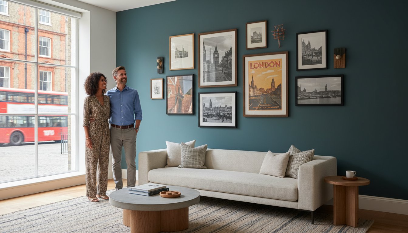
Architectural and Geometric Precision

The allure of brutalist shapes and urban symmetry lies in their honesty. Architectural photography, with its focus on clean lines and perspective, serves as an ideal anchor for hallways and home offices where professional focus is paramount. By finding beauty in the mundane, a style heavily influenced by the “New Topographics” movement, these prints transform everyday structures into timeless studies of form. They provide a sense of order and stability, acting as a sophisticated backdrop for a modern, high-end lifestyle.

Minimalist Portraiture and the Human Form

Portraits can be profoundly minimalist when the photographer strips away the artifice of the studio. Iconic masters like Terry O’Neill excelled at capturing legends through candid, stripped-back compositions that emphasize the human silhouette. Curating from a “Music Archive” or cinematic collection allows you to bring a sense of evocative history into your home without the visual noise of traditional memorabilia. These candid monochrome shots capture the essence of a subject with minimal distraction, offering a narrative that remains elegant, understated, and deeply evocative of a bygone era of glamour.

The Art of Display: Framing and Placement for Impact

The physical presentation of minimalist black and white art prints is what distinguishes a serious collector’s piece from a temporary decoration. A frame is not merely a container; it constitutes roughly 50% of the visual impact and serves as a structural extension of the artwork itself. Choosing the correct profile ensures the work harmonizes with your interior’s scale and architectural rhythm. Without the right housing, even the most prestigious photograph loses its authority and risks looking like a standard poster.

To achieve the coveted “Gallery Look,” you should utilize oversized mounts, often referred to as mats. A wide, acid-free mount creates a deliberate buffer of negative space, forcing the eye to focus on the print’s subject while adding a layer of sophisticated breathing room. This technique is particularly effective for smaller, intimate works that need to command a larger wall. For placement, the Rule of Thirds offers a reliable framework for hanging art in minimalist environments. Instead of centering everything predictably, try positioning your print off-center to create a dynamic tension with the surrounding furniture. This approach respects the “visual silence” of the room, ensuring the wall feels curated rather than crowded.

Protecting your investment is a practical necessity that requires museum-grade materials. High-end prints require UV-protective glass to prevent the degradation of deep blacks and the yellowing of white spaces over time. When you invest in archival quality, you ensure the work remains a lasting piece of history rather than a fading memory. To ensure your collection receives this level of care, consider utilizing our bespoke framing service to match your art with the perfect museum-standard finish.

Bespoke Framing vs. Ready-Made

Bespoke framing offers a level of precision that ready-made plastic or mass-produced wood frames cannot replicate. A professional framer uses acid-free mounting to prevent “cockling,” the unsightly rippling that occurs when paper reacts to humidity. When choosing colors, a slim black frame provides a classic, authoritative border, while white frames offer a seamless, modern integration into light walls. Natural wood frames are increasingly popular in “warm minimalism,” adding a tactile, organic element to the monochrome palette.

Paper Quality: Archival Pigment vs. Standard Prints

The gold standard for collectors is the Archival Pigment Print, often called a Giclée. Unlike standard digital prints, these use lightfast, pigment-based inks that offer incredible longevity. For minimalist black and white art prints, the choice between a Lustre and Matte finish is crucial. Lustre provides a subtle sheen that enhances contrast and depth, while Matte offers a soft, non-reflective surface that feels deeply artisanal. 300gsm cotton rag paper is essential for monochrome depth because its heavy weight and texture allow for the richest possible absorption of dark pigments.

Investing in Heritage: The Galerie Prints Collection

Acquiring minimalist black and white art prints from Galerie Prints is a commitment to preserving the soul of the photographic medium. We don’t merely print images; we act as guardians of a visual legacy, bridging the gap between prestigious historical archives and the refined requirements of modern decor. Our London-based workshop operates with a reverence for artisanal craftsmanship, ensuring that every piece leaving our hands meets the exacting standards of serious collectors. By prioritizing traditional production methods over mass-market speed, we ensure that your chosen artwork is a lasting piece of history rather than a transient decoration.

The prestige of our collection is anchored in our exclusive access to the Getty Images Gallery and the world-renowned Slim Aarons Collection. These archives contain some of the most significant monochrome works of the twentieth century, offering a level of exclusivity that elevates a home from a living space to a curated gallery. When you invest in these works, you’re securing a tangible connection to a bygone era of elegance, rendered with a technical precision that honors the original artist’s vision.

From the Archives to Your Wall

Our curatorial process begins with the meticulous sourcing of original negatives and high-resolution digital files. We understand that authenticity is the cornerstone of value, which is why our prints carry the weight and prestige of the original photographer’s intent. Whether you’re drawn to the stark, geometric lines of mid-century architecture or the quiet intensity of our Music Archives, each print is produced to reveal the deepest blacks and the most nuanced textures. This technical superiority ensures that our most sought-after minimalist photography collections remain as striking in fifty years as they are today.

The Collector’s Journey

We believe the experience of acquiring fine art should be as refined as the work itself. Our curators are available to provide personalized advice, helping you select the perfect minimalist piece that harmonizes with your architectural environment and personal aesthetic. Once your selection is made, we manage the entire process, from professional mounting to secure global delivery, with the precision you’d expect from a luxury gallery. This seamless journey ensures that your investment is protected and presented with the dignity it deserves. Explore our curated collection of minimalist black and white art prints today.

Curate Your Legacy in Monochrome

Embracing the quiet power of monochrome is a deliberate step toward a more intentional home. You now understand that the most impactful minimalist black and white art prints are those that balance structural precision with museum-grade archival integrity. By prioritizing the relationship between negative space and high-contrast form, you’ve moved beyond mere decoration. You’re now equipped to choose works that offer both psychological calm and enduring visual gravitas, ensuring your walls reflect a sophisticated, discerning eye.

As an official Getty Images Gallery Partner, we take pride in offering access to the world’s most prestigious photographic archives. Every piece we produce undergoes a meticulous journey, from the selection of heavy-weight cotton rag paper to our bespoke London-based framing service. These aren’t just images; they’re historical artifacts designed to withstand the passage of time and the shifting tides of interior trends. We invite you to Browse the Curated Minimalist Collection at Galerie Prints and find the cornerstone of your own private gallery. Your space deserves the permanence and prestige of true fine art.

Frequently Asked Questions

What makes an art print “minimalist”?

An art print is considered minimalist when it prioritizes the economy of form and the deliberate use of negative space to convey its subject. It’s not merely about simplicity; it’s about the precision of what remains after all distractions are removed. In high-end photography, this often manifests as stark architectural lines or isolated silhouettes that allow the viewer’s eye to rest on a singular, powerful focal point without visual clutter.

How do I choose the right size for a minimalist black and white print?

Choosing the right size depends on whether you want the piece to act as a subtle accent or a definitive architectural statement. For a truly sophisticated look, we recommend going larger than you initially expect; an oversized print creates a vacuum of attention that reinforces the minimalist philosophy. Ensure the print covers approximately two-thirds to three-quarters of the available wall space above a piece of furniture to maintain a balanced, gallery-standard proportion.

Is black and white art better in a matte or lustre finish?

The choice between finishes depends on the intended atmosphere of the room and the specific lighting environment. A lustre finish is often preferred for minimalist black and white art prints because it enhances the depth of the blacks and the brilliance of the whites, providing a classic photographic feel. Conversely, a matte finish offers a soft, non-reflective surface that feels deeply artisanal and works beautifully in spaces with significant natural light or directed spotlights.

How can I make a minimalist print look more expensive?

You can elevate a minimalist print by investing in museum-grade presentation and our bespoke framing service rather than ready-made options. Utilizing an oversized, acid-free mount creates a luxurious buffer of space that directs the eye and signals that the work is a curated piece of history. When the print is housed in a high-quality frame with UV-protective glass, it gains a sense of permanence and prestige that mass-produced items simply cannot replicate.

What is the best room for minimalist monochrome art?

Minimalist monochrome art is exceptionally versatile, but it’s particularly effective in spaces where you wish to foster a sense of serene order or intellectual focus. In a master bedroom, the simplified palette provides a calming sanctuary, while in a hallway or study, architectural prints create a sophisticated rhythm. Because these works act as neutral anchors, they integrate seamlessly into any room without competing with existing textures or seasonal color palettes.

Do black and white prints fade faster than colour prints?

On the contrary, high-quality monochrome prints produced with archival pigment inks are significantly more stable and resistant to fading than traditional color photographs. When printed on 300gsm cotton rag paper, these works are designed to last for generations without losing their tonal depth. It’s still essential to use UV-protective glass to shield the paper from direct sunlight, which can cause the whites to yellow or the paper fibers to degrade over time.

Should I use a mount (mat) for my minimalist art?

Using a mount is highly recommended for minimalist black and white art prints to provide both aesthetic breathing room and physical protection. A wide, off-white or crisp white mount creates a professional gallery look that emphasizes the intentionality of the composition. Practically, the mount also creates a necessary air gap between the print and the glass, preventing the artwork from sticking or being damaged by trapped moisture or temperature fluctuations.

How do I style a minimalist print without making the room look “empty”?

Styling a minimalist piece effectively involves playing with textures and lighting rather than adding more objects. Pair your print with rich, tactile materials like velvet, natural wood, or stone to create a warm minimalism that feels intentional rather than sparse. Use directed spotlights to emphasize the print’s contrast; this creates a dynamic focal point that commands the room’s energy. By following the Rule of Thirds for placement, you ensure the art feels like a deliberate part of the room’s architecture.

Bold and Vibrant Lifestyle Art Prints: A Curator’s Guide to Saturated Elegance

The most prestigious rooms are never defined by what they hide, but by the stories they boldly broadcast through saturated color and historical light. You likely understand that a house only becomes a home when it reflects a life well-lived; yet the fear of a clashing palette or a generic, soul-less aesthetic often leads to safe, muted choices. Integrating bold and vibrant lifestyle art prints into your collection isn’t just about adding color. It’s about anchoring a room with “Aspirational Realism,” a curated window into a world of timeless elegance that commands attention without ever feeling garish.

We recognize the hesitation that comes with investing in high-saturation pieces, from worries about archival longevity to the challenge of balancing energy with sophistication. This guide will show you how to elevate your interior using the prestige and historical narrative found in high-end photography, such as the legendary works of Slim Aarons or Terry O’Neill. You’ll discover how museum-quality giclée standards, utilizing pigment-based inks and archival cotton papers, protect your investment. We’ll explore the technical excellence of artisanal production and how bespoke framing ensures these vibrant stories remain as vivid as the day they were captured, turning your space into a sanctuary of energetic, expensive design.

Key Takeaways

  • Distinguish between ordinary snapshots and the curated, high-saturation works of masters like Slim Aarons and Terry O’Neill that define the jet-set aesthetic.
  • Discover how to select bold and vibrant lifestyle art prints that serve as sophisticated focal points, balancing energetic color palettes with your existing interior architecture.
  • Learn the psychological impact of specific hues and how to harness saturated color to evoke feelings of calm, energy, or timeless prestige within a living space.
  • Explore the technical superiority of archival Giclée and C-type printing, ensuring your investment in photographic heritage is preserved against time and fading.
  • Understand how bespoke framing acts as a bridge between historical narrative and modern furniture, creating a cohesive look that feels both expensive and deeply personal.

Defining the Aesthetic: Beyond the Saturated Lens

True elegance in photography isn’t found in the merely bright; it resides in the deliberate. When we discuss bold and vibrant lifestyle art prints, we are referring to a sophisticated mastery of high-contrast, high-saturation imagery that elevates authentic human experiences into the realm of the extraordinary. Unlike the flat, neon-heavy files found in mass-market décor shops, these curated works rely on a concept we call “Aspirational Realism.” This is the delicate art of capturing a moment that feels entirely genuine yet possesses an impossibly polished, cinematic quality. It’s the difference between a simple holiday photo and a piece of history that commands a room’s attention through its sheer visual weight.

A significant part of this luminous look stems from a reverence for natural light. Master photographers often waited hours for the “Golden Hour,” that specific window of time when the sun’s low angle provides a warmth and depth that artificial filters cannot replicate. This natural brilliance ensures the colors are deeply saturated without losing the subtle textures of the subject, whether it’s the ripple of a pool or the silk of a summer dress. By prioritizing the sun’s own palette, these artists achieved a clarity that feels both vintage and remarkably modern.

The Anatomy of a Vibrant Lifestyle Print

The most compelling pieces in our collection often utilize specific color theory principles to create visual harmony that lasts. Consider the signature palettes of Slim Aarons; his work frequently pairs Mediterranean blues with sun-drenched yellows, creating a complementary balance that feels both energetic and stable. High-key lighting plays a crucial role here, flooding the frame with light to ensure vibrancy remains high while preserving the fine details in the shadows. This aesthetic is the precise intersection of candid human energy and meticulous editorial precision.

Vibrancy vs. Saturation: A Curatorial Distinction

A discerning collector understands that there is a vast difference between vibrancy and mere saturation. In amateur photography, increasing saturation often leads to flat, “clipped” colors where skin tones become unnaturally orange and textures disappear. Professional-grade bold and vibrant lifestyle art prints preserve the integrity of the human form while pushing the boundaries of the color spectrum. This legacy was largely established by the historical use of Kodachrome film, celebrated for its rich, realistic reds and greens. When selecting a piece, look for luminosity and depth. A truly great print doesn’t just look bright; it appears to glow from within, offering a three-dimensional quality that invites the viewer to step into the frame and join the narrative.

The Pioneers of Aspirational High-Life Photography

While modern digital filters attempt to mimic the glow of a sun-drenched life, the true essence of this genre was forged by a handful of visionaries who lived among their subjects. These masters didn’t just document the elite; they curated a visual language of success and leisure. By choosing bold and vibrant lifestyle art prints from these specific archives, a collector isn’t just buying a picture, but a certified piece of photographic heritage. This aesthetic was born from an era where color was a luxury, used deliberately to tell stories of mid-century glamour that still resonate in the modern home.

The vibrancy found in these works isn’t a post-production trick. It’s a direct reflection of the actual environments these photographers inhabited. From the bright umbrellas of the Amalfi Coast to the neon energy of a 1960s film set, the saturation was a byproduct of the era’s optimism. These pioneers understood that the psychological effects of color could transform a static image into a living experience, inviting the viewer to share in the warmth of a world that felt both authentic and impossibly elegant.

Slim Aarons: The Master of Saturated Leisure

Slim Aarons remains the undisputed architect of aspirational photography. His philosophy was famously simple: “attractive people doing attractive things in attractive places.” His ‘Poolside’ series, particularly works like “Poolside Gossip” at the Kaufmann House, serves as the definitive benchmark for luxury interior art in 2026. The way he captured the turquoise of a Palm Springs pool against a stark desert sky creates a visual harmony that few have ever matched. For those looking to understand the technical depth behind his lens, our definitive guide to Slim Aarons explores his transition from a combat photographer to the chronicler of the world’s most exclusive social circles.

Terry O’Neill and the Energy of Fame

If Aarons captured the environment of the elite, Terry O’Neill captured their pulse. Known for his unprecedented access to the 1960s jet set, O’Neill brought a raw, candid energy to his celebrity portraits. His shift from traditional black and white to iconic color works allowed him to showcase the vibrant personalities of icons like Brigitte Bardot. These archives are increasingly rare and highly collectable, offering a sense of permanence that fleeting digital trends lack. O’Neill’s use of color was a narrative tool that highlighted the “color” of fame itself, making his work a cornerstone for anyone seeking bold and vibrant lifestyle art prints with genuine soul. You can explore these legendary perspectives in our Terry O’Neill photography collection to find a piece that resonates with your own space.

The Emotional Resonance: Why Bold Colour Matters in Art

Color is rarely a neutral participant in a room’s atmosphere; it’s a silent conductor of mood and energy. When you introduce bold and vibrant lifestyle art prints into a living space, you’re doing more than filling a void on a wall. You’re establishing an emotional frequency. While some collectors lean toward the timeless allure of black and white pictures for their quiet, structural grace, others seek the visceral pulse that only a saturated palette can provide. This choice often stems from a desire to capture the “Nostalgia Factor,” where deep cyans and sun-baked oranges evoke the sensory memories of Mediterranean summers and the golden age of travel.

The science behind these reactions is well-documented. As explored in research regarding The Psychology of Color in Graphic Design, specific hues can fundamentally alter human perception and behavior. Saturated blues tend to instill a sense of expansive calm, reminiscent of the endless horizons in a Slim Aarons seascape, while bold yellows and reds provide a shot of adrenaline to social spaces. By understanding these triggers, a curator can use bold and vibrant lifestyle art prints to dictate the “temperature” of a home, ensuring the art does more than decorate, it resonates.

Creating a Mood with Chromatic Intensity

Selecting the right print requires a thoughtful analysis of a room’s intended function. A high-energy dining room or entrance hall benefits from the electric vitality of a Terry O’Neill celebrity portrait, where the colors pulse with the rhythm of the 1960s. For a bedroom, a “soft-vibrant” approach, focusing on the deep teals or muted terracottas of a coastal landscape, offers energy without disrupting rest. Large-format prints also play a vital role in spatial perception; a massive, color-saturated piece can make a small room feel intentionally cozy and expensive rather than cramped. A single, commanding print serves as the definitive visual anchor that harmonizes every other element in your room’s color story.

Overcoming the “Garish” Fear

The most common hesitation among new collectors is the worry that a bright piece will appear “too loud” or clash with existing decor. This is where professional curation differs from retail impulse. To prevent a print from feeling garish, balance its intensity with neutral wall tones, such as gallery white or soft charcoal, and incorporate natural textures like wood or linen. Pay close attention to the “white space” and internal composition of the photograph itself; a well-composed masterwork uses color as a focal point, not a chaotic wash. Because we prioritize museum-quality production, the depth and luminosity of the ink prevent the work from ever looking like a flat, commercial poster, maintaining a level of sophistication that honors both the artist and your home.

How to Curate Vibrant Lifestyle Prints in Modern Interiors

Integrating bold and vibrant lifestyle art prints into a contemporary home requires a shift from mere decoration to architectural intention. A common error is selecting a size that feels timid against the scale of modern furniture; instead, aim for pieces that command the room’s attention. Large-scale statement prints are a dominant trend in 2026, serving as a dramatic focal point that anchors the room’s energy. To ensure the art feels integrated rather than imposed, use a bespoke framing service to bridge the visual gap between the photograph’s saturated palette and your existing furniture textures. A hand-finished wood frame or a sleek, gallery-style shadow box can ground the most electric colors, providing a sense of permanence and stability.

The perceived vibrancy of your collection isn’t static; it shifts with the movement of the sun and the quality of your interior lighting. Natural light can bring out the hidden depths of a sun-drenched Mediterranean scene, yet it also presents the greatest risk to your investment. While mass-market prints often use dye-based inks that shift color under sunlight, our archival Giclée and C-type standards use pigment-based inks designed to resist fading for decades. To truly honor the work, consider how it interacts with the room’s light throughout the day, perhaps placing a particularly luminous Slim Aarons piece where it can catch the soft, late-afternoon glow.

The Art of the Gallery Wall

A thematic gallery wall offers a sophisticated way to display a diverse collection while maintaining a cultured feel. You might pair high-society lifestyle shots with fine art photography or iconic music photography to create a narrative of 20th-century cool. For high-impact, colorful imagery, keep the spacing tight-roughly two to three inches between frames-to ensure the collection reads as a single, powerful installation. Using consistent, bespoke framing across disparate vibrant subjects provides the visual “connective tissue” needed to prevent the wall from feeling cluttered or chaotic.

Lighting Your Vibrant Collection

Lighting is the final, essential layer of curation. Direct UV light is the primary enemy of non-archival prints, leading to brittle paper and washed-out colors. We recommend “museum glass” for any high-saturation lifestyle art; its anti-reflective properties and UV-filtering capabilities ensure the colors remain crisp while reducing distracting glare. For a truly professional finish, use dedicated picture lights. These fixtures can be adjusted to enhance the internal “glow” of a saturated scene, making a bold and vibrant lifestyle art print feel as though it’s being illuminated from within. Explore our full range of premium photographic collections to find the perfect centerpiece for your next curation project.

Investing in History: The Galerie Prints Difference

A photograph of historical significance is more than a decoration; it’s a window into a specific cultural zenith. When you choose bold and vibrant lifestyle art prints from our collection, you aren’t merely selecting a wall covering. You’re acquiring a piece of photographic heritage produced to the highest archival standards. Unlike temporary decor that relies on non-traditional materials like infused acrylics, we remain committed to the prestige of traditional C-type and Giclée printing methods. These techniques ensure that the deep, saturated tones of a Slim Aarons poolside or a Terry O’Neill portrait remain as striking in fifty years as they are today.

Our status as a premier destination for serious collectors is anchored by our exclusive partnerships with renowned photographic archives, including the Slim Aarons archives. These relationships allow us to work directly from original negatives and transparencies, preserving a level of detail and color accuracy that secondary retailers cannot replicate. Every print is a testament to our role as a bridge to a bygone era of elegance, supported by a localized, artisanal framing process in London. This hand-finished approach ensures that your art is protected by museum-quality materials, transforming a simple purchase into a lasting investment in history.

From Archive to Wall: The Production Journey

The journey from a vintage 35mm transparency to your living room wall is one of meticulous technical precision. We prioritize the integrity of the original source material, utilizing Giclée standards that demand a minimum resolution of 300 dots per inch and pigment-based inks. Our bespoke mounting and hand-finished frames are crafted by seasoned specialists who understand the nuances of high-saturation color. We guarantee that our prints maintain their vibrancy for generations, providing the permanence that high-caliber visual art deserves.

Start Your Vibrant Collection Today

Owning a piece from the Slim Aarons or Terry O’Neill archives brings a quiet authority to any interior, signaling a discerning appreciation for both history and aesthetics. Whether you’re drawn to the sun-drenched leisure of the jet-set era or the electric energy of 1960s fame, our curated collections offer a gateway into an elite world of beauty. We invite you to move beyond the generic and invest in art that possesses a genuine soul. Explore our most vibrant lifestyle prints and bespoke framing options to find a legacy piece that resonates with your personal narrative.

Cultivating a Legacy of Saturated Elegance

Selecting the perfect piece for your home is a journey into the heart of photographic heritage. By embracing bold and vibrant lifestyle art prints, you aren’t just decorating a wall; you’re anchoring your space with the energy of a sun-drenched, aspirational era. We’ve explored how the deliberate use of saturated color by masters like Slim Aarons and Terry O’Neill creates an emotional frequency that transforms modern interiors. You now understand that true vibrancy relies on technical excellence, from the preservation of original transparencies to the application of pigment-based inks on archival paper.

As an official Getty Images Gallery Partner, we ensure every print meets the rigorous standards of a serious collector. Our bespoke, London-based artisanal framing service provides the final, protective layer to your investment, guaranteeing museum-quality results that endure for generations. It’s time to move beyond the temporary and own a lasting piece of history. Browse the Iconic Slim Aarons Collection at Galerie Prints and begin curating a home that resonates with timeless, saturated elegance.

Frequently Asked Questions

What makes a photograph “lifestyle” rather than just a portrait?

Lifestyle photography prioritizes the environment and the narrative moment over the simple documentation of a subject’s features. While a portrait focuses on the individual, a lifestyle shot captures “Aspirational Realism,” placing subjects within a curated world of architecture, leisure, and social interaction. It tells a story of a life well-lived, where the surroundings are just as vital to the composition as the people within them.

Will the vibrant colours in my print fade over time?

Our commitment to archival Giclée and C-type printing ensures that your collection remains protected against the passage of time. By utilizing pigment-based inks and acid-free, 100% cotton rag papers, we produce bold and vibrant lifestyle art prints designed to resist UV degradation for decades. When paired with museum-quality glass, these prints maintain their chromatic integrity and luminosity without the risk of washing out.

How do I choose the right frame for a very colourful photograph?

The ideal frame acts as a sophisticated border that grounds the energy of the image without competing for attention. For high-saturation works, we often recommend neutral tones such as gallery white, charcoal, or hand-finished natural woods. Our bespoke framing service is designed to create a visual bridge between the electric palette of the art and the architectural textures of your home, providing a polished and permanent finish.

Can I mix bold lifestyle prints with black and white photography?

Combining saturated imagery with monochrome works is a hallmark of a cultured and worldly collection. The structural grace of black and white photography provides a timeless counterpoint to the visceral pulse of a vibrant scene, creating a layered narrative on any gallery wall. To maintain a sense of order, we suggest using consistent framing materials to unify the disparate styles into a single, cohesive installation.

What is the best room in the house for vibrant lifestyle art?

Social spaces that benefit from a sense of energy and prestige, such as dining rooms, entrance halls, or primary living areas, are the most effective settings for these pieces. A large-format print serves as a definitive visual anchor that can dictate the “temperature” of the entire room. In more private quarters, choosing a “soft-vibrant” piece with deep Mediterranean blues or coastal teals offers a luxurious atmosphere that remains tranquil.

Are these prints considered a good investment for art collectors?

Investing in certified archives from masters like Slim Aarons or Terry O’Neill is a strategy for those seeking both aesthetic beauty and long-term value. As the global art market expands, particularly for high-caliber photography, limited edition and estate-stamped prints from recognized historical archives continue to be highly sought after. These works are not merely decorations; they are tangible pieces of photographic heritage that carry a sense of permanence.

What is the difference between a poster and a fine art lifestyle print?

The distinction lies in the material quality and the authenticity of the source. A standard poster is mass-produced on thin, non-archival paper using dye-based inks that shift and fade within years. In contrast, a fine art print is produced from original negatives or transparencies using museum-grade standards. This results in a three-dimensional depth and a level of detail that a commercial reproduction simply cannot replicate.

How does lighting affect the look of a high-saturation print?

Lighting serves as the final layer of curation, influencing how the colors resonate within the space. Natural light can bring out the warmth of a sun-drenched scene, but it requires the protection of UV-filtering glass to prevent damage. Indoors, using dedicated picture lights allows you to control the “glow” of the work, making a high-saturation print feel as though it is being illuminated from within, regardless of the time of day.

Beyond the Generic: Sophisticated Alternatives to Mass Produced Wall Art

The most intimate spaces in your home deserve more than the hollow aesthetic of “fast decor.” While it’s tempting to fill a void with a generic canvas, your walls shouldn’t mirror the same predictable catalogs found in every big-box retailer. If you’ve ever felt that your living room looks a bit too cookie-cutter, you’re likely seeking alternatives to mass produced wall art that offer genuine soul and historical weight. Distinguishing between a temporary poster and a museum-grade print can feel daunting, especially when you want a home that reflects a curated, worldly perspective rather than a fleeting trend.

We believe that art should act as a portal to a specific historical moment or an aspirational lifestyle. In this article, you’ll discover how to transcend the generic by investing in archival photography and limited edition prints that carry a sense of permanence. We’ll explore the prestige of the Terry O’Neill and Slim Aarons collections, the nostalgia of cinema lobby cards, and the technical superiority of bespoke framing. By the end, you’ll understand how to select pieces with true provenance that ensure your collection remains as timeless as the stories they tell.

Key Takeaways

  • Identify why “fast decor” fails to provide the unique character your home deserves and how to transition toward a more intentional, curated aesthetic.
  • Explore sophisticated alternatives to mass produced wall art by accessing world-class archives, including the legendary works of Slim Aarons and Terry O’Neill.
  • Learn to distinguish quality through the technical superiority of Giclée printing and archival-grade materials that ensure your art remains a lasting legacy.
  • Discover how to move beyond matching furniture to telling a story by integrating rare pieces like cinema lobby cards and vintage movie posters into your decor.
  • Understand the role of bespoke framing and localized craftsmanship in transforming a high-caliber print into a finished gallery-quality masterpiece.

The ‘Fast Decor’ Dilemma: Why Mass-Produced Wall Art Fails the Modern Home

The rise of “fast decor” has mirrored the trajectory of fast fashion, flooding the market with disposable, trend-chasing pieces designed for immediate consumption rather than enduring appreciation. These mass-produced items, often found in the sprawling aisles of big-box retailers, are manufactured to satisfy a fleeting aesthetic impulse. They fill a void on a wall but offer little in the way of narrative or soul. For those who view their home as a sanctuary of personal history, these pieces fail because they lack the weight of intention. Discerning collectors are moving toward a philosophy of “slow decor,” where the focus shifts from filling space quickly to curating a collection that prioritizes quality, story, and longevity. Seeking alternatives to mass produced wall art is not merely a design choice; it’s an act of reclaiming the home’s unique character from the clutches of the generic.

Identifying the ‘Hotel Room’ Aesthetic

Mass-market art often carries distinct visual markers that betray its origins. You’ll notice thin, flimsy paper that ripples under humidity, plastic frames that mimic wood grain with startling inaccuracy, and over-saturated filters that attempt to mask a lack of true photographic depth. Standard offset lithography, the process used for most inexpensive posters, cannot replicate the rich tonality or tactile texture found in fine art processes. This creates a “hotel room” aesthetic, a sense of sterile anonymity that dilutes your personal narrative. While some avant-garde collectors might appreciate the conceptual nature of Found object art, most mass-produced decor lacks even that level of intellectual curiosity, offering instead a diluted version of beauty that feels hollow and repetitive.

The True Cost of Inexpensive Prints

The allure of a low price tag often hides the inevitable degradation of the product. Non-archival materials are prone to rapid decline. Standard inks lack UV resistance, meaning a print positioned in a sunlit room can begin to fade or shift in color within just a few years. It’s a frustrating cycle. You buy a piece to brighten a room, only to watch it lose its vitality. Beyond the physical decline, mass-produced frames often utilize acidic backing boards that can leach into the paper over time, causing yellowing and brittle fibers. When you consider the environmental impact of this disposable cycle, the “affordable” option becomes quite costly. Investing in alternatives to mass produced wall art ensures that your investment retains its visual and emotional value for decades, rather than just a single season.

The Archival Alternative: Fine Art Photography and the Power of the Archive

The distinction between a mere decoration and a piece of cultural history lies in its provenance. While big-box retailers rely on algorithms to predict trends, the true alternatives to mass produced wall art are found within the silent, temperature-controlled corridors of the world’s great archives. These repositories, which house the life’s work of legendary photographers, offer a depth of narrative that “fast decor” simply cannot mimic. By choosing an image with a documented history, you’re not just filling a space; you’re acting as a temporary guardian of a specific moment in time.

Photographic heritage represents a cornerstone of a truly sophisticated home. It bridges the gap between an unattainable museum original and a generic poster, providing a tangible connection to moments that shaped our collective consciousness. A curator’s role is essential in this process. They don’t just find an image. They select a narrative that has already stood the test of time, ensuring that the work remains relevant even as your personal style evolves. Selecting these alternatives to mass produced wall art is about more than aesthetics; it is about the quiet authority of authenticity.

The Allure of the Slim Aarons Collection

Slim Aarons famously documented “attractive people doing attractive things in attractive places,” creating a visual language of mid-century leisure that remains unparalleled. As the master of aspirational photography, Slim Aarons offers more than just a view of a pool; he offers a seat at the table of high society. It’s vital to distinguish between an authorized archival print, produced directly from the original transparency, and a diluted digital reproduction. The former preserves the vividness and specific grain that defines the artist’s legacy, while the latter is merely a hollow imitation.

Beyond Modernity: Tapping into Iconic Archives

Tapping into iconic archives allows a collector to move beyond modern trends and access the emotional resonance of the mid-century to the late 90s. These archives, much like the Library of Congress archives, preserve the exquisite detail and historical weight of the original negatives. Selecting fine art photography with “official” status ensures that you are investing in a piece with future collectability. These works carry a gravity that mass-produced decor can never replicate, acting as a permanent fixture of history on your wall. You might consider exploring our curated music archives to find a piece that resonates with your own history.

Materiality and Craft: The Technical Superiority of Bespoke Prints

The transition from a mere image to a physical masterpiece requires a profound understanding of materiality. While the digital age has made imagery ubiquitous, the physical print remains the final, definitive expression of a photographer’s vision. True alternatives to mass produced wall art rely on the Giclée revolution, a sophisticated printing process that utilizes high-definition, pigment-based inks. Unlike the dye-based inks found in standard commercial printers, which soak into the fibers and lose their vibrancy, pigment inks sit upon the surface of the medium. This creates a chromatic depth and tonal graduation that is unreachable by standard offset lithography, allowing the viewer to perceive the subtle textures of a mid-century poolside or the fine grain of a vintage film negative.

The tactile experience of art is often overlooked in the rush to fill a room. A high-end print possesses a physical weight and surface texture that commands attention. When you hold a bespoke print, you feel the difference of cotton rag or pH-neutral fibers, materials that provide a stable, luxurious base for the imagery. This focus on craft ensures that the viewing experience is not just visual, but sensory. By prioritizing these technical nuances, a collector ensures their home is anchored by pieces that possess a palpable sense of quality and permanence.

Understanding Archival Standards

In the world of fine art, “Museum Quality” is a specific technical benchmark, signifying that a piece is constructed to last for 100 years or more without significant fading or deterioration. This longevity is achieved through the use of pigment-based inks, which offer superior lightfastness compared to their dye-based counterparts. Archival photo paper serves as the essential, acid-free foundation that distinguishes a permanent artistic investment from a fleeting, mass-produced alternative. This commitment to chemical stability ensures that the history captured within the frame remains as vivid for the next generation as it is today.

The Art of Bespoke Framing

A bespoke framing service is a non-negotiable element for those seeking alternatives to mass produced wall art, acting as both a protective vessel and a stylistic finishing touch. Professional framing creates a controlled environment that shields the print from humidity, physical warping, and the slow damage of UV rays. Beyond protection, the frame must complement the era and soul of the work. For instance, the iconic works within our Slim Aarons collection are often best served by a slim white wood frame, a choice that mirrors the clean, modernist lines of the architecture he documented. Proper mounting and matting further elevate the piece, providing the “breathing room” necessary to create a commanding gallery-like presence within a residential setting.

Curation with a Narrative: Choosing Art with a Historical Pulse

Sophisticated interiors are rarely built on color coordination alone; they’re built on narrative. While mass-market retailers often encourage consumers to select art that simply matches a rug or a sofa, a truly curated home demands a deeper dialogue between the viewer and the wall. When seeking alternatives to mass produced wall art, the most discerning collectors look for a historical pulse. This shift from “matching” to “storytelling” transforms a room from a static showroom into a living gallery. It’s about finding pieces that possess a documented history, whether that’s a moment of high-society leisure or a candid glimpse into a legendary recording session.

The “Conversation Starter” test is a simple yet effective metric for any new acquisition. Ask yourself: does this piece have a provenance or a story to tell guests? If the answer is no, it likely lacks the staying power required for a lasting collection. Archival treasures represent the pinnacle of alternatives to mass produced wall art because they carry an inherent authority. They don’t just sit on the wall; they command the space, inviting questions about the photographer, the subject, and the specific era they represent. This intellectual weight ensures that your decor remains relevant long after fleeting interior trends have faded.

The Timelessness of Black and White

In an era of over-saturated digital filters, black and white pictures act as a sophisticated anchor for the modern home. By stripping away the distraction of color, monochrome art forces a focus on form, shadow, and raw emotion. These works serve as a timeless alternative to the loud, trend-driven palettes found in big-box stores. Integrating monochrome pieces into a contemporary room doesn’t mean sacrificing warmth. Instead, it provides a neutral yet powerful focal point that allows your furniture and architectural details to breathe, creating a sense of composed elegance that color photography sometimes struggles to achieve.

Music and Film: The Art of Cultural Memory

The transition from disposable “fan posters” to fine art photography marks the maturity of a collector’s journey. Instead of generic reprints, imagine owning a piece of the Terry O’Neill archive or rare cinema lobby cards. These cards are not merely advertisements; they are tangible pieces of cinematic heritage that once sat in the foyers of grand theaters. Whether it’s a Star Wars limited edition print or an iconic image from our music archives, these cultural icons provide an intellectual pulse to a home office or library. They act as a bridge to a bygone era of elegance and artistry. Browse our collection of authentic cinema lobby cards to find a piece of film history that resonates with your personal style.

Elevating Your Space with Galerie Prints: The Guardian of Photographic Heritage

At the intersection of historical preservation and contemporary interior design, Galerie Prints operates as a bridge between world-class archives and private collectors. Our mission is rooted in the belief that a home’s walls should serve as a testament to cultural significance rather than a reflection of mass-market trends. By positioning ourselves as guardians of photographic heritage, we provide access to imagery that was once reserved for museum galleries or elite private estates. Every piece we offer, from the sun-drenched poolside scenes of the Slim Aarons collection to the gritty intimacy of Terry O’Neill’s music archives, represents a deliberate choice for those who seek alternatives to mass produced wall art. We don’t just sell prints; we facilitate the acquisition of history.

Our commitment to localized, artisanal craftsmanship is what truly separates a Galerie Print from a standard commercial reproduction. We understand that the technical superiority of the Giclée process and the use of pH-neutral fibers only reach their full potential when handled by experts who respect the medium. Each frame is a product of our bespoke framing service, ensuring that your chosen piece is protected and presented with the dignity it deserves. This artisanal marker acts as a seal of quality, a promise that your investment will remain a stable, vibrant, and evocative part of your home for decades to come. By curating the world’s most iconic photographers, we ensure your walls never feel mass-produced.

A Curated Path to Ownership

Transitioning from an admirer of fine art to a serious collector should be a seamless, intellectually stimulating journey. Our online gallery is designed to provide the context and narrative depth necessary to make an informed decision, offering a steady and composed flow of information that mirrors the experience of a physical gallery. Whether you’re interested in Star Wars limited edition prints or rare cinema lobby cards, the process is one of discovery rather than a mere transaction. Our bespoke framing service completes the experience, providing ready-to-hang luxury delivered with precision. For those looking to build a cohesive gallery wall, we offer personalized advice to help you select pieces from our archives that speak to a singular, sophisticated aesthetic.

Your Home as a Private Gallery

Investing in authorized, high-fidelity archival prints is an investment in permanence. By choosing alternatives to mass produced wall art with a clear provenance, you join an elite community of collectors who value the stability of history over the frantic pace of modern trends. Your home becomes more than a residence; it becomes a private gallery, a sanctuary of beauty and history that reflects a worldly, discerning perspective. The prestige of owning a piece from the Terry O’Neill or Slim Aarons collection provides a sense of wonder and nostalgia that generic decor can never hope to achieve. Explore our curated collections and find your home’s signature piece to begin your journey into the world of high-caliber photographic art.

Curating Your Legacy of Visual Heritage

Transcending the cycle of disposable decor requires a commitment to authenticity and a reverence for the stories captured through a lens. By prioritizing archival quality over fleeting trends, you transform your home into a private gallery that reflects a discerning, worldly perspective. We’ve explored how the technical precision of Giclée printing and the historical weight of iconic archives provide the ultimate alternatives to mass produced wall art, ensuring that your collection remains as vivid and relevant decades from now as it is today.

As an authorized Getty Images Gallery partner, we’re dedicated to preserving the integrity of every image. Our bespoke framing is executed by master craftsmen to museum standards, and we provide worldwide delivery of our museum-quality prints to ensure your chosen piece arrives ready to command the room. Your walls are the canvas for your personal history; choose pieces that speak with quiet authority and enduring elegance.

Discover the world’s most iconic photographic archives at Galerie Prints and begin curating a home that is truly your own.

Frequently Asked Questions

What makes a print ‘fine art’ rather than just a poster?

A fine art print is defined by its archival quality and documented provenance, whereas a poster is a mass-produced item intended for temporary display. Fine art prints utilize pigment-based inks and museum-grade paper to capture the artist’s original vision with extreme fidelity. While posters often use thin, acidic paper that degrades quickly, a fine art print remains stable and vibrant for generations. This distinction ensures your home reflects a curated collection rather than a fleeting retail trend.

Why is archival paper so important for wall art longevity?

Archival paper is essential because it lacks the acidic compounds that cause standard paper to turn yellow and become brittle over time. These pH-neutral fibers, often made from 100% cotton rag, provide a chemically stable environment for the photographic image. By choosing archival materials, you’re ensuring your art can withstand a century of display without losing its structural integrity or visual clarity. It’s the foundation of any serious investment in photographic heritage.

Are limited edition photography prints a good investment?

Limited edition photography prints can be a sound investment because they possess inherent scarcity and documented authenticity. When a run is capped at a specific number, the supply is finite, which can lead to appreciation as the artist’s reputation grows. It’s vital to ensure the prints are authorized by the estate or archive to maintain their future collectability. These pieces offer a sense of exclusivity that mass-market reproductions simply cannot provide.

How do I know if a Slim Aarons print is authentic and authorized?

Authenticity for a Slim Aarons print is verified through authorized gallery partnerships and certificates of authenticity. Genuine prints are produced directly from the original negatives or transparencies held in the Getty Images Archive. You should look for official stamps or documentation that confirm the piece was created using museum-grade processes. Unauthorized digital copies lack the chromatic depth and specific grain that characterize Aarons’ masterworks, making them poor substitutes for the real thing.

What are the best alternatives to mass-produced art for a mid-range budget?

Cinema lobby cards and music archive prints represent some of the best alternatives to mass produced wall art for those with a mid-range budget. These pieces offer a tangible connection to cinematic or musical history without the premium price of oversized limited editions. They provide a unique, artisanal feel and a rich narrative that elevates your space. By selecting these curated items, you’re investing in authentic cultural artifacts that possess genuine soul and historical weight.

Can I frame a fine art print myself, or should I use a professional service?

You should always use a professional framing service to ensure the long-term protection and presentation of your fine art. DIY framing often involves acidic materials or non-UV glass that can cause irreversible damage to the print through chemical leaching or sun bleaching. A professional framer provides bespoke mounting and archival-grade barriers that shield the work from humidity and warping. This ensures your art remains a permanent fixture of your home’s aesthetic legacy.

How do I create a gallery wall that doesn’t look like a retail display?

Creating a sophisticated gallery wall involves moving beyond uniform grids to embrace a mix of scales, eras, and textures. You might anchor the arrangement with an iconic Terry O’Neill photograph and surround it with smaller cinema lobby cards or music archive pieces. This varied approach avoids the sterile feel of a retail display. By blending different historical pulses, you tell a personal story that reflects your own journey and appreciation for the arts.

What is the difference between giclée printing and standard digital printing?

The primary difference lies in the quality of the ink and the precision of the output. Giclée printing utilizes twelve or more pigment-based inks to achieve a depth of color and tonal graduation that standard four-color digital printers can’t replicate. These pigments are specifically designed for lightfastness and longevity. Standard digital printing often uses dye-based inks that are prone to fading and lack the professional resolution required for high-caliber photographic art.

How to Choose Art That Reflects Your Personality: A Curator’s Guide

Your home should be a visual autobiography, yet many find themselves living in spaces that feel more like a sterile showroom than a sanctuary. It’s a common frustration to look at a blank wall and struggle to find art that reflects my personality without the fear of making a costly, misaligned investment. With the global art market reaching $59.6 billion in 2025, according to the Art Basel and UBS report, the sheer volume of choice can feel overwhelming. You aren’t just looking for a decoration. You’re seeking a piece of history that resonates with your soul.

You likely believe that your surroundings should speak to your personal history and your aspirations. We’ll show you how to translate your inner world into a curated visual legacy using fine art photography and iconic archives. This guide explores the deep connection between character and aesthetics, giving you the confidence to select high-end prints that endure. From understanding the provenance of a silver gelatin print to embracing the flight to quality trend seen in 2026, you’ll learn to build a collection that is uniquely yours.

Key Takeaways

  • Perform a personal “Intuition Audit” to identify recurring visual themes and articulate the specific narrative you wish to project within your home.
  • Discover how iconic archives, ranging from the aspirational luxury of Slim Aarons to edgy music photography, serve as aesthetic anchors for finding art that reflects my personality.
  • Understand the vital distinction between a standard poster and an archival fine art print, ensuring your collection embodies values of craftsmanship and technical excellence.
  • Learn to utilize bespoke framing as a final curatorial polish that bridges the historical significance of a print with the modern architecture of your living space.

The Psychology of Visual Curation: Why Art is a Mirror of the Self

Choosing a piece for your wall is rarely about filling a gap in the plaster. It’s an act of quiet confession, a way to signal who you are without saying a word. We often view our homes as sanctuaries, yet the objects within them serve as a non-verbal autobiography, recording our tastes, travels, and deepest values. When you find yourself searching for art that reflects my personality, you aren’t just shopping for decor; you’re engaging in a sophisticated form of self-discovery that moves beyond the superficial trend of buying to match a sofa, opting instead for a collection that resonates with your inner life. This curated approach ensures that every frame holds art that reflects my personality with uncompromising clarity.

Scientific research into the Psychology of art indicates that our aesthetic preferences aren’t accidental. They’re tied to our cognitive structures and emotional needs. Your “visual diet,” the imagery you consume and surround yourself with daily, has a profound impact on your domestic sanctuary. It influences your sense of belonging and your creative energy. With the global art market reaching $59.6 billion in 2025, collectors are increasingly moving away from mass-produced items toward pieces with genuine provenance. By shifting your perspective from mere acquisition to intentional curation, you transform your living space into a reflective mirror of your true self.

The Emotional Resonance of Fine Art Photography

Photography offers a visceral connection to reality that other mediums often lack. It bridges the gap between the viewer and a specific, captured moment in history. When you invest in fine art photography, you’re often responding to a “gut reaction” triggered by the power of nostalgia. Iconic archives allow us to borrow the glamour or grit of past eras to reflect our current aspirations. Whether it’s the effortless cool of a 1960s film star or the raw energy of a London darkroom print, these images evoke memories we may not personally own, yet they feel essential to our narrative.

Values vs. Aesthetics: What Your Walls Say About You

Your walls act as a broadcast of your internal priorities. A collector who gravitates toward high-octane music photography often values rebellion, energy, and the cultural zeitgeist. Conversely, someone drawn to minimalist landscapes likely prioritizes serenity and mental clarity. Adopting an “Archival Mindset” signifies a respect for permanence and craftsmanship. It shows you value the technical superiority of a hand-printed negative over the fleeting nature of a digital trend. Choosing a silver gelatin print, for instance, communicates a commitment to authenticity and the preservation of photographic heritage. Your art choice is the visual manifestation of the principles you live by and the legacy you intend to leave behind.

Decoding the Aesthetic: Matching Iconic Genres to Your Personality

Moving beyond generic style quizzes that offer surface-level results, curating a collection from established archives allows for a deeper exploration of your identity. The research on personality and art preferences suggests our choices are often mirrors of our psychological traits, whether we crave the structured elegance of a classic portrait or the chaotic energy of a live performance. When I seek art that reflects my personality, I’m looking for a visual shorthand for my values. Identifying which photographic genre resonates with you is the first step in building a legacy that feels authentic rather than merely decorative.

  • The Glamour Seeker: Drawn to the Slim Aarons collection for its portrayal of high-society leisure and aspirational optimism.
  • The Rebel Spirit: Finds resonance in music photography, where the raw, unscripted energy of the stage reflects an unconventional worldview.
  • The Historian: Prefers lobby cards, treating their walls as a museum for cinematic heritage and narrative storytelling.
  • The Sophisticate: Values the quiet, architectural strength of black and white pictures, perfect for the minimalist who seeks depth without distraction.

By aligning your choice with these established archetypes, you ensure your home tells a cohesive story. You can explore these diverse narratives within the world’s finest photography collections to find your perfect match.

The Aspirational Lens of Slim Aarons

Slim Aarons famously claimed to photograph “attractive people doing attractive things in attractive places.” This philosophy appeals to the social optimist who appreciates mid-century modern aesthetics and the sun-drenched allure of the jet-set era. These prints don’t just decorate; they transport. They bring an air of poolside leisure and effortless prestige to even the most utilitarian urban spaces. For the collector who prizes elegance and a life well-lived, these images are the ultimate expression of art that reflects my personality.

The Raw Energy of Music and Cinema Archives

For those with a bolder edge, the archives of Terry O’Neill offer a masterclass in capturing the elusive “cool” persona. His work doesn’t just show a celebrity; it reveals a character. Choosing iconic rock photography or intimate cinema stills suggests a personality that prizes authenticity and human connection over polished perfection. It reflects a desire to live life with the same intensity as the subjects on the wall. This genre suits the rebel who views their home as a gallery of cultural significance rather than a standard showroom.

The Curator’s Framework: 5 Steps to Identifying Your Visual Signature

Building a collection is an intentional process that requires more than just a passing interest in a beautiful image. It demands a structured approach to ensure you don’t merely fill a space, but rather invest in art that reflects my personality with precision. While the 2026 art market shows a “flight to quality,” with collectors gravitating toward established names, the true value of a piece lies in its alignment with your personal narrative. Professional curators use a specific framework to move beyond impulse buys, focusing instead on long-term resonance and historical integrity.

As noted in the study The Art You Like Reveals Your Personality Traits, our preferences for specific compositions and subjects are deeply rooted in our psychological makeup. To find art that reflects my personality, follow these five essential steps:

  • Step 1: The Intuition Audit. Review your “saved” images across digital platforms. Look past the subject to find recurring themes like high-contrast lighting or expansive, open horizons.
  • Step 2: Identifying Your Narrative. Decide what story your home should tell. Are you a guardian of cinematic history or a devotee of mid-century glamour?
  • Step 3: Defining Your Palette. Consider how color reflects your energy. Monochrome suggests a personality focused on structure and form, while vibrant, saturated tones often mirror a social, high-energy lifestyle.
  • Step 4: Scale and Impact. Determine if you prefer quiet, intimate whispers that require close inspection or bold, wall-spanning statements.
  • Step 5: The Provenance Check. Verify the history of the print. A silver gelatin print hand-printed in a London darkroom carries a weight of authenticity that standard digital reproductions cannot match.

Conducting a Visual Audit

A successful audit requires you to look past the “what” and focus on the “how.” Identifying “Visual Anchors” in your preferred photography, such as a specific use of grain or a recurring architectural symmetry, reveals your unconscious patterns. Use digital mood boards to group twenty images together. If fifteen of them feature the candid intimacy of 1960s music archives, you’ve discovered a core pillar of your visual signature. This process helps you avoid the generic showroom look, ensuring your collection feels deeply personal.

Defining Your Scale and Presence

The physical presence of a print dictates the “volume” of the room’s conversation. A large-scale statement piece, perhaps a 32″x40″ archival print, suggests a confident, decisive personality that values singular impact. Conversely, a gallery wall composed of smaller, detailed prints reflects a multifaceted focus and a love for complex storytelling. The physical size of a print acts as a direct reflection of the emotional volume of your personality. Whether you choose a single iconic archive or a curated series, the scale must match the intensity of the narrative you intend to project.

Reflecting Excellence: The Role of Archival Quality and Provenance

The decision to acquire art that reflects my personality is as much about the physical medium as it is about the image itself. If your character is defined by a commitment to excellence and a respect for heritage, a mass-produced poster will never suffice. There is a profound psychological difference between a fleeting decoration and an archival fine art print. While a poster is a transient reproduction, an archival print is a lasting piece of history, meticulously crafted to endure for generations. This shift toward permanence aligns with the flight to quality observed in the 2026 art market, where collectors increasingly prioritize established benchmarks and physical authenticity.

Owning a piece hand-printed in a London darkroom adds a layer of artisanal soul that digital processes simply cannot replicate. It connects the collector to the original negative and the photographer’s initial vision. Provenance acts as a seal of integrity. It ensures that the work has a verified lineage, coming directly from renowned archives like Getty or the estate of Terry O’Neill. For the discerning individual, art that reflects my personality must possess this level of transparency and technical superiority. It signals a sophisticated palate that values the “real thing” over the ubiquitous and the disposable.

The Language of Quality: Silver Gelatin and C-Type

Understanding the technical nuances of printing is essential for any serious collector. Silver gelatin prints, the gold standard for black and white photography, utilize actual silver suspended in a gelatin layer on fiber-based paper. This process creates a depth of tone and a tactile richness that digital prints lack. For color, C-Type prints offer a museum-grade commitment to longevity, ensuring the vibrant hues of a Slim Aarons poolside scene don’t fade over time. These aren’t just buzzwords; they’re a promise of stability. When you touch the heavy, textured surface of a fine art print, the connection is visceral. You aren’t just looking at a picture; you’re experiencing a masterwork of chemistry and light.

Authenticity in an Age of AI

In an era where digital imagery is increasingly synthesized by AI, the value of verified heritage has skyrocketed. Bidders throughout 2025 and 2026 have gravitated toward blue-chip works with strong provenance to mitigate the risks of a hybrid physical-digital market. Collecting from iconic archives signals that you value human history and the painstaking effort of the darkroom. This dedication to authenticity resonates deeper than any algorithmically generated image ever could. It provides a sense of permanence in a world of constant flux. You can secure your own piece of photographic history by exploring the world’s finest photography collections today.

Bringing Your Story Home: Bespoke Framing and Final Curation

The final stage of curating a personal collection is the physical manifestation of your vision within your living space. Selecting art that reflects my personality is only half the journey; the way that art is presented and positioned determines how the narrative is perceived by those who enter your home. Bespoke framing acts as the final polish on your autobiography, serving as a bridge between the historical significance of the print and the unique architecture of your room. It’s the difference between hanging a picture and installing a legacy. By treating the frame as an extension of the artwork, you reinforce the sense of permanence and prestige that characterizes a world-class collection.

Curation within a room is a deliberate act of storytelling. The placement of a large-scale Slim Aarons print or a series of music archives should guide a guest through your personal journey, revealing layers of your character as they move through the space. According to Galerie Prints data published on May 2, 2026, professional custom framing for a 20″x24″ print typically ranges between $175 and $400, depending on the choice of artisanal materials. This investment ensures that your art that reflects my personality is protected by the highest standards of craftsmanship. Galerie Prints stands as your partner in this endeavor, providing the expertise needed to transform a house into a gallery of your own making.

The Art of the Frame

Your choice of frame further refines your personality statement. An ornate, gilded frame might signal a reverence for classical glamour and cinematic heritage, while a sleek, minimalist black wood frame suggests a focus on modern sophistication and the raw power of the image itself. Archival mounting is essential here; it isn’t just a technical detail but a commitment to preserving your visual legacy for decades. For larger pieces up to 32″x40″, prices for robust, museum-grade framing are approximately $365 or more as of April 2026. Consulting with experts ensures that every bespoke element, from the mount to the glass, executes your vision flawlessly.

Living With the World’s Finest Photography

There is a profound daily joy in seeing your values and aspirations reflected back at you through iconic imagery. A collection shouldn’t be static. It’s a “living gallery” that evolves as you do, with new acquisitions adding fresh chapters to your story. Whether you’re drawn to the sun-drenched optimism of the jet-set era or the edgy intimacy of the music world, your walls should be a constant source of inspiration and wonder. This enduring connection to history and aesthetics is what makes a purchase more than a transaction; it’s a lasting piece of heritage. Explore our curated collections to find the piece that speaks your language.

Curate Your Visual Legacy

Transforming your home from a temporary space into a storied sanctuary requires a shift from passive buying to active curation. By applying a professional framework, you move beyond the superficial and finally secure art that reflects my personality with absolute confidence. You’ve learned that the secret lies in the intersection of psychological resonance, archival integrity, and the final bespoke polish of a master framer. Every print should be a testament to your values, whether that’s the aspirational glamour of the mid-century or the raw grit of a music archive.

At Galerie Prints, we provide the tools to build this narrative. With exclusive access to the Slim Aarons and Getty Images archives, our pieces are hand-printed in our London darkroom to ensure museum-quality results. We complement this technical excellence with a bespoke framing service designed to preserve your investment for decades. Discover the world’s finest photography and find art that reflects your unique story at Galerie Prints. Your walls are ready to tell a story that is entirely your own.

Frequently Asked Questions

How can I tell if a piece of art truly reflects my personality or if I just like the trend?

You can distinguish between a fleeting trend and a lasting connection by observing your emotional response to an image over several months. Trends often rely on social media ubiquity or current color fads that fade within 12 to 24 months, whereas art that reflects my personality evokes a consistent visceral reaction. If a photograph still resonates after the initial novelty wears off, it likely aligns with your core values rather than a passing aesthetic movement.

Does the colour of the art matter more than the subject for reflecting personality?

The subject matter establishes the narrative of your life, while color dictates the immediate atmospheric energy of your sanctuary. A high-contrast black and white print suggests a personality focused on structure and clarity, regardless of whether the subject is a film star or an architectural landmark. Research from the British Psychological Society indicates that color preferences are often tied to temperament, but the story told by the subject provides the long-term intellectual depth your collection requires.

Can I mix different styles of photography, like Slim Aarons and rock music prints, in one home?

You can absolutely mix disparate genres by using a cohesive framing strategy to unify the collection across different rooms. A bespoke, museum-quality frame provides a visual bridge between the sun-drenched pools of the 1960s and the raw energy of a London stage. You might even consider incorporating evocative landscape paintings alongside photography; for instance, you can explore Winter Turf, Donegal options to find a piece that adds a different textural depth to your curated space. This juxtaposition creates a multifaceted gallery that reflects the complexity of a worldly personality rather than a one-dimensional showroom, proving that diverse interests can exist in aesthetic harmony.

What does a preference for black and white photography say about someone?

A preference for monochrome photography often signals a personality that values timelessness, architectural form, and emotional depth. By stripping away the distraction of color, the viewer focuses on the play of light and shadow. This choice reflects a sophisticated, discerning palate that prioritizes the enduring quality of the silver gelatin process and the historical provenance of the original negative over the fleeting saturations of modern digital filters.

Is it better to have one large statement piece or a gallery wall to show my personality?

A single large-scale statement piece projects confidence and decisive focus, while a gallery wall allows for a more complex, layered narrative. Data from 2025 shows that 61% of lots sold at U.S. auctions were priced under $50,000, suggesting that many collectors are opting to build diverse, multi-piece collections. Whether you choose one iconic archive or several smaller prints, the scale should match the emotional volume of the story you intend to tell.

How do I start an art collection if I’m not sure what my “style” is yet?

Start by conducting a visual audit of images that instinctively draw your eye, looking for recurring themes in composition or era. Don’t worry about a defined label immediately; instead, invest in one high-quality anchor piece from a renowned archive. As you live with art that reflects my personality, your specific tastes will naturally crystallize, allowing your collection to grow organically alongside your evolving life experiences and worldly perspective.

What is the most important thing to look for in terms of quality when buying art?

The most critical factor is the technical provenance of the print, specifically whether it’s an archival silver gelatin or C-type work. Ensure the piece comes from a verified source like the Getty Images or Terry O’Neill archives to guarantee its historical value and future stability. Hand-printing in a London darkroom serves as a seal of artisanal quality, distinguishing a lasting piece of history from a temporary digital reproduction that lacks physical depth.

Can art help me change or improve the “vibe” of my personality in my home?

Art serves as a visual diet that can actively refine or elevate the atmosphere of your domestic sanctuary. Introducing aspirational imagery, such as the jet-set lifestyle captured by Slim Aarons, can foster a sense of optimism and leisure within a busy urban environment. By surrounding yourself with photographs that represent the qualities you wish to embody, you use your walls to reinforce a specific emotional state and a more sophisticated personal trajectory.

How to Create a Balanced Gallery Wall: A Curator’s Guide to Timeless Display

A truly sophisticated gallery wall is never about the perfect alignment of frames; it’s about the rhythmic dialogue between the images themselves. You likely feel the weight of every potential nail hole, worrying that a single misstep will ruin the architectural integrity of your room. It’s a common hesitation, especially when professional installation for a large display can exceed $1,000 as of March 2026. Mastering how to create a balanced gallery wall means moving beyond the rigid grid to embrace the 2026 “Everyday Exhibit” trend, which prioritizes a relaxed, personal narrative over mathematical precision.

While archival photography creates the foundation, you can also incorporate contemporary pieces to add variety; learn more about the stylish and affordable collections at Artze Wall Art that can help round out your display.

Key Takeaways

  • Shift your perspective from mathematical symmetry to curatorial harmony, focusing on the visual weight of each piece to ground your display.
  • Learn how to create a balanced gallery wall by weaving a cohesive narrative through the mix of archival photography and vintage movie posters.
  • Identify the ideal layout strategy for your home, whether you prefer the quiet authority of a formal grid or the storytelling depth of a salon hang.
  • Explore the transformative power of bespoke framing to unify diverse media and enhance the perceived prestige of every print in your collection.
  • Master the “floor-first” methodology and template testing to eliminate the fear of unnecessary wall damage before the first nail is struck.

The era of the chaotic, floor-to-ceiling “maximalist” wall has faded, replaced by a sophisticated approach known as curated harmony. In 2026, collectors are moving away from visual noise and toward a more discerning selection that emphasizes the principles of interior design to create a sense of permanence. Understanding how to create a balanced gallery wall requires a fundamental shift in perspective. You aren’t just filling a void on a plaster surface; you’re building a window into the golden age of glamour. This balance relies on the presence of a “hero” piece, often a large-scale archival print, which grounds the smaller, more delicate elements of the collection and provides a central point of focus for the viewer’s eye.

Visual Weight vs. Mathematical Symmetry

The secret to a compelling display lies in visual weight, which refers to the perceived “heaviness” of an artwork based on its color intensity, frame depth, and subject matter. A single, iconic Slim Aarons print, rich with the saturated blues of a mid-century poolside, can effortlessly balance three smaller, monochromatic sketches or vintage movie posters. Symmetry often feels sterile and rigid, lacking the soul required for a luxury home. Balance, however, allows for an organic flow that feels collected over time. You must consider the “breathing room” around each frame. White space acts as a silent curator, giving the eye a place to rest so that the historical significance of each piece can be fully appreciated without distraction.

The Curatorial Philosophy of Galerie Prints

We view every home as a private exhibition space where every print tells a story of prestige and artistic heritage. When selecting your pieces, prioritize provenance and the technical excellence of the medium, such as the deep blacks and lustrous whites found in a silver gelatin print hand-printed in our London darkroom. A balanced wall is an intentional dialogue between art, frame, and space. By choosing works from our music archives or Terry O’Neill collections, you’re investing in pieces that hold their own against fleeting contemporary trends. This approach ensures your wall remains timeless, acting as a bridge to a more elegant era while maintaining a polished, modern aesthetic. Every frame becomes a testament to quality, transforming a simple room into a sophisticated home gallery that speaks of worldliness and refined taste.

Selecting Your Collection: The Curatorial Mix

Building a wall that transcends mere decoration requires a discerning eye for the fundamental principles of design. A common pitfall in home styling is the use of disjointed, low-quality prints that lack a unifying thread or historical weight. To truly understand how to create a balanced gallery wall, you must treat the selection process as a seasoned curator would. This involves establishing fine art photography as the structural foundation of your display. These pieces, often hand-printed in our London darkroom using traditional silver gelatin processes, provide the necessary gravitas to ensure your collection becomes a lasting piece of history rather than a fleeting trend.

The Slim Aarons Effect: Aspirational Luxury

Few artists capture the essence of a bygone era quite like Slim Aarons. His work is more than just photography; it’s a shorthand for a specific type of aspirational luxury that defines the Galerie Prints identity. When you’re arranging his vibrant poolside scenes, consider the surrounding palette carefully. You can balance the intense, saturated turquoise of a Mediterranean villa with neutral architectural shots or bespoke frames that echo the mid-century aesthetic. This thematic anchor allows you to move between different geographical locations while maintaining a consistent emotional resonance throughout the entire wall.

Mixing Media: Photography and Cinema Heritage

A sophisticated display often thrives on the tension between different formats and historical eras. Integrating vintage lobby cards alongside larger-scale archival prints adds a layer of tactile texture that a uniform grid often lacks. These smaller, narrative-driven pieces offer a fascinating glimpse into cinema history and provide a counterpoint to the grand scale of a hero image. To keep the arrangement from feeling cluttered, use black and white pictures as a grounding force. Monochromatic tones act as a visual palette cleanser, allowing the eye to transition smoothly between a colorful music archive section featuring Terry O’Neill’s candid portraits and the bold, graphic lines of vintage movie posters.

The key to a successful curatorial mix is the intentionality behind every choice you make. Whether you’re showcasing legendary rock stars or Star Wars limited edition prints, each piece should contribute to a larger story of prestige and worldly expertise. If you’re looking to start your journey with the world’s finest photography, consider exploring our curated Slim Aarons collection to find the perfect anchor for your home gallery. This approach ensures your wall remains a timeless exhibition of beauty and provenance.

Structural Harmony: Choosing the Right Layout Strategy

The arrangement of your collection serves as the architectural backbone of the room, where curatorial theory finally meets physical space. When you’re determining how to create a balanced gallery wall, the decision between a disciplined grid and an evocative salon hang will define the entire atmosphere of your home. A grid layout offers a museum-quality aesthetic that communicates stability and precision. It’s particularly effective for showcasing a series of Star Wars Limited Edition Prints or a uniform set of silver gelatin music archives. This structural choice requires absolute mathematical accuracy, as the clean, geometric lines leave no room for error. It’s a statement of order that suits formal dining rooms or minimalist corridors perfectly.

Conversely, a triptych offers a simplified yet powerful impact by using three related pieces to tell a concise story. This strategy works beautifully above a sideboard or a master suite headboard. When you select three prints from the same artist, perhaps hand-printed in our London darkroom, the shared provenance creates an immediate sense of prestige. This layout relies on perfect horizontal alignment to guide the viewer’s eye across the narrative arc of the imagery, providing a sophisticated focal point without the complexity of a larger display.

Grid vs. Salon: Which Suits Your Space?

The choice between these two styles depends on the architectural language of your interior. If you prefer a clean feel, the grid is your best ally. Ensure your bespoke frames are identical to maintain the structural integrity of the display. For more lived-in spaces, the salon wall offers a sense of “collected history.” To avoid a chaotic appearance, utilize the “Central Axis” method. By establishing an invisible horizontal line through the center of your arrangement, you can grow your collection over time while maintaining a sense of curated harmony. This allows you to blend large-scale Terry O’Neill photography with intimate cinema lobby cards seamlessly.

The 3-Inch Rule and Beyond

Professional curators typically hang art so the center of the piece sits at “eye level,” which is approximately 57 inches from the floor. This standard ensures a consistent horizon line that grounds the room. Spacing between frames is equally critical to the final result. The “3-Inch Rule” is a reliable benchmark for medium-sized frames, providing enough distance to prevent the images from competing while keeping them close enough to feel like a single unit. For larger, iconic prints that require more presence, you might increase this to 4 or 5 inches. Smaller clusters of vintage movie posters can sit as close as 2 inches apart to create a dense, high-energy focal point. Precision in these measurements separates a professional home gallery from a casual assortment.

The Role of Bespoke Framing in Visual Balance

While the layout dictates the rhythm of your display, the frame provides the necessary punctuation. Framing isn’t merely a protective measure; it’s a critical component in understanding how to create a balanced gallery wall that resonates with authority. According to industry data from May 2026, custom framing for a standard 20×24 inch print typically costs between $175 and $400. This investment ensures that the archival integrity of a silver gelatin print is maintained for decades. Without bespoke framing, museum-quality paper is highly susceptible to warping due to environmental shifts in humidity. By choosing high-quality materials, you’re safeguarding the provenance of the work while adding a layer of structural stability to your home exhibition.

Unifying Your Collection with Frame Finishes

Selecting the right finish is essential for bridging the gap between disparate artistic eras and media. A classic black frame acts as a “Black Frame Anchor”; this technique uses dark, heavy lines to ground a wall that might otherwise feel too light or airy. While identical frames provide a sense of museum-level discipline, mixing textures can create a more curated, eclectic atmosphere. You might pair the warmth of a natural wood frame with the cold, sleek precision of an aluminum edge. This variety adds narrative depth to the display, suggesting a collection that has been carefully assembled over many years rather than purchased in a single transaction. It’s a sophisticated way to achieve a “collected” look without sacrificing the overall harmony of the space.

The Technical Superiority of Professional Mounting

The mount, or mat, serves as a silent indicator of the artwork’s prestige. A generous mat provides the necessary breathing room for the eye to appreciate the technical nuances of a hand-printed photograph. Float mounting is a particularly sophisticated choice for silver gelatin prints, as it allows the paper to sit slightly away from the backing to create a subtle shadow that adds three-dimensional depth. This modern gallery feel is ideal for highlighting the unique, deckled edges of hand-printed stock. This attention to technical detail is a vital part of knowing how to create a balanced gallery wall that feels both professional and permanent. Every choice, from the depth of the rebate to the acidity of the mount board, contributes to the final visual equilibrium.

To ensure your collection receives the museum-grade protection it deserves, we invite you to explore our bespoke framing service. Our master craftsmen utilize only the finest archival materials to preserve your photographic heritage for future generations, ensuring every piece is displayed with the quiet authority it commands.

Executing Your Vision: From Floor Plan to Final Hang

The transition from conceptual layout to physical installation is where many collectors hesitate. To master how to create a balanced gallery wall, you must adopt a patient, methodical approach that mirrors the precision of a professional art hanger. Given that professional installation for a large-scale collection can range from $300 to over $1,000 as of March 2026, many discerning owners choose to execute the final hang themselves. The process begins not on the wall, but on the floor. By arranging your pieces, from the iconic Slim Aarons poolside scenes to the intricate Terry O’Neill music archives, on a flat surface, you can adjust the visual weight and spacing without the permanence of a nail. Once the arrangement feels harmonious, you’re ready to proceed to the mapping phase.

Mapping the Wall: The Template Method

Avoid the frustration of a “Swiss cheese” wall by using Kraft paper templates. Trace each bespoke frame onto the paper and cut out the shapes, marking the exact nail placement on the template itself. Tape these to the wall using low-tack painter’s tape to visualize the 3D impact of the display. This step allows you to step back and evaluate the dialogue between the frames from across the room. Use a spirit level to ensure every horizontal line is perfectly true; even a millimeter of tilt can disrupt the architectural discipline of a grid or the organic flow of a salon hang. This level of precision is what separates a casual home display from a professional gallery environment.

Lighting Your Masterpieces

The final curatorial pass involves adjusting for the specific environmental conditions of your space. Light is both the lifeblood and the enemy of fine art. While natural light reveals the exquisite detail of a silver gelatin print, prolonged exposure to direct UV rays can damage the archival integrity of the work over time. Ensure your frames utilize UV-protective glass and consider the placement of artificial light. Picture lights, which cast a focused, warm glow, add a high-end gallery atmosphere that elevates the entire room. When maintaining your display, avoid harsh chemicals or wet cloths. A dry, soft microfiber cloth is all that’s required to keep the glass clear and the frames pristine without risking the provenance of the photography.

Building a home gallery is a journey of refinement and worldly appreciation. If you’re ready to begin this process with the world’s finest photography, we invite you to discover Galerie Prints and select the archival pieces that will define your space for decades to come. This final step ensures your collection remains a lasting piece of history that continues to inspire wonder in every viewer.

Curating Your Legacy in Light and Frame

Transforming a blank wall into a sophisticated home gallery is an act of storytelling that requires both creative vision and technical discipline. By understanding the nuances of visual weight and the structural harmony of a salon hang, you’ve mastered the essential elements of how to create a balanced gallery wall. This journey doesn’t end with the final nail; it’s an evolving exhibition that reflects your personal history and worldly appreciation. Your home becomes a sanctuary where the golden age of glamour meets modern interior aesthetics.

The prestige of your display rests upon the authenticity of the medium. Our collections are hand-printed in our London darkroom, preserving the exquisite detail found within the original negatives of the Getty Images and Slim Aarons archives. Every print is protected by bespoke framing crafted by master craftsmen to ensure your investment remains a timeless piece of history. Whether you’re drawn to the aspirational luxury of poolside scenes or the raw energy of our music archives, each piece serves as a testament to technical superiority and artistic heritage. You’re now ready to build a collection that speaks with quiet authority.

Explore our curated collections of the world’s finest photography to begin your curatorial journey today.

Frequently Asked Questions

How do I start a gallery wall if I only have two pieces of art?

Begin by treating the duo as a formal diptych or a horizontal pair. Align them perfectly on a central axis at eye level to create an immediate sense of intention and architectural weight. This foundational arrangement allows you to expand the collection organically over time, adding new archival prints or cinema lobby cards as your personal gallery grows.

Should all the frames in a gallery wall match?

Matching frames aren’t a requirement, but they do provide a disciplined, museum-quality aesthetic that anchors a diverse collection. If you prefer a more eclectic “Everyday Exhibit” look, you can mix textures like natural wood and sleek metal while keeping the mount sizes consistent. This approach ensures that the historical significance of the photography remains the focal point rather than the disparate frame styles.

How high should the center of a gallery wall be?

The center of your primary “hero” piece or the midpoint of the entire arrangement should sit approximately 57 inches from the floor. This standard eye-level measurement ensures the display feels grounded and accessible to the viewer. When you’re learning how to create a balanced gallery wall, maintaining this consistent horizon line is the most effective way to achieve professional results.

Can I mix black and white photography with color prints?

Mixing monochrome and color imagery is a hallmark of sophisticated curation that adds depth to any interior. Use black and white silver gelatin prints to act as a visual palette cleanser between more vibrant works, such as the saturated turquoise hues found in the Slim Aarons collection. This contrast highlights the technical superiority of the hand-printing process while preventing the wall from feeling overwhelmed by a single color story.

What is the best way to arrange art on a large, blank wall?

Start with a substantial “hero” piece in the center and build your narrative outwards in a salon style. This central anchor prevents the collection from looking lost on a vast surface and provides a structural heart for the display. By using paper templates to visualize the arrangement in 3D, you can ensure the scale of the prints feels proportional to the room’s architecture.

How do I ensure my gallery wall doesn’t look cluttered?

Prioritize “breathing room” by maintaining a consistent spacing of 3 to 5 inches between each frame. White space acts as a silent curator, allowing the eye to rest and giving each archival print the prestige it deserves. Avoid the temptation to fill every inch of the wall; a curated selection with intentional gaps always feels more luxurious than a crowded one.

What are the best types of art to include for a luxury feel?

Focus on pieces with strong provenance and historical weight, such as Terry O’Neill photography or music archives hand-printed in a London darkroom. High-end displays often feature a mix of large-scale archival prints and smaller, tactile elements like vintage movie posters. Bespoke framing with generous mounts further elevates the perceived value and stability of the entire collection.

How do I choose the right size prints for a gallery wall?

Combine at least three different scales to create a rhythmic and layered narrative. A typical prestigious wall might feature one large-scale print (20×24 inches or larger), two medium-sized works, and several smaller cinema lobby cards. This variation in size creates visual interest and allows you to highlight specific artists while maintaining the overall structural harmony of the display.