
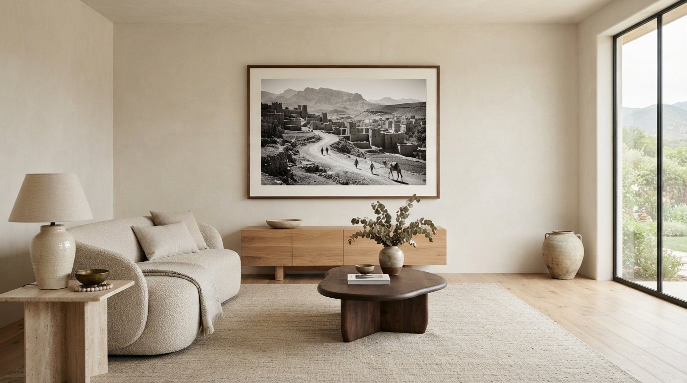
True minimalism is never achieved by leaving your walls entirely barren, as a sterile white expanse often reflects hesitation rather than quiet sophistication. When curating art for a minimalist home, the objective isn’t to fill negative space out of obligation; it’s to anchor an interior with a singular, evocative visual voice that honors the room’s architectural calm.
You’ve likely felt the delicate tension between protecting a serene sanctuary and dreading the soulless, impersonal nature of mass-produced wall art. Balancing a warm cultural narrative with crisp spatial discipline isn’t simple, particularly when an improper print proportion or chaotic arrangement risks cluttering the very peace you worked to design.
In this guide, you’ll discover how to select, scale, and frame archival photography to build striking, intentional minimalist interiors. We’ll explore exact architectural hanging ratios, the power of generous matting, and the bespoke framing standards needed to turn legendary photographic archives into lasting, heirloom anchors for your home.
Key Takeaways
- Master the philosophy of visual restraint by treating negative space as an active architectural element rather than empty wall area.
- Discover the definitive spatial proportions and golden ratio formulas that prevent undersized prints from cluttering clean interior lines.
- Learn how curating art for a minimalist home relies on selecting singular, storied archives rather than impersonal, mass-market decor.
- Explore how bespoke framing materials, from natural hardwood profiles to museum-grade glazing, bridge the artwork with your living environment.
- Build an enduring, iterative art collection guided by authentic provenance and certified archival darkroom print quality.
The Philosophy of Minimalist Art: Choosing Impact Over Abundance
Minimalism is frequently misunderstood as an exercise in sheer erasure. In interior architecture, stripped-back rooms often fall into sterile emptiness when bare walls are treated as an aesthetic virtue rather than a missed opportunity. True intentionality operates on restraint, not deprivation. In the practice of curating art for a minimalist home, the objective isn’t to cover every surface, nor is it to leave walls hollow; it’s about choosing singular, narrative-rich works that command attention through quiet authority.
A solitary, museum-grade photographic print introduces emotional tranquility that scattered decor cannot replicate. By presenting an authentic narrative, whether captured in the sun-drenched leisure of Slim Aarons or the candid intimacy of legendary music archives, the wall transforms from an unoccupied barrier into an intentional architectural anchor.
Rethinking Negative Space on Modern Walls
Negative space isn’t blank void; it’s an active structural design element. Much like the pauses between musical notes, unadorned expanses of vertical plaster give an artwork room to breathe, elevating the piece from casual decoration to an intentional installation. In movements such as minimalist photography, sparse composition and expansive margins direct visual energy toward subtle variations in light and form.
To successfully integrate negative space into your environment, consider how surrounding physical elements interact:
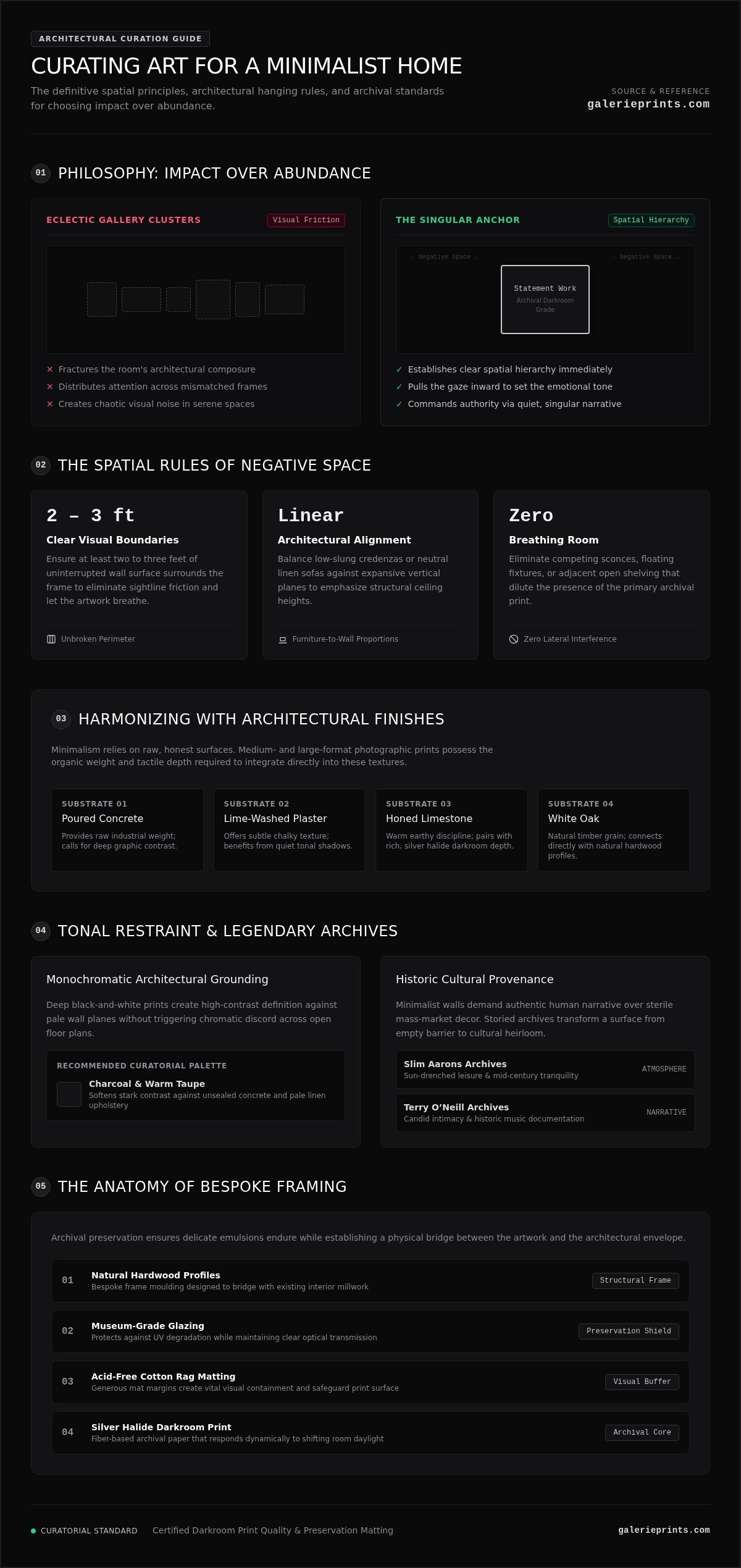
- Clear visual boundaries: Ensure at least two to three feet of uninterrupted wall surface surrounds the frame to prevent sightline friction.
- Architectural alignment: Balance low-slung credenzas or linen sofas against open vertical planes to emphasize ceiling height.
- Breathing room: Avoid competing sconces or adjacent shelving that dilute the impact of the primary print.
The Power of the Singular Focal Point
Eclectic gallery clusters often fracture a room’s composure. When you distribute attention across a dozen mismatched frames, visual clutter naturally follows. Curating art for a minimalist home requires replacing that chaotic visual noise with one decisive, large-format statement work that anchors the entire room’s layout.
A monumental, darkroom-grade print immediately establishes spatial hierarchy. Rather than allowing eyes to dart aimlessly across disparate frames, an oversized archival work pulls the gaze inward, setting the emotional temperature of the living space. By investing in museum-quality fine art photography, you introduce genuine cultural provenance and technical mastery, grounding modern architectural discipline with profound human history.
How to Select the Perfect Photographic Art for Minimalist Spaces
Minimalist interior design relies on raw, honest surfaces. Poured concrete, lime-washed plaster, honed limestone, and white oak create an architectural canvas that rejects decorative superficiality. When curating art for a minimalist home, the artwork shouldn’t sit as an alien layer atop these materials; it must harmonize with their inherent weight and grain. Medium-format and large-format photographic prints achieve this seamlessly because their physical medium possesses depth, texture, and technical provenance.
Silver halide prints on fiber-based archival paper respond dynamically to daylight, shifting their tonal presence as shadows cross the room. To ensure these tactile heirlooms endure, collectors adhere to strict preservation matting and framing standards, utilizing acid-free cotton rag boards that protect delicate emulsions while providing essential visual containment.
Tonal Restraint: The Case for Monochromatic Imagery
Monochrome imagery provides immediate architectural grounding. A deep black-and-white print establishes a strong graphic contrast against pale, neutral wall finishes, anchoring an open floor plan without introducing chromatic discord. The quiet depth found in historical black and white pictures, whether documenting brutalist facades or intimate portraits by masters like Terry O’Neill, brings human narrative into stark living spaces without competing against organic interior finishes.
Consider these key pairings when integrating black-and-white prints:
- Charcoal and warm taupe: Softens the stark contrast against unsealed concrete and pale linen upholstery.
- Deep pitch black: Aligns with blackened steel fixtures, minimal joinery, and architectural window mullions.
- High-key silvers: Harmonizes with pale ash, light travertine, and brushed aluminum accents.
Aspirational Color: Curating Saturated Heritage Photography
Color in a minimalist residence must feel deliberate, never accidental. Instead of scattering decorative accents across cushions and accessories, introduce focused, saturated heritage works. The mid-century archives of Slim Aarons serve as an extraordinary tool for this approach. His depictions of poolside leisure and modernist architecture juxtapose azure waters and terracotta roofs directly against neutral interior textiles.
A single, expansive Aarons print breathes warm, golden-era vitality into disciplined rooms, delivering an effortless narrative bridge between modern restraint and storied European or desert modernism. To discover pieces that elevate your space through verifiable historical significance, explore the curated editions available at galerieprints.com.
Proportion, Scale, and Placement: The Architectural Formula
Minimalist architecture exposes spatial errors without mercy. While traditional interiors can disguise improper sizing amid layered furnishings, an uncluttered room highlights every proportional mismatch. An undersized frame adrift on a wide expanse of drywall doesn’t read as delicate; it appears hesitant, fracturing the room’s sightlines and generating visual clutter through awkward emptiness. Successful wall curation requires mathematical discipline to ensure the artwork functions as a natural structural extension of the space.
Mastering this balance is essential when curating art for a minimalist home. When an archival print commands the correct physical volume, the surrounding wall transitions from blank drywall into intentional, calming negative space.
Calculating the Two-Thirds Furniture Proportion Rule
Placing art above primary furniture anchors, such as low-profile credenzas, linen sofas, or platform headboards, requires strict adherence to spatial ratios. The total width of the framed artwork should span approximately 60% to 75% (roughly two-thirds to three-quarters) of the furniture piece beneath it. For an 84-inch sofa, the ideal frame width falls between 56 and 63 inches.
To preserve structural balance between the artwork and the furniture foundation, apply these clear guidelines:
- The vertical gap: Hang the bottom edge of the frame 6 to 8 inches above the back of a sofa or the surface of a console to maintain a unified visual unit.
- The Mantel clearance: Position the frame 4 to 8 inches above a fireplace mantel to prevent the art from floating away from the hearth.
- Prevent visual tipping: Avoid frames narrower than 50% of the furniture width, which look stranded and disrupt horizontal balance.
Gallery Sightlines and Spatial Breathing Room
Residential art placement frequently suffers from being mounted too high. Gallery and museum standards dictate that the vertical center of an artwork should sit at eye level, precisely 57 to 60 inches from the finished floor. In rooms with standard eight-foot ceilings or seated gathering areas, 57 inches provides an intimate resting point. In hallways or open spaces featuring nine- to ten-foot ceilings, lifting the center line to 60 inches preserves vertical harmony.
When curating art for a minimalist home, calculate fastener placement using this museum formula: add half the total frame height to 57 inches, then subtract the distance from the top edge of the frame to the hanging hardware. This prevents measuring to the top rim and guarantees exact eye-level centering. Finally, preserve at least 12 to 18 inches of clearance between the outer frame and adjacent door casings, architectural corners, or light sconces, ensuring natural light washes across the glazing without visual interruption.
The Art of Bespoke Framing: Enhancing Without Overwhelming
A frame should never compete with the artwork it encloses, nor should it feel like an afterthought. In modern interiors, bespoke framing acts as a structural bridge, linking the artwork to the room’s materials, millwork, and light quality. When curating art for a minimalist home, the moulding profile, mat margin, and glazing specifications define the piece’s physical presence on the wall. Mass-market frames flex, cast distracting reflections, and rely on acidic backing boards that degrade paper over time. Artisanal framing, by contrast, transforms an archival print into an enduring architectural fixture.
Selecting Frame Profiles for Minimalist Architecture
Disciplined spaces demand restrained frame profiles that emphasize geometric precision. Deep-set box mouldings with ultra-narrow faces, measuring between one-quarter and one-half inch, create subtle shadow lines without cluttering clean wall planes.
- Raw White Oak and Maple: Introduces organic grain and warmth, softening austere concrete, limestone, or Scandinavian palettes.
- Satin Black and Powder-Coated Aluminium: Provides a razor-sharp graphic perimeter, perfect for delineating high-contrast black-and-white photography.
- Deep-Set Spacers: Suspends the print away from the glazing, letting the paper’s natural texture and darkroom luster sit undisturbed.
Matting Margins and Glazing Precision
Matting establishes vital breathing room between the subject and its perimeter. Standard narrow mats often look cramped in minimalist rooms. Specifying generous mat borders, where the mat width is at least twice the moulding face (typically 3 to 4.5 inches of unblemished white space), amplifies negative space and intensifies visual focus. For full-bleed images, float mounting with internal spacers allows the entire physical sheet to sit celebrated as an authentic artifact.
Archival preservation is equally paramount. To safeguard rare photographic emulsions from irreversible light degradation, specify museum-grade glazing that blocks 99% of UV rays while suppressing surface reflection to under 1%. Combined with acid-free, 100% cotton rag mat boards that pass ISO 18916 Photographic Activity tests, your collection retains its darkroom clarity across generations. To ensure your artwork is tailored to your exact architectural dimensions, specify museum-grade finishes through the artisanal bespoke framing service at Galerie Prints.
Building a Cohesive Art Collection Over Time
Minimalist curation rejects the impulse to fill every room immediately. The most striking architectural homes embrace the slow art philosophy, where an intentional wall remains unadorned until an authentic, resonant work is acquired. When curating art for a minimalist home, acquiring pieces iteratively ensures your collection reflects genuine cultural stewardship rather than hasty interior decorating. A disciplined collection develops through patience, guided by a clear aesthetic thesis rather than fleeting design trends.
Developing a Personal Curatorial Narrative
A cohesive home doesn’t demand identical themes in every room. Instead, visual continuity emerges from subtle connective threads across adjacent living areas. You might link spaces through shared historical eras, photographic printing techniques, or disciplined tonal palettes. For instance, pairing high-contrast silver halide music archives in an entryway with dramatic Terry O’Neill portraits in a formal study establishes a sophisticated rhythm across rooms.
To build an enduring narrative across your interior, prioritize works with distinct historical authenticity:
- Thematic resonance: Unify separate rooms through consistent subject matter, such as mid-century architecture, classic cinema, or candid performance imagery.
- Documented provenance: Select prints sourced directly from authorized negative archives, accompanied by gallery certification.
- Tonal continuity: Match black-and-white tonal depth across hallways to maintain unbroken sightlines between doorways.
Acquiring Masterworks for Your Home
Living with intention means allowing your collection to evolve without accumulating visual clutter. Rotating signature prints seasonally between rooms refreshes your living environment while honoring your home’s spatial restraint. A large-format Slim Aarons print that enlivens a bright summer living room can easily make way for a moody, contemplative darkroom study during winter months, altering the space’s energy without adding a single extra frame.
Mastering this approach is the cornerstone of curating art for a minimalist home. When every acquisition represents museum-grade darkroom craftsmanship and historic provenance, each piece commands permanent respect within your private sanctuary. To begin building an intentional collection of heirloom photography, explore ready-to-hang collections at Galerie Prints.
Transforming Minimalist Walls into Architectural Statements
Intentional interiors require a confident dialogue between architectural space and cultural narrative. When curating art for a minimalist home, true sophistication isn’t found in sterile emptiness or rushed decoration. It reveals itself when you honor negative space, observe precise spatial proportions, and anchor your environment with an authentic masterwork that speaks with quiet authority.
Selecting the right photographic print gives your walls permanent gravity. Whether you are drawn to the sun-soaked elegance of the Slim Aarons archive or dramatic monochrome portraiture from storied music archives, your private collection deserves museum-level preservation. Handcrafted bespoke framing, museum-grade glazing, and darkroom-grade silver halide papers ensure each ready-to-hang piece endures across generations without losing its visual luster.
Take your time building an intentional environment that allows your living space to breathe. Explore the curated archives at Galerie Prints to discover fine art photography that brings timeless elegance and cultural resonance to your home.
Frequently Asked Questions
Can you have vibrant, colorful art in a minimalist home?
Yes, vibrant artwork functions beautifully in minimalist spaces when it serves as the singular chromatic anchor. Rather than scattering competing accent colors across pillows and accessories, concentrate color within one commanding archival print. Works from the Slim Aarons Collection, with their vivid pool blues and sun-drenched architectural settings, inject warmth and narrative energy while preserving clean spatial serenity.
What size print should I choose for an expansive living room wall?
Choose a print that commands significant physical volume rather than defaulting to smaller, standard sizes. An ideal statement frame spans 60% to 75% of the width of adjacent furniture, such as a credenza or sofa. In large rooms without anchoring furniture, an oversized print measuring at least 40 by 60 inches preserves scale and prevents blank walls from feeling cavernous or abandoned.
Is black and white photography better suited for minimalism than color?
Monochrome photography isn’t inherently better, but it offers immediate architectural discipline. Black-and-white silver gelatin prints emphasize contrast, graphic structure, and texture without introducing chromatic tension. When curating art for a minimalist home, high-contrast monochrome portraits by photographers like Terry O’Neill provide dramatic human depth while seamlessly honoring neutral palettes of raw timber, stone, and plaster.
Should minimalist art always be framed with a wide white mat board?
Wide matting isn’t mandatory, but it significantly elevates focus and provides breathing room. A generous mat border, typically measuring three to four inches, creates intentional negative space within the frame itself. Alternatively, full-bleed float mounting inside a deep spacer box offers an equally refined look, letting the physical edges and natural paper texture of an archival print take center stage.
How do I choose art if my furniture features diverse natural materials?
Select art that complements the underlying tonal undertones and grain of your materials rather than trying to match them identically. If your interior combines travertine, blackened steel, and white oak, archival photography works exceptionally well because darkroom prints offer organic paper luster. A bespoke natural oak or slender black frame effortlessly ties these contrasting interior textures into a unified visual statement.
Can I curate a gallery wall while maintaining a minimalist aesthetic?
You can curate multi-print displays while preserving minimalism by replacing chaotic salon arrangements with strict geometric symmetry. Instead of varied frame profiles and eclectic layouts, choose a disciplined diptych or triptych of matching dimensions. Curating art for a minimalist home requires consistent spacing, identical bespoke mouldings, and a cohesive subject theme to maintain a calm architectural rhythm.
What makes archival fine art prints superior to standard poster prints?
Archival fine art prints are exposed onto darkroom-grade silver halide or cotton rag papers rather than mass-produced ink-jet paper. These museum-quality substrates resist yellowing and fading across decades, preserving deep tonal graduations and rich shadow details. When paired with conservation glazing and acid-free mounting, archival prints retain genuine physical value and historical authenticity that disposable commercial posters lack.