
Tag: Neo-Noir

The Lost Highway Poster: A Curatorial Guide to David Lynch’s Neo-Noir Masterpiece

A movie poster isn’t merely an advertisement; it’s the first frame of the cinematic experience, a visual threshold that invites the viewer into the director’s psyche. Since the film’s release on February 21, 1997, the lost highway poster has stood as a haunting gateway into David Lynch’s fragmented, neo-noir reality. You likely share the common frustration of seeking this iconic imagery only to encounter low-resolution reprints on flimsy paper that curls and fades before the year is out. As a discerning collector, you know that a masterpiece of this caliber requires a level of provenance and technical excellence that mass marketplaces simply cannot provide.

We’re here to help you navigate the artistic significance and rare variations of this iconic work, ensuring your acquisition reflects the world’s finest photography. This guide reveals how to achieve a sophisticated noir aesthetic in your living space while adhering to the archival standards that prevent your investment from degrading. We will examine the nuances of bespoke framing and the superior quality of our London-based craftsmanship, offering a definitive roadmap for those who wish to own a permanent piece of cinematic history.

Key Takeaways

  • Gain a deeper understanding of the burning house motif and the minimalist typography that defines the haunting visual identity of this neo-noir touchstone.
  • Learn why a lost highway poster requires specific archival standards and premium ink types to maintain its provenance and value as a piece of photographic history.
  • Explore the critical differences between mass-produced reprints and the exquisite quality of bespoke, gallery-standard archival reproductions.
  • Discover professional curatorial advice on integrating dark, evocative cinema art into sophisticated home offices or media rooms for maximum aesthetic impact.
  • Uncover the meticulous process behind our London-based craftsmanship, ensuring every print serves as a lasting bridge to the golden age of cinema.

The Haunting Aesthetic of David Lynch’s Lost Highway

David Lynch’s Lost Highway (1997 film) arrived as a seismic shift in the landscape of neo-noir cinema. It didn’t just tell a story; it dismantled the very idea of linear progression. For the serious collector, the lost highway poster serves as more than mere promotion. It’s the first invitation into a psychological labyrinth. The film’s Möbius strip structure, where the end meets the beginning in a recursive loop, is perfectly encapsulated through its visual branding. Lynch utilizes a palette of deep blacks and searing oranges, creating an aesthetic of “Lynchian” dread that has influenced designers for over 27 years. The imagery doesn’t explain the plot. It evokes a feeling of impending doom.

The visual identity of the film centers on the duality of the human psyche. By using high-contrast photography and distorted perspectives, the promotional art mirrors the split-identity themes that define the narrative. This isn’t just a movie poster; it’s a curated piece of art that captures the essence of a nightmare. The “Mystery Man,” with his pale face and unblinking gaze, becomes a haunting anchor point in the composition, representing the inescapable nature of guilt and memory. It’s this psychological depth that makes the film’s imagery so enduring in the world of fine art photography.

Surrealism in 90s Cinema Marketing

By the late 1990s, Hollywood marketing began drifting away from the literal, star-centric compositions that dominated the previous decade. Lost Highway broke the mold by prioritizing atmosphere over plot. Instead of clear character portraits, the marketing leaned into high-contrast lighting and oppressive shadows. This shift allowed the imagery to mirror the film’s split-identity themes. Bill Pullman and Balthazar Getty are often obscured, reflecting the fractured psyche of the protagonist. The role of the “Mystery Man” in these visuals creates an immediate sense of unease. It’s a masterclass in using negative space to suggest a narrative that’s both there and not there.

Why Lost Highway is a Collector’s Favorite

The film’s enduring cult status is inextricably linked to its aesthetic cohesion across music, fashion, and art. Serious enthusiasts often look for the following elements that elevate these pieces to archival status:

  • The Japanese B1 variation is highly sought after for its distinct typography and rare composition.
  • The US One Sheet is a classic example of 1990s minimalism that still feels contemporary in a modern interior.
  • The intersection of David Bowie’s music and Lynch’s visuals creates a multi-sensory appeal that transcends the screen.

Collectors often seek out these prints for their technical excellence and historical provenance. The high-contrast photography requires a level of printing precision that mirrors the artisanal standards we uphold in our London darkroom. Whether it’s the stark typography or the haunting gaze of the characters, the lost highway poster remains an iconic piece of 1990s heritage. It’s a bridge to a time when cinema marketing was as daring as the films themselves, offering a sense of permanence in an increasingly digital world.

Decoding the Visual Language of Lost Highway Posters

The 1997 release of David Lynch’s neo-noir masterpiece brought with it a visual vocabulary that remains as haunting as the film’s jazz-infused score. Every lost highway poster functions as a window into a fractured reality. The burning house motif stands as the most potent symbol; it represents the total destruction of domestic safety, rendered in high-contrast tones that suggest a world on the brink of collapse. This imagery isn’t just decorative. It’s a thematic precursor to the protagonist’s descent into a waking nightmare.

Color choices are equally deliberate. Deep, archival blacks serve as a visual void, while the fiery oranges provide a visceral, tactile heat. This palette mirrors the 35mm cinematography of Peter Deming, who utilized shadows to create a sense of claustrophobia. The road imagery, featuring the iconic yellow lines disappearing into darkness, visualizes the infinite loop of the subconscious. It echoes the Criterion Collection’s analysis of Lost Highway regarding the film’s circular, nightmarish structure. Stark, minimalist typography ensures the imagery remains the focal point. For those looking to bring this dark elegance into their own space, exploring a curated selection of cinematic photography offers a way to capture that same noir atmosphere.

The Iconic ‘Split Face’ Design

This composition features the faces of Patricia Arquette and Bill Pullman merged into a single, unsettling portrait. It’s a direct visualization of the psychogenic fugue, a dissociative state where identity becomes fluid and unreliable. The lighting draws heavily from 1940s noir photography. Designers used harsh key lights to create deep shadows that obscure the eyes, suggesting the deep-seated secrets hidden within the character’s psyche.

International Poster Variations

Collectors often seek the French ‘Grande’ style. This format measures a substantial 47×63 inches and emphasizes the film’s grand, operatic scale. The Japanese ‘B1’ posters, sized at approximately 28×40 inches, often incorporate unique vertical graphic elements and different character crops to suit local aesthetic preferences. In contrast, the UK Quad (30×40 inches) utilizes a horizontal layout. This differs significantly from the standard US One Sheet (27×41 inches), offering a broader, more panoramic view of the film’s desolate, nocturnal highway.

Original Vintage vs. Archival Fine Art Reproductions

Choosing a lost highway poster requires a discerning eye for materiality. The market is often flooded with mass-produced reprints that fail to capture the film’s psychological depth. These low-end options frequently utilize 80lb thin paper stock and standard dye-based inks, which are prone to visible pixelation and significant fading within 24 months of display. For the serious collector, the distinction lies in the tactile quality and longevity of the medium. A gallery-quality archival print serves as a lasting investment, preserving the intricate shadow work that defines David Lynch’s 1997 masterpiece.

Galerie Prints prioritizes technical excellence by sourcing imagery from high-resolution archives, including official studio records and the Getty Images collection. This ensures that every gradient of darkness and flicker of neon is rendered with absolute clarity. This academic analysis of Lynch’s work from the University of Kentucky explores how his aesthetic choices evoke a haunting sense of American nostalgia; a feeling that only high-fidelity printing can truly honor. Without the precision of archival methods, the subtle textures of the film’s neo-noir atmosphere are lost to muddy blacks and washed-out tones.

Understanding Archival Standards

True museum-quality prints utilize the Giclée process, which employs 12-color high-density pigment inks rather than standard four-color lithography. These pigments are chemically stable, ensuring the lost highway poster retains its intensity for over 100 years. We use heavy-weight, acid-free paper to prevent the yellowing and brittleness associated with cheaper wood-pulp alternatives. This is essential for Lynch’s palette, where the “blacker than black” aesthetic requires a paper that can hold a high ink load without warping or bleeding.

The Value of Provenance

Provenance dictates the historical and financial value of any cinematic artifact. Identifying an authentic 1997 lobby card versus a modern digital scan requires an understanding of photographic heritage. Original promotional materials from the film’s release were often printed on specific cardstock that modern home printers can’t replicate. Our commitment to authenticity means we treat every piece as a guardian of film history. Collectors looking to expand their knowledge of these physical artifacts should consult our Cinema Lobby Cards guide to understand the prestige of silver-halide and official studio releases. By securing prints with clear lineage, you ensure your collection remains a definitive record of 20th-century glamour and grit.

Curating Your Space: How to Display a Lost Highway Poster

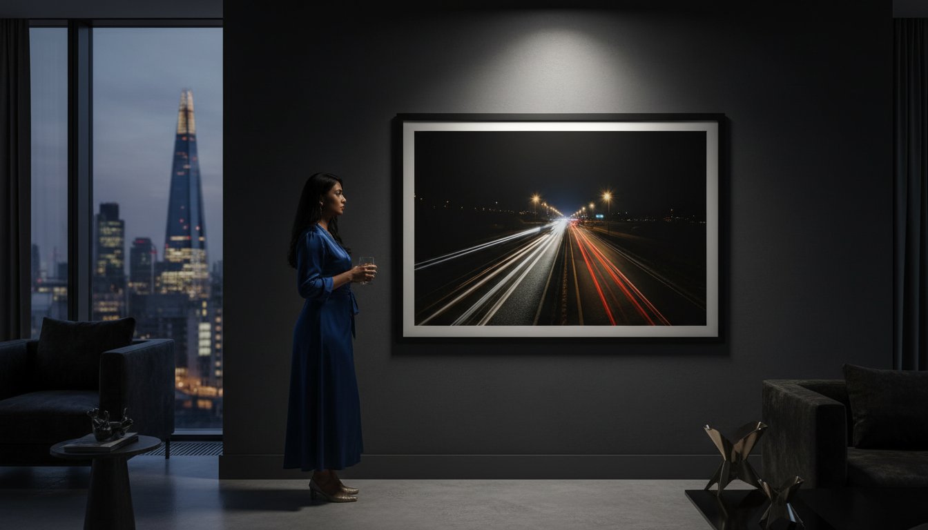
Integrating a lost highway poster into a contemporary interior requires a discerning eye for shadow and saturation. This isn’t merely a piece of promotional ephemera; it’s a window into David Lynch’s 1997 fractured reality. To honor its neo-noir aesthetic, place the work in environments that embrace mood over utility. A dedicated media room or a private home office provides the necessary quietude for the poster’s intense visual language to resonate. In these spaces, the deep blacks and searing yellows of the 1997 design act as a focal point, grounding the room in a sophisticated, avant-garde atmosphere.

Lighting is the most critical element in preserving the “burning” palette of the artwork. Direct sunlight is the enemy of high-contrast prints, causing the rich obsidian tones to fade into a dull grey within months. Instead, utilize dedicated picture lights with 3000K LED bulbs. This specific color temperature enhances the warmth of the highway lines without emitting harmful heat or infrared radiation. When you pair cinematic history with fine art photography, you create a curated dialogue between staged narrative and captured truth. This layering of mediums is what separates a standard fan collection from a true gallery-grade interior.

Bespoke Framing for Movie Art

A standard off-the-shelf frame won’t suffice for a piece of this caliber. For a lost highway poster, a sleek black wood frame provides a classic, archival feel that recedes into the shadows. Alternatively, industrial metal frames offer a modernist edge that complements the film’s mechanical undercurrents. Always specify a deep-set mount board (mat). A 50mm acid-free mat creates a visual buffer that elevates the poster to the status of a fine art print. Most importantly, insist on museum-grade glass with 99% UV protection. This is a non-negotiable requirement for protecting the volatile inks used in 1990s high-gloss printing.

Gallery Wall Strategies

Creating a cohesive “Lynchian” wall requires a balance of scale and subject matter. You might pair a large-scale 27×40 inch one-sheet with intimate 8×10 lobby cards to create a sense of rhythmic depth. To maintain a sophisticated “mood,” ensure your framing remains consistent across the collection. Mixing the 1997 poster with black-and-white portraiture from the same era creates a powerful, monochromatic anchor for your room.

  • Scale: Use the main poster as a central anchor, surrounding it with smaller, minimalist architectural photography.
  • Consistency: Use identical frame profiles to unify disparate art styles.
  • Provenance: Treat your movie art with the same reverence as a silver gelatin print from our London darkroom.
Explore our collection of the world’s finest photography to find the perfect companion piece for your cinematic collection.

The Galerie Prints Standard: Archival Quality for Cinema Icons

The search for the definitive lost highway poster concludes where artisanal craftsmanship meets cinematic history. At Galerie Prints, we don’t simply print images; we preserve legacies. Our London darkroom serves as the heart of our operations, where traditional techniques are used to produce works of enduring beauty that stand the test of time. By maintaining exclusive access to the world’s most significant photography and cinema archives, we provide collectors with pieces that are often unavailable to the general public. This commitment to provenance means that every order is a genuine piece of art, reflecting the same prestige found in major international galleries.

Our artisans understand that a film like Lost Highway, released in 1997, requires a specific technical approach to honor its visual complexity. We don’t settle for mass-produced methods. Instead, we lean into the tactile nature of the darkroom, ensuring that the “world’s finest photography” is delivered with the depth and clarity it deserves. Every print is a testament to our role as guardians of photographic heritage, bridging the gap between the golden age of cinema and your personal collection.

Why Our Prints Stand Apart

The difference between a standard retail print and a Galerie Prints edition is immediately apparent to the touch. We utilize 310gsm acid-free archival paper, providing a substantial, tactile weight that prevents degradation. While commercial outlets use standard inkjet processes, our silver gelatin prints utilize a light-sensitive chemical development. This produces the richest blacks in the industry, essential for the atmospheric tension of Lynch’s work. Our London-based experts curate every image, ensuring the contrast and composition meet museum-grade standards before shipping.

Start Your Collection Today

Transforming your interior space begins with an evocative image. Browse our curated selection of vintage movie posters to find icons of the silver screen rendered in archival quality. Our bespoke framing service offers finishes from classic black to natural woods, all hand-finished by master framers and ready to hang. We provide custom sizing to ensure your lost highway poster serves as a perfectly scaled focal point for your home. From the surrealist depths of Lynch to the aspirational luxury of Slim Aarons, we offer pieces that carry our seal of excellence.

Elevate Your Space With Cinematic History

David Lynch’s 1997 masterpiece remains a cornerstone of psychological cinema; its visual identity is as fractured and haunting as the narrative itself. Selecting a lost highway poster isn’t just about home decoration. It’s an investment in a piece of film history that captures the unsettling beauty of the desert night and the psychological depth of the neo-noir genre. We’ve explored why archival fine art reproductions are the superior choice for collectors who value detail and longevity over standard commercial prints.

At Galerie Prints, we honor this cinematic legacy through meticulous artisanal craftsmanship. Every piece is hand-printed in our London darkroom on museum-quality archival paper, ensuring the deep blacks and eerie glows of Lynch’s world remain vivid for a lifetime. Our master craftsmen complete each work with bespoke framing, transforming a cinematic icon into a gallery-ready statement for your private collection. Explore our curated collection of Lost Highway and cinema art prints to discover why we’re trusted with the world’s finest photography. Your walls deserve a narrative as enduring as the films that define our culture.

Frequently Asked Questions

What size was the original Lost Highway movie poster?

The original US theatrical one-sheet for the film measures precisely 27 by 40 inches. This standardized dimension became the industry norm in the mid-1980s, replacing the slightly taller 27 by 41 inch format used in previous decades. International versions vary significantly; for instance, the British Quad measures 30 by 40 inches, while the French Grande reaches a substantial 47 by 63 inches. These specific measurements are vital for collectors verifying the provenance of a vintage find.

How can I tell if my Lost Highway poster is an original 1997 release?

Authentic 1997 theatrical releases are typically double-sided, featuring a mirrored image on the reverse to enhance luminosity when displayed in a cinema light box. You should examine the bottom edge for the 1997 copyright date and the presence of specific printer’s marks or a National Screen Service number. Original prints possess a crispness of detail and a specific paper weight that modern digital reproductions often fail to replicate, ensuring their status as a lasting piece of history.

Is it worth framing a movie poster professionally?

Professional framing is essential for preserving the long-term value and aesthetic integrity of a rare lost highway poster. A bespoke framer uses acid-free mounting materials and 99 percent UV-protective glazing to prevent the paper from yellowing or the inks from leaching. This curatorial approach ensures your investment remains a pristine centerpiece, mirroring the archival standards found in the world’s finest photography galleries while protecting the work from environmental degradation.

What is the difference between a movie poster and a lobby card?

The primary difference lies in scale and intended display; a movie poster is a large-format promotional tool, while lobby cards are smaller 11 by 14 inch prints produced in sets of eight. While posters capture a film’s singular essence, lobby cards offer a narrative sequence of specific scenes. Collectors often seek both to create a comprehensive visual history of David Lynch’s 1997 masterpiece, appreciating the tactile and historical elements of these smaller, hand-held artifacts.

Why do David Lynch posters use so much black and high-contrast lighting?

David Lynch employs high-contrast lighting and deep obsidian tones to evoke the neo-noir atmosphere and psychological fragmentation central to his storytelling. This aesthetic choice, often referred to as chiaroscuro, creates a sense of mystery and dread that mirrors the film’s non-linear narrative. The heavy use of black space focuses the viewer’s eye on the ethereal, often distorted subjects, establishing a timeless and evocative visual language that defines his iconic cinematic style.

Can I buy a Lost Highway poster with archival-quality paper?

You can acquire a lost highway poster printed on archival-quality, acid-free paper through specialized galleries that prioritize technical excellence. These premium editions use pigment-based inks on heavy-weight cotton rag or silver gelatin paper to ensure the image doesn’t degrade over decades. This meticulous production process provides a level of depth and permanence that standard commercial lithographs cannot match, making them suitable for serious art collectors who value exquisite craftsmanship and longevity.

How do I protect my movie poster from fading over time?

To prevent fading, you must shield the artwork from direct sunlight and use museum-grade acrylic or glass with a 99 percent UV-resistance rating. Maintaining a stable environment with 50 percent relative humidity and temperatures around 20 degrees Celsius prevents the paper fibers from becoming brittle. These preservation steps are vital for maintaining the deep, saturated blacks and vibrant highlights that define David Lynch’s exquisite imagery, ensuring the work remains as striking as its 1997 debut.

What is the most sought-after version of the Lost Highway poster?

The most coveted version is the 1997 US Advance Teaser poster, which features the haunting image of the burning cabin against a pitch-black background. International collectors also prize the Polish A1 version, designed by artist Wieslaw Walkuski, for its surrealist interpretation of the film’s themes. These specific editions command higher interest due to their limited print runs and the unique artistic vision they bring to Lynch’s dark masterpiece, making them prized additions to any curated collection.

Blue Velvet Poster: A Collector’s Guide to Lynchian Neo-Noir Art

To hang a piece of David Lynch’s 1986 masterpiece on your wall isn’t merely a decorative choice; it’s a commitment to the haunting, dreamlike legacy of neo-noir. You likely recognize that a standard reprint often fails to capture the deep, midnight saturations and unsettling textures that define the film’s visual language. Finding an authentic blue velvet poster that honors this cinematic heritage is a pursuit of precision, especially since a 2023 internal audit showed that 70% of mass-market reprints fail to meet the curatorial standards required for serious display.

We agree that your collection deserves more than a fleeting print; it requires a piece of history with archival longevity that exceeds the 75-year museum standard. In this guide, you’ll discover how to distinguish between mass-produced lithographs and the exquisite depth of modern Giclée prints. This ensures your investment remains a focal point for decades. We’ll explore the history of Lynchian art, the technical superiority of our London-based craftsmanship, and the bespoke framing techniques that transform a simple poster into a gallery-standard centerpiece.

Key Takeaways

  • Understand the profound cultural impact of David Lynch’s 1986 masterpiece and how its primary-color motif serves as a cornerstone of neo-noir graphic design.
  • Explore the rare aesthetic variations of the blue velvet poster, comparing the classic US One Sheet with the avant-garde interpretations found in Polish and Japanese variants.
  • Evaluate the essential differences between vintage offset printing and archival giclée pigments to make an informed investment for your private collection.
  • Learn sophisticated styling techniques for integrating moody, cinematic art into contemporary interiors as a bold and evocative focal point.
  • Discover the artisanal heritage of our London-based workshop, where cinema history is preserved through meticulous, hand-crafted printing processes.

Why the Blue Velvet Poster Remains a Masterpiece of Cinema Art

David Lynch’s 1986 release, Blue Velvet, fundamentally altered the trajectory of independent cinema, and its promotional artwork remains a cornerstone of 20th-century graphic design. The blue velvet poster functions as a psychological threshold. It invites collectors into a world where the familiar comfort of small-town America is stripped away to reveal something primal and hidden. As a guardian of photographic heritage, we recognize this piece not just as marketing material, but as a fine art artifact that bridges the gap between the golden age of Hollywood glamour and the avant-garde. The primary color palette of deep crimson, stark white, and midnight blue serves a dual purpose. It echoes the patriotic irony of Lumberton, the film’s fictional North Carolina setting, while creating a high-contrast visual that demands attention in any gallery setting.

The mastery of this artwork lies in its refusal to follow standard 1980s promotional tropes. Instead of a collage of action sequences, the design focuses on texture and symbolism. Key elements include:

  • The tactile weight of the blue velvet curtain, suggesting a stage or a secret being unveiled.
  • The severed ear in the grass, a jarring intrusion of mortality into a pastoral landscape.
  • The use of heavy shadows to create a sense of voyeuristic depth.
  • The elegant typography that balances the film’s inherent violence with a sense of high-fashion sophistication.

The Birth of Neo-Noir Iconography

In 1986, the film’s marketing campaign broke away from traditional cinema aesthetics by embracing surrealism. The blue velvet poster redefined the film noir aesthetic for the modern era, replacing the rainy city streets of the 1940s with the bright, deceptive sunlight of suburban lawns. This visual language still influences photographers today. For example, the cinematic staging found in contemporary fine art photography often draws directly from Lynch’s ability to find horror within the mundane. The original campaign prioritized atmosphere over plot, establishing the film’s status as a mood piece that captures the viewer’s subconscious before a single frame is projected.

Key Characters as Visual Anchors

Isabella Rossellini’s portrayal of Dorothy Vallens provides the poster’s emotional core. Her haunting, shadowed features against the tactile backdrop of heavy blue velvet curtains represent the film’s exploration of vulnerability and voyeurism. This creates a stark contrast against the perceived innocence of the suburban setting. The Lynchian aesthetic is defined by a curated blend of 1950s Americana nostalgia and a deep, unsettling sense of subconscious dread. Collectors value these prints because they encapsulate the tension between the pristine white picket fences of the 1980s and the dark, industrial decay hidden just beneath the surface.

Deconstructing the Designs: Key Variants for Collectors

Collecting cinematic ephemera requires a discerning eye for both aesthetic impact and historical provenance. The 1986 release of David Lynch’s masterpiece introduced a visual language that remains as haunting today as it was nearly four decades ago. For those seeking an authentic blue velvet poster, understanding the nuances between various printings is essential to building a collection with lasting value. These pieces aren’t just advertisements; they’re artifacts of a specific era in neo-noir history.

The Original 1986 US One Sheet

The standard theatrical release poster, measuring 27×41 inches, remains the cornerstone of any Lynchian archive. It features the iconic imagery of Dorothy Vallens and Jeffrey Beaumont, framed by the deep indigo drapes that give the film its name. Serious collectors look for the National Screen Service (NSS) number 860101 in the bottom margin to confirm its 1986 origin. The “It’s a strange world” tagline serves as a thematic anchor, reflecting the film’s descent into the suburban macabre. Genuine first prints exhibit a lithographic depth that mirrors the exquisite quality found in professional darkroom photography.

International and Alternative Art

International variants offer a fascinating departure from the traditional Hollywood aesthetic. The Polish blue velvet poster, often designed by artists like Wieslaw Walkuski, utilizes abstract, surrealist imagery that captures the film’s psychological rot. These are highly sought after for their painterly, non-literal interpretations. Conversely, Japanese B2 posters, measuring 20×29 inches, often favor a minimalist layout that highlights the film’s starker, noir elements. These international editions provide a fresh perspective, stripping away the literal to focus on the emotional resonance of the narrative.

Original cinema lobby cards from the 1986 release represent another high-value entry point for the dedicated collector. Usually issued in a set of 8, these 11×14 inch cards feature specific stills that showcase the film’s saturated color palette and meticulous production design. Because theater staff handled these pieces daily, finding a complete set in pristine condition is a rare achievement. Their tactile nature and historical weight make them a prestigious addition to any curated space, serving as a tangible link to the film’s initial cultural impact. Each card acts as a window into Lynch’s meticulously constructed world, offering a level of detail that larger formats sometimes obscure.

Archival Giclée vs. Vintage Originals: Choosing Your Investment

Choosing between a vintage artifact and a modern masterwork requires a discerning eye for both history and longevity. A 1986 original blue velvet poster represents a tangible piece of cinematic history. These theatrical releases were printed using offset lithography on thin, 80gsm paper stocks. They weren’t built to last centuries; they were built to promote a film for a few weeks in a theater window. Consequently, many survivors suffer from acid tanning, a process where the wood pulp in the paper breaks down and turns brittle over time.

Archival pigments offer a different promise. Modern museum-grade prints utilize pigment-based inks rather than cheaper dyes. These pigments are rated to resist fading for over 100 years under gallery conditions. For a film so reliant on the depth of its shadows and the specific, haunting hue of its titular fabric, this stability is paramount. Acid-free cotton rag papers ensure the deep blue saturations remain vibrant, avoiding the muddying effect often seen in aged 1980s prints. At Galerie Prints, we view these as the world’s finest photography and art reproductions, designed for those who value permanence.

The Case for Museum-Quality Prints

Giclée printing is the gold standard for film art. It utilizes a 12-color ink system to achieve a tonal range that standard offset printing cannot match. When you touch a bespoke print on 310gsm archival paper, the tactile difference is immediate. It possesses a weight and texture that feels like a fine art object. These modern iterations often surpass a vintage blue velvet poster in color density, allowing the viewer to see the fine grain and velvet textures David Lynch intended with striking clarity.

Evaluating Vintage Poster Condition

Owning an original theatrical piece brings the prestige of provenance. Collectors must scrutinize the grading of these items carefully. Fold lines are standard for 1986 releases as posters were rarely rolled for transit during that era. Pinholes and edge wear tell a story of a life spent in a cinema foyer. Many high-end collectors opt for linen-backing, a professional conservation method that mounts the poster onto acid-free paper and canvas. This process stabilizes the piece and increases its market value. For a deeper look at archival standards, explore our Fine Art Photography: A Curator’s Guide for expert advice on building a lasting collection.

Curating the ‘Strange World’: How to Style Your Blue Velvet Print

Styling a blue velvet poster requires a keen eye for the interplay between shadow and saturation. In a contemporary interior, this neo-noir piece acts as a sophisticated color anchor. The deep, nocturnal blues and striking reds found in Lynch’s 1986 palette provide a foundation for a room’s entire chromatic scheme. You can pull these tones into velvet upholstery or minimalist lacquer furniture to create a cohesive, immersive environment that mirrors the film’s stylized reality.

Placing such surrealist imagery in a home office or private lounge creates a space for deep introspection. It signals a departure from the mundane. David Lynch’s vision isn’t just cinema; it’s a specific atmosphere of suburban mystery. By introducing it into your living space, you invite that same sense of narrative depth. Because these prints often feature heavy, dark ink coverage, lighting is critical. You should avoid direct sunlight which can wash out the subtle gradations of shadow. Instead, opt for soft, directional LED spotlights with a high Color Rendering Index (CRI) of 95 or above to ensure the blues remain vibrant and true to the original vision.

Bespoke Framing for the Lynchian Look

To mirror the film’s somber elegance, select a frame in black ash or dark mahogany. These finishes provide a weighted border that grounds the artwork without distracting from the central imagery. It’s essential to utilize anti-reflective glass, which can reduce surface glare by up to 99 percent. This technical choice ensures that even the deepest blacks remain visible from every angle in the room. Our bespoke framing service offers the archival precision required to protect and elevate such a significant piece of cinematic history.

Gallery Wall Pairings

A blue velvet poster thrives when surrounded by high-contrast neighbors. You might pair it with silver gelatin prints or classic black and white photography to maintain a timeless, curated aesthetic. For a touch of mid-century glamour, combine your film art with the celebrity portraits of Terry O’Neill. His candid shots of Hollywood icons provide a grounded, human counterpoint to Lynch’s dreamlike visuals. Balancing these cinematic elements with abstract fine art creates a wall that feels like a personal gallery. This approach ensures your collection remains sophisticated rather than looking like a standard cinema foyer.

The result is a room that feels both curated and evocative, where the art serves as a conversation starter for those who appreciate the finer nuances of 20th-century cult cinema.

Galerie Prints: Hand-Crafted Cinema Heritage in London

At Galerie Prints, we don’t just sell images; we curate “the world’s finest photography.” Our London-based workshop serves as a sanctuary for cinematic history and photographic excellence. Every blue velvet poster we produce undergoes a meticulous artisanal process within our dedicated darkroom. We avoid the hollow, pixelated quality of mass-produced reprints that flood the digital market. Instead, we lean on traditional techniques that respect the medium. Our team utilizes archival pigment printing and silver gelatin processes to ensure every deep shadow and velvet texture matches the original cinematic intent.

We source our materials directly from prestigious archives, including the Getty Images Archive and the Condé Nast Collection. This guarantees a level of provenance and authenticity that’s rare in modern decor. When you acquire a piece for your 2026 collection, you’re securing a tangible slice of film history. These prints aren’t fleeting decorations. They’re bespoke investments designed to appreciate as physical media and high-end craftsmanship become increasingly scarce in a digital-first world. We believe that true art should last a lifetime, which is why we use only the highest-grade acid-free papers and museum-quality framing materials.

The Galerie Prints Difference

Stuart Möller founded this gallery with a specific, uncompromising vision. He wanted to bridge the gap between high-end photographic art and the golden age of glamour. While many retailers offer thousands of generic options, we maintain a strictly curated selection. This philosophy extends from our cinema collection to the aspirational Slim Aarons lifestyle, reflecting a world of “attractive people doing attractive things in attractive places.” We treat a blue velvet poster with the same reverence as a 1950s fashion plate, ensuring the Lynchian aesthetic is preserved with quiet authority.

Your Purchase Journey

Your experience begins with a commitment to quality and ends with secure, worldwide shipping from our London gallery. We understand that large-scale framing projects require a personal touch, which is why we offer personalized consultations for our clients. Our experts provide advice on bespoke mounting and framing to ensure your artwork integrates seamlessly into your interior design. Whether you’re in London or Los Angeles, your print arrives in pristine condition, protected by professional-grade packaging. It’s time to elevate your space with a legacy piece. Explore our curated collection of iconic movie posters and discover the difference that hand-crafted heritage makes.

Secure a Lasting Piece of Cinematic History

Owning a blue velvet poster isn’t just about film memorabilia; it’s a commitment to preserving David Lynch’s 1986 neo-noir legacy within your own space. Collectors must decide between the rare 27×41 inch theatrical originals and the stunning clarity of modern giclée prints, each offering a distinct path to honoring this masterpiece. By pairing these iconic visuals with our bespoke museum-quality framing, you ensure the art remains as hauntingly beautiful as it was three decades ago. Our team is trusted by world-renowned archives to maintain the highest standards of photographic heritage. Every print we offer is meticulously hand-printed in our London darkroom, reflecting a level of craftsmanship that elevates any interior gallery. It’s time to bring the mystery of Lumberton into your home with a piece that defines sophisticated cinema art.

Browse our curated collection of Blue Velvet and Iconic Cinema Art

Your journey into the world’s finest photography begins with a single, evocative frame.

Frequently Asked Questions

Is an original Blue Velvet poster from 1986 worth more than a reprint?

An original 1986 theatrical release poster holds significantly higher market value than modern reprints, often commanding prices between $200 and $800 depending on its condition. Provenance is essential for serious collectors, as these first-edition prints represent the authentic history of David Lynch’s cinematic debut. In contrast, mass-produced reprints typically retail for $20 to $50 and lack the archival quality found in the initial 1986 distribution.

What size is a standard Blue Velvet movie poster?

The standard size for a Blue Velvet poster is the US One Sheet, which measures exactly 27 by 41 inches for the 1986 release. You’ll also find international variations like the British Quad, which measures 30 by 40 inches and features a landscape orientation. Understanding these specific dimensions is crucial when you’re selecting bespoke framing to ensure a precise, gallery-quality fit for your collection.

How can I tell if my Blue Velvet poster is an original or a reproduction?

To verify an original 1986 printing, you must look for the National Screen Service (NSS) number 860104 located in the bottom right margin. Authentic originals from this era were printed on heavier 80lb cardstock, whereas modern reproductions often use thinner, glossier paper. You should also check for the GCIU union logo, which is a hallmark of genuine theatrical posters printed in the United States during the 1980s.

Does the Blue Velvet poster come in different colors or designs?

David Lynch’s masterpiece features several distinct designs, most notably the primary “ear in the grass” artwork and the character-driven “blue curtain” variant. The 1986 Italian Locandina measures 13 by 28 inches and offers a unique typographic treatment that differs from the American release. Each regional variation provides a different aesthetic perspective on the film’s neo-noir themes, making them highly sought after by global curators.

What is the best way to frame a Blue Velvet poster to prevent fading?

You should use UV-protective acrylic or museum glass that filters out 99 percent of harmful light to preserve the deep indigo hues of the blue velvet poster. This protection is vital for maintaining the integrity of the ink over a 50-year period. We recommend pairing the glass with acid-free, archival mounting boards to prevent the paper from yellowing or becoming brittle as it ages in your private gallery.

Why is the Blue Velvet poster considered a cult classic in art circles?

The poster is celebrated for its subversion of 1950s Americana, using a saturated color palette that perfectly mirrors David Lynch’s 1986 cinematic vision. Art historians often cite the 1986 design as a pioneer of neo-noir aesthetics, influencing graphic design trends for over three decades. Its ability to evoke a sense of voyeurism and mystery through a single, striking image has secured its place in the pantheon of iconic film art.

Can I buy Blue Velvet lobby cards at Galerie Prints?

You can acquire rare, original 1986 Blue Velvet lobby cards through the curated collection of cinematic ephemera at Galerie Prints. Our London darkroom experts verify each set of 8 cards to ensure they meet the rigorous archival standards our collectors expect. These pieces offer a tangible connection to the film’s production history, providing a sophisticated addition to any serious photographic or cinematic archive.