
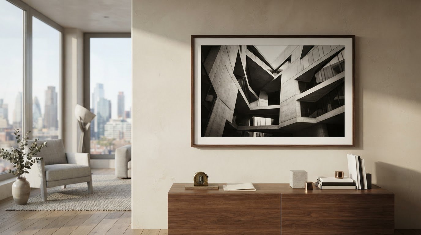
What makes an architectural photograph feel like a work of art rather than familiar wall décor? Often, it’s the way light meets structure, the photographer’s point of view, and the care taken in the finished print. When you’re considering architectural photography for sale, a striking building is only the starting point.
A photograph also needs to hold your attention, suit your room, and feel right on the wall. Look beyond the subject to its composition, image source, print format, paper, and presentation. Edition information matters, too, as does knowing exactly what a listing includes.
This guide explains how to assess composition and image details, compare prints using consistent criteria, and choose a size and finish for your space. Galerie Prints brings together fine art photography from curated archives, with customizable print sizes, premium paper choices, and bespoke framing. Use the guidance below to make a considered choice you’ll be glad to live with.
Key Takeaways
- Look beyond the building itself: geometry, light, perspective, and negative space shape how an architectural photograph holds your attention.
- When comparing architectural photography for sale, assess the image source, edition information, dimensions, paper, and framing separately.
- Measure your wall, consider orientation and palette, and judge whether the architectural details will read clearly from your usual viewing distance.
- Notice how architecture, materials, and atmosphere can make a photograph an expression of place rather than simple décor.
- Curated photographic archives, customizable print sizes, premium paper choices, and bespoke framing can help you create a finished artwork for your space.
Why Architectural Photography for Sale Belongs in a Considered Art Collection
Architectural photography makes buildings and designed spaces its central subjects, using viewpoint, light, framing, and atmosphere to shape how we see them. It may show a landmark, a quiet interior, or an everyday façade. What distinguishes an artistic interpretation from general building imagery is not simply the presence of a structure. The photograph invites you to look, feel, and consider, rather than only identify a property.
This distinction is useful when browsing architectural photography for sale. An image made primarily to document a property tends to communicate its features clearly. An artistic interpretation may instead draw attention to an unusual angle, a play of shadow, or the relationship between a building and its surroundings. Neither purpose is inherently superior. Knowing which approach appeals to you helps you choose a print with lasting visual interest.
What makes a building photograph feel like art?
Composition gives architecture its visual rhythm. A centred façade can feel formal and still, while repeated windows or columns draw the eye across the frame. Negative space, such as open sky, a bare wall, or a shadowed interior, gives those forms room to breathe. A low viewpoint can make a structure seem monumental; an oblique angle may reveal its layers and irregularities.
Light changes the character of a surface. Side light can bring out the texture of stone or carved details, while softer conditions may quiet a façade’s contrast and create a more contemplative mood. Notice what the photograph shows, but also how its tonal balance and viewpoint shape your response. For a broader account of the genre’s techniques and history, see Architectural Photography on Wikipedia.
Architecture, place, and the story behind the image
A building rarely exists in isolation. Its design may reflect a period, a local tradition, or a response to climate and landscape. You don’t need specialist knowledge to appreciate these connections. Ask what the image suggests about the place and the people who use it. A modernist structure framed against open sky can feel very different from a similar building surrounded by dense streets.
Look closely at the edges of the frame. A tree, shoreline, neighboring façade, or glimpse of daily life can establish scale and deepen the sense of place. These details may turn a study of form into a story about how people inhabit a landscape. Often, the most rewarding image works at first glance and continues to reveal details over time.
The balance between visual pleasure and context is useful well beyond architectural photography. The fine-art photography collecting guide offers broader perspective on living with photographic art. Next, consider how composition, light, and perspective work together in an individual image.
How to Assess Composition, Light, and Perspective in Architectural Photography
An architectural image can feel orderly, expansive, intimate, or unsettled. To understand why, look beyond the building’s name and read the photograph as a carefully constructed view. Use this checklist to compare images in architectural photography for sale without relying on subject matter alone:
- Geometry: Follow lines, repeated forms, symmetry, and open space. Notice where your eye enters the image and where it comes to rest.
- Viewpoint: Ask whether the photographer looks straight on, upward, downward, or across the structure, and how that angle changes its presence.
- Light: Observe which surfaces are illuminated, which fall into shadow, and whether the contrast feels gentle or dramatic.
- Context: See how the setting, nearby structures, or landscape affect the building’s meaning and scale.
- Emotional effect: Name the impression the image leaves: calm, monumental, austere, welcoming, or something less easily defined.
Read the building’s lines, forms, and point of view
A frontal view often emphasizes symmetry and gives a building a composed, ceremonial quality. An angled view can reveal depth, overlap, and movement, guiding the eye from a near edge into the structure. Neither approach is automatically stronger. Consider whether the perspective suits the subject’s character.
Viewpoint changes perceived scale: a low camera position can make a building feel monumental, while an elevated view may make it seem more contained within its setting. Lens choice and camera angle also influence how parallel lines appear. Converging verticals can create a sense of height or drama, while corrected verticals may give an image a more measured, architectural precision. Look for intention rather than treating either effect as a flaw.
Design vocabulary offers another way to read an image. In Brutalist architecture, mass, raw surfaces, and forceful geometry may dominate the composition. Bauhaus design often draws attention to functional forms, clean lines, and balanced relationships. Consider how the photographer translates these qualities into the frame, rather than stopping at identifying the style.
Notice how light and colour shape the photograph
Soft, diffused light can reveal detail across a façade with subtle transitions between tones. Harder light creates sharper shadows, making relief, edges, and sculptural form more pronounced. Colour temperature matters, too: warmer tones can lend a scene a welcoming or nostalgic quality, while cooler hues may suggest restraint. Strong tonal contrast can heighten drama; a quieter range may feel contemplative.
As you compare images, consider whether light clarifies the structure or becomes a subject in its own right. Monochrome can focus attention on line, texture, and tonal relationships, a quality explored in this black-and-white photography collector’s guide.
With these observations in mind, browse curated photographic prints. Look for an image that rewards close attention to its formal choices and creates the feeling you want in the room.

Compare Architectural Photography Prints by Provenance, Edition, and Quality
A compelling image is only one part of the decision. When comparing architectural photography for sale, examine what the listing says about the image’s source, edition, physical dimensions, paper, and presentation. Clear details help you compare the artwork as both an image and a finished print, rather than relying on appearance alone. Apply the same criteria to each work:
| Detail | What to look for | Why it matters |
|---|---|---|
| Image source | Photographer, archive attribution, or other source information | Provides context for the image and its authorship. |
| Edition information | Whether the work is open or limited edition, and any stated edition details | Clarifies the status of the specific print without implying future value. |
| Dimensions | Print measurements and orientation | Helps you judge scale and plan how the image will sit on your wall. |
| Paper | The named paper option and any description of its surface or finish | Paper influences the print’s tactile and visual character. |
| Framing | Whether framing is offered and what presentation is described | Framing affects the artwork’s final appearance and how it relates to its surroundings. |
What to look for in provenance and edition information
Provenance is the documented history and source of an artwork or photographic image. For a photograph, useful context may include the artist’s name and attribution to a photographic archive. Galerie Prints curates works from renowned photography archives, providing context as you discover photographic prints.
Read edition information as a description of the specific artwork. Edition status and accompanying documentation vary from one photograph to another, so don’t assume a print is limited, signed, or accompanied by a certificate unless its listing says so. A limited edition describes a defined edition; it does not, by itself, establish future market value or guarantee appreciation.
How print materials and specifications affect the result
Paper is part of the image’s presentation, not a minor technical detail. A smooth surface can look different from a textured one, and paper choice can influence how tonal transitions and fine details appear. Compare the paper options named for each print, considering the image’s contrast, detail, and intended viewing distance. Don’t assume performance or longevity from a broad label alone.
Check dimensions and orientation before choosing. A tall, narrow print and a wide horizontal one make different demands of a wall, even if their subjects are similar. Distinguish print dimensions from the space a frame may occupy, too. Galerie Prints offers customizable print sizes, premium paper choices, and professional bespoke framing, allowing you to consider each part of the finished artwork. Read the listing carefully: the source, edition, format, and presentation apply to the individual work, and those details make a sound comparison possible.
Choose an Architectural Photograph That Suits Your Wall and Interior
A photograph can look compelling on screen yet feel quite different once it occupies a wall. Before browsing architectural photography for sale, consider the room as well as the image: available space, viewing distance, surrounding colours, and the role you want the print to play. This four-step approach helps make the choice intentional without turning interior design into a set of rigid rules.
Match image scale, orientation, and viewing distance
Start with the wall. Measure the width and height of the space available for the artwork, allowing for nearby furniture, doorways, and other visual elements. Compare those measurements with the print dimensions in each listing. If you’re considering professional framing, account for the framed artwork’s overall footprint, not just the print itself.
Next, choose an orientation that suits the wall and the composition. A landscape image can echo a long sofa or wide wall, while a portrait format can emphasize height beside a doorway or in a narrower space. A panoramic composition may create a quieter horizontal sweep, but needs enough room to read comfortably. These are starting points, not rules; an unexpected orientation can bring welcome energy to a room.
Finally, consider how far away you’ll usually view the print. A photograph rich in window patterns, masonry, or fine façade details may need a larger presentation or a position where you can approach it easily. From across a room, small details can merge into texture, while broader shapes and tonal relationships remain legible. Decide whether you want an image that rewards close inspection, holds its presence from a distance, or does both.
Coordinate architectural imagery with the room
Assess the dominant palette after considering scale and orientation. Warm stone can sit naturally alongside wood, ochre, or cream, while cool glass may complement restrained blues, greys, and crisp neutrals. Concrete can harmonize with natural materials or provide a deliberate contrast against softer furnishings. Monochrome photographs draw attention to form and tone, but can feel subtle or striking depending on their contrast and the room around them.
Use these relationships as prompts, not prescriptions. A quiet composition with open space may give a layered room a moment of visual calm; a more graphic image can lend definition to a pared-back interior. Look at the colours already present, then decide whether the photograph should echo them or introduce a considered counterpoint. A strong choice feels connected to the space while still holding your attention in its own right.
Once you’ve measured the wall, settled on orientation, considered the palette, and judged the image at its likely viewing distance, explore photographic prints with your room in mind. Galerie Prints offers customizable print sizes, premium paper choices, and professional bespoke framing to help bring your selected image together as a finished artwork.
Buy Architectural Photography Prints Through Galerie Prints
Choosing a photograph is the beginning of collecting; its format and presentation shape how it will live in your home. Galerie Prints is a specialist fine art photography gallery offering physical prints from curated archives, including the Getty Images Gallery. Its collections provide a considered way to encounter photographs, with the image and its context at the heart of the selection.
As you browse architectural photography for sale, use each artwork’s listing as your guide. Edition information, available dimensions, paper choices, and framing options are specific to the individual photograph. Compare those details with what you’re looking for: a particular composition, a scale that suits your wall, or a surface that complements the image’s tones. This helps ensure your choice reflects both the photograph and how you intend to display it.
From curated photograph to considered print
An archive can place a photograph in a broader artistic or historical context, helping you look beyond a building’s appearance to the image’s authorship and story. Galerie Prints curates works from the Getty Images Gallery and other photography archives, offering a route from discovery to a physical artwork. Read the listing for details about that specific piece rather than assuming every photograph shares the same edition status or format.
Print size and paper contribute to an artwork’s presence. A larger format may give architectural lines room to unfold across the wall; another size may suit a more intimate setting. Paper choices affect the print’s surface and visual character, so consider them alongside the photograph’s tonal range and level of detail. Available sizes and premium paper types vary by artwork, and the listing sets out the relevant options.
Complete the artwork with a considered frame
Professional bespoke framing can bring a print together as a finished, ready-to-hang presentation. A frame profile establishes an edge around the image, while a mount can create visual breathing room between the photograph and its frame. A restrained choice may support a quiet composition; a more defined border can give a graphic image stronger presence. Aim for balance: the frame should complement the photograph, not compete with its architectural forms.
Consider the artwork and its setting as a whole. The print’s orientation, dimensions, paper, and framing all contribute to how it will appear on your wall, so review the options attached to the individual listing. Galerie Prints offers customizable print sizes, premium paper choices, and professional bespoke framing, allowing you to shape the presentation around your selected photograph.
With the image’s context and practical details in view, you can make a more informed choice. Explore Galerie Prints’ curated photographic archives and find a photograph that feels at home in your collection.
Choose a Photograph You’ll Keep Discovering
The most rewarding print isn’t always the one that makes the strongest first impression. It may be the photograph whose lines, shadows, or sense of place continue to draw your attention as the room changes around it. Let that response guide your final choice. A considered piece of architectural photography can become more than a portrait of a building; it can offer a daily invitation to pause and look again.
Revisit the images that stayed with you. Which one feels connected to your point of view, and which would you be glad to encounter every day? Choose the photograph that holds both visual interest and personal meaning. A collection can begin with one image selected with care.
Explore Galerie Prints’ photography collection and find a print that feels right for your space and your story.
Frequently Asked Questions
What is architectural photography?
Architectural photography makes buildings and designed spaces the subject of a photograph, whether the aim is documentary, commercial, or artistic. An image might record a building’s appearance, communicate a design, or invite a personal response to its structure and atmosphere. As a buyer, consider the purpose behind the image: does it simply show what a place looks like, or does the photographer offer an interpretation you want to live with?
Is architectural photography different from real estate photography?
Yes, although the categories can overlap. Real estate photography generally presents a property to prospective buyers or renters, often prioritizing a clear view of its rooms and features. An architectural photograph may instead focus on a design element, material, or particular mood. For example, a property image might show an entire room, while an art photograph isolates the geometry of a staircase. Consider the image’s intent and treatment, not just its subject.
Can architectural photography include interiors?
Why do buildings look distorted in some architectural photographs?
Building edges can appear to lean or converge when a camera points upward, especially from close to a tall structure. Lens characteristics can also affect how a scene’s proportions appear. Photographers may retain converging lines to heighten drama or use perspective-control techniques to keep verticals more parallel. Neither treatment is automatically an error. Consider whether the geometry feels expressive or distracting, and how it changes your impression of the building.
Do architectural photographers use special lenses?
Some photographers use wide-angle lenses to include more of a building or interior, while tilt-shift lenses can help manage framing and perspective. The choice depends on the subject and the desired effect. A wider view may make a compact interior feel more expansive, while other lens choices can preserve a more natural sense of proportion. For print buyers, the finished image matters most: judge how convincing and engaging the space feels, not the equipment used.
How much does an architectural photography print cost?
There isn’t one price for every print. The amount can vary with the individual artwork, selected dimensions, paper option, edition details, and framing. Compare listings for architectural photography for sale by their specific options, rather than by image alone. Before deciding, review the chosen format and presentation details so you understand what the displayed price applies to. A lower price does not, by itself, tell you whether an image is right for your collection.
Can architectural photography be black and white?
Yes. Monochrome can make a photograph’s tonal structure especially prominent, which can suit a façade with strong shadows or an interior defined by light and shade. Colour may be more expressive when the building’s materials or setting carry distinctive hues. To compare treatments, imagine each version in the room under its usual lighting and alongside nearby furnishings. Choose the interpretation that best sustains the mood you want, rather than assuming one approach is more sophisticated.