Tag: art curation

How to Build an Art Collection on a Budget: A Curator’s Guide to Accessible Elegance

The most evocative art collections aren’t defined by the staggering prices paid at auction; they’re defined by the cultural weight and historical narrative of the pieces within them. You might feel that the world of high-end galleries is an exclusive club reserved for the elite, yet understanding how to build an art collection on a budget is actually about strategic curation rather than compromise. It’s a common frustration to feel trapped between the intimidating “white cube” scene and the fear of buying “cheap” art that lacks soul or lasting value.

We’re here to bridge that gap by showing you how to secure accessible elegance through archival photography and limited editions. You’ll discover how to distinguish a high-quality fine art print from a mere poster, ensuring your home is filled with iconic imagery that sparks conversation and carries genuine prestige. By focusing on technical excellence and provenance, you can own a piece of photographic heritage that feels both timeless and deeply personal. We’ll guide you through selecting investment-worthy works, from the Slim Aarons collection to rare music archives, that offer a sophisticated aesthetic without the blue-chip price tag.

Key Takeaways

  • Embrace a curator’s mindset by prioritizing narrative and historical significance over simply filling empty wall space.
  • Master how to build an art collection on a budget by leveraging limited editions and archival photography to secure iconic imagery.
  • Uncover high-character entry points such as Cinema Lobby Cards and music archives that add a unique, soulful layer to your personal space.
  • Learn why bespoke framing is the essential final step to elevate a modest print into a gallery-worthy centerpiece.
  • Gain confidence in the technical quality and provenance of your acquisitions by sourcing from established guardians of photographic heritage.

The Philosophy of Budget Art Collecting: Curation Over Consumption

To the uninitiated, the term “budget” might suggest a sacrifice in quality or a settling for the mundane. In the context of a sophisticated interior, however, learning how to build an art collection on a budget is an exercise in intentionality. It’s the art of selecting works that possess enduring historical or aesthetic significance within a defined financial framework. This isn’t about filling empty wall space with transient trends. It’s about the deliberate acquisition of pieces that resonate with a specific narrative and carry the weight of a bygone era.

Adopting a “Curator’s Mindset” transforms a simple purchase into a meaningful investment. Instead of looking for something that merely matches the upholstery, a true collector searches for provenance and a story that transcends the frame. The Philosophy of Art Collecting teaches us that the value of a collection lies in its cohesion and the dialogue between individual pieces. By viewing your home as a private gallery, you shift from being a consumer of decor to a guardian of culture. You’re no longer just buying; you’re building a legacy.

There is a sharp distinction between disposable decor and collectable assets, even when the price point is accessible. A mass-produced print from a high-street retailer is a temporary solution; a limited edition archival photograph is a legacy. Focusing on technical excellence ensures your collection maintains its integrity over time. Building a thematic collection, perhaps centered around a specific era or a particular photographic style, provides a professional, unified feel that commands respect and sparks deeper conversation among guests.

Quality Over Quantity: The Collector’s Golden Rule

When you understand how to build an art collection on a budget, you realize that a single, high-quality archival print carries more weight than a dozen mass-produced posters. The psychological satisfaction of owning a work with a documented heritage is profound. It’s better to save for one exceptional piece than to clutter your environment with items that lack soul. Setting a realistic starting budget allows you to approach your first acquisition with confidence, knowing you’re investing in material quality that will last for generations without fading into obscurity.

Defining Your Personal Aesthetic Heritage

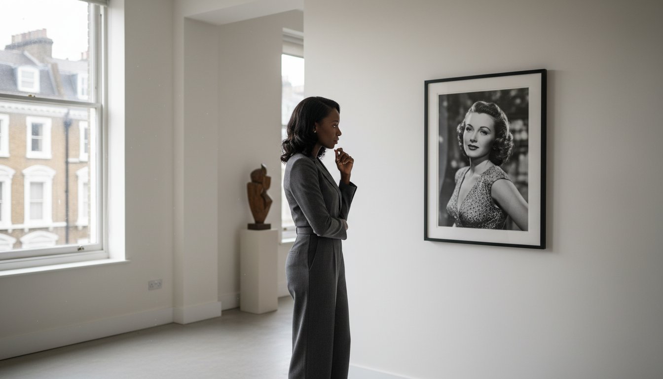
Finding your voice as a collector requires exploration. You might find yourself drawn to the aspirational luxury found in the Slim Aarons collection or perhaps the raw, intimate celebrity portraits captured in Terry O’Neill photography. Digital galleries and social media serve as a risk-free classroom, allowing you to refine your eye before committing. However, nothing replaces the tactile experience of visiting a fine art photography gallery in London or your local city. Seeing the depth of tone and the texture of the paper in person is essential for understanding the true value of fine art and the prestige of the artists involved.

Strategic Entry Points: Limited Editions and Archival Photography

Photography serves as the ultimate equalizer for those discovering how to build an art collection on a budget. While an original oil painting by a historical master remains locked behind the vault of a billionaire, a fine art photograph offers a direct, tangible connection to that same level of cultural prestige. It allows you to step away from the mass-produced and into the realm of the curated. By utilizing photographic archives, such as those maintained by Getty Images, professional galleries can provide access to iconic moments in history, printed from original negatives with a level of detail that a digital download simply cannot replicate.

Understanding the distinction between edition types is vital for your collection’s future. Limited editions are the cornerstone of the market; the scarcity created by a fixed number of prints inherently protects the value of your acquisition. However, you shouldn’t overlook “Open Editions” if they’re produced to the same exacting standards. When an open edition is sourced from a reputable archive and printed with artisanal care, it remains a high-caliber asset that tells a powerful story on your walls. It’s about the quality of the production rather than just the number on the corner.

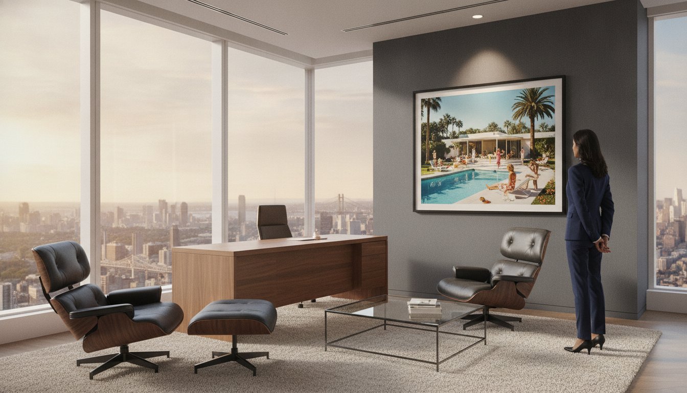
The Allure of the Masters: Slim Aarons and Terry O’Neill

For many, the journey begins with Slim Aarons. His work, famously described as “attractive people doing attractive things in attractive places,” remains the ultimate entry point for the aspirational collector seeking a slice of mid-century elegance. Similarly, Terry O’Neill photography captures the 20th century’s most iconic faces, from Hollywood royalty to rock legends, offering an investment in cultural history that only grows more poignant with time. These archive-backed prints ensure you’re buying a piece of the original legacy, preserved with the same reverence as the day the shutter clicked. You might explore the Terry O’Neill collection to find a piece that resonates with your personal narrative.

Archival Standards: The Technical Side of Value

A collector must look beyond the image to the material itself. Traditional silver gelatin prints, known for their deep blacks and silvery highlights, offer a classic aesthetic, while modern C-types provide vibrant, lush color depth. The role of museum-quality paper is paramount in preventing the fading and degradation that plagues standard posters. Archival photo paper is a 100-year commitment to visual integrity. By choosing these materials, you ensure that your collection doesn’t just decorate a room but endures as a lasting piece of history. This technical superiority is what distinguishes a genuine collector’s piece from mere home decor.

Hidden Gems: Cinema Lobby Cards and Music Memorabilia

While large-scale archival prints offer a sweeping visual statement, the discerning collector knows that smaller, niche categories often provide the most intimate connection to cultural history. Developing a strategy for how to build an art collection on a budget often involves looking where others don’t, specifically toward the world of collectable ephemera. These pieces aren’t merely decorations. They’re artifacts that bridge the gap between fan appreciation and serious curatorial investment. By integrating cinema and music history into your home, you create a space that feels both intellectually stimulating and deeply personal.

The crossover appeal of these items lies in their dual nature as visual assets and historical documents. A vintage lobby card or a candid shot from a music archive carries a sense of “lived-in” history that a modern reproduction simply cannot mirror. Spotting rare collectables in these archives requires an eye for detail and an appreciation for the “unseen” moment. Whether it’s a behind-the-scenes glimpse of a legendary film set or a quiet moment before a sold-out concert, these pieces offer a unique perspective that adds significant weight to a growing collection.

Lobby Cards: Small Scale, Large Impact

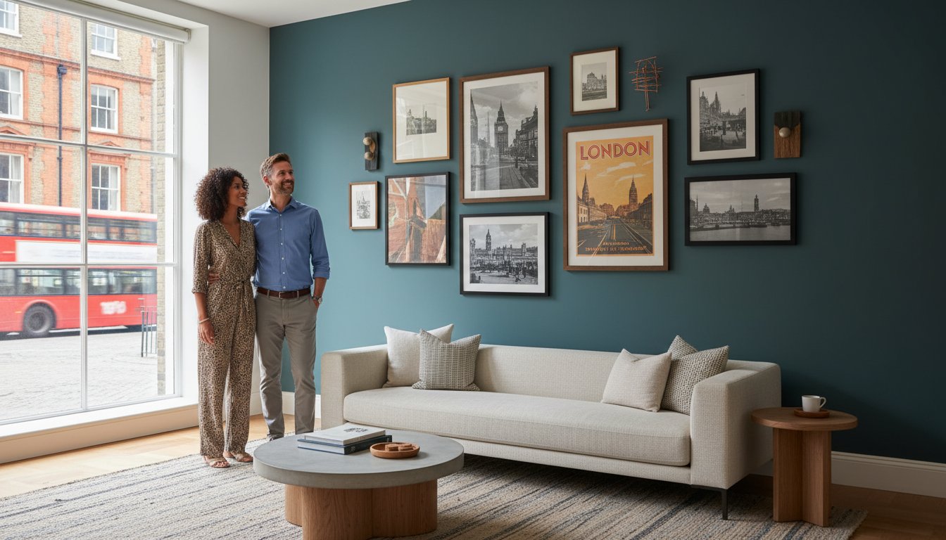
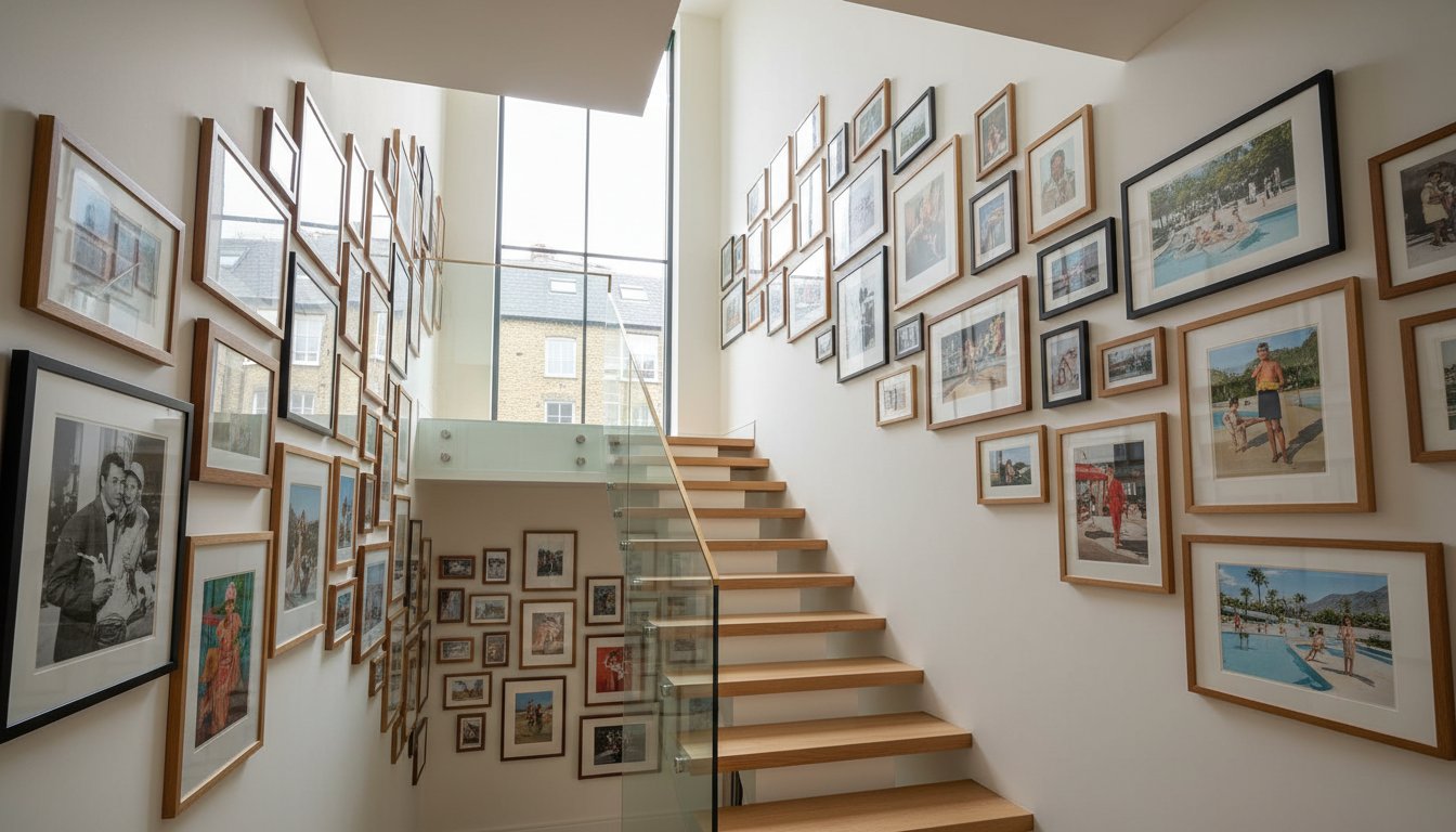
Originally produced in sets of eight to entice theatergoers, lobby cards have transitioned from promotional tools to highly sought-after artifacts. Their smaller dimensions make them a high-character, low-cost entry point for those learning how to build an art collection on a budget. While a full-sized vintage movie poster might command a premium, a well-preserved lobby card offers the same cinematic prestige at a fraction of the cost. Framing these small-scale works with generous mounts can transform them into sophisticated centerpieces for a study or a curated gallery wall. Their rarity, compared to mass-market posters, ensures they remain a distinctive addition to any home.

Music Photography: Capturing Sound and Soul

Music photography represents a powerful intersection of sound and soul, allowing you to build a collection around the cultural icons who shaped your world. From the rebellious energy of the Beatles to the chameleonic presence of Bowie, these images capture the essence of an era. Professional music photography bridges the gap between fan memorabilia and fine art, elevating the subject matter through technical excellence and historical context. Look for “unseen” or candid moments within the Music Archives. These intimate perspectives provide a more nuanced narrative than standard publicity shots, ensuring your collection remains a true reflection of your personal aesthetic heritage.

Maximizing Value Through Preservation and Bespoke Framing

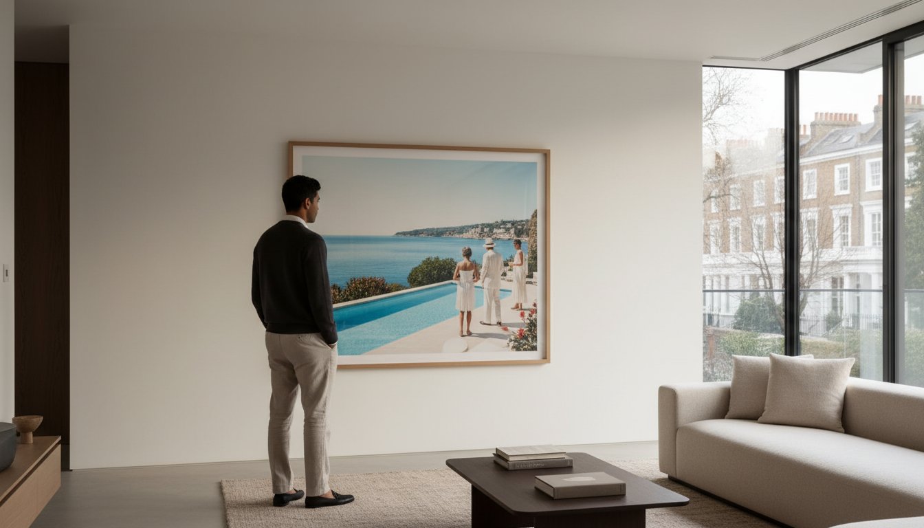
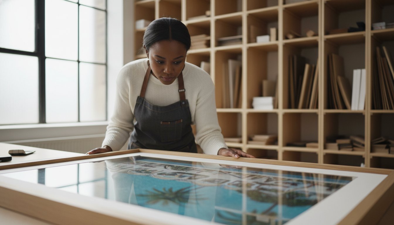
The most common error in learning how to build an art collection on a budget is treating the frame as an afterthought. You’ve spent time researching the Slim Aarons collection or Terry O’Neill photography, only to place that archival print in a generic, off-the-shelf frame. This is a critical mistake. A professional frame doesn’t just hold the art; it elevates a modest print into a gallery-worthy centerpiece. It provides the necessary gravitas and presence, ensuring the work commands the room’s attention while bridging the gap between a simple image and a curated asset.

Preservation is a meticulous science. Without UV-protective glass, the vibrant hues of a C-type print or the rich tonal range of a silver gelatin print will inevitably fade when exposed to natural light. Acid-free mounting is equally vital. Standard adhesives can leach chemicals into the paper, causing irreversible yellowing or brittle edges. By choosing museum-grade materials, you’re protecting the historical authenticity and material quality of your purchase. A bespoke frame acts as a tailored suit for your art, enhancing its aesthetic presence and ensuring it sits with quiet authority on your wall.

The Anatomy of a Professional Frame

Material choice is paramount for longevity. Natural wood offers a stability and timeless feel that synthetic alternatives simply cannot mirror. Beyond the exterior, a curator focuses on “breathing room.” Using high-quality mounts keeps the print’s surface from touching the glass, preventing moisture damage or “cockling” over time. A bespoke frame is an insurance policy for your art’s physical and financial value. Investing in professional craftsmanship ensures that the technical superiority of the print is matched by its presentation. To ensure your new acquisitions receive this level of care, consider utilizing a Bespoke Framing Service that understands the nuances of archival preservation.

Creating the Gallery Wall on a Budget

This is where the strategic nature of how to build an art collection on a budget truly shines. You don’t need a wall of massive, expensive prints to make an impact. Instead, use a “hero piece”—perhaps a larger iconic image from the music archives—to anchor the space. Surround it with smaller, more accessible works like cinema lobby cards or limited edition Star Wars prints. This mix of sizes and mediums creates visual interest and narrative depth. Remember, a collection is a marathon, not a sprint. A “rotation” strategy allows you to build your gallery over years, replacing entry-level pieces as your discerning eye matures and your collection grows in prestige.

Galerie Prints operates as a vital bridge to a bygone era, offering a sanctuary for those seeking to master how to build an art collection on a budget without sacrificing the prestige of historical authenticity. While digital marketplaces are often flooded with reproductions of dubious origin and inconsistent quality, our gallery functions as a trusted guardian of photographic heritage. We meticulously curate the world’s most iconic archives, ensuring that every piece within our collection meets the rigorous standards expected by serious collectors and connoisseurs alike. Buying from a specialist gallery offers a level of security and documented provenance that generic, high-volume retailers simply cannot match. It’s the difference between a fleeting purchase and a permanent investment in visual history.

From Archive to Your Wall

The journey of a single print is one of meticulous care and technical reverence. We source directly from the most prestigious repositories, including the expansive Getty Images archives and the intimate Terry O’Neill archives, to bring you imagery that has shaped the global cultural consciousness. Once an image is selected, it undergoes an artisanal production process that prioritizes material quality and historical accuracy above all else. By combining these archive-quality prints with our bespoke framing service, we offer a seamless “ready-to-hang” advantage. This ensures that the technical superiority of the print is immediately protected by gallery-standard presentation. Our curators are also available to provide personalized advice, helping you select your first piece with the confidence of a seasoned expert.

The Legacy of Your Collection

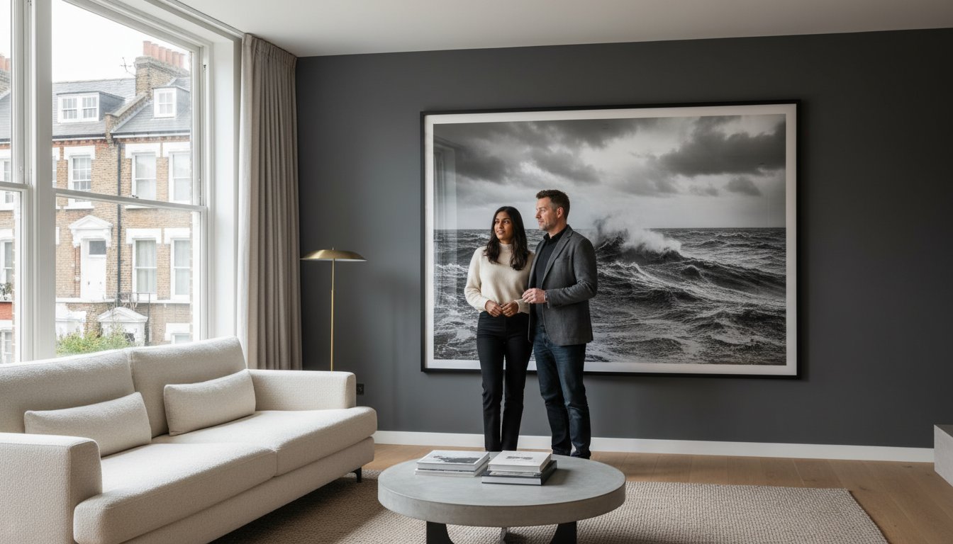
As you refine your approach to how to build an art collection on a budget, you’ll realize that each acquisition is far more than a decorative choice; it’s a lasting piece of history that will endure for generations. By choosing works that carry the profound weight of the past, you join an elite community of discerning collectors who value authenticity over the ephemeral nature of mass-market trends. Your home becomes a testament to your personal taste and a sophisticated spark for conversation, reflecting a world of elegance, stability, and heritage. This is the moment to transition from an admirer of beauty to a custodian of it. Explore our curated collections and start your journey today.

Cultivating Your Legacy of Elegance

True collection building is an intentional journey that transcends mere decoration. By shifting your focus from volume to value, you’ve learned that how to build an art collection on a budget is essentially a study in discerning curation. Whether you’re drawn to the cinematic charm of vintage lobby cards or the cultural resonance of the music archives, the key lies in selecting pieces with documented heritage and material integrity. As official partners of the Getty Images Gallery and the Terry O’Neill archives, we provide the security of provenance that every serious collector requires.

Your journey doesn’t end with the selection of an image; it’s solidified through our commitment to artisanal craftsmanship. Every ready-to-hang order includes bespoke, museum-grade framing, ensuring your durable, archival-quality prints are preserved for generations. This technical excellence transforms a simple photograph into a lasting piece of history. We invite you to begin your collection with our curated Slim Aarons archives and discover the profound satisfaction of owning a masterpiece. Your home is a canvas for your personal narrative, and the first iconic chapter is waiting to be told.

Frequently Asked Questions

Is photography considered “real” art for a collection?

Photography is absolutely recognized as a premier fine art medium, held in the permanent collections of prestigious institutions like the Victoria and Albert Museum and MoMA. For those learning how to build an art collection on a budget, it offers a sophisticated way to own iconic cultural moments. Unlike unique paintings, photography’s reproducibility through authorized archives allows for a more accessible entry into high-end collecting while maintaining technical and historical prestige.

What is the difference between an open edition and a limited edition print?

A limited edition print is produced in a strictly fixed quantity, which naturally creates scarcity and protects future value. Once the edition sells out, no further prints are ever made. In contrast, an open edition has no set limit on the number of prints produced. While limited editions are the gold standard for long-term investment, high-quality open editions from reputable archives still offer immense aesthetic and curatorial value for a growing collection.

How much should I expect to spend on my first collectable print?

Your initial investment depends on the rarity of the artist, the physical size of the work, and the edition type. Generally, entry-level archival prints or vintage ephemera allow you to start a meaningful collection without a massive financial hurdle. It’s best to prioritize a single piece of documented quality over several lower-grade items. This strategic approach ensures every acquisition contributes to the overall prestige of your home gallery.

Does framing really affect the value of my art collection?

Professional framing is essential for both the aesthetic impact and the long-term physical integrity of your art. Poor framing with acidic materials or standard glass can lead to irreversible fading and degradation, effectively devaluing your investment over time. A bespoke, museum-grade frame acts as a protective seal, ensuring the work remains in pristine condition while enhancing its presence as a centerpiece in your room.

Can I build an art collection entirely online?

You can certainly build a sophisticated art collection entirely through digital platforms, provided you source from established specialist galleries. Online access allows you to research archives and compare movements with ease. When buying online, look for detailed information regarding production methods, paper types, and provenance. This transparency is crucial for anyone discovering how to build an art collection on a budget while seeking the security of a professional gallery.

What are the best artists to look for when starting on a budget?

Focus on artists whose work is preserved in major archives, such as the legendary Slim Aarons or the iconic Terry O’Neill. These photographers captured a bygone era of elegance that remains timelessly aspirational. Additionally, exploring music archives for candid shots of cultural icons or Star Wars limited edition prints can provide high-character entry points. These names carry established market recognition, making them safer choices for new collectors.

How do I know if a print is “archival quality”?

Archival quality is defined by the use of acid-free, museum-grade papers and specialized printing processes like silver gelatin or high-end C-types. These materials are specifically designed to resist fading and degradation for over a century. You should look for galleries that explicitly state their production standards and use of original source materials. This technical excellence is what distinguishes a lasting collectable from a disposable commercial poster.

What is a lobby card and why is it collectable?

A lobby card is a small, photographic promotional piece originally displayed in cinema foyers to highlight scenes from a film. Because they were produced in limited sets and often feature iconic actors or pivotal moments, they’ve become highly sought-after historical artifacts. Their compact scale makes them an exquisite choice for creating detailed gallery walls or intimate displays, offering a slice of Hollywood heritage at an accessible price point.

Slim Aarons for Office Decor: A Curatorial Guide to Professional Elegance

A study by Exeter University found that employees are 32% more productive when working in an environment enriched by art and nature. You likely recognize that a sterile, uninspired workspace does little to foster the creative clarity or quiet authority required at the highest professional levels. It’s a common frustration to feel trapped between the coldness of corporate minimalism and the risk of choosing “bad hotel art” that lacks soul. Selecting Slim Aarons for office decor offers a sophisticated solution, allowing you to infuse your surroundings with a sense of heritage and an evocative, aspirational lifestyle.

This guide serves as your curatorial roadmap to transforming a standard office into a gallery of professional elegance. We’ll show you how to move beyond simple decoration to create a space that commands respect and serves as a genuine conversation starter for clients and colleagues alike. You’ll learn the essential framework for archival quality, from estate-stamped collectors prints to museum-grade framing techniques. By the end, you’ll have the tools to build a visual environment that supports well-being, which 69% of participants in a 2022 Brookfield Properties study identified as a key benefit of visually striking workplace art.

Key Takeaways

  • Learn how to utilize Slim Aarons for office decor as a visual shorthand for professional authority and a signal of your worldly perspective.
  • Understand the hierarchy of authenticity by distinguishing between mass-market reproductions and museum-quality archival prints sourced from official negatives.
  • Master the technical principles of scaling and placement, including the Rule of Thirds, to ensure your artwork commands the room with balanced precision.
  • Discover why a curated workspace is a strategic investment that reduces decision fatigue and fosters an atmosphere of high-level creative clarity.

Defining the Curated Workspace: Why Office Art is a Strategic Investment

In the modern executive suite, art is no longer a peripheral afterthought. It acts as a visual shorthand, communicating a profound sense of professional authority and intellectual curiosity before a single word is exchanged. By integrating Slim Aarons for office decor, you’re not simply filling wall space; you’re establishing a narrative of heritage and worldly success. This intentional selection signals to clients and colleagues that your workspace is a site of strategic thought rather than accidental arrangement.

The transition from generic corporate decor to a private gallery aesthetic reflects a deeper understanding of brand identity. High-caliber photography serves as a bridge to a bygone era of elegance, building immediate client trust through the display of cultural capital. Beyond the external impression, the return on investment manifests in employee retention and personal branding. A 2022 study by Brookfield Properties found that 69% of participants felt striking art at work contributes to their well-being. A workspace that feels like a curated sanctuary reduces decision fatigue, allowing the mind to pivot from the mundane to the visionary.

The Psychology of Professional Imagery

Visual stimuli directly influence cognitive performance in high-pressure environments. Strategic imagery can modulate the room’s energy. Calming, expansive landscapes are often ideal for areas dedicated to deep work and focused analysis. Conversely, vibrant social scenes can spark the kinetic energy needed for collaborative boardrooms. Within this framework, a curatorial approach is a method of preserving historical significance while enhancing the modern aesthetic.

Moving Beyond the ‘Hotel Art’ Trap

Mass-produced, anonymous prints often lack the soul required for a serious professional setting. They feel disposable, which can inadvertently undermine a brand’s perceived authenticity. The human element in photography is what separates a generic pattern from a masterpiece. The work of Slim Aarons captures genuine moments in time, offering a window into an aspirational lifestyle that feels lived-in rather than staged. This creates a sense of “quiet authority.” It doesn’t need to be loud or garish to be noticed. It commands the room through its inherent quality, artisanal craftsmanship, and historical weight. Consider these factors when selecting your pieces:

  • Narrative Depth: Does the image tell a story of success, travel, or heritage?
  • Material Excellence: Is the print produced using archival methods that ensure longevity?
  • Emotional Resonance: Does the piece inspire a sense of wonder or nostalgia in the viewer?

Choosing art that reflects these values ensures your office remains a place of inspiration rather than just a place of work. It’s about building a legacy, one frame at a time.

The Slim Aarons Aesthetic: Balancing Leisure with Professional Rigor

Aspirational photography serves as a primary narrative for the modern executive office. It moves beyond the clinical and the abstract, offering instead a window into a world defined by success and a sophisticated, worldly perspective. When you integrate Slim Aarons for office decor, you aren’t merely selecting a visual accent. You are adopting a shorthand for achievement. These images act as sophisticated icebreakers in a boardroom setting, inviting dialogue about travel, heritage, and the pursuit of excellence. They suggest a leader who values both the rigor of the climb and the rewards of the summit.

Aligning the era of the photography with your office architecture is essential for a cohesive visual field. A mid-century modern suite naturally complements the sun-drenched, geometric precision of Aarons’ 1950s and 60s work. However, placing these vintage scenes within a contemporary glass tower provides a necessary warmth, grounding a high-tech environment with a sense of permanence and history. This balance ensures the workspace feels established rather than transient.

Why Slim Aarons is the Gold Standard for Office Decor

Slim Aarons famously dedicated his career to capturing “attractive people doing attractive things in attractive places.” For a comprehensive look at his legacy, consult Slim Aarons: The Definitive Guide to the Master of Aspirational Photography. Using his “Poolside” or “High Society” imagery in a professional context creates a paradox that inspires. While the subject is leisure, the subtext is accomplishment. It communicates a sense of arrival, suggesting that the drive for professional excellence is what grants access to such a refined lifestyle. This subtle psychological cue can be more motivating than any traditional corporate slogan.

Iconic Portraits and Cultural Heritage

The impact of Fine Art Photography lies in its ability to create an immediate sense of heritage. Portraits of cultural legends and leaders from the Aarons archive inspire resilience. They remind the viewer that today’s business challenges are part of a longer historical arc of innovation and class. This iconic imagery bridges the gap between a bygone era of elegance and the demands of contemporary business, providing a stable foundation of style. To begin curating your own professional sanctuary, you might explore the archival selections within The Slim Aarons Collection.

  • Visual Storytelling: Move from generic patterns to narrative-driven art.
  • Conversation Starters: Use heritage imagery to build rapport with clients.
  • Architectural Harmony: Match the photographic era to your building’s design for maximum impact.

By treating your office as a private gallery, you elevate the daily experience of work into something more profound. It’s an investment in your personal brand that pays dividends in both mood and perception.

The Hierarchy of Authenticity: Prints, Posters, and Archival Standards

In the hierarchy of professional aesthetics, the material quality of your art is just as communicative as the subject matter itself. While mass-market posters might offer a temporary visual fix, they often lack the depth, tonal range, and physical gravitas required to command a boardroom. When selecting Slim Aarons for office decor, the distinction lies in the archival process. Authentic prints are produced from the original negatives and transparencies housed within the Getty Images Archive, ensuring that every sun-drenched terrace and alpine vista is rendered with the precision the artist intended. This connection to the source material transforms a simple image into a piece of photographic heritage.

The collectability of these works is intrinsically tied to their production standards. In high-pressure environments, where offices are often flooded with natural light, the longevity of the medium becomes a practical concern. Standard commercial inks can fade within years when exposed to UV rays, but museum-quality archival prints are designed for permanence. Utilizing acid-free papers and lightfast pigments ensures that the “quiet authority” of your workspace remains untarnished by time. This commitment to quality reflects a broader corporate philosophy of stability and long-term vision.

Fine Art Photography vs. Commercial Prints

The technical superiority of Fine Art Photography is found in the meticulous methods of production. Estate-stamped collectors prints often utilize original Colour C-type processes on Silver Halide Crystal paper, which produces a lush, painterly depth that digital alternatives cannot replicate. For monochrome selections, Black and White Silver Gelatin photographs on Ilford warm tone fibre darkroom paper offer a silver-rich texture that feels tactile and historic. Choosing archival pigment prints on Fine Art Hahnemühle Baryta paper (325 gsm) provides a promise of permanence, ensuring your investment retains its visual and financial value in a transient corporate world.

The Appeal of Rare Collectables

For those looking to add a layer of curated personality to a professional alcove, small-scale artifacts offer a unique solution. Integrating cinema lobby cards allows you to display rare, historic fragments of film culture that serve as intimate conversation pieces. These artifacts carry a prestige that standard retail catalogues can’t match, as they represent a tangible link to the golden age of Hollywood. Similarly, selections from music archives can signal a sophisticated cultural awareness, bridging the gap between professional rigor and personal passion. These rare finds ensure that your office feels less like a workspace and more like a private, highly specialized gallery.

Proportion and Presentation: Scaling Slim Aarons for Maximum Impact

The visual impact of Slim Aarons for office decor depends heavily on the precise relationship between the print’s dimensions and the room’s architecture. In a sprawling reception area, a singular, large-scale work acts as a definitive anchor, establishing the company’s aesthetic identity immediately upon entry. A print that is too small for a vast boardroom wall can feel hesitant, inadvertently undermining the prestige you wish to project. Conversely, the space above an executive desk requires a more intimate scale. A medium-sized print allows for closer inspection, inviting the viewer to linger on the meticulous details of the composition without overwhelming the primary workspace.

Strategic placement follows the Rule of Thirds, a principle that ensures a balanced visual field by dividing the wall into a grid of nine equal parts. Rather than centering every piece with mathematical rigidity, consider the surrounding furniture and negative space. Aligning the artwork’s focal point with the eye level of a seated guest creates a natural, unforced connection that encourages conversation. To combat the harsh glare of modern office lighting, the use of Museum Glass is indispensable. This specialized glazing features non-reflective coatings that virtually disappear, allowing the rich colors and textures of the archival print to remain visible from every angle in the room while providing essential UV protection for the longevity of the ink.

Bespoke Framing as a Professional Statement

The frame is not merely a border; it is a piece of furniture that must harmonize with your interior design. Hand-stained woods offer a warmth that complements traditional executive suites, while sleek, hand-finished aluminium provides a sharp, contemporary edge for modern glass-walled environments. Professional mounting is equally critical. It prevents “cockling,” the unsightly rippling of paper caused by changes in humidity. A perfectly flat, expertly mounted print signals a commitment to excellence and long-term preservation. You can elevate your collection through our Bespoke Framing Service to ensure every piece meets these exacting standards.

Creating a Gallery Wall in a Professional Context

While a home gallery might embrace a maximalist spirit, a professional arrangement requires a more structured approach. Consistency is the unifying thread. By using identical framing and matting, you can successfully hang disparate subjects, such as music archives and landscapes, side-by-side. For inspiration on tonal harmony, explore The Timeless Allure of Black and White Pictures. This curated method allows you to build a narrative of cultural awareness that feels intentional and composed. A well-executed gallery wall in a boardroom communicates a breadth of interest and a sophisticated, multi-layered professional legacy.

Curating Your Professional Legacy with Galerie Prints

Choosing the right pieces for a workspace is an act of legacy building. Galerie Prints operates as a seasoned curator for your professional journey, offering more than just imagery; we provide a gateway to a bygone era of elegance. When you integrate Slim Aarons for office decor through our gallery, you’re securing a piece of photographic heritage that’s been meticulously preserved. Our direct access to world-renowned official archives ensures that every print carries the weight of historical authenticity and technical superiority.

A purchase from our collection isn’t a transient decorative choice. It’s a permanent addition to your professional environment. We understand that the transition from selection to installation must be seamless. Our bespoke framing services ensure that your artwork arrives ready-to-hang, meeting museum-level standards that reflect your own commitment to quality. This isn’t just art; it’s a communication of quiet authority that grows in value as it anchors your office’s aesthetic identity. It tells a story of success that transcends the temporary trends of modern design.

The Galerie Prints Difference: From Archive to Wall

Our commitment to artisanal craftsmanship is evident in every stage of production. We rely on traditional methods and localized expertise to produce prints that meet the exacting demands of serious collectors. The Galerie Prints platform is designed for the modern executive, offering an intuitive way to customize sizes and frames to fit any office scale. We act as a vital bridge between you and the most prestigious photographic masters of the twentieth century, ensuring that the visual impact of the work is matched by the integrity of its creation. Every piece is a testament to our role as guardians of photographic history.

Next Steps for the Discerning Collector

Building a gallery-grade workspace doesn’t require an immediate, large-scale overhaul. Many of our clients begin their journey with a single, powerful “anchor” piece. Whether it’s an iconic Slim Aarons poolside scene or a striking portrait from our Terry O’Neill Photography archive, a lone masterpiece can redefine the energy of a room. For those planning extensive corporate installations or a complete home office refresh, our experts are available to provide curatorial guidance. We invite you to explore our curated collections and select your next professional masterpiece to begin your own legacy of style.

Establishing Your Professional Sanctuary

As official curators of the Slim Aarons and Getty Images Archives, we’re dedicated to preserving this photographic heritage for the modern collector. Every order is paired with hand-crafted bespoke framing and museum-quality archival prints, delivered with care to professional suites worldwide. This is your invitation to move beyond the transient and embrace a visual narrative of permanence and prestige. A well-chosen piece doesn’t just decorate a room; it anchors a career.

Curate your workspace with our exclusive Fine Art Collections and transform your office into a gallery that inspires both productivity and wonder. Your sanctuary of professional elegance is just one masterwork away.

Frequently Asked Questions

Is it better to have one large piece of art or a gallery wall in an office?

The choice depends entirely on the room’s architectural function and the volume of the wall. A singular, large-scale work acts as a definitive anchor for reception areas, establishing an immediate sense of prestige and focus. Structured gallery walls are often more effective in collaborative spaces or corridors, where they invite viewers to engage with a multifaceted narrative of heritage and success.

How do I choose art that is professional but still shows my personality?

Focus on the intersection of personal interest and museum-quality presentation. By selecting subjects that resonate with your worldly perspective, such as travel or history, and rendering them in archival formats, you communicate intellectual curiosity without sacrificing rigor. This curatorial approach ensures your personal tastes are perceived as a sophisticated collection rather than a casual decorative choice.

What is the best height to hang art in a commercial or home office?

Standard practice dictates centering the piece at eye level, which typically sits between 57 and 60 inches from the floor. In a boardroom or private office where guests are primarily seated, you might consider lowering the placement by two or three inches. This adjustment maintains a comfortable visual connection and ensures the artwork remains a natural part of the conversational field.

Should I choose black and white or colour photography for a boardroom?

Colour photography, especially when utilizing Slim Aarons for office decor, provides a vibrant, aspirational energy that suits modern, forward-thinking firms. Black and white imagery offers a timeless, formal rigor that communicates a sense of permanent stability and classic elegance. Your choice should align with the specific “quiet authority” you wish to project within that high-stakes environment.

How do I ensure my office art does not distract clients during meetings?

Strategic placement is the most effective way to manage visual attention during critical discussions. Positioning art on the wall behind the client or to the side allows the work to serve as a sophisticated icebreaker before the meeting begins. Avoid placing large, high-contrast pieces directly behind your head, as this can create a competing focal point that pulls attention away from your presentation.

What are the benefits of archival paper and bespoke framing for office art?

These elements are essential for preserving the physical integrity and investment value of your collection. Archival paper prevents the yellowing and degradation often caused by the harsh UV exposure found in window-heavy offices. Our Bespoke Framing Service provides a structural seal that protects the print from humidity shifts, ensuring your Slim Aarons for office decor remains as crisp and evocative as the day it was installed.

Can I mix different styles of photography, such as music and film, in the same office?

You can certainly mix disparate subjects provided you maintain a unifying aesthetic thread. Utilizing consistent materials and hand-finished frames across different collections, such as music archives and cinema lobby cards, creates a cohesive visual language. This layered approach signals a broad cultural intelligence and a sophisticated, worldly personality that transcends a single interest or era.

Does office art need to match the company’s brand colours?

Art should complement the company’s spirit rather than mimic its literal branding. A strict colour match can often feel forced or overly corporate, which undermines the authenticity of a curated workspace. Instead, look for tonal relationships that harmonize with your interior design and furniture. This creates a more organic, private gallery atmosphere that feels both established and intellectually stimulating.

Understanding Art Print Quality: A Curator’s Guide to Fine Art Standards

Have you ever wondered why a photograph displayed in a gallery possesses a luminous, almost tactile depth that seems impossible to replicate at home? It’s a common frustration for collectors who fear that a prized acquisition might arrive looking pixelated or, worse, begin to yellow and fade within a few short years. Truly understanding art print quality requires looking beyond the image itself to the invisible alchemy of paper, ink, and artisanal precision.

We recognize that deciphering terms like Giclée, archival pigment, and GSM often feels like learning a hidden language. You deserve the certainty that your investment will remain a vibrant piece of history for decades to come. This guide reveals the technical and artisanal hallmarks that distinguish a museum-grade fine art print from a standard reproduction. We will explore the essential trinity of source integrity, archival chemistry, and professional finishing; this knowledge ensures you can read any product specification with the discerning eye of a seasoned gallery expert.

Key Takeaways

  • Master the distinction between commercial 4-colour printing and the 12-colour Giclée pigment systems that guarantee a lifespan of over 100 years.
  • Learn to identify premium material ingredients, specifically why 300gsm cotton rag paper remains the undisputed benchmark for tactile and visual depth.
  • Refine your approach to understanding art print quality by exploring why source integrity, especially direct access to historical archives, dictates the final visual impact.
  • Understand the vital role of bespoke framing in preserving your collection; learn how UV-protective glass prevents the irreversible bleaching of fine art.
  • Discover the curatorial difference of artisanal production where the human eye, rather than an automated factory, ensures every piece meets museum standards.

The Fundamental Shift: Fine Art Prints vs. Standard Posters

To the untrained eye, a print might seem like a simple reproduction. However, the gulf between a commercial poster and a museum-grade print is vast. It’s the difference between a fleeting decorative item and a legacy piece. When you’re understanding art print quality, you must first recognize that fine art prints are engineered for permanence. While a standard poster may begin to fade or yellow within five short years, a true archival print is designed to remain pristine for over a century. This isn’t just a marketing claim; it’s a result of rigorous material science.

This durability stems from the use of acid-free substrates. Over time, the lignin found in standard, wood-pulp paper reacts with light and oxygen. This reaction causes the “browning” or “foxing” that ruins lesser works. Fine art standards require materials that are chemically stable and PH-neutral. This ensures the paper remains as crisp and white as the day it was struck, providing a stable foundation for the imagery it holds.

What is a Giclée Print?

The term Giclée, derived from the French word gicler meaning “to spray,” represents the pinnacle of digital reproduction. Unlike the basic 4-colour CMYK process used by high-street commercial printers, a Giclée printer utilizes a sophisticated 12-colour pigment system. This allows for a vastly expanded colour gamut and incredibly smooth graduations. By understanding the printmaking process through this lens, collectors can appreciate how archival pigment inks provide a depth of tone that standard dye-based inks cannot match. The “dot gain” is meticulously controlled, preventing the pixelation that often plagues mass-produced prints.

The Aesthetic Impact of Archival Materials

The emotional impact of a fine art print is often found in its relationship with light. Premium papers, often crafted from 100% cotton rag, possess a natural texture that absorbs light rather than reflecting it harshly. This creates a “luminous” quality, which is particularly vital for capturing the subtle silver and charcoal tones in black and white photography. High-quality papers avoid “optical brighteners,” which are chemical additives that can break down and cause the art to shift colour over time. When you’re understanding art print quality, you’ll notice that museum-grade prints have a tactile, three-dimensional presence that makes the image feel alive, unlike the flat, plastic look of a standard poster.

The Materiality of Art: Understanding Paper and Ink Chemistry

The true soul of a museum-grade piece lies in its molecular composition. While the image captures the eye, the physical materials ensure the work endures. Understanding art print quality requires an appreciation for the delicate balance of paper and ink chemistry. Standard prints often rely on dye-based inks, which are essentially liquid stains. These are highly vulnerable to UV degradation, causing vibrant reds and deep blues to vanish within years. In contrast, archival pigment inks are composed of solid particles of mineral or synthetic origin. These particles sit on the surface of the paper rather than soaking in, resisting the “bleaching” effect of sunlight and ensuring the work remains a permanent fixture in your home.

The choice of surface finish further defines the visual narrative. A Lustre finish provides a gentle sheen that enhances contrast and saturation without the harsh reflections of high gloss. Matt surfaces offer a sophisticated, reflection-free viewing experience, ideal for spaces with abundant natural light. For those seeking a classic, historical aesthetic, a Pearl finish mimics the subtle glow of traditional gelatin-silver prints, adding a layer of nostalgic elegance to the imagery.

The Weight of Quality: Why GSM Matters

Weight is a silent indicator of prestige. In the art world, we measure this in Grams per Square Metre (GSM). A 150gsm poster feels fragile, almost disposable. However, the gallery standard is 300gsm or higher. This card-like stability is essential for large-format fine art photography. Heavier paper is not merely about a premium feel; it provides the structural integrity needed to prevent “cockling.” This unsightly rippling occurs when thinner papers expand and contract in response to changes in humidity, a flaw that can ruin the presentation of a framed work.

Cotton Rag: The Gold Standard for Collectors

When curators discuss the “ingredient list” of a print, cotton rag is the undisputed gold standard. Unlike standard papers made from wood pulp, cotton rag is naturally acid-free and pH neutral. It does not contain the lignin that causes cheaper prints to turn brittle and brown. The texture of cotton rag is deeply tactile, possessing a soft, painterly dimension that draws the viewer in. It is this purity that allows museum curators to preserve historical works for centuries. By understanding art print quality through the lens of these premium substrates, you can invest with the confidence that your collection is built on a foundation of permanence. You might find yourself drawn to the tangible excellence of our hand-selected archives, where every piece is struck on these very standards.

Source Integrity: Why Provenance Dictates Visual Quality

The true essence of a masterpiece is often decided long before the printer is ever engaged. While many collectors focus on the technical specs of the output, understanding art print quality requires a deeper investigation into the provenance of the source material. In the curatorial world, we adhere to the “Garbage In, Garbage Out” rule. A high-resolution scan of a poor, third-party copy will never possess the soul of a print struck directly from the original negative. Authentic source integrity ensures that the grain structure, depth of field, and subtle light transitions remain exactly as the artist intended.

Working with official archives, such as Getty Images, provides a significant advantage that mass-market retailers simply cannot replicate. For example, the iconic work of Terry O’Neill or the “Technicolor” vibrancy of the Slim Aarons collection relies on access to the original transparencies. These physical artifacts hold a wealth of visual information that is lost in subsequent generations of copies. When these details are captured correctly, they require an archival-quality fine art paper to translate that inherited brilliance into a physical object that commands attention in a room.

Original Archive Access vs. Third-Party Scans

The process of creating a premium print begins with scanning original 8×10 transparencies at immense resolutions. This method captures microscopic details that third-party scans often miss, resulting in a clarity that feels almost three-dimensional. Unauthorized or “bootleg” prints frequently appear muddy, lacking the critical shadow detail that defines high-end photography. By securing direct access to these historical archives, we ensure that every tonal graduation is preserved, maintaining the prestigious standard that serious collectors expect. This level of integrity is what separates a mere poster from a guardian of photographic heritage.

The Truth About DPI and Large Format Printing

A common myth in the digital age is that 300 DPI is a universal standard for quality. While this may suffice for small prints, large-scale wall art demands a much more sophisticated approach to resolution. Relying on interpolation, or digital upscaling, to enlarge an image can ruin the crispness of a Terry O’Neill portrait, introducing soft edges and digital artifacts. Native resolution is the inherent detail captured by the original camera lens at the moment of exposure. Understanding art print quality means recognizing that no amount of digital manipulation can replace the raw, authentic detail found in the original source material. When an image is printed at its true scale—often requiring the precision and equipment of a large format expert like Banner 4 Sale—the result is a sharp, evocative piece that stands up to the closest inspection.

Preservation and Presentation: The Role of Bespoke Framing

The pursuit of excellence doesn’t end when the pigment hits the paper. In fact, a high-quality print is only as secure as the architecture protecting it. While we’ve discussed the molecular stability of cotton rag and archival inks, these elements remain vulnerable to external stressors if housed in inferior framing. Truly understanding art print quality involves recognizing that the frame is not merely a decorative border but a functional shield. A museum-grade print is a masterpiece in waiting; its final form is dictated by the vessel that holds it.

Standard, off-the-shelf frames often utilize wood-pulp materials that contain lignin and other acidic compounds. Over time, these chemicals migrate into the art, causing irreversible staining and “burn” marks. We treat every piece with a curatorial “Seal of Quality,” utilizing bespoke, hand-finished frames that prioritize preservation alongside aesthetic elegance. This ensures the chemical interaction between the frame and the print remains neutral, protecting the integrity of the work for decades.

UV Protection and Optical Clarity

Light is both the creator and the destroyer of photography. Standard glass offers little resistance to ultraviolet rays, which act as a slow-motion bleach on even the most robust pigment inks. In sunlit rooms, this exposure leads to a loss of tonal range and vibrancy. Museum-grade UV acrylic or specialized anti-reflective glass acts as a high-factor “sunscreen” for your photographic investment. This clarity is especially vital for black and white pictures, where the preservation of deep blacks and subtle grey gradients is essential to maintaining the work’s emotional impact. High-end glazing ensures that the only thing you see is the art itself, free from distracting reflections.

Acid-Free Mounting and Spacers

The “hidden” threat to longevity often lies behind the print. Professional curators insist on acid-free, conservation-grade mounting to prevent the browning associated with cheap materials. We often distinguish between “dry mounting,” which flattens the print for a perfectly smooth finish, and “hinge mounting,” which allows the paper to breathe and move naturally with atmospheric changes. Another critical component is the use of spacers. These small, invisible inserts ensure the print never touches the glass directly. Without spacers, condensation can trap moisture against the ink, causing the paper to stick or “cockle.” Bespoke framing is a structural necessity that ensures your art remains a lasting piece of history. Experience the difference of our Bespoke Framing Service, where artisanal craftsmanship meets museum standards.

The Galerie Prints Standard: Curating Excellence in London

At Galerie Prints, we believe that understanding art print quality is not just a technical exercise; it’s an appreciation of the human touch. While much of the industry leans toward high-volume, automated “print-on-demand” factories, we maintain a steadfast commitment to artisanal production. Every print that leaves our studio is treated as a museum object. This means we don’t just hit a button and hope for the best. We employ a meticulous “Human Eye” check at every stage, ensuring that the tonal balance and detail meet our exacting standards before any work is signed off for delivery.

Our position as a guardian of photographic heritage is built on exclusive access to the world’s most prestigious archives. Whether it’s the sun-drenched poolside scenes of Slim Aarons or the intimate celebrity portraits of Terry O’Neill, these works are struck from the finest source materials available. When you acquire a piece from us, you aren’t just buying a decoration; you’re securing a lasting piece of history that has been handled with the reverence it deserves.

Artisanal Craftsmanship in the Heart of London

Our master printers and framers operate with a localized expertise that only decades of experience can provide. Hand-finishing is a cornerstone of our process. Whether it’s the precise cut of a conservation mount or the careful alignment of a bespoke frame corner, these details can’t be replicated by a machine. Our London gallery heritage informs every choice we make, from the specific texture of our archival papers to the weight of our hand-selected timber frames. This dedication to craft ensures that each piece possesses a tactile quality that commands attention in any room.

Building Your Collection with Confidence

Investing in art should be an act of joy, supported by the knowledge that you’re acquiring something of genuine value. When you look for authentic cinema lobby cards or limited edition prints, you’re looking for a tangible connection to a bygone era. Buying from a gallery that prioritizes source integrity provides long-term security for your collection. Understanding art print quality means knowing that your piece has been crafted to survive the test of time, both physically and aesthetically. We invite you to explore our curated archives and discover a world where historical significance meets modern elegance.

Crafting Your Legacy: The Final Step in Curating Your Collection

True art is an investment in time. By prioritizing archival chemistry and the integrity of the original source, you ensure your collection remains as evocative tomorrow as it is today. Mastering the nuances of understanding art print quality allows you to transform a home into a gallery of enduring significance. You now possess the knowledge to distinguish between a temporary reproduction and a museum-grade masterpiece that will withstand the passing decades.

We invite you to begin this journey with a partner who shares your reverence for photographic heritage. As official partners of the Getty Images Gallery and specialists in the Slim Aarons and Terry O’Neill archives, we apply these rigorous standards to every piece we strike. From our bespoke hand-finished framing in London to our selection of premium cotton rag papers, we ensure every detail is handled with curatorial precision. Explore our curated collections of museum-grade Fine Art Prints and discover the difference that artisanal dedication makes. Your walls deserve nothing less than a lasting piece of history.

Frequently Asked Questions

What is the difference between a Giclée print and a digital C-type print?

A Giclée print utilizes a high-precision inkjet process with archival pigment inks, whereas a digital C-type print is a light-sensitive photographic paper developed through traditional chemical processes. Giclée prints generally offer a superior colour gamut and significantly greater longevity. Collectors often prefer Giclée for its painterly texture on matte papers; conversely, C-type is favoured for its continuous tone and “true photograph” aesthetic on gloss or lustre surfaces.

How can I tell if a print is truly “archival” when shopping online?

Truly archival prints are defined by their ingredients; specifically, the use of 100% cotton rag or alpha-cellulose paper and pigment-based inks. When shopping online, look for explicit mentions of these materials rather than vague terms like “premium paper.” A reputable gallery will provide detailed specifications regarding the paper weight and ink system. Understanding art print quality means identifying these technical hallmarks to ensure your acquisition won’t degrade over time.

Why does the GSM of the paper matter if I am framing the art?

The GSM (Grams per Square Metre) dictates the structural integrity of the paper, which is essential to prevent “cockling” or rippling within the frame. Even when secured behind glass, thinner papers react to atmospheric humidity by expanding and contracting. A heavier weight, such as 300gsm or higher, provides the rigidity required to maintain a perfectly flat presentation. This stability is a key component in understanding art print quality for large-format displays.

Will my fine art print fade if it is placed in a bright room?

While archival pigment inks are exceptionally lightfast, any artwork will eventually suffer from prolonged exposure to direct, intense sunlight. The best defense is museum-grade glazing with UV protection, which acts as a barrier against the rays that cause bleaching. Placing your art on a wall that receives indirect light is always preferable. This curatorial approach preserves the vibrancy of the “Technicolor” tones found in archives like the Slim Aarons Collection.

What is the best way to clean the glass of a framed art print?

You should use a soft, lint-free microfibre cloth and a specialized ammonia-free glass cleaner to maintain the optical clarity of your frame. Never spray the cleaning solution directly onto the glass, as liquid can seep under the rebate and damage the mount or the print itself. Instead, mist the cloth lightly before gently wiping the surface. This careful maintenance ensures that the intricate details of your photographic investment remain visible and pristine.

Are limited edition prints higher quality than open editions?

Limited edition prints are not inherently higher in material quality than open editions, but they often carry a higher curatorial standard. These editions are frequently produced under the artist’s or estate’s supervision, ensuring the colour balance and contrast are perfect. The value lies in their scarcity and documented provenance. At Galerie Prints, we apply the same museum-grade production standards to all our works, from Terry O’Neill portraits to vintage movie posters.

How do I know if the resolution of a print is high enough for a large wall?

High resolution for large-scale art depends on the native resolution of the original source, such as an 8×10 transparency, rather than just the digital DPI. If a print is enlarged beyond its native capacity, you’ll notice soft edges or a “muddy” appearance in the shadows. For a large statement wall, the source must be a high-fidelity scan of an original negative. This ensures the grain structure remains crisp even at significant dimensions.

What does “acid-free” actually mean for the lifespan of my art?

Acid-free refers to materials that are PH-neutral and free from lignin, a natural component of wood pulp that causes paper to turn yellow and brittle. Using acid-free mounts and papers is a non-negotiable requirement for historical preservation. Without this standard, the chemical breakdown of the substrate would eventually destroy the image from the inside out. This commitment to chemical purity is what allows a fine art print to last for over a century.

How to Mix Different Art Styles: A Curator’s Guide to Cohesive Interior Decor

The most captivating rooms don’t rely on matching sets; they thrive on the deliberate collision of history and aesthetic. While you might worry that a 1960s Slim Aarons poolside scene would clash with a Star Wars limited edition print or a vintage movie poster, the reality is that contrast creates depth. Learning how to mix different art styles is less about finding identical colors and more about mastering the art of the visual narrative. It’s a skill that transforms a mere wall of pictures into a sophisticated, multi-layered home gallery that whispers of worldly travels and refined tastes.

You’ve likely felt that familiar uncertainty when standing before a blank wall, wondering if your Terry O’Neill music archives can truly coexist with traditional cinema lobby cards without looking chaotic. This guide provides the professional curatorial strategies you need to blend diverse movements and photography archives into a cohesive masterpiece. We’ll examine how a shared palette, thematic anchors, and the quiet authority of bespoke framing can unify even the most eclectic collection. You’ll gain the confidence to invest in the pieces you love, knowing exactly how to bridge the gap between different eras and mediums.

Key Takeaways

  • Shift your mindset from mere decoration to intentional curation by distinguishing between a random assortment and a purposeful selection of historical works.
  • Master how to mix different art styles by identifying a common thread, such as a recurring color palette or a shared narrative theme, to anchor your diverse collection.
  • Explore how bespoke framing acts as a visual bridge, using consistent materials or profiles to unify disparate mediums like vintage movie posters and contemporary photography.
  • Learn to select the ideal arrangement for your space, whether it’s the disciplined symmetry of a grid or the evocative, storied depth of a salon hang.
  • Discover how to pair the high-society elegance of the Slim Aarons Collection with the raw energy of music archives for a truly sophisticated home gallery.

The Curatorial Philosophy of Mixing Art Styles

True curation is a deliberate act of selection; it is not merely the gathering of objects. It requires a discerning eye that appreciates the friction between a sun-drenched Slim Aarons poolside scene and the raw, monochromatic intensity of a Terry O’Neill portrait. This friction creates a narrative depth that a single-style room simply cannot replicate. By adhering to fundamental design principles like scale and visual weight, you ensure that this mix feels prestigious rather than accidental. A curator looks for the quiet harmony that exists between disparate pieces, finding beauty in the tension of competing eras.

Understanding how to mix different art styles involves recognizing the difference between an accidental hoard and a purposeful selection. A selection is curated with a specific intent; it is a conversation held across decades. When you place a vibrant Star Wars limited edition print near a classic cinema lobby card, you aren’t just filling wall space. You are building a bridge between pop culture milestones and traditional cinematic history. This multi-layered approach suggests a worldly perspective, signaling that the collector values the heritage of the image as much as its aesthetic impact.

Intentionality vs. Clutter

A gallery feels cluttered when the eye has nowhere to rest. To avoid this, utilize white space as a silent partner in your design. An “earned” mix is one where the quality of the production and the authenticity of the source material remain consistent, even if the subjects differ wildly. This shared excellence provides the necessary cohesion to prevent visual chaos. Ultimately, eclectic curation is the balance of historical narrative and visual rhythm. It demands that every piece, whether it is a vintage movie poster or a music archive print, earns its place through its contribution to the room’s overarching story.

The Value of the Multi-Layered Collection

A room styled in only one era often feels like a sterile showroom; it lacks the soul and character of a lived-in space. A home should feel layered, reflecting a lifetime of discerning tastes and cultural appreciation. Integrating fine art photography as a foundational layer allows you to build a collection that feels permanent and stable. Mixing photography archives with cinema memorabilia invites guests to linger. These diverse pieces spark a silent dialogue about culture and artistry, ensuring your home remains a sanctuary of elegance rather than a fleeting trend. Mastering how to mix different art styles is the final step in evolving from a decorator to a true guardian of visual history.

Finding the Visual Anchor: Establishing a Common Thread

To achieve a balanced gallery, you must establish a visual tether that binds diverse pieces together. While some suggest designer-curated art sets as a starting point, a truly bespoke collection relies on more nuanced anchors. Color is the most immediate tool at your disposal. A single recurring hue, perhaps the deep azure of a Mediterranean sea or the softened charcoal of a studio backdrop, can bridge the gap between a Terry O’Neill portrait and a contemporary abstract print. This color repetition provides a rhythmic continuity that guides the eye across the wall, ensuring the transition between eras feels intentional.

Subject matter offers another sophisticated anchoring technique. Grouping by theme allows you to explore how to mix different art styles without sacrificing clarity. A collection centered on “The Aspirational Life” might elegantly sit a vibrant Slim Aarons poolside scene alongside minimalist sketches of mid-century architecture. You should also consider visual weight; a bold, saturated photograph requires a strategic counterweight. Pairing it with a minimalist black and white piece ensures neither work overwhelms the other. Contrast in medium, such as the matte texture of a vintage lobby card against the high-gloss finish of a modern archival print, adds a tactile dimension that enriches the viewer’s experience.

Pairing Photography with Illustrative Art

Integrating different mediums requires precision. When hanging a Slim Aarons work alongside oil paintings or sketches, maintain a consistent horizon line or eye level. This geometric alignment creates a sense of order that permits stylistic diversity. Using tonal values is equally effective; a sepia-toned photograph can effortlessly share space with a graphic poster if they share the same warmth. If you’re looking to expand your collection, you might browse our music archives for pieces that share these subtle tonal qualities.

The Narrative Anchor: Storytelling Through Art

A collection should tell a story that spans generations. Using a lobby card adds a layer of historical grit and cinematic nostalgia to an otherwise polished gallery. This creates a “time-travel” wall where the grit of 1940s Hollywood meets the sleekness of modern limited edition prints. To preserve this narrative for decades, emphasize archival quality. High-caliber visual art is an investment in history, and maintaining its condition ensures the story remains vivid. Mastering how to mix different art styles through storytelling transforms a room from a decorative space into a curated archive of human experience.

The Bridge of Bespoke Framing and Materiality

Framing is often the unsung hero of a successful gallery. It serves as the physical bridge between the art and the room’s architecture. When considering how to mix different art styles, the frame acts as a “uniform” that can reconcile a 19th-century sketch with a 21st-century limited edition print. By applying a consistent bespoke framing treatment across your collection, you create a visual language that speaks of intentionality. This approach is supported by a curator’s guide to mixing art styles, which emphasizes that strategic framing is vital for preventing visual chaos in eclectic spaces.

A “complimentary mix” is an alternative for those who find identical frames too rigid. You might select different profiles that share a common material, such as hand-finished dark wood or blackened aluminum. This shared materiality provides enough cohesion to allow for diversity in the art itself. Mount sizing, or matting, also plays a critical role in establishing a gallery rhythm. Generous, consistent matting provides a “breathing space” for the eyes, allowing a gritty Terry O’Neill music archive print to sit comfortably beside a vibrant Star Wars limited edition piece. Investing in museum-quality paper and archival mounting isn’t just about aesthetics; it’s about the permanence of your history.

Unifying Disparate Eras with Frame Choice

Selecting a frame involves honoring the artwork’s heritage while acknowledging the room’s contemporary aesthetic. A “modern classic” look is achieved by pairing a vintage archive print with a sleek, minimalist frame. This juxtaposition highlights the timelessness of the image while ensuring it feels relevant in a modern interior. A bespoke frame acts as a visual translator between the art and the architecture. It allows a vintage movie poster to speak the same language as a piece of contemporary furniture.

Materiality and Texture

The viewing experience is profoundly affected by technical specifications like premium glazing. Anti-reflective museum glass ensures that the intricate details of a photograph are visible from every angle without the distraction of glare. The tactile nature of black and white pictures is enhanced by professional mounting techniques that prevent warping over time. In a luxury context, “ready-to-hang” must always signify hand-crafted excellence, utilizing acid-free materials that justify the investment by preserving the work for future generations.

The physical arrangement of your collection is the final act of curation, dictating how the viewer moves through the space and interacts with the history on your walls. While a Grid Layout offers a disciplined, rhythmic approach ideal for serial works like Star Wars Limited Edition Prints, a Salon Hang embraces the evocative complexity of a diverse archive. Understanding how to mix different art styles through spatial placement requires a delicate balance of geometry and narrative flow. By establishing an “Anchor Piece,” perhaps a large-scale Slim Aarons photograph, you create a gravitational focal point that allows smaller, more varied works to orbit around it without feeling untethered or accidental.

Mastering the Salon Hang

A successful salon hang begins at the center. Place your most challenging or unique piece first, then build outward to maintain a sense of organic growth. To prevent visual noise, adhere to the 2-3 inch rule, keeping spacing consistent even when the mediums differ. This discipline allows you to mix small-scale cinema lobby cards with large-format music photography without losing the intricate details of the smaller works. It’s a sophisticated way to explore how to mix different art styles, creating a wall that feels like a lived-in archive rather than a static display.

The “One Per Sightline” Evolution

In luxury homes with open-plan layouts, the traditional “one statement per sightline” rule often feels too restrictive. Instead, use your collection to zone the room, creating distinct atmospheres within a single space. You might dedicate one corner to the raw energy of music archives while allowing a cinematic hallway to lead guests through a history of film. Always perform a “scale test” to ensure your mix doesn’t feel dwarfed by the volume of the room. If you’re ready to elevate your home’s narrative, you can explore our curated collections to find your next anchor piece.

Curating Your Collection with Galerie Prints

Galerie Prints operates as more than a premier destination for fine art; it serves as a guardian of photographic heritage and a bridge to a bygone era of elegance. By offering a seamless bridge between the raw, monochromatic grit of Terry O’Neill’s music archives and the sun-drenched, aspirational luxury found within the Slim Aarons collection, Galerie Prints provides the essential building blocks for a truly worldly home gallery. When you are discovering how to mix different art styles, the provenance of the work is just as vital as its visual impact. Our archives are meticulously selected to ensure that every piece, whether a cinematic lobby card or a limited edition Star Wars print, carries an inherent prestige that elevates the surrounding decor.

The defining advantage of a Galerie Prints acquisition lies in our bespoke framing service, where each frame is hand-crafted in our London workshop by skilled artisans. This localized craftsmanship acts as a seal of quality, ensuring that the “visual translator” discussed in previous sections is of the highest technical caliber. Starting your collection begins with the selection of an anchor piece, a significant work that establishes the tonal and narrative direction of your space. Our seasoned experts are available to guide you through this selection, ensuring your first investment provides a stable foundation for the eclectic layers to follow.

A Legacy of Quality

Every print within our collection is produced with a reverence for historical significance, utilizing original source materials to maintain absolute authenticity. Under the curatorial direction of Stuart Möller, Galerie Prints has established itself as an authority in the art world, ensuring that every acquisition is a lasting piece of history. We prioritize the tactile elements of production, from the choice of museum-grade papers to the precision of archival mounting. This commitment to technical superiority ensures that your journey in learning how to mix different art styles is supported by works that will retain their vibrancy and value for generations.

Begin Your Curatorial Journey

We invite you to linger within our digital gallery and explore the vast narratives contained within our music, film, and fashion archives. Our professional “Ready-to-Hang” service removes the logistical complexities of installation, allowing you to focus entirely on the creative joy of curation. Whether you are drawn to the timeless allure of black and white portraiture or the bold graphic impact of vintage movie posters, our collections offer the diversity required for a sophisticated, multi-layered home. Explore our curated collections and find your next statement piece.

Mastering how to mix different art styles transforms your home from a simple collection of objects into a cohesive narrative of cultural heritage. By establishing a clear visual anchor and utilizing the unifying power of bespoke framing, you bridge the gap between disparate eras and artistic mediums. Whether you are pairing the raw grit of a Terry O’Neill portrait with the sun-drenched elegance of Slim Aarons, the secret lies in the quality of the source material and the precision of the final presentation. These strategies ensure your gallery feels earned and intentional rather than accidental.

We invite you to begin this curatorial journey by exploring our official archives, featuring prestigious works from Getty Images and historic music archives. Every selection is hand-crafted with artisanal bespoke framing in our London workshop and protected by worldwide shipping in museum-grade packaging to ensure its lasting stability. Curate your space with our hand-picked Fine Art Photography collections. Your walls are the ultimate canvas for your personal history; let them speak with the quiet authority and timeless beauty they deserve.

Frequently Asked Questions

Can I mix black and white photography with colorful paintings?

You can certainly mix monochromatic photography with vibrant paintings to create a sophisticated visual contrast. Black and white images, such as those found in our Terry O’Neill archives, act as a neutral grounding element that allows the saturation of colorful works to flourish without competition. This juxtaposition highlights the technical nuances of both mediums, creating a curated depth that feels intentional rather than accidental.

How many different art styles should I limit myself to in one room?

Aim to focus on two or three dominant artistic movements to ensure your space remains balanced and refined. While there are no rigid rules on how to mix different art styles, over-extending your selection can dilute the narrative impact of individual pieces. By selecting a few core styles, such as mid-century photography and cinematic history, you allow each work to contribute to a clear, authoritative story.

Should all my frames match if the art styles are different?

Matching frames aren’t a requirement, but utilizing a shared material or profile provides a necessary uniform for a diverse collection. You might choose different frame widths while sticking to a single finish, such as hand-finished black wood or blackened aluminum. Our bespoke framing service in London specializes in creating these subtle visual bridges, ensuring that disparate works like Star Wars prints and vintage movie posters share a common architectural language.

Is it okay to hang a modern photograph next to a vintage movie poster?

Pairing modern photography with vintage cinematic memorabilia is an excellent way to add historical grit to a polished interior. This contrast creates a time-travel effect that rewards the viewer with layers of cultural significance and nostalgia. The key is to ensure both pieces share a similar level of production quality, which prevents the vintage item from looking out of place next to a contemporary archival print.

How do I choose the right size when mixing different art mediums?

Choose one large-scale statement work to act as your primary focal point and arrange smaller pieces around it to create a balanced hierarchy. This anchor piece strategy provides a sense of stability, especially when mixing varied mediums like cinema lobby cards and music archives. Maintaining consistent spacing between these different sizes helps the eye navigate the collection without feeling overwhelmed by the change in scale.

What is the best way to arrange a gallery wall with different styles?

The salon hang is the most evocative arrangement for a collection that spans multiple eras and mediums. Start by placing your most significant or visually complex piece at eye level and build the layout organically outward. This approach is a masterclass in how to mix different art styles, as it celebrates the tension between pieces while maintaining a rhythmic, intentional flow across the wall.

Can I mix landscape and portrait orientations in the same display?

Mixing landscape and portrait orientations adds a dynamic, sculptural quality to your display that prevents the arrangement from feeling static. To keep the look sophisticated, align the center points or the top edges of the frames to create a sense of underlying order. This geometric discipline allows you to combine horizontal Slim Aarons poolside scenes with vertical Terry O’Neill portraits in a way that feels curated and professional.

How do I ensure my eclectic art collection doesn’t look like a mess?

Ensure your collection maintains a high standard of material quality and authenticity to prevent an eclectic mix from appearing cluttered. Utilizing generous white space and professional matting provides each piece with the breathing room it requires to be appreciated as a standalone work. When every item is produced using archival methods and museum-grade materials, the shared excellence of the collection acts as its own unifying force.

Minimalist Black and White Art Prints: A Curator’s Guide to Monochrome Elegance

What if the most profound statement your home could make was whispered in shades of charcoal and bone, rather than shouted in color? You likely understand that a room’s atmosphere hinges on the quiet strength of its walls, yet finding high-caliber minimalist black and white art prints often feels like an exercise in avoiding the mediocre. It’s frustrating to sift through endless digital posters that lack the textural soul of a true gallery piece. You want your space to reflect a discerning eye, not a mass-produced catalog.

This guide promises to help you transcend the common pitfalls of online art shopping by mastering the nuances of monochrome curation. We’ll explore the critical distinction between standard paper and archival fine art prints, ensuring your investment possesses the permanence of a historical artifact. From selecting iconic Terry O’Neill photography to utilizing bespoke framing services that elevate the work, you’ll gain the confidence to transform your residence into a private gallery of timeless elegance. Discover how to curate a home that feels both modern and steeped in photographic heritage.

Key Takeaways

  • Understand how high-contrast monochrome imagery creates a psychological focal point, providing a sense of refined calm and visual clarity to modern interiors.
  • Learn to select minimalist black and white art prints that utilize architectural lines and precise composition to command attention while harmonizing with your existing furniture.
  • Discover the transformative power of scale and why a singular, oversized fine art photograph often provides a more sophisticated statement than a collection of smaller pieces.
  • Master the art of the gallery look by choosing bespoke framing and oversized mounts that protect archival integrity while significantly elevating the print’s visual impact.
  • Explore how to bridge historical significance with contemporary aesthetics through exclusive access to prestigious archives like the Slim Aarons Collection and Terry O’Neill photography.

The Essence of Minimalist Black and White Art Prints

True minimalism in fine art is rarely about the absence of subject matter. Instead, it represents the absolute precision of what remains. When we discuss minimalist black and white art prints, we’re describing a philosophy where every grain of silver halide and every subtle gradation of grey serves a specific purpose. While mass-market decor often treats minimalism as a “blank” aesthetic, high-end curation views it as a rigorous discipline. This shift from the dated “less is more” mantra to a modern “every detail matters” approach defines the current landscape of sophisticated interior design.

As we move through 2026, the design world is embracing a concept known as “warm minimalism.” This trend rejects the clinical, cold environments of previous decades in favor of spaces that feel tactile, historical, and deeply personal. Monochrome photography provides the perfect conduit for this transition. By utilizing negative space, a curator creates “breathing room” within a home, allowing the architecture and the art to exist in a silent, luxurious dialogue. This space isn’t empty; it’s a structural element that directs the eye and commands a sense of stillness.

The Heritage of Monochrome Minimalism

The roots of this aesthetic stretch back to the functional elegance of Bauhaus architecture and the mid-century modern obsession with clean, geometric forms. The movement toward Monochrome painting in the mid-20th century paved the way for photographers to experiment with radical simplicity. Masters like Richard Avedon famously utilized stark white backgrounds to strip away the environmental “noise,” forcing the viewer to confront the raw essence of his subjects. This is the primary difference between generic minimalism and curated art. One is a placeholder; the other is a deliberate piece of photographic heritage designed to endure for generations.

Why Black and White is the Ultimate Minimalist Medium

Color can be a profound distraction. It carries emotional baggage and seasonal trends that can quickly date a room. By removing it, you focus entirely on the foundational elements of visual art: form, texture, and the play of light. The black and white pictures found in prestigious archives offer a sense of permanence that color photography rarely achieves. Whether you’re decorating a sleek contemporary penthouse or a traditional estate, these prints act as a sophisticated anchor. They bridge the gap between disparate styles, ensuring that your minimalist black and white art prints remain relevant even as your furniture or wall colors evolve. The result is a home that feels like a curated gallery, grounded in technical excellence and historical weight.

The Psychology of Contrast: Why Minimalist Art Works

The human brain thrives on order. In an era defined by digital saturation and visual clutter, the stark clarity of a monochrome palette offers an immediate neurological reprieve. This phenomenon, often described as “visual silence,” isn’t merely the absence of noise; it’s the presence of intentionality. When you introduce minimalist black and white art prints into a living space, you aren’t just decorating a wall. You’re creating a psychological anchor that allows the mind to rest. By stripping away the emotional complexity of color, these works focus the viewer’s attention on the fundamental relationship between light and dark, fostering a sense of serene permanence that vibrant trends cannot replicate.

High-contrast prints, characterized by deep, velvety blacks and crisp, luminous whites, establish a clear visual hierarchy. This contrast creates a powerful focal point that commands the room without overwhelming it. While colorful art often competes with furniture and textiles, monochrome works exist in a state of quiet authority. They feel “collected” rather than “purchased,” suggesting a homeowner who values historical depth and artistic integrity over fleeting aesthetic fads. To understand the intellectual foundations of this approach, one can look to the Minimalism movement, which sought to reduce art to its essential elements to reveal a more profound truth.

Creating Atmosphere with Light and Shadow

The most compelling minimalist black and white art prints utilize the technique of Chiaroscuro, a classical method of managing extreme light and shadow to create three-dimensional depth on a flat surface. This interplay is essential for setting a room’s mood. A print with heavy, dramatic shadows can transform a study into a place of mystery and intellectual rigor, while a high-key image with abundant white space can make a bedroom feel airy and ethereal. It’s also vital to consider your home’s lighting; natural morning light will soften a print’s edges, while directed evening spotlights will emphasize its textural grain and archival quality.

Minimalism as a Statement of Quality

In the world of high-end design, “Quiet Luxury” is the prevailing standard. This philosophy suggests that prestige is found in material excellence and understated elegance rather than overt branding. A single, large-scale minimalist photograph often possesses more gravity than a cluttered gallery wall, as it demonstrates a confident willingness to let a singular piece of history speak for itself. To begin your journey into high-contrast curation, you might explore the legendary Slim Aarons collection, where monochrome works reveal a different side of mid-century glamour. Ultimately, a minimalist aesthetic serves as a sophisticated and neutral foundation that allows the evolving story of your own personal heritage to take center stage.

Curating Your Collection: Subjects and Composition

Selecting minimalist black and white art prints requires an eye for structural integrity rather than just decorative appeal. While many retailers suggest that minimalism is limited to abstract brushstrokes, a true curator looks for the inherent geometry in the world. Whether it’s the repetitive rhythm of a spiral staircase or the stark silhouette of a lone figure, the subject must possess a clarity that survives the removal of color. This section of your collection should be a deliberate choice, reflecting a philosophy where the lens acts as a filter for the essential.

Scale plays a pivotal role in this curation process. To make a definitive statement, you shouldn’t be afraid to go oversized. A single, large-format print creates a vacuum of attention, drawing the viewer into its specific world and reinforcing the minimalist philosophy through sheer physical presence. This approach ensures the work feels like a permanent architectural feature rather than a transient piece of decor. When you match the subject matter to your home’s architectural style, you create a seamless transition between the art and the environment. A mid-century modern residence, for instance, finds its perfect match in the geometric precision of 1950s urban photography.

Identifying “archival-worthy” compositions involves looking for pieces with visual gravity. You’re looking for images that won’t feel dated in a year because they don’t rely on fleeting visual gimmicks. Instead, they lean on universal truths of light, shadow, and form. These are the works that maintain their prestige over decades, becoming part of your personal heritage rather than just another item on the wall.

Architectural and Geometric Precision

The allure of brutalist shapes and urban symmetry lies in their honesty. Architectural photography, with its focus on clean lines and perspective, serves as an ideal anchor for hallways and home offices where professional focus is paramount. By finding beauty in the mundane, a style heavily influenced by the “New Topographics” movement, these prints transform everyday structures into timeless studies of form. They provide a sense of order and stability, acting as a sophisticated backdrop for a modern, high-end lifestyle.

Minimalist Portraiture and the Human Form

Portraits can be profoundly minimalist when the photographer strips away the artifice of the studio. Iconic masters like Terry O’Neill excelled at capturing legends through candid, stripped-back compositions that emphasize the human silhouette. Curating from a “Music Archive” or cinematic collection allows you to bring a sense of evocative history into your home without the visual noise of traditional memorabilia. These candid monochrome shots capture the essence of a subject with minimal distraction, offering a narrative that remains elegant, understated, and deeply evocative of a bygone era of glamour.

The Art of Display: Framing and Placement for Impact

The physical presentation of minimalist black and white art prints is what distinguishes a serious collector’s piece from a temporary decoration. A frame is not merely a container; it constitutes roughly 50% of the visual impact and serves as a structural extension of the artwork itself. Choosing the correct profile ensures the work harmonizes with your interior’s scale and architectural rhythm. Without the right housing, even the most prestigious photograph loses its authority and risks looking like a standard poster.

To achieve the coveted “Gallery Look,” you should utilize oversized mounts, often referred to as mats. A wide, acid-free mount creates a deliberate buffer of negative space, forcing the eye to focus on the print’s subject while adding a layer of sophisticated breathing room. This technique is particularly effective for smaller, intimate works that need to command a larger wall. For placement, the Rule of Thirds offers a reliable framework for hanging art in minimalist environments. Instead of centering everything predictably, try positioning your print off-center to create a dynamic tension with the surrounding furniture. This approach respects the “visual silence” of the room, ensuring the wall feels curated rather than crowded.

Protecting your investment is a practical necessity that requires museum-grade materials. High-end prints require UV-protective glass to prevent the degradation of deep blacks and the yellowing of white spaces over time. When you invest in archival quality, you ensure the work remains a lasting piece of history rather than a fading memory. To ensure your collection receives this level of care, consider utilizing our bespoke framing service to match your art with the perfect museum-standard finish.

Bespoke Framing vs. Ready-Made

Bespoke framing offers a level of precision that ready-made plastic or mass-produced wood frames cannot replicate. A professional framer uses acid-free mounting to prevent “cockling,” the unsightly rippling that occurs when paper reacts to humidity. When choosing colors, a slim black frame provides a classic, authoritative border, while white frames offer a seamless, modern integration into light walls. Natural wood frames are increasingly popular in “warm minimalism,” adding a tactile, organic element to the monochrome palette.

Paper Quality: Archival Pigment vs. Standard Prints

The gold standard for collectors is the Archival Pigment Print, often called a Giclée. Unlike standard digital prints, these use lightfast, pigment-based inks that offer incredible longevity. For minimalist black and white art prints, the choice between a Lustre and Matte finish is crucial. Lustre provides a subtle sheen that enhances contrast and depth, while Matte offers a soft, non-reflective surface that feels deeply artisanal. 300gsm cotton rag paper is essential for monochrome depth because its heavy weight and texture allow for the richest possible absorption of dark pigments.

Investing in Heritage: The Galerie Prints Collection

Acquiring minimalist black and white art prints from Galerie Prints is a commitment to preserving the soul of the photographic medium. We don’t merely print images; we act as guardians of a visual legacy, bridging the gap between prestigious historical archives and the refined requirements of modern decor. Our London-based workshop operates with a reverence for artisanal craftsmanship, ensuring that every piece leaving our hands meets the exacting standards of serious collectors. By prioritizing traditional production methods over mass-market speed, we ensure that your chosen artwork is a lasting piece of history rather than a transient decoration.

The prestige of our collection is anchored in our exclusive access to the Getty Images Gallery and the world-renowned Slim Aarons Collection. These archives contain some of the most significant monochrome works of the twentieth century, offering a level of exclusivity that elevates a home from a living space to a curated gallery. When you invest in these works, you’re securing a tangible connection to a bygone era of elegance, rendered with a technical precision that honors the original artist’s vision.

From the Archives to Your Wall

Our curatorial process begins with the meticulous sourcing of original negatives and high-resolution digital files. We understand that authenticity is the cornerstone of value, which is why our prints carry the weight and prestige of the original photographer’s intent. Whether you’re drawn to the stark, geometric lines of mid-century architecture or the quiet intensity of our Music Archives, each print is produced to reveal the deepest blacks and the most nuanced textures. This technical superiority ensures that our most sought-after minimalist photography collections remain as striking in fifty years as they are today.

The Collector’s Journey

We believe the experience of acquiring fine art should be as refined as the work itself. Our curators are available to provide personalized advice, helping you select the perfect minimalist piece that harmonizes with your architectural environment and personal aesthetic. Once your selection is made, we manage the entire process, from professional mounting to secure global delivery, with the precision you’d expect from a luxury gallery. This seamless journey ensures that your investment is protected and presented with the dignity it deserves. Explore our curated collection of minimalist black and white art prints today.

Curate Your Legacy in Monochrome

Embracing the quiet power of monochrome is a deliberate step toward a more intentional home. You now understand that the most impactful minimalist black and white art prints are those that balance structural precision with museum-grade archival integrity. By prioritizing the relationship between negative space and high-contrast form, you’ve moved beyond mere decoration. You’re now equipped to choose works that offer both psychological calm and enduring visual gravitas, ensuring your walls reflect a sophisticated, discerning eye.

As an official Getty Images Gallery Partner, we take pride in offering access to the world’s most prestigious photographic archives. Every piece we produce undergoes a meticulous journey, from the selection of heavy-weight cotton rag paper to our bespoke London-based framing service. These aren’t just images; they’re historical artifacts designed to withstand the passage of time and the shifting tides of interior trends. We invite you to Browse the Curated Minimalist Collection at Galerie Prints and find the cornerstone of your own private gallery. Your space deserves the permanence and prestige of true fine art.

Frequently Asked Questions

What makes an art print “minimalist”?

An art print is considered minimalist when it prioritizes the economy of form and the deliberate use of negative space to convey its subject. It’s not merely about simplicity; it’s about the precision of what remains after all distractions are removed. In high-end photography, this often manifests as stark architectural lines or isolated silhouettes that allow the viewer’s eye to rest on a singular, powerful focal point without visual clutter.

How do I choose the right size for a minimalist black and white print?

Choosing the right size depends on whether you want the piece to act as a subtle accent or a definitive architectural statement. For a truly sophisticated look, we recommend going larger than you initially expect; an oversized print creates a vacuum of attention that reinforces the minimalist philosophy. Ensure the print covers approximately two-thirds to three-quarters of the available wall space above a piece of furniture to maintain a balanced, gallery-standard proportion.

Is black and white art better in a matte or lustre finish?

The choice between finishes depends on the intended atmosphere of the room and the specific lighting environment. A lustre finish is often preferred for minimalist black and white art prints because it enhances the depth of the blacks and the brilliance of the whites, providing a classic photographic feel. Conversely, a matte finish offers a soft, non-reflective surface that feels deeply artisanal and works beautifully in spaces with significant natural light or directed spotlights.

How can I make a minimalist print look more expensive?

You can elevate a minimalist print by investing in museum-grade presentation and our bespoke framing service rather than ready-made options. Utilizing an oversized, acid-free mount creates a luxurious buffer of space that directs the eye and signals that the work is a curated piece of history. When the print is housed in a high-quality frame with UV-protective glass, it gains a sense of permanence and prestige that mass-produced items simply cannot replicate.

What is the best room for minimalist monochrome art?

Minimalist monochrome art is exceptionally versatile, but it’s particularly effective in spaces where you wish to foster a sense of serene order or intellectual focus. In a master bedroom, the simplified palette provides a calming sanctuary, while in a hallway or study, architectural prints create a sophisticated rhythm. Because these works act as neutral anchors, they integrate seamlessly into any room without competing with existing textures or seasonal color palettes.

Do black and white prints fade faster than colour prints?

On the contrary, high-quality monochrome prints produced with archival pigment inks are significantly more stable and resistant to fading than traditional color photographs. When printed on 300gsm cotton rag paper, these works are designed to last for generations without losing their tonal depth. It’s still essential to use UV-protective glass to shield the paper from direct sunlight, which can cause the whites to yellow or the paper fibers to degrade over time.

Should I use a mount (mat) for my minimalist art?

Using a mount is highly recommended for minimalist black and white art prints to provide both aesthetic breathing room and physical protection. A wide, off-white or crisp white mount creates a professional gallery look that emphasizes the intentionality of the composition. Practically, the mount also creates a necessary air gap between the print and the glass, preventing the artwork from sticking or being damaged by trapped moisture or temperature fluctuations.

How do I style a minimalist print without making the room look “empty”?

Styling a minimalist piece effectively involves playing with textures and lighting rather than adding more objects. Pair your print with rich, tactile materials like velvet, natural wood, or stone to create a warm minimalism that feels intentional rather than sparse. Use directed spotlights to emphasize the print’s contrast; this creates a dynamic focal point that commands the room’s energy. By following the Rule of Thirds for placement, you ensure the art feels like a deliberate part of the room’s architecture.

Bold and Vibrant Lifestyle Art Prints: A Curator’s Guide to Saturated Elegance

The most prestigious rooms are never defined by what they hide, but by the stories they boldly broadcast through saturated color and historical light. You likely understand that a house only becomes a home when it reflects a life well-lived; yet the fear of a clashing palette or a generic, soul-less aesthetic often leads to safe, muted choices. Integrating bold and vibrant lifestyle art prints into your collection isn’t just about adding color. It’s about anchoring a room with “Aspirational Realism,” a curated window into a world of timeless elegance that commands attention without ever feeling garish.

We recognize the hesitation that comes with investing in high-saturation pieces, from worries about archival longevity to the challenge of balancing energy with sophistication. This guide will show you how to elevate your interior using the prestige and historical narrative found in high-end photography, such as the legendary works of Slim Aarons or Terry O’Neill. You’ll discover how museum-quality giclée standards, utilizing pigment-based inks and archival cotton papers, protect your investment. We’ll explore the technical excellence of artisanal production and how bespoke framing ensures these vibrant stories remain as vivid as the day they were captured, turning your space into a sanctuary of energetic, expensive design.

Key Takeaways

  • Distinguish between ordinary snapshots and the curated, high-saturation works of masters like Slim Aarons and Terry O’Neill that define the jet-set aesthetic.
  • Discover how to select bold and vibrant lifestyle art prints that serve as sophisticated focal points, balancing energetic color palettes with your existing interior architecture.
  • Learn the psychological impact of specific hues and how to harness saturated color to evoke feelings of calm, energy, or timeless prestige within a living space.
  • Explore the technical superiority of archival Giclée and C-type printing, ensuring your investment in photographic heritage is preserved against time and fading.
  • Understand how bespoke framing acts as a bridge between historical narrative and modern furniture, creating a cohesive look that feels both expensive and deeply personal.

Defining the Aesthetic: Beyond the Saturated Lens

True elegance in photography isn’t found in the merely bright; it resides in the deliberate. When we discuss bold and vibrant lifestyle art prints, we are referring to a sophisticated mastery of high-contrast, high-saturation imagery that elevates authentic human experiences into the realm of the extraordinary. Unlike the flat, neon-heavy files found in mass-market décor shops, these curated works rely on a concept we call “Aspirational Realism.” This is the delicate art of capturing a moment that feels entirely genuine yet possesses an impossibly polished, cinematic quality. It’s the difference between a simple holiday photo and a piece of history that commands a room’s attention through its sheer visual weight.

A significant part of this luminous look stems from a reverence for natural light. Master photographers often waited hours for the “Golden Hour,” that specific window of time when the sun’s low angle provides a warmth and depth that artificial filters cannot replicate. This natural brilliance ensures the colors are deeply saturated without losing the subtle textures of the subject, whether it’s the ripple of a pool or the silk of a summer dress. By prioritizing the sun’s own palette, these artists achieved a clarity that feels both vintage and remarkably modern.

The Anatomy of a Vibrant Lifestyle Print

The most compelling pieces in our collection often utilize specific color theory principles to create visual harmony that lasts. Consider the signature palettes of Slim Aarons; his work frequently pairs Mediterranean blues with sun-drenched yellows, creating a complementary balance that feels both energetic and stable. High-key lighting plays a crucial role here, flooding the frame with light to ensure vibrancy remains high while preserving the fine details in the shadows. This aesthetic is the precise intersection of candid human energy and meticulous editorial precision.

Vibrancy vs. Saturation: A Curatorial Distinction

A discerning collector understands that there is a vast difference between vibrancy and mere saturation. In amateur photography, increasing saturation often leads to flat, “clipped” colors where skin tones become unnaturally orange and textures disappear. Professional-grade bold and vibrant lifestyle art prints preserve the integrity of the human form while pushing the boundaries of the color spectrum. This legacy was largely established by the historical use of Kodachrome film, celebrated for its rich, realistic reds and greens. When selecting a piece, look for luminosity and depth. A truly great print doesn’t just look bright; it appears to glow from within, offering a three-dimensional quality that invites the viewer to step into the frame and join the narrative.

The Pioneers of Aspirational High-Life Photography

While modern digital filters attempt to mimic the glow of a sun-drenched life, the true essence of this genre was forged by a handful of visionaries who lived among their subjects. These masters didn’t just document the elite; they curated a visual language of success and leisure. By choosing bold and vibrant lifestyle art prints from these specific archives, a collector isn’t just buying a picture, but a certified piece of photographic heritage. This aesthetic was born from an era where color was a luxury, used deliberately to tell stories of mid-century glamour that still resonate in the modern home.

The vibrancy found in these works isn’t a post-production trick. It’s a direct reflection of the actual environments these photographers inhabited. From the bright umbrellas of the Amalfi Coast to the neon energy of a 1960s film set, the saturation was a byproduct of the era’s optimism. These pioneers understood that the psychological effects of color could transform a static image into a living experience, inviting the viewer to share in the warmth of a world that felt both authentic and impossibly elegant.

Slim Aarons: The Master of Saturated Leisure

Slim Aarons remains the undisputed architect of aspirational photography. His philosophy was famously simple: “attractive people doing attractive things in attractive places.” His ‘Poolside’ series, particularly works like “Poolside Gossip” at the Kaufmann House, serves as the definitive benchmark for luxury interior art in 2026. The way he captured the turquoise of a Palm Springs pool against a stark desert sky creates a visual harmony that few have ever matched. For those looking to understand the technical depth behind his lens, our definitive guide to Slim Aarons explores his transition from a combat photographer to the chronicler of the world’s most exclusive social circles.

Terry O’Neill and the Energy of Fame

If Aarons captured the environment of the elite, Terry O’Neill captured their pulse. Known for his unprecedented access to the 1960s jet set, O’Neill brought a raw, candid energy to his celebrity portraits. His shift from traditional black and white to iconic color works allowed him to showcase the vibrant personalities of icons like Brigitte Bardot. These archives are increasingly rare and highly collectable, offering a sense of permanence that fleeting digital trends lack. O’Neill’s use of color was a narrative tool that highlighted the “color” of fame itself, making his work a cornerstone for anyone seeking bold and vibrant lifestyle art prints with genuine soul. You can explore these legendary perspectives in our Terry O’Neill photography collection to find a piece that resonates with your own space.

The Emotional Resonance: Why Bold Colour Matters in Art

Color is rarely a neutral participant in a room’s atmosphere; it’s a silent conductor of mood and energy. When you introduce bold and vibrant lifestyle art prints into a living space, you’re doing more than filling a void on a wall. You’re establishing an emotional frequency. While some collectors lean toward the timeless allure of black and white pictures for their quiet, structural grace, others seek the visceral pulse that only a saturated palette can provide. This choice often stems from a desire to capture the “Nostalgia Factor,” where deep cyans and sun-baked oranges evoke the sensory memories of Mediterranean summers and the golden age of travel.

The science behind these reactions is well-documented. As explored in research regarding The Psychology of Color in Graphic Design, specific hues can fundamentally alter human perception and behavior. Saturated blues tend to instill a sense of expansive calm, reminiscent of the endless horizons in a Slim Aarons seascape, while bold yellows and reds provide a shot of adrenaline to social spaces. By understanding these triggers, a curator can use bold and vibrant lifestyle art prints to dictate the “temperature” of a home, ensuring the art does more than decorate, it resonates.

Creating a Mood with Chromatic Intensity

Selecting the right print requires a thoughtful analysis of a room’s intended function. A high-energy dining room or entrance hall benefits from the electric vitality of a Terry O’Neill celebrity portrait, where the colors pulse with the rhythm of the 1960s. For a bedroom, a “soft-vibrant” approach, focusing on the deep teals or muted terracottas of a coastal landscape, offers energy without disrupting rest. Large-format prints also play a vital role in spatial perception; a massive, color-saturated piece can make a small room feel intentionally cozy and expensive rather than cramped. A single, commanding print serves as the definitive visual anchor that harmonizes every other element in your room’s color story.

Overcoming the “Garish” Fear

The most common hesitation among new collectors is the worry that a bright piece will appear “too loud” or clash with existing decor. This is where professional curation differs from retail impulse. To prevent a print from feeling garish, balance its intensity with neutral wall tones, such as gallery white or soft charcoal, and incorporate natural textures like wood or linen. Pay close attention to the “white space” and internal composition of the photograph itself; a well-composed masterwork uses color as a focal point, not a chaotic wash. Because we prioritize museum-quality production, the depth and luminosity of the ink prevent the work from ever looking like a flat, commercial poster, maintaining a level of sophistication that honors both the artist and your home.

How to Curate Vibrant Lifestyle Prints in Modern Interiors

Integrating bold and vibrant lifestyle art prints into a contemporary home requires a shift from mere decoration to architectural intention. A common error is selecting a size that feels timid against the scale of modern furniture; instead, aim for pieces that command the room’s attention. Large-scale statement prints are a dominant trend in 2026, serving as a dramatic focal point that anchors the room’s energy. To ensure the art feels integrated rather than imposed, use a bespoke framing service to bridge the visual gap between the photograph’s saturated palette and your existing furniture textures. A hand-finished wood frame or a sleek, gallery-style shadow box can ground the most electric colors, providing a sense of permanence and stability.

The perceived vibrancy of your collection isn’t static; it shifts with the movement of the sun and the quality of your interior lighting. Natural light can bring out the hidden depths of a sun-drenched Mediterranean scene, yet it also presents the greatest risk to your investment. While mass-market prints often use dye-based inks that shift color under sunlight, our archival Giclée and C-type standards use pigment-based inks designed to resist fading for decades. To truly honor the work, consider how it interacts with the room’s light throughout the day, perhaps placing a particularly luminous Slim Aarons piece where it can catch the soft, late-afternoon glow.

The Art of the Gallery Wall

A thematic gallery wall offers a sophisticated way to display a diverse collection while maintaining a cultured feel. You might pair high-society lifestyle shots with fine art photography or iconic music photography to create a narrative of 20th-century cool. For high-impact, colorful imagery, keep the spacing tight-roughly two to three inches between frames-to ensure the collection reads as a single, powerful installation. Using consistent, bespoke framing across disparate vibrant subjects provides the visual “connective tissue” needed to prevent the wall from feeling cluttered or chaotic.

Lighting Your Vibrant Collection

Lighting is the final, essential layer of curation. Direct UV light is the primary enemy of non-archival prints, leading to brittle paper and washed-out colors. We recommend “museum glass” for any high-saturation lifestyle art; its anti-reflective properties and UV-filtering capabilities ensure the colors remain crisp while reducing distracting glare. For a truly professional finish, use dedicated picture lights. These fixtures can be adjusted to enhance the internal “glow” of a saturated scene, making a bold and vibrant lifestyle art print feel as though it’s being illuminated from within. Explore our full range of premium photographic collections to find the perfect centerpiece for your next curation project.

Investing in History: The Galerie Prints Difference

A photograph of historical significance is more than a decoration; it’s a window into a specific cultural zenith. When you choose bold and vibrant lifestyle art prints from our collection, you aren’t merely selecting a wall covering. You’re acquiring a piece of photographic heritage produced to the highest archival standards. Unlike temporary decor that relies on non-traditional materials like infused acrylics, we remain committed to the prestige of traditional C-type and Giclée printing methods. These techniques ensure that the deep, saturated tones of a Slim Aarons poolside or a Terry O’Neill portrait remain as striking in fifty years as they are today.

Our status as a premier destination for serious collectors is anchored by our exclusive partnerships with renowned photographic archives, including the Slim Aarons archives. These relationships allow us to work directly from original negatives and transparencies, preserving a level of detail and color accuracy that secondary retailers cannot replicate. Every print is a testament to our role as a bridge to a bygone era of elegance, supported by a localized, artisanal framing process in London. This hand-finished approach ensures that your art is protected by museum-quality materials, transforming a simple purchase into a lasting investment in history.

From Archive to Wall: The Production Journey

The journey from a vintage 35mm transparency to your living room wall is one of meticulous technical precision. We prioritize the integrity of the original source material, utilizing Giclée standards that demand a minimum resolution of 300 dots per inch and pigment-based inks. Our bespoke mounting and hand-finished frames are crafted by seasoned specialists who understand the nuances of high-saturation color. We guarantee that our prints maintain their vibrancy for generations, providing the permanence that high-caliber visual art deserves.

Start Your Vibrant Collection Today

Owning a piece from the Slim Aarons or Terry O’Neill archives brings a quiet authority to any interior, signaling a discerning appreciation for both history and aesthetics. Whether you’re drawn to the sun-drenched leisure of the jet-set era or the electric energy of 1960s fame, our curated collections offer a gateway into an elite world of beauty. We invite you to move beyond the generic and invest in art that possesses a genuine soul. Explore our most vibrant lifestyle prints and bespoke framing options to find a legacy piece that resonates with your personal narrative.

Cultivating a Legacy of Saturated Elegance

Selecting the perfect piece for your home is a journey into the heart of photographic heritage. By embracing bold and vibrant lifestyle art prints, you aren’t just decorating a wall; you’re anchoring your space with the energy of a sun-drenched, aspirational era. We’ve explored how the deliberate use of saturated color by masters like Slim Aarons and Terry O’Neill creates an emotional frequency that transforms modern interiors. You now understand that true vibrancy relies on technical excellence, from the preservation of original transparencies to the application of pigment-based inks on archival paper.

As an official Getty Images Gallery Partner, we ensure every print meets the rigorous standards of a serious collector. Our bespoke, London-based artisanal framing service provides the final, protective layer to your investment, guaranteeing museum-quality results that endure for generations. It’s time to move beyond the temporary and own a lasting piece of history. Browse the Iconic Slim Aarons Collection at Galerie Prints and begin curating a home that resonates with timeless, saturated elegance.

Frequently Asked Questions

What makes a photograph “lifestyle” rather than just a portrait?

Lifestyle photography prioritizes the environment and the narrative moment over the simple documentation of a subject’s features. While a portrait focuses on the individual, a lifestyle shot captures “Aspirational Realism,” placing subjects within a curated world of architecture, leisure, and social interaction. It tells a story of a life well-lived, where the surroundings are just as vital to the composition as the people within them.

Will the vibrant colours in my print fade over time?

Our commitment to archival Giclée and C-type printing ensures that your collection remains protected against the passage of time. By utilizing pigment-based inks and acid-free, 100% cotton rag papers, we produce bold and vibrant lifestyle art prints designed to resist UV degradation for decades. When paired with museum-quality glass, these prints maintain their chromatic integrity and luminosity without the risk of washing out.

How do I choose the right frame for a very colourful photograph?

The ideal frame acts as a sophisticated border that grounds the energy of the image without competing for attention. For high-saturation works, we often recommend neutral tones such as gallery white, charcoal, or hand-finished natural woods. Our bespoke framing service is designed to create a visual bridge between the electric palette of the art and the architectural textures of your home, providing a polished and permanent finish.

Can I mix bold lifestyle prints with black and white photography?

Combining saturated imagery with monochrome works is a hallmark of a cultured and worldly collection. The structural grace of black and white photography provides a timeless counterpoint to the visceral pulse of a vibrant scene, creating a layered narrative on any gallery wall. To maintain a sense of order, we suggest using consistent framing materials to unify the disparate styles into a single, cohesive installation.

What is the best room in the house for vibrant lifestyle art?

Social spaces that benefit from a sense of energy and prestige, such as dining rooms, entrance halls, or primary living areas, are the most effective settings for these pieces. A large-format print serves as a definitive visual anchor that can dictate the “temperature” of the entire room. In more private quarters, choosing a “soft-vibrant” piece with deep Mediterranean blues or coastal teals offers a luxurious atmosphere that remains tranquil.

Are these prints considered a good investment for art collectors?

Investing in certified archives from masters like Slim Aarons or Terry O’Neill is a strategy for those seeking both aesthetic beauty and long-term value. As the global art market expands, particularly for high-caliber photography, limited edition and estate-stamped prints from recognized historical archives continue to be highly sought after. These works are not merely decorations; they are tangible pieces of photographic heritage that carry a sense of permanence.

What is the difference between a poster and a fine art lifestyle print?

The distinction lies in the material quality and the authenticity of the source. A standard poster is mass-produced on thin, non-archival paper using dye-based inks that shift and fade within years. In contrast, a fine art print is produced from original negatives or transparencies using museum-grade standards. This results in a three-dimensional depth and a level of detail that a commercial reproduction simply cannot replicate.

How does lighting affect the look of a high-saturation print?

Lighting serves as the final layer of curation, influencing how the colors resonate within the space. Natural light can bring out the warmth of a sun-drenched scene, but it requires the protection of UV-filtering glass to prevent damage. Indoors, using dedicated picture lights allows you to control the “glow” of the work, making a high-saturation print feel as though it is being illuminated from within, regardless of the time of day.

Art to Create a Calming Atmosphere: The Curated Guide to a Serene Home

What if the most effective antidote to the relentless pace of the modern world isn’t a temporary digital detox, but a deliberate return to the physical permanence of a curated wall? We often find ourselves overwhelmed by a sea of fleeting pixels and mass-produced prints that lack soul, yet the right art to create a calming atmosphere, characterized by its orderly composition and evocative depth, acts as a vital visual anchor for the spirit. It’s about more than just filling a void. It’s about inviting a profound sense of stillness into your private sanctuary through imagery that speaks of heritage and quiet elegance.

You probably feel the subtle exhaustion that comes from living in a home cluttered by the visual noise of the everyday. This guide will show you how to transform your living space into a prestigious gallery sanctuary by selecting high-end photographic art and embracing the quiet power of archival craftsmanship. We’ll explore how the intersection of nostalgic escapism and technical excellence, the very hallmarks of a serious collection, ensures your art becomes a lasting piece of history that fosters genuine mental peace.

Key Takeaways

  • Understand the neurological link between aquatic “Blue Space” imagery and the parasympathetic nervous system’s ability to trigger deep relaxation.
  • Discover how the aspirational leisure of Slim Aarons photography provides a psychological escape from digital noise through scenes of timeless elegance.
  • Learn why black and white photography serves as a visual detox, allowing the mind to rest by focusing on light and form rather than color saturation.
  • Master the “Hero Piece” strategy to select the perfect art to create a calming atmosphere without the visual clutter of traditional gallery walls.
  • Recognize the critical role of archival photo paper and bespoke framing in reducing glare and preserving the serene integrity of your investment-grade art.

The Science of Stillness: How Art Influences a Calming Atmosphere

In an era defined by digital saturation and the incessant flicker of screens, our cognitive resources are often pushed to their limits. Finding the right art to create a calming atmosphere isn’t merely a decorative choice; it’s a strategic restoration of “Visual Rest.” When the eye meets a high-end photographic print, it stops scanning for information and begins to linger. This shift allows the brain to transition from a state of high alert to one of quiet contemplation, providing a much-needed reprieve from the noise of modern life.

Scientific research into the “Blue Space” effect suggests that aquatic imagery, such as the crystalline pools found in the Slim Aarons Collection, triggers a parasympathetic response. These vast, tranquil expanses of water signal safety and abundance to the primitive brain, effectively lowering heart rates and reducing cortisol levels. It’s a biological homecoming facilitated by archival craftsmanship. By placing these scenes within your home, you invite a permanent sense of shore-side serenity into your daily environment.

Orderly composition and deliberate balance serve to reduce the cognitive load placed upon the viewer. When an image follows established geometric principles, the mind doesn’t have to work to “solve” the visual puzzle. This ease of processing is a cornerstone of The Science of Art Therapy, which explores how structured visual stimuli can improve emotional well-being. Biophilic design, when expressed through fine art photography, bridges the gap between the built environment and the restorative power of the natural world, turning a simple wall into a window for the soul.

Color Psychology Beyond the Basics

Muted pastels and desaturated tones are inherently superior to high-contrast palettes for those seeking true relaxation. Vibrant, clashing colors demand immediate attention, whereas the soft earth tones found in vintage photography or the gentle hues of a Mediterranean coast invite the viewer to exhale. Depending on your room’s natural light, you might choose “Cool” serenity through blues and greys to temper a bright, southern-facing office, or “Warm” serenity using sepia and gold to soften a shaded library.

Fractal Patterns and Natural Geometry

The human brain is evolutionarily hardwired to recognize and find comfort in fractal patterns, the repeating geometries found in coastlines, clouds, and even classical architecture. Landscapes that feel “orderly” provide a sense of predictability and safety. Minimalist compositions, which strip away the unnecessary, reflect a desire for mental clarity. By choosing art that mirrors these natural geometries, you create a space that feels inherently stable and permanent, anchoring your home in a sense of timeless order.

The Luxury of Leisure: Slim Aarons and the Art of Aspirational Escapism

The unique “Leisure” aesthetic of Slim Aarons is far more than a historical archive; it’s a meticulously curated vision of a golden era. Aarons famously spent his career capturing “attractive people doing attractive things in attractive places,” a philosophy that translates into a powerful form of aspirational escapism. Unlike the raw, unpredictable nature of traditional landscapes, these images present a world that’s perfectly composed, sun-drenched, and entirely without conflict. This specific brand of visual storytelling provides a positive psychological escape, allowing the viewer to momentarily inhabit a space of effortless grace and social harmony.

Engaging with these scenes does more than decorate a room. A World Health Organization report on arts and health has highlighted how consistent engagement with art can reduce stress and improve mental health outcomes. Within the domestic sphere, a well-chosen piece from the Slim Aarons Collection serves as a primary anchor for tranquility. The iconic “Poolside” motif stands as a pinnacle of art to create a calming atmosphere, utilizing the orderly, bright, and airy compositions that define the Aarons archive to soothe the modern mind.

The Orderly Beauty of the Mediterranean and Palm Springs

The architectural lines of mid-century modernism, frequently featured in Aarons’ work, promote a sense of structural calm. These clean, horizontal planes mirror the stability we crave in our private sanctuaries. The deliberate use of turquoise and azure, colors synonymous with the infinite horizon and the refreshing depth of a pool, acts as a dominant, soothing anchor for any room. These images don’t just hang on a wall. They function as a “permanent holiday,” offering a window into a world where the sun never sets and the water is always still.

Social Serenity vs. Solitary Calm

While many seek peace in solitary landscapes, there’s a unique benefit to “peopled” environments that evoke feelings of belonging and joy. Aarons’ subjects are often seen in states of relaxed interaction, which can foster a sense of social serenity and connection. The nostalgic fashion and mid-century settings provide a comforting buffer from the frantic pace of the 21st century. By curating a space with these high-caliber works, you create an environment that feels both sophisticated and profoundly relaxed, bridging the gap between historical prestige and modern wellness.

Monochrome Mastery: Why Black and White Photography Soothes the Mind

While the previous exploration of aquatic blues highlighted the biological pull of nature, there’s a distinct, distilled power in the absence of color. Choosing monochrome works as your primary art to create a calming atmosphere offers a sophisticated visual detox for the modern home. By stripping away the sensory demands of a full color spectrum, black and white photography allows the viewer to engage with the core elements of a composition: the interplay of light, the richness of texture, and the strength of form. This reduction in visual complexity creates a space where the mind can finally rest.

There’s a reason why collectors gravitate toward the timeless allure of black and white pictures. These works don’t compete for attention; they command it with a quiet authority. This phenomenon is supported by scientific evidence of how we respond to the arts, which indicates that viewing well-structured imagery can actively lower cortisol levels and induce a state of “flow.” In an eclectic room filled with diverse furniture and fabrics, a large monochrome print acts as a vital visual anchor, bringing a sense of cohesive order to an otherwise busy environment.

The masters of this medium, such as those found in our Terry O’Neill Photography archives, understood that what’s left out is just as important as what’s included. Whether it’s the stark, elegant lines of a Herb Ritts portrait or the candid poise of a 1960s icon, these images provide a sense of stability. They aren’t fleeting snapshots; they’re enduring legacies that foster a profound sense of peace through their sheer permanence. They offer a window into a world of refined stillness that remains untouched by the frantic pace of the present.

Reducing Visual Noise with Minimalism

The “less is more” philosophy is central to creating a domestic sanctuary. High-key lighting, often used in archival portraiture, floods a scene with light, creating an immediate sense of openness and air. This technique, combined with a generous use of negative space, gives the eye a “place to land.” When a composition isn’t crowded, your brain isn’t forced to work to categorize every detail. This simplicity is the ultimate luxury in a world that’s often too loud, providing a silent invitation to simply be.

The Emotional Stability of Heritage

Iconic, historical images provide a sense of cultural permanence that modern snapshots cannot replicate. In a rapidly changing world, the “timelessness” of a classic black and white print offers a comforting psychological buffer. Selecting portraits that evoke a sense of quiet confidence and poise can influence the mood of the entire room. These images serve as silent companions, reminding us of a bygone era of elegance and providing a steady, calming presence that anchors your home in a sense of history and grace.

Curating Your Sanctuary: Placement and Scale for Maximum Peace

The curation of a serene home requires more than just selecting beautiful imagery; it demands a sophisticated understanding of scale and spatial integrity. While the temptation to create a dense gallery wall is often strong, true visual serenity is usually achieved through the “Hero Piece” strategy. Investing in a single, large-scale print serves as a definitive anchor for a room, whereas a cluttered arrangement of smaller works can inadvertently introduce visual friction. Choosing a significant work of art to create a calming atmosphere allows the eye to settle on one harmonious focal point, immediately lowering the room’s “volume.”

Spatial breathing room is equally vital. Allowing a generous amount of wall space to remain unoccupied around your chosen piece reinforces its importance and prevents a sense of enclosure. This deliberate use of negative space on the wall mirrors the minimalism within the art itself, providing a physical manifestation of the stillness you seek to cultivate. Lighting also plays a decisive role. A high-quality photographic print will react differently to the soft glow of a dusk lamp than it does to the direct brilliance of the morning sun, shifting its emotional weight as the hours pass.

Bedroom Art: The Final Frontier of Relaxation

The sleeping area is a sanctuary where visual input should be strictly curated to support sleep hygiene. Soft horizons and low-contrast images are essential here, as they don’t demand active cognitive engagement. Avoiding “aggressive” subjects or frantic compositions is paramount. Instead, look toward the tranquil expanses found in fine art photography that emphasizes atmospheric depth and gentle transitions. A well-placed landscape above the headboard can act as a nightly invitation to disconnect from the digital world and transition into a state of rest.

The Home Office: Calm Meets Focus

In the workspace, art must balance tranquility with intellectual clarity. Utilizing “Deep Perspective” images, such as long, winding roads or distant mountain ranges, can physically reduce eye strain by allowing the gaze to travel into the distance. These works act as a “Micro-Break” during a demanding day, providing a moment of mental expansion. By selecting imagery that inspires quiet productivity rather than frantic energy, you transform your office into a space of measured focus. To ensure your chosen piece is displayed with the prestige it deserves, explore our bespoke framing service to perfectly match your interior’s architectural profile.

The Archival Anchor: Why Quality and Framing Define the Atmosphere

True visual serenity is rarely achieved through the image alone; it requires a physical vessel that honors the stillness of the subject. When selecting art to create a calming atmosphere, the material quality of the print becomes an essential component of the sensory experience. High-end archival photo paper offers a sophisticated, tactile depth that standard commercial prints simply cannot replicate. These heavy-weight, fiber-based papers are designed to absorb light rather than bounce it back. This technical detail eliminates the harsh glare that often plagues lower-quality, glossy reproductions, preventing the visual agitation that disrupts a room’s harmony.

Investing in archival permanence, where vibrancy is preserved for 75 years or more, provides a subconscious sense of security. There’s a profound psychological comfort in knowing that the beauty on your wall is not fleeting. It’s a lasting piece of history that remains unchanged while the world outside continues its frantic pace. This stability anchors the home, transforming a decorative choice into a legacy of stillness that persists for generations.

The Role of Bespoke Framing in Visual Harmony

Bespoke framing acts as the architectural skeleton of your mental sanctuary. It bridges the photograph’s narrative with your home’s physical textures, such as natural wood grains or soft linens. The “Shadow Box” effect adds three-dimensional depth and prestige by setting the work back from the glass. Professional mounting ensures the print remains perfectly flat, eliminating the wavy distractions and ripples common in mass-produced frames.

Museum-Grade Materials as a Seal of Quality

Museum-grade materials ensure every nuance of shadow and light is preserved with absolute clarity. Unlike standard prints, pigment-based archival versions offer a tonal richness that brings the image to life. Non-reflective glass is a non-negotiable for those seeking the perfect art to create a calming atmosphere. It removes reflections, allowing the eye to enter the scene without the barrier of domestic clutter. We invite you to explore the bespoke framing services at Galerie Prints to preserve your collection with artisanal excellence.

Transforming your living space into a haven of tranquility is a deliberate act of curation. By moving beyond the flicker of digital screens and embracing the physical permanence of the Slim Aarons and Getty Images archives, you create a home that resonates with quiet authority. We’ve explored how the intersection of orderly composition, nostalgic escapism, and the tactile depth of archival paper provides the essential visual rest needed in a chaotic world. Selecting the right art to create a calming atmosphere is not merely an aesthetic choice; it’s a commitment to your long-term mental well-being.

At Galerie Prints, we honor this commitment through our bespoke, museum-grade framing, which is handcrafted in the UK to provide an architectural anchor for your collection. Our prints are lab-tested to remain vibrant for over 75 years, ensuring your investment becomes a lasting piece of history. We invite you to explore our curated collections of calming fine art photography and begin your journey toward a more serene domestic life. Your sanctuary is waiting to be realized.

Frequently Asked Questions

What colors are most effective in art to create a calming atmosphere?

Muted palettes featuring sage greens, soft azures, and warm sepias are most effective for fostering tranquility. These desaturated tones don’t demand immediate cognitive processing, which allows the nervous system to remain in a state of rest. When selecting art to create a calming atmosphere, avoiding high-chroma pigments like neon or aggressive reds is vital. Instead, look for hues that mirror the soft transitions found in the natural world.

Can black and white photography be as relaxing as color landscapes?

Monochrome imagery is profoundly relaxing because it eliminates the sensory complexity of a full color spectrum. By stripping away color, the eye focuses on the rhythmic interplay of light and shadow. This reduction in visual noise acts as a detox for the mind. It allows you to appreciate the architectural form and tactile texture of a subject without the frantic energy of vibrant tones.

How large should a calming art piece be for a standard living room?

A calming art piece should be substantial enough to anchor the room, typically occupying two-thirds to three-quarters of the wall space above a sofa or sideboard. Small, scattered prints can create a sense of visual clutter that increases anxiety. A large-scale work provides a singular, expansive window for the gaze to settle. This sense of scale fosters a feeling of openness and grandeur within the domestic sanctuary.

Why is archival quality important for a peaceful home environment?

Archival quality ensures that the visual integrity of your investment remains stable for decades, which fosters a subconscious sense of security. Cheap prints often fade or yellow, creating a subtle feeling of decay that disrupts a peaceful environment. Using acid-free materials and pigment-based inks guarantees that the work stays vibrant for over 75 years. This permanence anchors your home in a sense of lasting history and stability.

What is the best subject matter for art in a high-stress home office?

Deep perspective imagery, such as distant horizons or winding paths, is ideal for high-stress workspaces. These compositions encourage the eye to “travel” into the distance, which physically relaxes the ocular muscles and reduces strain from screen use. Such subjects provide a necessary mental escape. They invite a sense of expansive possibility and quiet productivity rather than the claustrophobia of a busy, detail-heavy composition.

How does framing affect the calming potential of a photograph?

Professional framing acts as an architectural boundary that separates the art from the chaos of the everyday world. Using museum-grade, non-reflective glass is essential to eliminate distracting glare and reflections. A well-chosen frame finish, such as natural oak or a matte black shadow box, complements the room’s textiles. This harmony ensures the photograph remains a serene focal point rather than a source of visual friction.

Is it better to have one large print or a gallery wall for a zen space?

One large, high-caliber print is significantly better for creating a zen space than a traditional gallery wall. Multiple frames create a “puzzle” that the brain must constantly work to organize. A singular hero piece provides an immediate destination for the eye, lowering the cognitive load. This simplicity is the ultimate luxury, allowing the viewer to engage deeply with one narrative rather than scanning many.

What is biophilic art and how does it reduce stress?

Biophilic art incorporates natural patterns and fractals, such as the repeating geometry of clouds or shorelines, to lower stress levels. Humans are evolutionarily hardwired to find safety in these organic forms. This type of art to create a calming atmosphere triggers a parasympathetic response, effectively reducing cortisol. By bringing the outside world into the home through fine art photography, you bridge the gap between modern living and natural restoration.

Fine Art for Corporate Interiors: Curating Prestige and Narrative in the Modern Workspace

Did you know that 78% of employees believe art in the workspace significantly reduces stress, while 64% report a direct boost in creativity and innovation? Despite these compelling figures from Exeter University, many executive suites remain trapped in the cold embrace of sterile, uninspired walls. Choosing the right fine art for corporate interiors often feels like an impossible choice between the generic and the inaccessible. You want a workspace that reflects the quiet authority of your brand, yet the logistics of procurement and framing frequently overshadow the artistic vision. It’s a common frustration to seek prestige but find only catalog placeholders.

We believe your office should act as a bridge to an era of elegance, functioning as a curated gallery that inspires both your team and your clientele. This article will show you how to transform your environment into a sophisticated brand narrative using world-renowned fine art photography and archival prints. You’ll discover how iconic collections from masters like Slim Aarons and Terry O’Neill serve as lasting heritage assets. We will also detail how a bespoke framing service simplifies the procurement process, ensuring your transition to a high-end, narrative-driven workspace is entirely hassle-free.

Key Takeaways

  • Learn why selecting fine art for corporate interiors requires moving beyond generic abstracts toward photography that serves as a profound “realism anchor” for your brand identity.
  • Understand the “Slim Aarons Effect” and how his philosophy of documenting high-society leisure creates an unmatched aspirational backdrop for modern business environments.
  • Discover the scalability of photographic archives, allowing you to maintain a unified, prestigious aesthetic across multiple floors or international office locations.
  • Master the implementation phase through a strategic space audit, identifying high-impact zones like boardrooms and lobbies to maximize your collection’s narrative weight.
  • Explore how a bespoke framing service and access to exclusive archives, such as Terry O’Neill and the music archives, can streamline your procurement into a seamless, gallery-grade experience.

The Strategic ROI of Fine Art for Corporate Interiors

In the modern corporate environment, the walls often speak before the executives do. While many firms settle for generic, mass-produced abstracts, the most discerning organizations understand that fine art for corporate interiors serves as a vital strategic asset. It’s not just about filling empty space; it’s about intentional storytelling. By choosing archival photography over forgettable prints, a brand can signal its stability and global perspective. This visual narrative transforms a sterile office into a curated experience, reflecting a company’s reverence for heritage and its ambition for the future.

High-caliber art acts as a silent recruiter. Top-tier talent increasingly seeks workspaces that reflect a sophisticated company culture and a genuine investment in the employee experience. A workspace filled with world-renowned photography doesn’t just look better; it feels different. It suggests a brand that values excellence and historical context. This signaling extends to clients and partners, where the presence of museum-grade prints communicates a level of permanence and success that digital screens or generic canvases simply cannot replicate.

Beyond internal culture, the choice of art serves as a sophisticated form of brand signaling. In a world of transient digital trends, physical archives represent a commitment to quality and longevity. Integrating pieces from the Music Archives or Star Wars Limited Edition Prints into specific breakout zones can highlight a company’s creative edge or its connection to cultural milestones. These choices are deliberate, showing that the firm doesn’t just exist in the present but respects the icons and movements that shaped the world.

Visual Identity as a Competitive Advantage

Art functions as a non-verbal mission statement for stakeholders. When a client enters a boardroom adorned with a Terry O’Neill masterpiece, the atmosphere shifts toward “Quiet Luxury.” This sophistication is something generic office art cannot achieve. Consider the historical weight of The Fleming Collection, which shows how a corporate entity becomes a guardian of cultural heritage. Curated archives offer a narrative depth that establishes permanence in a fleeting market.

Measuring the Intangible: Productivity and Well-being

The impact of high-caliber art reaches deep into the workforce. Research from Exeter University shows that 78% of employees feel art reduces stress, and 64% say it sparks creativity. Aspirational imagery provides a mental reprieve that generic decor lacks. It’s a space where talent feels truly valued, fostering pride in the physical environment. Corporate Art ROI is the measurable synthesis of enhanced brand equity and the optimization of human capital.

Photography vs. Traditional Media: Why Photography Wins in the Office

While traditional media like sculpture or canvas certainly have their place, photography offers a unique “realism anchor” that is particularly effective in professional environments. When selecting fine art for corporate interiors, the goal is often to ground the workspace in a sense of shared history and human experience. A photograph captures a specific moment in time, providing a tangible connection to the world that abstract media often lacks. This clarity ensures that the brand’s message isn’t lost in translation or subject to the varying interpretations of every visitor, making it a more stable choice for the boardroom.

Scalability and consistency are also paramount in modern office design. For organizations operating across multiple floors or global regions, achieving a unified aesthetic is significantly easier with high-end photographic prints. Unlike original paintings, which are impossible to duplicate, a curated photographic series can be sized and framed to fit diverse spaces while maintaining a consistent narrative thread. This allows a firm to project a cohesive identity from its London headquarters to its New York satellite office without sacrificing the prestige of the work.

The durability of museum-grade photographic prints ensures long-term value. Printed on archival papers with pigments designed to resist fading, these works stand up to the high-traffic conditions of corporate life. They don’t require the complex climate controls or insurance premiums often associated with more fragile media, offering a sophisticated solution that is as practical as it is evocative.

The Power of the Curated Archive

Photography serves as a window into a “Golden Era,” leveraging nostalgia to build modern prestige. Whether it’s the effortless cool of Terry O’Neill or the sun-drenched leisure of the Slim Aarons Collection, these images invite the viewer into a world of elegance. In high-end minimalist interiors, the versatility of black and white photography provides a striking contrast that feels both timeless and contemporary. Our guide on fine art photography explores these nuances in greater detail, highlighting how archival selections can elevate a space beyond mere decoration.

Comparative Analysis: Photography vs. Abstract Paintings

Clarity of message is the primary reason photography often triumphs in the office. Abstract works can sometimes feel exclusionary or difficult to parse, whereas a historic photograph tells an immediate, compelling story. When considering how to build a corporate art collection, the efficiency of photographic procurement becomes a deciding factor. Lead times for high-end prints are predictable, allowing for precise project management that commissioned original works cannot match.

Feature Fine Art Photography Abstract Paintings
Clarity of Message High; provides a direct narrative anchor. Subjective; prone to misinterpretation.
Lead Times Short; precise and predictable. Long; depends on artist availability.
Scalability Excellent; consistent across global sites. Low; every piece is unique and disparate.
Brand Alignment High; leverages historical prestige. Variable; depends on individual taste.

If you’re looking to redefine your workspace with a sense of permanence and style, you might begin your journey by browsing the archival collections at Galerie Prints.

Case Study in Aspiration: The Slim Aarons Effect

Slim Aarons captured a world that many strive to inhabit. His mantra, “attractive people doing attractive things in attractive places,” has become a foundational element for fine art for corporate interiors in the 21st century. By placing these icons in a high-stakes environment, a firm does more than decorate; it aligns itself with a legacy of international prestige and effortless success. This isn’t merely window dressing. It’s a psychological anchor that suggests your brand is already a part of the elite world Aarons documented so meticulously.

The choice of imagery carries significant weight in how a firm is perceived by both clients and talent. As highlighted in the discussion on The Strategic ROI of Fine Art, the physical environment is a direct reflection of corporate values. In private equity boardrooms or the lobbies of international law firms, an Aarons print serves as a visual shorthand for the “good life.” It grounds the intense, often frantic energy of modern business in a sense of established wealth and permanence. This creates an atmosphere where high-stakes decisions feel like a natural extension of a successful, well-ordered world.

Balancing leisure with legacy is a delicate art. While a poolside scene might seem too relaxed for a financial hub, the inherent exclusivity of the subject matter ensures the tone remains elevated. These images function as windows, bringing a sense of outdoor vitality and light into indoor spaces that might otherwise feel sterile. It’s a way to foster a relaxed yet elite atmosphere, where the visual promise of success motivates the work happening within the walls.

Curating the Aspirational Workspace

Selecting specific works from the Slim Aarons collection requires a nuanced understanding of your company’s “zonal” needs. Lobbies benefit from vibrant, wide-angle social scenes that immediately signal an open, worldly perspective. In contrast, executive suites might favor more intimate portraits that speak to individual legacy. Understanding how Aaron Slims became the definitive shorthand for 20th-century elegance allows a curator to use his work as a tool for modern brand building.

Beyond Aarons: Terry O’Neill and Music Archives

Creative agencies often require a different kind of pulse, one that favors energy and iconoclasm over quiet leisure. In these spaces, music photography from the great archives can inject raw cultural relevance and a sense of “now.” Terry O’Neill’s legendary portraits of stars and leaders offer a bridge between celebrity culture and executive authority, communicating a brand that is both daring and established. For media and entertainment firms, archival cinema prints provide a narrative depth that ensures the workspace feels like a living extension of their industry. Integrating these diverse archives is a sophisticated way to utilize fine art for corporate interiors to tell a multifaceted brand story.

Implementation: From Archival Selection to Bespoke Framing

Transitioning from a vision of prestige to a physical reality requires a meticulous, multi-staged approach. When executing a strategy for fine art for corporate interiors, the process begins with a comprehensive space audit. This involves identifying high-impact zones, such as the primary lobby, the executive boardroom, and communal breakout areas, where imagery can exert the most influence. Each zone demands a specific narrative weight; a lobby might require an expansive, welcoming vista, while a boardroom necessitates a piece that commands focus and signals institutional stability.

Once the zones are established, theme selection aligns the photographic archive with the brand’s specific industry and historical trajectory. An established financial firm might lean into the timeless elegance of the Slim Aarons Collection, while a modern tech hub could find synergy with the iconoclastic energy of Terry O’Neill’s portraits. Sizing and scale are equally critical. In vast corporate environments, oversized prints often provide the monumental impact needed to anchor a room. Small pieces can feel lost on expansive walls, whereas a large-scale archival print creates an immediate, undeniable presence. Strategic lighting and professional installation represent the final physical steps. Proper illumination, whether through dedicated art spots or diffused ambient light, ensures the textures and tones of the photographic print are fully realized, maximizing the visual impact of the company’s investment.

The Technical Standard: Archival Quality

In a high-traffic professional setting, the material integrity of the art is as important as the image itself. Museum-grade, acid-free paper is a non-negotiable standard for corporate assets, ensuring that colors remain vibrant and the paper doesn’t degrade over time. Modern offices are often glass-heavy, exposing art to significant natural light. UV-protective glazing is essential here, acting as a shield against the fading effects of sunlight and preserving the long-term value of the investment. Investing in high-margin archival production ensures that these pieces remain permanent fixtures of the company’s heritage rather than temporary decor.

The Art of Professional Framing

The choice of frame serves as the bridge between the artwork and the surrounding architecture. Minimalist, thin-profile frames often complement contemporary, glass-and-steel structures, while classic, hand-finished wood frames may suit more traditional, wood-paneled executive suites. To reduce procurement friction, a “ready-to-hang” delivery model is vital, allowing for immediate installation without the logistical burden of coordinating with secondary contractors. Bespoke framing is the final 10% of corporate art success, as it provides the essential polish and protection that elevates a mere print into a museum-quality installation.

If you’re ready to begin curating a workspace that truly reflects your brand’s narrative, you can explore our comprehensive Bespoke Framing Service to ensure every piece is presented with the excellence it deserves.

Galerie Prints: Your Partner in Corporate Curation

Galerie Prints operates as a bridge to a bygone era of elegance, functioning with the quiet authority of a seasoned curator rather than a mere retailer. We act as a guardian of photographic heritage, providing our clients with exclusive access to world-renowned archives, including the legendary works of Terry O’Neill, the iconic Slim Aarons Collection, and the vast historical depth of Getty Images. For those seeking fine art for corporate interiors, this partnership offers a rare opportunity to ground a workspace in historical significance and prestige. Our role is to guide you through these vast archives, ensuring every selection resonates with your brand’s unique narrative and modern passion for aesthetics.

Our personalized curation services are designed to support both interior designers and corporate leadership in their pursuit of excellence. We understand that a high-end office is more than just a place of work; it’s a statement of permanence and stability. By blending a reverence for the past with a sophisticated understanding of contemporary design, we help you select imagery that inspires wonder and nostalgia while maintaining a professional distance. Every piece we produce carries the “London Gallery” seal of quality, a testament to our localized, artisanal craftsmanship. While our production is deeply rooted in traditional methods, our logistics are handled with a precise, global reach, ensuring your collection arrives in pristine condition, regardless of your location.

Bespoke Solutions for Large-Scale Projects

Managing the aesthetic requirements of multi-site corporate rollouts requires a delicate balance of artistic vision and logistical precision. We provide comprehensive project management and volume discounts for large-scale installations, ensuring a unified brand story across global offices. Our bespoke services include:

  • Custom sizing and framing tailored to specific architectural dimensions.
  • Archival selection of Music Archives and Star Wars Limited Edition Prints for creative zones.
  • Bespoke framing using museum-quality materials to protect your investment.

In a recent high-profile corporate transformation, we successfully transitioned a multi-floor financial headquarters into a narrative-driven environment. By utilizing oversized archival prints and coordinated themes, the workspace was elevated from a standard office into a prestigious gallery that reflects the firm’s global perspective.

The Galerie Prints Difference

We provide direct-to-consumer prices for museum-quality archival work, ensuring that the highest standards of fine art for corporate interiors remain accessible to discerning firms. Led by the expertise of Stuart Möller and our dedicated curatorial team, we offer a level of knowledge that spans from technical production nuances to the historical significance of artistic movements. This expertise ensures you feel both intellectually stimulated by the art and practically supported in your procurement journey. We invite you to invest in a lasting piece of history that will inspire your team and impress your clients for decades to come.

Contact our curatorial team at Galerie Prints today to begin your corporate interior transformation.

Redefining the Corporate Horizon with Archival Heritage

Transforming a professional environment into a curated narrative requires more than just decoration; it demands a commitment to historical authenticity and technical excellence. We’ve explored how fine art for corporate interiors serves as a vital strategic asset, leveraging the “realism anchor” of photography to foster a culture of creativity and quiet authority. By integrating iconic archival selections with museum-quality production, your workspace becomes a bridge to an era of timeless elegance and stability.

Galerie Prints provides direct access to the prestigious Getty Images Gallery archives, ensuring your collection remains exclusive and evocative. Our bespoke framing service, executed by artisanal craftsmen, provides the essential final polish for any high-end installation. With global shipping capabilities tailored for international corporate offices, the journey from archival selection to final installation is handled with reassuring precision. It’s time to move beyond the generic and invest in a visual legacy that resonates with ambition and prestige.

Elevate your workspace with the Slim Aarons Collection and begin your journey toward a more sophisticated interior today.

Frequently Asked Questions

What are the best types of fine art for corporate interiors?

Curated photographic archives and limited edition prints are the premier choices for fine art for corporate interiors due to their narrative clarity and historical weight. Unlike abstract works, photography provides a realism anchor that immediately connects with viewers. Collections like Terry O’Neill or Cinema Lobby Cards offer a sophisticated aesthetic that suggests a company is both culturally literate and grounded in excellence.

How do I choose art that reflects my company’s brand values?

Selecting art requires aligning the historical context and emotional tone of the imagery with your brand’s mission. A financial firm might choose the Slim Aarons Collection to signal international prestige and success, while a tech startup might prefer the iconoclastic energy found in our Music Archives. It’s essential to treat each piece as a non-verbal mission statement that reflects your company’s stability and perspective.

Is fine art photography a good investment for a business?

Fine art photography serves as a durable heritage asset that builds long-term brand equity while improving the daily human experience within the office. Beyond its value as a physical asset, high-caliber art is a proven tool for reducing workplace stress and fostering creativity. Investing in museum-grade prints ensures that your collection remains a permanent, valuable part of your corporate identity rather than a temporary expense.

What is the best way to frame art for a high-traffic office area?

High-traffic environments demand bespoke framing that utilizes UV-protective glazing and museum-quality materials to prevent fading and structural damage. It’s essential to choose frames that complement the building’s architecture while providing long-term protection. Our Bespoke Framing Service ensures that every piece is delivered ready-to-hang, providing a seamless transition from the gallery to your boardroom or lobby.

Can I buy large-scale Slim Aarons prints for a corporate lobby?

Large-scale prints from the Slim Aarons Collection are specifically recommended for high-impact zones like corporate lobbies to create a sense of monumental prestige. These oversized works act as windows into an aspirational world, bringing vitality and light into expansive architectural spaces. We specialize in custom sizing to ensure these iconic images fit the exact scale of your interior, providing an immediate and undeniable presence.

Does corporate art have tax benefits for my company?

Tax regulations regarding the acquisition of fine art for corporate interiors vary significantly depending on your specific jurisdiction and the nature of the artwork. Some regions offer capital allowances or deductions for art displayed in public-facing areas, but these rules are subject to frequent change. You should consult with a qualified tax advisor or financial professional to understand the current benefits available for your business in 2026.

How often should a company update its interior art collection?

A well-curated collection of archival photography should be viewed as a permanent heritage asset rather than a seasonal decoration. While the core narrative of your collection remains stable, you might choose to rotate specific pieces or expand into new zones as your firm grows. This approach maintains a sense of freshness and evolution without sacrificing the established prestige and history that your brand has already built.

What is the difference between museum-quality prints and standard office posters?

The primary difference lies in the material integrity and the preservation of original source materials used in the production process. Museum-quality prints utilize acid-free, archival papers and lightfast pigments designed to last for decades without fading or yellowing. Standard office posters lack this technical superiority and historical authenticity, often resulting in a degraded visual experience that fails to communicate the high-end nature of a professional brand.

Curating Prestige: The Interior Designer’s Guide to High-End Art Prints in 2026

A room without a storied focal point isn’t a curated space; it’s merely a collection of furniture. You know that your most sophisticated clients don’t just want decor. They want a legacy that resonates through every frame and fiber. Yet, the search for high end art prints for interior designers often leads to a frustrating cycle of questionable archives and limited framing options that fail to match your bespoke vision.

This guide provides the definitive roadmap to sourcing and specifying museum-quality photographic works that serve as the architectural narrative of a space. We’ll explore how to access prestigious collections like the Slim Aarons and Terry O’Neill archives, ensure archival longevity through Giclée standards, and utilize bespoke framing to create pieces that act as the ultimate conversation starters for 2026. By the end, you’ll have the tools to transform a project with art that possesses both historical weight and visual brilliance.

Key Takeaways

  • Learn how to transition from simple wall decor to selecting curated assets that define a project’s architectural narrative and sense of place.
  • Master the technical specifications required for high end art prints for interior designers, focusing on archival pigment standards that ensure lifelong color fidelity.
  • Discover how to integrate the aspirational lifestyle of Slim Aarons or the cinematic gravity of Terry O’Neill into modern luxury interiors.
  • Understand why a bespoke framing service is essential for aligning statement photography with specific architectural hardware and material palettes.
  • Gain direct access to exclusive world-renowned archives and artisanal production values that simplify the procurement of rare limited editions.

Beyond Decoration: Why High-End Art Prints Define Luxury Interiors

In 2026, the distinction between a decorated house and a curated home lies in the provenance of its walls. High end art prints for interior designers have evolved from mere aesthetic additions into essential architectural anchors. We’re seeing a decisive pivot away from mass-produced “wall filler” toward pieces that carry historical weight and narrative depth. Designers now specify photographic archives not just for their beauty, but for their ability to establish an immediate, undeniable sense of place that resonates with a client’s lifestyle. It’s about finding that rare intersection of heritage and modern aesthetics.

A single, iconic image can dictate the entire material palette of a luxury residential project. For instance, the sun-drenched pastels of the Slim Aarons collection often serve as the genesis for a room’s upholstery and stone selections. By anchoring a space with a museum-quality print, you provide a visual center of gravity that balances the room’s proportions. This commitment to quality is reinforced by adhering to Giclée printing standards, ensuring that the vibrancy and historical accuracy of the work remain intact for generations. This isn’t just about filling a void. It’s about establishing a legacy.

The Psychology of the Statement Piece

A large-scale photograph does more than occupy space; it evokes an aspirational world. In private residences, the “Gallery Effect” creates a bridge between the intimate scale of furniture and the grander scale of architecture. These pieces act as windows into a bygone era of elegance, offering a sense of permanence. When you specify a work that captures a specific moment in time, you aren’t just choosing a color; you’re choosing a mood. It’s a powerful tool for defining the emotional temperature of a room.

Art as a Narrative Tool for Designers

Sourcing high end art prints for interior designers is an exercise in storytelling. Whether it’s a Terry O’Neill portrait reflecting a client’s passion for cinema or a rare music archive piece, the art should feel like an extension of the inhabitant’s history. Specifying Limited Edition works adds a layer of exclusivity that is vital for high-end residential and hospitality sectors. It transforms a room into a conversation, where every piece has a story, a creator, and a verified place in photographic heritage. This narrative approach ensures that the interior remains timeless, transcending fleeting trends.

The Archival Standard: Identifying Museum-Quality Prints for Professional Specification

For the discerning professional, “museum-quality” isn’t a marketing buzzword. It’s a rigorous technical standard. While standard digital prints might look acceptable upon delivery, they often degrade within a few years. High end art prints for interior designers must meet archival pigment standards to ensure color fidelity for over a century. This involves using pigment-based inks rather than dyes, which are notoriously prone to fading when exposed to the varied lighting conditions of luxury residences. It’s the difference between a temporary decoration and a lasting legacy.

For black and white collections, the silver gelatin process remains the gold standard of the industry. This traditional method involves light-sensitive silver salts and meticulous chemical development. The result is a tonal range and physical depth that digital processes struggle to replicate. It offers a sense of permanence and “heritage” that aligns perfectly with the atmosphere of a high-end interior. When you specify these works, you’re offering your client a piece of photographic history that holds its visual power through time.

Paper and Ink: The Technical Foundation

The choice of substrate is critical for both tactile feel and longevity. Designers often choose between the textured, heavy depth of Hahnemühle and the refined, smooth finish of Canson. Both brands offer 100% cotton rag, acid-free options that prevent the yellowing associated with cheaper wood-pulp papers. Specifying archival photo paper is non-negotiable for high-traffic commercial projects where durability is as vital as aesthetics. Understanding the proper care and handling of these materials allows you to advise clients on placement, particularly regarding UV exposure and humidity.

Authentication and Provenance

Beyond physical materials, provenance defines the ultimate value of a print. A professional specification should always include an embossed gallery stamp or a signed certificate of authenticity. This documentation proves the work originated from a verified archive, such as the Getty or Slim Aarons collections. It justifies the investment to the client, transforming a simple purchase into a recognized asset. If you’re ready to elevate your next project with these standards, you can explore our professional archives to see this artisanal quality firsthand. Building a cohesive story across multiple rooms becomes seamless when the quality of the source material is beyond reproach.

Sourcing Iconic Narratives: From Slim Aarons to Terry O’Neill

The true power of a photograph lies in its ability to transport the viewer to a specific, heightened reality. When sourcing high end art prints for interior designers, the selection process shifts from mere visual harmony to the curation of a specific narrative atmosphere. In 2026, we’re seeing a profound return to the masters of the 20th century. Designers are increasingly utilizing the work of slim aarons to anchor maximalist interiors, where his sun-drenched vistas of the jet-set elite provide a vibrant, social anchor for a room. These images don’t just fill a wall; they invite the inhabitant into a world of leisure and prestige.

While color photography offers a lush, immediate impact, the integration of black and white pictures remains the definitive choice for minimalist and brutalist aesthetics. The monochromatic palette emphasizes form, shadow, and the raw architecture of the image, allowing the art to complement rather than compete with starker design elements. For smaller, more intimate spaces, the rise of vintage cinema lobby cards and rare movie posters offers a unique opportunity for collectible accents. These pieces provide a tactile connection to film history, acting as sophisticated curiosities that spark immediate conversation.

The Slim Aarons Aesthetic: Aspirational Luxury

There’s a reason “Poolside Gossip” remains a staple in the world’s most prestigious coastal projects. The Aarons effect is about more than just a beautiful scene; it’s about bringing a sense of perpetual summer and high-society grace into a residence. His work pairs effortlessly with mid-century modern furniture, where the clean lines of the decor mirror the structured elegance of his subjects. By specifying these works, you’re injecting a room with a specific type of social prestige that mass-market prints simply can’t replicate. It’s an investment in a lifestyle as much as a visual asset.

Rock and Cinema Archives: The Modern Edge

For urban interiors that require a sharper, more contemporary energy, designers are pivoting toward the archives of Terry O’Neill and legendary music photographers. These images capture the “Golden Age” of Hollywood and the raw power of rock and roll with a candid intimacy that feels incredibly modern. Whether it’s a rare portrait of Faye Dunaway or limited edition Star Wars prints, these pieces offer a “cool” factor that grounds a luxury lounge or executive office. Utilizing fine art photography from these archives ensures that the space feels curated by an expert hand, blending cultural significance with high-end interior aesthetics.

The Designer’s Toolkit: Bespoke Framing and Large-Scale Specification

The final stage of curating a space involves a meticulous focus on the physical presentation of the work. Framing isn’t merely a border; it’s the bridge between the art and the architecture. For the discerning professional, a bespoke framing service is a technical necessity that ensures the art integrates seamlessly with the surrounding interior envelope. High end art prints for interior designers require more than a standard solution. They demand profiles that echo the room’s hardware, whether that involves the warmth of hand-finished oak, the industrial precision of black steel, or the timeless luster of polished brass. It’s about achieving a level of finish that matches the bespoke nature of the furniture and millwork.

Specifying the correct glazing is equally vital for a successful delivery. In luxury environments with expansive windows and layered lighting, standard glass creates distracting reflections that obscure the artist’s intent. We recommend anti-reflective, UV-protective museum glass as the baseline for all professional specifications. This ensures that the deep blacks of a Terry O’Neill portrait or the vibrant teals of a Slim Aarons poolside scene remain visible and protected from solar degradation. When managing large-scale wall installations, logistics become a primary concern. Oversized prints require reinforced mounting and specialized handling to maintain their structural integrity during transit and installation. Precision here is non-negotiable.

Mounting and Framing Styles

The choice between a “Shadow Box” and a traditional window mount significantly alters the piece’s presence. A shadow box provides a sense of depth, allowing the print to “float” within the frame. This is ideal for highlighting the tactile, deckled edges of heavy cotton rag paper. Conversely, a “Full Bleed” specification offers a contemporary, borderless aesthetic where the image extends to the very edge of the frame. Regardless of the style, archival mounting is essential to prevent the paper warping or “cockling” over time, especially in larger formats that are susceptible to environmental shifts.

Integration and Installation

Successful gallery walls rely on a delicate balance of scale and theme. While a mix of frame finishes can add character, maintaining a consistent material palette prevents the arrangement from feeling cluttered. Lighting is the final, transformative element. Dedicated picture lights or precisely angled ceiling spots should be planned during the early design phases to highlight the texture of the archival paper. For large-scale commercial commissions, working with gallery consultants ensures that the production and installation phases are handled with the same precision as the initial sourcing. If you’re ready to specify your next project, you can view our full collection of bespoke options to find the perfect architectural match.

Galerie Prints: A Curatorial Partnership for Interior Professionals

Selecting high end art prints for interior designers is a process that demands absolute confidence in provenance and production. At Galerie Prints, we don’t simply act as a retailer. We serve as a dedicated bridge to photographic history, offering direct access to world-renowned archives that define the luxury aesthetic. From the sun-drenched social scenes of Slim Aarons to the cinematic gravity of Terry O’Neill, our collections provide the authentic source material required for prestigious residential and commercial interiors. We understand that your reputation relies on the longevity and quality of every specified piece, which is why we maintain a standard of excellence that matches the most demanding project briefs.

Our professional logistics are designed to support international projects with the same precision you apply to your designs. Whether you’re specifying for a London townhouse or a boutique hotel in Dubai, our global shipping ensures that museum-quality works arrive in pristine condition, fully insured and ready for installation. By opening a trade account, interior professionals gain access to exclusive benefits, including tiered pricing and priority sourcing for rare limited editions. This partnership allows you to focus on the creative vision while we handle the technical rigors of archival production and bespoke delivery. We offer direct access to Music Archives, Star Wars Limited Edition Prints, and vintage cinema lobby cards, ensuring a diverse range of narratives for any project.

The Galerie Prints Difference

We approach every print as a guardian of heritage. This philosophy ensures that the historical significance of the work is preserved through technical excellence. Every piece undergoes a journey of artisanal craftsmanship within our London-based studio, where traditional printing methods meet modern precision. This localized expertise allows us to maintain total control over quality before the work enters our global distribution network. Our team provides tailored support throughout the sourcing process, ensuring that the selected narratives align perfectly with your client’s aspirations. It’s a commitment to the tactile and historical elements that turn a simple image into a lasting piece of history.

Starting Your Next Project

The path to an elevated interior begins with a conversation about mood, era, and architectural intent. You can browse our curated collections to find pieces that resonate with your specific design language, from the “Golden Age” of Hollywood to the modern edge of rock and roll. For projects requiring non-standard dimensions or specific material matches, our gallery consultants are available for bespoke sizing and framing consultations. We invite you to explore our curated collections for your next project and discover how our archives can transform your architectural narrative into something truly extraordinary.

Elevating Your Vision with Photographic Heritage

The transition from mere decoration to the curation of lasting assets represents the pinnacle of modern interior design. By prioritizing museum-quality archival standards and selecting narratives that resonate with historical weight, you ensure that every project possesses a soul. We’ve explored how iconic imagery from masters like Slim Aarons and Terry O’Neill acts as a visual anchor, bridging the gap between architecture and inhabitant. Integrating high end art prints for interior designers into your workflow isn’t just about aesthetics; it’s about specifying a legacy that remains vibrant for decades.

As an official partner of the Slim Aarons and Getty Images archives, Galerie Prints provides the technical precision and artisanal craftsmanship your projects demand. From bespoke hand-finished framing to worldwide white-glove delivery, our services are tailored to the exacting standards of luxury specification. We invite you to Join our Trade Programme for exclusive access to the world’s finest photographic archives. Let’s collaborate to transform your next interior into a storied environment of elegance and permanence.

Frequently Asked Questions

What makes an art print “high-end” for interior design projects?

High-end art prints are defined by their verified provenance and museum-grade technical specifications. They must originate from authorized archives, such as the Slim Aarons or Terry O’Neill collections, and be produced on acid-free, 100% cotton rag paper. This combination of historical authenticity and archival quality ensures the piece acts as a lasting asset rather than a fleeting decoration.

Do you offer trade discounts or specialized services for interior designers?

We provide a dedicated trade programme that offers exclusive benefits to interior professionals, including specialized sourcing and tiered pricing. Many galleries offer trade discounts ranging from 10% to 30% for verified members of the design community. You’ll also receive direct access to our curatorial team to help identify rare pieces from our music and cinema archives that fit your project’s narrative.

What is the difference between an archival pigment print and a standard digital print?

The primary difference lies in the chemistry of the ink and the longevity of the result. Archival pigment prints use Giclée standards with mineral-based pigments that resist UV degradation for over a century. Standard digital prints often rely on dye-based inks, which are prone to fading. Specifying high end art prints for interior designers requires these archival standards to ensure the work’s color fidelity remains intact.

Can I order bespoke sizes for large-scale commercial installations?

Bespoke sizing is a core component of our service, allowing you to specify dimensions that match the architectural scale of your project. We can produce oversized prints for commercial lobbies or grand residential galleries that require a significant visual anchor. Our team handles the technical rigors of large-format production to ensure the image’s clarity and structural integrity are preserved.

How do I ensure the art prints I source will not fade over time?

To prevent fading, you must specify the use of archival pigment inks combined with UV-protective museum glass. This specialized glazing blocks the majority of harmful light rays that cause pigment breakdown. Using acid-free substrates like Hahnemühle or Canson paper also prevents the yellowing and structural decay associated with standard wood-pulp papers found in mass-market prints.

What framing options are best for high-end residential interiors?

Hand-finished wood profiles, such as natural oak, or precision-milled metals like black steel are the preferred choices for luxury residences. Shadow box frames are particularly popular for high end art prints for interior designers because they create a sophisticated depth that highlights the tactile edges of the paper. We ensure every frame is artisanal and tailored to complement the room’s specific hardware and millwork.

Do you provide certificates of authenticity for limited edition prints?

Every limited edition work from our collections is accompanied by an official certificate of authenticity or an embossed gallery stamp. This documentation verifies the print’s origin from prestigious sources like the Getty Images archive or the Terry O’Neill estate. It provides your clients with the necessary provenance to justify the work’s status as a collectible investment and a piece of photographic history.

What is the typical lead time for a bespoke framed print delivery?

Lead times are determined by the meticulous nature of our artisanal printing and hand-finishing processes. Because each frame is bespoke and every print is produced to museum standards, the timeline reflects the care required for professional delivery. We manage the entire logistics chain, from our London studio to a white-glove delivery at your project site, ensuring the work arrives in pristine condition.

Finding Art That Speaks to You: A Curator’s Guide to Personal Collecting

The most expensive mistake a collector can make isn’t overpaying at auction; it’s purchasing a piece that lacks a soul. It’s common to feel like an outsider when observing the high-stakes world of fine art, especially when Christie’s maintains a 27% buyer’s premium on works up to $1.5 million as of early 2026. You might worry that photography holds less prestige than a traditional canvas, or perhaps you struggle to explain why one specific image moves you while another feels entirely hollow. The process of finding art that speaks to you shouldn’t feel like a test of your academic knowledge, but rather an exploration of your own history and taste.

We agree that your home deserves more than just high-end decoration. It requires a visual narrative that resonates with who you are. This article provides a clear framework to help you move beyond the surface, giving you the confidence to invest in archival silver gelatin prints that enhance your interior aesthetic. We’ll examine how to identify your personal eye and explain why the world’s finest photography acts as a bridge to the golden age of glamour, ensuring your collection becomes a permanent legacy rather than a fleeting trend.

Key Takeaways

  • Learn to distinguish between mere aesthetic attraction and the visceral, soulful connection that identifies a piece as a lasting part of your personal narrative.
  • Master the “Visual Audit” technique to decode your unique visual language by identifying recurring themes and moods within your existing environment.
  • Explore how the provenance of a photograph, including the artist’s unique access and the story behind the lens, adds layers of meaning to your collection.
  • Gain practical insights into finding art that speaks to you by understanding the relationship between the physical scale of a print and the architectural volume of your home.
  • Discover why the artisanal process of hand-printing from original negatives in a London darkroom ensures a level of technical and emotional depth that mass-produced works cannot replicate.

Defining the Connection: What Does It Mean When Art Speaks to You?

The moment an image transcends its frame is often described as a visceral response; it is that sudden, sharp intake of breath when a piece of film captures a memory you didn’t know you possessed. Finding art that speaks to you requires moving past the superficial layer of aesthetic attraction. While you might like how a certain color palette complements a room, a soulful connection is far more profound. It’s the difference between a decorative accessory and a piece of history you feel a physical need to live with every day. This connection transforms an object into an experience, turning a wall into a window into another era.

Photography possesses a singular ability to speak through shared human history because it’s rooted in captured reality. When you look at an archival silver gelatin print, you aren’t just seeing a composition; you’re witnessing a moment that actually occurred. This medium acts as a mirror, where the themes you choose to display reveal your deepest values and aspirations. Building a private art collection is an act of self-curation that tells your story to the world, reflecting the world’s finest photography through the lens of your own life.

The Psychology of Visual Resonance

Our subconscious minds process light and shadow long before we consciously identify the subject of a photograph. This triggers immediate emotional states, often rooted in what curators call aspirational nostalgia. It explains why a 2026 collector might feel a deep pull toward a Slim Aarons poolside scene from the 1960s, despite never having walked those grounds. Visual resonance is the alignment of a viewer’s internal narrative with an artist’s external expression.

Moving Beyond Decorative Trends

The impulse to match a print to a velvet sofa is a secondary concern. In a market where 75% of art galleries reported economic uncertainty in 2025, the flight to quality has become the primary driver for discerning buyers. Choosing mass-produced art offers no permanence. Conversely, an exquisite, hand-printed photograph from a London darkroom carries emotional weight that matures over time. Finding art that speaks to you involves looking for pieces that offer:

  • Emotional Longevity: The ability for an image to reveal new layers of meaning over several years.
  • Artisanal Integrity: The tactile quality found in hand-printed works from original negatives.
  • Historical Significance: A connection to iconic moments or figures that transcend the current fashion cycle.

A truly curated collection doesn’t follow the twelve month cycle of interior design trends. Instead, it grows with you over decades, anchoring your home with pieces that possess genuine provenance and a lasting soul. By prioritizing the emotional weight of a piece over its decorative utility, you ensure your collection remains relevant as your personal style evolves.

Decoding Your Aesthetic: How to Identify Your Personal Visual Language

The journey toward finding art that speaks to you begins with a quiet observation of your current surroundings rather than a frantic search through digital catalogs. A “Visual Audit” involves examining the objects you already cherish, such as the curve of a mid-century chair or the specific hue of a vintage textile, to uncover recurring themes. You might find that your life gravitates toward the quietude of monochromatic silver gelatin prints or, conversely, the vibrant glamour of high-society poolside life. This process isn’t about matching a color swatch; it’s about identifying the atmosphere you wish to inhabit.

In an era where 51% of high-net-worth collectors reported purchasing digital art in 2025, the saturation of screen-based imagery can often cloud one’s true judgment. Practicing “Visual Fasting” involves stepping away from the endless scroll of social media to allow your mind to reset. This clarity helps you develop your own art style by revealing which specific images remain etched in your memory long after the screen is dark. When you eventually return to curation, you’ll use mood boards not to copy a trend, but to identify sophisticated patterns in light, subject matter, and composition that feel authentically yours.

The Five Pillars of Personal Taste

Understanding your visual language requires breaking down your preferences into structural pillars. Consider the story you wish to tell through your subject matter, whether it’s the raw energy of the music archives or the structured elegance of fashion photography. Contrast and tone also play a pivotal role; you may find yourself drawn to the high drama of black and white pictures or the soft, pastel aesthetics of a Mediterranean summer. Finally, analyze composition by deciding if you prefer the meticulous, balanced arrangements found in a Slim Aarons photograph or the candid, spontaneous energy of a Terry O’Neill portrait.

A Step-by-Step Exercise in Curation

To refine your discerning eye, follow this structured approach to selection. First, save twenty images that evoke an immediate reaction without pausing to consider technical specifications or archival value. Second, categorize these selections by the emotion they stir, such as “Calm,” “Nostalgic,” or “Aspirational.” Finally, look for the common thread; you’ll likely discover a recurring era, a specific quality of light, or a particular type of human interaction. Your “eye” is a muscle that improves with intentional observation, allowing you to move from a casual observer to a confident collector. As you begin to recognize these patterns, you may wish to explore our curated collections to see which historical narratives align with your newly defined aesthetic.

The Power of Provenance: Why the Story Behind the Lens Matters

Provenance is far more than a mere paper trail; it’s the soul of the image and the foundation of its value. When you are finding art that speaks to you, the historical background of the piece is as vital as the visual composition itself. Provenance, defined as the documented history of an artwork’s ownership and its direct origin in the artist’s archive, ensures that the print you hang is an authentic piece of photographic heritage. In a market where global sales at major auction houses like Christie’s and Sotheby’s reached $4.55 billion in 2025, discerning collectors are increasingly prioritizing provenance to justify the long term value and exclusivity of their acquisitions.

Knowing the specific “why” behind a photograph deepens your emotional connection to the work. For example, the photography of Terry O’Neill is legendary not just for its technical brilliance, but for the unprecedented, intimate access he maintained to the world’s most elusive stars. Owning a print from a recognized archive or a respected publisher, such as the Slim Aarons collection, provides a sense of prestige that elevates a simple living space into a private gallery. These narratives act as sophisticated conversation starters, allowing you to share the story of the artist’s life and the specific cultural moment they were invited to capture.

The Narrative of Glamour: Slim Aarons

Slim Aarons famously described his career as capturing “attractive people in attractive places doing attractive things.” This philosophy continues to resonate because it speaks to a universal human desire for leisure, beauty, and a life well-lived. These images don’t just decorate a wall; they transport the viewer to a specific, aspirational era of mid-century elegance. To truly understand the depth of his legacy and how his work might anchor your home, you can explore our Slim Aarons Guide.

Capturing the Sound: The Soul of Music Photography

Iconic music photography serves as a portal to fleeting cultural history, capturing the raw energy of a legendary performance or the quiet intimacy of a private recording session. By integrating these archival prints into your environment, you’re connecting with your own musical heritage through imagery that feels as though you can hear the art on your walls. Whether it’s a hand-printed silver gelatin shot from our London darkroom or a vibrant backstage moment, these pieces offer a permanent link to the sounds that shaped your world.

Practical Curation: How to Choose Art for Your Specific Environment

Finding art that speaks to you involves a delicate dance between emotional resonance and physical scale. A print shouldn’t merely hang on a wall; it should command the space it occupies. In expansive, open-plan residences, a single large-scale statement piece often possesses a greater “voice” than a fragmented gallery wall. This approach allows the eye to rest on the narrative, whether it’s a sprawling Slim Aarons landscape or an intimate Terry O’Neill portrait. Proper curation requires understanding that the volume of the room dictates the dimensions of the artwork. A piece that is too small feels like an afterthought, whereas a correctly scaled print anchors the architecture itself.

Lighting serves as the final step in activating a piece of fine art photography. Archival silver gelatin prints, hand-printed in our London darkroom, possess a unique depth that reacts beautifully to directional light. Aim for a dedicated spotlight with a color temperature around 3000K to highlight the silver’s luminosity without washing out the delicate shadows. This technical precision ensures the artwork transitions from a static image to a living part of your home’s atmosphere.

The Art of Bespoke Framing

A frame isn’t simply a border. It’s a bridge between the artwork and your interior design. Our bespoke framing service prioritizes archival mounting, a non-negotiable standard for protecting your investment against the passage of time. For a classic look, hand-finished black wood frames offer a timeless sophistication. Alternatively, contemporary minimalist mounts allow the imagery to breathe, ensuring the focus remains entirely on the photographer’s vision. To ensure your chosen piece is perfectly preserved and presented, explore our bespoke framing options.

Understanding Print Rarity and Value

As you build your collection, understanding the distinction between open and limited edition prints is essential for long-term value. While open editions provide an accessible entry point, limited edition works represent a finite piece of history. As of May 2026, signed, limited-edition works from artists like Terry O’Neill are priced from £4,200 to £12,000, reflecting their scarcity and provenance. Every serious acquisition must be accompanied by a certificate of authenticity. This document serves as your collection’s legal and historical anchor, verifying that the work meets the rigorous archival standards required by serious collectors.

By treating curation as a deliberate, technical process, you move beyond simple decoration. You are creating an environment where the world’s finest photography can truly speak, reflecting both the prestige of the artist and the sophistication of your own eye.

The Galerie Prints Approach: Finding Your Piece of History

Galerie Prints operates as a dedicated guardian of photographic heritage, bridging the gap between the golden age of glamour and the modern collector. Finding art that speaks to you is a deeply personal endeavor that we support through a meticulous curatorial process. Every image in our collection is selected for its ability to transcend time. We ensure that what you hang on your wall is a piece of living history. Unlike mass-market retailers who favor digital shortcuts, we prioritize the tactile and technical superiority of hand-printing from original negatives in our London darkroom. This artisanal approach creates a superior emotional impact. The silver gelatin process captures a range of tone, shadow, and depth that digital alternatives cannot replicate. Each print is a unique physical record of a moment in time, produced with a level of care that justifies its position in an elite collection.

The bespoke journey begins with the selection of the image and concludes with a hand-finished frame. We guide you through this process with the quiet authority of a seasoned curator. This ensures the transition from a gallery archive to your private environment is seamless and sophisticated. It’s about more than just aesthetics; it’s about the permanence of the physical object. Our specialists understand the technical nuances of 1950s fashion shoots and the gritty energy of 1970s rock archives, providing you with the context needed to make an informed investment. This deliberate pacing builds value and respect for the artwork long before it reaches your home.

From Archive to Your Wall

Sourcing from the world’s most prestigious archives requires a discerning eye and a reverence for provenance. We assist clients in identifying that one elusive image that resonates with their specific personal narrative. Our collections range from iconic lobby cards that capture the essence of vintage Hollywood to the intimate, high-access portraiture of Terry O’Neill. This breadth allows you to build a collection that is as diverse as your own interests. You maintain a consistent standard of excellence across every piece, knowing that each acquisition has been vetted for its historical significance and technical quality.

Investing in the World’s Finest Photography

A purchase from Galerie Prints is an acquisition of history rather than a simple transaction. The lasting value of our work is anchored in museum-grade materials and the stability of traditional darkroom techniques. By choosing archival silver gelatin prints, you’re securing a legacy piece that maintains its integrity for future generations. This commitment to quality reflects your status as a serious collector who values authenticity over fleeting trends. The world’s finest photography deserves a place of honor in your home, acting as a window into a more glamorous era. We invite you to explore our curated collections and find the art that speaks to you.

Curating Your Personal Legacy

The journey of building a collection is an evolution from simply filling wall space to curating a narrative that reflects your deepest values. By decoding your visual language and prioritizing the historical weight of provenance, you transform your home into a sanctuary of meaning. You’ve learned that the world’s finest photography acts as a bridge to a more glamorous era, where the story behind the lens is as vital as the image itself. Finding art that speaks to you is not a matter of following trends, but of listening to the visceral response an iconic photograph triggers within your soul.

At Galerie Prints, we act as the guardian of this heritage. Every archival silver gelatin print is hand-printed in our London darkroom from original negatives, ensuring a technical superiority that digital methods cannot match. Our authorized prints from the world’s most prestigious archives are paired with a bespoke framing service using museum-quality materials to protect your investment for decades. We invite you to discover the photography that resonates with your soul in our curated gallery. Your collection is a lasting piece of history; let it begin with a moment of true connection.

Frequently Asked Questions

How do I start an art collection if I am a complete beginner?

Begin by focusing on intentional observation rather than market speculation. Beginners should prioritize archival quality and historical significance, especially as 75% of galleries cited economic uncertainty as a primary challenge in 2025. This shift makes finding art that speaks to you through established archives a more stable path. Start with one significant piece that resonates with your personal narrative and build your collection around that central theme.

Is photography considered as valuable as traditional paintings for collectors?

Photography is firmly established as a headline category in the global art market. With Christie’s maintaining a 27% buyer’s premium on works up to $1.5 million as of early 2026, the financial world recognizes its prestige. Archival prints from iconic photographers hold immense value because they represent a finite piece of cultural history, often outperforming traditional mediums in terms of emotional resonance and contemporary relevance.

How does the size of a print affect its emotional impact in a room?

Scale dictates the command an image has over its environment. A large-scale statement piece creates an immersive experience that anchors a room’s architectural volume, triggering a stronger visceral response. While smaller prints work well in intimate corridors, a significant work in a living space acts as a window into another era, demanding the viewer’s full attention and defining the room’s atmosphere.

What is the difference between an archival print and a standard poster?

The distinction lies in the artisanal process and chemical longevity. Standard posters are mass-produced and prone to fading, whereas archival silver gelatin prints are hand-printed in our London darkroom from original negatives. This traditional method ensures a silver-rich depth and tonal range that won’t degrade over time. It transforms a simple image into a permanent piece of photographic heritage with lasting value.

Can I buy a Slim Aarons print that is officially authorized?

Yes, you can acquire officially authorized Slim Aarons prints through our direct partnership with the Getty Images Archive. Every print is produced to rigorous museum standards, ensuring that finding art that speaks to you also results in an acquisition with verified provenance. These authorized works are the only way to ensure you are investing in the true legacy of Aarons’ aspirational lifestyle photography.

How do I know if a piece of art will go out of style?

Art rooted in historical significance and “blue-chip” artist reputations rarely loses its appeal. The 2026 “flight to quality” trend indicates that collectors are moving away from fleeting digital hypes toward works with established market track records. By choosing images that have already stood the test of time, such as iconic fashion or cinema photography, you ensure your collection remains relevant for decades.

Should I choose black and white or color photography for my home?

The choice depends on the specific mood you wish to cultivate within your space. Black and white photography offers a timeless, cinematic quietude that emphasizes texture and light. Conversely, vibrant color photography provides an aspirational energy that can brighten a minimalist interior. Use your visual audit results to determine which palette aligns most closely with the recurring themes in your life.

What role does framing play in preserving the value of my art?

Bespoke framing is the primary defense against environmental degradation. Using museum-quality materials and archival mounting ensures that your print remains in pristine condition, which is vital for maintaining its status as a collectible. Given that art is taxed at a maximum federal rate of 28% as a collectible in 2026, preserving the physical integrity of your investment is essential for its long term valuation.

How to Choose Art That Reflects Your Personality: A Curator’s Guide

Your home should be a visual autobiography, yet many find themselves living in spaces that feel more like a sterile showroom than a sanctuary. It’s a common frustration to look at a blank wall and struggle to find art that reflects my personality without the fear of making a costly, misaligned investment. With the global art market reaching $59.6 billion in 2025, according to the Art Basel and UBS report, the sheer volume of choice can feel overwhelming. You aren’t just looking for a decoration. You’re seeking a piece of history that resonates with your soul.

You likely believe that your surroundings should speak to your personal history and your aspirations. We’ll show you how to translate your inner world into a curated visual legacy using fine art photography and iconic archives. This guide explores the deep connection between character and aesthetics, giving you the confidence to select high-end prints that endure. From understanding the provenance of a silver gelatin print to embracing the flight to quality trend seen in 2026, you’ll learn to build a collection that is uniquely yours.

Key Takeaways

  • Perform a personal “Intuition Audit” to identify recurring visual themes and articulate the specific narrative you wish to project within your home.
  • Discover how iconic archives, ranging from the aspirational luxury of Slim Aarons to edgy music photography, serve as aesthetic anchors for finding art that reflects my personality.
  • Understand the vital distinction between a standard poster and an archival fine art print, ensuring your collection embodies values of craftsmanship and technical excellence.
  • Learn to utilize bespoke framing as a final curatorial polish that bridges the historical significance of a print with the modern architecture of your living space.

The Psychology of Visual Curation: Why Art is a Mirror of the Self

Choosing a piece for your wall is rarely about filling a gap in the plaster. It’s an act of quiet confession, a way to signal who you are without saying a word. We often view our homes as sanctuaries, yet the objects within them serve as a non-verbal autobiography, recording our tastes, travels, and deepest values. When you find yourself searching for art that reflects my personality, you aren’t just shopping for decor; you’re engaging in a sophisticated form of self-discovery that moves beyond the superficial trend of buying to match a sofa, opting instead for a collection that resonates with your inner life. This curated approach ensures that every frame holds art that reflects my personality with uncompromising clarity.

Scientific research into the Psychology of art indicates that our aesthetic preferences aren’t accidental. They’re tied to our cognitive structures and emotional needs. Your “visual diet,” the imagery you consume and surround yourself with daily, has a profound impact on your domestic sanctuary. It influences your sense of belonging and your creative energy. With the global art market reaching $59.6 billion in 2025, collectors are increasingly moving away from mass-produced items toward pieces with genuine provenance. By shifting your perspective from mere acquisition to intentional curation, you transform your living space into a reflective mirror of your true self.

The Emotional Resonance of Fine Art Photography

Photography offers a visceral connection to reality that other mediums often lack. It bridges the gap between the viewer and a specific, captured moment in history. When you invest in fine art photography, you’re often responding to a “gut reaction” triggered by the power of nostalgia. Iconic archives allow us to borrow the glamour or grit of past eras to reflect our current aspirations. Whether it’s the effortless cool of a 1960s film star or the raw energy of a London darkroom print, these images evoke memories we may not personally own, yet they feel essential to our narrative.

Values vs. Aesthetics: What Your Walls Say About You

Your walls act as a broadcast of your internal priorities. A collector who gravitates toward high-octane music photography often values rebellion, energy, and the cultural zeitgeist. Conversely, someone drawn to minimalist landscapes likely prioritizes serenity and mental clarity. Adopting an “Archival Mindset” signifies a respect for permanence and craftsmanship. It shows you value the technical superiority of a hand-printed negative over the fleeting nature of a digital trend. Choosing a silver gelatin print, for instance, communicates a commitment to authenticity and the preservation of photographic heritage. Your art choice is the visual manifestation of the principles you live by and the legacy you intend to leave behind.

Decoding the Aesthetic: Matching Iconic Genres to Your Personality

Moving beyond generic style quizzes that offer surface-level results, curating a collection from established archives allows for a deeper exploration of your identity. The research on personality and art preferences suggests our choices are often mirrors of our psychological traits, whether we crave the structured elegance of a classic portrait or the chaotic energy of a live performance. When I seek art that reflects my personality, I’m looking for a visual shorthand for my values. Identifying which photographic genre resonates with you is the first step in building a legacy that feels authentic rather than merely decorative.

  • The Glamour Seeker: Drawn to the Slim Aarons collection for its portrayal of high-society leisure and aspirational optimism.
  • The Rebel Spirit: Finds resonance in music photography, where the raw, unscripted energy of the stage reflects an unconventional worldview.
  • The Historian: Prefers lobby cards, treating their walls as a museum for cinematic heritage and narrative storytelling.
  • The Sophisticate: Values the quiet, architectural strength of black and white pictures, perfect for the minimalist who seeks depth without distraction.

By aligning your choice with these established archetypes, you ensure your home tells a cohesive story. You can explore these diverse narratives within the world’s finest photography collections to find your perfect match.

The Aspirational Lens of Slim Aarons

Slim Aarons famously claimed to photograph “attractive people doing attractive things in attractive places.” This philosophy appeals to the social optimist who appreciates mid-century modern aesthetics and the sun-drenched allure of the jet-set era. These prints don’t just decorate; they transport. They bring an air of poolside leisure and effortless prestige to even the most utilitarian urban spaces. For the collector who prizes elegance and a life well-lived, these images are the ultimate expression of art that reflects my personality.

The Raw Energy of Music and Cinema Archives

For those with a bolder edge, the archives of Terry O’Neill offer a masterclass in capturing the elusive “cool” persona. His work doesn’t just show a celebrity; it reveals a character. Choosing iconic rock photography or intimate cinema stills suggests a personality that prizes authenticity and human connection over polished perfection. It reflects a desire to live life with the same intensity as the subjects on the wall. This genre suits the rebel who views their home as a gallery of cultural significance rather than a standard showroom.

The Curator’s Framework: 5 Steps to Identifying Your Visual Signature

Building a collection is an intentional process that requires more than just a passing interest in a beautiful image. It demands a structured approach to ensure you don’t merely fill a space, but rather invest in art that reflects my personality with precision. While the 2026 art market shows a “flight to quality,” with collectors gravitating toward established names, the true value of a piece lies in its alignment with your personal narrative. Professional curators use a specific framework to move beyond impulse buys, focusing instead on long-term resonance and historical integrity.

As noted in the study The Art You Like Reveals Your Personality Traits, our preferences for specific compositions and subjects are deeply rooted in our psychological makeup. To find art that reflects my personality, follow these five essential steps:

  • Step 1: The Intuition Audit. Review your “saved” images across digital platforms. Look past the subject to find recurring themes like high-contrast lighting or expansive, open horizons.
  • Step 2: Identifying Your Narrative. Decide what story your home should tell. Are you a guardian of cinematic history or a devotee of mid-century glamour?
  • Step 3: Defining Your Palette. Consider how color reflects your energy. Monochrome suggests a personality focused on structure and form, while vibrant, saturated tones often mirror a social, high-energy lifestyle.
  • Step 4: Scale and Impact. Determine if you prefer quiet, intimate whispers that require close inspection or bold, wall-spanning statements.
  • Step 5: The Provenance Check. Verify the history of the print. A silver gelatin print hand-printed in a London darkroom carries a weight of authenticity that standard digital reproductions cannot match.

Conducting a Visual Audit

A successful audit requires you to look past the “what” and focus on the “how.” Identifying “Visual Anchors” in your preferred photography, such as a specific use of grain or a recurring architectural symmetry, reveals your unconscious patterns. Use digital mood boards to group twenty images together. If fifteen of them feature the candid intimacy of 1960s music archives, you’ve discovered a core pillar of your visual signature. This process helps you avoid the generic showroom look, ensuring your collection feels deeply personal.

Defining Your Scale and Presence

The physical presence of a print dictates the “volume” of the room’s conversation. A large-scale statement piece, perhaps a 32″x40″ archival print, suggests a confident, decisive personality that values singular impact. Conversely, a gallery wall composed of smaller, detailed prints reflects a multifaceted focus and a love for complex storytelling. The physical size of a print acts as a direct reflection of the emotional volume of your personality. Whether you choose a single iconic archive or a curated series, the scale must match the intensity of the narrative you intend to project.

Reflecting Excellence: The Role of Archival Quality and Provenance

The decision to acquire art that reflects my personality is as much about the physical medium as it is about the image itself. If your character is defined by a commitment to excellence and a respect for heritage, a mass-produced poster will never suffice. There is a profound psychological difference between a fleeting decoration and an archival fine art print. While a poster is a transient reproduction, an archival print is a lasting piece of history, meticulously crafted to endure for generations. This shift toward permanence aligns with the flight to quality observed in the 2026 art market, where collectors increasingly prioritize established benchmarks and physical authenticity.

Owning a piece hand-printed in a London darkroom adds a layer of artisanal soul that digital processes simply cannot replicate. It connects the collector to the original negative and the photographer’s initial vision. Provenance acts as a seal of integrity. It ensures that the work has a verified lineage, coming directly from renowned archives like Getty or the estate of Terry O’Neill. For the discerning individual, art that reflects my personality must possess this level of transparency and technical superiority. It signals a sophisticated palate that values the “real thing” over the ubiquitous and the disposable.

The Language of Quality: Silver Gelatin and C-Type

Understanding the technical nuances of printing is essential for any serious collector. Silver gelatin prints, the gold standard for black and white photography, utilize actual silver suspended in a gelatin layer on fiber-based paper. This process creates a depth of tone and a tactile richness that digital prints lack. For color, C-Type prints offer a museum-grade commitment to longevity, ensuring the vibrant hues of a Slim Aarons poolside scene don’t fade over time. These aren’t just buzzwords; they’re a promise of stability. When you touch the heavy, textured surface of a fine art print, the connection is visceral. You aren’t just looking at a picture; you’re experiencing a masterwork of chemistry and light.

Authenticity in an Age of AI

In an era where digital imagery is increasingly synthesized by AI, the value of verified heritage has skyrocketed. Bidders throughout 2025 and 2026 have gravitated toward blue-chip works with strong provenance to mitigate the risks of a hybrid physical-digital market. Collecting from iconic archives signals that you value human history and the painstaking effort of the darkroom. This dedication to authenticity resonates deeper than any algorithmically generated image ever could. It provides a sense of permanence in a world of constant flux. You can secure your own piece of photographic history by exploring the world’s finest photography collections today.

Bringing Your Story Home: Bespoke Framing and Final Curation

The final stage of curating a personal collection is the physical manifestation of your vision within your living space. Selecting art that reflects my personality is only half the journey; the way that art is presented and positioned determines how the narrative is perceived by those who enter your home. Bespoke framing acts as the final polish on your autobiography, serving as a bridge between the historical significance of the print and the unique architecture of your room. It’s the difference between hanging a picture and installing a legacy. By treating the frame as an extension of the artwork, you reinforce the sense of permanence and prestige that characterizes a world-class collection.

Curation within a room is a deliberate act of storytelling. The placement of a large-scale Slim Aarons print or a series of music archives should guide a guest through your personal journey, revealing layers of your character as they move through the space. According to Galerie Prints data published on May 2, 2026, professional custom framing for a 20″x24″ print typically ranges between $175 and $400, depending on the choice of artisanal materials. This investment ensures that your art that reflects my personality is protected by the highest standards of craftsmanship. Galerie Prints stands as your partner in this endeavor, providing the expertise needed to transform a house into a gallery of your own making.

The Art of the Frame

Your choice of frame further refines your personality statement. An ornate, gilded frame might signal a reverence for classical glamour and cinematic heritage, while a sleek, minimalist black wood frame suggests a focus on modern sophistication and the raw power of the image itself. Archival mounting is essential here; it isn’t just a technical detail but a commitment to preserving your visual legacy for decades. For larger pieces up to 32″x40″, prices for robust, museum-grade framing are approximately $365 or more as of April 2026. Consulting with experts ensures that every bespoke element, from the mount to the glass, executes your vision flawlessly.

Living With the World’s Finest Photography

There is a profound daily joy in seeing your values and aspirations reflected back at you through iconic imagery. A collection shouldn’t be static. It’s a “living gallery” that evolves as you do, with new acquisitions adding fresh chapters to your story. Whether you’re drawn to the sun-drenched optimism of the jet-set era or the edgy intimacy of the music world, your walls should be a constant source of inspiration and wonder. This enduring connection to history and aesthetics is what makes a purchase more than a transaction; it’s a lasting piece of heritage. Explore our curated collections to find the piece that speaks your language.

Curate Your Visual Legacy

Transforming your home from a temporary space into a storied sanctuary requires a shift from passive buying to active curation. By applying a professional framework, you move beyond the superficial and finally secure art that reflects my personality with absolute confidence. You’ve learned that the secret lies in the intersection of psychological resonance, archival integrity, and the final bespoke polish of a master framer. Every print should be a testament to your values, whether that’s the aspirational glamour of the mid-century or the raw grit of a music archive.

At Galerie Prints, we provide the tools to build this narrative. With exclusive access to the Slim Aarons and Getty Images archives, our pieces are hand-printed in our London darkroom to ensure museum-quality results. We complement this technical excellence with a bespoke framing service designed to preserve your investment for decades. Discover the world’s finest photography and find art that reflects your unique story at Galerie Prints. Your walls are ready to tell a story that is entirely your own.

Frequently Asked Questions

How can I tell if a piece of art truly reflects my personality or if I just like the trend?

You can distinguish between a fleeting trend and a lasting connection by observing your emotional response to an image over several months. Trends often rely on social media ubiquity or current color fads that fade within 12 to 24 months, whereas art that reflects my personality evokes a consistent visceral reaction. If a photograph still resonates after the initial novelty wears off, it likely aligns with your core values rather than a passing aesthetic movement.

Does the colour of the art matter more than the subject for reflecting personality?

The subject matter establishes the narrative of your life, while color dictates the immediate atmospheric energy of your sanctuary. A high-contrast black and white print suggests a personality focused on structure and clarity, regardless of whether the subject is a film star or an architectural landmark. Research from the British Psychological Society indicates that color preferences are often tied to temperament, but the story told by the subject provides the long-term intellectual depth your collection requires.

Can I mix different styles of photography, like Slim Aarons and rock music prints, in one home?

You can absolutely mix disparate genres by using a cohesive framing strategy to unify the collection across different rooms. A bespoke, museum-quality frame provides a visual bridge between the sun-drenched pools of the 1960s and the raw energy of a London stage. You might even consider incorporating evocative landscape paintings alongside photography; for instance, you can explore Winter Turf, Donegal options to find a piece that adds a different textural depth to your curated space. This juxtaposition creates a multifaceted gallery that reflects the complexity of a worldly personality rather than a one-dimensional showroom, proving that diverse interests can exist in aesthetic harmony.

What does a preference for black and white photography say about someone?

A preference for monochrome photography often signals a personality that values timelessness, architectural form, and emotional depth. By stripping away the distraction of color, the viewer focuses on the play of light and shadow. This choice reflects a sophisticated, discerning palate that prioritizes the enduring quality of the silver gelatin process and the historical provenance of the original negative over the fleeting saturations of modern digital filters.

Is it better to have one large statement piece or a gallery wall to show my personality?

A single large-scale statement piece projects confidence and decisive focus, while a gallery wall allows for a more complex, layered narrative. Data from 2025 shows that 61% of lots sold at U.S. auctions were priced under $50,000, suggesting that many collectors are opting to build diverse, multi-piece collections. Whether you choose one iconic archive or several smaller prints, the scale should match the emotional volume of the story you intend to tell.

How do I start an art collection if I’m not sure what my “style” is yet?

Start by conducting a visual audit of images that instinctively draw your eye, looking for recurring themes in composition or era. Don’t worry about a defined label immediately; instead, invest in one high-quality anchor piece from a renowned archive. As you live with art that reflects my personality, your specific tastes will naturally crystallize, allowing your collection to grow organically alongside your evolving life experiences and worldly perspective.

What is the most important thing to look for in terms of quality when buying art?

The most critical factor is the technical provenance of the print, specifically whether it’s an archival silver gelatin or C-type work. Ensure the piece comes from a verified source like the Getty Images or Terry O’Neill archives to guarantee its historical value and future stability. Hand-printing in a London darkroom serves as a seal of artisanal quality, distinguishing a lasting piece of history from a temporary digital reproduction that lacks physical depth.

Can art help me change or improve the “vibe” of my personality in my home?

Art serves as a visual diet that can actively refine or elevate the atmosphere of your domestic sanctuary. Introducing aspirational imagery, such as the jet-set lifestyle captured by Slim Aarons, can foster a sense of optimism and leisure within a busy urban environment. By surrounding yourself with photographs that represent the qualities you wish to embody, you use your walls to reinforce a specific emotional state and a more sophisticated personal trajectory.

How to Create a Balanced Gallery Wall: A Curator’s Guide to Timeless Display

A truly sophisticated gallery wall is never about the perfect alignment of frames; it’s about the rhythmic dialogue between the images themselves. You likely feel the weight of every potential nail hole, worrying that a single misstep will ruin the architectural integrity of your room. It’s a common hesitation, especially when professional installation for a large display can exceed $1,000 as of March 2026. Mastering how to create a balanced gallery wall means moving beyond the rigid grid to embrace the 2026 “Everyday Exhibit” trend, which prioritizes a relaxed, personal narrative over mathematical precision.

While archival photography creates the foundation, you can also incorporate contemporary pieces to add variety; learn more about the stylish and affordable collections at Artze Wall Art that can help round out your display.

We’ll show you how to blend curatorial intent with structural harmony to transform your living space into a prestigious home gallery. You’ll learn to mix iconic Terry O’Neill photography with tactile 3D elements and earthy tones like smoky teal and burnt orange. Since framing can add 60% to your art investment, we’ll guide you through using bespoke framing to elevate your collection. By the end of this guide, you’ll have the confidence to combine archival silver gelatin prints with your own history to create a display that feels curated over a lifetime.

Key Takeaways

  • Shift your perspective from mathematical symmetry to curatorial harmony, focusing on the visual weight of each piece to ground your display.
  • Learn how to create a balanced gallery wall by weaving a cohesive narrative through the mix of archival photography and vintage movie posters.
  • Identify the ideal layout strategy for your home, whether you prefer the quiet authority of a formal grid or the storytelling depth of a salon hang.
  • Explore the transformative power of bespoke framing to unify diverse media and enhance the perceived prestige of every print in your collection.
  • Master the “floor-first” methodology and template testing to eliminate the fear of unnecessary wall damage before the first nail is struck.

The era of the chaotic, floor-to-ceiling “maximalist” wall has faded, replaced by a sophisticated approach known as curated harmony. In 2026, collectors are moving away from visual noise and toward a more discerning selection that emphasizes the principles of interior design to create a sense of permanence. Understanding how to create a balanced gallery wall requires a fundamental shift in perspective. You aren’t just filling a void on a plaster surface; you’re building a window into the golden age of glamour. This balance relies on the presence of a “hero” piece, often a large-scale archival print, which grounds the smaller, more delicate elements of the collection and provides a central point of focus for the viewer’s eye.

Visual Weight vs. Mathematical Symmetry

The secret to a compelling display lies in visual weight, which refers to the perceived “heaviness” of an artwork based on its color intensity, frame depth, and subject matter. A single, iconic Slim Aarons print, rich with the saturated blues of a mid-century poolside, can effortlessly balance three smaller, monochromatic sketches or vintage movie posters. Symmetry often feels sterile and rigid, lacking the soul required for a luxury home. Balance, however, allows for an organic flow that feels collected over time. You must consider the “breathing room” around each frame. White space acts as a silent curator, giving the eye a place to rest so that the historical significance of each piece can be fully appreciated without distraction.

The Curatorial Philosophy of Galerie Prints

We view every home as a private exhibition space where every print tells a story of prestige and artistic heritage. When selecting your pieces, prioritize provenance and the technical excellence of the medium, such as the deep blacks and lustrous whites found in a silver gelatin print hand-printed in our London darkroom. A balanced wall is an intentional dialogue between art, frame, and space. By choosing works from our music archives or Terry O’Neill collections, you’re investing in pieces that hold their own against fleeting contemporary trends. This approach ensures your wall remains timeless, acting as a bridge to a more elegant era while maintaining a polished, modern aesthetic. Every frame becomes a testament to quality, transforming a simple room into a sophisticated home gallery that speaks of worldliness and refined taste.

Selecting Your Collection: The Curatorial Mix

Building a wall that transcends mere decoration requires a discerning eye for the fundamental principles of design. A common pitfall in home styling is the use of disjointed, low-quality prints that lack a unifying thread or historical weight. To truly understand how to create a balanced gallery wall, you must treat the selection process as a seasoned curator would. This involves establishing fine art photography as the structural foundation of your display. These pieces, often hand-printed in our London darkroom using traditional silver gelatin processes, provide the necessary gravitas to ensure your collection becomes a lasting piece of history rather than a fleeting trend.

The Slim Aarons Effect: Aspirational Luxury

Few artists capture the essence of a bygone era quite like Slim Aarons. His work is more than just photography; it’s a shorthand for a specific type of aspirational luxury that defines the Galerie Prints identity. When you’re arranging his vibrant poolside scenes, consider the surrounding palette carefully. You can balance the intense, saturated turquoise of a Mediterranean villa with neutral architectural shots or bespoke frames that echo the mid-century aesthetic. This thematic anchor allows you to move between different geographical locations while maintaining a consistent emotional resonance throughout the entire wall.

Mixing Media: Photography and Cinema Heritage

A sophisticated display often thrives on the tension between different formats and historical eras. Integrating vintage lobby cards alongside larger-scale archival prints adds a layer of tactile texture that a uniform grid often lacks. These smaller, narrative-driven pieces offer a fascinating glimpse into cinema history and provide a counterpoint to the grand scale of a hero image. To keep the arrangement from feeling cluttered, use black and white pictures as a grounding force. Monochromatic tones act as a visual palette cleanser, allowing the eye to transition smoothly between a colorful music archive section featuring Terry O’Neill’s candid portraits and the bold, graphic lines of vintage movie posters.

The key to a successful curatorial mix is the intentionality behind every choice you make. Whether you’re showcasing legendary rock stars or Star Wars limited edition prints, each piece should contribute to a larger story of prestige and worldly expertise. If you’re looking to start your journey with the world’s finest photography, consider exploring our curated Slim Aarons collection to find the perfect anchor for your home gallery. This approach ensures your wall remains a timeless exhibition of beauty and provenance.

Structural Harmony: Choosing the Right Layout Strategy

The arrangement of your collection serves as the architectural backbone of the room, where curatorial theory finally meets physical space. When you’re determining how to create a balanced gallery wall, the decision between a disciplined grid and an evocative salon hang will define the entire atmosphere of your home. A grid layout offers a museum-quality aesthetic that communicates stability and precision. It’s particularly effective for showcasing a series of Star Wars Limited Edition Prints or a uniform set of silver gelatin music archives. This structural choice requires absolute mathematical accuracy, as the clean, geometric lines leave no room for error. It’s a statement of order that suits formal dining rooms or minimalist corridors perfectly.

Conversely, a triptych offers a simplified yet powerful impact by using three related pieces to tell a concise story. This strategy works beautifully above a sideboard or a master suite headboard. When you select three prints from the same artist, perhaps hand-printed in our London darkroom, the shared provenance creates an immediate sense of prestige. This layout relies on perfect horizontal alignment to guide the viewer’s eye across the narrative arc of the imagery, providing a sophisticated focal point without the complexity of a larger display.

Grid vs. Salon: Which Suits Your Space?

The choice between these two styles depends on the architectural language of your interior. If you prefer a clean feel, the grid is your best ally. Ensure your bespoke frames are identical to maintain the structural integrity of the display. For more lived-in spaces, the salon wall offers a sense of “collected history.” To avoid a chaotic appearance, utilize the “Central Axis” method. By establishing an invisible horizontal line through the center of your arrangement, you can grow your collection over time while maintaining a sense of curated harmony. This allows you to blend large-scale Terry O’Neill photography with intimate cinema lobby cards seamlessly.

The 3-Inch Rule and Beyond

Professional curators typically hang art so the center of the piece sits at “eye level,” which is approximately 57 inches from the floor. This standard ensures a consistent horizon line that grounds the room. Spacing between frames is equally critical to the final result. The “3-Inch Rule” is a reliable benchmark for medium-sized frames, providing enough distance to prevent the images from competing while keeping them close enough to feel like a single unit. For larger, iconic prints that require more presence, you might increase this to 4 or 5 inches. Smaller clusters of vintage movie posters can sit as close as 2 inches apart to create a dense, high-energy focal point. Precision in these measurements separates a professional home gallery from a casual assortment.

The Role of Bespoke Framing in Visual Balance

While the layout dictates the rhythm of your display, the frame provides the necessary punctuation. Framing isn’t merely a protective measure; it’s a critical component in understanding how to create a balanced gallery wall that resonates with authority. According to industry data from May 2026, custom framing for a standard 20×24 inch print typically costs between $175 and $400. This investment ensures that the archival integrity of a silver gelatin print is maintained for decades. Without bespoke framing, museum-quality paper is highly susceptible to warping due to environmental shifts in humidity. By choosing high-quality materials, you’re safeguarding the provenance of the work while adding a layer of structural stability to your home exhibition.

Unifying Your Collection with Frame Finishes

Selecting the right finish is essential for bridging the gap between disparate artistic eras and media. A classic black frame acts as a “Black Frame Anchor”; this technique uses dark, heavy lines to ground a wall that might otherwise feel too light or airy. While identical frames provide a sense of museum-level discipline, mixing textures can create a more curated, eclectic atmosphere. You might pair the warmth of a natural wood frame with the cold, sleek precision of an aluminum edge. This variety adds narrative depth to the display, suggesting a collection that has been carefully assembled over many years rather than purchased in a single transaction. It’s a sophisticated way to achieve a “collected” look without sacrificing the overall harmony of the space.

The Technical Superiority of Professional Mounting

The mount, or mat, serves as a silent indicator of the artwork’s prestige. A generous mat provides the necessary breathing room for the eye to appreciate the technical nuances of a hand-printed photograph. Float mounting is a particularly sophisticated choice for silver gelatin prints, as it allows the paper to sit slightly away from the backing to create a subtle shadow that adds three-dimensional depth. This modern gallery feel is ideal for highlighting the unique, deckled edges of hand-printed stock. This attention to technical detail is a vital part of knowing how to create a balanced gallery wall that feels both professional and permanent. Every choice, from the depth of the rebate to the acidity of the mount board, contributes to the final visual equilibrium.

To ensure your collection receives the museum-grade protection it deserves, we invite you to explore our bespoke framing service. Our master craftsmen utilize only the finest archival materials to preserve your photographic heritage for future generations, ensuring every piece is displayed with the quiet authority it commands.

Executing Your Vision: From Floor Plan to Final Hang

The transition from conceptual layout to physical installation is where many collectors hesitate. To master how to create a balanced gallery wall, you must adopt a patient, methodical approach that mirrors the precision of a professional art hanger. Given that professional installation for a large-scale collection can range from $300 to over $1,000 as of March 2026, many discerning owners choose to execute the final hang themselves. The process begins not on the wall, but on the floor. By arranging your pieces, from the iconic Slim Aarons poolside scenes to the intricate Terry O’Neill music archives, on a flat surface, you can adjust the visual weight and spacing without the permanence of a nail. Once the arrangement feels harmonious, you’re ready to proceed to the mapping phase.

Mapping the Wall: The Template Method

Avoid the frustration of a “Swiss cheese” wall by using Kraft paper templates. Trace each bespoke frame onto the paper and cut out the shapes, marking the exact nail placement on the template itself. Tape these to the wall using low-tack painter’s tape to visualize the 3D impact of the display. This step allows you to step back and evaluate the dialogue between the frames from across the room. Use a spirit level to ensure every horizontal line is perfectly true; even a millimeter of tilt can disrupt the architectural discipline of a grid or the organic flow of a salon hang. This level of precision is what separates a casual home display from a professional gallery environment.

Lighting Your Masterpieces

The final curatorial pass involves adjusting for the specific environmental conditions of your space. Light is both the lifeblood and the enemy of fine art. While natural light reveals the exquisite detail of a silver gelatin print, prolonged exposure to direct UV rays can damage the archival integrity of the work over time. Ensure your frames utilize UV-protective glass and consider the placement of artificial light. Picture lights, which cast a focused, warm glow, add a high-end gallery atmosphere that elevates the entire room. When maintaining your display, avoid harsh chemicals or wet cloths. A dry, soft microfiber cloth is all that’s required to keep the glass clear and the frames pristine without risking the provenance of the photography.

Building a home gallery is a journey of refinement and worldly appreciation. If you’re ready to begin this process with the world’s finest photography, we invite you to discover Galerie Prints and select the archival pieces that will define your space for decades to come. This final step ensures your collection remains a lasting piece of history that continues to inspire wonder in every viewer.

Curating Your Legacy in Light and Frame

Transforming a blank wall into a sophisticated home gallery is an act of storytelling that requires both creative vision and technical discipline. By understanding the nuances of visual weight and the structural harmony of a salon hang, you’ve mastered the essential elements of how to create a balanced gallery wall. This journey doesn’t end with the final nail; it’s an evolving exhibition that reflects your personal history and worldly appreciation. Your home becomes a sanctuary where the golden age of glamour meets modern interior aesthetics.

The prestige of your display rests upon the authenticity of the medium. Our collections are hand-printed in our London darkroom, preserving the exquisite detail found within the original negatives of the Getty Images and Slim Aarons archives. Every print is protected by bespoke framing crafted by master craftsmen to ensure your investment remains a timeless piece of history. Whether you’re drawn to the aspirational luxury of poolside scenes or the raw energy of our music archives, each piece serves as a testament to technical superiority and artistic heritage. You’re now ready to build a collection that speaks with quiet authority.

Explore our curated collections of the world’s finest photography to begin your curatorial journey today.

Frequently Asked Questions

How do I start a gallery wall if I only have two pieces of art?

Begin by treating the duo as a formal diptych or a horizontal pair. Align them perfectly on a central axis at eye level to create an immediate sense of intention and architectural weight. This foundational arrangement allows you to expand the collection organically over time, adding new archival prints or cinema lobby cards as your personal gallery grows.

Should all the frames in a gallery wall match?

Matching frames aren’t a requirement, but they do provide a disciplined, museum-quality aesthetic that anchors a diverse collection. If you prefer a more eclectic “Everyday Exhibit” look, you can mix textures like natural wood and sleek metal while keeping the mount sizes consistent. This approach ensures that the historical significance of the photography remains the focal point rather than the disparate frame styles.

How high should the center of a gallery wall be?

The center of your primary “hero” piece or the midpoint of the entire arrangement should sit approximately 57 inches from the floor. This standard eye-level measurement ensures the display feels grounded and accessible to the viewer. When you’re learning how to create a balanced gallery wall, maintaining this consistent horizon line is the most effective way to achieve professional results.

Can I mix black and white photography with color prints?

Mixing monochrome and color imagery is a hallmark of sophisticated curation that adds depth to any interior. Use black and white silver gelatin prints to act as a visual palette cleanser between more vibrant works, such as the saturated turquoise hues found in the Slim Aarons collection. This contrast highlights the technical superiority of the hand-printing process while preventing the wall from feeling overwhelmed by a single color story.

What is the best way to arrange art on a large, blank wall?

Start with a substantial “hero” piece in the center and build your narrative outwards in a salon style. This central anchor prevents the collection from looking lost on a vast surface and provides a structural heart for the display. By using paper templates to visualize the arrangement in 3D, you can ensure the scale of the prints feels proportional to the room’s architecture.

How do I ensure my gallery wall doesn’t look cluttered?

Prioritize “breathing room” by maintaining a consistent spacing of 3 to 5 inches between each frame. White space acts as a silent curator, allowing the eye to rest and giving each archival print the prestige it deserves. Avoid the temptation to fill every inch of the wall; a curated selection with intentional gaps always feels more luxurious than a crowded one.

What are the best types of art to include for a luxury feel?

Focus on pieces with strong provenance and historical weight, such as Terry O’Neill photography or music archives hand-printed in a London darkroom. High-end displays often feature a mix of large-scale archival prints and smaller, tactile elements like vintage movie posters. Bespoke framing with generous mounts further elevates the perceived value and stability of the entire collection.

How do I choose the right size prints for a gallery wall?

Combine at least three different scales to create a rhythmic and layered narrative. A typical prestigious wall might feature one large-scale print (20×24 inches or larger), two medium-sized works, and several smaller cinema lobby cards. This variation in size creates visual interest and allows you to highlight specific artists while maintaining the overall structural harmony of the display.

Choosing the Right Paper for Photography Prints: A Curator’s Guide to Fine Art

The moment a light-captured memory transitions from a negative to a physical object is the most critical stage in the life of an artwork. You might possess a rare Slim Aarons or a Terry O’Neill masterpiece, but without the correct substrate, the soul of the image remains trapped. Choosing the right paper for photography prints is the final, definitive act of curation that separates a temporary decoration from a lasting piece of history. With 70% of professional photographers now insisting on premium archival papers, the distinction between a common print and a museum-quality investment has never been more pronounced.

It’s natural to feel a sense of trepidation when faced with technical terms like giclée or silver gelatin, especially when you fear a finish that looks synthetic or yellows within a decade. You deserve the confidence that your collection will maintain its brilliance for a century. This guide will demystify the latest ISO 11108 standards established in April 2025 and explore the bespoke craftsmanship of our London darkroom. We’ll examine how specific grammages and pH-neutral fibers transform a simple image into the world’s finest photography.

Key Takeaways

  • Understand how the tactile nature of paper transforms a fleeting image into a museum-quality legacy by influencing light absorption and viewer engagement.
  • Learn to navigate the nuances of gloss, matte, and lustre finishes to either maximize color saturation or achieve a soft, painterly aesthetic for your art.
  • Master the art of choosing the right paper for photography prints by distinguishing between the vibrant accuracy of giclée and the timeless depth of silver gelatin.
  • Discover how to align your paper selection with specific subject matter, ensuring iconic lifestyle shots radiate while historical portraits retain their vintage soul.
  • Gain insight into the bespoke standards of a professional London darkroom where hand-printed techniques preserve the heritage of the world’s finest photography.

The Curatorial Perspective: Why Paper Choice Defines Fine Art

A digital file is a transient ghost, existing only in pixels and light. To transform that file into a physical legacy, one must treat the substrate with the same reverence as the subject matter itself. Choosing the right paper for photography prints is not merely a technical decision; it’s the final act of curation that breathes life into photographic heritage. While a standard commercial poster might rely on plastic-coated surfaces that reflect light harshly, a fine art print absorbs and interacts with its environment. This interaction defines how a viewer engages with the piece, whether it’s the sun-drenched poolside of a Slim Aarons original or the moody, high-contrast shadows of a 1960s London portrait.

The distinction between a “poster” and a “fine art” print lies in the chemical and structural integrity of the material. Commercial papers often contain optical brighteners (OBAs) that eventually turn yellow or brittle. In contrast, archival standards, such as those refined in the ISO 11108 ballot of April 2025, require a foundation that resists the ravages of time and environmental shifts. This choice is also the silent partner in professional bespoke framing. A high-quality paper provides the structural stability needed to sit perfectly behind museum glass, ensuring the artwork remains flat and vibrant for decades.

Defining Fine Art Paper

True fine art paper is defined by its composition and longevity. Unlike mass-produced wood pulp papers, these substrates are crafted from cotton rag, alpha-cellulose, or even linen and hemp. The history of photographic paper shows a steady evolution toward these acid-free bases, which prevent the “browning” effect seen in older, cheaper prints. The weight of the paper is measured in GSM (Grams per Square Metre). For a print to possess true “heft” and presence, it typically requires a weight of at least 250 to 310 GSM. Archival paper is a material designed to last over 100 years without degradation.

  • Cotton Rag: The gold standard for texture and durability, often used for the most prestigious gallery collections.
  • Alpha-Cellulose: High-grade wood pulp fibers that have been purified to remove lignin, offering a smooth, professional finish.
  • Acid-Free Bases: Essential for preventing chemical reactions that destroy the image over time.

The Tactile Experience of Art

The world’s finest photography deserves more than a standard commercial finish because art is a sensory experience. Surface texture creates a three-dimensional depth in two-dimensional imagery, allowing light to catch the grain of the paper rather than bouncing off a plastic-like coating. There’s a psychological weight to a heavy, textured print. When a collector holds a bespoke print from our London darkroom, the physical density of the paper immediately communicates value and permanence. It’s a tactile promise that the investment is secure. Choosing the right paper for photography prints ensures that the final object feels as significant as the history it represents.

Decoding Finishes: Gloss, Matte, and the Nuance of Lustre

The surface finish is where the photograph finally meets the light of your home. Choosing the right paper for photography prints requires a sophisticated understanding of how light interacts with different textures. It isn’t just about personal preference; it’s about the specific environment where the art will live. Whether you’re illuminating a hallway with soft ambient light or a grand salon with floor-to-ceiling windows, the finish you select determines whether the image sings or remains hidden behind a veil of reflection.

The Visual Characteristics of Glossy Prints

Glossy papers are celebrated for their ability to achieve a high D-max, a technical term for the deepest, richest blacks possible in printing. This maximum density creates a striking contrast that makes vibrant colors and sharp details pop with an almost three-dimensional intensity. It’s the natural choice for high-fashion imagery and modern architectural photography where precision is paramount. However, this impact comes with a trade-off. Glossy surfaces are notoriously sensitive to fingerprints and can act like a mirror in rooms with heavy natural light. Expert advice on choosing the right paper for photo prints often highlights that while gloss offers the most “punch”, it requires carefully controlled lighting to avoid distracting hot spots.

The Sophistication of Matte and Smooth Finishes

Matte finishes offer a zero-glare experience, which is why they’re the preferred choice for museum displays and elite gallery walls. These papers, particularly those crafted from 100% cotton rag, possess a “velvet” or “toothed” feel that adds a tactile, painterly quality to the work. This texture softens transitions and creates a sense of depth that feels organic rather than synthetic. This finish is especially effective when showcasing the timeless allure of black and white pictures, as the absence of shine allows the viewer to focus entirely on the delicate tonal shifts in the shadows and highlights.

For those seeking a professional middle ground, Lustre or Satin finishes provide the color saturation of gloss without the “plastic” shine. Lustre features a fine, pebbled texture that effectively hides minor handling marks and breaks up direct reflections. If your gallery wall is positioned opposite a south-facing window, a matte or lustre finish is essential to prevent the image from being lost in a wash of white light. Conversely, if you use dedicated gallery spotlights, a lustre finish can catch the light beautifully without creating a blinding glare. Consider how your unique lighting setup will interact with your chosen piece before you browse our curated collections for your next investment.

Archival Integrity: Giclée vs. Silver Gelatin Standards

The permanence of a photograph relies entirely on the chemical marriage between the image-forming substance and its base. When choosing the right paper for photography prints, understanding the distinction between modern digital methods and historical chemical processes is vital for establishing the work’s provenance. A true fine art print must be acid-free and lignin-free; these are non-negotiable standards that prevent the yellowing and structural decay often seen in commercial reproductions. By selecting materials that meet the ISO 9706 standard for permanence, collectors ensure their investment remains a pristine piece of history for a century or more.

What is a Giclée Print?

Giclée printing represents the pinnacle of digital reproduction, transitioning the artistry of the darkroom into a high-fidelity inkjet process. Unlike standard desktop printing, a genuine giclée requires a wide-format printer using at least 8 to 12 pigment-based ink cartridges. These inks are prized for their archival stability and exquisite tonal range, offering a depth of color that dye-based alternatives cannot match. This process has revolutionized the fine art photography market, allowing for breathtaking detail and color accuracy on heavy, archival substrates. For a print to be certified as giclée in 2026, it must utilize a source file of at least 300 DPI and be rendered on acid-free paper, ensuring a lifespan that exceeds 100 years under gallery conditions.

The Heritage of Silver Gelatin

For the serious collector, silver gelatin remains the undisputed gold standard for black and white photography. This is a purely analog, chemical process where light-sensitive silver salts are suspended in a gelatin layer on fibre-based paper. Unlike the layered ink of a giclée, the silver particles are embedded within the paper itself, creating a unique “glow” and a three-dimensional quality that digital methods struggle to replicate. Many of the world’s most iconic images, including the legendary archives of Terry O’Neill, were born from this meticulous darkroom legacy.

At Galerie Prints, we honor this tradition by offering prints that are hand-printed in our London darkroom from original negatives. These silver gelatin works are not just copies; they’re physical artifacts of the photographic process. To maintain their integrity, these prints should be stored in environments that pass the Photographic Activity Test (P.A.T.), ideally at 68°F with 50% relative humidity. This dedication to artisanal quality ensures that when you’re choosing the right paper for photography prints, you’re opting for a medium that carries the weight of photographic heritage in every fibre.

The Subject-Matter Strategy: Matching Paper to the Image

The narrative of a photograph is often told through the texture of its surface. Choosing the right paper for photography prints is a strategic alignment between the artist’s intent and the physical medium. An architectural study demands a different tactile response than a 1950s poolside scene. If you’re displaying a piece from the Slim Aarons collection, the goal is to replicate the aspirational luxury of a bygone era. These vibrant lifestyle images, defined by their vivid cyans and sun-soaked skin tones, thrive on lustre or gloss finishes. Lustre paper effectively balances the sun-drenched saturation of Aarons’ work while maintaining a subtle sheen that mimics the high-end editorial spreads of original 1960s magazines.

The ‘Slim Aarons’ Aesthetic

Capturing the essence of “poolside glamour” requires a substrate that can handle intense color without looking synthetic. A slight sheen is vital here. It catches the light just enough to evoke the shimmering surfaces of water and polished mid-century decor. Lustre paper provides this delicate balance, offering the punch of a glossy finish while avoiding the harsh reflections that can obscure the fine details of a crowded social scene. This choice ensures the aspirational quality of the work remains the focal point of the room.

Vintage and Archival Archives

Historical portraits and mid-century archives require a more nuanced approach. When dealing with original negatives from the golden age of Hollywood, a smooth matte or fibre-based paper is essential to preserve the authentic film grain. Using a standard commercial finish on these works can introduce an “artificial” digital sharpness that feels disconnected from the image’s history. Curators often look at the paper’s “whiteness” as well. While “bright white” papers are popular for modern graphics, they often contain optical brighteners that can look too clinical for a vintage portrait. A natural white or cream-based paper offers a warmer foundation that feels historically accurate.

Monochrome masterpieces benefit from a similar level of scrutiny. To deepen the blacks in black and white pictures, a semi-gloss or pearl finish provides a rich D-max that matte cannot always achieve. This adds a luminous quality to the shadows, creating the three-dimensional depth prized by serious collectors. Cinema heritage, particularly lobby cards and vintage posters, requires a sturdier substrate that reflects the utilitarian yet glamorous nature of movie house memorabilia. By matching the paper to the subject, you aren’t just printing an image; you’re honoring its soul. Explore our curated collections to find the perfect archival pairing for your next acquisition.

The Galerie Prints Standard: Bespoke Craftsmanship

While understanding the technical nuances of substrates is essential, the final result depends entirely on the hand that guides the process. Choosing the right paper for photography prints is only the first step in a much larger journey toward creating a physical legacy. At Galerie Prints, we don’t view paper as a commodity; we treat it as a vital component of the artwork’s soul. Our commitment to excellence is anchored in our London darkroom, where the transition from a historic negative to a gallery-grade masterpiece is handled with an artisanal touch that mass-production facilities cannot replicate. We operate as guardians of photographic heritage, ensuring that every piece we produce meets the most stringent archival standards of 2026.

Our Hand-Printing Process

Every print that leaves our facility is a testament to London-based craftsmanship. We don’t rely on automated, high-volume workflows that sacrifice depth for speed. Instead, our experts curate specific archival papers for each collection, ensuring a bespoke match between the artist’s vision and the final substrate. By maintaining a strict adherence to the ISO 11108 standards balloted in April 2025, we ensure that every fibre-based substrate possesses the folding strength and chemical purity required for a century of display. This meticulous attention to detail provides a level of provenance and quality that makes our offerings the world’s finest photography. It’s a reassuring seal of quality for collectors who demand permanence.

  • Hand-Printed Excellence: Each work is individually crafted in our London darkroom to ensure tonal perfection.
  • Curated Substrates: We select papers that specifically enhance the historical narrative of the photographer, from the glamour of Slim Aarons to the grit of mid-century street scenes.
  • Archival Security: We use only acid-free, lignin-free materials that have passed the Photographic Activity Test (P.A.T.).

The Final Touch: Framing Your Choice

The synergy between paper choice and bespoke framing is what ultimately defines the viewer’s experience. A museum-quality paper requires a protective environment to maintain its integrity over time. Our framing service utilizes museum-grade glass with advanced UV protection, shielding the delicate pigments or silver particles from environmental degradation. This holistic approach ensures that your investment is protected from the moment it’s mounted. Choosing the right paper for photography prints is a decision that our curators are happy to assist with, providing a tactile understanding of how different finishes will look in your unique space.

When you acquire a piece from us, you aren’t just buying a decoration; you’re investing in a ready-to-hang piece of history. Whether it’s a vibrant C-type print or a deep, evocative silver gelatin work, the combination of our hand-printing and bespoke framing creates an object of lasting beauty. We invite you to consult with our experts to ensure your next art acquisition is perfectly tailored to your aesthetic and archival needs. Discover the world’s finest photography and begin your collection with the confidence of museum-quality craftsmanship.

Elevate Your Collection to Museum Standards

Your journey through the nuances of surface finishes and archival standards reveals a fundamental truth: the substrate is the final brushstroke of the artist. By mastering the balance between light-absorbing matte and high-contrast lustre, you ensure that every acquisition reflects its true historical soul. Choosing the right paper for photography prints is the bridge between a simple image and a lasting piece of history that remains vibrant for a century. Whether you’re drawn to the three-dimensional depth of silver gelatin or the exquisite tonal range of giclée, the material you select anchors the work’s place in your legacy.

At Galerie Prints, we honor this heritage by providing exclusive access to the official archives of Slim Aarons and Terry O’Neill. Every piece is hand-printed in our London darkroom and paired with bespoke framing using museum-grade materials to guarantee its permanence. You’re invited to explore our curated collections on museum-quality paper and find a masterpiece that speaks to your unique aesthetic. Transform your space with a curated window into the golden age of glamour, knowing your investment is protected by artisanal excellence and timeless craftsmanship.

Frequently Asked Questions

What is the best paper for black and white photography prints?

Silver gelatin fibre-based paper remains the gold standard for black and white collectors due to its unique chemical depth and three-dimensional quality. For digital giclée reproductions, a heavy 310 GSM cotton rag with a smooth matte finish provides the most authentic tonal transitions. This combination ensures that deep blacks remain rich and velvety without the interference of surface glare or synthetic reflections.

Does the weight (GSM) of the paper affect the quality of the image?

Weight directly influences the physical presence and long-term stability of the artwork. While it doesn’t change the pixel resolution, choosing the right paper for photography prints with a grammage of 250 to 310 GSM prevents the substrate from warping or rippling behind glass. This structural integrity is essential for maintaining the flat, pristine surface required for professional museum-quality framing and a luxury feel in the hand.

What is the difference between acid-free and archival paper?

Archival paper is a more rigorous standard that encompasses acid-free properties while adding requirements for permanence. While acid-free paper simply has a neutral pH, archival substrates must also be lignin-free and meet ISO 9706 standards for durability. This distinction is what guarantees a print will resist yellowing or becoming brittle for over 100 years, making it a secure investment for serious art collectors.

Should I choose glossy or matte for a photo with a lot of detail?

Glossy finishes are superior for maximum sharpness and contrast in high-detail imagery like modern architecture or high-fashion. The smooth surface allows light to reflect directly, making fine lines and intricate patterns appear more defined to the eye. However, if the detail is meant to feel painterly or soft, a smooth matte paper offers an elegant alternative that highlights texture without the distraction of surface hotspots.

Can the wrong paper choice cause my photography print to fade?

Yes, inferior papers containing wood pulp or optical brighteners will inevitably yellow and cause the image to lose its vibrancy. Choosing the right paper for photography prints that is certified acid-free and lignin-free is the only way to ensure the work doesn’t degrade. Archival pigment inks paired with these high-grade substrates are what create the 100-year lifespan expected of the world’s finest photography.

What does ‘cotton rag’ mean in fine art printing?

Cotton rag refers to paper crafted from 100% cotton fibres rather than processed wood pulp. These fibres are naturally stronger and more durable, providing a luxury tactile experience and a “toothed” texture that holds ink beautifully. It’s the preferred medium for our London darkroom when producing the most prestigious editions, as it offers a sense of permanence and prestige that commercial papers lack.

Is lustre paper the same as semi-gloss?

Lustre is a specific type of semi-gloss finish that features a subtle, pebbled texture. While both offer more vibrancy than matte, lustre is specifically designed to hide handling marks and fingerprints while breaking up direct light reflections. This makes it an ideal professional choice for iconic lifestyle shots where color saturation is vital but distracting glare must be minimized for the viewer.

Why do galleries prefer matte finishes for large-scale displays?

Galleries prefer matte finishes to eliminate the distracting reflections caused by powerful overhead spotlights. A matte surface allows a large-scale piece to be viewed clearly from any angle in the room without hotspots of light obscuring the image. This finish encourages the viewer to linger on the photographic narrative rather than battling with the physical shine of the substrate.

Art to Make Your Home Look Expensive: The Curator’s Guide to Quiet Luxury

What if the missing element in your interior design isn’t a designer sofa, but a sense of documented history? Most homeowners recognize that a single, poorly chosen print can instantly undermine a room’s entire aesthetic. Finding the right art to make your home look expensive is less about a flashy price tag and more about the narrative of provenance and the technical soul of the medium. You’ve likely felt the frustration of seeing the same pixelated, mass-market posters in every shop window, knowing your space deserves a more sophisticated, curated presence.

What if the missing element in your interior design isn’t a designer sofa, but a sense of documented history? Most homeowners recognize that a single, poorly chosen print can instantly undermine a room’s entire aesthetic, whereas selecting high-quality Art Prints can set a sophisticated tone from the start. Finding the right art to make your home look expensive is less about a flashy price tag and more about the narrative of provenance and the technical soul of the medium. You’ve likely felt the frustration of seeing the same pixelated, mass-market posters in every shop window, knowing your space deserves a more sophisticated, curated presence.

We’ll help you bridge the gap between mere decoration and the world’s finest photography. You’ll discover how to master the aspirational lifestyle aesthetic that Slim Aarons immortalized during the 1970s; you’ll also learn why archival quality, such as the ISO 18902 standard for photographic permanence, is non-negotiable for serious collectors. This guide explores the art of scaling works for expansive walls and the meticulous precision of our London-based darkroom craftsmanship. By the end, you’ll possess the curatorial knowledge to transform your living space into a gallery that whispers of quiet luxury and timeless glamour.

Key Takeaways

  • Learn how the philosophy of “Quiet Luxury” prioritizes intentional curation over price tags to create a space that feels inherently prestigious.
  • Discover why technical excellence and archival provenance are the essential markers that distinguish art to make your home look expensive from temporary decor.
  • Understand how to select evocative subjects, such as the aspirational “Slim Aarons” aesthetic, to weave a narrative of timeless glamour throughout your home.
  • Master the “Go Large” rule and the transformative power of bespoke framing to achieve a professional gallery aesthetic in any room.
  • Explore the value of hand-printed works from world-class archives and how a London-based darkroom heritage ensures your art is a lasting legacy.

The Architecture of ‘Quiet Luxury’: What Makes Art Look Expensive?

Quiet luxury in interior design is the art of saying more with less. It’s an aesthetic defined by restraint, quality, and an avoidance of overt branding. When you’re seeking art to make your home look expensive, the secret lies in intentionality rather than just the price tag. A room feels elevated when the art appears to have been collected over a lifetime, suggesting a discerning eye and a deep appreciation for culture. This approach moves away from the clutter of “fast-decor” and toward the permanence of fine art photography.

Psychologically, art that carries a narrative creates a sense of lived-in prestige. It stops being a mere object and becomes a window into a different time or place. A home filled with such pieces feels grounded. It suggests the owner values substance over trends. While mass-market items are designed for the current season, fine art photography represents a legacy. It’s a choice that prioritizes the soul of a piece over its ability to match a specific shade of paint.

The Difference Between Decor and Fine Art

Mass-produced decor often lacks the soul found in an artist’s original vision. These pieces are created to fill voids, not to inspire. Fine art, however, possesses a distinct “visual weight” that anchors a room. It draws the eye and holds it. Understanding The Value of Archival Provenance is essential here; knowing a print comes from an original negative hand-printed in a London darkroom adds a layer of authenticity that a retail chain print can’t match. True art should be a conversation starter, inviting guests to ask about the photographer or the moment captured, rather than blending into the background.

The Role of Curation in Modern Interiors

Curation is the hallmark of a worldly, well-traveled homeowner. It’s about creating a cohesive “vibe,” such as the sun-drenched mid-century glamour of a Slim Aarons collection. A curated gallery wall suggests a life of experiences and a refined taste. Choosing art to make your home look expensive often involves selecting “the world’s finest photography” as a status symbol. These images don’t just decorate; they signify an appreciation for photographic heritage and technical excellence. Whether it’s a silver gelatin print or a bespoke archival piece, curation ensures your home tells a story of timeless elegance.

Beyond the Poster: The Value of Archival Provenance and Craftsmanship

True luxury isn’t found in the mass-produced. To acquire art to make your home look expensive, you must look beyond the glossy surfaces of retail posters and into the soul of the medium. The distinction lies in the marriage of provenance and technical mastery. Provenance, the documented history and origin of an image, transforms a simple photograph into a historical artifact. When you own a print produced from the original negative, you possess a direct link to the photographer’s vision, captured at the very moment the shutter clicked. This connection creates an aura of authenticity that guests can sense immediately.

At Galerie Prints, we believe the physical creation of the work is as vital as the image itself. Our pieces are often hand-printed in our London darkroom, a process that honors the heritage of the craft. This tactile connection to the past is what separates a curated collection from a decorated room. To create quiet luxury, one must prioritize the intangible value of craftsmanship over the convenience of digital mass-production. It’s about the weight of the paper, the depth of the chemistry, and the story behind the frame.

The Allure of the Silver Gelatin Print

The silver gelatin process, perfected since its introduction in 1871, remains the pinnacle of black and white photography. Unlike digital inkjet prints that lay ink on top of paper, silver gelatin prints involve a chemical reaction where silver halides are suspended in a gelatin layer. This creates a breathtaking tonal range and deep, velvet blacks that digital methods struggle to replicate. The result is a three-dimensional quality that draws the eye, offering a richness that signals prestige. It’s the difference between a mere reproduction and a handcrafted masterpiece.

Why Archival Quality is a Luxury Standard

Investment-grade art requires a commitment to longevity. Standard paper degrades, yellows, and fades within years, but archival photo paper is designed to last for 100 years or more. Museum-grade materials are acid-free and pH-neutral, ensuring the image remains as vibrant as the day it was printed. Serious collectors view these production standards as a guarantee of value. By selecting art to make your home look expensive, you’re investing in a piece that won’t just decorate a wall, but will endure as a family heirloom. You might consider exploring our curated collections to find a piece that resonates with your own sense of history and permanence.

The Curated Narrative: Selecting Subjects That Evoke Prestige

To cultivate a space that feels truly elevated, you must look beyond mere aesthetics and consider the narrative weight of the subject matter. Selecting the right art to make your home look expensive requires an understanding of cultural prestige. Images that capture vintage glamour or high-society rituals don’t just decorate a wall; they anchor the room in a legacy of sophistication. By choosing works from recognized Masters, you bypass the generic and invest in a piece of history that commands immediate respect from any observer. This visual shorthand for wealth relies on the provenance of the image and the technical mastery of the person behind the lens.

Aspirational Photography: The Slim Aarons Lifestyle

The work of slim aarons remains the gold standard for aspirational luxury. His philosophy focused on documenting “attractive people doing attractive things in attractive places,” a mantra that redefined how we perceive high-end photography. These images are not mere snapshots. They are meticulous captures of a sun-drenched era of leisure. Poolside scenes at the Kaufmann House or gatherings amidst mid-century architecture feel inherently expensive because they represent a world of architectural perfection and social grace. Hanging a large-scale Aarons print in a modern living room introduces a sense of escapism that’s both nostalgic and deeply prestigious.

Iconic Portraits and the Terry O’Neill Aesthetic

While color captures a moment, black and white pictures capture an essence. This is particularly evident when viewing iconic portraits by photographers like Terry O’Neill. Owning a shot of Faye Dunaway by the Beverly Hills Hotel pool after her 1977 Oscar win or a candid David Bowie moment elevates your decor from simple memorabilia to a serious collection. The photographer’s eye transforms a celebrity into a fine art subject through composition and lighting; it’s this transformation that defines art to make your home look expensive. These silver gelatin prints carry an air of authority, signaling that the homeowner values craftsmanship and the archival preservation of cultural history.

  • Authority: Master photographers lend instant credibility to a room’s design.
  • Timelessness: Monochrome palettes ensure the artwork never feels dated or out of fashion.
  • Narrative: Subjects with historical weight provide a conversation piece for guests.
  • Quality: Hand-printed works from original negatives provide a depth that digital reproductions cannot match.

Choosing a subject is an act of curation that reflects your personal worldliness. Whether it’s the jet-set glamour of the Mediterranean or the gritty elegance of a 1960s London film set, the subject matter should evoke a sense of permanence. When you invest in the world’s finest photography, you aren’t just buying a picture; you’re acquiring a curated slice of the golden age of glamour that will maintain its allure for generations.

The difference between a house that feels decorated and one that feels curated lies in the execution of scale. When you’re selecting art to make your home look expensive, the size of the piece is just as critical as the subject matter itself. A common error in interior design is choosing a print that’s too small for the wall, which makes even the most iconic photograph look like an afterthought.

The Power of Oversized Art

Adopting the ‘Go Large’ rule is the most effective way to elevate a room’s status. A single, massive print creates a sense of architectural permanence that smaller clusters can’t replicate. For a standard 2.5-meter sofa, a print should ideally measure between 1.5 and 1.8 meters in width. This follows the 60% to 75% rule of thumb that professional curators use to ensure art doesn’t float awkwardly on the wall. Large-scale photography, particularly works with expansive horizons or architectural depth, dictates the room’s color palette and establishes a clear visual hierarchy. It’s a bold move that signals confidence and discernment.

Bespoke Framing: The Silent Luxury

Bespoke framing is the invisible hallmark of a high-end collection. While store-bought frames are convenient, they often lack the structural integrity and material quality required for true art preservation. Professional framing isn’t just about aesthetics; it’s about longevity. High-quality museum glass reduces reflections by approximately 99% and protects the delicate silver gelatin or archival pigments from UV damage.

The frame style should complement the work’s provenance. A classic black wood frame with a deep profile offers a timeless, gallery-like feel. For a more modern aesthetic, minimalist thin-edge frames provide a sleek finish. The use of a generous mount, or matting, is another essential technique. By providing 5 to 10 centimeters of negative space around the image, the mount focuses the viewer’s attention and creates the breathing room found in the world’s most prestigious galleries.

Choosing between a single focal point and a curated gallery wall depends on the room’s purpose. A singular statement piece exudes quiet luxury and calm. Conversely, a gallery wall tells a complex narrative, provided the frames are uniform to maintain a sense of order. When you invest in art to make your home look expensive, the final presentation acts as the ultimate seal of quality. Whether you’re showcasing an original negative or a modern masterpiece, the presentation is what confirms its value.

Elevate your collection by exploring the world’s finest photography hand-printed to your exact specifications.

Acquiring a Legacy: The Galerie Prints Curation

Selecting art to make your home look expensive requires a shift in perspective. It’s a move away from the mass-produced and toward the authentic. Galerie Prints serves as the definitive bridge to the world’s most prestigious archives, offering access to imagery that was once the exclusive domain of high-end editorial houses and private estates. By sourcing directly from original negatives, we ensure that the “expensive” look is rooted in genuine historical significance rather than fleeting decor trends. This is the essence of quiet luxury; it’s a confidence that comes from owning a piece of the world’s cultural heritage.

From the Darkroom to Your Door

The journey of a print is a meticulous process of artisanal craftsmanship. Each piece begins its life as a master negative before entering our London-based darkroom. Here, the “hand-printed” seal of quality is applied through traditional techniques that have remained unchanged for decades. Choosing a specialist gallery ensures technical perfection that digital printers simply cannot replicate. When you acquire fine art photography through our curation, you’re securing a work with verifiable provenance. From the initial silver gelatin process to the final bespoke frame, every step is handled with the reverence that archival art demands. We don’t just ship boxes; we deliver a legacy of technical excellence.

Building Your Investment-Grade Collection

Your first “hero” piece should be a statement of intent. Whether it’s the sun-drenched aspirational luxury of a Slim Aarons poolside scene or the gritty glamour of a 1960s fashion icon, this central work sets the tone for your entire interior. Galerie Prints supports collectors by providing a roadmap to a more beautiful, sophisticated home. We offer pieces that grow in sentimental and historical value as they age, ensuring your investment remains relevant for generations. A well-chosen photograph is a legacy that remains timeless, anchoring your space in an era of elegance. It’s about the quiet authority of a discerning eye. Your collection reflects a life well-lived, and we are here to guide that vision.

Ready to transform your living space into a gallery of quiet luxury? Explore our curated collections of the world’s finest photography and discover the art to make your home look expensive today.

Begin Your Journey as a Private Collector

Transforming a residence into a sanctuary of quiet luxury depends on more than just aesthetics; it requires an investment in heritage. You’ve discovered that the right scale and the meticulous details of archival provenance are essential. Selecting art to make your home look expensive isn’t about mere decoration. It’s about securing a piece of history, such as a silver gelatin print from the 1950s or a rare Slim Aarons perspective on high society. Each piece serves as a narrative anchor for your room, telling a story of craftsmanship that mass-produced alternatives cannot replicate.

At Galerie Prints, we honor these traditions through our exclusive access to the Getty Images and Slim Aarons archives. Every selection is hand-printed in our London darkroom to ensure the highest technical standards. We complete this process with bespoke museum-quality framing services designed to preserve your investment for decades. By choosing works with true artistic pedigree, you’re not just styling a wall; you’re building a legacy that reflects a cultured and worldly perspective. Your walls are a canvas for the extraordinary. Discover the World’s Finest Photography at Galerie Prints and find the piece that resonates with your unique vision of elegance.

Frequently Asked Questions

What type of art makes a living room look most expensive?

Large-scale photography with a clear historical provenance makes a living room look most expensive. When you choose art to make your home look expensive, focus on pieces that tell a narrative, such as silver gelatin prints from the 1950s. These archival works offer a depth of tone that mass-produced items lack. Investing in a piece with a documented history provides an air of quiet luxury that instantly elevates a residential space.

Is photography considered fine art for home decor?

Photography is absolutely considered fine art, particularly when it’s produced using traditional methods like silver gelatin or C-type printing. Institutions like the Victoria and Albert Museum have curated photographic collections since 1852, cementing the medium’s status. High-end home decor relies on the authenticity of the print. A hand-printed photograph from an original negative carries a level of craftsmanship that rivals any oil painting, ensuring your collection holds its value over time.

How big should art be to look professional on a wall?

Professional art placement generally requires the piece to occupy 60% to 75% of the available wall space not covered by furniture. For a balanced look, the center of the image should sit at the standard gallery height of 57 inches from the floor. Small pieces often disappear on large walls, which diminishes their impact. A single, oversized statement piece creates a focal point that suggests a deliberate, curated approach to interior design.

Does black and white or color art look more expensive?

Black and white photography often conveys a sense of timeless prestige, though vibrant color prints from the 1970s color revolution also command high value. Monochrome images focus on texture and composition, which lends a sophisticated, archival feel to a room. Color works, particularly those using the C-type process, offer a lushness that feels contemporary and bold. The choice depends on the specific mood you want to evoke in your personal collection.

What is the “Slim Aarons” style in interior design?

The Slim Aarons style is defined by his mantra of “attractive people doing attractive things in attractive places,” capturing the jet-set lifestyle of the 1950s through the 1980s. This aesthetic focuses on sun-drenched poolsides, mid-century architecture, and effortless glamour. It’s a cornerstone of quiet luxury that brings a sense of aspirational history into a home. These images act as windows into an elite world of leisure and high society that remains incredibly popular today.

How can I tell if a print is high quality or just a poster?

High-quality prints are distinguished by their archival paper weight, often exceeding 300 gsm, and the presence of a gallery’s embossed seal. Unlike standard posters, fine art prints use pigment-based inks or traditional chemical processes that ensure a 100-year lifespan without fading. You should look for crispness in the details and a rich, matte finish. A genuine archival print feels substantial and lacks the flimsy, glossy texture of mass-market reproductions found in retail chains.

Is it better to have one large piece of art or a gallery wall?

A single large-scale piece is usually the superior choice when selecting art to make your home look expensive. While gallery walls are popular, they can sometimes feel cluttered if not executed with absolute precision. An oversized photograph creates a sense of museum-quality grandeur and simplifies the visual narrative of the room. It shows a confident, singular vision that defines the luxury aesthetic of a well-curated and sophisticated living space.

Why is professional framing so important for expensive-looking art?

Professional framing provides essential protection through acid-free mount boards and glass that offers 99% UV protection. It’s not just about the look; it’s about preserving the provenance and physical integrity of the artwork. A bespoke frame made from solid wood adds a tactile element of quality that pre-made frames can’t match. This final touch ensures the piece sits perfectly on the wall while maintaining its historical and financial value for decades to come.

Gallery Wall Ideas for Staircase: Curating a Vertical Narrative in 2026

What if the ascent to your upper floors was not merely a transition, but a curated journey through the golden age of glamour? For many homeowners, the vertical expanse of a stairwell remains an intimidating canvas, often left bare due to the fear of damaging plaster with trial and error holes or the struggle to apply gallery wall ideas for staircase design against a shifting 45 degree incline. You likely recognize that a staircase possesses the unique potential to become a private museum; yet, the technical precision required to balance diverse art styles often feels out of reach.

Salon arrangements offer a more evocative, narrative-driven experience. This style allows you to mix various sizes and orientations, creating a visual weight that feels balanced yet dynamic. Start with a large anchor piece, perhaps a 30×40 inch Slim Aarons landscape, positioned at the landing or the first major turn of the stairs. This grounds the collection and provides a focal point for the viewer. From there, use the organic growth method to expand the collection upward and downward. It’s a strategy favored by those who view their walls as a living archive, adding new acquisitions over many years. By keeping the 2 inch spacing rule consistent, even the most diverse gallery wall ideas for staircase remain sophisticated. This method celebrates the history of each piece, allowing a vintage print to sit comfortably beside a contemporary bespoke work hand-printed in a London darkroom. To complement such a collection of archival prints, you can explore Original Abstract Paintings options to add vibrant, hand-painted textures that bring a unique energy to your vertical gallery.

This guide will transform those anxieties into a masterclass in curation, offering a definitive roadmap to create a sophisticated home gallery in 2026. You’ll learn to select investment-grade, archival prints that harmonize across diverse frames while preserving the integrity of your walls. We will examine the exact measurements for sloped displays, the art of mixing iconic photographers, and the secrets to creating a vertical narrative that feels both timeless and intentional. From the hand-printed depth of a silver gelatin photograph to the measured spacing of a tiered layout, this journey reveals how to build a collection that tells a compelling story with every step.

Key Takeaways

  • Discover how to transform your staircase into a curated vertical narrative that guides the eye through a cohesive story as you ascend.
  • Explore sophisticated gallery wall ideas for staircase design by anchoring your collection around an evocative theme, such as iconic cinema or the aspirational world of Slim Aarons.
  • Master the “Sloping Horizon” rule to achieve perfect visual balance, whether you prefer the structured precision of a symmetrical layout or the artistic flow of a salon-style arrangement.
  • Learn professional secrets for technical execution, including the “Paper Template” method and the 57-inch rule for maintaining ideal eye-level placement on an incline.
  • Understand the enduring value of archival-quality silver gelatin prints, hand-crafted in our London darkroom, to ensure your home gallery remains a lasting piece of photographic history.

The staircase is often the most neglected architectural feature of a home, yet it provides the most compelling canvas for visual storytelling. It’s a vertical journey. By 2026, homeowners have shifted away from haphazard arrangements toward a more deliberate, curatorial approach. A well-executed staircase gallery wall functions as a vertical axis, guiding the viewer through a narrative that transcends mere transit. This is where a functional passage transforms into a high-impact interior design focal point.

When planning these spaces, designers lean on fundamental design principles to ensure the rhythm of the art matches the rhythm of the architecture. This involves moving beyond temporary decor toward investment-grade displays that retain their allure for decades. Choosing archival pieces, such as silver gelatin prints hand-printed in a London darkroom, ensures that your gallery wall ideas for staircase aren’t just decorative but are legacy pieces. These displays create a sense of permanence and stability that standard retail frames cannot replicate.

The Psychology of the Ascent

The human eye behaves differently when we’re in motion. As you move upward, your gaze naturally tracks along a diagonal path, making the 25-to-45-degree incline of a staircase a unique psychological opportunity. Unlike a static gallery in a living room, a staircase allows for a sense of discovery with every step taken. Alignment is critical; art should follow the eye-level of the viewer as they climb. This creates a cinematic experience where each frame reveals a new chapter of the home’s narrative. It’s a rhythmic progression that rewards the viewer for their movement.

Moving Beyond the “Family Photo” Cliche

While personal snapshots have their place, a sophisticated home in 2026 demands a more elevated aesthetic. Integrating fine art photography into your staircase gallery establishes a sense of timelessness and quiet authority. It’s about balancing personal memories with iconic cultural heritage. Consider the impact of a curated collection that includes:

  • Iconic Photography: Works that capture the golden age of glamour or historic moments.
  • Aspirational Lifestyle: The sun-drenched, sophisticated world of Slim Aarons.
  • Textural Depth: Bespoke framing that complements the architectural materials of the home.

Fine art photography serves as a bridge between the past and the present. It creates a home’s personality by showcasing a discerning eye for the world’s finest photography. This approach avoids the cluttered look of small, mismatched frames. Instead, it favors a professional, polished distance that befits a luxury gallery. You’re not just hanging pictures; you’re acting as a guardian of photographic heritage within your own walls.

Curating Your Theme: From Slim Aarons to Iconic Cinema

A successful staircase installation requires more than just hanging frames at eye level. It demands a cohesive anchor theme to prevent the transition between floors from feeling like an afterthought. Without a central narrative, the vertical climb can quickly become a cluttered visual experience. By implementing effective design strategies that prioritize thematic consistency, you transform a functional thoroughfare into a private gallery. Selecting a specific era or a single photographer’s body of work provides the architectural discipline needed for these often narrow, high-traffic spaces.

The Aspirational Luxury of Slim Aarons

Bringing the “poolside glamour” of Slim Aarons to an interior staircase offers an immediate injection of light and leisure. His work, which famously captured “attractive people doing attractive things in attractive places,” utilizes a vibrant color palette from the 1950s and 60s. These saturated hues of Mediterranean blues and Palm Springs pinks are particularly effective for brightening enclosed stairwells that lack natural light. Pairing these large-scale scenes of the jet-set lifestyle with minimalist, modern frames ensures the focus remains on the narrative of mid-century prestige. It’s a sophisticated way to execute gallery wall ideas for staircase projects that aim for an airy, expansive feel.

Cinema Heritage: Lobby Cards and Vintage Posters

For collectors with a passion for the silver screen, incorporating cinema lobby cards creates a nostalgic, cinematic climb. These cards, typically measuring 11×14 inches, offer a uniform size that’s ideal for negotiating tight corners or awkward landings where larger frames won’t fit. Mixing these smaller, detailed pieces with bold, graphic vintage film posters creates a dynamic rhythm. This approach allows you to weave a story of Hollywood’s photographic heritage, using the staircase as a chronological timeline of cinematic history. The repetition of the lobby card format provides a sense of order that grounds the more eclectic, larger posters.

Timeless Monochrome: The Black and White Aesthetic

If you’re looking for the most forgiving layout, black and white pictures offer a masterclass in architectural consistency. A monochrome palette hides inconsistencies in frame spacing and allows for a diverse mix of subjects, from 1960s fashion archives to gritty street photography. The impact of silver gelatin prints on a staircase is profound; the depth of the blacks and the crispness of the whites provide a museum-quality finish. These prints, often hand-printed in our London darkroom, bring a tactile sense of history to the home. This aesthetic is one of the most enduring gallery wall ideas for staircase designs, as it remains unaffected by changing interior trends. Explore our curated collections at Galerie Prints to find the archival pieces that will define your home’s vertical narrative.

Staircase Layout Strategies: Symmetrical vs. Salon Style

The ascent of a staircase presents a unique architectural canvas for the discerning collector. To master gallery wall ideas for staircase design, you must choose between two distinct philosophies: the disciplined grid or the fluid salon. Regardless of the chosen aesthetic, success relies on the Sloping Horizon rule. This principle dictates that the art maintains a consistent distance from the stair treads, typically 57 to 60 inches from the floor to the center of the frame. This height mirrors the eye level of a person standing mid-ascent, ensuring the work remains intimate and engaging.

To calculate the center line, measure upward from every third step to establish a diagonal path that mirrors the staircase angle, which usually sits between 30 and 35 degrees. Precision is the hallmark of a luxury display. Maintaining a 2 or 3 inch gap between frames is the golden rule for high-end installations. This specific spacing prevents the collection from feeling crowded while ensuring the individual provenance of each print is respected. It’s a technical detail that separates a professional gallery installation from a casual home display.

The Symmetrical Grid: Order and Precision

This approach favors collectors who appreciate the rhythmic stability of uniform print sizes and identical bespoke frames. It creates a clean, architectural silhouette that complements modern or minimalist interiors. The technical execution is demanding; you’ll need to calculate precise vertical offsets for every frame to ensure the grid follows the stairs’ incline perfectly. This method works best with a series of silver gelatin prints from a single photographer. The repetition of form enhances the archival quality of the work, turning a functional transit space into a structured exhibition of the world’s finest photography.

The Salon Style: Curated Eclecticism

Salon arrangements offer a more evocative, narrative-driven experience. This style allows you to mix various sizes and orientations, creating a visual weight that feels balanced yet dynamic. Start with a large anchor piece, perhaps a 30×40 inch Slim Aarons landscape, positioned at the landing or the first major turn of the stairs. This grounds the collection and provides a focal point for the viewer. From there, use the organic growth method to expand the collection upward and downward. It’s a strategy favored by those who view their walls as a living archive, adding new acquisitions over many years. By keeping the 2 inch spacing rule consistent, even the most diverse gallery wall ideas for staircase remain sophisticated. This method celebrates the history of each piece, allowing a vintage print to sit comfortably beside a contemporary bespoke work hand-printed in a London darkroom.

Technical Execution: Measuring, Spacing, and Bespoke Framing

Transforming a staircase into a curated corridor requires more than just an eye for beauty; it demands the precision of a master technician. When implementing gallery wall ideas for staircase projects, the physical execution must match the caliber of the photography itself. The process begins with the “Paper Template” method. Trace each frame onto kraft paper and secure these mockups to the wall using low-tack tape. This allows you to visualize the vertical narrative and adjust the flow without committing to a single nail hole. It’s a vital step for maintaining the rhythm of the collection as it ascends.

The core of a successful installation lies in the 57-inch rule, a gallery standard that places the center of the artwork at the average human eye level. On a staircase, this measurement must be taken vertically from each individual tread to ensure the diagonal axis remains fluid. For instance, a 2024 study on gallery ergonomics suggests that maintaining this 145 cm height creates a more immersive experience for the viewer. To protect your investment, especially in stairwells flooded with natural light, specify anti-reflective museum glass. High-quality glazing provides up to 99% UV protection, preventing the degradation of silver gelatin prints while eliminating the glare that often obscures art in bright transitions.

Step-by-Step Hanging Guide

  • Find the Anchor: Start at the midpoint of the staircase. Hang your primary, largest piece here and work outward toward the upper and lower landings to maintain balance.
  • Maintain the Axis: Use a laser level or a taut string line to define the diagonal slope. This ensures your gallery wall ideas for staircase don’t feel disjointed or haphazard.
  • Prioritize Safety: Never balance a standard ladder on steps. Use a specialized multi-position ladder or a stair-platform system to ensure a stable base while reaching higher points of the wall.

The Importance of Bespoke Framing

Retail frames often lack the structural integrity and chemical purity required to protect high-end photographic art in high-traffic areas. Bespoke framing offers a marriage of aesthetic harmony and archival security. When selecting finishes, consider how a deep black ash or a warm natural oak might echo the texture of your banister or the grain of the floorboards. A gilt frame can add a touch of 1950s glamour, reminiscent of the Slim Aarons lifestyle, while a minimalist white frame allows the subject matter to breathe.

Archival mounting is the standard for preserving print provenance, utilizing pH-neutral adhesives and acid-free mounting boards to prevent the chemical yellowing that destroys paper fibers over time. Every print we offer is a piece of history, often hand-printed in our London darkroom, and deserves a housing that reflects that heritage. Choosing bespoke materials ensures your collection remains as vibrant in 2046 as it is today.

Discover how our curated collections can elevate your home by exploring the world’s finest photography at Galerie Prints.

The Galerie Prints Standard: Crafting Your Museum-Quality Staircase

Selecting the right gallery wall ideas for staircase projects requires more than just an eye for design; it demands access to the world’s finest photography. At Galerie Prints, we serve as a bridge to the golden age of glamour, sourcing imagery from prestigious archives like Getty Images and the estate of Terry O’Neill. Our commitment to authenticity begins in our London darkroom. Here, we produce silver gelatin prints from original negatives, a process that captures a depth of tone and level of detail that digital alternatives simply cannot replicate. These aren’t mere decorative items. They’re archival treasures designed to last for generations, ensuring your investment remains as vibrant in fifty years as it is today.

Our bespoke framing service arrives ready to hang, removing the guesswork from your installation. By choosing museum-quality materials, we protect the art from environmental factors; this makes it a permanent fixture of your home’s architectural narrative. We don’t just sell prints; we provide the components for a legacy.

Curatorial Assistance for Your Project

Our experts understand that every vertical space presents unique challenges. We provide tailored advice to help you select a cohesive set of prints that respect your home’s specific dimensions. Whether you’re filling a vast three-story void or a small architectural niche, we offer custom sizing to ensure a perfect fit. Every piece comes with a documented history. This provenance ensures that your gallery wall ideas for staircase aren’t just visually stunning but also intellectually rich, telling the story of photographic heritage with every step you take.

From Darkroom to Destination

The journey of your print is one of meticulous London-based craftsmanship. From the initial chemical bath in the darkroom to the final join of the bespoke frame, every step is handled by artisans. There’s a distinct sensory experience in unboxing a Galerie Prints delivery. The weight of the solid wood frame and the crisp clarity of the archival glass signal a standard of quality found in the world’s leading institutions. Your home deserves nothing less than this level of prestige.

Mastering the Art of the Curated Ascent

Transforming a transitional space into a meaningful journey requires more than just hanging frames; it demands a vision for storytelling. By 2026, the most compelling interiors will prioritize the vertical narrative, using the staircase to bridge the gap between architectural function and artistic expression. Whether you opt for the rigid discipline of a symmetrical grid or the storied charm of a salon-style arrangement, your choices should reflect a commitment to archival quality. These gallery wall ideas for staircase designs succeed when they pair iconic imagery from the Getty Images archives with the precision of museum-standard craft.

Every piece we produce is hand-crafted in our London darkroom, ensuring that the silver gelatin prints you hang today remain legacies for the next generation. We provide exclusive access to the Slim Aarons collection, offering a window into a world of mid-century glamour that’s preserved through our bespoke framing process. It’s about investing in a piece of photographic history that resonates every time you move between floors.

Begin your curated ascent with the world’s finest photography at Galerie Prints

Your walls are a canvas for your most sophisticated stories; let them speak with authority.

Frequently Asked Questions

How high should art be hung on a staircase wall?

Aim for a center point approximately 145 centimeters above each stair tread to mirror the natural eye level of an ascending viewer. This measurement ensures your collection maintains a rhythmic flow as one climbs the stairs. If you’re curating a bespoke arrangement of silver gelatin prints, this 145 centimeter baseline provides the structural integrity needed to anchor more expansive, floor to ceiling compositions.

Can I mix black and white photos with color prints on a staircase?

You can absolutely blend monochrome photography with vibrant color prints to create a layered, editorial aesthetic. A successful ratio often involves 70 percent black and white imagery punctuated by 30 percent color accents to maintain visual cohesion. This technique allows iconic archival shots to sit comfortably alongside contemporary Slim Aarons poolside scenes, bridging the gap between historical provenance and modern interior design.

What is the best way to plan a staircase gallery wall without making extra holes?

The most effective method involves cutting paper templates to the exact dimensions of your frames and securing them with low tack painter’s tape. This allows you to visualize your gallery wall ideas for staircase without committing to a single nail. By mapping out the 5 centimeter gaps between each piece on the wall first, you ensure the final installation of your hand printed collection is precise and balanced.

Should all frames on a staircase gallery wall be the same color?

Frames don’t need to be identical, though a unified material palette often enhances the prestige of the collection. Mixing three distinct finishes, such as hand stained oak, matte black, and antique gold, adds a curated depth that feels like a professional gallery. Using bespoke framing for every piece ensures that even if the colors vary, the quality of the craftsmanship remains a consistent thread throughout the vertical journey.

How many pictures do I need for a standard staircase gallery wall?

A standard residential staircase typically requires between 7 and 12 pieces to feel fully realized. For a 13 step flight, a curated grouping of 9 prints provides enough visual interest without overwhelming the architectural space. Smaller landings might only need 3 larger, high impact archival prints to establish a sense of permanence and luxury without cluttering the narrow passage during your gallery wall ideas for staircase project.

How do I handle lighting for a staircase gallery wall?

Install directional LED spotlights with a 30 degree beam angle to illuminate each print without creating harsh glare on the glass. Proper lighting is essential for showcasing the silver gelatin textures and fine details of your photography. Position the fixtures 45 to 60 centimeters away from the wall to ensure the light washes evenly over the frames, highlighting the provenance of each individual work.

Is it better to use large prints or several small ones on a stairs?

A combination of one large anchor piece and several smaller supporting prints creates the most compelling narrative. Using a single 70 by 100 centimeter statement print at the turn of the stairs provides a focal point that grounds the entire installation. Surrounding this with smaller 20 by 30 centimeter frames allows for a nuanced exploration that invites closer inspection from guests as they move through the home.

What is the most common mistake when hanging art on stairs?

The most frequent error is ignoring the 5 centimeter spacing rule, which results in a disjointed and chaotic appearance. Many homeowners hang their art based on the ceiling line rather than the staircase incline, creating a visual disconnect. Maintaining a consistent distance from the stair treads ensures the collection feels like an intentional, permanent installation rather than an afterthought in a high traffic area.

The Curator’s Guide: How to Choose a Picture Frame for Fine Art (2026)

A masterpiece loses 40 percent of its visual authority the moment it’s placed in a substandard, off-the-shelf mount. You’ve likely spent months sourcing the perfect iconic print, perhaps a 1954 fashion study or a vibrant poolside scene, only to feel paralyzed by the technical nuances of archival preservation. It’s a valid concern; the wrong materials don’t just look “cheap”, they can actively degrade a silver gelatin print over a 20 year period. Understanding how to choose a picture frame is the final, essential step in transitioning from a simple purchase to a curated, gallery-ready collection.

We’ll guide you through the sophisticated world of bespoke craftsmanship, from selecting museum-grade anti-reflective glass to the precise proportions of acid-free matting that ensure your art remains as timeless as the day it left our London darkroom. This guide offers the clarity you need to protect your investment’s provenance while achieving a cohesive, luxury aesthetic in your home. Discover the professional secrets to framing that transform a beautiful photograph into a lasting piece of history.

Key Takeaways

  • Learn to view the frame as a “curatorial bridge” that safeguards an artwork’s provenance while elegantly anchoring it within your living space.
  • Gain expert insight on how to choose a picture frame that complements specific styles, from the minimalist “Slim Aarons Aesthetic” to the vibrant demands of cinema art.
  • Discover the material logic behind selecting sustainable hardwoods like Oak or Walnut to reflect the unique “soul” and character of your print.
  • Identify the technical essentials of museum-quality framing, including why acid-free components are vital for long-term archival preservation.
  • Explore the benefits of bespoke, hand-finished framing from our London darkroom to ensure your acquisition is perfectly protected and ready to hang.

The Philosophy of Framing: More Than Just a Border

To understand how to choose a picture frame, one must first recognize that a frame is never a mere afterthought. It’s a curatorial bridge that connects the internal narrative of a silver gelatin print to the architectural soul of your interior space. This structure acts as a silent guardian of a print’s provenance, signaling to the viewer that the work within is a curated piece of history. At Galerie Prints, we often see how a frame transforms a 1962 fashion study into a monumental focal point. It creates a psychological threshold. This threshold elevates a piece of archival paper into a prestigious object of desire, asserting its status as a permanent fixture of a home’s heritage.

Selecting the right surround is an exercise in quiet authority. It’s about honoring the artist’s intent while acknowledging the modern environment where the art lives. Researching a brief history of picture frames reveals they’ve served as markers of wealth and taste since the 12th century. In a contemporary setting, the right choice communicates a sophisticated reverence for the medium. If you’re displaying “The world’s finest photography,” the frame must match that caliber. It’s the difference between a temporary decoration and a legacy investment that retains its allure for decades.

Bespoke framing is the intersection of artisanal craftsmanship and archival preservation.

The Aesthetic Purpose of a Frame

The frame serves as a visual funnel. It strips away the distractions of the surrounding room to focus the eye entirely on the artist’s intent. For the sun-drenched, aspirational photography of Slim Aarons, a well-chosen frame creates a “window” effect that transports the viewer to a 1970s poolside in Marbella or Palm Springs. This immersion depends on balancing the internal colors of the print with the room’s palette. A frame shouldn’t compete with the art; it should harmonize with the environment. We recommend looking for tones that pick up on subtle shadows or highlights within the image to create a sense of cohesion.

The Functional Necessity: Protection

Protection is the primary duty of any high-end housing, and how to choose a picture frame often comes down to technical specifications. We refer to this as the “archival envelope,” a specialized environment that shields the work from environmental degradation. Framing is the first line of defense against the 99% of harmful UV rays that lead to irreversible pigment fading. While decorative framing might look acceptable for a few seasons, museum-standard preservation uses acid-free 100% cotton rag mats to prevent “mat burn.” This level of technical excellence ensures that a print hand-produced in our London darkroom today will look identical in the year 2075. Consistency in temperature and humidity control within the frame is vital for long-term stability.

  • Archival Mounts: Prevents chemical reactions that yellow the paper.
  • UV-Protective Glass: Blocks nearly all light-based damage.
  • Sealed Backing: Stops dust and insects from entering the enclosure.

The personality of a room is often defined by these final touches. A seasoned curator knows that a frame is the final word in an artwork’s story. It provides the stability and permanence required for serious collectors who view their acquisitions as part of a lasting legacy. By prioritizing both the aesthetic “window” and the functional “envelope,” you ensure your investment remains as striking as the day it was captured.

Matching the Frame to the Masterpiece: Photography vs. Cinema Art

Selecting the right surround for your artwork is an act of curation that extends beyond simple decoration. It’s a dialogue between the medium’s history and your home’s contemporary atmosphere. Fine art photography and vintage cinema art possess distinct souls; one often seeks to capture a fleeting, realistic moment, while the other serves as a bold, graphic celebration of narrative. Understanding how to choose a picture frame requires a discerning eye for these differences. A frame that elevates a 1960s fashion plate might utterly overwhelm a vibrant movie poster from the same era.

The “Slim Aarons Aesthetic” provides a masterclass in this balance. His lush, saturated depictions of the high life, such as his iconic 1970 poolside scenes, carry a visual weight that demands breathing room. For these colorful masterpieces, minimalist frames are almost always superior. A thin, recessed shadow box frame allows the turquoise waters and vibrant jet-set attire to remain the focal point. This approach ensures the frame acts as a window rather than a border, a philosophy echoed in expert tips on choosing the perfect frame provided by the world’s leading auction houses. When the art is this vivid, the frame should provide a quiet, architectural structure that supports the image without competing for attention.

Scale also dictates the framing logic. A large-format 40×60 inch print requires a profile with enough depth to prevent the wood from warping over time, ensuring the archival integrity of the piece. Conversely, smaller works require a more intimate touch. If you’re looking to build a collection, you might consider starting with carefully curated limited editions that suit your specific wall dimensions. Historical context should guide your material choice; a 19th-century silver gelatin print feels most authentic in a frame that reflects the era’s craftsmanship, whereas a modern digital C-type print often thrives in a sleek, contemporary moulding.

Framing Fine Art Photography

The classic “Gallery Look” remains the gold standard for high-end photography. This typically involves a thin black or white wood frame paired with a generous, acid-free mount. Silver gelatin prints, often hand-printed in our London darkroom, demand specific tonal considerations. The frame profile must complement the deep blacks and bright highlights of the silver crystals without appearing too harsh. For those seeking the ultimate in mid-century glamour, The Slim Aarons Collection looks best when framed with wide white matting, which provides a sophisticated buffer between the artwork and the interior wall.

Framing Vintage Movie Posters and Lobby Cards

Cinema art operates on a different frequency, defined by bold typography and lithographic colors. For these pieces, the “float mount” technique is exceptionally effective. By raising the art slightly above the backing board, you celebrate the authentic, often deckled edges of the paper. This is particularly vital for Cinema Lobby Cards, which often feature 11×14 inch dimensions and unique historical markings or stamps on the reverse. Floating the card allows the viewer to appreciate the object as a physical artifact of film history. This method transforms a simple piece of ephemera into a museum-quality display. Learning how to choose a picture frame for cinema art means embracing the imperfections of the paper, from original fold lines to the subtle patina of age.

Materiality and Finish: Selecting the Right Profile

Framing is the final, essential act of curation. It’s the moment where the technical excellence of a hand-printed photograph from our London darkroom meets the specific aesthetic of your private collection. When you’re deciding how to choose a picture frame, you’re not just picking a border; you’re selecting a material that speaks to the “soul” of the art. The choice between the organic warmth of timber and the industrial precision of metal determines how the viewer perceives the print’s historical weight and contemporary relevance.

The Elegance of Natural Wood

Solid wood is the global benchmark for high-end art galleries, used in approximately 92% of archival museum displays. It offers a sense of permanence that synthetic materials simply can’t replicate. Sustainable hardwoods such as Oak, Walnut, and Ash are prized for their structural integrity and unique grain patterns. These materials don’t just look superior; they’re chemically stable. Unlike composite or plastic alternatives, solid wood doesn’t release harmful gases that can degrade archival paper over a 50-year period. For those seeking expert tips on choosing the perfect frame, the consensus among top conservationists is that the frame must respect the artwork’s history while ensuring its physical longevity. Consider these classic pairings:

  • Oak: Offers a light, honeyed grain that complements the sun-drenched nostalgia of a Slim Aarons poolside scene.
  • Walnut: Provides a deep, architectural richness that lends a sense of 1950s provenance to a classic silver gelatin print.
  • Ash: A versatile, pale hardwood that suits minimalist interiors while maintaining the tactile warmth of natural timber.

The Modernity of Metal and Lacquer

Aluminum frames provide a sleek alternative that suits the minimalist philosophy of modern interior design. These profiles are often ultra-thin, sometimes measuring only 5mm to 7mm in width. This creates an “invisible” frame effect, allowing the world’s finest photography to speak for itself without visual interruption. Aluminum is incredibly rigid. This makes it the ideal choice for large-format prints exceeding 40×60 inches, where wood might warp under the weight of the glass. For a touch of contemporary luxury, hand-painted lacquered finishes offer a sophisticated sheen. These are often applied in 4 distinct layers to achieve a deep, reflective surface that adds a pop of color to a monochrome study. It’s a bold choice for collectors who want their art to bridge the gap between the golden age of glamour and 21st-century opulence.

The proportions of the profile are just as vital as the material itself. Understanding how to choose a picture frame width is essential for managing the viewer’s focus. A wide, 3-inch profile adds significant visual gravity. It makes a small 8×10 print feel like a substantial, authoritative piece of history. A narrow profile, however, maintains a sense of lightness and speed. It’s a calculation of balance. You’re balancing the physical dimensions of the frame with the emotional impact of the image. Every millimeter counts when you’re preserving a legacy.

The Technical Essentials: Mounts, Glass, and Preservation

The structural integrity of a frame determines the longevity of the artwork it protects. A museum-quality frame is a sophisticated assembly of layers, starting with a pH-neutral backing board that prevents moisture and environmental pollutants from reaching the paper. Above this sits the print, ideally secured with archival T-hinges to allow for the natural expansion and contraction of paper fibers. Learning how to choose a picture frame involves prioritizing these internal components just as much as the outer molding. The term “acid-free” is the most critical phrase in your framing vocabulary. Without acid-free materials, lignin and other acidic compounds will leach into your print over decades, causing irreversible yellowing and brittle edges that diminish the work’s provenance.

The mount, often referred to as a mat, serves as a physical barrier between the artwork and the glazing. This 1.5mm to 3mm gap prevents the print from touching the glass, a contact that can lead to condensation, ink transfer, or mold growth in humid environments. Beyond protection, the mount provides the visual “breathing room” necessary for a viewer to appreciate the composition without the distraction of the frame’s edge. A well-proportioned mount ensures the eye remains focused on the subject matter rather than the boundary.

The Art of the Mount

Choosing the right mount color is a subtle science. Pure white often appears clinical or overly bright, reflecting harsh light that competes with the highlights in a silver gelatin print. An off-white or “gallery white” provides a softer transition that complements the natural tones of archival paper. For those seeking extra dimension, double matting involves layering two mounts with a 5mm offset, creating a recessed border that adds a sense of luxury and depth. As a general rule, the mount should represent 10% to 15% of the total frame width to ensure the art isn’t overwhelmed by its surroundings.

Glazing Options: Clear vs. Non-Reflective

Selecting the right glazing is a choice between clarity, weight, and protection. Standard 2mm float glass is a traditional choice, yet it remains heavy and prone to shattering. For large-format prints exceeding 100cm in width, acrylic or Plexiglass is the safer, lighter alternative. However, the gold standard for serious collectors is Museum Glass. This specialized glazing utilizes microscopic coatings to eliminate reflections while blocking 99% of harmful UV rays. UV-protective glass is non-negotiable for prints exposed to natural light. To ensure your investment remains pristine for a lifetime, pair these choices with Archival Photo Paper and Printing techniques that meet international gallery standards.

Our London-based craftsmen understand that “the world’s finest photography” requires a bespoke approach to preservation. Every element, from the moisture-resistant dust seal at the back to the precision-cut mount at the front, is designed to honor the heritage of the image. When you consider how to choose a picture frame, remember that you’re selecting a protective vault for a piece of history. This commitment to technical excellence ensures that the iconic glamour of a Slim Aarons original or a vintage fashion study remains as vibrant in fifty years as it is today.

The Bespoke Advantage: Hand-Finished in Our London Darkroom

Selecting a masterpiece from our collection of the world’s finest photography is an act of curation that deserves a definitive conclusion. A bespoke frame is not merely an accessory; it’s the final, protective layer of an art acquisition. At Galerie Prints, we view the framing process as a continuation of the darkroom’s precision. Every piece that leaves our South London workshop is treated with the same reverence as the original negatives from which they spring. This ensures your investment arrives in a “Ready-to-Hang” state, removing the risk of third-party handling that often compromises archival integrity.

Our commitment to excellence means we utilize 99% UV-protective acrylic and 100% acid-free mounting materials. These technical choices aren’t optional extras but essential standards that prevent the yellowing or fading that can occur with inferior high-street alternatives. When you’re deciding how to choose a picture frame, the technical specifications are as vital as the aesthetic ones. We provide a seamless transition from the silver gelatin print to a hand-finished wooden frame, ensuring the artwork remains as vibrant in fifty years as it is today. This meticulous attention to detail is why 85% of our private collectors opt for our in-house framing services rather than sourcing their own.

Customization allows for a dialogue between the art and your specific interior environment. Whether you’re seeking to mirror the poolside glamour of a Slim Aarons classic or the stark contrast of a 1960s fashion editorial, our bespoke service tailors the dimensions and finishes to your walls. We offer three distinct wood finishes and various mount widths to ensure the scale is mathematically perfect for your room’s proportions. This level of tailoring transforms a high-quality print into a permanent architectural feature of your home.

The Artisanal Process

Our London workshop is a space where heritage techniques meet modern precision. We believe there is an irreplaceable value in having the same experts who hand-print your art also execute the framing. This continuity ensures that the delicate surface of a fiber-based print is never touched by anyone other than a trained technician. Since our workshop’s expansion in 2018, we’ve refined a process that adds approximately 25% to the projected resale value of a work by providing a documented chain of provenance and professional housing. A bespoke frame from Galerie Prints acts as a seal of authenticity, signaling to future generations that this piece was handled by the world’s leading photographic guardians.

Acquiring Your Next Piece

Visualizing the final result is effortless with our digital preview tool. This interface allows you to toggle between frame styles and mount colors, providing a 98% color-accurate representation of your selection. Once your choice is finalized, our logistics team manages the complexities of global transit. We utilize custom-built wooden crates for all framed orders, maintaining a 0.5% damage rate across over 4,000 international shipments annually. Whether you’re in New York, London, or Sydney, your framed masterpiece arrives ready to transform your space. We invite you to Explore our Bespoke Framing Service to see how we elevate the world’s most iconic imagery. Understanding how to choose a picture frame becomes a simple matter of trust when you partner with artisans who live and breathe photographic history.

Elevating Your Collection for the Next Century

Selecting the perfect surround for your art is a definitive act of curatorial intent. When you master how to choose a picture frame, you’re not just decorating a wall; you’re safeguarding a piece of history. We’ve discussed the technical necessity of 100% acid-free museum-quality archival materials and the aesthetic balance required to match a frame profile to a specific cinematic era. These choices ensure your artwork remains gallery-ready for 75 years or more. At Galerie Prints, we’ve spent decades perfecting this craft. Every piece is hand-printed in our London darkroom, drawing from the world’s finest photography archives to bring timeless glamour into your home. We believe every masterpiece deserves a bespoke finish that reflects its provenance and prestige. It’s time to transform your space with the same rigor and passion used by the world’s leading curators. Discover our curated collections and bespoke framing to begin your journey. Your walls deserve an exquisite, hand-finished legacy that will stand the test of time.

Frequently Asked Questions

Should the frame match the art or the room decor?

The frame must prioritize the artwork first to ensure the piece remains the focal point of the space. A frame should enhance the print’s inherent character; for example, a classic white or slim black frame respects a 1960s aesthetic while fitting into 95% of modern luxury interiors. This curatorial approach ensures the art survives future redecorating projects without losing its visual impact or historical context.

How much bigger should the frame be than the picture?

A frame’s external dimensions typically extend 4 to 6 inches beyond the print size when you include a standard 2 inch mount. If you’re learning how to choose a picture frame for a 20×24 inch silver gelatin print, adding a 3 inch border creates a finished size of 26×30 inches. This proportional breathing room ensures the eye focuses on the central subject rather than the surrounding wall space.

What is the best frame color for black and white photography?

Black, white, or deep charcoal frames are the definitive choices for silver gelatin and monochromatic prints. A 1 inch matte black wooden frame provides a crisp, architectural boundary that highlights the 256 shades of grey found in a professional darkroom print. Avoid overly ornate gold frames; these often distract from the stark, iconic contrast that defines the world’s finest photography.

Is it better to frame art with or without a mount?

Framing with an acid-free mount is superior for both preservation and visual depth. A 2.4mm thick archival mount creates a physical barrier between the print and the glass, preventing moisture build-up that affects 15% of unmounted works over a decade. This bespoke window effect elevates the print, giving it the prestige and breathing room of a curated gallery exhibition.

How do I protect my prints from fading in a sunny room?

Utilize UV-protective acrylic or museum glass which filters out 99% of harmful ultraviolet rays. While standard glass offers minimal protection, these specialized glazing options ensure that the vibrant pigments in our London-printed works remain stable for 75 years or more. Position your art on walls that receive indirect light to further extend the life of the archival paper and maintain its provenance.

Can I change the frame later without damaging the print?

You can safely change a frame if the print was originally mounted using T-hinges or archival photo corners. These professional techniques ensure the artwork isn’t permanently bonded to the backing board. At Galerie Prints, we use reversible mounting methods so collectors can update their decor every 5 to 10 years without compromising the print’s physical integrity or its long-term investment value.

What is the difference between custom framing and a ready-made frame?

Custom framing offers bespoke dimensions and archival materials tailored to the specific needs of high-end photography. While ready-made frames often use acidic wood pulp that yellows paper within 24 months, our handcrafted London frames utilize FSC-certified hardwoods and pH-neutral components. This investment protects the 100% cotton rag paper used in our most exquisite, hand-printed collections.

How do I choose a frame for a gallery wall?

Maintain visual harmony by selecting a single frame style or a consistent color palette across all 5 to 12 pieces in the arrangement. When you decide how to choose a picture frame for a diverse collection, using uniform 20mm black frames creates a cohesive narrative. This curated approach allows a mix of iconic fashion shots and vintage landscapes to feel like a singular, intentional installation.

Curated Gallery Wall Ideas: From Classic Grids to Eclectic Salon Styles

The silent expanse of a blank wall presents both a daunting challenge and a magnificent opportunity. The ambition to create a personal gallery, a wall that speaks to your own story, can often be tempered by apprehension-the fear of a disjointed result or the uncertainty of mixing frames and subjects. How does one artfully combine iconic moments and quiet landscapes into a singular, harmonious statement? This is where our expertly curated gallery wall ideas serve as your guide, transforming creative hesitation into confident execution.

Within this journal, we demystify the art of arrangement. We invite you to explore a collection of timeless layouts, from the disciplined elegance of the classic grid to the free-spirited charm of the eclectic salon style. Discover the principles that will empower you to select and arrange the world’s finest photography, creating a bespoke display that not only elevates your interior but also serves as a lasting reflection of your discerning taste. Your masterpiece awaits its composition.

Key Takeaways

  • Move beyond simple arrangement to true curation by establishing a distinct visual narrative for your collection of fine art prints.
  • Understand the distinct impact of different layouts, from the ordered elegance of a classic grid to the expressive freedom of an eclectic salon style.
  • Discover thematic gallery wall ideas that transform a group of photographs into a cohesive, personal statement reflecting your passions and travels.
  • Master the fundamental principles of balance, scale, and spacing to compose a gallery wall with the confidence of a professional curator.

A truly captivating gallery wall transcends mere decoration; it is a deeply personal exhibition, a visual narrative that tells a story. The art of curation moves beyond the random placement of images, inviting a more intentional approach. Transforming a personal space into a gallery is a practice with a rich lineage, drawing from the long history of art display to create something bespoke and meaningful. The wall itself becomes your canvas, its size and colour informing the composition. Whether you seek the quiet harmony of symmetry or the dynamic energy of an asymmetrical arrangement, the foundational principle remains the same: balance is paramount. These foundational gallery wall ideas will guide you in creating a collection that is not just seen, but felt.

Choosing a Unifying Theme or Colour Palette

The most compelling collections are bound by a unifying thread. This could be a narrative theme, a consistent colour palette, or the signature vision of a single artist. Consider curating your display around a central concept to create a cohesive and impactful statement. A shared colour palette can elegantly tie together disparate images, while a monochrome collection, rendered in timeless black and white, offers an effortlessly sophisticated aesthetic. For inherent cohesion, consider centring your collection on a single photographer, such as the iconic Slim Aarons, to capture a specific era and lifestyle with inimitable grace.

Mastering Scale, Proportion, and Spacing

The interplay of scale and proportion is critical to achieving a professional, balanced composition. Begin by selecting a large ‘anchor’ piece-the gravitational centre of your arrangement-and build outwards from there. Introducing a variety of print sizes creates a visual rhythm, preventing monotony and drawing the eye across the display. For a polished, gallery-quality finish, maintain consistent spacing between each frame, typically between two and four inches. Finally, consider the context of the room; the gallery wall’s overall footprint should relate harmoniously to the furniture it presides over, feeling neither too dominant nor too diminutive.

The Art of the Frame: Unifying Your Collection

A frame is far more than a simple border; it is an essential extension of the artwork itself, shaping its final presentation. A set of matching frames in a classic finish imparts a formal, structured elegance, perfect for a cohesive series. Conversely, mixing frame styles, materials, and finishes can cultivate an eclectic, storied character that feels collected over time. For smaller prints, the addition of a generous mat provides necessary breathing room, lending them greater visual presence and preventing them from feeling lost within the larger arrangement. The frame completes the art, and the right choice is paramount.

For the discerning collector, a gallery wall is more than an arrangement; it is a statement of intent. Classic and symmetrical layouts, with their emphasis on balance and precision, offer a timeless appeal that brings a profound sense of order and calm to a space. These curated configurations are particularly suited to more formal settings-a stately dining room, a gracious living area, or a grand entryway-where they impart a clean, architectural feel. Achieving this level of polish requires careful measurement and a curatorial eye, but the result is a composition of enduring elegance. For those seeking inspiration, exploring the fundamental gallery wall decorating elements can provide a foundational understanding of balance and theme.

The Grid: A Study in Order and Precision

Perhaps the most disciplined of all arrangements, the grid layout is a powerful study in order. By using identically sized frames and prints, this approach transforms individual photographs into a singular, large-scale work of art. It is the ideal format for presenting a cohesive series-such as a collection of iconic black and white portraits or a study of architectural details. An even number of pieces, typically four, six, or nine, creates the most harmonious visual rhythm, making it one of the most impactful gallery wall ideas for a modern interior.

The Triptych or Diptych: A Narrative in Parts

A more narrative approach to symmetry, the triptych (three pieces) or diptych (two pieces) tells a story across complementary images. This layout is exceptionally effective for displaying panoramic landscapes or sequential photography, where the visual narrative flows seamlessly from one frame to the next. Hung horizontally, this arrangement can anchor a large piece of furniture like a sofa; positioned vertically, it brings a sophisticated focus to a narrow wall, guiding the eye through its unfolding story.

The Vertical Stack: Drawing the Eye Upward

An elegant solution for challenging spaces, such as a narrow wall or the column between two windows, the vertical stack creates a dramatic sense of height. This composition involves arranging three to five similarly-sized pieces in a single, perfectly aligned column. The effect is immediate, drawing the eye upward and making ceilings feel considerably taller. This layout lends itself beautifully to a curated collection of classic portraits or botanical prints, offering a refined and space-enhancing display.

Modern & Eclectic Styles: Expressing Your Unique Vision

While the precision of a grid has its place, the true art of curation often lies in embracing a more organic, free-flowing arrangement. These modern and eclectic gallery wall ideas move beyond rigid rules, allowing your collection to breathe and tell a deeply personal story. The objective is not perfection, but personality; a display that showcases a diverse collection of archival prints, treasured objects, and unique finds. The secret to success lies in establishing a subtle visual thread-a consistent colour palette, a shared theme, or a complementary frame style-that unifies the disparate elements into a cohesive, captivating narrative.

The Salon Style: A Rich and Layered Display

Evoking the grandeur of 19th-century Parisian art salons, this style is a celebration of abundance. A truly magnificent way to fill a dramatic, large-scale wall, the salon hang thrives on a rich mixture of sizes, orientations, and bespoke frame styles for a truly collected-over-time aesthetic. To achieve this layered look, begin with a central, prominent piece and build outwards, keeping the spacing between frames tight and consistent to create a dense, visually arresting mosaic of art.

The Staircase Gallery: A Journey Through Art

A staircase offers a unique architectural canvas, presenting an opportunity to guide the eye on a journey. This dynamic display follows the ascending line of the stairs, creating a sense of movement and progression. The key to a polished execution is to use the bottom edges of the frames to create a consistent diagonal line that echoes the angle of the banister. This layout is particularly suited for telling a chronological story, perhaps with a collection of family portraits or photographs from world travels.

The Picture Ledge: Flexible and Effortless Style

For the collector who delights in change, the picture ledge offers unparalleled flexibility and effortless style. By installing one or more narrow shelves, you create a versatile stage for your art that can be rearranged at a moment’s notice-no new nail holes required. This approach encourages a more dimensional display; layer frames of varying heights and depths, overlapping them slightly to create visual interest. Enhance the curated feel by incorporating small sculptures or cherished books alongside your favourite prints from the Galerie Prints collection.

Thematic Inspiration: Curating a Wall with a Story

A truly exceptional gallery wall transcends mere decoration; it becomes a personal exhibition, a narrative statement crafted from carefully chosen images. The most compelling gallery wall ideas are born from a strong, unifying theme that transforms a collection of individual prints into a cohesive and evocative story. Draw inspiration from your deepest passions—be it the allure of travel, a reverence for cinematic history, or an appreciation for local craftsmanship from purveyors like The Artisan Butcher. Fine art photography, with its unique ability to capture a moment in time, allows you to curate an atmosphere and let the art itself guide the narrative of your space.

The ‘Jet-Set’ Wall: The Glamour of Slim Aarons

Channel the effervescent spirit of mid-century high society by curating a wall dedicated to the master of aspirational photography, Slim Aarons. This theme captures the essence of poolside leisure and exclusive glamour. Combine iconic, sun-drenched shots from Palm Springs, the snowy peaks of the Alps, and the azure coastlines of the Riviera. To allow the vibrant, saturated colours to command attention, frame each archival print in clean, minimalist white. Explore the Slim Aarons Collection to begin your journey into this timeless world of elegance.

The ‘Golden Age’ Wall: Icons of Cinema & Music

Pay tribute to the enduring legends of the silver screen and the pioneers of rock and roll with a wall that exudes timeless cool. This curated collection is perfect for a media room, home office, or study. Create a powerful visual history by mixing classic portraits with rare, candid on-set photography and vintage poster art. A strictly monochrome palette, presented in elegant black frames, evokes a classic, almost cinematic feel, honouring the iconic status of your chosen subjects and creating a sophisticated, contemplative mood.

The ‘Wanderlust’ Wall: A Traveller’s Diary

Transform a blank wall into a visual diary of your global adventures. This deeply personal theme allows you to showcase stunning landscapes and evocative cityscapes from destinations that hold a special significance. For a harmonious display, consider grouping images by location, a shared colour palette, or a common architectural style. Create a dynamic rhythm by mixing large-scale, immersive hero shots with smaller, more intimate images that capture a specific detail or memory-a daily reminder of cherished past journeys and the promise of future destinations.

Transforming Your Space into a Curated Story

As we have explored, a gallery wall is far more than an arrangement of pictures; it is a deeply personal narrative expressed through art. Whether you are drawn to the timeless discipline of a symmetrical grid or the expressive freedom of an eclectic salon hang, the most compelling gallery wall ideas are those that tell your unique story. The key lies in curating with intention, allowing each piece to contribute to a cohesive and evocative whole that transforms your interior.

The foundation of any magnificent collection is, of course, magnificent art. At Galerie Prints, we provide exclusive access to the iconic Slim Aarons & Getty Images archives, offering a bridge to a golden age of glamour. Each piece is an investment in history, protected by our bespoke, archival-quality framing, meticulously handmade in London. Allow our expertly curated collections to provide the inspiration and the iconic imagery for your vision. Discover the world’s finest photography and begin your collection.

Your personal gallery awaits. Begin the journey today.

Frequently Asked Questions

How high should I hang a gallery wall?

To achieve a professional, gallery-like presentation, the central point of your entire arrangement should be positioned at eye level, approximately 145-152 cm (57-60 inches) from the floor. This principle ensures the collection is viewed comfortably and creates a harmonious visual anchor. When hanging above furniture, such as a sofa or console, maintain a clearance of 15-20 cm (6-8 inches) to create a cohesive relationship between the art and the object below, ensuring a balanced composition.

Should all the frames in a gallery wall match?

The choice of frames is a pivotal curatorial decision. Utilizing matching bespoke frames lends a formal, cohesive symmetry to your display, creating a powerful, unified statement. Conversely, an eclectic mix of styles and materials can tell a more personal story, reflecting a collection amassed over time. The key is to establish a unifying element-be it a consistent colour palette or a common matting style-to ensure the final composition feels intentional and artfully balanced.

How far apart should pictures be in a gallery wall?

Proper spacing is essential for achieving spatial harmony and allowing each piece to command its own presence. We recommend a consistent distance of 5-8 cm (2-3 inches) between each frame. This measured gap provides sufficient visual breathing room without allowing the individual works to feel disconnected from the whole. Maintaining this consistency, especially in structured layouts, is the secret to a polished, professionally curated appearance that elevates the entire collection to a true art installation.

Can you create a gallery wall on a small wall or in a tight space?

Absolutely. A smaller wall or an intimate nook presents a superb opportunity for a focused, jewel-box-like installation. These spaces are ideal for thematic collections or a vertical arrangement that draws the eye upward, creating an illusion of height. Excellent gallery wall ideas for such areas often involve smaller-scale prints, allowing you to curate a dense and impactful display. An artfully arranged collection in a hallway can transform a transitional space into a captivating destination within your home.

What is the best way to mix fine art with personal photographs?

To create a seamless narrative between fine art and personal memories, the key is unified presentation. Services that specialize in personal photo products, such as Nfoto, can help you achieve this by printing your photographs with archival-quality inks and paper, mirroring the permanence of your collected artworks. Then, establish a visual dialogue through a common element, such as a consistent framing style or a shared colour palette. This elevates your personal images, allowing them to hold their own alongside iconic pieces, creating a deeply personal yet sophisticated collection.

How do I start planning my gallery wall layout before making holes in the wall?

The most prudent approach, one favoured by professional curators, is to map your composition before a single nail is used. Trace each frame onto kraft paper, cut out the templates, and arrange them on the wall with painter’s tape. This method allows for limitless adjustments, ensuring you perfect the balance and flow of your gallery wall ideas. Live with the paper layout for a day or two to appreciate it in different lights before committing to the final, exquisite installation.

Large-Scale Photography for Your Living Room: A Curator’s Guide

The decision to introduce a magnificent work of art into the heart of your home is one of profound significance, often accompanied by a quiet trepidation. The fear of choosing the wrong size, the concern that a bold image might overwhelm a carefully considered decor, the weight of making a lasting investment-these are the valid hesitations of a discerning collector. This is particularly true when selecting large scale photography for living room spaces, where the chosen piece is destined to become the very soul of the interior narrative, a silent storyteller for all who gather there.

Consider this your personal curatorial consultation. Within this guide, we will demystify the process of acquiring a statement piece, transforming apprehension into confident assurance. You will discover how to select an archival print with timeless resonance, determine the perfect scale to complement your architecture, and style your chosen work to create a sophisticated focal point that feels both deeply personal and effortlessly elegant. Prepare to transform your living room into a curated gallery space that will captivate for years to come.

Key Takeaways

  • Understand the essential principles of scale and proportion to select a piece that truly anchors your living space, creating a definitive focal point.
  • Develop a cohesive strategy for selecting, sizing, and styling large scale photography for your living room, transforming it into a curated gallery space.
  • Discern the critical difference between a standard poster and an archival fine art print to ensure your investment possesses lasting impact and exquisite clarity.
  • Learn to view framing not as an accessory but as an integral component that elevates the narrative of the photograph and protects its legacy.

The Transformative Power of Statement Photography

To introduce a significant photograph into a living space is an act of curation, not mere decoration. It is a declaration of taste and a commitment to a particular narrative. The decision to invest in large scale photography for living room design is one that promises profound impact, moving beyond simple ornamentation to become an architectural element that fundamentally shapes the experience of a home. A single, powerful image commands attention, anchors the surrounding decor, and establishes the emotional frequency of the entire room.

This is the essential distinction between a piece with provenance and a mass-market poster. An archival print is a work of Fine-art photography, conceived by an artist to convey a specific vision or emotion. Its value is rooted in its story, its rarity, and the meticulous craftsmanship of its creation-from the original negative to the final, hand-printed silver gelatin or C-type print. It is an investment in a piece of history, designed to be cherished for a lifetime.

Beyond Decoration: Creating a True Focal Point

A true focal point is more than just the first thing one sees; it is the visual centre of gravity around which all other elements in a room orbit. The generous dimensions of large scale photography for living room interiors create an immersive experience, inviting the viewer to step into the scene. This scale gives the artwork the necessary weight to unify disparate elements-the colour palette of a bespoke sofa, the texture of a rug, or the line of a console table-into a cohesive and intentional design statement.

Setting the Emotional Tone of Your Living Space

A photograph is a vessel for mood. The image you select has the singular ability to define the atmosphere of your most lived-in space. Consider the difference in tone evoked by:

  • A serene landscape: A tranquil, expansive vista from the likes of Slim Aarons can instill a sense of calm and escape, perfect for a space dedicated to relaxation.
  • An energetic, iconic portrait: A dynamic, black-and-white shot of a cultural icon can spark conversation and infuse a room with sophisticated energy.
  • A nostalgic moment: An image capturing a bygone era of glamour or adventure tells a personal story, reflecting your own aspirations and history.

Ultimately, the right piece of photography does more than fill a wall; it completes a vision, transforming a house into a curated home.

A Curator’s Method for Selecting the Perfect Piece

Selecting significant large scale photography for your living room is an exercise in both aesthetic judgment and personal expression. It is a deliberate, curatorial process that transcends mere decoration, transforming a room into a gallery of one’s own narrative. The piece you choose is an investment not only in your home’s ambiance but in a tangible piece of history, crafted with meticulous care from archival-grade materials to ensure its legacy. This methodical approach ensures the final selection resonates with perfect harmony and authority.

Mastering Scale and Proportion

The first principle in a curator’s toolkit is an innate understanding of scale. An improperly sized work can disrupt the balance of a room, while a perfectly proportioned piece creates an immediate sense of intention and grace. As a guiding rule, your artwork should occupy approximately two-thirds to three-quarters of the width of the furniture it hangs above, such as a sofa or console. Consider the vertical space as well; high ceilings can command a portrait-oriented photograph, drawing the eye upward, while a sweeping horizontal format can accentuate a room’s width and create a panoramic focal point.

Choosing a Subject and Mood

The subject of your chosen photograph dictates the emotional tenor of your living room. It is the story you choose to tell. Consider the atmosphere you wish to cultivate:

  • Iconic Portraits: A portrait of a cultural titan introduces a layer of history and personality, offering a compelling human connection.
  • Sweeping Landscapes: Vast seascapes or serene natural vistas provide a window to another world, instilling a sense of calm and escape.
  • Abstract & Architectural Forms: For the modern interior, clean lines and abstract compositions offer a sophisticated, contemplative mood without a literal narrative.
  • Aspirational Lifestyle: The work of photographers like Slim Aarons captures a timeless glamour, infusing a space with an air of effortless elegance and sun-drenched nostalgia.

Harmonising with Your Interior Style

The final layer of consideration is the dialogue between the artwork and your existing decor. A piece of large scale photography for living room spaces should not simply match, but harmonise. You might select a photograph with a colour palette that complements your furnishings, or choose a bold, contrasting piece to serve as a dramatic anchor. Black and white photography offers unparalleled versatility, its timeless quality allowing it to integrate seamlessly into any aesthetic, from the traditional to the starkly contemporary. Do not be afraid to create an intriguing juxtaposition-a modern print above a classic piece of furniture can be an exceptionally chic statement, reinforcing your home’s unique, curated identity.

The Unseen Details: Why Print Quality is Paramount for Large Formats

When selecting large scale photography for living room walls, the distinction between a simple decoration and a commanding work of art lies not in the image alone, but in its physical manifestation. A mass-produced poster, while accessible, lacks the permanence and depth of a true fine art print. The integrity of an oversized photograph is a direct result of its material composition and the mastery behind its creation, where every detail is magnified and every flaw becomes unforgivable.

Understanding Archival Papers and Inks

The term ‘archival’ or ‘museum-quality’ is more than a descriptor; it is a guarantee of permanence. It signifies the use of acid-free, cotton-rag papers and stable, pigment-based inks engineered to resist fading and degradation for generations. This commitment to preservation, which is completed by properly framing the piece against environmental harm, ensures your investment endures. The paper’s finish further shapes the narrative of the image:

  • Lustre: A refined semi-gloss finish that enriches colour and depth without distracting reflections, offering a classic, versatile appeal.
  • Gloss: Highly reflective and sleek, this finish produces deep, dramatic blacks and vibrant colours, lending a contemporary edge to the photograph.
  • Matte: With its non-reflective, tactile surface, matte paper imparts a soft, painterly quality, ideal for more subtle, evocative imagery.

From Original Negative to Masterpiece

The journey to an exquisite piece of large scale photography for your living room begins at the source: the original negative. Sourcing directly from the artist’s or archive’s negative is the only way to capture the full spectrum of detail and tonal nuance intended by the photographer. This pristine image is then brought to life through the time-honoured craft of hand-printing. In our London darkroom, master printers meticulously create each silver gelatin print, an alchemical process that imbues the photograph with a luminosity and three-dimensional depth that digital methods cannot replicate. This is the nexus of art and science, where heritage techniques yield a truly timeless masterpiece. Discover our commitment to quality in every print.

This same appreciation for meticulous, small-batch craftsmanship can be found in other sensory details that complete a home’s atmosphere. For those who value this level of quality, the artisan approach of a family-owned roastery like The Roast Haus Coffee Co. offers a similar commitment to excellence, enhancing the moments spent contemplating the art on your walls.

The Art of the Frame: Elevating Your Chosen Photograph

A photograph is only truly complete once it is framed. This final curatorial step is not a mere accessory but an integral part of the artwork itself, a decision that defines its presence and permanence within your home. The right frame serves a dual purpose: it protects your investment for generations with archival-quality materials while seamlessly integrating the piece into your interior aesthetic, transforming it from a simple print into a gallery-worthy statement.

How Framing Complements the Artwork and Your Room

The selection of a frame is a dialogue between the art and its environment. A slim, black gallery frame might complement a minimalist living room, allowing a monochrome photograph to command absolute attention. Conversely, a rich, hand-stained wood frame can lend warmth and tradition to a classic space. The inclusion of an archival window mount, or matboard, provides essential breathing room, guiding the viewer’s eye inward and adding a layer of visual sophistication to your large scale photography for living room. Consider using the frame’s colour to echo a subtle tone within the image or a key accent in your decor, creating a cohesive and polished narrative.

Bespoke Framing vs. Ready-Made Solutions

While ready-made frames offer convenience, they often lack the precision and archival qualities required for fine art. A bespoke frame, crafted by artisans, is tailored to the exact dimensions of your print, ensuring perfect proportions that honour the artist’s composition. This commitment to craftsmanship extends to the materials and protective measures:

  • Superior Quality: We utilise only the finest solid woods and archival, acid-free mounting materials to prevent degradation over time.
  • Protective Glazing: Opting for UV-protective glazing is paramount. It acts as an essential shield against light damage, preserving the vibrancy and detail of the original print for decades to come.

Mounting Options for a Polished Finish

The mounting technique dictates the final presentation, offering distinct visual effects to suit your chosen piece and personal style.

  • Classic Window Mount: The traditional gallery standard, where the print is set behind a cut-out window in a pristine, acid-free board. Timeless and eternally elegant.
  • Float Mount: A contemporary approach where the artwork is raised from the backboard, creating a subtle shadow and a striking three-dimensional effect.
  • Full-Bleed: For a bold, modern statement, the photograph extends to the very edge of the frame, creating an immersive and impactful viewing experience.

Each decision, from the frame profile to the mounting style, contributes to the final masterpiece. To ensure your chosen artwork is presented with the reverence it deserves, we invite you to explore our expert, London-based framing services.

Curated Inspiration: Iconic Photography for the Living Room

Selecting the perfect artwork is the final, defining gesture in interior design-the element that transforms a room from a decorated space into a curated home. To inspire your choice, we explore how different genres of iconic photography can anchor and elevate your central living area. The right piece of large scale photography for living room walls does more than fill a space; it introduces a narrative, sets a mood, and reflects a life of discerning taste.

The Timeless Glamour of Slim Aarons

No photographer captured the rarefied world of high society with more charm than Slim Aarons. His sun-drenched poolside scenes and exclusive resort vistas offer a portal to a bygone era of effortless glamour. Introducing a large-scale Aarons print into your living room infuses it with a vibrant, aspirational atmosphere-a daily dose of luxury and escape. This aesthetic pairs exquisitely with the clean lines of Mid-Century Modern furniture or the opulent textures of Hollywood Regency decor, creating a space that is both sophisticated and endlessly inviting.

The Power of Black and White Portraiture

For a statement of profound soul and quiet authority, consider the impact of large-format black and white portraiture. The work of legendary photographers like Terry O’Neill, who captured the world’s most famous faces in their most candid moments, brings a deeply human element to an interior. The inherent versatility of monochrome art ensures it complements any colour scheme, from minimalist neutrals to bold jewel tones. It creates a mood that is at once dramatic, sophisticated, and utterly timeless, turning a simple wall into a point of powerful reflection.

This classic approach is not limited to famous subjects; for those seeking to capture their own history, studios like the award-winning Wow Photography specialize in creating timeless, personal portraits with a similar soulful quality.

Cinematic Drama with Vintage Film Stills

For the connoisseur of film, a vintage movie still offers a unique opportunity to embed narrative and intrigue directly into your decor. An iconic scene from a classic film can serve as a compelling focal point, sparking conversation and expressing a deep personal passion for the art of cinema. This genre of large scale photography for living room spaces is perfect for media rooms or any living area with a storytelling focus, transforming a wall into a piece of cultural history. It is a sophisticated way to share what you love, making your home a true reflection of your identity.

Each photograph tells a story. To find the one that will become part of yours, explore our collection of statement prints and discover a piece of history that will define your living space.

An Enduring Statement: Your Final Curatorial Step

As we have explored, selecting a statement photograph is a deeply personal, curatorial journey. It moves beyond mere decoration, demanding a consideration for not only the image itself but also for the archival quality of the print and the bespoke elegance of the frame-the very details that transform a wall into a gallery. This thoughtful approach ensures that the large scale photography for living room you choose will not simply occupy a space, but define it, imbuing it with history, glamour, and a profound sense of character.

At Galerie Prints, we are custodians of this legacy. Each of our prints is meticulously hand-printed in our London darkroom, offering exclusive access to archives like the world-renowned Slim Aarons collection, and is completed with a bespoke, museum-quality framing service. We invite you to explore our curated collection of large-scale photographic prints and begin the final, most rewarding step: selecting a timeless piece of history to call your own.

Frequently Asked Questions

What is the best height to hang large-scale art in a living room?

As a guiding principle, galleries and designers adhere to the standard of hanging artwork with its centre at eye level, which is approximately 57-60 inches (145-152 cm) from the floor. When positioning a piece above furniture, such as a sofa, ensure a clearance of 6-8 inches between the top of the sofa and the bottom of the frame. This measured placement creates a deliberate and cohesive visual anchor within your interior design.

Can a very large piece of photography work in a smaller living room?

Most certainly. A single, dramatic artwork can masterfully create an illusion of space, serving as a captivating focal point that expands the room’s perceived dimensions. Introducing bold, large scale photography for a living room with more intimate proportions is a classic interior design technique. It lends an air of uncluttered sophistication and grandeur, proving that scale is not a limitation but an opportunity for profound visual impact.

How do I choose between a single large piece and a gallery wall?

The decision rests on the narrative you wish to create. A single, large-format photograph delivers a powerful, singular statement, establishing an immediate and confident focal point that commands attention. A gallery wall, by contrast, offers a more personal and evolving story, allowing you to curate a collection of complementary images. Consider whether your space calls for the bold simplicity of one iconic piece or the rich, layered dialogue of many.

Is large-scale fine art photography a good financial investment?

Indeed, acquiring fine art photography from celebrated artists can be a discerning financial decision. Prints with established provenance, particularly limited editions hand-printed using archival methods like our silver gelatin process, tend to appreciate over time. Beyond its profound aesthetic value, such a piece is a tangible asset that enriches not only your home but also your portfolio, representing a lasting piece of cultural history and artistic heritage.

How do I care for and clean my large framed photograph?

To preserve the archival integrity of your artwork, gentle care is paramount. We advise dusting the bespoke frame and its acrylic glazing periodically with a soft, dry microfibre cloth. For any marks on the glazing, lightly dampen a separate cloth with water-never spray liquid directly onto the surface. Avoid all chemical cleaners and abrasive materials, which can irrevocably damage the exquisite finish of the frame and the print within.

What are the best lighting techniques to showcase large artwork?

Proper illumination is essential to reveal the depth and nuance within fine art photography. We recommend using a dedicated picture light or adjustable, ceiling-mounted spotlights with a narrow beam. To minimise glare on the glazing, position the light source at a 30-degree angle to the piece. For true colour fidelity, select LED bulbs with a high Colour Rendering Index (CRI) of 90 or above, ensuring the image is seen exactly as the artist intended.