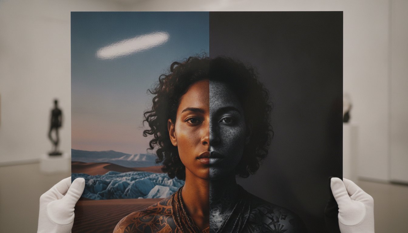
Tag: Archival Paper

Matte vs Glossy Photo Prints: A Curator’s Guide to Fine Art Finishes

The choice between a matte or glossy finish is rarely a simple matter of personal preference. It is a strategic archival decision that dictates how a moment in history will be perceived for decades to come. When weighing the merits of matte vs glossy photo prints, you are not just selecting a surface texture; you are choosing how light interacts with the legacy of the artist. You likely understand the frustration of a stray sunbeam turning a legendary Terry O’Neill portrait into a sheet of white glare, or the anxiety that a single fingerprint might mar the surface of a limited edition archive.

This guide will help you master the technical and aesthetic nuances required to ensure your fine art photography is displayed with museum-quality precision. You’ll discover how the right finish preserves the provenance of a Slim Aarons original and learn why certain historical archives demand specific paper stocks like Hahnemühle Photo Rag or Canson Infinity. We’ll examine how your choice of bespoke framing influences the final presentation, providing you with the confidence to select a finish that offers both visual brilliance and lasting archival stability.

Key Takeaways

  • Understand how glossy finishes amplify color saturation to make the vibrant hues of a Slim Aarons piece truly resonate within a room.
  • Master the art of glare-free presentation by selecting matte finishes for expansive displays situated near large windows or intense spotlights.
  • Finalize your decision between matte vs glossy photo prints by assessing the interplay between your room’s light temperature and the photograph’s historical era.
  • Recognize why the choice of acid-free, museum-quality paper is the most critical factor in ensuring the archival longevity of your photographic collection.
  • Learn how professional framing techniques complement your chosen finish to create a cohesive, gallery-standard aesthetic in any residential or professional space.

Matte vs Glossy Photo Prints: Understanding the Technical Divide

The physical essence of a fine art photograph is defined by its interaction with light, a relationship governed by the microscopic topography of the paper’s surface. When we discuss matte vs glossy photo prints, we’re examining the fundamental tension between light reflection and light absorption. A glossy finish is achieved through a smooth, non-porous chemical coating that allows light to travel through the ink and bounce directly back to the eye. This creates a high-fidelity experience, characterized by exceptionally sharp details and the kind of deep, obsidian blacks that give an image a three-dimensional quality. Conversely, a matte finish employs a more porous, textured top layer. This surface intentionally traps and diffuses light, resulting in an artistic finish that prioritizes the tactile nature of the medium over raw optical intensity.

The Science of Specular Reflection

Specular reflection dictates how light behaves when it strikes a polished surface, bouncing back at a consistent, mirror-like angle. This phenomenon is responsible for the hot spots often seen on glossy prints, yet it remains the primary reason for their unrivaled clarity. By allowing light to penetrate the ink layers and reflect directly, glossy finishes achieve a visual depth that matte simply cannot replicate. In contrast, matte surfaces scatter light in a multitude of directions, a process that eliminates glare but can subtly soften the sharpest edges of a composition. This scattering creates a more democratic viewing experience, as the art remains visible and clear regardless of the observer’s position relative to a window or gallery spotlight. At Galerie Prints, we view the selection of the finish as a critical step in our bespoke service, ensuring that a Slim Aarons poolside scene or a Terry O’Neill celebrity portrait is presented with the reverence it deserves.

Lustre and Semi-Gloss: The Middle Ground

Collectors seeking a balanced aesthetic often gravitate toward the sophisticated middle ground known as Lustre or E-surface paper. This finish features a delicate, pebbled texture that provides a subtle sheen without the mirror-like properties of a full gloss. It captures the vibrant color saturation necessary for a Slim Aarons piece while offering the practical, fingerprint-resistant benefits of a matte surface. Deciding between matte vs glossy photo prints often leads collectors to this hybrid choice, as it performs exceptionally well under varied lighting conditions. The photographic printing process for Lustre creates a versatile substrate that maintains deep blacks without the overwhelming glare of a high-shine finish. It’s a pragmatic yet elegant solution for those displaying work in high-traffic areas of a home or office. Lustre is the industry standard for professional portraiture because it balances detail with a flattering, soft-focus quality on skin tones.

The Luminous Allure of Glossy Prints: When Vibrancy is Paramount

Glossy finishes possess a singular ability to translate the chromatic brilliance of a master’s lens into a physical object of desire. This finish is characterized by a reflective, glass-like coating that amplifies color saturation and sharpens every minute detail. When collectors navigate the choice between matte vs glossy photo prints, they often find that gloss provides a level of visual “pop” that is simply unattainable with more muted surfaces. It’s the finish of choice for those who want their artwork to command attention, evoking the high-sheen elegance of mid-century fashion editorials and luxury travel journals.

There’s a distinct nostalgia factor at play here. A glossy print feels like a direct artifact from a bygone era of glamour. While it requires more careful handling due to its sensitivity to fingerprints and oils, the payoff is a depth of field that invites the viewer into the scene. It’s a finish that doesn’t just display an image; it celebrates the medium’s capacity for vivid storytelling. If you’re seeking to recreate the polished atmosphere of a premier gallery, our bespoke framing service can help protect these delicate surfaces while maximizing their luminous impact.

Capturing the Slim Aarons Aesthetic

To truly honor the legacy of Slim Aarons photography, one must understand how light interacts with his legendary subject matter. His work, which famously captured “attractive people doing attractive things in attractive places,” relies heavily on the vibrant blues of Mediterranean pools and the sun-drenched whites of Palm Springs villas. A glossy finish enhances this sun-soaked luminosity, making the water appear to shimmer on the paper. The high-energy color palettes of the 1960s and 70s find their most faithful representation in this finish, as the coating prevents the colors from appearing “flat” or recessed into the paper fibers.

Achieving Maximum D-Max (Black Density)

In the world of fine art curation, “D-Max” refers to the maximum optical density of the deepest black a paper can produce. Glossy papers consistently achieve a higher D-Max than their matte counterparts. Deciding on matte vs glossy photo prints often comes down to this technical requirement for tonal range. High-contrast black and white photography, such as the gritty yet glamorous archives in our Music Archives or Terry O’Neill collections, thrives on a glossy substrate like Canson Infinity Platine Fibre Rag. The deeper the blacks, the more the highlights appear to glow, creating a striking contrast that defines the image’s structure. This enhanced density is what makes glossy prints appear sharper to the naked eye, as the crisp transition between light and shadow remains undisturbed by surface texture.

The Sophistication of Matte Finishes: Texture and Curatorial Depth

While glossy finishes demand the spotlight, matte finishes operate with a sense of quiet authority. This surface is defined by its lack of a reflective coating, which allows the viewer to engage with the image without the interference of ambient light or distracting “hot spots.” In the context of matte vs glossy photo prints, the matte choice is often viewed as the more “curatorial” option. It transforms a photograph from a commercial product into a tactile object of art, emphasizing the physical presence of the paper itself. This finish is particularly adept at hiding minor surface imperfections and resisting the fingerprint marks that often plague high-touch items in a private collection.

For large-scale wall displays, matte is frequently the superior choice. Its ability to scatter light ensures that the composition remains legible from every angle in the room, regardless of how many windows or spotlights are present. This practical advantage is paired with an aesthetic maturity; matte finishes lean into the “painterly” qualities of photography, making them ideal for works that prioritize mood, atmosphere, and historical weight over raw chromatic intensity.

Fine Art and the “Terry O’Neill” Effect

Portraits of iconic figures, such as those captured in the Terry O’Neill Photography collection, often find their most evocative expression on matte substrates. The absence of a high-sheen coating provides a softness that is incredibly flattering to skin tones and textile textures. It allows the subject matter to speak with a directness that isn’t interrupted by the glare of the room. When displaying black and white pictures, curators often select matte to achieve a velvety, deep-inked texture that feels grounded in photographic heritage. This lack of distraction forces the eye to linger on the grain, the composition, and the soul of the subject rather than the surface of the print.

The Role of Paper Grain and “Tooth”

The physical texture of a matte print, often referred to in the art world as the “tooth” of the paper, adds a literal third dimension to the artwork. High-end archival papers like Hahnemühle Photo Rag or Canson Infinity Rag Photographique possess a subtle grain that interacts with the ink to create a rich, embossed effect. This texture is essential for “painterly” photography, where the goal is to evoke the feeling of a fine art lithograph or a traditional charcoal drawing. Matte finishes absorb light to create a built-in sense of history. By selecting a paper with a pronounced grain, you’re not just choosing a finish; you’re choosing a substrate that anchors the photograph within the tradition of artisanal craftsmanship. This choice is a cornerstone of our bespoke framing service, where we match the paper’s physical character to the narrative depth of the image.

The Curator’s Framework: How to Choose for Your Space

Selecting the ideal finish requires a holistic view of the environment where the art will reside. When weighing matte vs glossy photo prints, the physical architecture of your room is as influential as the image itself. A sun-drenched lounge with floor-to-ceiling windows presents a different set of challenges than a dimly lit study or a hallway with focused track lighting. The goal is to ensure the finish serves the art without becoming a source of visual frustration for the viewer.

Size also plays a pivotal role in this decision. Larger prints, particularly those exceeding 30×40 inches, tend to perform better with matte or lustre finishes. A glossy print of that magnitude can act like a giant mirror, reflecting the entire room and obscuring the photographic detail. By opting for a more muted surface for large-scale works, you maintain the integrity of the composition across the entire viewing plane, allowing the eye to wander through the scene undisturbed.

Lighting Environments: The Ultimate Deciding Factor

Ambient light is the primary antagonist of a glossy finish. In rooms where “light pollution” from multiple windows is unavoidable, a high-sheen print will likely suffer from distracting glare. Conversely, a gallery-style setting with dedicated track lighting allows a glossy print to shine without interference, provided the lights are angled correctly to avoid direct reflection. If your heart is set on a high-shine finish for a bright room, our bespoke framing service offers a solution through museum-quality, non-reflective glass. This specialized glazing provides the clarity of a glossy print while filtering out up to 99% of reflections, effectively changing the rules of the matte vs glossy photo prints debate.

The Archive vs. Modernity

Historical context often dictates the “correct” finish for a specific collection. For instance, our cinema lobby cards and vintage movie posters possess a specific satin sheen that is central to their nostalgic appeal. Replicating that on a flat matte paper might strip the work of its period-accurate charm and tactile authenticity. In contrast, sleek, contemporary interiors often demand the understated flatness of a matte finish to align with minimalist decor and architectural lines. Use the following framework to guide your selection:

Subject Matter Recommended Finish
Poolside & Tropical (Slim Aarons) Glossy or Lustre
Intimate Portraits (Terry O’Neill) Matte
Street Photography & Music Archives Lustre or Glossy
Atmospheric Landscapes Matte or Fine Art Textured

To ensure your next acquisition is perfectly tailored to your interior, explore our full range of Bespoke Framing Service options today.

Archival Excellence: Why Paper Quality Surpasses the Finish

The surface sheen captures the eye, but the substrate determines the lifespan. When choosing between matte vs glossy photo prints, the most critical decision happens beneath the coating. High-street printing services often rely on resin-coated papers made from acidic wood pulp, which inevitably leads to brittleness and yellowing over time. In contrast, museum-grade archival paper utilizes 100% cotton rag or alpha-cellulose fibers. These acid-free materials ensure that the chemical composition of the print remains stable for over a century, protecting the integrity of the image from the inside out.

The ink technology employed is equally vital to this archival equation. While commercial printers often use dye-based inks for their immediate vibrancy, these organic molecules break down rapidly when exposed to UV light. Galerie Prints utilizes professional pigment-based inks. These inks are composed of microscopic solid particles that sit on the surface of the paper rather than soaking in, providing superior chromatic stability and resistance to fading. Whether you select a high-gloss finish or a textured matte, the combination of acid-free paper and pigment inks ensures your acquisition remains a lasting piece of history.

The Galerie Prints Standard

Every Slim Aarons print we produce is a testament to artisanal craftsmanship. Our curators don’t simply apply a finish; they select specific paper weights, often ranging from 300 to 310 gsm, to provide the structural support required for a premium finish. A heavier paper prevents the “cockling” or waving that can occur with thinner stocks, ensuring the print remains perfectly flat within its frame. This gallery-vetted production process bridges the gap between a simple photograph and a collectible object of art, providing the technical foundation necessary for the matte vs glossy photo prints debate to even matter.

Investing in Longevity

A fine art print is an investment in an aesthetic legacy, and its financial value is intrinsically tied to its physical condition. The right finish, when paired with professional mounting, protects the delicate emulsion from environmental stressors. We emphasize that the preservation of the print surface is a collaborative effort between the paper’s archival properties and the quality of the framing. By utilizing acid-free mounting boards and museum-quality glazing, you seal the artwork in a micro-environment that halts degradation. Ultimately, the choice of finish is a sophisticated aesthetic preference, but the quality of the paper is a permanent commitment to the photograph’s provenance.

Refining Your Aesthetic Legacy

Selecting the ideal finish is the final, essential step in honoring a photograph’s heritage and ensuring its place within your home. Whether you seek the luminous depth of a high-shine surface or the velvety, glare-free sophistication of a textured substrate, the choice of matte vs glossy photo prints ultimately serves the narrative of your space. By balancing the room’s unique lighting with the historical era of the archive, you ensure that every acquisition resonates with museum-quality precision.

As a premier destination for serious collectors, we operate as guardians of photographic history through meticulous artisanal craftsmanship. Every piece benefits from our hand-crafted bespoke framing in London and worldwide gallery-grade shipping to preserve its prestige. Explore our curated collections and choose your perfect finish today to begin your journey into the world of fine art acquisitions. Your decision is not merely a purchase; it’s a commitment to preserving a lasting piece of history. Trust your discernment as you select a finish that will safeguard your investment for generations to come.

Frequently Asked Questions

Is glossy or matte better for black and white photography?

The choice depends on the desired tonal depth; glossy finishes provide a superior D-Max for high-contrast imagery, while matte surfaces offer a velvety texture for softer, atmospheric works. For iconic black and white archives, a semi-gloss or lustre often provides the most balanced representation. It captures the deep blacks of the original film while maintaining a sophisticated, non-reflective surface.

Does a matte finish make photos look blurry or less sharp?

Matte finishes don’t cause blurriness, although they scatter light in a way that can subtly soften the sharpest edges of a composition. This diffusion is often a deliberate curatorial choice to achieve a painterly aesthetic. Glossy prints maintain a higher perceived sharpness due to their smooth, reflective top layer, which allows for finer detail rendition in high-resolution captures.

Which photo finish is best for framing behind glass?

Matte or lustre finishes are generally preferred for traditional framing to prevent the distracting double reflection caused by light bouncing off both the glass and the print. If you prefer a glossy aesthetic behind glass, we recommend our bespoke framing service with museum-quality non-reflective glazing. This specialized glass eliminates up to 99% of glare while preserving the print’s vibrancy.

Can I clean fingerprints off a glossy photo print?

Removing fingerprints from a glossy surface is notoriously difficult and carries the risk of permanent scratching. While a clean, dry microfiber cloth can gently lift some oils, it’s best to handle these prints with cotton gloves during the framing process. Matte finishes are far more resilient to handling and rarely show the marks of a stray touch, making them more forgiving.

Why do professional photographers often prefer lustre or matte over high-gloss?

Professionals often favor lustre or matte for their versatility in varied lighting environments and their sophisticated, tactile quality. These finishes allow the viewer to engage with the subject matter without the interference of specular reflection. When considering matte vs glossy photo prints, many artists feel matte conveys a sense of permanence and fine-art prestige that high-gloss lacks.

Will a glossy print fade faster than a matte print?

A print’s longevity is determined by its archival components rather than its surface sheen. Fading is primarily a result of using dye-based inks on acidic paper rather than the choice of finish itself. Our use of pigment-based inks on acid-free cotton rag ensures that both matte and glossy prints remain stable and vibrant for over a century.

What is the best finish for a Slim Aarons poolside photograph?

A lustre or glossy finish is typically the most evocative choice for a Slim Aarons poolside scene. These finishes amplify the vibrant blues and shimmering reflections of the water, capturing the sun-drenched luminosity of the mid-century era. This sheen mirrors the polished, aspirational lifestyle depicted in his legendary photographic archives, making the colors appear to radiate from the wall.

How does paper thickness (gsm) affect the look of matte vs glossy prints?

Paper thickness dictates the structural integrity and tactile prestige of the work regardless of the surface coating. A higher gsm, such as 300 or 310, prevents warping and provides a substantial feel that justifies a premium positioning in a collection. Heavier stocks support the ink load of both matte and glossy finishes without compromising the paper’s essential flatness.

Choosing the Right Paper for Photography Prints: A Curator’s Guide to Fine Art

The moment a light-captured memory transitions from a negative to a physical object is the most critical stage in the life of an artwork. You might possess a rare Slim Aarons or a Terry O’Neill masterpiece, but without the correct substrate, the soul of the image remains trapped. Choosing the right paper for photography prints is the final, definitive act of curation that separates a temporary decoration from a lasting piece of history. With 70% of professional photographers now insisting on premium archival papers, the distinction between a common print and a museum-quality investment has never been more pronounced.

It’s natural to feel a sense of trepidation when faced with technical terms like giclée or silver gelatin, especially when you fear a finish that looks synthetic or yellows within a decade. You deserve the confidence that your collection will maintain its brilliance for a century. This guide will demystify the latest ISO 11108 standards established in April 2025 and explore the bespoke craftsmanship of our London darkroom. We’ll examine how specific grammages and pH-neutral fibers transform a simple image into the world’s finest photography.

Key Takeaways

  • Understand how the tactile nature of paper transforms a fleeting image into a museum-quality legacy by influencing light absorption and viewer engagement.
  • Learn to navigate the nuances of gloss, matte, and lustre finishes to either maximize color saturation or achieve a soft, painterly aesthetic for your art.
  • Master the art of choosing the right paper for photography prints by distinguishing between the vibrant accuracy of giclée and the timeless depth of silver gelatin.
  • Discover how to align your paper selection with specific subject matter, ensuring iconic lifestyle shots radiate while historical portraits retain their vintage soul.
  • Gain insight into the bespoke standards of a professional London darkroom where hand-printed techniques preserve the heritage of the world’s finest photography.

The Curatorial Perspective: Why Paper Choice Defines Fine Art

A digital file is a transient ghost, existing only in pixels and light. To transform that file into a physical legacy, one must treat the substrate with the same reverence as the subject matter itself. Choosing the right paper for photography prints is not merely a technical decision; it’s the final act of curation that breathes life into photographic heritage. While a standard commercial poster might rely on plastic-coated surfaces that reflect light harshly, a fine art print absorbs and interacts with its environment. This interaction defines how a viewer engages with the piece, whether it’s the sun-drenched poolside of a Slim Aarons original or the moody, high-contrast shadows of a 1960s London portrait.

The distinction between a “poster” and a “fine art” print lies in the chemical and structural integrity of the material. Commercial papers often contain optical brighteners (OBAs) that eventually turn yellow or brittle. In contrast, archival standards, such as those refined in the ISO 11108 ballot of April 2025, require a foundation that resists the ravages of time and environmental shifts. This choice is also the silent partner in professional bespoke framing. A high-quality paper provides the structural stability needed to sit perfectly behind museum glass, ensuring the artwork remains flat and vibrant for decades.

Defining Fine Art Paper

True fine art paper is defined by its composition and longevity. Unlike mass-produced wood pulp papers, these substrates are crafted from cotton rag, alpha-cellulose, or even linen and hemp. The history of photographic paper shows a steady evolution toward these acid-free bases, which prevent the “browning” effect seen in older, cheaper prints. The weight of the paper is measured in GSM (Grams per Square Metre). For a print to possess true “heft” and presence, it typically requires a weight of at least 250 to 310 GSM. Archival paper is a material designed to last over 100 years without degradation.

  • Cotton Rag: The gold standard for texture and durability, often used for the most prestigious gallery collections.
  • Alpha-Cellulose: High-grade wood pulp fibers that have been purified to remove lignin, offering a smooth, professional finish.
  • Acid-Free Bases: Essential for preventing chemical reactions that destroy the image over time.

The Tactile Experience of Art

The world’s finest photography deserves more than a standard commercial finish because art is a sensory experience. Surface texture creates a three-dimensional depth in two-dimensional imagery, allowing light to catch the grain of the paper rather than bouncing off a plastic-like coating. There’s a psychological weight to a heavy, textured print. When a collector holds a bespoke print from our London darkroom, the physical density of the paper immediately communicates value and permanence. It’s a tactile promise that the investment is secure. Choosing the right paper for photography prints ensures that the final object feels as significant as the history it represents.

Decoding Finishes: Gloss, Matte, and the Nuance of Lustre

The surface finish is where the photograph finally meets the light of your home. Choosing the right paper for photography prints requires a sophisticated understanding of how light interacts with different textures. It isn’t just about personal preference; it’s about the specific environment where the art will live. Whether you’re illuminating a hallway with soft ambient light or a grand salon with floor-to-ceiling windows, the finish you select determines whether the image sings or remains hidden behind a veil of reflection.

The Visual Characteristics of Glossy Prints

Glossy papers are celebrated for their ability to achieve a high D-max, a technical term for the deepest, richest blacks possible in printing. This maximum density creates a striking contrast that makes vibrant colors and sharp details pop with an almost three-dimensional intensity. It’s the natural choice for high-fashion imagery and modern architectural photography where precision is paramount. However, this impact comes with a trade-off. Glossy surfaces are notoriously sensitive to fingerprints and can act like a mirror in rooms with heavy natural light. Expert advice on choosing the right paper for photo prints often highlights that while gloss offers the most “punch”, it requires carefully controlled lighting to avoid distracting hot spots.

The Sophistication of Matte and Smooth Finishes

Matte finishes offer a zero-glare experience, which is why they’re the preferred choice for museum displays and elite gallery walls. These papers, particularly those crafted from 100% cotton rag, possess a “velvet” or “toothed” feel that adds a tactile, painterly quality to the work. This texture softens transitions and creates a sense of depth that feels organic rather than synthetic. This finish is especially effective when showcasing the timeless allure of black and white pictures, as the absence of shine allows the viewer to focus entirely on the delicate tonal shifts in the shadows and highlights.

For those seeking a professional middle ground, Lustre or Satin finishes provide the color saturation of gloss without the “plastic” shine. Lustre features a fine, pebbled texture that effectively hides minor handling marks and breaks up direct reflections. If your gallery wall is positioned opposite a south-facing window, a matte or lustre finish is essential to prevent the image from being lost in a wash of white light. Conversely, if you use dedicated gallery spotlights, a lustre finish can catch the light beautifully without creating a blinding glare. Consider how your unique lighting setup will interact with your chosen piece before you browse our curated collections for your next investment.

Archival Integrity: Giclée vs. Silver Gelatin Standards

The permanence of a photograph relies entirely on the chemical marriage between the image-forming substance and its base. When choosing the right paper for photography prints, understanding the distinction between modern digital methods and historical chemical processes is vital for establishing the work’s provenance. A true fine art print must be acid-free and lignin-free; these are non-negotiable standards that prevent the yellowing and structural decay often seen in commercial reproductions. By selecting materials that meet the ISO 9706 standard for permanence, collectors ensure their investment remains a pristine piece of history for a century or more.

What is a Giclée Print?

Giclée printing represents the pinnacle of digital reproduction, transitioning the artistry of the darkroom into a high-fidelity inkjet process. Unlike standard desktop printing, a genuine giclée requires a wide-format printer using at least 8 to 12 pigment-based ink cartridges. These inks are prized for their archival stability and exquisite tonal range, offering a depth of color that dye-based alternatives cannot match. This process has revolutionized the fine art photography market, allowing for breathtaking detail and color accuracy on heavy, archival substrates. For a print to be certified as giclée in 2026, it must utilize a source file of at least 300 DPI and be rendered on acid-free paper, ensuring a lifespan that exceeds 100 years under gallery conditions.

The Heritage of Silver Gelatin

For the serious collector, silver gelatin remains the undisputed gold standard for black and white photography. This is a purely analog, chemical process where light-sensitive silver salts are suspended in a gelatin layer on fibre-based paper. Unlike the layered ink of a giclée, the silver particles are embedded within the paper itself, creating a unique “glow” and a three-dimensional quality that digital methods struggle to replicate. Many of the world’s most iconic images, including the legendary archives of Terry O’Neill, were born from this meticulous darkroom legacy.

At Galerie Prints, we honor this tradition by offering prints that are hand-printed in our London darkroom from original negatives. These silver gelatin works are not just copies; they’re physical artifacts of the photographic process. To maintain their integrity, these prints should be stored in environments that pass the Photographic Activity Test (P.A.T.), ideally at 68°F with 50% relative humidity. This dedication to artisanal quality ensures that when you’re choosing the right paper for photography prints, you’re opting for a medium that carries the weight of photographic heritage in every fibre.

The Subject-Matter Strategy: Matching Paper to the Image

The narrative of a photograph is often told through the texture of its surface. Choosing the right paper for photography prints is a strategic alignment between the artist’s intent and the physical medium. An architectural study demands a different tactile response than a 1950s poolside scene or the intricate detail found in professional pet photography. If you’re displaying a piece from the Slim Aarons collection, the goal is to replicate the aspirational luxury of a bygone era. These vibrant lifestyle images, defined by their vivid cyans and sun-soaked skin tones, thrive on lustre or gloss finishes. Lustre paper effectively balances the sun-drenched saturation of Aarons’ work while maintaining a subtle sheen that mimics the high-end editorial spreads of original 1960s magazines.

In the realm of commercial and residential property, achieving this level of visual excellence starts with the shoot itself; you can learn more about Durham Real Estate Photography to see how professional visual marketing can elevate the raw material for your prints.

The ‘Slim Aarons’ Aesthetic

Capturing the essence of “poolside glamour” requires a substrate that can handle intense color without looking synthetic. A slight sheen is vital here. It catches the light just enough to evoke the shimmering surfaces of water and polished mid-century decor. Lustre paper provides this delicate balance, offering the punch of a glossy finish while avoiding the harsh reflections that can obscure the fine details of a crowded social scene. This choice ensures the aspirational quality of the work remains the focal point of the room.

Vintage and Archival Archives

Historical portraits and mid-century archives require a more nuanced approach. When dealing with original negatives from the golden age of Hollywood, a smooth matte or fibre-based paper is essential to preserve the authentic film grain. Using a standard commercial finish on these works can introduce an “artificial” digital sharpness that feels disconnected from the image’s history. Curators often look at the paper’s “whiteness” as well. While “bright white” papers are popular for modern graphics, they often contain optical brighteners that can look too clinical for a vintage portrait. A natural white or cream-based paper offers a warmer foundation that feels historically accurate.

Monochrome masterpieces benefit from a similar level of scrutiny. To deepen the blacks in black and white pictures, a semi-gloss or pearl finish provides a rich D-max that matte cannot always achieve. This adds a luminous quality to the shadows, creating the three-dimensional depth prized by serious collectors. Cinema heritage, particularly lobby cards and vintage posters, requires a sturdier substrate that reflects the utilitarian yet glamorous nature of movie house memorabilia. By matching the paper to the subject, you aren’t just printing an image; you’re honoring its soul. Explore our curated collections to find the perfect archival pairing for your next acquisition.

The Galerie Prints Standard: Bespoke Craftsmanship

While understanding the technical nuances of substrates is essential, the final result depends entirely on the hand that guides the process. Choosing the right paper for photography prints is only the first step in a much larger journey toward creating a physical legacy. At Galerie Prints, we don’t view paper as a commodity; we treat it as a vital component of the artwork’s soul. Our commitment to excellence is anchored in our London darkroom, where the transition from a historic negative to a gallery-grade masterpiece is handled with an artisanal touch that mass-production facilities cannot replicate. We operate as guardians of photographic heritage, ensuring that every piece we produce meets the most stringent archival standards of 2026.

Our Hand-Printing Process

Every print that leaves our facility is a testament to London-based craftsmanship. We don’t rely on automated, high-volume workflows that sacrifice depth for speed. Instead, our experts curate specific archival papers for each collection, ensuring a bespoke match between the artist’s vision and the final substrate. By maintaining a strict adherence to the ISO 11108 standards balloted in April 2025, we ensure that every fibre-based substrate possesses the folding strength and chemical purity required for a century of display. This meticulous attention to detail provides a level of provenance and quality that makes our offerings the world’s finest photography. It’s a reassuring seal of quality for collectors who demand permanence.

  • Hand-Printed Excellence: Each work is individually crafted in our London darkroom to ensure tonal perfection.
  • Curated Substrates: We select papers that specifically enhance the historical narrative of the photographer, from the glamour of Slim Aarons to the grit of mid-century street scenes.
  • Archival Security: We use only acid-free, lignin-free materials that have passed the Photographic Activity Test (P.A.T.).

The Final Touch: Framing Your Choice

The synergy between paper choice and bespoke framing is what ultimately defines the viewer’s experience. A museum-quality paper requires a protective environment to maintain its integrity over time. Our framing service utilizes museum-grade glass with advanced UV protection, shielding the delicate pigments or silver particles from environmental degradation. This holistic approach ensures that your investment is protected from the moment it’s mounted. Choosing the right paper for photography prints is a decision that our curators are happy to assist with, providing a tactile understanding of how different finishes will look in your unique space.

When you acquire a piece from us, you aren’t just buying a decoration; you’re investing in a ready-to-hang piece of history. Whether it’s a vibrant C-type print or a deep, evocative silver gelatin work, the combination of our hand-printing and bespoke framing creates an object of lasting beauty. We invite you to consult with our experts to ensure your next art acquisition is perfectly tailored to your aesthetic and archival needs. Discover the world’s finest photography and begin your collection with the confidence of museum-quality craftsmanship.

Elevate Your Collection to Museum Standards

Your journey through the nuances of surface finishes and archival standards reveals a fundamental truth: the substrate is the final brushstroke of the artist. By mastering the balance between light-absorbing matte and high-contrast lustre, you ensure that every acquisition reflects its true historical soul. Choosing the right paper for photography prints is the bridge between a simple image and a lasting piece of history that remains vibrant for a century. Whether you’re drawn to the three-dimensional depth of silver gelatin or the exquisite tonal range of giclée, the material you select anchors the work’s place in your legacy.

At Galerie Prints, we honor this heritage by providing exclusive access to the official archives of Slim Aarons and Terry O’Neill. Every piece is hand-printed in our London darkroom and paired with bespoke framing using museum-grade materials to guarantee its permanence. You’re invited to explore our curated collections on museum-quality paper and find a masterpiece that speaks to your unique aesthetic. Transform your space with a curated window into the golden age of glamour, knowing your investment is protected by artisanal excellence and timeless craftsmanship.

Frequently Asked Questions

What is the best paper for black and white photography prints?

Silver gelatin fibre-based paper remains the gold standard for black and white collectors due to its unique chemical depth and three-dimensional quality. For digital giclée reproductions, a heavy 310 GSM cotton rag with a smooth matte finish provides the most authentic tonal transitions. This combination ensures that deep blacks remain rich and velvety without the interference of surface glare or synthetic reflections.

Does the weight (GSM) of the paper affect the quality of the image?

Weight directly influences the physical presence and long-term stability of the artwork. While it doesn’t change the pixel resolution, choosing the right paper for photography prints with a grammage of 250 to 310 GSM prevents the substrate from warping or rippling behind glass. This structural integrity is essential for maintaining the flat, pristine surface required for professional museum-quality framing and a luxury feel in the hand.

What is the difference between acid-free and archival paper?

Archival paper is a more rigorous standard that encompasses acid-free properties while adding requirements for permanence. While acid-free paper simply has a neutral pH, archival substrates must also be lignin-free and meet ISO 9706 standards for durability. This distinction is what guarantees a print will resist yellowing or becoming brittle for over 100 years, making it a secure investment for serious art collectors.

Should I choose glossy or matte for a photo with a lot of detail?

Glossy finishes are superior for maximum sharpness and contrast in high-detail imagery like modern architecture or high-fashion. The smooth surface allows light to reflect directly, making fine lines and intricate patterns appear more defined to the eye. However, if the detail is meant to feel painterly or soft, a smooth matte paper offers an elegant alternative that highlights texture without the distraction of surface hotspots.

Can the wrong paper choice cause my photography print to fade?

Yes, inferior papers containing wood pulp or optical brighteners will inevitably yellow and cause the image to lose its vibrancy. Choosing the right paper for photography prints that is certified acid-free and lignin-free is the only way to ensure the work doesn’t degrade. Archival pigment inks paired with these high-grade substrates are what create the 100-year lifespan expected of the world’s finest photography.

What does ‘cotton rag’ mean in fine art printing?

Cotton rag refers to paper crafted from 100% cotton fibres rather than processed wood pulp. These fibres are naturally stronger and more durable, providing a luxury tactile experience and a “toothed” texture that holds ink beautifully. It’s the preferred medium for our London darkroom when producing the most prestigious editions, as it offers a sense of permanence and prestige that commercial papers lack.

Is lustre paper the same as semi-gloss?

Lustre is a specific type of semi-gloss finish that features a subtle, pebbled texture. While both offer more vibrancy than matte, lustre is specifically designed to hide handling marks and fingerprints while breaking up direct light reflections. This makes it an ideal professional choice for iconic lifestyle shots where color saturation is vital but distracting glare must be minimized for the viewer.

Why do galleries prefer matte finishes for large-scale displays?

Galleries prefer matte finishes to eliminate the distracting reflections caused by powerful overhead spotlights. A matte surface allows a large-scale piece to be viewed clearly from any angle in the room without hotspots of light obscuring the image. This finish encourages the viewer to linger on the photographic narrative rather than battling with the physical shine of the substrate.