Tag: Photographic Prints

Buying Art for the First Time: A Thoughtful Beginner’s Guide

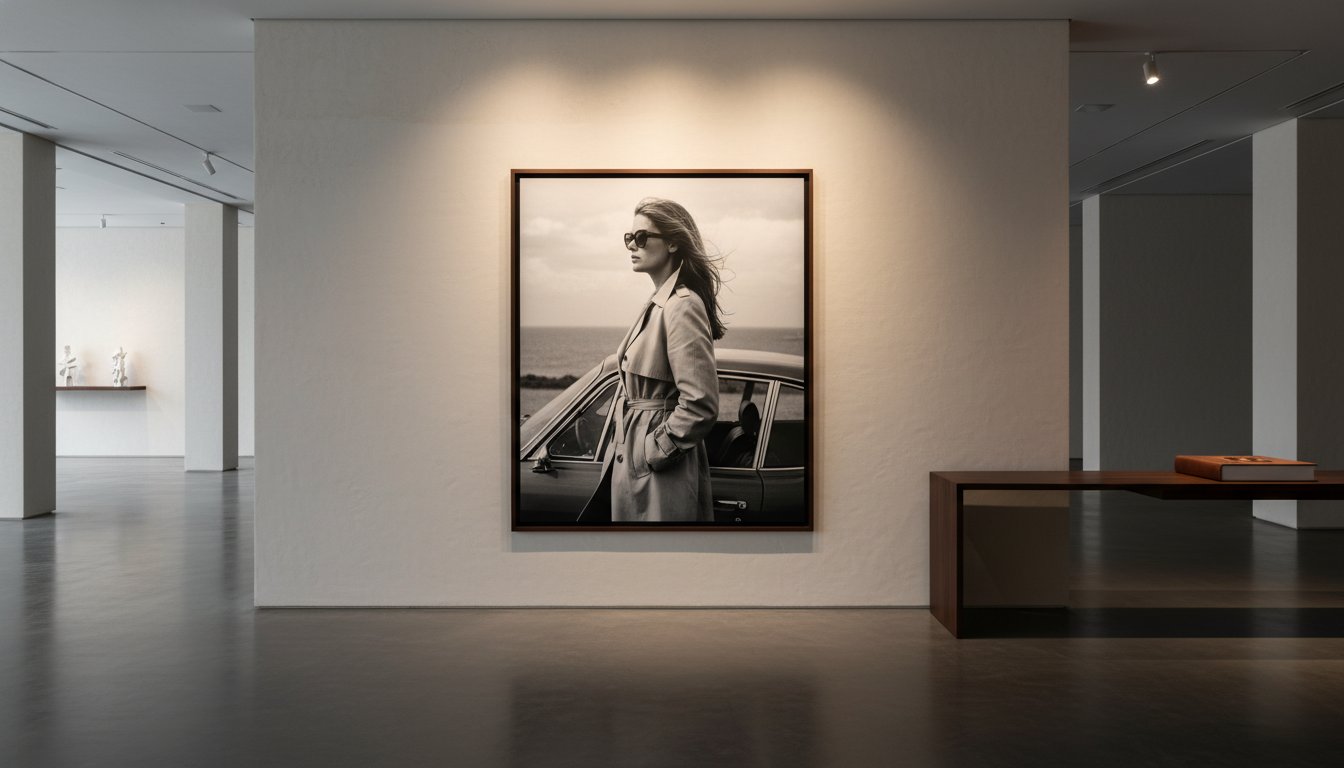
What if your first artwork didn’t need to be a grand investment or a perfectly informed choice, only an image you’re glad to see each day? Buying art for the first time can feel daunting when prints, photographs, posters, sizes and framing all invite different decisions. It’s natural to worry about choosing something you’ll later regret, but a lasting connection often begins with a simple response: a subject, mood or moment that keeps drawing you back.

Start with what resonates, then give the practical details their due. This guide will help you compare different kinds of art, choose a format and size that suit your space, and understand how paper and framing shape the finished piece. You’ll also find practical ways to narrow your choices when purchasing physical photographic prints and collectables. From the first image that catches your eye to the final frame on your wall, each decision can bring you closer to a piece you’ll enjoy living with.

Key Takeaways

  • Buying art for the first time can begin with the images and photographic styles you’re naturally drawn to, no specialist knowledge required.
  • Photographic prints, vintage movie posters, cinema lobby cards, and signed or limited editions are different ways to collect and display imagery.
  • Choose a first artwork for the connection it inspires and how it suits your space, rather than treating it as a test of investment potential.
  • Plan where a piece will hang before choosing its size, paper type, and presentation.
  • Galerie Prints offers exhibition-quality prints and bespoke framing to help you shape a considered first purchase.

Buying Art for the First Time: Begin with What You Want to Live With

You don’t need a specialist vocabulary, a collection already taking shape, or a theory about art to make a thoughtful first choice. A photograph can move you before you know its history or how to describe its composition. Give that response room. Buying art for the first time is less about proving your expertise than finding an image you’ll be pleased to encounter in your home, day after day.

It helps to separate personal enjoyment from investment expectations. An artwork’s future financial value is uncertain, and no first purchase should depend on a promised return. Instead, consider what you want the piece to bring to your surroundings: a sense of calm, a vivid focal point, a reminder of a place or period, or simply the pleasure of looking. A considered choice is one whose appeal makes sense to you, regardless of what’s currently fashionable or widely admired.

How to recognise art that feels personally meaningful

Pause with an image before deciding what you think you should like. Ask what holds your attention: the subject, the atmosphere, the balance of light and shadow, or a memory it stirs. Notice whether you’re drawn to a candid moment, a carefully composed scene, a familiar face, or a particular photographic style.

Then return to the images that stayed with you. A piece that remains compelling after repeated viewing may have more lasting significance than one that impressed you only in the moment. Let your own eye lead, rather than choosing something for its perceived prestige or because it echoes a trend.

Set a realistic first-purchase brief

A simple brief makes browsing more focused without turning discovery into a rigid exercise. Note the room where you imagine displaying the artwork, the approximate wall space, and whether you want it to make a quiet contribution or command attention. Think, too, about whether you’re choosing one focal work or a print that may become part of a developing collection.

Keep the brief flexible. You might begin with a preference for a particular subject, then find that another image speaks to you more strongly. The purpose is to give your search a useful starting point, not to rule out an unexpected choice.

Before browsing, jot down a few reminders:

  • What draws you in: a subject, mood, composition, or personal association.
  • Where it may live: the room and approximate wall area you have in mind.
  • How it should feel: a subtle accent, a strong focal point, or a first piece in a growing collection.
  • What matters most: the image’s lasting appeal, rather than a trend or speculative return.

This short brief gives you a confident place to begin. As you explore photographic prints and other forms of collectable imagery, keep returning to the question that matters most: would you enjoy living with this image?

Understand What You Are Buying: Photographic Prints, Posters, and Collectables

Once an image catches your attention, consider the form in which it’s presented. Subject and format are separate choices: a photograph’s subject might appeal to you, while the print or collectable form determines what kind of object you’re bringing home. Understanding the distinction makes buying art for the first time feel less like choosing from a blur of categories.

A photographic print presents an image; a collectable cinema item is an object connected with film culture and its history. The categories can overlap in visual appeal, but they aren’t interchangeable. A vintage movie poster, for example, has a different purpose and character from a photographic print, while a cinema lobby card belongs to its own collectable category.

Choosing between a photographic print and a vintage cinema item

Photographic prints offer a way to collect imagery from curated photographic archives, including work by photographers such as Slim Aarons and Terry O’Neill. Galerie Prints offers exhibition-quality photographic prints, with choices of size and paper type. Vintage movie posters and cinema lobby cards, by contrast, are collectable pieces of cinema memorabilia. Their appeal may lie in the film they evoke, their graphic design, or their place in a broader collection.

Think about what you want the object to contribute. A print may put the photograph itself at the centre of your display; a poster or lobby card can bring the atmosphere of cinema into a room. These are different starting points, not a hierarchy of value. For a vintage item, read its product description for details such as condition rather than assuming every piece shares the same characteristics.

What signed and limited editions mean to a first-time buyer

Galerie Prints offers signed and limited editions alongside other photographic prints. Edition status can be part of a work’s appeal, but it shouldn’t replace your response to the image. Read the details given for the individual work to understand how it’s presented, then ask yourself whether you’d still want to live with it if the edition information weren’t part of the description.

A limited edition has a defined limit, while a signed work is described as signed. Those terms don’t, by themselves, tell you an edition’s size or the details of a particular signature. Consider each work on its own terms, and let the photograph’s subject, composition, and atmosphere remain central to your decision.

  • Photographic print: choose when the image and photographic practice are your main interest.
  • Vintage movie poster: consider it as a cinema collectable with its own visual and cultural presence.
  • Cinema lobby card: explore it as a distinct form of movie memorabilia.
  • Signed or limited edition: consider the edition detail alongside, not instead of, the work itself.

Galerie Prints brings these forms together through its photographic and cinema offerings. Exploring photographic prints and cinema collectables can help you see which format best suits the image you’re drawn to and the kind of object you want to display.

Compare Art Choices Without Treating Your First Purchase Like an Investment

A first artwork doesn’t need to justify itself through resale value or future appreciation. It can earn its place through the pleasure it brings to a room, the ideas it invites, or the way its image continues to reward attention. Treating a purchase as though it must perform financially can distract from the qualities you can actually assess: whether you’re drawn to the work, whether it suits your space, and whether its format fits how you want to display it.

Art may change hands, but no particular resale outcome or rise in value should be assumed. Edition status or a celebrated subject alone can’t establish what a work will be worth later. For a first-time buyer, it’s more grounded to choose by criteria you can evaluate now, without turning future market performance into a promise.

Is art collecting right for you if you are not investing?

Yes. Enjoyment, curiosity, and a desire to live with an image are sufficient reasons to begin collecting. You don’t need to build a portfolio or predict what a work might be worth. Think of ownership as a relationship with the piece: the visual details you notice, the atmosphere it creates, or the personal associations it holds. That’s a valid purpose in its own right, not a lesser version of collecting.

A simple framework for comparing shortlisted works

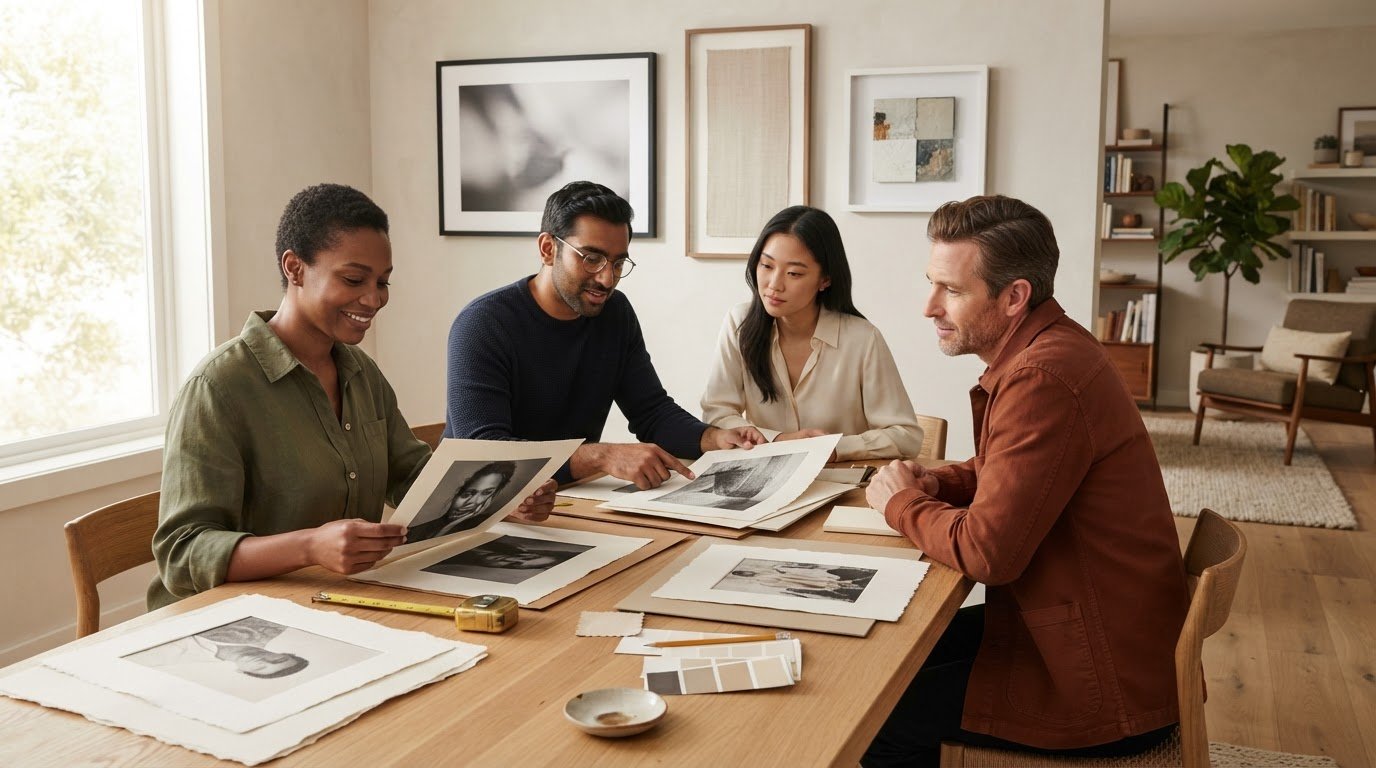
Put shortlisted works side by side and consider each against the preferences you’ve already identified. Does its subject or mood still appeal? Does its visual presence feel right for the intended room? Is the format suited to the way you want to display it? Format and display are practical considerations, not measures of artistic worth.

A compact decision matrix can keep the comparison clear. Separate what speaks to you from what needs to work in your home:

  • Personal priorities: subject, mood, composition, and the response the work continues to prompt.
  • Practical considerations: format, approximate dimensions, available wall space, and how the piece will be presented.
  • Context: whether the work feels at home in the room, while retaining enough presence to be appreciated on its own.

For each work, make a brief note under both headings. A strong personal response shouldn’t be dismissed because a format needs more thought; equally, a piece that fits a wall neatly may not be the one you most want to see there. The matrix helps reveal trade-offs without pretending there’s a formula for artistic merit.

Give yourself room to consider the comparison. A trend, a sense of urgency, or the fear of choosing incorrectly can make a decision feel more pressured than it needs to be. Buying art for the first time becomes more considered when you can explain why a work appeals to you and how it might live in your space, without needing to claim it will gain financial value. If neither of those answers feels clear yet, keep looking. The right shortlist should help you choose with intention, not rush you toward a verdict.

Plan the Print, Size, and Display Before You Buy

A photograph’s impact depends partly on how it meets the room around it. Before choosing a print, picture the wall where it might hang and how you’ll encounter it: from across a living space, at closer range in a hallway, or as the focal point above a piece of furniture. Planning the display alongside the image helps you select a size and format that feel intentional, rather than leaving presentation as an afterthought.

Use this sequence to shape your choice:

  1. Identify the wall. Note the available wall area and anything nearby that affects how the artwork will sit in the room.
  2. Consider visual scale. Think about viewing distance and whether you want the image to make a prominent statement or a quieter contribution.
  3. Choose the format. Compare the available print sizes and paper types for the image you’ve selected.
  4. Plan the presentation. Decide whether the print suits a frame, and how its finished appearance will relate to the space.

Match the artwork format to the intended space

Stand where you expect to view the work and consider how its details and overall composition will read from that distance. A print intended to anchor a room may call for a different visual scale from one placed among other objects. Galerie Prints offers choices of print size and paper type, so you can consider the presentation as part of selecting the image. If you’re unsure how a frame affects the finished display, the gallery’s guidance on displaying and framing photography can help you think through that final layer.

Keep the wall in view while browsing. Mark out the approximate area you have in mind with removable tape, then step back and see how that footprint feels. Include the space around the print in your thinking, too. An image can need breathing room to hold attention, while a group of pieces may call for a different arrangement.

Decide whether bespoke framing or customisation suits the work

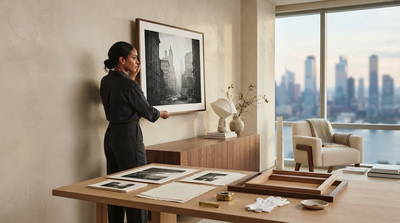
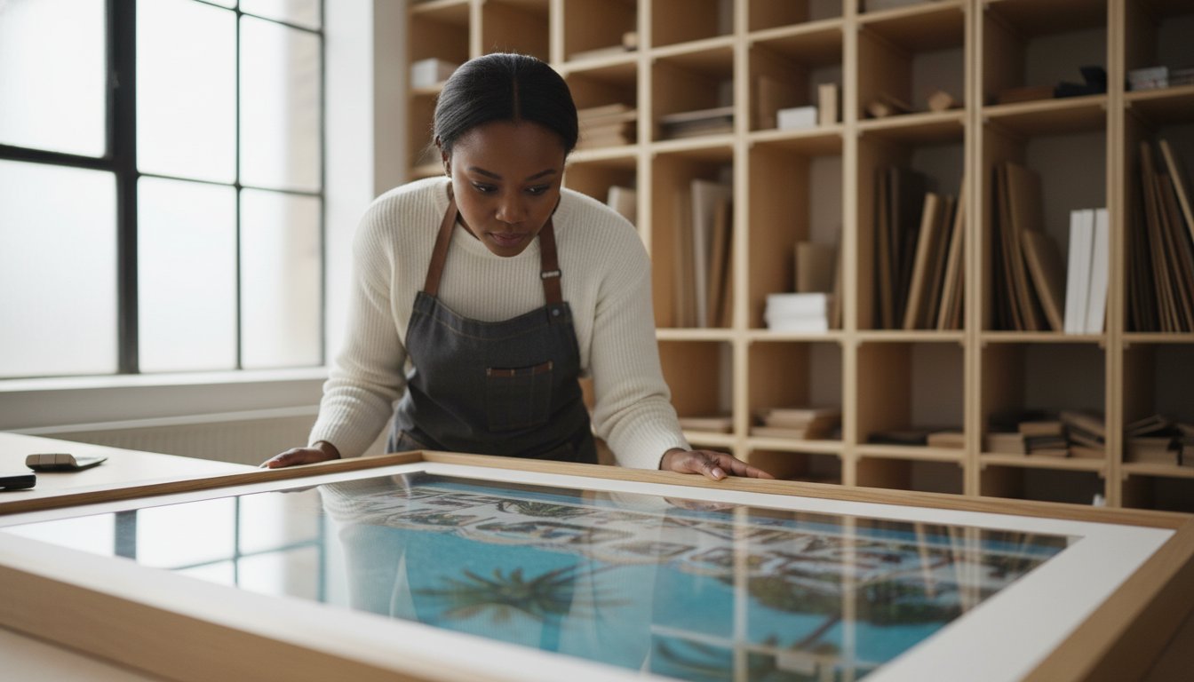
Framing changes how an image is encountered, giving it a defined presence on the wall. Galerie Prints offers a Bespoke Framing Service as an add-on for purchased prints, creating a ready-to-hang piece. Bespoke Services also include custom sizing and cropping, as well as printing on any substrate, including aluminium, wood, and glass.

For buying art for the first time, it’s useful to settle the image and intended display together, while leaving room to refine the presentation. Consider whether the original proportions suit your wall, or whether custom sizing or cropping would better support the composition. Each choice should serve the work and the space, not simply follow a decorating trend.

Once you’ve considered the wall, scale, paper, and framing, you’ll have a clearer picture of the finished piece. Explore photographic prints and bespoke framing to consider the presentation choices for your selected image.

Make Your First Art Purchase with Galerie Prints

With your preferences and display plans in mind, explore a gallery where photography and cinema memorabilia offer distinct ways to collect visual culture. Galerie Prints brings together exhibition-quality photographic prints and curated collections across different subjects and periods. The aim isn’t to select the most prestigious-sounding work, but to find an image or object whose appeal feels personal and enduring.

Explore a curated range of photographic prints and collectables

The Slim Aarons Collection and Terry O’Neill Photography offer different photographic perspectives, while the music archives bring another cultural lens to the gallery. If you’re drawn to the atmosphere of cinema, vintage movie posters and cinema lobby cards are collectable categories with their own character. They’re physical objects, distinct from photographic prints, and each individual work has its own description.

For broader collecting context, a Fine Art Photography guide can help you think about the place photographic works might hold in a collection. Readers particularly interested in Slim Aarons’ photography may also find a dedicated guide to that subject useful. Follow the images that genuinely appeal to you, rather than assuming that every category or work offers the same qualities.

Choose a presentation that feels right for your artwork

For photographic prints, Galerie Prints offers choices of size and paper type, with bespoke framing available as an option. These decisions shape how a print will appear in your space: size affects its visual presence, paper type contributes to its presentation, and framing can give the finished piece a considered place on the wall. Galerie Prints describes its prints as exhibition-quality and its printing and framing process as second to none.

Keep the object in mind as you make those choices. A photographic print, a vintage poster, and a lobby card are not the same kind of purchase, so presentation should respond to the specific work rather than follow a single formula. Bespoke framing can help create a ready-to-hang piece. Bespoke Services also include custom sizing, cropping, and printing on any substrate, including aluminium, wood, and glass.

If a Slim Aarons image is what first caught your eye, explore that collection on its own terms. If you’re still comparing photographic subjects with cinema or music memorabilia, browse more widely and notice which works hold your attention. A thoughtful first purchase doesn’t need to encompass everything you might collect one day. It can begin with one work that suits your taste and feels right for your home.

Explore Galerie Prints and take time to discover the photographic prints and collectables that resonate with you.

Let Your First Artwork Begin a Lasting Connection

Your first art purchase doesn’t need to mark the end of your search or define the collection you may build later. Think of it as the beginning of a more attentive relationship with the images around you: the moments you return to, the details you notice over time, and the atmosphere a work brings into your home.

Buying art for the first time can feel more assured when you allow personal response to lead and give practical choices their place. Galerie Prints’ exhibition-quality photographic prints and bespoke framing service offer a considered way to shape the finished presentation of a purchased print.

When you’re ready, take an unhurried look through the gallery and follow the subjects or photographs that hold your attention. Explore exhibition-quality prints at Galerie Prints and discover a work that feels right for your space and your point of view.

There’s no single correct first choice. Begin with the image you’re glad to see again, and let the rest unfold from there.

Frequently Asked Questions

Does Galerie Prints offer exhibition-quality photographic prints?

Yes, Galerie Prints describes its photographic prints as exhibition quality. For anyone buying art for the first time, this means you can browse physical photographic works selected for presentation as prints. Browse by subject or photographer, then read the individual work’s details to understand what’s offered. The gallery’s collections include photography associated with Slim Aarons and Terry O’Neill, among other photographic archives.

Can I choose different print sizes and paper types?

Yes, buyers can choose print sizes and paper types. These options let you consider how a photograph’s presentation might suit your space and preferences. The selections vary by individual work, so use its product details to see the options for that print. If you’re comparing artworks for a particular wall, keep the intended placement in mind as you review the choices rather than assuming every image has identical size or paper options.

Does Galerie Prints offer bespoke framing for prints?

Yes, Galerie Prints offers bespoke framing as an add-on for purchased prints. Framing can help bring the print and its presentation together as one considered piece, and the gallery’s framing service can provide a ready-to-hang finished work. It’s a useful option if you’re planning a display and want the frame to be part of your purchase. Framing is an optional addition, separate from the print itself.

What can Galerie Prints customise through its Bespoke Services?

Galerie Prints’ Bespoke Services include custom sizing, cropping, and printing on any substrate. Examples include aluminium, wood, and glass. Customisation can help adapt a chosen image to a particular presentation or spatial requirement. The service is distinct from standard print-size and paper choices, and the right approach depends on the work and intended result.

Does Galerie Prints sell signed and limited-edition photography?

Yes, Galerie Prints offers signed and limited editions featuring photography from a range of movements and periods. Edition details belong to the specific work, so review each product description rather than assuming all prints share the same edition status or attributes. As you browse, consider whether the photograph itself appeals to you, then use the listing details to understand the particular signed or limited-edition offering.

How can a Galerie Prints Gift Voucher be delivered?

Galerie Prints Gift Vouchers can be delivered as an E-card, Card & Envelope, or Luxury Gift Box. These formats offer different ways to present a gift, from an electronic card to a physical presentation. Choose the option that best suits the occasion and how you’d like the recipient to receive it.
Best Frame Style for Modern Art: A Curated Guide

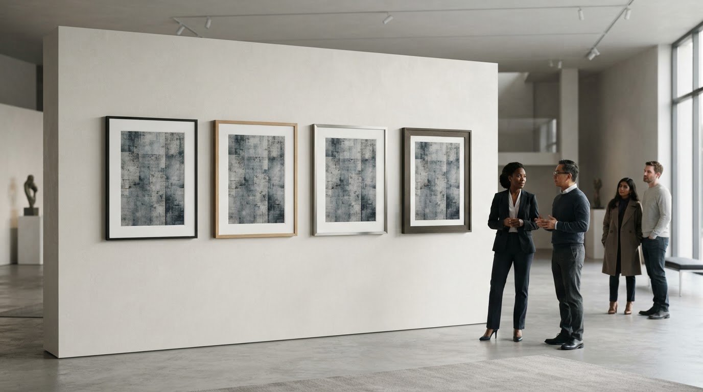
The best frame style for modern art may be the one you barely notice, or the one that creates a deliberate contrast. The right choice depends on the artwork and how you want it to read in the room. A frame that feels too dominant can interrupt a composition, while one that’s too restrained may leave a bold work feeling unfinished. Profile, finish, and the space around the image all affect the balance.

If you’re weighing a clean, minimal profile against a more expressive presentation, start with the artwork, then consider where it will hang. Look at the image’s colours, lines, and visual density, and compare how different frame widths and finishes change its presence. This guide explains how to make those comparisons, when contrast can feel intentional, and how custom sizing and cropping can help a photographic print suit its setting. The aim is a presentation in which the artwork and its surroundings feel considered together.

Key Takeaways

  • The best frame style for modern art depends on the work’s visual intent, not a single rule about contemporary art.
  • Compare profile, finish, and spacing to see how each choice changes the artwork’s presence.
  • Use the artwork’s character and the room to decide whether minimalist framing or a more traditional presentation feels right.
  • Assess the piece at its intended display distance and against the wall where it will hang.
  • Galerie Prints offers professional framing as an add-on for purchased exhibition-quality photographic prints.

What Makes a Frame Work with Modern Art?

A frame works when it helps the artwork’s visual intent come into focus. A quiet edge can give a composition room to breathe; a more pronounced border can create a deliberate counterpoint. The best frame style for modern art isn’t defined by one profile or finish. It’s the choice that feels in dialogue with the work rather than competing for attention.

Modern art encompasses many visual languages and approaches. A brief overview of Modern art offers context, but the individual piece should guide your framing decision. Consider its colour, line, texture, and visual density. Then look at how the frame and surrounding space change the image’s presence. A frame can give the artwork definition, connect it to the room, or make the overall presentation feel crowded.

Why modern art does not have one universal frame

A minimal composition with open space and fine lines may benefit from a restrained edge that preserves its calm. A geometric work with crisp shapes may suit a frame that echoes its order or gives it a clean boundary. An expressive piece with layered texture and energetic marks has a different character: a substantial profile might lend it visual weight, while a simpler one can keep attention on the surface.

Photographic works bring their own considerations, including tonal range, fine detail, and atmosphere. A dark frame may reinforce contrast, while a lighter one can keep the presentation open. Treat these as options, not rules for a medium or movement. Judge the specific artwork rather than assuming that every abstract, geometric, or photographic piece calls for the same treatment.

The frame’s relationship to the artwork and room

Begin with the artwork, then consider the room. Look at the palette and architecture around it, as well as the display context. A single piece above a console makes a different impression from one shown among other works. The frame can separate the image from a busy wall, pick up a tone or material already in the room, or create a deliberate contrast that makes the relationship between artwork and interior more dynamic.

The test is not whether the frame matches the room perfectly, but whether the full presentation feels resolved. Step back and notice what catches your eye first. If the frame’s colour, width, or ornament draws attention away from the artwork’s defining feature, it may be too dominant. If it helps the image read clearly and sit comfortably in its setting, it’s doing useful work.

A frame clarifies modern art when it gives the work a considered boundary without becoming the reason you look. That leaves room for both restraint and contrast: the right choice depends on what best serves the particular piece.

How Frame Profile, Finish, and Spacing Change the Artwork

Profile, finish, and spacing work together to shape the boundary around an artwork. A narrow edge can feel discreet; a broad one adds visual weight. A flat profile keeps the outline crisp, while a dimensional profile introduces shadow and depth. The question is how each choice changes the balance between the image, its frame, and the space around it.

Frame proportion influences visual balance: the more presence the frame has, the more carefully it must relate to the artwork’s scale and visual weight.

Choosing a profile that matches the work’s visual weight

A work with strong graphic impact, crisp lines, or a compact composition may already have plenty of visual definition. A restrained profile can give it a clear edge without adding another competing shape. For example, a broad border around a small geometric composition can become a major part of its presence, while a narrow one can preserve the image’s precision.

A more substantial profile can be effective when the artwork feels expansive, richly layered, or visually dense. It may ground a large composition or create intentional contrast with a delicate image. Assess the frame’s width in relation to the artwork, not in isolation. A profile that seems modest up close can look quite different from across the room.

Using colour, finish, and negative space thoughtfully

Choose a finish in conversation with the artwork’s palette. A frame that echoes a quiet colour within the image can make the presentation feel composed. Contrast is more assertive: a dark edge beside a pale image, for instance, can sharpen its boundary. Instead of choosing a finish just because it is popular in interiors, compare how it affects the image’s tones and focal points.

Spacing matters, too. For a work on paper, a mat can set the image apart from the frame and offer visual breathing room. A generous border may give a small image greater presence, while a closer margin can keep a compact composition feeling contained. Consider the wall as part of the overall spacing: a frame that stands out against one wall may blend into another. View the complete arrangement from the distance at which it will usually be seen.

To compare options, look for changes in visual hierarchy. Does your eye go first to the artwork or to the frame’s colour and width? Does the space around the image make details easier to read, or leave the work feeling detached? These questions help identify the best frame style for modern art without reducing the decision to a fixed rule.

For an exhibition-quality photographic print, professional framing for purchased prints can complete the presentation as a considered whole.

Minimalist or Traditional Frame: Which Suits Your Modern Artwork?

A clean-lined frame and an ornate one make different impressions. The first can recede, keeping attention on the image; the second brings its own visual history and creates a purposeful conversation with the work. Neither is automatically more suitable for contemporary art. Consider the artwork’s visual language, the frame’s presence, and the room together.

Bauhaus, Pop Art, and Minimalism offer distinct starting points, not framing instructions. Bauhaus design often foregrounds structure and function, Pop Art may work with vivid imagery and deliberate visual impact, while Minimalism gives close attention to reduction and space. Each individual work still has its own scale, palette, and composition. The best frame style for modern art responds to those qualities rather than relying on a movement label.

Approach Visual effect Artwork and room context Trade-off to consider
Minimalist Creates a quiet, defined edge and keeps visual emphasis on the image. Can suit a work with strong colour, graphic lines, or an uncluttered composition, especially in a contemporary interior. May feel too discreet if the piece needs greater visual grounding or a more expressive relationship with the room.
Traditional Adds detail and a sense of visual richness, introducing contrast with a contemporary image. Can bring an unexpected note to a modern work, particularly where the room already includes traditional architectural details or furnishings. May compete with a dense or highly detailed composition if the frame’s ornament becomes the first thing noticed.

When a minimalist frame may be the stronger choice

Consider a restrained frame when the artwork already carries strong visual energy: a vivid field of colour, tightly controlled geometry, or a photograph with a clear focal point. A simple profile can keep the presentation composed and contemporary. Then assess it in the room. A minimal edge may suit a calm interior, while a more layered space might call for a frame with greater presence.

When a traditional frame can create purposeful contrast

A traditional-looking frame can make a modern work feel deliberately unexpected, setting contemporary imagery against a more classical visual language. The contrast works best when both elements remain legible: the frame contributes character, but the artwork retains its visual authority. Consider the scale and detail of each, then assess how their combined presence relates to the room.

Before choosing, compare the options from the artwork’s intended display distance. Notice whether the frame extends the work’s mood, gives it a counterpoint, or distracts from its defining qualities. This is a question of balance, not a contest between old and new. A thoughtfully chosen traditional frame can feel as considered as a minimalist one when it supports the overall presentation.

A Practical Checklist for Choosing a Modern Art Frame

A little preparation makes the decision clearer. Before browsing frame styles, study the artwork, the wall where it will hang, and the space it will occupy. This helps you move from visual impression to practical dimensions without letting room trends dictate the result.

  1. Observe the work. Note its dominant colours, strongest lines, texture, visual density, and overall mood. Decide whether the frame should blend into the composition or create deliberate contrast. Identify the details that matter most, such as a quiet margin around the image or a bold central form.
  2. Assess scale. Measure the artwork, then consider the full presentation, including any mat or surrounding border. Compare those proportions with the available wall space and nearby furnishings. A piece that looks substantial on its own may feel small above a long console, while a large work can dominate a narrow wall.
  3. Consider the room. Look at the wall colour, architectural details, furniture, and other art nearby. The frame needn’t match them exactly, but it should help the artwork feel at home. If possible, view the piece against the actual wall and step back to the distance from which it will usually be seen.
  4. Compare presentations. Settle on two or three distinct directions rather than considering every possible frame. Compare how each changes the image’s emphasis, separation from the wall, and overall visual weight. Ask someone else to view the options from the intended display distance. A choice that feels subtle up close may read quite differently across a room.
  5. Finalise the dimensions. Write down the desired finished size and, for a photographic print, any crop you’re considering before exploring bespoke options. This gives you a clear reference for the balance between image, border, and wall.

Assess the artwork before browsing frame styles

Keep your first observations focused on the artwork rather than a particular frame. A high-contrast image with assertive lines may call for a different balance from a soft, spacious composition. Then consider the work’s proportions alongside the wall and furnishings. This sequence helps you judge whether the frame should quietly contain the image or contribute a more noticeable counterpoint.

Plan the finished presentation and dimensions

Custom sizing and cropping can help shape a print for its intended setting, while the substrate also contributes to the presentation. Galerie Prints’ bespoke printing can be made on any substrate, including aluminium, wood, and glass. For further context on displaying photographic work, explore this fine art photography collecting and decorating guide.

Once you’ve noted the artwork’s character, desired dimensions, and room context, consider Galerie Prints’ bespoke framing service to complete a chosen print with a considered presentation.

Complete Your Modern Art Presentation with Galerie Prints

At Galerie Prints, a passion for art informs a collection of exhibition-quality photographic prints, selected for the character and stories held within each image. A considered frame is part of how a print meets its surroundings: it can establish a boundary, add visual presence, or let the image remain the focus. The best frame style for modern art is ultimately a personal decision shaped by the artwork, its intended setting, and the impression you want the finished presentation to make.

Thinking about these elements together makes the next steps more intentional. First, settle on the image and the space where it will live. Then consider its proportions, the surrounding wall, and whether the print’s crop and scale support the composition. With those choices in view, framing becomes part of a unified presentation rather than a separate decision made at the end.

Bring print, scale, and presentation together

Galerie Prints’ Bespoke Services include custom sizing and cropping, options that can help shape a print for its intended display. Custom sizing can help align the artwork with the available wall space; thoughtful cropping can adjust the image’s framing while keeping its visual character in mind. Note the desired finished dimensions and consider how much of the image should remain visible within the overall presentation.

The substrate is another part of the print’s visual expression. Bespoke printing can be made on any substrate, including aluminium, wood, and glass. Each can bring a different material quality to the presentation, so consider how the surface relates to the image and the room. These choices work alongside the frame: the print, its scale, and its material all contribute to how the artwork is experienced.

Photographic art also carries its own language of tone, detail, and atmosphere. Galerie Prints’ black and white photography collector’s guide explores one enduring example, where subtle gradations and contrast are central to the image’s presence. Reflecting on the qualities that draw you to a particular print can help you decide how its crop, scale, and surrounding presentation might best support it.

Explore bespoke framing and photographic art

For a purchased print, Galerie Prints offers professional framing as an add-on. This brings the framing decision into the same process as choosing the photographic work, allowing you to consider the finished presentation as a whole. Keep your notes on dimensions, crop, room context, and the artwork’s visual character close at hand. They can help you approach the options clearly while leaving room for the image itself to guide the final choice.

If you’re ready to explore photographic art and framing options, take a considered look through Explore Galerie Prints.

Let the Artwork Lead the Final Choice

The frame is not simply a finishing touch; it shapes how an artwork enters a room and how its details are encountered over time. As you make your choice, return to the feeling you want the piece to create. The best frame style for modern art is the one that supports that intention and feels at home in its setting, whether it recedes quietly or brings considered contrast.

Let that decision guide the next step: selecting a photographic print and shaping its presentation around the space you have in mind. Galerie Prints offers exhibition-quality prints, professional framing as an add-on for purchased prints, and bespoke options including sizing, cropping, and printing on any substrate. Together, these choices let you consider the image and its presentation as a whole.

Explore exhibition-quality prints and bespoke options, and find a work that feels distinctly at home in your space.

Frequently Asked Questions

Can I customise the size and crop of a Galerie Prints artwork?

Yes. Galerie Prints’ Bespoke Services include custom sizing and cropping, so you can consider a print’s proportions and image boundaries in relation to the space you have in mind. A crop may help direct attention within the composition, while a size adjustment can suit a particular wall. Consider these options as part of the presentation you’re planning.

Does Galerie Prints offer professional framing for purchased prints?

Yes. Professional framing is available as an add-on for prints purchased from Galerie Prints, with ready-to-hang delivery. If you’re considering the best frame style for modern art, framing can be part of your plan for presenting the chosen print rather than a separate decision made in isolation. Galerie Prints offers professional framing as an add-on for purchased prints.

Can Galerie Prints print artwork on different substrates?

Yes. Galerie Prints’ Bespoke Services include printing on any substrate. Aluminium, wood, and glass are examples, not a complete list. Consider the surface as part of the artwork’s final character: the image and its material together influence how the print feels in a room. Substrate selection is separate from choosing a frame, so consider both elements when planning the presentation.

Are Galerie Prints’ photographic prints exhibition quality?

Yes. Galerie Prints describes its photographic prints as exhibition quality and states that its printing and framing process is second to none. As you browse, consider the subject, mood, and scale that suit your collection, then reflect on how you’d like the finished work to live in your space.

Does Galerie Prints offer signed and limited-edition photography?

Yes. Galerie Prints offers signed and limited editions featuring photography from a wide variety of movements and periods. This selection gives collectors an opportunity to explore photographic art across distinct histories and sensibilities. As you browse, consider which period or visual language resonates with your collection and the space you’re furnishing. The offering encompasses varied photography rather than one single aesthetic or era.

What can bespoke framing and printing help me customise?

Galerie Prints’ Bespoke Services include custom sizing and cropping, as well as printing on any substrate, including aluminium, wood, and glass. Professional framing is a separate add-on for purchased prints. Consider image dimensions, crop, material, and framing as separate parts of the presentation you have in mind.

Decorating a Hallway with Art: A Practical Guide to a More Considered Space

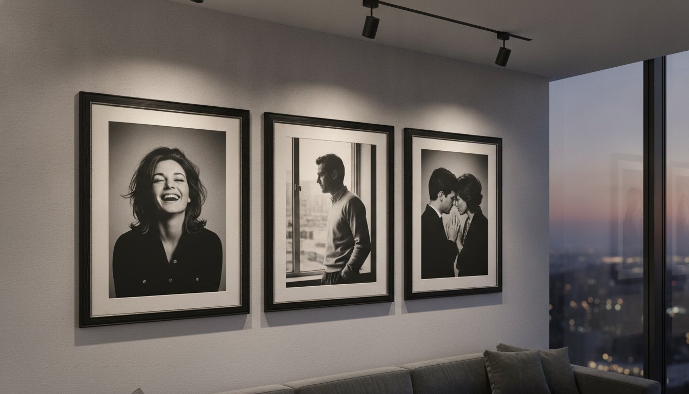
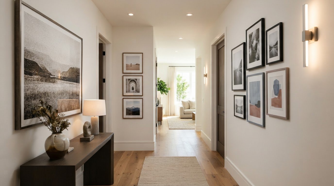
What if the hallway were more than a passage between rooms, and became the first glimpse of your home’s character? Decorating a hallway with art can give even a narrow or overlooked space a sense of purpose. But filling every bare patch of wall may leave it feeling cluttered rather than considered. Plan around the route through the space, so each work can be seen in relation to the next and to the rooms beyond.

It’s easy to misjudge scale or hanging height in a corridor, where viewing angles and proportions differ from those in a living room. A thoughtful arrangement can balance the walls, while carefully chosen imagery and framing connect the hallway to your home’s wider palette and mood.

This guide will help you assess your hallway, choose artwork suited to its proportions and arrange it with confidence. We’ll cover hanging height, spacing, gallery-wall layouts and framing, including how exhibition-quality photographic prints and bespoke sizing can help a work feel at home. The result is a more welcoming transition, with a visual rhythm that rewards both a passing glance and a pause.

Key Takeaways

  • Start decorating a hallway with art by considering the route through the space, its proportions and how it connects to adjoining rooms.
  • Measure the usable wall area, noting how doors, switches, mirrors and furniture shape your options.
  • Choose a single statement piece, a linear sequence or a compact cluster to suit your hallway’s shape and viewing distance.
  • Use image subject, colour and contrast to complement nearby rooms and respond thoughtfully to the hallway’s lighting.
  • Refine the final look with suitable framing and sizing, then explore exhibition-quality photographic prints for a considered finish.

Why Decorating a Hallway with Art Changes the Feel of Your Home

A hallway is a space for movement, not usually a room where people linger. Yet it shapes the experience of arriving home and offers an early impression of the rooms beyond. Decorating a hallway with art gives this passage its own visual identity, making the walls part of the home’s story rather than an afterthought.

A successful display is more than a collection of frames filling available space. It respects the hallway’s proportions and the way people move through it. A work positioned where the route opens up can invite a pause; a sequence along a longer wall can create a gentle rhythm. Either approach makes the journey feel deliberate.

What role should artwork play in a hallway?

Think of the hall as both a passageway and a personal introduction. Decide what you want it to express: quiet continuity, a sense of discovery or a confident focal point. A restrained arrangement might use a shared colour palette or subject to create cohesion. One striking image, by contrast, can give a simple corridor a distinct centre of attention.

These approaches can work together. A prominent piece can sit among smaller works, or a sequence of images can feel calm through considered spacing and a common thread. Cohesion doesn’t require identical subjects, frame finishes or dimensions. Variety can feel collected and personal when each piece has room to be seen and the arrangement suits the wall.

How can art help a hallway feel more welcoming?

Repeated visual cues can give a long route a sense of intention. A recurring tone, subject or frame detail may guide the eye from the entrance towards the rooms beyond, creating small visual pauses as you pass. The effect comes not from matching every object, but from establishing a subtle conversation between works—a principle also central to supportive living spaces, where specialists like Find Memory Care use visual markers and art to create intuitive, reassuring environments.

Let adjoining rooms inform your choices without making the hallway a copy of either one. A colour from a nearby room might reappear in a photograph, while a contrasting subject can create a fresh moment between familiar spaces. If you’re exploring how different visual traditions might shape the mood, The History of Art offers a broad introduction to styles and periods.

Fine art photography can bring a personal point of view to this transition, from evocative interiors and landscapes to portraits that suggest another era. Consider how each image reads both in passing and at close range. A thoughtful display welcomes visitors, connects the character of adjoining rooms and rewards a second look without interrupting the natural flow of the home.

Measure Your Hallway Before Choosing Art

Before choosing a work, look at the hallway as a series of viewing opportunities rather than one long wall. Note its length, the width of each usable section, ceiling height and the distance from which someone will first see the art. A piece viewed from the far end may need a different presence from one encountered at close range beside a doorway.

Measure the clear wall area, not just the full stretch from corner to corner. Doorways, light switches, mirrors, radiators and console tables interrupt the visual field or limit where a frame can sit. For hallways featuring period furnishings, design insights from Nwtiques can help you balance scale and historic character alongside your wall decor. Mark their positions, including how doors open and where people naturally pass. This helps you avoid placing a work where it feels squeezed, obstructs everyday use or competes with another feature.

How do you choose artwork scale for a narrow hallway?

Choose a scale that suits the wall area the artwork will actually occupy. On a long, uninterrupted wall, one larger focal piece can create a clear point of attention. A sequence of smaller works may suit a corridor broken up by doors or changes in wall space, giving the eye a measured progression. Neither approach has a fixed size requirement; the test is whether the art feels balanced against its immediate setting.

Where should hallway art sit on the wall?

A useful starting point is to place the centre of the artwork at a natural standing viewing height. Galleries commonly use a centre point around 57 to 60 inches from the floor, but treat this as a guide, not a rule. Ceiling height, nearby furniture and the corridor’s sightlines may call for an adjustment. Check the proposed position from both ends and while walking past, since the artwork will be seen from changing angles.

Test the layout before committing. Cut paper templates to match the outer dimensions of the framed pieces, then tape them to the wall. Step back, approach from each direction and check that the arrangement clears switches, mirrors and door swings. If a template feels too large in the actual corridor, revise the plan before choosing the artwork.

  1. Measure the hallway, wall sections, ceiling height and viewing distance.
  2. Mark obstacles such as doors, switches, mirrors and furniture.
  3. Mock up the proposed artwork positions with paper templates.
  4. Review the arrangement from both ends and along the route.

Once the layout feels right, accurate measurements can guide choices such as custom sizing and framing. Explore exhibition-quality photographic prints suited to your hallway’s proportions.

Choose a Hallway Art Layout That Suits the Space

The best layout follows the architecture rather than forcing a preferred style onto it. A short hall with one uninterrupted wall may suit a single image, while a longer corridor can support a sequence that carries the eye along its length. Where doorways divide the wall into smaller sections, a compact cluster can bring those areas together. Each arrangement feels composed when it leaves the route clear and gives the artwork room to register.

Use this comparison to find a starting point, then adjust it to the available wall space and the way the hall is experienced.

Layout Suitable space Visual effect Planning consideration
Single statement piece A short hall or a clear, uninterrupted wall section Creates a distinct focal point Allow enough surrounding space for the work to stand on its own
Linear sequence A long, relatively continuous corridor wall Establishes a steady visual rhythm along the route Keep spacing and alignment considered as the wall changes
Compact cluster A wider landing or a contained wall area between openings Forms a concentrated, layered composition Plan the group as one overall shape, not isolated frames

When does a single statement piece work best?

One focal image often suits a short hallway, where a sequence could feel compressed or a cluster might compete with nearby doors. Its impact depends on proportion and negative space. A work that nearly fills the available wall can feel imposing, while generous space around it gives the composition a quieter presence. Choose an image that feels at home with the wider interior, so the hallway makes a clear impression without seeming detached from the rooms beyond.

How can a sequence or gallery wall feel balanced?

For a sequence, repeat the spacing or alignment to give the eye a reliable rhythm, even if the photographs, frame finishes or formats vary. In a cluster, treat the outside edges as one larger shape and balance the visual weight across the group. Lay out the proposed arrangement on the floor before hanging it, preserving the relative gaps as you test alternate positions. Account for door openings and changing sightlines so no piece feels stranded or crowded as someone walks past.

Gallery walls benefit from planning before a single hook goes in. Sketch the wall and mark its boundaries, then arrange paper outlines or the framed works on the floor to see how the composition reads as a whole. A step-by-step gallery-wall guide can help with the broader process; the hallway-specific test is whether the arrangement remains clear from the approach as well as at close range. Consistent spacing adds structure, not uniformity, so a personal mix of images can still feel deliberate.

Select Art, Colour and Framing for Hallway Conditions

With the layout established, consider how each image relates to the hallway’s colours and light. Artwork doesn’t need to repeat the wall colour to belong there. It might echo a tone from an adjoining room, offer measured contrast against a pale wall or introduce a quieter note among richer colours. Subject matters too: a portrait, landscape or cinematic photograph sets a different mood as someone moves through the space.

Look at the image and its setting together. A photograph with strong tonal contrast can remain legible against a busy wall or in a dim passage; softer gradations may feel more integrated where the surroundings are calm. Neither is universally right. Choose a palette and subject that feel intentional beside the wall finish and the rooms around it.

What artwork works in a dark or windowless hallway?

Observe the hallway’s lighting at different times, including the effect of any ceiling or wall lights. In a dim corridor, compare subtle imagery with stronger contrast, and consider whether details remain easy to discern from the usual viewing distance. A restrained palette can sit harmoniously with the interior, while brighter tones may introduce another note. Neither guarantees that the space will appear lighter.

If possible, review a print in the hallway’s own lighting before settling on its position. Light can change how colours and tonal differences read, so an image that feels balanced elsewhere may have a different presence in the corridor.

How should frames complement hallway artwork?

A consistent frame treatment can lend a sequence or cluster visual unity, while deliberate variation can give a collected arrangement more character. In either case, consider how the frame’s visual weight relates to the image and the available wall space. The frame should support the artwork, not make a narrow passage feel busier. A dedicated guide to bespoke framing can offer further help with this choice.

Artwork and framing solve different parts of the design. First decide how the image’s subject, contrast and palette work in the hallway, then choose a frame that suits both the print and its surroundings. If a standard proportion doesn’t sit comfortably within the planned composition, custom sizing and cropping can help adapt the image to the space. Galerie Prints also offers bespoke framing for a tailored finish.

When decorating a hallway with art, assess each work in context rather than choosing by colour or subject alone. Consider how the print reads against the wall, under the available light and beside its frame. Explore Galerie Prints’ exhibition-quality photographic prints and bespoke framing as you refine a display for your hallway.

Bring Your Hallway Art Plan to Life with Galerie Prints

A considered hallway display comes together in stages: assess the available wall space, choose a layout that suits the route, then refine the image and its framing. With those decisions in place, you can select a print for a defined purpose rather than choosing an image first and trying to make it fit afterwards. The result can connect more closely to the character and proportions of your home.

Fine art photography offers a wide range of visual moods, from quietly atmospheric imagery to portraits and scenes with a more pronounced presence. Galerie Prints offers exhibition-quality photographic prints, alongside bespoke options to adapt a chosen work to a particular wall and composition.

How can a print be tailored to a hallway?

Custom sizing can help a print sit comfortably within the planned arrangement, whether it will serve as a focal point or form part of a group. Cropping offers another way to shape the composition, bringing attention to details that work well at the viewing distance and proportions of the hallway. These options are useful when a wall’s usable area has a distinctive shape or when a chosen image needs to relate carefully to nearby frames.

Galerie Prints’ bespoke services include printing on any substrate. Aluminium, wood and glass are examples, not an exhaustive list. Consider the substrate alongside the image, the interior and the display’s intended character, so the finished work feels deliberate within the space.

What should you settle before choosing a print?

Before making a final selection, note the exact wall or wall section the artwork will occupy, the layout you’ve chosen and the mood you want the hallway to convey. Decide whether the image should provide a quiet pause, introduce a distinctive subject or create continuity with an adjoining room. Then consider the frame alongside the image: its visual weight and character will affect how the finished piece relates to the wall and neighbouring works.

Keep your measurements and paper mock-up nearby as you browse. They provide a practical reference for comparing image proportions with the space and judging whether a single print or a group will feel balanced. If a composition needs adjustment, custom sizing and cropping can help shape the artwork to the plan, rather than forcing the plan around an unsuitable format.

With the wall, layout and visual mood in mind, explore Galerie Prints’ exhibition-quality photographic prints and consider bespoke sizing, cropping and framing for a display that feels at home in your hallway.

Let Your Hallway Tell a Story Over Time

A hallway display doesn’t have to feel complete in a single afternoon. It can grow as you discover photographs that speak to you, or change as the rooms around it evolve. Leave space for a future addition, or let one carefully chosen image remain the quiet centre of the composition. The most enduring displays feel personal, with each work earning its place rather than filling a wall for its own sake.

That’s the pleasure of decorating a hallway with art: a familiar route can offer a new detail to notice each time you pass, while still feeling connected to the wider home. Choose a subject you’ll enjoy seeing in the everyday rhythm of arriving, leaving and moving between rooms. When you’re ready to find the image that gives the space its own character, explore exhibition-quality photographic prints at Galerie Prints. A thoughtful choice can make the hallway feel unmistakably yours.

Frequently Asked Questions

How high should you hang art in a hallway?

A useful starting point is to place the centre of a single artwork about 57 to 60 inches (145 to 152 cm) from the floor. For a group, treat the whole arrangement as one piece and find its visual centre, rather than centring each frame separately. Stand back and check the result from the hallway entrance and while walking past. The position should feel comfortable to view without drawing attention to the ceiling or floor.

What size art is best for a narrow hallway?

Choose artwork in proportion to the clear wall area and the distance from which it will be viewed. A tall, narrow piece may suit a slim wall section, while a small work can feel lost on a broad expanse unless it’s part of a considered grouping. Before choosing, outline the frame dimensions on paper and check whether the piece leaves the passage feeling open. Let the usable wall, not the hallway’s full length, guide the scale.

How do you arrange pictures along a long hallway?

For a long corridor, arrange pictures in a steady line or sequence that responds to doorways and changes in the wall. Keep the spacing consistent; around 2 to 3 inches between frames is a common gallery-wall guideline. Before hanging, check that the first and last works don’t feel stranded at the ends and that the sequence reads clearly from both directions. Leave gaps where the wall is crowded by switches, mirrors or openings.

Can you mix different frame styles in a hallway?

Yes, different frame styles can work together if the overall arrangement has a unifying detail. Vary frame profiles while keeping a related tone, or mix finishes and let a shared subject or palette tie the images together. In a narrow corridor, use variation with intention: a cluster can feel more eclectic, while a long sequence may benefit from a repeating feature that guides the eye along the wall.

How do you decorate a dark hallway with art?

Choose imagery after observing the hallway under its usual lighting, since subtle details and colours can read differently in a dim space. Stronger tonal contrast may help an image remain distinct, while a restrained palette can sit quietly with the walls. LED lighting is often recommended for home artwork because it emits no damaging UV rays or significant heat. Assess the print where it will hang, and don’t rely on art alone to brighten the corridor.

Should hallway art match the artwork in adjoining rooms?

No, hallway art doesn’t need to match adjoining rooms or repeat their subjects. A more considered connection can come from echoing a colour, mood or period while choosing different imagery for the passage. For example, a contemporary portrait might sit between rooms with landscape art if its tones relate to the surrounding palette. This lets the hallway feel part of the home without making each space look identical.

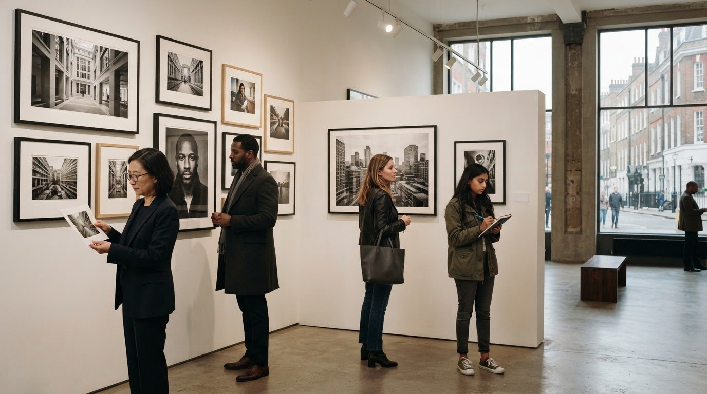
Fine Art Photography Gallery London: A Collector’s Buying Guide

Finding a fine art photography gallery London collectors can explore is about more than recognising a famous name. A photograph can hold a moment of glamour, intimacy or history, but before choosing a print, it helps to know who made the image, what collection it belongs to, how it was printed and how it might work in your space.

A striking image is a good place to start, but artwork details make it easier to compare options with confidence. This guide explains what to look for in a specialist photography collection, how to compare artists, archives, subjects and formats, and what to consider when choosing paper, dimensions and framing. It also explains why a photographic print and an original photograph are not necessarily the same thing.

From the sunlit world of the Slim Aarons Collection to the portraits of Terry O’Neill, a curated collection can offer different routes into photographic history. Follow your interests, assess the details behind each print and choose a work that resonates with you and suits the place you have in mind for it.

Key Takeaways

  • Assess a fine art photography gallery London search by the depth of its curation, artist context and clarity of artwork information.
  • Look for details such as the photographer, image date, print process and source to better understand a photographic work.
  • Compare photographs by subject, mood, dimensions and display setting to find work that suits your interests and available wall space.
  • Use a practical checklist to move from initial subject preferences to informed decisions about print and framing.
  • Explore distinct routes into photographic history through curated archives, including the Slim Aarons Collection, Galerie Prints, and Terry O’Neill Photography.

Searching for a fine art photography gallery London collectors can explore is about more than finding an address. Look for work that holds your attention, context that helps you understand it and enough detail to make an informed choice. A specialist photography collection puts the artists, archives, image histories and print processes at the centre of how the work is presented.

Fine art photography can include images made with artistic intention rather than solely for documentary or commercial purposes. For an introduction to the history and idea behind the medium, see What is Fine Art Photography? To assess an individual photograph, move from that broad context to specific questions: who made it, which body of work it belongs to and how the print was produced.

How a specialist photography gallery differs from a general art gallery

A focused collection lets you follow a subject or photographic period across different artists and images. Knowledge of archives and image histories can show why a photograph matters beyond its immediate visual appeal. Print information, meanwhile, helps you understand the physical work you are considering. Galleries present photography in different ways: an exhibition offers a selection in a physical setting, while an appointment can provide a more focused viewing. Events bring people together around a subject, and online collections make it possible to browse beyond a single show. Each format offers a different way to discover work.

What London gallery listings can, and cannot, tell you

A directory listing is a starting point, not a complete measure of a gallery’s curatorial depth. For example, the AIPAD profile for Augusta Edwards gives practical information such as a Cromwell Place address and appointment-based visiting arrangements, alongside represented artists. Those details describe where and how to view, but they do not tell you whether the selection suits your interests.

Exhibition pages can provide more artwork context. Atlas Gallery’s Fashion Show page, for instance, introduces a theme through named photographers and selected works. Details such as artist, date, process and dimensions help readers look beyond the image and make more meaningful comparisons.

Gallery listings and event information are time-specific, so treat them as a snapshot rather than a permanent guide. When comparing collections, look beyond location: does the curation give you enough artist context and artwork information to assess the photographs? A considered experience may come through a physical exhibition, an appointment or a well-presented online collection. An address tells you where a gallery is; interpretation and artwork details help you decide what the work means to you.

How to assess fine art photography, its creator, and its source

When comparing prints, look beyond the image to understand what the work is, who made it and how the print relates to the photograph’s history. Provenance means the documented history or source of a work. Information can differ between prints, so read the description for each piece instead of assuming every listing includes the same records.

What photographer, archive, and image history reveal

The photographer’s name and the image’s history place a photograph in context. They can help you connect it to an artist’s wider practice, a particular era or an archive. An archive gives you a way to explore a photographer’s body of work and historical images beyond a single celebrated photograph. Galerie Prints’ curated photographic archives include the Getty Images Gallery and The Slim Aarons Collection, each offering a distinct route into photographic history and subject matter.

As you browse, note whether a listing identifies the image title and date, and whether that date refers to when the photograph was made. A print can also have its own production date and process, which are separate details. For a broader framework on choosing and living with photographic work, see this fine art photography collecting guide. The Learn How to Collect Photography resource from Sotheby’s Institute of Art also offers a useful collecting perspective.

How to read photographic print details

Process labels describe how a print was made; they are not automatic rankings of quality. Gelatin silver and C-Type, for example, identify different photographic print processes. Consider the stated process alongside the image, photographer and intended presentation rather than treating one term as proof that a print is superior.

Dimensions matter, too. Check whether measurements refer to the image or the overall framed work, if specified, and compare like with like across listings. Scale affects how a photograph reads on a wall and whether it suits the space you have in mind. Paper type and framing also shape the final presentation. Galerie Prints offers a choice of print dimensions and paper types, as well as bespoke framing.

Compare the photographer, image title, image date, print process, stated source and dimensions across listings before deciding. This gives you a clearer basis for comparison without assuming that a brief description guarantees a particular edition status or authentication. Put the approach into practice by exploring curated photographic prints and reading each artwork description closely.

Compare photographic prints by subject, format, and intended setting

Choosing between photographs is a matter of personal and curatorial judgement, not a ranking of artists or a prediction of future value. Ask what you will enjoy living with, what interests you in the image and how it might sit in the room. A portrait can create an intimate focal point. Fashion photography may draw attention to clothing, gesture and changing visual conventions, while music and cinema imagery can evoke performers, performance and a particular cultural moment. Lifestyle photography offers a different pleasure, drawing you into a scene and its atmosphere.

Choose a photographic subject that will hold your interest

Compare the feeling and story each subject offers. Then consider whether you want one image to stand alone or sit alongside related works. If lifestyle imagery appeals to you, the Slim Aarons Collection is a recognised photographic archive to explore. For more context on its photographer and visual world, read this Slim Aarons photography guide.

Match image scale and paper choice to the room

Dimensions influence how a photograph reads from across a room and how much wall space it occupies. Before comparing formats, measure the area you have available and consider the distance from which you will usually view the work. Paper selection is another practical consideration: compare the options stated for each print and choose according to your preferences rather than assuming one paper suits every image. Framing can help connect the finished work with the room’s palette and style.

Use the comparison below as a starting point, not a set of rules. Each photograph and room will suggest its own balance.

What to compare Questions to consider
Subject Does portraiture, fashion, cinema, music or lifestyle imagery hold your attention?
Mood Do you want the image to feel intimate, animated, reflective or transporting?
Photographic period Are you drawn to a particular era, and does the image’s history interest you?
Dimensions Will the stated print size suit your wall area and viewing distance?
Paper choice Which of the options described for the print best suits your preferences?
Display setting Will the work be a focal point, or part of a considered grouping?

For anyone exploring a fine art photography gallery London search, this method makes comparisons more purposeful. Weigh the image’s subject and period against its dimensions, paper options and intended setting. A compelling choice is one that continues to reward your attention and feels at home in your space, regardless of how celebrated its creator may be.

A useful shortlist starts with what draws you to a photograph, then moves through the details that shape how you will experience it at home. Use this five-step method when browsing a fine art photography gallery London listing, viewing an exhibition or comparing an online collection.

  1. Start with your interest. Identify the photographer, subject or photographic period you are genuinely drawn to. A personal connection is a more useful starting point than reputation alone.
  2. Read the artwork details. Compare the image title, photographer and date. Note whether the date refers to when the image was made, and look for any source or archive information provided.
  3. Understand the print. Read the stated process and paper options for each individual work. Treat them as descriptive details to consider, not automatic rankings of quality.
  4. Check scale and setting. Compare the print dimensions with your available wall space and usual viewing distance. Consider how the image’s mood and visual character will relate to the room.
  5. Picture the finished presentation. Think about framing alongside the room’s existing palette and style. Decide whether the work should stand alone or sit within a grouping.

Save this summary: follow your interest, compare the artwork details, check the dimensions, then picture the framed work in its intended space.

Plan a London gallery visit around current information

Evaluation criteria apply from one gallery to another, but exhibition schedules and visitor arrangements can change. Treat dates and visiting information in directories or older pages as a snapshot. During a visit, note the titles and details of works you want to compare later. A few precise notes make it easier to move from a vivid impression to a considered comparison.

In-person viewing lets you encounter a selection in its exhibition setting. Online browsing can complement that experience by making it easier to compare a wider curated collection at your own pace, including images beyond a single show. An exhibition may help you respond to a photograph in person, while an online collection can support closer comparison of subject, format and artwork information.

Continue your shortlist with physical photographic prints in Galerie Prints’ curated photography collection, where you can consider print dimensions, paper choices and bespoke framing alongside the image.

Discover curated fine art photography and choose a print with confidence

A search for a fine art photography gallery london can lead from a London exhibition to a curated online collection, where you can browse photographic archives at your own pace. Galerie Prints brings together physical photographic prints and related collectables, offering a way to discover artists and subjects beyond the scope of a single show. Online browsing complements seeing work in person: you can revisit an image, compare options and consider how it might fit into your collection.

Explore photography through distinct archives and artists

Different archives open different paths into photographic history. The Slim Aarons Collection speaks to collectors drawn to lifestyle imagery, while Getty Images Gallery offers a broad photographic archive to explore. Terry O’Neill Photography brings another perspective, including portraiture and images connected with music and culture. If music photography is your particular interest, discover more in this music photography collection guide. Moving between these collections lets you follow a subject, mood or era that resonates with you instead of relying on reputation alone.

Choose the print presentation that suits your collection

Once a photograph catches your eye, its presentation helps determine how it will live in your space. Buyers can select print dimensions and paper types through the online purchasing experience, making it possible to consider scale and finish alongside the image itself. Compare the available dimensions with your wall area and viewing distance. A format that feels balanced in one room may have a different presence in another.

Paper choice is another personal consideration. Read the options shown for the individual print and choose according to your preferences, without treating one option as universally best. Galerie Prints’ professional bespoke framing service offers a considered way to complete the presentation, helping the framed work relate to the room’s palette and style. The aim is not simply to fill a wall, but to choose an image and format you will continue to enjoy.

With the subject, artwork details and setting in mind, take time to find a photograph that feels at home in your collection. Explore fine art photography prints.

Choose a photograph you’ll treasure in your collection

A thoughtful search for a fine art photography gallery london collectors can trust begins with more than a striking image. Look for meaningful curation and clear artwork details, then compare the photographer, image history and print information. The right choice is personal: a photograph should hold your interest and feel at home in the space you have chosen for it.

Galerie Prints brings together curated photographic archives, including the Slim Aarons Collection and Getty Images Gallery, alongside works by Terry O’Neill. As you explore, consider how print dimensions, paper types and bespoke framing can shape the finished presentation. These choices connect the photograph’s story with the room where you will live with it.

Take your time, follow the subjects and images that resonate, and let careful comparison guide your decision. Explore fine art photography prints and discover a work for your collection.

Frequently Asked Questions

Is there a fine art photography gallery in London?

Yes, London has specialist photography galleries, dealers, exhibitions and photography events. A “fine art photography gallery London” search can also lead to online collections, where you can explore artists and compare works beyond a single exhibition. Focus on the curation, artwork details and presentation options that matter to you.

What should I look for in a fine art photography gallery?

Look for clear artwork information and curation that reflects your interests. Useful details may include the photographer, image title and date, print process, dimensions and the work’s source. Consider whether the selection and descriptions help you understand the image, rather than relying on reputation or appearance alone. Paper choices, print size and framing options can also help you decide how a work might fit your collection.

Can I buy fine art photography prints online from a gallery?

Yes, online galleries let you browse photographic collections, compare artwork details and select from available print and presentation options. Read each artwork description carefully, paying attention to its dimensions and any stated process details. Galerie Prints offers physical fine art photography prints, with choices of print dimensions and paper types, as well as professional bespoke framing. You can consider the image and its presentation together as you make your selection.

How do I know whether a photographic print is right for my home?

Start with the image itself. Its subject and the feeling it creates should matter, since you will live with the work beyond its decorative role. Then compare the print’s dimensions with your available wall space and viewing distance. Think about how the image will relate to the room’s light, palette and furnishings. Consider paper options and framing alongside the photograph rather than as afterthoughts.

What is the difference between a photographic print and an original photograph?

A photograph is the image; a print is a physical rendering of that image. The print’s process, date and edition information can vary, so listing terms may describe different aspects of the work. Read the details attached to the specific piece instead of assuming all prints are alike. For a useful comparison, note the photographer, image title, stated process, dimensions and source information.

Do fine art photography galleries offer framing?

Framing options vary between galleries. Where offered, framing gives a print a finished presentation and can help it sit comfortably in a room. Galerie Prints provides professional bespoke framing alongside its physical photographic prints. Before choosing, consider the artwork’s dimensions and intended display space, as well as the room’s existing style. The frame is part of how the image will appear in your collection.

Is it better to visit a photography gallery or browse online?

Each approach offers a different way to discover work. A current exhibition lets you experience photographs in person and see how a gallery presents them, while online browsing makes it easier to compare artists and artwork details across a wider curated collection. You can use both: visit an exhibition to encounter a subject or period, then continue exploring related photographs and presentation choices online at your own pace.

Buying Art from Getty Images Gallery: A Collector’s Guide

A photograph can be more than an image you’re licensed to use. It can become a physical artwork chosen for the memory, mood or moment it holds. If you’re considering buying art from getty images gallery, start with an important distinction: a stock-image licence grants defined usage rights, while a gallery print is an artwork to display and live with.

It’s natural to wonder how to make that choice with confidence, especially when a photograph must also work in a particular room. Getty Images Gallery is a trade-only platform, so individual collectors purchase its photographic prints through authorized partners. Galerie Prints offers physical prints from the Getty Images Gallery archive, with choices including print dimensions, paper types and professional bespoke framing.

This guide will help you look beyond the image on screen and assess the details that shape the finished piece. You’ll learn how to choose a photograph with lasting appeal, compare print size and paper with your space, and consider how framing can bring the composition into focus. With those decisions in view, you can approach your purchase as a considered addition to your home, not a licence to use an image.

Key Takeaways

  • Understand how a physical photographic print differs from an image licence, and what you’re choosing when buying art from getty images gallery.
  • Use a considered selection process to find a photograph that continues to appeal beyond your first impression.
  • Compare print dimensions, paper types and bespoke framing with the room and display you have in mind.
  • Review the artwork’s product details and separate creative choices from practical ordering information.
  • Bring your decisions together to choose a Getty Images Gallery print that feels at home in your space.

A physical photographic print is an artwork to display; an image licence concerns the permitted use of a digital image. That distinction is central to buying art from getty images gallery. This guide focuses on physical prints from the Getty Images Gallery archive, not stock-image subscriptions or digital downloads. Through Galerie Prints, you can choose a photograph as a print and consider how its dimensions, paper and framing will shape its presence at home.

Getty Images Gallery operates within the wider photographic archive and image business of Getty Images, whose history includes major photographic archives. That context can help explain the breadth of imagery available, but it doesn’t establish that a particular print is rare, uniquely sourced or likely to increase in value. Assess each photograph using the details presented for that specific print.

How a gallery print differs from a stock image licence

A licence concerns using an image in a particular way; a physical print is a tangible object selected for display. Ordering a print means choosing an artwork, not receiving a file to download or a subscription to a stock library. Getty Images Gallery is a trade-only platform, and individual collectors buy its prints through partner retailers and galleries. Galerie Prints offers physical prints from the archive, with product details to guide your selection. If you’re considering image use beyond displaying the artwork, don’t assume the print’s product information grants those permissions.

Why collectors are drawn to photographic archives

An archive can open a view into different people, places and periods, bringing together images that might otherwise be difficult to discover. A portrait could lend a room intimacy; a scene of a faraway city might evoke travel; a candid moment could add movement to a composed interior. The archive offers a starting point for discovery, while the individual photograph creates the personal connection.

Give that connection time. An image may catch your eye for its colour or subject, yet feel less compelling after the first glance. Look again at its composition, atmosphere and details. Then imagine it on the wall: does it invite you to pause, and does its story feel at home in the room? Let both the image’s character and the specific print information guide your choice. Next, compare the available formats and presentation choices with the space you have in mind.

A photograph may first catch your attention through its subject, but the right one earns a place in your home by continuing to hold it. As you consider buying art from getty images gallery, look beyond the immediate appeal. Notice how the image’s atmosphere, tonal range and composition might shape a room.

Photography can invite the same close attention as other art forms. Tate’s overview of fine art photography offers a perspective on the medium’s artistic possibilities. For a wider look at how photographs can inform a collection and an interior, explore Fine Art Photography: A Curator’s Guide to Collecting and Decorating.

A considered process for choosing

  • 1. Notice your first response. Ask what draws you in: a person, a place, a particular period, the light or the mood. A clear personal response is a stronger starting point than choosing only to match a current trend.
  • 2. Revisit your shortlist. Save several possibilities, then return to them later at a comfortable viewing scale. Look for images that still hold your attention after the first impression has passed.
  • 3. Consider the room and composition. Think about whether the photograph’s subject, orientation and visual weight suit the intended wall. A focused image can anchor a room; a more restrained composition may sit comfortably among other works.
  • 4. Review the product details. Once an image feels right, compare its listed print dimensions with the available wall area and surrounding furnishings.

Match subject, scale and setting

Imagine the photograph in its intended position, not just on a screen. A wide composition above a long sofa may echo the furniture’s horizontal line, while a portrait-oriented image can draw the eye upward on a narrower wall. These are starting points, not strict rules. Measure the wall area and account for nearby furniture before settling on a print dimension.

Colour and tonal range matter, too. A photograph with deep shadows may bring visual weight to a light interior, while softer tones can create a quieter transition among existing artwork and furnishings. Decide whether you want the image to become a focal point or contribute to a larger arrangement. The aim isn’t simply to coordinate, but to bring the photograph’s character into the room.

When your shortlist is ready, browse Getty Images Gallery prints and use each image’s product details to guide your next decision.

Once you’ve settled on a photograph, its format shapes how you’ll experience it. Galerie Prints offers choices of print dimensions, paper types and professional bespoke framing. Compare the options shown for the specific artwork rather than assuming every image has identical formats. The guide to collecting photographs from AIPAD offers a broader collecting perspective. For this decision, start with how each available choice will serve the image and the room.

Choice What to consider A practical way to decide
Print size Wall area, viewing distance, the image’s orientation and its visual weight. Measure the intended space and mark out candidate dimensions before ordering.
Paper The paper description and how its presentation complements the photograph’s tonal range and character. Compare the paper choices listed for that artwork, considering the image as well as the room.
Framing How a frame defines the print and relates to nearby furnishings and other works. Consider the complete framed piece in its planned position, not only the print by itself.

Choose a print size that suits the wall

Scale changes the way a photograph reads. A smaller print may invite closer viewing, while a larger one can command attention across a room. Viewing distance matters, too: consider whether the image will be seen up close in a hallway or from across a living space. Before buying art from getty images gallery, use a tape measure or removable paper to mark the dimensions on the wall. Check the selected artwork’s product details. Listed dimensions may refer to the paper, including a handling border, while the image area can vary to preserve the photograph’s proportions.

Consider paper and bespoke framing together

Paper is part of the print’s visual and tactile presentation, so read the specific product description rather than choosing based on a general assumption about paper types. Then consider framing alongside it. A frame can give the photograph a defined boundary and help it sit harmoniously with the room, whether it stands alone or joins a collection. Galerie Prints’ bespoke framing options let you plan the presentation as part of the artwork’s place in your home. For more guidance, read How to Choose the Perfect Frame for Your Art.

With the wall measured and the product details in view, compare the formats for your chosen photograph. Explore Getty Images Gallery prints to consider the available dimensions, paper choices and framing together.

A final review helps ensure the photograph you’ve chosen becomes the artwork you intended, in a format suited to its place in your home. When buying art from getty images gallery, separate two questions: does this image and print format feel right, and have you reviewed the practical order details? A physical print and permission to reproduce or otherwise use an image are distinct considerations. Read the product information for the artwork rather than assuming a print purchase covers other uses.

Artwork and format

  • Confirm the image. Check the product image and title against the photograph you shortlisted. Revisit it at a comfortable viewing size and look again at the details and composition that caught your attention.
  • Check the dimensions. Make sure the selected size is the one you intend to order. Compare the dimensions shown for that artwork with your measurements for the wall, and note whether they refer to the paper or image area.
  • Review the paper choice. Read the options presented for the item and consider which description best suits the image’s tonal character and the presentation you want.
  • Settle the framing decision. If you’re choosing professional bespoke framing, review the options shown for the print and picture the complete piece in its planned position. Consider the frame alongside nearby furniture and other artwork.
  • Read the displayed product information. Check the item-specific details before ordering, particularly those that shape your choice of print and presentation. Don’t assume information about one photograph applies to another.

Practical order and display

  • Review delivery details during checkout. Read the delivery and order information presented in the purchase journey, including details relevant to your destination and chosen format.
  • Plan where the finished work will go. Consider the wall, viewing distance and surrounding furnishings, then decide whether the photograph should stand alone or join an existing arrangement.

Keeping these checks distinct makes the decision clearer: first confirm the artwork and its format, then review the practical information for completing the order. For further inspiration on presenting a photograph in your home, explore The Art of Framing and Displaying Photography.

Ready to put your choices into practice? Browse physical Getty Images Gallery prints and review the details for the photograph you have in mind.

A photograph’s place in a home is shaped by more than the image alone. Its dimensions, paper and framing affect how it meets the wall, while light, surrounding colours and furniture influence how its tones and details are perceived. Picture the finished work in its intended setting before settling on a format.

Create a considered place for the photograph

Think about how the room is used and where attention naturally falls. A photograph hung above a sideboard may become a focal point, while one placed among other works can contribute to a layered arrangement. Allow enough visual space around a prominent print for its subject and composition to register. In a quieter corner, a smaller-scale piece may invite a closer look.

Light and colour can subtly alter the image’s presence. A photograph with strong contrast may stand out against a softly toned wall; a more muted image might sit gently alongside patterned furnishings or other art. There’s no single formula. Let the subject and scale guide the placement, and consider how the image reads at different times of day.

Turn a considered choice into a lasting artwork

The decision comes together through four connected choices: an image you feel drawn to, dimensions suited to its intended place, paper that complements its presentation, and framing that relates to the room. Galerie Prints offers physical photographic prints from its curated Getty Images Gallery offering, with print dimensions, paper types and professional bespoke framing to consider. Choosing framing lets you plan the finished presentation while leaving the pleasure of deciding where the piece belongs.

Buying art from getty images gallery is ultimately about choosing a photograph whose character continues to resonate, then giving it a setting where it can be appreciated. A personal connection to the image and a thoughtful visual fit are more dependable guides than assumptions about future value. Review the product details for your chosen print, and let the room inform its presentation.

Browse Getty Images Gallery prints at Galerie Prints to discover a photograph that speaks to you, then consider the available dimensions, paper and bespoke framing options as you imagine it in your home.

Choose a Photograph You’ll Be Glad to Live With

A thoughtful purchase begins with an image that continues to speak to you, then takes shape through choices that suit both the photograph and its place at home. The key steps in buying art from getty images gallery are to select a photograph for its lasting personal appeal, compare the dimensions and paper choices shown for that artwork, and consider how framing and placement will affect its presence.

Galerie Prints offers physical photographic prints from the Getty Images Gallery archive, with print dimensions, paper types and professional bespoke framing to help you plan the finished presentation. Reviewing the specific product details before ordering makes each choice clearer, from the proportions of the print to how it may sit within your room.

Explore the archive at your own pace and discover an image that feels right for your space. Explore Getty Images Gallery prints at Galerie Prints and consider the available print and framing choices. A photograph chosen with care can bring a memorable point of view into your home.

Frequently Asked Questions

Can I buy a physical print from Getty Images Gallery?

Yes, individual collectors can buy Getty Images Gallery photographs as physical prints through authorized partners, including Galerie Prints. Galerie Prints offers prints from the Getty Images Gallery archive, with choices of print dimensions, paper types and professional bespoke framing. Browse the specific artwork’s product details to see the format and presentation options for that image, then consider how the finished piece will suit your intended display.

Is buying art from Getty Images Gallery the same as licensing a Getty Images photo?

No. Buying art from Getty Images Gallery through a partner such as Galerie Prints means purchasing a physical photographic print to display. An image licence relates to permitted uses of an image, such as using it in a particular publication or project. These are separate considerations. Review the print’s product information for details about the artwork, and don’t assume a print purchase is a licence for other image uses.

How do I choose the right size for a Getty Images Gallery print?

Choose a size that suits both the photograph and the space where you plan to display it. Measure the available wall area, consider the viewing distance, and mark candidate dimensions on the wall with removable tape or paper. Then compare those measurements with the options shown for your chosen artwork. Check whether the listed dimensions refer to the paper, as the image area may differ to preserve the photograph’s proportions.

Can I have a Getty Images Gallery print framed?

Yes. Galerie Prints offers professional bespoke framing for its photographic prints, including prints from Getty Images Gallery. Framing can help define the image and bring it into visual conversation with the room. Review the framing choices presented for your selected artwork and think about the frame alongside the wall colour, nearby furnishings and other pieces on display. Consider the complete framed work when planning its dimensions and placement.

What should I check before buying a Getty Images Gallery print?

Check that the product image and title match the photograph you want, then review the selected print dimensions, paper choices and framing options. Compare the stated dimensions with your measurements and revisit the image at a comfortable viewing scale. Keep artwork decisions separate from practical ordering details: review the delivery and order information shown during checkout. A physical print is also distinct from a licence to use an image elsewhere.

Are Getty Images Gallery prints digital downloads?

No. A Getty Images Gallery print purchased through Galerie Prints is a physical photographic artwork, not a digital download. You can review the options for print dimensions, paper and professional bespoke framing presented for the selected image. If you’re seeking permission to use an image in a publication, campaign or other project, that’s different from purchasing a print for display, so don’t treat the two as interchangeable.

How can I make a photographic print work in my interior?

Start with the place you have in mind, then consider how the photograph’s subject, colours and composition will read against the room. Measure the wall and account for viewing distance, furniture and the print’s orientation. A striking image may benefit from clear space around it, while a quieter work can sit within a larger arrangement. Choose paper and framing with the image and its surroundings in mind, so the presentation feels considered.

Terry O’Neill Photography: The Definitive Guide to a Photographic Legacy

Terry O’Neill didn’t just photograph fame; he humanized the icons of the 20th century through a fly-on-the-wall intimacy that remains the gold standard for fine art portraiture. You likely recognize the effortless cool of David Bowie or the morning-after exhaustion of Faye Dunaway, yet owning a piece of this history often feels shrouded in technical mystery. It’s common to feel a sense of hesitation when faced with the complexities of editions, paper types, and the vital importance of provenance. This definitive guide to terry o’neill photography will demystify those nuances, offering you the clarity needed to invest in authentic, museum-quality prints that resonate with historical significance.

We’ll explore the evolution of his signature style that defined the Swinging Sixties and beyond. You’ll gain the confidence to navigate the secondary market and understand why certain lifetime editions command such prestige at auction. We also provide expert guidance on our bespoke framing services to ensure your chosen work is preserved with artisanal craftsmanship. By the end of this journey, you’ll possess a deep understanding of O’Neill’s legacy and the inspiration to display these timeless moments within a modern, curated home.

Key Takeaways

  • Learn how Terry O’Neill transitioned from a Fleet Street photographer to a fine art legend by capturing the raw, unscripted essence of the 20th century’s most famous faces.
  • Discover the technical secrets behind the O’Neill aesthetic, including his pioneering use of 35mm film to achieve a spontaneous, fly-on-the-wall perspective.
  • Gain professional insight into collecting terry o’neill photography, distinguishing between rare lifetime editions and open prints to build a stable art portfolio.
  • Uncover the narrative behind legendary works like Faye Dunaway’s “The Morning After,” exploring why these specific moments remain the most sought-after pieces in the archive.
  • Understand the importance of museum-quality archival pigment prints and bespoke framing in preserving the historical integrity and long-term value of your collection.

The Narrative of Terry O’Neill Photography: From Fleet Street to Fine Art

The genesis of the O’Neill archive is a masterclass in serendipity and sharp instinct. In 1959, while employed by the photographic unit of British Overseas Airways Corporation at Heathrow, a young Terry O’Neill captured a candid frame of a sleeping man who happened to be Rab Butler, the Home Secretary. This single image, sold to the Sunday Dispatch, effectively ended the era of stiff, reverent reportage and launched a career that would span sixty years. While Terry O’Neill’s biography details a professional journey across every major publication in the world, it was his early days on Fleet Street that forged his instinct for the unscripted moment. O’Neill’s work stands as the definitive bridge between the raw energy of tabloid photojournalism and the refined elegance of museum-grade fine art.

The Man Who Shot the Sixties

As London transformed into the epicenter of global youth culture, O’Neill was positioned at its very heart. He wasn’t merely an observer; he was a contemporary of the icons he documented. In 1963, he took the first newspaper photograph of The Beatles, and soon after, he was the only photographer invited to document The Rolling Stones during their nascent years. This proximity allowed him to capture the birth of a new social order. Today, his work is regarded as a primary historical record, offering a window into a decade where the barriers between class and celebrity were being dismantled. The enduring appeal of terry o’neill photography lies in this authentic documentation of a cultural revolution as it unfolded in real time.

Redefining the Celebrity Portrait

Before O’Neill’s arrival, celebrity portraiture was dominated by the rigid, highly stylized studio traditions of the 1950s. He consciously rejected these formal constraints, opting instead for a psychological shift that made the world’s most famous people feel accessible. By utilizing portable 35mm cameras rather than heavy studio equipment, he gained the freedom to move with his subjects. He possessed a rare, quiet authority that allowed him to ‘disappear’ into a room, waiting hours for the moment when a star’s public mask would finally slip. This approach didn’t just produce beautiful images; it humanized the untouchable, turning gods of the screen and stage into relatable figures of flesh and blood. Through his lens, terry o’neill photography became synonymous with an intimacy that remains the gold standard for fine art portraiture today.

The O’Neill Aesthetic: Candidness as a High Art Form

While some critics suggest O’Neill was simply a witness to history, his aesthetic was a deliberate technical rebellion. He pioneered the use of 35mm film in an era when medium format was the industry standard for portraiture. This choice wasn’t merely about convenience; it was about kinetic energy. The smaller, lighter camera allowed him to move with the rhythm of his subjects, capturing the blur of a stage performance or the subtle shift in a star’s posture. This technical agility is what separates terry o’neill photography from the static, overly staged images of his predecessors.

His mastery extended to a sophisticated use of natural light. O’Neill avoided the harsh, artificial glare of traditional studio lamps, preferring the soft, directional light found in hotel suites, dressing rooms, or the pale London sun. This approach created a sense of ‘expensive’ intimacy, making the viewer feel like a privileged guest in a private world. As he transitioned into the 1970s, he translated this sensitivity into lush, saturated colors that retained his signature candidness, a transition beautifully illustrated in the retrospective a life in pictures.

Mastering the Black and White Medium

For many serious collectors, the monochrome works represent the pinnacle of his archive. The deliberate use of contrast and the visible grain of the film stock lend these images a tactile, archival quality that digital photography cannot replicate. There is a profound permanence in these frames; they strip away the distractions of fashion and era to focus entirely on the subject’s essence. You can explore this further in our guide to the timeless allure of black and white pictures.

Psychological Intimacy with the Subject

The secret to O’Neill’s ‘fly-on-the-wall’ perspective was time. He famously practiced what became known as the ‘Sinatra Protocol’ during his three-decade relationship with Frank Sinatra. On their first assignment, O’Neill spent three weeks simply existing in Sinatra’s orbit before taking a single frame. This investment built a foundation of trust that transformed him from a paparazzo into a confidant with a camera. This psychological depth is why a genuine piece of terry o’neill photography feels so remarkably alive. If you are looking to bring this level of historical prestige into your own space, you can view our curated collection of iconic prints.

The Faces of an Era: Defining Moments in the O’Neill Archive

Within the vast catalog of terry o’neill photography, certain frames have transcended their status as mere images to become cultural shorthand for 20th-century allure. These photographs aren’t just portraits; they’re narratives frozen in silver halide. O’Neill possessed an uncanny ability to capture the exact moment a public persona collided with a private reality, creating works that feel as vital today as they did when the shutter first clicked. For the serious collector, these defining moments represent the holy grails of the archive, each carrying a story that extends far beyond the edges of the frame.

Hollywood Royalty: Dunaway, Sinatra, and Bardot

Perhaps the most famous image in the collection is the 1977 portrait of Faye Dunaway at the Beverly Hills Hotel. Taken at 6:30 AM the morning after her Oscar win for Network, the photograph captures a weary, contemplative Dunaway surrounded by the morning newspapers and her golden statuette. This piece has become a cornerstone of fine art photography, representing the hollow exhaustion that often follows immense success. Similarly, his 1971 shot of Brigitte Bardot on the set of The Legend of Frenchie King in Spain remains a masterclass in raw charisma. With a cigar clenched between her teeth and wind-swept hair, Bardot’s unscripted power is palpable. O’Neill also provided the definitive look at Frank Sinatra, specifically the 1968 image of the entertainer walking onto the set of Lady in Cement in Miami Beach. Escorted by his entourage, Sinatra exudes a quiet, terrifying gravitas that only a trusted confidant like O’Neill could hope to document.

The Music Archives: From The Stones to Bowie

The transition from the silver screen to the recording studio was seamless for O’Neill. He was there in the Abbey Road backyard in 1963, capturing a rare moment of calm for The Beatles before the storm of global mania truly took hold. As the decade shifted into the theatrical 1970s, O’Neill became the primary chronicler of David Bowie’s chameleonic evolution. His work during the Diamond Dogs era in 1974, including the famous shots with the barking dog, showcased Bowie’s move into a more stylized, avant-garde territory. These images are essential entries in our broader music photography collection, serving as historical anchors for the era of glam rock. Whether it’s the vulnerability of Audrey Hepburn or the defiant energy of The Rolling Stones, the defining spirit of terry o’neill photography is found in these authentic, unmasked glimpses of greatness.

Investing in Terry O’Neill Prints: A Collector’s Perspective

Acquiring terry o’neill photography is a deliberate investment in cultural capital that transcends mere home decoration. Since his passing in 2019, the market for his work has entered a new phase of maturity. Because he can no longer hand-sign new releases, original ‘Artist Signed’ prints have become finite treasures, causing a significant shift in rarity and secondary market value. This scarcity has solidified O’Neill’s status as a stable asset, appealing to both seasoned collectors and those looking to anchor their personal archive with a piece of photographic history.

Rarity and Edition Sizes

Understanding the hierarchy of editions is essential for any discerning buyer. Limited editions are strictly capped at a specific number, which naturally protects the long-term value of the print. Within this category, ‘Artist Signed’ works represent the pinnacle of the archive, as they carry the direct physical imprimatur of the photographer himself. In contrast, ‘Estate Stamped’ prints are produced following his death, authorized by his estate to ensure his legacy remains accessible while maintaining a clear distinction for collectors. While large-scale works make a bold statement, smaller dimensions can often offer a more intimate viewing experience, allowing the tactile grain of the original film to be appreciated in a private setting.

Curating Your Space with Iconic Portraits

A large-scale O’Neill print often serves as the gravitational center of a room. When choosing a subject, consider how the narrative of the photograph interacts with your existing interior design. A monochromatic portrait of Sinatra brings a sense of mid-century gravitas to a library or study, while a vibrant, wind-swept shot of Bardot can inject a modern, rebellious energy into a contemporary living space. Many of our clients achieve a sophisticated ‘jet-set’ aesthetic by pairing the candid grit of O’Neill with the sun-drenched, aspirational leisure found in the Slim Aarons Collection. This juxtaposition of raw intimacy and polished glamour creates a nuanced visual dialogue that celebrates the very best of 20th-century style.

In 2026, the importance of provenance and gallery authentication is more critical than ever. Ensuring your print is sourced from a guardian of the archive is the only way to guarantee the historical integrity and future value of your investment. To begin your journey into serious collecting, you can explore our authenticated Terry O’Neill collection and discover the perfect piece for your home.

Acquiring Terry O’Neill Art: The Galerie Prints Experience

The transition from digital appreciation to physical ownership is a defining moment for any collector. At Galerie Prints, we treat each piece of terry o’neill photography not as a commodity, but as a preserved fragment of cultural history. Our commitment to historical integrity begins with the production process itself. We utilize museum-quality archival pigment prints, a method that ensures the depth of the blacks and the nuance of the highlights are captured with absolute precision. This technical superiority guarantees that the spontaneous energy O’Neill found on the streets of London or the sets of Hollywood is translated faithfully onto the paper, maintaining its vibrancy for generations to come.

Navigating our online gallery allows you to filter through decades of iconic imagery to find the specific work that resonates with your personal narrative. Whether you are drawn to the early reportage of the 1960s or the polished glamour of his later color work, our platform provides the high-resolution detail and provenance information necessary to make an informed investment. We act as a bridge between the vast archives and your private collection, ensuring that every acquisition is supported by expert curatorial oversight.

Bespoke Framing for Timeless Presentation

A premium photograph requires a surround that matches its prestige. Our Bespoke Framing Service is designed to elevate a print into a gallery-ready centerpiece while providing essential protection. Choosing the right frame is an exercise in curatorial judgment:

  • Classic Black Wood: Offers a sharp, authoritative border that emphasizes the contrast in monochrome portraits.
  • White Gallery Frames: Creates a minimalist, contemporary look that allows the subject to ‘breathe’ within the space.
  • Natural Oak: Provides a warmer, organic texture that complements modern interior aesthetics and softer natural lighting.

Beyond aesthetics, we use archival mounting materials and acid-free mats to prevent the yellowing or aging that can occur with lesser production methods. This meticulous attention to detail ensures that your investment remains as pristine as the day it left the darkroom.

From Archive to Wall: The Delivery Process

Our commitment to the archive doesn’t end at the printing press. We understand that the final stage of the journey—the delivery to your home—requires the same level of care as the curation itself. Galerie Prints employs secure packaging standards specifically designed for fine art, utilizing reinforced materials to protect against the rigors of transit. With reliable worldwide shipping, we manage the logistics of international delivery with professional precision, providing a seamless transition from our gallery to your wall. It’s our mission to ensure that your chosen piece of history arrives ready to hang and inspire. You can explore the Terry O’Neill collection at Galerie Prints today to find the next cornerstone of your archive.

Securing Your Piece of Photographic History

The journey through the O’Neill archive reveals more than just famous faces; it uncovers the very soul of an era that reshaped global culture. By embracing the spontaneous and the unscripted, terry o’neill photography transformed the traditional portrait into a living historical document. Whether you’re drawn to the quiet vulnerability of Audrey Hepburn or the defiant stage presence of David Bowie, these works offer a sense of permanence in an increasingly fleeting world. Owning such a piece is an act of stewardship, a way to preserve a fragment of 20th-century elegance within your own curated environment.

At Galerie Prints, we support this journey through our hand-curated archives and museum-grade production standards. We invite you to Discover the Iconic Terry O’Neill Collection at Galerie Prints, where each acquisition is elevated by expert bespoke framing and protected by worldwide secure shipping. These frames don’t just decorate a room; they anchor it with the weight of history and the grace of a master’s eye. We hope you find a piece that speaks to your own sense of style and legacy.

Frequently Asked Questions

What makes Terry O’Neill photography so valuable to collectors?

Terry o’neill photography holds immense value due to its role as a primary historical record of the 20th century’s cultural elite. His ability to capture unscripted moments with subjects like David Bowie and Frank Sinatra created a finite archive that has seen increased demand since his passing in 2019. Collectors prioritize his work because it represents a bridge between raw photojournalism and fine art, offering a stable asset that appreciates as the availability of signed lifetime editions decreases.

Are the Terry O’Neill prints at Galerie Prints authentic?

Every print offered through Galerie Prints is a fully authenticated piece of photographic heritage. We maintain rigorous standards of provenance by working directly with the official archives, including the Getty Images Gallery. This ensures that your acquisition is a genuine representation of the artist’s vision, produced using museum-grade materials. Each piece is accompanied by the necessary documentation to guarantee its historical integrity and long-term value within your private fine art collection.

What is the most famous photograph taken by Terry O’Neill?

While his archive is vast, the 1977 portrait of Faye Dunaway poolside at the Beverly Hills Hotel is widely considered his most iconic work. Captured at dawn the morning after her Academy Award win, it perfectly encapsulates the exhaustion and surreal nature of Hollywood success. Other highly sought-after frames include his 1971 shot of Brigitte Bardot with a cigar and the 1968 image of Frank Sinatra walking onto a film set in Miami Beach.

Can I get my Terry O’Neill print framed by the gallery?

We provide a specialized Bespoke Framing Service to ensure your artwork arrives ready for immediate installation. Our curators offer a selection of premium finishes, including classic black wood, white gallery frames, and natural oak. Each frame is handcrafted using archival mounting materials to preserve the photograph’s condition. This professional finish doesn’t just protect the print; it elevates the work to a gallery standard that complements the sophisticated aesthetic of a modern home.

What is an archival pigment print and why is it used for photography?

Archival pigment prints are the gold standard for fine art photography, utilizing advanced inkjet technology and stable, pigment-based inks. Unlike traditional dye-based prints, these won’t fade or yellow over several decades when kept in proper conditions. We use this process on acid-free, 100% cotton rag paper to ensure the highest level of detail and color accuracy. It’s the preferred medium for museums and serious collectors who demand long-term preservation and technical excellence.

How do I choose the right size Terry O’Neill print for my living room?

Selecting the ideal size depends on the architectural scale of your space and the intended visual impact. A large-format piece of terry o’neill photography acts as a commanding focal point, ideal for placement above a sofa or a mantelpiece. Conversely, smaller editions are perfect for creating an intimate narrative in a study or hallway. We recommend measuring your wall space and considering the viewing distance to ensure the grain and detail of the photograph are fully appreciated.

Is Terry O’Neill still alive?

Terry O’Neill passed away in November 2019 at the age of 81. His death marked the end of an extraordinary sixty-year career that spanned from the early days of the Swinging Sixties to the modern era of celebrity culture. While he is no longer with us, his legacy is meticulously preserved through his estate and the official archives. This transition has made his existing signed lifetime prints particularly rare and highly prized by the global art community.

Do you ship Terry O’Neill prints internationally?

We offer secure, worldwide shipping to ensure our collection is accessible to international collectors. Each photograph is packaged using reinforced, art-specific materials to prevent damage during transit. Our logistics team manages the entire process with professional precision, providing a seamless journey from our gallery to your doorstep. Whether you’re located in London, New York, or beyond, we guarantee that your chosen piece of history arrives in pristine, gallery-ready condition.

Terry O’Neill Brigitte Bardot Print: The Definitive Collector’s Guide to an Iconic Moment

The windblown hair and the casual, smoldering cigar were never meant to be a mere photograph; they were a declaration of a new kind of cinematic rebellion. You likely recognize the magnetic pull of this image, a piece that has transcended its 1971 origin on a Spanish film set to become a permanent fixture in the pantheon of fine art. Acquiring a terry o’neill brigitte bardot print is more than an act of decoration. It’s an investment in a specific, fleeting moment of cultural alchemy that defined an era of effortless elegance.

It’s natural to feel a sense of hesitation when choosing such a significant piece, especially when faced with the technical nuances of estate stamps, paper types, and archival preservation. This guide provides the expert clarity you need to understand the nuances of various editions and the long-term value of these works. We’ll examine the narrative depth of O’Neill’s most famous session, the technical superiority of different printing methods, and the essential role of bespoke framing in securing your piece of photographic history for generations to come.

Key Takeaways

  • Uncover the narrative behind the legendary 1971 Spain film set where O’Neill redefined the celebrity portrait through unposed intimacy.
  • Explore the technical mastery of the terry o’neill brigitte bardot print, focusing on the high-contrast aesthetics that drive its enduring investment value.
  • Navigate the critical differences between archival paper types and print methods to ensure your acquisition meets professional gallery standards.
  • Understand how bespoke, archival framing protects the historical integrity of your print while elevating it to a ready-to-hang statement piece.
  • Leverage the expertise of a premier London gallery to bridge the gap between a bygone era of elegance and your modern interior aesthetic.

The Story Behind the Lens: Terry O’Neill and Brigitte Bardot in 1971

In 1971, the rugged, sun-scorched landscapes of Almeria, Spain, served as the primary backdrop for the film ‘Les Pétroleuses’, known to English-speaking audiences as ‘The Legend of Frenchie King’. This was more than a simple movie set; it was the crucible for one of the most significant collaborations in the history of fine art photography. Terry O’Neill arrived with a specific, almost architectural intent. He sought to capture Brigitte Bardot not as a curated studio object, but as a living, breathing force of nature. His approach was famously unobtrusive. By moving quietly among the cast and crew, he managed to dissolve the barrier between the subject and the lens, capturing the ‘unposed’ essence of the world’s most famous woman.

Almeria 1971: The Birth of a Cultural Icon

The Spanish desert provided a stark, cinematic texture that perfectly complemented Bardot’s transition into her ‘Western’ persona. In this environment, O’Neill waited for the moments that existed in the quiet spaces between takes. He understood that the most compelling images are often found in the pauses. The legendary wind-swept look wasn’t a product of a studio fan or a stylist’s intervention. It was a genuine meteorological accident. As the wind caught her hair, O’Neill pressed the shutter, immortalizing a raw, untamed elegance that continues to make a terry o’neill brigitte bardot print a centerpiece for serious collectors today.

The Cigar Shot: A Symbol of Liberation

Central to this series is the image of Bardot with a cigar clamped between her teeth. It’s a defiant subversion of the hyper-feminine tropes that dominated the era. According to Terry O’Neill’s biography, his career was defined by this unique, intimate proximity to his subjects, earning him the title of the man who shot the sixties. This specific shot remains a staple in high-end interior design in 2026 because it captures a seismic shift from “sex symbol” to an “icon of liberation.” It isn’t just a portrait; it’s a narrative of independence and effortless cool.

This series redefined celebrity photography by moving away from the stiff, formal portraiture of the previous decade. O’Neill’s work introduced a sense of reportage and raw honesty into the world of glamour. Every terry o’neill brigitte bardot print from this Almeria collection carries that weight of authenticity. It’s why these images don’t just decorate a room; they anchor it with a sense of history and permanence. The technical precision of his work, combined with Bardot’s magnetic presence, ensures these prints remain the pinnacle of the ‘candid icon’ movement.

Terry O’Neill’s Mastery: Why His Prints are Fine Art Investments

Terry O’Neill’s path to becoming a legendary chronicler of fame began not with a camera, but with a pair of drumsticks. His initial ambition to be a jazz drummer in the United States required a job that would allow him to travel, leading him to take a role at an airline’s photographic unit. This accidental start launched a career spanning six decades. His rhythmic sensibility translated perfectly into his photography, where he captured the syncopated beats of celebrity life with unparalleled timing. When you acquire a terry o’neill brigitte bardot print, you aren’t just buying an image; you’re securing a piece of a legacy that bridges the raw energy of reportage with the polished grace of fine art portraiture.

His work isn’t merely about the fame of the subject; it’s about the “O’Neill Style.” This aesthetic is defined by deep, velvety blacks and high-contrast lighting that gives his subjects a sculptural quality. By maintaining a close, intimate proximity to his subjects, he achieved a level of trust that other photographers couldn’t replicate. This intimacy is why his work is held in such high esteem by major institutions, including the National Portrait Gallery collection, which preserves his significant contribution to the British visual record.

The Man Who Captured the Front Row of History

O’Neill’s unique relationships with his subjects, from Frank Sinatra to the Rolling Stones, allowed him to become a fixture in their private worlds. He famously used small 35mm cameras to maintain a low profile on film sets and in dressing rooms. This technical choice was revolutionary, allowing him to capture the “front row of history” without the intrusion of bulky equipment. Within the broader fine art photography landscape, his work stands out for its ability to make the world’s most famous people feel human and accessible.

Technical Excellence in the O’Neill Archive

The investment value of an O’Neill piece is rooted in the meticulous preservation of the original negatives. Producing high-fidelity prints requires direct access to these source materials, ensuring that every nuance of the 1971 Almeria session is rendered with absolute clarity. Collectors often prioritize his black and white work for its timelessness. The lack of color focuses the eye on the composition and the play of light, elements that make a terry o’neill brigitte bardot print instantly recognizable. If you’re looking to start or expand a collection, you can explore the curated Terry O’Neill photography archives to find pieces that resonate with your personal aesthetic.

The rarity and provenance of prints sourced from the official archive provide a level of security for the collector. Each piece serves as a bridge to a bygone era of elegance, maintaining its value as both a cultural artifact and a masterpiece of technical execution. This combination of historical weight and artisanal quality ensures that his work remains a pillar of the modern art market.

Brigitte Bardot: The Muse of the 20th Century

Beyond the Screen: Bardot as a Symbol

O’Neill’s genius lay in his ability to move past the famous “pout” to find the woman behind the myth. He discovered a sense of liberation in her demeanor that was years ahead of its time. By utilizing black and white pictures, he stripped away the distractions of 1970s Technicolor. This focused the viewer entirely on the psychological weight of her presence. The “Bardot gaze” captured in these sessions possesses a quiet authority that anchors a room. It’s a look of knowing defiance. Collectors can see the institutional and market validation of this gaze when viewing the works of Terry O’Neill on Artsy, where his portraits consistently command respect for their narrative depth.

The 1970s Aesthetic in Modern Interiors

Fast forward to 2026, and the 1970s aesthetic is experiencing a profound revival in premium interior design. The Almeria series, characterized by its rugged textures and high-contrast lighting, fits perfectly into contemporary spaces. Whether you’re furnishing a minimalist penthouse or a more eclectic, maximalist home, these prints provide a necessary focal point. They pair exceptionally well with mid-century modern furniture, where the clean lines of walnut or teak contrast with the raw, wind-swept energy of the photograph. The iconic cigar shot remains the ultimate conversation starter. When hosting, pairing this visual centerpiece with a gourmet selection from Le Coq Gourmet allows you to share the authentic French terroir with guests, while the artwork itself adds a layer of sophisticated grit to the decor.

The enduring appeal of this series lies in Bardot’s transition from “sex symbol” to an “icon of liberation.” Through O’Neill’s eyes, her defiance becomes her most attractive quality. This psychological power is what gives the terry o’neill brigitte bardot print its permanence. It isn’t a transient piece of pop culture; it’s a study of a cultural shift. When placed in a modern home, it acts as a silent guardian of style, reminding the observer that true cool is unposed and entirely authentic.

Choosing Your Print: Sizes, Paper, and Bespoke Framing

Selecting the right medium for your terry o’neill brigitte bardot print is as crucial as the image itself. Collectors often weigh the merits of traditional Silver Gelatin prints against modern Archival Pigment methods. Silver Gelatin, the gold standard of the 20th-century darkroom, offers a unique chemical depth and a rich, fibrous texture that purists adore. Conversely, Archival Pigment prints provide a level of detail and tonal range that captures every nuance of O’Neill’s original negative with breathtaking fidelity. Both options ensure that the raw energy of the Almeria set remains vivid for decades.

Selecting the Perfect Dimensions for Your Space

Dimensions play a pivotal role in how the work interacts with your environment. An A3 format offers an intimate, scholarly feel, perfect for a study or a curated gallery wall alongside other historical artifacts. For those seeking a definitive statement, the ‘Collector’s Large’ format allows Bardot’s presence to command the room. Imagine the iconic cigar shot scaled to fit a grand mantelpiece; it becomes less of a photograph and more of an architectural element. We also offer custom sizing for those unique spaces where standard dimensions simply won’t suffice.

The Art of the Frame: Elevating the Image

The true guardian of your investment is our bespoke framing service. A premium print deserves more than a standard off-the-shelf solution. We utilize acid-free mounting to prevent the chemical ‘burning’ that often plagues lesser frames. By 2030, a print framed with non-archival materials may show signs of yellowing or brittle edges; our process ensures the paper remains pristine. We recommend a classic black wood frame for a sophisticated look that doesn’t distract from the high-contrast mastery of O’Neill’s work.

For a contemporary edge, the ‘Float Mount’ technique creates the illusion that the print is hovering within the frame, adding a subtle depth and modern flair. This is coupled with UV-protective glass, an essential component for any piece exposed to natural light. This museum-grade glazing filters out harmful rays that can cause irreversible fading over time. To begin your journey into serious collecting, you can explore our full range at galerieprints.com and find the perfect configuration for your home.

Why Galerie Prints is the Premier Destination for Terry O’Neill Art

Galerie Prints operates as a vital link between the golden age of photojournalism and the modern collector’s home. Our position as a premier destination is built upon a foundation of quiet authority and a deep reverence for the artists we represent. By maintaining direct access to world-renowned photographic archives, we provide our clients with the absolute certainty that their acquisition is authentic and of the highest pedigree. When you invest in a terry o’neill brigitte bardot print through our gallery, you aren’t simply purchasing a piece of wall art. You’re securing a meticulously produced artifact that has been handled with the same curatorial care as a museum piece, ensuring its status as a lasting piece of history.

Our Commitment to Photographic Heritage

We view ourselves as stewards of a visual legacy. This commitment requires us to preserve the integrity of Terry O’Neill’s original vision without compromise. Our production standards are unyielding; we treat every print as a significant historical document rather than a mere reproduction. This dedication allows us to act as a bridge between the aspirational, sun-drenched lifestyle captured in the Slim Aarons era and the raw, intimate proximity of 1970s celebrity photography. Every piece that leaves our London studio undergoes a rigorous quality control process, ensuring the tonal depth and material quality meet our exacting standards before it enters your collection.

A Seamless Global Acquisition Experience

Acquiring high-caliber art should be an experience marked by ease and professional reassurance. We provide worldwide shipping through specialist art couriers, ensuring your terry o’neill brigitte bardot print arrives in pristine condition regardless of your geographical location. This specialist handling is a cornerstone of our service, providing the peace of mind that comes with buying from an established London gallery with a global reputation for excellence. We understand that a purchase of this magnitude often requires a personal touch and expert validation.

Our curators are available for personalized consultations, offering expert guidance to both seasoned investors and those purchasing their first major piece of photographic history. Whether you need advice on how a specific size will interact with your existing architecture or require details on the technical nuances of the archival process, our team provides clear, direct, and reassuringly precise support. This bespoke service ensures that the functional aspects of your purchase are handled with the same precision and elegance as the art itself, making the journey from our gallery to your mantelpiece entirely seamless.

Secure Your Piece of Cinematic History

Owning a terry o’neill brigitte bardot print is more than an aesthetic choice; it’s a commitment to preserving a pivotal moment of cultural rebellion. As we’ve explored, O’Neill’s ability to capture the unposed essence of the 20th century’s greatest muse has created a body of work that remains a cornerstone of fine art photography. By choosing a piece sourced directly from the iconic Terry O’Neill Archive, you’re investing in a legacy of technical mastery and narrative depth that continues to appreciate in both cultural and material value.

Our London-based curators are dedicated to ensuring your acquisition is handled with the highest standards of professional care. From our use of museum-quality archival paper to our meticulous bespoke framing service, every detail is designed to protect the historical integrity of your print for decades. With worldwide secure shipping and our deep curatorial expertise, the journey to owning a masterpiece of the 1971 Almeria session is entirely seamless. We invite you to Explore the Terry O’Neill Brigitte Bardot Collection at Galerie Prints and find the definitive statement piece for your home. It’s time to bring the effortless cool of a bygone era into your modern space.

Frequently Asked Questions

Is the Terry O’Neill Brigitte Bardot print an original photograph?

Every terry o’neill brigitte bardot print we offer is a genuine fine art photograph produced from the artist’s original negatives. These aren’t mass-produced posters but high-fidelity works of art created using traditional or archival pigment processes. This ensures that the depth and detail of the 1971 Almeria session are preserved with absolute historical integrity, allowing you to own a tangible piece of cinematic heritage.

What is the most popular size for the Bardot cigar print?

The ‘Collector’s Large’ format, often measuring 20×24 inches or 30×40 inches, remains the most popular choice for the iconic cigar portrait. This substantial scale allows the photograph to function as a definitive architectural focal point in a room. While smaller A3 sizes are favored for intimate gallery walls, the larger dimensions truly capture the raw, wind-swept energy that makes this specific series so magnetically powerful.

Does the print come with a certificate of authenticity?

All Terry O’Neill photographs are accompanied by a formal certificate of authenticity, providing essential provenance for your investment. This document verifies the print’s origin from the official archive and confirms its status as a recognized edition. For serious collectors, this certification is a crucial component that anchors the work’s long-term value and ensures its standing within the international fine art market.

How do I care for my fine art photography print to prevent fading?

Preserving your print requires shielding it from direct sunlight and environmental fluctuations. We recommend using museum-grade UV-protective glass, which filters out the rays responsible for tonal degradation over time. Additionally, ensuring your piece is mounted using acid-free materials prevents the chemical yellowing that can occur with standard framing. These archival measures ensure your photographic history remains as vibrant as the day it was produced.

Can I order the Brigitte Bardot print with a custom frame?

We provide a comprehensive bespoke framing service tailored to the specific aesthetic of your terry o’neill brigitte bardot print. You can select from a range of museum-grade materials, including classic black wood and modern float-mounting options. Our curators are available to advise on which frame style best complements your interior decor while ensuring the piece is housed in an archival-safe environment that guarantees its longevity.

What is the difference between an open edition and a limited edition print?

A limited edition print is part of a strictly controlled production run with a fixed number of copies. It’s a structure that often increases its rarity and investment appeal. Once the edition is sold out, no further prints are made. In contrast, open editions are produced without a pre-determined limit. Both versions maintain our rigorous production standards, but limited editions generally command a higher premium due to their finite availability.

How long does shipping take for a framed Terry O’Neill print?

Shipping for a framed fine art piece typically takes between 7 and 14 business days, depending on your global location. Because each frame is handcrafted in our London studio, we allow time for meticulous production and assembly. We utilize specialist art couriers who are trained to handle high-value cargo, ensuring your piece is delivered with the security and care that a museum-quality work of art demands.

Why is black and white photography preferred for this specific Bardot series?

Black and white photography is preferred for the 1971 series because it strips away the noise of Technicolor to focus on texture and form. This monochromatic approach emphasizes the high-contrast lighting and the raw, unposed intimacy that Terry O’Neill mastered. By removing color, the viewer is drawn directly into Bardot’s gaze. It’s a technique that transforms a celebrity portrait into a timeless study of character and liberation.

How to Store Fine Art Prints: A Collector’s Guide to Archival Preservation

What if the most significant threat to your collection isn’t the passage of time, but the invisible chemistry of its immediate surroundings? A fine art print is a silent dialogue between the artist’s vision and the paper’s texture, yet this conversation is remarkably fragile. Without a disciplined approach to preservation, even the most prestigious Terry O’Neill or Slim Aarons photograph can fall victim to the invisible ravages of oxidation and environmental decay. If you’re uncertain about how to store fine art prints to maintain their archival integrity, you’re not alone. Many collectors harbor a quiet fear that a simple storage error might diminish the value of their vintage movie posters or rare Star Wars prints.

It’s natural to feel overwhelmed by the technical nuances of pH-neutral barriers and atmospheric stability. You seek the confidence that your collection will retain its vibrant depth and historical significance for decades. This guide demystifies the curatorial secrets used by the world’s leading galleries to protect museum-quality works. We’ll examine the specific environmental benchmarks while identifying the essential acid-free materials required to safeguard your photographic heritage against the elements, ensuring your investment remains a pristine heirloom for generations to come.

Key Takeaways

  • Learn to manage the environmental alchemy of your storage space to prevent the chemical degradation of historical pigment-based inks.
  • Identify the non-negotiable archival materials, including Solander boxes and lignin-free barriers, required for how to store fine art prints with professional precision.
  • Adopt the professional curator’s “White Glove” rule to safeguard the tactile integrity of your collection during inspection or relocation.
  • Understand the role of bespoke framing as a permanent preservation tool that acts as a protective micro-environment for your most valued acquisitions.

The Stewardship of Art: Why Proper Storage is a Collector’s Duty

Owning high-end imagery isn’t merely an act of decoration; it’s a commitment to historical preservation. Archival storage is defined as the active prevention of chemical and physical degradation over time, ensuring the material remains in its intended state. When you acquire fine art photography, you’re accepting a role as a steward of a cultural artifact. Unlike temporary decorative posters, which are often printed on acidic wood-pulp paper, museum-grade editions are designed for centuries of stability. However, this longevity isn’t a passive guarantee. You must defend the work against the “Three Enemies of Art”: light, humidity, and volatile organic compounds (VOCs). Understanding how to store fine art prints ensures these forces don’t erode the artist’s original intent or the print’s structural integrity.

The Investment Perspective: Protecting Market Value

In the world of high-caliber art, condition is the ultimate arbiter of market value. A minor crease, a hint of yellowing, or the presence of foxing can drastically reduce the resale price of a limited edition piece. Condition reports serve as a clinical biography of the print’s life, documenting every nuance of its physical state. While your Certificate of Authenticity proves the work’s origin, only “mint condition” status secures your long-term financial upside. Professional collectors don’t just buy art; they manage it with the same rigor as a gallery curator—much like how property professionals utilize properlens.app for media wellness checks—to ensure their investment remains untarnished.

A Legacy of Preservation: From Archives to Heirlooms

Meticulous preservation transforms a modern purchase into a cherished family heirloom. Professional galleries adhere to strict photograph preservation guidelines to protect fragile assets like vintage cinema lobby cards. These items weren’t always intended to survive the decades, yet they endure through disciplined care. When you master how to store fine art prints, you’re protecting a specific, tangible moment in cultural history. It’s a bridge between the past and the future, ensuring the emotional depth and tactile beauty of the work remains vibrant for your children and grandchildren.

Environmental Alchemy: Controlling Light, Humidity, and Temperature

The endurance of a masterpiece depends on a delicate chemical equilibrium. When considering how to store fine art prints, you must view your storage space as a controlled laboratory where atmospheric stability is the highest priority. Modern giclée prints utilize a sophisticated technical alchemy where microscopic pigment particles are suspended in a liquid carrier and bonded to archival paper. This process, pioneered in the early 1990s through the Graham Nash legacy, transformed digital scans into museum-quality works. Nash’s insistence on archival stability pushed the industry to move beyond fleeting dyes toward the lightfast pigments we rely on today. These pigments are remarkably resilient, but they aren’t invincible. They require an environment that adheres to the strict museum standard: a stable temperature between 18-20°C and a relative humidity of 40-50%.

Atmospheric stability is your primary defense against the invisible forces of decay. For works not currently showcased behind UV-protective glass, dark storage is a non-negotiable requirement. Light damage is cumulative; even low levels of ambient exposure can slowly break down the molecular bonds of the ink. By following professional conservation storage guidelines, you can ensure that the evocative depth of your collection remains unchanged for decades. If you’re ever in doubt about the safety of your current display, our bespoke framing service provides a sealed, UV-shielded environment that offers the ultimate peace of mind.

Pigment vs. Dye: The Chemistry of Fading

The distinction between pigment and dye is the difference between a legacy and a memory. Dye-based inks are molecularly dissolved in water, making them highly susceptible to rapid fading and “bleeding” when exposed to light or moisture. In contrast, archival pigment is composed of solid particles of color that sit on the surface of the paper; it’s officially rated for 100-year stability under proper conditions. While these pigment particles are far more stable, their lightfastness ratings still depend on your storage choices. Direct sunlight will eventually bleach even the most robust Star Wars limited edition prints, making the choice of a shaded, climate-controlled room essential for long-term preservation.

The Humidity Hazard: Preventing Foxing and Mould

Moisture is perhaps the most insidious threat to paper-based art. High humidity encourages the growth of mould and the development of “foxing,” those distinctive reddish-brown spots that frequently mar antique black and white pictures. These blemishes are often caused by the oxidation of iron or copper particles within the paper fibers when they encounter moisture. Beyond chemical staining, fluctuating humidity causes the paper to “cockle,” creating an unsightly warping or rippling effect as the fibers swell and shrink. To prevent this, never store your collection in basements, attics, or against external walls, as these areas are prone to dampness and rapid temperature shifts. Consistent airflow and a dehumidifier are often necessary tools for anyone serious about how to store fine art prints in a residential setting.

The Anatomy of Protection: Archival Materials and Solander Boxes

The physical preservation of a masterpiece requires more than just a stable room; it demands a physical sanctuary. If you are researching how to store fine art prints, the Solander Box represents the pinnacle of this protection. Invented in the 18th century by botanist Daniel Solander, this book-shaped case remains the gallery standard because it allows prints to lie perfectly flat while offering a rigid, dust-proof barrier. Within this sanctuary, every material that touches the print must meet the non-negotiable standards of being both acid-free and lignin-free. Lignin, a natural component of wood pulp, is the primary culprit behind the yellowing and eventual “burning” of paper fibers. By utilizing alpha-cellulose or cotton rag materials that have been chemically purified, you ensure that the substrate remains as pristine as the day it left the press.

Interleaving is the quiet hero of archival storage. Choosing between Mylar and Glassine depends on the specific needs of your collection. Mylar, a brand of polyester film, is valued for its absolute chemical neutrality and transparency, making it ideal for frequent viewing of Star Wars Limited Edition Prints. Glassine, a translucent and glazed paper, provides a smooth surface that prevents ink transfer or “ghosting” between stacked works. When managing the complexities of how to store fine art prints, these layers act as the final defense against the friction of time and the subtle transfer of pigments.

Why Shipping Tubes are Only for Shipping

Tubes are a logistical necessity, not a storage solution. Paper possesses a “memory” that becomes more stubborn the longer it remains coiled. Long-term storage in a tube leads to permanent curling, making the print nearly impossible to frame without risking structural damage. The act of extracting a large-format print from a narrow cylinder often leads to “mooning” or crushed edges, particularly with fragile cotton rag papers. Beyond the physical risks, standard cardboard tubes often off-gas acidic vapors that can yellow the edges of a Slim Aarons photograph or a vintage movie poster within a few short years.

Selecting Your Substrate Protectors

The choice between buffered and non-buffered materials is a subtle but critical distinction in the art world. Buffered materials contain calcium carbonate to neutralize acids, which is excellent for most giclée prints and modern photography. However, certain historical photographic processes require non-buffered tissue to maintain their specific chemical balance. You should always avoid using adhesive tapes, even those labeled “archival,” directly on the print surface. Instead, utilize polyester corner mounts within your storage folders to secure the work. This method allows the paper to breathe and expand naturally without the risk of adhesive delamination or permanent staining.

The Curator’s Touch: Handling and Maintenance Protocols

Mastering how to store fine art prints requires a transition from collector to curator, starting with the physical touch. The moment a print is handled is the moment of greatest risk. Even the most pristine storage environment cannot undo the damage caused by a single careless fingerprint. The “White Glove” rule isn’t merely gallery theater; it’s a chemical necessity. The oils naturally present on human skin contain fatty acids and salts that can permanently etch the delicate emulsion of a photographic print, leaving marks that may only become visible years later as they oxidize. When you prepare to inspect your collection, always utilize lint-free cotton or nylon gloves to maintain the tactile integrity of the work.

Before unboxing any acquisition, establish a “Clean Surface” protocol. Your workspace should be a flat, rigid surface, significantly larger than the print itself, and cleared of all potential contaminants. When handling a large-format slim aarons print, never lift it by a single corner. This creates a fulcrum point that leads to “half-moon” creases, which are permanent breaks in the paper fibers. Instead, use two hands to support the print from opposite sides, or better yet, slide a piece of archival board underneath to act as a support cradle. This meticulous approach ensures that the “as-new” condition of your investment remains uncompromised during every viewing.

Unboxing Your New Acquisition

Opening a new shipment is a moment of high anticipation, but haste is the enemy of preservation. Avoid the temptation to reach inside a shipping tube and pull the print out by its edge. This friction can cause “scuffing” on the ink surface. Instead, use a gravity-assisted removal: tilt the tube and let the print gently slide out onto your prepared surface. Once removed, the print will likely retain its curled “memory.” Use the “24-hour Flattening” technique by placing the print between two sheets of acid-free glassine and weighted with archival weights at the corners. During this time, perform a close-range inspection for “silvering” or ink flaking, particularly in high-density color areas where the ink load is heaviest.

The Dangers of DIY Cleaning

A collector’s instinct is to keep their work spotless, but traditional cleaning methods are often destructive. You should never use liquids, glass cleaners, or “canned air” on a giclée surface. The propellants in canned air can leave oily residues, while liquids can cause the pigment-based inks to swell or delaminate. If you notice surface dust, the only safe method is a light pass with a soft hake brush made of natural hair. If you encounter stubborn spots or foxing on vintage movie posters or music archives, stop immediately. These issues require a professional conservator who understands the specific chemistry of historical paper. For the ultimate protection that allows for safe display, consider our bespoke framing service to seal your art away from domestic hazards.

Finally, maintain a rigorous documentation log for your growing collection. Every time a print is moved, inspected, or rehoused, record the date and any subtle changes in its condition. This log, combined with your Certificate of Authenticity, creates a comprehensive provenance that proves your commitment to professional standards. Understanding how to store fine art prints is a journey of constant vigilance, ensuring that the visual impact of your collection never fades.

The Galerie Prints Standard: Bespoke Framing as Permanent Preservation

While a Solander box offers a sanctuary for works in repose, the true culmination of a collector’s journey is the transition from archive to display. Many enthusiasts struggle with the dilemma of how to store fine art prints without hiding them from the world. The solution lies in the sophisticated micro-environment of a gallery-grade frame. At Galerie Prints, our bespoke framing service isn’t merely an aesthetic choice; it’s a rigorous extension of archival science. We view the frame as a sealed vessel, a silent sentinel that guards a Terry O’Neill portrait or a rare Star Wars limited edition print from the subtle, daily threats of a lived-in interior. By utilizing museum-grade materials, we allow you to “store” your art in plain sight, maintaining its “as-new” condition while it graces your walls.

Our London-based artisanal craftsmanship is rooted in the tradition of the master framer, where every component is selected for its chemical neutrality. We utilize only acid-free mounting materials and pH-balanced adhesives to ensure that the paper fibers of your acquisition remain undisturbed. There is a profound synergy between a museum-quality giclée print and a hand-finished frame. This partnership creates a stable atmospheric pocket that buffers the work against the temperature shifts and humidity fluctuations discussed in earlier chapters. It’s a commitment to localized, artisanal quality that serves as a seal of excellence for any serious collection.

Sealing the Heritage: The Anatomy of a Gallery Frame

The structural integrity of a frame depends on what remains invisible to the casual observer. We employ archival spacers to create a vital gap between the print surface and the glass. This prevents the delicate pigment-based inks from bonding to the glazing, a common tragedy in non-professional framing caused by moisture condensation. Our frames utilize high-density, archival backing boards that act as a primary defense against moisture ingress from external walls. These frames are designed to be heirlooms themselves, constructed with the same reverence for permanence as the Star Wars Limited Edition Prints or Music Archives they protect.

Quiet Authority: Selecting Frames for Your Collection

Choosing the right profile is an exercise in quiet authority. A frame should complement the aspirational lifestyle captured in iconic Slim Aarons photography without competing for attention. By incorporating UV-protective museum glass, which blocks 99% of harmful rays, we significantly reduce the need to rotate works out of sunlight. This advanced glazing allows the deep blacks of a vintage movie poster or the vibrant hues of cinema lobby cards to remain vivid for decades. Our ready-to-hang luxury experience ensures that from the moment a work leaves our London workshop, it’s prepared to endure as a lasting piece of history in your home.

Securing Your Photographic Legacy for the Future

With a deep commitment to preserving photographic history, Galerie Prints stands as a dedicated guardian of photographic heritage. We specialize in the iconic Slim Aarons and Terry O’Neill archives, offering bespoke, hand-made framing in our London workshop to provide the ultimate protective micro-environment. Your collection is a window into a bygone era of elegance, and it deserves nothing less than professional-grade preservation. Explore our curated collection of museum-quality Giclée prints and begin building a legacy that will inspire wonder for generations to come.

Frequently Asked Questions

How long do fine art prints last if stored correctly?

High-quality giclée prints can endure for more than 100 years without visible fading. This impressive longevity depends on the use of pigment-based inks and 100% cotton rag paper. When you maintain museum-grade environmental controls, your collection becomes a lasting piece of history for future generations.

Is it safe to store my art prints in the original shipping tube?

Shipping tubes are designed for transport, not for permanent storage. The physical “memory” of the paper will cause stubborn, permanent curling if it’s left coiled for more than a few weeks. Additionally, standard cardboard often off-gasses acidic vapors that can yellow the edges of your photography.

Do I really need to wear gloves when handling my photography prints?

Wearing lint-free cotton or nylon gloves is a non-negotiable requirement for any serious collector. Fingerprints are more than just surface smudges; they’re deposits of fatty acids and salts. These chemicals can permanently etch the delicate emulsion of a print over time, leaving marks that are impossible to remove.

What is the best temperature and humidity for storing art at home?

You should aim to maintain a stable temperature of approximately 20°C and a relative humidity between 40% and 50%. When researching how to store fine art prints in a domestic setting, remember that stability is your primary goal. Rapid fluctuations in these levels are what cause paper fibers to swell, leading to unsightly warping or cockling.

What is a Solander box and do I need one for my collection?

A Solander box is a specialized, acid-free case with a book-shaped design that protects prints from light, dust, and physical pressure. It remains the gallery standard for archival storage across the globe. If you own rare photography or Star Wars limited edition prints, it’s a necessary investment to ensure their long-term preservation.

Can I store my prints in a plastic storage bin from a hardware store?

Most hardware store bins are made from plastics that off-gas volatile organic compounds, which can be highly destructive to art. These vapors often lead to yellowing or the chemical breakdown of the ink. If you must use plastic, ensure it’s chemically inert polypropylene; however, archival-grade Solander boxes are always the superior choice.

How do I tell if my print has been damaged by “foxing”?

Foxing manifests as distinctive reddish-brown or yellowish spots that appear scattered across the paper’s surface. It’s a chemical reaction typically caused by fungal growth or the oxidation of metallic impurities within the paper when exposed to high moisture. If you notice these blemishes, it’s a sign that your storage environment is too humid.

Why is archival-grade paper so important for long-term storage?

Archival paper is chemically purified to be entirely acid-free and lignin-free, preventing the internal structural decay that turns ordinary paper brittle. This purity provides a stable foundation that allows pigment-based inks to remain vibrant. Understanding these material differences is a foundational part of how to store fine art prints with professional-grade results.

The Curator’s Guide: How to Choose a Picture Frame for Fine Art (2026)

A masterpiece loses 40 percent of its visual authority the moment it’s placed in a substandard, off-the-shelf mount. You’ve likely spent months sourcing the perfect iconic print, perhaps a 1954 fashion study or a vibrant poolside scene, only to feel paralyzed by the technical nuances of archival preservation. It’s a valid concern; the wrong materials don’t just look “cheap”, they can actively degrade a silver gelatin print over a 20 year period. Understanding how to choose a picture frame is the final, essential step in transitioning from a simple purchase to a curated, gallery-ready collection.

We’ll guide you through the sophisticated world of bespoke craftsmanship, from selecting museum-grade anti-reflective glass to the precise proportions of acid-free matting that ensure your art remains as timeless as the day it left our London darkroom. This guide offers the clarity you need to protect your investment’s provenance while achieving a cohesive, luxury aesthetic in your home. Discover the professional secrets to framing that transform a beautiful photograph into a lasting piece of history.

Key Takeaways

  • Learn to view the frame as a “curatorial bridge” that safeguards an artwork’s provenance while elegantly anchoring it within your living space.
  • Gain expert insight on how to choose a picture frame that complements specific styles, from the minimalist “Slim Aarons Aesthetic” to the vibrant demands of cinema art.
  • Discover the material logic behind selecting sustainable hardwoods like Oak or Walnut to reflect the unique “soul” and character of your print.
  • Identify the technical essentials of museum-quality framing, including why acid-free components are vital for long-term archival preservation.
  • Explore the benefits of bespoke, hand-finished framing from our London darkroom to ensure your acquisition is perfectly protected and ready to hang.

The Philosophy of Framing: More Than Just a Border

To understand how to choose a picture frame, one must first recognize that a frame is never a mere afterthought. It’s a curatorial bridge that connects the internal narrative of a silver gelatin print to the architectural soul of your interior space. This structure acts as a silent guardian of a print’s provenance, signaling to the viewer that the work within is a curated piece of history. At Galerie Prints, we often see how a frame transforms a 1962 fashion study into a monumental focal point. It creates a psychological threshold. This threshold elevates a piece of archival paper into a prestigious object of desire, asserting its status as a permanent fixture of a home’s heritage.

Selecting the right surround is an exercise in quiet authority. It’s about honoring the artist’s intent while acknowledging the modern environment where the art lives. Researching a brief history of picture frames reveals they’ve served as markers of wealth and taste since the 12th century. In a contemporary setting, the right choice communicates a sophisticated reverence for the medium. If you’re displaying “The world’s finest photography,” the frame must match that caliber. It’s the difference between a temporary decoration and a legacy investment that retains its allure for decades.

Bespoke framing is the intersection of artisanal craftsmanship and archival preservation.

The Aesthetic Purpose of a Frame

The frame serves as a visual funnel. It strips away the distractions of the surrounding room to focus the eye entirely on the artist’s intent. For the sun-drenched, aspirational photography of Slim Aarons, a well-chosen frame creates a “window” effect that transports the viewer to a 1970s poolside in Marbella or Palm Springs. This immersion depends on balancing the internal colors of the print with the room’s palette. A frame shouldn’t compete with the art; it should harmonize with the environment. We recommend looking for tones that pick up on subtle shadows or highlights within the image to create a sense of cohesion.

The Functional Necessity: Protection

Protection is the primary duty of any high-end housing, and how to choose a picture frame often comes down to technical specifications. We refer to this as the “archival envelope,” a specialized environment that shields the work from environmental degradation. Framing is the first line of defense against the 99% of harmful UV rays that lead to irreversible pigment fading. While decorative framing might look acceptable for a few seasons, museum-standard preservation uses acid-free 100% cotton rag mats to prevent “mat burn.” This level of technical excellence ensures that a print hand-produced in our London darkroom today will look identical in the year 2075. Consistency in temperature and humidity control within the frame is vital for long-term stability.

  • Archival Mounts: Prevents chemical reactions that yellow the paper.
  • UV-Protective Glass: Blocks nearly all light-based damage.
  • Sealed Backing: Stops dust and insects from entering the enclosure.

The personality of a room is often defined by these final touches. A seasoned curator knows that a frame is the final word in an artwork’s story. It provides the stability and permanence required for serious collectors who view their acquisitions as part of a lasting legacy. By prioritizing both the aesthetic “window” and the functional “envelope,” you ensure your investment remains as striking as the day it was captured.

Matching the Frame to the Masterpiece: Photography vs. Cinema Art

Selecting the right surround for your artwork is an act of curation that extends beyond simple decoration. It’s a dialogue between the medium’s history and your home’s contemporary atmosphere. Fine art photography and vintage cinema art possess distinct souls; one often seeks to capture a fleeting, realistic moment, while the other serves as a bold, graphic celebration of narrative. Understanding how to choose a picture frame requires a discerning eye for these differences. A frame that elevates a 1960s fashion plate might utterly overwhelm a vibrant movie poster from the same era.

The “Slim Aarons Aesthetic” provides a masterclass in this balance. His lush, saturated depictions of the high life, such as his iconic 1970 poolside scenes, carry a visual weight that demands breathing room. For these colorful masterpieces, minimalist frames are almost always superior. A thin, recessed shadow box frame allows the turquoise waters and vibrant jet-set attire to remain the focal point. This approach ensures the frame acts as a window rather than a border, a philosophy echoed in expert tips on choosing the perfect frame provided by the world’s leading auction houses. When the art is this vivid, the frame should provide a quiet, architectural structure that supports the image without competing for attention.

Scale also dictates the framing logic. A large-format 40×60 inch print requires a profile with enough depth to prevent the wood from warping over time, ensuring the archival integrity of the piece. Conversely, smaller works require a more intimate touch. If you’re looking to build a collection, you might consider starting with carefully curated limited editions that suit your specific wall dimensions. Historical context should guide your material choice; a 19th-century silver gelatin print feels most authentic in a frame that reflects the era’s craftsmanship, whereas a modern digital C-type print often thrives in a sleek, contemporary moulding.

Framing Fine Art Photography

The classic “Gallery Look” remains the gold standard for high-end photography. This typically involves a thin black or white wood frame paired with a generous, acid-free mount. Silver gelatin prints, often hand-printed in our London darkroom, demand specific tonal considerations. The frame profile must complement the deep blacks and bright highlights of the silver crystals without appearing too harsh. For those seeking the ultimate in mid-century glamour, The Slim Aarons Collection looks best when framed with wide white matting, which provides a sophisticated buffer between the artwork and the interior wall.

Framing Vintage Movie Posters and Lobby Cards

Cinema art operates on a different frequency, defined by bold typography and lithographic colors. For these pieces, the “float mount” technique is exceptionally effective. By raising the art slightly above the backing board, you celebrate the authentic, often deckled edges of the paper. This is particularly vital for Cinema Lobby Cards, which often feature 11×14 inch dimensions and unique historical markings or stamps on the reverse. Floating the card allows the viewer to appreciate the object as a physical artifact of film history. This method transforms a simple piece of ephemera into a museum-quality display. Learning how to choose a picture frame for cinema art means embracing the imperfections of the paper, from original fold lines to the subtle patina of age.

Materiality and Finish: Selecting the Right Profile

Framing is the final, essential act of curation. It’s the moment where the technical excellence of a hand-printed photograph from our London darkroom meets the specific aesthetic of your private collection. When you’re deciding how to choose a picture frame, you’re not just picking a border; you’re selecting a material that speaks to the “soul” of the art. The choice between the organic warmth of timber and the industrial precision of metal determines how the viewer perceives the print’s historical weight and contemporary relevance.

The Elegance of Natural Wood

Solid wood is the global benchmark for high-end art galleries, used in approximately 92% of archival museum displays. It offers a sense of permanence that synthetic materials simply can’t replicate. Sustainable hardwoods such as Oak, Walnut, and Ash are prized for their structural integrity and unique grain patterns. These materials don’t just look superior; they’re chemically stable. Unlike composite or plastic alternatives, solid wood doesn’t release harmful gases that can degrade archival paper over a 50-year period. For those seeking expert tips on choosing the perfect frame, the consensus among top conservationists is that the frame must respect the artwork’s history while ensuring its physical longevity. Consider these classic pairings:

  • Oak: Offers a light, honeyed grain that complements the sun-drenched nostalgia of a Slim Aarons poolside scene.
  • Walnut: Provides a deep, architectural richness that lends a sense of 1950s provenance to a classic silver gelatin print.
  • Ash: A versatile, pale hardwood that suits minimalist interiors while maintaining the tactile warmth of natural timber.

The Modernity of Metal and Lacquer

Aluminum frames provide a sleek alternative that suits the minimalist philosophy of modern interior design. These profiles are often ultra-thin, sometimes measuring only 5mm to 7mm in width. This creates an “invisible” frame effect, allowing the world’s finest photography to speak for itself without visual interruption. Aluminum is incredibly rigid. This makes it the ideal choice for large-format prints exceeding 40×60 inches, where wood might warp under the weight of the glass. For a touch of contemporary luxury, hand-painted lacquered finishes offer a sophisticated sheen. These are often applied in 4 distinct layers to achieve a deep, reflective surface that adds a pop of color to a monochrome study. It’s a bold choice for collectors who want their art to bridge the gap between the golden age of glamour and 21st-century opulence.

The proportions of the profile are just as vital as the material itself. Understanding how to choose a picture frame width is essential for managing the viewer’s focus. A wide, 3-inch profile adds significant visual gravity. It makes a small 8×10 print feel like a substantial, authoritative piece of history. A narrow profile, however, maintains a sense of lightness and speed. It’s a calculation of balance. You’re balancing the physical dimensions of the frame with the emotional impact of the image. Every millimeter counts when you’re preserving a legacy.

The Technical Essentials: Mounts, Glass, and Preservation

The structural integrity of a frame determines the longevity of the artwork it protects. A museum-quality frame is a sophisticated assembly of layers, starting with a pH-neutral backing board that prevents moisture and environmental pollutants from reaching the paper. Above this sits the print, ideally secured with archival T-hinges to allow for the natural expansion and contraction of paper fibers. Learning how to choose a picture frame involves prioritizing these internal components just as much as the outer molding. The term “acid-free” is the most critical phrase in your framing vocabulary. Without acid-free materials, lignin and other acidic compounds will leach into your print over decades, causing irreversible yellowing and brittle edges that diminish the work’s provenance.

The mount, often referred to as a mat, serves as a physical barrier between the artwork and the glazing. This 1.5mm to 3mm gap prevents the print from touching the glass, a contact that can lead to condensation, ink transfer, or mold growth in humid environments. Beyond protection, the mount provides the visual “breathing room” necessary for a viewer to appreciate the composition without the distraction of the frame’s edge. A well-proportioned mount ensures the eye remains focused on the subject matter rather than the boundary.

The Art of the Mount

Choosing the right mount color is a subtle science. Pure white often appears clinical or overly bright, reflecting harsh light that competes with the highlights in a silver gelatin print. An off-white or “gallery white” provides a softer transition that complements the natural tones of archival paper. For those seeking extra dimension, double matting involves layering two mounts with a 5mm offset, creating a recessed border that adds a sense of luxury and depth. As a general rule, the mount should represent 10% to 15% of the total frame width to ensure the art isn’t overwhelmed by its surroundings.

Glazing Options: Clear vs. Non-Reflective

Selecting the right glazing is a choice between clarity, weight, and protection. Standard 2mm float glass is a traditional choice, yet it remains heavy and prone to shattering. For large-format prints exceeding 100cm in width, acrylic or Plexiglass is the safer, lighter alternative. However, the gold standard for serious collectors is Museum Glass. This specialized glazing utilizes microscopic coatings to eliminate reflections while blocking 99% of harmful UV rays. UV-protective glass is non-negotiable for prints exposed to natural light. To ensure your investment remains pristine for a lifetime, pair these choices with Archival Photo Paper and Printing techniques that meet international gallery standards.

Our London-based craftsmen understand that “the world’s finest photography” requires a bespoke approach to preservation. Every element, from the moisture-resistant dust seal at the back to the precision-cut mount at the front, is designed to honor the heritage of the image. When you consider how to choose a picture frame, remember that you’re selecting a protective vault for a piece of history. This commitment to technical excellence ensures that the iconic glamour of a Slim Aarons original or a vintage fashion study remains as vibrant in fifty years as it is today.

The Bespoke Advantage: Hand-Finished in Our London Darkroom

Selecting a masterpiece from our collection of the world’s finest photography is an act of curation that deserves a definitive conclusion. A bespoke frame is not merely an accessory; it’s the final, protective layer of an art acquisition. At Galerie Prints, we view the framing process as a continuation of the darkroom’s precision. Every piece that leaves our South London workshop is treated with the same reverence as the original negatives from which they spring. This ensures your investment arrives in a “Ready-to-Hang” state, removing the risk of third-party handling that often compromises archival integrity.

Our commitment to excellence means we utilize 99% UV-protective acrylic and 100% acid-free mounting materials. These technical choices aren’t optional extras but essential standards that prevent the yellowing or fading that can occur with inferior high-street alternatives. When you’re deciding how to choose a picture frame, the technical specifications are as vital as the aesthetic ones. We provide a seamless transition from the silver gelatin print to a hand-finished wooden frame, ensuring the artwork remains as vibrant in fifty years as it is today. This meticulous attention to detail is why 85% of our private collectors opt for our in-house framing services rather than sourcing their own.

Customization allows for a dialogue between the art and your specific interior environment. Whether you’re seeking to mirror the poolside glamour of a Slim Aarons classic or the stark contrast of a 1960s fashion editorial, our bespoke service tailors the dimensions and finishes to your walls. We offer three distinct wood finishes and various mount widths to ensure the scale is mathematically perfect for your room’s proportions. This level of tailoring transforms a high-quality print into a permanent architectural feature of your home.

The Artisanal Process

Our London workshop is a space where heritage techniques meet modern precision. We believe there is an irreplaceable value in having the same experts who hand-print your art also execute the framing. This continuity ensures that the delicate surface of a fiber-based print is never touched by anyone other than a trained technician. Since our workshop’s expansion in 2018, we’ve refined a process that adds approximately 25% to the projected resale value of a work by providing a documented chain of provenance and professional housing. A bespoke frame from Galerie Prints acts as a seal of authenticity, signaling to future generations that this piece was handled by the world’s leading photographic guardians.

Acquiring Your Next Piece

Visualizing the final result is effortless with our digital preview tool. This interface allows you to toggle between frame styles and mount colors, providing a 98% color-accurate representation of your selection. Once your choice is finalized, our logistics team manages the complexities of global transit. We utilize custom-built wooden crates for all framed orders, maintaining a 0.5% damage rate across over 4,000 international shipments annually. Whether you’re in New York, London, or Sydney, your framed masterpiece arrives ready to transform your space. We invite you to Explore our Bespoke Framing Service to see how we elevate the world’s most iconic imagery. Understanding how to choose a picture frame becomes a simple matter of trust when you partner with artisans who live and breathe photographic history.

Elevating Your Collection for the Next Century

Selecting the perfect surround for your art is a definitive act of curatorial intent. When you master how to choose a picture frame, you’re not just decorating a wall; you’re safeguarding a piece of history. We’ve discussed the technical necessity of 100% acid-free museum-quality archival materials and the aesthetic balance required to match a frame profile to a specific cinematic era. These choices ensure your artwork remains gallery-ready for 75 years or more. At Galerie Prints, we’ve spent decades perfecting this craft. Every piece is hand-printed in our London darkroom, drawing from the world’s finest photography archives to bring timeless glamour into your home. We believe every masterpiece deserves a bespoke finish that reflects its provenance and prestige. It’s time to transform your space with the same rigor and passion used by the world’s leading curators. Discover our curated collections and bespoke framing to begin your journey. Your walls deserve an exquisite, hand-finished legacy that will stand the test of time.

Frequently Asked Questions

Should the frame match the art or the room decor?

The frame must prioritize the artwork first to ensure the piece remains the focal point of the space. A frame should enhance the print’s inherent character; for example, a classic white or slim black frame respects a 1960s aesthetic while fitting into 95% of modern luxury interiors. This curatorial approach ensures the art survives future redecorating projects without losing its visual impact or historical context.

How much bigger should the frame be than the picture?

A frame’s external dimensions typically extend 4 to 6 inches beyond the print size when you include a standard 2 inch mount. If you’re learning how to choose a picture frame for a 20×24 inch silver gelatin print, adding a 3 inch border creates a finished size of 26×30 inches. This proportional breathing room ensures the eye focuses on the central subject rather than the surrounding wall space.

What is the best frame color for black and white photography?

Black, white, or deep charcoal frames are the definitive choices for silver gelatin and monochromatic prints. A 1 inch matte black wooden frame provides a crisp, architectural boundary that highlights the 256 shades of grey found in a professional darkroom print. Avoid overly ornate gold frames; these often distract from the stark, iconic contrast that defines the world’s finest photography.

Is it better to frame art with or without a mount?

Framing with an acid-free mount is superior for both preservation and visual depth. A 2.4mm thick archival mount creates a physical barrier between the print and the glass, preventing moisture build-up that affects 15% of unmounted works over a decade. This bespoke window effect elevates the print, giving it the prestige and breathing room of a curated gallery exhibition.

How do I protect my prints from fading in a sunny room?

Utilize UV-protective acrylic or museum glass which filters out 99% of harmful ultraviolet rays. While standard glass offers minimal protection, these specialized glazing options ensure that the vibrant pigments in our London-printed works remain stable for 75 years or more. Position your art on walls that receive indirect light to further extend the life of the archival paper and maintain its provenance.

Can I change the frame later without damaging the print?

You can safely change a frame if the print was originally mounted using T-hinges or archival photo corners. These professional techniques ensure the artwork isn’t permanently bonded to the backing board. At Galerie Prints, we use reversible mounting methods so collectors can update their decor every 5 to 10 years without compromising the print’s physical integrity or its long-term investment value.

What is the difference between custom framing and a ready-made frame?

Custom framing offers bespoke dimensions and archival materials tailored to the specific needs of high-end photography. While ready-made frames often use acidic wood pulp that yellows paper within 24 months, our handcrafted London frames utilize FSC-certified hardwoods and pH-neutral components. This investment protects the 100% cotton rag paper used in our most exquisite, hand-printed collections.

How do I choose a frame for a gallery wall?

Maintain visual harmony by selecting a single frame style or a consistent color palette across all 5 to 12 pieces in the arrangement. When you decide how to choose a picture frame for a diverse collection, using uniform 20mm black frames creates a cohesive narrative. This curated approach allows a mix of iconic fashion shots and vintage landscapes to feel like a singular, intentional installation.

Tim Walker: The Surrealist Visionary of Modern Fashion Photography

What if a fashion photograph wasn’t a mere commercial asset, but a portal into a fever dream where giant dolls and pastel fighter jets reign supreme? We understand the frustration when contemporary imagery feels increasingly flat, lacking the tactile magic that once defined the golden age of glamour. It’s here that tim walker stands alone as a guardian of the fantastical. Since his first major shoot for Vogue at age 25 in 1995, he’s rejected the digital veneer in favor of elaborate, physical sets that challenge our very perception of reality.

This article invites you to discover the surrealist world of an artist who treats every frame as a curated piece of history. You’ll learn how his whimsical, large-scale dreamscapes have redefined the boundaries of fine art photography and interior design. We’ll examine his most iconic themes, provide professional insight into selecting archival-grade prints, and offer guidance on framing these exquisite statements to ensure they command the room. From his landmark 2019 V&A retrospective to the bespoke craftsmanship of a silver gelatin print, we’ll help you invest in the world’s finest photography with absolute confidence.

Key Takeaways

  • Explore the 25-year evolution of a British fashion icon and understand his commitment to tangible, large-scale sets over digital manipulation.
  • Uncover the surrealist philosophy that bridges classic elegance with the macabre, defining a unique aesthetic for the discerning art collector.
  • Delve into the cultural significance of the V&A’s “Wonderful Things” exhibition and the iconic muses who have shaped his most celebrated works.
  • Learn how to distinguish between silver gelatin and C-type prints to ensure your Tim Walker archival pieces maintain their exquisite, high-contrast detail for generations.
  • Discover professional strategies for integrating high-concept photography into your residence to create a bespoke gallery wall that evokes wonder and nostalgia.

Who is Tim Walker? Defining the Dreamscape

Tim Walker has occupied a singular position at the summit of British fashion photography for more than 25 years. His name is synonymous with a specific brand of whimsical extravagance that defies the gravity of the mundane. Unlike the polished, often sterile output of the digital age, Walker’s portfolio feels like a collection of artifacts from a lost civilization. He doesn’t just take pictures; he orchestrates grand, theatrical events that happen to be captured on film. This dedication to the physical reality of a scene has earned him a reputation as a guardian of the craft, producing work that resonates with the same depth as the classic masters held in our gallery collections.

The Avedon Influence and the Path to Vogue

The technical foundation of his career was built in the shadows of giants. In 1994, Walker worked in New York as a studio assistant to Richard Avedon, the man who defined the mid-century photographic aesthetic. It was a formative experience that provided him with a deep understanding of light and composition. While Avedon found power in the void of a white studio, Walker used that technical clarity to populate his own frames with intricate, dreamlike details. You can find the full trajectory of this evolution in Tim Walker’s biography, which notes his move back to London to find his own voice. In 1995, at the age of 25, he secured his first commission for British Vogue, marking the start of a relationship that would redefine the magazine’s visual identity for decades.

The transition from commercial fashion to high-art narrative was swift. Walker began to treat the pages of Vogue not as a catalog, but as a gallery space. He moved away from the simple task of showing clothes, focusing instead on the stories they could tell. This shift was fueled by his obsession with the “real.” In an era where software can create any landscape, tim walker insists on building them, ensuring every shadow and reflection is rooted in physical reality.

Why Tim Walker is a ‘Set-Builder’ First

He’s often described as a set-builder who happens to carry a camera. This physical approach is what gives his work its unmistakable presence. Working alongside visionary set designer Shona Heath since their first collaborations in the late 1990s, Walker has realized some of the most ambitious concepts in photographic history. These include:

  • A full-scale Spitfire fighter plane crashed into a drawing-room for a 2005 Vogue shoot.
  • Giant, 20-foot tall dolls that dwarf the human models.
  • Hundreds of live white cats populating a single frame.
  • Ornate, crumbling 18th-century mansions filled with oversized pastel balloons.

This rejection of digital shortcuts isn’t just a stylistic choice; it’s a commitment to the soul of the medium. His commitment to an analog-first methodology ensures each frame possesses a tangible depth and grain that elevates the work from a mere commercial asset to a piece of archival-worthy history. By capturing these massive installations in situ, he creates a sense of wonder that feels earned. The light is real, the shadows have weight, and the textures are palpable.

For the collector, a tim walker image represents more than a fashion moment. It’s an investment in a specific kind of photographic heritage. His work evokes a nostalgia for a time when the camera was a tool for magic. Whether it’s a portrait of an icon or a sprawling landscape of giant roses, the images maintain a curated, prestigious quality that fits perfectly within a sophisticated interior. He remains a master of the fantastical, proving that even in a digital world, there’s no substitute for the power of a physical dream.

The Surrealist Philosophy: More Than Just Fashion

Tim Walker transforms the glossy pages of fashion magazines into a curated gallery of the subconscious. His work functions as a bridge between the mid-century classicism of Cecil Beaton and the subversive, gothic energy of Alexander McQueen. While Beaton captured the refined grace of the British aristocracy, Walker peels back the ornate wallpaper to reveal the ghosts beneath. This duality is central to his appeal; he balances a reverence for historical grandeur with a modern, darker curiosity. The 2019 V&A’s ‘Wonderful Things’ exhibition showcased this perfectly, displaying 10 new photographic series inspired by artifacts from the museum’s permanent collection. It proved that his images are not mere advertisements but profound explorations of the human psyche.

The tension in his work often stems from the collision of childhood innocence and adult reality. He utilizes motifs that feel familiar yet skewed:

  • The English countryside, rendered as a fever dream rather than a pastoral idyll.
  • Overwhelming scale shifts, where 20-foot dolls tower over human models.
  • A lingering sense of the macabre, suggesting that beauty is most potent when it’s on the verge of decay.

These elements elevate his photography into the realm of fine art. Each frame demands a slow, contemplative reading, rewarding the viewer with layers of narrative that transcend the season’s latest couture.

English Eccentricity as a Visual Language

For tim walker, the English stately home is more than a backdrop; it’s a primary character. He frequently utilizes locations like Eglingham Hall or the crumbling interiors of 18th-century manors to ground his fantasies in a specific, weathered history. These spaces, often overgrown with ivy or filled with literal mountains of bread, evoke the literary nonsense of Lewis Carroll and the lush, tragic romanticism of the Pre-Raphaelites. This distinct “Englishness” isn’t just a stylistic choice. It’s a bespoke brand of eccentricity that resonates with a global collector base. It offers an aspirational yet slightly unhinged vision of British heritage that feels both timeless and urgently modern. Collectors who value provenance and historical depth find his work particularly compelling for interior aesthetics.

Surrealism in the Darkroom

The dream-logic of a Tim Walker composition relies on a refusal to lean on digital artifice. He famously prefers to build gargantuan props and orchestrate impossible scenarios in-camera. This physical commitment to the surreal mirrors the visual metaphors of Jean Cocteau and the melting realities of Salvador Dalí. When you look at a Walker print, you aren’t seeing a CGI composite; you’re seeing a captured moment of a constructed reality. This artisanal approach adds significant value to the final image, turning an editorial assignment into a piece of photographic history. The tactile nature of his process, from the initial sketch to the final hand-printed result, ensures each image possesses a soul that digital manipulation cannot replicate. For those seeking to bring this sense of narrative depth into their own curated spaces, exploring our collection of archival silver gelatin prints offers a way to own a piece of this photographic history.

Ultimately, his images require “reading” rather than just viewing. They’re visual riddles that invite the observer to linger, much like one would in a physical gallery. By blending the whimsical with the melancholic, he ensures his work remains relevant long after the fashion trends have faded. It’s this commitment to the “slow look” that cements his status as a modern master of the medium.

Iconic Collections and the V&A Legacy

The transition of tim walker from the glossy, ephemeral pages of high-fashion magazines to the permanent, hallowed galleries of the Victoria and Albert Museum marked a definitive shift in his career trajectory. This evolution reached its zenith during the landmark Tim Walker: Wonderful Things exhibition, which ran from September 21, 2019, to March 8, 2020. This wasn’t merely a retrospective of past successes; it was a profound dialogue between the artist and the museum’s sprawling archives. By granting him unprecedented access to its 2.3 million objects, the V&A allowed Walker to create ten new photographic series that drew inspiration from 15th-century stained glass, 18th-century snuff boxes, and rare botanical illustrations. This institutional embrace transformed his work into a curated legacy, moving beyond the magazine rack and into the realm of serious art history.

The curated nature of these collections has significant implications for print provenance and market desirability. When a photographer’s work is acquired by a major institution, the prints gain a layer of academic and historical validation that commercial success alone cannot provide. For the discerning collector, this means that a tim walker print is no longer just a beautiful image; it’s a piece of British cultural heritage. His frequent collaborations with iconic figures like Helena Bonham Carter and the late Alexander McQueen have only heightened this prestige. His 2009 tribute to McQueen, for instance, remains a haunting testament to their shared gothic sensibility, capturing a raw, avant-garde energy that collectors find irresistible. This museum-led narrative ensures that the physical prints, often produced with meticulous archival standards, retain a sense of permanence and stability in an ever-changing art market.

Tilda Swinton: The Ultimate Muse

Swinton’s translucent, androgynous features have long served as the ideal catalyst for Walker’s most ambitious visions. In the 2011 ‘Prometheus’ shoot and the 2013 ‘Planet Narnia’ series, the synergy between her chameleonic presence and his surrealist set design created something truly otherworldly. Collectors prioritize these portraits because they represent a perfect alignment of subject and creator. They aren’t just fashion photographs; they are character studies of an icon who exists outside of traditional gender norms, making them some of the most sought-after works in his entire catalog.

The V&A ‘Wonderful Things’ Impact

This exhibition solidified Walker’s status as a guardian of the fantastical. By creating new work directly from the museum’s treasures, he proved that his imagination is deeply rooted in historical craftsmanship. The formal validation of a photographer by a major museum acts as a catalyst for market stability, ensuring that the long-term investment value of their prints appreciates as they transition from commercial assets to recognized historical artifacts. This legacy continues to influence a new generation of photographers, including Stuart Möller, who look to Walker’s reliance on practical, physical sets over digital manipulation as the gold standard for contemporary image-making.

  • Exhibition Date: September 2019 – March 2020.
  • New Works: 10 photographic series inspired by V&A artifacts.
  • Key Subjects: Tilda Swinton, Helena Bonham Carter, Alexander McQueen.
  • Legacy: Influenced practitioners like Stuart Möller toward tactile, high-concept surrealism.

The weight of this museum recognition cannot be overstated. It provides a framework for understanding the technical superiority of his prints, many of which are hand-printed to ensure the depth and texture of the original vision are preserved for decades. For those looking to invest in the world’s finest photography, the V&A era represents the moment Walker’s work became timeless.

The Collector’s Guide: Archival Prints and Bespoke Framing

Acquiring a Tim Walker print is an investment in the heritage of fashion photography. It’s a commitment to preserving a specific, dreamlike vision of the world that has defined editorial excellence since his first Vogue shoot in 1995. For the serious collector, the technical specifications of the print are as significant as the image itself. Silver gelatin prints are the preferred medium for Walker’s monochrome work. These prints rely on light-sensitive silver salts and traditional chemistry; they’re often hand-printed in our London darkroom to achieve a tonal range that digital ink simply can’t mimic. Walker’s iconic color imagery requires C-Type prints for a lush, painterly quality. These are produced on archival-quality paper, such as 310gsm baryta, which ensures the high-contrast whites and whimsical pastels remain vibrant for 100 years or more.

Verification is the final pillar of a secure investment. Every piece should come with clear provenance. This includes a Certificate of Authenticity or a gallery stamp that links the print back to the original negative or high-resolution archive. Without this documentation, the long-term value of a tim walker piece is difficult to sustain in the secondary art market. Professional collectors look for these markers to ensure they’re purchasing a genuine piece of history rather than a mass-market reproduction.

Choosing the Right Print Size for Maximum Impact

A tim walker photograph is built on grand theatricality. To truly honor the scale of his set designs, collectors often choose “statement” sizes, such as 40×50 inches. This allows the viewer to appreciate the 300dpi clarity of the intricate props and hand-stitched costumes. In a home gallery, a single large-format print creates a focal point that smaller sizes can’t match. The tactile quality of a hand-printed work from a London darkroom becomes visible at these dimensions, revealing a depth that draws the eye inward.

Bespoke Framing for Surrealist Art

The frame should serve as a quiet boundary for the artist’s “fairytale” aesthetic. We suggest slim, hand-finished wooden frames that don’t compete with the complexity of the photograph. Protection is the primary goal here. Museum-grade glass is a requirement; it offers 99% UV protection to prevent the fading of delicate pigments. Proper mounting is also essential to prevent the paper from warping over time. You can learn more about these specialized techniques through the Galerie Prints Bespoke Framing Service. This professional approach ensures that the “world’s finest photography” is preserved for generations.

Decorating with Whimsy: Tim Walker in the Modern Interior

Bringing high-concept fashion photography into a residential setting transforms a room from a functional space into a narrative experience. While minimalist trends often favor starkness, the presence of a tim walker print introduces a necessary layer of theatricality. It’s about more than just aesthetics; it’s about the emotional texture that a curated piece of art provides to the daily environment. Collectors who invest in these works aren’t just buying paper and ink. They’re acquiring a fragment of a dreamscape that challenges the boundaries of traditional interior design.

The Statement Piece: Focal Points in Design

A single, large-format 40×60 inch print acts as a gravitational center for a room. When you’re selecting a piece, consider how the ethereal pastel palettes of 2015-era Walker shoots interact with your existing textiles. A soft mint green or a dusty rose in the photograph can be echoed in velvet upholstery or silk drapes to create a cohesive sensory experience. This approach to high-glamour living beautifully complements The Slim Aarons Collection, where the sun-drenched realism of the mid-century elite meets Walker’s modern surrealist visions.

The juxtaposition of these two worlds creates a compelling dialogue within a home. On one wall, you might have the structured, aspirational leisure of a 1970s poolside scene. On the opposite wall, a surrealist tim walker composition breaks that reality with a touch of the impossible. This contrast prevents a space from feeling like a period piece, instead grounding it in a sophisticated, multi-layered present. To achieve this balance, follow these curatorial steps:

  • Vary the Scale: Pair a massive focal point with smaller, 10×12 inch archival silver gelatin prints.
  • Mix the Eras: Combine 1950s fashion archives with contemporary avant-garde works to show a timeline of style.
  • Cohesive Framing: Use consistent bespoke framing, perhaps in classic black or hand-finished wood, to unify diverse photographic styles.

Creating a gallery wall that tells a story requires a discerning eye. By mixing Walker’s high-concept imagery with classic archives from the 1960s, you’re building a visual biography of taste. It’s a method that has seen a 25% increase in popularity among interior designers since 2021, as clients move away from generic art toward pieces with genuine provenance and historical weight. This layering of eras suggests a home that has been thoughtfully assembled over time rather than decorated in a single afternoon.

Curating Your Own World’s Finest Photography

Owning a piece of fashion history is an investment in the enduring power of the imagination. Galerie Prints serves as a dedicated guardian of these iconic archives, ensuring that every hand-printed image retains the depth and soul of the original negative. It’s our mission to provide a bridge between the darkroom and your living room, maintaining the highest standards of archival quality. We invite you to explore our curated collections at our London gallery or online, where the world’s finest photography awaits your discovery. Start your collection today and transform your home into a sanctuary of style.

Invite the Extraordinary Into Your Collection

The enduring influence of tim walker lies in his ability to bridge the gap between high-fashion artifice and raw, human emotion. From his first 1995 Vogue assignment to the immersive 2019 “Wonderful Things” exhibition at the Victoria and Albert Museum, his work remains a benchmark for surrealist storytelling. These images aren’t merely decorations; they’re historical artifacts that demand the highest level of preservation. Our team at Galerie Prints acts as authorized curators of the world’s most iconic photographic archives, maintaining a standard of excellence that honors the original artist’s intent. We ensure every piece is expertly hand-printed in our London darkroom, utilizing archival methods that guarantee longevity and visual depth. With our bespoke museum-quality framing services, your selected work is protected by the same craftsmanship found in the world’s leading institutions. It’s time to move beyond the ordinary and anchor your space with a legacy of whimsical sophistication. Explore the World’s Finest Photography and Curated Collections at Galerie Prints to find a piece that speaks to your unique aesthetic vision.

Frequently Asked Questions

Is Tim Walker’s photography considered a good investment for art collectors?

Tim Walker’s photography represents a robust investment for discerning collectors because his work is held in permanent collections at the Victoria and Albert Museum and the National Portrait Gallery. Prices for his limited edition prints have shown steady appreciation since his first major solo exhibition in 2008. As a titan of 21st-century fashion photography, his unique aesthetic ensures long-term cultural relevance. Collectors view his pieces as blue-chip assets within the contemporary photographic market.

What is the difference between an editorial print and a fine art archival print?

An editorial print is typically produced for rapid publication in magazines like British Vogue, whereas a fine art archival print is crafted for longevity using acid-free papers and pigment inks. Our archival prints meet ISO 9706 standards, ensuring they remain vibrant for over 100 years. These museum-grade pieces are hand-checked in our London darkroom to guarantee the exquisite tonal depth that serious collectors demand. They aren’t just images; they’re enduring physical legacies.

How do I choose the right frame for a surrealist fashion photograph?

Choosing the right frame for a surrealist fashion photograph requires a balance between protection and aesthetic restraint. We recommend a bespoke 20mm matte black or solid oak frame with an acid-free mount to provide a 5cm border. This clean approach ensures the fantastical elements of the imagery remain the focal point. Using anti-reflective UV glass protects the delicate silver gelatin or C-type surfaces from 99% of harmful light rays.

Why does Tim Walker use practical sets instead of Photoshop?

Tim Walker prioritizes practical sets to capture a tangible sense of wonder that digital manipulation cannot replicate. He famously collaborated with set designer Shona Heath for 20 years to build oversized props, such as the giant 12-foot skeletons used in his 2017 shoots. This commitment to physical craft creates a distinct depth and organic texture in the final image. It’s this dedication to the set-build that defines his status as a master of fantastical photography.

What are Tim Walker’s most famous photographs?

Among the most iconic works by tim walker are the 2005 portrait of Lily Cole on a giant spiral staircase and the 2009 Spitfire series for Vogue. His 2018 Pirelli Calendar, featuring an all-black cast including Naomi Campbell and RuPaul, redefined contemporary fashion narratives. These images are celebrated for their 18th-century romanticism blended with 20th-century surrealism. Each photograph serves as a window into a meticulously curated dreamscape that remains instantly recognizable.

Can I buy Tim Walker prints for my home through Galerie Prints?

You can acquire exquisite prints through Galerie Prints, where we specialize in the world’s finest photography. Our collection includes curated works that bring the ethereal beauty of tim walker into your private space. Every piece is produced with the same artisanal care as our signature Slim Aarons collection, ensuring your investment is of gallery-standard quality. We provide worldwide shipping from our London base, reaching collectors in over 50 countries within 10 working days.

How should I care for an archival photographic print to prevent fading?

To prevent fading, you must display your archival print away from direct sunlight and maintain a stable humidity level between 40% and 50%. We advise using museum-grade acrylic or UV-protective glass that filters out 99% of ultraviolet radiation. Never hang your artwork in bathrooms or directly above radiators, as temperature fluctuations can cause the paper to ripple. These simple steps preserve the provenance and visual brilliance of your photographic investment for decades.

What is the ‘Wonderful Things’ exhibition at the V&A?

The Wonderful Things exhibition was a landmark 2019 retrospective at the Victoria and Albert Museum in London. It featured 10 new photographic series inspired by artifacts within the museum’s permanent collection of 2.3 million objects. Tim Walker spent 3 years researching the archives to create these works, which were displayed alongside the original historical items. This exhibition solidified his reputation as a visionary artist capable of bridging the gap between historical heritage and modern fashion.