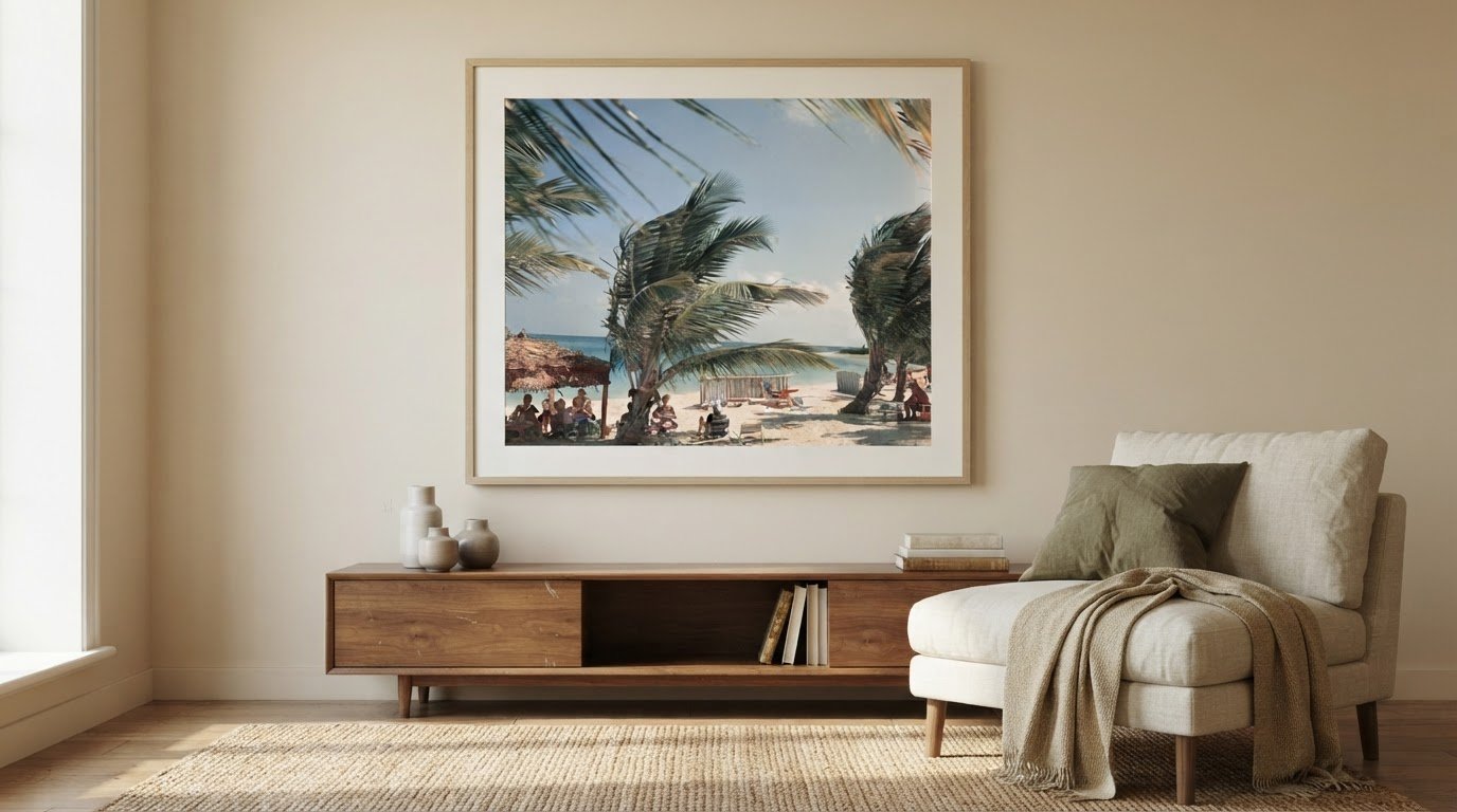
Tag: Black and White Photography

Calming Photography Prints for Home Décor

What if the most calming print isn’t the one with the softest colors, but the one that brings a room into balance? Choosing calming photography prints for the home starts with considering how a photograph’s palette, scale, and subject will sit alongside the furnishings already there. This gives you a practical way to picture the print in your space before deciding where it belongs.

It’s natural to want artwork that feels peaceful without making a room feel impersonal. This guide explores how color, décor, and landscape imagery can help you find that balance, from the quiet simplicity of water to the sheltering quality of a misty scene. You’ll learn what to consider when imagining a print in your space, how to coordinate it with textiles and furnishings, and how a larger photograph can create a focal point that draws the eye gently into the landscape.

Key Takeaways

  • Choose color or black-and-white photography according to the atmosphere and visual balance you want in the room.
  • Use colors in your textiles and furnishings to create a considered connection with the artwork.
  • Explore how water, trees, mist, and waterfalls each bring a distinct quality to a landscape photograph.
  • Consider the print’s scale and placement to shape a focal point that feels at ease within your décor.

Color and black-and-white photo art

Begin with the room’s existing palette, then decide whether the photograph should echo or soften it. Green and blue are often chosen for their calming associations, making a forest scene or quiet seascape a considered choice for a restful space. Muted green foliage can sit comfortably beside natural wood, while blue water may complement pale, cool-toned walls. Look at the photograph’s dominant colors, not just its overall impression. A small area of vivid color can draw more attention than a broad field of gentle tones.

Black-and-white photography offers a different kind of visual calm. Without color, the eye follows tonal contrast, texture, and composition. A misty landscape in gray may feel quieter than a high-contrast image with deep blacks and bright whites. In a room with patterned upholstery or colorful objects, monochrome photography can create a visual pause. In a restrained interior, a strongly contrasted image can instead become the room’s most commanding detail. Consider how the print’s darkest and lightest areas relate to nearby furnishings.

Compare the artwork with the colors already in the room. Picture its palette beside a blue cushion, a green throw, or a cream wall. Similar hues can create continuity; a restrained contrast can give the image definition without overwhelming the setting. A soft blue landscape, for example, may connect with a blue textile, while a black-and-white print can balance a room with several competing colors. Aim for one clear relationship between the photograph and its surroundings.

To narrow your choice, identify the room’s strongest color, such as sage upholstery or a charcoal sofa. Decide whether you want the print to repeat that color, introduce a related tone, or offer monochrome contrast. Then consider the image’s tonal range. A pale photograph may blend into a light wall, while darker details can give it presence. Finally, view the choice alongside the room’s textiles and furnishings. This sequence helps you select photographic art that feels composed rather than disconnected.

Matching artwork with décor

Start with the room’s materials, then consider how a photograph might relate to them. Nature imagery can feel more cohesive when nearby textiles echo its colors. A landscape with mossy greens, for example, may connect with a muted cushion or woven throw. The aim isn’t to match every shade exactly. A shared color note can link artwork and furnishings while allowing each to retain its character.

Look beyond color to the textures shaping the room. A photograph of smooth water may complement linen, glass, or polished wood, while a rugged mountain scene can sit naturally among woven fabrics and tactile ceramics. These pairings create visual relationships between image and setting. If the room already has strong patterns, choose a photograph with a simpler composition. In a quieter interior, a richly layered landscape can introduce detail without requiring more decorative objects.

Placement also affects how artwork relates to furniture. Above a sofa, a horizontal photograph can echo the furniture’s long line; beside a reading chair, a vertical composition may follow the shape of a bookcase or window. Keep the arrangement deliberate. A crowded cluster of objects can compete with a peaceful image, while clear space lets its subject remain legible. In a small room, consider nearby shelves, lamps, and doorways before settling on a position.

To choose calming photography prints for home décor, identify a textile or finish the artwork can relate to, then look for a landscape with a compatible hue or texture. Consider the image’s orientation and nearby furniture. The best calming photography prints for home interiors support the room’s atmosphere without competing with its furnishings. Notice whether surrounding objects frame the photograph or distract from it. A nature image with soft greens, for instance, may feel at home beside woven upholstery and pale wood. Explore photographic prints for considered interiors as you refine the relationship between image, room, and furnishings.

Peaceful landscape imagery and emotional connection

Water offers a particularly quiet subject for photographic art. Wallace J. Nichols, PhD, notes that water simplifies the visual landscape, giving the eye fewer competing details to process. A broad lake, still shoreline, or gently receding tide can create that sense of visual spaciousness. Waves add movement, while their repeated forms can make a seascape feel measured rather than busy. Choose a photograph where the water’s pattern and surrounding detail suit the room’s intended mood.

Trees can suggest shelter, depth, and a connection to the natural world. Viewing tree photographs may reduce stress and support focus for people without easy access to forests. A close study of trunks and leaves offers intricate detail, while a woodland path gives the gaze a clear route through the composition. For a reading corner, consider which image would hold your attention without demanding it. Nature imagery can decrease stress and increase positivity, making the photograph’s particular subject worth considering—much like how creative studios such as Art Therapy explore how artistic engagement contributes to relaxation and everyday well-being.

Mist changes the emotional character of a landscape. Fog can make a scene feel intimate and protected, qualities that may evoke security and peace. A distant hill softened by mist often has less visual urgency than a sharply defined skyline. Waterfalls offer another kind of calm: their sights and sounds are soothing, and their motion is perceived by the brain as non-threatening. In a still photograph, flowing water preserves the impression of movement through cascading lines and pale highlights.

Use the image’s visual rhythm to guide your choice. For a quieter effect, look for a level horizon, gentle tonal shifts, or open space around the main subject. A close crop of rushing water creates more energy than a wide view of a calm bay. Waves produce negative ions that can improve mood, increase alertness, and boost mental energy. Consider whether that livelier association suits the room. Compare the emotional character of trees, fog, and water, then choose the landscape you’d most like to return to.

Photographic prints for home decor

Paper and finish affect how a print looks in a room. Matte surfaces reduce reflections, while glossy ones emphasize contrast and sheen. Fine-art prints can draw attention to tonal detail and the character of the paper. Consider the room’s lighting: a glossy surface near a bright window may catch reflections, while matte artwork can appear more subdued.

A print’s price depends on its dimensions, material, and presentation, including framing. Larger prints use more material, while framing affects the overall purchase. Compare the finished piece rather than size alone, since the frame and print surface influence its presence. Decide what matters most: scale, finish, or frame.

For bedrooms, still water, fog, or a softly lit woodland can suit a restful mood. In living rooms, a broad landscape may establish a focal point, while a close view of leaves can bring nature into a smaller arrangement. The best calming photography prints for home décor suit the room’s scale, light, and intended mood.

In the United States, explore photographic prints through an art gallery’s collection, where image and presentation can be considered together. To choose calming photography prints for home, compare the available artwork with the room’s purpose and the effect you want it to create. A clear visual intention can help narrow the selection.

Preserve a print by keeping it away from direct sunlight, moisture, and abrupt environmental changes. Handle it by the edges with clean, dry hands, and avoid touching the image area. Dust a frame gently with a soft cloth rather than applying cleaner to the print. For example, position a framed landscape away from a sunny window and a damp bathroom wall.

Before choosing, picture the finished work in its intended position. A large, immersive nature print can create a focal point and suggest a view into the landscape. Consider the wall’s available space, nearby furniture, and image orientation together. Browse photographic prints for your home to explore images that could bring this visual balance into your rooms.

Galerie Prints: Terry O’Neill Photography

Galerie Prints offers Terry O’Neill Photography for readers drawn to photographic art with a distinctive cultural presence. Once you’ve considered color, subject, and placement, exploring a photographer’s work can help you find images that suit your room and personal taste. The Slim Aarons Collection, Cinema Lobby Cards, and Star Wars Limited Edition Prints offer other directions, from photographic collections to cinema imagery.

Choose according to the atmosphere you want the artwork to contribute. A print can complement a considered interior or provide a point of contrast within it. Galerie Prints also offers a Bespoke Framing Service, a useful consideration when you want the finished presentation to relate thoughtfully to your décor. For a closer look at the photographic choices, contact Galerie Prints.

Choose a Print That Feels at Home

Let your final choice reflect more than the room’s palette. The photograph you live with can carry a personal association, a remembered place, or a sense of escape that makes the space feel distinctly yours. Before deciding, picture the artwork in its intended setting and consider whether you’ll enjoy seeing it every day. That personal connection can turn a considered piece into part of your home’s story.

For a next step, explore the distinct photographic perspectives in Terry O’Neill Photography and The Slim Aarons Collection, alongside the cinematic character of Cinema Lobby Cards. Each offers a different visual mood to consider as you refine your selection. Galerie Prints brings these collections together to help you explore the atmosphere you want to create.

Contact Galerie Prints for help choosing, and take the next step toward finding a photograph that feels personal to your home.

Frequently Asked Questions

Can I See How a Print Will Look in My Room?

Yes, make a simple paper template to preview the print’s scale and placement. Cut kraft paper to match the intended dimensions, then tape it where you plan to hang the artwork. This helps you judge its relationship to a sofa, doorway, or nearby shelf before choosing. Include the frame’s outer dimensions too, so your preview reflects the finished piece.

How Should I Display The Print?

Place the print where its composition can be appreciated without competing with nearby objects. Above a console, align the artwork with the furniture’s center; in a gallery arrangement, keep spacing visually consistent. Consider the room’s sightlines from the main entrance and seating area. A photograph opposite a favorite chair, for instance, can become a quiet point of focus.

What Photography Print Subjects and Styles Create a Calming Atmosphere at Home?

Choose a subject whose mood suits the room’s purpose. An open shoreline can feel spacious, while a close botanical study offers a more intimate view of nature. In a bedroom, a restrained composition may feel restful; in a living room, a wider scene can invite longer attention. Personal meaning matters too: a landscape reminiscent of a cherished place can make the artwork especially resonant.

Which Colors in Wall Art Are Most Calming for Living Spaces?

Green and blue are often chosen for their calming associations, but the specific shade and balance matter. Muted blue can feel quieter than a highly saturated shade, while soft green may blend gently with natural materials. Consider the wall color and furnishings as well. A small accent of a stronger hue can add definition without making the entire artwork feel visually intense.

What Print Sizes Work Best for Different Rooms and Wall Dimensions?

The right size depends on the available wall area, nearby furniture, and the visual role you want the print to play. Measure the intended space, including room for the frame, then compare that footprint with the furniture below. A narrow wall may suit a vertical composition, while a broad sofa wall can accommodate a wider work. A paper template makes these proportions easier to judge.

How Do I Choose a Frame and Mat for Photography Prints?

Choose a frame that relates to the room’s finishes, such as pale wood near light timber furniture or a dark frame against deeper accents. A mat can create separation between the photograph and frame, especially when the image has delicate details. Keep the overall presentation in proportion to the print and wall. Galerie Prints offers bespoke framing for its prints.
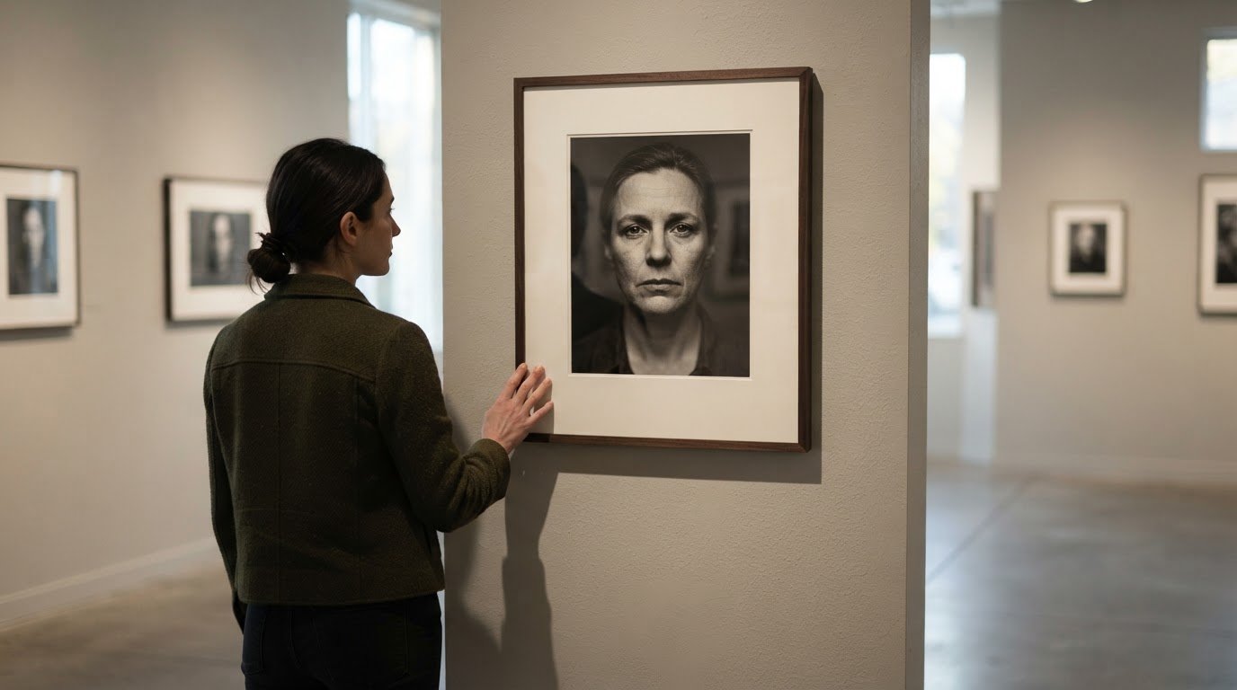
Powerful Black and White Portrait Examples That Reveal Emotion

Color isn’t always what makes a portrait feel alive. Powerful black and white portraits draw the eye to expression, using light, shadow, and tonal contrast to give a glance, a crease, or a moment of stillness emotional weight. When color distracts from or changes an image’s character, monochrome can bring its message into sharper focus.

The absence of color doesn’t diminish a portrait’s feeling; it asks us to notice what remains. A subtle shift in light can soften a face or deepen its mystery, while shadow and texture give the sitter presence. Expression, composition, and carefully shaped contrast combine to create portraits that feel intimate and enduring, explaining why this restrained visual language continues to resonate.

Key Takeaways

  • Look for expression, gesture, and composition to understand how a portrait communicates when color is absent.
  • Notice how contrast, light, shadow, and texture give a monochrome portrait its mood and depth.
  • Explore how influential photographers use distinct approaches to make black-and-white images memorable.
  • Discover photographic art at Galerie Prints, including Terry O’Neill Photography, when you want to bring an expressive image into your space.

Emotion as the focus of black and white portraiture

Color can establish a setting or draw attention to clothing, but it can also compete with a face. In monochrome, expression, gesture, and tonal relationships take center stage. A raised eyebrow, a tightly held jaw, or a downward glance can become the image’s defining moment. The strongest choice is not simply to remove color; it is to choose black and white when color would change the portrait’s character or message.

Consider a portrait made in a room with vivid patterned wallpaper. The setting may pull attention from the sitter’s thoughtful expression. A photographer can simplify the frame, direct light toward the face, and render the scene in monochrome. The result is a clearer emotional focus: the viewer notices the sitter before the pattern. This sequence of situation, action, and result also helps assess a finished portrait. Ask what drew your attention first, what directed it, and whether the image conveys the intended feeling.

Expression is more than a smile or a frown. In a close portrait, the space between a person’s eyes, tension in their hands, and the angle of their shoulders can suggest confidence, weariness, or reserve. A sitter looking just beyond the camera, for example, may seem reflective rather than confrontational. A photographer can preserve that quiet quality by waiting for an unforced moment instead of directing a broad smile. In monochrome, subtle facial changes remain legible without color adding another signal.

Darlene Hildebrandt’s college photography program offers an example of deliberate study: its first year focused on black-and-white photography. Working without color encourages closer attention to how gesture and tonal separation shape meaning. Hildebrandt has also photographed on film and processed it in a darkroom, where the final tonal image emerges through a considered process. Her experience illustrates why monochrome rewards observation at every stage, from noticing a fleeting expression to deciding how the finished image should read.

For a practical portrait exercise, begin by naming one feeling the image should convey, such as calm or uncertainty. Arrange the sitter’s posture and gaze to support that intention, then remove distracting objects from the frame. Review the image for a single point of emotional emphasis. If a bright background or accessory competes with the eyes, adjust the composition or lighting. Each step gives the portrait a clearer visual hierarchy without forcing the sitter into an artificial expression.

A compelling monochrome portrait should retain its emotional force without color. Compare a color rendering with a black-and-white version and consider whether the sitter’s expression, gesture, and surroundings tell the same story. If a dominant color changes the message, monochrome may bring the intended character forward. If color carries essential meaning, removing it may weaken the image. This simple comparison helps distinguish a purposeful artistic choice from a merely decorative effect.

Light, shadow, and depth

In monochrome portraiture, contrast guides the eye through the frame. A bright cheek against a darker background can make a face feel immediate, while evenly lit features may seem gentler. Begin by identifying the portrait’s intended mood, then position the sitter where the light supports it. A narrow beam across the face can suggest tension; broad, soft window light can create a quieter impression.

Consider a sitter standing beside a window on an overcast day. The light is soft, but the face may blend into a pale wall. Turn the sitter slightly toward the window and choose a darker background. This separates the facial tones from the surroundings, giving the portrait clearer structure without dramatic shadows. The result is a more legible expression and a stronger sense of the subject within the frame.

Shadows can describe form rather than conceal it. When a face turns toward a single lamp, the light may define one cheek while the far side falls into shadow. Retain detail in that darker area if the portrait should feel open and contemplative. Let the shadow deepen if the intended mood is more secretive. In either case, watch how the nose, brow, and jaw cast shadows: those shapes guide the eye across the sitter’s features.

Texture also changes a portrait’s character. A weathered coat, knitted scarf, or fine lines around the eyes can become more pronounced under angled light. For example, place a sitter wearing a textured jacket near a side-lit window. The light reveals the fabric’s ridges while the opposite side retains softer detail. The result feels tactile, with tonal variation adding dimension rather than turning the clothing into a flat, dark area.

For a practical study, photograph the same pose beside a window and then farther into the room. Keep the framing consistent and compare how each position changes the face, background, and shadow edges. Try a pale wall behind the sitter, then a darker one. These comparisons reveal how light direction and background tone work together, helping you choose the arrangement that best supports the portrait’s mood.

Which black-and-white portrait photographers are considered influential?

Influence in monochrome portraiture comes from more than a recognizable style. Photographers shape how later artists observe people, compose a frame, and preserve a particular moment. Henri Cartier-Bresson, Mary Ellen Mark, and Sebastião Salgado offer distinct points of reference. Their work also shows how influence crosses genres: documentary, street, and portrait photography all draw meaning from human presence.

Henri Cartier-Bresson discovered photography in 1929 and bought his first Leica in 1931. His practice is often associated with alert observation and carefully timed moments. For a portrait photographer, that example suggests watching for a gesture that feels unposed: a turned head, an interrupted conversation, or a fleeting change in expression. The action is patient observation; the result can be a portrait that feels discovered rather than arranged.

Mary Ellen Mark, born in Philadelphia in 1940, is a significant reference for photographers interested in people and documentary portraiture. Her example invites a different question: what does a portrait reveal about the person’s surroundings as well as their face? A photographer might include a familiar room or meaningful object, then frame the sitter so those details add context without overwhelming their presence. The result can connect individual expression with a wider human story.

Sebastião Salgado’s work offers another perspective on human presence in photography. During a nearly five-decade career, he traveled to more than 120 countries. His Amazonia project took six years to make and involved close work with twelve Indigenous groups. The situation was an extended photographic project; the action was sustained engagement with communities; the result was a body of work shaped by place and people. Portrait makers can take from this the value of attentive, contextual observation.

Daido Moriyama is known for black-and-white portrayals of Japan captured during the 1960s and 70s. His example points toward a less polished visual language, where atmosphere and setting can shape how a person is seen. A photographer studying his approach can consider how grain, contrast, and an unsettled composition affect a sitter’s presence. The result may feel immediate, especially when the surroundings become part of the portrait’s emotional character.

Elliott Erwitt, born in Paris in 1928, spent seven decades creating photographs and joined Magnum in 1953. His long photographic career offers a reminder to look for human character in ordinary encounters. In a portrait session, a small exchange or spontaneous gesture can say more than a formal pose. The photographer’s action is to stay observant; the result is an image with personality rather than mere presentation.

To study these photographers, compare how each frames people, uses surroundings, and handles a decisive moment. Then explore photographic works by influential artists to see how a distinct vision can shape a lasting image.

Galerie Prints

Galerie Prints offers a way to bring photographic art into a considered interior, with works spanning distinctive subjects and visual histories. Explore Terry O’Neill Photography for portraits shaped by the presence and character of their subjects, alongside The Slim Aarons Collection, Cinema Lobby Cards, and Star Wars Limited Edition Prints. These offerings let you consider how an image’s mood, composition, and cultural associations might speak to your space and personal taste. If you’re drawn to the expressive power of portraiture and want to explore photographic works for your home, contact Galerie Prints.

Choose an Image That Resonates Beyond the Frame

A portrait can become part of a room’s atmosphere, inviting a fresh look each time you pass it. When considering powerful black and white portraits, notice which image continues to hold your attention and what its expression or visual character brings to mind. The right choice is personal: it may reflect a mood you want to live with, a fascination with a particular era, or an appreciation for the photographer’s way of seeing.

Galerie Prints offers photographic and cinematic art, including The Slim Aarons Collection, Terry O’Neill Photography, and Cinema Lobby Cards. Each offers a distinct visual language to consider as you shape a collection around your taste and space. Choose an image you want to return to, rather than following a passing trend.

Ready to explore portrait photography for your space? Contact Galerie Prints about portraits, and take the next step toward finding an image that feels distinctly your own.

Frequently Asked Questions

How Do Black and White Portraits Convey Human Expression Without Color?

Monochrome portraits direct attention to facial cues, posture, and the relationship between subject and setting. A patterned outfit might dominate a color image, while its shape and texture become quieter tonal details in black and white. The sitter’s expression can then carry more of the image’s meaning. If a particular color signals identity or mood, however, removing it may change the portrait’s intent.

What Makes a Portrait Truly Artistic?

An artistic portrait brings its choices into agreement: framing, timing, setting, and the sitter’s presence all support a clear visual idea. For instance, a portrait made in a familiar workspace can use tools or personal objects as meaningful context rather than incidental decoration. Pay attention to the frame’s edges, too. A cropped hand or distracting object can change the image’s meaning as much as the sitter’s pose.

What makes a black-and-white portrait powerful or compelling?

A compelling portrait gives viewers something specific to notice while leaving room for interpretation. In a portrait of two people, their distance, shared gaze, or contrasting gestures might suggest intimacy or unease without spelling out a story. The image becomes more affecting when those details feel connected rather than arranged solely for dramatic effect. Consider whether the composition invites a second look after its first impression.

How do lighting and contrast affect black-and-white portrait photography?

Lighting determines which tones separate clearly and which details recede. Strong contrast can make a portrait feel graphic, but overly deep shadows may hide important features. Softer contrast can preserve subtle transitions across skin and clothing, though too little tonal variation may flatten the image. When reviewing a portrait, inspect highlights on the forehead and cheeks alongside darker areas around hair and clothing; both extremes shape the tonal balance.

Where can I find powerful black-and-white portrait examples and inspiration?

Start with the photographers discussed in this article, then compare how each frames a sitter and uses the surrounding space. For a curated photographic reference, explore Terry O’Neill Photography at Galerie Prints; study each image’s composition and how its subject holds your attention. Note the visual qualities you respond to, such as a close crop or an unguarded expression, and use those observations to guide your own taste.

Frame Colour Guide for Black and White Photos

A frame is never just a border; it’s the final, silent dialogue between a monochrome masterpiece and the space it inhabits. Whether you’re curating a private collection or styling a single statement piece, choosing a frame color for black and white photos is the critical step that either liberates the image or anchors it in mediocrity. Many collectors worry that a heavy wood grain might overwhelm delicate greyscale tones or that a stark white finish could “choke” the life out of a classic cinematic scene.

We recognize the importance of achieving a gallery-standard display that honors the technical excellence of your prints. This guide will provide you with the confidence to select a frame that enhances tonal depth and historical resonance while harmonizing with your room’s aesthetic. We’ll explore how specific finishes, from deep charcoals to artisanal wood grains, interact with light and shadow to transform a photographic print into a definitive piece of heritage.

Key Takeaways

  • Learn to identify whether your monochrome print possesses warm or cool undertones to ensure your frame enhances rather than clashes with the photograph’s tonal depth.
  • Master the art of choosing a frame color for black and white photos by understanding how classic black provides a definitive visual stop while gallery white offers essential breathing room.
  • Discover how to pair metallic accents like pewter or brass with specific photographic archives to echo the era’s historical resonance and prestige.
  • Understand why artisanal, museum-quality materials are essential for preserving the integrity of world-renowned collections like Slim Aarons and Terry O’Neill.
  • Gain the confidence to select a bespoke frame profile that serves as a bridge between your photograph’s narrative and your modern interior decor.

The Curatorial Philosophy of Framing Black and White Photography

In the quiet halls of a premier gallery, a frame is never a secondary thought. It serves as a curated threshold, a deliberate window that invites the viewer into the photograph’s unique narrative. While color photography often allows for a playful dialogue with interior accents, black and white imagery demands a more disciplined palette. Every choice must serve the image’s soul, ensuring the frame doesn’t compete with the artist’s intended contrast. The process of choosing a frame color for black and white photos is less about matching your furniture and more about respecting the provenance of the work.

A gallery-standard display relies on the concept of ‘visual weight.’ This psychological effect dictates how the viewer’s eye moves across the composition. A dense, charcoal frame can ground a high-key image, providing a definitive anchor for the eye. Conversely, a lighter profile allows the photograph to expand, creating a sense of infinite space. Unlike domestic decorative styles that prioritize wall color, a curatorial approach focuses on the photograph’s intrinsic needs:

  • Tonal Extension: The frame should feel like a natural continuation of the print’s darkest or lightest values.
  • Architectural Presence: The frame provides the structural integrity necessary to transform a paper print into a sculptural object.
  • Historical Context: The finish should echo the era of the photograph, whether it’s a mid-century Terry O’Neill or a contemporary architectural study.

Defining the Visual Narrative of Your Print

The color of your frame dictates which elements of the image the viewer notices first. A matte black frame often emphasizes the deep shadows and rich blacks of a noir-style portrait, drawing the eye toward the drama of the darks. If you prefer to highlight the delicate textures in the highlights, a soft white or light timber frame can lift those brighter tones, making the entire piece feel more luminous. Monochrome balance is the harmony between frame depth and print contrast.

Bespoke vs. Ready-Made: Why Quality Dictates Colour Perception

The perceived color of a frame changes based on the quality of its materials. A hand-stained timber frame possesses a tactile soul and a depth of hue that mass-produced plastic alternatives simply cannot replicate. In high-end curation, material authenticity is paramount. Using professional archival processing ensures that the tonal subtleties of a silver gelatin print remain vibrant for generations. When you invest in fine art photography, the framing must meet the same museum-quality standards. Choosing a frame color for black and white photos becomes a matter of selecting a finish that matures with the art, rather than a cheap veneer that distracts from the print’s technical excellence.

The Essential Palette: Black, White, and Natural Timber

Selecting the right boundary for a monochrome image is an exercise in sophisticated restraint. The essential palette of black, white, and natural timber remains the gold standard for a reason. While many retailers suggest that black frames work for every scenario, a seasoned curator knows that choosing a frame color for black and white photos requires a more nuanced touch. The goal is to create a visual dialogue that respects the print’s tonal range without overwhelming its subtle greys. For those seeking a broader overview of the technical considerations involved, this Guide to Framing Black and White Photography offers excellent foundational advice on the impact of different finishes.

The Sophistication of the Classic Black Frame

A black frame acts as a definitive ‘stop’ for the eye, containing the energy of the photograph within a crisp, architectural boundary. This choice is particularly effective for the high-contrast, iconic work found in the Terry O’Neill archive. When the frame matches the ‘black point’, which is the deepest, darkest area of the photographic paper, the image gains an immediate sense of depth and authority. Thin black profiles offer a modern, minimalist edge, while thicker, more substantial frames add a sense of historical weight and prestige to the display.

Gallery white frames, by contrast, encourage a ‘breathing room’ effect. This approach allows the photograph to float effortlessly on the wall, making it the preferred choice for contemporary, high-key interiors where the focus is on light and air. It’s an ideal strategy for minimalist compositions that rely on negative space to tell their story.

Natural Woods: Bringing Warmth to Silver Gelatin Tones

While monochrome can sometimes feel clinical, natural timber introduces an organic warmth that softens the display. Woods like oak, walnut, and ash are exceptional companions for black and white pictures that feature natural textures, such as architectural stone or botanical details. The key is to avoid grains that are too aggressive, as they can clash with the fine grain of the photographic film. A hand-stained walnut frame provides a rich, dark brown that complements the warmer, subtle undertones often found in vintage silver gelatin prints.

Beyond the hue, the finish of the wood or paint is vital. A matte finish absorbs light, keeping the focus entirely on the print’s details, whereas a satin finish adds a subtle, prestigious sheen that catches the light without distracting. Gloss finishes should be used sparingly, typically reserved for very modern, high-contrast works that require a bold, reflective statement. Our bespoke framing service ensures that every element, from the wood species to the final finish, is meticulously selected to honor the photographic heritage of your piece.

Metallics and Tonal Accents: Elevating Archival Prints

When choosing a frame color for black and white photos, collectors often overlook the transformative power of metallics. These finishes shouldn’t be dismissed as merely “vintage” or “traditional” accents. Instead, think of silver and pewter as a tonal extension of the silver gelatin process itself. These cool-toned metals harmonize with the metallic sheen inherent in archival prints, creating a seamless visual bridge between the artwork and its boundary. In a gallery setting, metallic frames catch ambient light with a subtle glow, adding a layer of luminosity that can breathe life into a low-contrast, grey-heavy image.

The interaction between metal and monochrome is deeply rooted in the history of the medium. While a black frame provides a definitive border, a metallic profile reflects the environment, making the piece feel more integrated into the room’s atmosphere. This choice is particularly effective for prints that possess a wide range of mid-tone greys, as the metallic luster echoes the delicate highlights found within the grain of the paper.

The Mid-Century Modern Appeal of Metallic Frames

For the aspirational lifestyle captures within the Slim Aarons collection, a slim gold or brass frame adds a touch of Hollywood Regency glamour. This choice isn’t just about decoration; it’s about reinforcing the narrative of high-society elegance. A gold profile provides a warm contrast to monochrome tones, particularly when balanced with the hardware or accents in a modern room. It transforms a simple photograph into a prestigious object of art that feels both historical and contemporary.

Dark Grey and Charcoal: The Understated Sophisticate

While black remains the classic choice, gunmetal and charcoal offer a modern, more versatile alternative. True black can occasionally feel too harsh against soft-focus art or prints with delicate tonal transitions. Charcoal, however, provides a softer “visual stop” that feels more integrated into the composition. This palette is particularly effective in industrial-style interiors where raw materials and muted tones dominate. It offers the authority of a dark frame without the clinical coldness of a pitch-black border.

Using a matte charcoal frame allows for a seamless transition when paired with dark mount boards, creating a sophisticated “box” effect that draws the viewer’s eye deep into the photograph’s center. This approach reinforces our curatorial philosophy: the frame should never compete with the image. By choosing a frame color for black and white photos that leans into these nuanced tonal accents, you ensure your display feels like a bespoke investment rather than an off-the-shelf afterthought. Our London-based production team specializes in these subtle finishes, ensuring every archival print is matched with a profile that respects its unique tonal chemistry.

Matching Frame Colour to Your Print’s Tonal Range

Black and white photography is rarely a simple matter of grey. Every print possesses a ‘tonal temperature’ that dictates its emotional resonance and its relationship with the surrounding decor. Warm monochrome prints, often seen in vintage silver gelatin works, lean toward subtle sepia or cream undertones. Cool prints, common in modern digital archival processes, exhibit a steely, almost bluish crispness. When choosing a frame color for black and white photos, identifying this temperature is the first step toward a harmonious gallery display.

The ‘Rule of Contrast’ serves as your curatorial compass. You must decide whether to match the frame to the print’s dominant tone for a seamless look or oppose it to create a dramatic boundary. If your photograph features a heavy concentration of mid-tone greys, a frame that matches that specific grey can make the artwork feel more expansive. However, a contrasting frame provides the necessary tension to make a minimalist piece stand out. Identifying the dominant grey in your image allows you to select a profile that either recedes into the background or anchors the composition with authority.

High-Contrast Prints vs. Soft Tonal Gradations

Dramatic ‘Noir’ style photography, characterized by deep shadows and piercing highlights, often demands the authority of a high-gloss black profile. This finish echoes the intensity of the blacks within the image, reinforcing the artist’s use of shadow. Conversely, high-key photography with its airy, ethereal quality is best preserved with a gallery white frame that doesn’t ‘choke’ the light. To achieve a classic, professional aesthetic, employ the ‘sandwich technique’ by utilizing a crisp white archival mount board placed between the photograph and a slim black frame. This creates a layered, sophisticated transition that guides the eye inward toward the narrative of the print.

The Interplay of Archival Mount Boards and Frame Colour

The mount board acts as the essential buffer between the art and its casing. It’s important to consider how the white-point of your archival photo paper interacts with the surrounding mat. A brilliant white paper paired with an off-white mount can make the mat appear aged or ‘yellowed’ incorrectly. In these instances, choosing a natural wood frame like ash or light oak can bridge the gap, providing a warm, organic transition that feels intentional rather than accidental.

For a more complex display, a ‘double-mount’ effect using contrasting colours can add a sense of three-dimensional depth and prestige. This technique is particularly effective for small, precious prints that require additional visual weight to command a wall. Our bespoke framing service offers expert consultation to ensure your mount and frame work in perfect unison with your print’s unique tonal chemistry, preserving your investment for decades to come.

The Galerie Prints Bespoke Approach: A Legacy of Quality

At our London studio, framing is regarded as a final, vital act of creation. We don’t view the casing as a mere boundary; it’s a structural testament to the photograph’s provenance. For the serious collector, choosing a frame color for black and white photos is an exercise in heritage preservation. Our artisanal approach ensures that every piece leaves our gallery ready to hang, possessing a professional finish that mirrors the technical brilliance of the world-renowned archives we represent. This level of craftsmanship provides a bridge between the historical significance of the image and the modern elegance of your home.

Our curators possess a deep understanding of the specific requirements of legendary collections. When honoring the Slim Aarons archive, for instance, we select profiles that echo the mid-century glamour and aspirational lifestyle captured in his work. We consider the narrative era of the photograph, ensuring the frame color and texture act as a sympathetic extension of the scene. This curatorial expertise is what separates a gallery-standard display from standard e-commerce offerings.

Museum-Quality Materials for Timeless Preservation

The longevity of your investment depends entirely on the materials that remain invisible to the eye. We utilize acid-free mounts and pH-neutral backing boards to prevent the chemical degradation that often plagues lesser framing options. This commitment to archival standards is a fundamental part of fine art photography ownership. A hand-finished gallery frame offers a tactile soul and a depth of color that mass-produced alternatives cannot replicate. When you run your hand along the grain of our hand-stained timbers, you feel the weight of artisanal tradition.

Professional Guidance for Your Collection

Whether you are acquiring rare lobby cards or commanding large-scale prints, our team provides the expert guidance necessary to navigate the nuances of display. We understand that choosing a frame color for black and white photos can be a daunting investment; therefore, we act as your trusted guide through every tonal decision. Every acquisition is handled with meticulous care, from the initial selection to the final, secure crating for worldwide shipping.

We invite you to explore our bespoke framing service to complete your acquisition with the prestige it deserves. By choosing a professional, London-based production, you aren’t just decorating a wall. You are securing a piece of photographic history for generations to come, ensuring your collection remains as vibrant and evocative as the day it was first captured.

Elevating Your Monochrome Masterpiece

Framing isn’t just a border; it’s the final layer of the artistic process. By analyzing the tonal temperature of your print and selecting a palette that respects its historical provenance, you transform a simple image into a lasting piece of heritage. Whether you opt for the definitive authority of a matte black profile or the organic warmth of hand-stained timber, the process of choosing a frame color for black and white photos should always prioritize the photograph’s intrinsic needs over fleeting interior trends.

Our London-based studio specializes in this delicate balance. We utilize museum-quality archival materials trusted by world-renowned archives to ensure your collection remains pristine for generations. Every frame is hand-crafted with the same artisanal precision found in the original works themselves, providing a bridge to a bygone era of elegance. This commitment to quality ensures your investment is both protected and perfectly presented within your home.

Discover the perfect frame for your collection with our bespoke framing service and ensure your acquisition is presented with the prestige it deserves. Let your walls reflect a shared reverence for beauty, history, and technical excellence.

Frequently Asked Questions

Is a black frame always the best choice for black and white photos?

A black frame is a definitive classic, but it isn’t the universal solution for every monochrome print. For high-key photography where light and airy tones dominate, a stark black border can feel restrictive or “choke” the composition. In these instances, a gallery white frame or a light ash timber provides the necessary breathing room. The choice depends entirely on the photograph’s tonal balance and the emotional atmosphere you wish to evoke.

Should my frame colour match the darkest part of the photo?

Matching the frame to the deepest “black point” of the photographic paper is an excellent way to ground a high-contrast image. This technique creates a definitive visual anchor that draws the viewer’s eye inward. However, for images with a softer tonal range or dominant mid-tone greys, a charcoal or gunmetal finish may be more sophisticated. Choosing a frame color for black and white photos often involves finding a tonal extension rather than a literal match.

Can I use a coloured frame (like blue or red) for monochrome art?

Coloured frames are technically possible but often distract from the intrinsic narrative of a monochrome print. A bold red or blue border risks overwhelming the delicate greyscale transitions that define fine art photography. If you desire a contemporary statement, consider a muted metallic or a deep, hand-stained wood. These options provide a subtle hint of colour while maintaining the curatorial integrity and prestige of the artwork itself.

What is the best frame colour for a vintage silver gelatin print?

Vintage silver gelatin prints often possess a warm, subtle sepia undertone that responds beautifully to natural materials. A hand-stained walnut frame or a muted pewter finish harmonizes with the chemical heritage of the silver gelatin process. These choices avoid the clinical coldness of modern black finishes, instead leaning into the historical resonance of the piece. Our bespoke framing service specializes in selecting profiles that honour the specific archives of legendary photographers.

How do I choose between a matte or glossy frame finish for B&W art?

Matte finishes are generally preferred for archival prints because they absorb light and keep the focus entirely on the photograph’s details. A matte charcoal or black profile provides a sophisticated, understated elegance that suits most gallery-standard displays. Glossy finishes are better reserved for high-contrast, modern works where a bold, reflective statement is required. The finish should always complement the texture of the photographic paper without creating distracting glare.

Does the mount colour need to match the frame colour?

The mount and frame should work in unison, but they rarely need to match in colour. Using a crisp white archival mount board with a slim black frame creates a classic “sandwich” effect that provides essential breathing room for the print. This layered approach adds three-dimensional depth and a sense of prestige to the display. The mount acts as a neutral buffer, ensuring the frame doesn’t compete directly with the artwork’s tonal range.

What frame colour makes a small black and white photo look larger?

A gallery white frame paired with an oversized mount is the most effective way to make a small photograph command a larger space. This technique utilizes negative space to expand the visual footprint of the artwork, giving it the prestige of a much larger piece. Choosing a frame color for black and white photos that matches the wall colour can also create a seamless, expansive effect that allows the image to float effortlessly.

Should I match my frame colour to my room’s furniture or the art?

You should always prioritize the needs of the artwork over the room’s furniture. A frame is a curated window into the photograph’s narrative, and its primary role is to enhance the print’s tonal depth. While a walnut frame might happen to match your desk, its first duty is to harmonize with the warm tones of the photograph. A well-framed piece of art possesses a permanence that outlasts changing interior trends and furniture arrangements.

Herb Ritts: The Sculptural Visionary of Modern Fine Art Photography

Herb Ritts didn’t merely photograph the icons of his age; he harnessed the harsh California sun to translate the language of classical Greek sculpture into the permanent medium of film. While much of contemporary fashion photography feels fleeting and derivative, the work of herb ritts possesses a singular, architectural weight that demands a place in the world’s most prestigious collections. You likely recognize the tension between commercial success and artistic depth, often finding it difficult to distinguish a simple celebrity portrait from a museum-grade masterpiece that anchors a room.

This article offers a deep immersion into the Ritts legacy, revealing how he transformed the human physique into a landscape of light and shadow. You’ll discover how he elevated the medium into timeless art and why his prints remain a cornerstone for fine art photography collectors today. We’ll explore the technical mastery behind his iconic gelatin silver prints and provide the curatorial context necessary to understand his enduring market value, evidenced by recent high-profile auction sales. From the sculptural “Wrapped Torso” to his intimate portraiture, you’ll gain the insight needed to curate a home gallery that reflects a sophisticated, worldly perspective on photographic heritage.

Key Takeaways

  • Understand how the legendary “California Aesthetic” redefined monochrome photography by treating the human form as a graceful, sculptural element.
  • Discover why the work of herb ritts remains a blue-chip investment for discerning collectors, especially those seeking to capture the prestige of a pre-digital Hollywood era.
  • Learn how to anchor a minimalist interior using large-scale black and white prints that provide both architectural weight and a sense of timeless elegance.
  • Explore the artist’s transition from commercial heritage to fine art mastery, including his evocative ethnographic studies that expanded his legacy beyond celebrity portraiture.
  • Recognize the technical precision of high-contrast printing and the importance of artisanal framing in preserving the historical authenticity of your photographic collection.

Herb Ritts: The Visionary Who Sculpted with Light and Shadow

Herb Ritts didn’t merely capture images; he carved them out of the intense brightness of the West Coast. As a master of the “California Aesthetic,” he redefined monochrome photography by treating the human form with the same reverence a Renaissance sculptor might show a block of Carrara marble. While his work rose to prominence during the 1980s and 90s, it transcends the neon-soaked artifice of that era. Instead, his photographs possess a timeless, architectural weight that feels as relevant in a contemporary minimalist gallery as it did on the pages of Vogue thirty years ago.

His journey into the pantheon of great artists began quite by accident in 1978. During a casual road trip, a flat tyre forced Ritts and his then-unknown friend, Richard Gere, into a desert gas station. Ritts took a few candid shots of Gere in a simple white vest, leaning against a car with a cigarette between his lips. These images didn’t just launch Gere’s career; they revealed Ritts’s innate ability to find heroic beauty in the mundane. A deeper exploration of Herb Ritts’s life and career reveals how this serendipitous moment evolved into a disciplined pursuit of museum-grade fine art, eventually bridging the gap between high-fashion commerce and the permanent collections of institutions like the Getty Museum.

The California Influence: Light as a Medium

The harsh, unforgiving Los Angeles sun was Ritts’s primary tool. While his contemporaries often relied on the controlled, artificial environments of New York studios, Ritts sought the high-contrast brilliance of the outdoors. He frequently utilised the El Mirage salt flats, where the vast, white expanse served as a minimalist canvas that pushed his subjects into sharp relief. By rejecting the artificiality of the flash in favour of his “natural studio” lighting, Ritts stripped away the artifice of the era to reveal something primal and enduring. This technique created the deep, velvety blacks and brilliant, tactile whites that define the herb ritts aesthetic.

Breaking the Fashion Mould

Ritts was a central figure in the “Supermodel” era, yet his approach differed fundamentally from his peers. He viewed muses like Cindy Crawford, Naomi Campbell, and Stephanie Seymour not merely as clothes horses, but as artistic collaborators. He didn’t shoot dresses; he shot the architecture of the human spine and the rhythmic lines of the body. This distinction is vital for collectors to understand:

  • Focus on Form: He often draped his subjects in simple fabrics or sand, ensuring the garment never distracted from the anatomical silhouette.
  • Artistic Study vs. Fashion Shoot: His images are less about a specific season’s trends and more about the universal language of physical grace.
  • Legacy of the Muse: He transformed the supermodel from a commercial face into a sculptural icon of modern fine art.

The Anatomy of Style: Defining the Ritts Aesthetic

His technique drew heavily from the balanced proportions of Greek and Roman antiquity. Throughout Herb Ritts’s photographic career, he consistently applied classical posing techniques to modern icons. A prime example is the 1990 “Versace Dress, Back View,” where the cascading fabric and the curve of the model’s spine echo the drapery of a Hellenistic marble. This focus on form over fashion is why his work avoids the dated feel of “trendy” photography. It isn’t about the season; it’s about the timeless dialogue between light and anatomy.

The Power of the Monochrome Print

Monochrome was the primary dialect for Ritts. He understood that by removing colour, he could force the viewer to confront the purity of shape and the nuance of texture. His prints are celebrated for their technical mastery of tonal range, featuring deep, velvety blacks and brilliant, crystalline whites. This high-contrast approach creates a palpable sense of depth, highlighting the juxtaposition of varied textures within a single frame:

  • Skin: Captured with a tactile warmth that suggests the radiant heat of the California sun.
  • Water: Often frozen into crystalline droplets that accentuate the muscular curve of a limb.
  • Stone and Sand: Used as rigid, elemental counterpoints to the organic softness of the human form.

For those looking to bring this level of artistic gravity into their own home, exploring archival photography collections can provide the perfect anchor for a sophisticated interior. This technical excellence is what distinguishes the commercial assignments of herb ritts from his fine art legacy, ensuring that each print carries the weight of a curated museum piece rather than a fleeting advertisement.

Beyond the Supermodel: Ritts as a Master of Fine Art

A common misconception in the art world suggests that work commissioned for a magazine or a brand cannot possess the soul of fine art. Ritts dismantled this hierarchy with every shutter click. While his contemporaries often changed their visual language to suit a client’s brief, Ritts remained uncompromising. Whether he was shooting a high-budget campaign for Gap or an editorial for Vanity Fair, his signature sculptural aesthetic remained the dominant force. This consistency transformed him into more than a photographer; he became a singular auteur whose vision was sought after specifically for its artistic weight rather than its mere commercial utility.

His departure from the glitz of Hollywood is perhaps best exemplified by his “Africa” series. In these works, he moved away from the familiar faces of the supermodel era to capture the ethnographic beauty and raw landscapes of East Africa. These images, stripped of celebrity context, highlight his fundamental obsession with form, light, and the human condition. It is this depth of vision that has secured his place in the permanent collections of the world’s most prestigious institutions. For instance, the significant retrospective of Herb Ritts at the Museum of Fine Arts, Boston, solidified his status as a pillar of modern photography, bridging the gap between the newsstand and the gallery wall.

Artistic Intent vs. Commercial Brief

Collectors today don’t just look for the published covers; they seek the outtakes and the personal studies that reveal Ritts’s unedited process. During the late 20th century, he pioneered the concept of the photographer as a brand with a distinct, unshakeable identity. His ability to maintain a museum-grade standard across all mediums means that a print originally intended for a Versace advertisement now commands thousands at auction. Recent market data supports this enduring appeal. In April 2026, a signed print of “Kate Moss 2, Malibu” realized a price of $13,970 at Christie’s, while “Wrapped Torso, Los Angeles” fetched $16,510 at Swann in October 2025. These figures demonstrate that the secondary market views herb ritts not as a fashion photographer, but as a blue-chip artist whose work holds significant historical value.

The Legacy of the Herb Ritts Foundation

The long-term value of any photographic investment relies heavily on provenance and the preservation of the artist’s intent. Established after his passing in 2002, the Herb Ritts Foundation plays a critical role in managing his vast archives and ensuring that every estate-authorized print meets his exacting standards for tonal range and paper quality. The foundation acts as a guardian of his heritage, working with elite institutions and world-renowned archives to maintain a controlled, high-end presence in the art market. The foundation’s rigorous curation and commitment to philanthropic causes maintain his market prestige while ensuring his sculptural vision remains accessible to future generations of collectors. For those looking to invest in this era of elegance, herb ritts remains a cornerstone of any serious photographic collection.

Curating Your Space: The Impact of Large-Scale Monochrome

Integrating a work by herb ritts into a modern interior requires a nuanced understanding of space and light. His high-contrast, sculptural style acts as a powerful anchor for minimalist environments, providing an architectural focal point that grounds the room. Unlike smaller, busy compositions, a large-scale Ritts print possesses the gravity of a physical sculpture, demanding a position of prominence, such as above a fireplace or centered in a grand hallway. This sense of permanence is what distinguishes a curated fine art collection from mere wall decoration.

Designing with High Contrast

The boldness of deep blacks and radiant whites can overwhelm a space if not balanced correctly. Pairing these prints with neutral palettes, such as soft greys, creams, or natural woods, allows the artwork to breathe and maintain its visual impact. Scale is paramount here. Large-format prints emphasize the grain and the anatomical precision of the subject, making the image feel like a permanent fixture rather than a decorative afterthought. Because these are significant investments, protecting them with museum-grade glass and archival mounting is essential to prevent degradation from natural UV light.

The Gallery Wall: A Curated Dialogue

A sophisticated home gallery often thrives on the dialogue between different artists. You might consider pairing the sculptural stillness of herb ritts with the candid, narrative energy found in Terry O’Neill photography. This juxtaposition creates a “90s Icon” wall that captures both the glamour and the humanity of a bygone era. For more detailed advice on arranging your collection, consult our guide on The Timeless Allure of Black and White Pictures, which explores the technical and aesthetic considerations of displaying monochrome art.

The final layer of curation is the choice of frame. A bespoke frame doesn’t just hold the print; it elevates it to museum-grade status. The frame acts as a bridge between the artwork’s historical authenticity and your home’s contemporary aesthetic. Whether you prefer a slim, modern black profile or a more substantial hand-finished wood, the craftsmanship must match the prestige of the artist. To ensure your collection is ready-to-hang and perfectly preserved, take advantage of our bespoke framing service, designed specifically for high-end archival photography.

Investing in Heritage: Why Herb Ritts Remains Essential

The acquisition of a print by herb ritts is an act of preservation. His work represents a definitive, unrepeatable chapter in the history of visual culture, capturing a pre-digital era of Hollywood glamour that relied on physical presence rather than post-production manipulation. In a world saturated with fleeting digital imagery, these photographs offer a tangible connection to a period of high elegance. Collectors view his portfolio as a series of “blue-chip” assets; the market stability is evidenced by a consistent volume of sales, with 26 works changing hands at auction in the last 12 months alone. This sustained demand confirms that Ritts is not merely a figure of nostalgia but a foundational pillar of the modern masters movement.

At Galerie Prints, we position ourselves as the bridge to this bygone era. We don’t view these images as simple decorations. Each piece is a fragment of photographic heritage, requiring a level of curatorial care that honors the artist’s original intent. By sourcing from the most prestigious archives, we ensure that the sculptural weight and tonal depth Ritts worked so hard to achieve are perfectly preserved for the modern home.

The Artisanal Touch in Modern Printing

Completing the Collection

A sophisticated gallery space often finds its voice through the interaction of different perspectives on glamour. While Ritts provides the architectural and sculptural foundation, you might choose to contrast his stark monochrome with the vibrant, aspirational world of Slim Aarons. Alternatively, those captivated by the cinematic roots of Ritts’s style will find a natural companion in our collection of Cinema Lobby Cards, which document the evolution of Hollywood’s photographic identity.

Ultimately, a Ritts print is a statement of permanence. It reflects a discerning eye that values technical mastery and historical authenticity over temporary trends. We invite you to explore the full Galerie Prints collection to find the iconic imagery that will anchor your personal gallery for generations to come.

Securing a Legacy of Sculptural Elegance

Galerie Prints acts as a bridge to this bygone era of elegance, providing access to world-renowned archives like Getty Images and Terry O’Neill. We ensure the integrity of every museum-quality print through our hand-crafted, bespoke framing service, designed to preserve the tonal depth of iconic monochrome works. With our reliable worldwide shipping, you can begin building a gallery that reflects a worldly perspective on photographic heritage and artisanal craftsmanship.

Explore our curated collection of iconic Fine Art Photography and Bespoke Framing to find the piece that will define your space for years to come.

Frequently Asked Questions

What is Herb Ritts’ most famous photograph?

The 1989 photograph titled “Stephanie, Cindy, Christie, Tatjana, Naomi, Hollywood” is arguably the most recognized work by herb ritts. This iconic image, featuring the era’s top supermodels in a sculptural embrace, perfectly encapsulates his ability to blend high fashion with the permanence of classical art. While his early portrait of Richard Gere is legendary for its raw energy, the “Supermodels” shot remains the definitive symbol of his influence on 20th-century visual culture.

Did Herb Ritts only take black and white photos?

Although monochrome was his signature dialect, Ritts did not work exclusively in black and white. He produced a significant body of color work for high-end editorial clients such as Vogue and Vanity Fair throughout the 1980s and 90s. However, his fine art legacy is almost entirely defined by his high-contrast monochrome prints. The removal of color allowed him to emphasize the architectural lines and physical textures that collectors value most today.

Why is Herb Ritts considered a ‘sculptural’ photographer?

Ritts is considered a sculptural photographer because he treated the human body as an architectural silhouette rather than a mere portrait subject. He utilized the intense California sun to create sharp highlights and deep shadows that carved out the physical dimensions of his muses. By posing his subjects in ways that mimicked classical Greek and Roman statuary, he elevated the medium of photography into a permanent study of anatomical grace and structural weight.

How can I tell if a Herb Ritts print is a high-quality reproduction?

Discerning collectors should examine the tonal range and paper quality to distinguish a museum-grade print from a standard reproduction. High-quality prints feature deep, velvety blacks and crisp whites without losing detail in the shadows. It is also essential to verify the source and provenance. Galerie Prints sources from prestigious archives to ensure that every herb ritts print maintains the historical authenticity and technical excellence required for a professional fine art collection.

What celebrities did Herb Ritts work with most frequently?

Ritts maintained long-standing creative partnerships with some of the most significant cultural icons of his time. He worked extensively with Madonna, directing her “Cherish” music video and shooting several of her most famous album covers. Other frequent collaborators included Richard Gere, Naomi Campbell, and Cindy Crawford. His ability to transform these world-famous faces into timeless, sculptural icons is a testament to his unique vision and his status as a trusted guardian of Hollywood’s photographic heritage.

How should I frame a large-scale black and white photography print?

Large-scale monochrome prints require a frame that complements their architectural weight without distracting from the imagery. We recommend using museum-grade glass to protect the archival paper from UV damage and unwanted reflections. A minimalist, hand-crafted wood frame in black or dark charcoal often provides the best anchor for high-contrast photography. Galerie Prints offers a bespoke framing service that ensures your piece is professionally mounted and ready to hang, providing a polished look for any sophisticated interior.

Are Herb Ritts’ music videos considered part of his artistic legacy?

Herb Ritts’ music videos are an integral part of his artistic legacy, as they translated his sculptural still-photography style into moving images. His direction of Madonna’s “Cherish” and Chris Isaak’s “Wicked Game” utilized the same high-contrast, beach-focused aesthetic that defined his fine art prints. These videos are often studied alongside his photography for their innovative use of natural light and their role in shaping the sophisticated visual identity of the late 20th century.

What is the difference between an archival print and a standard poster?

The primary difference lies in the materials and the intended lifespan of the piece. Standard posters are typically printed on thin, acidic paper that yellows and fades over time. In contrast, an archival print uses premium, acid-free paper designed to preserve the integrity of the image for decades. Galerie Prints focuses on museum-quality archival materials, ensuring that the deep blacks and subtle gradients of a master’s work remain as vivid as the day they were produced.

Weegee: The Master of New York’s Noir Street Photography

While most photographers of the 1940s sought beauty in the light, Arthur Fellig, the man known as Weegee, found his masterpiece in the flash-scorched shadows of a New York crime scene. He didn’t just document the city; he exposed its raw, unscripted theatre through a lens that felt both intrusive and deeply human. Today, the transition from the frantic pace of the daily tabloid to the quiet prestige of collectible photographic prints marks a profound shift in how we value these moments of urban history.

You likely recognize the grit and the high-contrast drama of his work, yet it’s often challenging to distinguish between mere sensationalism and the technical mastery required to capture the night. This article explores the cultural impact of Weegee’s nocturnal world, offering a deep understanding of why his work remains a cornerstone of photographic heritage. We’ll examine the artistry behind his most famous shots, provide inspiration for displaying these historic black and white prints in a modern space, and discuss the enduring investment value of an archive that continues to captivate the global art market in 2026.

Key Takeaways

  • Uncover the myth of Arthur Fellig, the self-taught photographer whose uncanny ability to arrive first at crime scenes earned him the moniker “Weegee” and defined a new era of urban realism.
  • Explore the “Naked City” aesthetic, a high-contrast noir style that elevated the grit of mid-century New York into a sophisticated and evocative form of visual storytelling.
  • Gain insight into the technical precision of the 4×5 Speed Graphic camera and the innovative use of the flashbulb to create a stark, theatrical light in the dead of night.
  • Discover the curatorial process of selecting Getty Images Gallery prints to ensure your collection reflects the authentic heritage of Weegee’s most iconic New York moments.
  • Understand how museum-grade archival paper and bespoke framing serve as the essential bridge between historical tabloid imagery and contemporary fine art.

Who was Weegee? The Legend of Arthur Fellig

Arthur Fellig wasn’t just a photographer; he was a carefully constructed persona that blurred the line between newsman and artist. Born in 1899 in what is now Ukraine, he arrived in New York as a child, eventually finding his calling in the city’s frantic press rooms. By the 1930s, he had carved out a niche that no one else could touch. He was the only freelance press photographer granted permission to install a police radio in his car, essentially turning his Chevrolet into a mobile darkroom and office. This allowed him to arrive at fires, accidents, and crime scenes often before the authorities themselves, capturing the raw, bleeding edges of the city. He didn’t just witness the news; he lived within the heartbeat of the precinct, positioning himself as a guardian of the city’s most visceral moments.

The Origins of a Pseudonym

The name “Weegee” is inseparable from the myth he cultivated throughout his career. It’s widely believed to be a phonetic rendering of “Ouija,” a nod to his seemingly psychic ability to sense a story before it broke. While he leaned into this supernatural reputation, it was also a brilliant exercise in branding. In the cutthroat world of mid-century New York tabloids, he ensured his credit line was as recognizable as the imagery itself. A detailed look at Weegee’s life and career reveals a man who understood that in a city of millions, one had to become a legend to be remembered. His self-stamped “Weegee the Famous” on the back of his work wasn’t just arrogance; it was a declaration of his status as a master of the urban narrative.

The Lower East Side Context

While his crime shots brought him notoriety, his most enduring work often centered on the quiet, desperate humanity of the Lower East Side. The Bowery was his primary canvas. He captured the immigrant experience not with the detached eye of a social scientist, but with the lived empathy of someone who knew those streets intimately. He photographed families sleeping on fire escapes during heatwaves and the weary faces of late-night diners. These images, now available as prestigious Getty Images Gallery prints, serve as a bridge to a vanished era of New York history. They transform the gritty reality of 1940s poverty into a profound artistic statement that resonates with modern collectors. Today, those seeking to invest in photographic heritage often turn to Getty Images Gallery prints of his work to preserve that unpolished energy within a sophisticated, gallery-ready context. This shift from the sidewalk to the gallery wall recognized that Weegee had captured something essential about the human condition that transcended the morning edition.

The ‘Naked City’ Aesthetic: Grit as High Art

Weegee’s visual language was defined by a brutal, high-contrast clarity that transformed the mundane into the monumental. With the 1945 publication of his seminal book, Naked City, he shifted the cultural needle, proving that the flash-blasted reality of a midnight tenement fire could hold the same weight as a classical portrait. His work wasn’t merely reporting; it was a psychological excavation of urban life. By capturing the city in its most vulnerable states, he invited a voyeuristic gaze that forced viewers to confront the raw, unpolished truth of their own environment. This approach raised enduring questions about the ethics of the urban eye, yet it was this very intrusion that allowed him to document the soul of New York with such haunting precision.

The Cinematic Influence of Noir

The interplay of light and shadow in Weegee’s work directly informed the visual vocabulary of 1940s Hollywood. His signature style, characterized by stark white highlights against ink-black backgrounds, mirrored the burgeoning Film Noir genre. Directors and cinematographers looked to his images of wet pavements and rain-slicked alleys to find the authentic “noir” look. This wasn’t a coincidence; the heavy-duty flash bulbs he utilized created a theatrical artificiality that turned every street corner into a stage. Later in his career, he moved to Hollywood, serving as a consultant and even an actor, ensuring that the fictional grit of the silver screen matched the reality he had documented on the streets of New York. Collectors who acquire Getty Images Gallery prints of these works often find they possess a cinematic quality that anchors a room with dramatic, narrative weight.

Beyond the Crime Scene

While the sirens and strobe lights of the precinct were his primary focus, Weegee’s lens was equally fascinated by the “human menagerie” of the city’s private moments. He photographed lovers entwined in the back rows of movie theaters and crowds of thousands at Coney Island, treating each subject with a mixture of curiosity and profound empathy. These images capture the vulnerability of the sleeper and the uninhibited joy of the beachgoer, moving beyond the sensational to the sociological. By turning his camera away from the tragedy to face the onlookers, Weegee effectively immortalized the voyeuristic pulse of the city, documenting the spectator’s face as the true mirror of the event.

If you’re looking to bring this historic intensity into your own collection, exploring our curated selection of Getty Images Gallery prints offers a direct link to this era of unparalleled visual drama.

Technical Mastery: The Speed Graphic and the Flash

Weegee’s haunting aesthetic wasn’t merely a byproduct of chance; it was the result of a deliberate, heavy-duty technical setup that allowed him to conquer the night. His primary instrument was the 4×5 Speed Graphic, a formidable piece of engineering that became the standard for press photographers of the era. This camera was a box of wood and metal, built to withstand the chaotic energy of the New York streets. In the 1930s, capturing sharp motion in low-light conditions was an immense technical challenge, as film speeds were slow and lenses lacked the sophisticated coatings of modern optics. Weegee bypassed these limitations through a masterful, if brutal, use of the flashbulb, creating a signature look that defined an entire era of noir photography.

The ‘F/8 and Be There’ Philosophy

The stark, startling depth found in his work is a direct result of his technical discipline. Weegee famously adhered to the “f/8 and be there” mantra, setting his aperture to a mid-range f/8 and pre-focusing his lens to a fixed distance of ten feet. This approach removed the need for fine adjustments at a crime scene, allowing him to fire his shutter the moment he arrived. The powerful flashbulbs he used acted as a miniature sun, blasting the immediate foreground with light while the background dissolved into an inky, impenetrable black. This created a flat, theatrical perspective that made his subjects pop with an almost three-dimensional intensity, a quality that remains a hallmark of authentic Getty Images Gallery prints today.

The Artisanal Darkroom Process

Speed was Weegee’s primary currency, and to maintain his edge, he transformed the trunk of his Chevrolet into a mobile darkroom. This “trunk-lab” allowed him to develop negatives and produce wet prints while still on the scene, ensuring he was the first to deliver imagery to the tabloid editors. This rushed, artisanal process often introduced a specific chemical grit and texture to the negatives, a tactile history that is meticulously preserved in modern reproductions. When collectors invest in Getty Images Gallery prints, they aren’t just buying an image; they’re acquiring a piece of history that respects the original grain and the volatile conditions of its creation.

  • The 4×5 Speed Graphic provided a large negative size, ensuring high resolution even in grainy conditions.
  • Single-use flashbulbs were essential for freezing action in the dead of night.
  • Mobile development allowed for an immediate bridge between the street and the printing press.

Modern museum-quality archival paper ensures that the raw, unpolished energy of his “trunk-lab” development is translated into a stable, lasting piece of art for the contemporary interior.

Iconic Works: From Tenement Fires to Coney Island

Weegee’s portfolio represents a relentless pursuit of the city’s many faces, moving far beyond the blood-stained sidewalks of the morning edition. His most celebrated work, The Critic (1943), serves as a masterclass in social juxtaposition. In this frame, two socialites, dripping in diamonds and fur, are confronted by a disheveled onlooker outside the Metropolitan Opera House. It’s a biting commentary on the chasm between New York’s elite and its marginalized citizens. Similarly, his 1940 photograph of Coney Island captures a literal sea of humanity, where nearly a million beachgoers merge into a single, pulsating organism of summer relief. These images are now preserved as high-fidelity Getty Images Gallery prints, allowing collectors to own a piece of this vanished social landscape.

Social Commentary through the Lens

Weegee possessed a rare ability to capture raw emotion during moments of extreme duress, particularly in his coverage of tenement fires. Rather than focusing on the flames, he turned his lens toward the faces of the displaced, recording a level of empathy that transcends mere sensationalism. His Opening Night at the Opera series further explored these class tensions, documenting the performative nature of wealth with a discerning, often cynical eye. This focus on the human condition is part of The Timeless Allure of Black and White Pictures, where the absence of color forces the viewer to engage directly with the narrative weight of the scene. He didn’t just take pictures; he curated the soul of the street.

The Architecture of the Night

In Weegee’s world, the city itself became a living character, a labyrinth of shadows and steel. He used his flash to isolate subjects against the vast urban dark, creating a sense of isolation even in a city of millions. Whether it was a lone drunkard on a Bowery stoop or the silhouette of a fire escape against a charcoal sky, his work provides a definitive historical record of mid-century New York. For those building serious Fine Art Photography collections, his architectural studies offer a bridge between street reportage and formalist composition. Every shadow tells a story of a city that was as brutal as it was beautiful.

The enduring power of these Getty Images Gallery prints lies in their ability to make the past feel startlingly present. You can explore our full archive and acquire your own museum-quality Weegee print to anchor your home with a piece of photographic history.

A Collector’s Guide: Displaying Weegee in a Modern Space

Weegee’s photography possesses a rare, raw magnetism that transforms a room. While his subjects were often found in the darkest corners of the city, the resulting Getty Images Gallery prints are now recognized as sophisticated additions to high-end residential and commercial spaces. The transition from a 1940s tabloid “press shot” to a contemporary focal point is achieved through a meticulous curatorial process. By utilizing museum-quality archival paper, these historic archives are elevated into permanent works of art that command attention without overwhelming a modern aesthetic. It’s a deliberate choice for the collector who values narrative depth alongside visual impact.

The Power of Black and White

The inherent versatility of monochrome art allows Weegee’s work to integrate seamlessly into a wide variety of contemporary color palettes. Whether placed within a minimalist setting or a warm mid-century modern environment, the high-contrast drama of his noir style provides a necessary visual anchor. A single, large-scale print can serve as a bold conversation piece, while a curated gallery wall of street photography creates a compelling narrative of urban history. A deep black frame effectively anchors the startlingly high-contrast whites of a Weegee print, providing a sophisticated bridge between the grit of the subject matter and the elegance of a curated interior. This balance ensures the work feels like a timeless heirloom rather than a historical relic.

Investing in Photographic Heritage

Investing in physical Getty Images Gallery prints offers a tactile connection to history that digital imagery simply cannot replicate. There is a palpable sense of permanence in the texture of a premium print, reminding the collector of the artisanal craftsmanship required to preserve these original source materials. As market activity in 2026 demonstrates a continued appreciation for Weegee’s critique of the “spectacle,” owning a piece of his archive is as much a cultural investment as it is an aesthetic one. Our bespoke framing service ensures that every piece is protected and presented with the quiet authority it deserves, bridging the gap between the sidewalk and the gallery. To find your next acquisition, explore our curated Fine Art Photography Gallery London for more iconic masters who defined the visual language of the 20th century.

Preserving the Pulse of the Naked City

Arthur Fellig’s journey from the frantic sidewalks of the Lower East Side to the hallowed walls of international galleries is a testament to the enduring power of raw, unscripted truth. By mastering the stark geometry of the night, he created a visual language that continues to influence the worlds of film and fine art. Today, acquiring Getty Images Gallery prints of his most iconic works allows you to bring that visceral energy into your own home, bridging the gap between historical grit and contemporary elegance. These images don’t just document the past; they invite you to experience the city’s soul in its most vulnerable state.

We invite you to Browse our curated collection of Iconic Fine Art Photography to find the perfect piece for your collection. Every acquisition features museum-quality archival giclée prints, supported by our hand-crafted bespoke framing in London. With worldwide shipping on all fine art photography, you can invest in a lasting piece of history that remains as provocative today as it was in the 1940s. Start your journey into the noir world of Weegee and let his legendary lens define your space.

Frequently Asked Questions

What camera did Weegee use for his famous night shots?

Weegee relied on the 4×5 Speed Graphic, a robust press camera that defined mid-century reportage. Its large negative format allowed for exceptional detail even when pushed in the darkroom. He paired this with a high-intensity flashbulb, creating the stark, high-contrast look that characterizes his archive. This combination was essential for freezing motion on the chaotic streets of New York, ensuring every face in the crowd was rendered with startling clarity.

Why is Weegee’s work considered fine art rather than just news?

While his work began as tabloid reportage, it’s considered fine art because of its profound psychological depth and masterful composition. He didn’t just capture events; he captured the human reaction to them. His use of light and shadow anticipated the Film Noir movement, elevating his imagery into a realm of deliberate artistic expression. Today, collectors value these works as masterpieces of the urban soul, transcending their original purpose as morning news.

Where can I buy authentic Getty Images Gallery prints by Weegee?

You can acquire authentic Weegee works through Galerie Prints, which provides direct access to the prestigious archive of Getty Images Gallery prints. We specialize in transforming these historic negatives into gallery-ready art using museum-quality archival paper. Each piece is treated as a lasting piece of history, ensuring that the raw energy of the original shot is preserved for a sophisticated modern interior. We provide global shipping and a bespoke framing service in London.

What does the name ‘Weegee’ actually mean?

The name’s a phonetic spelling of “Ouija,” referring to the popular board used for summoning spirits. It was a nickname given to him by fellow photographers who were amazed by his uncanny ability to arrive at crime scenes before the police. Arthur Fellig embraced this persona, often stamping his work “Weegee the Famous.” It became a powerful brand that suggested he possessed a supernatural sense for the city’s next big story.

Is Weegee’s photography still relevant to modern street photographers?

Modern street photographers continue to study his work for its unflinching narrative and bold technical execution. His pioneering use of off-camera flash to isolate subjects in the urban dark remains a cornerstone of the genre. He taught photographers that the story’s often found in the reaction of the crowd rather than the event itself. His influence is visible in any contemporary work that prioritizes raw, unscripted human emotion over polished perfection.

How should I frame a high-contrast black and white photography print?

High-contrast black and white photography is best served by a frame that anchors its dramatic tones without distraction. A slim, matte black wooden frame is a classic choice that complements the deep blacks of a Weegee print. We recommend using acid-free mounting and museum-quality archival paper to protect the image over time. Our bespoke framing service in London specializes in creating these elegant borders, ensuring your Getty Images Gallery prints are preserved in a gallery-ready format.

What is the ‘Naked City’ in the context of Weegee’s work?

The “Naked City” refers to the title of Weegee’s landmark 1945 book, which served as a definitive visual survey of New York’s nocturnal life. It stripped away the city’s polished facade to reveal the raw, unvarnished reality of its inhabitants. The term eventually became synonymous with the gritty, noir aesthetic he championed. It remains a vital cultural reference point, describing a city that’s exposed, vulnerable, and endlessly fascinating under the glare of a flashbulb.

Did Weegee really have a police radio in his car?

Yes, he was the first freelance photographer in New York to be granted a permit for a police radio. This allowed him to monitor emergency frequencies directly from his car, which he famously equipped as a mobile office and darkroom. By staying tuned to the city’s heartbeat, he could often beat the authorities to the scene. This technical advantage was the secret behind his prolific output and his reputation for being everywhere at once; today, that same spirit of constant vigilance is maintained through high-definition equipment from CCTVSecurityPros – Professional Security Cameras and Systems.

The Art of Black and White Photography: A Collector’s Guide to Timeless Imagery

In an era saturated with high-definition color, the most profound visual statements are often those stripped of it entirely. A masterful piece of black and white photography doesn’t merely capture a moment; it distills an emotion, offering a depth of narrative that color sometimes obscures. You likely recognize that a single, well-placed monochrome print carries more intellectual weight than a dozen vibrant, generic posters. It’s the reason why this medium remains the definitive choice for those seeking to anchor their living spaces in a sense of history and quiet prestige.

This guide helps you move beyond the overwhelming world of low-quality reproductions to curate a collection of museum-quality works that define your home with elegance. We’ll explore the emotional resonance of the medium, the technical nuances of archival prints from the Slim Aarons or Terry O’Neill archives, and the framework for selecting iconic imagery. You’ll gain the confidence to invest in high-end framed pieces, understanding how bespoke craftsmanship and historical provenance transform a simple wall into a gallery of timeless significance. From the tactile quality of estate-approved prints to the art of mixing monochrome with existing decor, we invite you to discover how these archives serve as a bridge to a bygone era of sophistication.

Key Takeaways

  • Learn how monochrome serves as a deliberate artistic choice that distills the texture and soul of a subject rather than acting as a historical limitation.
  • Discover the transition of black and white photography from documentary record to aspirational fine art through the iconic lenses of masters like Terry O’Neill and Slim Aarons.
  • Understand how to utilize monochrome as a sophisticated neutral that anchors modern interiors and adds narrative depth to vibrant color palettes.
  • Master the technical checklist for identifying museum-quality prints, focusing on archival-grade paper and the necessity of bespoke, artisanal framing.
  • Explore how to build a lasting visual legacy in your home by acquiring exclusive, limited-edition pieces from world-renowned photographic archives.

The Enduring Aesthetic of Black and White Photography

To view black and white photography as a mere precursor to color is to fundamentally misunderstand the medium. For the discerning collector, monochrome is a deliberate subtraction that reveals a hidden architecture. By removing the literal information of hue, a photographer forces the eye to engage with the structural soul of the subject. It’s a choice that shifts the viewer’s focus from “what” is being seen to “how” it feels. This sense of permanence is what makes monochrome the pinnacle of fine art. While a color photograph is often anchored to the specific decade of its creation by the palette of the era, a black and white image exists in a state of suspended time. We call this “curatorial silence.” It is the intentional power of what is left out, allowing the viewer’s own perspective to inhabit the shadows.

The aesthetic power of monochrome relies on several key pillars:

  • Structural Integrity: The focus on lines, shapes, and geometry.
  • Tonal Narrative: The story told through the transition from shadow to highlight.
  • Emotional Essentialism: The removal of distractions to reach the heart of the subject.

The Psychology of Monochrome

Visual noise vanishes when the spectrum is reduced to silver and soot. This reduction creates a direct conduit to emotion. Without the distraction of a bright red dress or a piercing blue sky, the viewer is left with the raw intimacy of a gaze or the stark geometry of a landscape. There is a profound psychological link here to the Golden Era of Hollywood, a period where the silver screen defined our collective sense of glamour. It’s why black and white photography remains the undisputed standard for high-end portraiture. It doesn’t just record a face; it documents a legacy. By stripping away the mundane reality of color, the artist elevates the subject into the realm of the archetypal.

Contrast, Texture, and Light

In the world of the serious collector, light is not just a tool; it’s the primary subject. This focus was perfected through the Zone System, a technical framework popularized by Ansel Adams that divided an image into eleven distinct tones from absolute black to pure white. For a gallery-grade print, the mastery of these zones is essential. Deep, velvety blacks provide a foundation of luxury, while brilliant, crisp whites offer a sense of clarity and breath. When light hits a textured surface in a monochrome composition, it creates a tactile quality that color simply cannot replicate. The interplay of shadow and highlights becomes a narrative in itself, inviting the viewer to linger on the subtle gradations of a Terry O’Neill portrait or the architectural precision of a vintage cityscape. This tonal range creates a physical presence on the wall, turning a flat image into a three-dimensional experience. This appreciation for tactile monochrome and organic geometry is also found in botanical printmaking; to explore how the natural world is distilled into similar high-contrast art, you can check out Visibull Art and Design and their celebration of timber heritage.

Masters of the Lens: From Terry O’Neill to the Slim Aarons Collection

The evolution of black and white photography mirrors a broader shift in how we perceive the visual image. Once regarded as a purely documentary tool, monochrome transitioned into a medium for high-end aspirational art during the mid-20th century. This shift was led by photographers who didn’t just record events but curated a specific mood of exclusivity and intimacy. By stripping away the distractions of the literal world, these masters moved the medium from the newsroom to the gallery wall, creating a legacy of imagery that remains the gold standard for serious collectors.

Terry O’Neill: Capturing the Icons

Terry O’Neill was the definitive architect of this transition. His lens provided a bridge to the otherwise inaccessible world of the 1960s elite, capturing the raw charisma of the era’s most guarded figures. O’Neill’s significance lies in his candid approach; his portraits of Frank Sinatra and Brigitte Bardot aren’t staged publicity shots but intimate records of a “Swinging Sixties” reality. These works have become staples in luxury interior design because they offer a sense of historical weight. They don’t just decorate a room; they anchor it in a bygone era of sophistication. His ability to capture a star in a moment of quiet reflection is what separates a mere photograph from a piece of fine art.

The Archive as a Window into History

While many enthusiasts associate the Slim Aarons collection with the vibrant blues of Mediterranean pools, his rare black and white works offer a more nuanced perspective on his “attractive people in attractive places” mantra. These monochrome pieces strip luxury down to its essential geometry, revealing the architectural elegance of mid-century design. The rarity of these specific archival prints increases their value, positioning them as significant assets for any private collection.

Preserving this heritage requires the stewardship of official archives and estates, which act as guardians of our visual history. Beyond traditional prints, cinema lobby cards provide a fascinating sub-genre for collectors, capturing the essence of film history in a format originally designed for public intrigue. The archival value of a print is defined by the integrity of its source material and the pedigree of the estate from which it was struck. As you look to build your own visual legacy, exploring the Terry O’Neill photography archives offers a rare chance to own a piece of this guarded history.

  • Historical Provenance: Direct access to estate-stamped archives ensures authenticity.
  • Aspirational Narrative: Images that tell a story of status, culture, and timeless style.
  • Investment Potential: Limited edition prints from masters like O’Neill often appreciate as the archives become more exclusive.

Decorating with Contrast: B&W Photography in Modern Interiors

In the architectural composition of a room, black and white photography acts as the quiet intellectual. It doesn’t compete with a vibrant velvet sofa or a bold wall color; instead, it provides the necessary visual pause that allows those colors to breathe. This medium serves as a structural neutral, adding a layer of sophisticated depth that color prints can sometimes crowd. When you place a historical archive print within a minimalist space, you create a compelling dialogue between the past and the present. An oversized statement piece commands the room, offering a window into another world that feels both grounded and aspirational. Conversely, a curated set of smaller prints can lead the eye through a space, creating an intimate, rhythmic narrative that invites closer inspection.

Balancing contemporary furniture with vintage imagery requires a discerning eye for friction. A Terry O’Neill portrait of a guarded icon placed above a sleek, low-profile sideboard creates a sophisticated tension. The sharp, modern lines of the furniture ground the image, while the historical weight of the photograph softens the austerity of the design. It’s about moving beyond simply filling a void on a wall; it’s about anchoring the room in a sense of permanence and stability.

Creating a Sophisticated Gallery Wall

The secret to a gallery wall that feels curated rather than cluttered lies in the tension between the subjects. Mixing different eras, perhaps a 1920s architectural study alongside a 1960s celebrity portrait, suggests a collection built with discernment over decades. This approach avoids the “instant decor” feel of mass-produced sets, favoring a more layered, worldly persona. To unify these disparate moments, use a consistent, bespoke framing style. This architectural boundary allows the individual stories within the fine art photography to shine while maintaining a cohesive aesthetic. It’s an opportunity to build a visual autobiography on your walls, where each piece reflects a facet of your own taste and heritage.

Lighting Your Monochrome Collection

Lighting is the final, essential layer of curation. Because black and white photography relies so heavily on tonal range, the way light interacts with the paper is paramount. Directional spotlighting can deepen the velvety blacks of a museum-quality print, lending it a three-dimensional presence that draws the viewer in. However, collectors must be wary of glare. High-gloss finishes require careful placement away from direct window light to prevent the image from washing out. In darker corners of a home, a high-contrast print with dominant white space can actually act as a subtle light source, drawing the eye and lifting the mood of the entire area. The interplay between the light and the depth of the print is where the artisanal craftsmanship of the production process truly becomes visible.

The Collector’s Checklist: Quality, Paper, and Bespoke Framing

A true investment in black and white photography is defined by its physical integrity as much as its visual narrative. While a common poster is a fleeting reproduction on thin, acidic paper, a fine art print is a meticulously crafted artifact designed to endure for generations. The distinction lies in the substrate and the chemistry. Collectors should look for heavyweight, acid-free, museum-quality paper, often made from 100% cotton rag. This material ensures the print doesn’t yellow or become brittle over time, preserving the deep blacks and crisp whites that define the medium’s soul. Providing the artwork with “breathing room” through a professional mount, or matting, is equally vital. This acid-free border prevents the print from touching the glass, protecting the emulsion from moisture and temperature fluctuations while focusing the viewer’s eye on the composition’s heart.

Understanding Archival Standards

The technical pedigree of a print determines its longevity. While traditional silver gelatin processes remain a gold standard for their chemical depth, modern Giclée printing has revolutionized the field. By utilizing high-resolution pigment-based inks rather than fugitive dyes, Giclée prints offer a staggering resistance to fading, even when exposed to ambient light. For the serious collector, archival-quality serves as the ultimate benchmark. It represents a commitment to materials that remain chemically stable and visually unchanged for over a century under museum conditions. This permanence is what transforms a simple image into a lasting piece of history.

The Art of Bespoke Framing

Framing is never a mere afterthought; it’s the final act of curation. A bespoke frame acts as both a protective sanctuary and an aesthetic amplifier. The choice of style can radically alter the mood of a photograph. A sleek, matte black wood frame might emphasize the modernism of a mid-century architectural shot, while a more substantial, hand-finished molding can lend a sense of classical authority to a celebrity portrait. Beyond aesthetics, professional mounting is a technical necessity. It prevents “rippling,” a common issue where large prints sag or wave due to humidity. Every piece we handle is treated with localized, artisanal craftsmanship, ensuring that the work is physically secured against the elements of time. To ensure your collection receives this level of protection, we invite you to explore our bespoke framing service.

Curating Your Legacy with Galerie Prints

Galerie Prints operates as a dedicated guardian of photographic heritage, acting as a bridge between the exclusive archives of the past and the sophisticated interiors of today. We believe that selecting a piece of black and white photography should be an experience that mirrors the prestige of the artwork itself. Our collections are not merely decorative; they are curated selections of cultural significance, ranging from the intimate celebrity portraits of Terry O’Neill to the rare, limited-edition Star Wars prints that capture the cinematic imagination. When you acquire a piece from our gallery, you aren’t just buying a print. You are securing a lasting piece of history that defines your space with an air of quiet authority and historical depth.

A World-Class Curation

The breadth of our archives reflects a deep reverence for the icons of music, film, and fashion. Under the visionary direction of Stuart Möller, who brings his own perspective as both a director and an artist to the gallery’s vision, we have assembled a collection that spans the “Golden Era” to the modern day. This stewardship ensures that every collector, whether beginning their journey with a single print or designing a complete home gallery, has access to works of genuine provenance. Our music archives and vintage movie posters offer a specialized look into the sub-cultures that shaped the 20th century, providing a level of exclusivity that mass-market retailers cannot replicate. We support the collector’s journey by providing the context and narrative depth necessary to build a collection of substance. In an age where digital access has transformed how we acquire specialized tools, enthusiasts can now explore Direct-to-consumer e-commerce product sales to find the high-quality pre-owned cameras that make this level of artistry possible.

We have refined the digital experience to ensure that the transition from our gallery to your wall is seamless and reassuring. Choosing the right size and bespoke framing style is handled with gallery-level expertise, allowing you to select pieces that perfectly complement your architectural environment. Every order arrives ready-to-hang, supported by professional logistics that prioritize the safety of the archival materials. This commitment to localized, artisanal quality ensures that your investment in black and white pictures is protected from the moment it leaves our hands.

Investing in black and white photography is a commitment to a specific, aspirational lifestyle. It’s a choice that favors the permanent over the ephemeral. We invite you to explore our latest arrivals and discover the imagery that resonates with your personal narrative. By choosing a piece that speaks to your own sense of elegance and wonder, you are not just decorating a wall; you are curating a legacy for your home.

Building a Visual Legacy for Your Home

The journey into black and white photography is one of refinement. It’s a path that moves from mere decoration toward the intentional curation of a lasting visual heritage. You’ve seen how monochrome distills the architectural soul of a subject, stripping away the ephemeral to reveal the permanent. By prioritizing archival-grade materials and the precision of bespoke, handcrafted framing, you ensure that these moments of historical significance remain preserved for future generations. This isn’t just about filling a space; it’s about anchoring your home in a sense of stability and prestige.

As official partners of the Slim Aarons and Terry O’Neill archives, we are dedicated to providing access to these guarded windows into history. Every print is produced to museum standards and arrives in secure, art-specialist packaging, ready to redefine your space through our worldwide shipping service. Whether you’re drawn to the candid intimacy of the 1960s or the geometric elegance of mid-century design, your collection acts as a bridge to a bygone era of sophistication. We invite you to Explore the Curated Black and White Collection at Galerie Prints and begin selecting the pieces that will define your home’s narrative with elegance and historical depth.

Frequently Asked Questions

What makes black and white photography different from color photography?

Black and white photography differs from color by stripping away literal information to reveal the underlying architecture of an image. While color records a specific moment in time, monochrome distills the emotion, focusing the viewer on form, light, and shadow. It’s a deliberate artistic choice that invites a more intellectual engagement with the subject. By removing the distraction of hue, the photographer emphasizes the raw soul and timelessness of the composition.

How do I choose the right size black and white print for my room?

Selecting the appropriate scale depends on the architectural intent of your space. A large, statement-sized print acts as a focal point, anchoring a room with a sense of permanence. For more intimate areas, a curated set of smaller prints creates a rhythmic, narrative experience. We recommend measuring the available wall space and considering the viewing distance; a piece should feel grounded by your furniture rather than floating aimlessly in a void.

Is black and white photography more expensive than color?

The value of a photographic print is determined by its archival pedigree and rarity rather than the presence of color. Limited edition works from prestigious estates command a premium due to their historical significance and the exclusivity of the source material. Whether monochrome or color, the investment reflects the technical excellence of the production process and the artisanal craftsmanship of the bespoke framing that protects the work over time.

Can I mix black and white photos with color art in the same room?

You can certainly mix monochrome imagery with color art to create a sophisticated visual dialogue. Black and white photography acts as a structural neutral, providing a necessary pause that allows vibrant colors in other pieces to resonate more deeply. This contrast adds layers of narrative depth to an interior, blending historical weight with modern aesthetics. Consistency in framing can help unify disparate mediums, ensuring the collection feels intentional.

What is the best type of paper for black and white photography prints?

The definitive choice for high-end monochrome prints is heavyweight, acid-free, 100% cotton rag paper. This museum-quality substrate provides the chemical stability required for longevity, ensuring the deep blacks and crisp whites remain unchanged for decades. Unlike standard papers, cotton rag is a tactile material that resists yellowing and brittleness. It’s the essential foundation for any black and white photography work intended to be a lasting piece of history.

How do I care for and clean my framed photography prints?

Proper care involves protecting the print from environmental stressors such as direct sunlight and high humidity. To clean the frame, use a soft, lint-free microfiber cloth to gently remove dust from the glass. Never spray cleaning agents directly onto the frame, as moisture can seep behind the mount and damage the archival paper. Our bespoke framing service includes protective matting to ensure the print never touches the glass, maintaining its integrity.

Why are some black and white prints “limited edition”?

Limited edition prints are restricted to a specific number of copies, which preserves their rarity and investment value. Once the edition is sold out, no further prints are authorized from that specific archive or estate. This scarcity is a hallmark of the fine art world, signifying that the owner possesses a guarded piece of photographic heritage. These editions are often estate-stamped, providing a verified link to the artist’s original vision.

What is the difference between a silver gelatin print and a Giclée print?

A silver gelatin print is a traditional chemical process where light-sensitive silver salts create the image within a gelatin layer. It’s prized for its deep, velvety blacks. A Giclée print utilizes high-resolution, pigment-based inks on archival paper. While silver gelatin offers historical authenticity, modern Giclée printing provides exceptional resistance to fading and a wider tonal range. Both methods meet museum standards when executed with the artisanal craftsmanship we apply to every piece.

Weegee: The Cinematic Grit and Noir Soul of New York’s Greatest Press Photographer

Long before film noir became a Hollywood staple, Arthur Fellig was already capturing its dark, rain-slicked soul on the midnight streets of Manhattan. You likely recognize the high-contrast drama of his work, that stark interplay of shadow and flash that defines an era of urban mystery. It’s a style that feels both timeless and dangerously immediate, yet many collectors find it difficult to source authentic Galerie Prints that preserve this raw, mid-century energy while meeting the rigorous archival standards required for a private collection.

We understand that the challenge lies not just in finding the image, but in visualizing how such gritty, visceral photography fits within the refined atmosphere of a luxury home. This article explores how the man known as Weegee transformed the stark reality of New York into a definitive cinematic aesthetic that remains the gold standard for historical photography today. We’ll provide a curated framework for decorating with high-contrast noir art and explain how bespoke framing ensures these museum-quality pieces become lasting heirlooms. By the end, you’ll possess the expert knowledge needed to select and display a piece of New York’s photographic heritage with confidence and poise.

Key Takeaways

  • Understand how Arthur Fellig evolved from a freelance night owl into Weegee, the definitive chronicler of mid-century New York’s cinematic soul.
  • Discover the visual hallmarks of the “Naked City” aesthetic, where harsh flash and deep shadows focus as much on the emotional reactions of the crowd as on the events themselves.
  • Learn how the technical limitations of the Speed Graphic camera created the signature high-contrast look now meticulously preserved in museum-grade getty images gallery prints.
  • Master the art of integrating gritty noir photography into sophisticated interiors by using statement pieces to anchor industrial or minimalist rooms.
  • Recognize the importance of archival paper and bespoke framing in preserving the deep tonal range and historical integrity of these iconic photographic works.

New York in the 1930s was a city of stark contrasts, a place where the glittering lights of Broadway sat just blocks away from the shadow-drenched alleys of the Lower East Side. Arthur Fellig, the man who’d eventually become Weegee, didn’t just inhabit this world; he owned its darkest hours. As a freelance night owl, he spent his nights in a Chevrolet Coupe equipped with a police radio and a portable darkroom. This relentless pursuit of the city’s pulse transformed him into a cultural icon. His work eventually transcended the ephemeral nature of the daily newspaper, culminating in the landmark 1943 exhibition at the Museum of Modern Art. This event was pivotal. It validated raw, gritty press photography as a legitimate form of high art. Today, getty images gallery prints of his work serve as the definitive visual record of this tumultuous, cinematic era.

The Birth of a Pseudonym

The transition from Usher Fellig to the moniker “Weegee” is steeped in both practical necessity and clever self-promotion. While some suggest the name originated from his early days as a “squeegee boy” in a darkroom, Fellig preferred the more mystical explanation. He claimed it was a phonetic play on “Ouija,” a nod to his seemingly psychic ability to arrive at crime scenes before the authorities. You can explore his full biographical timeline via Weegee’s official Wikipedia entry. To cement his legacy, he began marking his work with a bold, proprietary stamp: “Weegee the Famous.” This wasn’t just a signature; it was a brand that signaled a unique perspective on the human condition, one that collectors still seek out in authentic getty images gallery prints.

A Bridge Between Two Worlds

Weegee navigated the delicate boundary between raw tabloid reportage and fine art photography with unparalleled finesse. His 1945 book, Naked City, stripped away the artifice of the metropolis, revealing a world of sleeping children on fire escapes and bewildered socialites. This publication had an enduring cultural impact, influencing the visual language of film noir for decades. Modern collectors often view his work with the same reverence reserved for masters like Terry O’Neill, recognizing that both photographers shared a rare ability to capture the essence of their subjects with unflinching honesty. His images don’t just document events. They curate a specific, haunting atmosphere that remains as potent today as it was eighty years ago.

Naked City: Defining the Film Noir Aesthetic

Weegee’s lens didn’t just record events; it sculpted them into a visual grammar that we now define as film noir. His signature style, characterized by the blinding pop of a flashbulb against the impenetrable New York night, created a world of high-contrast drama. These shadows weren’t just absences of light; they were active participants in the narrative, suggesting secrets lurking just beyond the frame. This aesthetic provided a blueprint for the classic Hollywood crime films of the 1940s, where directors sought to replicate the raw, claustrophobic energy found in his photographs. This was a world of stark urban isolation, where every figure seemed to be operating under a lonely, unforgiving spotlight. For the modern collector, getty images gallery prints of these works offer more than a historical record. They provide a window into a stylized reality where the city itself becomes a brooding, breathing character.

The Psychology of the Crowd

While his peers focused on the grisly details of a crime scene, Weegee often turned his back to the action. He was fascinated by the “Bystander Effect,” capturing the raw, unvarnished reactions of those watching from the sidelines. In his frames, you see a spectrum of human emotion: the ghoulish glee of a child, the stoic indifference of a beat cop, or the shattered grief of a relative. This voyeuristic quality gives his work a profound psychological depth, capturing the social hierarchy and grit of the era with startling clarity. As documented in the International Center of Photography’s Weegee archive, his ability to humanize the urban spectacle was unparalleled. Authentic getty images gallery prints allow the collector to appreciate the minute details of these expressions, from the sweat on a brow to the texture of a wool coat, making the viewer a silent participant in the scene.

Mastering the Black and White Aesthetic

The power of Weegee’s work lies in the timeless allure of black and white pictures. Without the distraction of color, the viewer is forced to confront the structural elements of the composition: the grit of the pavement, the glint of a badge, and the deep, velvety blacks that define his tonal range. This monochromatic focus enhances the dramatic narrative, stripping the city down to its essential truths. Preserving this tonal range is vital, as the subtle gradations of grey are what prevent the image from feeling flat or clinical. When integrated into a home, these prints provide a sense of permanence and architectural stability. They anchor a room, offering a sophisticated counterpoint to modern minimalist decor or industrial textures. If you’re looking to start your own collection of historical masterworks, you might consider exploring the curated selections at Galerie Prints to find a piece that resonates with your personal aesthetic.

The Technique Behind the Grit: Speed Graphics and Police Radios

Weegee’s creative process was as much about logistics as it was about aesthetics. His 1938 Chevrolet Coupe served as a mobile command center, uniquely equipped with a police radio that was the first of its kind authorized for a civilian. This wasn’t merely a convenience; it was a radical technological edge that allowed him to arrive at scenes before the sirens had even faded. Inside the trunk, a portable darkroom allowed him to develop film on the fly, ensuring his visceral records of the night reached the morning editions with startling speed. This relentless, mechanical approach to photography is explored in detail within this Weegee biography, which highlights how his technical setup birthed a new genre of urban reportage. His ability to illuminate the city’s hidden corners relied on a combination of brute force technology and a pioneer’s intuition.

Chasing the Siren

The life of a mid-century “night owl” was one of constant adrenaline and ethical complexity. By monitoring police frequencies, Weegee circumvented the traditional news cycle, often reaching a fire or a crime scene while the embers were still hot. This competitive edge didn’t just serve the tabloids; it allowed him to capture the city in its most unguarded states. He operated within a press circuit that valued the “scoop” above all else, yet he managed to infuse these fleeting moments with a sense of permanence that moved his work from the newsstand to the gallery wall.

The Signature High-Contrast Look

Technically, Weegee adhered to the “f/8 and be there” philosophy, a shorthand for prioritizing presence and focus over complex adjustments. This approach, combined with the intense pop of his flashbulbs, resulted in a stark, monochromatic palette where the subjects are thrust forward against a void of deep, velvety black. The preservation of these getty images gallery prints depends heavily on the use of premium archival photo paper. This material is essential for maintaining the extreme tonal range of his exposures, ensuring that the dramatic shadows remain rich and the highlights stay crisp. This artisanal attention to the printing process is what allows a press photograph from 1940 to function as a sophisticated piece of contemporary art.

A large-scale Weegee print possesses a monolithic quality that can transform the architecture of a room. In industrial lofts or minimalist apartments, these images act as visual anchors, their stark blacks and brilliant whites providing a structural weight that softer artworks often lack. While the subject matter is undeniably gritty, the execution is purely cinematic. This makes them a sophisticated choice for spaces that value clean lines and raw materials. By introducing getty images gallery prints of mid-century New York into a modern setting, you create a dialogue between the historical and the contemporary, elevating a simple wall into a narrative focal point.

Designing with such visceral imagery requires a keen eye for contrast. One of the most compelling ways to display Weegee’s work is to pair it with its aesthetic opposite. For instance, creating a gallery wall that mixes these dark urban scenes with iconic Slim Aarons prints offers a fascinating study in “Sun and Shadow.” This juxtaposition between the gritty streets of the Lower East Side and the sun-drenched pools of the jet set creates a rich, conversational atmosphere in home offices or libraries. It suggests a collector who is as comfortable with the raw truth of the street as they are with the polished elegance of high society.

Framing the Grit

The transition from a press photograph to a piece of fine art is often determined by the presentation. Utilizing a bespoke framing service is vital to ensure the historical integrity of the piece remains intact. For Weegee’s noir aesthetic, a classic black wood frame with a generous white mount is often the gold standard, as it echoes the monochromatic nature of the work. Alternatively, modern floating mounts can lend a more contemporary, “gallery-style” feel to the print. Regardless of the style, museum-grade glass is an essential investment. It protects the deep tonal range of these high-contrast getty images gallery prints from UV damage while minimizing reflections that could obscure the intricate details of the shadows.

Mood and Atmosphere

Integrating noir photography is about more than just placement; it’s about evoking the “Old New York” spirit. To balance the darker subject matter, consider using warm, sophisticated lighting that grazes the texture of the print rather than washing it out. In transition spaces like hallways, a series of smaller Weegee prints can create a narrative flow, leading the eye through a sequence of urban moments. This curatorial approach ensures the photography feels like a permanent part of the home’s history rather than a temporary decoration. To begin curating your own cinematic interior, browse the curated archives at Galerie Prints today.

Acquiring a Masterpiece: Why Galerie Prints is the Destination for Weegee Collectors

Selecting a Weegee print is a deliberate choice to welcome the raw, unvarnished history of New York into your private space. While the digital age makes images ubiquitous, the physical print remains the only way to truly experience the depth and grit of Arthur Fellig’s vision. We operate with a curatorial mindset, acting as a bridge between vast historical archives and the discerning collector. We don’t just facilitate a transaction; we ensure that every piece meets a standard of excellence that honors the artist’s legacy. By offering a definitive selection of getty images gallery prints, we provide collectors with a gateway to museum-quality art that has been meticulously vetted for its historical and aesthetic significance.

The investment value of a master like Weegee lies in his permanence. Unlike contemporary trends that fade with the season, his work has already survived eighty years of critical scrutiny and cultural shifts. It’s a lasting piece of history. When you acquire one of these works, you’re investing in a legacy that continues to influence modern cinema and visual culture. Our curators are available to assist with bespoke sizing and selection, ensuring your chosen piece fits perfectly within your architectural environment. Securing authentic getty images gallery prints from a trusted gallery ensures the provenance and material quality of your investment for generations to come.

Our Commitment to Quality

The technical superiority of our production process is what distinguishes a fine art acquisition from a mere decoration. We utilize premium archival photo paper, a material specifically chosen for its ability to hold the deep, velvety blacks and crisp, theatrical highlights that define Weegee’s noir style. This tonal range is often lost in mass-produced posters, which lack the detail and archival longevity required for serious collections. Our printing process utilizes high-resolution source materials to ensure every grain of the original 4×5 negative is preserved. This commitment to quality extends to our localized, artisanal craftsmanship, where each frame is constructed with the precision that only a seasoned specialist can provide.

Start Your Collection Today

Building a collection is a personal journey, and we’re here to act as your trusted guide. You can explore our curated selection of historical photography online or consult with our experts for personalized art advice. Whether you’re looking for a singular statement piece or a series of smaller narratives, we offer a level of bespoke service that larger, impersonal platforms cannot match. Our approach ensures that your acquisition is supported by expert knowledge and technical excellence.

  • Access to rare imagery from world-renowned archives and iconic masters of photography.
  • Expert guidance on our bespoke framing service to ensure archival preservation.
  • Museum-grade production standards that prioritize tonal depth and material longevity.

We invite you to bring a piece of cinematic history home. You can consult with our London gallery experts to discuss your specific requirements or explore our digital archives for inspiration. Browse the collection today and discover the enduring power of New York’s most legendary press photographer. You might also visit Awful Art Store to discover how other independent creatives in London and Tallinn are blending artistic heritage with modern design.

Preserving the Cinematic Soul of New York

Arthur Fellig’s lens didn’t just document the night; it defined a visual language that continues to haunt and inspire the modern collector. By bridging the gap between raw tabloid reportage and high art, Weegee created a body of work that serves as a powerful architectural anchor for the contemporary home. His mastery of the Speed Graphic camera and the high-contrast flash produced a tonal range that demands the highest level of preservation. Our collection of getty images gallery prints ensures that this visceral history is captured on museum-quality archival paper, maintaining the deep, velvety blacks and razor-sharp highlights of the original negatives.

Every acquisition is an investment in a lasting piece of history, further elevated by our artisanal, bespoke professional framing. Whether you are looking to create a cinematic focal point in a library or a narrative sequence in a minimalist gallery, these works offer a sense of permanence and prestige. We invite you to explore our expertly curated archives and discover how the grit of mid-century New York can bring a sophisticated, noir soul to your interior.

Browse the Masters of Photography Collection and buy Weegee prints at Galerie Prints and begin your journey into the elite world of photographic heritage today.

Frequently Asked Questions

Why was Arthur Fellig called Weegee?

Arthur Fellig adopted the pseudonym “Weegee” as a phonetic play on the Ouija board, a clever nod to his seemingly psychic ability to arrive at crime scenes before the authorities. While some historians suggest the name originated from his early days as a darkroom “squeegee boy,” Fellig preferred the mystical branding. He utilized this persona to cultivate his status as “Weegee the Famous,” the definitive chronicler of the New York night.

What camera did Weegee use for his famous New York photos?

Weegee primarily utilized the Speed Graphic 4×5 press camera, a robust and demanding instrument that produced large, high-resolution negatives. This equipment, coupled with a powerful flashbulb, created the stark, high-contrast aesthetic that characterizes his most iconic works. The camera’s large format allowed for a level of detail and tonal depth that remains striking in contemporary prints, capturing every texture of the city’s grit.

Is Weegee’s photography considered fine art or journalism?

Weegee’s body of work occupies a unique space where raw tabloid journalism meets sophisticated fine art. Although his images began as ephemeral records for the daily press, their inclusion in a landmark 1943 Museum of Modern Art exhibition solidified their status as high art. Collectors today value his work for its unflinching human truth and its profound influence on the visual language of the film noir movement.

How did Weegee get to crime scenes so quickly?

His uncanny speed was the result of a 1938 Chevrolet Coupe equipped with the first civilian-authorized police radio in New York City. By monitoring emergency frequencies, he was often able to reach a scene while the events were still unfolding. This technological edge allowed him to capture the immediate, visceral energy that defines the most sought-after getty images gallery prints.

What is the ‘Naked City’ in photography?

“Naked City” refers to Weegee’s seminal 1945 photography book, which stripped away the city’s glamorous facade to reveal its raw, unvarnished reality. The term has since become synonymous with a specific style of urban photography that prioritizes stark realism and psychological depth. It suggests a metropolis caught in its most unguarded, often haunting, moments of isolation, joy, and drama.

How should I frame a black and white Weegee print?

Framing a black and white Weegee print requires a sophisticated approach that respects its high-contrast nature. A classic black wood frame paired with a generous white acid-free mount is the preferred choice for many curators, as it anchors the image without competing with its dramatic shadows. Utilizing our bespoke framing service ensures that museum-grade glass is used to protect the print’s delicate tonal range from environmental damage.

Are Getty Images Gallery prints archival quality?

Yes, all getty images gallery prints provided through our gallery are of museum-grade archival quality. We utilize premium, heavy-weight paper types that are specifically engineered for longevity and the preservation of deep tonal values. This ensures that the intricate details and velvety blacks of the original negatives remain vibrant and stable, allowing the work to be passed down through generations.

What makes a museum-quality photography print?

A museum-quality print is defined by its material longevity, technical precision, and historical authenticity. This involves printing from high-resolution original sources onto acid-free archival paper using processes that resist fading over time. The process requires artisanal craftsmanship to ensure the artist’s original vision is translated with absolute fidelity, providing a sense of permanence and stability that befits a serious art collection.

Decorating with Black and White Photography: A Curator’s Guide to Timeless Interiors

A truly sophisticated interior does not rely on a vibrant palette to command attention; it relies on the structural elegance and quiet authority of shadow and light. You likely understand that a home should feel like a curated sanctuary, yet the prospect of decorating with black and white photography often brings a hesitation that the space might feel cold or clinical. It’s a common concern for those who appreciate the prestige of fine art but fear losing the warmth of a lived-in environment. By treating monochrome imagery as a source of visual silence and a narrative anchor, you can elevate a room from a mere living space to a gallery of photographic heritage.

This guide serves as your curatorial compass, showing you how to transform your home using the narrative power of archival-quality works. You’ll discover how to move beyond simple decoration to create a residence that reflects deep personal taste and historical appreciation. We’ll explore practical layout rules for different rooms, the technical importance of bespoke framing, and how to mix legendary archives like Terry O’Neill or Slim Aarons with contemporary aesthetics to ensure your investment stands as a lasting piece of history.

Key Takeaways

  • Master the concept of visual silence to reduce aesthetic clutter and seamlessly bridge the gap between historical photographic archives and modern interior design.
  • Gain confidence in decorating with black and white photography by selecting subjects that evoke either intimate human connection or atmospheric architectural drama.
  • Learn the curator’s golden rule of scale to match print sizes with wall dimensions while discovering why bespoke framing is essential for both protection and prestige.
  • Explore room-specific styling techniques to create sophisticated social hubs in living areas or tranquil, restful retreats in your private quarters.
  • Understand the technical superiority of archival-quality prints over standard posters to ensure your art investments remain heirloom-quality pieces of history.

The Timeless Allure: Why Black and White Photography is a Design Essential

Black and white photography is frequently mischaracterized as a safe or neutral design choice. In reality, it acts as a deliberate structural anchor that provides a necessary sense of “visual silence” within a modern home. By stripping away the distraction of color, the viewer is forced to engage with the composition, the interplay of light, and the raw emotion of the subject. This reduction of visual noise creates a calming effect, making decorating with black and white photography an essential strategy for those looking to balance complex interior textures or bold architectural features. It’s the gold standard for “quiet luxury,” offering a level of sophistication that color prints often struggle to match.

The psychological impact of high-contrast imagery shouldn’t be underestimated. Darker tones provide a sense of grounded stability, while bright, blown-out highlights can make a small room feel airy and expansive. This duality allows monochrome art to bridge different design eras effortlessly. You might place a legendary Terry O’Neill portrait in a room filled with mid-century modern furniture, and the result feels cohesive rather than cluttered. Monochrome photography functions as a bridge to a bygone era of elegance, providing a sense of permanence in an age of fleeting digital trends.

Creating a Narrative Anchor

A narrative anchor is a focal point that tells a story. In high-end interior design, this is often achieved through a single, large-scale iconic piece that sets the emotional tone for the entire room. There is a profound difference between “decorative” photography, which merely fills a void, and “collectable” photography, which carries the weight of history. When you choose a print from a prestigious archive, you aren’t just hanging a picture; you’re installing a piece of photographic heritage that invites curiosity and commands respect. This singular focus prevents a room from feeling fragmented, giving the eye a sophisticated place to rest—an effect that can be further enhanced by pairing the work with themed collections, such as aviation history books for sale alongside archival flight imagery.

The Versatility of the Monochrome Palette

One of the greatest strengths of the monochrome palette is its ability to complement vibrant accent colors without clashing. Whether your space features deep emerald velvets or burnt orange linens, black and white art provides a crisp counterpoint that lets those colors sing. Beyond simple black and white, the vast tonal ranges of greyscale add incredible depth to minimalist interiors. The tactile quality of a silver gelatin print or a high-end archival pigment print introduces a physical texture that color photography often lacks, emphasizing the artisanal craftsmanship behind the work.

  • Visual Silence: Reduces room clutter by focusing on form over color.
  • Heritage: Connects modern spaces with historical significance.
  • Contrast: Adds dramatic weight and architectural definition to walls.

Selecting Your Subject: From Iconic Portraits to Atmospheric Architecture

Choosing the right subject is where the curator’s eye truly reveals itself. While landscapes offer a serene escape, portraits provide an unrivaled emotional depth. When you are decorating with black and white photography, the subject matter acts as the soul of the room, dictating whether the space feels like a high-energy social hub or a quiet, contemplative retreat. Portraits, in particular, strip away the noise of color to focus on the raw essence of human connection, making them ideal for intimate spaces like libraries or private lounges.

For the ultra-modern, structured home, architectural prints and abstract compositions offer a different kind of strength. These pieces emphasize the geometry of the built environment, providing a sense of order and rhythm. This sculptural quality is especially potent when you invest in works that prioritize archival-quality prints and preservation, ensuring that the stark contrasts and deep blacks of the original negative are captured with absolute fidelity. Whether you are drawn to the moody edge of a misty landscape or the sharp lines of a skyscraper, the subject should serve as a reflection of your personal narrative rather than a generic design choice.

Iconic Portraiture and Celebrity Heritage

Integrating Terry O’Neill photography into your interior brings an immediate touch of 60s glamour and sophisticated wit to a wall. O’Neill’s ability to capture icons in candid, unguarded moments adds a layer of authenticity that contemporary celebrity photography often lacks. Similarly, exploring the Music Archives offers a way to celebrate cultural heritage in home offices and lounges, balancing the “cool factor” of fame with genuine artistic merit. It’s about choosing an image that resonates with your own history as much as the subject’s, creating a space that feels both prestigious and deeply personal.

Cinema and Cultural Milestones

Social spaces benefit immensely from the conversational power of cinema heritage. Vintage movie posters and Cinema Lobby Cards are not just memorabilia; they are graphic artifacts that capture the essence of a specific era. These pieces work beautifully alongside fashion photography, which often possesses a sculptural quality perfect for dressing rooms or hallways. By exploring the timeless allure of black and white pictures, you can find heritage inspiration that transcends fleeting interior trends. For those seeking to begin their own collection, exploring the Music Archives and limited edition prints at Galerie Prints provides a gateway into this world of prestige and artisanal craftsmanship.

The Curator’s Eye: Mastering Scale, Framing, and Layout

Precision is everything. When decorating with black and white photography, the physical presentation is just as vital as the image itself. A common error in high-end interiors is selecting a piece that is swallowed by the wall. To avoid this, follow the Golden Rule of Scale: art should typically occupy two-thirds to three-quarters of the available wall space above a piece of furniture. This ensures the work feels intentional rather than like an afterthought. A large-scale print from the Music Archives, for instance, requires breathing room to maintain its prestige and visual impact.

The frame is not merely a border; it’s an extension of the artwork. Utilizing a Bespoke Framing Service allows you to select materials that honor the historical authenticity of the print. A “Museum Mount” adds professional depth through high-quality, acid-free matting, which creates a necessary buffer between the glass and the photograph. This technique draws the eye inward, emphasizing the tonal ranges of the greyscale. To preserve the clarity of the work, consider anti-reflective glass. It eliminates distracting glares from windows or lamps, allowing the intricate details of the silver gelatin process to remain visible from every angle.

Step-by-Step: Creating a Balanced Gallery Wall

Building a gallery wall requires a measured approach to avoid a cluttered appearance. It’s about finding a rhythm between different eras and subjects.

  • Step 1: Choose a central “anchor” piece. This should be your largest or most evocative print, perhaps a Terry O’Neill classic, placed slightly off-center for a modern feel.
  • Step 2: Mix orientations. Intersperse landscape and portrait formats to create a dynamic flow that keeps the viewer engaged.
  • Step 3: Maintain consistent spacing. A gap of two to three inches between frames is a standard rule for a professional, curated look.
  • Step 4: Decide on your framing strategy. Uniform black frames provide a sense of cohesive stability, while eclectic framing can add individual character to a more personal collection.

The Power of the Oversized Print

The impact of decorating with black and white photography at a grand scale cannot be overstated. An oversized “hero” image can transform a room’s architecture, acting as a window into another era. This statement piece approach works best in dining rooms or entryways where the art has the space to command the entire environment. When hanging these heavy, large-scale framed pieces, structural safety is paramount. Professional installation ensures that your investment in photographic heritage is securely anchored, allowing the artisanal craftsmanship of the frame and the narrative power of the image to shine without compromise.

Room-by-Room Styling: Applying Monochrome Magic Across the Home

The emotional architecture of a home is defined by the art that occupies its walls. When you’re decorating with black and white photography, each room demands a specific tonal and thematic approach. It’s not just about filling space. It’s about matching the narrative of the print to the rhythm of the room. A living room requires the prestige of heritage, while a bedroom calls for the visual silence of soft-focus imagery. By tailoring your selection to the function of each space, you ensure the art feels like a permanent, integrated part of the home’s history.

The Social Spaces: Living and Dining Rooms

Living and dining rooms serve as the social heartbeat of the residence, requiring art that is both commanding and conversational. In these environments, monochrome photography acts as a sophisticated anchor for the surrounding decor. Pairing these prints with organic textures, such as aged leather, polished walnut, or raw linen, creates a rich and multi-layered sensory experience. Even when presented without his signature poolside colors, Slim Aarons prints evoke an unmistakable sense of high-society elegance and an aspirational lifestyle. For maximum engagement during gatherings, position these works at eye level. This placement ensures the art remains part of the social dialogue, inviting guests to linger over the meticulous details and historical provenance of each piece.

Transition Spaces: Hallways and Entryways

Hallways and staircases are frequently overlooked, yet they offer the perfect “runway” for a chronological gallery or a thematic visual journey. Smaller, related prints from the Music Archives or Terry O’Neill collections can tell a compelling story as one moves through the home. The sharp, structural contrast of black-framed art against a crisp white wall provides a rhythmic architectural element that guides the eye. By utilizing dedicated gallery lighting, you turn a simple corridor into a private exhibition space. This approach honors the artisanal craftsmanship of the frames while highlighting the subtle tonal ranges of the archival prints.

The private quarters of the home require a shift in intensity. In the bedroom, the goal is tranquility, making it the ideal setting for soft-focus landscapes or intimate portraits that promote a restful atmosphere. Conversely, the home office benefits from the structured lines of architectural or abstract photography. These images provide a sense of order and mental focus, inspiring productivity through their geometric precision and quiet authority. Whether you’re selecting a Star Wars limited edition print for a touch of cinematic nostalgia or a stark architectural study, the art should reflect the room’s unique purpose and your personal narrative.

Ready to begin your journey into fine art collecting? Browse our curated selection of archival-quality photography to find the perfect narrative anchor for your home.

Investing in Quality: Why Archival Prints and Professional Framing Matter

Distinguishing between a mass-market poster and a fine art print is a vital step for any serious collector. When you’re decorating with black and white photography, the physical medium acts as the vessel for the artist’s vision, carrying the weight of history into your modern space. Mass-produced posters often rely on thin, acidic paper and standard digital inks that lose their vibrancy within a few years. In contrast, an archival-quality print is crafted to be an heirloom, possessing a tactile weight and a depth of tone that transforms a simple image into a piece of photographic heritage. By choosing museum-quality materials, you ensure that the narrative anchor you’ve selected for your home remains as striking in fifty years as it’s today.

The Galerie Prints difference lies in our commitment to artisanal craftsmanship and the preservation of original source materials. Accessing world-renowned archives, such as the Terry O’Neill and Getty Images collections, requires a production process that honors the technical superiority of the original work. We treat each print not as a product, but as a lasting piece of history. This dedication to material quality serves to justify the premium positioning of our collections, offering a sense of permanence and stability that fleeting interior trends can’t provide.

Understanding Museum-Quality Materials

Technical excellence is the foundation of a true collector’s piece, ensuring the longevity of the work’s emotional impact. The use of acid-free matting and UV-protective glass is essential to shield the work from environmental degradation and light-induced fading. Silver gelatin-style printing is particularly revered in the art world for its ability to preserve the deep, velvety blacks and nuanced greys found in original negatives. Museum-grade paper prevents yellowing over decades, maintaining the crisp contrast that makes monochrome art so evocative. These production standards represent the bridge between contemporary home decor and historical artistic movements.

The Final Touch: Bespoke Framing

The presentation of the work is the final layer of the curatorial process, providing the necessary context for the imagery. A professional bespoke framing service allows you to customize your frame to match your home’s specific interior palette, ensuring the art feels integrated into its environment. The reassurance of hand-finished frames, crafted by experts in a specialist London gallery, adds a palpable sense of prestige to the finished piece. This ready-to-hang convenience means your investment is protected and perfected from the moment it arrives. Decorating with black and white photography is an invitation into an elite world of beauty; explore our bespoke framing service to complete your collection with the authority it deserves.

Elevate Your Home with Photographic Heritage

Decorating with black and white photography isn’t merely about filling wall space; it’s about establishing a narrative anchor that bridges the past and the present with quiet authority. You’ve discovered how the structural elegance of monochrome art provides essential “visual silence” in a modern home and how mastering scale and bespoke framing can transform a standard room into a sophisticated gallery. By prioritizing archival-quality prints over mass-produced alternatives, you’re ensuring that your collection remains a cherished heirloom that withstands the test of time. It’s a commitment to material quality and historical authenticity that reflects a truly discerning eye.

Galerie Prints offers a gateway to this world of prestige and artisanal craftsmanship. With direct access to the Terry O’Neill and Slim Aarons archives, we provide more than just imagery; we offer a connection to a bygone era of elegance. Every print is produced on museum-quality archival paper and can be hand-finished with bespoke framing by London artisans, ensuring your art arrives ready to command the room. Curate your home with the world’s most iconic black and white archives at Galerie Prints. Your journey toward a more cultured and evocative living space starts with a single, timeless frame.

Frequently Asked Questions

Is black and white photography better for modern or traditional homes?

Black and white photography is exceptionally versatile, functioning as a bridge between diverse design eras. In modern homes, it provides a structural anchor that emphasizes clean lines and minimalist architecture. In traditional settings, it adds a layer of historical weight and heritage, ensuring that the space feels curated rather than dated. This adaptability makes it a premier choice for any refined interior.

How do I choose the right frame for a black and white photo?

The choice of frame should reflect both the era of the photograph and the room’s architectural character. A slim black frame offers a contemporary, gallery-like finish, while a wider, hand-finished wood frame can evoke a sense of traditional prestige. Utilizing a Bespoke Framing Service ensures that the materials used are museum-quality, providing a seamless transition between the artwork and your wall.

Can I mix black and white photos with colour prints in a gallery wall?

What is the best way to light black and white photography at home?

Dedicated picture lights or adjustable ceiling-mounted LEDs are the ideal choices for highlighting the tonal ranges of a print. Position the light source to avoid direct glare on the glass, which can obscure the deep blacks of a silver gelatin print. Anti-reflective glass is highly recommended for spaces with significant natural light, as it preserves the intricate details of the work from every viewing angle.

Does black and white photography make a room look smaller?

No, monochrome art often has the opposite effect by introducing “visual silence” and reducing aesthetic clutter. By stripping away distracting colors, the eye focuses on the composition and depth of the image, which can make a space feel more expansive and airy. High-contrast architectural prints or vast landscapes are particularly effective at adding a sense of three-dimensional depth to smaller rooms.

How do I know if a black and white print is ‘archival quality’?

An archival-quality print is defined by its use of acid-free museum-grade paper and lightfast pigment inks or traditional silver gelatin processes. These materials ensure the work won’t yellow or fade over several decades. When investing in fine art, look for prints sourced from world-renowned archives that emphasize artisanal craftsmanship, as these are designed to be lasting heirlooms rather than temporary decorations.

Should I use a mat (mount) when framing black and white pictures?

A museum-quality mat is essential for both the aesthetic impact and the long-term preservation of the photograph. The mat creates a physical buffer between the print and the glass, preventing moisture buildup and sticking. Visually, it provides a “window” that draws the eye into the image, emphasizing the prestige of the work and giving it the breathing room it requires to command attention.

What subjects work best for a large statement piece in a living room?

Iconic portraits and atmospheric landscapes are the most effective subjects for a large-scale focal point. A legendary Terry O’Neill portrait or a Slim Aarons social study brings immediate narrative depth and a touch of glamour to a social space. When decorating with black and white photography at this scale, choose an image that reflects your personal history, ensuring the room feels like a sophisticated, lived-in gallery.

Art to Create a Calming Atmosphere: The Curated Guide to a Serene Home

What if the most effective antidote to the relentless pace of the modern world isn’t a temporary digital detox, but a deliberate return to the physical permanence of a curated wall? We often find ourselves overwhelmed by a sea of fleeting pixels and mass-produced prints that lack soul, yet the right art to create a calming atmosphere, characterized by its orderly composition and evocative depth, acts as a vital visual anchor for the spirit. It’s about more than just filling a void. It’s about inviting a profound sense of stillness into your private sanctuary through imagery that speaks of heritage and quiet elegance.

You probably feel the subtle exhaustion that comes from living in a home cluttered by the visual noise of the everyday. This guide will show you how to transform your living space into a prestigious gallery sanctuary by selecting high-end photographic art and embracing the quiet power of archival craftsmanship. We’ll explore how the intersection of nostalgic escapism and technical excellence, the very hallmarks of a serious collection, ensures your art becomes a lasting piece of history that fosters genuine mental peace.

Key Takeaways

  • Understand the neurological link between aquatic “Blue Space” imagery and the parasympathetic nervous system’s ability to trigger deep relaxation.
  • Discover how the aspirational leisure of Slim Aarons photography provides a psychological escape from digital noise through scenes of timeless elegance.
  • Learn why black and white photography serves as a visual detox, allowing the mind to rest by focusing on light and form rather than color saturation.
  • Master the “Hero Piece” strategy to select the perfect art to create a calming atmosphere without the visual clutter of traditional gallery walls.
  • Recognize the critical role of archival photo paper and bespoke framing in reducing glare and preserving the serene integrity of your investment-grade art.

The Science of Stillness: How Art Influences a Calming Atmosphere

In an era defined by digital saturation and the incessant flicker of screens, our cognitive resources are often pushed to their limits. Finding the right art to create a calming atmosphere isn’t merely a decorative choice; it’s a strategic restoration of “Visual Rest.” When the eye meets a high-end photographic print, it stops scanning for information and begins to linger. This shift allows the brain to transition from a state of high alert to one of quiet contemplation, providing a much-needed reprieve from the noise of modern life.

Scientific research into the “Blue Space” effect suggests that aquatic imagery, such as the crystalline pools found in the Slim Aarons Collection, triggers a parasympathetic response. These vast, tranquil expanses of water signal safety and abundance to the primitive brain, effectively lowering heart rates and reducing cortisol levels. It’s a biological homecoming facilitated by archival craftsmanship. By placing these scenes within your home, you invite a permanent sense of shore-side serenity into your daily environment.

Orderly composition and deliberate balance serve to reduce the cognitive load placed upon the viewer. When an image follows established geometric principles, the mind doesn’t have to work to “solve” the visual puzzle. This ease of processing is a cornerstone of The Science of Art Therapy, which explores how structured visual stimuli can improve emotional well-being. Biophilic design, when expressed through fine art photography, bridges the gap between the built environment and the restorative power of the natural world, turning a simple wall into a window for the soul.

Color Psychology Beyond the Basics

Muted pastels and desaturated tones are inherently superior to high-contrast palettes for those seeking true relaxation. Vibrant, clashing colors demand immediate attention, whereas the soft earth tones found in vintage photography or the gentle hues of a Mediterranean coast invite the viewer to exhale. Depending on your room’s natural light, you might choose “Cool” serenity through blues and greys to temper a bright, southern-facing office, or “Warm” serenity using sepia and gold to soften a shaded library.

Fractal Patterns and Natural Geometry

The human brain is evolutionarily hardwired to recognize and find comfort in fractal patterns, the repeating geometries found in coastlines, clouds, and even classical architecture. Landscapes that feel “orderly” provide a sense of predictability and safety. Minimalist compositions, which strip away the unnecessary, reflect a desire for mental clarity. By choosing art that mirrors these natural geometries, you create a space that feels inherently stable and permanent, anchoring your home in a sense of timeless order.

The Luxury of Leisure: Slim Aarons and the Art of Aspirational Escapism

The unique “Leisure” aesthetic of Slim Aarons is far more than a historical archive; it’s a meticulously curated vision of a golden era. Aarons famously spent his career capturing “attractive people doing attractive things in attractive places,” a philosophy that translates into a powerful form of aspirational escapism. Unlike the raw, unpredictable nature of traditional landscapes, these images present a world that’s perfectly composed, sun-drenched, and entirely without conflict. This specific brand of visual storytelling provides a positive psychological escape, allowing the viewer to momentarily inhabit a space of effortless grace and social harmony.

Engaging with these scenes does more than decorate a room. A World Health Organization report on arts and health has highlighted how consistent engagement with art can reduce stress and improve mental health outcomes. Within the domestic sphere, a well-chosen piece from the Slim Aarons Collection serves as a primary anchor for tranquility. The iconic “Poolside” motif stands as a pinnacle of art to create a calming atmosphere, utilizing the orderly, bright, and airy compositions that define the Aarons archive to soothe the modern mind.

The Orderly Beauty of the Mediterranean and Palm Springs

The architectural lines of mid-century modernism, frequently featured in Aarons’ work, promote a sense of structural calm. These clean, horizontal planes mirror the stability we crave in our private sanctuaries. The deliberate use of turquoise and azure, colors synonymous with the infinite horizon and the refreshing depth of a pool, acts as a dominant, soothing anchor for any room. These images don’t just hang on a wall. They function as a “permanent holiday,” offering a window into a world where the sun never sets and the water is always still.

Social Serenity vs. Solitary Calm

While many seek peace in solitary landscapes, there’s a unique benefit to “peopled” environments that evoke feelings of belonging and joy. Aarons’ subjects are often seen in states of relaxed interaction, which can foster a sense of social serenity and connection. The nostalgic fashion and mid-century settings provide a comforting buffer from the frantic pace of the 21st century. By curating a space with these high-caliber works, you create an environment that feels both sophisticated and profoundly relaxed, bridging the gap between historical prestige and modern wellness.

Monochrome Mastery: Why Black and White Photography Soothes the Mind

While the previous exploration of aquatic blues highlighted the biological pull of nature, there’s a distinct, distilled power in the absence of color. Choosing monochrome works as your primary art to create a calming atmosphere offers a sophisticated visual detox for the modern home. By stripping away the sensory demands of a full color spectrum, black and white photography allows the viewer to engage with the core elements of a composition: the interplay of light, the richness of texture, and the strength of form. This reduction in visual complexity creates a space where the mind can finally rest.

There’s a reason why collectors gravitate toward the timeless allure of black and white pictures. These works don’t compete for attention; they command it with a quiet authority. This phenomenon is supported by scientific evidence of how we respond to the arts, which indicates that viewing well-structured imagery can actively lower cortisol levels and induce a state of “flow.” In an eclectic room filled with diverse furniture and fabrics, a large monochrome print acts as a vital visual anchor, bringing a sense of cohesive order to an otherwise busy environment.

The masters of this medium, such as those found in our Terry O’Neill Photography archives, understood that what’s left out is just as important as what’s included. Whether it’s the stark, elegant lines of a Herb Ritts portrait or the candid poise of a 1960s icon, these images provide a sense of stability. They aren’t fleeting snapshots; they’re enduring legacies that foster a profound sense of peace through their sheer permanence. They offer a window into a world of refined stillness that remains untouched by the frantic pace of the present.

Reducing Visual Noise with Minimalism

The “less is more” philosophy is central to creating a domestic sanctuary. High-key lighting, often used in archival portraiture, floods a scene with light, creating an immediate sense of openness and air. This technique, combined with a generous use of negative space, gives the eye a “place to land.” When a composition isn’t crowded, your brain isn’t forced to work to categorize every detail. This simplicity is the ultimate luxury in a world that’s often too loud, providing a silent invitation to simply be.

The Emotional Stability of Heritage

Iconic, historical images provide a sense of cultural permanence that modern snapshots cannot replicate. In a rapidly changing world, the “timelessness” of a classic black and white print offers a comforting psychological buffer. Selecting portraits that evoke a sense of quiet confidence and poise can influence the mood of the entire room. These images serve as silent companions, reminding us of a bygone era of elegance and providing a steady, calming presence that anchors your home in a sense of history and grace.

Curating Your Sanctuary: Placement and Scale for Maximum Peace

The curation of a serene home requires more than just selecting beautiful imagery; it demands a sophisticated understanding of scale and spatial integrity. While the temptation to create a dense gallery wall is often strong, true visual serenity is usually achieved through the “Hero Piece” strategy. Investing in a single, large-scale print serves as a definitive anchor for a room, whereas a cluttered arrangement of smaller works can inadvertently introduce visual friction. Choosing a significant work of art to create a calming atmosphere allows the eye to settle on one harmonious focal point, immediately lowering the room’s “volume.”

Spatial breathing room is equally vital. Allowing a generous amount of wall space to remain unoccupied around your chosen piece reinforces its importance and prevents a sense of enclosure. This deliberate use of negative space on the wall mirrors the minimalism within the art itself, providing a physical manifestation of the stillness you seek to cultivate. Lighting also plays a decisive role. A high-quality photographic print will react differently to the soft glow of a dusk lamp than it does to the direct brilliance of the morning sun, shifting its emotional weight as the hours pass.

Bedroom Art: The Final Frontier of Relaxation

The sleeping area is a sanctuary where visual input should be strictly curated to support sleep hygiene. Soft horizons and low-contrast images are essential here, as they don’t demand active cognitive engagement. Avoiding “aggressive” subjects or frantic compositions is paramount. Instead, look toward the tranquil expanses found in fine art photography that emphasizes atmospheric depth and gentle transitions. A well-placed landscape above the headboard can act as a nightly invitation to disconnect from the digital world and transition into a state of rest.

The Home Office: Calm Meets Focus

In the workspace, art must balance tranquility with intellectual clarity. Utilizing “Deep Perspective” images, such as long, winding roads or distant mountain ranges, can physically reduce eye strain by allowing the gaze to travel into the distance. These works act as a “Micro-Break” during a demanding day, providing a moment of mental expansion. By selecting imagery that inspires quiet productivity rather than frantic energy, you transform your office into a space of measured focus. To ensure your chosen piece is displayed with the prestige it deserves, explore our bespoke framing service to perfectly match your interior’s architectural profile.

The Archival Anchor: Why Quality and Framing Define the Atmosphere

True visual serenity is rarely achieved through the image alone; it requires a physical vessel that honors the stillness of the subject. When selecting art to create a calming atmosphere, the material quality of the print becomes an essential component of the sensory experience. High-end archival photo paper offers a sophisticated, tactile depth that standard commercial prints simply cannot replicate. These heavy-weight, fiber-based papers are designed to absorb light rather than bounce it back. This technical detail eliminates the harsh glare that often plagues lower-quality, glossy reproductions, preventing the visual agitation that disrupts a room’s harmony.

Investing in archival permanence, where vibrancy is preserved for 75 years or more, provides a subconscious sense of security. There’s a profound psychological comfort in knowing that the beauty on your wall is not fleeting. It’s a lasting piece of history that remains unchanged while the world outside continues its frantic pace. This stability anchors the home, transforming a decorative choice into a legacy of stillness that persists for generations.

The Role of Bespoke Framing in Visual Harmony

Bespoke framing acts as the architectural skeleton of your mental sanctuary. It bridges the photograph’s narrative with your home’s physical textures, such as natural wood grains or soft linens. The “Shadow Box” effect adds three-dimensional depth and prestige by setting the work back from the glass. Professional mounting ensures the print remains perfectly flat, eliminating the wavy distractions and ripples common in mass-produced frames.

Museum-Grade Materials as a Seal of Quality

Museum-grade materials ensure every nuance of shadow and light is preserved with absolute clarity. Unlike standard prints, pigment-based archival versions offer a tonal richness that brings the image to life. Non-reflective glass is a non-negotiable for those seeking the perfect art to create a calming atmosphere. It removes reflections, allowing the eye to enter the scene without the barrier of domestic clutter. We invite you to explore the bespoke framing services at Galerie Prints to preserve your collection with artisanal excellence.

Transforming your living space into a haven of tranquility is a deliberate act of curation. By moving beyond the flicker of digital screens and embracing the physical permanence of the Slim Aarons and Getty Images archives, you create a home that resonates with quiet authority. We’ve explored how the intersection of orderly composition, nostalgic escapism, and the tactile depth of archival paper provides the essential visual rest needed in a chaotic world. Selecting the right art to create a calming atmosphere is not merely an aesthetic choice; it’s a commitment to your long-term mental well-being.

At Galerie Prints, we honor this commitment through our bespoke, museum-grade framing, which is handcrafted in the UK to provide an architectural anchor for your collection. Our prints are lab-tested to remain vibrant for over 75 years, ensuring your investment becomes a lasting piece of history. We invite you to explore our curated collections of calming fine art photography and begin your journey toward a more serene domestic life. Your sanctuary is waiting to be realized.

Frequently Asked Questions

What colors are most effective in art to create a calming atmosphere?

Muted palettes featuring sage greens, soft azures, and warm sepias are most effective for fostering tranquility. These desaturated tones don’t demand immediate cognitive processing, which allows the nervous system to remain in a state of rest. When selecting art to create a calming atmosphere, avoiding high-chroma pigments like neon or aggressive reds is vital. Instead, look for hues that mirror the soft transitions found in the natural world.

Can black and white photography be as relaxing as color landscapes?

Monochrome imagery is profoundly relaxing because it eliminates the sensory complexity of a full color spectrum. By stripping away color, the eye focuses on the rhythmic interplay of light and shadow. This reduction in visual noise acts as a detox for the mind. It allows you to appreciate the architectural form and tactile texture of a subject without the frantic energy of vibrant tones.

How large should a calming art piece be for a standard living room?

A calming art piece should be substantial enough to anchor the room, typically occupying two-thirds to three-quarters of the wall space above a sofa or sideboard. Small, scattered prints can create a sense of visual clutter that increases anxiety. A large-scale work provides a singular, expansive window for the gaze to settle. This sense of scale fosters a feeling of openness and grandeur within the domestic sanctuary.

Why is archival quality important for a peaceful home environment?

Archival quality ensures that the visual integrity of your investment remains stable for decades, which fosters a subconscious sense of security. Cheap prints often fade or yellow, creating a subtle feeling of decay that disrupts a peaceful environment. Using acid-free materials and pigment-based inks guarantees that the work stays vibrant for over 75 years. This permanence anchors your home in a sense of lasting history and stability.

What is the best subject matter for art in a high-stress home office?

Deep perspective imagery, such as distant horizons or winding paths, is ideal for high-stress workspaces. These compositions encourage the eye to “travel” into the distance, which physically relaxes the ocular muscles and reduces strain from screen use. Such subjects provide a necessary mental escape. They invite a sense of expansive possibility and quiet productivity rather than the claustrophobia of a busy, detail-heavy composition.

How does framing affect the calming potential of a photograph?

Professional framing acts as an architectural boundary that separates the art from the chaos of the everyday world. Using museum-grade, non-reflective glass is essential to eliminate distracting glare and reflections. A well-chosen frame finish, such as natural oak or a matte black shadow box, complements the room’s textiles. This harmony ensures the photograph remains a serene focal point rather than a source of visual friction.

Is it better to have one large print or a gallery wall for a zen space?

One large, high-caliber print is significantly better for creating a zen space than a traditional gallery wall. Multiple frames create a “puzzle” that the brain must constantly work to organize. A singular hero piece provides an immediate destination for the eye, lowering the cognitive load. This simplicity is the ultimate luxury, allowing the viewer to engage deeply with one narrative rather than scanning many.

What is biophilic art and how does it reduce stress?

Biophilic art incorporates natural patterns and fractals, such as the repeating geometry of clouds or shorelines, to lower stress levels. Humans are evolutionarily hardwired to find safety in these organic forms. This type of art to create a calming atmosphere triggers a parasympathetic response, effectively reducing cortisol. By bringing the outside world into the home through fine art photography, you bridge the gap between modern living and natural restoration.

The Timeless Allure of Black and White Pictures: A Collector’s Guide

In an era where 3.2 billion digital images are uploaded to the internet daily, the quiet permanence of a silver gelatin print remains the ultimate mark of a discerning collector. Fine art black and white pictures don’t merely capture a fleeting moment; they distill it into its most essential form, stripped of the distractions of color to reveal raw emotion and architectural structure.

You likely recognize that a home should be a curated reflection of your heritage and taste, yet finding authentic pieces is difficult when the market is flooded with mass-produced reproductions that lack depth. This guide will empower you to identify true archival quality and understand the provenance of iconic works, ensuring your next acquisition is a legacy piece rather than a temporary decoration. We’ll explore the technical mastery behind hand-printed negatives from our London darkroom, the historical significance of 20th-century masters, and how to curate these works to create a sophisticated, gallery-inspired interior.

Key Takeaways

  • Understand why the monochrome aesthetic remains the pinnacle of fine art, transcending the mere absence of color to reveal the raw emotion and architectural form of a subject.
  • Uncover the technical heritage of the silver gelatin process and why its tactile, archival quality provides a depth that modern digital prints often struggle to emulate.
  • Learn to curate your own collection of black and white pictures by mastering the nuances of contrast ratios and selecting subject matter that resonates with your interior aesthetic.
  • Challenge the misconception that monochrome is purely vintage by exploring how modern masters use the medium to create striking, distraction-free contemporary statements.
  • Gain insight into the provenance of iconic archives and the enduring value of investing in artisanal, London-made photographic heritage.

Why Black and White Pictures Remain the Pinnacle of Fine Art

The allure of black and white pictures lies in their ability to strip away the distractions of the spectrum, focusing instead on the architectural integrity of a composition. When we remove color, we invite the viewer to engage with the raw interplay of light and shadow, a technique perfected throughout the history of monochrome photography that began in the 1820s. This aesthetic choice forces an immediate confrontation with form and texture. It turns a simple portrait into a profound study of character and a landscape into a dramatic narrative of topography. Monochrome isn’t merely the absence of color; it’s the presence of essence.

Unlike color film, which often dates a photograph to a specific era through shifting chemical palettes or saturation trends, the monochrome image remains immune to the passage of time. The silver gelatin prints of the 1950s golden age possess the same visceral power today as they did 70 years ago. By bypassing the fleeting trends of Technicolor or modern digital vibrancy, these images achieve a state of permanence. They exist as archival records of a moment, unburdened by the aesthetic markers of a particular decade. Our London darkroom continues this tradition, hand-printing works that retain their prestige for generations.

The Emotional Language of Monochrome

High contrast creates a visual tension that color cannot replicate. In the noir tradition, shadows become active participants in the story, concealing as much as they reveal to create a sense of mystery. Portraits captured as black and white pictures feel inherently more intimate. Without the distraction of varying skin tones or vivid clothing hues, the eye settles on the subject’s gaze and the subtle lines of experience. It’s a stripped-back honesty that defines the world’s finest photography.

Aesthetic Versatility in Modern Interiors

Monochrome art serves as a sophisticated anchor within contemporary design. Whether placed in a starkly minimalist loft or a lush, classic study, these prints provide a sense of visual silence that grounds a room. In a space filled with diverse textures, black and white acts as a neutral focal point. They harmonize with industrial steel, warm oak, or velvet upholstery with equal grace. This bespoke quality ensures the artwork feels like a curated piece of history rather than a mere decoration.

The Technical Soul: Silver Gelatin vs. Digital Prints

A digital file is essentially a collection of code, yet a silver gelatin print is a physical object born from a sophisticated dance of light and chemistry. This process, perfected in the 1870s, remains the gold standard for black and white pictures that demand depth and soul. While digital sensors capture light with clinical precision, film grain possesses a tactile, organic quality. It creates a three dimensional texture that digital pixels often fail to replicate; a microscopic landscape of silver halides that gives the image its unique “bite.”

The difference lies in the medium’s ability to render light. In a traditional darkroom, light passes through a negative to strike paper coated with silver salts. This creates a rich tonal range where the transition from absolute black to brilliant white feels fluid rather than stepped. Scholars and collectors often study the historical black and white photographs preserved by the Library of Congress to understand how these chemical processes capture the raw intensity of the human condition with a permanence that digital formats struggle to match.

The Darkroom Heritage

Authenticity in photography is found in the provenance of the work. At Galerie Prints, we believe the original negative is the true “DNA” of the image. Unlike mass produced posters that rely on ink sitting atop a surface, our prints are hand-crafted in our London darkroom. This artisanal approach ensures that every piece is a unique interpretation of the artist’s vision. A gallery-grade print isn’t just a copy; it’s a handcrafted artifact that carries the weight of photographic history within its fibers.

Archival Quality and Longevity

Museum-quality is a term we use with specific intent. It refers to materials that are chemically stable and designed to last for 100 years or more without yellowing or fading. Silver-based prints are remarkably resilient; they maintain deep, velvety blacks and crisp whites because the image is embedded within the gelatin layer of the paper itself. Protecting this investment requires more than just high-quality paper. Bespoke framing, utilizing acid-free mounts and UV-protective glass, acts as a sanctuary for the artwork, shielding it from environmental degradation. You can explore our curated collections to see how these technical standards elevate a simple image into a lasting piece of history.

Busting the Myth: Is Black and White Photography “Old Fashioned”?

To view monochrome as a relic of the pre-technicolor era is to fundamentally misunderstand the soul of the medium. Modern masters don’t select black and white pictures because they’re limited by technology; they choose them to strip away the chromatic noise of the 21st century. By removing the distraction of color, a photographer forces the eye to confront texture, form, and the delicate play of light. This is exactly why luxury houses like Chanel and Dior consistently favor monochrome for their global campaigns. It’s a deliberate aesthetic choice that signals prestige and a refusal to follow fleeting trends.

The enduring power of black and white photography lies in its ability to transcend time. Consider a 1960s Terry O’Neill print of a cinematic icon. When hung in a sleek, 2026-designed apartment, it doesn’t feel like a dusty museum artifact. Instead, the high-contrast silver gelatin print acts as a contemporary anchor. The sharp grain and deep shadows provide a tactile depth that modern digital color often flattens. It bridges the gap between the golden age of glamour and the cutting edge of modern interior aesthetics.

The Minimalism Movement

The “less is more” philosophy has redefined how we curate our living spaces. Black and white photography is the natural companion to this movement. In urban photography, removing color emphasizes the aggressive, sculptural lines of modern architecture. It transforms a skyscraper into a study of geometry. Abstract monochrome works have seen a 22% rise in auction demand since 2021, proving that collectors value the quiet authority of a silver-toned image over the loud saturation of contemporary digital art.

The Celebrity and Icon Factor

There’s a reason the most enduring images of Marilyn Monroe pictures or The Beatles are monochrome. It creates a “purity” of the icon, stripping away the mundane details of the era to reveal the legend beneath. This creates a legendary status that color simply can’t achieve. From an investment perspective, the market value for these iconic portraits remains exceptionally robust.

  • Archival prints from original negatives often appreciate by 7% annually.
  • Bespoke, hand-printed pieces from our London darkroom carry a provenance that digital files cannot match.
  • Monochrome portraits offer a sense of permanence in an increasingly disposable visual culture.

Investing in these works isn’t just about decoration; it’s about owning a piece of history that remains eternally modern.

A Collector’s Framework: How to Choose and Style B&W Art

Selecting black and white pictures for a private collection requires a discerning eye for tonal range. Our London darkroom artisans emphasize that the contrast ratio dictates the room’s energy. A print with high-impact blacks and crisp whites demands attention in minimalist spaces; it creates a graphic punch that defines an interior. Conversely, a print featuring a spectrum of soft, silvery greys offers a sophisticated, quiet presence. Choosing the subject matter is equally vital. A 1964 Terry O’Neill portrait of Brigitte Bardot captures a specific historical allure, while an expansive, textured landscape can ground a large living area with a sense of permanence.

Scaling is your primary tool for visual impact. A 1.5-meter oversized print acts as a definitive focal point, commanding the architecture of the room. Small-scale works require intimacy, drawing the viewer in to inspect the fine grain of the silver gelatin process. The frame choice finalizes the mood. A bespoke black frame adds architectural weight and modern definition. An oak frame softens the image, making it suitable for mid-century modern interiors where warmth is a priority. White frames provide a gallery-standard “floating” effect, allowing the photography to breathe against a neutral wall.

Creating a Stunning Gallery Wall

A successful gallery wall balances diverse textures and historical eras. You might pair a grit-filled 1970s street scene with a polished Slim Aarons poolside view from 1958. Maintain a professional aesthetic by keeping a consistent 50mm spacing between frames. This precision ensures the arrangement feels like a curated exhibition. Mixing vertical and horizontal orientations adds visual rhythm, but you should keep the monochromatic theme tight to ensure the collection remains cohesive rather than cluttered.

Lighting Your Photography

Light is the final element in displaying black and white pictures. High-contrast prints benefit from non-reflective, museum-grade glass. This prevents glare from obscuring deep shadow details in heavy blacks. Use dedicated LED spotlights with a 3000K color temperature to reveal the true depth of the print. It’s essential to avoid placing archival pieces in direct sunlight. Constant UV exposure can degrade 100% cotton rag paper over a 50-year period, even with protective coatings.

Explore our collection of hand-printed silver gelatin works to find your next investment piece.

Discover the World’s Finest Photography at Galerie Prints

Mastering the art of black and white pictures involves more than just technique; it requires surrounding yourself with the masters of the craft. At Galerie Prints, we provide access to the world’s finest photography, curated from legendary archives and esteemed collections. Our collection represents a bridge to the golden age of glamour, offering collectors a chance to own a piece of history that has been meticulously preserved through the decades.

Every print we produce is a testament to artisanal excellence. We don’t believe in mass production. Instead, our London-based team focuses on hand-printing techniques that honor the original negative’s integrity. Whether it’s a silver gelatin print or a modern archival pigment process, the result is a museum-grade masterpiece. This dedication to the darkroom ensures that your investment retains its clarity and depth for a lifetime.

To finish your piece, we offer bespoke framing services. Our craftsmen use sustainably sourced wood and anti-reflective glass to elevate the print. This isn’t just a frame; it’s a protective sanctuary for the art. You can begin your journey with our open-run classics or choose the exclusivity of a limited edition, with some runs restricted to as few as 50 prints worldwide.

The Slim Aarons B&W Collection

While famous for his vibrant poolside scenes, Aarons’ work with black and white pictures reveals a different layer of his genius. These rare monochrome shots capture the 1950s elite with a quiet intimacy that color sometimes masks. You’ll find the same high-society subjects but with a focus on texture and composition that defines the mid-century era. For collectors seeking to understand the full scope of this legendary photographer’s work, our comprehensive guide to Slim Aarons’ mastery of aspirational photography explores both his color and monochrome legacy. Explore the stories behind these frames in Slim Aarons: The Definitive Guide.

Terry O’Neill: The Man Who Shot the Sixties

Terry O’Neill’s lens defined a generation. His ability to capture candid moments of Hollywood royalty, from Audrey Hepburn to the legends of rock, relied on a technical brilliance that made the camera disappear. His B&W portraits aren’t just photos; they’re historical documents of cool. Browse our Terry O’Neill Collection to find iconic imagery that transformed the 1960s into a timeless aesthetic.

Collecting fine art is a journey of refinement. Whether you’re drawn to the cinematic quality of a 1920s street scene or the sharp contrast of a modern architectural study, our curators are here to guide you. We ensure that every piece leaving our London gallery meets the highest standards of the international art market.

Building Your Legacy with Timeless Imagery

Choosing a piece of fine art is an act of preservation. By prioritizing the chemical depth of silver gelatin prints over fleeting digital trends, you secure a work that maintains its luster for generations. Black and white pictures don’t just decorate a room; they anchor it with a sense of permanence and historical weight that color photography often lacks. Whether you’re drawn to the 1950s glamour of a Slim Aarons poolside scene or the grit of a mid-century street portrait, these images remain the definitive standard for sophisticated interiors.

At Galerie Prints, we act as the bridge between these historic moments and your private collection. As an official partner of the Getty Images archive, we utilize original negatives to produce works of unparalleled provenance. Each print is meticulously hand-printed in our London darkroom, ensuring the tactile quality that serious collectors demand. With our bespoke museum-quality framing services, your selected artwork arrives ready to transform your space into a curated gallery. It’s time to move beyond simple decoration and invest in a lasting piece of photographic heritage.

Explore the World’s Finest Black and White Photography

We invite you to discover a world where light and shadow tell a story that’s uniquely yours.

Frequently Asked Questions

What makes black and white photography “fine art” compared to color?

Black and white photography earns its fine art status by stripping away the distraction of color to focus on form, light, and texture. This medium allows the viewer to connect with the emotional core of the subject, a technique perfected by masters like Ansel Adams in his 1941 Yosemite series. By emphasizing the interplay of ten distinct zones of gray, these images transform a literal scene into a timeless, evocative composition that transcends mere documentation.

Are black and white prints more expensive than color prints?

Premium monochrome prints often command a 15% to 20% higher price point due to the specialized artisanal labor involved in their creation. At Galerie Prints, our darkroom specialists spend up to four hours hand-printing a single image from an original negative to ensure perfect tonal depth. While mass-produced digital prints are inexpensive, a bespoke silver gelatin print represents a significant investment in historical craftsmanship and archival quality.

How do I prevent my black and white pictures from fading over time?

You can prevent your black and white pictures from fading by using 99% UV-protective museum glass and acid-free mounting materials. According to the Wilhelm Imaging Research institute, prints kept in controlled environments with 40% humidity can last over 200 years without visible degradation. Don’t hang your artwork in direct sunlight or near heat sources like radiators to preserve the delicate silver crystals in the emulsion.

Does black and white photography work in a colorful room?

Monochrome photography acts as a sophisticated visual anchor in rooms featuring bold palettes like 2024’s popular Terracotta or Midnight Blue. The neutral tones of a curated print provide a resting point for the eye, preventing a vibrant space from feeling cluttered. A large-scale 40×60 inch print can unify disparate colors by introducing a timeless, architectural element that transcends fleeting interior design trends.

What is a silver gelatin print and why is it valuable?

A silver gelatin print is a traditional photographic process where light-sensitive silver salts are suspended in a gelatin layer on fiber-based paper. This method, which became the industry standard in 1885, is prized for its unrivaled deep blacks and luminous highlights. Collectors value these prints because they’re hand-processed in our London darkroom, ensuring each piece is a unique, physical connection to the world’s finest photography.

Can I mix black and white photos with color art on the same wall?

Mixing black and white pictures with color art creates a dynamic gallery wall that feels curated rather than staged. To achieve a cohesive look, maintain a consistent 2-inch spacing between frames and use a unifying element like matching black wood moldings. This approach, often seen in high-end London estates, allows the monochromatic pieces to highlight the vibrancy of the color works while adding historical weight to the collection.

How do I choose the right frame for a monochrome photograph?

The ideal frame for a monochrome print is typically a minimalist 20mm black or dark charcoal wood profile that doesn’t compete with the imagery. For a classic gallery aesthetic, include a 3-inch white acid-free mount to provide the artwork with breathing room and professional scale. This framing style focuses the viewer’s attention on the print’s provenance and technical excellence, ensuring it remains a centerpiece for decades.

What are the most iconic black and white pictures to collect in 2026?

Collectors in 2026 are focusing on the Slim Aarons archive and mid-century fashion photography from the 1950s. Works by Terry O’Neill, specifically his 1977 portrait of Faye Dunaway at the Beverly Hills Hotel, continue to see a 12% annual increase in valuation. Investing in prints with clear provenance and limited edition status remains the most reliable way to build a collection of the world’s finest photography.

The Timeless Allure of Black and White Photography: A Collector’s Guide for 2026

In an era defined by 48-megapixel sensors and a billion digital hues, the most profound statement a discerning collector can make is to strip every color away. You likely recognize that while digital trends flicker and fade, the quiet authority of black and white photography remains the undisputed pinnacle of fine art. Yet, as we look toward 2026, the challenge isn’t just finding an image you love; it’s distinguishing a fleeting decor piece from a true archival investment. Recent 2024 auction data from Sotheby’s showed a 15% increase in demand for certified silver gelatin prints, confirming that serious collectors are moving away from the ephemeral and toward the eternal.

At Galerie Prints, we believe your home should reflect a curated legacy rather than a seasonal catalog. This guide will help you master the nuances of provenance and technical excellence, ensuring you never settle for a low-quality digital substitute. We’ll explore how to identify the works of iconic masters like Terry O’Neill and provide a blueprint for creating a luxury gallery atmosphere in your own space. From the meticulous craftsmanship of our London darkroom to the aspirational world of a Slim Aarons original, you’re about to discover how to build a collection that transcends time.

Key Takeaways

  • Understand why black and white photography remains the ultimate medium for capturing texture and light, transcending the temporary nature of modern design trends.
  • Explore the provenance and enduring appeal of iconic archives, from the aspirational lifestyle of Slim Aarons to the candid Hollywood portraits of Terry O’Neill.
  • Learn to distinguish between mass-produced prints and the superior archival quality of the silver gelatin process, the definitive standard for serious collectors.
  • Discover how to professionally curate your space by balancing oversized statement pieces with intimate gallery walls to anchor a room’s aesthetic.
  • Gain insight into the value of hand-printed craftsmanship and how investing in historical negatives ensures your collection becomes a lasting legacy.

The Aesthetic Philosophy: Why Black and White Photography Remains Timeless

Choosing black and white photography isn’t a retreat into the past; it’s a sophisticated embrace of visual essentialism. When an artist strips away the vibrant distractions of the color spectrum, they reveal the skeletal structure of an image. This process highlights texture, form, and the nuanced behavior of light in a way that color often obscures. In our London darkroom, we see how the absence of hue allows the silver gelatin process to emphasize the tactile quality of a subject, from the weathered grain of a stone wall to the soft luminescence of skin. It’s a deliberate subtraction that adds intellectual weight to a frame.

Monochrome serves as a powerful nostalgia bridge, connecting contemporary interiors to the 20th-century golden age of cinema and fashion. This medium carries an inherent authority. It feels permanent and archival, whereas color can sometimes feel anchored to the fleeting trends of a specific decade. There’s a psychological reason why collectors view monochromatic works as “fine art” more readily than color prints. Black and white represents an abstraction of reality. Since we don’t see the world in grayscale, a monochromatic print signals that the image is a curated interpretation of a moment rather than a mere literal record of it.

Distinguishing between a modern “desaturated” digital image and true monochromatic vision is vital for any serious collector. A digital filter applied in 2024 often lacks the tonal depth found in traditional methods. True black and white photography requires the artist to pre-visualize the world in terms of luminosity and contrast. It’s about the relationship between the deepest blacks and the crispest whites, a technical discipline that has defined the world’s finest photography for over a century.

The Emotional Weight of Monochrome

The absence of color forces an intimate encounter with the subject. Without the noise of competing palettes, a viewer’s gaze travels directly to the eyes and the subtle muscular shifts of an expression. This creates a narrative depth that color struggles to replicate. Iconic 1954 portraits of Marilyn Monroe or the delicate captures of Audrey Hepburn remain etched in the collective memory specifically because their monochromatic nature strips away the “celebrity” to reveal the human. Contrast becomes the primary storyteller, using deep shadows to create drama and bright highlights to evoke hope or purity.

A Legacy of the Masters

The enduring prestige of this medium is rooted in the work of early pioneers. Ansel Adams revolutionized the craft in the 1930s with his Zone System, a technical framework that ensured every print achieved a full range of tones. Henri Cartier-Bresson later mastered “The Decisive Moment” in 1952, proving that black and white could capture the frantic energy of street life with poetic stillness. Understanding the history of monochrome photography reveals how these masters transitioned the medium from a historical necessity into a deliberate artistic choice. Their influence persists today, as contemporary artists return to the darkroom to create bespoke prints that carry the same tactile soul and provenance as the classics. This legacy ensures that every silver gelatin print isn’t just a decoration, but a lasting piece of photographic heritage.

  • Texture: Enhanced through the interplay of micro-contrast.
  • Form: Defined by the graduation of shadows rather than color boundaries.
  • Timelessness: Immune to the shifting color grading trends of digital software.

The Masters of the Lens: Iconic Collections and Their Provenance

To understand why a piece of chromatic diversity in early photography resonates across decades, one must look toward the provenance of the negative itself. An iconic image transcends the simple capture of light; it represents a curated moment of cultural significance. At Galerie Prints, we recognize that the value of black and white photography lies in its connection to the original artist and the meticulous nature of the archival process. Authentic prints from established archives ensure that the collector isn’t just buying a reproduction, but a piece of history. This distinction separates the true masterpiece from the common snapshot, providing a sense of permanence in an increasingly digital world.

The Slim Aarons Monochrome Rarities

Slim Aarons is synonymous with the vibrant blues of the 1970s jet-set lifestyle, yet his monochrome work reveals a deeper, more architectural sophistication. Before he documented “attractive people doing attractive things” in places like Palm Springs or the Amalfi Coast, Aarons served as a combat photographer during World War II. His work for Stars and Stripes between 1941 and 1945 taught him the precision of composition under pressure. This background informed his later social studies, where he utilized high-contrast film to strip away the distractions of color. These prints are particularly suited for mid-century modern interiors, where the clean lines of 1950s design mirror the sharp focus of his lens. By removing the lush palettes of his poolside scenes, the viewer is forced to focus on the geometry and the social dynamics of the subjects.

Terry O’Neill and the Spirit of the Sixties

Terry O’Neill redefined the celebrity portrait by removing the barrier between the subject and the viewer. His 1963 shots of The Beatles at Abbey Road or his legendary 1977 portrait of Faye Dunaway by the pool at the Beverly Hills Hotel capture an intimacy that color often obscures. O’Neill’s mastery of the 35mm camera allowed him to move with the “Cool Britannia” crowd, turning candid snapshots into enduring art. You can explore these moments further in our dedicated collection, Terry O’Neill: The Man Who Shot the Sixties. His ability to find the human element within the high-stakes world of Hollywood royalty remains unparalleled. The stark whites and deep blacks of his film choice emphasize the raw charisma of his subjects, creating a timeless aesthetic that refuses to date.

True value in art collecting is found in the physical heritage of the print. A genuine silver gelatin print, hand-processed in our London darkroom, offers a depth of tone that digital reproductions can’t replicate. We maintain official partnerships with the world’s most prestigious archives to guarantee that every piece meets the highest standards of the art world. This commitment to quality ensures that the black and white photography you choose today will remain a centerpiece for generations. Collectors looking to begin their journey can browse our curated selection of silver gelatin prints to find a piece that speaks to their unique aesthetic. Every print we produce is a testament to the enduring power of the original negative and the skill of the darkroom technician.

  • Official archive partnerships provide 100% authenticity for serious collectors.
  • Silver gelatin prints offer a tactile quality and tonal range unique to traditional darkroom methods.
  • Iconic status is achieved through a combination of historical timing, technical mastery, and cultural relevance.

Technical Excellence: Silver Gelatin vs. Giclée Archival Prints

Distinguishing a mass-produced poster from a gallery-grade masterpiece requires an eye for the physical medium. A standard commercial print often relies on thin, 150gsm wood-pulp paper and dye-based inks that begin to shift in color within five years. In contrast, true fine art prints are built to endure for centuries. Our London darkroom serves as a sanctuary for these traditional techniques, ensuring that the artisanal knowledge of the 20th century isn’t lost to modern automation. Every print we produce is treated as a singular artifact, crafted with a level of precision that mirrors the prestige of the photographers we represent.

The Silver Gelatin Process Explained

The silver gelatin process, perfected in 1871, remains the gold standard for monochrome art. It’s a chemical journey rather than a mechanical one. The process involves suspending light-sensitive silver halide crystals in a gelatin layer atop a heavy, fiber-based baryta paper. When light from an enlarger hits these salts, it creates a latent image that only reveals itself during chemical development. This isn’t just a reproduction of a digital file; it’s a physical reaction that yields a depth of field and a tonal range that digital sensors struggle to replicate. The blacks aren’t just dark; they’re “wells” of silver that draw the eye into the frame.

There’s a tactile “soul” in a silver gelatin print that digital alternatives lack. The fiber-based paper has a slight, organic texture and a semi-gloss finish that breathes with the light in a room. Collectors who regularly consult Black & White Magazine for collectors understand that this medium carries a sense of permanence and history. It’s the difference between a fleeting image and a tangible piece of the past. The way the silver sits within the gelatin creates a three-dimensional quality, making the highlights shimmer with a purity that feels almost luminous.

Silver Gelatin is the definitive medium for ensuring the multi-generational longevity of fine art black and white photography.

Modern Archival Giclée Printing

While the darkroom is our heart, modern Giclée printing offers incredible flexibility for large-scale installations. When a collector requires a piece that exceeds 40×60 inches, traditional darkroom papers can be restrictive. Our Giclée process utilizes 12-color Lucia PRO pigment inks, which provide a D-max-or maximum black density-that rivals chemical prints. This technology allows for a breathtaking level of detail that remains sharp even when viewed from inches away, making it ideal for the sweeping, iconic landscapes and high-fashion portraits that define our collection.

The substrate is just as vital as the ink. We insist on 100% cotton rag paper, which is naturally acid-free and lignin-free. This prevents the unsightly yellowing and brittleness that plague inferior materials. By choosing a pH-neutral base, we guarantee that the black and white photography stays crisp and vibrant for over 150 years under normal gallery conditions. If you’re curious about why these technical specifications matter for your investment, explore our guide on Museum-Quality Paper: What Does It Mean? to understand the science of preservation. This commitment to archival standards ensures that your purchase isn’t just a decoration, but a lasting piece of history that maintains its provenance and value.

Curating Your Space: Styling Black and White Prints in Modern Interiors

Integrating black and white photography into a modern living space requires more than just hanging a frame; it’s a deliberate exercise in visual weight and architectural harmony. Monochrome prints act as a permanent, sophisticated anchor within a room. While bold interior colors might shift with seasonal trends, a silver gelatin print remains a constant. It provides a place for the eye to rest, especially in rooms featuring vibrant furniture or complex wallpaper. If you’re working with a 2024 palette of deep terracottas or forest greens, a monochrome piece provides a crisp counterpoint that prevents the space from feeling cluttered or overwhelming.

The impact of your art often depends on scale. A single, oversized 150cm statement print creates an immediate, commanding focal point in a minimalist loft or a grand entryway. It’s a bold declaration of taste that mimics the atmosphere of a high-end gallery. Conversely, smaller prints allow for a more intimate, intellectual exploration of the subject matter. Lighting these pieces is the final, crucial step in the curatorial process. To truly appreciate the exquisite tonal range of a professional print, you should avoid direct overhead spotlights that cause harsh reflections. Instead, position your light source at a 30-degree angle to the wall. Using bulbs with a Color Rendering Index (CRI) of 95 or higher ensures the deep blacks retain their depth and the highlights stay crisp without appearing yellowed.

The Art of the Gallery Wall

A successful gallery wall feels like a private museum collection gathered over a lifetime. The beauty of a monochrome theme is the ability to mix disparate styles without creating visual chaos. You might pair a 1953 fashion study with a 1970s architectural abstract; the shared tonal palette binds them together. Symmetry offers a formal, classical feel perfect for dining rooms, while an asymmetrical layout provides a dynamic, contemporary energy suited for living areas. To master the placement, many curators follow the 145cm rule, where the center of the collection sits at eye level. For a detailed breakdown of layout techniques, explore our guide on Creating a Stunning Gallery Wall: Step-by-Step.

Choosing the Perfect Frame

The frame is the essential bridge between the photograph and the room’s architecture. A slim 20mm black wooden frame is the quintessential choice for a modern, clean aesthetic, whereas a vintage ornate frame can add a layer of historical prestige to a contemporary setting. The mount, or matting, is just as vital as the frame itself. A 50mm to 70mm border of museum-grade, acid-free card provides the visual “breathing room” the image needs to stand out. At Galerie Prints, our London-based craftsmanship ensures that every piece is handled with archival care. We use 99% UV-protective glass and bespoke mounting techniques to guarantee your investment is protected from fading for decades. This meticulous attention to detail ensures that the world’s finest photography remains a lasting piece of history in your home.

Ready to transform your interior with a curated masterpiece? Browse our exclusive collection of bespoke framed prints today.

Investing in History: Why Galerie Prints is the Collector’s Choice

Choosing a piece of art is a deeply personal investment. At Galerie Prints, we serve as the bridge between the golden age of glamour and your private collection. We maintain a steadfast commitment to “the world’s finest photography” by securing rare, exclusive access to the most prestigious photographic archives and historic collections on the planet. This isn’t just retail; it’s a guardianship of history. When you choose a piece of black and white photography from our curated selection, you’re acquiring a masterwork that has been preserved for decades. Your purchase supports the vital work of physical archive maintenance, ensuring that original negatives from the 1940s and 50s don’t fade into obscurity.

The digital age produces over 3.2 billion images every single day, most of which are ephemeral and forgotten within seconds. We stand in direct opposition to this digital ubiquity. Every print we offer is a testament to the tactile, enduring nature of the silver gelatin process. Our personalised service reflects this high-touch philosophy. From the moment you seek curatorial advice to the final stage of global white-glove delivery, our team manages every detail with precise, professional care. We understand that a luxury purchase requires a seamless experience, which prevents why we’ve perfected our international shipping logistics to serve collectors in over 50 countries.

Hand-Printed in London

Our gallery on Arthur Road in Wimbledon is more than a showroom; it’s a center of artisanal excellence. The darkroom expertise we employ is a vanishing art form that Stuart Möller has championed for over 25 years. Stuart’s curatorial eye ensures that every print meets a standard far beyond “decor.” These are collectable assets. We focus on the nuances of tone and contrast that only hand-printing can achieve, giving our prints a depth that digital alternatives simply cannot replicate. By maintaining our production in London, we ensure that every piece leaving our gallery carries a seal of authentic British craftsmanship.

Start Your Collection Today

Beginning an art collection can feel daunting, but we simplify the journey by focusing on long-term value. We guide first-time buyers toward limited edition prints and works bearing official archival stamps. These markers of provenance are essential, as they often correlate with the appreciation of the piece over time. Since our founding in 2012, we’ve helped thousands of collectors find their first iconic image. Whether you’re captivated by the mid-century elegance of a Slim Aarons poolside scene or the raw emotion of 20th-century reportage, a well-chosen black and white photography print is a milestone. Explore our curated Black and White collection to find the piece that speaks to your personal narrative and secure your own fragment of photographic history.

Investing in a Legacy of Monochromatic Excellence

Securing a premier art collection for 2026 demands a focus on both historical provenance and technical longevity. The enduring market for black and white photography proves that true value resides in the tangible connection to the past. By choosing an Official Getty Images Gallery Partner, you gain access to a curated archive that spans over 100 years of visual history. Every piece we offer is hand-printed in our London darkroom, utilizing traditional silver gelatin processes or archival Giclée methods to ensure museum-standard quality. These aren’t mass-produced items; they’re bespoke treasures finished with museum-quality framing designed to protect your investment for decades. Whether you’re drawn to the 1950s glamour of a Slim Aarons scene or the raw power of a mid-century photojournalistic masterpiece, your choice reflects a commitment to authentic craftsmanship. It’s time to transform your interior space into a gallery that speaks of timeless sophistication and quiet authority.

Browse the World’s Finest Black and White Photography

Your journey into the golden age of photography starts with a single, exquisite frame.

Frequently Asked Questions

Is black and white photography more expensive than colour?

Authentic black and white photography often commands a premium price, particularly when produced as silver gelatin prints. These artisan works frequently cost 30% more than digital C-type color prints because they require manual hand-processing in a darkroom. At Galerie Prints, our London darkroom technicians spend up to 4 hours perfecting a single master print from an original negative, reflecting the intense labor involved in traditional monochrome artistry.

What is the difference between a silver gelatin print and a standard digital print?

A silver gelatin print is a chemical photograph created by exposing light-sensitive silver salts onto fiber-based paper, a process perfected in 1871. Standard digital prints, or Giclées, use inkjet nozzles to spray pigment onto the surface. Silver gelatin prints offer a 100 year lifespan and deep, three-dimensional blacks that digital methods struggle to replicate. We maintain this heritage by hand-printing from original glass plates to ensure unparalleled depth.

How do I know if a black and white print is “archival”?

You can identify an archival print by checking if it meets ISO 18902 standards for stability and uses acid-free, 100% cotton rag or fiber-based paper with a pH between 7 and 9. Archival black and white photography avoids the yellowing seen in non-treated papers over 20 years. Every piece in our collection is produced using museum-grade materials designed to resist degradation for 150 years when kept in controlled environments.

Can I mix black and white photos with colour art on the same wall?

Mixing mediums creates a sophisticated gallery aesthetic, though designers often suggest a 70/30 ratio to maintain visual harmony. A monochrome image provides a structural anchor for vibrant color pieces, acting as a visual cleanser for the eye. Use consistent framing, such as our bespoke black wood frames, to unify a 5 piece collection. This approach allows a 1960s monochrome fashion shot to sit elegantly alongside contemporary color abstracts.

Why are Slim Aarons black and white prints so collectable?

Slim Aarons black and white prints are highly collectable because they capture the raw, unvarnished beginnings of his career during the 1940s and 1950s. While his 1970 “Poolside Gossip” is famous for color, his earlier monochrome work offers a rare, intimate look at Hollywood royalty. Collectors value these prints for their 99% accuracy to the original negatives held in the Getty Images Archive, representing a finite piece of mid-century history.

Does black and white photography fade over time?

Traditional black and white photography is significantly more resistant to fading than color photography, which relies on volatile dyes that can shift in 40 years. Silver gelatin prints use metallic silver, which remains stable for 100 to 200 years if kept away from direct UV light. We use UV-protective glazing on all framed works to ensure your investment retains its tonal range and deep contrast for multiple generations.

What is the best frame colour for a black and white photograph?

A matte black or dark charcoal frame is the gold standard, chosen by 80% of gallery curators to emphasize the print’s tonal contrast. This choice draws the viewer’s eye into the image without the distraction of ornate colors. Our London workshop recommends a 20mm wide black wood frame with a 50mm acid-free mount. This specific combination provides a window-like depth that enhances the classic prestige of the world’s finest photography.

How do I clean and maintain my fine art photography prints?

Clean your framed prints using a 100% microfiber cloth and a small amount of ammonia-free glass cleaner applied directly to the cloth, never the frame. Maintain a consistent humidity level between 30% and 50% to prevent the paper from rippling or cockling. If you own an unframed silver gelatin print, only handle it with white cotton gloves to avoid transferring skin oils that can cause oxidation within 5 years.

Exploring Iconic Black and White Photography: A Timeless Journey

In a world saturated with vibrant colour, what is it about the stark, dramatic contrast of monochrome that continues to captivate the discerning eye? The absence of colour is not an absence of information; rather, it is a deliberate invitation to see the world differently-to focus on form, texture, and the pure, unadulterated emotion of a single, captured moment. It is within this refined and powerful palette that we discover the profound legacy of iconic black and white photography, an art form that transcends mere documentation to communicate directly with the soul, creating a visual language that is truly timeless.

This curated exploration will guide you beyond the surface, demystifying the qualities that elevate a photograph from a simple print to a lasting cultural touchstone. We will journey through the masterworks of legendary artists, examining the techniques and compelling narratives that define their seminal creations. By the end, you will possess not only a deeper appreciation for the depth and emotional resonance of this exquisite medium but also the discerning knowledge to identify and perhaps even acquire a piece of photographic history for your own collection.

Key Takeaways

  • Discover how the absence of colour can profoundly enhance emotional depth, directing focus to composition, texture, and the pure essence of a subject.
  • Gain insight into the legendary photographers who defined the genre and learn to recognise the signature styles that made their work timeless.
  • Understand the key markers of value and provenance, providing you with the confidence to begin curating your own collection of iconic black and white photography.
  • Appreciate the technical artistry behind a masterpiece, from deliberate film choices to the meticulous process of hand-printing in the darkroom.

The Essence of Black and White Photography

Long before the advent of colour, photography found its voice in a world of stark contrast and subtle gradation. Black and white photography is not merely the absence of colour; it is an intentional artistic choice, a deliberate distillation of a scene to its most fundamental components: light, shadow, texture, and form. By stripping away the potential distraction of a vibrant palette, the photographer invites the viewer to engage more deeply with the emotional core and compositional structure of the image. This subtractive process reveals a timeless quality, transforming a fleeting moment into a lasting statement and forming the basis of truly iconic black and white photography.

The medium’s journey is as compelling as the images it produces. The rich history of monochrome photography charts a course from the pioneering daguerreotypes of the 1830s to the refined, archival silver gelatin prints that defined the 20th century. Visionaries like Henri Cartier-Bresson utilized its immediacy to capture the “decisive moment” in street photography, while photojournalists documented the stark realities of the Great Depression and World War II, cementing its role as a powerful medium for truth. Each technological advance refined the artist’s control, allowing for an ever-greater mastery over the tonal range, from the deepest, most velvety blacks to the most luminous whites.

In a world saturated with colour, the choice to work in monochrome is more potent than ever. Where colour photography often seeks to replicate reality, black and white photography interprets it. It excels in moments where mood and emotion supersede literal documentation. The dramatic interplay between light and shadow-the classic chiaroscuro-can sculpt a portrait, define a landscape, or imbue a simple object with profound significance. This focus on elemental forces is why some of the most enduring and iconic black and white photography possesses a universal appeal, speaking a visual language that transcends time and culture to connect directly with the human experience.

Iconic Black and White Photographers and Their Masterpieces

The enduring power of iconic black and white photography lies not just in the absence of colour, but in the profound vision of the artists who wielded the medium. Behind every timeless silver gelatin print is a master who saw the world differently, translating its complexities into powerful compositions of light and shadow. The legacies of these photographers are preserved in their masterpieces, which continue to shape our cultural and artistic landscapes.

Ansel Adams: Master of Landscape

Ansel Adams possessed an unparalleled ability to translate the sublime grandeur of the American West into meticulously crafted prints. His technical mastery, epitomized by his development of the Zone System, allowed for an extraordinary range of tones, from the deepest blacks to the most brilliant whites. His work, such as the transcendent Moonrise, Hernandez, New Mexico, is more than a mere document of a place; it is an emotional and spiritual interpretation of nature. Through his lens, Adams not only created breathtaking art but also became a powerful advocate for environmental conservation.

Dorothea Lange: Capturing Human Experience

Where Adams found majesty in landscapes, Dorothea Lange found it in the human spirit. As a pivotal figure in documentary photography, she gave a face to the struggles of the Great Depression. Her most famous work, Migrant Mother, is a portrait of profound dignity and despair that became an emblem of an era. Lange’s technique was rooted in empathy; she connected with her subjects, capturing their vulnerability and resilience with unflinching honesty. Her work is a testament to the artistry and emotion of black-and-white photography, demonstrating its unique capacity to distil a complex human story into a single, unforgettable frame.

Henri Cartier-Bresson: Decisive Moments

A pioneer of street photography, Henri Cartier-Bresson elevated the candid shot to an art form with his philosophy of “the decisive moment.” He believed in capturing the instant when the visual and emotional elements of a scene align in perfect harmony. With his discreet Leica camera, he roamed the streets of Paris and beyond, creating images like Behind the Gare Saint-Lazare that are masterpieces of geometry, timing, and humanism. His approach has left an indelible mark on modern photography, teaching generations of photographers to see and seize the poetry of everyday life.

The Emotional and Cultural Impact of Black and White Photography

Beyond the technical mastery of the darkroom and the perfect composition lies the true soul of iconic black and white photography: its profound ability to stir emotion and chronicle history. By stripping away the literal representation of color, monochrome images transcend the immediate moment, inviting a deeper, more contemplative engagement. They do not simply show us what a scene looked like; they tell us how it felt, creating an enduring legacy that shapes our collective memory and understanding of the past.

Emotional Depth and Expression

The stark drama of monochrome is a powerful conduit for human emotion. Without the distraction of a vibrant palette, the viewer’s eye is drawn to the fundamental elements of the image: the raw texture of a subject’s skin, the subtle language of their posture, and the profound depth in their eyes. The high contrast between shadow and light becomes a visual metaphor for struggle and triumph, joy and sorrow. This deliberate reduction is central to what the Rocky Mountain College of Art + Design explores in The Power of Black and White Photography, forcing an intimate connection with the subject’s inner world. Consider the defiant gaze in a portrait by Richard Avedon or the quiet solitude in an Ansel Adams landscape; the emotion is not merely captured but amplified by the absence of color.

Cultural Significance

Monochrome images have long served as the definitive record of our shared history, their perceived truthfulness and gravitas cementing moments into cultural touchstones. From the resolute determination captured in Dorothea Lange’s Migrant Mother, which became the face of the Great Depression, to the revolutionary spirit documented by the photojournalists of the Civil Rights Movement, these photographs are more than historical artifacts. They are catalysts for social change and cornerstones of our cultural memory. The very medium of black and white lends a sense of timelessness and historical weight, ensuring that these examples of iconic black and white photography remain indelibly etched into the public consciousness, shaping our perception of pivotal eras for generations to come.

These historical records remind us that navigating life’s pivotal and often complex moments requires resilience and, at times, expert guidance. For English-speaking expatriates, these challenges can be magnified when facing personal legal matters in a different country. For those navigating family law in Israel, for example, resources like the SALIOR Law Office can provide crucial support and representation.

The deep connection between black and white photography and cultural movements is perhaps nowhere more evident than in the world of jazz. The smoky clubs, the intense focus of the musicians, and the raw emotion of a solo were all perfectly captured in monochrome, creating a visual identity for the genre that remains iconic. For enthusiasts who appreciate this rich artistic history, you can discover The Jazz House for apparel that celebrates the timeless cool of the jazz aesthetic.

Collecting Iconic Black and White Photography

To acquire a piece of iconic black and white photography is to become a custodian of a captured moment, a guardian of a visual legacy. The journey from admirer to collector is a deeply rewarding one, transforming a passion for the medium into a tangible collection of historical and artistic significance. Understanding the nuances of the fine art market is the first step toward building a collection of enduring value and personal resonance.

Identifying Iconic Works

A truly iconic photograph transcends its subject matter, possessing a rare combination of cultural impact, compositional mastery, and historical weight. When identifying potential acquisitions, discerning collectors look for several key markers:

  • Photographer’s Renown: The work of masters like Helmut Newton or Terry O’Neill carries inherent prestige.
  • Historical Significance: Does the image define an era, a person, or a pivotal moment?
  • Print Quality: The technical excellence of the print, whether a vintage silver gelatin or a modern archival pigment print, is paramount.

The provenance-a documented history of the print’s ownership-and its physical condition are non-negotiable elements that verify authenticity and preserve its long-term value.

Buying and Collecting

The world of fine art photography is navigated through trusted channels. Reputable galleries, specialist auction houses, and established dealers are the primary venues for acquiring authentic iconic black and white photography. Galleries, in particular, play a vital curatorial role, offering expertly vetted collections and invaluable guidance. At Galerie Prints, we provide access to an exclusive archive, ensuring each piece meets the highest standards of quality and authenticity. Collecting is both an aesthetic pursuit and a considered investment; therefore, focusing on archival-quality prints is essential for long-term preservation and appreciation.

The Role of Framing and Display

The final presentation of a photograph is as crucial as the image itself. A thoughtfully chosen frame does more than protect the print; it elevates its visual power and integrates it seamlessly into your interior space. Bespoke framing with conservation-grade materials, such as acid-free mounts and UV-protective glazing, is essential to preserve the integrity of your investment. The right frame honours the artist’s vision and transforms a print into a true centrepiece. Explore our bespoke framing services for your collection and ensure your artwork receives the exquisite presentation it deserves.

The Technical Mastery Behind Black and White Photography

The enduring power of iconic black and white photography lies not only in the artist’s vision but in a profound, almost alchemical, technical mastery. Behind every timeless monochrome image is a series of deliberate choices and meticulous processes, a testament to the photographer’s dedication to craftsmanship. This journey from latent image to tangible art object is where a fleeting moment is imbued with permanence and prestige, transforming a photograph into a coveted piece of history.

Film and Processing Techniques

The process begins with the foundational choice of film, where the emulsion itself becomes a critical part of the artistic signature. Photographers like Henri Cartier-Bresson famously utilized the versatile and grainy Kodak Tri-X for its gritty, immediate feel, perfectly suited for street photography. In the sanctuary of the darkroom, the true alchemy unfolds. Here, the artist engages in a delicate dance of chemistry and light, using techniques like dodging and burning to manually sculpt the image, enhancing shadows and illuminating highlights to guide the viewer’s eye and infuse the scene with dramatic tension.

Printing and Presentation

The ultimate expression of the photographer’s intent is the final print. For generations, the silver gelatin print has remained the gold standard, celebrated for its unparalleled tonal depth, rich blacks, and archival permanence. The craftsmanship involved in creating a flawless, hand-printed silver gelatin photograph is an art form in itself. The choice of paper, its texture, and its finish are all crucial decisions that contribute to the final aesthetic. A masterfully executed print is not a mere reproduction; it is the definitive, physical embodiment of the artist’s vision, and its quality is directly tied to its perception and value in the fine art world.

This unwavering commitment to technical excellence-from the original negative to the exquisite final print-is what elevates a photograph from a simple document to a lasting work of art. It is a reverence for the craft that defines the world’s finest photography and is at the heart of every piece curated for the Galerie Prints collection.

The Timeless Allure of Light and Shadow

From the technical mastery of the darkroom to the profound emotional narratives captured by legendary photographers, it is clear that monochrome is not an absence of color, but a presence of substance. Stripping a scene to its essential elements of light, shadow, and form allows for a deeper connection, revealing universal truths and immortalizing fleeting moments. This is the enduring power of iconic black and white photography-a medium that transcends time and trend to speak directly to the soul.

To bring this profound legacy into your own space, we invite you to explore our exquisitely curated collections. Each piece represents a moment of cultural significance, meticulously hand-printed in our London darkroom to achieve unparalleled depth and authenticity. Paired with our bespoke framing and presentation options, these works become more than photographs-they are heirlooms. Discover iconic black and white photography collections at Galerie Prints and begin your own journey with the world’s finest photography.

Frequently Asked Questions

What makes black and white photography timeless and iconic?

Black and white photography achieves its timeless quality by distilling a scene to its essential elements: light, shadow, form, and texture. By removing the distraction of color, the medium directs the viewer’s focus to the emotional core and compositional strength of the image. This abstraction lends the work a universal, enduring appeal that transcends the era in which it was captured, allowing it to resonate with profound clarity and sophistication across generations.

Who are some of the most influential black and white photographers?

The masters of the medium include figures like Ansel Adams, whose breathtaking landscapes defined the American West, and Henri Cartier-Bresson, the father of modern photojournalism. In portraiture and fashion, Richard Avedon’s minimalist style revealed the inner lives of his subjects, while Slim Aarons captured the rarefied world of high society with an insider’s ease. Each artist uniquely harnessed the power of monochrome to create their indelible vision and artistic legacy.

How do black and white photographs compare to color ones in terms of emotional impact?

While color photography often presents a literal interpretation of reality, black and white imagery communicates on a more psychological and emotive level. The absence of color encourages a focus on mood, atmosphere, and the subtle interplay of light and shadow, creating a powerful sense of drama and intimacy. This tonal nuance allows the photographer to convey a deeper, more interpretive truth, transforming a scene into a profound statement on the human condition.

What should I consider when collecting black and white photography?

When collecting iconic black and white photography, one must consider several key factors. The artist’s historical significance, the specific print edition, and its physical condition are paramount. Furthermore, look for prints made with archival materials, such as fibre-based silver gelatin papers, to ensure longevity. Most importantly, the work’s provenance-its documented history-is essential for verifying authenticity and securing its value as a lasting investment in fine art.

How does the process of developing and printing affect the quality of black and white photographs?

The artistry of a black and white photograph is profoundly shaped in the darkroom. A master printer, interpreting the original negative, makes meticulous decisions about exposure and contrast to bring the artist’s vision to life. Traditional methods, such as the hand-printed silver gelatin process, yield exquisite prints with unparalleled depth, rich tonal range, and a tangible quality that digital reproductions cannot replicate. This artisanal craftsmanship is integral to the final work’s quality and permanence.

Why is provenance important in the value of black and white prints?

Provenance is the documented history of a photograph, tracing its ownership back to the artist or their estate. This unbroken chain of custody is crucial as it authenticates the print, confirming it is not a later reproduction or forgery. For serious collectors, strong provenance provides confidence in the work’s legitimacy and rarity, solidifying its value not just as a beautiful object but as a genuine and verifiable piece of photographic history.