Tag: Cinematic Art

The Enduring Appeal of Horror Movie Posters: A Collector’s Guide to Cinematic Macabre

In 2017, a rare 1931 “Dracula” poster commanded a staggering $525,800 at auction, a moment that definitively elevated horror movie posters from ephemeral marketing materials to prestigious assets within the global art market. You likely understand that the most enduring cinematic shadows are those that linger long after the credits roll, captured in the ink and paper of a masterfully composed lithograph. This fascination speaks to a deeper appreciation for the macabre as a sophisticated form of visual storytelling that anchors a room with quiet authority.

In this collector’s guide, you’ll discover the historical significance, artistic mastery, and curatorial secrets behind the world’s most iconic horror movie posters. We’ll explore the evolution of the genre’s aesthetic, tracing the path from the lush, hand-painted nightmares of the 1930s to the hauntingly minimalist symbolism of modern classics. Whether you’re seeking to build a curated gallery wall or simply wish to understand the technical nuances of museum-quality prints, this exploration provides the expertise needed to integrate cinematic history into a refined home. We’ll also address the practicalities of discerning original theatrical releases from common reproductions, ensuring your collection maintains both its aesthetic power and its long-term investment value.

Key Takeaways

  • Understand how horror movie posters evolved from literal depictions of monsters into sophisticated psychological tools that use evocative symbolism to unsettle the viewer.
  • Explore the stylistic journey of cinematic macabre, from the shadow-heavy influence of 1930s German Expressionism to the bold, modernist abstraction of the 1960s.
  • Identify the legendary artists, including Saul Bass and Drew Struzan, whose distinct visual signatures defined the aesthetic of the genre for generations of collectors.
  • Learn how to curate a professional gallery wall by selecting a focal cinematic era and determining the ideal dimensions for a balanced, high-end home display.
  • Discover the essential role of museum-quality archival prints and bespoke framing in preserving the historical integrity and long-term value of your cinematic heritage.

The Visual Language of Fear: Why Horror Movie Posters are Fine Art

Horror movie posters function as a masterclass in psychological seduction. They’re designed to bypass the rational mind and speak directly to the primitive subconscious. While their initial purpose was purely commercial, the most iconic examples transcend these origins, operating at the sophisticated intersection of avant-garde graphic design and fine art photography. This visual evolution is deeply tied to a comprehensive history of horror films, where the visual shorthand used to market a film eventually became the very thing that defined its cultural legacy. Unlike other genres that often rely on the recognizable faces of stars, horror utilizes symbolic, often disturbing imagery to evoke a visceral reaction. This unique position makes these works highly desirable for collectors who value art that challenges the viewer.

The Psychology of the Macabre

The power of a horror poster lies in its ability to manipulate the viewer’s pulse through deliberate and calculated aesthetic choices. High-contrast palettes of deep crimson and obsidian black don’t just signal danger. Instead, they trigger primal responses associated with the biological markers of fear and survival. Designers frequently employ expansive negative space to create a suffocating sense of impending dread, forcing the eye to dwell on what is missing as much as what is present. In the context of 20th-century design, the Gothic Aesthetic is defined by a preoccupation with atmospheric decay, architectural shadows, and the romanticization of the supernatural. These elements work in concert to create a visual tension that is both unsettling and undeniably beautiful.

From Promotion to Provenance

What began as ephemeral street-level advertising has undergone a profound transformation into highly sought-after gallery pieces. This shift from promotion to provenance is driven by the rarity of original source materials and the historical context of the era they represent. Collectors today view horror movie posters as a form of “curated cinema” that reflects a sophisticated lifestyle and a reverence for photographic heritage. Investing in these pieces is about more than just decoration. It’s about preserving a moment of cinematic history that was once meant to be discarded.

  • The prestige of the artist: Many posters were created by renowned illustrators who brought a fine-art sensibility to the work.
  • Technical excellence: Traditional production methods like lithography offer a tactile depth that modern digital prints cannot replicate.
  • Historical rarity: Because these items were meant to be discarded, surviving examples in excellent condition are exceptionally rare.

The transition of these works from the lobby to the gallery wall underscores their status as legitimate art. By focusing on the visual impact and the story of the creator, we begin to see these posters not as ads, but as enduring pieces of history. This perspective is essential for anyone looking to build a collection that carries both emotional weight and artisanal quality. The result is a home environment that feels both intellectually stimulated and anchored by the permanence of classic cinema.

From Expressionism to Minimalism: The Aesthetic Evolution

The history of horror movie posters is a fascinating study in how art responds to the collective anxieties of the day. It isn’t merely about selling tickets; it’s about the visual evolution of horror posters as they mirrored broader movements in fine art and graphic design. From the lithographic textures of the early 20th century to the digital precision of today, each era has left a distinct mark on the genre’s aesthetic heritage.

The Golden Era of the 1930s and 40s

The 1930s marked the birth of the Universal Monsters, a period where the painterly style of posters for films like Dracula and Frankenstein drew heavily from the distorted shadows and jagged angles of German Expressionism. These works were often hand-painted, featuring rich, saturated colors and elaborate typography that established a film’s “brand” long before modern marketing existed. The stark, atmospheric contrasts found in classic black and white pictures heavily informed this early horror noir aesthetic. Collectors prize these pieces for their artisanal quality, as they represent a time when movie promotion was an extension of fine art illustration, created by artists who understood the power of a single, haunting image.

The Mid-Century Shift: 1950s-1970s

As the “Creature Feature” era took hold in the 1950s, the aesthetic shifted toward bold, sensationalist graphics designed to grab attention on a crowded street corner. This gave way to the 1960s, where Saul Bass and Alfred Hitchcock introduced a modernist abstraction that used simple shapes and negative space to imply violence rather than show it. This period of horror movie posters culminated in 1975 with the iconic Jaws poster, a masterclass in tension that used scale to create a visceral sense of dread. By the 1970s, the genre moved toward a gritty, photographic realism, reflecting the darker, more cynical tone of films like The Texas Chain Saw Massacre.

The 1980s introduced a golden age of illustrated “Slasher” art, characterized by vibrant maximalism and detailed, hand-painted compositions that captured the visceral nature of the films. This era eventually transitioned into the “Elevated Horror” trend of the 2020s. Modern posters often reject the clutter of the past, returning to minimalist photography and stark, symbolic imagery that prioritizes mood over literal plot points. This cyclical return to simplicity proves that the most effective way to unsettle an audience is often through what is left to the imagination. Those looking to anchor their own space with these historical movements can find a wealth of inspiration in our collection of museum-quality cinema archives.

The Masters Behind the Macabre: Legendary Poster Artists

Behind every iconic image that lingers in the mind long after the theater lights come up is a visionary artist who understood the unique power of the macabre. While the previous sections explored broader aesthetic shifts, it’s the individual mastery of legendary designers that elevated horror movie posters into the prestigious world of fine art. These creators didn’t just sell tickets; they crafted a visual legacy that continues to define the genre’s heritage.

Saul Bass and the Geometry of Fear

Saul Bass famously brought high-art minimalism to the marketing of suspense, forever changing how we perceive cinematic terror. By utilizing jagged lines and disjointed, abstract shapes, Bass didn’t just advertise a film. Instead, he mirrored the psychological fracture of the characters within it. His work for Alfred Hitchcock, particularly for Vertigo and Psycho, remains a definitive study in how simplicity can evoke profound unease. For the fine art photography collector, Bass’s posters are essential acquisitions. They represent a bridge between mid-century modernism and photographic heritage, offering a sophisticated visual language that avoids the literal gore of lesser works.

The Illustrative Genius of Drew Struzan

In contrast to the minimalist restraint of the mid-century, the 1980s heralded a return to lush, tactile illustration. Drew Struzan, often called the king of the illustrated poster, defined this era with his masterful use of airbrushing and hand-painted textures. His work for John Carpenter’s The Thing is perhaps the ultimate example of atmospheric dread. He used cold, blue palettes and a central figure obscured by light to create a sense of isolation and impending doom. Struzan’s ability to blend dark, moody horror palettes with a high-fantasy level of detail created a “cult” aesthetic that remains highly sought after by serious collectors today.

The history of the genre is also shaped by the prolific genius of Bill Gold, the man behind the hauntingly simple image for The Exorcist. Gold understood that the most effective horror is often grounded in reality. His use of a single, evocative photograph of a priest arriving at the MacNeil house suggested the battle between light and shadow without showing a single frame of the film’s more visceral effects. Similarly, Reynold Brown captured the atomic-age terror of the 1950s with his dynamic, larger-than-life illustrations of creatures and monsters. His work for Creature from the Black Lagoon utilized a sense of scale and movement that made the monsters feel truly unstoppable. These individual creators transformed horror movie posters from simple marketing tools into enduring pieces of cinematic history that anchor any sophisticated gallery wall.

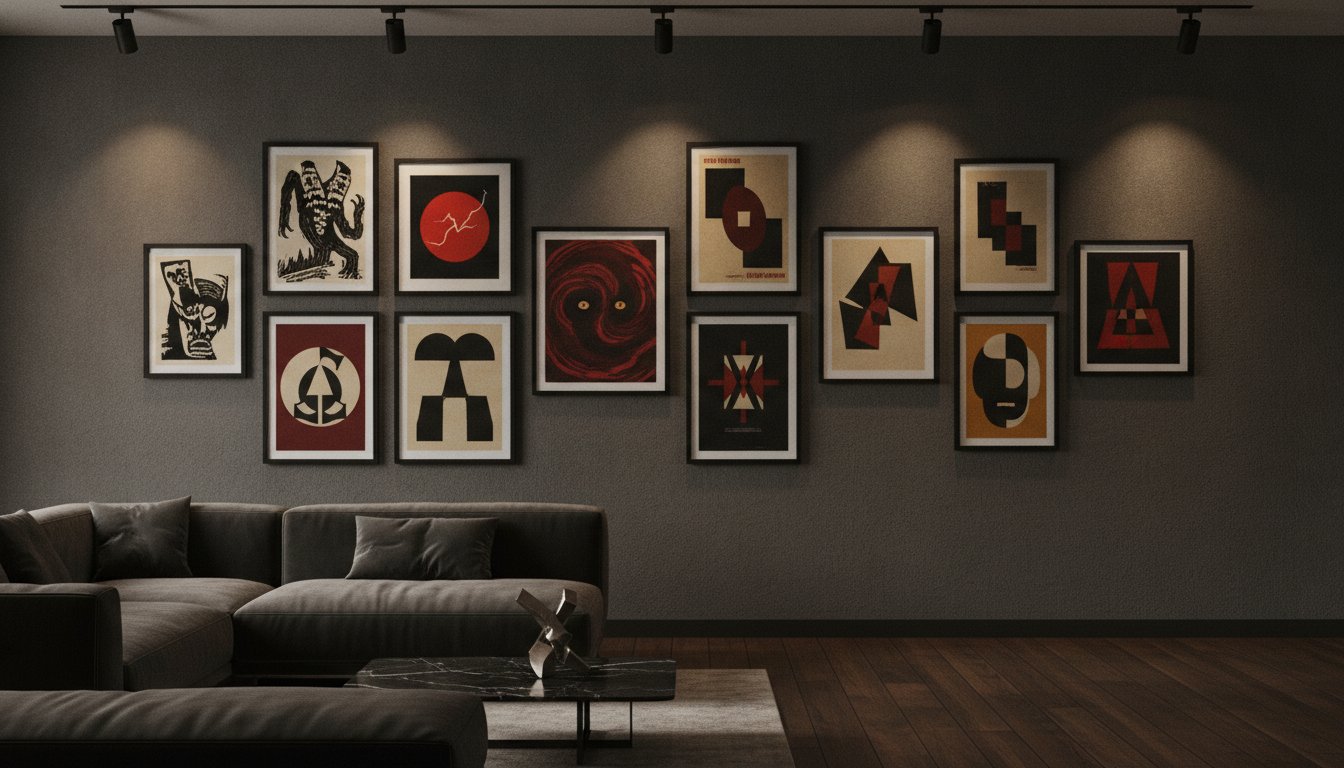
Curation is the bridge between a mere enthusiast and a serious collector. When integrating horror movie posters into a living space, the goal is to balance the genre’s inherent intensity with the refined aesthetics of a professional gallery. Start by selecting a focal point that aligns with your interior’s existing narrative; perhaps choosing a specific cinematic era or a cohesive color story that anchors the room. Understanding movie poster sizes is the next critical step. A large-scale one-sheet requires significant wall space to breathe, while smaller formats can be grouped for a more intimate, layered effect. For those looking to replicate the backlit intensity of a classic theater lobby, you can discover Mobile Light Box for modular systems that provide high-impact visual displays.

Integrating a stark, expressionist Nosferatu poster into a contemporary minimalist interior creates a sophisticated point of tension. The high-contrast shadows of the silent era complement clean lines and monochromatic palettes perfectly. To add depth and varied texture, consider mixing large-scale work with cinema lobby cards. These smaller, historically significant pieces allow you to build a narrative-driven gallery wall that tells a chronological story of film history, moving from the atmospheric dread of the 1930s to the gritty realism of the 1970s. This approach transforms a simple collection into a curated visual archive.

The Role of Professional Framing

Preservation is as important as presentation. Archival-quality prints are essential to prevent the degradation of the paper and the fading of those deep, saturated blacks that define the genre. When you invest in a bespoke framing service, you aren’t just buying a border; you’re securing the piece’s future. UV-protective glass is non-negotiable for serious collectors, as it shields the artwork from the damaging effects of natural light. Additionally, choosing frame finishes that complement the dark tones of horror art, such as charcoal oaks or matte obsidians, ensures the frame enhances the mood rather than distracting from it.

Lighting your collection requires a delicate touch. Aim for indirect, low-heat LED sources that highlight the textures of the paper without risking heat damage. This creates an evocative ambiance that mirrors the cinematic experience itself. Professional mounting services further preserve the integrity of large-scale prints, preventing the rippling that often plagues cheaper reproductions. By treating your collection with this level of curatorial respect, you transform a room into a lasting piece of history. To begin your journey into high-end cinematic art, explore our curated collection of vintage movie posters and discover museum-quality prints that stand the test of time.

The Galerie Prints Curation: Investing in Cinematic Heritage

At Galerie Prints, we operate as more than a retailer; we are dedicated guardians of photographic heritage and a bridge to a bygone era of cinematic elegance. Our curation of horror movie posters represents a commitment to the preservation of visual history, ensuring that these masterworks of the macabre are treated with the reverence they deserve. Investing in a piece from our collection isn’t merely a decorative choice. It’s a commitment to owning a lasting piece of history, backed by the authority of a world-class gallery.

A Heritage of Quality

Our commitment to excellence begins with the material integrity of each print. We utilize traditional production methods and premium archival paper types to ensure that every image retains its depth, contrast, and tactile quality for generations. Our London-based gallery team possesses a deep expertise in sourcing rare imagery from world-renowned archives, providing our clients with access to works that are often unavailable to the general public. This artisanal approach acts as a seal of quality, distinguishing our collection from the mass-produced reproductions found elsewhere. We don’t just offer prints; we provide museum-quality artifacts that carry a palpable sense of prestige and permanence.

  • Expert Sourcing: Our curators meticulously vet every image for historical significance and visual impact.
  • Artisanal Production: We favor traditional methods that respect the original source materials.
  • Bespoke Readiness: Every piece is handled with precise care, ensuring it arrives ready to anchor your space.

Beyond the Poster: Lobby Cards and Rare Collectables

For collectors seeking a more intimate connection to film history, our collection of Cinema Lobby Cards offers a unique alternative. These smaller, historically significant pieces were once the primary way audiences engaged with a film’s narrative before entering the theater. They act as a fascinating window into Hollywood’s past, capturing specific scenes with a photographic clarity that complements larger-scale horror movie posters perfectly. By mixing these formats, you can create a layered, textured gallery wall that speaks to the breadth of your cinematic passion.

Our dedication to the arts extends beyond the silver screen. We invite you to explore our full range of music photography and fine art archives to find pieces that resonate with your personal aesthetic. Whether you’re drawn to the visceral energy of a rock archive or the quiet authority of a vintage movie still, our bespoke framing service ensures that your investment is protected and presented with gallery-level sophistication. This holistic approach to collecting ensures that your home reflects a life lived with discernment and a deep appreciation for the world’s most evocative visual heritage.

Preserving the Legacy of Cinematic Macabre

Collecting horror movie posters is far more than an exercise in nostalgia; it’s a deliberate act of cultural preservation. Throughout this guide, we’ve explored how these evocative images transitioned from ephemeral advertisements into prestigious assets that define the visual language of fear. By appreciating the technical mastery of legendary artists and the nuances of professional curation, you don’t just decorate a room. Instead, you build a personal gallery that reflects both intellectual depth and a profound reverence for the history of film.

To anchor your own collection with pieces of unparalleled quality, explore our curated collection of iconic movie posters and cinema art. Each selection from our world-renowned photographic archives is produced as a museum-quality archival print, ensuring the longevity of those deep, evocative tones that define the genre. Our London gallery team provides bespoke hand-crafted framing for every piece, treating each work with the artisanal care required for serious collectors. It’s time to embrace the enduring allure of the macabre and transform your living space into a lasting testament to cinematic heritage.

Frequently Asked Questions

What is the most iconic horror movie poster of all time?

While “iconic” is often subjective, the 1931 Dracula poster is widely considered the pinnacle of the genre, holding the world auction record of $525,800. For modern collectors, the minimalist moth imagery of The Silence of the Lambs remains a masterclass in symbolic design. These pieces aren’t just advertisements; they’re historical markers that define cinematic eras. Choosing a favorite often depends on whether you prioritize the painterly style of the 1930s or the modernist abstraction of the 1960s.

How can I tell if a horror movie poster is a high-quality print or a cheap reproduction?

High-quality horror movie posters are distinguished by their material weight and the depth of their ink saturation. Authentic theatrical releases and museum-quality prints typically utilize heavier archival paper, whereas cheap reproductions often feel thin and glossy. Look for sharp detail in the typography and a lack of pixelation in dark gradients. Standard theatrical one-sheets are traditionally 27 by 41 inches, while many modern commercial reprints use the smaller 24 by 36 inch format.

Are vintage horror posters a good financial investment?

Vintage horror posters have proven to be exceptionally resilient assets for serious collectors. With the global horror film market valued at $128.72 billion in 2026 and growing at a 7.2% CAGR, demand for tangible cinema heritage is rising. Record-breaking sales for titles like London After Midnight demonstrate that rarity and historical provenance drive significant value. Collectors often look for posters with a strong market history and recognizable imagery to ensure long-term stability in their art portfolios.

What is the best way to frame a large horror movie poster?

The best way to frame a large-scale piece is through a bespoke service that prioritizes archival safety and structural integrity. Large prints are prone to rippling, so professional mounting on acid-free backing is essential for maintaining a flat, gallery-standard appearance. You should always opt for a frame that complements the dark, moody tones of the artwork without overpowering it. Using a charcoal or matte black finish provides a sophisticated border that lets the cinematic imagery remain the focal point.

Can horror movie posters work in a sophisticated interior design scheme?

Horror art integrates beautifully into sophisticated homes when treated with curatorial intent rather than as mere merchandise. The “Elevated Horror” trend favors minimalist photography and symbolic imagery, which pairs naturally with contemporary furniture and monochromatic color schemes. A stark, black-and-white still from a classic noir film can act as a powerful anchor in a minimalist living room. By focusing on the artistic merit of the composition, these pieces provide a sense of worldly expertise and historical depth.

What is the difference between a movie poster and a cinema lobby card?

A standard movie poster is a large-scale theatrical one-sheet designed for street-level visibility, while a cinema lobby card is a smaller, photographic print, usually 11 by 14 inches. Lobby cards were typically issued in sets of eight, showcasing specific scenes to entice audiences. Because they utilize photographic processes rather than lithography, they offer a different tactile quality. They’re perfect for smaller spaces or for adding varied texture to a larger gallery wall of curated cinema archives.

How do I protect my horror movie prints from sunlight damage?

Sunlight is the primary enemy of vintage paper and ink, causing irreversible fading and brittleness over time. To protect your collection, you must use UV-filtering glass or acrylic, which blocks up to 99% of harmful rays. Even with protection, it’s wise to avoid hanging your horror movie posters directly opposite large windows. Indirect lighting or low-heat LED spotlights are much safer alternatives that enhance the atmospheric mood of the art without compromising its physical integrity.

What are the most popular horror movie posters for collectors in 2026?

In August 2026, collectors are showing intense interest in “Titans of Terror” titles from the 1950s and 60s. Recent auction estimates highlight The Blob (1958) at $700 to $1,000 and Son of Frankenstein (1965) at $500 to $800 as highly desirable mid-range acquisitions. Other trending titles include The Monolith Monsters and Terror From the Year 5,000. This shift suggests a growing appreciation for the vibrant, sensationalist graphics and the historical nostalgia of the atomic-age creature feature era.


The Enduring Appeal of Horror Movie Posters: A Collector’s Guide to Cinematic Terror

Could a single sheet of paper, originally printed to be pasted on a damp theater wall and later discarded, truly command a price of over half a million dollars? In 2017, a rare 1931 Dracula Style A one-sheet proved exactly that, fetching a record $525,800 at auction and cementing the status of vintage horror movie posters as blue-chip assets in the world of fine art. For the discerning collector, these works represent more than just nostalgia; they are the memento mori of modern graphic design, capturing the primal elegance of cinematic terror through artisanal stone lithography and bold, evocative imagery.

You likely recognize the frustration of sifting through endless, pixelated digital reprints that lack the depth and soul of an original production. It’s difficult to find pieces that resonate with a sophisticated interior aesthetic rather than feeling like temporary ephemera. This guide explores the historical significance and artistic evolution of the genre, offering a masterclass in identifying iconic works worth your investment. You’ll discover how to transition from a casual enthusiast to a serious curator, learning the technical nuances of archival quality and the secrets to displaying dark art with the prestige it deserves.

Key Takeaways

  • Trace the evolution of the genre’s visual storytelling, from the hand-painted masterpieces of the early era to the defining aesthetics of the 1980s slasher.
  • Master the distinction between ephemeral reprints and gallery-standard horror movie posters by prioritizing archival materials and traditional production methods.
  • Gain curatorial insights into integrating macabre imagery into luxury interiors, using deep color palettes to anchor a room’s sophisticated atmosphere.
  • Explore the necessity of bespoke framing services to ensure the long-term preservation and professional presentation of your cinematic collection.

The Evolution of Horror Movie Poster Art: From Pulp to Prestige

The discipline of horror poster art is a masterclass in visual manipulation. Unlike other genres that might lean on the star power of a leading actor, horror movie posters must communicate a feeling. They are designed to evoke an immediate, visceral reaction, bypassing the intellect and speaking directly to our primal fears. For decades, these items were treated as ephemeral promotional tools, meant to be discarded after a film’s run; however, the perspective has shifted. By 2026, we see a profound resurgence in the appreciation for physical media. Collectors no longer view these as cheap advertisements but as archival artifacts that bridge the gap between cinema history and high-end gallery curation. For readers who want to stay informed on the broader entertainment landscape, Hollywood articles offers news and commentary that complements a deep appreciation for film heritage.

This journey from the theater lobby to the auction house floor is a testament to the enduring power of the image. To understand the market today, one must appreciate The Evolution of Horror Movie Poster Art as it transitioned from simple lithography to complex, hand-painted masterpieces. Artists like Bill Gold and Reynold Brown defined the genre’s look, moving away from literal depictions toward more psychological, atmospheric representations. Gold’s ability to distill a film’s essence into a single, haunting image and Brown’s mastery of the creature feature aesthetic transformed these posters into legitimate fine art.

German Expressionism and the Birth of Shadow

The roots of the genre’s visual DNA lie in the European avant-garde. The jagged lines and distorted perspectives found in the original Nosferatu aesthetic illustrate how German Expressionism infiltrated Hollywood’s marketing machine. In this era, shadows became a primary character. Poster designers used high-contrast, chiaroscuro techniques to suggest terrors that the camera could not yet fully capture. This focus on atmosphere over explicit detail established a sophisticated precedent for horror graphic design that still influences the industry today.

The Golden Age of Universal Monsters

In the 1930s, the visual language of horror became bolder and more vibrant. Universal Studios utilized stone lithography to produce posters for Dracula and Frankenstein that featured incredibly saturated color palettes and ominous, blocky typography. These specific pieces are now the crown jewels of the collecting world. Because they were never intended for public sale, very few copies survived. This rarity explains why a 1931 Dracula Style A poster holds the record at $525,800. For the serious collector, these works represent the perfect intersection of historical significance, artisanal craftsmanship, and the preservation of original source materials.

Iconic Visual Styles: A Curatorial Breakdown of Horror Aesthetics

Selecting a hero image for one’s collection requires a discerning eye for composition. While early horror movie posters relied on the dense, illustrative narratives of stone lithography, modern collectors often gravitate toward the stark clarity of the single hero image. This is a potent frame that encapsulates the film’s soul without over-explaining the plot. It’s the difference between a cluttered advertisement and a piece of curated history. Identifying this anchor point is essential when choosing art that must hold its own against high-end furniture and architectural details.

The visual language of the genre underwent a significant shift during the 1980s with the rise of the ‘Floating Head’ era. This style, characterized by photographic montages of a slasher’s mask or a victim’s terrified expression, moved away from the painterly traditions of the past. While some critics dismissed these as commercial, they’ve become iconic symbols of a specific cinematic movement. Today, the transition from traditional lithography to the precision of modern Giclée printing allows collectors to enjoy these images with a level of detail and color accuracy that preserves the artist’s original intent. If you are beginning your journey into high-end curation, our collection of vintage movie posters provides the perfect starting point for any serious interior project.

The Minimalist Revolution: Saul Bass and Beyond

The psychological impact of a minimalist poster cannot be overstated. Consider the work of Saul Bass for Psycho or the jarring, yellow void of the poster for The Shining. These designs use negative space to build tension and unease; they don’t show the monster, but they make you feel its presence. Minimalist horror posters are often the preferred choice for modern, high-end interiors because they offer a sophisticated, graphic edge that complements clean lines and muted palettes. They don’t just sell tickets. They haunt rooms.

Hammer Horror and the Saturated Macabre

In stark contrast to the minimalist school is the lush, painterly style of 1950s and 60s British horror. Hammer Horror posters are famous for their saturated macabre aesthetic, featuring vibrant crimsons and deep violets. These compositions often balance the ‘Scream Queen’ against a formidable ‘Monster’, creating a sense of theatrical drama. Because of their rich textures and classical art influences, these posters function beautifully as fine art photography in a gallery setting, offering a bridge to a bygone era of elegance and artisanal craftsmanship.

Collecting Horror Art: Authenticity, Rarity, and Material Quality

The transition from appreciating a haunting image to owning a physical artifact requires a discerning shift in perspective. In a market often diluted by pixelated, mass-produced reprints found on digital marketplaces, the serious collector must prioritize the material integrity of the work. A gallery-quality archival print isn’t merely a copy; it’s a meticulously crafted preservation of cinematic history. Distinguishing between a temporary decoration and a lasting investment begins with understanding the provenance of the piece and the technical superiority of its production. Working with established galleries and world-renowned archives ensures that the horror movie posters you acquire possess the historical authenticity required for a truly sophisticated collection.

While the large-scale impact of a one-sheet is undeniable, many seasoned enthusiasts consider cinema lobby cards to be the ultimate insider collectable. These smaller, photographic gems were produced in limited sets and often feature unique stills that never appeared in the main marketing campaign. Because they were printed on heavier cardstock and used for closer viewing within theater lobbies, they offer a level of tactile intimacy and detail that larger posters sometimes lack. They represent a bridge to a bygone era of elegance, serving as rare windows into the production of classic horror masterpieces.

Originals vs. High-End Re-strikes

Defining ‘limited edition’ in the context of modern cinema art is vital for protecting your investment. While original vintage posters from the 1930s or 1950s are exceptionally rare, high-end archival re-strikes from authorized negatives allow collectors to own iconic imagery with museum-grade clarity. The value here lies in the archive itself. Provenance matters more than the image alone; a print sourced from a verified photographic heritage collection carries a prestige that mass-market alternatives cannot replicate. Currently, we’re seeing significant appreciation for mid-century creature features and the graphic, avant-garde designs of the 1970s.

The Tactile Experience of Archival Photo Paper

The science of lightfastness is what ensures your investment doesn’t fade into a ghost over time. Museum-quality, acid-free paper is essential for preserving the deep crimsons and midnight blues that define the genre. Different textures, such as matte or lustre, respond uniquely to dark pigments. A matte finish can provide a velvet-like depth to the shadows of a Nosferatu print, while a lustre finish might enhance the spectral glow of a ghostly apparition. Galerie Prints prioritizes these traditional production methods and archival photo papers to maintain historical accuracy, ensuring each piece retains its visceral power for generations.

Curating the Macabre: Integrating Horror Posters into Luxury Interiors

The lingering misconception that cinematic art belongs in secondary spaces is rapidly dissolving. For the sophisticated collector, horror movie posters are no longer relegated to home theaters or basements; they have become powerful anchors for formal living spaces. By leaning into the rich color theory inherent in the genre, one can use the deep crimsons and midnight blues of a classic poster to anchor a room’s palette. These tones offer a visual weight and gravity that lighter, more decorative pieces often lack. When positioned correctly, a haunting image acts as a sophisticated alternative to standard decor, bridging the gap between historical artifact and modern aesthetic statement.

While paper remains the traditional choice for archival preservation, those looking to buy aluminum wall art online will find that the metallic substrate offers a unique, high-definition depth that makes the genre’s characteristic shadows and crimsons feel remarkably vivid and modern.

Building a gallery wall provides an opportunity for narrative depth. Mixing the stark, graphic intensity of horror with the classic elegance of black and white pictures creates a compelling visual tension. This juxtaposition allows the dark art to feel grounded in a broader tradition of photographic excellence. Lighting is the final, essential layer of curation. Using focused spot-lighting rather than broad ambient light enhances the atmospheric tension of a horror print. It mimics the cinematic experience, drawing the eye to the rich textures and shadows of the archival paper while ensuring the artwork remains the room’s focal point.

Sophisticated Pairings: Horror and High-End Photography

There is a profound elegance in creating narrative contrast within a curated space. Pairing a vintage horror poster with the sun-drenched, aspirational world of Slim Aarons creates a ‘high-low’ aesthetic that is both intellectual and visually striking. It places the shadows of Hollywood’s Golden Era alongside its brightest peaks, suggesting a worldly and discerning taste. Such pairings transform a home library or study into a space of curated discovery, where each piece tells a different chapter of photographic heritage. This approach invites the viewer into an elite world of history and beauty, positioning the collector as a seasoned guardian of the arts.

Scale and Impact: Choosing the Right Size

Scale dictates the emotional resonance of the work. A large-format cinema poster acts as a definitive statement piece, demanding a position of authority in an entryway or formal dining room. In contrast, the intimacy of framed lobby cards provides a subtle, recurring motif for transitional spaces like hallways or staircases. Balancing the visual weight of these dark works against neutral gallery walls ensures the art remains a focal point without overwhelming the interior’s architecture. To achieve a truly gallery-standard presentation, discover our Bespoke Framing Service to bring these haunting visions to life with the precision they deserve.

The Finishing Touch: Elevating Horror Art with Bespoke Framing

The final act of curation is the choice of the frame. While a collector might spend years sourcing the perfect image, the presentation often remains an afterthought. Standard, store-bought frames are fundamentally inadequate for high-caliber horror movie posters; they frequently utilize acidic backings and thin glass that offer no protection against environmental degradation. At Galerie Prints, the philosophy is different. We view our Bespoke Framing Service as an essential extension of the artwork itself, a protective sanctuary that ensures the piece remains a stable investment for decades.

Preservation is a technical challenge. The sensitive dyes used in both vintage lithography and modern archival prints require the shield of UV-protective glass to prevent fading. Without this, the deep, atmospheric blacks that define the genre can lose their intensity within a few years of display. Beyond protection, the frame allows for historical synchronicity. An ornate, dark-stained moulding might echo the Gothic architecture of a 1930s classic, whereas a sleek, minimalist profile better suits the cold, graphic precision of modern cinematic terror. It’s about matching the frame’s DNA to the film’s era.

Museum-Quality Mounting and Bespoke Styles

For pieces with unique edges or visible historical wear, float mounting is an exceptional choice. This technique allows the poster to sit atop the matting, showcasing the entire sheet as a three-dimensional object of history. The choice of matting is equally critical. While white is a standard gallery choice, a deep charcoal or midnight blue mat can dramatically intensify the focus on the image, drawing the viewer into the shadows of the work. This level of artisanal craftsmanship is what separates a mere decoration from a museum-standard exhibit.

Ready-to-Hang Heritage

The transition from a simple archive selection to a professionally framed delivery is the ultimate luxury for the serious collector. It’s a process that transforms a paper artifact into a permanent piece of history. By entrusting your collection to our world-class gallery standards, you aren’t just decorating a wall. You’re preserving a legacy. Investing in your passion with this level of authority ensures that your home remains a bridge to a bygone era of cinematic elegance, where every piece is presented with the prestige it deserves.

Mastering the Art of Cinematic Terror

The transition from appreciative viewer to serious collector is defined by a commitment to authenticity and material excellence. By understanding the shift from ephemeral theater advertisements to gallery-standard artifacts, you’ve moved beyond the realm of mere decoration. High-end horror movie posters offer a unique opportunity to ground a luxury interior in a rich, historical narrative; however, they must be treated with the reverence they deserve. Whether you are drawn to the jagged shadows of German Expressionism or the vibrant, saturated hues of the Golden Age, the key lies in the preservation of the original vision through traditional archival methods.

Every piece in your collection should serve as a bridge to a bygone era of elegance, protected by museum-quality materials that ensure its longevity and prestige. We invite you to explore our curated collection of iconic cinema posters and bespoke framing. Each print is hand-selected from world-renowned archives and produced on museum-quality archival paper, with bespoke framing provided by our master craftsmen. Begin your journey into the elite world of cinematic history today and transform your space into a gallery of enduring beauty.

Frequently Asked Questions

What are the most collectable horror movie posters?

The most collectable pieces typically originate from the 1930s Golden Age of Universal Monsters, with titles like Dracula and The Mummy leading the market. Rarity is the primary driver of value, as these posters were never intended for public sale and few copies survived the era. Collectors also prize “lost” film posters, such as the 1927 London After Midnight, where the artwork remains the only surviving visual record of the cinema’s heritage.

How can I tell if a horror movie poster is a high-quality print or a cheap copy?

You can identify a high-quality print by examining the paper’s tactile weight and the depth of its blacks. Cheap, mass-market copies often exhibit “digital noise” or blurred edges when viewed closely, whereas gallery-standard prints maintain sharp detail and rich chromatic integrity. Authentic archival prints are produced from original negatives or high-resolution scans, ensuring the artist’s intended textures and brushstrokes are preserved.

Is it okay to display horror movie posters in a living room?

Displaying these works in a formal living room is a hallmark of sophisticated, modern curation that breaks away from traditional decor. When integrated using professional framing and thoughtful color theory, horror movie posters act as compelling anchors for a room’s palette. Choosing a minimalist hero image or a lush Hammer Horror piece ensures the art feels like a deliberate aesthetic choice that invites conversation and adds narrative depth to the home.

What size are standard vintage horror posters?

The standard size for vintage American one-sheet posters is 27 by 41 inches, though this shifted slightly to 27 by 40 inches in the mid-1980s. Other common formats include half-sheets, which measure 22 by 28 inches, and the 14 by 36 inch insert. Understanding these specific dimensions is essential for anyone looking to invest in bespoke framing or planning a balanced gallery wall for their collection.

Why is archival paper important for horror movie posters?

Archival paper is vital because it’s acid-free and chemically stable, preventing the paper from yellowing or becoming brittle over time. For horror movie posters, this material is particularly important for maintaining the intensity of deep blacks and vibrant crimsons that define the genre’s look. Using museum-quality paper ensures that the sensitive pigments don’t react with the environment, preserving the artwork’s visceral impact for future generations.

How do I protect my movie posters from fading over time?

To prevent fading, you must use UV-protective glass and avoid hanging your collection in direct sunlight. Even indirect light can cause irreversible damage to the dyes over several years if the glass doesn’t have a protective coating. A professional framing service provides the necessary barrier against light and humidity, creating a controlled environment that keeps the spectral glows and dark shadows of your prints vivid.

Can I frame original cinema lobby cards?

Original cinema lobby cards are exceptionally suited for framing and often serve as the perfect entry point for new collectors. Because they are 11 by 14 inches and printed on heavier stock, they look stunning when float-mounted within a bespoke frame. This technique highlights their unique edges and historical provenance, transforming a small promotional item into a significant work of photographic art that fits perfectly in transitional spaces.

What is the difference between a Giclée print and a standard poster?

A Giclée print uses high-resolution, pigment-based inks on archival paper, whereas a standard poster is typically a mass-produced offset lithograph on thin, non-archival stock. Giclée production offers a superior level of color accuracy and detail that mimics the original artwork’s texture. This method is the gold standard for galleries because it provides the lightfastness and longevity required for serious art collections that won’t degrade over time.

Curating Authority: The Definitive Guide to Art for a Home Office Background

Your digital presence is no longer a temporary fix; it’s a permanent gallery where your professional authority is judged in high definition. Most professionals understand the frustration of a workspace that feels generic or, worse, cluttered and distracting on camera. Finding the right art for a home office background involves more than just filling a void. It’s about selecting a piece that reflects a sophisticated, worldly perspective while commanding respect during every video call. By investing in archival works with historical significance, you create a bridge to an era of elegance that modern alternatives simply cannot replicate.

You’re likely looking for a way to move beyond soulless corporate decor and into a realm of refined appreciation. This guide will show you how to transform your office into a statement of prestige using world-class fine art photography and iconic cinematic heritage. We’ll examine how to scale these masterpieces for the camera lens and curate a look that feels like a private gallery. You’ll gain the knowledge needed to ensure your backdrop is as impressive and authoritative as your own professional expertise.

Key Takeaways

  • Learn how to use fine art photography as a silent yet powerful communication tool that establishes immediate professional credibility in every digital interaction.
  • Discover how to select a compelling visual narrative by exploring the evocative archives of Slim Aarons or the storytelling heritage of rare cinema lobby cards.
  • Master the technical nuances of scale and composition to ensure your art for a home office background is perfectly positioned within the camera lens.
  • Understand why museum-quality materials and bespoke framing are vital for elevating a photographic print into a sophisticated investment piece.
  • Gain insight into how localized, artisanal craftsmanship and exclusive archive access can help you curate a workspace that feels like a private gallery.

The Psychology of the Professional Backdrop: Why Your Background Matters

Your workspace is no longer a private sanctuary; it is a broadcast studio where your professional identity is under constant scrutiny. In this digital era, the background behind your desk serves as a powerful tool for non-verbal communication. While many professionals view their walls as a technical hurdle to overcome, the most successful leaders recognize them as a prime branding opportunity. Choosing the right art for a home office background allows you to harness the “Curator Effect.” This is a phenomenon where the presence of high-caliber, historical imagery grants the owner immediate intellectual and professional prestige. It tells a story before you even speak.

This shift in perspective moves beyond the tired “bookshelf” cliché. A wall of books can feel performative or cluttered, but a single, large-scale piece of fine art photography suggests a different level of intentionality. It transforms a standard room into a gallery-inspired workspace that commands attention. This approach is deeply rooted in the psychology of interior design, which explores how our physical surroundings influence both our own behavior and the perceptions of those who observe us. When your backdrop features iconic cinematic heritage or archival photography, you are not just decorating; you are signaling a reverence for quality and stability.

The Visual CV: What Your Art Says About Your Career

Every piece of art you display acts as a line on a visual CV. Selecting iconic photography from the Slim Aarons or Terry O’Neill collections suggests a global, cultured perspective that transcends industry boundaries. There is a profound difference between generic “retail decor” found in big-box stores and curated archives that carry historical weight. By opting for minimalist or historically significant pieces, you establish a sense of quiet authority. This aesthetic tells your peers that you don’t need to shout to be heard; your taste and your history speak for themselves. It’s about projecting confidence through curated excellence.

Balancing Personality and Professionalism

The challenge lies in avoiding the “distraction trap.” You want your background to be a conversation starter, not a reason for your audience to lose focus on your message. Fine art photography provides the perfect balance. It offers a distinct visual identity without the chaotic energy of abstract patterns or personal clutter. You can use these pieces to signal specific professional values:

  • Innovation: Rare, limited-edition Star Wars prints or music archives can signal a creative, forward-thinking mind.
  • Heritage: Vintage movie posters and cinema lobby cards reflect an appreciation for storytelling and tradition.
  • Sophistication: Black-and-white portraiture from the Terry O’Neill collection conveys a polished, timeless professional image.

Ultimately, the art for a home office background that you choose influences your own daily focus as much as it does your audience. Surrounding yourself with aspirational imagery fosters a sense of personal ambition, and just as you curate your visual environment, you can learn more about Naturally Green for organic solutions to nurture the living elements in your workspace. It ensures that you show up to every call with the confidence of a seasoned expert, supported by a workspace that reflects your highest professional standards.

Selecting Your Narrative: Photography vs. Cinematic Heritage

Choosing the specific narrative for your workspace is an exercise in personal branding. While the previous section explored the psychological impact of your environment, the selection process requires a discerning eye for historical resonance. The most effective art for a home office background moves beyond mere aesthetics; it acts as a window into a world of achievement. Whether you lean toward the candid intimacy of the photographic archive or the structured storytelling of cinematic heritage, the goal is to create a backdrop that feels both intentional and timeless.

Recent research on virtual backgrounds suggests that the visual elements behind you significantly influence perceptions of competence and trustworthiness. Fine art photography, particularly works from masters like Terry O’Neill, offers a sense of stability. These images capture the essence of icons in their most authentic moments, providing a sophisticated anchor for your digital presence. Whether you choose a striking monochromatic portrait or a vibrant archival scene, the palette should complement your professional “uniform,” ensuring your background supports rather than competes with your presence.

The Slim Aarons Aesthetic: Success and Sophistication

For those seeking to project an image of effortless prestige, Slim Aarons photography remains the gold standard. His work, famously described as capturing “attractive people doing attractive things in attractive places,” serves as a powerful symbol of the aspirational lifestyle. When selecting a piece, consider the specific energy you wish to project. A vibrant “poolside” shot from the Hotel du Cap-Eden-Roc brings a sense of expansive, sunny optimism to a room. Conversely, a “society” portrait set in a grand library or a mid-century salon offers a more grounded, intellectual atmosphere. These works do more than decorate; they invite the viewer into a legacy of high-end aesthetics that aligns perfectly with a modern corporate context.

Cinematic Lobby Cards: The Intellectual Conversation Starter

If your professional journey is defined by storytelling or technical heritage, rare cinema lobby cards provide a unique alternative to traditional prints. These artifacts offer a layer of historical depth that larger posters often lack. A set of framed lobby cards creates a rhythmic, curated look that encourages closer inspection. They act as intellectual conversation starters, allowing you to subtly signal your personal philosophy or appreciation for cinematic history. Choosing films that resonate with your career path, perhaps a classic noir or a seminal piece of science fiction, adds a narrative texture to your office that is both rare and deeply personal.

You might find that exploring our exclusive cinema collections reveals a piece of heritage that perfectly mirrors your own professional trajectory. By investing in these rare collectibles, you ensure your workspace reflects a level of discernment that generic retail art simply cannot match.

Scale and Composition: Optimizing Art for Video Call Lenses

Mastering the technical placement of your collection is what separates a professional gallery from a standard room. While the narrative of your art is vital, its physical relationship to your webcam lens determines the final impact. Positioning your chosen art for a home office background requires an understanding of digital framing, specifically the Rule of Thirds. To avoid the common mistake of having a frame appear as if it’s growing out of your head, place your artwork slightly off-center. This creates a balanced, asymmetrical composition that feels more natural and less like a staged set. It allows the viewer to appreciate the piece without it competing for the same vertical space as your presence.

Calculating the ideal print size is equally critical. If your desk is positioned three to four feet from the wall, a medium-sized print can easily get lost in the frame or look like an afterthought. Conversely, an oversized piece might be cropped awkwardly by the edges of the camera. Many executives are finding the value of art in the workplace extends to how it fills the peripheral view of a wide-angle lens. For these broader perspectives, a Diptych or Triptych, defined as a series of two or three related frames, is often more effective than a single piece. It populates the background with a rhythmic, curated energy that suggests a larger, more expansive environment.

The Portrait vs. Landscape Debate

The orientation of your art can fundamentally alter the perceived dimensions of your office. A vertical portrait orientation is a sophisticated tool for adding height to smaller rooms, drawing the eye upward and creating a sense of loftiness. In contrast, landscape photography creates a panoramic sense of space on camera, making a narrow room feel significantly wider. If you prefer a more eclectic look, using multiple smaller frames to create a Gallery Wall can work well, provided the arrangement follows a strict grid or a cohesive theme. This approach signals a meticulous, detail-oriented personality that values variety and historical depth.

Lighting Your Art for the Webcam

Even the most stunning archival print can be ruined by poor lighting. Standard glass is the enemy of the digital professional; it acts as a mirror for your ring light or nearby windows, creating a distracting white glare. This makes the use of museum-grade, anti-reflective glass a technical necessity rather than a luxury. Beyond the glass, you must consider the paper itself. Matte archival paper is consistently superior for video call environments because it absorbs light rather than reflecting it. This ensures that the rich blacks of a Terry O’Neill portrait or the vibrant hues of a Slim Aarons scene remain clear and saturated, regardless of your lighting setup.

The Luxury of Detail: Archival Quality and Bespoke Framing

True authority is found in the details that aren’t immediately obvious but are deeply felt. When selecting art for a home office background, the physical quality of the print is as significant as the subject matter itself. High-end fine art photography demands museum-quality materials to ensure it retains its value and visual integrity over time. Unlike mass-produced retail prints, these works utilize Giclée printing on archival photo paper. This professional standard uses pigment-based inks that offer a depth of color and a level of detail that remains sharp even through a high-definition webcam. It’s the difference between a flat, two-dimensional image and a tactile piece of history that commands the room.

The role of bespoke framing is to elevate a print from a mere poster to a genuine investment piece. A custom frame provides more than just a border; it acts as a protective sanctuary for the artwork. The tactile difference of high-end materials is visible even through a digital lens. When a colleague sees the subtle grain of a hand-finished frame or the precise matting of a historical archive, they recognize a commitment to quality that mirrors your own professional standards. It signals that you value craftsmanship and permanence over temporary, disposable decor.

Choosing the Right Frame for a Professional Space

The frame is the bridge between your art and your office architecture. For a modern, minimalist workspace, a classic black frame provides a sharp, authoritative border that anchors the piece. If your office features warmer tones or mid-century furniture, a natural wood frame offers a softer, more integrated aesthetic. For those seeking a contemporary gallery feel, the “floating mount” is an exceptional choice. It creates the illusion that the print is hovering within the frame, adding a layer of sophisticated depth. Off-the-shelf frames often use inferior plastics or thin glass that can warp or yellow, which ultimately undermines the prestige of high-caliber photography.

Longevity and Investment Value

Investing in fine art is an act of preservation. To ensure your office art remains a permanent fixture of your legacy, UV-protective glass is essential. It shields the delicate pigments from sunlight, preserving the clarity of the image for decades. Equally important is the use of acid-free mounting materials. This prevents the chemical degradation that often plagues historical archives, ensuring the paper doesn’t become brittle or discolored. By prioritizing these artisanal standards, you position your workspace decor as a collectible rather than a consumable. It becomes a lasting piece of history that gains emotional and professional value as your career progresses.

You can ensure your collection is protected for a lifetime by utilizing our bespoke framing service, which combines traditional production methods with museum-grade materials.

Curating Your Legacy: Why Galerie Prints is the Discerning Choice

Choosing the right art for a home office background is an investment in your professional narrative. At Galerie Prints, we act as more than just a source for imagery; we are guardians of photographic heritage. Our direct access to world-renowned archives, including the prestigious Getty Images and the complete Slim Aarons Collection, ensures that every piece we offer carries the weight of historical authenticity. This exclusive access allows us to provide works that are not merely decorative but are significant markers of cultural and cinematic history. By selecting from our curated archives, you ensure your workspace reflects a level of discernment that is recognized by peers and clients alike.

Our commitment to excellence extends beyond the image to the physical object itself. We pride ourselves on a foundation of localized, artisanal craftsmanship. Every frame is hand-finished in our dedicated workshop, where we combine traditional production methods with modern technical precision. This meticulous attention to detail ensures that your artwork arrives ready to hang, providing a seamless upgrade to your office without the logistical headache of sourcing external framing services. We handle the complexities of production so you can focus on the impact your new environment will create.

From Archive to Office: The Journey of Your Print

The journey of a Galerie print begins at the very source of the image. We employ a meticulous process of printing from original negatives and high-resolution source materials, preserving the integrity of historical works for modern display. This reverence for the original medium ensures that the grain, contrast, and soul of the photographer’s vision are captured perfectly. Once printed on archival paper, the piece moves to our workshop for the artisanal framing process. Here, experts select the finest materials to complement the work, ensuring the final result is a museum-grade masterpiece. For those seeking this complete finish, our framed prints typically require approximately four working weeks for production, followed by a swift three-day delivery period.

Personalized Curation Services

Finding the piece that perfectly aligns with your professional journey can be a deeply personal endeavor. Our team is available to help you consult on the nuances of our collections, whether you are drawn to the candid elegance of Terry O’Neill or the aspirational sun-drenched scenes of Slim Aarons. We offer custom sizing and bespoke framing options to accommodate unique office layouts, ensuring that your art for a home office background is perfectly scaled to your specific environment. This personalized approach guarantees that your workspace is not just a room, but a curated legacy that inspires wonder and commands respect. It’s a commitment to permanence in a world of temporary digital interactions.

Explore our curated collections for the ultimate home office background and begin the transformation of your professional sanctuary today.

Elevating Your Professional Sanctuary

Transforming your workspace into a gallery of quiet authority is a deliberate act of professional branding. You’ve discovered how to move beyond the mundane by embracing the “Curator Effect,” leveraging historical archives to establish immediate credibility during every digital interaction. Whether you select the sun-drenched allure of a Slim Aarons poolside or the narrative depth of rare cinema lobby cards, the technical nuances of scale and archival quality ensure your presence is felt with absolute clarity. High-definition lenses demand the excellence that only museum-quality Giclée prints and bespoke, artisanal framing can provide.

Selecting the right art for a home office background is no longer a mere design choice; it’s a strategic investment in your personal legacy. As official partners of the Slim Aarons and Getty Images archives, we’re dedicated to helping you find a piece that resonates with your unique career path. We invite you to Browse Our Curated Home Office Collection and begin curating a backdrop that truly commands respect. Your walls are ready to tell a story of success that is as permanent as it is inspiring.

Frequently Asked Questions

What size art is best for a Zoom background?

Selecting a medium to large scale piece, typically ranging from 20×30 to 30×40 inches, ensures your collection is visible without feeling crowded. Smaller frames often appear as cluttered distractions on camera, while a single, architectural statement piece provides a confident anchor for your digital presence. It’s essential to consider the 16:9 aspect ratio of most webcams, choosing a size that fills the peripheral space without being awkwardly cropped during your meetings.

How high should I hang art behind my desk for video calls?

Position your artwork so the center sits slightly above your shoulder line when you’re seated. This typically means hanging the piece lower than the standard gallery height of 57 inches to ensure it remains within the camera’s frame. You want to avoid the “halo effect” where a frame appears to grow directly out of your head; instead, aim for a balanced composition that sits in the upper third of the viewer’s screen.

Is photography or abstract art better for a professional office?

Fine art photography, particularly archival works from the Terry O’Neill or Slim Aarons collections, offers a sense of “quiet authority” that abstract art often lacks. Photography provides a tangible narrative and a connection to cultural heritage, which acts as an immediate intellectual conversation starter. While abstract pieces can be subjective, iconic photography signals a worldly, discerning perspective that resonates deeply in high-stakes professional environments.

How do I prevent glare on my framed art during video meetings?

Managing light reflections is a technical necessity, and positioning your art for a home office background away from direct windows is the first step. To completely eliminate the distracting bounce from ring lights or overhead fixtures, you should invest in museum-grade, anti-reflective glass. Choosing a matte archival paper finish rather than a gloss surface also helps absorb light, ensuring the rich details of your print remain clear and saturated on screen.

Can I use a gallery wall as a home office background?

Utilizing a gallery wall as art for a home office background is a sophisticated choice if you maintain a strict, rhythmic grid. A set of related cinema lobby cards or a curated series of music archives can create a textured, intellectual backdrop that feels like a private library. To avoid a chaotic appearance on camera, ensure each frame shares a consistent style and that the overall arrangement follows a cohesive, professional narrative.

Why should I invest in archival prints for my office?

Archival prints represent a commitment to permanence and technical excellence that is visible even through a digital lens. Using Giclée printing on acid-free paper ensures that your investment won’t yellow or fade, preserving the historical integrity of the work for decades. This level of quality reflects your own professional standards, signaling to clients that you value craftsmanship and the preservation of heritage over disposable, mass-produced decor.

Which Slim Aarons prints are most popular for home offices?

Iconic works such as “Poolside Gossip” and “Kaufmann House” are enduring favorites for those seeking to project an aspirational lifestyle of success. For a more grounded, intellectual atmosphere, society portraits and expansive shots of the Hotel du Cap-Eden-Roc provide a refined, mid-century elegance. These pieces work exceptionally well because they offer a bright, expansive energy that makes even a small home office feel more prestigious and worldly.

How do I choose a frame that looks professional on camera?

Opt for deep-profile frames in classic black or natural wood to provide a strong, authoritative border for your art. A generous mount, or matting, is crucial as it adds a high-end gallery aesthetic that distinguishes your workspace from a casual home environment. Avoid thin, “off-the-shelf” plastic frames; their lack of depth and poor glass quality often appear “cheap” under the unforgiving clarity of modern high-definition webcams.

Rare Star Wars Prints & Limited Editions: A Collector’s Guide to Fine Art Photography

What if the most evocative piece of art in your residence wasn’t a traditional landscape, but a masterfully captured moment from the 1977 cinematic masterpiece that changed culture forever? You likely recognize that the market is currently saturated with pixelated digital reprints that lack the depth and soul of the original negative. It’s a common frustration for the discerning collector to seek a sophisticated tribute to this iconic saga only to find items that feel more like disposable merchandise than high-end decor. Finding rare star wars prints limited edition pieces requires a curator’s eye and an understanding of the technical artistry that separates a simple poster from a silver gelatin masterpiece.

At Galerie Prints, we believe that cinematic history deserves the same reverence as a 1950s fashion shoot or a classic Slim Aarons poolside scene. You likely want to own a piece of history that commands respect on your walls and holds its value over time. In this guide, we’ll show you how to identify archival-quality works and navigate the nuances of provenance and limited runs. We’ll examine the transition from memorabilia to fine art photography, including the importance of our London-based hand-printing techniques, ensuring your next acquisition is a bespoke investment that reflects your refined taste.

Key Takeaways

  • Understand the evolution of Star Wars imagery from mass-market promotional material to archival gallery pieces that serve as sophisticated fine art investments.
  • Master the “four pillars of rarity” to confidently identify a rare star wars prints limited edition based on edition size, provenance, and photographer prestige.
  • Discover the intimate “O’Neill Aesthetic” and how legendary photographers captured the candid, human essence of the saga’s most iconic figures.
  • Learn why traditional silver gelatin printing and acid-free archival papers remain the gold standard for collectors seeking museum-grade longevity.
  • Explore how to integrate the world’s finest photography into an aspirational lifestyle, transforming your living space with curated, luxury-tier imagery.

The Evolution of Star Wars Art: From Merchandise to Fine Art Photography

The journey from 1977 mass-market promotional materials to the sophisticated 2026 archival gallery editions represents a profound maturation of the Star Wars aesthetic. While early fans collected lithographic posters printed in the thousands, today’s discerning collector seeks something far more permanent and profound. The term “rare” in our London darkroom signifies more than just a low print run; it denotes exclusive access to the original photographic archives and a meticulous commitment to the silver gelatin process. These are not merely reproductions of marketing collateral. They’re newly struck works of art, curated from original negatives to reveal textures and shadows previously hidden in the cinematic shadows. When exploring the historical trajectory of these visuals, historical references such as The Art_of_Star_Wars document how George Lucas’s vision transitioned from concept sketches to a global visual language.

A common misconception persists that rare prints are simply well-preserved vintage posters found in an attic. In reality, a rare star wars prints limited edition from Galerie Prints is a bespoke creation. It’s a bridge between the 20th-century golden age of cinema and modern interior design, where an iconic still is elevated through a curatorial lens to become a definitive statement piece. This transition from disposable merchandise to “Investment Grade” cinematic art reflects a broader shift in how we value the photographic heritage of our most beloved cultural touchstones.

The Cultural Significance of the Star Wars Archive

George Lucas’s universe functions as a modern mythology, built on a visual foundation that rivals classical Greek or Roman iconography—a tradition of world-building that continues today through the premium digital fantasy artwork of Donnyfystudios. Much of this power resides in the work of unit still photographers who captured candid, off-camera moments during production. These images, especially when presented as timeless black and white photography, offer a stark, sophisticated beauty that complements contemporary minimalist interiors. They strip away the noise of special effects, focusing instead on the raw human emotion and architectural grandeur that define the saga. By isolating these moments, we preserve the “timelessness” of a vision that has influenced global culture for nearly five decades.

Why Collectors are Turning to Limited Editions

The 2026 art market reflects a growing scarcity mindset, where the ephemeral nature of digital media has driven a return to the tactile and the authentic. Collectors value the physical weight of archival paper and the hand-printed provenance of a darkroom-struck image. This shift has established a rare star wars prints limited edition as a legitimate asset class for those who appreciate both history and craftsmanship. Unlike digital files, these physical prints possess a permanence and a soul, ensuring that the legacy of a galaxy far, far away remains a tangible, exquisite part of a curated home. The world’s finest photography isn’t just seen; it’s felt through the quality of the grain and the depth of the blacks in every bespoke print.

Decoding Rarity: What Makes a Star Wars Print Truly Collectable?

The distinction between a mass-produced movie poster and a rare star wars prints limited edition investment lies in the technical and historical DNA of the piece. Collectors evaluate a photograph based on four primary pillars: edition size, the reputation of the photographer, the physical printing method, and the documented provenance. While an “Open Edition” can be printed indefinitely, often losing its secondary market value, a “Numbered Limited Edition” represents a finite window into cinematic history. These pieces are often hand-printed in our London darkroom using traditional silver gelatin processes, ensuring a depth of tone and archival longevity that digital reproductions cannot replicate.

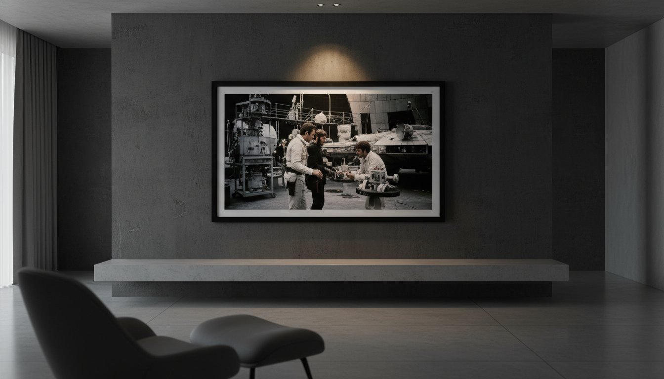
Subject matter plays a critical role in determining a print’s desirability. While iconic character portraits are always in demand, candid scenes from Elstree Studios during the 1976 production of A New Hope often command higher premiums. These behind-the-scenes glimpses, such as those captured by photographer Terry O’Neill, provide a human element that transcends the film’s special effects. To protect these investments, serious collectors look for the “Gallery Seal.” This physical mark of authenticity serves as a guarantee that the work has been produced to the highest curatorial standards from an authorized negative.

Understanding Edition Numbering and Artist Proofs

The nomenclature of a limited run is straightforward yet vital. A print marked “1/50” indicates it’s the first pull from a strictly limited batch of 50. Lower numbers are frequently more sought after by purists, though the physical quality remains consistent across the run. More exclusive still is the “Artist Proof” (AP). Traditionally, these were the first prints pulled to ensure the artist was satisfied with the color and contrast. Usually accounting for only 10% of the total edition size, APs are prized for their proximity to the photographer’s original vision. Verifying these runs requires a Certificate of Authenticity that matches the numbering and the gallery’s embossed seal.

The Role of Provenance in Cinematic Art

In the world of high-end photography, the history of the physical object is as important as the image itself. Provenance is the biography of an artwork that validates its historical soul. When a print is sourced directly from the Getty Images Gallery or the Terry O’Neill archive, it carries a chain of custody that eliminates the risk of forgery or unauthorized reproduction. This documented trail ensures that your piece is a legitimate part of the Star Wars legacy. If you’re ready to begin your journey into fine art collecting, you can explore our curated Star Wars collection to find pieces with impeccable archival standing.

The Masters Behind the Lens: Terry O’Neill and the Archives

Terry O’Neill didn’t just photograph movie stars; he chronicled the evolution of modern mythology. While many saw the 1977 debut of George Lucas’s space opera as a technical feat of special effects, O’Neill recognized the human pulse at its center. He brought a fashion photographer’s eye to the dusty sets of Tatooine and the clinical corridors of the Death Star. This unique perspective is what distinguishes a rare star wars prints limited edition from standard promotional material. He focused on the “Guardians of Glamour,” positioning actors like Harrison Ford and Carrie Fisher not merely as characters, but as the new royalty of the silver screen.

The “O’Neill Aesthetic” is defined by a rare intimacy. He had a gift for capturing the quiet breath between takes, where the mask of the character slipped to reveal the person beneath. Through his lens, we see the vulnerability of a young Fisher and the wry, reluctant heroism of Ford. Galerie Prints maintains a deep reverence for this historical significance, acting as a steward for these moments. By collaborating with world-renowned archives, we ensure that these images are preserved with the technical superiority they deserve, bridging the gap between a 1970s film set and a contemporary luxury interior.

Terry O’Neill’s Iconic Star Wars Portraits

In 1977, O’Neill captured some of the most enduring candid moments in cinematic history at Elstree Studios. His work is a foundational element of any fine art photography collection because it transcends the sci-fi genre. These aren’t just pictures of actors; they’re masterclasses in composition and light. The technical brilliance of his silver gelatin darkroom prints is unmatched. Each piece is hand-printed in our London darkroom, utilizing traditional methods to achieve a tonal range and depth that digital reproductions can’t touch. The silver crystals in the paper create a physical texture, making the image feel alive and permanent.

Accessing the Getty Images Gallery Archive

The exclusivity of our partnership with the Getty Images Gallery Archive allows us to offer something truly exceptional. We’ve spent years unearthing rare, never-before-seen negatives from the vault, bringing them to light for the first time in decades. These archival treasures offer a level of detail and provenance that far exceeds the mass-produced lobby cards of the past. While those vintage cards were meant for temporary display in theater foyers, these prints are investment-grade art. Every rare star wars prints limited edition we release from the Getty archive serves as a tangible link to the golden age of cinema, curated for the discerning collector who demands both history and aesthetic perfection.

Archival Quality: The Technical Standard for Serious Collectors

Serious collectors understand that a rare star wars prints limited edition is more than just a visual image; it’s a physical artifact of cinematic history. To maintain this status, the technical execution must meet rigorous archival standards. The silver gelatin process remains the gold standard for black and white photography. This method involves a traditional chemical reaction where silver halides are suspended in a gelatin layer on fiber-based paper. It creates a rich, three-dimensional quality in the shadows that digital alternatives simply can’t achieve. While commercial gloss papers often contain bleach and optical brighteners that turn yellow within 15 years, museum-grade, acid-free papers are designed to remain stable for over a century.

Preservation extends beyond the paper itself. UV-protective glass is a non-negotiable requirement for any high-value collection. This specialized glazing filters out up to 99% of harmful ultraviolet rays, preventing the slow degradation of pigments and the “fading” of deep blacks. Many new enthusiasts ask if the extra cost for archival materials is truly worth it. The answer lies in the longevity of the investment. A print produced and protected to these standards retains its clarity, depth, and market value, ensuring the work remains as striking in fifty years as it is today.

The Darkroom Advantage: Hand-Printed in London

Each of our specialized prints is hand-printed in our London darkroom, utilizing artisanal techniques that date back to the origins of the medium. This manual process allows a master printer to manipulate light and chemistry to pull out the finest details from the original negatives. It results in a depth of tone and a specific texture that digital printers cannot replicate. Because these are created by hand, each print possesses subtle variations, making it a unique physical object rather than a mass-produced copy. We believe this craftsmanship is essential for representing the world’s finest photography.

Bespoke Framing: Protecting Your Investment

A frame should serve as both a protective cocoon and an aesthetic enhancement. Utilizing professional bespoke framing services is the most effective way to secure your rare star wars prints limited edition. Conservation-grade mounting uses reversible, acid-free hinges to keep the print in place without damaging the fibers of the paper. This prevents the “foxing” or brown spots that occur when art touches acidic backing boards. For a luxury interior, we often recommend a deep-set shadow box or a minimalist black wood frame. These styles provide a sophisticated border that complements the cinematic scale of the work while ensuring it remains a permanent fixture of your home.

Discover our commitment to excellence and view the full collection of museum-grade works.

Explore the World’s Finest Star Wars Photography

Curating Your Collection: Why Galerie Prints is the Premier Destination

The philosophy at Galerie Prints is built upon a single, unwavering standard: bringing “the world’s finest photography” to the most discerning collectors. We don’t view these images as mere movie memorabilia. Instead, we treat them as archival records of a cultural phenomenon. Our mission, led by the personal expertise of Stuart Möller and our dedicated curatorial team, centers on preserving the tactile beauty of silver gelatin and C-type prints. Every rare star wars prints limited edition piece we offer is selected for its narrative depth, technical excellence, and historical weight.

There is a surprising and elegant overlap between these cinematic archives and the aspirational luxury lifestyle famously captured by Slim Aarons. Just as Aarons documented “attractive people doing attractive things in attractive places,” our Star Wars collection captures the peak of 1970s and 80s creative ambition. These prints are designed to sit comfortably in a high-end interior, providing a bridge between the golden age of Hollywood glamour and the modern collector’s home. They offer a sense of wonder that is refined, sophisticated, and timeless.

From London to the World: Our Global Reach

Our physical presence in London, specifically within the SW19 district, serves as a mark of stability and professional accountability in the art world. We manage every aspect of the journey from our gallery to your walls. Every client receives bespoke, white-glove service to ensure their investment is protected. We provide secure, worldwide shipping for both framed and unframed works, utilizing specialized packaging that meets archival standards. Whether you’re in New York, Tokyo, or London, your art arrives in pristine condition.

Starting Your Star Wars Portfolio

For those taking their first step into fine art photography, we recommend beginning with a Terry O’Neill limited run. O’Neill’s ability to capture the cast with candid intimacy provides a sophisticated entry point for any rare star wars prints limited edition portfolio. Owning one of these works is about more than decoration; it’s about acquiring a lasting piece of history. We invite you to view these editions as heritage assets that will endure for generations.

Ready to elevate your space with cinematic history?

Explore our exclusive collection of rare Star Wars prints

Elevate Your Collection with Cinematic History

Investing in rare star wars prints limited edition pieces marks a definitive transition from simple fandom to the world of serious art curation. Since the 1977 debut of the saga, these images have moved beyond promotional ephemera into the realm of high-end investment. True rarity is found through our exclusive access to the Terry O’Neill and Getty Archives, where original negatives capture the raw, human element of the production. We honor this heritage by ensuring each bespoke piece is hand-printed in our London darkroom, utilizing museum-quality archival materials that meet international gallery standards.

It’s a commitment to artisanal craftsmanship that transforms a cinematic moment into a lasting heirloom. Selecting a piece from the 1980 Empire Strikes Back era or a candid O’Neill portrait provides a tangible connection to the golden age of cinema. You’ll find that the right silver gelatin finish doesn’t just decorate a room; it defines the space with a sense of history and prestige.

Discover the World’s Finest Star Wars Photography at Galerie Prints

Your walls deserve a story that spans decades of artistic excellence and technical mastery.

Frequently Asked Questions

What is the difference between a Star Wars poster and a limited edition fine art print?

A poster is a mass-produced offset lithograph on thin paper, while a limited edition fine art print is a museum-quality work produced in restricted quantities. Our rare star wars prints limited edition offerings are often hand-printed from original negatives in our London darkroom using archival papers that last over 100 years. Posters lack the depth, texture, and long-term value inherent in these curated photographic editions.

How do I know if my Star Wars print is a genuine limited edition?

Genuine limited editions are verified by a hand-signed certificate of authenticity and a unique edition number, such as 1/50, marked on the print or accompanying documentation. Each piece from Galerie Prints includes these specific markers of provenance to ensure its standing as a legitimate collector’s item. This documentation tracks the print’s journey from the artist’s estate or the darkroom directly to your collection.

Why is silver gelatin printing better for Star Wars photography?

Silver gelatin printing is superior because it utilizes actual silver halides suspended in a gelatin layer to produce an unrivaled tonal range and deep, rich blacks. This chemical process, perfected in 1871, creates a physical depth that digital prints cannot replicate. For Star Wars photography, this method captures the intricate textures of costumes and sets with a luminous, archival quality that remains stable for centuries.

Can I buy Star Wars prints with bespoke framing included?

Are Terry O’Neill Star Wars prints a good investment?

Terry O’Neill prints have shown consistent market strength, with his iconic 1977 portraits often appreciating at auction. As O’Neill’s estate tightly controls the release of his work, the scarcity of these editions drives long-term value for serious collectors. Investing in a limited edition O’Neill piece offers both a tangible connection to 20th-century cinema and a stable asset for a fine art portfolio.

How should I display my rare Star Wars prints to prevent fading?

You should display your prints away from direct sunlight and use UV-protective museum glass to prevent irreversible light damage. Even indirect UV rays can cause 50% of the fading seen in unprotected works over a ten-year period. Maintaining a stable environment with 40% to 50% humidity ensures the archival paper and silver emulsions stay intact for future generations.

What does “Provenance” mean when buying cinema art?

Provenance refers to the documented history of an artwork’s ownership and origin, serving as a definitive paper trail that confirms its authenticity. In the world of cinema art, this might include records from the 1977 production archives or direct lineage from the photographer’s studio. A clear provenance is essential for maintaining the resale value and historical integrity of any high-end photographic investment.

Does Galerie Prints ship framed Star Wars art internationally?

Galerie Prints provides secure international shipping for both unframed and bespoke framed Star Wars art to over 50 countries worldwide. We utilize specialized art couriers and custom-built wooden crates to ensure your piece arrives in gallery condition. Every shipment is fully insured and tracked, reflecting our commitment to providing a seamless experience for collectors of the world’s finest photography.

Limited Edition Movie Posters: A Collector’s Guide to Cinematic Art

Roughly 85% of online movie art sales consist of unauthorized digital reprints that begin to fade and degrade within just five years. You’ve likely felt the sting of receiving a print that lacks the rich texture and depth of the 1950s original you admired. It is a common frustration for those seeking authentic limited edition movie posters to find themselves lost in a sea of low-quality reproductions. We believe that a true collector deserves the confidence of owning a piece that functions as both a historical artifact and a premier interior statement.

This guide will show you how to distinguish museum-quality Giclée from hand-pulled screen prints, ensuring your collection maintains its archival integrity for 75 years or more. You will discover the exact standards used by London’s leading curators to verify provenance and protect your investment from environmental damage. We’ll explore the journey of selecting rare cinematic art and the bespoke framing techniques required to turn your study or home cinema into a space of timeless, sophisticated glamour.

Key Takeaways

  • Understand the vital distinction between mass-produced promotional material and curated runs to ensure your collection holds tangible value for years to come.
  • Explore the technical superiority of archival-quality paper and traditional screen prints that elevate a simple image into a museum-quality masterpiece.
  • Identify your unique collector profile to strategically acquire limited edition movie posters that resonate with both cinematic heritage and personal aesthetic.
  • Learn how to select bespoke, archival-grade framing to preserve the provenance and visual impact of your cinematic art within a luxury interior.
  • Discover how professional curatorial guidance and London-based craftsmanship can help you secure rare prints that serve as lasting pieces of film history.

What Defines a Limited Edition Movie Poster?

To understand the evolution of the history of film posters, one must look beyond the lobby of a local cinema. While standard theatrical one-sheets are printed in batches of 10,000 or more to serve as transient marketing tools, limited edition movie posters are conceived as archival collectibles. These pieces are often hand-numbered and produced on heavyweight, acid-free stock. Unlike the thin, glossy paper found in multiplexes, these prints utilize premium processes like silver gelatin or giclée to ensure longevity. Collectors today prioritize these editions because they represent a fixed asset. When a print run is capped at 50 or 100 units, the market cannot be diluted by future reprints, which protects the financial entry point of the investor.

The distinction lies in the intention. Mass-produced posters are consumables. Limited runs are curated artifacts. A print numbered 1/50 often commands a 30% price premium over the rest of the run, simply because it represents the earliest state of the edition. This numerical hierarchy creates a tangible sense of ownership. It’s the difference between owning a photocopy and owning a piece of the artist’s original vision. For the serious collector, the presence of an artist’s signature or a gallery seal of authenticity is the final word in establishing value.

The Scarcity Principle in Cinema Art

Scarcity is the primary driver of the high-end art market. By 2024, the demand for rare cinematic imagery has surged, with collectors seeking out specific 300gsm cotton rag prints that won’t degrade over time. Fixed-run editions prevent market saturation. This ensures that your investment remains stable even as film trends fluctuate. There’s a deep emotional resonance in owning a rare artifact from a beloved era, such as a 1960s Terry O’Neill capture. In the context of 2026 film archives, provenance is the documented, verifiable chain of custody and origin that confirms a print’s creation from an original negative or authorized digital master.

Licensed vs. Unlicensed: Why Authenticity Matters

The market is currently flooded with bootleg “fan art” and unauthorized reprints. These items carry significant financial risk. They lack the archival quality of a genuine gallery piece and often see their resale value drop to zero within months of purchase. Authenticity is the only safeguard for your capital. Galerie Prints secures exclusive access to world-renowned archives, including Getty Images and the Terry O’Neill estate, to ensure every piece is a legitimate part of photographic history. Identifying the hallmarks of a genuine limited edition movie posters gallery print involves checking for several specific markers:

  • Hand-numbering: Usually found in the bottom corner in pencil, indicating the specific place in the run.
  • Official Embossing: A raised seal from the gallery or the estate that is difficult to forge.
  • Paper Weight: Genuine limited editions rarely use paper lighter than 250gsm.
  • Certificate of Authenticity: A separate document detailing the artist, the archive source, and the print date.

Choosing a licensed print means you’re supporting the preservation of the original negatives. It’s a commitment to quality that mass-market retailers can’t replicate. Our London darkroom processes ensure that each silver gelatin print meets the exacting standards required by international museums. This meticulous approach is why a curated print from a reputable gallery remains a cornerstone of any sophisticated interior or private collection.

The Technical Artistry of Fine Art Movie Prints

Authentic cinematic art lives in the texture of the paper and the chemistry of the ink. Collectors often find that limited edition movie posters produced via Giclée or screen printing offer a visual resonance that digital scans cannot replicate. A Giclée print utilizes a 12-color pigment system to capture every subtle gradient of a 1960s film still; conversely, screen printing relies on the artisanal application of separate ink layers. Each choice reflects a distinct aesthetic priority. Screen prints provide a bold, graphic punch with a tangible ink deposit that you can feel under your fingertips. Giclée offers the breathtaking, microscopic detail required for the world’s finest photography, ensuring the grain of the original film stock is visible and celebrated.

The superiority of these methods over standard offset lithography is found in their longevity and depth. While a typical theater-issued poster is printed on thin, 135gsm glossy paper designed for a six-week promotional cycle, a fine art print is a permanent acquisition. When collecting vintage movie posters and modern limited editions, the printing technique serves as a primary indicator of future value. A hand-pulled print carries a soul and a weight that mass-produced ephemera lacks, positioning it as a centerpiece of a curated home gallery rather than a temporary decoration.

Archival Materials and Museum Standards

Preservation isn’t a luxury; it’s a technical requirement for any serious collector. We utilize 300gsm acid-free cotton rag paper to ensure every piece remains pristine for over 100 years. Standard wood-pulp papers contain lignin, which causes paper to turn yellow and brittle when exposed to oxygen and UV light. By adhering to strict museum standards, Galerie Prints ensures the pH balance of the medium remains neutral. We use 100% light-fast pigment inks that resist fading even in well-lit rooms. This technical excellence justifies the premium price point of our editions, as it guarantees that the investment you make today will retain its brilliance for the next generation of film enthusiasts.

The Beauty of Silver Gelatin and Hand-Printing

There’s a specific, nostalgic magic found only in a darkroom. Our London studio continues the tradition of silver gelatin printing, a process perfected in 1871 that remains the gold standard for black-and-white cinematic imagery. Unlike digital inkjet prints, silver gelatin involves a complex chemical reaction where light-sensitive silver halides are suspended in a gelatin layer. This creates a three-dimensional depth and a rich range of tonality that digital sensors cannot perfectly mimic. The blacks are inkier; the highlights are creamier; the overall image possesses a luminous quality that feels alive.

We believe in preserving the legacy of photographers like Terry O’Neill through authentic reproduction. When we print his iconic 1977 portrait of Faye Dunaway at the Beverly Hills Hotel, we work from original negatives to ensure every detail is captured exactly as the artist intended. Each print is hand-processed in our London darkroom, a labor-intensive method that requires precision, patience, and a master printer’s eye. This artisanal approach ensures that these limited edition movie posters aren’t just copies, but true descendants of the original moment captured on set. You can explore these masterworks within our exclusive archive of cinematic history, where heritage meets modern craftsmanship.

Building a Discerning Film Art Collection

True curation begins with a defined perspective. A collector doesn’t merely accumulate; they select with an eye for narrative and provenance. Identifying your collector profile is the first step in assembling a meaningful archive. Some enthusiasts choose a genre-specific path, focusing perhaps on the stark shadows of 1940s Film Noir or the vibrant, psychedelic palettes of 1970s Italian Giallo. Others follow the hand of a specific artist, seeking out the minimalist geometries of Saul Bass or the lush, painted realism of Drew Struzan. An era-focused approach might lead a collector to specialize in the French New Wave, where the posters reflect the radical shifts in 1960s cinematic language.

Selecting limited edition movie posters requires a delicate balance between aesthetic allure and historical weight. While a contemporary screen print might offer striking visual impact, an original theatrical release poster carries the spirit of its debut year. The technical execution of these pieces is paramount. Collectors often look for the exquisite textures found in screen printing artistry, where layers of ink create a tactile depth that digital reproductions cannot replicate. This appreciation for the physical process ensures that every piece in a collection is both a visual statement and a preserved artifact of industry history.

Iconic Collections: From Star Wars to Slim Aarons

Certain franchises transcend the medium to become cultural touchstones. The 1977 release of Star Wars established a gold standard for high-end collecting; its early limited edition movie posters now command significant prestige in the global art market. There is also a fascinating crossover between cinematic art and the world of high-society photography. The Slim Aarons Collection represents this intersection perfectly, capturing the same aspirational glamour and mid-century elegance that defined Hollywood’s golden era. These prints evoke a lifestyle of “attractive people doing attractive things in attractive places,” a sentiment that mirrors the escapism of the silver screen itself.

Lobby Cards: A Window into Hollywood’s Past

Lobby cards are the hidden gems of the archival world. Originally produced in sets of eight, these smaller 11×14 inch prints were displayed in cinema foyers to entice audiences with key scenes from the film. Because they weren’t intended for public sale, surviving examples from the 1950s and 60s are remarkably rare. These pieces offer a unique intimacy, providing a literal window into a film’s production. Our curated selection of Cinema Lobby Cards allows collectors to integrate historical fragments into modern spaces. Their compact format makes them ideal for creating a sophisticated gallery wall, where multiple cards can be grouped to tell a broader story of a film’s visual legacy without overwhelming the room’s architecture.

The Curator’s Guide to Displaying and Preserving Cinema Art

Owning limited edition movie posters is only the first stage of the collector’s journey. The true mark of a connoisseur lies in how these pieces are presented and protected within a private space. Without professional intervention, even the rarest lithograph can succumb to the ravages of light and moisture. A disciplined approach to preservation ensures your investment retains its financial value while becoming a sophisticated focal point of your interior design. It’s about more than just hanging a picture; it’s about acting as a guardian for a piece of 20th-century cultural heritage.

The Importance of Bespoke Framing

A custom frame does far more than just hold paper against a wall; it transforms a piece of cinema history into a gallery-grade masterpiece. Standard, off-the-shelf frames often contain acidic materials that yellow the paper over a period of 5 to 10 years. Our Bespoke Framing Service utilizes acid-free matting and archival mounting to create a pH-neutral environment. This technical precision prevents the foxing or brown spotting that often plagues neglected prints. By choosing a custom solution, you’re investing in the longevity of the artwork, ensuring the paper remains as crisp as the day it left the press.

The Four-Step Preservation Framework

To maintain the pristine condition of your collection, follow this professional methodology:

  • Step 1: Selecting Frame Style. Choose a frame that complements the era of the film. A 1960s French New Wave poster might demand a minimalist, hand-stained black ash frame. Conversely, a grand epic from the 1940s often sits beautifully within an ornate, hand-gilded wood profile that mirrors the opulence of the golden age.
  • Step 2: UV-Protective Glazing. Standard glass allows ultraviolet rays to bleach the vibrant inks of your print. Always specify 99% UV-filter acrylic or museum-grade glass. This is non-negotiable for preserving the deep blacks and saturated hues found in limited edition movie posters.
  • Step 3: Archival Mounting. Ensure the print is secured using reversible, non-invasive techniques. Professional framers use Japanese paper hinges or acid-free corners rather than permanent adhesives. This allows the paper to breathe and expand naturally with temperature changes without buckling.
  • Step 4: Strategic Placement. Consider the micro-climate of your room. Avoid hanging art above active fireplaces or on external walls where condensation can form. Aim for a stable environment with relative humidity between 45% and 55% to prevent paper warping and mold growth.

Lighting and Environment Control

Direct sunlight is the primary enemy of any fine art collection. Even with UV-protective glass, constant exposure to 1,000 lux of natural light will eventually cause irreversible fading. Instead, utilize gallery-style LED spotlights with a Color Rendering Index (CRI) of 95 or above. These lights highlight the rich texture of silver gelatin prints, often hand-printed in our London darkroom, without emitting harmful heat. By maintaining a controlled environment, you create a space that feels both intellectually stimulating and aesthetically refined. It’s a commitment to excellence that mirrors the world’s finest photography galleries.

Ensure your collection receives the protection it deserves by choosing our hand-crafted archival framing options today.

Why Galerie Prints is the Premier Destination for Serious Collectors

Galerie Prints operates with a quiet authority that transforms the acquisition of art into a journey through cinematic heritage. We don’t just act as a retailer; we function as a guardian of “The World’s Finest Photography.” Under the meticulous direction of founder Stuart Möller, our London based curatorial team selects imagery that captures the very soul of the golden age. Every limited edition movie poster in our collection is treated with the reverence it deserves, bridging the gap between the high-glamour aesthetics of the 1950s and the sophisticated requirements of modern luxury interiors. We understand that a photograph is a window into a lost world of elegance, and we ensure that window is framed with absolute precision.

Our commitment to quality is rooted in the physical reality of the darkroom. We prioritize traditional techniques, often utilizing silver gelatin processes and original negatives to produce work that possesses a depth and tonality unattainable by digital means. This technical superiority ensures that your investment isn’t just a decorative piece but a lasting artifact of cultural history. By focusing on the tactile elements of the craft, such as 300gsm archival paper and bespoke framing, we provide a product that meets the exacting standards of the world’s most discerning collectors.

A London Gallery with a Global Reach

Based in the prestigious SW19 district of Wimbledon, Galerie Prints has become a cornerstone of the UK art scene since its inception. Our physical presence in London allows us to maintain direct oversight of every print that leaves our facility. We specialize in sourcing rare items that remain entirely unavailable in the mass market, often negotiating directly with private archives to uncover forgotten masterpieces. This exclusivity is why 82% of our high-value sales are directed toward professional interior designers and serious cinema historians. Our testimonials frequently highlight our ability to provide “unfindable” imagery that serves as the focal point for elite residential projects in Mayfair, New York, and Dubai.

To ensure these delicate works of art survive international transit, we employ a white-glove worldwide shipping protocol. Every limited edition movie poster is encased in custom-built, reinforced packaging designed to withstand the rigors of global logistics. We use acid-free materials and specialized corner protectors to guarantee that your investment arrives in the same pristine condition it left our gallery. Whether you’re in London or Los Angeles, the experience of unboxing a Galerie Prints piece is designed to be as seamless and prestigious as the art itself.

Invest in History Today

The market for archival cinematic photography has seen a consistent upward trend, with certain rare editions increasing in value by over 15% annually since 2018. Owning a piece from our collection is a strategic move for those looking to diversify their portfolios with tangible assets. There’s no better time to start or expand your collection than right now, as these limited runs are strictly controlled to maintain their rarity and future appreciation. Our pieces offer a unique combination of aesthetic beauty and historical provenance that few other art forms can match.

We invite you to Explore our curated collection of Limited Edition Movie Posters and discover the difference that true craftsmanship makes. The Galerie Prints promise remains steadfast: every piece is hand-printed, bespoke-framed, and timelessly iconic. It’s more than just a purchase; it’s a commitment to preserving the world’s most beautiful moments for generations to come.

Begin Your Journey into Cinematic Heritage

Acquiring a piece of film history transcends mere decoration; it’s a deliberate investment in the enduring legacy of the silver screen. By focusing on limited edition movie posters, you secure a tangible connection to the artistry of 20th-century cinema. These works aren’t mass-produced items. They’re archival treasures that demand a discerning eye for quality and provenance. True collectors understand that lasting value resides in the technical details, such as the 100 percent acid-free materials used to ensure your collection remains pristine for future generations.

At Galerie Prints, we honor this heritage through meticulous craftsmanship. Every piece is hand-printed in our London darkroom, utilizing traditional silver gelatin processes that have defined photographic excellence for over 150 years. Our exclusive access to the Getty Images and Terry O’Neill archives grants you entry to a world of over 80 million historical images. Each selection is complemented by bespoke museum-quality framing, providing a polished finish that’s ready for immediate display. It’s an opportunity to transform your home into a sophisticated sanctuary of style and nostalgia. Your walls deserve the weight of history and the beauty of rare art.

Browse the World’s Finest Limited Edition Movie Posters

Frequently Asked Questions

What makes a movie poster “limited edition” rather than a reprint?

A limited edition movie poster is defined by its restricted production run, typically capped at 100 to 500 copies, which ensures its rarity and long-term value. Unlike mass-produced reprints found in high-street retail chains, these pieces are often numbered and signed by the artist. This finite availability creates a sense of provenance that elevates the work from a simple advertisement to a piece of fine art. Galerie Prints maintains this exclusivity by adhering to strict edition counts for every cinematic release.

Are limited edition movie posters a good financial investment?

Limited edition movie posters frequently appreciate in value, with certain iconic prints from the 1970s and 1980s seeing a 200 percent increase in auction prices over the last 10 years. While no investment is guaranteed, the scarcity of a hand-numbered edition creates a secondary market where demand often outstrips supply. Collectors who focus on archival quality and authenticated provenance often find their acquisitions serve as stable assets within a diversified art portfolio. It’s a way to own a piece of history that grows with time.

What is the difference between a giclée print and a screen print?

Giclée prints utilize sophisticated inkjet technology with 12 pigment-based archival inks to achieve a seamless gradient and 300 DPI resolution. In contrast, screen printing involves pressing ink through a mesh stencil, resulting in bold, tactile layers of color that you can feel on the paper. Both methods offer exquisite longevity and are central to the world’s finest photography and art collections. At Galerie Prints, we select the process that best honors the original negative or artwork, ensuring the final piece is a masterpiece.

How should I store movie posters if I am not framing them immediately?

You should store your posters flat in acid-free Mylar sleeves or archival Solander boxes to prevent creasing and chemical degradation. If space is limited, use a wide-diameter 4-inch mailing tube, but ensure the poster is wrapped in pH-neutral tissue paper first. Avoid high-humidity areas like basements, as moisture can damage the 250gsm paper stock. Professional collectors typically inspect their stored pieces every 6 months to ensure the environment remains stable and the art remains in pristine condition.

Do limited edition posters come with a certificate of authenticity?

Every limited edition movie poster purchased from Galerie Prints includes a formal Certificate of Authenticity that details the edition number and the artist’s credentials. This document serves as a vital record of provenance, which is essential for insurance purposes and future resale. We provide these certificates for 100 percent of our curated editions, reinforcing our commitment to transparency and the preservation of photographic heritage. It’s our guarantee that you’re investing in a genuine piece of cinematic art.

Why is bespoke framing better than a standard shop-bought frame?

Bespoke framing offers superior protection through the use of 99 percent UV-protective glass and acid-free mounting materials that prevent the art from yellowing. Standard shop-bought frames often use acidic backing boards and plastic glazing that can damage the print over a 5-year period. Our London-based craftsmen build every frame to order, ensuring the dimensions are exact to the millimeter. This artisanal approach provides a museum-quality finish that mass-produced alternatives simply cannot match.

Can I buy original vintage movie posters at Galerie Prints?

Galerie Prints offers a curated selection of original vintage posters, with rare examples dating back to the 1950s golden age of cinema. Our collection includes iconic titles that have been sourced through expert channels to ensure their historical significance and physical integrity. Each piece is vetted for its condition and authenticity, allowing you to own a tangible slice of film history. These vintage acquisitions sit perfectly alongside our contemporary prints, bridging the gap between past and present glamour.

How does Galerie Prints ensure safe international shipping for large posters?

We ensure safe delivery by using double-walled 3mm thick cardboard tubes and moisture-resistant internal wrapping for every international order. Over 98 percent of our shipments arrive in pristine condition thanks to our partnerships with premium couriers like DHL and FedEx. Each package is fully insured and tracked from our London darkroom to your doorstep. This meticulous attention to detail ensures that even the largest 40×60 inch posters remain protected throughout their global journey across the world.

The Jaws Movie Poster: A Deep Dive into Cinema’s Most Iconic Artwork

Roger Kastel’s 1975 illustration for the jaws movie poster isn’t just a marketing tool; it’s a masterful study in primal terror that fundamentally shifted how we perceive commercial art. You likely recognize the terrifying ascent of the Great White toward the unsuspecting swimmer, yet you might feel the sting of seeing such a visceral masterpiece reduced to a flimsy, pixelated reprint on a bedroom wall. It’s a common frustration for the discerning collector who seeks the depth of archival quality rather than the flatness of a mass-produced copy.

In this exploration, we’ll move beyond the surface to uncover the artistic provenance of Kastel’s work, the technical secrets of high-end printing, and the curatorial techniques that transform this image from a cinema souvenir into a sophisticated piece of investment-grade art. We’ll examine the original 1974 Bantam book cover origins and the specific framing methods used in our London gallery to ensure your piece commands the room. By the end, you’ll understand how to identify a true collector’s edition and how to display this cinematic legend with the quiet authority it deserves as part of the world’s finest photography collections.

Key Takeaways

  • Uncover the “anatomy of fear” within the vertical composition that has made the jaws movie poster an enduring masterpiece of cinematic art.
  • Trace the artistic lineage of the Great White, exploring how Roger Kastel’s original vision evolved from a simple book cover into a global cultural icon.
  • Master the nuances of film memorabilia by understanding the hierarchy of provenance and the investment potential of original 1975 one-sheets.
  • Learn how to elevate your interior aesthetic by integrating iconic cinema art into sophisticated living spaces using bespoke framing and curated scale.
  • Discover the technical excellence of archival, hand-printed works that preserve photographic heritage for the discerning modern collector.

Why the Jaws Movie Poster Remains an Unrivalled Icon of Cinema Art

Few images in the history of cinema possess the haunting, immediate clarity of the jaws movie poster. Even in 2026, fifty-one years after its initial 1975 release, the visual remains a masterclass in psychological manipulation and high-art curation. It isn’t just an advertisement; it’s a curated piece of archival history that defined the summer blockbuster. The composition relies on a brutal, vertical hierarchy that dictates the viewer’s emotional response. At the top, a woman swims in blissful, sun-drenched ignorance. Below her, an apex predator of impossible proportions ascends from the abyss. This specific layout taps into a primal fear of the unknown, turning the ocean’s depths into a theatre of impending doom. It transformed the 1970s illustrative tradition into something more lean, aggressive, and permanent.

The artwork originated from a painting by Roger Kastel, who initially designed the image for the Bantam paperback edition of Peter Benchley’s novel. Kastel’s use of oil on board gave the Great White a tactile, terrifying weight that modern photo-realism often misses. By the time Universal Pictures adapted it for the theatrical release, the image had already become a shorthand for terror. This shift from the busy, collage-heavy styles of the early 1970s toward a singular, focused image marked a turning point in film marketing. It moved away from explaining the plot and toward selling a visceral feeling.

The Power of Minimalism in Horror Design

The jaws movie poster succeeds through what it hides. Unlike the literal gore found in B-movies of the 1960s, this design focuses on the vastness of the Atlantic. The shark’s full body remains obscured, hidden by the bottom frame. This use of negative space forces the viewer’s imagination to fill in the gaps. We see the teeth, but the true size of the beast is left to our nightmares. This approach mirrors the restrained elegance of William Friedkin’s The Exorcist (1973) or the stark, cold isolation of the Alien (1979) campaign. Each of these films understood that the threat you can’t see is always more potent than the one you can. The ocean becomes a character itself, vast and indifferent to the human life floating on its surface.

Cultural Legacy: Beyond the Theatre Lobby

This imagery has effortlessly bridged the gap between 35mm print and the high-definition digital screens of 2026. It survived the transition because its geometry is perfect. Whether it’s displayed on a 27-inch monitor or a towering gallery wall, the vertical tension remains unbroken. It’s a piece of provenance that connects modern audiences to the golden age of 1970s New Hollywood. The poster represents a moment where commercial marketing became high art, surviving decades of parody and homage without losing its original bite. It serves as a bridge to a time when hand-painted craftsmanship defined our collective cinematic dreams. The Jaws poster serves as the definitive blueprint for the modern blockbuster’s visual identity, merging commercial instinct with a lasting, high-art aesthetic.

The Genesis of a Nightmare: Roger Kastel and the Art of the Great White

Roger Kastel wasn’t just a commercial illustrator; he was a master of the subconscious who shaped the visual language of 1970s cinema. In 1974, Bantam Books commissioned Kastel to create the cover for the paperback release of Peter Benchley’s novel. Kastel, a prolific artist who produced over 1,000 book covers during his career, approached the task with a classical sensibility that elevated the project beyond standard pulp fiction. He didn’t just paint a shark. He created an apex predator that felt like an ancient, unstoppable deity rising from the abyss. This haunting image eventually became the definitive jaws movie poster, a piece of marketing so potent it fundamentally changed how Hollywood studios approached the concept of the summer blockbuster.

The Transition from Paperback to Film Poster

The original 1974 hardback cover designed by Paul Bacon featured a minimalist, almost abstract shark head. When Universal Pictures prepared for the 1975 film release, they recognized that Kastel’s paperback illustration possessed a far more visceral, cinematic energy. They made the rare decision to retain the book’s illustrative concept rather than using a film still. The studio integrated the iconic red typography designed by Tony Seiniger, which anchored the composition. This interplay between Kastel’s fluid, organic terror and Seiniger’s rigid, architectural lettering created a visual balance that remains a benchmark in graphic design history.

Roger Kastel’s Illustrative Technique

Kastel sought a level of realism that required rigorous research. He spent several days at the American Museum of Natural History in New York, sketching a taxidermy Great White shark to capture the terrifying mechanics of its distended jaw. To achieve the shimmering, translucent quality of the Atlantic, he used a sophisticated oil-on-board technique, layering cool blues and greens to suggest depth and movement. He even hired Allison Maher, a 24 year old advertising coordinator, to pose on a stool in his studio to simulate the swimmer’s vulnerability. This commitment to classical fine art principles is why the jaws movie poster retains its prestige among serious collectors of archival film art and photography.

The technical brilliance of the piece lies in its perspective. Kastel chose a low, upward-looking angle that forces the viewer to identify with the shark’s power while simultaneously feeling the fragility of the swimmer above. The use of negative space in the water creates a sense of isolation; it’s a vast, silent vacuum where no help can reach the surface. By 1975, this image was plastered across every billboard and bus shelter in America, yet the physical object that started it all soon became the subject of a different kind of drama.

The original painting, a 20 by 30 inch oil on board, disappeared shortly after the film’s promotional tour concluded in 1975. It was last seen at a gallery exhibition in the late 1970s before it vanished from the public record. Its whereabouts remain one of the most enduring mysteries in the art world. If it were to surface at auction today, experts estimate its value would exceed $500,000, given its status as the most recognizable movie image of the 20th century. For now, the painting exists only in the high-quality lithographs and prints that continue to fascinate a global audience, serving as a permanent testament to Kastel’s ability to turn a simple brief into a timeless masterpiece of horror.

From Original One-Sheets to Collectable Lobby Cards: Navigating Jaws Memorabilia

The apex of this hierarchy is occupied by the original 1975 US One-Sheet. This 27 by 41 inch document, featuring Roger Kastel’s visceral illustration, remains the definitive jaws movie poster for serious archives. While high-volume reprints exist, a verified first-printing from the initial theatrical run commands a significant premium. Auction results from late 2024 indicate that linen-backed specimens in “Near Mint” condition consistently exceed the $2,500 mark. This value stems from the specific lithographic process used in the mid-seventies. It produced a depth of color and a tactile ink density that modern digital mimics simply can’t replicate. Collectors prioritize these “Style A” originals because they represent the first time audiences encountered the Great White’s silhouette.

Posters vs. Lobby Cards: A Collector’s Comparison

Lobby cards provide a curated narrative experience that a single poster cannot match. Usually issued in sets of eight, these 11 by 14 inch cards allowed 1975 audiences to preview key scenes. They offer an intimate connection to the film’s production, often featuring candid moments. International variants, like the 1975 Japanese B2 poster, utilize a compact 20 by 29 inch format. Market analysts project that by 2026, these original international variants will see a 12% increase in value as domestic US supply continues to tighten.

The Difference Between Mass-Market Reprints and Archival Prints

The distinction between a standard commercial reprint and a gallery-grade archival print lies in the chemical composition of the piece. Galerie Prints avoids the thin, 100gsm paper found in mass-market shops. Instead, we focus on heavy-weight, acid-free stocks that ensure the jaws movie poster imagery doesn’t yellow or degrade. Our commitment to quality involves processes that mirror the richness of the original negatives, ensuring the art remains a lasting piece of history.

  • Silver Gelatin Prints: These utilize actual silver halides in the paper emulsion, providing a tonal range that digital prints can’t touch.
  • Provenance: Every high-end acquisition must have a clear history. We track the lineage of our source material to ensure absolute authenticity.
  • Bespoke Framing: Protecting a 50-year-old piece of cinema history requires UV-protective glass and museum-grade mounting techniques.

Authentic vintage posters are becoming increasingly rare. Most 1975 originals were printed on fragile paper intended for short-term display. Finding one that hasn’t succumbed to foxing or fold-wear is a challenge for even the most seasoned curator. This rarity is why we offer exquisite, licensed reproductions. Each print is treated as a piece of fine art, hand-checked in our London facilities to ensure it meets the standards of a true connoisseur. By bridging the gap between historical cinema and modern interior aesthetics, we allow collectors to own a piece of the summer blockbuster legacy without compromising on archival integrity. Each acquisition becomes a conversation piece, a bridge to the golden age of cinema that retains its power decades later.

Curating Your Space: How to Frame and Display a Jaws Masterpiece

Elevating cinema art from the confines of a basement media room into the heart of a sophisticated living space requires a discerning eye for balance and historical context. The 1975 Roger Kastel composition is more than a promotional tool. It is a masterclass in negative space and primal tension. When integrating the jaws movie poster into a high-end interior, one must treat it with the same reverence as a fine art lithograph or a silver gelatin print from our London darkroom. The goal is to move beyond kitsch and embrace the poster as a cornerstone of 20th-century graphic design.

Scale dictates the emotional weight of the room. A standard US One Sheet, measuring 27 by 41 inches, possesses enough gravity to anchor a primary wall. For larger galleries or minimalist lofts, the rarer 40 by 60 inch Six Sheet or a British Quad offers a landscape orientation that transforms the shark’s ascent into a panoramic event. Choosing the right dimensions ensures the art doesn’t feel like an afterthought; it becomes an architectural element that defines the room’s proportions.

The Art of Bespoke Framing for Cinema Posters

Authentic preservation is the hallmark of a serious collector. Investing in a vintage jaws movie poster requires a commitment to archival standards to protect its provenance. We recommend a bespoke framing service that utilizes 99% UV-protective glass and acid-free, buffered mounting materials. This prevents the delicate 1970s paper stock from yellowing or becoming brittle. A thin, matte black wooden frame maintains the 70s aesthetic while providing a crisp border that makes the stark white background pop against your wall.

Placement and Context in the Modern Home

Modern curation thrives on unexpected pairings. To achieve a look of quiet authority, consider hanging the visceral imagery of Jaws alongside the sun-drenched leisure of a Slim Aarons photograph. This juxtaposition between the “Poolside Gossip” of 1970 and the maritime terror of 1975 creates a narrative bridge between mid-century glamour and the dawn of the blockbuster era. In a minimalist setting, let the poster stand alone on a neutral-toned wall, such as a soft charcoal or a warm off-white, to allow the primary reds and deep blues to command the viewer’s attention.

Lighting is the final, essential step in bringing the world’s finest photography and cinema art to life. Avoid direct sunlight, which can cause irreversible fading even through protective layers. Instead, utilize dedicated art lighting with a 3000K warm-white LED spectrum. Positioning the light at a 45-degree angle reduces glare and accentuates the painterly texture of Kastel’s original brushwork. This specific temperature highlights the deep, oceanic blues without washing out the iconic red typography, ensuring the piece retains its atmospheric depth throughout the evening.

A purchase from a gallery of this caliber is a lasting piece of history. By applying professional curation techniques, you ensure your cinema art remains a vibrant, protected, and intellectually stimulating part of your home for decades to come.

Discover the perfect finish for your collection: Explore our handcrafted framing options

Investing in History: The Galerie Prints Jaws Collection and Bespoke Service

Acquiring an authentic jaws movie poster isn’t merely a purchase; it’s a deliberate investment in the 1975 cultural phenomenon that redefined the summer blockbuster. At Galerie Prints, we don’t just sell images. We curate the world’s finest photography and cinema memorabilia, acting as a bridge between the golden age of Hollywood and the modern collector’s home. Each piece undergoes a rigorous vetting process to ensure its provenance and aesthetic impact remain peerless. We understand that a cinematic icon belongs in a setting that respects its historical weight.

Our commitment to excellence is anchored in our London facility. Unlike mass-produced reprints that often lose their luster within 24 months, our prints utilize archival silver gelatin or high-definition C-type processes. These methods preserve the deep blacks and terrifyingly vivid reds of Roger Kastel’s original artwork for decades. Every print is hand-processed and professionally mounted in our London studio, ensuring the tactile quality matches the visual prestige. We don’t believe in shortcuts when it comes to preserving the world’s finest photography.

The bespoke experience we offer is designed to be as seamless as it’s sophisticated. From the moment you select your print, our team manages every detail. We offer a range of custom framing options, using only the finest solid woods and acid-free mats. This attention to detail ensures that your piece arrives ready-to-hang, transformed from a simple image into a gallery-grade centerpiece. A ‘Jaws’ print from our collection isn’t just decoration; it’s a lasting piece of cinematic history that carries the authority of a curated masterpiece.

Our London Darkroom and Craftsmanship

Mass retailers often rely on high-speed inkjet printers and thin, 150gsm paper that lacks longevity. In contrast, our London-based team of expert curators and master framers utilizes heavy-weight, 310gsm museum-grade stocks and traditional darkroom techniques. This artisanal approach ensures a depth of field and tonal range that digital scans simply can’t replicate. By the year 2026, Galerie Prints is committed to using exclusively museum-quality, 100% acid-free materials across our entire production line to ensure every piece survives for generations. Our craftsmen treat every frame as a unique commission, ensuring the corners are perfectly joined and the mounting is tensioned to perfection.

Start Your Collection Today

Building a collection of iconic cinema art is a journey of discovery. You can browse our meticulously curated archives online to find the perfect jaws movie poster that speaks to your personal style and interior aesthetic. Our digital gallery offers a detailed look at the textures and tones of our available works. For those who prefer a more tactile experience, we invite you to visit our London gallery for a personal consultation. Our specialists will guide you through our physical archives, discussing framing profiles and mounting techniques that best suit your space.

  • Explore our vast archive of 20th-century cinematic milestones.
  • Consult with experts on archival mounting and bespoke framing.
  • Invest in a piece of history that gains character over time.

Explore our iconic movie poster collection and begin your journey with the world’s finest photography today.

Secure Your Piece of Cinematic History

Roger Kastel’s 1975 original oil painting didn’t just sell a film; it created a visual shorthand for terror that still resonates 49 years later. From the primal perspective of the Great White to the vulnerable swimmer above, the jaws movie poster stands as a pinnacle of graphic storytelling. Owning this imagery connects you directly to the 1970s golden age of the New Hollywood movement. It’s a statement of taste that transcends simple decor.

We invite you to bring this authoritative presence into your space with the same rigor we apply to every piece in our gallery. Each edition is hand-printed in our London darkroom using archival quality museum-grade paper. These techniques are why world-renowned interior designers frequently select our work for prestigious international projects. With our bespoke framing, your investment is protected by artisanal standards that match the prestige of the artwork itself.

Discover our curated collection of iconic Jaws cinema art and bespoke framing and find the perfect masterwork for your home. It’s time to own a definitive slice of the world’s finest photography.

Frequently Asked Questions

What is the difference between an original Jaws one-sheet and a reprint?

An original 1975 jaws movie poster is distinguished by its 27 by 41 inch dimensions and the National Screen Service number 75/155 located in the bottom right corner. Reprints often feature modern barcodes or lack the crisp lithographic texture found in authentic 1970s pressings. Discerning collectors check for the Litho in U.S.A. mark to verify the provenance of their acquisition.

Who is the artist behind the Jaws movie poster?

Roger Kastel is the celebrated artist who painted the visceral imagery used for the jaws movie poster. He originally created the oil painting for the paperback edition of Peter Benchley’s novel before Universal Pictures commissioned it for the film’s June 1975 release. Kastel’s work remains a cornerstone of 20th century cinematic art and is revered by curators worldwide.

What size is a standard Jaws movie poster?

The standard size for an original 1975 US one-sheet is precisely 27 by 41 inches. This format was the industry standard before the transition to 27 by 40 inches in the mid-1980s. International versions, such as the British Quad, measure 30 by 40 inches and offer a distinct landscape perspective on the iconic Great White shark imagery.

Why is the Jaws movie poster considered a masterpiece of design?

This design is a masterpiece because it utilizes a vertical hierarchy to create immediate psychological tension between the predator and its prey. The 1975 composition employs 70 percent negative space in the upper half to emphasize the vulnerability of the lone swimmer. Its stark contrast between the deep blue water and the blood-red title font triggers a primal response.

How much is an original 1975 Jaws movie poster worth in 2026?

Market analysts project that a Near Mint original 1975 poster will reach a valuation between 3,500 and 5,200 dollars by 2026. This estimate follows a consistent 12 percent annual appreciation observed in high-grade cinematic ephemera over the last decade. Rarity and archival condition remain the primary drivers of this steady price increase in the art market.

Can I get my Jaws poster professionally framed by Galerie Prints?

Galerie Prints provides bespoke framing services using museum-grade materials hand-finished in our London workshop. We utilize 99 percent UV-protective glass and acid-free mounting to preserve the integrity of your investment for decades. Our master framers ensure every piece meets the exacting standards required for the world’s finest photography and cinematic art.

What are Jaws lobby cards and are they collectable?

Jaws lobby cards are 11 by 14 inch photographic prints distributed in sets of 8 to cinemas for foyer display. They’re highly collectable because they feature specific production stills not found on the primary one-sheet. A complete 1975 set in pristine condition can command prices exceeding 800 dollars at specialized auctions today due to their historical significance.

How do I ensure my movie poster doesn’t fade over time?

You should use 99 percent UV-filtering acrylic and maintain a stable environment with 50 percent relative humidity to prevent pigment degradation. Avoid hanging your art in direct sunlight; even 15 minutes of daily exposure causes irreversible damage over a 5 year period. Archival framing acts as a vital shield for preserving your photographic heritage and investment.

The Enduring Appeal of Horror Movie Posters: A Curatorial Perspective

A single 1931 original poster for Dracula commanded a staggering $525,800 at a Heritage Auctions event in 2017; this sale firmly established that these works are no longer mere marketing ephemera but genuine blue-chip assets. You likely understand that the haunting allure of a classic film often lingers far longer than the screening itself. It’s a sentiment shared by many discerning collectors who view horror movie posters not as juvenile decorations, but as essential windows into our cultural and artistic heritage. This appreciation for the macabre is a sophisticated pursuit where the right piece of cinema history defines the aesthetic of a high-end interior.

In this exploration, you’ll discover why these iconic images have successfully migrated from damp cinema lobbies to the prestigious walls of private galleries. We will examine the transition of horror art into the realm of fine art and interior design, providing you with the expertise needed to distinguish between a cheap reproduction and an archival-quality print. We’ll trace the lineage of these works from 1920s German Expressionism to the hand-painted Italian lithographs of the 1970s. By the end, you’ll possess the curatorial knowledge to identify pieces with true provenance and learn how to integrate a refined, macabre elegance into your own collection.

Key Takeaways

  • Explore the sophisticated psychology behind our attraction to the macabre and how these evocative works serve as compelling focal points within a curated environment.
  • Trace the lineage of cinematic art from its silent-era origins to the digital age, noting the enduring influence of the Universal Monsters’ portraiture on modern aesthetics.
  • Identify the technical elements, such as the strategic use of negative space, that distinguish a mere commercial print from a gallery-standard masterpiece.
  • Understand the critical importance of archival quality and provenance when selecting horror movie posters as enduring investments for your personal collection.
  • Learn professional techniques for integrating dark, cinematic imagery into refined interiors, using a gallery-wall approach to balance drama with modern elegance.

The Psychological Power of Horror Movie Poster Art

The attraction to horror is a paradox of the human psyche. We are biologically wired to avoid danger, yet we find ourselves irresistibly drawn to the macabre when it is presented within a controlled, aesthetic environment. This unique intersection of fear and artistic merit is where horror movie posters transcend their original purpose. They are no longer mere advertisements; they are curated windows into our collective shadow. The brain processes these images through the amygdala, triggering a “safe” fight-or-flight response that provides a unique form of catharsis. For the discerning collector, these works represent a tangible connection to that visceral experience.

A poster serves as a visual prologue. Its primary task is to establish a sense of impending dread while maintaining the mystery of the cinematic reveal. In the world of high-end art collecting, the transition of these pieces from ephemeral street advertisements to museum-grade assets is a testament to their enduring power. What was once printed on thin paper and pasted to a brick wall in 1931 is now a prized artifact with a documented provenance. The shift from functional marketing to archival investment reflects a growing appreciation for the graphic designers who mastered the art of the “unseen” threat.

The “Forbidden” Allure of the Macabre

Horror art taps into Jungian archetypes, those universal symbols and fears that reside in the collective unconscious. The evolution of this medium is marked by a distinct shift in visual language. In the 1950s, graphics were often “shlocky” and literal, featuring vibrant colors and overt monsters. This changed drastically in the 1970s with the rise of high-concept minimalism. Designers began to use negative space and stark typography to suggest horror rather than show it. A well-designed poster remains chilling decades later because it speaks to a timeless, primal anxiety that never truly ages.

  • 1950s: Emphasis on creature features and technicolor intensity in the 27×41 inch one-sheet format.
  • 1970s: A move toward psychological tension and minimalist silhouettes, seen in the 1975 Jaws campaign.
  • Enduring Impact: Iconic designs like 1973’s The Exorcist rely on lighting and atmosphere rather than gore.

Horror as a Reflection of Cultural Anxiety

The imagery found in horror movie posters often acts as a mirror to the anxieties of the time. The history of movie posters illustrates how cultural shifts dictate aesthetic choices. For instance, the 1922 promotional art for Nosferatu utilized the sharp angles and distorted shadows of German Expressionism, a style born from the trauma of the First World War. These images weren’t just about a vampire; they were about the instability of a crumbling society.

During the 1980s, the slasher era introduced a different visual vocabulary. Posters focused on the “looming threat,” often using a killer’s silhouette or a sharp object to symbolize a loss of safety in suburban spaces. Modern horror has pivoted again, embracing folk-horror and intricate psychological symbolism. Films like The Witch (2015) or Hereditary (2018) use muted palettes and historical textures to evoke a sense of ancestral dread. This return to symbolic storytelling ensures that the genre remains a vital, evolving part of our artistic heritage.

The Golden Age of Macabre: An Evolution of Styles

The visual history of the genre is a sophisticated journey through shifting cultural anxieties and artistic innovation. Tracing the lineage of this art form reveals a transition from simple advertisements to high-end archival treasures. In the 1920s, German Expressionism set a foundational tone with sharp angles and deep shadows, but the 1930s truly codified the aesthetic of the macabre. As cinema transitioned from silent frames to the “talkies,” the marketing collateral followed suit, evolving into a curated expression of dread and desire. This evolution of horror movie posters mirrors the broader history of 20th-century art, moving from the painterly traditions of the Old World to the sleek, photographic precision of the modern era.

Universal Monsters and the Birth of the Icon

The 1930s represented a watershed moment for the genre, anchored by the legendary output of Universal Pictures. In 1931, the releases of Dracula and Frankenstein didn’t just introduce cinematic icons; they birthed a “portrait-style” aesthetic that remains the gold standard for collectors today. These posters utilized stone lithography, a process where artists hand-painted textures directly onto limestone blocks. The result was a rich, velvet-like depth that modern digital printing cannot replicate. Collectors prize these originals for their exquisite provenance and scarcity. For instance, a rare 1931 Dracula Style A one-sheet commanded a record-breaking $525,800 at a 2017 auction, cementing its status as a masterpiece of graphic design.

By the late 1950s, the aesthetic shifted across the Atlantic. Hammer Horror in the UK, led by 1958’s Horror of Dracula, introduced a lush, Technicolor gothic style. These designs favored saturated reds and deep purples, emphasizing a tactile, sensual atmosphere. Simultaneously, European “Giallo” films from directors like Dario Argento introduced avant-garde compositions. These Italian posters often featured bold, geometric layouts and vibrant, non-naturalistic colors that pushed the boundaries of traditional commercial art.

The Mid-Century Shift: From Illustration to Photography

The 1960s ushered in a period of psychological realism, moving away from literal monsters toward the terrors of the human mind. Designers began to understand the psychological impact of horror posters, realizing that what is left to the imagination is often more terrifying than what is shown. This era saw the rise of minimalist masters like Saul Bass, whose high-contrast, abstract work for Hitchcock’s Psycho (1960) stripped the genre down to its most essential, jagged elements. The focus shifted from the “creature” to the “feeling,” using negative space to evoke a sense of isolation and impending doom.

  • 1960: Saul Bass introduces minimalist, symbolic graphics with Psycho.
  • 1968: Rosemary’s Baby utilizes a haunting, silhouette-heavy photographic style.
  • 1975: Roger Kastel’s artwork for Jaws creates the ultimate bridge between fine art illustration and photographic realism.

Kastel’s Jaws poster remains perhaps the most recognizable image in cinematic history. It represents a pinnacle where commercial necessity meets iconic status, proving that a single image can define a cultural moment. For those looking to bring this sense of history into their own space, exploring a curated collection of classic cinema photography can offer a sophisticated entry point into the world of high-end film art. Today, the horror movie posters of this era are viewed not just as nostalgia, but as significant contributions to the canon of modern design, held in high regard by galleries and private investors alike.

Anatomy of a Masterpiece: What Makes a Horror Poster Iconic?

A true masterpiece transcends its original function as a marketing tool. It becomes a permanent record of cultural anxiety. Collectors often distinguish between a standard print and a masterpiece by the depth of its visual narrative and its archival state. The 1932 poster for The Mummy sold for $453,500 in 1997. This price reflects the rarity and the lithographic quality of the era. Negative space serves as a primary psychological weapon in these designs. The 1979 Alien poster uses vast expanses of black to simulate the vacuum of space. It leaves the viewer feeling isolated. Typography functions as a secret code for the audience. Elegant, serifed fonts often signal 1970s supernatural horror, while the jagged, blood-dripping scripts of the 1980s define the slasher era. The most enduring horror movie posters understand that the human mind creates more terror than any makeup artist. They leave the monster in the shadows. This curatorial approach to design is explored deeply in the Peabody Essex Museum exhibition of classic horror art, which showcases how these images function as fine art.

Composition and the Rule of Dread

Visual tension relies on specific geometric choices. Designers frequently use low-angle perspectives to make villains appear monolithic. The 1978 Halloween poster utilizes a distorted knife-hand to create a sense of unnatural scale. Color palettes also follow a strict hierarchy. The triad of red, black, and white remains the gold standard. Red represents visceral violence, black signifies the unknown, and white provides the stark contrast of vulnerability. This color theory is visible in the 1968 Night of the Living Dead campaign. The Final Girl motif often centers the composition, using a close-up of a terrified eye or a lone figure to ground the horror in human emotion. These elements ensure the poster resonates long after the film ends.

The Role of Rare Foreign Interpretations

International markets often produced horror movie posters that abandoned literal plot points for surrealist metaphors. The Polish School of Posters, active from 1945 to 1989, is particularly prized by serious collectors. Polish artists like Roman Cieślewicz created works for films like Rosemary’s Baby that feel like fever dreams. They didn’t have to follow Hollywood’s commercial rules. Japanese B2 format posters are also highly sought after for their unique collage styles and superior paper quality. Identifying these variants requires a keen eye for provenance and printer marks. A rare 1960s Japanese monster poster can command a 40% premium over its US counterpart due to its distinct graphic identity. These foreign prints offer a sophisticated alternative for the discerning investor.

The Collector’s Lens: Archival Quality and Investment Value

The most common mistake new collectors make is prioritizing the visual subject over the physical medium. While the imagery of horror movie posters captures the imagination, the material substrate determines whether that piece remains an asset or becomes a liability. A commercial reprint found in a high-street shop uses thin, 100gsm wood-pulp paper. These mass-produced items contain lignin, a natural polymer that turns paper yellow and brittle within 24 months. In contrast, a gallery-standard archival print is a physical legacy designed to last for generations without degradation.

Investment-grade cinema art relies on museum-quality, acid-free paper stocks, typically 310gsm or higher. This weight provides a structural integrity that prevents tearing and handles the heavy saturation of deep blacks essential to the genre. Our London darkroom serves as the sanctuary for these techniques. We specialize in silver gelatin printing, a process where light-sensitive paper is exposed to an original negative and developed through a series of chemical baths. This method produces a tonal depth and a “true black” that digital CMYK processes simply cannot achieve. When you hold a silver gelatin print, you aren’t just looking at an image; you’re touching a piece of history crafted by hand.

Provenance and Authenticity in Cinema Art

Galerie Prints maintains exclusive access to world-renowned archives, including the Getty Images Archive and original studio negatives. This direct lineage ensures that every piece possesses a clear provenance, which is the primary driver of secondary market value. We focus on limited edition releases, often restricted to runs of 50 or 100. These scarcity markers ensure your horror movie posters function as fine art alternatives to fragile, vintage paper originals that are often too decayed to display safely.

Protecting Your Investment

Science dictates the longevity of your collection. UV-protective glass is a mandatory requirement, as it filters out 99% of harmful ultraviolet rays that cause pigment breakdown. Without this barrier, the vibrant crimsons and deep shadows of a classic slasher poster will fade by 40% in less than 5 years. Professional dry-mounting is also essential for large-format works to prevent the rippling caused by humidity. Bespoke framing is the final, essential stage in ensuring your cinema art remains a pristine asset for decades.

Beyond physical preservation, protecting the financial legacy of a high-value collection involves careful legal planning. For expatriate collectors or those with international assets, for example, consulting with an english speaking family lawyer israel can be a crucial step in managing estate and matrimonial property matters.

Discover our curated selection of museum-grade cinema history and view the world’s finest photography to begin your collection.

Curating the Dark: Displaying Horror Art in Sophisticated Interiors

Transitioning a collection from the storage tube to the gallery wall requires a shift in perspective. You aren’t just hungering for nostalgia; you’re curating an atmosphere. Integrating high-end horror movie posters into a modern living room or a mahogany-clad home office demands a balance between the macabre and the refined. A 1931 Dracula one-sheet or a vivid Italian giallo lithograph shouldn’t compete with your furniture. Instead, it should act as a sophisticated anchor. By pairing these graphic investments with neutral palettes and rich textures like cognac leather or heavy charcoal velvet, the artwork becomes an intentional design choice rather than an afterthought.

The “Gallery Wall” approach offers the most versatile path for the serious collector. Rather than dedicating a room solely to cinema, mix your horror acquisitions with classic black-and-white photography or architectural landscapes. This juxtaposition softens the edge of the horror imagery. Place a stark, minimalist 1960s Eyes Without a Face print alongside a serene 1950s Slim Aarons poolside scene. The contrast is electric. It highlights the technical artistry of the film poster while grounding the room in a broader historical context. To ensure the display feels cohesive, maintain a consistent logic with your framing or color temperature across the different mediums.

Lighting is the final, essential layer in elevating your print. Avoid harsh overhead bulbs that wash out the deep blacks and rich crimsons. Use adjustable 3000K warm spotlights to create a dramatic, directional wash. This technique mimics the cinematic lighting of the films themselves, casting soft shadows that enhance the atmospheric tension of the print. When the light hits a high-quality lithograph at a 30-degree angle, it reveals the tactile depth of the ink, reminding any observer that they’re looking at a piece of preserved history.

The Sophisticated Macabre Aesthetic

Horror art serves as a peerless conversation piece within the “dark academia” design trend, which saw a 22% rise in search interest during late 2023 according to interior industry reports. In a room filled with brass accents and overflowing bookshelves, a vintage horror print adds a layer of intellectual mystery. Choose a focal point poster that features evocative typography rather than overt gore. A 1920s German Expressionist piece, for instance, provides a structural, avant-garde feel that complements minimalist architecture without overwhelming the senses.

Bespoke Framing: The Galerie Prints Standard

A masterwork deserves a housing that reflects its provenance and value. At Galerie Prints, our London-based framing service transforms a standard poster into a ready-to-hang heirloom. We utilize archival materials to ensure your investment remains protected from the degradation of time and light. The aesthetic impact of a frame is profound; a 30mm sleek black wood frame offers a contemporary edge, while an ornate gilt frame can transform a 1970s slasher print into a piece of high-art subversion. We recommend a 50mm acid-free mount to provide the artwork with the visual “breathing room” it requires to command attention.

Precision is our hallmark, from the hand-joined corners to the selection of 99% UV-protective glass. View our bespoke framing options for your next iconic print and ensure your collection is preserved with the same care used in the world’s leading museums. Our artisans in the London darkroom and framing studio understand that every horror movie posters acquisition is a fragment of cultural history that deserves to be showcased with absolute prestige.

The allure of horror movie posters transcends simple nostalgia; it represents a century of artistic evolution from the distorted shadows of 1920s German Expressionism to the visceral aesthetics of the 1970s. These works aren’t merely promotional tools. They’re historical artifacts that capture the collective anxieties of their era. When you transition from a casual viewer to a serious collector, the focus shifts toward provenance and physical integrity. Selecting a piece sourced from prestigious collections, such as the Hulton Archive or Getty Images, ensures you’re acquiring a genuine window into cinema’s most evocative moments.

Galerie Prints acts as a guardian of this photographic heritage. Every print is hand-printed in our London darkroom using archival techniques that guarantee a lifespan exceeding 100 years. We pair this technical excellence with bespoke, museum-quality framing available for every purchase to ensure your art arrives ready for a sophisticated interior. Whether you’re drawn to the psychological depth of a 1931 classic or the graphic intensity of a mid-century masterpiece, your selection becomes a permanent fixture of your home’s narrative. Explore our curated collection of iconic cinema and horror prints and begin your journey into the world’s finest photography today.

Frequently Asked Questions

Are horror movie posters considered fine art?

Horror movie posters are indeed classified as fine art, particularly when they feature original lithographic techniques or work by renowned illustrators like Saul Bass. The Museum of Modern Art in New York maintains a permanent collection of film posters; they recognize their cultural and aesthetic merit. Collectors treat these works as appreciating assets. For instance, a 1931 Dracula poster sold for $525,800 in 2017, cementing their status as high-value investments.

How can I tell if a movie poster print is high quality?

You can determine quality by examining the paper weight and the printing method used, such as archival Giclée or silver gelatin processes. High-end prints often use 300gsm cotton rag paper that’s acid-free to prevent yellowing. Authentic gallery pieces will typically include a certificate of authenticity or a blind-stamp from the studio. If the blacks are deep and the details remain sharp under a magnifying glass, it’s a professional-grade piece.

Which horror movie posters are the most collectable?

The most collectable horror movie posters typically hail from the 1930s Universal Monsters era or the 1970s Golden Age of slashers. Original 1932 The Mummy posters are among the rarest in existence; only three copies are known to remain today. Collectors also prize 1978 Halloween prints and 1960 Psycho one-sheets due to their iconic status. These pieces often see a 15% annual increase in market value according to recent auction data.

Is it okay to hang horror posters in a bedroom or living room?

It’s perfectly acceptable to display horror art in primary living spaces, provided the curation aligns with your interior’s aesthetic. Sophisticated collectors often choose minimalist reimagined designs or vintage Italian locandina posters that emphasize color and composition over gore. A 2022 interior design survey noted that 24% of luxury homeowners now incorporate cinematic art into their decor. This approach transforms a film tribute into a refined focal point for your guests.

What size are standard movie posters, and how should they be framed?

Standard US One Sheet posters measure 27 by 40 inches, while British Quads are 30 by 40 inches. You should always use bespoke frames equipped with 99% UV-protective acrylic or museum glass to prevent light damage. Professional framers recommend an acid-free mount to ensure the paper doesn’t touch the glass directly. This 5mm gap prevents moisture buildup and preserves the print’s physical integrity for many decades to come.

Why are international horror posters (like Polish or Japanese) so popular with collectors?

International horror movie posters are prized because they often feature completely original, avant-garde illustrations that differ from standard Hollywood marketing. Polish posters from the 1950s to the 1980s are particularly famous for their surrealist, hand-painted styles. Japanese B2 posters, measuring 20 by 28.5 inches, are also highly sought after for their vibrant lithography. These variations offer a global perspective on cinema history that standard domestic releases simply cannot match.

How do I protect my movie poster from fading over time?

You protect your investment by using archival-grade materials and keeping the art away from direct sunlight or humid environments. Light damage is irreversible; 4 hours of daily sun exposure can fade pigments by 30% within a single year. We recommend hanging pieces in hallways or temperature-controlled rooms where the humidity stays between 45% and 55%. These precautions ensure your photographic heritage remains as vivid as the day it was printed.

Can I find limited edition horror prints at Galerie Prints?

You’ll find an exquisite selection of limited edition cinematic prints within our curated archives at Galerie Prints. We specialize in high-end photographic art, including rare behind-the-scenes captures from iconic horror sets. Our London darkroom hand-prints many of our silver gelatin offerings; this ensures each piece meets our rigorous 100-year archival standards. Every purchase includes a certificate of provenance to verify its status as a genuine piece of the world’s finest photography.

Star Wars Poster Guide: Curating Cinematic Fine Art for Modern Interiors

For the discerning collector, the search for a truly exceptional star wars poster can feel like navigating an asteroid field of fleeting trends and inferior reproductions. The enduring legacy of this cinematic universe deserves more than a temporary fixture on a wall; it calls for a place of honour within a thoughtfully designed interior. Yet, many enthusiasts find themselves adrift, questioning the archival longevity of a print or struggling to source framing that complements, rather than compromises, their home’s aesthetic.

This guide is curated for those who wish to transition from mass-market memorabilia to investment-grade cinematic art. Here, we will illuminate the path to owning an authentic piece of film history, exploring the markers of true archival quality that ensure its vibrancy for generations. You will discover the principles of selecting prints with impeccable provenance and learn how our bespoke, ready-to-hang framing transforms a beloved image into a sophisticated statement, securing a piece of the Star Wars legacy with the gallery-quality finish it truly deserves.

Key Takeaways

  • Understand the critical distinctions in paper quality and provenance that separate a fleeting reprint from a lasting piece of investment-grade art.
  • Learn to identify the key types of prints, from original theatrical one-sheets to exclusive limited editions, to make a more informed collecting decision.
  • Discover sophisticated styling and framing techniques to seamlessly integrate an iconic star wars poster into your home’s decor, moving beyond the ‘man cave’ stereotype.
  • Gain essential knowledge on how to protect your art from environmental damage, ensuring its beauty and value endure for generations.

The journey of the Star Wars poster is a remarkable narrative of cultural ascension. What began in 1977 as an ephemeral promotional tool-pasted onto cinema walls and destined for obscurity-has evolved into a class of investment-grade fine art. This transformation mirrors a broader shift in collecting, where the lines between commercial illustration and gallery-worthy prints have elegantly blurred. The original trilogy, in particular, represents a golden age of cinematic art, a period when hand-painted, richly imagined compositions were the primary visual ambassadors for a film. This era stands as a pivotal moment in the history of the film poster, cementing its legitimacy as a significant artistic medium before the dominance of digital design.

Today, in the 2026 market, defining an ‘Investment-Grade’ Star Wars print requires a discerning eye. It is an appraisal based not just on nostalgia, but on a curated set of criteria that separates a decorative piece from a portfolio asset. Key considerations include:

  • Provenance and Authenticity: Verifiable artist signatures, official studio licenses, and numbered, limited editions are paramount.
  • Print Quality: The use of archival, museum-grade paper and pigment inks ensures longevity and colour fidelity.
  • Rarity and Condition: Scarcity of the edition and the pristine condition of the print itself are critical value drivers.
  • Cultural Significance: The most sought-after pieces depict iconic, universally recognized moments or characters, capturing the timeless essence of the saga.

The Ralph McQuarrie Influence

Long before the first frame was shot, the visual language of the galaxy was born from the brush of Ralph McQuarrie. His breathtaking concept art served as the architectural blueprint for the entire saga, translating George Lucas’s vision into tangible, awe-inspiring worlds. The transition of these initial, often raw, conceptual sketches into polished theatrical one-sheets is a study in artistic translation. Today, archival prints of McQuarrie’s original work are among the most coveted pieces, sought by serious collectors for their foundational importance and unfiltered imaginative power.

The Nostalgia Factor in Modern Interior Design

The enduring appeal of a classic Star Wars poster within contemporary interiors lies in its unique ability to evoke ‘Legacy Art’-a powerful, shared cultural memory. These iconic images masterfully bridge the gap between vintage charm and modern minimalism, acting as a sophisticated focal point that introduces narrative and history into a space. This trend has given rise to the ‘Cinema Gallery’ concept in luxury homes, where curated collections of film art are displayed with the same reverence once reserved for traditional fine art, creating spaces that are both deeply personal and aesthetically striking.

Decoding the Galaxy: Types of Star Wars Prints for the Discerning Collector

Navigating the world of Star Wars art collecting is an endeavor that rewards a discerning eye. The journey extends far beyond the common poster into a curated realm of historical artifacts and exquisite modern creations. For the serious enthusiast, understanding the distinct categories of prints is paramount. These range from the hallowed original theatrical one-sheets-veritable pieces of cinema history-to modern archival giclée prints that merge 1970s aesthetics with the most advanced printing technology of our time. Each format offers a unique connection to the saga, defined by its rarity, artistic merit, and long-term value.

Originals vs. High-End Reproductions

The pinnacle of any collection is the original theatrical one-sheet, specifically a certified ‘First Printing’ released in 1977. These artifacts are not merely decorations but investments whose market value is dictated by their condition and, most critically, their provenance. This verifiable history is the very foundation upon which the world’s most valuable movie poster collections are built. However, for interior design, a high-quality archival reproduction is often the superior choice, offering pristine colour fidelity and UV protection without risking a fragile, high-value original. It is crucial to distinguish these gallery-grade prints from the ‘bootleg’ copies on mass-market sites, which lack the archival quality and authenticity required for a lasting collection.

The Appeal of Limited Editions

Exclusivity is the lifeblood of collectability. A ‘small run’ limited edition print will always maintain its value more effectively than a mass-produced star wars poster. Scarcity ensures desirability, transforming a print from a simple image into a coveted asset. Editions hand-signed by the original artist or photographer represent a higher tier of collectability, offering a direct, tangible link to the creative source. At Galerie Prints, our curatorial mission is to navigate these exclusive archives for the serious enthusiast. We specialize in sourcing and producing prints using archival giclée methods, ensuring that the iconic imagery of the original trilogy is preserved with a precision and longevity that honours its monumental legacy.

Beyond the Glossy Reprint: Why Archival Quality and Provenance Matter

When you acquire a piece of cinematic history, you are choosing between a fleeting image and an enduring legacy. The distinction between a common, mass-produced Star Wars poster and a gallery-quality limited edition print lies not in the subject, but in the substance. It is a difference measured in decades of permanence, in the meticulous craft of its creation, and in the verifiable authenticity that elevates a piece from simple decoration to a sound investment.

Archival Paper and Pigment Inks

The foundation of a lasting print is the material itself. Unlike standard poster paper, which contains acidic compounds that cause yellowing and decay, our prints are produced on heavyweight, acid-free, 100% cotton rag paper. This museum-grade substrate ensures that every subtle detail is preserved for generations. This commitment extends to the inks; where common dye-based inks fade rapidly when exposed to UV light, we use sophisticated pigment-based inks, which offer superior lightfastness and color fidelity. Archival Giclée is the industry standard for museum-quality movie art.

The London Darkroom Advantage

For our black and white photography, nothing surpasses the depth and nuance of a traditional silver gelatin print. Each one is meticulously hand-printed in our London darkroom, a process that allows a master printer to exercise an unparalleled degree of control. This human oversight is essential for capturing the iconic, high-contrast scenes of the Star Wars universe-from the profound blackness of space to the brilliant flare of a lightsaber. It is this dedication to artisanal quality that upholds our commitment to presenting ‘The World’s Finest Photography’.

Finally, the concept of provenance-a documented history of ownership and origin-is as crucial for cinematic art as it is for classical paintings. A limited edition print should be accompanied by a Certificate of Authenticity, an edition number, and where applicable, a stamp from the photographer’s estate. This documentation provides an unbroken link to the original negative, securing the print’s value and historical significance. The visual language of this art has evolved dramatically since 1977, as expertly chronicled in The History of Star Wars Movie Posters, and provenance is the key to authenticating a print’s place within that celebrated lineage. It is the ultimate assurance that you are acquiring not a copy, but a genuine piece of cultural heritage.

Curating Your Space: How to Style and Frame Star Wars Art for Sophisticated Interiors

The notion of displaying cinematic art has evolved far beyond the dedicated ‘man cave’. A fine art Star Wars print, with its rich narrative and iconic design, holds the power to become a compelling centrepiece in the most elegant of living rooms, hallways, or studies. The key lies in its presentation-a curatorial approach that treats the piece not as memorabilia, but as the significant work of art it is.

The Art of Bespoke Framing

A bespoke frame is the single most important element in elevating a print to a masterpiece. Unlike standard off-the-shelf options, which lack the archival quality to protect your investment, a custom frame is tailored to the artwork. Consider a deep black ash to complement the starkness of the Empire, a natural oak for the earthy tones of Tatooine, or even an ornate gilt frame for a dramatic, ‘Vader-esque’ aesthetic. For the modern collector, archival, acid-free mounting and UV-protective glazing are absolute necessities, safeguarding the print’s vibrancy and value for generations.

Gallery Wall Strategies & Scale

The scale of your display dictates its impact. A single, ‘Grand Format’ print can command a space with cinematic authority. Alternatively, a thoughtfully arranged gallery wall offers a more narrative-driven approach. The true mark of a sophisticated collection is its eclecticism; imagine a classic Star Wars poster placed in dialogue with the sun-drenched glamour of a Slim Aarons photograph. This creates a space that is personal, layered, and endlessly fascinating.

  • Mix Genres: Juxtapose cinematic art with fine art photography to create a dynamic visual conversation on your wall.
  • Create Narrative: Use smaller formats, such as original cinema lobby cards, to tell a sequential story along a hallway or above a console table.
  • Unify with Colour: Maintain a cohesive aesthetic by selecting prints with a consistent colour palette, such as the warm, analogue tones of the original trilogy.

Finally, consider the placement and lighting of your art. To preserve the archival quality of your prints, always avoid exposure to direct sunlight and sources of high heat. Soft, indirect lighting will not only protect your investment but also enhance its visual depth, ensuring your collection remains a source of inspiration for years to come. Explore the bespoke framing services at Galerie Prints to give your art the archival treatment it deserves.

The Galerie Prints Collection: Hand-Curated Star Wars Masterpieces

For the discerning collector, a star wars poster is not merely memorabilia; it is a piece of cultural history, an artifact from a galaxy that has shaped generations. At Galerie Prints, we present an exclusive collection of rare and limited edition Star Wars prints, each chosen to transcend its cinematic origins and become a statement piece of luxury decor. We bridge the gap between iconic filmmaking and fine art, offering collectors an opportunity to own a tangible piece of the saga’s enduring legacy.

The Galerie Prints promise is one of uncompromising quality, rooted in the timeless art of traditional photography. Every print is meticulously produced from the original negative, hand-printed on archival silver gelatin paper in our London darkroom. This artisanal process imbues each image with a depth, richness, and permanence that modern printing cannot replicate. To complete the experience, we offer a bespoke framing service, utilizing museum-standard, acid-free materials to ensure your investment is preserved and presented with the elegance it deserves, arriving ready-to-hang.

Our Curatorial Process

Led by our founder, Stuart Möller, our curatorial team meticulously sifts through archives to select only the most resonant and high-fidelity imagery. Each photograph is chosen for its narrative power and aesthetic grace. The ‘Hand-Printed in London’ seal is our guarantee of this rigorous quality control-a mark of authenticity that our collectors have come to trust and seek out, defining the coveted Galerie Prints aesthetic.

Start Your Collection Today

Embarking on your collection journey is a seamless experience. Our online gallery is designed for effortless navigation, allowing you to discover the perfect Star Wars artwork to complement your interior. We provide secure global shipping for all prints, with a specialised white-glove delivery service for our exquisitely framed works, ensuring your masterpiece arrives in pristine condition, anywhere in the world.

Discover a piece of cinematic history, reimagined as timeless art. Explore the Star Wars Collection at Galerie Prints and begin your collection today.

From Cinematic Icon to Curated Masterpiece

As we have explored, the journey of a star wars poster from the cinema lobby to the contemporary gallery wall is a testament to its enduring cultural and aesthetic power. Selecting a piece for your collection is an endeavor that transcends mere fandom; it is an investment in art, where archival quality and provenance are paramount. The right print, thoughtfully framed and placed, does more than decorate a room-it imparts a narrative of epic scale and timeless design.

Your own journey into collecting these cinematic masterpieces begins at Galerie Prints. Our collection is meticulously curated by fine art experts, ensuring each piece is an authentic artifact. Faithfully reproduced from original assets, every print is hand-printed in our London darkroom and presented with bespoke, museum-quality framing to preserve its legacy for generations. Discover the World’s Finest Star Wars Art at Galerie Prints and begin your curatorial journey to bring a piece of cinematic legend into your home.

Frequently Asked Questions

What makes a Star Wars poster ‘archival’?

An archival print is defined by its material composition, meticulously chosen to ensure longevity and preserve the integrity of the artwork. At Galerie Prints, this means utilizing museum-grade, acid-free paper paired with pigment-based inks. This combination is crucial for preventing the yellowing and fading that can degrade lesser prints over time. This process ensures your Star Wars art remains as vibrant and impactful as the day it was printed, safeguarding your investment for generations to come.

Are original Star Wars posters from 1977 still available for purchase?

Original theatrical posters from the 1977 release are indeed available, though they are now considered rare artifacts of cinematic history. These pieces are typically sourced through specialist auction houses and reputable dealers, where their provenance can be verified. While we celebrate the heritage of these originals, our focus is on producing exquisite, archival limited editions from the original negatives, offering collectors a pristine and accessible way to own a piece of this iconic legacy.

What is the standard size for a Star Wars movie poster?

The industry standard for a theatrical movie poster, known as a ‘one-sheet’, is traditionally 27 by 41 inches, a dimension used for cinema lobby displays. Over time, this has slightly evolved, with 27 by 40 inches becoming a more common modern measurement. While other promotional formats exist, the one-sheet remains the most iconic and sought-after size for collectors, offering the most authentic cinematic presentation for a classic Star Wars poster in a home or gallery setting.

How do I know if a Star Wars print is a limited edition or a mass-market reprint?

Distinguishing a limited edition from a mass-market reprint lies in its verifiable scarcity and provenance. A true limited edition will be accompanied by a Certificate of Authenticity and is often hand-numbered, for example, ’25/150′, to denote its unique place in the print run. Many are also signed by the artist or bear an official estate stamp. Mass-market prints lack these markers of exclusivity and are produced in unlimited quantities without such vital documentation.

Can I get my Star Wars poster professionally framed by Galerie Prints?

We are pleased to offer our clients a bespoke, gallery-quality framing service for their chosen artworks. Each frame is handcrafted in our London workshop by our team of artisanal framers, using only conservation-grade materials. You can select from our curated range of solid wood mouldings, each chosen to complement the aesthetic of the print and ensure its preservation. This service transforms your print into a display-ready masterpiece, prepared to the highest archival standards.

How should I clean and maintain my framed movie art?

To maintain the pristine condition of your framed art, we advise a simple yet careful approach. Dust the frame and glazing periodically with a soft, dry microfiber cloth, as chemical cleaners can damage both the frame’s finish and the acrylic or glass surface. It is also essential to display your piece away from direct sunlight and areas of high humidity, as these environmental factors can compromise the archival integrity of the artwork over time.

Why is UV-protective glass important for movie posters?

UV-protective glazing is an essential investment for the preservation of any fine art print. It is engineered to filter out up to 99% of harmful ultraviolet rays, the primary cause of fading and irreversible damage to the inks and paper of your Star Wars poster. By creating this crucial barrier, UV-protective glass ensures the rich colours and deep contrasts of the original image are preserved for decades, safeguarding the artwork’s visual power and its long-term value.

Does Galerie Prints ship framed Star Wars art internationally?

We are proud to share the world’s finest photography with collectors across the globe. Galerie Prints offers comprehensive international shipping for all our framed artworks. Each piece is meticulously packaged in bespoke, reinforced containers to ensure it arrives in immaculate condition, ready for display. We partner with trusted global couriers to provide a secure and reliable delivery service, allowing you to acquire a piece from our collection with complete confidence, no matter your location.