
Tag: Printmaking

Artist Proofs vs Limited Editions: Differences and Value

An artist’s proof isn’t automatically a better or more valuable print. The difference is its place in the edition: a limited-edition print belongs to the declared, numbered run, while an artist’s proof is produced separately from that main edition, often marked “A/P” or “AP.” To understand what artist proofs are versus limited editions, start with that distinction, not assumptions about quality or worth.

A proof can seem more exclusive because it sits outside the main edition and may be produced in smaller numbers. But scarcity alone doesn’t determine a print’s desirability or value. The edition details matter just as much as the label.

This guide explains how numbering and signatures identify each type, what proof markings mean, and how condition, provenance, image, and collector demand affect collectibility. You’ll be better equipped to read an edition’s markings and understand what they do, and don’t, tell you.

Key Takeaways

  • An artist’s proof sits outside the main numbered edition; its label describes its place in the print run, not superior print quality.
  • Read the fraction as the individual impression number followed by the edition size, and interpret proof markings in context.
  • A lower number within an edition doesn’t automatically make a print more valuable; condition and provenance also matter.
  • Assess collectibility through the artwork, edition details, condition, provenance, and collector demand rather than scarcity alone.

What is the difference between a Limited Edition Print and an Artist’s Proof?

An artist’s proof is produced outside the main numbered edition, while a limited-edition print belongs to its declared run. The distinction is the impression’s place in production, not necessarily its appearance.

Proof Types in Printmaking

Proof types identify impressions set aside for the artist, printer, or publisher rather than counted in the main edition. Traditionally, artists kept proofs to assess colour and print quality. Artist’s proofs may also be made after approval and before the numbered edition begins. Their quantity may be smaller than the main run, but the proof designation alone doesn’t establish how scarce a particular print is.

Artist’s proofs are often marked “AP” or “A/P,” while printer’s or publisher’s proofs may be marked “PP.” “H.C.” means “outside commerce,” identifying impressions not intended for ordinary sale. These labels describe an impression’s role or status, not a lower production standard.

Print Quality and Production Differences

Artist’s proofs and limited-edition prints can share the same artwork and production run, so the proof label alone doesn’t indicate superior quality. Modern printing techniques mean both can meet the same technical standard. Historically, proof impressions helped artists assess colour before approving the numbered run, though proofs may also follow approval.

Scarcity differs from quality: proofs sit outside the main edition, while the edition has a declared cap. If an artist releases a limited print in multiple sizes, each size needs its own edition limit. A larger format is therefore a separate capped group, not an extra impression within the smaller size’s edition.

Print Markings and Abbreviations

Markings distinguish a proof from a numbered impression. “AP” or “A/P” identifies an artist’s proof; “PP” identifies a printer’s or publisher’s proof; and “H.C.” means “outside commerce.” “EA” is another notation used for an artist’s proof.

A fraction such as “17/150” means impression 17 in a main edition of 150. By contrast, “AP 1/10” identifies an artist’s proof numbered within a separate proof group. Read the letters and fraction together: the edition number alone doesn’t establish whether an impression belongs to the main run or a proof group.

Limited-edition print numbering and signatures

A numbered edition records the impression and declared total, while proof markings identify impressions outside that main run. To understand how artist’s proofs and limited-edition prints are marked and authenticated, read the inscription alongside the signature and any accompanying documentation.

Numbering Limited Editions

Edition numbering shows an impression’s position and the total edition size, giving collectors a clear record of the declared run. In “25/100,” 25 is the individual impression number, and 100 is the total edition. An edition of twenty-five prints may run from 1/25 through 25/25. The first number doesn’t usually make one impression more valuable than another when condition and provenance are comparable.

A numbered edition of 100 contains 100 prints in its main run. If a print is released in different sizes, each size requires its own edition limit. That distinction matters when assessing rarity: the total edition applies to the particular size, not automatically to every format of the image.

Identifying Artist Proofs

Artist’s proofs are identified by an “AP” or “A/P” marking rather than solely by the main edition number. A proof group may use Roman numerals to distinguish its impressions from the numbered edition. These marks describe the print’s classification; on their own, they don’t establish its full publication history.

Compare the inscription with the stated edition terms. A print marked as an artist’s proof remains separate from the numbered edition, even if its proof group has its own count. Hand-detailing, such as added watercolour, doesn’t make a print an artist’s proof unless it is designated as one.

Signatures and Authentication

Artists sign and number limited-edition prints, and artist’s proofs are also commonly signed with proof markings. A signature alone doesn’t establish that a print belongs to a limited edition. Pencil signatures and numbering are traditional features, but read the inscription alongside the work’s documentation.

A certificate of authenticity can identify the artist and artwork, describe the medium and size, and state edition details. Ideally, it also specifies that the impression is an artist’s proof. Documentation identifying the work as a proof helps distinguish it from a numbered edition. The certificate complements, rather than replaces, clear terms about the print.

How scarcity relates to collectibility

Yes, artist’s proofs can be sold; their sale doesn’t make them part of the main edition. The distinction follows the publication’s edition terms: a sold-out limited edition shouldn’t be expanded with additional copies.

Scarcity and Collector Demand

Scarcity can increase collector interest when demand for a particular artwork exceeds its available supply, but rarity alone doesn’t determine desirability. Banksy’s Gangsta Rat illustrates why proof counts deserve attention: it has 257 artist’s proofs alongside a main edition of 500 prints. That separate proof pool adds context to the artwork’s total circulation, rather than making scarcity a simple count of the numbered edition.

Collectors also weigh the image’s popularity, the artist’s standing, condition, and provenance. A smaller quantity may appeal to a focused group of buyers, while a widely admired image can attract demand across its edition and proof impressions. The publisher’s declared terms and reliable documentation help clarify what those quantities represent.

Collector Appeal and Resale Value

Resale interest reflects the artwork and its history, not just the label on the sheet. A sought-after image in excellent condition, with clear provenance, may appeal more than a rarer impression with damage or incomplete documentation. These details help collectors distinguish genuine scarcity from a number that sounds exclusive but says little about demand.

Market results can differ even for impressions of the same artwork. Those separate sales illustrate collector interest in specific impressions, not a universal resale formula.

Why Collectors Seek Artist Proofs

Collectors may value an artist’s proof for its distinct place in an artwork’s publication history. The proof designation can connect an impression to the artist’s or publisher’s production process, while the image itself remains central to its appeal. Authenticity, provenance, and condition give that history meaning for a future owner.

Proofs don’t automatically outrank numbered editions. A damaged proof may attract less interest than a well-preserved edition print, even when its quantity is smaller. Comparing the artwork, documentation, and collector demand offers a more useful view of collectibility than treating rarity as a guarantee of resale value.

Artist’s proof value compared with limited editions

An artist’s proof can command a premium, but the “proof” mark alone doesn’t settle its value. Artist’s proofs usually command prices 25-50% higher than limited-edition prints, yet this tendency isn’t a rule for every artwork. Compare the artist, image, edition size, condition, provenance, and collector demand before treating a proof as the more valuable impression.

The difference becomes clearer when two impressions share an image but differ in condition or documentation. A pristine numbered edition may be more desirable than a damaged proof, even if the proof group is smaller. A signature and edition inscription help describe the print, while a certificate of authenticity can record its status and publication details. Neither the signature nor the certificate alone determines market value.

Consider the format and edition terms together. An artwork released in more than one size has a separate edition limit for each size, so scarcity is tied to that format. A proof’s value also depends on whether collectors seek that particular image and artist. When condition and provenance are comparable, a lower edition number isn’t automatically more valuable than a higher one from the same edition.

For a practical comparison, first identify whether the impression is a proof or part of the numbered edition. Then assess its condition, supporting documentation, and demand for the artwork. Treat the proof designation as one element of the object’s history, not a promise of appreciation. If you’re drawn to collectible editions with a distinct visual story, explore Star Wars Limited Edition Prints as you consider which artwork belongs in your collection.

Galerie Prints: The Slim Aarons Collection

Galerie Prints offers The Slim Aarons Collection for readers drawn to photographic art with a distinctive sense of place and time. After weighing edition markings and collectibility, exploring an artist’s body of work can help you decide which images you want to live with, beyond scarcity alone.

The collection sits alongside Terry O’Neill Photography, Cinema Lobby Cards, and Star Wars Limited Edition Prints. Each offers a different visual world, from celebrated photography to film imagery, so you can explore the subjects and atmosphere that speak to you. Choose work for its image and significance to you, then consider its edition details as part of that choice.

Visit galerieprints.com to explore the collections.

Choose the Artwork That Speaks to You

Understanding what artist’s proofs are versus limited editions can sharpen your eye, but the most rewarding choice begins with the image itself. Consider which photograph you’ll return to, the atmosphere you want it to bring to your space, and how its story resonates with you. Edition details can inform that choice without becoming its only measure.

When you’re ready to explore photographic art for your collection, contact Galerie Prints. A thoughtful choice can make the beginning of a lasting relationship with an image.

Frequently Asked Questions

Do Artist’s Proofs come with a Certificate of Authenticity?

Not always; whether an artist’s proof includes a Certificate of Authenticity depends on when and how it was published. Older releases may not have been issued with one, while more recent publications are more likely to include a certificate. If documentation accompanies a print, useful details include the artist, artwork, medium, dimensions, and proof designation, helping preserve identifying information.

How Does Edition Numbering Work?

Edition numbering records an impression’s place within a declared print run. In a marking such as 25/100, the first number identifies that impression, while the second gives the edition’s total size. Read the inscription together with the print’s stated terms: different formats can have separate edition limits, and a proof marking indicates a different category from the main numbered run.

Is a Limited Edition Print Worth the Higher Price?

It can be worthwhile if the image, artist, condition, and documented history suit your collecting priorities. A limited designation doesn’t promise future demand or appreciation, so consider the artwork’s appeal to you alongside its edition details. For a potential resale, provenance and condition can influence desirability; the edition label alone cannot determine whether a particular print represents good value.

What does AP mean on a print?

“AP” means artist’s proof, a designation that identifies the impression as a proof rather than an ordinary impression in the main numbered edition. The marking may appear with a proof number, such as AP 1/10, showing its position within that proof group. Read the inscription in context, since numbering alone doesn’t establish the print’s full publication terms.

Which Should You Buy?

Choose the print whose image and documented history matter most to you, rather than selecting solely by proof status. If you value a clearly stated main edition, a numbered impression may suit your preference. If the proof’s separate place in the publication appeals to you, weigh that designation alongside condition and provenance. A considered choice balances visual connection with the details that identify the work.

Which is Rarer?

Neither category is automatically rarer: the answer depends on the declared edition size and the number of proofs produced for that artwork. Artist’s proofs sit outside the main edition, so assess total scarcity by considering both groups, not just the numbered run. Compare the publication’s stated quantities and proof markings to understand how many impressions belong to each category.
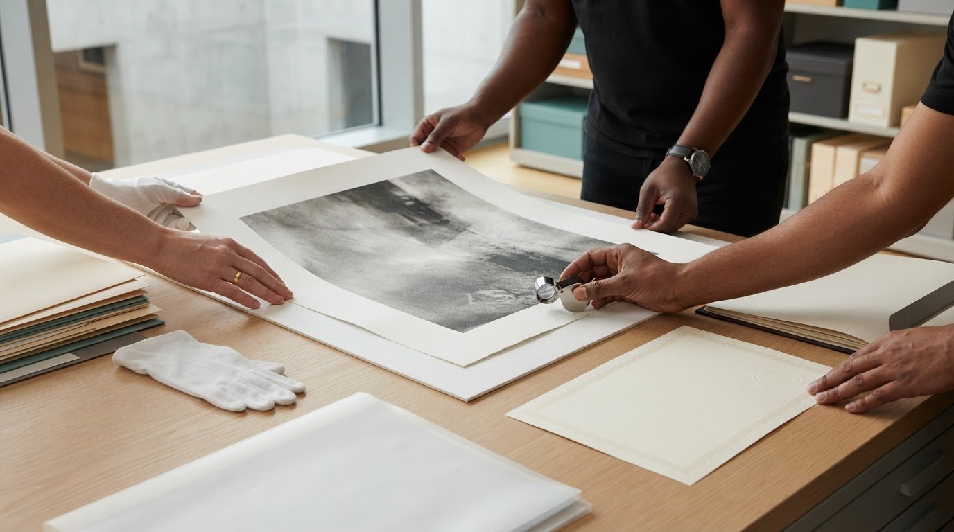
Understanding Print Edition Numbers: A Collector’s Guide

A print marked 1/100 isn’t automatically more valuable or better made than one numbered 40/100. Understanding print edition numbers starts with seeing them as a record of a work’s place within a stated run, not a verdict on its quality. The numerator identifies the individual impression; the denominator indicates the edition’s total size. But that fraction alone can’t reveal when the print was made, how it was produced, or how it has been cared for.

It’s natural to wonder whether a low number, a limited-edition label, or an artist’s proof signals greater rarity and value. The details matter, but they need context. This guide explains how to read edition markings, distinguish limited and open editions from proofs, and understand what the numbers can and can’t tell you. You’ll also learn how to weigh edition information alongside condition, provenance, and presentation when comparing photographic prints and other works on paper.

Key Takeaways

  • Understanding print edition numbers starts with reading the fraction correctly: the top number identifies the impression, while the bottom gives the edition size.
  • Compare limited and open editions by whether the print run is capped, not by assuming one reflects greater artistic merit.
  • Recognize artist’s proofs as a distinct marking, while remembering that their use and quantity can vary.
  • Assess a print beyond its number by considering attribution, publisher, provenance, medium, condition, and accompanying documentation.
  • Use edition details alongside the image, materials, size, and intended display to compare prints with greater confidence.

What Do Print Edition Numbers Mean? Read the Marking Correctly

Print edition numbers identify an individual impression within a stated edition. The top number indicates that impression, and the bottom number shows the edition’s total size. This fraction is a useful starting point, but it doesn’t tell the whole story of a print’s creation or significance.

Understanding print edition numbers means reading the notation alongside information about the artist, publisher, and print process. Conventions differ: some works use a fraction, while others may have a lettered marking or another form of documentation. Treat the number as one detail in the print’s record, not a complete account of its quality, history, or value.

What does a marking such as 12/100 mean?

In the common fraction format, 12/100 means the print is identified as number 12 in an edition of 100. The denominator describes the declared size of that edition; the numerator distinguishes this impression from the others in it.

The “12” isn’t a quality grade. It doesn’t mean this impression is sharper, more carefully made, or more desirable than number 40. Nor does the fraction alone establish how the print was produced or how it was documented. Interpret the marking in context, taking account of the edition information and any supporting details provided for the work.

Is the edition number the same as the print number?

In everyday collecting, people may call the numerator the print number. More precisely, it identifies an individual impression within the edition, while the denominator states the total declared edition size. So in 12/100, “12” identifies the impression and “100” describes the edition.

The numerator doesn’t necessarily record the order in which prints were made, inspected, or released. A print numbered 12 may not have been produced before one numbered 40. A lower number therefore isn’t inherently more desirable. Consider the work’s documentation and condition rather than treating the numerator as a ranking.

Other markings may appear alongside edition fractions. For example, “A/P” can indicate an Artist’s Proof, a related proof designation with a different meaning from a standard numbered impression. Interpret the marking according to the conventions used for that particular work rather than assuming it follows the same numbering system.

A careful reading begins with two questions: what does each part of the marking designate, and what context explains the convention? These questions help separate useful edition information from assumptions the numbers alone can’t support.

How Are Limited-Edition Prints Numbered and Produced?

A limited-edition print has a declared boundary: the artist or publisher sets the intended number of impressions for that edition. Prints are produced using the chosen process, and individual impressions may be numbered, signed, or recorded in accompanying documentation. The sequence and details vary, so read a fraction alongside information about the work and its production.

In a fraction, the denominator communicates the stated total size of that edition, not how many prints remain available. For example, the “30” in 5/30 indicates an edition declared to contain 30 impressions. It doesn’t tell you how many have been sold, retained, or released at a particular moment.

What does the denominator tell a collector?

The denominator records the edition size for the specific work and edition being described. Availability is a separate matter: some impressions may already be with collectors, while others may be held back or released later. The notation alone doesn’t show when each print entered circulation or whether the entire edition was offered at the same time.

This distinction is central to understanding print edition numbers. A declared edition size describes the intended scope of a run; a seller’s current stock describes only what is available now. Christie’s guide to the original print provides further context on prints and multiples, including how edition notation functions.

Can the same image appear in different editions or formats?

Yes. An image may be printed in different sizes, on different materials, or through distinct processes, and those versions may be treated as separate editions. The artist or publisher’s terms determine how each edition is defined; there isn’t one universal convention that automatically groups every version of an image together.

Read the documentation for the particular print rather than assuming that a number applies to every reproduction of the image. Look for details that identify its format, medium, edition size, and publisher. These particulars help distinguish one defined run from another, especially when the same image appears in more than one presentation.

An edition reflects decisions about both scope and production. Methods can range from traditional printmaking to photographic printing, and the process may influence how impressions are made and documented. For a broader introduction to collecting photographic prints and memorabilia, explore curated print collections.

Limited Edition, Open Edition, or Artist’s Proof: What Is the Difference?

These labels describe different relationships to a print run, not a simple scale of artistic merit. A limited edition has a stated production cap; an open edition has no fixed limit declared in its terms; and an artist’s proof is a related proof marking whose meaning and use depend on the artist or publisher. None of these labels, on its own, establishes a print’s authenticity, condition, or market value.

Understanding print edition numbers means looking beyond the label to the documentation for the specific work. Christie’s guide to collecting prints offers further context on printmaking and the role edition information plays in collecting.

  • Limited edition: A declared, bounded run, often represented by a fraction such as 12/100. Check which work or format the stated edition size applies to.
  • Open edition: A print offered without a stated fixed edition limit. Review the description for details about its medium, publisher, and production.
  • Artist’s proof: Often marked AP or A/P, this is a proof associated with an edition and may be marked separately from its numbered impressions. Its meaning depends on how the term is used for that particular print.

How does a limited edition differ from an open edition?

A limited edition is defined by a stated cap on the number of impressions in that edition. An open edition has no such fixed limit in its terms. This distinction concerns the scope of production, not whether a print is more beautifully made, more significant, or better suited to a collection. Both formats can appeal for different reasons, depending on the work and the collector’s interests.

What is an artist’s proof, or AP?

AP commonly stands for artist’s proof, a marking associated with a print edition and sometimes shown outside its main numbered run. Proof practices and quantities vary by artist and publisher, so the letters alone don’t establish rarity, quality, or value. Read the accompanying description or documentation to understand how the proof relates to the edition.

Edition terminology can be informative, but it isn’t a substitute for a fuller assessment. A limited-edition label doesn’t independently prove that a print is authentic, and an AP marking doesn’t automatically make one more desirable. Consider the artist attribution, publisher, provenance, condition, and documentation together. This keeps the focus on the print itself and the evidence that accompanies it.

How Should You Assess a Print Beyond Its Edition Number?

An edition marking is one clue in a print’s story, not a complete assessment. Edition size alone cannot establish a print’s authenticity, market value, demand, or future appreciation. A small declared run may be relevant, but it doesn’t replace attention to who made or published the work, what it’s printed on, and how it has been preserved.

Use this checklist to build a fuller picture:

  • Artist attribution: Does the stated artist match the work’s accompanying description?
  • Publisher and production details: Are the publisher and medium identified, and do they correspond with the print’s documentation?
  • Provenance: Is there information about the work’s ownership or history?
  • Condition: Examine the print for visible wear, damage, or changes that could affect its appearance.
  • Documentation: Compare certificates, labels, and other records with the edition marking and description.

What evidence helps establish a print’s identity and provenance?

Attribution connects a work to its stated artist, while provenance provides a record of its history and ownership. A certificate or other documentation can support that account, especially when details such as title, medium, publisher, and edition information are consistent. Treat documents as useful evidence, not automatic proof in isolation. Compare their details with the print and its accompanying description.

Does a lower edition number make a print more valuable?

No. A lower numerator alone doesn’t reliably establish greater value. It identifies an impression within an edition, but not its quality or place in a hierarchy. The artist, image, edition terms, condition, provenance, and collector demand all provide context. A small edition also doesn’t guarantee authenticity or future appreciation. Assess the work as a whole rather than allowing one number to stand in for evidence.

For photographic prints and collectable works, the image matters alongside its physical presentation and history. Condition affects how a print looks and feels in a space, while framing can help present it thoughtfully. Galerie Prints brings together photography and collectable print categories from curated archives, with framing options for purchased prints. Explore curated photographic prints with these considerations in mind.

Using Edition Knowledge to Choose a Collectable Print

Edition details are most useful when considered alongside the image and how you want to live with it. A number can clarify a print’s stated place in a run, but your choice should also reflect the photograph’s subject, its materials, and how it will sit within your space. For broader collecting and display ideas, read Fine Art Photography: A Curator’s Guide to Collecting and Decorating.

What should you look for in a print listing?

Read each description carefully, separating stated details from assumptions. A limited-edition label, for example, tells you about the edition terms as described, but it doesn’t establish quality or value by itself. As you compare prints, consider:

  • Edition information: Note the stated size and any numbering or proof marks. Treat the listing’s wording as the starting point, not a reason to infer details it doesn’t provide.
  • Image and context: Consider the subject, the photographer’s perspective, and the story or period the image evokes. A print’s appeal can be personal as well as historical.
  • Materials and format: Compare the available size and paper choices with the scale and character you want in the room.
  • Presentation: Think about where the work will hang and whether framing suits the setting. A considered frame can help integrate a print into its surroundings.

This is where understanding print edition numbers becomes practical: the marking helps you read the edition statement, while the image, materials, and intended display help you decide whether the work is right for you. A striking photograph with edition terms that meet your preferences may be more satisfying than one selected simply for a smaller numerator. Beyond traditional gallery prints, that same appreciation for tangible presentation extends to custom memorabilia from Custom Sports Products, where personalized trading cards and photo plaques turn meaningful sporting moments into display-worthy keepsakes.

How can a curated gallery support a considered choice?

A curated gallery offers a starting point for discovering photography and collectable print categories, bringing works together through their subjects, creators, and visual character. Galerie Prints presents photography from archives including the Slim Aarons Collection and works by Terry O’Neill, alongside collectable cinema memorabilia. Compare each work’s description and edition details, then consider how its scale and materials will complement your space.

Once you’ve chosen a print, Galerie Prints’ bespoke framing service offers a way to prepare it for display. Weigh the image, edition terms, materials, and presentation together. Explore the Galerie Prints collections to discover works for your collection and home.

Collect with Clarity and Confidence

Understanding print edition numbers helps you read a marking accurately, but the fraction is only one part of a print’s story. The denominator describes the stated edition size, while the numerator identifies an impression. Neither a low number nor a limited-edition label, by itself, establishes authenticity, quality, or value.

A considered choice brings edition terms together with the artist, publisher, provenance, medium, condition, and documentation. Then look beyond the paperwork: the image’s subject, its materials, and the way it will live in your space all shape the pleasure of collecting.

Galerie Prints presents curated works from the Slim Aarons Collection, alongside photography by Terry O’Neill. Once you’ve found a print that speaks to you, professional bespoke framing is available for purchased prints, helping prepare the work for display.

Explore the curated print collections and discover a work that feels meaningful to collect and rewarding to display.

Frequently Asked Questions

What does 1/50 mean on a print?

On a print using the common fraction format, 1/50 usually identifies impression number 1 in a stated edition of 50. The denominator describes the edition size, while the numerator distinguishes that impression within the run. The “1” doesn’t necessarily mean it was printed first, and the notation doesn’t grade its quality. Read it alongside the work’s description and documentation to understand the edition terms being used.

Is a lower print edition number more valuable?

No. A lower numerator alone doesn’t reliably make a print more valuable or desirable. It identifies an impression within the edition, but doesn’t indicate superior quality, production order, or greater demand. Collectors also consider the artist, image, edition terms, provenance, documentation, and condition. A number can help describe a print, but it shouldn’t be treated as a ranking or a prediction of future appreciation.

What does AP mean on a limited-edition print?

AP commonly stands for “Artist’s Proof,” a marking associated with an edition and sometimes used for impressions marked separately from the numbered run. The meaning, quantity, and handling of proofs can vary between artists and publishers. An AP marking alone doesn’t establish that a print is rarer, more valuable, or identical to every other impression. Read the work’s accompanying description and documentation for its specific context.

Are limited-edition prints more valuable than open-edition prints?

Not automatically. A limited edition has a stated production cap, while an open edition has no fixed limit stated in its terms. That distinction describes production, not artistic merit or guaranteed market value. A print’s appeal depends on factors such as the artist, image, condition, provenance, and collector demand, as well as its edition details. Consider the particular work and its documentation rather than relying on the label alone.

Can the same photograph have more than one edition?

Yes. The same image may be produced in different sizes, media, or formats, with each version described under separate edition terms. The artist or publisher determines how a particular run is defined, so don’t assume one edition statement applies to every version of the photograph. Compare the description and documentation for the specific print, paying attention to the stated format, medium, publisher, and edition size.

Does a numbered print prove it is authentic?

No. A number is useful identifying information, but it doesn’t prove authenticity on its own. Consider it alongside artist attribution, publisher details, provenance, the print’s condition, and any accompanying documentation. Check that the details are consistent with one another and with the description of the work. Understanding print edition numbers helps you interpret the marking, while the broader evidence provides a more complete basis for assessing the print’s identity.

What is the difference between a print number and an edition size?

In a fraction such as 12/100, the print number is generally the numerator, “12,” which identifies the individual impression within the edition. The edition size is the denominator, “100,” which states the total size of that edition. The number doesn’t necessarily indicate when the print was made or inspected. Conventions can vary, so interpret the marking with the work’s own description and documentation.

Understanding Art Print Quality: A Curator’s Guide to Fine Art Standards

Have you ever wondered why a photograph displayed in a gallery possesses a luminous, almost tactile depth that seems impossible to replicate at home? It’s a common frustration for collectors who fear that a prized acquisition might arrive looking pixelated or, worse, begin to yellow and fade within a few short years. Truly understanding art print quality requires looking beyond the image itself to the invisible alchemy of paper, ink, and artisanal precision.

We recognize that deciphering terms like Giclée, archival pigment, and GSM often feels like learning a hidden language. You deserve the certainty that your investment will remain a vibrant piece of history for decades to come. This guide reveals the technical and artisanal hallmarks that distinguish a museum-grade fine art print from a standard reproduction. We will explore the essential trinity of source integrity, archival chemistry, and professional finishing; this knowledge ensures you can read any product specification with the discerning eye of a seasoned gallery expert.

Key Takeaways

  • Master the distinction between commercial 4-colour printing and the 12-colour Giclée pigment systems that guarantee a lifespan of over 100 years.
  • Learn to identify premium material ingredients, specifically why 300gsm cotton rag paper remains the undisputed benchmark for tactile and visual depth.
  • Refine your approach to understanding art print quality by exploring why source integrity, especially direct access to historical archives, dictates the final visual impact.
  • Understand the vital role of bespoke framing in preserving your collection; learn how UV-protective glass prevents the irreversible bleaching of fine art.
  • Discover the curatorial difference of artisanal production where the human eye, rather than an automated factory, ensures every piece meets museum standards.

The Fundamental Shift: Fine Art Prints vs. Standard Posters

To the untrained eye, a print might seem like a simple reproduction. However, the gulf between a commercial poster and a museum-grade print is vast. It’s the difference between a fleeting decorative item and a legacy piece. When you’re understanding art print quality, you must first recognize that fine art prints are engineered for permanence. While a standard poster may begin to fade or yellow within five short years, a true archival print is designed to remain pristine for over a century. This isn’t just a marketing claim; it’s a result of rigorous material science.

This durability stems from the use of acid-free substrates. Over time, the lignin found in standard, wood-pulp paper reacts with light and oxygen. This reaction causes the “browning” or “foxing” that ruins lesser works. Fine art standards require materials that are chemically stable and PH-neutral. This ensures the paper remains as crisp and white as the day it was struck, providing a stable foundation for the imagery it holds.

What is a Giclée Print?

The term Giclée, derived from the French word gicler meaning “to spray,” represents the pinnacle of digital reproduction. Unlike the basic 4-colour CMYK process used by high-street commercial printers, a Giclée printer utilizes a sophisticated 12-colour pigment system. This allows for a vastly expanded colour gamut and incredibly smooth graduations. By understanding the printmaking process through this lens, collectors can appreciate how archival pigment inks provide a depth of tone that standard dye-based inks cannot match. The “dot gain” is meticulously controlled, preventing the pixelation that often plagues mass-produced prints.

The Aesthetic Impact of Archival Materials

The emotional impact of a fine art print is often found in its relationship with light. Premium papers, often crafted from 100% cotton rag, possess a natural texture that absorbs light rather than reflecting it harshly. This creates a “luminous” quality, which is particularly vital for capturing the subtle silver and charcoal tones in black and white photography. High-quality papers avoid “optical brighteners,” which are chemical additives that can break down and cause the art to shift colour over time. When you’re understanding art print quality, you’ll notice that museum-grade prints have a tactile, three-dimensional presence that makes the image feel alive, unlike the flat, plastic look of a standard poster.

The Materiality of Art: Understanding Paper and Ink Chemistry

The true soul of a museum-grade piece lies in its molecular composition. While the image captures the eye, the physical materials ensure the work endures. Understanding art print quality requires an appreciation for the delicate balance of paper and ink chemistry. Standard prints often rely on dye-based inks, which are essentially liquid stains. These are highly vulnerable to UV degradation, causing vibrant reds and deep blues to vanish within years. In contrast, archival pigment inks are composed of solid particles of mineral or synthetic origin. These particles sit on the surface of the paper rather than soaking in, resisting the “bleaching” effect of sunlight and ensuring the work remains a permanent fixture in your home.

The choice of surface finish further defines the visual narrative. A Lustre finish provides a gentle sheen that enhances contrast and saturation without the harsh reflections of high gloss. Matt surfaces offer a sophisticated, reflection-free viewing experience, ideal for spaces with abundant natural light. For those seeking a classic, historical aesthetic, a Pearl finish mimics the subtle glow of traditional gelatin-silver prints, adding a layer of nostalgic elegance to the imagery.

The Weight of Quality: Why GSM Matters

Weight is a silent indicator of prestige. In the art world, we measure this in Grams per Square Metre (GSM). A 150gsm poster feels fragile, almost disposable. However, the gallery standard is 300gsm or higher. This card-like stability is essential for large-format fine art photography. Heavier paper is not merely about a premium feel; it provides the structural integrity needed to prevent “cockling.” This unsightly rippling occurs when thinner papers expand and contract in response to changes in humidity, a flaw that can ruin the presentation of a framed work.

Cotton Rag: The Gold Standard for Collectors

When curators discuss the “ingredient list” of a print, cotton rag is the undisputed gold standard. Unlike standard papers made from wood pulp, cotton rag is naturally acid-free and pH neutral. It does not contain the lignin that causes cheaper prints to turn brittle and brown. The texture of cotton rag is deeply tactile, possessing a soft, painterly dimension that draws the viewer in. It is this purity that allows museum curators to preserve historical works for centuries. By understanding art print quality through the lens of these premium substrates, you can invest with the confidence that your collection is built on a foundation of permanence. You might find yourself drawn to the tangible excellence of our hand-selected archives, where every piece is struck on these very standards.

Source Integrity: Why Provenance Dictates Visual Quality

The true essence of a masterpiece is often decided long before the printer is ever engaged. While many collectors focus on the technical specs of the output, understanding art print quality requires a deeper investigation into the provenance of the source material. In the curatorial world, we adhere to the “Garbage In, Garbage Out” rule. A high-resolution scan of a poor, third-party copy will never possess the soul of a print struck directly from the original negative. Authentic source integrity ensures that the grain structure, depth of field, and subtle light transitions remain exactly as the artist intended.

Working with official archives, such as Getty Images, provides a significant advantage that mass-market retailers simply cannot replicate. For example, the iconic work of Terry O’Neill or the “Technicolor” vibrancy of the Slim Aarons collection relies on access to the original transparencies. These physical artifacts hold a wealth of visual information that is lost in subsequent generations of copies. When these details are captured correctly, they require an archival-quality fine art paper to translate that inherited brilliance into a physical object that commands attention in a room.

Original Archive Access vs. Third-Party Scans

The process of creating a premium print begins with scanning original 8×10 transparencies at immense resolutions. This method captures microscopic details that third-party scans often miss, resulting in a clarity that feels almost three-dimensional. Unauthorized or “bootleg” prints frequently appear muddy, lacking the critical shadow detail that defines high-end photography. By securing direct access to these historical archives, we ensure that every tonal graduation is preserved, maintaining the prestigious standard that serious collectors expect. This level of integrity is what separates a mere poster from a guardian of photographic heritage.

The Truth About DPI and Large Format Printing

A common myth in the digital age is that 300 DPI is a universal standard for quality. While this may suffice for small prints, large-scale wall art demands a much more sophisticated approach to resolution. Relying on interpolation, or digital upscaling, to enlarge an image can ruin the crispness of a Terry O’Neill portrait, introducing soft edges and digital artifacts. Native resolution is the inherent detail captured by the original camera lens at the moment of exposure. Understanding art print quality means recognizing that no amount of digital manipulation can replace the raw, authentic detail found in the original source material. When an image is printed at its true scale—often requiring the precision and equipment of a large format expert like Banner 4 Sale—the result is a sharp, evocative piece that stands up to the closest inspection.

Preservation and Presentation: The Role of Bespoke Framing

The pursuit of excellence doesn’t end when the pigment hits the paper. In fact, a high-quality print is only as secure as the architecture protecting it. While we’ve discussed the molecular stability of cotton rag and archival inks, these elements remain vulnerable to external stressors if housed in inferior framing. Truly understanding art print quality involves recognizing that the frame is not merely a decorative border but a functional shield. A museum-grade print is a masterpiece in waiting; its final form is dictated by the vessel that holds it.

Standard, off-the-shelf frames often utilize wood-pulp materials that contain lignin and other acidic compounds. Over time, these chemicals migrate into the art, causing irreversible staining and “burn” marks. We treat every piece with a curatorial “Seal of Quality,” utilizing bespoke, hand-finished frames that prioritize preservation alongside aesthetic elegance. This ensures the chemical interaction between the frame and the print remains neutral, protecting the integrity of the work for decades.

UV Protection and Optical Clarity

Light is both the creator and the destroyer of photography. Standard glass offers little resistance to ultraviolet rays, which act as a slow-motion bleach on even the most robust pigment inks. In sunlit rooms, this exposure leads to a loss of tonal range and vibrancy. Museum-grade UV acrylic or specialized anti-reflective glass acts as a high-factor “sunscreen” for your photographic investment. This clarity is especially vital for black and white pictures, where the preservation of deep blacks and subtle grey gradients is essential to maintaining the work’s emotional impact. High-end glazing ensures that the only thing you see is the art itself, free from distracting reflections.

Acid-Free Mounting and Spacers

The “hidden” threat to longevity often lies behind the print. Professional curators insist on acid-free, conservation-grade mounting to prevent the browning associated with cheap materials. We often distinguish between “dry mounting,” which flattens the print for a perfectly smooth finish, and “hinge mounting,” which allows the paper to breathe and move naturally with atmospheric changes. Another critical component is the use of spacers. These small, invisible inserts ensure the print never touches the glass directly. Without spacers, condensation can trap moisture against the ink, causing the paper to stick or “cockle.” Bespoke framing is a structural necessity that ensures your art remains a lasting piece of history. Experience the difference of our Bespoke Framing Service, where artisanal craftsmanship meets museum standards.

The Galerie Prints Standard: Curating Excellence in London

At Galerie Prints, we believe that understanding art print quality is not just a technical exercise; it’s an appreciation of the human touch. While much of the industry leans toward high-volume, automated “print-on-demand” factories, we maintain a steadfast commitment to artisanal production. Every print that leaves our studio is treated as a museum object. This means we don’t just hit a button and hope for the best. We employ a meticulous “Human Eye” check at every stage, ensuring that the tonal balance and detail meet our exacting standards before any work is signed off for delivery.

Our position as a guardian of photographic heritage is built on exclusive access to the world’s most prestigious archives. Whether it’s the sun-drenched poolside scenes of Slim Aarons or the intimate celebrity portraits of Terry O’Neill, these works are struck from the finest source materials available. When you acquire a piece from us, you aren’t just buying a decoration; you’re securing a lasting piece of history that has been handled with the reverence it deserves.

Artisanal Craftsmanship in the Heart of London

Our master printers and framers operate with a localized expertise that only decades of experience can provide. Hand-finishing is a cornerstone of our process. Whether it’s the precise cut of a conservation mount or the careful alignment of a bespoke frame corner, these details can’t be replicated by a machine. Our London gallery heritage informs every choice we make, from the specific texture of our archival papers to the weight of our hand-selected timber frames. This dedication to craft ensures that each piece possesses a tactile quality that commands attention in any room.

Building Your Collection with Confidence

Investing in art should be an act of joy, supported by the knowledge that you’re acquiring something of genuine value. When you look for authentic cinema lobby cards or limited edition prints, you’re looking for a tangible connection to a bygone era. Buying from a gallery that prioritizes source integrity provides long-term security for your collection. Understanding art print quality means knowing that your piece has been crafted to survive the test of time, both physically and aesthetically. We invite you to explore our curated archives and discover a world where historical significance meets modern elegance.

Crafting Your Legacy: The Final Step in Curating Your Collection

We invite you to begin this journey with a partner who shares your reverence for photographic heritage. As official partners of the Getty Images Gallery and specialists in the Slim Aarons and Terry O’Neill archives, we apply these rigorous standards to every piece we strike. From our bespoke hand-finished framing in London to our selection of premium cotton rag papers, we ensure every detail is handled with curatorial precision. Explore our curated collections of museum-grade Fine Art Prints and discover the difference that artisanal dedication makes. Your walls deserve nothing less than a lasting piece of history.

Frequently Asked Questions

What is the difference between a Giclée print and a digital C-type print?

A Giclée print utilizes a high-precision inkjet process with archival pigment inks, whereas a digital C-type print is a light-sensitive photographic paper developed through traditional chemical processes. Giclée prints generally offer a superior colour gamut and significantly greater longevity. Collectors often prefer Giclée for its painterly texture on matte papers; conversely, C-type is favoured for its continuous tone and “true photograph” aesthetic on gloss or lustre surfaces.

How can I tell if a print is truly “archival” when shopping online?

Truly archival prints are defined by their ingredients; specifically, the use of 100% cotton rag or alpha-cellulose paper and pigment-based inks. When shopping online, look for explicit mentions of these materials rather than vague terms like “premium paper.” A reputable gallery will provide detailed specifications regarding the paper weight and ink system. Understanding art print quality means identifying these technical hallmarks to ensure your acquisition won’t degrade over time.

Why does the GSM of the paper matter if I am framing the art?

The GSM (Grams per Square Metre) dictates the structural integrity of the paper, which is essential to prevent “cockling” or rippling within the frame. Even when secured behind glass, thinner papers react to atmospheric humidity by expanding and contracting. A heavier weight, such as 300gsm or higher, provides the rigidity required to maintain a perfectly flat presentation. This stability is a key component in understanding art print quality for large-format displays.

Will my fine art print fade if it is placed in a bright room?

While archival pigment inks are exceptionally lightfast, any artwork will eventually suffer from prolonged exposure to direct, intense sunlight. The best defense is museum-grade glazing with UV protection, which acts as a barrier against the rays that cause bleaching. Placing your art on a wall that receives indirect light is always preferable. This curatorial approach preserves the vibrancy of the “Technicolor” tones found in archives like the Slim Aarons Collection.

What is the best way to clean the glass of a framed art print?

You should use a soft, lint-free microfibre cloth and a specialized ammonia-free glass cleaner to maintain the optical clarity of your frame. Never spray the cleaning solution directly onto the glass, as liquid can seep under the rebate and damage the mount or the print itself. Instead, mist the cloth lightly before gently wiping the surface. This careful maintenance ensures that the intricate details of your photographic investment remain visible and pristine.

Are limited edition prints higher quality than open editions?

Limited edition prints are not inherently higher in material quality than open editions, but they often carry a higher curatorial standard. These editions are frequently produced under the artist’s or estate’s supervision, ensuring the colour balance and contrast are perfect. The value lies in their scarcity and documented provenance. At Galerie Prints, we apply the same museum-grade production standards to all our works, from Terry O’Neill portraits to vintage movie posters.

How do I know if the resolution of a print is high enough for a large wall?

High resolution for large-scale art depends on the native resolution of the original source, such as an 8×10 transparency, rather than just the digital DPI. If a print is enlarged beyond its native capacity, you’ll notice soft edges or a “muddy” appearance in the shadows. For a large statement wall, the source must be a high-fidelity scan of an original negative. This ensures the grain structure remains crisp even at significant dimensions.

What does “acid-free” actually mean for the lifespan of my art?

Acid-free refers to materials that are PH-neutral and free from lignin, a natural component of wood pulp that causes paper to turn yellow and brittle. Using acid-free mounts and papers is a non-negotiable requirement for historical preservation. Without this standard, the chemical breakdown of the substrate would eventually destroy the image from the inside out. This commitment to chemical purity is what allows a fine art print to last for over a century.