Tag: Photo Prints

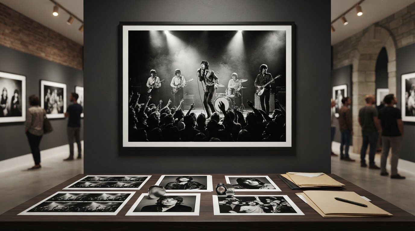
Rolling Stones Tour Photos and Historic Performances

The best places to look for Rolling Stones photographs are specialist photography galleries and curated music-image collections. If you’re deciding where to buy Rolling Stones photos, begin with the image’s photographer, date and context: Art Kane photographed the band in 1966, while Roger Jackson’s “Park Stones” captures them walking through Green Park in 1967.

A great Rolling Stones photograph offers more than a familiar face: it can capture the atmosphere of a performance, a moment between shows or the band in another era. Understanding the image’s context can help you find a photograph that resonates with your connection to the music.

This guide explores historic performance images, candid photographs and portraits of band members and their collaborators. You’ll also learn how to compare image subjects and provenance, and what to consider when choosing a print for a collection or a place in your home.

Key Takeaways

  • Trace a photograph through its photographer, date, setting and edition details to understand the story behind the image.
  • Compare live-performance scenes, candid moments and portraits to find the kind of Rolling Stones image that suits your collection.
  • Look beyond the band itself: photographs of members with fellow musicians can capture a wider chapter of music history.
  • Before purchasing, distinguish ownership of a physical print from permission to reproduce or use the photograph.
  • Explore how image format, presentation and the photograph’s historical context shape its appeal as a collectible or display piece.

Historic Rolling Stones images and performances

Historic Rolling Stones photographs can preserve more than a performance: they record a place, a moment and the way the band appeared to the camera. Start by reading the caption alongside the image. A named photographer, location and date can help distinguish a concert scene from a portrait or an informal moment away from the stage. Those details also give you a clearer way to compare photographs with different moods.

One example is Dominic Lamblin’s photograph “Rolling Stones in Montreux, Switzerland 1972.” It is signed and numbered in an edition of 50. The Montreux setting and date give the image a specific historical frame, while the edition information identifies it as part of a defined print run. For collectors, those details can make a photograph easier to place and discuss than an image with only a band name attached.

Performance photographs and candid images offer distinct perspectives on the band’s history. A live image centres on gesture, movement and the relationship between musicians and audience. A photograph taken away from the stage may draw attention to expression, clothing or setting. Decide which kind of moment you want to live with to narrow a broad search to images that feel personal.

Captions deserve close attention. Compare the photographer’s name, the stated place and the date, then note whether the title describes a performance, a location or the people pictured. For example, “Rolling Stones in Montreux, Switzerland 1972” provides a place and year, not simply a general band identification. Keep those details together when considering several photographs, so images from different moments don’t blur into one undifferentiated collection.

Edition information adds another layer to a historic print. In Lamblin’s Montreux photograph, the signed, numbered edition of 50 gives the print a defined place within its edition. Treat the signature, numbering and title as separate details when reading an artwork description. Together, they help you understand what is being offered and why the photograph belongs to a particular historical and photographic context.

  • Choose a subject: live performance, portrait or candid scene.
  • Read the caption for photographer, place and date.
  • Note edition details, including a signature and numbering.

These steps make it easier to compare historic Stones images by visual character and documented context. Lamblin’s Montreux image, for example, may appeal to someone drawn to a specific place and year, while another collector may prefer the energy of a stage scene. Let the setting, caption and edition details guide your selection, rather than relying on the band’s name alone.

Photo collections and image providers

Rolling Stones photographs appear in different kinds of collections, each offering a distinct way to search. A photographer-led archive groups work around an individual perspective, while a music collection brings together artists, eras and performance settings. A gallery collection may be arranged by signed prints, limited editions or subject matter. Start with the kind of image you want, then narrow your search by photographer, date or place.

Photographer names can make a broad search more precise. Terry O’Neill’s work, for instance, includes portraits and images of musicians, while Gered Mankowitz’s Stones photographs offer another path into the band’s visual history. Search the photographer’s full name alongside “Rolling Stones,” then compare captions and image details rather than relying on a thumbnail alone.

Collection structure also affects what you discover. A music archive may include portraits, backstage moments and images of musicians together; a concert-focused collection may foreground stage action. If you’re drawn to a particular period, pair “Rolling Stones” with a place or year. A location-based search can uncover photographs that a general band-name search misses.

Compare listings by the information attached to each photograph. Look for the photographer, image title, setting, date and print details. A caption naming a studio or city, for example, gives you a more specific starting point than a description that identifies only the band. Record these details as you browse to compare images accurately across collections and avoid confusing similar scenes.

Use this short search sequence to keep your search focused:

  • Choose a subject, such as a live performance or band portrait.
  • Search the subject with a photographer’s name, such as Terry O’Neill.
  • Add a place, year or venue when you have one in mind.
  • Compare captions, edition descriptions and presentation details.

This sequence helps distinguish a broad image search from a purposeful collection search. “Rolling Stones” plus “Terry O’Neill,” for example, narrows the photographer; adding a studio or year can help identify a particular image. Keep a shortlist with each photograph’s caption and collection context. You can then compare the images’ historical focus rather than choosing solely by first impression.

Collectors interested in music photography can also explore adjacent subjects, such as portraits of fellow performers or collaborators. Keep the Stones as your anchor, then broaden the search with a musician’s name when the image’s wider musical context matters. To explore a wider selection of photographic art, browse curated photographic collections.

Photographs of band members and collaborators

Images of Rolling Stones members with other musicians reveal connections beyond the band’s performances. A photograph can place Mick Jagger or Keith Richards within a wider musical circle, making the collaborator, setting and date part of its appeal. These works suit collectors interested in shared histories, not only group portraits. Caption names help identify those relationships and compare images with different subjects.

Eddie Kramer’s photograph of Jimi Hendrix and Mick Jagger at Madison Square Garden, New York City, in 1969, brings two influential musicians into one frame. Its title identifies both performers, the venue and the year, giving the image a clear historical setting. Consider whether you’re drawn to the meeting of artists, the specific New York location or the period represented. Each detail offers a different reason to choose the photograph.

Other images place Stones members alongside celebrated collaborators. Bob Gruen’s photograph of Keith Richards with Tina Turner and David Bowie in New York City in 1983, for example, centres a trio of major musical figures. Ken Regan’s 1972 New York City image brings Richards and Jagger together with Bob Dylan. These captions help distinguish a photograph’s significance from a general band portrait.

Peter Simon’s photograph of Keith Richards, Mick Jagger and Peter Tosh, dated 1978, offers another route into the Stones’ musical relationships. Compare its named subjects with the New York scenes by Gruen and Regan. The collaborators, dates and locations create different historical associations, even when a photograph features the same Stones members. A caption can therefore guide both research and personal selection.

For a different perspective, David Yarrow’s photograph The Rolling Stones depicts a scene in Wells, Nevada, dated 2023. Its contemporary date and named setting distinguish it from images documenting earlier decades. Consider whether you want a photograph tied to a particular musical encounter or one focused on the band in a specific place. That choice will shape the kinds of images worth comparing.

Use these details to assess a photograph’s subject and context:

  • Identify each named musician in the caption.
  • Compare the stated date and location with your interests.
  • Decide whether the collaboration or the Stones themselves anchor the image.
  • Keep the full title beside each shortlisted photograph.

These examples suggest useful search combinations: a band member’s name with a collaborator, place or year. Pairing “Keith Richards” with “Bob Dylan” or “Peter Tosh,” for instance, can narrow the search to a specific musical encounter. If the setting matters, add New York City or Madison Square Garden. Your shortlist can then reflect the story you want the photograph to preserve.

Photographs of the Rolling Stones for sale

For a more focused search, compare photographs by scene, photographer and listed price. A classic 1972 tour photograph is listed from $490. The contrast shows how image, context and the specific print can shape the range of available offers.

Other examples capture different moments in the band’s history, such as intimate studio sessions and energetic backstage moments.

These listings provide comparison points, not a universal valuation. The market snapshot for Rolling Stones and band-member photographic prints places typical offers between $151 and $2,000, with a median of about $490. It draws on 31 price samples from 3 sources, collected October 24, 2026, and is valid until November 23, 2026. Individual photographs can sit outside that range.

Consider the named image before comparing figures. Different titles, settings and listed formats make direct comparisons more complex than looking at price alone.

Use listing details to create a shortlist. Record the photographer, image title, date or place, and whether the figure is a starting price or displayed range. For example, compare the starting price for Russell’s 1972 tour photograph with the displayed range for Szabo’s 1978 image. This keeps unlike listing formats distinct and helps you identify which photographs best fit your interests.

  • Compare the full image title and photographer, not just the band name.
  • Distinguish a starting price from a displayed price range.
  • Keep the market snapshot’s date alongside its figures.

When searching for where to buy rolling stones photos through trusted platforms like Galerie Prints, international customers outside the United States are responsible for paying any duties or taxes imposed by their country before delivery. Include this in your purchase considerations. Comparing the photograph, its listing details and applicable charges in the destination country helps you assess the full transaction, rather than focusing on the displayed figure alone.

Buying a Rolling Stones photograph and receiving permission to reproduce it are different matters. Treat a print purchase as acquiring the physical artwork unless its written terms explicitly grant additional uses. Displaying a framed photograph at home, for example, differs from reproducing it on a website, album cover or advertisement. The photographer, rights holder and seller’s terms all matter.

Before purchasing a print, identify how you intend to use it. A collector seeking a photograph for private display has a different purpose from a publisher planning a book cover. An image for a business campaign or merchandise may require permissions beyond owning a print. Read the product description and any accompanying terms for details about permitted use.

Pay particular attention to terms such as “personal use,” “reproduction” and “commercial use.” A listing for a signed or numbered print describes the physical artwork; those details alone don’t explain whether you may reproduce the image. An edition statement, for instance, may identify a print’s place in a series without addressing online publication or promotional use.

Use this checklist before completing a purchase:

  • Write down your intended use, such as home display or editorial publication.
  • Read the listing and transaction terms for permitted uses and restrictions.
  • Separate ownership of the print from permission to copy or publish its image.
  • Keep the receipt and any written license with the photograph’s title and photographer.

Written terms are especially important when an image will appear beyond a private interior. Posting a photograph online, including it in a publication or using it to promote a product can involve distinct permissions. Don’t assume permission for one purpose extends to another. For example, a license describing editorial use shouldn’t automatically be read as permission for advertising.

Captions can help identify a photograph, but they don’t replace licensing terms. A title naming Mick Jagger, a photographer and a concert setting describes the subject and context. It doesn’t explain by itself whether copying or publication is authorized. Keep the caption with the seller’s written terms so the image and its permitted use remain clearly associated.

If your intended use changes after purchase, revisit the written terms before reproducing the image. A print bought for a living room may later attract interest from a magazine or business. That new purpose calls for a separate review of the applicable permissions. Careful recordkeeping preserves the distinction between owning a photographic artwork and having the right to use its image elsewhere.

Galerie Prints: The Slim Aarons Collection

Galerie Prints offers Terry O’Neill Photography for readers drawn to the atmosphere and artistry of classic music photography. If you’re looking beyond Rolling Stones images, this collection offers a way to explore photography from another era. The Slim Aarons Collection presents a different photographic perspective, while Cinema Lobby Cards and Star Wars Limited Edition Prints extend the selection into film and popular culture.

These collections suit readers choosing photographic art for its subject, historical character or place within a wider visual collection. Explore Terry O’Neill Photography when the photographer’s perspective matters as much as the musical subject, or consider The Slim Aarons Collection for a contrasting photographic style.

Visit Galerie Prints to explore its collections.

Choose the image that keeps its story alive

A photograph can be more than a record of a performance: it can shape a room’s atmosphere and keep a musical era close. As you decide where to buy Rolling Stones photos, consider which image you’ll want to return to and how its story will sit alongside the art you already value.

Galerie Prints offers Terry O’Neill Photography, The Slim Aarons Collection and Cinema Lobby Cards, each presenting a distinct perspective on photography and popular culture. Explore these collections as you consider what kind of visual history belongs in your space.

For a next step, contact Galerie Prints about Rolling Stones photos. Let your interest in a particular image, photographer or moment guide the conversation, and continue your search with a clearer sense of the photograph you hope to live with.

Frequently Asked Questions

Where can I buy authentic Rolling Stones photos online?

Look for galleries and music-photo archives whose listings identify the photographer and specific image. To decide where to buy Rolling Stones photos, compare the title, edition details and description of the physical print rather than relying on the band’s name alone. Galerie Prints offers a Music Archives category for music photography. Keep the listing details with your purchase record so you can identify the artwork later.

Which reputable photo agencies sell Rolling Stones concert photographs?

Specialist music-photo archives and fine-art photography galleries are relevant places to search for concert imagery. Compare each listing’s photographer credit, image title and event context to distinguish a performance photograph from a portrait. Galerie Prints offers Music Archives and Terry O’Neill Photography, collections for exploring music-related photographic art. Search by an artist or event as well as the band, then assess each listing on its own details.

Where can I buy vintage Rolling Stones prints and original photographs?

Search gallery and photographic archive listings, distinguishing a vintage print from a photograph described as an original. Those terms refer to different qualities, so read the item description carefully. Note the photographer, image title, print details and any condition information provided. If age matters to your collection, prioritize listings that clearly describe the specific object rather than relying on a general “vintage” label.

How much do Rolling Stones photos and prints typically cost?

Market offers for Rolling Stones and band-member photographic prints typically range from $151 to $2,000, with a median of about $490. This market snapshot is based on 31 price samples from 3 sources, collected October 24, 2026, and valid until November 23, 2026. Treat the range as a broad comparison, not a quote for a particular image. Photographer, rarity and print dimensions affect individual listings.

Where can I buy Rolling Stones photos in the United States?

US buyers can search online gallery collections and music-photography archives, comparing listings by image and photographer. Galerie Prints offers a Music Archives category and worldwide coverage. For a practical shortlist, record each candidate’s title, edition information and listed format. When comparing options across locations, also account for any duties or taxes imposed by your country before delivery.

Are Rolling Stones photos available as licensed fine-art prints?

Some photographs are offered as fine-art prints, but the purchase terms determine what uses are permitted. A print listing and image-use permissions are separate details. Before buying, decide whether you want the artwork for display or intend to reproduce the image elsewhere. Read the specific terms and keep them with your purchase record, especially if a publication or commercial project is involved.

How do Rolling Stones photo prints compare across sellers, sizes, and formats?

Compare like with like: the same photograph, photographer, edition status and physical format. Then consider the stated dimensions and whether the listing describes a print alone or a framed presentation. A lower figure may reflect a different size or format, so price alone doesn’t establish which option is the closer match. Keep each listing’s specifications together before choosing the version that suits your collection or display.
Luxury Hotel Art: Choosing Photography Prints

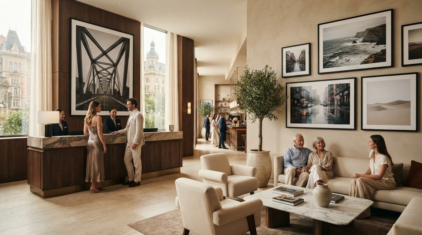
What if a hotel’s most memorable spaces are defined not by a single grand statement, but by photographs that quietly tell a story? The right art for luxury hotel decor can express a property’s sense of place, welcome guests into a distinctive atmosphere and create continuity across shared spaces without making every room feel the same.

Choosing that art takes more than matching colours to an interior. A striking image in a lobby may feel too imposing in a guest room, while repeating the same visual idea can build coherence or become impersonal if it lacks nuance. Subject, scale and presentation all shape how photography is experienced, from the first impression at reception to the quieter mood of a corridor or suite.

This guide explains how to select photographic prints for different hotel spaces, develop a visual identity that allows for varied moods, and compare sizing, cropping, framing and substrate options. Use the practical prompts to build a scheme that balances atmosphere, photographic perspective and a lasting sense of welcome.

Key Takeaways

  • Shape art for luxury hotel decor around the atmosphere and identity you want guests to experience, rather than choosing images by trend alone.
  • Give reception, dining areas, guest rooms and corridors distinct moods, balancing focal-point works with quieter pieces where guests come to rest.
  • Consider the photographer’s perspective and the image’s provenance to bring depth and context to your visual direction.
  • Build a practical art brief by recording each space’s purpose, intended atmosphere, shortlisted images and placement plans.
  • Explore exhibition-quality photographic prints and bespoke framing from Galerie Prints when developing a considered scheme.

How art for luxury hotel decor shapes a guest’s first impression

Art for luxury hotel decor is photography and other artwork selected as an integral part of a hotel’s guest-facing interior, with each work chosen to suit its setting, atmosphere and wider visual identity. Rather than filling empty walls at the end of a project, a considered art plan helps establish a space’s character from the moment a guest arrives.

A first impression forms through many details working together: architecture, light, furnishings and the images guests encounter. Artwork can add a point of focus, introduce calm or lend a room a sense of history. The effect needn’t be theatrical. A carefully placed photograph can draw the eye and invite a closer look, while a quieter image can let the interior breathe. For context, the role of hotels in hospitality spans different kinds of stays and guest experiences, making the property’s purpose and character a useful starting point.

What makes hotel artwork feel considered rather than purely decorative?

Look at the relationship between subject, scale, placement and function. A large, visually assured photograph might anchor a prominent reception wall; a more contemplative image may better suit a guest room intended for rest. A work seen from across a lounge has a different presence from one viewed at close range along a corridor. Let the room’s use and viewing distance guide the image’s energy and position.

Colour coordination matters, but it isn’t the whole composition. Art that simply repeats the interior palette can feel like another furnishing choice. Consider what the photograph adds: its subject, point of view, composition and emotional register. The aim is harmony with a little resonance, not a perfect match that leaves the space without distinction.

How can art express a hotel’s sense of place?

Begin with the building and its setting, then consider the experience the hotel intends to offer. Is the interior formal or relaxed, intimate or expansive, steeped in history or guided by a contemporary sensibility? These questions can shape an art direction without dictating a particular subject. The most fitting choice depends on the property, not on a formula for luxury.

Photography can suggest a narrative through what it shows and how it sees. A landscape may evoke openness; an architectural study can draw attention to structure and form; a candid portrait may bring human warmth. These are possibilities, not fixed meanings. Light, framing and the photographer’s perspective all influence how an image reads. Choose work that feels connected to the hotel’s character, whether that connection is direct or atmospheric.

A coherent visual identity doesn’t require identical pictures throughout the property. Think of it as a shared sensibility: a consistent level of quality, a considered approach to subject matter or a recurring visual mood. Individual spaces can still have their own character, with focal works where guests gather and more restrained choices where they pause or rest. This balance gives the hotel a recognisable point of view without making every wall tell the same story.

Plan luxury hotel art room by room without losing visual coherence

A successful art scheme responds to the way guests move through a property. Reception may call for a confident focal point, while a bedroom benefits from a gentler visual rhythm. Give each area a distinct role while retaining a shared sensibility, so the experience feels curated rather than assembled room by room.

What kind of artwork suits a hotel lobby or reception?

Reception is often a natural place for a defining work: a photograph or other artwork that gives the arrival space a clear centre of attention. Judge its scale against the wall, sightlines and surrounding furnishings. A large image can anchor an expansive surface, while a more intimate work may suit a smaller reception. For vast public zones where scale is paramount, techniques such as grand format banner printing illustrate how oversized visual displays can effectively command attention across open architecture. Photographic prints offer one considered option, but the right choice depends on the interior and the mood the hotel wants to establish.

How should guest rooms, dining spaces, and corridors differ?

In guest rooms, favour images that support rest rather than compete with the room’s primary purpose. Dining and lounge areas invite closer looking, so artwork with detail or a human presence can reward guests who linger. In corridors, a sequence can create a sense of progression: connect works through subject, palette or photographic character, while varying the images to avoid repetition.

Choose a visual thread that can travel between spaces without dictating identical choices. It might be a consistent approach to composition, a recurring tonal range or a preference for photographs with a particular sense of intimacy or movement. Apply that thread with different intensity: a strong statement at reception, considered pauses in public areas, and quieter works in private rooms. This allows art for luxury hotel decor to feel recognisable throughout the property while giving each space its own voice.

Use this checklist to turn the idea into a room-by-room plan:

  • Reception: Identify the main viewing wall and choose a focal work whose scale feels proportionate to the space.
  • Guest rooms: Prioritise a restful mood and consider how the artwork reads from the bed and seating areas.
  • Dining spaces: Look for images that invite a closer view and complement the pace and character of the room.
  • Lounges: Place artwork around seating to create moments of interest, balancing focal pieces with works that reward lingering.
  • Corridors: Plan a connected sequence, varying subjects and compositions while maintaining a shared visual thread.

Before selecting individual works, note each room’s purpose, principal viewing points and desired mood. Then review the choices together, not just as separate purchases. A photographic print that works beautifully in isolation may feel out of place beside its neighbours. Viewed as a sequence, each image can contribute to a more composed guest experience. Browse exhibition-quality photographic prints for examples of imagery to consider within your scheme.

Choose luxury hotel photography by mood, provenance, and presentation

A photograph can alter the feeling of an interior before a guest has consciously taken in its subject. Rather than selecting images by trend label, start by describing the atmosphere the room should hold: relaxed, cinematic, contemplative or timeless. Then consider which subjects, compositions and tonal qualities might evoke that feeling while remaining true to the interior concept.

How do you match photographic subject matter to a hotel’s atmosphere?

Translate mood into visual qualities before shortlisting images. A relaxed space might call for an open composition and a sense of ease; a cinematic mood may come from dramatic light, gesture or framing; a timeless character could be suggested by enduring subject matter and a strong point of view. These are prompts, not prescriptions. A landscape, portrait or architectural photograph can each feel very different depending on how it is made and presented.

Assess an image in the room, not only on a screen. Consider how it reads from the entrance, from a seat and at closer range. Ask whether its visual energy supports the intended experience or competes with it. In art for luxury hotel decor, the best choice is not automatically the boldest or most fashionable. It is the work that belongs in the space and rewards the way guests encounter it.

Why consider photographic provenance and print presentation?

Provenance gives a photograph context: who made it, the source or archive it comes from, and the perspective that shaped the image. Knowing something about the photographer’s approach can deepen a viewer’s engagement, allowing a print to carry a story as well as a mood. The fine art photography collecting and decorating guide offers further perspective on considering photographic work as both art and part of an interior.

Presentation matters, too. Exhibition-quality printing is relevant to a hotel scheme, where tonal nuance, detail and the image’s overall presence contribute to how it sits within a room. Consider the relationship between the photograph, its scale and its framing rather than treating the image as separate from its finished display.

A statement work and a quieter companion can share a visual language without competing for attention:

Consideration Statement image Quieter complementary work
Visual presence Distinct subject or composition that draws the eye More restrained detail or a gentler composition
Role in the interior Sets a focal point or defines the room’s character Supports the atmosphere without dominating it

Use the contrast as a guide, not a fixed formula. A photograph that feels commanding in one interior may seem subdued in another. Let the architecture, furnishings, light and intended viewing experience determine the balance, so each work feels thoughtfully chosen within the whole.

Specify hotel artwork with a practical selection and presentation plan

A clear art brief turns an interior vision into choices that can be reviewed across the property. It also keeps image selection and presentation connected, so decisions about a photograph’s crop, scale or finish support the space rather than being made in isolation.

What should a hotel art brief include?

For each space, record its purpose, where guests will encounter the artwork, the atmosphere you want to create and how the room relates to nearby interiors. Note whether the wall needs a focal work or a sequence of images. Replace broad labels such as “modern” with visual cues: subdued tones, a strong sense of movement or a composition that feels intimate at close range.

Work through the choices in order:

  1. Review the spaces. Note the wall areas, sightlines, lighting conditions and furnishings that will shape how each work is seen.
  2. Define the atmosphere. Describe the mood and the role art should play, from a distinctive focal point to a quieter visual note.
  3. Shortlist images. Compare subject, composition and photographic character against the room’s purpose and the wider art direction.
  4. Plan the presentation. Consider sizing, crop, framing and substrate together, then record the intended placement for each selected image.

Keep the brief visual and practical. Reference specific walls or viewing positions and describe what the image should contribute. A project team can then compare shortlisted works against the same intent, rather than relying on personal impressions of whether an image simply “fits.”

How can bespoke presentation adapt photography to an interior?

Presentation can help a chosen photograph sit naturally within its setting. Custom sizing can tailor its overall scale to a project, while cropping can adjust the composition to suit the intended placement. Framing offers another way to relate the finished work to the interior. These decisions should preserve the image’s visual character while responding to the wall and surrounding design.

Galerie Prints’ Bespoke Services include custom sizing and cropping, and printing on any substrate, including aluminium, wood and glass. Murals and wallpapers are also bespoke options, giving projects ways to use photographic imagery beyond a conventional framed print. The right approach depends on the image, the room and the effect called for in the brief. These formats needn’t be treated as a fixed menu or applied uniformly throughout the property.

Galerie Prints offers exhibition-quality photographic prints and bespoke framing to help bring an interior scheme together. For examples of prints and framing, visit Galerie Prints.

Bring art for luxury hotel decor to life with Galerie Prints

Once a hotel’s art direction and project brief are in place, the next step is to find photographs and presentation choices that bring the vision into focus. Galerie Prints offers exhibition-quality photographic prints alongside bespoke framing, with imagery from distinctive photographic archives and photographers.

How can photographic archives support a hotel’s visual story?

A photograph can do more than complement a room’s palette. Its subject, composition and perspective can introduce a narrative, lending a space a sense of ease, glamour, intimacy or cultural character. Galerie Prints offers photography from archives and photographers including Slim Aarons and Terry O’Neill. Their work brings a range of photographic perspectives to consider as part of a wider visual story.

A hotel developing an atmosphere of relaxed sophistication might explore images with open, unforced compositions, while another property may prefer a more dramatic or intimate photographic character. The aim is not to impose one mood across every space, but to select images whose qualities belong in the rooms they’ll inhabit. To explore the world behind one distinctive photographic perspective, discover this Slim Aarons guide to aspirational photography.

What can bespoke framing and services contribute to a project?

Presentation is part of an artwork’s relationship with an interior. Galerie Prints’ bespoke framing service provides a considered way to present purchased prints, while custom sizing and cropping can be tailored to the intended placement and visual requirements. These choices help a photograph relate to its surroundings, whether it is meant to command attention or contribute to a quieter arrangement.

For a different treatment, Galerie Prints’ Bespoke Services include printing on any substrate, including aluminium, wood and glass. Murals and wallpapers offer further ways to incorporate photographic imagery into an interior. The most suitable approach depends on the image, the character of the space and the presentation set out in the project brief.

Keep the image and its presentation in view together as you refine the scheme. A carefully selected photograph can take on a different presence depending on its scale, crop and framing. That attention to detail helps carry an art direction through guest-facing spaces without requiring every room to feel alike.

Explore Galerie Prints’ exhibition-quality photographic prints and presentation options as you develop your hotel’s art direction.

Give your hotel’s visual story room to unfold

A considered art plan can become a more vivid guest experience when you view it as a journey through the property. Before finalising selections, follow the route a guest might take, from arrival to room, and notice where the eye naturally pauses. This can reveal whether a work feels purposeful in its setting, whether transitions between spaces feel fluid, and where a quieter moment might offer welcome contrast.

Keep the project brief as a reference while decisions take shape. It can preserve the character you set out to create while leaving room for each interior to express its own mood. That balance is at the heart of art for luxury hotel decor: a distinct point of view, thoughtfully carried through the property rather than imposed on every wall.

Ready to develop your hotel’s art scheme? Explore exhibition-quality photographic prints from Galerie Prints and choose imagery and presentation options that bring your visual story into focus.

What Makes a Photograph Fine Art? A Curator’s Guide

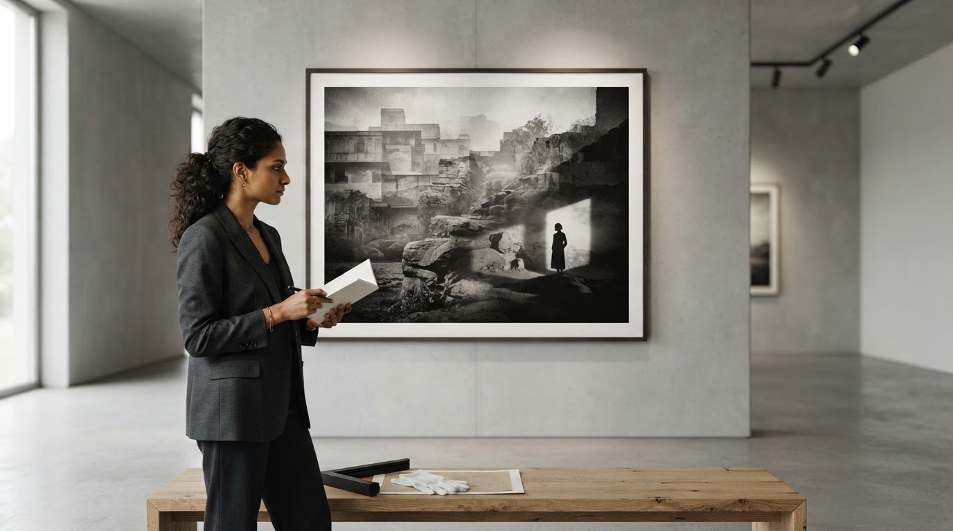
A technically flawless photograph can still leave you cold, while a softly focused or imperfect image may stay with you for years. What makes a photograph fine art isn’t the camera, the subject or a polished finish alone. The distinction begins with the photographer’s intention: what they want the image to express, and how they shape it to invite a response.

If the term feels subjective, that’s because interpretation matters. Fine art photography doesn’t follow a universal checklist, and personal taste isn’t the same as artistic value. Editing, equipment and print quality can all affect a photograph, but none settles the question on its own.

This guide offers a practical way to look beyond surface beauty. You’ll explore how intention, interpretation and photographic craft work together, and how to discuss a photograph without treating your response as a rule for everyone. You’ll also learn to distinguish the image’s artistic purpose from the qualities of its physical print and presentation, which can deepen its presence without creating its meaning.

Key Takeaways

  • To understand what makes a photograph fine art, trace how the photographer’s idea is expressed through choices such as composition, light, timing and perspective.
  • Compare a photograph’s purpose and visual approach, while remembering that fine art, documentary, commercial and decorative photography can overlap.
  • Look closely: notice what draws your attention, how the image guides your eye and what interpretation begins to emerge.
  • Consider paper, scale and framing as elements that shape the print’s presence, then assess them separately from the photograph’s artistic meaning.

What makes a photograph fine art? Start with the photographer’s intention

Fine art photography uses the medium to realise an artistic idea or expressive vision. The photograph may describe a person, place or moment, but its purpose reaches beyond simply recording what was there: the photographer shapes how that subject is seen and what it might suggest. In short, fine art photography uses photographic choices to express an idea, not just to make a technically accomplished image. The overview of Fine-art photography places the practice alongside other photographic purposes, including photojournalism and commercial work.

This is why subject matter, camera price and technical perfection aren’t reliable tests on their own. A portrait, landscape or everyday scene can become part of an artistic inquiry; a technically immaculate photograph may serve a different purpose. To consider what makes a photograph fine art, look at the relationship between the maker’s choices and the meanings a viewer can reasonably find in the image.

Is fine art photography defined by intention?

Intention gives a photograph direction. A photographer may choose a particular subject, frame it tightly or leave it at the edge, wait for a revealing gesture, or arrange images in a sequence so they speak to one another. These decisions can turn a familiar scene into an interpretation rather than a neutral record.

The artist’s explanation can offer useful context, but it doesn’t dictate every response. Viewers bring their own experience, and the image itself should support the interpretations they make. Intention alone isn’t a guarantee of success: the choices must come together in a photograph that communicates or invites reflection. When assessing a work, compare what the artist says they set out to do with the visual evidence in the image.

Does a photograph need to look unusual or heavily edited?

No. Fine art can draw on an ordinary subject, a restrained palette or a familiar way of seeing. It can also use abstraction, unusual perspectives or pronounced alterations. Post-processing is one creative choice among many, not a requirement or proof of artistic purpose. Ask what the treatment contributes to the image, rather than assuming that more visible editing means more artistic value.

Black-and-white photography makes this distinction clear. Removing colour can direct attention to contrast, texture, form or atmosphere, but monochrome alone doesn’t make an image fine art. Its significance depends on how that choice serves the photographer’s vision and shapes the viewer’s experience. For a closer look at the medium’s enduring visual appeal, explore this guide to black-and-white photography.

How artistic choices turn a photographic idea into a finished image

A photograph often begins with a question: what does a familiar place look like at dawn, or how can a quiet room suggest someone has just left? The photographer then makes a series of decisions that carry that thought into the frame. Subject, composition, light, timing and perspective work together, shaping not only what appears but how the scene may be read.

Creative decisions give a photograph expressive direction by guiding the viewer from what is visible toward what the image might mean. Technique is essential when it helps realise that direction, but complexity by itself doesn’t establish artistic merit. A simple composition can be deliberate; an elaborate process can be visually impressive yet disconnected from a clear idea. When looking at a photograph, try naming the choices you can see before deciding what they mean.

How do composition, light and timing shape meaning?

Framing determines what enters the image and what remains outside it. Imagine a person seated at the far end of a long table: the empty space may suggest distance, while a closer crop could make the same gesture feel intimate. Neither reading is automatic, but each is supported by visible choices in the photograph.

Light and timing add further possibilities. Soft window light may reveal subtle texture; a sharp shaft of sunlight can divide a room into contrasting areas. Colour, shadow and tonal range can establish atmosphere, while the instant chosen might emphasise a passing expression or an orderly arrangement. Rather than assume every viewer feels the same thing, point to the details that prompt your interpretation. Notice, for example, whether a bright area draws your eye away from the subject or whether a shadow makes part of the scene harder to read.

What role do editing and photographic processes play?

Editing can refine tonal relationships, adjust colour or remove distractions; it can also transform an image more visibly. The useful question is what that intervention contributes. Does it clarify the photographer’s direction, or does it draw attention to itself without developing the idea? As with other forms of art, how to assess art can begin with considering intent and concept alongside technical execution.

Keep image-making distinct from print production. Editing shapes the photograph itself; the later choice of paper, size or framing shapes how a physical print is encountered. Those presentation decisions can enrich its presence, but they don’t rewrite the choices that created the image. For a broader view of collecting and display, compare how an image reads on screen with how its scale and framing might affect a room. You can also explore photographic prints at Galerie Prints to consider how different images might sit within a collection.

Fine art photography versus documentary, commercial and decorative images

Photographs serve different purposes, and those purposes can overlap. A documentary image may record an event while expressing the photographer’s perspective; a commercial photograph may also carry a distinctive artistic vision. The categories below describe common aims, not fixed boxes or rankings of quality. Adobe’s overview of what fine art photography is likewise centres the distinction on the artist’s intent and ideas.

Approach Primary purpose Typical choices Possible audience
Fine art Express an idea or interpretation Personal subject, deliberate framing, expressive treatment or sequencing Gallery visitors, collectors, or viewers drawn to its meaning
Documentary Record or communicate people, places or events Attention to context, observed detail and a moment’s significance Readers, viewers or communities seeking a record
Commercial Support a product, service or campaign Choices shaped by a brief, audience and intended message Customers or a defined market
Decorative Contribute to the atmosphere of a space Choices made with scale, colour and setting in mind People living or working with the image

How is fine art photography different from documentary photography?

Documentary photography often prioritises recording or communicating events and their context. Fine art photography tends to foreground a personal interpretation, but this is a difference in emphasis, not a dividing line. A documentary photographer’s framing, timing and visual language can reveal authorship and artistic intention; an expressive photograph can also document something real. Consider the image’s purpose and context rather than assuming one approach excludes the other.

Can commercial or decorative photography also be fine art?

Yes. A commission may give an image a practical purpose without preventing the photographer from bringing a considered visual vision to it. Likewise, a photograph created with a room in mind may still invite reflection beyond its decorative role. An image can document, persuade, decorate and express an artistic vision at once; the balance depends on the work and how it’s encountered.

Beauty, rarity, price and manipulation aren’t reliable shortcuts for deciding what makes a photograph fine art. A striking image may be made for a commercial brief, while an unassuming photograph may carry a sustained artistic inquiry. Nor does a gallery setting or elegant frame settle the question. Look past the presentation: what is the photograph trying to do, and how do its visual choices support that purpose? If you’re comparing images, consider their intended use, the decisions visible in the frame and the context in which each was made.

How to assess whether a photograph works as fine art

There’s no universal scorecard for artistic value. Instead, slow down and build an interpretation from what the photograph actually shows. Separate observation from response: “the figure is small within a broad landscape” describes visible evidence; “the figure feels isolated” is an interpretation. Both can be useful, but the second is stronger when you can explain which visual choices led you there.

A thoughtful interpretation doesn’t need universal agreement; it needs attention to the image and reasons that can be discussed. This approach helps you consider what makes a photograph fine art without mistaking personal preference for a rule. You don’t have to like an image to examine how it works. If your interpretation feels uncertain, return to the frame and identify the detail that supports it.

What questions should you ask when viewing a photograph?

Begin with what’s in front of you, then look for the decisions that shape your response. A second viewing often reveals details that complicate an initial impression. Try these questions:

  • What first draws your attention, and what is the subject?
  • From what point of view is the scene shown? What has the photographer included or left out?
  • Which visual choices stand out, such as framing, light, colour, focus or timing?
  • What mood, idea or tension might those choices suggest? Which details support that reading?
  • On another look, does a detail shift or deepen your first interpretation?

For example, a doorway visible at the edge of a room might initially seem incidental. On a closer look, its position could direct attention toward an empty space or suggest a way out. That reading isn’t the only possible one, but it can be grounded in the composition rather than assumed from the artist’s biography.

How do authorship and context affect interpretation?

Knowing a photographer’s wider practice, the circumstances in which a picture was made, or how it relates to other work can add another layer. Context should enrich close looking, not replace it. Check captions, dates and attribution against reliable information before drawing conclusions, and distinguish documented facts from speculation about what the artist intended.

The Slim Aarons photography guide offers an optional example of approaching an established photographer’s work in context. To continue looking at curated photography, explore Galerie Prints and consider how each image’s details shape your own reading.

From artistic vision to photographic print: what the object adds

The artistic idea and image-making come first. Decisions about paper, scale and framing belong to the next stage: they shape how a photograph is encountered as a physical object. Keeping those stages distinct helps clarify what makes a photograph fine art. A refined print can give an image presence and invite close attention, but material quality or an elegant frame alone can’t supply artistic intent.

Does a photograph need to be printed to be fine art?

No single display format determines whether a photograph has artistic purpose. The intent and expressive choices may be present in the image before it’s printed or exhibited. A physical print, however, gives the photograph a material presence: its scale affects how closely a viewer engages, while its placement can shape the experience of seeing it.

Think of the image and the print as related, but not identical. The image carries the photographer’s visual decisions; the print is one way of presenting them. Neither should be judged by assumptions about editions, provenance or certification unless those details are confirmed for the particular work.

How should you think about paper, size and framing?

Scale can make a photograph feel intimate or expansive. Framing can create a visual boundary and help the work sit within a room, while paper influences the print’s physical character. These choices affect presentation and viewing, not the original artistic intention. A premium material or beautifully considered frame may enhance the experience, but it doesn’t automatically make the photograph fine art.

Before choosing a print, check its specific listing for available sizes, paper details and framing options. Compare the available dimensions with the wall space and viewing distance, then consider whether a frame suits both the image and the room. Don’t assume that every work offers the same choices or production details. Galerie Prints offers print-size, paper and bespoke-framing options, with details depending on the work.

Look first at the image and the ideas its choices invite; then consider how a physical print might bring it into a space. To continue exploring, browse Galerie Prints’ curated photography and consider how the photograph itself and its presentation each contribute to the experience.

Look closer, then follow the image that stays with you

What makes a photograph fine art is not a single subject, technique or level of polish. Look for the photographer’s expressive purpose, then notice how composition, light, timing and editing give that purpose form. Your interpretation needn’t match everyone else’s, but it should grow from details you can see in the image.

Keep the photograph’s artistic intent distinct from its physical presentation. Paper, print size and framing influence how a work meets the eye and occupies a space, but they don’t create the meaning on their own. A considered viewing can make room for both: the idea within the image and the qualities of the object that carries it.

Galerie Prints brings together curated photography, including the Slim Aarons Collection and prints by artists such as Terry O’Neill. Print-size, paper-type and bespoke-framing options allow you to consider how a selected work might be presented; check each listing for its specific details. Explore Galerie Prints’ curated photographic collections and continue looking with curiosity. The more attentively you view, the more each photograph may reveal.

Frequently Asked Questions

What makes a photograph fine art?

What makes a photograph fine art is its use of photography to express an artistic idea or vision. The photographer’s purpose becomes visible through choices such as subject, framing, light, timing and treatment. A viewer may interpret the image in more than one way, but those interpretations should engage with what’s actually present. A striking subject, expensive camera or technically flawless finish alone doesn’t establish artistic purpose.

Is fine art photography subjective?

Yes, interpretation and taste are personal, but that doesn’t mean every discussion of a photograph is arbitrary. Viewers can point to observable choices, such as the framing, tonal contrast or relationship between figures, and explain how these inform their reading. Two people may disagree about an image’s meaning or success while both offering thoughtful interpretations. Look for reasons grounded in the photograph, rather than treating preference as a universal rule.

Can a documentary photograph also be fine art?

Yes. A documentary photograph can record an event or communicate information while also reflecting the photographer’s perspective and artistic choices. Framing, timing and the details included in the image can shape how its subject is understood. Documentary and fine art are therefore not mutually exclusive categories. Consider the photograph’s purpose and context, and avoid assuming that documenting reality prevents a photographer from expressing a personal vision.

Does fine art photography have to be edited?

No. Editing may be part of a photographer’s creative process, but it isn’t a requirement for fine art photography. Some artists make subtle adjustments to tone or colour; others choose a more visibly transformed approach, while some rely on choices made at the moment of capture. The useful question is what the treatment contributes to the image. Editing alone doesn’t establish artistic intent or value.

Does a photograph need to be printed to be considered fine art?

No. A photograph’s artistic purpose can exist independently of a particular display format. A physical print gives the image a tangible presence, and its scale, paper and framing influence how it’s encountered. These presentation choices can shape the viewing experience, but they don’t create artistic intent by themselves. If you’re considering a specific print, check its listing for details such as available sizes, paper and framing options.

What is the difference between fine art photography and commercial photography?

Commercial photography is generally created to serve a brief, such as promoting a product, service or campaign. Fine art photography centres on expressing an idea or personal vision. The purposes can overlap: a commissioned image may also show a distinctive artistic approach, while an expressive photograph may later be used commercially. Look at the work’s intended purpose and visual choices rather than assuming a commission rules out artistic ambition.

Does expensive equipment make a photograph fine art?

No. Equipment can help a photographer achieve a particular technical result, but price or sophistication doesn’t determine whether an image expresses an artistic idea. A photograph made with simple equipment may be purposeful and compelling; an image made with advanced gear may serve a purely practical function. Look instead at the photographer’s choices and how they shape the image’s meaning. Technical skill supports the work, but isn’t a substitute for artistic direction.

Matte vs Glossy Photo Prints: A Curator’s Guide to Fine Art Finishes

The choice between a matte or glossy finish is rarely a simple matter of personal preference. It is a strategic archival decision that dictates how a moment in history will be perceived for decades to come. When weighing the merits of matte vs glossy photo prints, you are not just selecting a surface texture; you are choosing how light interacts with the legacy of the artist. You likely understand the frustration of a stray sunbeam turning a legendary Terry O’Neill portrait into a sheet of white glare, or the anxiety that a single fingerprint might mar the surface of a limited edition archive.

This guide will help you master the technical and aesthetic nuances required to ensure your fine art photography is displayed with museum-quality precision. You’ll discover how the right finish preserves the provenance of a Slim Aarons original and learn why certain historical archives demand specific paper stocks like Hahnemühle Photo Rag or Canson Infinity. We’ll examine how your choice of bespoke framing influences the final presentation, providing you with the confidence to select a finish that offers both visual brilliance and lasting archival stability.

Key Takeaways

  • Understand how glossy finishes amplify color saturation to make the vibrant hues of a Slim Aarons piece truly resonate within a room.
  • Master the art of glare-free presentation by selecting matte finishes for expansive displays situated near large windows or intense spotlights.
  • Finalize your decision between matte vs glossy photo prints by assessing the interplay between your room’s light temperature and the photograph’s historical era.
  • Recognize why the choice of acid-free, museum-quality paper is the most critical factor in ensuring the archival longevity of your photographic collection.
  • Learn how professional framing techniques complement your chosen finish to create a cohesive, gallery-standard aesthetic in any residential or professional space.

Matte vs Glossy Photo Prints: Understanding the Technical Divide

The physical essence of a fine art photograph is defined by its interaction with light, a relationship governed by the microscopic topography of the paper’s surface. When we discuss matte vs glossy photo prints, we’re examining the fundamental tension between light reflection and light absorption. A glossy finish is achieved through a smooth, non-porous chemical coating that allows light to travel through the ink and bounce directly back to the eye. This creates a high-fidelity experience, characterized by exceptionally sharp details and the kind of deep, obsidian blacks that give an image a three-dimensional quality. Conversely, a matte finish employs a more porous, textured top layer. This surface intentionally traps and diffuses light, resulting in an artistic finish that prioritizes the tactile nature of the medium over raw optical intensity.

The Science of Specular Reflection

Specular reflection dictates how light behaves when it strikes a polished surface, bouncing back at a consistent, mirror-like angle. This phenomenon is responsible for the hot spots often seen on glossy prints, yet it remains the primary reason for their unrivaled clarity. By allowing light to penetrate the ink layers and reflect directly, glossy finishes achieve a visual depth that matte simply cannot replicate. In contrast, matte surfaces scatter light in a multitude of directions, a process that eliminates glare but can subtly soften the sharpest edges of a composition. This scattering creates a more democratic viewing experience, as the art remains visible and clear regardless of the observer’s position relative to a window or gallery spotlight. At Galerie Prints, we view the selection of the finish as a critical step in our bespoke service, ensuring that a Slim Aarons poolside scene or a Terry O’Neill celebrity portrait is presented with the reverence it deserves.

Lustre and Semi-Gloss: The Middle Ground

Collectors seeking a balanced aesthetic often gravitate toward the sophisticated middle ground known as Lustre or E-surface paper. This finish features a delicate, pebbled texture that provides a subtle sheen without the mirror-like properties of a full gloss. It captures the vibrant color saturation necessary for a Slim Aarons piece while offering the practical, fingerprint-resistant benefits of a matte surface. Deciding between matte vs glossy photo prints often leads collectors to this hybrid choice, as it performs exceptionally well under varied lighting conditions. The photographic printing process for Lustre creates a versatile substrate that maintains deep blacks without the overwhelming glare of a high-shine finish. It’s a pragmatic yet elegant solution for those displaying work in high-traffic areas of a home or office. Lustre is the industry standard for professional portraiture because it balances detail with a flattering, soft-focus quality on skin tones.

The Luminous Allure of Glossy Prints: When Vibrancy is Paramount

Glossy finishes possess a singular ability to translate the chromatic brilliance of a master’s lens into a physical object of desire. This finish is characterized by a reflective, glass-like coating that amplifies color saturation and sharpens every minute detail. When collectors navigate the choice between matte vs glossy photo prints, they often find that gloss provides a level of visual “pop” that is simply unattainable with more muted surfaces. It’s the finish of choice for those who want their artwork to command attention, evoking the high-sheen elegance of mid-century fashion editorials and luxury travel journals.

There’s a distinct nostalgia factor at play here. A glossy print feels like a direct artifact from a bygone era of glamour. While it requires more careful handling due to its sensitivity to fingerprints and oils, the payoff is a depth of field that invites the viewer into the scene. It’s a finish that doesn’t just display an image; it celebrates the medium’s capacity for vivid storytelling. If you’re seeking to recreate the polished atmosphere of a premier gallery, our bespoke framing service can help protect these delicate surfaces while maximizing their luminous impact.

Capturing the Slim Aarons Aesthetic

To truly honor the legacy of Slim Aarons photography, one must understand how light interacts with his legendary subject matter. His work, which famously captured “attractive people doing attractive things in attractive places,” relies heavily on the vibrant blues of Mediterranean pools and the sun-drenched whites of Palm Springs villas. A glossy finish enhances this sun-soaked luminosity, making the water appear to shimmer on the paper. The high-energy color palettes of the 1960s and 70s find their most faithful representation in this finish, as the coating prevents the colors from appearing “flat” or recessed into the paper fibers.

Achieving Maximum D-Max (Black Density)

In the world of fine art curation, “D-Max” refers to the maximum optical density of the deepest black a paper can produce. Glossy papers consistently achieve a higher D-Max than their matte counterparts. Deciding on matte vs glossy photo prints often comes down to this technical requirement for tonal range. High-contrast black and white photography, such as the gritty yet glamorous archives in our Music Archives or Terry O’Neill collections, thrives on a glossy substrate like Canson Infinity Platine Fibre Rag. The deeper the blacks, the more the highlights appear to glow, creating a striking contrast that defines the image’s structure. This enhanced density is what makes glossy prints appear sharper to the naked eye, as the crisp transition between light and shadow remains undisturbed by surface texture.

The Sophistication of Matte Finishes: Texture and Curatorial Depth

While glossy finishes demand the spotlight, matte finishes operate with a sense of quiet authority. This surface is defined by its lack of a reflective coating, which allows the viewer to engage with the image without the interference of ambient light or distracting “hot spots.” In the context of matte vs glossy photo prints, the matte choice is often viewed as the more “curatorial” option. It transforms a photograph from a commercial product into a tactile object of art, emphasizing the physical presence of the paper itself. This finish is particularly adept at hiding minor surface imperfections and resisting the fingerprint marks that often plague high-touch items in a private collection.

For large-scale wall displays, matte is frequently the superior choice. Its ability to scatter light ensures that the composition remains legible from every angle in the room, regardless of how many windows or spotlights are present. This practical advantage is paired with an aesthetic maturity; matte finishes lean into the “painterly” qualities of photography, making them ideal for works that prioritize mood, atmosphere, and historical weight over raw chromatic intensity.

Fine Art and the “Terry O’Neill” Effect

Portraits of iconic figures, such as those captured in the Terry O’Neill Photography collection, often find their most evocative expression on matte substrates. The absence of a high-sheen coating provides a softness that is incredibly flattering to skin tones and textile textures. It allows the subject matter to speak with a directness that isn’t interrupted by the glare of the room. When displaying black and white pictures, curators often select matte to achieve a velvety, deep-inked texture that feels grounded in photographic heritage. This lack of distraction forces the eye to linger on the grain, the composition, and the soul of the subject rather than the surface of the print.

The Role of Paper Grain and “Tooth”

The physical texture of a matte print, often referred to in the art world as the “tooth” of the paper, adds a literal third dimension to the artwork. High-end archival papers like Hahnemühle Photo Rag or Canson Infinity Rag Photographique possess a subtle grain that interacts with the ink to create a rich, embossed effect. This texture is essential for “painterly” photography, where the goal is to evoke the feeling of a fine art lithograph or a traditional charcoal drawing. Matte finishes absorb light to create a built-in sense of history. By selecting a paper with a pronounced grain, you’re not just choosing a finish; you’re choosing a substrate that anchors the photograph within the tradition of artisanal craftsmanship. This choice is a cornerstone of our bespoke framing service, where we match the paper’s physical character to the narrative depth of the image.

The Curator’s Framework: How to Choose for Your Space

Selecting the ideal finish requires a holistic view of the environment where the art will reside. When weighing matte vs glossy photo prints, the physical architecture of your room is as influential as the image itself. A sun-drenched lounge with floor-to-ceiling windows presents a different set of challenges than a dimly lit study or a hallway with focused track lighting. The goal is to ensure the finish serves the art without becoming a source of visual frustration for the viewer.

Size also plays a pivotal role in this decision. Larger prints, particularly those exceeding 30×40 inches, tend to perform better with matte or lustre finishes. A glossy print of that magnitude can act like a giant mirror, reflecting the entire room and obscuring the photographic detail. By opting for a more muted surface for large-scale works, you maintain the integrity of the composition across the entire viewing plane, allowing the eye to wander through the scene undisturbed.

Lighting Environments: The Ultimate Deciding Factor

Ambient light is the primary antagonist of a glossy finish. In rooms where “light pollution” from multiple windows is unavoidable, a high-sheen print will likely suffer from distracting glare. Conversely, a gallery-style setting with dedicated track lighting allows a glossy print to shine without interference, provided the lights are angled correctly to avoid direct reflection. If your heart is set on a high-shine finish for a bright room, our bespoke framing service offers a solution through museum-quality, non-reflective glass. This specialized glazing provides the clarity of a glossy print while filtering out up to 99% of reflections, effectively changing the rules of the matte vs glossy photo prints debate.

The Archive vs. Modernity

Historical context often dictates the “correct” finish for a specific collection. For instance, our cinema lobby cards and vintage movie posters possess a specific satin sheen that is central to their nostalgic appeal. Replicating that on a flat matte paper might strip the work of its period-accurate charm and tactile authenticity. In contrast, sleek, contemporary interiors often demand the understated flatness of a matte finish to align with minimalist decor and architectural lines. Use the following framework to guide your selection:

Subject Matter Recommended Finish
Poolside & Tropical (Slim Aarons) Glossy or Lustre
Intimate Portraits (Terry O’Neill) Matte
Street Photography & Music Archives Lustre or Glossy
Atmospheric Landscapes Matte or Fine Art Textured

To ensure your next acquisition is perfectly tailored to your interior, explore our full range of Bespoke Framing Service options today.

Archival Excellence: Why Paper Quality Surpasses the Finish

The surface sheen captures the eye, but the substrate determines the lifespan. When choosing between matte vs glossy photo prints, the most critical decision happens beneath the coating. High-street printing services often rely on resin-coated papers made from acidic wood pulp, which inevitably leads to brittleness and yellowing over time. In contrast, museum-grade archival paper utilizes 100% cotton rag or alpha-cellulose fibers. These acid-free materials ensure that the chemical composition of the print remains stable for over a century, protecting the integrity of the image from the inside out.

The ink technology employed is equally vital to this archival equation. While commercial printers often use dye-based inks for their immediate vibrancy, these organic molecules break down rapidly when exposed to UV light. Galerie Prints utilizes professional pigment-based inks. These inks are composed of microscopic solid particles that sit on the surface of the paper rather than soaking in, providing superior chromatic stability and resistance to fading. Whether you select a high-gloss finish or a textured matte, the combination of acid-free paper and pigment inks ensures your acquisition remains a lasting piece of history.

The Galerie Prints Standard

Every Slim Aarons print we produce is a testament to artisanal craftsmanship. Our curators don’t simply apply a finish; they select specific paper weights, often ranging from 300 to 310 gsm, to provide the structural support required for a premium finish. A heavier paper prevents the “cockling” or waving that can occur with thinner stocks, ensuring the print remains perfectly flat within its frame. This gallery-vetted production process bridges the gap between a simple photograph and a collectible object of art, providing the technical foundation necessary for the matte vs glossy photo prints debate to even matter.

Investing in Longevity

A fine art print is an investment in an aesthetic legacy, and its financial value is intrinsically tied to its physical condition. The right finish, when paired with professional mounting, protects the delicate emulsion from environmental stressors. We emphasize that the preservation of the print surface is a collaborative effort between the paper’s archival properties and the quality of the framing. By utilizing acid-free mounting boards and museum-quality glazing, you seal the artwork in a micro-environment that halts degradation. Ultimately, the choice of finish is a sophisticated aesthetic preference, but the quality of the paper is a permanent commitment to the photograph’s provenance.

Refining Your Aesthetic Legacy

Selecting the ideal finish is the final, essential step in honoring a photograph’s heritage and ensuring its place within your home. Whether you seek the luminous depth of a high-shine surface or the velvety, glare-free sophistication of a textured substrate, the choice of matte vs glossy photo prints ultimately serves the narrative of your space. By balancing the room’s unique lighting with the historical era of the archive, you ensure that every acquisition resonates with museum-quality precision.

As a premier destination for serious collectors, we operate as guardians of photographic history through meticulous artisanal craftsmanship. Every piece benefits from our hand-crafted bespoke framing in London and worldwide gallery-grade shipping to preserve its prestige. Explore our curated collections and choose your perfect finish today to begin your journey into the world of fine art acquisitions. Your decision is not merely a purchase; it’s a commitment to preserving a lasting piece of history. Trust your discernment as you select a finish that will safeguard your investment for generations to come.

Frequently Asked Questions

Is glossy or matte better for black and white photography?

The choice depends on the desired tonal depth; glossy finishes provide a superior D-Max for high-contrast imagery, while matte surfaces offer a velvety texture for softer, atmospheric works. For iconic black and white archives, a semi-gloss or lustre often provides the most balanced representation. It captures the deep blacks of the original film while maintaining a sophisticated, non-reflective surface.

Does a matte finish make photos look blurry or less sharp?

Matte finishes don’t cause blurriness, although they scatter light in a way that can subtly soften the sharpest edges of a composition. This diffusion is often a deliberate curatorial choice to achieve a painterly aesthetic. Glossy prints maintain a higher perceived sharpness due to their smooth, reflective top layer, which allows for finer detail rendition in high-resolution captures.

Which photo finish is best for framing behind glass?

Matte or lustre finishes are generally preferred for traditional framing to prevent the distracting double reflection caused by light bouncing off both the glass and the print. If you prefer a glossy aesthetic behind glass, we recommend our bespoke framing service with museum-quality non-reflective glazing. This specialized glass eliminates up to 99% of glare while preserving the print’s vibrancy.

Can I clean fingerprints off a glossy photo print?

Removing fingerprints from a glossy surface is notoriously difficult and carries the risk of permanent scratching. While a clean, dry microfiber cloth can gently lift some oils, it’s best to handle these prints with cotton gloves during the framing process. Matte finishes are far more resilient to handling and rarely show the marks of a stray touch, making them more forgiving.

Why do professional photographers often prefer lustre or matte over high-gloss?

Professionals often favor lustre or matte for their versatility in varied lighting environments and their sophisticated, tactile quality. These finishes allow the viewer to engage with the subject matter without the interference of specular reflection. When considering matte vs glossy photo prints, many artists feel matte conveys a sense of permanence and fine-art prestige that high-gloss lacks.

Will a glossy print fade faster than a matte print?

A print’s longevity is determined by its archival components rather than its surface sheen. Fading is primarily a result of using dye-based inks on acidic paper rather than the choice of finish itself. Our use of pigment-based inks on acid-free cotton rag ensures that both matte and glossy prints remain stable and vibrant for over a century.

What is the best finish for a Slim Aarons poolside photograph?

A lustre or glossy finish is typically the most evocative choice for a Slim Aarons poolside scene. These finishes amplify the vibrant blues and shimmering reflections of the water, capturing the sun-drenched luminosity of the mid-century era. This sheen mirrors the polished, aspirational lifestyle depicted in his legendary photographic archives, making the colors appear to radiate from the wall.

How does paper thickness (gsm) affect the look of matte vs glossy prints?

Paper thickness dictates the structural integrity and tactile prestige of the work regardless of the surface coating. A higher gsm, such as 300 or 310, prevents warping and provides a substantial feel that justifies a premium positioning in a collection. Heavier stocks support the ink load of both matte and glossy finishes without compromising the paper’s essential flatness.