
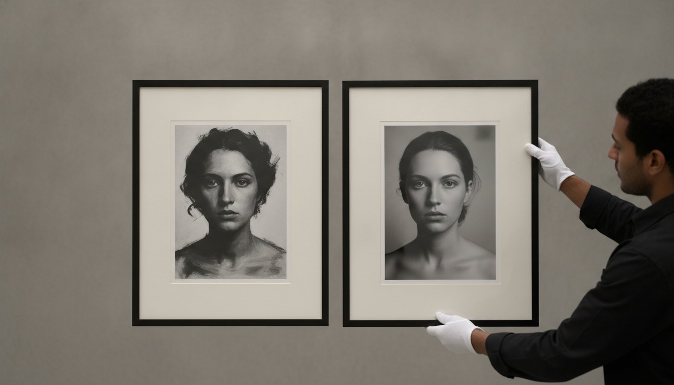
Tag: giclee

Giclée vs. C-Type Prints: A Collector’s Guide to Fine Art Quality

A masterpiece loses its soul the moment its vibrancy begins to surrender to the passage of time. When you curate a collection featuring the likes of Slim Aarons or Terry O’Neill, you’re acting as a guardian of a specific historical moment; yet, many enthusiasts find themselves paralyzed by the technical divide of the giclee vs c-type print. It’s a common fear, the worry that a lack of technical knowledge might result in a purchase that fades or fails to capture the artist’s original vision. You want the assurance that your investment will remain as evocative decades from now as it is the day it arrives at your door.

In this collector’s guide, you’ll discover the definitive differences between the chemical alchemy of C-Type and the painterly, archival depth of Giclée. We’ll provide the clarity you need to choose a medium that honors both the subject matter and your home’s unique lighting. From understanding the longevity of modern pigment inks to the tactile allure of traditional silver halides, you’ll gain the confidence to build a gallery that stands as a lasting testament to fine art excellence.

Key Takeaways

  • Uncover the fundamental distinction in the giclee vs c-type print debate, moving beyond technical jargon to see how chemistry and pigment define the soul of an image.
  • Learn why C-Type printing remains the authentic choice for mid-century archives, offering a continuous tone and deep, liquid-like blacks without visible digital dots.
  • Discover how the multi-ink precision of Giclée creates a painterly depth on textured fine art papers, making it the preferred choice for moody monochrome works.
  • Identify which print method best suits your environment, ensuring your collection maintains its gallery-standard brilliance under specific room lighting.
  • Gain the curatorial confidence to match world-renowned archives with the specific production method that best preserves their historical authenticity.

The Art of the Print: Understanding Giclée and C-Type

Selecting the medium is the foundational decision for any serious collector. It’s the bridge between the artist’s original negative and the final presence on your wall. The debate of giclee vs c-type print isn’t merely about equipment; it’s about the fundamental difference between light-sensitive chemistry and precision-sprayed pigment. By 2026, museum standards have tightened. The ISO 18937-3:2026 regulation now ensures that high-end prints maintain their stability even under modern LED indoor lighting. This commitment to longevity transforms a simple purchase into a legacy piece that can be passed through generations.

What is a C-Type Print?

Chromogenic prints, or C-Types, represent the pinnacle of traditional photographic heritage. Unlike standard digital prints, these are created by exposing light-sensitive paper to lasers or LEDs using sophisticated Durst Lambda or Océ Lightjet technology. This process triggers a chemical reaction within the silver halide emulsion, resulting in a “true” photograph rather than a layered ink image. The result is a breathtaking continuous tone. Because there are no visible ink dots, the gradients in a summer sky or the subtle shadows of a silhouette appear perfectly smooth. This method offers a nostalgic, liquid-like clarity that digital-only processes often struggle to replicate, making it a favorite for those who value the analog soul of a digital file.

What is a Giclée Print?

The term Giclée, derived from the French “to spray,” denotes a standard of inkjet production far beyond the reach of consumer devices. It utilizes 10 to 12 individual pigment-based inks to achieve a color gamut of extraordinary depth. This technique allows for a painterly interaction with the substrate, where the ink sits within the fibers of 100% cotton rag or textured fine art paper. The result is a tactile, matte finish that absorbs light rather than reflecting it. For collectors, the giclee vs c-type print choice often comes down to this: do you want the crisp, polished sheen of a chemical photograph or the rich, velvety texture of a pigment-on-fiber masterwork? Modern giclée technology allows for an incredible level of detail that brings out every nuance of the artist’s intent.

Ultimately, the substrate acts as the stage. Whether it’s a high-gloss metallic finish that makes a vibrant poolside scene pop or a heavy, textured paper that gives a monochrome portrait its charcoal-like grit, paper selection is the final brushstroke in the production process. Understanding these photographic print processes ensures that your collection doesn’t just decorate a room, but commands it. By choosing the right method, you ensure the image’s history and your home’s aesthetic exist in perfect harmony.

C-Type Prints: The Timeless Alchemy of Light and Chemistry

The C-Type print remains a marvel of photographic evolution, acting as a sophisticated digital-to-analog bridge for the modern collector. High-end equipment like the Durst Lambda or Océ Lightjet 500XL, capable of resolutions up to 4000 dpi, uses RGB lasers to expose light-sensitive silver halide paper. This isn’t a surface-level application of ink; rather, the image is developed through a chemical reaction within the paper itself. Determining the victor in the giclee vs c-type print debate often depends on the specific archival needs of the collector, but the C-Type offers a structural integrity that feels inherently permanent and historically grounded.

Visual characteristics are what truly define this method in the ongoing giclee vs c-type print discussion. Because the image is created by light rather than droplets, there are no visible “dots” or halftone patterns to distract the eye. You are left with deep, soulful blacks and crisp, luminous whites that command attention. The durability of the gelatin emulsion layer also makes these prints remarkably resilient, resisting the minor abrasions of handling far better than the fragile surface of a pigment print. Collectors can choose from several finishes to suit their specific interior aesthetic:

  • Gloss: For maximum impact and vivid color saturation.
  • Matt: For a sophisticated, reflection-free viewing experience in bright rooms.
  • Metallic: A professional-favorite that offers a three-dimensional, pearlescent quality.

The Photographic ‘Feel’

There is a tangible nostalgia in the “feel” of a C-Type. It captures the essence of a bygone era, providing the smooth transitions between colors that are essential for realistic skin tones and expansive sky gradients. C-Type printing is the undisputed industry standard for traditional photographic exhibitions and prestigious gallery displays. When viewing a piece from The Slim Aarons Collection, the C-Type process preserves that mid-century poolside shimmer with unmatched authenticity.

Longevity and Preservation

Modern silver-halide papers have reached a state of chemical stability that would have astonished previous generations of curators. These prints react gracefully to UV exposure when protected by museum-grade glazing, and their emulsion is naturally less sensitive to humidity than many ink-based alternatives. However, the preservation of C-Type integrity depends heavily on the quality of the surrounding materials. A bespoke framing service ensures the print remains perfectly flat, preventing the “silvering” or waving that can occur over decades if a print is poorly housed. This archival approach ensures your investment remains a stable piece of history.

Giclée Prints: The Pinnacle of Modern Pigment and Precision

While the C-Type print captures the liquid soul of traditional photography, the Giclée method represents a triumph of modern precision. It utilizes an array of 10 to 12 individual pigment inks, a configuration that allows for a color depth previously unattainable in the darkroom. This technology ensures that even the most subtle chromatic shifts are rendered with surgical accuracy. In the ongoing dialogue of giclee vs c-type print, the Giclée’s strength lies in this sheer technical range, offering a versatility that spans from smooth luster finishes to heavy, textured watercolor papers. The process involves a sophisticated “spray” technique that delivers microscopic droplets of pigment with absolute consistency, creating a work that feels both technologically advanced and artisanally crafted.

Modern galleries often specify Giclée for its uncompromising archival standards. Pigment inks are inherently more stable than the dyes used in older inkjet methods, resisting the fading effects of time and light with remarkable tenacity. This durability is why curators frequently turn to this method for contemporary works that demand a life beyond the current decade. The giclee vs c-type print selection often hinges on this sense of permanence. The process creates a “painterly” effect, where the image doesn’t just sit on the surface but feels like an organic part of the substrate itself. This interaction provides a sense of materiality and weight that makes the artwork feel like a handcrafted object of value rather than a mere reproduction.

Unrivaled Color Gamut

The primary advantage of pigment technology is the breadth of its color spectrum. High-resolution files benefit from HDR printing techniques that capture the finest details in both deep shadows and brilliant highlights. For modern art that features high contrast or extreme saturation, Giclée is the superior choice. It reaches vibrant hues that chemical processes simply cannot replicate, providing a visual punch that defines the contemporary aesthetic. This method allows the artist’s original vision to be translated with a fidelity that respects every pixel of the digital master.

Texture and Materiality

The tactile nature of the print is where the Giclée truly diverges from its chemical counterpart. By using archival photo paper, such as 100% cotton rag, the collector can achieve a sophisticated, matte finish that completely eliminates glare. This lack of reflection allows the viewer to connect with the work without the distraction of room lighting. Giclée ink sits ‘in’ the paper rather than ‘on’ it, creating a seamless union between the pigment and the underlying fibers. This quality is particularly appreciated in 2026, as collectors increasingly favor textured, matte papers for their “human-made” feel and perceived artisanal value.

The Showdown: Giclée vs. C-Type Head-to-Head

Choosing between these two prestigious mediums isn’t about finding a superior technology, but rather identifying the right partner for your specific space. The giclee vs c-type print decision requires weighing the liquid punch of a chemical emulsion against the velvet richness of pigment. While both meet the rigorous ISO 18937-3:2026 standards for LED light stability, they interact with your room’s environment in vastly different ways. Environmental considerations also play a role; modern Giclée production is often cited for its ink efficiency, whereas C-Type remains a specialized chemical process that requires meticulous waste management to meet 2026 sustainability goals.

Visual Comparison Table

Feature C-Type (Chromogenic) Giclée (Pigment Inkjet)
Process Laser exposure + Chemical development Precision micro-spray technology
Color Depth Continuous tone gradients Ultra-wide color gamut (10-12 inks)
Paper Options Gloss, Matt, Metallic (Emulsion-based) Cotton Rag, Textured Fiber, Watercolor
Best Use Case Classic photography, vibrant poolside scenes Moody monochromes, textured fine art

Lighting is the silent curator of your collection. A glossy C-Type print thrives in controlled environments but can struggle with glare near large windows. Conversely, the matte surface of a Giclée absorbs light, making it the ideal choice for rooms with heavy natural exposure. There’s also the persistent “dot” debate. Many collectors fear visible pixels in Giclée work, yet modern professional printers utilize microscopic droplets that are invisible to the naked eye, rivaling the smooth transitions of chemical prints.

Archival Quality and Value

Both methods carry the “Museum Grade” label when produced by master printers, but their impact on resale value can differ. In the secondary market, the choice of print method signals the artist’s intent; a limited edition C-Type often carries the weight of photographic tradition, while Giclée is prized for its tactile, “object-like” presence. Regardless of the method, the lifespan of your investment depends on protection. The necessity of bespoke framing cannot be overstated, as it provides the airtight, UV-shielded environment required to preserve the vibrancy of the work for generations.

Whether you’re drawn to the nostalgic shimmer of a silver-halide finish or the deep, charcoal-like grit of a pigment-on-fiber piece, your choice should reflect a harmony between the image and its final home. Explore our world-renowned archives to find the perfect masterwork for your next acquisition.

The Collector’s Choice: Finding the Perfect Match for Your Home

The final decision in the giclee vs c-type print debate often transcends technical specifications, settling instead into the realm of curatorial intuition. It’s about how the image breathes within your specific architectural context. While the previous sections established the “how” of production, the final choice rests on the “where” and the “why” of your collection. A masterwork shouldn’t just exist on a wall; it should harmonize with the room’s soul, its lighting, and the historical era it represents.

Subject Matter Synergy

Certain images possess a natural affinity for specific mediums. The aspirational photography found in The Slim Aarons Collection, for instance, captured a world of poolside glamour and sun-drenched elegance that practically demands the high-gloss or metallic shimmer of a C-Type. The chemical emulsion preserves the liquid brilliance of the water and the radiant skin tones with a historical “truth” that feels authentic to the mid-century era. This process honors the original film’s intent, providing a polished finish that suits minimalist, modern interiors with clean lines and reflective surfaces.

Conversely, when curating black and white pictures, the Giclée method is often the superior choice. The way pigment settles into 100% cotton fibers creates a moody, charcoal-like depth that chemical processes can’t quite replicate. This velvety finish enhances the emotional weight of monochrome work, making it a perfect match for maximalist spaces or traditional rooms where a softer, light-absorbing texture is desired. A seasoned curator will also consider the paper’s “white point.” Matching the natural tone of the substrate to your wall color ensures the artwork feels like an integrated part of the home rather than an after-thought.

Ready to Hang: The Final Touch

Presentation is the final brushstroke of the production process. Giclée prints, with their delicate matte surfaces, are particularly susceptible to room glare, making anti-reflective museum glass a necessity to protect those deep, pigment-rich blacks. C-Type prints are more resilient but require precise mounting to prevent the subtle waving that can occur with silver-halide papers over time. Both formats reach their full potential only when supported by a professional, artisanal approach to finishing. Prioritize C-Type when seeking photographic authenticity and a polished sheen; choose Giclée when your vision calls for tactile depth and unparalleled color saturation.

Discover our curated collections and choose your perfect print format today.

Preserving Your Legacy in Print

The journey from admiring a photograph to owning a piece of history requires more than just an appreciation for the image; it demands a commitment to the technical excellence that ensures its longevity. Whether you choose the liquid, continuous tones of a chemical emulsion or the velvety, pigment-rich depth of a cotton rag substrate, the giclee vs c-type print decision defines how your collection interacts with light and time. Modern museum-grade standards ensure that both methods offer the permanence required for a serious investment. At Galerie Prints, we act as guardians of this heritage, blending historical significance with a modern passion for interior aesthetics.

Every piece we offer is curated by expert gallery directors and realized through artisanal craftsmanship, including our bespoke framing service that provides the final layer of protection. Your choice of medium is the first step in ensuring the artist’s original vision remains vibrant for generations. Explore the Slim Aarons Collection and choose your archival finish today. Your walls deserve a masterwork that stands as a lasting testament to beauty and history.

Frequently Asked Questions

Which print lasts longer, Giclée or C-Type?

Giclée prints generally offer superior longevity due to the chemical stability of modern pigment inks. While C-Type prints are highly durable, the pigment-on-fiber nature of a giclee vs c-type print often scores higher in accelerated aging tests. Under the 2026 ISO standards for LED light exposure, both methods provide a lifespan exceeding 100 years when housed in a museum-grade environment. The choice rests on your specific archival goals and the environmental conditions of your home.

Is Giclée printing the same as inkjet printing?

Giclée is a specialized, high-fidelity evolution of inkjet technology that utilizes archival pigment inks rather than standard dyes. While the mechanical process of spraying droplets is similar, the Giclée label implies a commitment to 10 to 12 individual ink channels and acid-free substrates. This distinction ensures the work meets the rigorous demands of fine art collectors. It transforms a digital file into a tactile object of permanence that standard commercial inkjet processes cannot replicate.

Why do photographers often prefer C-Type prints?

Photographers favor C-Type prints for their continuous tone and the absence of visible halftones or ink droplets. Because the image is created by light exposing silver halide crystals within the paper’s emulsion, the transitions in skin tones and skies are flawlessly smooth. This method provides a photographic truth that feels authentic to the analog heritage of the medium. It remains the professional standard for those wanting to preserve the liquid clarity of traditional darkroom aesthetics.

Can I get a Giclée print on glossy paper?

You can certainly obtain a Giclée print on glossy or luster paper, though the medium is more celebrated for its matte, textured finishes. High-gloss Giclée substrates are designed to mimic the reflective punch of a traditional photograph while maintaining the wide color gamut of pigment inks. However, many collectors find that a luster finish provides a more sophisticated balance. It offers the vibrancy of gloss without the aggressive reflections that can distract from the work’s finer details.

Which is more expensive, Giclée or C-Type?

The cost of production for Giclée and C-Type prints is comparable, though setup requirements often influence the final investment. C-Type printing involves complex chemical processing and specialized laser equipment, which may result in different initial costs for a single master print. Giclée pricing is typically dictated by the weight and rarity of the chosen fine art paper. Ultimately, the value resides in the artisanal craftsmanship and the archival integrity of the finished masterwork rather than the method alone.

What is the best way to clean a C-Type print vs a Giclée print?

Cleaning should be avoided; instead, utilize a soft, anti-static brush or a gentle puff of air to remove dust. The surface of a Giclée is particularly delicate, as the pigment sits within the paper fibers and can be easily abraded. While a C-Type’s gelatin emulsion is slightly more resilient, it’s still prone to scratching and fingerprints. The most effective preservation strategy is to house your print behind anti-reflective museum glass immediately to avoid any direct contact.

Does the choice of print method affect framing options?

The print method significantly dictates your framing and mounting strategy. C-Type prints are traditionally dry-mounted to ensure they remain perfectly flat, preventing the subtle waving that can occur with silver-halide papers. Giclée prints on heavy cotton rag often benefit from float mounting to showcase the paper’s deckled edges and tactile materiality. Additionally, the matte surface of a Giclée demands high-quality anti-reflective glass to maintain the clarity of deep blacks without the interference of room glare.

Which method is better for large-scale wall art?

Both methods excel at large scales, but the choice depends on the desired visual impact. C-Type is often preferred for oversized works requiring razor-sharp clarity and deep, glossy blacks that command a large room. Giclée is the superior choice for large-scale pieces where a painterly, non-reflective texture is needed to create a sense of intimacy. When deciding on a large-scale giclee vs c-type print, consider the viewing distance and the room’s lighting to ensure the work’s presence isn’t diminished.

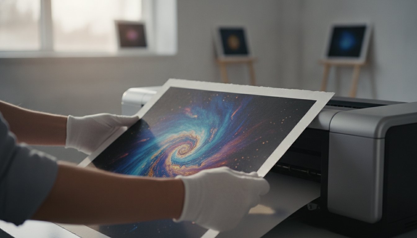
How to Buy Fine Art Photography Online: A Collector’s Guide to Archival Excellence

A photograph is not merely a captured moment; it is a tactile window into a vanished world of glamour that requires a guardian’s care to survive the century. You likely recognize that true elegance isn’t found in mass-produced decor, yet the decision to buy fine art photography online often brings a valid sense of hesitation. It’s natural to feel uncertain about the distinction between a fleeting digital reprint and a museum-quality investment that honors the legacy of masters such as Slim Aarons or Terry O’Neill.

We believe that acquiring art should be as refined an experience as the work itself. This guide will empower you to evaluate archival terminology with the confidence of a seasoned curator, ensuring your collection reflects both historical significance and technical excellence. We’ll explore the nuances of Giclée and C-type processes, the importance of localized artisanal craftsmanship in framing, and the specific steps required to transform your home into a sophisticated gallery of cultural history.

Key Takeaways

  • Distinguish between ephemeral mass-market posters and museum-quality limited editions that serve as lasting cultural investments.
  • Navigate the technical landscape to buy fine art photography online with confidence by identifying archival markers like acid-free cotton rag and traditional Giclée processes.
  • Uncover the historical significance of the Slim Aarons and Terry O’Neill archives to bring a sense of mid-century elegance into your home.
  • Learn to curate your environment by identifying a hero wall and selecting themes that reflect your unique appreciation for photographic heritage.
  • Understand the meticulous standards of archival production that preserve the tactile and visual integrity of your collection for generations.

What Defines Fine Art Photography in the Digital Age?

Fine art photography is far more than a simple visual record; it’s a deliberate, calculated expression of an artist’s vision. In an age where billions of images are uploaded daily to the digital ether, the distinction between a casual snapshot and a curated masterpiece has never been more significant. When you choose to buy fine art photography online, you aren’t just purchasing a decorative object. You’re acquiring a piece of cultural history that has been carefully shepherded from a negative or digital master to a physical, archival form. This transition from light to paper requires a level of intentionality that separates true art from mere illustration.

A critical distinction exists between a mass-market poster and an archival gallery print. Posters are often printed on thin, acidic paper that will eventually yellow and degrade under the touch of time. In contrast, a gallery-grade print is a legacy piece. It represents a commitment to material excellence, using acid-free papers and stable pigments designed to last for generations. The gallery, acting as a steadfast guardian of the original negative or digital master, ensures that each impression remains faithful to the creator’s intent. This careful preservation of the artist’s aesthetic ensures that the work maintains its depth, contrast, and soul long after it leaves the darkroom or the studio.

To find pieces that embody this standard of craftsmanship, collectors often turn to specialized sources like Dale Arts, which offers a diverse collection of high-quality photographic prints in both framed and unframed formats.

The Anatomy of a Gallery-Grade Print

A true collector’s piece begins with the integrity of the source. Whether it’s a vintage negative from the Music Archives or a master file from the Star Wars Limited Edition Prints, the quality of the original material dictates the final result. To understand What is Fine Art Photography?, one must appreciate how authorized archives maintain the artist’s legacy through technical superiority. This documented history protects your investment, ensuring the work remains a valuable asset within your collection. Provenance is the documented lineage of an artwork’s history, verifying its authenticity and connection to the artist’s original vision.

Limited Editions vs. Open Runs

Scarcity is a primary driver of value in the art world. Limited editions ensure that only a specific number of prints will ever exist, making each one a rare artifact of a specific moment in time. This rarity is formalized through signatures and numbering, which act as the cornerstones of photographic value. When you buy fine art photography online, it’s essential to look for a Certificate of Authenticity (COA). This document confirms the print’s place within the edition and guarantees its archival standards. There’s a profound emotional weight in owning a rare piece of history, knowing that your print is one of only a few in existence. It transforms your space from a simple room into a curated environment of prestige and narrative depth.

The Value of Provenance: From Slim Aarons to Terry O’Neill

The 20th century represents a pinnacle of photographic artistry, a period often referred to as the Golden Era. During these decades, photographers didn’t just document reality; they crafted a narrative of elegance that continues to define luxury today. When you choose to buy fine art photography online, the value of your acquisition rests heavily on provenance. This documented history ensures that a print sourced from a prestigious archive is a legitimate piece of cultural history rather than a modern imitation. Galerie Prints acts as a bridge to these world-renowned archives, maintaining rigorous museum-quality standards that honor the original vision of the artist. History deserves a guardian.

Curating these archives involves more than just selection. It requires a deep understanding of archival handling and storage to ensure that the physical print retains the same brilliance it possessed decades ago. By adhering to these exacting standards, we provide collectors with the assurance that their investment is protected against the environmental stressors that often degrade lesser works. This meticulous attention to technical detail is what allows us to offer pieces that don’t just decorate a room but elevate it to a curated space of historical significance.

Slim Aarons: The Master of Aspirational Style

Slim Aarons famously stated he was capturing “attractive people doing attractive things in attractive places.” His work has become the ultimate symbol of sophisticated interior design, particularly his poolside imagery of Palm Springs and the Amalfi Coast. These prints offer more than a visual; they provide an entry into a world of mid-century leisure and sun-drenched glamour. For those looking to understand his enduring impact, our resource on Slim Aarons: The Definitive Guide to the Master of Aspirational Photography offers deeper context into his life and methods. His work remains a cornerstone for anyone seeking to buy fine art photography online that embodies a specific, high-end lifestyle.

Icons of Music and Cinema

While Aarons captured the elite at play, Terry O’Neill focused his lens on the raw, magnetic energy of the 1960s and 70s. His celebrity portraits remain timeless because they reveal the human soul behind the icon, whether it’s David Bowie or Brigitte Bardot. The collectability of these images is matched only by the historical charm of Cinema Lobby Cards and vintage movie posters. These artifacts represent Hollywood’s photographic heritage, serving as tactile remnants of a bygone cinematic age. You might consider exploring our Music Archives to find a piece that resonates with your personal history. Each print is a testament to the enduring power of the celebrity image in modern culture.

Archival Quality: Why the Paper and Process Matter

The physical presence of a fine art print possesses a weight and depth that no digital screen can replicate. While a monitor emits light, a gallery print reflects it, creating a tactile experience where the texture of the paper and the richness of the pigment become part of the art itself. When you choose to buy fine art photography online, you’re investing in this material integrity. The difference between a lasting heirloom and a fading image lies in the meticulous combination of printing chemistry and archival substrates. It’s a science of preservation that ensures the visual impact remains unchanged for decades.

Two primary methods dominate the world of high-end photographic production: Silver Halide and Giclée. Silver Halide, often called a C-type print, is a traditional chemical process where light-sensitive paper is exposed to a master image and then processed through a developer. It’s prized for its continuous tones and deep, luscious blacks. Giclée printing, however, utilizes sophisticated inkjet technology with mineral-based pigment inks. This method offers an incredible color gamut and exceptional longevity. Each process has its merits; the choice depends on whether the subject matter demands the classic feel of a darkroom or the vibrant, high-definition precision of modern pigments.

Museum-Quality Materials

Collectors should prioritize papers from prestigious mills like Hahnemühle. These 100% cotton rag papers are the industry standard because they provide a stable, luxurious base that won’t degrade over time. Combined with archival inks, these materials maintain color accuracy for 75 years or more under standard lighting. Acid-free materials are non-negotiable for collectors because they prevent the chemical self-destruction and yellowing that inevitably occur when paper contains lignin or other acidic impurities. To protect this investment, UV-protective glazing is essential. It acts as a shield, filtering out the harmful rays that cause colors to shift and whites to dull.

The Digital-to-Physical Translation

Bridging the gap between a historical negative and a modern archival print requires a curator’s eye and a technician’s precision. Professional curators don’t simply “print” a file; they manage a complex translation of light and shadow. This often involves digital retouching that honors the original darkroom intent, ensuring that the final physical piece remains a faithful guardian of the artist’s legacy. For a deeper understanding of how these elements come together in a curated space, explore our guide on Fine Art Photography: A Curator’s Guide to Collecting and Decorating. The goal is always the same: to buy fine art photography online that feels as though it was pulled directly from a gallery’s private vault.

Curating Your Space: Selection and Framing Guide

Selecting a masterpiece is only the first movement in a larger symphony of interior curation. The placement of a print defines the dialogue between the artwork and your architectural environment. When you choose to buy fine art photography online, the digital preview is merely a prelude to the physical presence the work will command. To ensure your acquisition achieves its full potential, you must approach the installation with the eye of a seasoned curator, considering scale, theme, and the protective elements that surround the image.

Your first step is identifying the “Hero” wall. This is the primary focal point of the room, an architectural anchor that dictates the appropriate dimensions for your print. A common mistake is selecting a piece that’s too small for the volume of the space. For a grand living area, a print measuring 40×60 inches creates a commanding presence, while smaller corridors may benefit from a series of intimate, related works. Once the scale is set, choose a theme that reflects your personal narrative. Whether you’re drawn to the raw energy of the Music Archives or the sun-drenched leisure of the Slim Aarons Collection, the subject should feel like a natural extension of your personality.

Color palette plays a vital role in this cohesion. While vibrant lifestyle photography can energize a room, there’s a profound, quiet power in monochrome. For those seeking a more classic aesthetic, explore our guide on The Timeless Allure of Black and White Pictures to understand how tonal depth can anchor a modern interior. Finally, consider the height and lighting. Aim for a gallery-standard height, with the center of the print sitting approximately 57 to 60 inches from the floor, and utilize directional LED lighting to highlight the archival details without introducing heat.

The Art of Bespoke Framing

In the world of high-end art, the frame is far more than a decorative border. It’s a protective envelope designed to maintain the print’s archival integrity. Our approach to framing utilizes premium materials like lignin-free mount boards and specialized glazing to shield your investment. Whether you select a classic Black, a crisp White, or a warm Oak finish, the frame should complement the art’s era. A Slim Aarons print often finds its home in a clean, white frame that emphasizes its airy, aspirational quality. Explore our Bespoke Framing Service to ensure your piece is delivered ready to hang and preserved for the century.

Building a Gallery Wall

Creating a gallery wall requires a balance of variety and cohesion. We recommend the “Anchor” method: start with one large, iconic print as your centerpiece and build outward with smaller works. This allows you to mix different subjects, such as Terry O’Neill portraits and Cinema Lobby Cards, while maintaining a unified story. Using Slim Aarons prints within these arrangements is particularly effective for creating a sense of light and space in smaller rooms, acting as a visual window that expands the boundaries of your home.

Galerie Prints isn’t merely a digital storefront; it’s a sophisticated extension of our London heritage, designed to provide a seamless bridge between a physical gallery and the discerning global collector. Under the meticulous curatorial direction of Stuart Möller, we’ve secured access to the world’s most prestigious photographic archives, ensuring that every piece we offer meets the highest standards of historical authenticity. When you choose to buy fine art photography online through our platform, you’re engaging with a team that views itself as a guardian of the 20th century’s visual legacy. This commitment to technical excellence is matched by our dedication to localized, artisanal craftsmanship, ensuring that each print is produced with the same care and precision as those hanging in our physical gallery space.

Serious collectors choose our platform because we prioritize the integrity of the artist’s original vision above all else. We don’t just facilitate transactions; we cultivate a sense of permanence and stability in every acquisition. By combining traditional production methods with modern accessibility, we ensure that the prestige of the art world is available to those who value quality over convenience. Our role is to act as a trusted guide, helping you find pieces that don’t just fill a space but elevate your entire home aesthetic to a level of curated elegance.

From London to Your Living Room

The journey from our archives to your walls is handled with a level of precision that matches the art itself. We understand that purchasing high-end art requires absolute trust, which is why every shipment utilizes museum-grade packaging and fully insured global delivery. This “white-glove” experience ensures that your investment arrives in pristine condition, supported by direct expert advice at every stage of the process. Whether you’re in New York, Tokyo, or London, the experience remains intimate, professional, and reassuringly precise. It’s about more than just logistics; it’s about providing the peace of mind that comes with boutique gallery service. Browse our curated collections and start your collection today.

Investing in Photographic Heritage

A purchase from our collection is a lasting piece of history, far removed from the temporary nature of mass-market decor. By specializing in authorized prints from the Getty Images Gallery and the Terry O’Neill archives, we provide collectors with works that possess enduring cultural value and proven provenance. These images don’t just decorate a space; they anchor it in a narrative of elegance and historical significance. Choosing to buy fine art photography online from a dedicated archive ensures that your collection remains a source of wonder and nostalgia for generations to come. Explore the Slim Aarons Collection at Galerie Prints and discover how these iconic works can transform your environment into a curated sanctuary of aspirational style.

Securing Your Piece of Photographic History

Acquiring a masterpiece is a profound act of cultural stewardship. You’ve discovered that the decision to buy fine art photography online is anchored in a commitment to archival excellence, ranging from the meticulous selection of acid-free cotton rag papers to the verification of authorized provenance. By mastering the technical nuances of Giclée and Silver Halide processes, you ensure that your curated collection remains a vibrant, tactile testament to an artist’s original vision for generations. True elegance, after all, is measured by its permanence.

As an official Getty Images Gallery partner, we take pride in bridging the gap between world-renowned archives and your private environment. Every acquisition is handled with the quiet authority of a boutique gallery, featuring bespoke framing by master craftsmen and the absolute security of global insured shipping from our London-based gallery. We invite you to move beyond temporary decoration and invest in a lasting legacy of sophistication and historical significance. Discover the world’s most iconic fine art photography at Galerie Prints and begin transforming your space into a sanctuary of mid-century glamour today.

Frequently Asked Questions

What is the difference between a fine art print and a poster?

A fine art print is a deliberate, high-fidelity expression of an artist’s vision, crafted using museum-grade materials. In contrast, a poster is a mass-produced reproduction on thin, acidic paper that lacks the longevity required for a serious collection. When you buy fine art photography online, you’re choosing a piece that utilizes acid-free substrates and stable pigments. These archival elements ensure the image remains a lasting part of your home’s cultural narrative.

How do I know if a photography print is a good investment?

Evaluating a photographic investment involves assessing its provenance, the historical significance of the artist, and the scarcity of the edition. Limited edition prints from prestigious archives, such as the Music Archives or Star Wars Limited Edition Prints, tend to hold their value more reliably than open runs. A Certificate of Authenticity acts as your primary safeguard. It confirms the print’s origin and ensures it was produced to exacting archival standards.

What does “archival quality” actually mean for photography?

Archival quality refers to the scientific combination of chemically inert materials designed to preserve an image for 75 years or more. This process requires 100% cotton rag papers and mineral-based pigment inks that won’t react with the environment. These materials prevent the yellowing and fading that occur with standard commercial printing. It’s the gold standard for collectors who view their art as a permanent piece of history.

Are the Slim Aarons prints sold online authorized by the estate?

Yes, every piece within The Slim Aarons Collection at Galerie Prints is fully authorized and sourced through our official partnership with the Getty Images Gallery. These prints are produced from the original negatives housed in the Hulton Archive, ensuring the highest level of historical authenticity. This partnership allows us to act as a bridge to a bygone era of elegance while maintaining the technical excellence collectors expect.

How should I clean and maintain my fine art photography prints?

Maintaining your prints requires a gentle touch and a stable environment. Use a clean, dry microfiber cloth to remove dust from the glazing, but never apply liquid cleaners or chemicals directly to the surface. It’s best to display your art in a climate-controlled room away from direct sunlight or extreme humidity. These simple steps protect the tactile integrity of the paper and the vibrancy of the pigments for decades.

What is the best way to frame a large-scale photographic print?

Large-scale prints require a bespoke framing approach to provide necessary structural support and aesthetic balance. We recommend using a heavy-duty frame with a deep profile to prevent bowing, combined with high-quality UV-protective glazing to shield the expansive surface. Our Bespoke Framing Service ensures that even the most commanding works are mounted securely and delivered ready to hang, preserving the art’s prestige within your interior architecture.

Does Galerie Prints ship framed photography internationally?

We provide global insured shipping for our entire collection, including professionally framed photography. Our team utilizes custom-built, museum-grade packaging to protect the frame and glazing during the journey from our London gallery to your residence. This white-glove approach ensures your acquisition arrives ready for immediate display. It’s the most secure way to buy fine art photography online while maintaining the highest standards of physical protection.

Can I request a custom size for a specific Terry O’Neill print?

Custom sizing for Terry O’Neill Photography is often possible, provided the dimensions respect the original composition and the standards of the archive. While we offer a range of traditional gallery sizes, our curators can advise on bespoke requests that suit your specific architectural needs. Each request is handled with the same dedication to technical superiority that defines our entire collection, ensuring your piece fits your space perfectly.

What is a Giclée Print? A Curator’s Guide to Fine Art Reproductions

The difference between a common poster and a museum-grade reproduction isn’t just a matter of price; it’s the difference between a fleeting image and a legacy that lasts a century. If you’ve ever wondered exactly what is a giclee print, you’re likely seeking the assurance that your art will endure. It’s natural to feel overwhelmed by technical jargon like archival substrates or pigment-based inks, especially when you’re investing in a piece intended to anchor a room for decades. You want to know that the deep blacks and vibrant hues of a Slim Aarons or Terry O’Neill photograph won’t succumb to the passage of time.

In this curator’s guide, you’ll discover the technical precision and archival excellence that define giclée printing as the gold standard for luxury art collections. We’ll demystify the standards of 300 DPI resolutions and acid-free papers that allow these works to last for 80 to 100 years. By the end, you’ll have the confidence to select high-quality art that serves as a permanent window into a bygone era of elegance. We will explore the meticulous details of the production process and the essential care needed to preserve your fine art photography for generations.

Key Takeaways

  • Discover why the French term for “to spray” signifies a shift from mere decoration to a sophisticated, museum-standard art form.
  • Understand exactly what is a giclee print by exploring the specific technical benchmarks, such as the 300 DPI rule, that separate luxury reproductions from standard posters.
  • Compare the longevity of pigment-based inks against traditional methods to see why modern curators prioritize digital pigment for high-end collections.
  • Learn how archival-grade materials safeguard the heritage of prestigious artists, allowing you to build a collection with the permanence of a gallery.
  • Find out how to complete your presentation with bespoke framing and UV-protective glass to ensure your investment remains shielded from the elements.

What is a Giclée Print? Defining the Gold Standard of Art

To understand what is a giclee print, one must look beyond the surface of the paper and into the very mechanics of the ink’s journey onto the substrate. The term Giclée, derived from the French word gicler meaning “to spray,” describes the precise application of millions of microscopic ink droplets. This isn’t a mere mechanical output; it’s a digital translation of light and texture that rivals the original work. In the early 1990s, the landscape of art changed when musician Graham Nash began experimenting with large-format digital printers to reproduce his photography. His pursuit of perfection paved the way for a revolution, turning a technical process into a respected medium for fine art.

Galleries like Galerie Prints exclusively utilize this method because it represents the absolute threshold of archival quality. When you acquire a piece from the Slim Aarons Collection or a Terry O’Neill portrait, you aren’t just buying a copy. You’re securing a museum-grade artifact. This method ensures that the depth of color and the sharpness of the grain remain as evocative today as they will be in a century. It’s the silent guardian of photographic heritage, bridging the gap between historical negatives and modern interior aesthetics.

The Origins of the Giclée Name

Jack Duganne, a master printmaker at Nash Editions, coined the term in 1991 to elevate the conversation around digital art. At the time, the term “inkjet” carried connotations of low-quality office documents. Duganne wanted a word that reflected the prestige of the Iris printers he used, which were capable of producing continuous-tone images. By borrowing from the French language, he successfully repositioned the technology. The name evolved quickly, moving from a niche technical descriptor used by early digital pioneers to a global mark of curatorial prestige.

Giclée vs. Standard Digital Printing

The primary difference between a standard print and a giclée lies in the intent and the materials. A commercial printer prioritizes speed, often using dye-based inks that fade within a few years. A giclée print, however, demands an artisanal approach. It requires a minimum resolution of 300 DPI and the use of specialized, pigment-based inks that resist UV degradation. Your home printer lacks the sophisticated color management and the ability to handle heavy, acid-free cotton rag papers. Beyond the hardware, the “curatorial eye” of the master printer ensures that every tonal shift is captured with absolute fidelity, a level of oversight that machines alone cannot provide.

The Technical Anatomy: What Makes a Print ‘Giclée’?

To truly grasp what is a giclee print, one must examine the alchemy of its components. A standard digital print is often a product of convenience, but a giclée is a product of technical rigor. The process begins with the 300 DPI rule. This isn’t a mere suggestion; it’s a technical mandate. Dots per inch (DPI) determine the density of the information transferred to the page. High-resolution source files provide the microscopic detail necessary to prevent the pixelation that plagues standard commercial prints. Without this foundation of data, the final image lacks the crispness required for gallery display.

Modern giclée printing relies on aqueous pigmented inkjet systems, often utilizing 12 distinct ink colors. This complexity allows for a “continuous tone” effect, where transitions between shadows and highlights appear seamless. It captures the subtle gradations of a silver gelatin print or the vibrant saturation of a Kodachrome slide with startling fidelity. When you choose to invest in a piece from our curated archives, you’re securing a work that adheres to these exacting standards.

Archival Pigment Inks Explained

The secret to 100-year longevity lies in the molecular structure of the ink. Unlike dye-based inks, which are liquid-based and prone to spreading or fading, pigment-based inks consist of solid particles suspended in a carrier liquid. These particles are naturally resistant to UV degradation. This chemistry ensures “lightfastness,” meaning the colors won’t shift or dim when exposed to ambient light. This stability is essential for reproducing the intricate color gamuts found in high-end fine art photography, where every hue must remain true to the artist’s original vision.

The Importance of Museum-Quality Paper

The substrate is just as vital as the ink. A giclée print requires acid-free, 100% cotton rag paper, often sourced from legendary mills like Hahnemühle. These papers are free of lignin, the organic polymer that causes standard wood-pulp paper to yellow and become brittle over time. We also consider the tactile weight, measured in GSM (grams per square meter). A minimum weight of 250gsm provides a luxurious, heavy feel that signifies quality. This combination of artisanal paper and archival ink creates a synergy that protects your investment, ensuring the work remains a vibrant piece of history for generations.

Giclée vs. Traditional Methods: A Collector’s Comparison

Choosing between reproduction methods requires an understanding of how light and texture interact with the medium. While traditional lithography relies on physical plates and mechanical pressure to transfer ink, it often lacks the microscopic fidelity found in digital processes. A lithograph possesses a certain tactile soul, yet it cannot match the “continuous tone” of a giclée. When collectors ask what is a giclee print in the context of investment, they’re often seeking a balance between modern clarity and the artisanal feel of heavy, textured paper. This method allows for a depth of field that traditional offset printing simply cannot replicate.

The decline of the C-print, or chromogenic print, marks another shift in the art world. For decades, C-prints were the standard for color photography, but they rely on light-sensitive papers and chemical development. These prints are notoriously fragile, often showing signs of color shift or fading within twenty years. Digital pigment printing has superseded this method by offering superior lightfastness and a broader color gamut. It’s why giclée is the preferred medium for reproducing the Slim Aarons collection. His vivid poolside scenes and sun-drenched landscapes require the stability of pigment to maintain their iconic, saturated hues without the risk of chemical degradation.

The Superiority of Digital Pigment for Photography

Capturing the nuanced gradients of black and white pictures presents a unique challenge for digital printers. Lesser methods often suffer from “bronzing,” where dark areas take on an unwanted metallic sheen. Giclée avoids this by using multiple shades of black and grey inks to achieve true neutrality. This allows for the reproduction of original negatives with a level of clarity that honors the photographer’s intent. Giclée is the definitive archival standard for the digital era, ensuring that the visual integrity of a masterwork remains uncompromised for a century.

Investment Value and Rarity

A giclée print offers a compelling cost-to-value ratio for those entering the world of serious art collecting. While it’s more accessible than a vintage original, it carries a prestige that a standard digital poster never will. This value is reinforced through the creation of limited editions, where each piece is numbered and accompanied by a Certificate of Authenticity. This document acts as a provenance for the digital age, verifying the print’s origins and the quality of its production. Because a giclée uses museum-grade materials, it holds its value as a tangible asset, standing as a permanent piece of cultural history rather than a temporary decoration.

Why Giclée Prints are the Choice of Luxury Galleries

Luxury galleries don’t view art as mere inventory; they see themselves as guardians of a cultural legacy. For those who understand what is a giclee print, the appeal lies in the medium’s ability to protect the heritage of legendary photographers like Terry O’Neill. His intimate portraits of cinematic icons require a level of colour accuracy that only museum-grade pigment can provide. Standard prints often lose the “soul” of the original shot when scaled to gallery sizes. Giclée, however, maintains remarkable consistency, ensuring that a life-size reproduction carries the same sharp detail as an 8×10 proof. This fidelity creates an emotional impact, allowing the viewer to feel the texture of a velvet suit or the grain of a vintage film stock with startling proximity.

While the technical specs are impressive, the true power of these works lies in their ability to define an environment. High-end interior design relies on the “aspirational lifestyle” factor, where art serves as a window into a world of glamour and leisure. You can explore our full collection to see how these masterpieces transform a space from a simple room into a curated experience. It’s this intersection of historical significance and modern aesthetics that makes giclée the undisputed choice for serious collectors.

Curating the Aspirational Home

A premium print acts as the anchor for a room’s aesthetic. Whether it’s the high-octane energy of our music archives or the classic allure of cinema lobby cards, giclée offers a versatility that matches any sophisticated decor. One often overlooked benefit is the matte finish of archival paper. Unlike glossy commercial posters that catch every reflection, these prints reduce glare in sun-drenched living spaces. This allows the art to be seen clearly from every angle, maintaining a polished, gallery-like atmosphere that feels both permanent and inviting.

The Role of the Master Printer

The transition from a raw digital file to a finished work of art requires the human element. At Galerie Prints, the master printer’s role is essential to achieving true giclée status. This involves a meticulous process of colour grading and proofing to ensure the final output matches the artist’s original vision. When we prepare a piece for our aaron slims collection, we don’t just hit print. We scrutinize every tonal shift and contrast level to meet archival standards. This artisanal oversight ensures that your purchase isn’t just a decoration; it’s a lasting piece of history preserved with the utmost care.

Preservation and Presentation: Framing Your Giclée Print

The journey of a fine art reproduction doesn’t end at the printer’s exit tray. While you now understand what is a giclee print and the technical mastery required to produce one, the physical presentation is what truly anchors it within a luxury interior. A giclée print is a delicate archival object. It requires a bespoke frame to act as both a stylistic extension and a protective vault. Without the correct housing, even the finest pigment-based inks on cotton rag paper can be vulnerable to environmental shifts. The frame is the bridge between the art’s historical significance and your home’s modern aesthetic.

One of the most critical components of this vault is UV-protective glass. It serves as the final shield for your investment, filtering out the harmful rays that can cause even archival pigments to shift over decades. At Galerie Prints, we emphasize the synergy between the artwork and its enclosure. We use mounting techniques specifically designed to prevent “cockling,” which is the unsightly warping or rippling that occurs when paper reacts to changes in humidity. By securing the print with professional precision, we ensure it remains perfectly flat and visually striking for its entire lifespan. This ready-to-hang approach ensures your art arrives with the same museum-grade quality found in the world’s most prestigious galleries.

Bespoke Framing as an Art Form

Choosing a frame is an act of curation. It shouldn’t just match the room; it should honor the era of the photography. A sleek, minimal wood frame might suit the raw energy of a music archive piece, while a more traditional profile could complement the timeless allure of the Slim Aarons collection. Beyond aesthetics, the internal materials are paramount. We use only acid-free mounting boards to prevent chemical damage. These archival boards ensure that no pollutants leach into the paper, a process that would otherwise undermine the very definition of what is a giclee print.

Caring for Your Collection

Preserving a high-caliber collection requires a mindful approach to the environment. Ideally, your art should hang in a space with stable temperature and humidity, away from direct heat sources or damp walls. When it comes to maintenance, less is always more. Avoid harsh chemical sprays or glass cleaners that contain ammonia, as these can damage the specialized coatings on museum glass. Instead, a light dusting with a microfiber cloth is all that’s needed to maintain the clarity of the presentation.

Explore our bespoke framing service to complete your collection with museum-grade craftsmanship and give your art the protection it deserves.

Building Your Archival Legacy

Investing in fine art is a profound act of preservation. By understanding what is a giclee print, you’ve moved beyond the realm of temporary decor and into the world of serious collecting. You now recognize that the combination of high-resolution source files, archival pigment inks, and acid-free cotton rag paper ensures your collection will remain vibrant for up to 100 years. Whether you’re drawn to the sun-soaked poolsides of the Slim Aarons Collection or the iconic grit of Terry O’Neill’s photography, the giclée process guarantees that every tonal nuance is captured with absolute fidelity.

At Galerie Prints, we serve as the guardian of this photographic heritage. As specialists in the Slim Aarons and Getty Images archives, we produce museum-grade archival pigment prints that are delivered worldwide. Each piece is finished with hand-crafted bespoke framing in our London studio, providing the final shield of protection for your investment. It’s time to transform your living space with a piece of history that’s built to endure.

Discover our curated collections of archival giclée prints and begin curating a legacy of beauty and prestige today.

Frequently Asked Questions

Are giclée prints worth the investment?

Giclée prints represent a significant investment in quality and longevity, far exceeding the value of standard commercial posters. Because they utilize archival pigments and acid-free substrates, these pieces maintain their visual integrity and market appeal for decades. For collectors of the Slim Aarons Collection or Terry O’Neill photography, these prints serve as a tangible asset that preserves the cultural significance of the original work with museum-grade precision.

How long do giclée prints last before fading?

When produced to strict archival standards, a giclée print is designed to last between 80 and 100 years without any noticeable fading. This remarkable lifespan is achieved through the use of pigment-based inks, which are far more lightfast than the dye-based inks used in traditional printing. When shielded by UV-protective glass and kept in stable environmental conditions, your art will remain a vibrant, unfaded centerpiece for generations to come.

Can I tell the difference between a giclée and a regular print?

You can distinguish a giclée by its incredible depth of color and the tactile quality of its heavy substrate. Unlike regular prints that may show pixelation or a slight sheen, a giclée offers a continuous tone that mimics the original artwork’s nuance. The detail remains sharp even in the deepest shadows, and the heavy, 250gsm cotton rag paper provides a luxurious weight that standard paper simply cannot match.

Do giclée prints come with a certificate of authenticity?

Most high-end giclée prints, particularly those within our limited editions, are accompanied by a Certificate of Authenticity. This document serves as the essential provenance for your piece, verifying the artist’s name, the edition number, and the technical specifications of the production. It’s a crucial element for any serious collector, providing the absolute confidence that your investment is a genuine, museum-quality reproduction of a historical moment.

What is the best way to clean a giclée print?

The best way to maintain your print is through a gentle, dry approach that avoids all liquid cleaners or harsh chemicals. Use a soft microfiber cloth or a specialized anti-static brush to remove dust from the frame’s glass. If the print is unframed, you should never touch the surface with bare hands, as skin oils can damage the delicate pigment layers. Proper care ensures the work’s permanence remains undisturbed.

Is giclée printing only for photography or can it be used for paintings?

Giclée printing is an exceptionally versatile medium used for reproducing both fine art paintings and high-end photography. The process excels at capturing the thick textures of oil paints or the delicate washes of watercolors with startling fidelity. To see this in practice with contemporary works, you can explore Sale of original fine art and limited-edition prints options for high-quality archival reproductions. This versatility is why understanding what is a giclee print is essential for any art enthusiast, as it remains the gold standard for reproducing any high-resolution visual medium in the modern era.

Why do galleries prefer giclée over other reproduction methods?

Galleries favor this method because it offers unparalleled color accuracy and a commitment to archival permanence that other methods lack. Traditional lithography or C-prints often cannot match the wide color gamut provided by a 12-color pigment inkjet system. For a luxury gallery, the ability to offer a client a piece that won’t yellow or fade is vital to maintaining their reputation as a guardian of photographic heritage.

What should I look for on the back of a giclée print?

You should look for a gallery label or a stamp that specifies the archival materials used, such as the paper manufacturer or the ink type. In many cases, the back of the frame or the print itself will feature an edition number that matches your Certificate of Authenticity. These markers act as a seal of quality, confirming that the what is a giclee print standards have been met by a professional curatorial house.

Understanding Art Print Quality: A Curator’s Guide to Fine Art Standards

Have you ever wondered why a photograph displayed in a gallery possesses a luminous, almost tactile depth that seems impossible to replicate at home? It’s a common frustration for collectors who fear that a prized acquisition might arrive looking pixelated or, worse, begin to yellow and fade within a few short years. Truly understanding art print quality requires looking beyond the image itself to the invisible alchemy of paper, ink, and artisanal precision.

We recognize that deciphering terms like Giclée, archival pigment, and GSM often feels like learning a hidden language. You deserve the certainty that your investment will remain a vibrant piece of history for decades to come. This guide reveals the technical and artisanal hallmarks that distinguish a museum-grade fine art print from a standard reproduction. We will explore the essential trinity of source integrity, archival chemistry, and professional finishing; this knowledge ensures you can read any product specification with the discerning eye of a seasoned gallery expert.

Key Takeaways

  • Master the distinction between commercial 4-colour printing and the 12-colour Giclée pigment systems that guarantee a lifespan of over 100 years.
  • Learn to identify premium material ingredients, specifically why 300gsm cotton rag paper remains the undisputed benchmark for tactile and visual depth.
  • Refine your approach to understanding art print quality by exploring why source integrity, especially direct access to historical archives, dictates the final visual impact.
  • Understand the vital role of bespoke framing in preserving your collection; learn how UV-protective glass prevents the irreversible bleaching of fine art.
  • Discover the curatorial difference of artisanal production where the human eye, rather than an automated factory, ensures every piece meets museum standards.

The Fundamental Shift: Fine Art Prints vs. Standard Posters

To the untrained eye, a print might seem like a simple reproduction. However, the gulf between a commercial poster and a museum-grade print is vast. It’s the difference between a fleeting decorative item and a legacy piece. When you’re understanding art print quality, you must first recognize that fine art prints are engineered for permanence. While a standard poster may begin to fade or yellow within five short years, a true archival print is designed to remain pristine for over a century. This isn’t just a marketing claim; it’s a result of rigorous material science.

This durability stems from the use of acid-free substrates. Over time, the lignin found in standard, wood-pulp paper reacts with light and oxygen. This reaction causes the “browning” or “foxing” that ruins lesser works. Fine art standards require materials that are chemically stable and PH-neutral. This ensures the paper remains as crisp and white as the day it was struck, providing a stable foundation for the imagery it holds.

What is a Giclée Print?

The term Giclée, derived from the French word gicler meaning “to spray,” represents the pinnacle of digital reproduction. Unlike the basic 4-colour CMYK process used by high-street commercial printers, a Giclée printer utilizes a sophisticated 12-colour pigment system. This allows for a vastly expanded colour gamut and incredibly smooth graduations. By understanding the printmaking process through this lens, collectors can appreciate how archival pigment inks provide a depth of tone that standard dye-based inks cannot match. The “dot gain” is meticulously controlled, preventing the pixelation that often plagues mass-produced prints.

The Aesthetic Impact of Archival Materials

The emotional impact of a fine art print is often found in its relationship with light. Premium papers, often crafted from 100% cotton rag, possess a natural texture that absorbs light rather than reflecting it harshly. This creates a “luminous” quality, which is particularly vital for capturing the subtle silver and charcoal tones in black and white photography. High-quality papers avoid “optical brighteners,” which are chemical additives that can break down and cause the art to shift colour over time. When you’re understanding art print quality, you’ll notice that museum-grade prints have a tactile, three-dimensional presence that makes the image feel alive, unlike the flat, plastic look of a standard poster.

The Materiality of Art: Understanding Paper and Ink Chemistry

The true soul of a museum-grade piece lies in its molecular composition. While the image captures the eye, the physical materials ensure the work endures. Understanding art print quality requires an appreciation for the delicate balance of paper and ink chemistry. Standard prints often rely on dye-based inks, which are essentially liquid stains. These are highly vulnerable to UV degradation, causing vibrant reds and deep blues to vanish within years. In contrast, archival pigment inks are composed of solid particles of mineral or synthetic origin. These particles sit on the surface of the paper rather than soaking in, resisting the “bleaching” effect of sunlight and ensuring the work remains a permanent fixture in your home.

The choice of surface finish further defines the visual narrative. A Lustre finish provides a gentle sheen that enhances contrast and saturation without the harsh reflections of high gloss. Matt surfaces offer a sophisticated, reflection-free viewing experience, ideal for spaces with abundant natural light. For those seeking a classic, historical aesthetic, a Pearl finish mimics the subtle glow of traditional gelatin-silver prints, adding a layer of nostalgic elegance to the imagery.

The Weight of Quality: Why GSM Matters

Weight is a silent indicator of prestige. In the art world, we measure this in Grams per Square Metre (GSM). A 150gsm poster feels fragile, almost disposable. However, the gallery standard is 300gsm or higher. This card-like stability is essential for large-format fine art photography. Heavier paper is not merely about a premium feel; it provides the structural integrity needed to prevent “cockling.” This unsightly rippling occurs when thinner papers expand and contract in response to changes in humidity, a flaw that can ruin the presentation of a framed work.

Cotton Rag: The Gold Standard for Collectors

When curators discuss the “ingredient list” of a print, cotton rag is the undisputed gold standard. Unlike standard papers made from wood pulp, cotton rag is naturally acid-free and pH neutral. It does not contain the lignin that causes cheaper prints to turn brittle and brown. The texture of cotton rag is deeply tactile, possessing a soft, painterly dimension that draws the viewer in. It is this purity that allows museum curators to preserve historical works for centuries. By understanding art print quality through the lens of these premium substrates, you can invest with the confidence that your collection is built on a foundation of permanence. You might find yourself drawn to the tangible excellence of our hand-selected archives, where every piece is struck on these very standards.

Source Integrity: Why Provenance Dictates Visual Quality

The true essence of a masterpiece is often decided long before the printer is ever engaged. While many collectors focus on the technical specs of the output, understanding art print quality requires a deeper investigation into the provenance of the source material. In the curatorial world, we adhere to the “Garbage In, Garbage Out” rule. A high-resolution scan of a poor, third-party copy will never possess the soul of a print struck directly from the original negative. Authentic source integrity ensures that the grain structure, depth of field, and subtle light transitions remain exactly as the artist intended.

Working with official archives, such as Getty Images, provides a significant advantage that mass-market retailers simply cannot replicate. For example, the iconic work of Terry O’Neill or the “Technicolor” vibrancy of the Slim Aarons collection relies on access to the original transparencies. These physical artifacts hold a wealth of visual information that is lost in subsequent generations of copies. When these details are captured correctly, they require an archival-quality fine art paper to translate that inherited brilliance into a physical object that commands attention in a room.

Original Archive Access vs. Third-Party Scans

The process of creating a premium print begins with scanning original 8×10 transparencies at immense resolutions. This method captures microscopic details that third-party scans often miss, resulting in a clarity that feels almost three-dimensional. Unauthorized or “bootleg” prints frequently appear muddy, lacking the critical shadow detail that defines high-end photography. By securing direct access to these historical archives, we ensure that every tonal graduation is preserved, maintaining the prestigious standard that serious collectors expect. This level of integrity is what separates a mere poster from a guardian of photographic heritage.

The Truth About DPI and Large Format Printing

A common myth in the digital age is that 300 DPI is a universal standard for quality. While this may suffice for small prints, large-scale wall art demands a much more sophisticated approach to resolution. Relying on interpolation, or digital upscaling, to enlarge an image can ruin the crispness of a Terry O’Neill portrait, introducing soft edges and digital artifacts. Native resolution is the inherent detail captured by the original camera lens at the moment of exposure. Understanding art print quality means recognizing that no amount of digital manipulation can replace the raw, authentic detail found in the original source material. When an image is printed at its true scale—often requiring the precision and equipment of a large format expert like Banner 4 Sale—the result is a sharp, evocative piece that stands up to the closest inspection.

Preservation and Presentation: The Role of Bespoke Framing

The pursuit of excellence doesn’t end when the pigment hits the paper. In fact, a high-quality print is only as secure as the architecture protecting it. While we’ve discussed the molecular stability of cotton rag and archival inks, these elements remain vulnerable to external stressors if housed in inferior framing. Truly understanding art print quality involves recognizing that the frame is not merely a decorative border but a functional shield. A museum-grade print is a masterpiece in waiting; its final form is dictated by the vessel that holds it.

Standard, off-the-shelf frames often utilize wood-pulp materials that contain lignin and other acidic compounds. Over time, these chemicals migrate into the art, causing irreversible staining and “burn” marks. We treat every piece with a curatorial “Seal of Quality,” utilizing bespoke, hand-finished frames that prioritize preservation alongside aesthetic elegance. This ensures the chemical interaction between the frame and the print remains neutral, protecting the integrity of the work for decades.

UV Protection and Optical Clarity

Light is both the creator and the destroyer of photography. Standard glass offers little resistance to ultraviolet rays, which act as a slow-motion bleach on even the most robust pigment inks. In sunlit rooms, this exposure leads to a loss of tonal range and vibrancy. Museum-grade UV acrylic or specialized anti-reflective glass acts as a high-factor “sunscreen” for your photographic investment. This clarity is especially vital for black and white pictures, where the preservation of deep blacks and subtle grey gradients is essential to maintaining the work’s emotional impact. High-end glazing ensures that the only thing you see is the art itself, free from distracting reflections.

Acid-Free Mounting and Spacers

The “hidden” threat to longevity often lies behind the print. Professional curators insist on acid-free, conservation-grade mounting to prevent the browning associated with cheap materials. We often distinguish between “dry mounting,” which flattens the print for a perfectly smooth finish, and “hinge mounting,” which allows the paper to breathe and move naturally with atmospheric changes. Another critical component is the use of spacers. These small, invisible inserts ensure the print never touches the glass directly. Without spacers, condensation can trap moisture against the ink, causing the paper to stick or “cockle.” Bespoke framing is a structural necessity that ensures your art remains a lasting piece of history. Experience the difference of our Bespoke Framing Service, where artisanal craftsmanship meets museum standards.

The Galerie Prints Standard: Curating Excellence in London

At Galerie Prints, we believe that understanding art print quality is not just a technical exercise; it’s an appreciation of the human touch. While much of the industry leans toward high-volume, automated “print-on-demand” factories, we maintain a steadfast commitment to artisanal production. Every print that leaves our studio is treated as a museum object. This means we don’t just hit a button and hope for the best. We employ a meticulous “Human Eye” check at every stage, ensuring that the tonal balance and detail meet our exacting standards before any work is signed off for delivery.

Our position as a guardian of photographic heritage is built on exclusive access to the world’s most prestigious archives. Whether it’s the sun-drenched poolside scenes of Slim Aarons or the intimate celebrity portraits of Terry O’Neill, these works are struck from the finest source materials available. When you acquire a piece from us, you aren’t just buying a decoration; you’re securing a lasting piece of history that has been handled with the reverence it deserves.

Artisanal Craftsmanship in the Heart of London

Our master printers and framers operate with a localized expertise that only decades of experience can provide. Hand-finishing is a cornerstone of our process. Whether it’s the precise cut of a conservation mount or the careful alignment of a bespoke frame corner, these details can’t be replicated by a machine. Our London gallery heritage informs every choice we make, from the specific texture of our archival papers to the weight of our hand-selected timber frames. This dedication to craft ensures that each piece possesses a tactile quality that commands attention in any room.

Building Your Collection with Confidence

Investing in art should be an act of joy, supported by the knowledge that you’re acquiring something of genuine value. When you look for authentic cinema lobby cards or limited edition prints, you’re looking for a tangible connection to a bygone era. Buying from a gallery that prioritizes source integrity provides long-term security for your collection. Understanding art print quality means knowing that your piece has been crafted to survive the test of time, both physically and aesthetically. We invite you to explore our curated archives and discover a world where historical significance meets modern elegance.

Crafting Your Legacy: The Final Step in Curating Your Collection

True art is an investment in time. By prioritizing archival chemistry and the integrity of the original source, you ensure your collection remains as evocative tomorrow as it is today. Mastering the nuances of understanding art print quality allows you to transform a home into a gallery of enduring significance. You now possess the knowledge to distinguish between a temporary reproduction and a museum-grade masterpiece that will withstand the passing decades.

We invite you to begin this journey with a partner who shares your reverence for photographic heritage. As official partners of the Getty Images Gallery and specialists in the Slim Aarons and Terry O’Neill archives, we apply these rigorous standards to every piece we strike. From our bespoke hand-finished framing in London to our selection of premium cotton rag papers, we ensure every detail is handled with curatorial precision. Explore our curated collections of museum-grade Fine Art Prints and discover the difference that artisanal dedication makes. Your walls deserve nothing less than a lasting piece of history.

Frequently Asked Questions

What is the difference between a Giclée print and a digital C-type print?

A Giclée print utilizes a high-precision inkjet process with archival pigment inks, whereas a digital C-type print is a light-sensitive photographic paper developed through traditional chemical processes. Giclée prints generally offer a superior colour gamut and significantly greater longevity. Collectors often prefer Giclée for its painterly texture on matte papers; conversely, C-type is favoured for its continuous tone and “true photograph” aesthetic on gloss or lustre surfaces.

How can I tell if a print is truly “archival” when shopping online?

Truly archival prints are defined by their ingredients; specifically, the use of 100% cotton rag or alpha-cellulose paper and pigment-based inks. When shopping online, look for explicit mentions of these materials rather than vague terms like “premium paper.” A reputable gallery will provide detailed specifications regarding the paper weight and ink system. Understanding art print quality means identifying these technical hallmarks to ensure your acquisition won’t degrade over time.

Why does the GSM of the paper matter if I am framing the art?

The GSM (Grams per Square Metre) dictates the structural integrity of the paper, which is essential to prevent “cockling” or rippling within the frame. Even when secured behind glass, thinner papers react to atmospheric humidity by expanding and contracting. A heavier weight, such as 300gsm or higher, provides the rigidity required to maintain a perfectly flat presentation. This stability is a key component in understanding art print quality for large-format displays.

Will my fine art print fade if it is placed in a bright room?

While archival pigment inks are exceptionally lightfast, any artwork will eventually suffer from prolonged exposure to direct, intense sunlight. The best defense is museum-grade glazing with UV protection, which acts as a barrier against the rays that cause bleaching. Placing your art on a wall that receives indirect light is always preferable. This curatorial approach preserves the vibrancy of the “Technicolor” tones found in archives like the Slim Aarons Collection.

What is the best way to clean the glass of a framed art print?

You should use a soft, lint-free microfibre cloth and a specialized ammonia-free glass cleaner to maintain the optical clarity of your frame. Never spray the cleaning solution directly onto the glass, as liquid can seep under the rebate and damage the mount or the print itself. Instead, mist the cloth lightly before gently wiping the surface. This careful maintenance ensures that the intricate details of your photographic investment remain visible and pristine.

Are limited edition prints higher quality than open editions?

Limited edition prints are not inherently higher in material quality than open editions, but they often carry a higher curatorial standard. These editions are frequently produced under the artist’s or estate’s supervision, ensuring the colour balance and contrast are perfect. The value lies in their scarcity and documented provenance. At Galerie Prints, we apply the same museum-grade production standards to all our works, from Terry O’Neill portraits to vintage movie posters.

How do I know if the resolution of a print is high enough for a large wall?

High resolution for large-scale art depends on the native resolution of the original source, such as an 8×10 transparency, rather than just the digital DPI. If a print is enlarged beyond its native capacity, you’ll notice soft edges or a “muddy” appearance in the shadows. For a large statement wall, the source must be a high-fidelity scan of an original negative. This ensures the grain structure remains crisp even at significant dimensions.

What does “acid-free” actually mean for the lifespan of my art?

Acid-free refers to materials that are PH-neutral and free from lignin, a natural component of wood pulp that causes paper to turn yellow and brittle. Using acid-free mounts and papers is a non-negotiable requirement for historical preservation. Without this standard, the chemical breakdown of the substrate would eventually destroy the image from the inside out. This commitment to chemical purity is what allows a fine art print to last for over a century.

Giclee vs Lithograph for Art Prints: A Curator’s Guide to Fine Art Photography

Is it possible for a modern reproduction to possess the same soul and permanence as an original masterpiece? Many discerning collectors share the quiet fear that an uninformed choice might result in a piece that loses its lustre long before it can be passed to the next generation. Understanding the nuanced distinction of giclee vs lithograph for art prints is essential for anyone looking to invest in the timeless elegance of the Slim Aarons collection or the cinematic intensity of Terry O’Neill’s photography. It’s a decision that defines the longevity and the tactile resonance of your personal gallery.

You’ll gain the clarity needed to distinguish between a museum-grade archival print and a more traditional mechanical reproduction. We’ll explore the technical superiority of pigment-based inks, which offer a verified lifespan of up to 200 years, compared to the 30-year expected life of a standard offset lithograph. This exploration provides a clear framework for selecting works that offer both aesthetic beauty and enduring value. By the end of this guide, you’ll feel entirely confident in your ability to choose a medium that honors the historical significance and the meticulous craftsmanship of your fine art collection.

Key Takeaways

  • Master the technical lexicon by understanding the fundamental difference between the modern precision of the giclee process and the historic, plate-based artistry of traditional lithography.
  • Identify why the choice of giclee vs lithograph for art prints is pivotal when collecting high-fidelity photography, ensuring your investment captures the intricate detail of every frame.
  • Uncover the secret to achieving museum-quality depth in monochromatic works, particularly how 12-colour pigment inks enhance the evocative soul of classic black and white pictures.
  • Establish a clear framework for selecting the appropriate medium based on your subject matter, whether you are curating iconic music archives or vintage movie posters.
  • Learn the essential preservation techniques, including the importance of bespoke framing and specific lighting considerations, to protect the archival integrity of your fine art acquisitions.

Deciphering the Lexicon: What is the Difference Between Giclee and Lithograph?

To the uninitiated, the specialized terminology of the art world can feel like a guarded language. Yet, for those curating a serious collection, these words are the keys to understanding both historical value and aesthetic permanence. The debate surrounding giclee vs lithograph for art prints isn’t merely a technicality. It is a choice between two distinct philosophies of reproduction: the meticulous digital precision of the modern era and the tactile, mechanical tradition of the past. Understanding this lexicon allows a collector to move beyond the surface of an image and appreciate the craftsmanship that grants it a place on a gallery wall.

The term Giclée finds its origins in the French word “gicler,” which translates to “to spray” or “to squirt.” This etymology describes the sophisticated manner in which microscopic droplets of archival pigment are applied to a surface. Unlike standard printing, this method replicates the soul of the original work with startling accuracy. Conversely, a lithograph is a product of a planographic process rooted in the elementary chemical principle that oil and water don’t mix. Traditionally, an artist draws an image onto a flat stone or metal plate using a greasy substance. The surface is then treated so that ink only adheres to the design before it’s pressed onto paper, creating a print with a unique mechanical character.

The Evolution of the Fine Art Reproduction

The journey of the fine art reproduction has moved from the heavy limestone blocks of the 19th century to the silent, high-resolution studios of today. While stone lithography offered a revolutionary way to distribute art to the masses, the modern curator often demands a level of detail that traditional plates struggle to maintain. This shift is particularly evident in fine art photography, where the depth of a shadow or the specific grain of a vintage film stock must be preserved with absolute fidelity. For iconic archives like the Slim Aarons collection, the transition to digital standards has allowed for a vibrancy that honors the original transparency in ways older mechanical methods could not achieve.

Why Naming Conventions Matter for Provenance

In the gallery world, naming conventions serve as a shorthand for quality and intended longevity. A giclee is defined as a 12-colour pigment-based process for archival longevity, a standard that ensures the preservation of tonal nuances for centuries. It’s vital to distinguish between “Original Lithographs,” where the artist was directly involved in the plate creation, and “Offset Lithographic Reproductions,” which are often commercial in nature and lack the same archival weight. Whether you’re acquiring Star Wars limited edition prints or exploring music archives, the printing method acts as a seal of quality that dictates how the work will age within your home.

The Giclee Standard: Why It Dominates Fine Art Photography

When weighing the merits of giclee vs lithograph for art prints, the discerning collector must consider the unique demands of the photographic medium. Fine art photography requires a level of tonal precision that traditional mechanical methods often struggle to replicate. The giclee process, an artisanal marriage of technology and material science, has become the industry benchmark for this very reason. By utilizing high-resolution inkjet systems, this method deploys microscopic droplets of pigment with such accuracy that the resulting print is virtually indistinguishable from the artist’s original vision. It’s this microscopic detail that allows for the preservation of the sharpest lines and the softest gradients alike.

The true power of the giclee standard lies in its expansive colour gamut. While traditional lithography often relies on a four-colour CMYK process, a museum-grade giclee utilizes up to 12 distinct pigment inks. This increased palette allows for a depth and tonal range that is essential for capturing the saturated hues of the Slim Aarons collection or the moody, high-contrast shadows found in Terry O’Neill’s legendary archives. The result is a piece that possesses a luminous quality, drawing the viewer into a world of mid-century elegance and cinematic history.

Beyond the visual impact, the tactile nature of the print defines its prestige. We utilize heavy-weight, acid-free archival papers that provide a substantial, luxurious feel. These papers are specifically designed to absorb the pigment in a way that maintains the integrity of the image while offering a surface texture that feels both timeless and sophisticated. This commitment to material excellence ensures that every acquisition serves as a lasting piece of history for your home gallery.

The Science of Pigment vs. Dye

In the pursuit of archival perfection, the chemistry of the ink is paramount. We exclusively use pigment-based inks rather than the cheaper dye-based alternatives found in commercial printing. Pigment particles are solid and sit on the surface of the paper, providing superior UV resistance and preventing the premature fading that plagues lesser reproductions. This technical choice is why a giclee can maintain its vibrancy for 100 to 200 years, meeting the rigorous standards for museum-grade certification. Furthermore, these solid particles allow for richer, deeper blacks, which are essential for those looking to invest in the timeless allure of black and white photography.

Capturing the Nuance of Historical Film

Historical negatives possess a specific “glow” and grain that define their era. Giclee technology excels at translating these analog characteristics into the digital age without losing the atmospheric soul of the original film. It allows for the production of large-format works that retain every ounce of the negative’s integrity. Unlike traditional lithography, which is inherently constrained by the physical dimensions of fixed metal plates, giclee technology allows for bespoke sizing that adapts to the specific spatial requirements of a collector’s sophisticated interior. This flexibility, combined with uncompromising detail, ensures that your chosen artwork fits perfectly within your architectural vision.

The Mechanical Charm of the Lithograph: Tradition and Technique

While the modern giclee represents the pinnacle of digital fidelity, the lithograph remains a testament to the industrial elegance of a bygone era. It’s a medium rooted in the physical world of plates, rollers, and the rhythmic pulse of the printing press. For the collector, understanding the nuances of giclee vs lithograph for art prints requires an appreciation for this mechanical heritage. The process is planographic, relying on the chemical repulsion between oil and water to transfer an image from a treated surface to a rubber blanket, and finally onto the paper. This journey through the press imbues the work with a flatter, more graphic aesthetic that carries its own unique authority.

The distinction between “Fine Art Lithography” and commercial “Offset Lithography” is critical for those concerned with the provenance of their collection. Offset lithography is a high-volume method that, while capable of producing striking imagery, often lacks the archival weight of its artisanal counterparts. Research indicates that standard offset lithographs have an estimated lifespan of approximately 30 years if not meticulously protected from UV exposure. This stands in contrast to the centuries of permanence offered by pigment-based digital methods. However, the historical significance of the lithograph cannot be overstated. It was the primary medium for cinema lobby cards and vintage movie posters, capturing the vibrant, saturated spirit of Hollywood’s golden age through bold ink layers rather than microscopic dots.

The Tactile Quality of the Press

There’s an evocative, “ink-on-paper” soul to a traditional lithograph that digital processes struggle to replicate. Collectors often find beauty in the slight variations and mechanical textures that arise from the pressure of the rollers. This tactile quality is particularly suited to graphic art and vintage-inspired works where the medium’s inherent flatness complements the composition. It’s a celebration of the printer’s craft, offering a connection to the artisanal heritage of poster art and mid-century graphic design.

Investment and Collectability

In a market increasingly dominated by digital standards, the lithograph maintains its relevance through the principle of scarcity. The “editioning” process for a lithograph is physically finite; the metal or stone plates eventually degrade, naturally capping the number of high-quality impressions that can be made. While a giclee is often printed on demand to ensure bespoke quality, a limited-edition lithograph carries the prestige of a closed run. This inherent rarity ensures that well-preserved lithographs from significant archives continue to command attention at auction, serving as both a decorative centerpiece and a tangible piece of historical media.

Comparing Archival Integrity: Longevity, Texture, and Investment Value

The choice between giclee vs lithograph for art prints ultimately rests on the physical legacy you wish to leave behind. While a lithograph offers a nostalgic connection to the mechanical era of the press, the giclee is the undisputed champion of archival permanence. A giclee print, when produced with the meticulous care we demand, offers an expected longevity between 100 and 200 years. In stark contrast, even high-quality offset lithographs tend to have an estimated lifespan of about 30 years if they aren’t shielded from direct sunlight. This difference in durability defines whether a piece is a fleeting decoration or a permanent fixture of your family’s photographic heritage.

Beyond mere survival, the vibrancy of the image over time is a critical factor for the discerning eye. The superior 12-colour gamut of giclee is particularly vital for those acquiring black and white pictures, where the subtlety of silver-toned highlights and deep, velvet blacks must be absolute. Traditional lithography, while charming in its graphic simplicity, often lacks this tonal range, leading to a flatter appearance that can lose its impact as the inks age. The tactile experience also differs significantly; giclee prints possess a matte, fibrous quality that invites the eye to linger on the paper’s surface, while offset lithography typically presents a smoother, more commercial profile.

The Archival Checklist for Serious Collectors

To ensure a purchase retains its value, you must look beyond the image and examine the materials. A museum-grade print requires a foundation of 100% cotton rag or acid-free alpha-cellulose paper to prevent the yellowing and brittleness caused by wood-pulp alternatives. The ink must be pigment-based rather than solvent-based, as pigments are solid particles that resist the degradative effects of light and humidity. In the world of high-end galleries, these archival standards are non-negotiable markers of quality that justify a premium investment.

The “Poster” vs. “Fine Art Print” Debate

A common misconception is that a giclee is simply an expensive poster. This couldn’t be further from the truth. The distinction lies in the quality of the source file, the precision of the master printer, and the weight of the medium itself. While a poster is a mass-produced commodity, a fine art giclee is a bespoke reproduction that honors the original negative’s integrity. Galerie Prints only utilizes museum-grade production methods to ensure that every work, from Star Wars limited edition prints to our music archives, transcends the category of a mere reproduction. To secure a piece that will stand the test of time, we invite you to browse our curated collection of archival photography.

The final stage of your journey as a collector involves moving from technical theory to spatial application. When deciding between giclee vs lithograph for art prints, you must look closely at the nature of the image itself. Photography, with its complex gradients and atmospheric depth, finds its truest expression in the giclee format. Conversely, graphic art or vintage movie posters, which rely on bold blocks of colour and distinct lines, can thrive within the mechanical constraints of a lithograph. Your choice shouldn’t merely be a matter of preference; it’s an act of curatorial stewardship that ensures the artwork resonates within your specific environment.

For collectors who also appreciate modern, custom-designed decor alongside their investment pieces, Stellarwave provides a range of unique wall art and lifestyle products that can add a contemporary edge to any interior.

Matching the Print to the Interior Aesthetic

The lush, sun-drenched palettes of the Slim Aarons collection demand a medium that can replicate the exact saturation of a mid-century poolside afternoon. Giclee prints provide this necessary depth, allowing the colours to breathe and vibrate against the heavy-weight texture of archival paper. This tactile quality serves to complement the architectural elements of a room, whether it’s the sleek lines of a modernist villa or the warm wood of a traditional study. For those seeking a dramatic focal point, giclee remains the undisputed king of large-format bespoke requests, offering a scale that lithographic plates cannot physically accommodate without compromising the image’s integrity.

The Final Step: Bespoke Framing as Preservation

Acquiring a high-quality print is only half the battle in the pursuit of a lasting collection. A common oversight in the debate over giclee vs lithograph for art prints is the role of the frame as a protective vessel. Without acid-free mounting, even the finest archival paper will eventually succumb to environmental degradation. Similarly, the pigment-based inks of a giclee require UV-protective glass to prevent fading over the decades. This isn’t just about aesthetics; it’s about structural preservation. A bespoke frame acts as a guardian, shielding the work from the invisible threats of light and humidity while elevating it to a true centerpiece. We invite you to explore our curated collections and select your perfect bespoke frame to complete your acquisition.

Our final recommendation for the serious collector is clear: prioritize giclee for photographic archives. While the lithograph offers a charming nod to history, the giclee ensures lifelong fidelity and museum-grade permanence. By choosing the right medium and pairing it with expert preservation, you are not just decorating a wall. You are securing a piece of photographic history that will remain as vibrant and evocative as the day it was captured.

Securing Your Photographic Legacy

Deciding between giclee vs lithograph for art prints is a pivotal choice for the discerning collector. It’s the difference between a fleeting decoration and an enduring heirloom that preserves the soul of a historical moment. We’ve established that the giclee process provides the necessary archival integrity for high-fidelity photography, ensuring your investment remains vibrant for centuries. While the lithograph offers a nostalgic link to mechanical traditions, the modern digital standard remains the guardian of detail and tonal depth.

As an official partner of the Slim Aarons and Getty Images archives, we take our role as protectors of photographic heritage seriously. Every acquisition is complemented by bespoke, hand-crafted framing from our London studio and protected by museum-grade packaging for global delivery. This commitment to craftsmanship ensures that your chosen work arrives with the prestige it deserves. Browse our curated archives and invest in a museum-quality giclee print today to begin or elevate your personal gallery. Your collection is a lasting piece of history, and it’s our privilege to help you preserve it.

Frequently Asked Questions

Are giclee prints more valuable than lithographs?

The value of a piece typically rests on the rarity of the edition and the prestige of the artist rather than the medium alone. However, when comparing giclee vs lithograph for art prints in the context of photography, giclees often command a premium due to their museum-grade archival standards. While a vintage lithograph may hold value as a historical artifact, a modern giclee from a collection like the Slim Aarons archive is valued for its unparalleled tonal accuracy and 200-year longevity.

How can I tell if a print is a giclee or a lithograph?

You can distinguish between the two by examining the surface under a magnifying glass or a jeweler’s loupe. A giclee print will reveal a random, seamless spray of microscopic pigment droplets that mimic the continuous tones of a photograph. In contrast, an offset lithograph will show a structured pattern of tiny dots, often in a “rosette” formation, which is the signature of a traditional mechanical press.

Do giclee prints fade over time?

Giclee prints are engineered for permanence and are highly resistant to fading when produced with pigment-based archival inks. Unlike standard dye-based prints that may lose vibrancy within a decade, a giclee has a verified lifespan of 100 to 200 years. To ensure this stability, it’s vital to display the work behind UV-protective glass and keep it away from direct, harsh sunlight.

Is a giclee print considered an “original” piece of art?

A giclee print is defined as a museum-quality reproduction rather than an original work of art. It’s a high-fidelity physical translation of an artist’s original negative, transparency, or digital file. Despite being reproductions, limited edition giclees from iconic archives like Terry O’Neill photography are esteemed by collectors for their technical excellence and their role in preserving photographic heritage.

Why are giclee prints more expensive than standard digital prints?

The cost of a giclee reflects the superior quality of the materials and the artisanal nature of the process. Standard digital prints often use a simple four-colour process, whereas a giclee utilizes up to 12 archival pigment inks to achieve a vast colour gamut. When paired with heavy-weight, acid-free cotton rag paper, the result is a piece with a depth and tactile richness that commercial prints can’t replicate.

Can a lithograph be archival quality?

A lithograph can reach archival standards if it is printed on acid-free, 100% cotton paper using lightfast, fade-resistant inks. While many commercial lithographs are produced for shorter-term display, fine art versions are crafted with greater care. Even with these precautions, the expected lifespan of a high-quality lithograph is generally around 30 to 50 years, which is significantly shorter than the centuries offered by the giclee standard.

What is the best way to clean and maintain a giclee print?

You should treat a giclee print with the same care as a sensitive museum artifact. Never use water, cleaning sprays, or damp cloths, as moisture can permanently damage the pigment layer. Instead, use a soft, dry ostrich feather duster or a clean microfibre cloth to gently lift dust from the surface. The most effective maintenance strategy is to keep the print protected within a bespoke frame and behind UV-filtered glass.

Which printing method is better for black and white photography?

Giclee is the superior medium for black and white photography because the printers utilize dedicated ink channels for various shades of grey, photo black, and matte black. This allows for a neutral tonal balance and deep, velvety shadows that traditional lithography often fails to capture. This precision ensures that monochromatic works from music archives or cinema lobby cards maintain a luminous, silver-toned quality that honors the original film grain.