
Tag: Wall Art Ideas

Art That Inspires Creativity in an Office: Ideas for a More Imaginative Workspace

What if the art on your office walls could do more than fill empty space? Art that inspires creativity in an office gives people something to pause over, notice and interpret in their own way. A well-chosen image can lend a workspace a distinct character without overwhelming it.

If your office feels generic, choosing artwork can seem surprisingly difficult. A striking image that suits a reception area may feel distracting beside a desk, while a thoughtful subject can lose its presence if the scale or placement is wrong. The answer isn’t simply to add more, but to choose with intention.

This guide explores how imagery, subject matter and position can shape different workspaces, from shared meeting rooms to quieter individual offices. You’ll find practical ways to compare art directions, assess scale and placement, and create visual interest without clutter. Photographic prints, vintage cinema imagery and considered framing can each bring a distinctive point of view, helping your office feel personal, composed and suited to the way people use it.

Key Takeaways

  • Choose imagery for its visual character, from fine-art photography and abstract compositions to nature-inspired scenes and cinematic subjects.
  • Match the artwork’s mood and format to the room, considering how people use the space and what they’ll see from their usual positions.
  • Use a simple selection process to define the room’s needs, shortlist images, assess scale and refine the presentation.
  • Thoughtfully selected art that inspires creativity in an office can invite fresh perspectives while giving the workspace a more personal feel.
  • Explore exhibition-quality photographic prints, with bespoke framing and options for custom sizing and cropping to suit your chosen image and wall.

Why Art That Inspires Creativity in an Office Is More Than Decoration

An office can be carefully equipped and still feel impersonal: desks, screens and blank walls arranged for function, with little to suggest the character of the people who work there. Art changes how a room feels by giving the eye something worth returning to. Art that inspires creativity in an office is chosen to invite attention, interpretation and fresh associations, rather than simply match a passing trend or complete a colour scheme.

Creativity is not one fixed quality or process. The broad discussion of the concept of creativity reflects how varied its meanings can be. In a workspace, that variety is a useful starting point: choose imagery that leaves room for curiosity, rather than expecting one picture to prompt the same thought in everyone.

What makes an image feel creatively engaging?

Subject and composition shape how an image holds attention. A photograph of a familiar city from an unusual vantage point might draw attention to its geometry; a cropped portrait might bring gesture, expression or negative space to the fore. An image with a clear subject can be compelling, while a more ambiguous composition may invite several readings.

Those responses are personal, not universal. One person may find a cinematic scene evocative because it recalls a favourite film; another may respond to its lighting or arrangement of figures. A photograph connected to a team’s interests, history or sense of place can carry more meaning than an image chosen only because it matches the current palette. Consider what the work might mean to the people who will encounter it, as well as how it looks on the wall.

That doesn’t mean every surface needs artwork. One striking piece in a meeting room or a small group of images united by subject, tone or framing can be enough. Leaving some walls clear gives the selected work space to be seen. Aim for visual interest with intention, not decoration for decoration’s sake.

Start with the character of the office

Before choosing an image, decide what atmosphere each room should communicate. A shared brainstorming area might suit imagery with movement, contrast or details that invite conversation. A quiet focus room may call for a more restrained composition that feels absorbing without dominating the space. In reception, artwork can offer a first impression of the organisation’s sensibility, whether contemporary, warm, playful or shaped by cultural references.

Think about the room’s purpose, sightlines and existing character. What will people see as they enter, sit down or move through the space? A large, vivid work might anchor a generous wall, while a more intimate image could reward closer viewing in a smaller room. Art should complement the way a space is used, not dictate it. Once you’ve settled on the atmosphere, it becomes easier to compare subjects and formats and choose work that feels at home.

Four Art Directions That Can Bring Fresh Perspectives to an Office

Different visual languages create different kinds of presence. Fine-art photography offers observed detail, abstract imagery foregrounds form and colour, nature-inspired scenes bring the natural world into view, and cinematic subjects suggest a story. None is inherently more creative than another; the right choice depends on the space and the people who encounter it.

These approaches can sit alongside each other, provided the selection feels deliberate. Decide whether you want an image to reward a close look, establish a particular mood or introduce a cultural reference. The arts’ relationship with fresh thinking is explored in the arts and innovation, a useful perspective when considering how visual culture can have a place in working life.

  • Fine-art photography: Photography can offer immediate impact as well as intricate detail. A landscape might draw attention to changing light across a ridge; an architectural image can turn a familiar façade into a study of line, pattern and perspective. Photographs of people may invite reflection on gesture or connection. Galerie Prints’ curated photographic collections offer a range of images to consider, including the Slim Aarons Collection and Terry O’Neill Photography.
  • Abstract imagery: Rather than depicting a recognisable subject, abstract work emphasises shapes, texture, colour and rhythm. A composition of overlapping forms might feel measured to one viewer and spontaneous to another. This openness leaves room for individual interpretation, making abstract imagery a way to introduce visual contrast without requiring a literal narrative.
  • Nature-inspired scenes: Images of forests, coastlines, gardens or open skies bring natural forms and environments into a room. A misty shoreline has a different quality from a densely detailed woodland or a crisp botanical study. Choose by considering the scene’s palette, sense of space and level of detail, rather than assuming every nature image creates the same atmosphere.
  • Cinematic subjects: Film-related imagery can introduce period detail, recognisable visual language and the feeling of a story about to unfold. A vintage lobby card or movie poster may evoke a particular era or style of filmmaking, while its composition can also stand on its own as an image. One thoughtfully placed piece can serve as a cultural reference within a broader office interior.

A useful question is what kind of visual encounter you want: close observation, open interpretation, connection to the natural world or a hint of narrative. The answer can help narrow the field without turning these directions into a ranking. For photographic imagery with lasting presence, explore Galerie Prints’ fine-art photography as you consider the visual language that best suits your workspace.

How to Compare Office Art Ideas by Mood, Format and Workspace

Compare an artwork by more than its subject. Consider the visual tone it brings to a room, the space it occupies and the distance from which people will view it. This makes it easier to choose art that inspires creativity in an office without treating one style as a universal solution. The table offers a starting point; the room’s purpose and existing character should guide the final choice.

Art direction Visual mood Suitable setting Selection consideration
Photographic Observant, detailed or atmospheric Meeting rooms, corridors or reception Choose a subject and composition that hold interest at the expected viewing distance.
Abstract Expressive, rhythmic or open-ended Shared spaces or contemporary interiors Consider how its shapes and colours relate to the room’s palette.
Nature-inspired Expansive, organic or contemplative Focus rooms, breakout areas or transitions Look at the scene’s detail, tonal range and sense of space.
Cinematic Narrative, nostalgic or culturally referential Reception areas or communal rooms Decide whether the image’s era and references suit the office’s character.

Match visual intensity to the room’s purpose

For a room intended for concentration, quieter imagery with restrained contrast may feel more in keeping than a highly saturated, densely composed work. A communal area can accommodate a bolder focal image or a more varied visual language, particularly where people gather and talk. These are design considerations, not guarantees about how anyone will think or behave. Look for harmony between the artwork’s tone, the room’s function and its furnishings, finishes and light.

Choose a format and scale that feel considered

Scale depends on both the wall and the viewer. A work that seems substantial up close may feel undersized across a long reception wall; intricate details may be better appreciated where people can approach them. Consider the furniture below the artwork, nearby doorways and the usual standing or seated viewpoint. A paper plan or removable wall templates can help you judge proportions before settling on a layout.

Galerie Prints’ Bespoke Services include custom sizing and cropping, which can help a chosen image suit a particular wall or format. Cropping can alter the balance of a composition, so consider which details should remain visible. For more ideas on presenting photographic art, explore the gallery’s guides to displaying photography and fine-art photography.

A Practical Method for Choosing Art That Inspires Creativity in Your Office

A thoughtful selection begins with the room, not the frame. This process turns a broad search for art that inspires creativity in an office into clear decisions about atmosphere, subject, scale and presentation, whether you’re furnishing one compact room or a larger shared workplace.

Build a short visual brief before choosing a print

Before browsing, write down the room’s purpose, the atmosphere you want it to have and the subjects that feel meaningful to its users. For a shared space, invite the people who use it to discuss visual preferences; a few reference images can make differing tastes easier to compare. Look for a coherent thread, such as tone or subject, while allowing each chosen image to keep its own character.

  1. Identify the room. Note who uses it, what happens there and where people spend time. A meeting room, quiet office and reception area each call for different considerations. Include the main wall and the direction from which it’s usually viewed.
  2. Choose a mood. Describe the atmosphere in a few words, such as calm, curious, sociable or reflective. Use these as a guide, not a rigid rule. In shared spaces, discuss the words as a group and agree on a tone that feels welcoming without needing to suit every individual taste.
  3. Shortlist imagery. Gather a focused range of possible works that fit the brief. Compare their composition, subject and visual intensity, then ask what draws your attention and whether that interest is likely to endure. A clear shortlist makes it easier to compare images on their merits.
  4. Assess the scale. Measure the available wall area and consider viewing distance, furniture and surrounding finishes. A work should feel in proportion from the places people will actually see it. For a group of images, sketch the arrangement to judge its overall footprint, spacing and balance.
  5. Refine the presentation. Consider how the format and framing relate to the artwork and the room. Check that the arrangement feels deliberate beside nearby furnishings and other visual elements. If several people use the space, share a layout or physical mock-up before settling on the placement.

Refine the image for the wall and viewing distance

Wall dimensions are only part of the calculation. A detailed photograph may reward closer viewing, while a composition with broad shapes can read clearly across a room. Think about whether people will pass the artwork, sit opposite it or encounter it as they enter. Galerie Prints’ Bespoke Services include custom sizing and cropping, which can help adapt a chosen image to the wall while keeping its composition in view. Cropping changes what the viewer sees, so consider which details should remain in frame.

Once the visual brief and layout feel resolved, explore photographic prints for your office and choose a work that suits the character of the space.

Bring Exhibition-Quality Photographic Art into Your Office with Galerie Prints

Once you’ve settled on the atmosphere, subject and placement that suit your workspace, look for an image whose visual character you’ll want to live with. Galerie Prints offers curated photographic prints across a range of subjects, including the Slim Aarons Collection, Terry O’Neill Photography, music archives and cinema imagery. A carefully chosen work can give a shared room a point of interest or bring a more personal note to an individual office, without needing to define the entire interior.

Galerie Prints describes its prints as exhibition quality and its printing and framing process as second to none. The gallery is passionate about art and offers bespoke framing for purchased prints. Whether you’re drawn to a richly detailed photograph, a distinctive portrait or an image with a sense of narrative, choose a work that feels connected to the room and the way your team wants to use it.

Select a photographic print that suits the space

Let the room’s purpose guide your selection. A reception area might suit an image that offers an immediate point of visual interest, while a meeting space could benefit from a composition that rewards a closer look. For an office used by a particular team, consider subjects that reflect shared interests or references without relying on an overly literal statement. Galerie Prints’ collections offer a range of visual directions to explore, from fine-art photography to cinematic and music-related imagery.

If you’d like to consider the medium in more depth, the guide to fine-art photography offers another perspective on how photographic images can be appreciated and selected. As you browse, return to the practical questions you’ve already considered: how the work will read from the doorway, what details will hold attention at closer range, and whether its tone sits comfortably with the room.

Make the finished presentation feel intentional

Scale, crop and framing all contribute to how an image meets the wall. Galerie Prints’ Bespoke Services include custom sizing and cropping, helping a chosen photograph suit its intended space while keeping its composition in view. Bespoke framing is also available for purchased prints. For a different presentation, Bespoke Services include printing on any substrate, including aluminium, wood and glass. The options also include large-scale murals and wallpapers.

These choices let the presentation respond to the office rather than forcing the room around the artwork. Consider how the frame relates to nearby materials and how the image’s proportions sit within the available wall area. A considered finish can help the work feel at home, whether it stands alone or forms part of a wider visual arrangement.

Explore Galerie Prints’ exhibition-quality photographic prints and find art that inspires creativity in an office while reflecting the character of your workspace.

Let the Workspace Reflect What Comes Next

A considered office can develop alongside the people who use it. As teams change, projects evolve and rooms take on new purposes, artwork can remain a steady point of reference or offer a fresh perspective. Choosing art that inspires creativity in an office is less about finding a single perfect image than making space for curiosity, personal connection and visual character.

Begin with one wall or one room. Notice what feels missing, what already belongs and which image you’d be glad to encounter each day. Let that response guide your choice, rather than trying to fill every blank surface at once. A thoughtful piece can make a room feel more distinctly yours while leaving room for new ideas.

Galerie Prints offers exhibition-quality prints, with Bespoke Services that include custom sizing, cropping and printing on any substrate. When you’re ready to choose a photographic work for your space, explore Galerie Prints’ exhibition-quality photographic prints.

Frequently Asked Questions

Can photographic prints inspire creativity in an office?

Yes, photographic prints can invite people to pause, notice details and interpret an image in their own way. Individual responses vary, so no photograph can guarantee a particular creative result. For art that inspires creativity in an office, consider whether the subject and visual mood feel right for the room and its users. A cityscape, for example, might appeal to a team interested in architecture, while a portrait may feel more personal.

What type of art is best for a creative office?

There’s no single best choice. Photography can draw attention to observed detail; abstract imagery offers shapes and colours open to interpretation; nature-inspired scenes depict organic forms and landscapes; cinematic imagery brings cultural references and a sense of narrative. Think about the room’s purpose, the people who use it and the atmosphere you’d like to create. A preference shared by the team may matter more than choosing a style simply because it’s fashionable.

How do I choose art for an office wall?

Start by identifying the room’s purpose, then decide on a mood that suits how people use it. Shortlist images that reflect that intention, and assess the wall area, viewing distance and nearby furnishings before settling on a composition. Consider how the work will appear from the entrance as well as from a desk or meeting table. Galerie Prints offers bespoke custom sizing and cropping to help adapt a chosen print’s presentation to the space.

Can office art be made to fit a particular wall?

Galerie Prints’ Bespoke Services include custom sizing and cropping, which can help tailor a selected image’s presentation to a particular wall. Consider the wall’s proportions and the distance from which the print will usually be viewed, then think about how cropping may affect the composition. The right presentation depends on the image and the space; custom sizing doesn’t mean every photograph will suit every wall or arrangement.

Does Galerie Prints offer framed photographic prints for an office?

Yes, Galerie Prints offers a bespoke framing service as an add-on for purchased prints. Framing can form part of the overall presentation, helping the selected work feel considered within an office interior. The gallery describes its printing and framing process as second to none. Consider how the frame will relate to the artwork, the available wall space and surrounding furnishings.

What materials can Galerie Prints print on for bespoke office art?

Galerie Prints’ Bespoke Services include printing on any substrate. Examples include aluminium, wood and glass. The choice of substrate can be considered alongside the image and the character of the office, as part of planning the artwork’s presentation. Think about how the chosen surface will sit visually with nearby materials and finishes, without assuming a particular technical property or result.
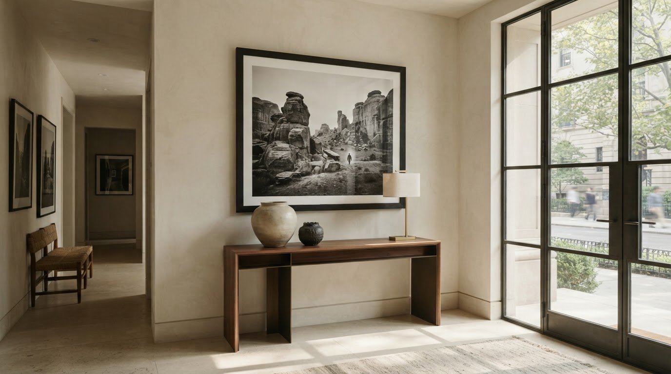
Choosing the Perfect Statement Art for Your Entryway

Your entryway isn’t just a hallway; it’s the visual prologue to your life, establishing your home’s narrative authority in the first seven seconds a guest crosses the threshold. Most homeowners settle for mass-produced decor that feels transient, yet they crave a space that resonates with the quiet prestige of a curated gallery. Finding the definitive statement art piece for entryway walls often feels like a choice between the generic and the unattainable. You understand that this first impression shouldn’t just fill a void; it should anchor the room with historical significance and a sense of permanence.

In this guide, you’ll discover how to transform your foyer into a sophisticated arrival experience using high-end photographic heritage and iconic archives. We’ll explore the technical nuances of selecting investment-grade works, from the sun-drenched society of Slim Aarons to the cinematic intensity of Terry O’Neill. You’ll learn the precise museum standards for hanging and lighting these large-scale works, ensuring your chosen piece commands the “wow-factor” it deserves. We also detail our bespoke, ready-to-hang process that utilizes conservation-grade materials to preserve these lasting pieces of history for generations.

Key Takeaways

  • Master the art of the “visual prologue” by choosing imagery that establishes your home’s narrative authority the moment guests arrive.
  • Apply the curator’s 60/40 rule to select a statement art piece for entryway walls that perfectly balances scale with your existing architecture.
  • Implement the 57-60 inch hanging standard used by world-class galleries to ensure your artwork sits at the most engaging, ergonomic eye-level.
  • Learn why museum-grade bespoke framing is essential for protecting your investment against the unique light and humidity challenges of a foyer.
  • Discover how iconic archives, such as the Slim Aarons Collection, provide a sense of cultural heritage that mass-produced decor can’t replicate.

The Visual Prologue: Why an Entryway Statement Piece Matters

Within the first seven to ten seconds of entering a residence, a guest has already subconsciously cataloged the aesthetic authority and emotional resonance of the entire home. This initial encounter is what curators call the “visual prologue.” It’s the primary visual anchor that links the transition from the exterior world to the private sanctuary within. Choosing a definitive statement art piece for entryway walls is a deliberate act of storytelling, moving past the mundane utility of furniture to establish a narrative that lingers long after the door has closed.

Most retail advice suggests choosing art that complements a rug or a console table, yet this approach reduces art to mere accessory. A true statement piece functions as a cultural anchor. When you select a work from the Slim Aarons Collection or the Terry O’Neill archives, you aren’t just decorating; you’re signaling a reverence for historical significance. Iconic photography carries a weight of authenticity that mass-produced prints simply cannot match. It suggests a household that is cultured, discerning, and deeply connected to the heritage of the twentieth century’s most evocative moments, positioning the owner as a guardian of photographic history rather than a consumer of temporary trends.

Setting the Aesthetic Tone

Bridging the gap between exterior architecture and interior life requires a work of significant presence. A large-scale photographic work acts as a transition point, grounding the space and providing a sense of permanence. By installing a singular, monumental piece, you often eliminate the need for excessive foyer furniture, allowing the hallway to breathe with gallery-like clarity. In these high-traffic transition spaces, monochrome works from our Music Archives provide a timeless stability, while saturated color prints can inject a sense of sun-drenched escapism that defines the mood for the rest of the house.

The Conversation Starter

Imagery from the Terry O’Neill Photography collection or our Cinema Lobby Cards provides an immediate point of human connection. These are pieces guests recognize and gravitate toward, sparking dialogue before a single word is exchanged in the living room. Aspirational photography creates a sense of wonder, inviting the viewer into a world of elegance and historical charm. A true statement art piece for entryway displays is defined as a seamless fusion of monumental scale, an evocative subject, and a narrative story that commands immediate attention while retaining its cultural value over time.

Choosing Your Narrative: Iconic Archives vs. Contemporary Prints

Selecting the right narrative for your foyer is a deeply personal endeavor. It isn’t merely about matching a color palette to your walls; it’s about choosing the era and energy you want guests to inhabit the moment they arrive. While contemporary graphics often feel fleeting or trend-dependent, archival photography offers a sense of permanence and cultural weight. The choice between vibrant color and stark monochrome defines the frequency at which your home communicates its identity.

The Timeless Appeal of Slim Aarons

Slim Aarons famously documented “attractive people doing attractive things in attractive places,” creating a body of work that serves as the ultimate visual anchor for a residence. His work brings a saturated, sun-drenched vibrancy to entryways that might otherwise feel dim or uninspired. These prints act as windows into a mid-century jet-set lifestyle, offering a refreshing sense of escapism every time you walk through the door. Whether your home features modern minimalism or mid-century textures, Slim Aarons captures a world of effortless elegance that remains eternally aspirational.

Black and White Authority

For the collector seeking a more measured, worldly atmosphere, monochrome photography remains the gold standard. Black and white pictures provide a “quiet authority” that commands respect through contrast and composition. The Terry O’Neill Photography collection, characterized by intimate and candid celebrity captures, turns a simple transition space into a gallery of iconic faces. These works are incredibly versatile, anchoring homes with bold wall colors or complex architectural details without competing for attention. A monochrome statement art piece for entryway displays establishes a sophisticated focal point that transcends seasonal decor.

Beyond traditional portraits, our Cinema Lobby Cards and Star Wars Limited Edition Prints offer a playful yet prestigious alternative for those who view the entryway as a space for nostalgia. These pieces ground the home in the cultural milestones of cinema history, proving that a statement art piece for entryway walls can be both a significant investment and a personal reflection of one’s passions. You might find your perfect narrative anchor within our curated Music Archives, where the legends of sound are preserved in museum-quality detail.

Scale, Proportion, and Placement: The Curator’s Framework

Achieving a gallery-level entrance requires more than selecting a beautiful image; it demands precise architectural harmony. A statement art piece for entryway walls should never feel like an afterthought or a filler for empty space. Instead, it must be scaled to the volume of the room, adhering to the professional curator’s framework of proportion and placement to ensure the work commands the space with quiet authority.

The foundational guideline for a singular work is the 60/40 rule. Your artwork should ideally occupy between 60% and 75% of the available wall width to anchor the room effectively. For an uninterrupted wall, the museum standard places the vertical center of the piece at 57 to 60 inches from the floor. This ergonomic height ensures the viewer’s eye lands naturally on the most compelling elements of the composition, regardless of the ceiling height.

In narrow hallways, large-scale works can surprisingly expand the visual field rather than overwhelm it. The key lies in managing the “breathing room” around the frame. Lighting remains equally critical, especially in entryways prone to harsh natural light from open doors. Utilizing museum-grade glass, which reduces reflections to under 1% and blocks 99% of UV rays, ensures that the clarity of the photographic emulsion is never compromised by environmental glare or environmental shifts.

Determining the Right Dimensions

Begin by measuring the total width of your focal wall and subtracting 12 to 24 inches to create a necessary visual border. This negative space prevents the art from feeling cramped. If you are hanging the work above a console table, the frame’s width should measure roughly two-thirds to three-quarters of the furniture’s width. A vertical gap of 6 to 8 inches between the tabletop and the bottom of the frame is ideal to anchor the composition. Before finalizing your acquisition, use masking tape to outline the proposed dimensions on your wall to visualize the physical impact.

The Multi-Piece Entryway

While a single massive print offers a singular punch, longer corridors often benefit from a curated pair or a rhythmic series. Using fine art photography to create a mini-gallery allows you to build a more complex narrative as guests move through the space. When opting for multiple pieces, maintain a consistent narrative through shared framing styles or a unified color story. This ensures the collection feels like a deliberate, professional installation rather than a fragmented assortment of decor.

The Role of Bespoke Framing in Defining “Statement Art”

A true statement art piece for entryway walls isn’t defined by the image alone; it’s the culmination of the print and its presentation. In the world of high-end curation, the frame accounts for roughly 50% of the artwork’s visual impact. It acts as the bridge between the photographic heritage of the piece and the architectural soul of your home. Without a gallery-grade housing, even the most iconic Slim Aarons print can lose its authority, appearing transient rather than permanent.

Entryways are notoriously volatile environments. They’re the primary transition zones where your collection faces rapid shifts in humidity, drafts, and direct sunlight from frequent door openings. Archival integrity isn’t just a buzzword; it’s a necessity for protecting your investment. High-quality bespoke framing ensures that your statement art piece for entryway displays remains a lasting piece of history, shielded from the environmental stressors that typically cause paper rippling or photochemical fading over time.

Museum-Quality Materials

Standard framing glass reflects roughly 8% of ambient light, often turning a beautiful photograph into a mirror in a bright foyer. We utilize museum-grade glazing that reduces reflections to less than 1%, providing an optical clarity that appears virtually invisible. This is paired with acid-free, 100% cotton rag matting to prevent the yellowing and embrittlement often seen in mass-market products. The tactile weight of the premium paper and the hand-finished texture of the wood create a sensory experience that signals quality before a guest even gets close to the work.

Choosing the Frame Style

The choice of finish should echo your home’s existing trim while respecting the era of the photography. Minimalist black or white frames offer a sharp, contemporary edge for music archives or mid-century jet-set scenes. Conversely, more classic or deep-set profiles add a sculptural element to the wall, perfect for our vintage lobby cards or Terry O’Neill portraits. This depth creates shadows and presence, ensuring the art doesn’t just sit on the wall but inhabits it.

Every work we produce arrives with professional-grade mounting and hardware, offering a “ready-to-hang” luxury that removes the uncertainty of installation. This seamless process ensures that your acquisition is as effortless as it is beautiful. To begin curating your foyer with a professional touch, explore our bespoke framing service and discover the difference of artisanal craftsmanship.

Curating Your Entrance with Galerie Prints

At Galerie Prints, we operate as more than a gallery; we are the guardians of a photographic heritage that spans decades of cultural significance. We serve as the definitive bridge between world-renowned archives and the private walls of your home. Selecting a statement art piece for entryway placement is a significant investment in your home’s narrative authority. Our curated collections, ranging from the sun-drenched society of the Slim Aarons Collection to the raw, monochromatic energy of our Music Archives, ensure that your first impression is anchored in historical authenticity rather than fleeting trends.

Our commitment to artisanal craftsmanship defines every work we release. Founded by artist and curator Stuart Möller, Galerie Prints prioritizes a sophisticated acquisition process that mirrors the prestige of the images themselves. We utilize localized, expert production to maintain the highest technical standards, ensuring that each large-format work possesses the material quality required to command a luxury foyer. We don’t deal in mass reproductions; we provide investment-grade art that retains its cultural and aesthetic value for a lifetime.

From Archive to Entryway

The journey of your chosen piece begins deep within the Getty Images and Slim Aarons archives. We source from original negatives to produce traditional C-type prints on Fuji Crystal Archive paper or darkroom-processed silver gelatin prints. These methods offer a colorfast, archival durability of 75 to 100+ years, far surpassing the lifespan of standard commercial prints. Each work is authenticated with an official embossed archive stamp and accompanied by a Certificate of Authenticity. This meticulous process transforms a photograph into a lasting piece of history, ready to withstand the environmental demands of a high-traffic entrance hall.

Start Your Entryway Transformation

Finding the perfect statement art piece for entryway walls is a journey of discovery. You can browse our collections by theme, artist, or specific color palette to find the work that resonates with your architectural style. For those with high-ceiling foyers or unique spatial requirements, our team provides personalized curation advice to help you navigate scale and framing choices. We understand that a premier destination for serious collectors must offer both intellectual stimulation and practical support. Explore our curated collections and find your statement piece today.

Elevating Your Arrival Experience

Transforming your foyer into a visual prologue requires more than just filling a wall; it’s about the deliberate marriage of scale, historical narrative, and material excellence. By adhering to the curator’s 60/40 rule and ensuring your artwork is hung at a precise gallery height, you create a space that feels both intentional and authoritative. A definitive statement art piece for entryway walls doesn’t merely decorate. It establishes a sense of permanence and cultural depth that resonates with every visitor who crosses your threshold.

At Galerie Prints, we believe your home deserves the same level of curation as a world-class gallery. Our collection offers museum-quality archival prints sourced from original negatives, paired with bespoke framing as standard to ensure your investment is protected for generations. With our secure global shipping for large-scale art, acquiring a masterpiece is a seamless and refined experience. Whether you’re drawn to the sun-soaked elegance of the jet-set era or the raw energy of music history, your perfect focal point is waiting to be discovered. Browse the Slim Aarons Collection for your entryway and begin the journey of defining your home’s story today.

Frequently Asked Questions

What is considered a “statement piece” of art for an entryway?

A statement piece is a work of significant scale and cultural weight that immediately anchors the room’s narrative. It isn’t merely decor; it’s a conversation starter that establishes the home’s aesthetic authority. For a definitive statement art piece for entryway walls, we recommend iconic photography from the Slim Aarons Collection or Terry O’Neill archives. These works combine monumental presence with a sense of historical permanence that mass-produced prints simply cannot replicate.

How large should art be for a two-story entryway?

Two-story foyers require monumental scale to avoid looking swallowed by the architecture. You should aim for a piece that occupies roughly 60% to 75% of the available wall width. In these high-volume spaces, vertical orientation often works best to draw the eye upward. Large-format framed works from our archives provide the necessary visual weight to balance high ceilings, ensuring the art feels like a deliberate architectural choice rather than a small afterthought.

Should entryway art be colorful or black and white?

The choice depends on the emotional tone you wish to set. Vibrant color prints, such as those in the Slim Aarons Collection, inject a sense of sun-drenched escapism and energy into the home. Conversely, black and white photography offers a quiet authority and timeless sophistication. Monochrome works are exceptionally versatile, anchoring spaces with bold wall colors or complex architectural details without competing for attention. Both styles effectively establish a cultured, discerning atmosphere.

How do I protect my fine art photography from sunlight in a foyer?

Protecting your investment in a high-traffic foyer requires museum-grade glazing. Standard glass reflects roughly 8% of light and offers minimal protection. We utilize specialized gallery glass that blocks 99% of harmful UV rays and reduces reflections to under 1%. This ensures your statement art piece for entryway displays remains vibrant and free from photochemical fading, even when exposed to the frequent light fluctuations common in transition spaces near exterior doors.

Can I use multiple smaller pieces instead of one large statement piece?

While a single massive print offers a singular punch, a curated pair or a rhythmic series can be equally effective in longer corridors. Using multiple works allows you to build a more complex narrative as guests move through the space. To maintain a sophisticated look, keep the framing styles or color stories consistent across all pieces. This ensures the collection feels like a professional, deliberate installation rather than a fragmented assortment of smaller, unrelated items.

What is the best height to hang a statement art piece in a hallway?

We follow the museum standard of hanging art so the vertical center of the piece sits 57 to 60 inches from the floor. This ergonomic height ensures the viewer’s eye lands naturally on the composition’s most compelling elements. If you’re hanging the work above a console table, maintain a gap of 6 to 8 inches between the tabletop and the frame’s bottom. This spacing anchors the piece to the furniture while maintaining gallery-level clarity.

Why is bespoke framing important for large-format photography?

Bespoke framing accounts for roughly half of the artwork’s visual impact and is essential for structural stability. Large-format works require precision mounting to prevent paper rippling over time, especially in volatile entryway environments. Our in-house service uses museum-quality materials and acid-free matting to preserve the photographic emulsion. This process transforms a high-quality print into a gallery-grade installation that arrives ready-to-hang, removing the logistical uncertainty of finding a third-party framer for oversized works.

How does shipping work for large, framed statement pieces?

We provide secure global shipping for all our large-format framed works, utilizing specialized, impact-resistant packaging to ensure safe transit. Each piece is handled with the care befitting a fine art acquisition, from our London-based production facility to your doorstep. We manage the logistics of oversized items so you can focus on the curation of your space. This professional support ensures your investment arrives in pristine condition, ready to transform your home’s first impression.

How to Mix Different Art Styles: A Curator’s Guide to Cohesive Interior Decor

The most captivating rooms don’t rely on matching sets; they thrive on the deliberate collision of history and aesthetic. While you might worry that a 1960s Slim Aarons poolside scene would clash with a Star Wars limited edition print or a vintage movie poster, the reality is that contrast creates depth. Learning how to mix different art styles is less about finding identical colors and more about mastering the art of the visual narrative. It’s a skill that transforms a mere wall of pictures into a sophisticated, multi-layered home gallery that whispers of worldly travels and refined tastes.

You’ve likely felt that familiar uncertainty when standing before a blank wall, wondering if your Terry O’Neill music archives can truly coexist with traditional cinema lobby cards without looking chaotic. This guide provides the professional curatorial strategies you need to blend diverse movements and photography archives into a cohesive masterpiece. We’ll examine how a shared palette, thematic anchors, and the quiet authority of bespoke framing can unify even the most eclectic collection. You’ll gain the confidence to invest in the pieces you love, knowing exactly how to bridge the gap between different eras and mediums.

Key Takeaways

  • Shift your mindset from mere decoration to intentional curation by distinguishing between a random assortment and a purposeful selection of historical works.
  • Master how to mix different art styles by identifying a common thread, such as a recurring color palette or a shared narrative theme, to anchor your diverse collection.
  • Explore how bespoke framing acts as a visual bridge, using consistent materials or profiles to unify disparate mediums like vintage movie posters and contemporary photography.
  • Learn to select the ideal arrangement for your space, whether it’s the disciplined symmetry of a grid or the evocative, storied depth of a salon hang.
  • Discover how to pair the high-society elegance of the Slim Aarons Collection with the raw energy of music archives for a truly sophisticated home gallery.

The Curatorial Philosophy of Mixing Art Styles

True curation is a deliberate act of selection; it is not merely the gathering of objects. It requires a discerning eye that appreciates the friction between a sun-drenched Slim Aarons poolside scene and the raw, monochromatic intensity of a Terry O’Neill portrait. This friction creates a narrative depth that a single-style room simply cannot replicate. By adhering to fundamental design principles like scale and visual weight, you ensure that this mix feels prestigious rather than accidental. A curator looks for the quiet harmony that exists between disparate pieces, finding beauty in the tension of competing eras.

Understanding how to mix different art styles involves recognizing the difference between an accidental hoard and a purposeful selection. A selection is curated with a specific intent; it is a conversation held across decades. When you place a vibrant Star Wars limited edition print near a classic cinema lobby card, you aren’t just filling wall space. You are building a bridge between pop culture milestones and traditional cinematic history. This multi-layered approach suggests a worldly perspective, signaling that the collector values the heritage of the image as much as its aesthetic impact.

Intentionality vs. Clutter

A gallery feels cluttered when the eye has nowhere to rest. To avoid this, utilize white space as a silent partner in your design. An “earned” mix is one where the quality of the production and the authenticity of the source material remain consistent, even if the subjects differ wildly. This shared excellence provides the necessary cohesion to prevent visual chaos. Ultimately, eclectic curation is the balance of historical narrative and visual rhythm. It demands that every piece, whether it is a vintage movie poster or a music archive print, earns its place through its contribution to the room’s overarching story.

The Value of the Multi-Layered Collection

A room styled in only one era often feels like a sterile showroom; it lacks the soul and character of a lived-in space. A home should feel layered, reflecting a lifetime of discerning tastes and cultural appreciation. Integrating fine art photography as a foundational layer allows you to build a collection that feels permanent and stable. Mixing photography archives with cinema memorabilia invites guests to linger. These diverse pieces spark a silent dialogue about culture and artistry, ensuring your home remains a sanctuary of elegance rather than a fleeting trend. Mastering how to mix different art styles is the final step in evolving from a decorator to a true guardian of visual history.

Finding the Visual Anchor: Establishing a Common Thread

To achieve a balanced gallery, you must establish a visual tether that binds diverse pieces together. While some suggest designer-curated art sets as a starting point, a truly bespoke collection relies on more nuanced anchors. Color is the most immediate tool at your disposal. A single recurring hue, perhaps the deep azure of a Mediterranean sea or the softened charcoal of a studio backdrop, can bridge the gap between a Terry O’Neill portrait and a contemporary abstract print. This color repetition provides a rhythmic continuity that guides the eye across the wall, ensuring the transition between eras feels intentional.

Subject matter offers another sophisticated anchoring technique. Grouping by theme allows you to explore how to mix different art styles without sacrificing clarity. A collection centered on “The Aspirational Life” might elegantly sit a vibrant Slim Aarons poolside scene alongside minimalist sketches of mid-century architecture. You should also consider visual weight; a bold, saturated photograph requires a strategic counterweight. Pairing it with a minimalist black and white piece ensures neither work overwhelms the other. Contrast in medium, such as the matte texture of a vintage lobby card against the high-gloss finish of a modern archival print, adds a tactile dimension that enriches the viewer’s experience.

Pairing Photography with Illustrative Art

Integrating different mediums requires precision. When hanging a Slim Aarons work alongside oil paintings or sketches, maintain a consistent horizon line or eye level. This geometric alignment creates a sense of order that permits stylistic diversity. Using tonal values is equally effective; a sepia-toned photograph can effortlessly share space with a graphic poster if they share the same warmth. If you’re looking to expand your collection, you might browse our music archives for pieces that share these subtle tonal qualities.

The Narrative Anchor: Storytelling Through Art

A collection should tell a story that spans generations. Using a lobby card adds a layer of historical grit and cinematic nostalgia to an otherwise polished gallery. This creates a “time-travel” wall where the grit of 1940s Hollywood meets the sleekness of modern limited edition prints. To preserve this narrative for decades, emphasize archival quality. High-caliber visual art is an investment in history, and maintaining its condition ensures the story remains vivid. Mastering how to mix different art styles through storytelling transforms a room from a decorative space into a curated archive of human experience.

The Bridge of Bespoke Framing and Materiality

Framing is often the unsung hero of a successful gallery. It serves as the physical bridge between the art and the room’s architecture. When considering how to mix different art styles, the frame acts as a “uniform” that can reconcile a 19th-century sketch with a 21st-century limited edition print. By applying a consistent bespoke framing treatment across your collection, you create a visual language that speaks of intentionality. This approach is supported by a curator’s guide to mixing art styles, which emphasizes that strategic framing is vital for preventing visual chaos in eclectic spaces.

A “complimentary mix” is an alternative for those who find identical frames too rigid. You might select different profiles that share a common material, such as hand-finished dark wood or blackened aluminum. This shared materiality provides enough cohesion to allow for diversity in the art itself. Mount sizing, or matting, also plays a critical role in establishing a gallery rhythm. Generous, consistent matting provides a “breathing space” for the eyes, allowing a gritty Terry O’Neill music archive print to sit comfortably beside a vibrant Star Wars limited edition piece. Investing in museum-quality paper and archival mounting isn’t just about aesthetics; it’s about the permanence of your history.

Unifying Disparate Eras with Frame Choice

Selecting a frame involves honoring the artwork’s heritage while acknowledging the room’s contemporary aesthetic. A “modern classic” look is achieved by pairing a vintage archive print with a sleek, minimalist frame. This juxtaposition highlights the timelessness of the image while ensuring it feels relevant in a modern interior. A bespoke frame acts as a visual translator between the art and the architecture. It allows a vintage movie poster to speak the same language as a piece of contemporary furniture.

Materiality and Texture

The viewing experience is profoundly affected by technical specifications like premium glazing. Anti-reflective museum glass ensures that the intricate details of a photograph are visible from every angle without the distraction of glare. The tactile nature of black and white pictures is enhanced by professional mounting techniques that prevent warping over time. In a luxury context, “ready-to-hang” must always signify hand-crafted excellence, utilizing acid-free materials that justify the investment by preserving the work for future generations.

The physical arrangement of your collection is the final act of curation, dictating how the viewer moves through the space and interacts with the history on your walls. While a Grid Layout offers a disciplined, rhythmic approach ideal for serial works like Star Wars Limited Edition Prints, a Salon Hang embraces the evocative complexity of a diverse archive. Understanding how to mix different art styles through spatial placement requires a delicate balance of geometry and narrative flow. By establishing an “Anchor Piece,” perhaps a large-scale Slim Aarons photograph, you create a gravitational focal point that allows smaller, more varied works to orbit around it without feeling untethered or accidental.

Mastering the Salon Hang

A successful salon hang begins at the center. Place your most challenging or unique piece first, then build outward to maintain a sense of organic growth. To prevent visual noise, adhere to the 2-3 inch rule, keeping spacing consistent even when the mediums differ. This discipline allows you to mix small-scale cinema lobby cards with large-format music photography without losing the intricate details of the smaller works. It’s a sophisticated way to explore how to mix different art styles, creating a wall that feels like a lived-in archive rather than a static display.

The “One Per Sightline” Evolution

In luxury homes with open-plan layouts, the traditional “one statement per sightline” rule often feels too restrictive. Instead, use your collection to zone the room, creating distinct atmospheres within a single space. You might dedicate one corner to the raw energy of music archives while allowing a cinematic hallway to lead guests through a history of film. Always perform a “scale test” to ensure your mix doesn’t feel dwarfed by the volume of the room. If you’re ready to elevate your home’s narrative, you can explore our curated collections to find your next anchor piece.

Curating Your Collection with Galerie Prints

Galerie Prints operates as more than a premier destination for fine art; it serves as a guardian of photographic heritage and a bridge to a bygone era of elegance. By offering a seamless bridge between the raw, monochromatic grit of Terry O’Neill’s music archives and the sun-drenched, aspirational luxury found within the Slim Aarons collection, Galerie Prints provides the essential building blocks for a truly worldly home gallery. When you are discovering how to mix different art styles, the provenance of the work is just as vital as its visual impact. Our archives are meticulously selected to ensure that every piece, whether a cinematic lobby card or a limited edition Star Wars print, carries an inherent prestige that elevates the surrounding decor.

The defining advantage of a Galerie Prints acquisition lies in our bespoke framing service, where each frame is hand-crafted in our London workshop by skilled artisans. This localized craftsmanship acts as a seal of quality, ensuring that the “visual translator” discussed in previous sections is of the highest technical caliber. Starting your collection begins with the selection of an anchor piece, a significant work that establishes the tonal and narrative direction of your space. Our seasoned experts are available to guide you through this selection, ensuring your first investment provides a stable foundation for the eclectic layers to follow.

A Legacy of Quality

Every print within our collection is produced with a reverence for historical significance, utilizing original source materials to maintain absolute authenticity. Under the curatorial direction of Stuart Möller, Galerie Prints has established itself as an authority in the art world, ensuring that every acquisition is a lasting piece of history. We prioritize the tactile elements of production, from the choice of museum-grade papers to the precision of archival mounting. This commitment to technical superiority ensures that your journey in learning how to mix different art styles is supported by works that will retain their vibrancy and value for generations.

Begin Your Curatorial Journey

We invite you to linger within our digital gallery and explore the vast narratives contained within our music, film, and fashion archives. Our professional “Ready-to-Hang” service removes the logistical complexities of installation, allowing you to focus entirely on the creative joy of curation. Whether you are drawn to the timeless allure of black and white portraiture or the bold graphic impact of vintage movie posters, our collections offer the diversity required for a sophisticated, multi-layered home. Explore our curated collections and find your next statement piece.

Mastering how to mix different art styles transforms your home from a simple collection of objects into a cohesive narrative of cultural heritage. By establishing a clear visual anchor and utilizing the unifying power of bespoke framing, you bridge the gap between disparate eras and artistic mediums. Whether you are pairing the raw grit of a Terry O’Neill portrait with the sun-drenched elegance of Slim Aarons, the secret lies in the quality of the source material and the precision of the final presentation. These strategies ensure your gallery feels earned and intentional rather than accidental.

We invite you to begin this curatorial journey by exploring our official archives, featuring prestigious works from Getty Images and historic music archives. Every selection is hand-crafted with artisanal bespoke framing in our London workshop and protected by worldwide shipping in museum-grade packaging to ensure its lasting stability. Curate your space with our hand-picked Fine Art Photography collections. Your walls are the ultimate canvas for your personal history; let them speak with the quiet authority and timeless beauty they deserve.

Frequently Asked Questions

Can I mix black and white photography with colorful paintings?

You can certainly mix monochromatic photography with vibrant paintings to create a sophisticated visual contrast. Black and white images, such as those found in our Terry O’Neill archives, act as a neutral grounding element that allows the saturation of colorful works to flourish without competition. This juxtaposition highlights the technical nuances of both mediums, creating a curated depth that feels intentional rather than accidental.

How many different art styles should I limit myself to in one room?

Aim to focus on two or three dominant artistic movements to ensure your space remains balanced and refined. While there are no rigid rules on how to mix different art styles, over-extending your selection can dilute the narrative impact of individual pieces. By selecting a few core styles, such as mid-century photography and cinematic history, you allow each work to contribute to a clear, authoritative story.

Should all my frames match if the art styles are different?

Matching frames aren’t a requirement, but utilizing a shared material or profile provides a necessary uniform for a diverse collection. You might choose different frame widths while sticking to a single finish, such as hand-finished black wood or blackened aluminum. Our bespoke framing service in London specializes in creating these subtle visual bridges, ensuring that disparate works like Star Wars prints and vintage movie posters share a common architectural language.

Is it okay to hang a modern photograph next to a vintage movie poster?

Pairing modern photography with vintage cinematic memorabilia is an excellent way to add historical grit to a polished interior. This contrast creates a time-travel effect that rewards the viewer with layers of cultural significance and nostalgia. The key is to ensure both pieces share a similar level of production quality, which prevents the vintage item from looking out of place next to a contemporary archival print.

How do I choose the right size when mixing different art mediums?

Choose one large-scale statement work to act as your primary focal point and arrange smaller pieces around it to create a balanced hierarchy. This anchor piece strategy provides a sense of stability, especially when mixing varied mediums like cinema lobby cards and music archives. Maintaining consistent spacing between these different sizes helps the eye navigate the collection without feeling overwhelmed by the change in scale.

What is the best way to arrange a gallery wall with different styles?

The salon hang is the most evocative arrangement for a collection that spans multiple eras and mediums. Start by placing your most significant or visually complex piece at eye level and build the layout organically outward. This approach is a masterclass in how to mix different art styles, as it celebrates the tension between pieces while maintaining a rhythmic, intentional flow across the wall.

Can I mix landscape and portrait orientations in the same display?

Mixing landscape and portrait orientations adds a dynamic, sculptural quality to your display that prevents the arrangement from feeling static. To keep the look sophisticated, align the center points or the top edges of the frames to create a sense of underlying order. This geometric discipline allows you to combine horizontal Slim Aarons poolside scenes with vertical Terry O’Neill portraits in a way that feels curated and professional.

How do I ensure my eclectic art collection doesn’t look like a mess?

Ensure your collection maintains a high standard of material quality and authenticity to prevent an eclectic mix from appearing cluttered. Utilizing generous white space and professional matting provides each piece with the breathing room it requires to be appreciated as a standalone work. When every item is produced using archival methods and museum-grade materials, the shared excellence of the collection acts as its own unifying force.