Tag: Photo Framing

Conservation Framing for Photography: How to Protect and Display Prints

A beautifully framed photograph can still be vulnerable behind the glass. Conservation framing for photography is not about choosing a prestigious-sounding material. It means making considered choices that help reduce avoidable risks to the print.

If you’re unsure whether a mat is necessary, what “archival” really means, or whether framing might harm a photograph you value, those are sensible questions. Suitable materials and construction can help protect a print, but no frame can shield it from every threat, particularly unsuitable display conditions.

This guide explains what conservation framing can and can’t do, how glazing, mats, backing, and mounting methods affect a photograph, and what to ask before approving a frame. You’ll also learn why clear, verifiable material specifications matter more than vague marketing language, and how to display a print with care while preserving its visual presence. With a little knowledge, you can make the frame a considered part of the photograph’s presentation, not a source of uncertainty.

Key Takeaways

  • Conservation framing for photography can reduce avoidable risks to a print, but it can’t prevent every kind of deterioration.
  • Glazing, mats, spacers, mounting, and backing work together. The photograph’s process can affect which materials are suitable.
  • UV-filtering glazing helps, but it isn’t a substitute for physical separation, compatible materials, and thoughtful display conditions.
  • Before commissioning a frame, identify the print and its condition, explain where it will hang, and ask specific questions about materials and construction.
  • Careful placement and handling remain important after framing, especially away from direct sunlight, persistent heat, and damp.

What Is Conservation Framing for Photography, and What Can It Protect?

Conservation framing for photography means choosing materials and construction methods intended to reduce avoidable risks to a photographic print. A suitable frame can help limit contact with the print’s surface and reduce unnecessary handling, as well as moderate exposure to some environmental hazards. It can’t prevent every kind of deterioration. Light, fluctuating conditions, and the natural ageing of photographic materials may still affect an image over time.

Conservation framing helps reduce preventable risks to a photograph; it cannot promise that the print will remain unchanged forever. The frame itself can also age or be affected by its surroundings. For a broader perspective on why frames need care, see Conservation and restoration of painting frames, which discusses deterioration factors such as humidity, pests, and adhesives. Caring for the frame, however, is distinct from protecting the photograph inside it.

Framing is preventive, not restorative. If a print is already faded, stained, creased, or otherwise damaged, a new frame won’t reverse its condition. Treatment may require examination by a qualified photograph conservator, who can assess the image and recommend appropriate next steps. Don’t attempt repairs or remove adhered materials without expert guidance.

Which photographic prints may need extra care?

A contemporary print in good condition may call for different decisions from a historic, rare, irreplaceable, or visibly fragile photograph. With an older print, both its photographic process and its present condition can affect which materials are suitable. Yellowing, flaking, tears, or evidence of previous repairs are reasons to seek specialist advice before framing. If a photograph is valuable or historically significant, consult a photograph conservator or a framer experienced with photographs before making changes.

Does every photograph need conservation framing?

No single framing approach suits every print. The right choices depend on the photograph’s process and condition, its personal or financial importance, where it will be displayed, and the conditions around it. A print intended for a bright room may raise different concerns from one kept in a quieter, more stable setting. The aim is informed care, not alarm or unnecessary expense.

Think of framing as part of the photograph’s presentation. It can support the image visually while helping you make thoughtful decisions about its care. For ideas on bringing photographic art into a home, explore fine art photography collecting and decorating. Next, consider how each component of the frame interacts with the print.

How Conservation Framing Materials Interact with a Photographic Print

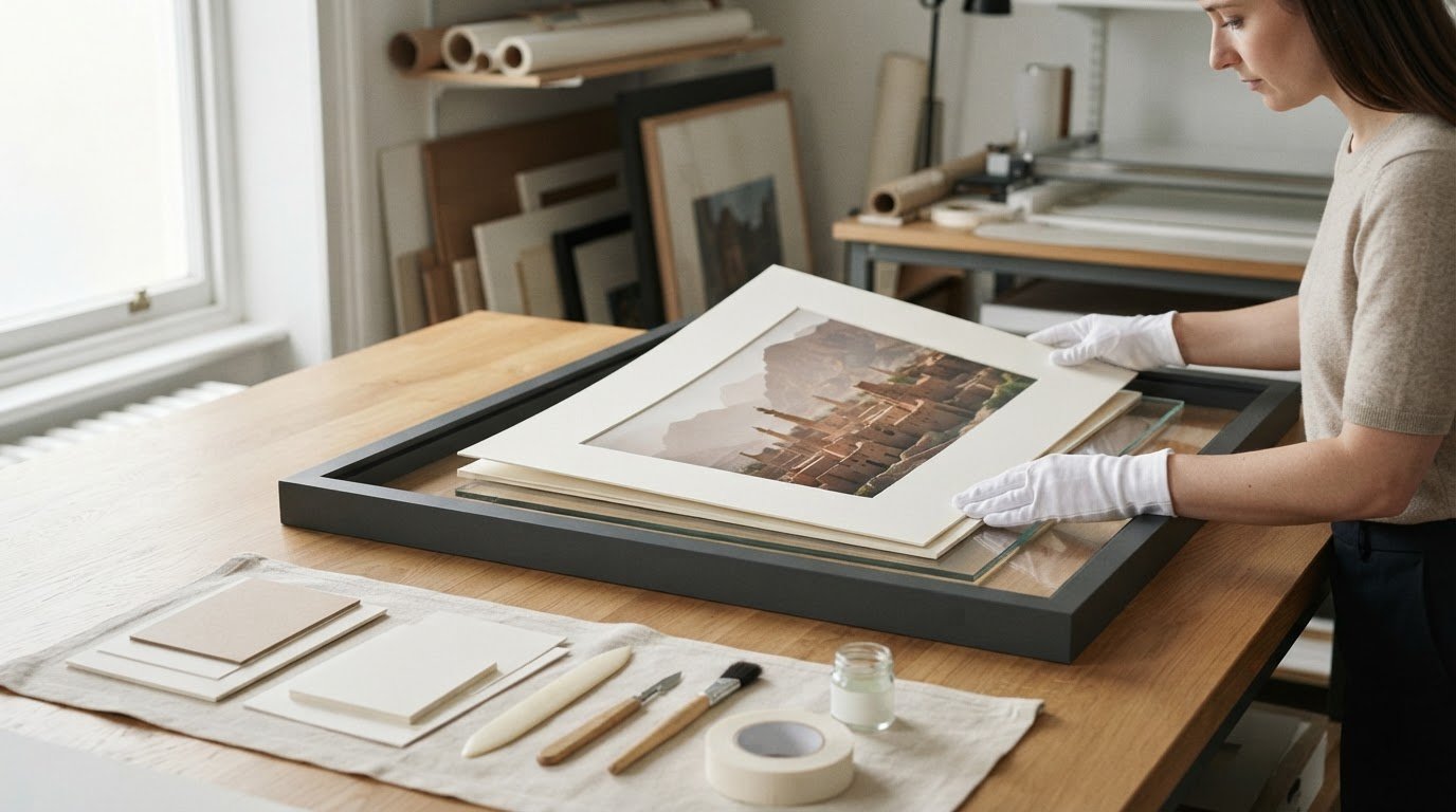
A framed photograph is a small, interconnected system. Glazing faces the image; a window mat or spacers create distance; the mount supports the print; backing sits behind it; and the frame holds the assembly together. Each part can affect the print through contact, pressure, or the environment inside the frame. Every layer that touches or encloses a print can affect how it’s cared for.

Choose materials for the photograph’s process, not just a label on the board. “Acid-free” describes a useful property, but on its own it doesn’t identify the material’s composition, test results, or suitability for a particular print. Ask what the mat, mount, and backing are made from, and whether their suitability for photographs can be documented. For prints within its scope, the Photographic Activity Test (PAT) is associated with ISO 18916; ISO 18902 sets requirements for materials used in framing and storing photographs. The Caring for Photographs guide from the American Institute for Conservation offers further guidance on handling and care.

Some photographic processes need particular consideration. Buffered boards, for example, aren’t suitable for every process; cyanotypes can be damaged by buffered materials. If the process is unknown, or the print is sensitive or historic, ask a qualified framer to assess which materials are appropriate. Don’t assume one board works for every photograph.

What should you ask about mats, mounts, and backing?

Start with the points of contact: what materials touch the print, and how is it held in place? Ask whether the mounting method is reversible, meaning the photograph can be removed later without damage. Non-adhesive supports may be appropriate, but the method should suit the print’s condition and format. A properly designed window mat or spacers can keep the image surface from resting directly against the glazing, helping reduce the risk of sticking or moisture-related contact.

Ask for specific material descriptions rather than relying on terms such as “museum quality.” For a delicate or historically important photograph, a qualified framer or photograph conservator can help assess the print and advise on the assembly.

What does UV-filtering glazing do, and not do?

UV-filtering glazing can reduce some ultraviolet exposure, but the degree of protection depends on the product and its stated specification. Ask which wavelengths it filters and request the manufacturer’s information. It won’t remove all fading risks: visible light, display conditions, and handling still matter. UV protection is one element of the framing system, not a substitute for suitable materials, separation from the glass, or thoughtful placement.

If you’re considering framing a purchased print, Galerie Prints offers a bespoke framing service. You can explore framing options and confirm the glazing, mounting, and backing specifications before choosing.

Conservation Framing Misconceptions: Is UV Glass Enough?

No. UV-filtering glazing can reduce some ultraviolet exposure, but it doesn’t make a photograph invulnerable. It can’t control every source of light or prevent heat and moisture from affecting the print. Nor can it compensate for unsuitable materials inside the frame. A more complete approach considers the whole assembly, the print’s condition, and where it will be displayed.

Think of each measure as addressing a different risk. The details below are a starting point, not a specification for every photograph. Confirm exact materials and performance claims with the framer or manufacturer, especially for a sensitive or historic print.

  • UV-filtering glazing: Reduces some ultraviolet exposure. Performance varies by product, and it doesn’t block all potentially damaging light.
  • A mat or spacers: Helps keep the print’s surface from touching the glazing. It doesn’t prevent fading or make unsuitable materials safe.
  • Compatible mount and backing: Helps avoid harmful contact and supports the print. Suitability depends on the photograph and its process.
  • Careful handling: Reduces risks from fingerprints, pressure, and accidental damage. It can’t reverse existing deterioration.
  • Thoughtful placement: Limits exposure to direct light, heat, moisture, and pollutants. Conditions can still change over time.

Can conservation framing prevent fading?

It may reduce some risks, but no framing choice can guarantee that a photographic print won’t change. Light exposure can affect colour stability, while the print’s materials and process also influence how it ages. Even glazing that filters ultraviolet light doesn’t eliminate exposure to visible light. Avoid direct sun and consider the room’s heat and moisture conditions. For advice tailored to a particular process, ask a photograph conservator rather than relying on a general lifespan estimate.

When is professional conservation advice worthwhile?

Routine framing of a replaceable contemporary print is different from making treatment decisions about a unique original. If a photograph is fragile, damaged, historically significant, or irreplaceable, seek specialist assessment before framing or attempting repairs. Ask a framer about their experience with photographic materials specifically; expertise with frames or other kinds of artwork doesn’t automatically mean familiarity with photographs. A conservator can assess the print and identify risks that may not be visible at a glance.

The aim of conservation framing for photography isn’t to promise permanence. It’s to make considered choices that reduce avoidable risks. A well-chosen frame is one part of that care, alongside appropriate handling and a suitable display location.

How to Commission Conservation Framing for a Photograph

A useful framing conversation begins with the photograph, not a frame sample. Share what you know about the print and where you plan to display it, then ask the framer to explain how the proposed construction addresses those circumstances. This checklist can help you compare options without relying on broad labels such as “archival” alone.

  1. Identify the print and its importance. Note its dimensions, any known photographic process or provenance, and visible concerns such as fading, tears, or surface damage. Explain whether it’s a replaceable print, a limited print, a historic photograph, or otherwise especially meaningful to you.
  2. Describe the intended location. Tell the framer which room you have in mind and whether the photograph may face direct sunlight or be near a heat source, damp area, or changing conditions. The display environment can help shape practical choices.
  3. Ask for the material details. What are the glazing, mat, mount, and backing made from? Which materials will touch the print, and how will the glazing be kept from contacting its surface? Ask for specific product or material information where available.
  4. Clarify how the print is held. Ask whether the attachment method is reversible and whether the photograph can be removed later without damage. If the process or condition is uncertain, ask what the framer can verify and what remains unknown.
  5. Record the agreed specifications. Keep a written note of the chosen materials, glazing description, mounting method, and any care advice. For a fragile, damaged, unique, or historically significant photograph, consult a qualified photograph conservator before proceeding.

What information should you bring to a framer?

Bring the print’s dimensions, known process or provenance, condition concerns, and intended display location. Share what you know about the photograph’s history, but don’t guess at details you can’t confirm. Tell the framer why the print matters to you, then ask for material choices to be explained in plain language. If a specification can’t be verified, ask that this uncertainty be made clear before you approve the design.

How should you assess the finished frame and its placement?

Before hanging the work, check the frame for signs of pressure, damage, or movement. Ask the framer to confirm that the print is securely supported and separated from the glazing. Choose a position away from direct sunlight and locations exposed to persistent heat or moisture changes. If you’re considering a monochrome work, black-and-white photography collecting offers further inspiration for displaying it thoughtfully.

Galerie Prints offers bespoke framing as an add-on for purchased prints. To explore the option, view the bespoke framing service, and confirm the materials and construction details that matter for your photograph.

Displaying and Caring for a Conserved Photograph Over Time

Conservation framing for photography works best alongside thoughtful display and careful handling. A well-considered frame can help reduce certain risks, but the photograph’s surroundings still matter. Choose a stable interior location away from direct sunlight, persistent heat, damp, and rapid changes in room conditions.

How can you reduce avoidable display risks?

Check the room throughout the day and across seasons. A wall that seems shaded in winter may receive strong sunlight later in the year. Bathrooms and kitchens can have fluctuating moisture, while radiators and fireplaces create heat. Keep framed photographs away from these conditions where possible, and avoid leaning objects against the glazing or stacking frames where pressure could affect the print.

For routine dusting, use a soft, dry cloth on the frame’s exterior. Don’t spray cleaner onto the glazing, where liquid could run into the edges, and don’t open the frame to clean or adjust the photograph. If the glazing needs more than light dusting, follow the framer’s care guidance for that specific frame and surface.

Once you’ve chosen a suitable place and established a gentle care routine, explore Galerie Prints bespoke framing as an option for a purchased print. Confirm the materials and construction details before selecting a framing option; conservation specifications shouldn’t be assumed.

When should a framed photograph be inspected?

Make occasional visual checks without taking the frame apart. Look for condensation, mould-like growth, new discolouration, loose hanging hardware, or signs that the print has shifted. Changes in a room’s light or moisture conditions may also make a previously suitable location less appropriate, so reassess placement if the environment changes.

If you notice an unusual change, don’t try to clean or repair the photograph yourself. Seek advice promptly from a qualified photograph conservator, particularly if the print is fragile, historic, or irreplaceable. A calm, regular check helps you notice concerns early while leaving the framed work undisturbed.

Choose a Frame That Lets the Photograph Endure

Good conservation framing for photography balances materials and construction suited to the print, protection that addresses real risks, and a display position that avoids unnecessary exposure. UV-filtering glazing can help, but it isn’t a guarantee against fading or change. The photograph’s process and condition matter, too, so seek a photograph conservator’s advice when a print is fragile, historic, or irreplaceable.

Ask clear questions about what touches the image, how it’s mounted, and which specifications can be verified. Keep the frame away from direct sunlight, persistent heat, and damp, then inspect it occasionally for changes. These practical steps make caring for a photograph less uncertain while allowing its image to remain at the heart of the room.

Galerie Prints offers bespoke framing as an add-on for purchased prints. Explore available framing and print options, and confirm current materials and specifications before deciding: Explore Galerie Prints bespoke framing. Choose a print and explore the framing options, then confirm the construction details that suit its display.

Frequently Asked Questions

Is conservation framing worth it for a photographic print?

Does UV-protective glass stop photographs from fading?

No. UV-filtering glazing can reduce some ultraviolet exposure, but it can’t guarantee that a photograph will never fade. Light, the print’s materials, and display conditions all influence how it changes over time. Ask the framer for the glazing specification and what exposure it addresses. Even with protective glazing, avoid direct sunlight. For a historic or irreplaceable photograph, seek advice from a qualified photograph conservator before choosing materials or a display location.

What materials should conservation framing use for photographs?

Suitable materials depend on the photograph’s process, condition, and intended display. Ask what the mat and backing are made from, which materials touch the print, how it’s mounted, and whether that method is reversible. “Acid-free” alone doesn’t explain every aspect of a material’s suitability. If the photograph is fragile, historic, or especially valuable, ask a qualified framer or photograph conservator to recommend materials for that specific print.

Can a photograph touch the glass in its frame?

It’s generally preferable to keep a photograph’s surface from touching the glazing. Changes in conditions can contribute to sticking or other damage, and direct contact may complicate future care. A properly designed mat or spacers can create separation, but the appropriate construction depends on the photograph and frame. Ask how the print is held, whether it contacts any framing materials, and whether the assembly can be accessed later without harming the image.

How should I display a framed photograph to protect it?

Choose a stable indoor location away from direct sunlight, persistent heat, damp, and marked environmental changes. Protective glazing doesn’t replace thoughtful placement. Check the frame occasionally for condensation, visible changes, or movement, and dust its surface gently without spraying liquid near the edges. Don’t open the frame to clean the print. If you notice damage or an unusual change, don’t attempt a repair; consult a qualified photograph conservator.

Should I use conservation framing for an old or valuable photograph?

Seek professional advice before framing a photograph that’s historic, fragile, damaged, unique, or especially valuable. Its process and present condition can affect which materials and mounting methods are suitable. A qualified photograph conservator can assess the print and advise on treatment needs, while a framer can explain construction options. Ask specifically about experience with photographic materials. Don’t assume standard framing or UV-filtering glazing alone is appropriate for an important original.

Is conservation framing the same as restoring a photograph?

No. Conservation framing concerns the materials and construction used to support and display a photograph while reducing avoidable risks. Restoration involves assessing or treating the photograph itself and should be undertaken by an appropriately qualified specialist. If a print is torn, stained, brittle, or otherwise damaged, seek conservation advice before framing it. This helps ensure framing decisions take the photograph’s condition into account rather than complicating its care.

Frame Colour Guide for Black and White Photos

A frame is never just a border; it’s the final, silent dialogue between a monochrome masterpiece and the space it inhabits. Whether you’re curating a private collection or styling a single statement piece, choosing a frame color for black and white photos is the critical step that either liberates the image or anchors it in mediocrity. Many collectors worry that a heavy wood grain might overwhelm delicate greyscale tones or that a stark white finish could “choke” the life out of a classic cinematic scene.

We recognize the importance of achieving a gallery-standard display that honors the technical excellence of your prints. This guide will provide you with the confidence to select a frame that enhances tonal depth and historical resonance while harmonizing with your room’s aesthetic. We’ll explore how specific finishes, from deep charcoals to artisanal wood grains, interact with light and shadow to transform a photographic print into a definitive piece of heritage.

Key Takeaways

  • Learn to identify whether your monochrome print possesses warm or cool undertones to ensure your frame enhances rather than clashes with the photograph’s tonal depth.
  • Master the art of choosing a frame color for black and white photos by understanding how classic black provides a definitive visual stop while gallery white offers essential breathing room.
  • Discover how to pair metallic accents like pewter or brass with specific photographic archives to echo the era’s historical resonance and prestige.
  • Understand why artisanal, museum-quality materials are essential for preserving the integrity of world-renowned collections like Slim Aarons and Terry O’Neill.
  • Gain the confidence to select a bespoke frame profile that serves as a bridge between your photograph’s narrative and your modern interior decor.

The Curatorial Philosophy of Framing Black and White Photography

In the quiet halls of a premier gallery, a frame is never a secondary thought. It serves as a curated threshold, a deliberate window that invites the viewer into the photograph’s unique narrative. While color photography often allows for a playful dialogue with interior accents, black and white imagery demands a more disciplined palette. Every choice must serve the image’s soul, ensuring the frame doesn’t compete with the artist’s intended contrast. The process of choosing a frame color for black and white photos is less about matching your furniture and more about respecting the provenance of the work.

A gallery-standard display relies on the concept of ‘visual weight.’ This psychological effect dictates how the viewer’s eye moves across the composition. A dense, charcoal frame can ground a high-key image, providing a definitive anchor for the eye. Conversely, a lighter profile allows the photograph to expand, creating a sense of infinite space. Unlike domestic decorative styles that prioritize wall color, a curatorial approach focuses on the photograph’s intrinsic needs:

  • Tonal Extension: The frame should feel like a natural continuation of the print’s darkest or lightest values.
  • Architectural Presence: The frame provides the structural integrity necessary to transform a paper print into a sculptural object.
  • Historical Context: The finish should echo the era of the photograph, whether it’s a mid-century Terry O’Neill or a contemporary architectural study.

Defining the Visual Narrative of Your Print

The color of your frame dictates which elements of the image the viewer notices first. A matte black frame often emphasizes the deep shadows and rich blacks of a noir-style portrait, drawing the eye toward the drama of the darks. If you prefer to highlight the delicate textures in the highlights, a soft white or light timber frame can lift those brighter tones, making the entire piece feel more luminous. Monochrome balance is the harmony between frame depth and print contrast.

Bespoke vs. Ready-Made: Why Quality Dictates Colour Perception

The perceived color of a frame changes based on the quality of its materials. A hand-stained timber frame possesses a tactile soul and a depth of hue that mass-produced plastic alternatives simply cannot replicate. In high-end curation, material authenticity is paramount. Using professional archival processing ensures that the tonal subtleties of a silver gelatin print remain vibrant for generations. When you invest in fine art photography, the framing must meet the same museum-quality standards. Choosing a frame color for black and white photos becomes a matter of selecting a finish that matures with the art, rather than a cheap veneer that distracts from the print’s technical excellence.

The Essential Palette: Black, White, and Natural Timber

Selecting the right boundary for a monochrome image is an exercise in sophisticated restraint. The essential palette of black, white, and natural timber remains the gold standard for a reason. While many retailers suggest that black frames work for every scenario, a seasoned curator knows that choosing a frame color for black and white photos requires a more nuanced touch. The goal is to create a visual dialogue that respects the print’s tonal range without overwhelming its subtle greys. For those seeking a broader overview of the technical considerations involved, this Guide to Framing Black and White Photography offers excellent foundational advice on the impact of different finishes.

The Sophistication of the Classic Black Frame

A black frame acts as a definitive ‘stop’ for the eye, containing the energy of the photograph within a crisp, architectural boundary. This choice is particularly effective for the high-contrast, iconic work found in the Terry O’Neill archive. When the frame matches the ‘black point’, which is the deepest, darkest area of the photographic paper, the image gains an immediate sense of depth and authority. Thin black profiles offer a modern, minimalist edge, while thicker, more substantial frames add a sense of historical weight and prestige to the display.

Gallery white frames, by contrast, encourage a ‘breathing room’ effect. This approach allows the photograph to float effortlessly on the wall, making it the preferred choice for contemporary, high-key interiors where the focus is on light and air. It’s an ideal strategy for minimalist compositions that rely on negative space to tell their story.

Natural Woods: Bringing Warmth to Silver Gelatin Tones

While monochrome can sometimes feel clinical, natural timber introduces an organic warmth that softens the display. Woods like oak, walnut, and ash are exceptional companions for black and white pictures that feature natural textures, such as architectural stone or botanical details. The key is to avoid grains that are too aggressive, as they can clash with the fine grain of the photographic film. A hand-stained walnut frame provides a rich, dark brown that complements the warmer, subtle undertones often found in vintage silver gelatin prints.

Beyond the hue, the finish of the wood or paint is vital. A matte finish absorbs light, keeping the focus entirely on the print’s details, whereas a satin finish adds a subtle, prestigious sheen that catches the light without distracting. Gloss finishes should be used sparingly, typically reserved for very modern, high-contrast works that require a bold, reflective statement. Our bespoke framing service ensures that every element, from the wood species to the final finish, is meticulously selected to honor the photographic heritage of your piece.

Metallics and Tonal Accents: Elevating Archival Prints

When choosing a frame color for black and white photos, collectors often overlook the transformative power of metallics. These finishes shouldn’t be dismissed as merely “vintage” or “traditional” accents. Instead, think of silver and pewter as a tonal extension of the silver gelatin process itself. These cool-toned metals harmonize with the metallic sheen inherent in archival prints, creating a seamless visual bridge between the artwork and its boundary. In a gallery setting, metallic frames catch ambient light with a subtle glow, adding a layer of luminosity that can breathe life into a low-contrast, grey-heavy image.

The interaction between metal and monochrome is deeply rooted in the history of the medium. While a black frame provides a definitive border, a metallic profile reflects the environment, making the piece feel more integrated into the room’s atmosphere. This choice is particularly effective for prints that possess a wide range of mid-tone greys, as the metallic luster echoes the delicate highlights found within the grain of the paper.

The Mid-Century Modern Appeal of Metallic Frames

For the aspirational lifestyle captures within the Slim Aarons collection, a slim gold or brass frame adds a touch of Hollywood Regency glamour. This choice isn’t just about decoration; it’s about reinforcing the narrative of high-society elegance. A gold profile provides a warm contrast to monochrome tones, particularly when balanced with the hardware or accents in a modern room. It transforms a simple photograph into a prestigious object of art that feels both historical and contemporary.

Dark Grey and Charcoal: The Understated Sophisticate

While black remains the classic choice, gunmetal and charcoal offer a modern, more versatile alternative. True black can occasionally feel too harsh against soft-focus art or prints with delicate tonal transitions. Charcoal, however, provides a softer “visual stop” that feels more integrated into the composition. This palette is particularly effective in industrial-style interiors where raw materials and muted tones dominate. It offers the authority of a dark frame without the clinical coldness of a pitch-black border.

Using a matte charcoal frame allows for a seamless transition when paired with dark mount boards, creating a sophisticated “box” effect that draws the viewer’s eye deep into the photograph’s center. This approach reinforces our curatorial philosophy: the frame should never compete with the image. By choosing a frame color for black and white photos that leans into these nuanced tonal accents, you ensure your display feels like a bespoke investment rather than an off-the-shelf afterthought. Our London-based production team specializes in these subtle finishes, ensuring every archival print is matched with a profile that respects its unique tonal chemistry.

Matching Frame Colour to Your Print’s Tonal Range

Black and white photography is rarely a simple matter of grey. Every print possesses a ‘tonal temperature’ that dictates its emotional resonance and its relationship with the surrounding decor. Warm monochrome prints, often seen in vintage silver gelatin works, lean toward subtle sepia or cream undertones. Cool prints, common in modern digital archival processes, exhibit a steely, almost bluish crispness. When choosing a frame color for black and white photos, identifying this temperature is the first step toward a harmonious gallery display.

The ‘Rule of Contrast’ serves as your curatorial compass. You must decide whether to match the frame to the print’s dominant tone for a seamless look or oppose it to create a dramatic boundary. If your photograph features a heavy concentration of mid-tone greys, a frame that matches that specific grey can make the artwork feel more expansive. However, a contrasting frame provides the necessary tension to make a minimalist piece stand out. Identifying the dominant grey in your image allows you to select a profile that either recedes into the background or anchors the composition with authority.

High-Contrast Prints vs. Soft Tonal Gradations

Dramatic ‘Noir’ style photography, characterized by deep shadows and piercing highlights, often demands the authority of a high-gloss black profile. This finish echoes the intensity of the blacks within the image, reinforcing the artist’s use of shadow. Conversely, high-key photography with its airy, ethereal quality is best preserved with a gallery white frame that doesn’t ‘choke’ the light. To achieve a classic, professional aesthetic, employ the ‘sandwich technique’ by utilizing a crisp white archival mount board placed between the photograph and a slim black frame. This creates a layered, sophisticated transition that guides the eye inward toward the narrative of the print.

The Interplay of Archival Mount Boards and Frame Colour

The mount board acts as the essential buffer between the art and its casing. It’s important to consider how the white-point of your archival photo paper interacts with the surrounding mat. A brilliant white paper paired with an off-white mount can make the mat appear aged or ‘yellowed’ incorrectly. In these instances, choosing a natural wood frame like ash or light oak can bridge the gap, providing a warm, organic transition that feels intentional rather than accidental.

For a more complex display, a ‘double-mount’ effect using contrasting colours can add a sense of three-dimensional depth and prestige. This technique is particularly effective for small, precious prints that require additional visual weight to command a wall. Our bespoke framing service offers expert consultation to ensure your mount and frame work in perfect unison with your print’s unique tonal chemistry, preserving your investment for decades to come.

The Galerie Prints Bespoke Approach: A Legacy of Quality

At our London studio, framing is regarded as a final, vital act of creation. We don’t view the casing as a mere boundary; it’s a structural testament to the photograph’s provenance. For the serious collector, choosing a frame color for black and white photos is an exercise in heritage preservation. Our artisanal approach ensures that every piece leaves our gallery ready to hang, possessing a professional finish that mirrors the technical brilliance of the world-renowned archives we represent. This level of craftsmanship provides a bridge between the historical significance of the image and the modern elegance of your home.

Our curators possess a deep understanding of the specific requirements of legendary collections. When honoring the Slim Aarons archive, for instance, we select profiles that echo the mid-century glamour and aspirational lifestyle captured in his work. We consider the narrative era of the photograph, ensuring the frame color and texture act as a sympathetic extension of the scene. This curatorial expertise is what separates a gallery-standard display from standard e-commerce offerings.

Museum-Quality Materials for Timeless Preservation

The longevity of your investment depends entirely on the materials that remain invisible to the eye. We utilize acid-free mounts and pH-neutral backing boards to prevent the chemical degradation that often plagues lesser framing options. This commitment to archival standards is a fundamental part of fine art photography ownership. A hand-finished gallery frame offers a tactile soul and a depth of color that mass-produced alternatives cannot replicate. When you run your hand along the grain of our hand-stained timbers, you feel the weight of artisanal tradition.

Professional Guidance for Your Collection

Whether you are acquiring rare lobby cards or commanding large-scale prints, our team provides the expert guidance necessary to navigate the nuances of display. We understand that choosing a frame color for black and white photos can be a daunting investment; therefore, we act as your trusted guide through every tonal decision. Every acquisition is handled with meticulous care, from the initial selection to the final, secure crating for worldwide shipping.

We invite you to explore our bespoke framing service to complete your acquisition with the prestige it deserves. By choosing a professional, London-based production, you aren’t just decorating a wall. You are securing a piece of photographic history for generations to come, ensuring your collection remains as vibrant and evocative as the day it was first captured.

Elevating Your Monochrome Masterpiece

Framing isn’t just a border; it’s the final layer of the artistic process. By analyzing the tonal temperature of your print and selecting a palette that respects its historical provenance, you transform a simple image into a lasting piece of heritage. Whether you opt for the definitive authority of a matte black profile or the organic warmth of hand-stained timber, the process of choosing a frame color for black and white photos should always prioritize the photograph’s intrinsic needs over fleeting interior trends.

Our London-based studio specializes in this delicate balance. We utilize museum-quality archival materials trusted by world-renowned archives to ensure your collection remains pristine for generations. Every frame is hand-crafted with the same artisanal precision found in the original works themselves, providing a bridge to a bygone era of elegance. This commitment to quality ensures your investment is both protected and perfectly presented within your home.

Discover the perfect frame for your collection with our bespoke framing service and ensure your acquisition is presented with the prestige it deserves. Let your walls reflect a shared reverence for beauty, history, and technical excellence.

Frequently Asked Questions

Is a black frame always the best choice for black and white photos?

A black frame is a definitive classic, but it isn’t the universal solution for every monochrome print. For high-key photography where light and airy tones dominate, a stark black border can feel restrictive or “choke” the composition. In these instances, a gallery white frame or a light ash timber provides the necessary breathing room. The choice depends entirely on the photograph’s tonal balance and the emotional atmosphere you wish to evoke.

Should my frame colour match the darkest part of the photo?

Matching the frame to the deepest “black point” of the photographic paper is an excellent way to ground a high-contrast image. This technique creates a definitive visual anchor that draws the viewer’s eye inward. However, for images with a softer tonal range or dominant mid-tone greys, a charcoal or gunmetal finish may be more sophisticated. Choosing a frame color for black and white photos often involves finding a tonal extension rather than a literal match.

Can I use a coloured frame (like blue or red) for monochrome art?

Coloured frames are technically possible but often distract from the intrinsic narrative of a monochrome print. A bold red or blue border risks overwhelming the delicate greyscale transitions that define fine art photography. If you desire a contemporary statement, consider a muted metallic or a deep, hand-stained wood. These options provide a subtle hint of colour while maintaining the curatorial integrity and prestige of the artwork itself.

What is the best frame colour for a vintage silver gelatin print?

Vintage silver gelatin prints often possess a warm, subtle sepia undertone that responds beautifully to natural materials. A hand-stained walnut frame or a muted pewter finish harmonizes with the chemical heritage of the silver gelatin process. These choices avoid the clinical coldness of modern black finishes, instead leaning into the historical resonance of the piece. Our bespoke framing service specializes in selecting profiles that honour the specific archives of legendary photographers.

How do I choose between a matte or glossy frame finish for B&W art?

Matte finishes are generally preferred for archival prints because they absorb light and keep the focus entirely on the photograph’s details. A matte charcoal or black profile provides a sophisticated, understated elegance that suits most gallery-standard displays. Glossy finishes are better reserved for high-contrast, modern works where a bold, reflective statement is required. The finish should always complement the texture of the photographic paper without creating distracting glare.

Does the mount colour need to match the frame colour?

The mount and frame should work in unison, but they rarely need to match in colour. Using a crisp white archival mount board with a slim black frame creates a classic “sandwich” effect that provides essential breathing room for the print. This layered approach adds three-dimensional depth and a sense of prestige to the display. The mount acts as a neutral buffer, ensuring the frame doesn’t compete directly with the artwork’s tonal range.

What frame colour makes a small black and white photo look larger?

A gallery white frame paired with an oversized mount is the most effective way to make a small photograph command a larger space. This technique utilizes negative space to expand the visual footprint of the artwork, giving it the prestige of a much larger piece. Choosing a frame color for black and white photos that matches the wall colour can also create a seamless, expansive effect that allows the image to float effortlessly.

Should I match my frame colour to my room’s furniture or the art?

You should always prioritize the needs of the artwork over the room’s furniture. A frame is a curated window into the photograph’s narrative, and its primary role is to enhance the print’s tonal depth. While a walnut frame might happen to match your desk, its first duty is to harmonize with the warm tones of the photograph. A well-framed piece of art possesses a permanence that outlasts changing interior trends and furniture arrangements.