A movie poster is often dismissed as a mere promotional artifact; yet, the right breakfast club poster serves as a profound window into the 1985 cultural zeitgeist when treated with the reverence of fine art. You likely recognize that while the emotional weight of John Hughes’ masterpiece remains unshakable, the flimsy, mass-produced versions found in most online marketplaces lack the gravitas required for a sophisticated interior. It’s frustrating to invest in a piece of history only to receive thin paper that creases at the slightest touch or colors that fade under standard lighting.
This guide will show you how to transcend the common dorm-room aesthetic by selecting an archival-quality print that captures every nuanced shadow of the original negative. We’ll explore the meticulous world of bespoke framing and the technical excellence of hand-printed craftsmanship that turns a nostalgic memory into a permanent piece of your collection’s provenance. From understanding the tactile beauty of 300gsm cotton rag paper to choosing a frame that complements your existing decor, you’re about to discover how to elevate a cult classic into a true conversation piece that commands attention in any room.
Key Takeaways
- Understand why the breakfast club poster has transitioned from a 1980s promotional piece to a definitive symbol of youth culture and a sophisticated modern aesthetic.
- Learn the critical differences between mass-market reprints and archival-quality prints that preserve ink saturation and prevent yellowing for serious collectors.
- Discover professional techniques for styling cinematic art within a minimalist interior, moving beyond casual displays to curated, bespoke framing solutions.
- Explore the meticulous process of hand-printing in our London darkroom, ensuring your collection reflects the prestige and heritage of the world’s finest photography.
The Enduring Legacy: Why The Breakfast Club Poster Remains a Cultural Icon
Released in February 1985, John Hughes’ seminal work redefined the cinematic portrayal of adolescence. The film’s primary promotional image, originally captured by photographer Annie Leibovitz, transcends its original function as a simple lobby card. Today, the breakfast club poster serves as a definitive artifact of the 1980s, representing a pivotal shift where promotional photography evolved into a curated piece of history. Collectors now view these prints not merely as nostalgia, but as significant works of photographic heritage that anchor a room with quiet authority. For those seeking deeper context on the film’s production and its enduring 97-minute narrative, The Breakfast Club Wikipedia entry provides an exhaustive record of its cultural impact since its mid-80s debut. The transition from marketing tool to collectable fine art is complete, as the image has been elevated from the bedroom walls of teenagers to the sophisticated frames of high-end galleries.
The 40-Year Evolution of a Cult Classic
As we approach 2026, the film’s exploration of identity and social labels remains startlingly relevant to a new generation of enthusiasts. The enduring “cool” of the poster lies in its raw, unvarnished depiction of youth, a quality that hasn’t faded over four decades. High-end collectors are increasingly sourcing archival versions of these images, valuing the provenance and technical excellence of original theatrical releases. This shift reflects a broader appreciation for the darkroom craftsmanship and original negatives that define the era’s best work. Investing in a breakfast club poster is no longer just about cinema; it’s about preserving a moment of 20th-century history that continues to inspire modern interior aesthetics.
Defining the Aesthetic of 1980s Cinema
The visual language of the 1985 campaign relies on a specific interplay of shadow and muted tones. This high-contrast lighting isolates the five protagonists, mirroring the film’s central character dynamics within a single, static frame. The ensemble layout forced audiences to confront the archetypes of the brain, the athlete, the basket case, the princess, and the criminal simultaneously. It’s a composition that demands attention, much like the silver gelatin prints found in a professional gallery. This aesthetic isn’t accidental; it was designed to bridge the gap between grit and glamour. The ‘Brat Pack’ aesthetic is a blend of suburban angst and high-fashion photography.
- Muted Tones: The use of greys, browns, and deep blues creates a timeless, grounded atmosphere.
- Compositional Balance: The pyramid-style seating arrangement suggests a temporary, fragile unity among disparate social groups.
- Authenticity: The lack of heavy digital retouching, common in 1985, provides a tactile quality that modern collectors crave.
By treating these promotional images with the reverence usually reserved for fine art, we acknowledge their role in shaping the modern visual landscape. The world’s finest photography often captures the simplest human truths, and this iconic ensemble remains the gold standard for character-driven cinema art.
Decoding the Imagery: From the Chalkboard to the Fist Pump
In 1984, legendary photographer Annie Leibovitz conducted a studio session that would forever alter the landscape of cinematic marketing. Eschewing traditional film stills, Leibovitz applied an editorial sensibility to the breakfast club poster, creating a portrait that felt more like a high-fashion spread than a teen comedy advertisement. This specific shot, known as the “chalkboard” portrait, became the definitive image of the film because it stripped away the noise of the plot to focus entirely on character archetypes. By placing these five distinct personalities against a neutral, studio-lit backdrop, the marketing team invited the audience to find themselves within the frame before they even stepped into the theatre on 15th February 1985.
The visual narrative culminates in the final, exhilarating shot of John Bender’s fist pump on the football field. This moment of cinematic rebellion, captured as the sun sets on the Shermer High School grounds, serves as a powerful bookend to the static tension of the poster. While the studio portrait captures the internal struggle of the “five strangers,” the fist pump represents the external triumph of their shared experience. This duality between the controlled environment of the studio and the raw, outdoor liberation of the finale is why the film’s imagery remains so potent for collectors today.
The Power of the Ensemble Portrait
The “Style A” theatrical poster relies on a classic pyramid composition to establish a sense of balance and permanence. John Bender sits at the apex, his defiant posture acting as the anchor for the entire group. This arrangement creates a timeless piece of art that feels grounded and intentional. Unlike the cluttered “floating head” designs common in 21st-century blockbuster posters, this layout utilizes negative space to let the subjects breathe. This deliberate spacing emphasizes the isolation each character feels, even while physically touching their peers. This sophisticated approach to Production Design of The Breakfast Club ensures that the poster functions as a standalone work of art, suitable for any bespoke gallery collection.
Symbolism in The Breakfast Club Artwork
Every element within the frame was curated to signal specific social cues to a 1980s audience. The props and costumes act as shorthand for the characters’ identities:
- The Earring: Claire’s diamond stud represents the wealth and expectations of the “Princess.”
- The Gloves: Bender’s fingerless gloves and flannel shirt signal a grit that contrasts with Andrew’s varsity jacket.
- The Posture: Brian’s slumped shoulders and Allison’s guarded stance highlight their roles as the “Brain” and the “Basket Case.”
The lighting is equally calculated, using soft, directional keys to emphasize the distinct textures of their clothing and the earnest expressions on their faces. The poster’s minimalist background focuses all attention on the emotional state of the actors. This focus on the human element, rather than explosive set pieces, is what gives the artwork its enduring archival value.
Archival Quality vs. Mass Market: Choosing a Print That Lasts
Acquiring a breakfast club poster isn’t just an act of nostalgia; it’s an investment in a piece of cinematic history that should survive the passage of time. Many enthusiasts fall into the trap of purchasing cheap, mass-produced reprints that rely on acidic wood-pulp paper and fugitive dye-based inks. These materials are chemically unstable and often begin to show signs of deterioration within 24 months. You’ll notice the paper turning a brittle yellow and the vibrant 1980s colors fading into a washed-out palette. True archival quality, by contrast, refers to a rigorous standard of production that ensures a print remains museum-fresh for over 100 years.
For the serious collector, the difference lies in the tactile soul of the print. A gallery-grade piece isn’t just a copy; it’s a meticulously crafted object that respects the original film’s grain and light. When you choose a print backed by provenance and darkroom craftsmanship, you aren’t just buying a wall covering. You’re securing a legacy piece that maintains its value and aesthetic power long after standard posters have crumbled.
The Technical Superiority of Fine Art Printing
Standard offset lithography, the method used for most commercial posters, uses a basic four-color process that lacks depth. In our London darkroom, we elevate the breakfast club poster through Giclée printing using 12-color pigment-based inks. This process captures the subtle transitions of shadow and light within the library setting that cheaper prints simply smudge. We utilize 100% acid-free Hahnemühle paper or traditional silver gelatin processes to ensure the deep blacks and rich textures of the 35mm film stock are preserved. This commitment to “the world’s finest photography” means every print possesses a luminous quality that mass-market alternatives can’t replicate.
Original Vintage vs. High-End Reproductions
Collectors must often decide between a 1985 theatrical original and a bespoke gallery reproduction. An original theatrical poster carries immense historical weight, though it’s often marred by fold lines or “pinholes” from its time in a cinema lobby. As detailed on The Breakfast Club Wikipedia page, the iconic imagery was captured by the legendary Annie Leibovitz, and finding an original in “Near Mint” condition is a rare, expensive endeavor. For those who prioritize visual perfection and longevity, a bespoke archival print offers a flawless alternative. To better understand the technical nuances of these materials and how they appreciate in value, consult our Fine Art Photography guide, which explores the intersection of heritage and home decor.
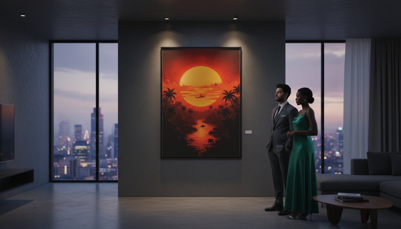
Curating Your Space: Styling The Breakfast Club Poster as Fine Art
Transitioning a cinematic icon from a teenage bedroom to a sophisticated adult residence requires a deliberate shift in curatorial perspective. The breakfast club poster, featuring the legendary 1984 photography by Annie Leibovitz, isn’t merely a piece of memorabilia; it’s a historical document of the Brat Pack era. To elevate this imagery, you must consider the architectural context of your room. In a minimalist interior, a single, large-format print acts as a tonal anchor, providing a splash of 1980s color against muted palettes. Scaling is vital here. While an A3 print offers a subtle nod to film history, a 70x100cm statement piece transforms a transition space, such as a hallway or home office, into a private gallery.
Protecting your investment is as important as the placement itself. Standard glass often fails to shield delicate pigments from solar degradation. Utilizing museum-grade acrylic with 99% UV protection ensures the deep saturation of the characters’ outfits remains vibrant for decades. Lighting should be indirect. Avoid harsh overhead bulbs; instead, use dedicated picture lights or adjustable track lighting to graze the surface of the frame, highlighting the texture of the paper and the sharpness of Leibovitz’s composition.
Creating a Cinema-Themed Gallery Wall
For collectors who wish to tell a broader story, pairing the breakfast club poster with other period-accurate works creates a compelling narrative. You might consider a “salon hang” layout, which allows for a rhythmic, asymmetrical arrangement of varying sizes. This approach works exceptionally well when integrating Cinema Lobby Cards, which offer a tactile, photographic contrast to the larger graphic scale of a primary poster. Maintaining a consistent color story, perhaps focusing on the earthy tones and denim blues prevalent in John Hughes’ filmography, ensures the collection feels intentional rather than cluttered.
Selecting the Right Frame Style
The frame acts as the bridge between the artwork and your architecture. A sleek, black wooden frame remains the “little black dress” of the art world, providing a sharp boundary that pulls the viewer’s eye toward the central figures. However, the true mark of a gallery-standard piece is the mount. Using a heavy, acid-free window mat creates a professional border that prevents the print from touching the glass. A bespoke frame provides the necessary breathing room for a high-impact movie image, ensuring the composition isn’t stifled by its borders. This archival approach transforms a simple print into a lasting piece of history.
Explore our curated selection of the world’s finest photography to find the perfect companion for your cinematic collection.
Bespoke Framing and Archival Excellence at Galerie Prints
At Galerie Prints, we don’t just sell reproductions; we curate legacies. Our commitment to the world’s finest photography extends deep into the cinematic realm, where we treat a breakfast club poster with the same reverence as a silver gelatin print from a 1960s fashion archive. Every piece we produce is a bridge to a golden age of storytelling. We hand-print our collections in our London darkroom, ensuring that the depth of tone and clarity of detail surpass standard commercial offerings. This artisanal approach transforms a piece of movie memorabilia into a sophisticated interior statement that resonates with history.
Choosing a frame is as vital as the art itself. Our bespoke framing services allow you to tailor every piece to your specific aesthetic, whether you prefer the minimalist lines of a contemporary black gallery frame or the warmth of hand-finished natural oak. We believe that a purchase from our gallery is a lasting investment in both style and heritage. It’s an opportunity to own a tangible fragment of the 1980s, preserved through modern technical excellence. By focusing on the tactile and historical elements of the work, we ensure your art remains as vibrant as the day it was printed.
The Galerie Prints Craftsmanship
Our London-based curators collaborate with prestigious archives to source the most evocative imagery. We utilize premium archival papers, specifically 310gsm Hahnemühle cotton rag stocks, which provide a tactile, museum-quality finish. To protect your investment, every frame features UV-protective glazing that filters out 99% of harmful rays, preventing the fading often seen in mass-produced prints. We manage international shipping with meticulous care, using custom-built packaging to ensure your framed art arrives in pristine condition. Our logistics team has successfully delivered to collectors in over 150 countries since our gallery’s inception.
Start Your Collection Today
Building a personal gallery is a journey of discovery. We invite you to browse our curated selection of cinema art and Music Photography, where the energy of the stage meets our archival excellence. Our online customization tool allows you to select from various sizes and bespoke frame finishes, ensuring the final piece complements your home’s unique character. Whether you’re a seasoned collector or acquiring your first breakfast club poster, you’re investing in a piece of art designed to last for generations. Explore our exquisite range of cinema art and bespoke framing to find your next centerpiece.
Elevate Your Space with a Piece of Cinematic History
Owning a breakfast club poster is more than a nod to the 1985 John Hughes masterpiece; it’s an investment in a cultural touchstone that defined a generation. By choosing 100% cotton archival museum-quality paper over standard mass-market prints, you ensure that the vivid defiance of the “Brat Pack” remains preserved for decades. Whether you’re drawn to the chalkboard’s symbolism or the raw emotion of the final fist pump, these images deserve a presentation that reflects their historical weight. Proper curation transforms a simple wall into a narrative of 1980s rebellion. You don’t just hang a poster; you curate a legacy.
At Galerie Prints, we treat every frame as a guardian of photographic heritage. Each piece is hand-printed in our London darkroom to exacting standards, ensuring the rich blacks and sharp contrasts meet the requirements of serious collectors. We offer global shipping with expert packaging to protect your investment from our door to yours. Discover how our bespoke framing services turn film moments into fine art. Browse our curated collection of iconic movie posters and bespoke framing to find the world’s finest photography for your home. We look forward to helping you curate a space that tells your unique story.
Frequently Asked Questions
What is the standard size for a Breakfast Club movie poster?
The standard size for an original Breakfast Club poster is the 27 x 41 inch One-Sheet. This specific dimension was the industry standard for theatrical releases in 1985 before the shift to the modern 27 x 40 inch format. Collectors often seek these precise measurements to verify authenticity. We provide various curated sizes for our fine art reproductions, ranging from 20 x 24 inches to larger statement pieces.
How can I tell if a Breakfast Club poster is an original 1985 theatrical release?
You can identify an original 1985 theatrical release by checking for the National Screen Service number 850009 at the bottom of the sheet. Authentic posters from this era were printed on thin paper stock and rarely featured a barcode. If your breakfast club poster measures exactly 27 x 41 inches and lacks modern copyright dates from the 1990s or 2000s, it’s likely a genuine artifact from the film’s debut.
Why should I choose an archival print over a standard poster?
Choosing an archival print ensures your investment remains vibrant for over 100 years without yellowing or degradation. Unlike standard posters printed on acidic wood-pulp paper, our archival selections utilize 100% cotton rag or alpha-cellulose paper. These materials are chemically stable and pH-neutral. When paired with pigment-based inks, they offer a depth of color and tonal range that mass-produced lithographs simply cannot replicate.
Does Galerie Prints offer bespoke framing for movie posters?
Galerie Prints provides bespoke framing services handcrafted in our London workshop to complement your cinema art. We offer a selection of premium finishes, including hand-stained hardwoods and sleek gallery-style frames. Every frame is built using museum-grade materials, ensuring that your breakfast club poster is both elegantly presented and physically protected. Our specialists advise on the best profiles to match your specific interior aesthetic.
What is the best way to display a movie poster in a luxury home?
The best way to display a cinema print in a luxury home is to treat it as a fine art centerpiece with dedicated 3000K LED picture lighting. Position the artwork so the center point sits exactly 57 inches from the floor, which is the standard gallery height for optimal viewing. Using a minimalist, oversized mat can create a sophisticated border that draws the eye toward the iconic 1980s imagery.
How do I protect my cinema prints from fading over time?
You should use 99% UV-protective acrylic or museum glass to protect your prints from irreversible light damage. Even indirect sunlight can cause colors to shift within 24 months if the glass doesn’t have a protective coating. We recommend hanging your collection away from direct heat sources, like fireplaces, to maintain a stable environment. This ensures the rich blacks and vibrant hues of the photography remain pristine.
Are there different versions of The Breakfast Club poster artwork?
There are two primary versions of the artwork, most notably the iconic group shot captured by photographer Annie Leibovitz in 1984. While the classic poster features the five students huddled together, some international releases and 25th-anniversary editions utilize alternative poses or color palettes. Our collection focuses on the most prestigious iterations, celebrating the timeless composition that defined a generation of cinema history.
Can I buy Breakfast Club lobby cards at Galerie Prints?
Galerie Prints offers a curated selection of original 11 x 14 inch lobby cards that were used for theatre promotion in 1985. These smaller, collectible sets often feature unique stills that didn’t appear on the main theatrical poster. We source these rare pieces with a focus on provenance and condition. They’re an excellent choice for collectors looking to create a narrative wall display alongside larger prints.