
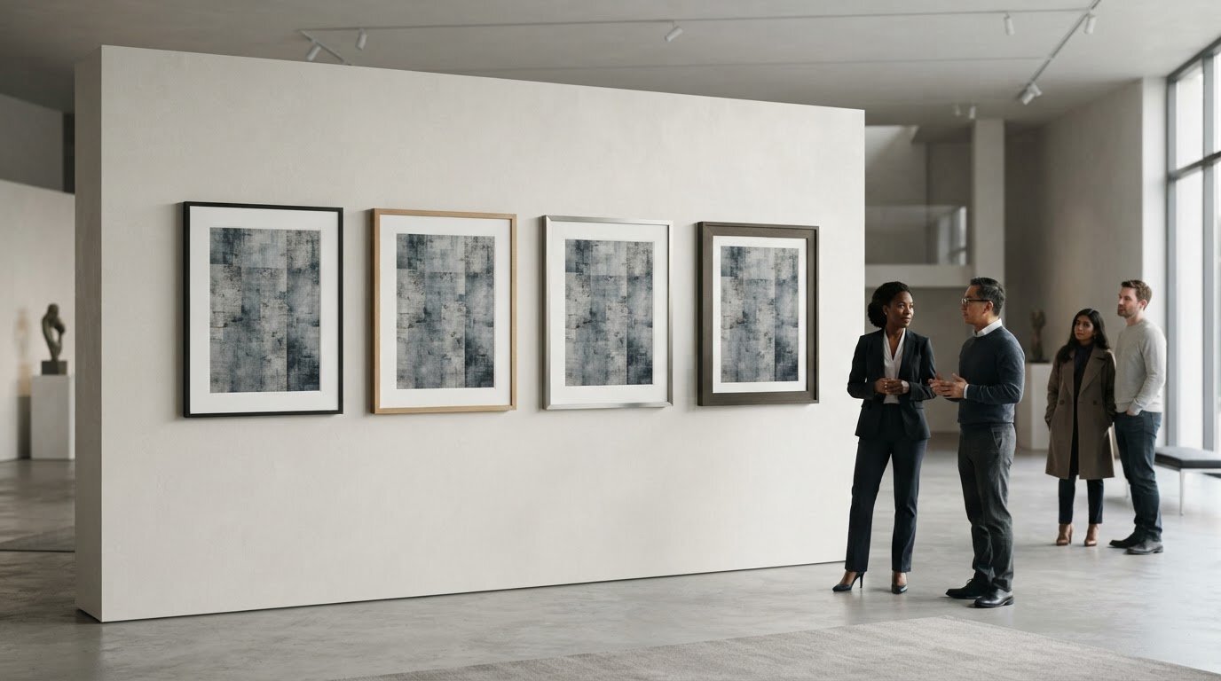
The best frame style for modern art may be the one you barely notice, or the one that creates a deliberate contrast. The right choice depends on the artwork and how you want it to read in the room. A frame that feels too dominant can interrupt a composition, while one that’s too restrained may leave a bold work feeling unfinished. Profile, finish, and the space around the image all affect the balance.
If you’re weighing a clean, minimal profile against a more expressive presentation, start with the artwork, then consider where it will hang. Look at the image’s colours, lines, and visual density, and compare how different frame widths and finishes change its presence. This guide explains how to make those comparisons, when contrast can feel intentional, and how custom sizing and cropping can help a photographic print suit its setting. The aim is a presentation in which the artwork and its surroundings feel considered together.
Key Takeaways
- The best frame style for modern art depends on the work’s visual intent, not a single rule about contemporary art.
- Compare profile, finish, and spacing to see how each choice changes the artwork’s presence.
- Use the artwork’s character and the room to decide whether minimalist framing or a more traditional presentation feels right.
- Assess the piece at its intended display distance and against the wall where it will hang.
- Galerie Prints offers professional framing as an add-on for purchased exhibition-quality photographic prints.
What Makes a Frame Work with Modern Art?
A frame works when it helps the artwork’s visual intent come into focus. A quiet edge can give a composition room to breathe; a more pronounced border can create a deliberate counterpoint. The best frame style for modern art isn’t defined by one profile or finish. It’s the choice that feels in dialogue with the work rather than competing for attention.
Modern art encompasses many visual languages and approaches. A brief overview of Modern art offers context, but the individual piece should guide your framing decision. Consider its colour, line, texture, and visual density. Then look at how the frame and surrounding space change the image’s presence. A frame can give the artwork definition, connect it to the room, or make the overall presentation feel crowded.
Why modern art does not have one universal frame
A minimal composition with open space and fine lines may benefit from a restrained edge that preserves its calm. A geometric work with crisp shapes may suit a frame that echoes its order or gives it a clean boundary. An expressive piece with layered texture and energetic marks has a different character: a substantial profile might lend it visual weight, while a simpler one can keep attention on the surface.
Photographic works bring their own considerations, including tonal range, fine detail, and atmosphere. A dark frame may reinforce contrast, while a lighter one can keep the presentation open. Treat these as options, not rules for a medium or movement. Judge the specific artwork rather than assuming that every abstract, geometric, or photographic piece calls for the same treatment.
The frame’s relationship to the artwork and room
Begin with the artwork, then consider the room. Look at the palette and architecture around it, as well as the display context. A single piece above a console makes a different impression from one shown among other works. The frame can separate the image from a busy wall, pick up a tone or material already in the room, or create a deliberate contrast that makes the relationship between artwork and interior more dynamic.
The test is not whether the frame matches the room perfectly, but whether the full presentation feels resolved. Step back and notice what catches your eye first. If the frame’s colour, width, or ornament draws attention away from the artwork’s defining feature, it may be too dominant. If it helps the image read clearly and sit comfortably in its setting, it’s doing useful work.
A frame clarifies modern art when it gives the work a considered boundary without becoming the reason you look. That leaves room for both restraint and contrast: the right choice depends on what best serves the particular piece.
How Frame Profile, Finish, and Spacing Change the Artwork
Profile, finish, and spacing work together to shape the boundary around an artwork. A narrow edge can feel discreet; a broad one adds visual weight. A flat profile keeps the outline crisp, while a dimensional profile introduces shadow and depth. The question is how each choice changes the balance between the image, its frame, and the space around it.
Frame proportion influences visual balance: the more presence the frame has, the more carefully it must relate to the artwork’s scale and visual weight.
Choosing a profile that matches the work’s visual weight
A work with strong graphic impact, crisp lines, or a compact composition may already have plenty of visual definition. A restrained profile can give it a clear edge without adding another competing shape. For example, a broad border around a small geometric composition can become a major part of its presence, while a narrow one can preserve the image’s precision.
A more substantial profile can be effective when the artwork feels expansive, richly layered, or visually dense. It may ground a large composition or create intentional contrast with a delicate image. Assess the frame’s width in relation to the artwork, not in isolation. A profile that seems modest up close can look quite different from across the room.
Using colour, finish, and negative space thoughtfully
Choose a finish in conversation with the artwork’s palette. A frame that echoes a quiet colour within the image can make the presentation feel composed. Contrast is more assertive: a dark edge beside a pale image, for instance, can sharpen its boundary. Instead of choosing a finish just because it is popular in interiors, compare how it affects the image’s tones and focal points.
Spacing matters, too. For a work on paper, a mat can set the image apart from the frame and offer visual breathing room. A generous border may give a small image greater presence, while a closer margin can keep a compact composition feeling contained. Consider the wall as part of the overall spacing: a frame that stands out against one wall may blend into another. View the complete arrangement from the distance at which it will usually be seen.
To compare options, look for changes in visual hierarchy. Does your eye go first to the artwork or to the frame’s colour and width? Does the space around the image make details easier to read, or leave the work feeling detached? These questions help identify the best frame style for modern art without reducing the decision to a fixed rule.
For an exhibition-quality photographic print, professional framing for purchased prints can complete the presentation as a considered whole.
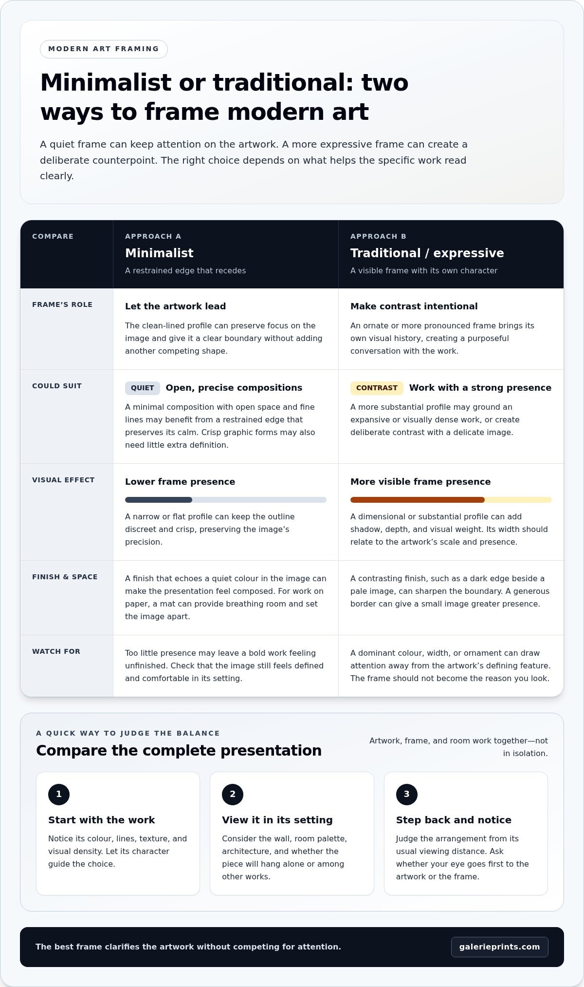
Minimalist or Traditional Frame: Which Suits Your Modern Artwork?
A clean-lined frame and an ornate one make different impressions. The first can recede, keeping attention on the image; the second brings its own visual history and creates a purposeful conversation with the work. Neither is automatically more suitable for contemporary art. Consider the artwork’s visual language, the frame’s presence, and the room together.
Bauhaus, Pop Art, and Minimalism offer distinct starting points, not framing instructions. Bauhaus design often foregrounds structure and function, Pop Art may work with vivid imagery and deliberate visual impact, while Minimalism gives close attention to reduction and space. Each individual work still has its own scale, palette, and composition. The best frame style for modern art responds to those qualities rather than relying on a movement label.
| Approach | Visual effect | Artwork and room context | Trade-off to consider |
|---|---|---|---|
| Minimalist | Creates a quiet, defined edge and keeps visual emphasis on the image. | Can suit a work with strong colour, graphic lines, or an uncluttered composition, especially in a contemporary interior. | May feel too discreet if the piece needs greater visual grounding or a more expressive relationship with the room. |
| Traditional | Adds detail and a sense of visual richness, introducing contrast with a contemporary image. | Can bring an unexpected note to a modern work, particularly where the room already includes traditional architectural details or furnishings. | May compete with a dense or highly detailed composition if the frame’s ornament becomes the first thing noticed. |
When a minimalist frame may be the stronger choice
Consider a restrained frame when the artwork already carries strong visual energy: a vivid field of colour, tightly controlled geometry, or a photograph with a clear focal point. A simple profile can keep the presentation composed and contemporary. Then assess it in the room. A minimal edge may suit a calm interior, while a more layered space might call for a frame with greater presence.
When a traditional frame can create purposeful contrast
A traditional-looking frame can make a modern work feel deliberately unexpected, setting contemporary imagery against a more classical visual language. The contrast works best when both elements remain legible: the frame contributes character, but the artwork retains its visual authority. Consider the scale and detail of each, then assess how their combined presence relates to the room.
Before choosing, compare the options from the artwork’s intended display distance. Notice whether the frame extends the work’s mood, gives it a counterpoint, or distracts from its defining qualities. This is a question of balance, not a contest between old and new. A thoughtfully chosen traditional frame can feel as considered as a minimalist one when it supports the overall presentation.
A Practical Checklist for Choosing a Modern Art Frame
A little preparation makes the decision clearer. Before browsing frame styles, study the artwork, the wall where it will hang, and the space it will occupy. This helps you move from visual impression to practical dimensions without letting room trends dictate the result.
- Observe the work. Note its dominant colours, strongest lines, texture, visual density, and overall mood. Decide whether the frame should blend into the composition or create deliberate contrast. Identify the details that matter most, such as a quiet margin around the image or a bold central form.
- Assess scale. Measure the artwork, then consider the full presentation, including any mat or surrounding border. Compare those proportions with the available wall space and nearby furnishings. A piece that looks substantial on its own may feel small above a long console, while a large work can dominate a narrow wall.
- Consider the room. Look at the wall colour, architectural details, furniture, and other art nearby. The frame needn’t match them exactly, but it should help the artwork feel at home. If possible, view the piece against the actual wall and step back to the distance from which it will usually be seen.
- Compare presentations. Settle on two or three distinct directions rather than considering every possible frame. Compare how each changes the image’s emphasis, separation from the wall, and overall visual weight. Ask someone else to view the options from the intended display distance. A choice that feels subtle up close may read quite differently across a room.
- Finalise the dimensions. Write down the desired finished size and, for a photographic print, any crop you’re considering before exploring bespoke options. This gives you a clear reference for the balance between image, border, and wall.
Assess the artwork before browsing frame styles
Keep your first observations focused on the artwork rather than a particular frame. A high-contrast image with assertive lines may call for a different balance from a soft, spacious composition. Then consider the work’s proportions alongside the wall and furnishings. This sequence helps you judge whether the frame should quietly contain the image or contribute a more noticeable counterpoint.
Plan the finished presentation and dimensions
Custom sizing and cropping can help shape a print for its intended setting, while the substrate also contributes to the presentation. Galerie Prints’ bespoke printing can be made on any substrate, including aluminium, wood, and glass. For further context on displaying photographic work, explore this fine art photography collecting and decorating guide.
Once you’ve noted the artwork’s character, desired dimensions, and room context, consider Galerie Prints’ bespoke framing service to complete a chosen print with a considered presentation.
Complete Your Modern Art Presentation with Galerie Prints
At Galerie Prints, a passion for art informs a collection of exhibition-quality photographic prints, selected for the character and stories held within each image. A considered frame is part of how a print meets its surroundings: it can establish a boundary, add visual presence, or let the image remain the focus. The best frame style for modern art is ultimately a personal decision shaped by the artwork, its intended setting, and the impression you want the finished presentation to make.
Thinking about these elements together makes the next steps more intentional. First, settle on the image and the space where it will live. Then consider its proportions, the surrounding wall, and whether the print’s crop and scale support the composition. With those choices in view, framing becomes part of a unified presentation rather than a separate decision made at the end.
Bring print, scale, and presentation together
Galerie Prints’ Bespoke Services include custom sizing and cropping, options that can help shape a print for its intended display. Custom sizing can help align the artwork with the available wall space; thoughtful cropping can adjust the image’s framing while keeping its visual character in mind. Note the desired finished dimensions and consider how much of the image should remain visible within the overall presentation.
The substrate is another part of the print’s visual expression. Bespoke printing can be made on any substrate, including aluminium, wood, and glass. Each can bring a different material quality to the presentation, so consider how the surface relates to the image and the room. These choices work alongside the frame: the print, its scale, and its material all contribute to how the artwork is experienced.
Photographic art also carries its own language of tone, detail, and atmosphere. Galerie Prints’ black and white photography collector’s guide explores one enduring example, where subtle gradations and contrast are central to the image’s presence. Reflecting on the qualities that draw you to a particular print can help you decide how its crop, scale, and surrounding presentation might best support it.
Explore bespoke framing and photographic art
For a purchased print, Galerie Prints offers professional framing as an add-on. This brings the framing decision into the same process as choosing the photographic work, allowing you to consider the finished presentation as a whole. Keep your notes on dimensions, crop, room context, and the artwork’s visual character close at hand. They can help you approach the options clearly while leaving room for the image itself to guide the final choice.
If you’re ready to explore photographic art and framing options, take a considered look through Explore Galerie Prints.
Let the Artwork Lead the Final Choice
The frame is not simply a finishing touch; it shapes how an artwork enters a room and how its details are encountered over time. As you make your choice, return to the feeling you want the piece to create. The best frame style for modern art is the one that supports that intention and feels at home in its setting, whether it recedes quietly or brings considered contrast.
Let that decision guide the next step: selecting a photographic print and shaping its presentation around the space you have in mind. Galerie Prints offers exhibition-quality prints, professional framing as an add-on for purchased prints, and bespoke options including sizing, cropping, and printing on any substrate. Together, these choices let you consider the image and its presentation as a whole.
Explore exhibition-quality prints and bespoke options, and find a work that feels distinctly at home in your space.
Frequently Asked Questions
Can I customise the size and crop of a Galerie Prints artwork?
Yes. Galerie Prints’ Bespoke Services include custom sizing and cropping, so you can consider a print’s proportions and image boundaries in relation to the space you have in mind. A crop may help direct attention within the composition, while a size adjustment can suit a particular wall. Consider these options as part of the presentation you’re planning.
Does Galerie Prints offer professional framing for purchased prints?
Yes. Professional framing is available as an add-on for prints purchased from Galerie Prints, with ready-to-hang delivery. If you’re considering the best frame style for modern art, framing can be part of your plan for presenting the chosen print rather than a separate decision made in isolation. Galerie Prints offers professional framing as an add-on for purchased prints.
Can Galerie Prints print artwork on different substrates?
Yes. Galerie Prints’ Bespoke Services include printing on any substrate. Aluminium, wood, and glass are examples, not a complete list. Consider the surface as part of the artwork’s final character: the image and its material together influence how the print feels in a room. Substrate selection is separate from choosing a frame, so consider both elements when planning the presentation.
Are Galerie Prints’ photographic prints exhibition quality?
Yes. Galerie Prints describes its photographic prints as exhibition quality and states that its printing and framing process is second to none. As you browse, consider the subject, mood, and scale that suit your collection, then reflect on how you’d like the finished work to live in your space.
Does Galerie Prints offer signed and limited-edition photography?
Yes. Galerie Prints offers signed and limited editions featuring photography from a wide variety of movements and periods. This selection gives collectors an opportunity to explore photographic art across distinct histories and sensibilities. As you browse, consider which period or visual language resonates with your collection and the space you’re furnishing. The offering encompasses varied photography rather than one single aesthetic or era.
What can bespoke framing and printing help me customise?
Galerie Prints’ Bespoke Services include custom sizing and cropping, as well as printing on any substrate, including aluminium, wood, and glass. Professional framing is a separate add-on for purchased prints. Consider image dimensions, crop, material, and framing as separate parts of the presentation you have in mind.